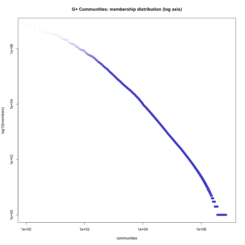
G+ Communities membership distribution
This is just a straight "how many members X how many communities" plot, with log axis on both dimensions.
The expectation is that you'd have a straight line. The plot doesn't quite show that, with a trailing down of the trend toward larger groups. This had showed up in my earlier smaller samples (this plot is from a full 8.1 million community dataset). The plotting character is at a 15% opacity to highlight the sparsity of the upper end of the data. The data range here is from 1 to 6.8 million members.
That trailing off at the upper left is pretty huge. The largest G+ communities look like they ought, by the trend of the middle of the graph, to be on the order of 100 million to 1 billion members. They're not.
Whether the top is deflated or the middle is inflated I'm not sure.