G+ Communities Activity Analysis: It's the Posts, Stupid
Over the past few weeks I've been ploughing through a web-scraping pull of the landing pages of 36,000 randomly-selected G+ Communities conducted 20-21 Dec 2018. I've been seeking answers to a few questions:
- How many G+ Communities are there? (A: 8.1 million, growing at a net of about 1%/month.)
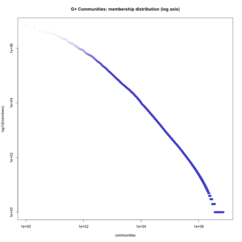
- How large are they? (A: For communities w/ >0 members: Median size 2, mean about 90, 95%ile: 113, 99%ile: 837)
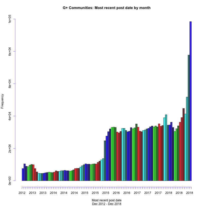
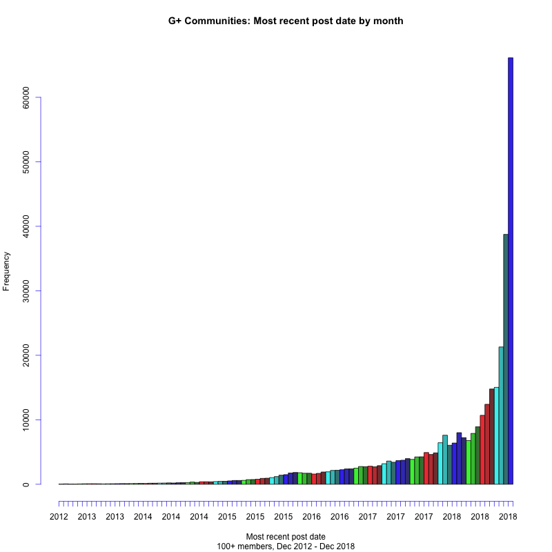
- How many are recently active? (A: Observed: <1m: 1, <1h: 29, <1d: 164, <1w: 310, <1mo: 639, <6mo: 1286. Actual is ~223 * observed, so ~ 142,497 between 1 week and 1 month, a total of ~255,800 active within the past month.)
- How many G+ users are present and active? (A: Can't say.)
- What characteristics seem to distinguish active communities? (A: Comments)
- How do you find active communities? (A: See below.)
I'm still working with the data, but the plot above seems to tell a very significant story.
An explanation of what is being shown here:
- This is a plot grid showing the relationship between multiple variables, a standard R graphics output.
- Data are from G+ communities with more than 10 members. This removes some low-membership noise without changing fundamental data relationships.
- All data are plotted as log10 values, that is logarithm base ten of the observed value. Actual data range from ~0.01 (-2 as scaled) to ~100,000 (5 as scaled).
- Selected fields are members (community membership), posts/wk, plus-ones/wk, comments/wk, reshares/wk, and most recent activity in seconds, as "members", "post_wk", "plus_wk", "com_wk", "share_wk", and "recent_sec", respectively.
Members tells us how many profiles are subscribed to a community.
The activity/wk values give us a measure of activity. From the scraped pages, there are up to ten posts visible, representing surviving and recent posts on communities. Only 4,500 of the 36,000 communities sampled have a full 10-post history, and about half have no visible posts. Since this gives us at best a very partial view of community activity, I instead computed the number of observed activities over the elapsed time interval, expressed as activity/wk, for posts, plus-ones, comments, and reshares. In aggregate, the large observation count should make these values robust.
The recent activity is the time between the start of the data pull and the most recently-visible post. This ranged from about 2 minutes to the first communities created in December 2012. There's a sharp discontinuity about 160 weeks prior to the pull (late November, 2015), which seems to reflect some sort of either purge of old, or creation of new, communities. I'd be interested in any history of this that people are aware of. The relationship of recency to other variables is inverted, so recent activity is less frequent, but also generally higher.
The plots use a partially-transparent symbol such that more observations produce darker regions. It's actually mostly the lighter regions which are of more interest -- these are the high-activity communities.
That's the background.
Graph interpretation
Reading across the top or down the right of the graphic we have relationships between members and other variables. There is a positive relationship (more members == more activity, or more recent activity), but it's ... pretty scattershot. If you look at the 4th plot from left, members vs. comments/wk, and follow the line down from 2 (~100 comments/wk), we seek that there are datapoints from '1' to '5' on the members scale -- that's 10 - 100,000 members. Having lots of members does not necessarily get you more commenting activity.
Similar patterns are seen for other relationships. For recency, 10^4^ seconds (about 2.2 hours) activity is found across all membership classes. 100+ reshares ('2' as scaled), 100+ pluses, and 100+ posts, similarly.
If we bump over one column to the right, for plus_wk, the story changes. The plot is far more compact and linear. If you post 100x weekly, you get ... reasonably close to 100 plus-ones (a bit over) per week. Similarly comments and reshares. And for recency, virtually all 100+ posts/wk communities have activity within 10^5^ seconds -- about 1.15 days.
For causality, I'd tend to attribute posts rather than other activity (comments, plusses, comments), as you need posts in order to have other activity occurring. This is a reiteration of an observation I'd made long ago about Google+: The basic unit of interaction is the post, not communities, collections, or other units. That is, it is on a post with traction and engagement that further activities occur.
If you want an active community, post content, reasonably frequently.
How do you find active Communities?
This has been a major frustration as I've been trying to reach out to and determine where community activity is. What I'm leaning toward is **use G+ search with filters for in:community and after:<date>. A date about 1 week to 1 month ago should be appropriate. For finding any activity, a fairly generic non-stopword (something that's filtered out of search, like "the" or "a") typically works well. For English, "this" is often a good choice.
What other characteristics are there?
I'm limited by the information I can access from Communities. In general, these are:
- Community ID
- Community URL
- Name
- Description
- Membership status (public vs. private) (about 91%/9%).
- Members (for public communities only)
- Membership policy ("Join" vs. "Ask to join) (about 55%/45%).
- "About" text -- a long community description
- "Links". Any linked URLs, with URL and name.
- "Classifications". Any indicated filters within the community.
- Posts: up to 10 recent and surviving posts.
- Post activities: plus ones, reshares, and comments.
- Post properties: author, date, is-pinned status, attachments, photos, photo description.
- Post contents: text of actual posts.
- Comment contents: text of actual comments.
What is not available are:
- Community creation date.
- Membership lists.
- Moderator lists.
- Deep community content (though this might be further scraped).
- Content that's been deleted by the author, removed by moderators, or by G+ filters or abuse systems.
We might be able to conduct some analysis based on the language and topics of communities.
Informally:
- Increased membership doesn't buy much buy way of more or more recent activity, especially above about 100 members, but does tend to sharply reduce the amount of no-post / no-activity communities.
- Requiring "ask to join" seems to sharply limit community size. About half of communities from 0-9 members have "Ask to join" policy. This is about 1/3 for 100+ member communities.
- Of engagements, reshares seem to be the least common. People will happily +1 or comment, but reshare (very) roughly 1/10 as often.
- There are numerous languages present, including Arabic, Japanese, Korean, Malay/Indonesian, Thai, Vietnamese, Arabic, Hebrew, Spanish, Russian/Cyrillic, and more.
- Popular communities tend to be focused around celebrities, photography, religious, or technology topics.
- There are a large number of porn and sex-related communities, though these seem frequently empty, and in many cases have no visible activity, suggesting they were purged. Many of these have large memberships but no activity.
- It appears that there is a fall-off in per-member engagement for groups above about 2,000 - 3,000 members. That is, looking at comments/member-week and similar measures, high values above the low-to-zero-engagement baseline fall off almost completely. This does not appear to be a sampling artifact, though this requires further investigation.
Sampling methods mean that large G+ communities are poorly represented. The sample draws about 1:223 communities, and correspondingly there is only one community represented from about the top-200 size class, weighing in at 291,025 members. Analysis of very large communities should be based on a dedicated list of these. I plan to do this shortly.
What this is not: The analysis is not claiming G+ communities activity or engagement is higher than or lower than other online communities. I've no basis on which to make such claims (though data on this would be of interest). The answers sought simply concern properties and characteristics of observable communities. I do suspect that the lessons here are fairly globally applicable, particularly as concerns the relationships between post and other activity, and the maximum size of cohesive communities.
Methods
Community lists are available from Google+ sitemaps, listed at https://plus.google.com/robots.txt. The 100 community sitemaps were pulled, listing 8,055,611 communities. This is about a 1% increase since an earlier analysis in November based on 12,000 communities.
A random seed was used to pre-filter about a 2% sample of candidate communities, which were sorted randomly and the first 36,000 records saved as the sample. This two-pass method is significantly faster than sorting the entire set. The 36,000 observations is 1:223.76697 of all extant communities.
Testing against the earlier 12,000 sample set, we would expect about 12,000 / 223.76697, or 53.627218 communities to be in common between the two samples. The actual match is 53 communities in common. This test of sample validity succeeded.
The community homepages were retrieved using curl, saving both the HTML and the HEAD request. The download took ~16 hours.
An error caused 8 retrieved records to be deleted. These were re-downloaded approximately 24h after the initial data pull. Influence on results is negligible.
Of the 36,000 communities, 13 were no longer retrievable (HTTP 302 errors) when fetched. This suggests a community deletion rate of about 4,348/day, or 132,000/mo. Note that with a net increase of 1% over a month, the raw creation rate is even higher.
Data extraction from raw HTML was performed using the html-xml-utils package, notably hxextract. This took ~18 hours over all 36,000 files. Parsing HTML DOMs, especially repeatedly, is slow work.
Further data massaging was conducted in awk to produce a 35,986 record CSV file fed to R for data analysis and graphing.
Further planned activities
As noted:
- There is more analysis forthcoming, including CAN HAZ MOAR GRAFFIX.
- Data processing needs validation, though it smells pretty good.
- A large-group analysis based on CircleCount's April 2016 (last available data) set of top-200 G+ communities is planned.
- Further thoughts on what to look at and questions to explore are appreciated.
#googlePlus #gplusRefugees #RStats #dataVis #statistics #socialMedia