#datavisualisations

dezeen@xn--y9azesw6bu.xn--y9a3aq

Raw Color's Temperature Textiles wrap wearers in climate-change data

image

Temperature Textiles by Raw Color

To raise awareness about environmental issues and provide a way to keep warm without turning on the heating, Dutch design studio Raw Color has created the Temperature Textiles collection, which is embedded with climate-change data.

The Temperature Textiles range features blankets, scarves and socks knitted with infographics about either temperate change, sea-level rise or greenhouse gas emissions.

Raw Color wanted to create pieces that draws attention to climate change and chose to focus on data because the studio regards it as an "essential visual" of the facts.

Person on sand dune holding up bright red, purple, orange and yellow blanket with patterns of linesRaw Color's textiles include a flat-knit blanket with a pattern representing projected temperature rise

"It also has a graphic nature because data is represented by graphs, lines and colours," Raw Color co-founder Christoph Brach told Dezeen. "Therefore they are an ideal source of ingredients to transform into graphic patterns on textile."

Additionally, the studio liked the idea of textiles as a way to make information that people usually only view on a screen more tangible.

"Textile was important for us because it manifests the data permanently," said Brach. "On a screen, one sees it temporarily."

Double-knit Temperature Textiles blanket with several data sets about emissions rise knitted into it
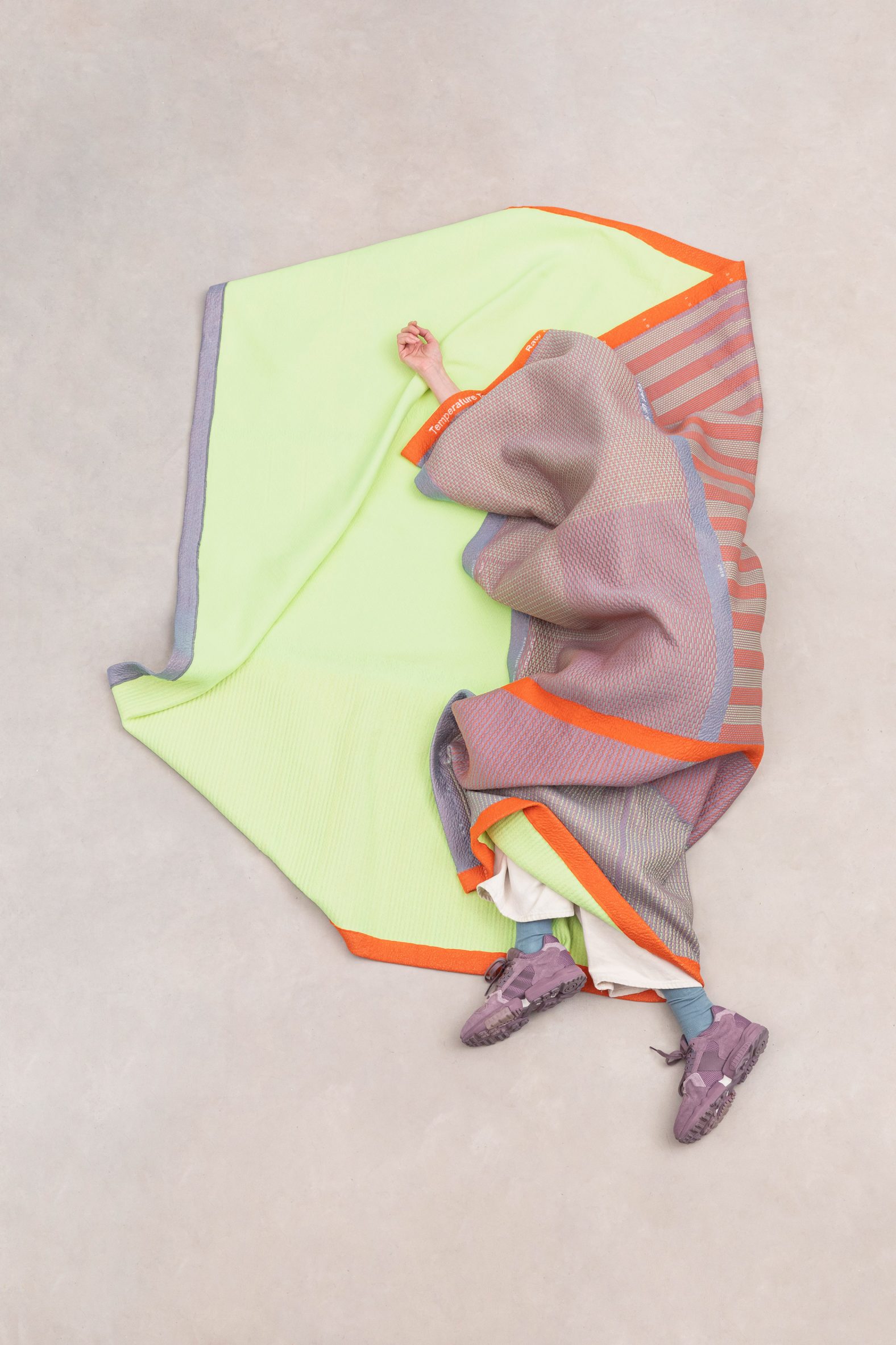
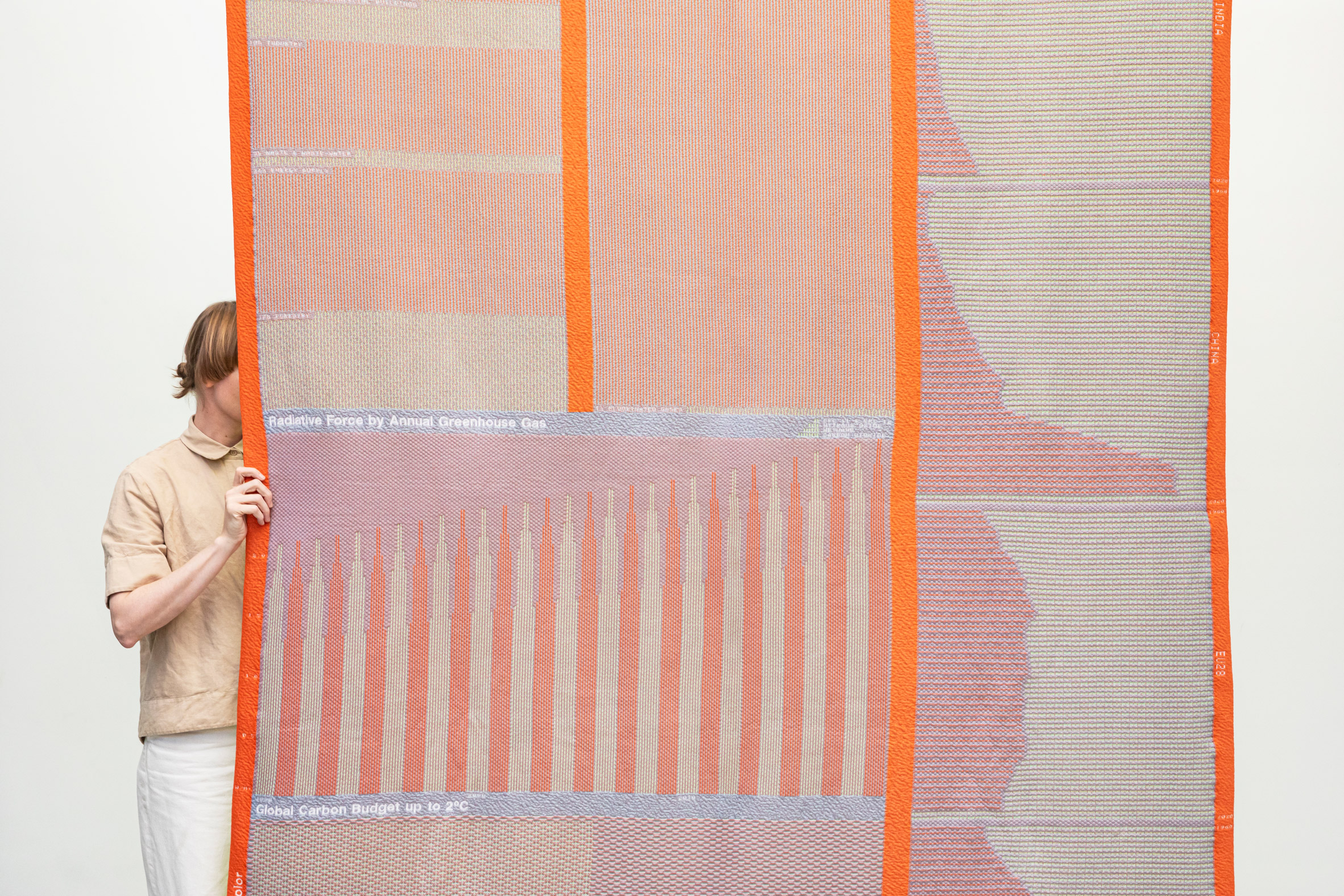
There are also double-knit blankets that gather several data sets into one piece

"Also, it is an object we can interact with," he continued. "A blanket can keep us warm and it can actively help to turn down the heating."

"And it is larger than a human when the data is displayed on the blanket, so it has more impact compared to a smaller screen display."

The largest items in the Temperature Textiles collection are blankets – three made using a flat knitting process and three using double knit.

Emissions rise flat-knit blanket from Raw Color's Temperature Textiles series
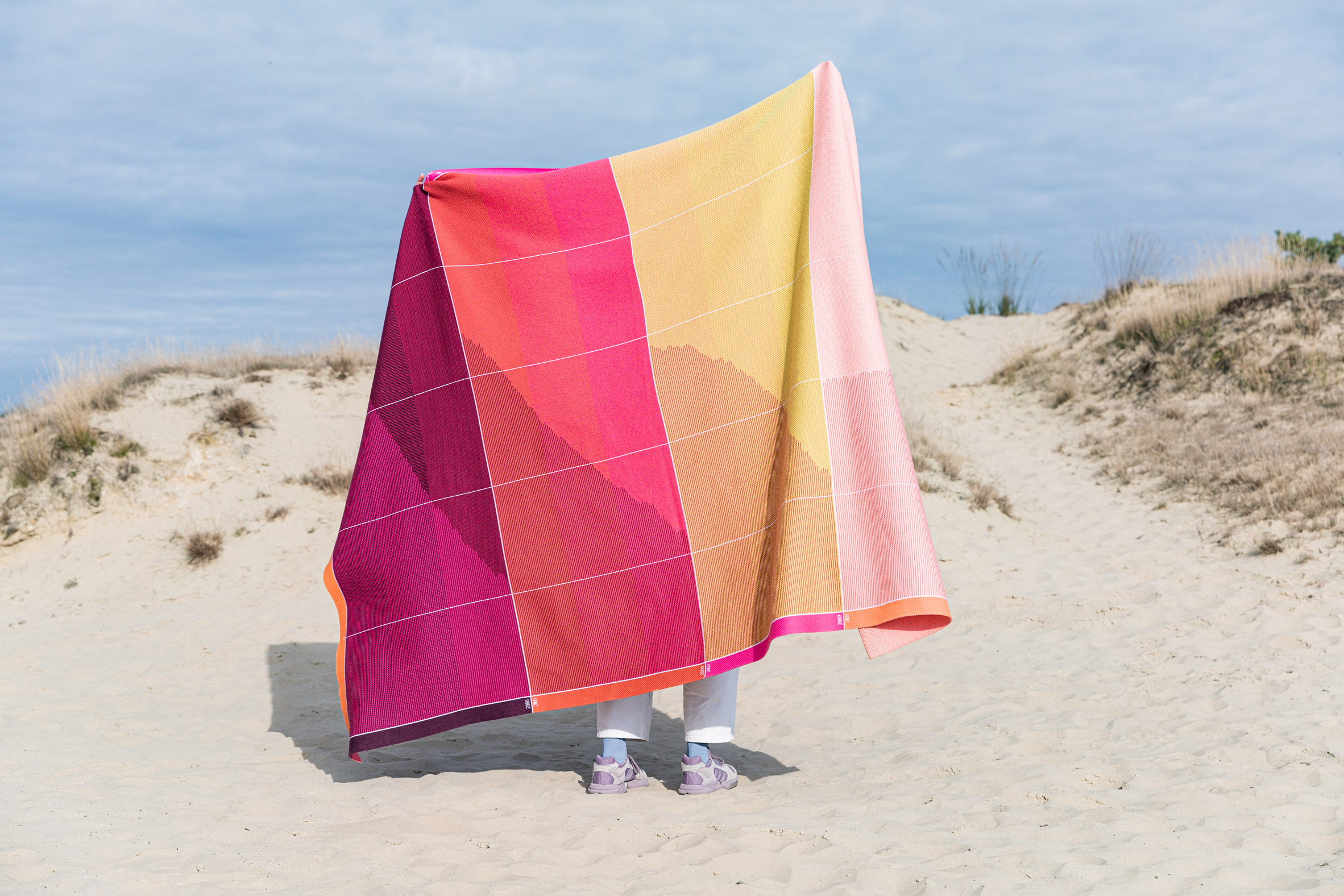
The patterns on this blanket represent projected emissions rise, while other designs focus on temperature and sea levels

The flat-knit blankets feature the different emission scenarios modelled by the United Nations Intergovernmental Panel on Climate Change, with one design focusing on temperature, one on sea-level rise and the last on emission rise. Each line represents one year from 2000 until 2100.

The double-knit blankets have a more complex collage of visualisations as the process allows for two interlocked layers of fabric to be created at the same time, incorporating height differences and embossing effects.

[ Arkup 75 villa-cum-yacht by Waterstudio.NL is a climate change resilient home

Read:

Ten climate-resilient homes that have adapted to the realities of global warming

](https://www.dezeen.com/2022/03/07/climate-resilient-homes-roundups/)

The temperature-themed blanket, for instance, incorporates data on global warming by country and surface air temperature anomalies.

The socks and scarves, with their limited canvases, required the most selective approach to the data sets.

Temperature Textiles scarf in red, pink and orange with pattern recording projected temperature rise under climate change
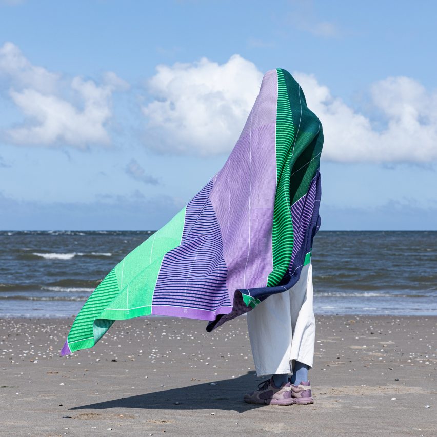
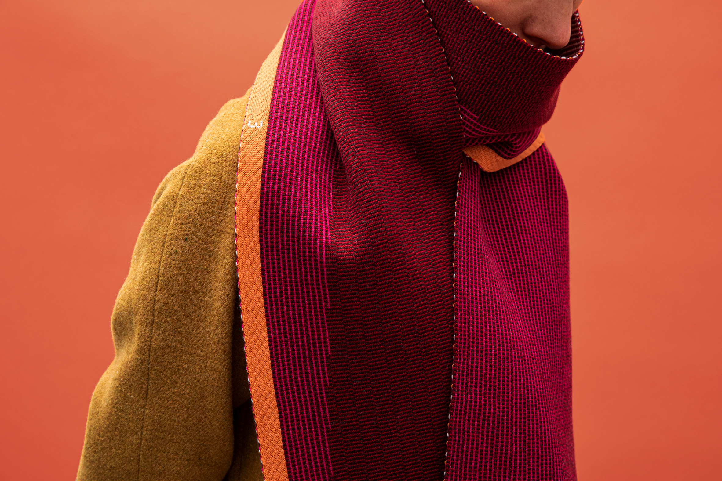
The collection also includes a scarf that records projected temperature rise

The socks visualise predicted sea-level rise as horizontal lines running along the back of the leg, similar to the lines of a ruler. But Raw Color could only fit one emissions scenario on the socks instead of the blankets' four – and could not use those with the most dynamic range.

"On the sock, we chose the most ideal scenario until 2050," said Brach. "Because everything else just did not fit on a regular sock. The highest highlighted line is 22 centimetres that you can feel on your ankle, the rise until 2050."

As well as taking advice from the Royal Netherlands Meteorological Institute on its use of data, Raw Color collaborated with TextielLab, the workshop of The Netherlands' TextielMuseum, on the design of the blankets, and design studio Knitwearlab on the scarves and socks.

Temperature Textiles sea level socks in cool blue and purple colours with horizontal lines up the back of the leg communicating projected sea level rise
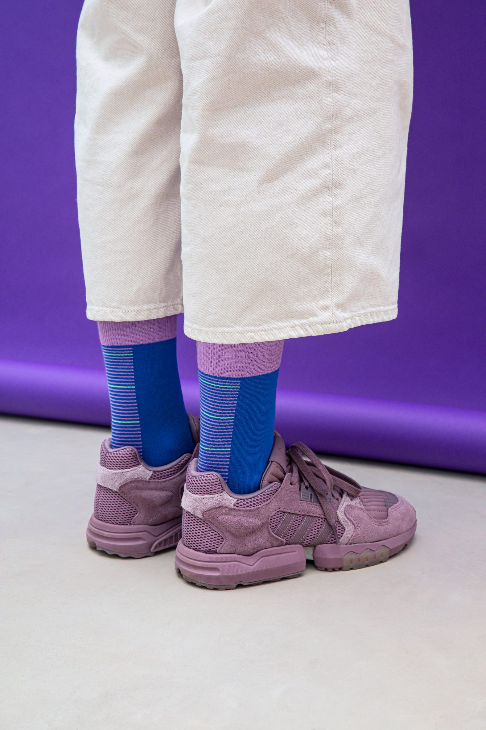
The collection's socks feature a mini visualisation of projected sea-level rise

Raw Color used the experience to learn about the different types of knitting processes and emerged with a particular appreciation for flat knit, which has a colour expression that Brach describes as "pure and vibrant".

The designers liked that the flat-knit process produces no offcuts, there is little waste and the machine can be adjusted to the size of the piece. This is in contrast to weaving, which requires the use of the full width of the loom and for the edges to be cut off.

The studio was also able to use a single material, natural merino wool, for the flat knit, whereas this was not an option for the double knit, which is a polyester blend.

Person wrapped up in Raw Color's Temperature Textiles blanket
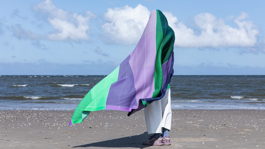
People can wrap themselves up in the Temperature Textiles to keep warm

Founded by Brach together with Daniera ter Haar, Raw Color is a studio that blends different design practices to explore elements of colour.

The studio has previously held an exhibition of chromatic experiments at London's Aram Gallery and bleached coded messages into scarves using a customised printer.

The post Raw Color's Temperature Textiles wrap wearers in climate-change data appeared first on Dezeen.

#all #design #fashion #homeware #textiles #blankets #scarves #rawcolor #climatechange #datavisualisations

dezeen@xn--y9azesw6bu.xn--y9a3aq

Blue bubbles helped "make the cause of climate change visible" say visualisers behind viral video

image

Still from data visualisation by Real World Visuals showing New York City's emissions

A 2012 animation showing New York City being buried under a mountain of giant bubbles allowed people to appreciate the scale of carbon emissions for the first time, according to its creators Real World Visuals.

Released in 2012, the computer-generated timelapse shows the city being buried under a mountain of bubbles representing the city's 54 million tonnes of annual CO2 emissions.

"Carbon emissions are invisible and that's a core part of the problem," said Real World Visuals co-founder Antony Turner. "If carbon dioxide was purple, we would start taking notice."

Making abstract concept of emissions more understandable

In the video, the communications agency depicted the city's annual emissions as 54 million bubbles, each ten metres in diameter, which gradually subsume the city.

Nine years later, the iconic image of the blue mountain towering above the Empire State Building remains one of the highest-ranking climate change images on the internet.

Despite the fact that the three-minute video features almost no audio, it has been viewed almost half a million times on YouTube and was picked up by outlets including the Guardian and Scientific American.

The simple animation helps to make the abstract concept of carbon dioxide equivalent (CO2e) emissions more understandable to the general public.

Still from data visualisation by Real World Visuals showing New York City's emissions
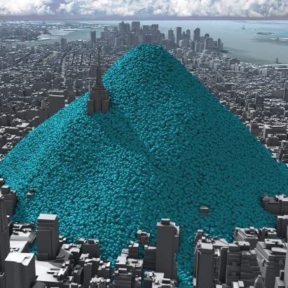
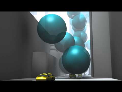
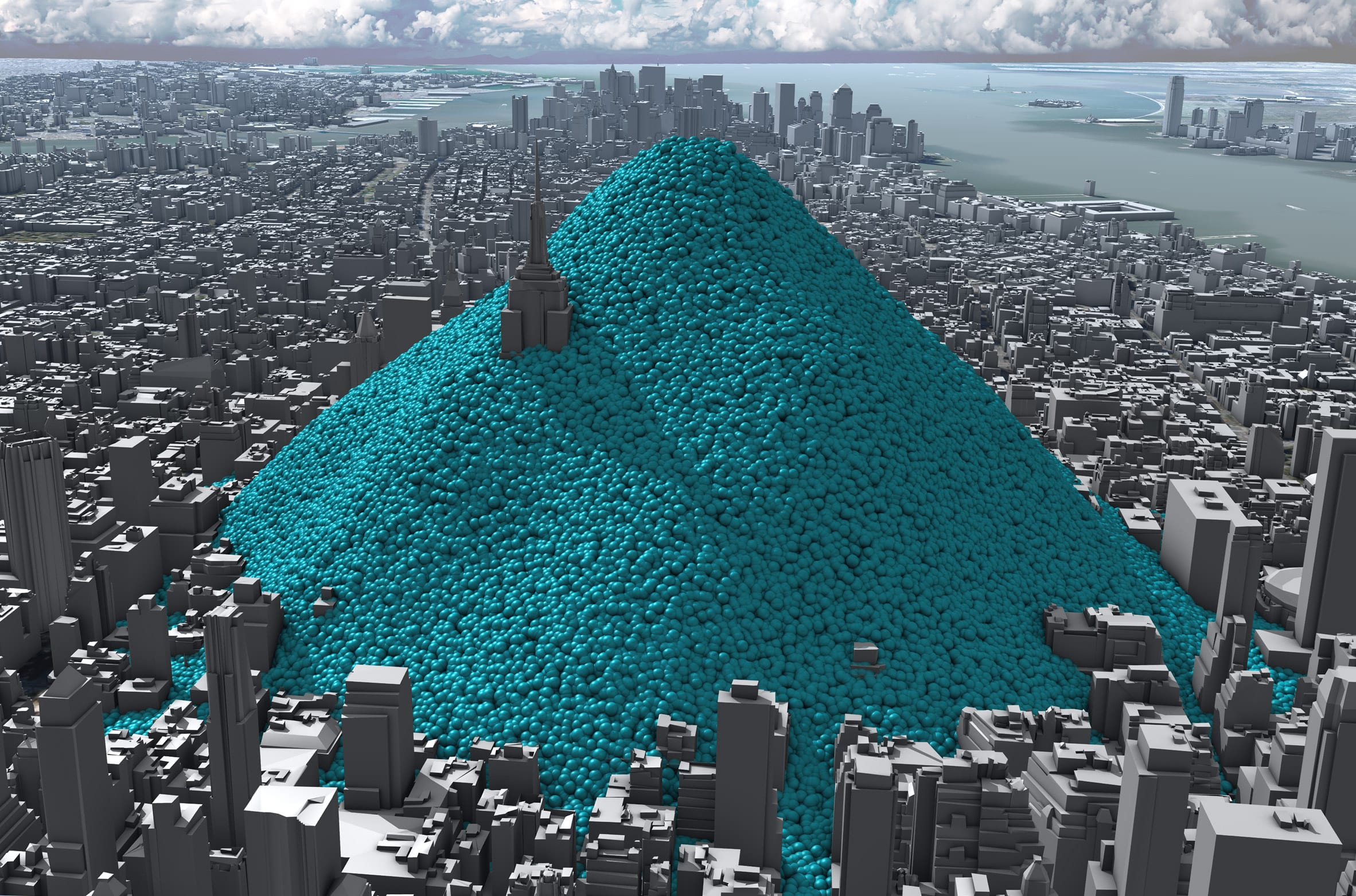
The animation shows New York being buried under a mountain of blue bubbles representing its carbon emissions

"Part of the problem is that some people are very cut off from quantitative information," said the agency's creative director Adam Nieman.

"You put numbers and graphs in front of people and they bounce straight off."

This is compounded when it comes to the issue of atmospheric carbon, he argues, which is "a problem with an invisible cause".

"Our [aim] is to make the cause of climate change visible because very few other people are approaching it like that," Nieman added.

Viewers can relate to spheres on a physical level

Based in England, Real World Visuals was originally founded in 2009 under the name Carbon Visuals with the aim of visualising imperceptible environmental challenges such as emissions, air pollution and ozone depletion.

The New York City emissions animation, which the agency created for the Environmental Defense Fund, is its most successful project to date.

Since it was published, the city of New York has managed to decrease its carbon emissions slightly to 50.7 million tonnes of CO2e in 2017 and committed to becoming carbon neutral by 2050.

Still from data visualisation showing the rate of global emissions
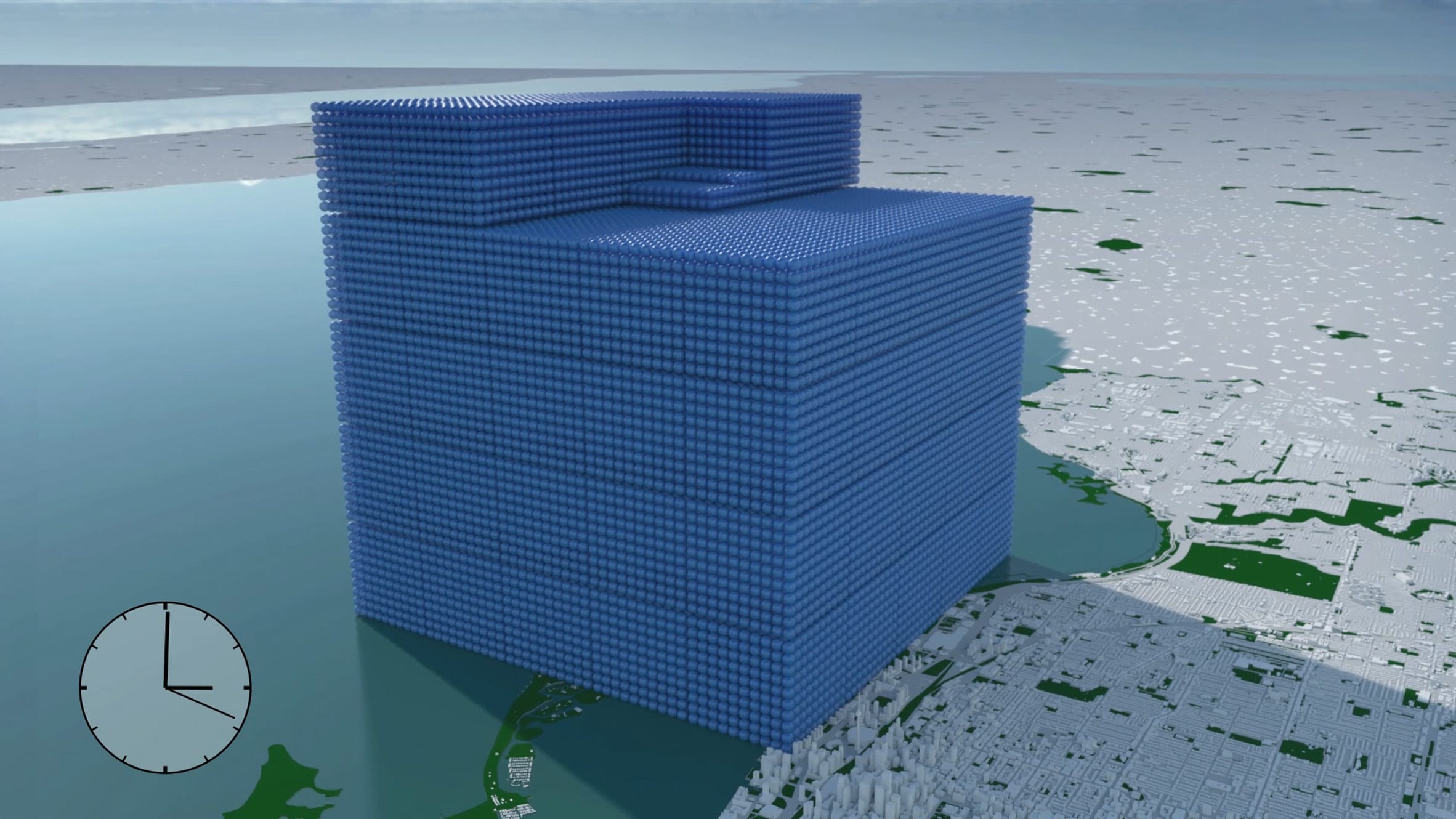
Real World Visuals has also used the blue spheres to represent the rate of global emissions for the 2018 G7 Summit

Meanwhile, Real World Visuals has used the same blue spheres to show the carbon footprint of entire countries from Ireland to the United States, as well as visualising the rate of all global emissions – 112 million tonnes of CO2e a day – for the G7 summit in 2018.

The agency has also been using the spheres to demonstrate how much carbon can be captured and stored in timber building elements or aquatic "blue carbon" sinks such as salt marshes and peatlands.

"We've been doing this for a long time so we've thought through all of the different ways you can show quantities of carbon dioxide gas," said Nieman.

"And the nice thing about spheres is you can relate to the shape," he added. "Because you can relate to it on a physical, visceral level, people were responding to it."

Showing emissions in real-time

Real World Visuals calculated that each tonne of CO2 would fill a sphere with a diameter of 10 metres.

New York City emissions amounted to two of these bubbles every second in 2010, which is the year the animation's data is based on.

The video initially shows these spheres ballooning up in real-time, before visualising the emissions that are generated after an hour, a day and ultimately a year when a panoramic view from the Statue of Liberty shows the city's skyline buried underneath a mountain of the blue balls.

"A really powerful way to turn an abstract number like 54 million tonnes a year into something that people can relate to is to show it in real-time," Neiman explained.

"A day is a period of time that we can imagine and feel like we inhabit. A year is an accountancy term but it's not something we can relate to that well."

Using a mountain of smaller spheres rather than one large sphere to represent the emissions helps to give viewers a more accurate sense of scale, Neiman said.

"As human beings, we're quite good at estimating discrete quantities but we're really bad at comparing volumes," he said."If you put two spheres with twice the volume next to each other, people will think that they're pretty much the same."

Prompting rather than answering questions

Contrary to most data visualisations, which Neiman says provide answers to specific questions, Real World Visuals hopes to provoke questions instead.

This is achieved by stripping back any evaluations of the data and letting the visuals speak for themselves. The New York animation, for example, is presented without any context about climate change.

"People responded by saying 'this is rubbish because climate change isn't real', which is an interesting response because we didn't mention climate change at all," Neiman explained.

"We just said: this is the carbon dioxide that is entering the atmosphere as a result of human activity in New York City. We didn't say this is a lot, we didn't say it's good or bad. And that provoked lots of discussions."


Carbon revolution logo

Carbon revolution

This article is part of Dezeen'scarbon revolution series, which explores how this miracle material could be removed from the atmosphere and put to use on earth. Read all the content at: www.dezeen.com/carbon.

The sky photograph used in the carbon revolution graphic is byTaylor van Riper via Unsplash.

The post Blue bubbles helped "make the cause of climate change visible" say visualisers behind viral video appeared first on Dezeen.

#carbonrevolution #interviews #graphics #all #design #videos #graphicdesign #animations #designvideos #climatechange #datavisualisations

New York City's greenhouse gas emissions as one-ton spheres of carbon dioxide gas