#designvideos

dezeen@xn--y9azesw6bu.xn--y9a3aq

The Decorators create Portal Tables furniture to bring humans and bacteria together

image

Cheese-Board by The Decorators

Design collective The Decorators has created three pieces of inflatable furniture that encourage humans and bacteria to intermingle through the process of food fermentation.

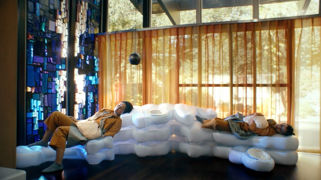
The three design sculptures include a 12-person table for making kimchi, a small table for producing labneh cheese and a sofa that can be used for proving the dough for bread.

Cheese-Board is an inflatable furniture design by The DecoratorsThe objects encourage humans and bacteria to mix

Designers Xavier Llarch Font and Mariana Pestana of The Decorators wanted to highlight the positive role that bacterial microbes can play in human life.

The project builds on the understanding that microbes, such as those cultivated in food fermentation, can improve human digestion. They are also believed to produce feelings of joy through the release of hormones like dopamine and serotonin.

Cheese-Board by The DecoratorsCheese-Board is used for making and drying labneh

At a time when Covid-19 has increased public fear of both bacteria and human interaction, Llarch Font and Pestana hoped to use bacteria as a way of forging rather than alienating communities.

"We've been made more aware of how non-human agents such as virus bacteria and microbes impact our lives," said Llarch Font.

"This has dramatically changed the way we interact with each other and our very notion of community."

Kimchi-Pool is an inflatable furniture design by The Decorators
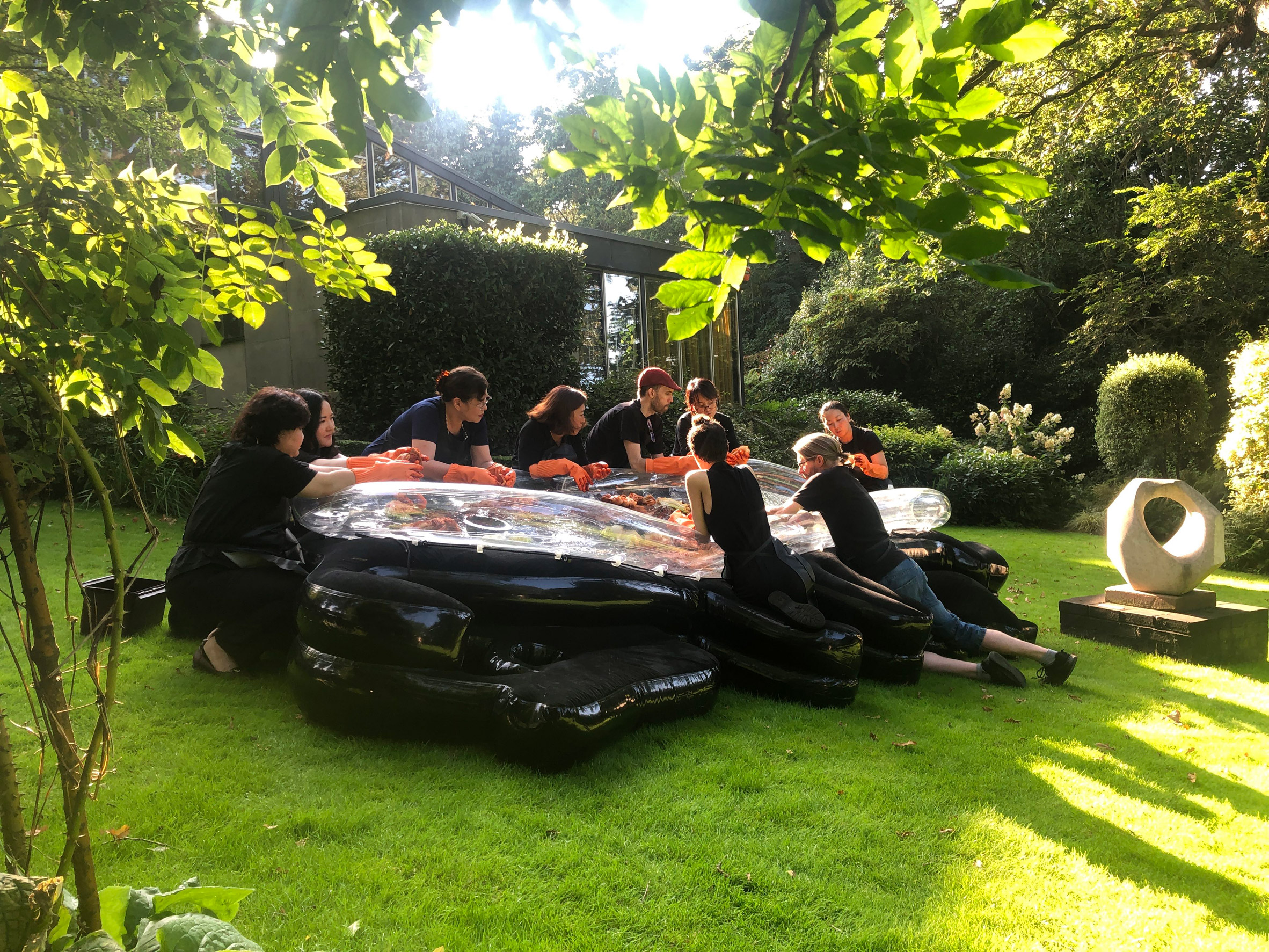
Kimchi-Pool allows up to 12 people to communally make kimchee

The first piece of inflatable furniture is Kimchi-Pool, a large basin-style table with irregularly-shaped seats around the outside.

A group of up to 12 people can sit or kneel at the table to collectively make kimchee, a Korean food created from seasoned and fermented cabbage and radish napa.

Sofa-Bread is an inflatable furniture design by The Decorators
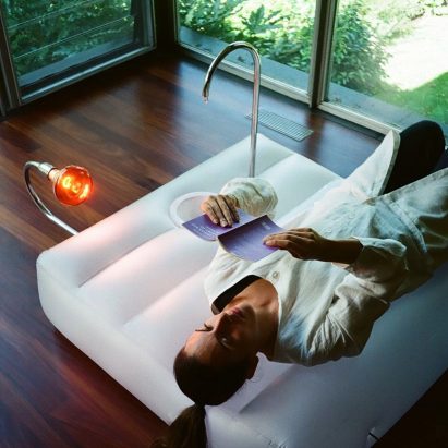
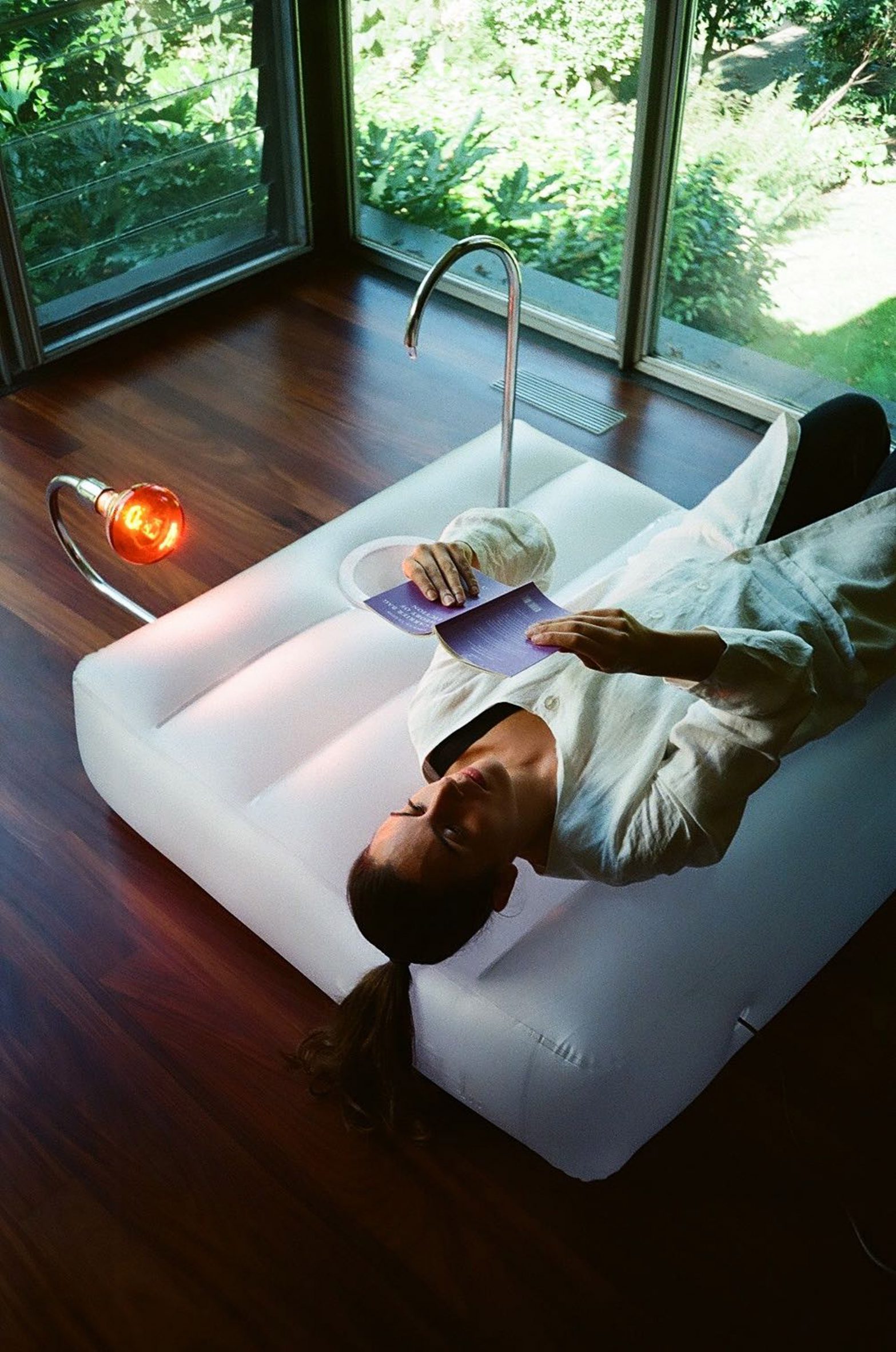
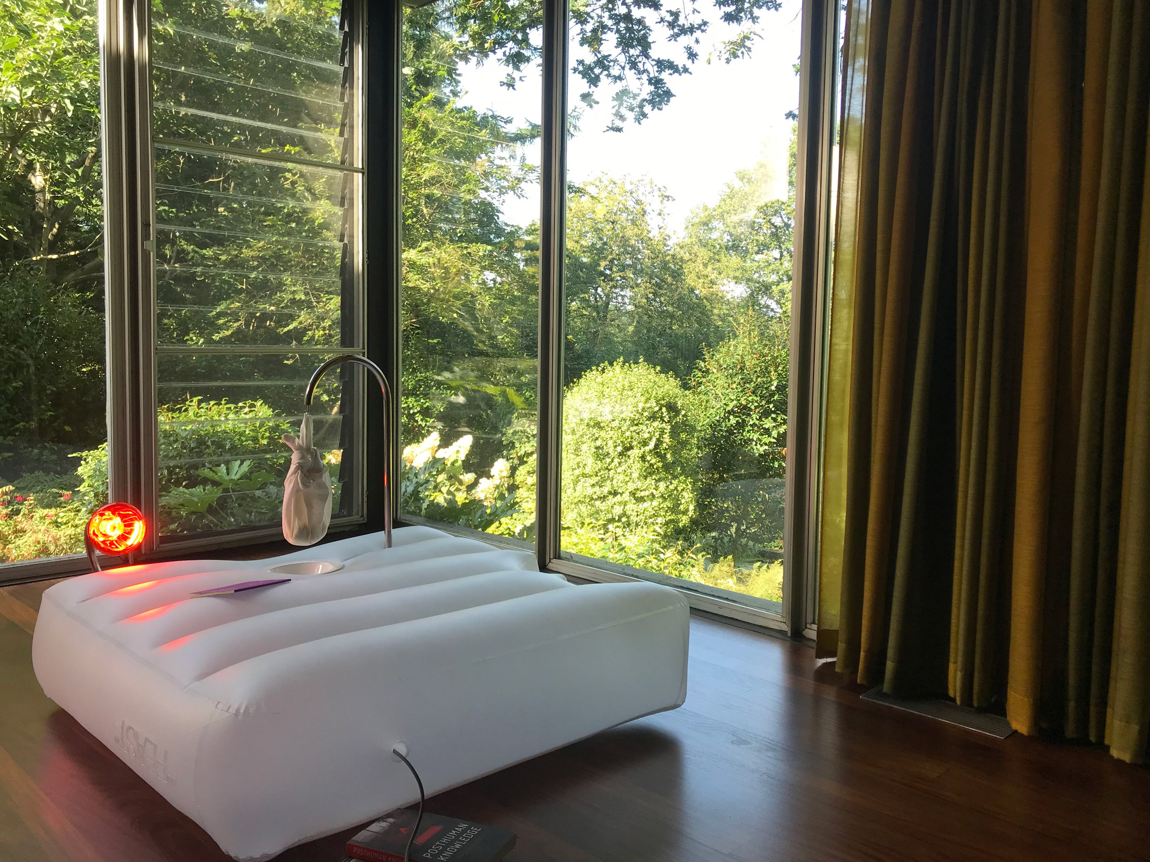
Sofa-Bread provides space for bread makers to lounge while dough is proving

Cheese-Board provides a surface and drying rack for making labneh, a soft cheese that is traditionally made in Lebanon.

Sofa-Bread is a tiered seat that invites bread makers to lounge while they wait for their bread dough to prove – the process where yeast ferments the dough – before baking.

"We were interested in this idea of domesticity, how these objects become like kitchen utensils," said Llarch Font.

Sofa-Bread by The Decorators
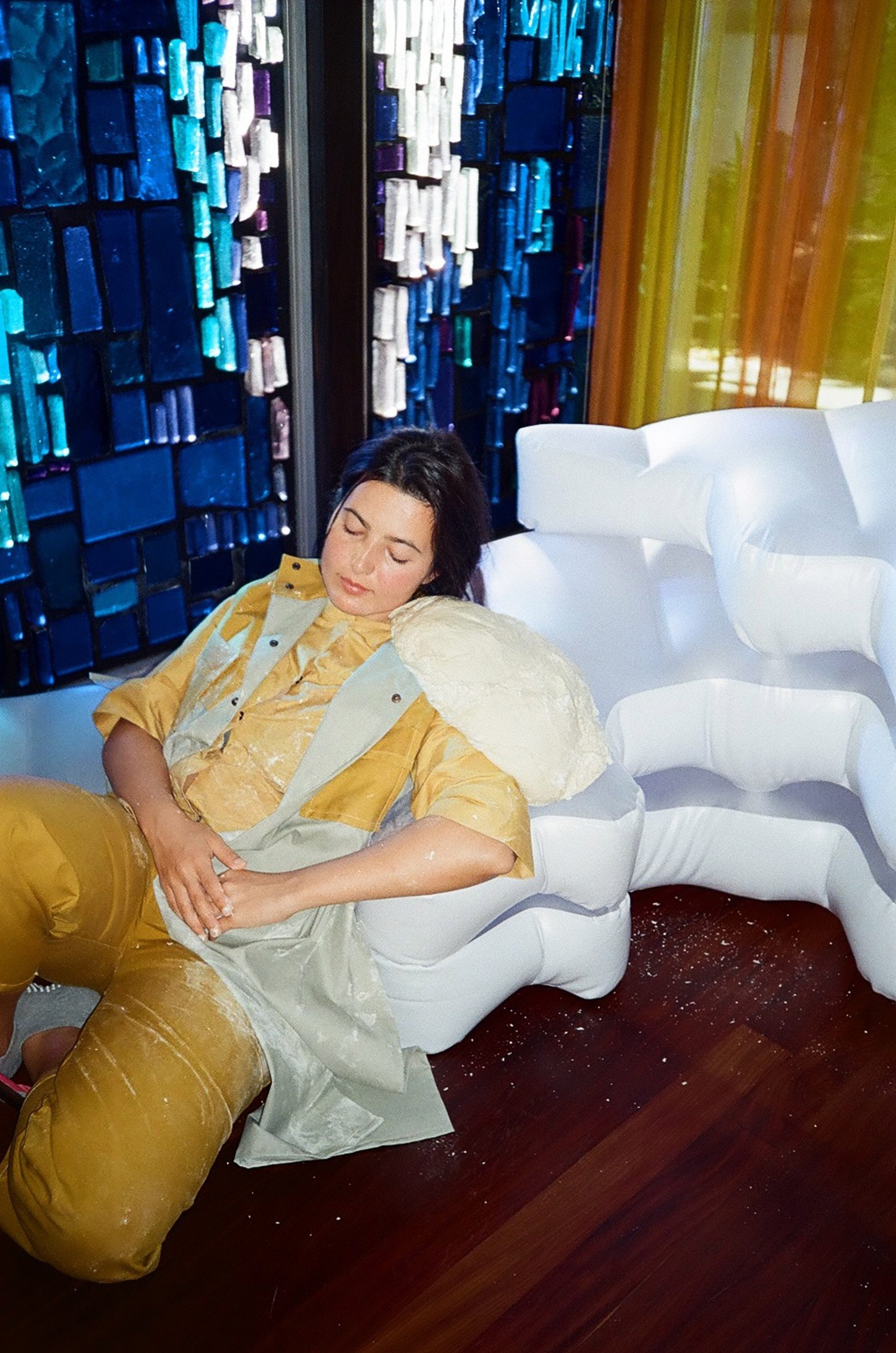
A performance by artist Laura Wilson was staged on Sofa-Bread

The Decorators produced the designs through a fellowship with the Stanley Picker Gallery at Kingston University in southwest London.

The project began in 2018 but naturally took on a new dimension in light of the pandemic – a time when antibacterial hand washes became part of everyday culture, but people also starting experimenting with recipes for making fermented foods at home.

[ The Decorators

Read:

"A lot of what we do is about testing public space"– Suzanne O'Connell of The Decorators

](https://www.dezeen.com/2013/01/18/suzanne-oconnell-the-decorators-designed-in-hackney-day-movie/)

The designers hoped to create a reminder that these foods were not always just hobbies to share on social media, but staple foods created through common domestic rituals.

Llarch Font points to the communal kimchee-making that still takes place today, while Pestana recalls how her grandmother would put bread dough above the fireplace.

"It was something that you lived with," she said.

Portal Tables by The Decorators at Stanley Picker Gallery
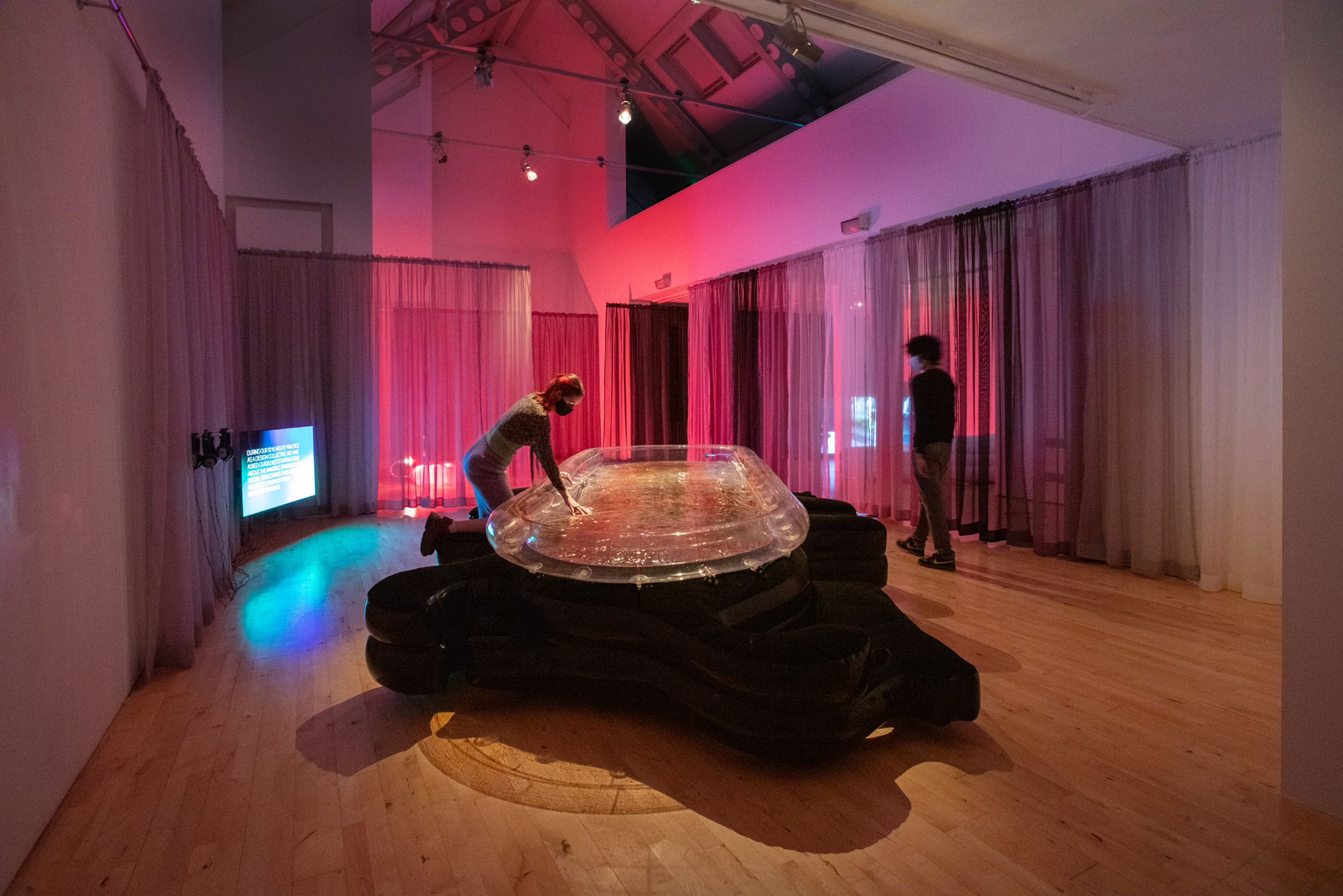
The designs were exhibited at Stanley Picker Gallery. Photo is by Ellie Laycock

All three inflatables have been brought to life through performances.

The kimchee table was used by the Kimjang Project, a spinoff of the Kingston Korea Festival, while the bread sofa was brought to life in a performance by artist Laura Wilson.

The Decorators produced a film to accompany the designs

The Decorators have also produced a film that explains the background behind the project, which was exhibited alongside the designs in an exhibition at Stanley Picker Gallery.

Portal Tables was on show at the Stanley Picker Gallery from 18 November 2021 to 5 February 2022. SeeDezeen Events Guide for an up-to-date list of architecture and design events taking place around the world.

Photography is by Sergio Márquez/The Decorators, unless otherwise indicated.

The post The Decorators create Portal Tables furniture to bring humans and bacteria together appeared first on Dezeen.

#furniture #all #design #videos #inflatables #art #sculptures #designvideos #thedecorators

dezeen@xn--y9azesw6bu.xn--y9a3aq

Ilse Crawford explores "useful design" in second episode of Braun's Good Design Masterclass

image

Good Design Masterclass

Ilse Crawford discusses useful objects such as prosthetic hands, electric bikes and shavers in the second episode of Braun's masterclass video series that Dezeen is publishing as part of our collaboration with the German design brand.

Braun launched the Good Design Masterclass video series, which is led by British designer Crawford, to inspire "good design for a better future" and to mark its centenary. The second episode focuses on useful objects.

"Fundamentally, 'useful' is about functional things that people really need," said Crawford in the video. "Genuinely useful design creates the building blocks of our lives."

"Sometimes, 'useful' can make things more convenient. But it can also improve lives in quite profound ways."

Braun Good Design Masterclass
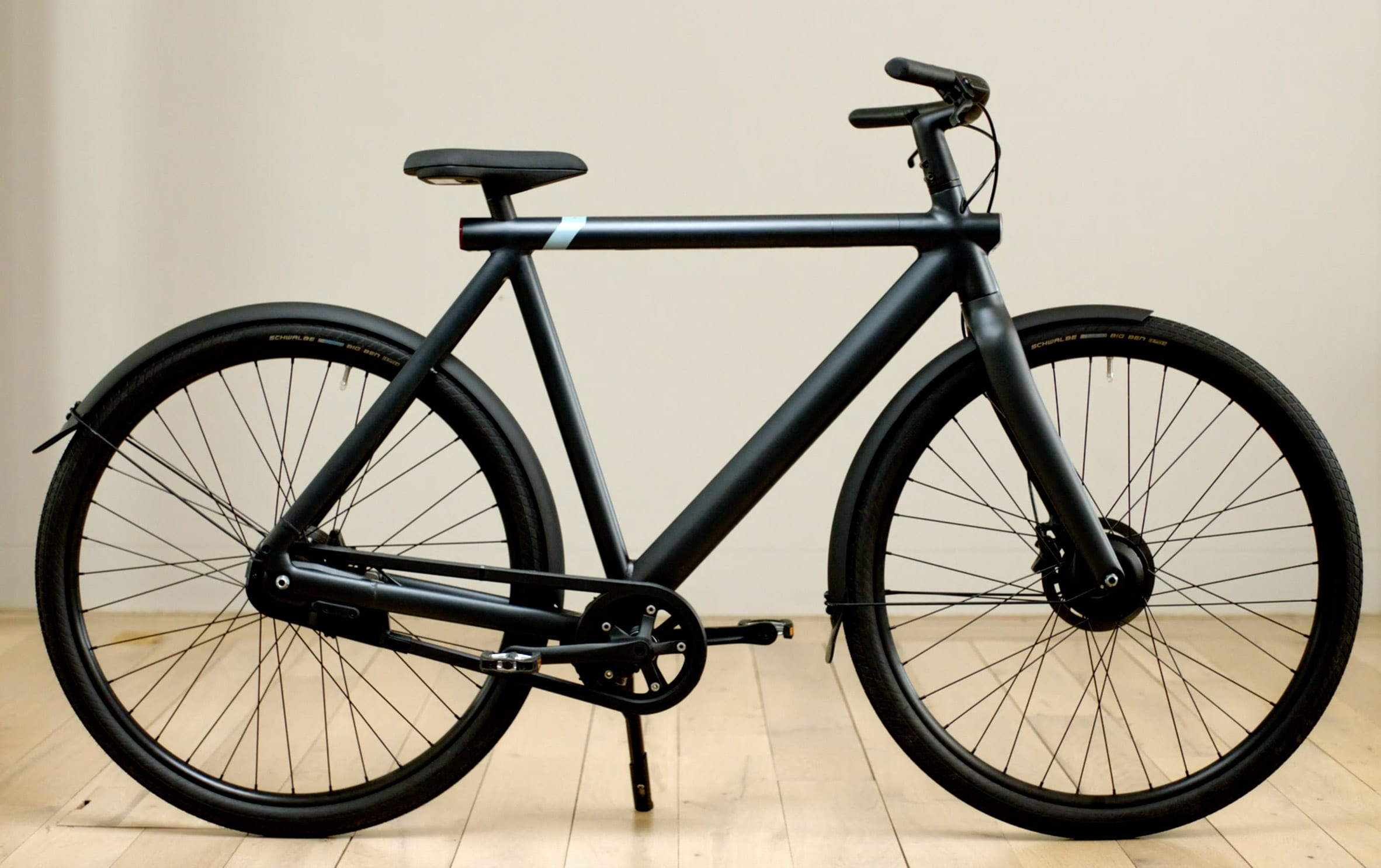
The VanMoof S3 bike aims to be "the sustainable future of mass transportation", according to Crawford

One example of useful design featured in the video is the VanMoof S3 electric bike, which Crawford described as a "beautiful piece of functional design". The design aims to be "the sustainable future of mass transportation", according to Crawford.

"This is a municipal object, it's a commuter tool," she said. "And you see it in what is in front of you. It is sturdy, everything is integrated into the frame, everything is embedded. And when they develop new models, they don't mess around with new styles or novelty. Every upgrade is based on improving the functionality of this bike."

Braun Good Design Masterclass
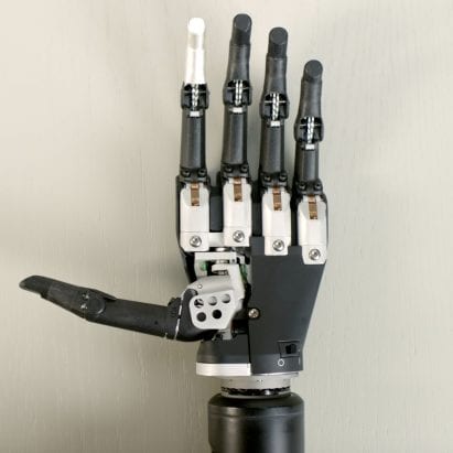
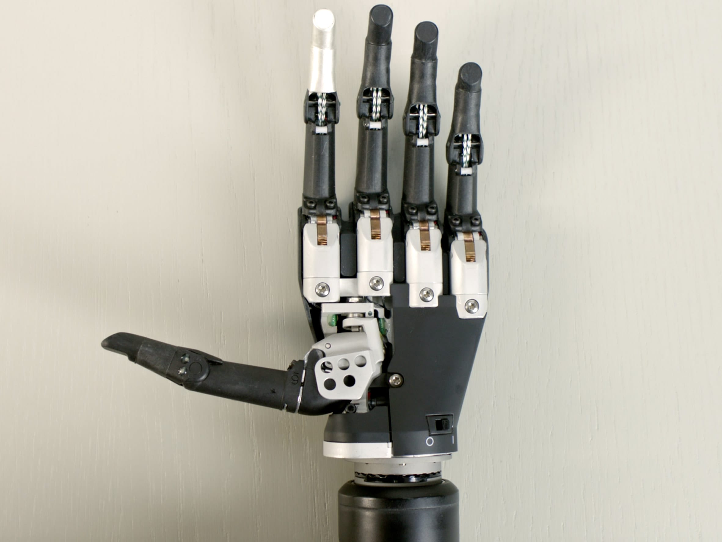
Össur's i-Limb Quantum is a myoelectric prosthetic hand

Another example of useful design featured in the video is the i-Limb Quantum prosthetic hand by Iceland-based company Össur.

The device is myoelectric, which means that it can be operated with the electrical signals generated by a person's muscles to enable the user to regain the functionality of a missing hand. Crawford described the design as "unashamedly robotic" and said it is something the user would want to show off.

"This really has been a shift from the times when to have a prosthetic limb was a matter of shame and social stigma to today when a prosthetic is not only functionally useful – technological shifts have made it a wonderful accessory in terms of dexterity – but also a thing of beauty," she said. "So it's now also useful from a social point of view – it's something to be proud of."

Braun Good Design Masterclass
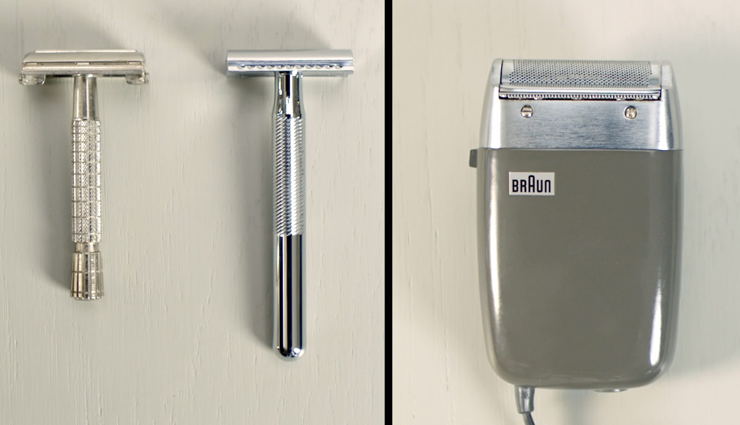
Braun's Parat BT SM 53 electric shaver (right) could be powered using the cigarette lighter in a car

The third design Crawford discussed in the video is Braun's Parat BT SM 53 electric shaver by Dieter Rams and Richard Fischer, which she said is an example of how usefulness shifts and changes over time.

Crawford described the shaver as "a pioneer of the unplugged lifestyle" because it could be powered via the cigarette lighter socket in a car.

"But, of course, 'useful' is not something that is pinned down in stone," she said.

"Tastes shift, values shift. And, of course, change continues. Because now beards are back so now there are new typologies for clippers and trimmers. So what is useful is continually tied into the cultural and social shifts of any time."

Braun Good Design MasterclassBraun's Good Design Masterclass series is led by British designer Ilse Crawford

This is the second episode of Braun's Good Design Masterclass. In the first episode, Crawford discussed "simple design".

Dezeen editor-in-chief Marcus Fairs also spoke to Crawford about the masterclass series in a live talk that we broadcast this week.

Next week, Dezeen will publish the final episode of the Good Design Masterclass series, which is also available to watch on Braun's website.


Dezeen x Braun Good Design Masterclass

This article was written by Dezeen for Braun as part of ourDezeen x Braun Good Design Masterclass partnership. Find out more about Dezeen partnership content here.

The post Ilse Crawford explores "useful design" in second episode of Braun's Good Design Masterclass appeared first on Dezeen.

#dezeenxbraungooddesignmasterclass #design #videos #ilsecrawford #braun #designvideos

dezeen@xn--y9azesw6bu.xn--y9a3aq

Blue bubbles helped "make the cause of climate change visible" say visualisers behind viral video

image

Still from data visualisation by Real World Visuals showing New York City's emissions

A 2012 animation showing New York City being buried under a mountain of giant bubbles allowed people to appreciate the scale of carbon emissions for the first time, according to its creators Real World Visuals.

Released in 2012, the computer-generated timelapse shows the city being buried under a mountain of bubbles representing the city's 54 million tonnes of annual CO2 emissions.

"Carbon emissions are invisible and that's a core part of the problem," said Real World Visuals co-founder Antony Turner. "If carbon dioxide was purple, we would start taking notice."

Making abstract concept of emissions more understandable

In the video, the communications agency depicted the city's annual emissions as 54 million bubbles, each ten metres in diameter, which gradually subsume the city.

Nine years later, the iconic image of the blue mountain towering above the Empire State Building remains one of the highest-ranking climate change images on the internet.

Despite the fact that the three-minute video features almost no audio, it has been viewed almost half a million times on YouTube and was picked up by outlets including the Guardian and Scientific American.

The simple animation helps to make the abstract concept of carbon dioxide equivalent (CO2e) emissions more understandable to the general public.

Still from data visualisation by Real World Visuals showing New York City's emissions
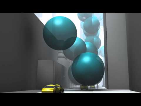
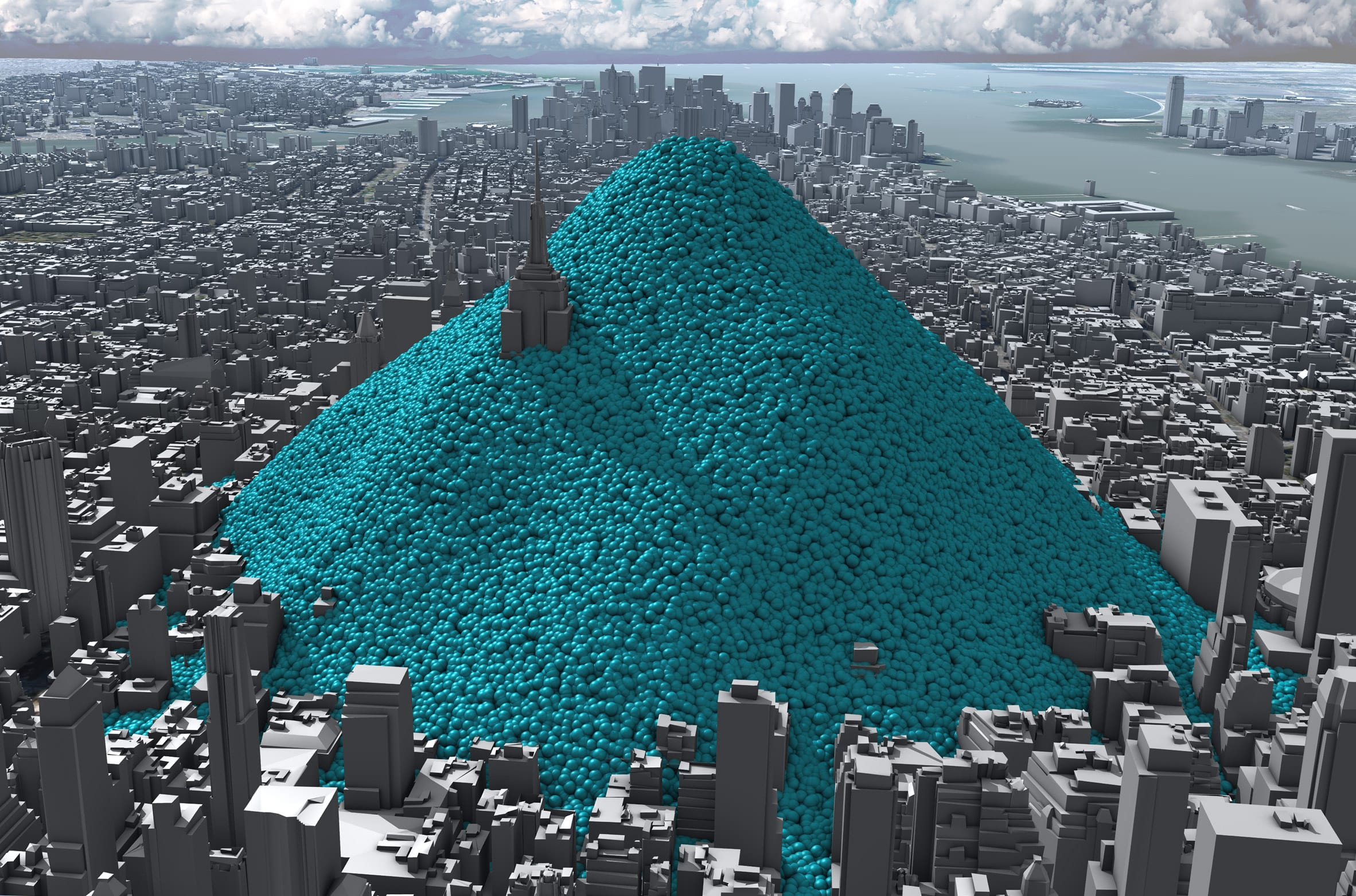
The animation shows New York being buried under a mountain of blue bubbles representing its carbon emissions

"Part of the problem is that some people are very cut off from quantitative information," said the agency's creative director Adam Nieman.

"You put numbers and graphs in front of people and they bounce straight off."

This is compounded when it comes to the issue of atmospheric carbon, he argues, which is "a problem with an invisible cause".

"Our [aim] is to make the cause of climate change visible because very few other people are approaching it like that," Nieman added.

Viewers can relate to spheres on a physical level

Based in England, Real World Visuals was originally founded in 2009 under the name Carbon Visuals with the aim of visualising imperceptible environmental challenges such as emissions, air pollution and ozone depletion.

The New York City emissions animation, which the agency created for the Environmental Defense Fund, is its most successful project to date.

Since it was published, the city of New York has managed to decrease its carbon emissions slightly to 50.7 million tonnes of CO2e in 2017 and committed to becoming carbon neutral by 2050.

Still from data visualisation showing the rate of global emissions
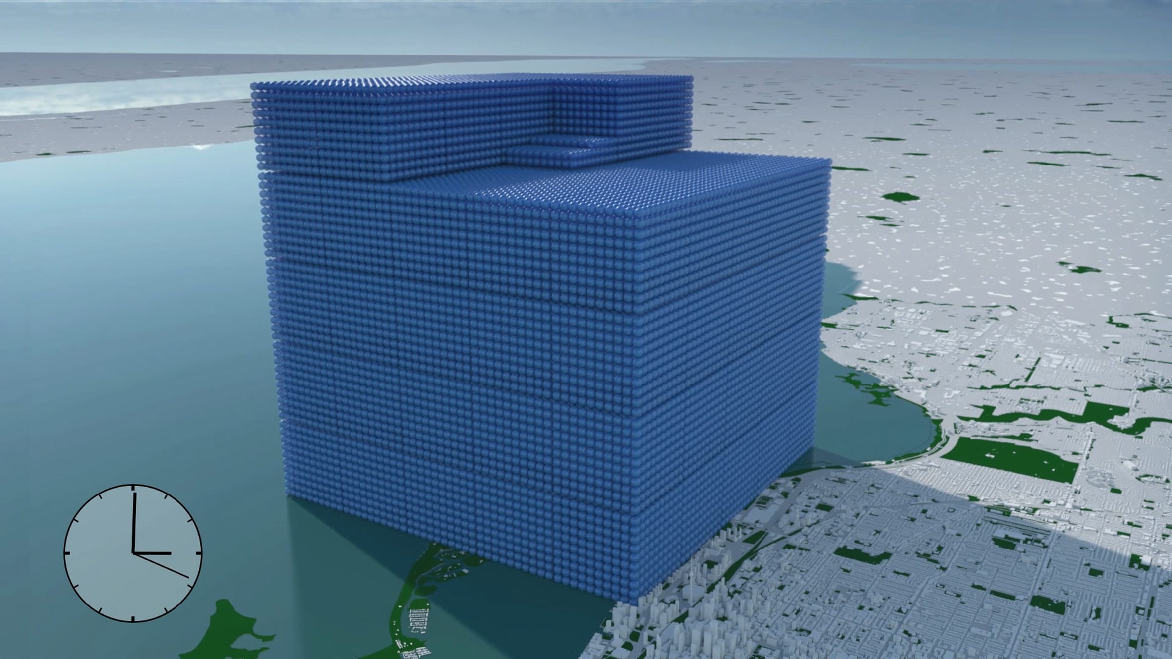
Real World Visuals has also used the blue spheres to represent the rate of global emissions for the 2018 G7 Summit

Meanwhile, Real World Visuals has used the same blue spheres to show the carbon footprint of entire countries from Ireland to the United States, as well as visualising the rate of all global emissions – 112 million tonnes of CO2e a day – for the G7 summit in 2018.

The agency has also been using the spheres to demonstrate how much carbon can be captured and stored in timber building elements or aquatic "blue carbon" sinks such as salt marshes and peatlands.

"We've been doing this for a long time so we've thought through all of the different ways you can show quantities of carbon dioxide gas," said Nieman.

"And the nice thing about spheres is you can relate to the shape," he added. "Because you can relate to it on a physical, visceral level, people were responding to it."

Showing emissions in real-time

Real World Visuals calculated that each tonne of CO2 would fill a sphere with a diameter of 10 metres.

New York City emissions amounted to two of these bubbles every second in 2010, which is the year the animation's data is based on.

The video initially shows these spheres ballooning up in real-time, before visualising the emissions that are generated after an hour, a day and ultimately a year when a panoramic view from the Statue of Liberty shows the city's skyline buried underneath a mountain of the blue balls.

"A really powerful way to turn an abstract number like 54 million tonnes a year into something that people can relate to is to show it in real-time," Neiman explained.

"A day is a period of time that we can imagine and feel like we inhabit. A year is an accountancy term but it's not something we can relate to that well."

Using a mountain of smaller spheres rather than one large sphere to represent the emissions helps to give viewers a more accurate sense of scale, Neiman said.

"As human beings, we're quite good at estimating discrete quantities but we're really bad at comparing volumes," he said."If you put two spheres with twice the volume next to each other, people will think that they're pretty much the same."

Prompting rather than answering questions

Contrary to most data visualisations, which Neiman says provide answers to specific questions, Real World Visuals hopes to provoke questions instead.

This is achieved by stripping back any evaluations of the data and letting the visuals speak for themselves. The New York animation, for example, is presented without any context about climate change.

"People responded by saying 'this is rubbish because climate change isn't real', which is an interesting response because we didn't mention climate change at all," Neiman explained.

"We just said: this is the carbon dioxide that is entering the atmosphere as a result of human activity in New York City. We didn't say this is a lot, we didn't say it's good or bad. And that provoked lots of discussions."


Carbon revolution logo

Carbon revolution

This article is part of Dezeen'scarbon revolution series, which explores how this miracle material could be removed from the atmosphere and put to use on earth. Read all the content at: www.dezeen.com/carbon.

The sky photograph used in the carbon revolution graphic is byTaylor van Riper via Unsplash.

The post Blue bubbles helped "make the cause of climate change visible" say visualisers behind viral video appeared first on Dezeen.

#carbonrevolution #interviews #graphics #all #design #videos #graphicdesign #animations #designvideos #climatechange #datavisualisations

New York City's greenhouse gas emissions as one-ton spheres of carbon dioxide gas