6 Likes
1 Shares
VFD or #Vacuum #Fluorescent #Display valhalla...
Note: The title says VFD Displays, because VFD also means variable frequency drive... But technically the D in VFD is already the word Display.
https://www.youtube.com/watch?v=PkPSDOjhxwM
#technology #technologie #music #musique
In this #video mixed the best #hits of the #French #composer Jean Michel #Jarre.
He is a #pioneer in the #electronic, #ambient and #new-age #genres, and is known for organising outdoor #spectacles featuring his #music, accompanied by vast #laser #displays, large projections and #fireworks.
Track list:
• 00:00 Rendez Vous 4
• 03:51 Oxygene 2
• 08:50 Magnetic Fields 2
• 12:14 Chronology 4
• 16:22 Orient Express
• 19:00 Oxygene 7
• 23:14 Equinoxe 7
• 26:28 Magnetic Fields 1
• 41:00 Oxygene 4
• 45:04 Chronology 6
• 48:30 Chronology 2
• 52:32 Rendez Vous 1
• 55:26 Rendez Vous 2
• 01:03:48 London Kid
• 01:06:58 Oxygene 8
• 01:10:54 Oxygene 10
• 01:14:44 Magnetic Fields 4
• 01:21:00 Equinoxe 4
• 01:27:48 Equinoxe 5
• 01:31:49 Oxygene 13
• 01:35:49 Computer Weekend
• 01:39:29 Oxygene 6
• 01:44:59 Oxygene 12
• 01:50:18 Téo & Téa
• 01:53:47 Vintage
• 01:56:54 Calypso 3
https://www.youtube.com/watch?v=wJqAJwHUf2c
#musique #compilation
If you're engaged in application or Web UI/UX design for E-Ink devices or displays, it helps to keep in mind what these displays' capabilities are. They're quite good in some regards, somewhat limited in others.
I've looked for existing sets of guidelines without luck, so apparently I get to draw my own line in the sand. An earlier version of this post proved popular on Mastodon, I'm expanding it here. This is a first effort and some of my suggestions may not hold up, though I hope most will. Further discussion on that point at the end of this post.
Keep in mind that e-ink is not just limited to digital signage, e-book readers, and tablets, but increasingly to e-ink monitors for desktop and laptop systems. You will likely find e-ink in places and uses you didn't expect, and detecting e-ink from a developer or Web-designer perspective is itself challenging.
Once set, the display will continue to show specific static content indefinitely, with no power applied. This is good if you plan on leaving output visible, somewhat less so if the content is sensitive. Applications with data sensitivity should best detect and overwrite displays when the device / display suspends.
DPI is typically 200 or higher, devices with well over 300 DPI are available, though not necessarily common. This is equivalent to many laser-printers' dot resolution. Individual pixels are typically visible only under strong magnification. High-detailed serif fonts render quite well, much better than on most emissive displays. Pixel density does tend to fall with larger devices which are typically viewed from greater distances from which the visual angle generally remains equivalent.
In terms of energy use (battery life), time, and disruption (display ghosting / flickering, varying with display mode), any screen changes impose technical or cognitive costs. Animation is at best distracting, and often a complete disaster. Many devices offer a range of display modes which exchange speed for quality (resolution and ghosting).
Rather than 60--120 Hz, displays typically update in the range of 0.5 -- 10 Hz, and perhaps slower for some devices or modes. Most devices / modes can accomplish fairly rapid (> 4 Hz) updates, but that's not guaranteed. Again, trade-offs exist with display mode.
Colour e-ink devices do exist, though they're a small subset of the total, palettes are limited, with some display characteristics lower than B&W: roughly one quarter the pixel density and slower refresh. Many current high-end devices offer a limited greyscale palette, ranging from 1--16 shades (1-4 bits). High-contrast colours (e.g., deep blue on deep red) may render as uniform dark grey on e-ink. Using colours to distinguish elements or information is generally ineffective. Gradients near white or black may be entirely indistinguishable. Designs which differ from stright black-on-white which otherwise work well on emissive displays are often suboptimal on e-ink, including my own entry into a popular theme. Text/background contrast ratios should be maximised as #FFF and #000.
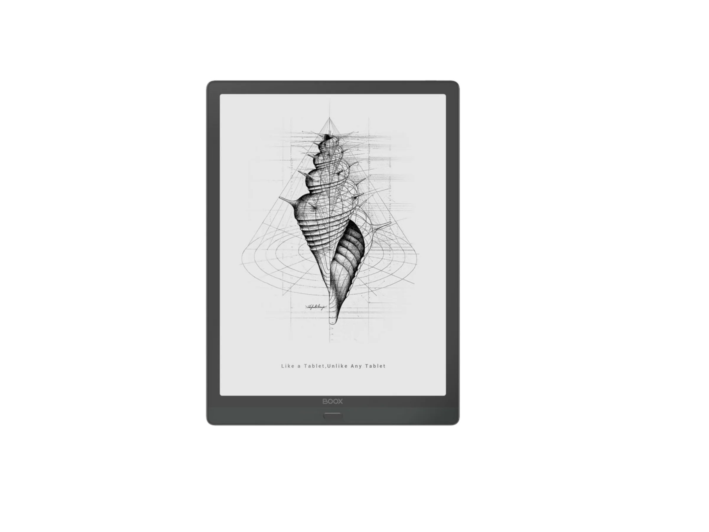
Line art works exceptionally well on e-ink, and there is a reason it is featured in promotional materials and screensavers: it looks delicious. (See this post's hero image for an example.) Most raster images require dithering or halftones for best effect -- and with the high DPI, halftoning may well be the best option, though it can lead to Moire effects. Halftone density should be half the display DPI for best results. For most text, any background shading, image, or patterns are exceptionally distracting. Distinguishing application windows from pop-up dialogues, particularly under "flat" UI/UX paradigms, is often quite difficult. Border regions help, and this is one place where shading or crosshatching may be appropriate, perhaps applied to the background window rather than the foreground dialogue. Dark-mode themes work poorly in most e-ink applications, please provide a light-mode option. Ironically, several theme-management tools commit this error.
Change the entire screen in one fell swoop, or if this isn't possible, a specific region, rather than scrolling or animated transitions. Devices and drivers typically support partial-screen updates. It's much harder to regain reading point when scrolling in e-ink than with emissive displays. This means providing interfaces for paginated movement, and for desktops, window management based on fixed window positions and full-window refresh rather than extensive movement and scrolling. Window contents should not be shown whilst repositioning or resizing. For touch devices / tablets, touch regions or physical buttons work better than gestures. The EinkBro web browser, optimsed for e-ink is far more pleasant to read and use than mainstream Android browsers. Its developer, Daniel Kau, has expressed several design considerations which correspond with mine.
You cannot pour light into portions of your display, you can only remove it. Colour mixing is pigment, not light (if it exists at all). For graphics designers, you're working in pigment rather than light colour space. Readability increases with direct sunlight / bright ambient light. Many consumer devices do have illumination (backlight / frontlight) for low-light environments. External task lighting may also be applied.
Many devices incorporate a Wacom layer and can use a stylus in addition to capacitive touch response. Do with this what you can / may. Be aware the usual pitfalls of touch interfaces.
There are relatively few tools for actually determining the characteristics of a display as pertains to e-ink. For Web development, there are CSS \@\media queries which may be useful such as the color media feature query. Display size and DPI may also be available, as well as preferences such as prefers-reduced-motion.
For a sense of raw display characteristics, independent of specific products, this video is highly informative. The displays show range from digital signage with minimal capabilities to high-performance large-format interactive displays, ordered by time through the video:
E-Ink display and refresh rates — a technical demonstration
https://yewtu.be/watch?v=KdrMjnYAap4
I am a space alien cat of questionable veracity. I've used e-ink intensively for about a year and a half on an Android tablet (Onyx BOOX Max Lumi), for e-book, Web browsing, and applications, and I'd had occasional interactions with the technology for over a decade prior to that. I've been in and around the technology field for most of 50 years, working professionally for over 30. Whilst not specialising in UI/UX work, much of both my own work --- back-end and some front-end design, and all of my use is informed by interface considerations.
E-ink seems to be an expanding though still niche field. In particular, there has been a breakout from dedicated single-purpose e-ink book readers to e-ink tablets and displays. Sales numbers are all but impossible to find (and if anyone has insights these would be appreciated). E-ink is also being incorporated in a range of devices from phones (LightPhone and numerous e-ink smartphones), along with devices simply better suited to e-ink than emissive displays.
As noted at the top, the question of e-ink design principles seems curiously underserved. Useability expert Jacob Nielson has almost entirely ignored the topic other than rubbishing e-book readers a quarter century ago. I'm reasonably confident that the suggestions I make here will hold up reasonably well, but as with any first effort, some, possibly much, may be in error.
Time will tell.
Post image: Onyx BOOX Max Lumi showing power-off screen line art.
#eink #displays #WebDesign #AppDesign #UI #UX #Interfaces #DesignPrinciples
Getting a realistic impressing of e-ink display capabilities is difficult, and many product-review videos don't focus on showing the device in operation, especially in comparison with other e-ink displays.
This video is a good overview of display rates and characteristics of a number of bare displays --- these aren't finished consumer products, but the displays which might go into those, or on electronic signage or display systems.
They range from small and slow to larger and high-speed. The displays typical of current-generation e-book readers start at about 8:10, and there's a timestamped index to displays demonstrated in the show notes.
As someone who'se been using (and greatly appreciating) an Onyx BOOX device for much of the past year, this is a useful overview and perspective.
It's even possible to watch video (in black and white in most cases) on newer e-ink devices. I can confirm the results are largely as viewed in these videos:
Have You Ever Seen an E Ink Display Update This Quickly?
https://yewtu.be/watch?v=KdrMjnYAap4
#eink #displays #eBooks #eBookReaders
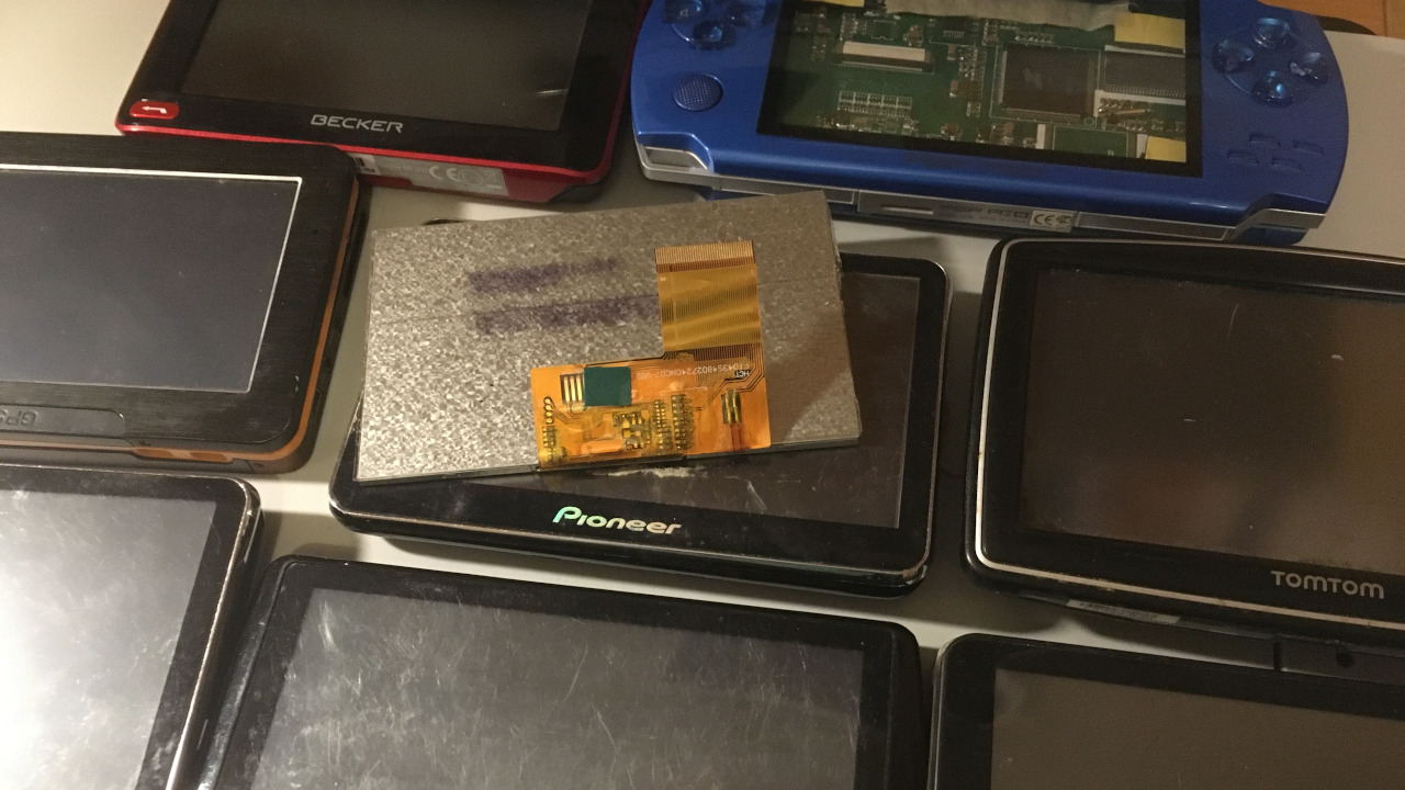
Source: https://alexsoto.dev/challenges-building-an-open-source-eink-laptop.html
In this article, I introduced #EI2030, our working groups, and the challenges with building an open-source eink laptop: sourcing the #eink #displays, interfacing with the display, and creating the laptop chassis