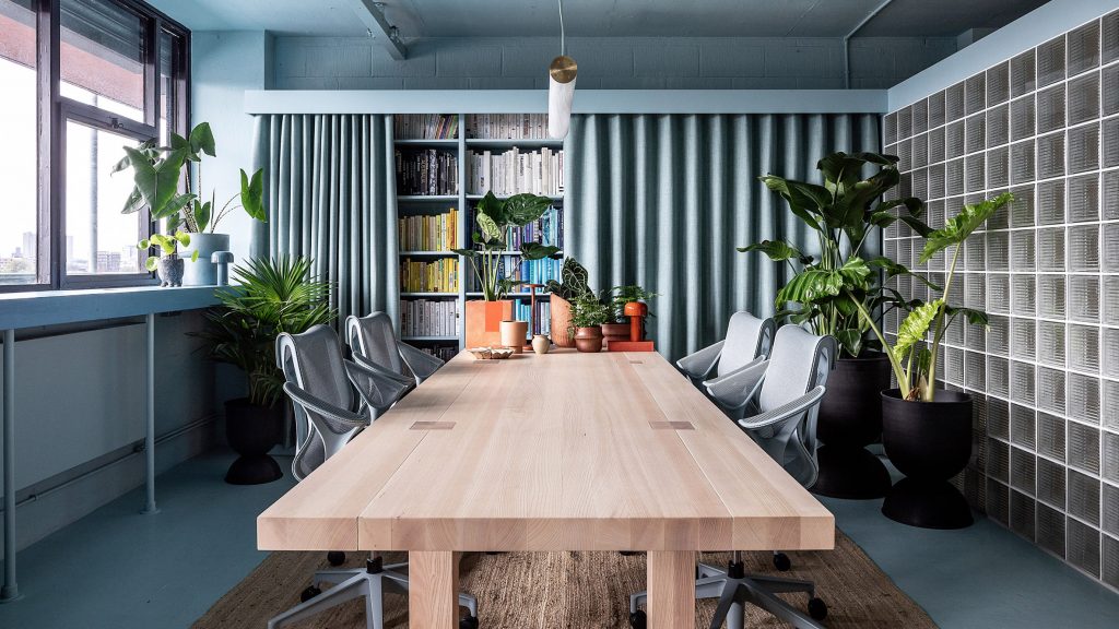
Studio Rhonda uses saturated colours and glass bricks to revamp Zetteler's headquarters

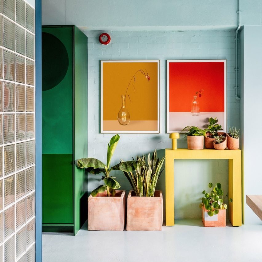
Interiors firm Studio Rhonda has redesigned communications agency Zetteler's London office using contrasting colours and tactile vegan and deaf-friendly materials.
The studio, which is led by Rhonda Drakeford, created a distinctive feeling for each of the headquarter's three zones – a main work area, a smaller cafe-style space for meals and relaxing, and a meeting space.
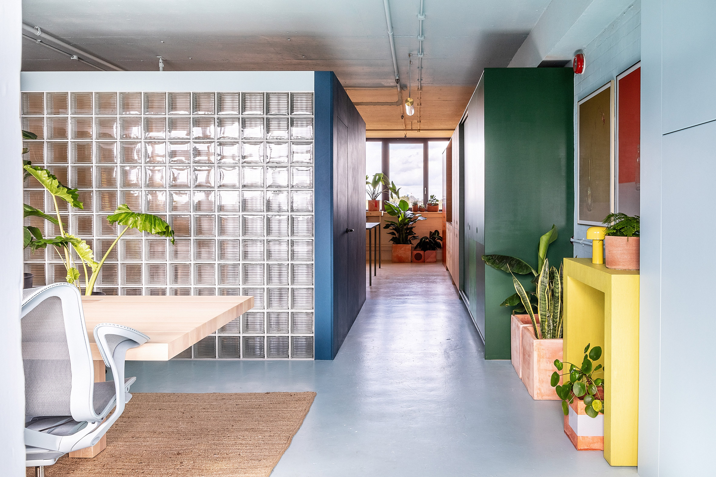 The Zetteler headquarters is located in east London
As Zetteler founder Sabine Zetteler has severe conductive hearing loss, it was also important that the office didn't feature details such as hard floors and high ceilings, which can create a disruptive atmosphere.
"The space was to be split into three zones, each with a different ambience and function, with an emphasis on the whole space to be deaf-friendly, plus there was the need for the materials used to be vegan," Drakeford explained.
 Plants are dotted throughout the space
The choice to use vegan materials was based on the fact that most of Zetteler's staff is vegan or vegetarian.
"The research process was enlightening; for example, I was surprised to learn that some paints include casein, a dairy product," Zetteler told Dezeen.
"I'm proud that we've been able to find vegan options for all our integral building materials, but I would really like to see manufacturers take more responsibility for transparency, so we can all make more informed decisions."
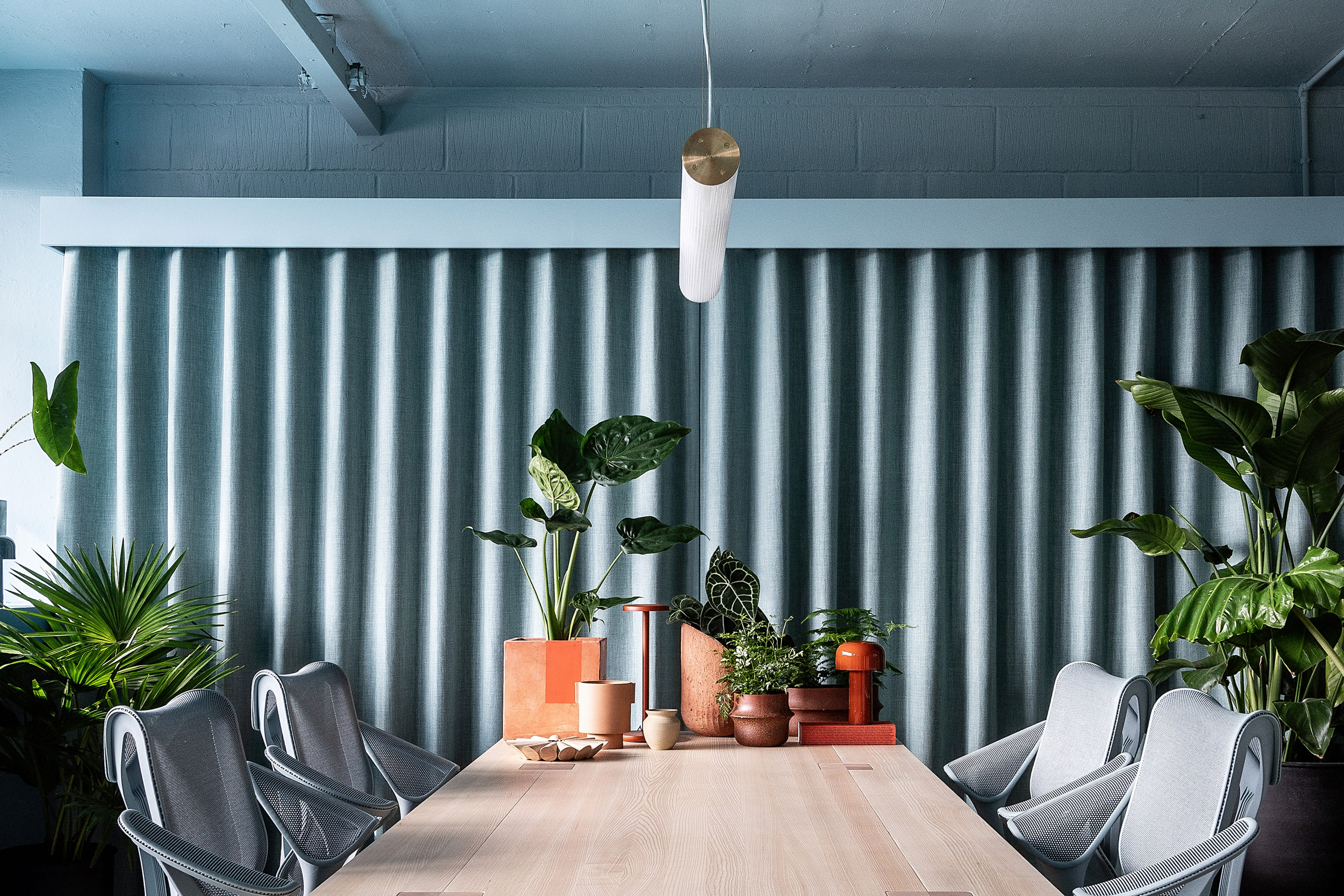 A duck-egg blue decorates the main workspace
To create distinctive zones in the office, located in a mid-century industrial block off Broadway Market in east London, Drakeford used different colours and materials to define the spaces.
A pale duck-egg blue was used for the main work area, which also features a large desk in natural wood and a jute carpet that gives the room an organic feel.
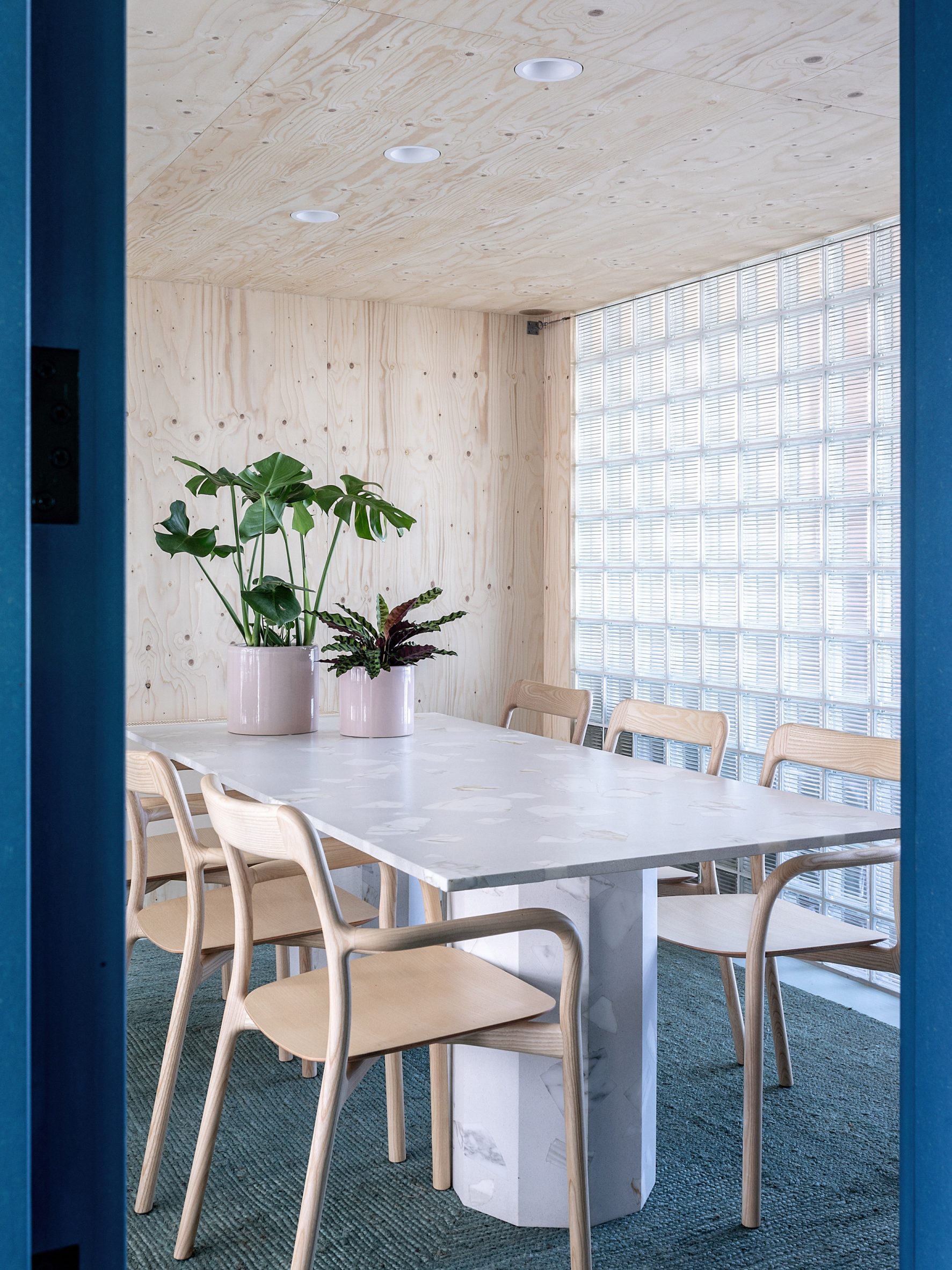 Glass bricks create a light meeting room
The adjacent meeting room is enclosed in glass brick walls, which Zetteler had requested to allow for light to flow through the space.
"I sourced some Czech glass bricks with graphic linear mouldings for a contemporary edge," Drakeford explained.
[ 
Read:
Fathom Architects designs London office with more meeting areas than desks
"I devised an anchor line of 2,300 millimetres from the ground as the top height of any structures so as to maintain coherence in all three zones and also to help the space retain an open-plan feel," she added.
"The roof of the glass-brick 'pod' stops at the 2,300 millimetres anchor line, allowing light to travel over it."
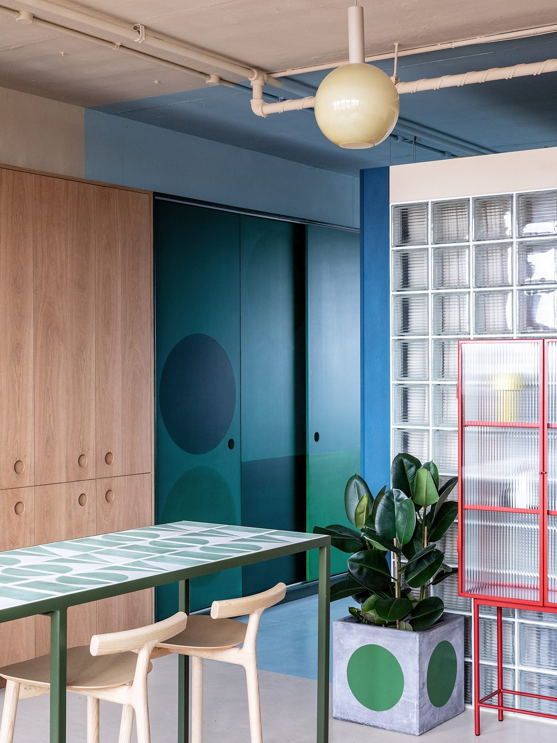
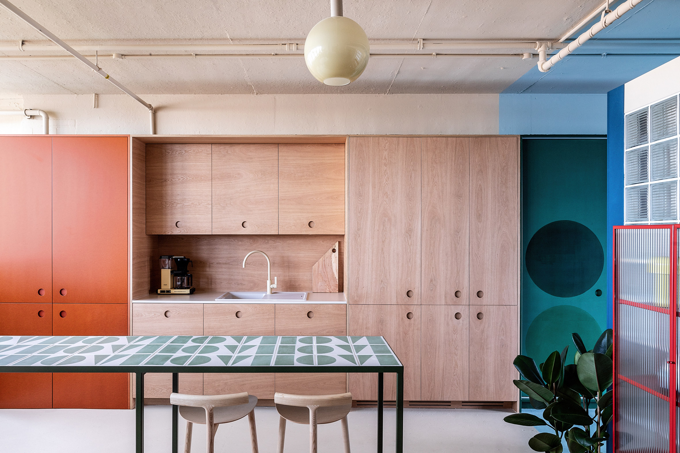 The Zetteler kitchen features wood and Valchromat surfaces
In the kitchen, the interior designer used furniture from brand Hølte, a Zetteler client whose showroom is close to the office.
"I specified custom oversize recessed handles and an unusual matching oak splash-back combined with a beige tap by Toniton for a mono-material/colour effect 'block'," Drakeford said.
"We also used the oversize circular handles on the adjoining orange Valchromat storage cupboards, which were also produced by Hølte, and the green Valchromat sliding doors to the right of the kitchen block,"
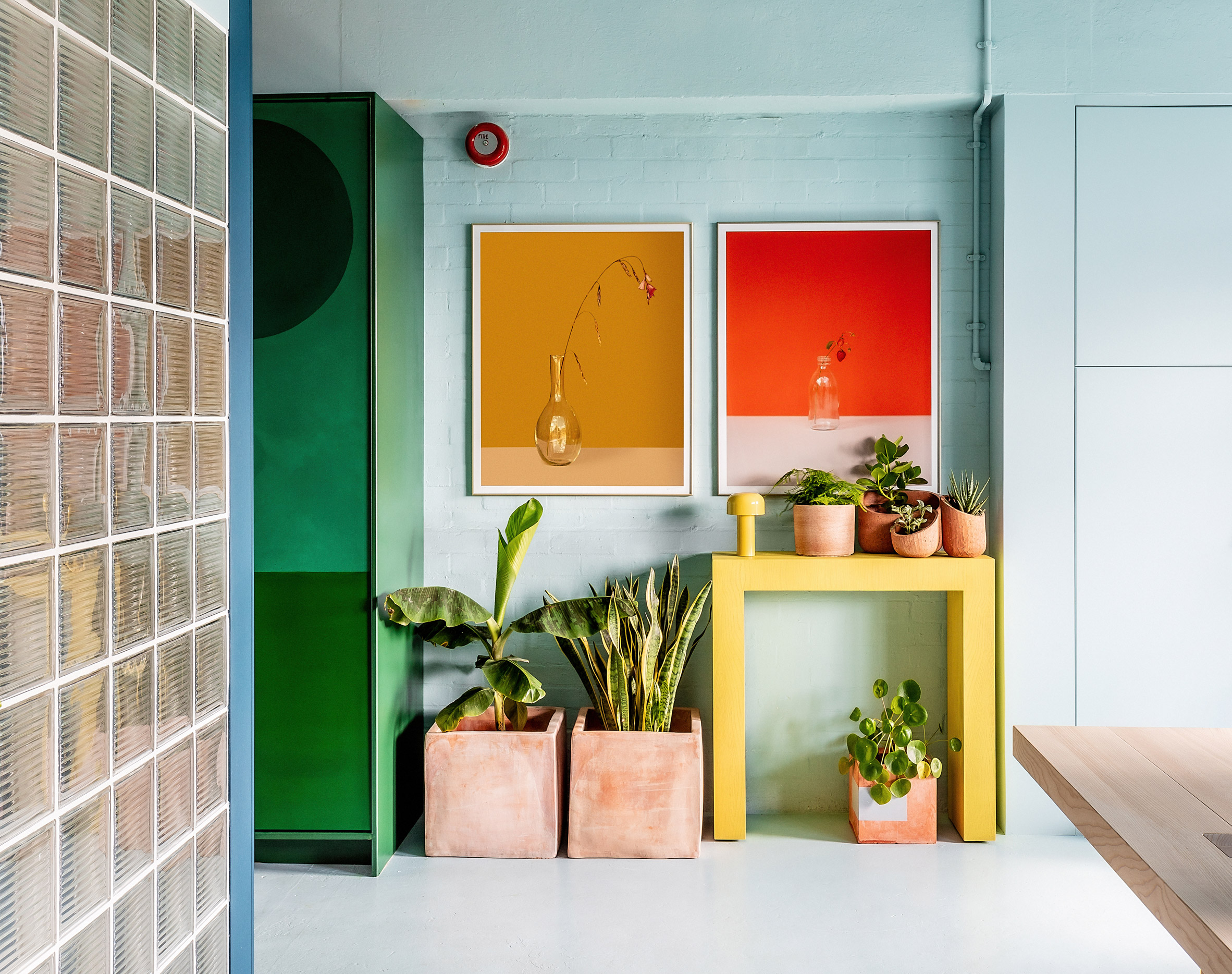 Pale blue walls meet green storage spaces and a glass-brick meeting room
The use of colour was defined by the light in the different rooms of the office, which sits on a north-south axis.
"I worked with a cool, duck-egg blue at the front, south-facing area as I knew that the space tends to get very warm in the summer," Drakeford explained.
"A warmer, buff colour was used at the rear, north-facing section, to counteract how cold that area can feel in the winter months."
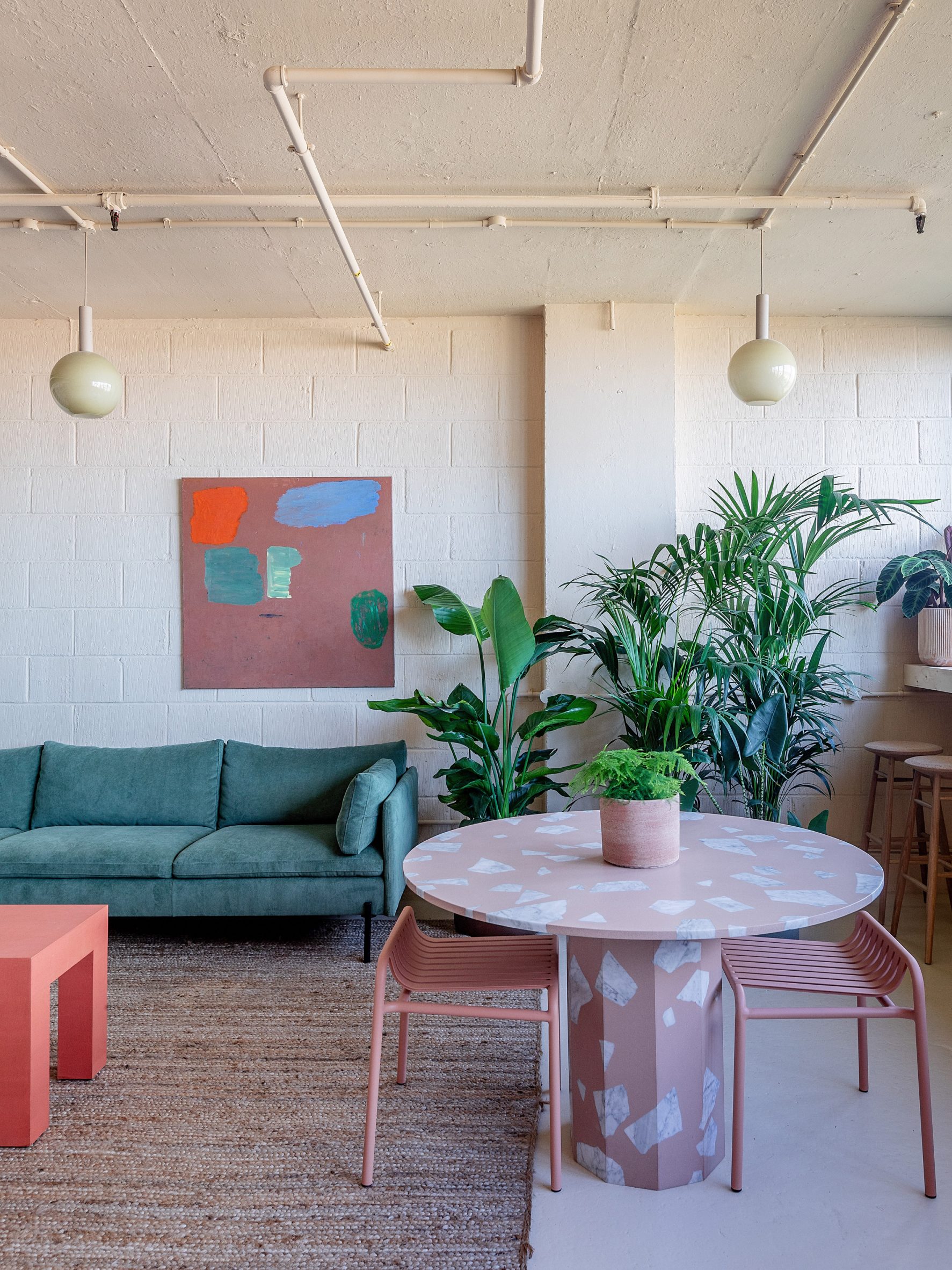 Warmer hues were used at the north-facing rear of the building
The neutral backdrop hues were complemented by pops of colour in a variety of textured materials and chalky tones. To make the space deaf-friendly, the designer chose to add plenty of soft materials to the interiors.
"Curtains and rugs are used throughout to help with zoning and privacy as well as optimising the acoustics," Drakeford said.
"The meeting pod is purpose-built, very solid and lined with acoustic vegan wool, creating a quiet sanctuary from the more open-plan spaces. Planting is also a key part of the acoustic softening, as well as making the space more welcoming."
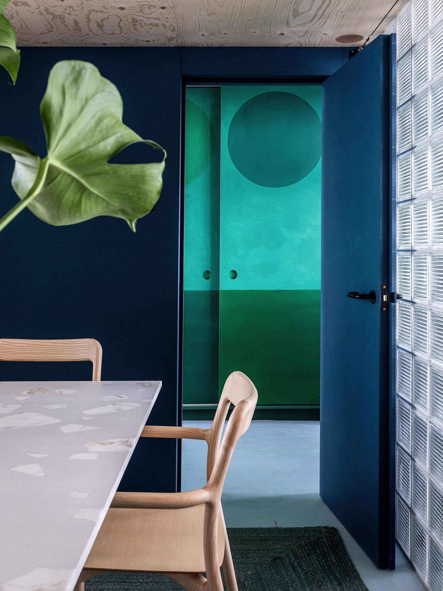 A deep blue hue makes the meeting room feel cosy
The overall design aimed to create an office that didn't have the "matchy-matchy" feel of many corporate office spaces, Drakeford said.
"I approached this space in the same way I would treat a residential interior, with the warmth and comfort of a mismatched but visually coherent family of furniture and materials," she added.
Other notable London offices include The Crown Estate's Fathom Architecture-designed space in St James's and a "homely" office in the brutalist Smithson Tower.
Photography is byTaran Wilkhu.
The post Studio Rhonda uses saturated colours and glass bricks to revamp Zetteler's headquarters appeared first on Dezeen.
#all #interiors #instagram #london #uk #officeinteriors #glassbricks #colour
