#officeinteriors

dezeen@xn--y9azesw6bu.xn--y9a3aq

Twelve Berlin architecture studios photographed by Marc Goodwin

image

Berlin architecture offices

British photographer Marc Goodwin has gone behind the scenes at 12 architecture studios in Berlin including Barkow Leibinger and Sauerbruch Hutton for the latest in his photography series exploring where architects work.

Goodwin, who is the founder of studio Archmospheres, has documented architecture studios in cities across the world including Istanbul, Shanghai and São Paulo.

Following a brief hiatus caused by the coronavirus pandemic, he is now continuing his global tour by visiting offices across Europe including those in the German capital.

"We are working our way around Europe at the moment and Berlin is of course one of the major stops on that tour," he told Dezeen.

"The idea was to go there two years ago but a little something got in the way."

[
Read:

São Paulo studios of Brazilian architects including Paulo Mendes da Rocha captured in photos

](https://www.dezeen.com/2019/08/14/sao-paulo-architecture-studios-marc-goodwin-photography/)

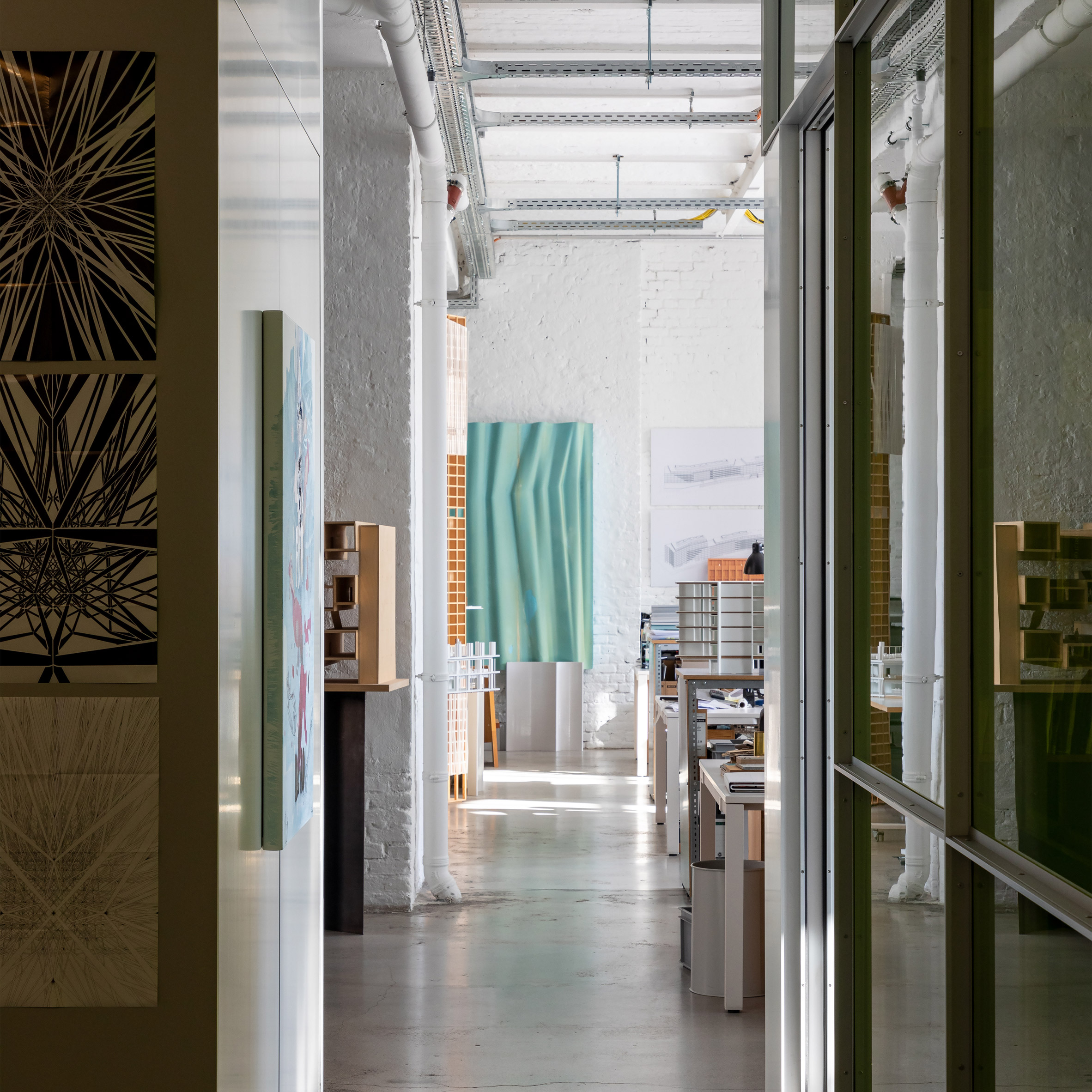
The Berlin series offers a glimpse inside 12 architecture studios including Barkow Leibinger, LAVA, Sauerbruch Hutton and Studio Karhard, the designer of the city's renowned nightclub Berghain. The studios range in size from three employees to 140 members of staff and occupy a mix of purpose-built offices and adaptively reused buildings.

Goodwin described the experience as "Vorsprung durch Technik" – referring to the famous slogan of German carmaker Audi, which translates as "progress through technology".

"There was little of the Bohemian Berlin of bygone days – that was what struck me most," Goodwin explained.

"It seemed a very professional place of work and I'll be interested to compare it with upcoming shoots in Munich, Frankfurt and Stuttgart."

Scroll down for a look inside 12 architecture studios in Berlin:

Interior of Barkow Leibinger's Berlin office

Barkow Leibinger

In this space since: 1997

Number of members of staff: 80

Building's history: located at Schillerstraße 94 by Georg Lewy
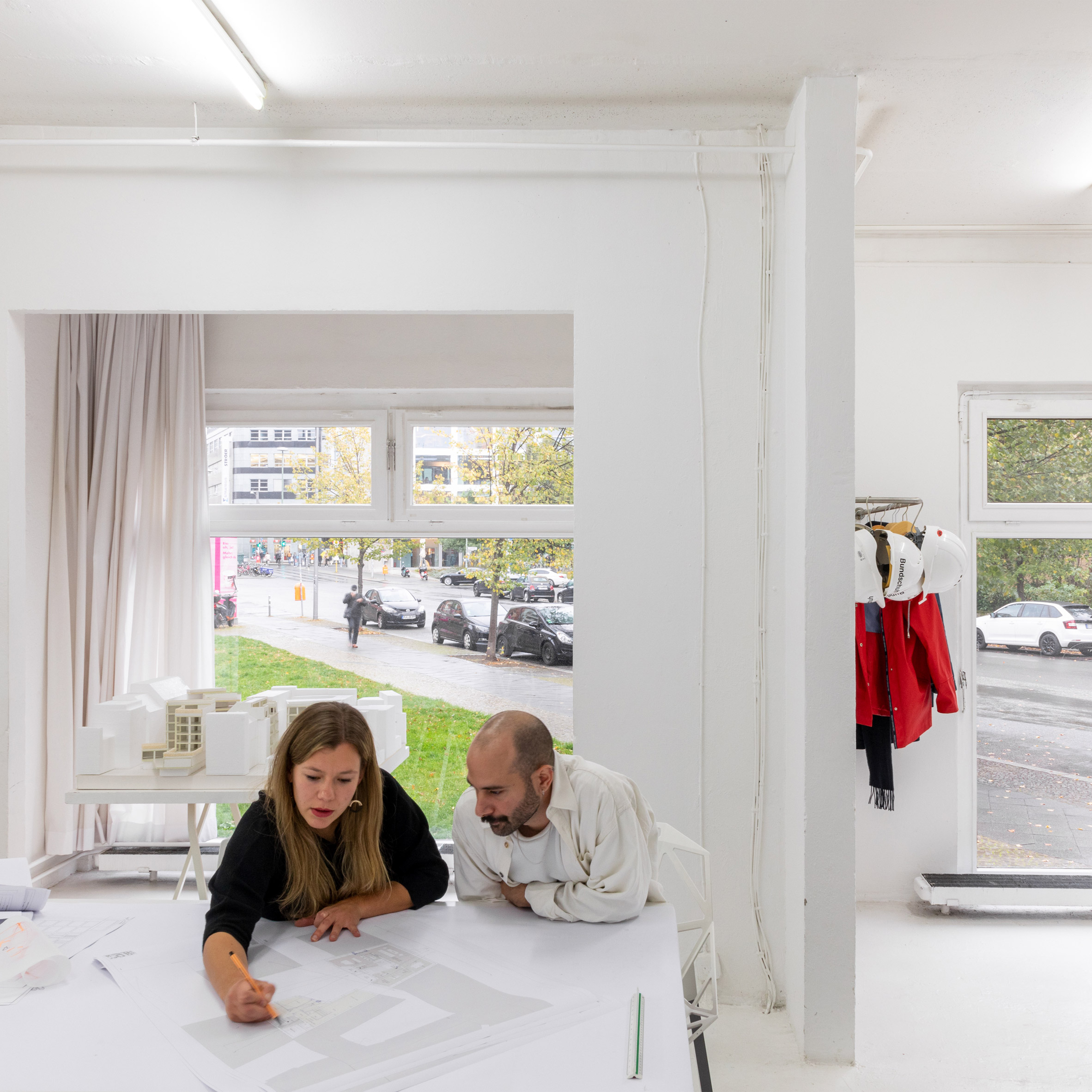

White-walled studio of Bundschuh Architekten

Bundschuh Architekten

In this space since: 2007

Number of members of staff: nine

Building's history: former counselling centre
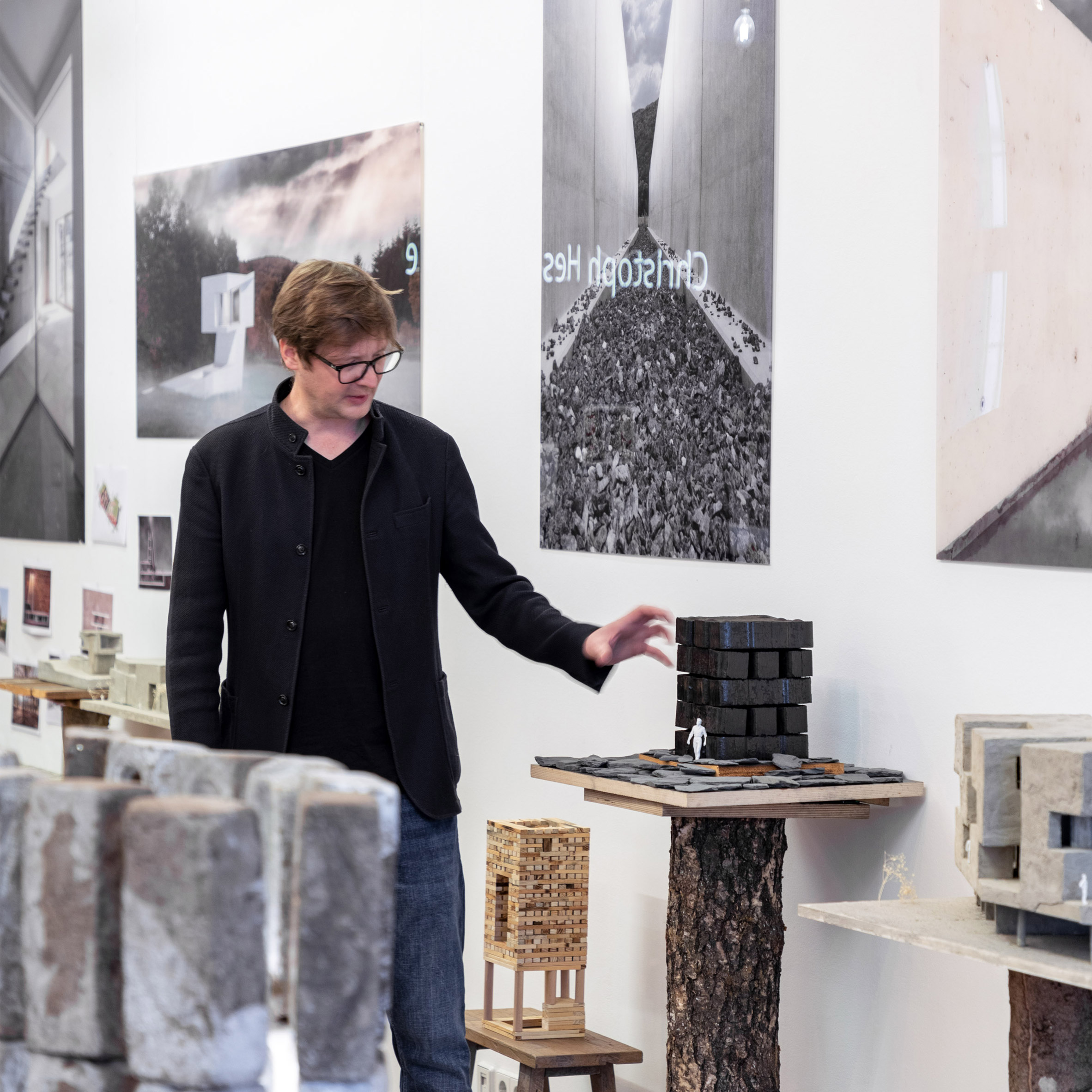

Architect Christoph Hesse

C hristoph Hesse Architects (Berlin)

In this space since: 2018

Number of members of staff: three

Building's history: old workshop
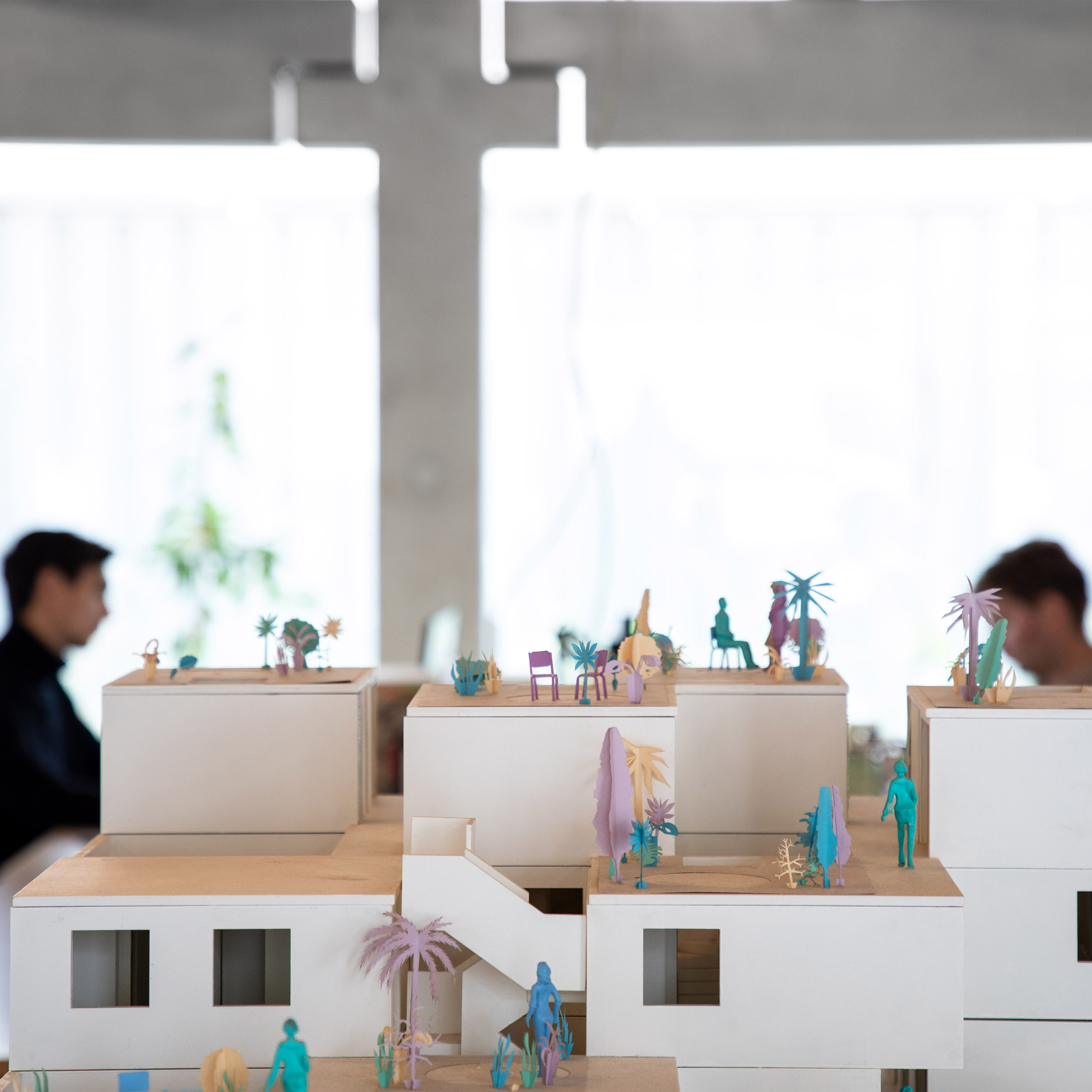

Architecture model

FAR

In this space since: 2019

Number of members of staff: 10

Building's history: new build
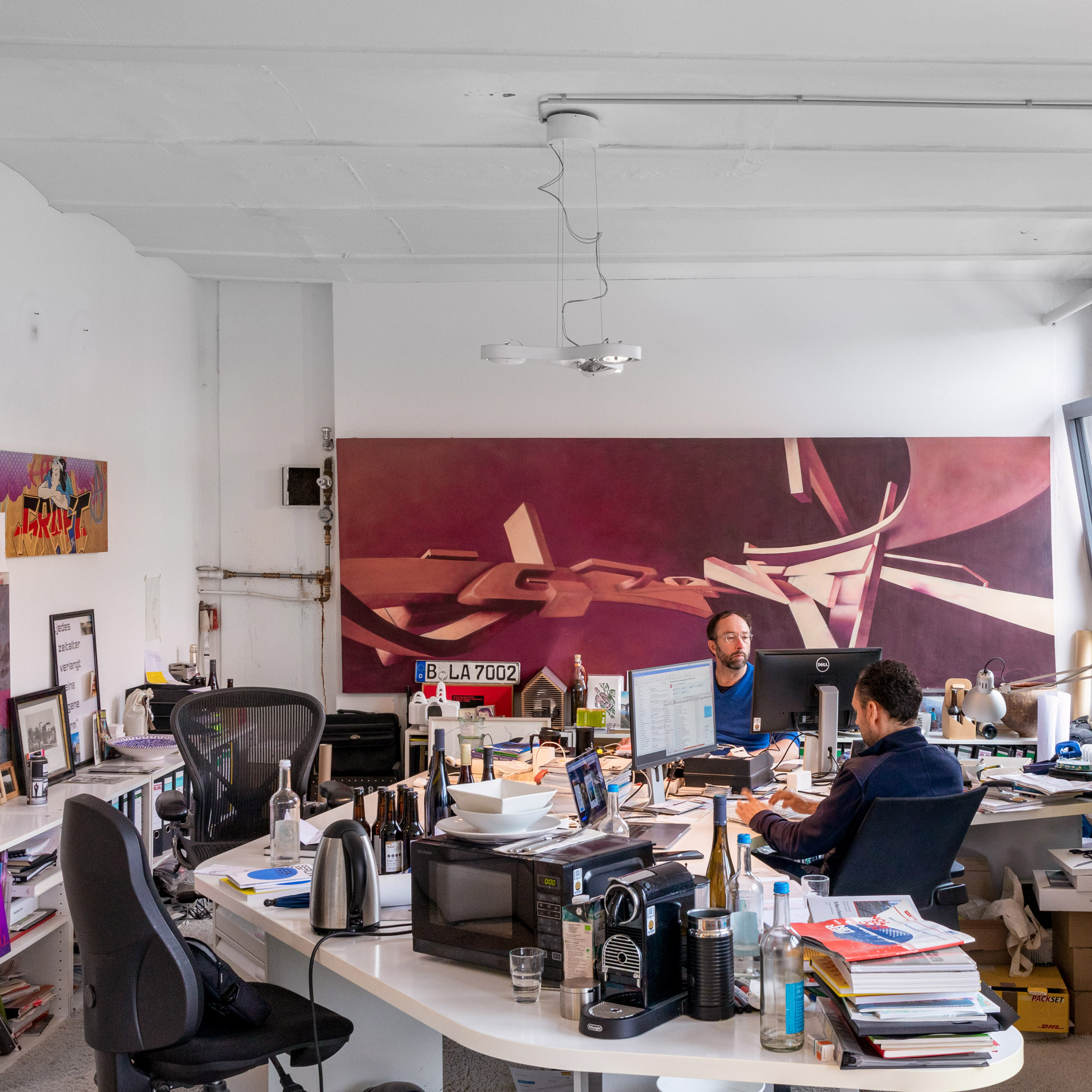

Graft architecture studio in Berlin

Graft

In this space since: 2007

Number of members of staff: 90

Building's history: former carburetor production facility
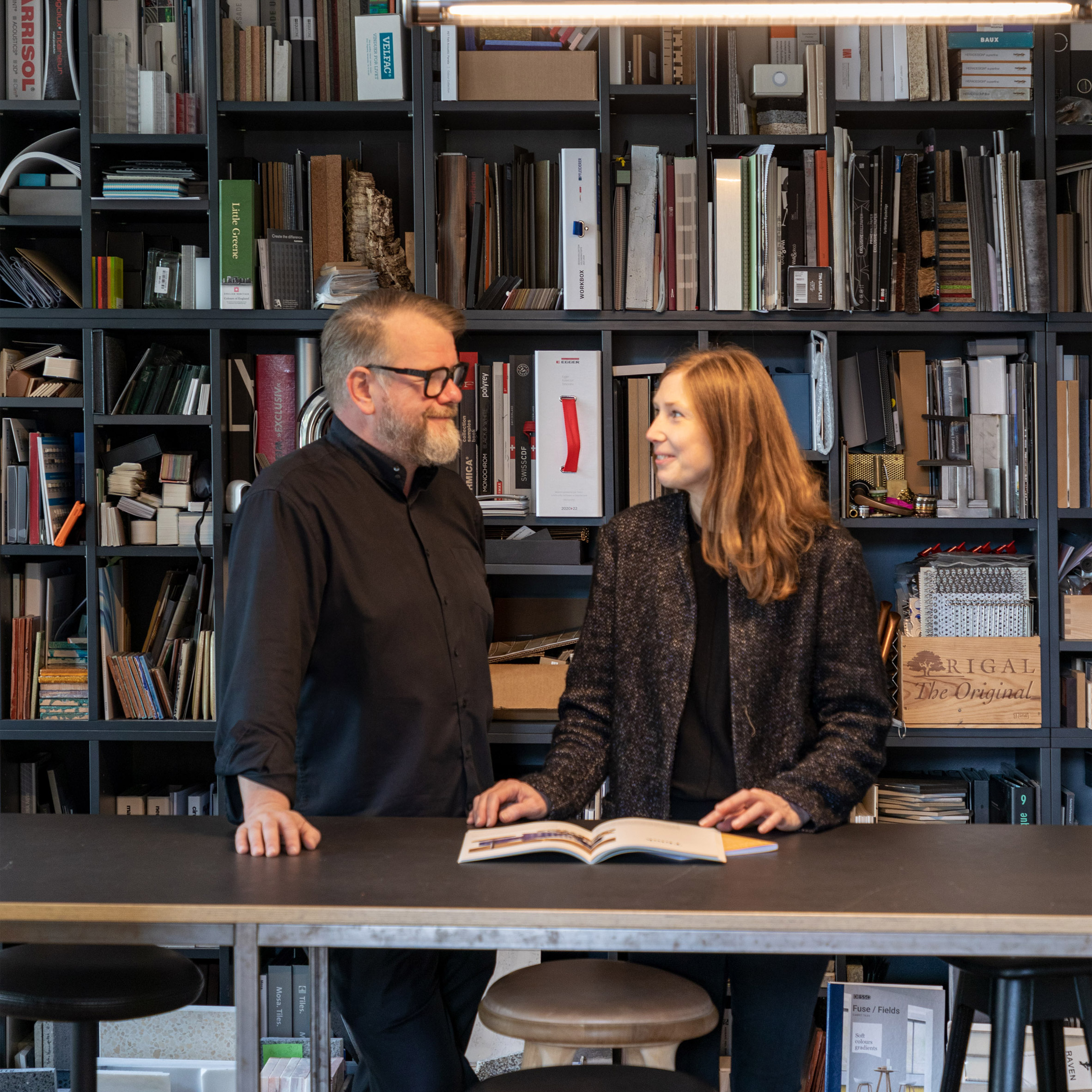

Studio Karhard founders

*Studio Karhard

*


In this space since: 2010

Number of members of staff: nine

Building's history: residential
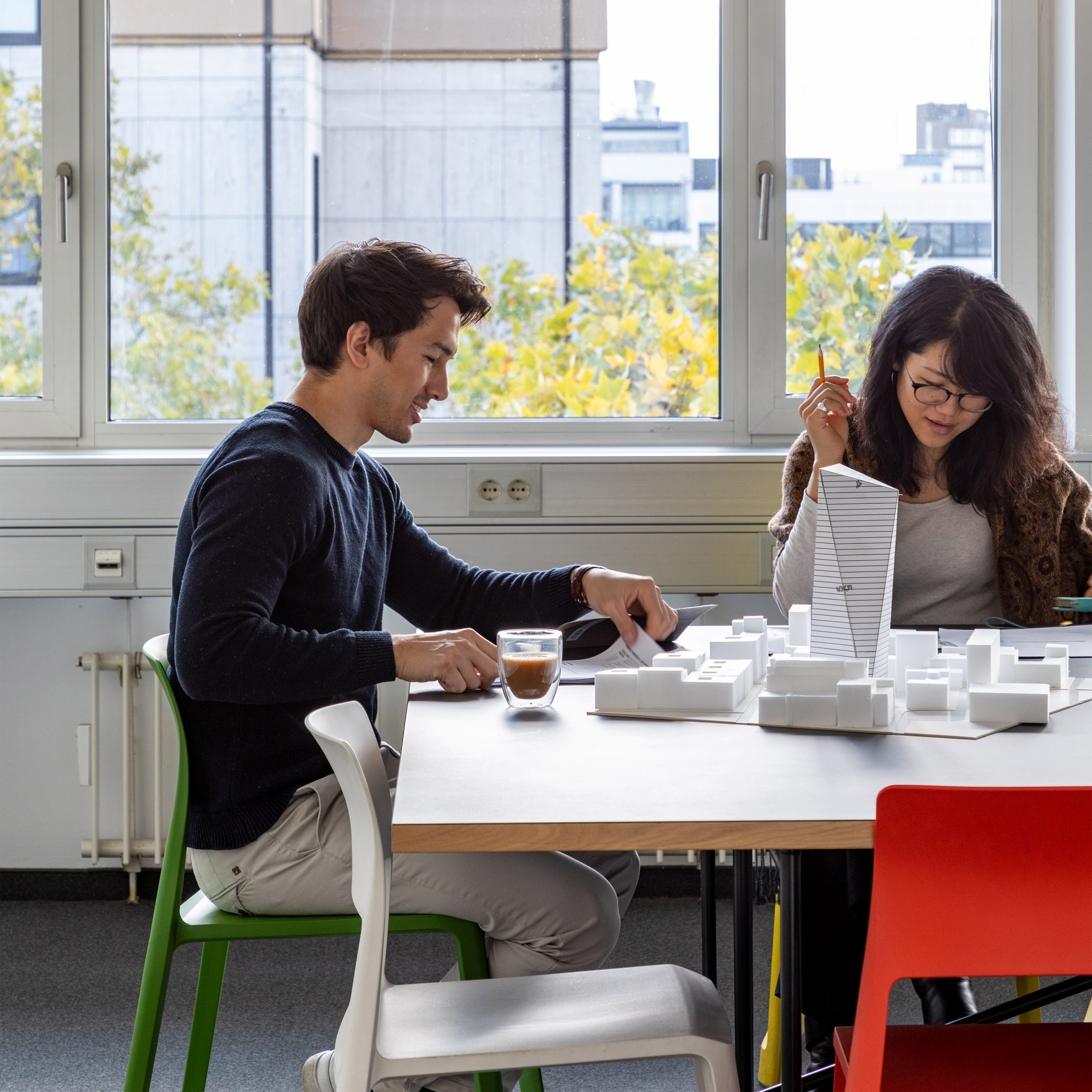

Inside Jasper's Berlin office

Jasper

In this space since: 2017

Number of members of staff: 26

Building's history: office building
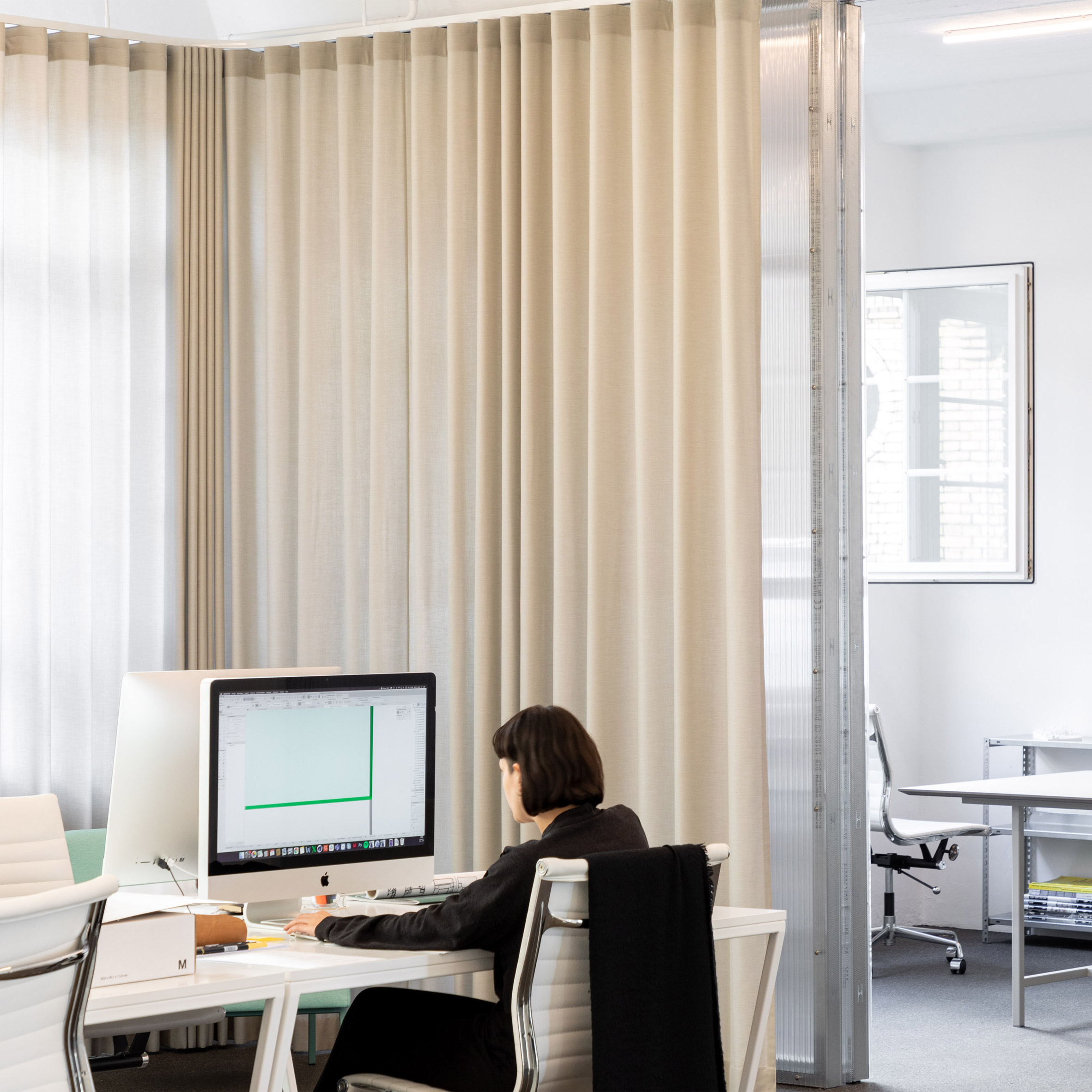

JWA offices Berlin

JWA

In this space since: 2018

Number of members of staff: 27

Building's history: commercial building
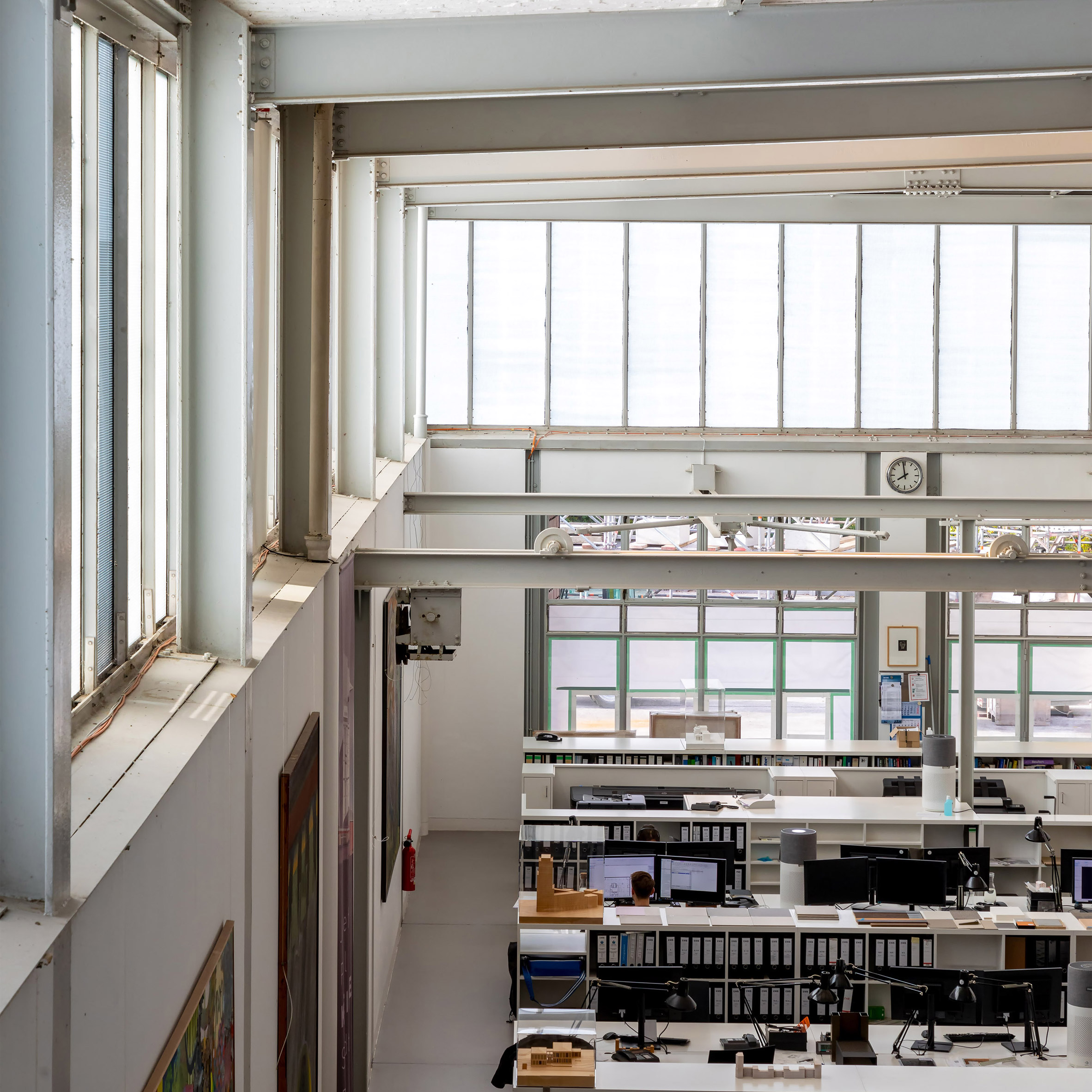

Kleihues office in Berlin

Kleihues

In this space since: 1989

Number of members of staff: 80

Building's history: former waste-loading station by Paul Baumgarten
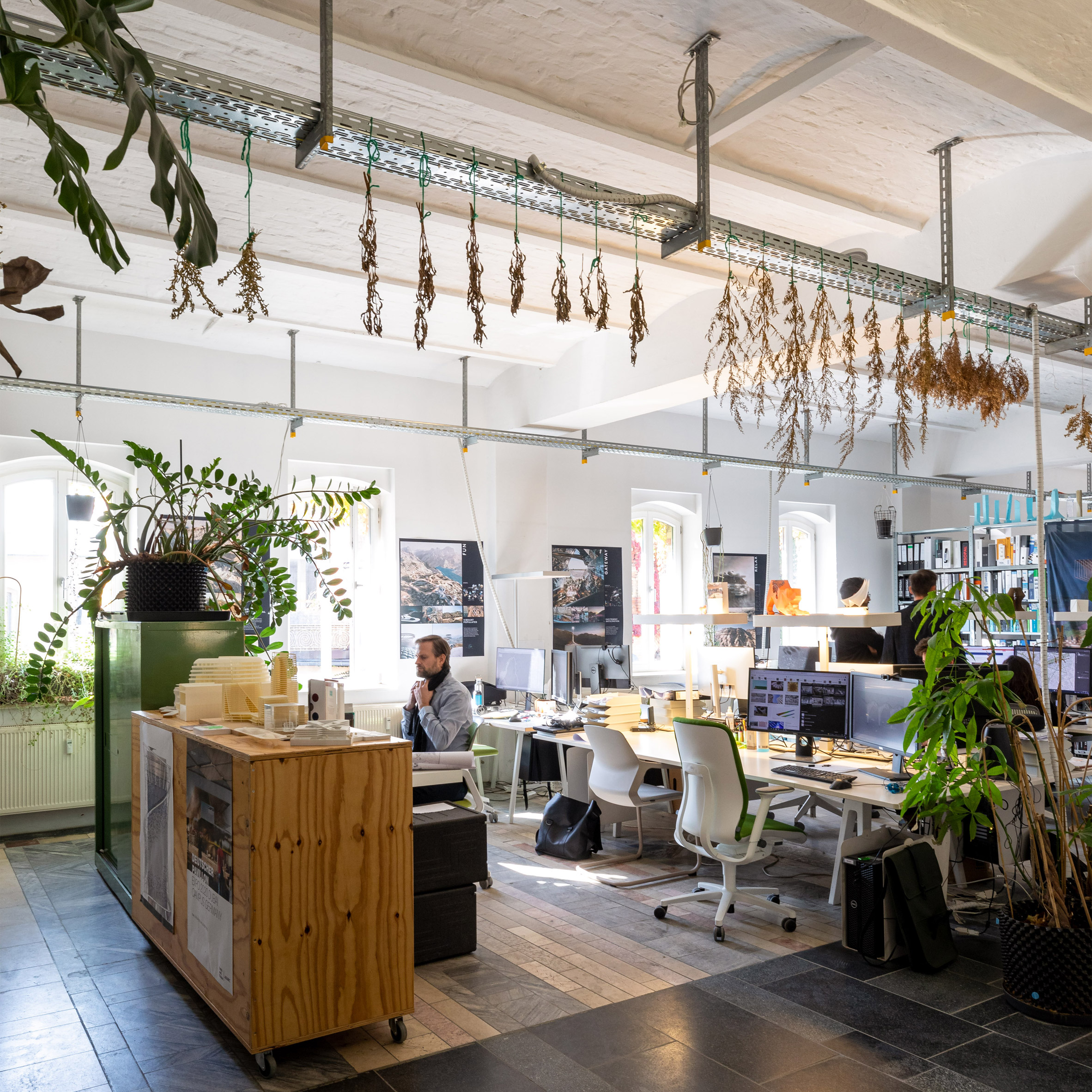

LAVA office in Berlin

LAVA

In this space since: 2021

Number of members of staff: 29

Building's history: brewery and bottle store
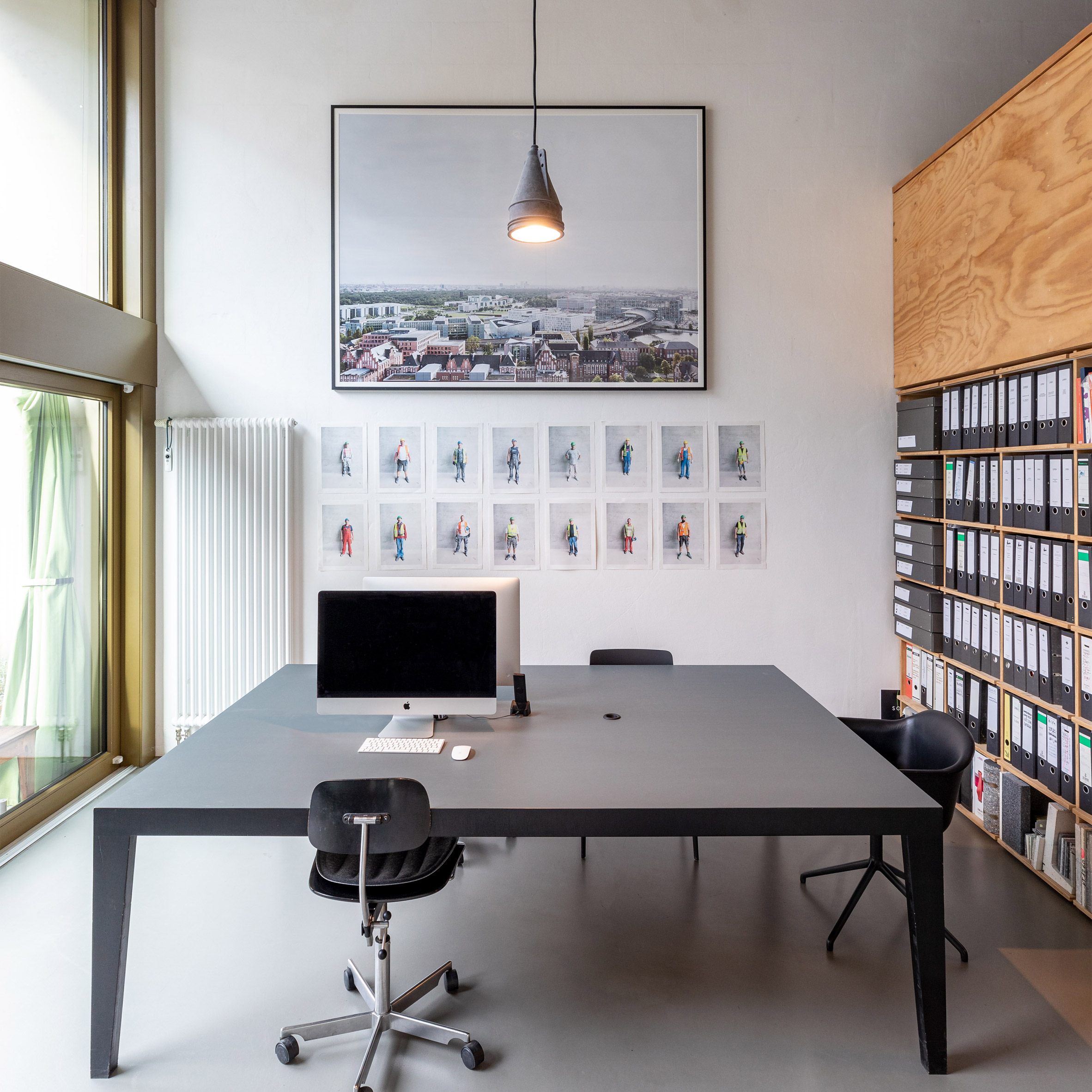

Richter Musikows office

Richter Musikows

In this space since: 2015

Number of members of staff: eight

Building's history: new build


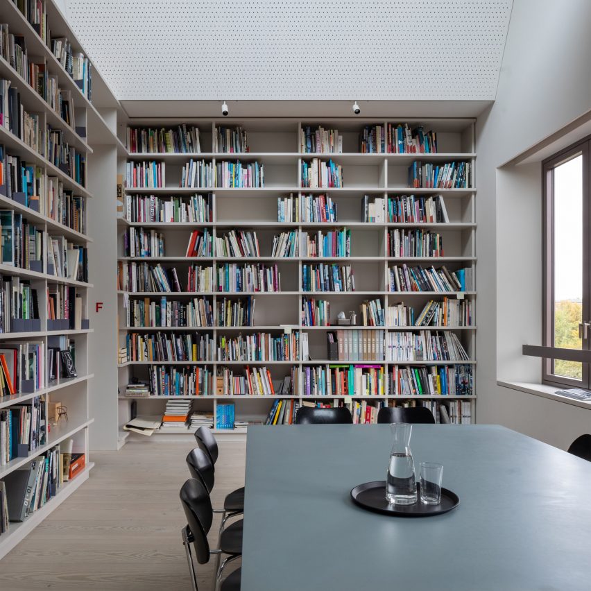
Office with floor-to-ceiling bookshelves

Sauerbruch Hutton

In this space since: 1991

Number of members of staff: 140

Building's history: historic barracks
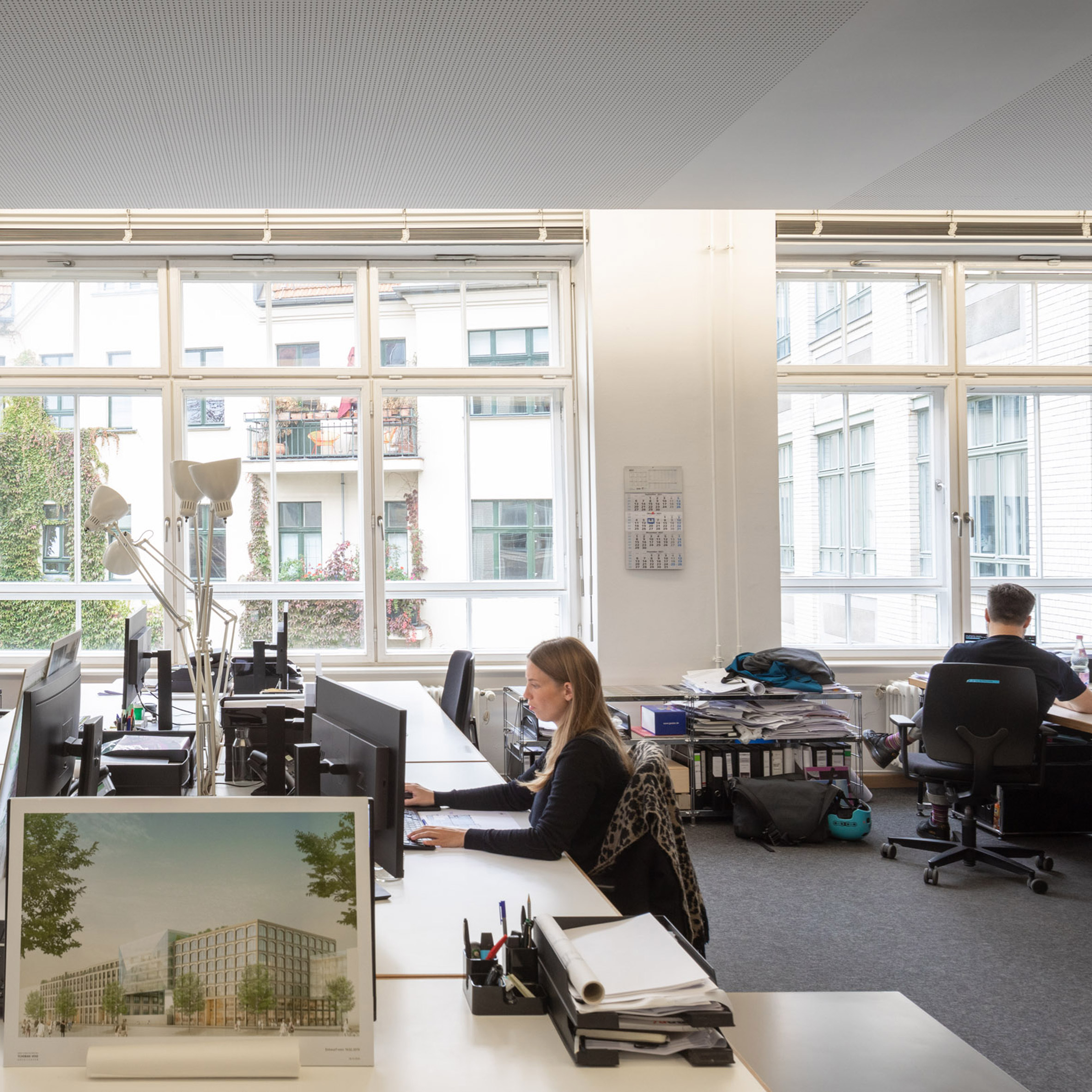

Tchoban Voss' office in Berlin

Tchoban Voss (Berlin)

In this space since: 1995

Number of members of staff: total: 80

Building's history: located atHackesche Höfe complex by Kurt Berndt

The post Twelve Berlin architecture studios photographed by Marc Goodwin appeared first on Dezeen.

#all #architecture #interiors #photography #germany #berlin #architectsstudios #marcgoodwin #officeinteriors
dezeen@xn--y9azesw6bu.xn--y9a3aq

McLaren Excell unveils minimalist London headquarters for Samsung Design Europe

image

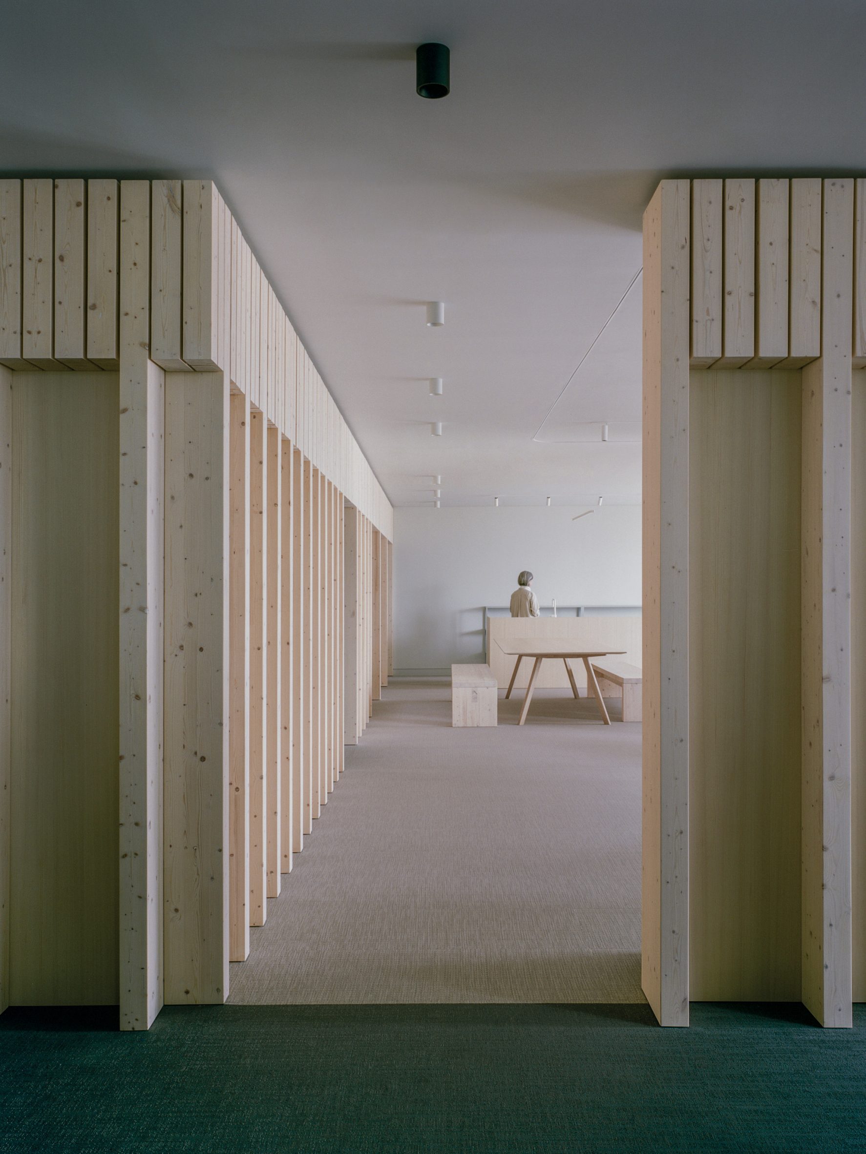
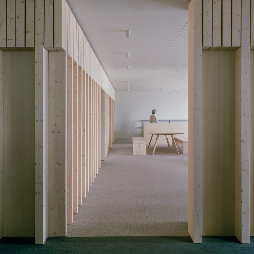
Spruce partitions and furnishings in Samsung Design Europe's minimalist office by McLaren Excell

Only a handful of spruce partitions carve up the pared-back interior of this London office, which McLaren Excell has created for Samsung's European design studio.

Set inside a 21-storey tower known as the Can of Ham building, Samsung Design Europe is one of the tech company's seven product design hubs across the globe, with other outposts located in the US, China, Brazil, India, Japan and South Korea.

Local architecture studio McLaren Excell said it devised the minimalist interior for the London headquarters to "consign the formality of the workspace to the past".

Spruce partitions and furnishings in Samsung Design Europe's minimalist office by McLaren ExcellSpruce wood partitions break up the Samsung Design Europe headquarters
"[The office] instead embraces a more relaxed, informal and experiential place of work," explained the firm's co-founder Luke McLaren.

"We want the Samsung office to have all the qualities that are enjoyable about your home – a softness, a sense of calm, a high degree of tactility, spaces to congregate, spaces to which one can withdraw – but all the while nurturing that sense of welcome, of belonging, of enjoyment."

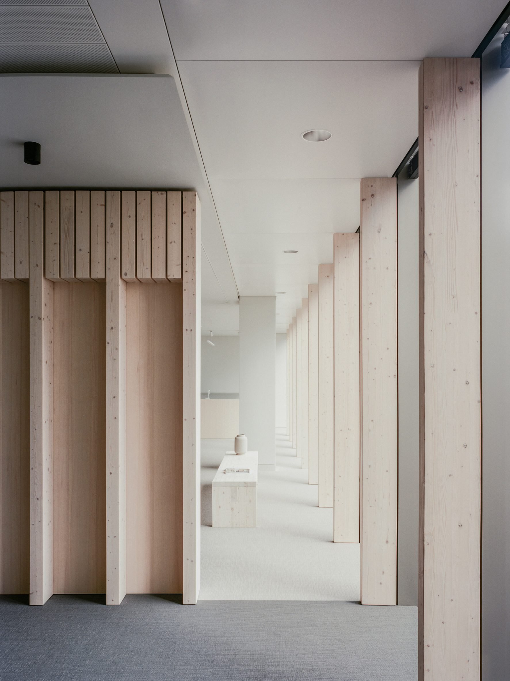
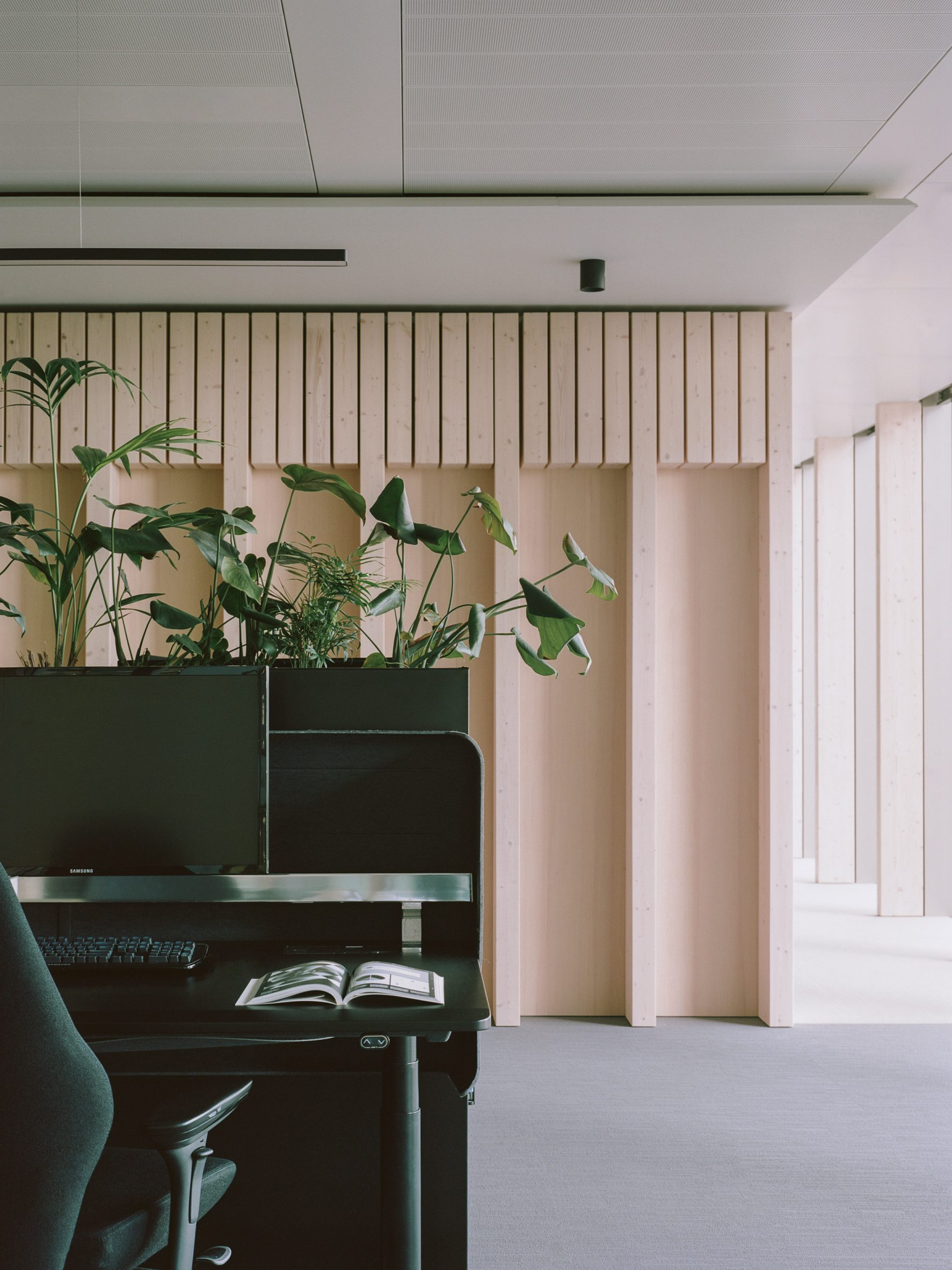
As a result, the office features just a handful of glue-laminated spruce partitions that loosely split the floor plan into private meeting rooms and communal zones where staff members can engage in more collaborative work.

Spruce wall fins and bench holding a ceramic vase in minimalist office by McLaren ExcellSpruce fins also run along the office's windows
Spruce glulam also forms a series of vertical fins, which appear at intervals along the office's windows.

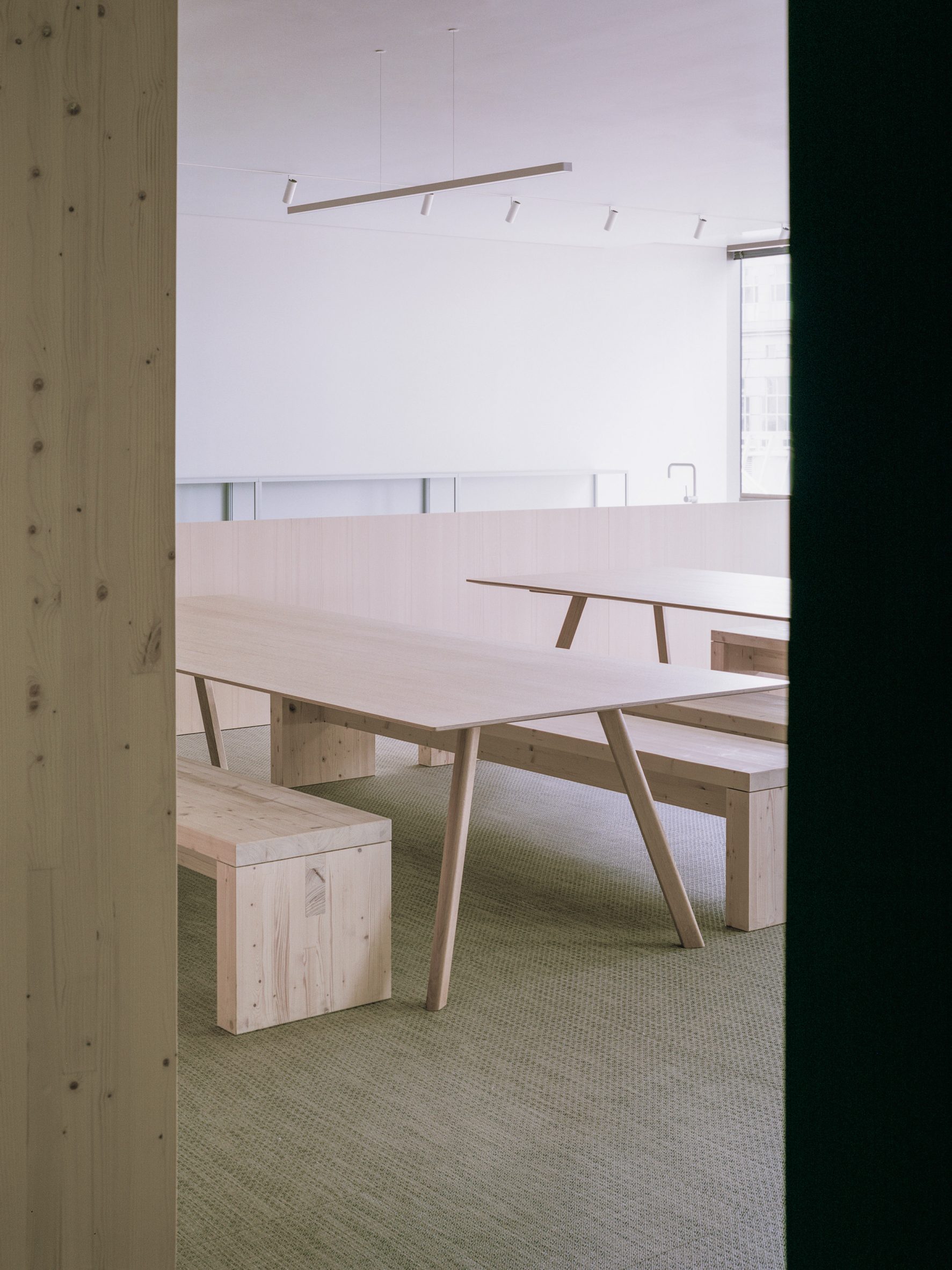
In the breakout area, the same pale-toned timber was used to craft the dining table, counter and benches.

Light wooden tables and benches in breakout area of Samsung Design Europe officeFurnishings in the breakout area are made from spruce
Grey linen curtains that hang from tracks on the ceiling can be used to further divide up the open-plan office while bringing a sense of tactility to the interior.

In an effort to make the HQ seem more relaxed and inviting, planters overspilling with foliage were embedded into the top of the desk banks.

[ The Splash Lab showroom in LA designed by McLaren Excell

Read:

McLaren Excell channels church interiors for The Splash Lab's LA showroom

](https://www.dezeen.com/2020/06/22/splash-lab-showroom-interiors-los-angeles/)

McLaren Excell also abandoned a traditional lighting grid in favour of fitted lamps, which illuminate pockets of the office in more targeted and intimate ways.

The architecture studio was founded by Luke McLaren and Robert Excell in 2010 and is based in London's Chelsea neighbourhood.

Desk banks with integrated planters in front of spruce partition in Samsung Design Europe office in London Planters are embedded into the office's desk banks

Recent projects by McLaren Excell include a bathroom showroom in Los Angeles with arched doorways and altar-like tables reminiscent of a church.

_The photography is byLorenzo Zandri. _

The post McLaren Excell unveils minimalist London headquarters for Samsung Design Europe appeared first on Dezeen.

#all #interiors #london #uk #england #samsung #mclarenexcell #minimalistinteriordesign #officeinteriors #spruce

dezeen@xn--y9azesw6bu.xn--y9a3aq

Henley Halebrown creates Bauhaus-inspired offices in converted London warehouse

image

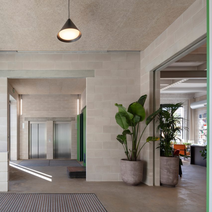
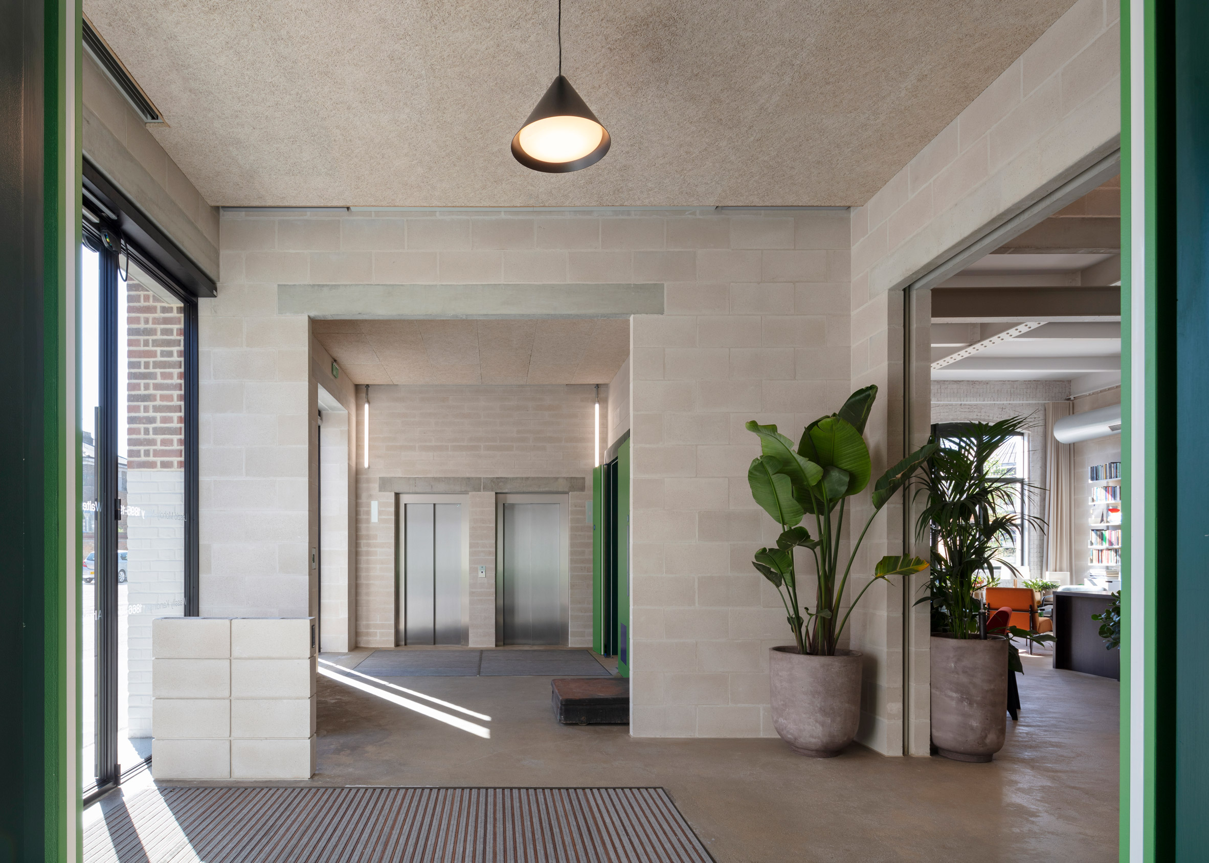
Concrete block walls in the reception of Lazlo offices by Henley Halebrown

The colours and craft techniques of the Bauhaus movement were the inspiration behind Laszlo, a century-old warehouse building transformed into workspaces by London studio Henley Halebrown.

Located in north London, the renovated building now contains five floors of flexible offices, ranging from 482 square metres up to 647 square metres.

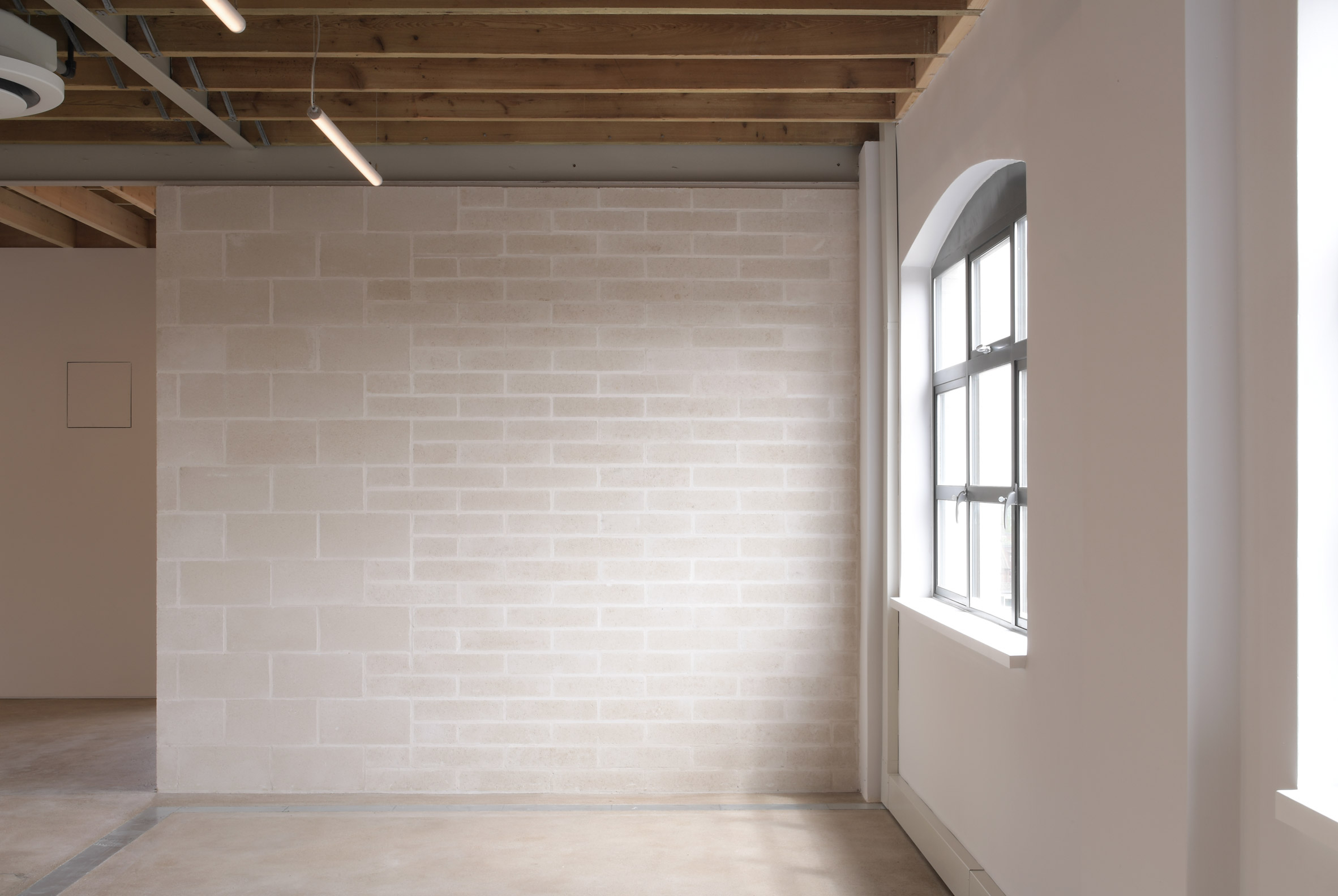
Concrete block walls in the reception of Lazlo offices by Henley HalebrownStructural elements are left exposed through Laszlo's interiors
Henley Halebrown approached the project differently to a standard office conversion.

Instead of a "shell and core" approach, where tenants have no choice but to complete a fit-out, the architects have made spaces that can be occupied simply as they are.

They did this by exposing the building's internal structure – its concrete floor slabs and steel I beams – and bringing order to the elements around. Services are neatly organised, while low-tech materials like concrete and timber are used to make adjustments.

Office floor in Lazlo offices by Henley HalebrownOffices are designed to require minimal additional fit-out
Studio founders Simon Henley and Gavin Hale-Brown describe the approach as seeking "to illustrate how elementary the construction of an office might be".

The idea is that companies would only need to add their own branding, plus furniture, which would significantly reduce the amount of waste generated when tenants move out.

[ 6 Orsman Road by Waugh Thistleton Architects in London

Read:

Waugh Thistleton Architects creates fully demountable office block next door to Dezeen

](https://www.dezeen.com/2020/07/08/waugh-thistleton-architects-demountable-clt-6-orsman-road/)

"Working on adaptive reuse buildings like Laszlo is second nature to us as a practice," said Henley.

"It builds on our interest in how you create new layers of life within a city while celebrating both its past and future, and of course, the great thing is that the huge environmental benefits that come through reuse are now more widely understood."

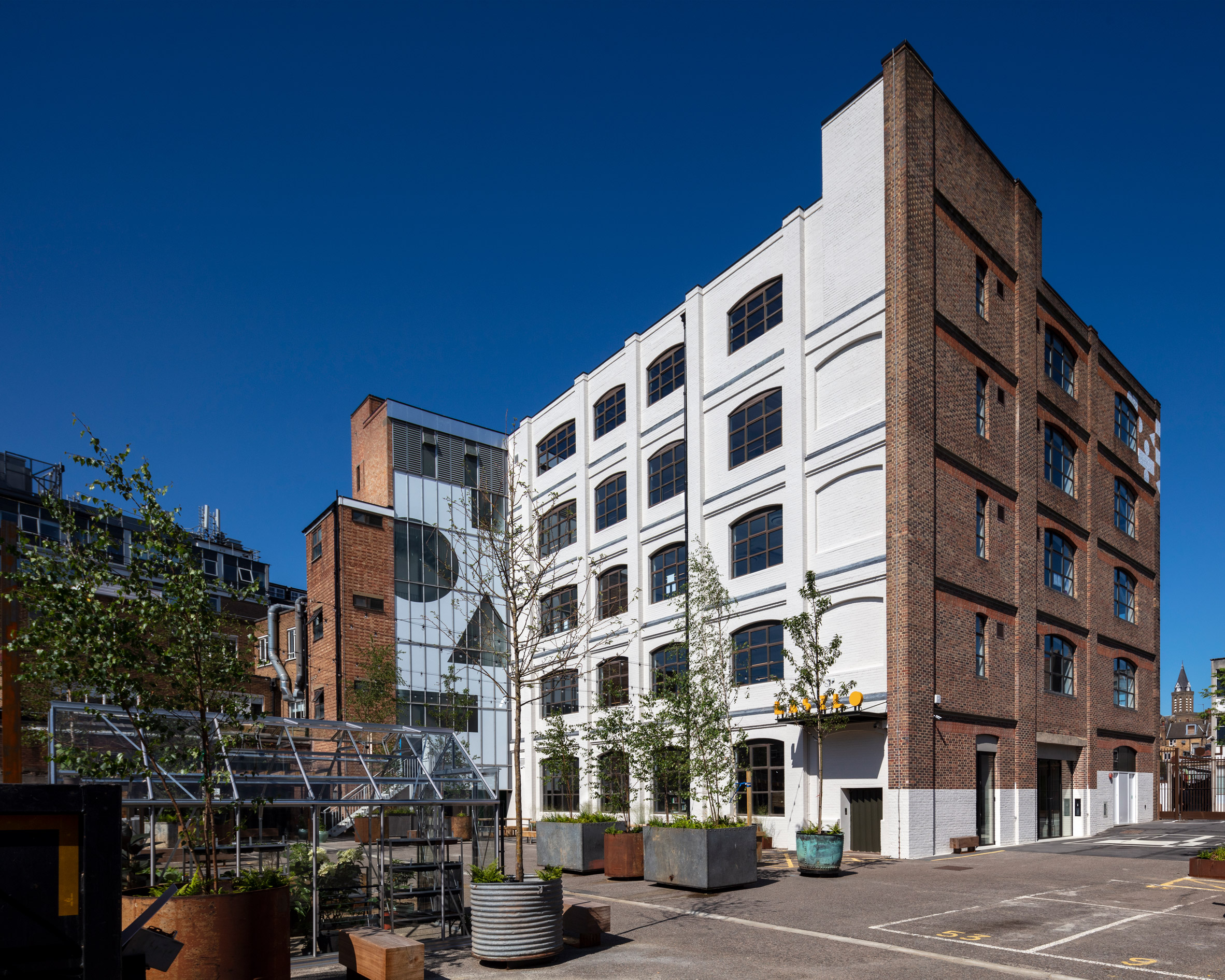
Exterior of Lazlo offices by Henley HalebrownGeometric graphics signal the building's change of use
Originally known as Batavia Mills, Laszlo was built in the early 20th century as a facility for manufacturing and printing, although it also served as storage for gas masks during the second world war.

The Bauhaus become an obvious point of reference for the renovation; not only does it date from the same period, but its core ethos was about being true to materials and finding beauty in craft.

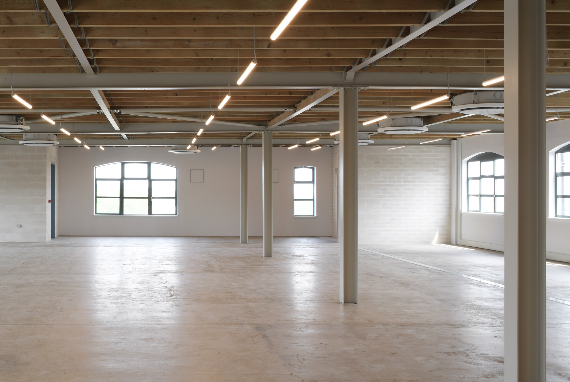
Office with wooden ceiling in Lazlo by Henley HalebrownA steel and timber joisted roof is now exposed on the fourth floor
A painting by Bauhaus artist Laszlo Moholy Nagy – who the building is named after – provided the cues for repairs made to the concrete floors.

There were various gaps created where partition walls had been removed. Instead of infilling these with concrete, Henley Halebrown chose an earth-coloured screed that highlights these marks as traces of history.

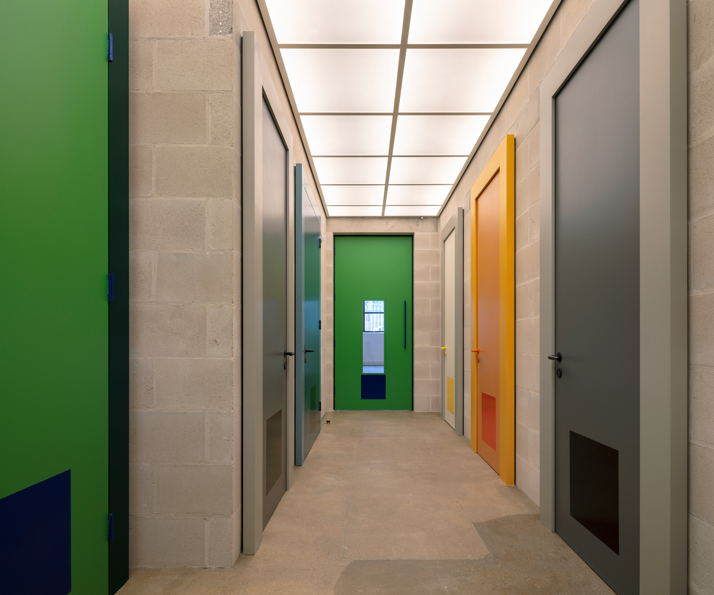
Colourful doors in Lazlo offices by Henley HalebrownDoors throughout the interior borrow tones from Josef Albers' colour studies
The building refers to the colour studies of Bauhaus teacher Josef Albers with a series of doors painted in bold but complementary shades of green, yellow, grey and blue.

Another Bauhaus reference can be found on the exterior, where the brickwork and glazing have been subtly decorated with the same graphic shapes and lettering that give the building its brand identity.

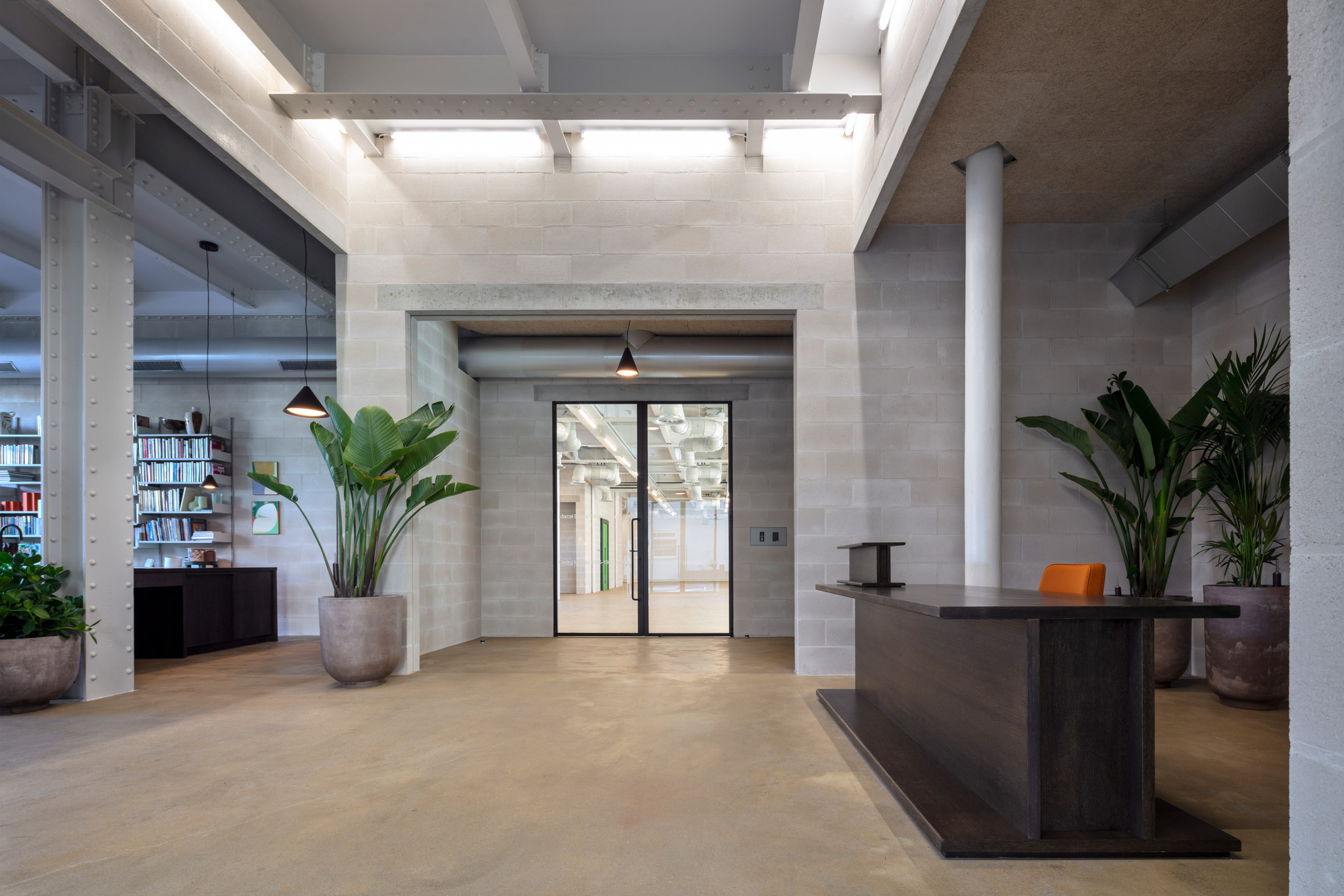
Lazlo offices by Henley HalebrownThe reception features a desk shaped like an I beam
Laszlo offers various amenities to its tenants, including a large outdoor seating area, bicycle parking and showers. There are also shared spaces on the ground floor, including a reception and an area known as the living room.

Furniture in these ground floor spaces is designed to feel like part of the structure, with highlights including a reception desk and bookshelf that both look like giant I beams.

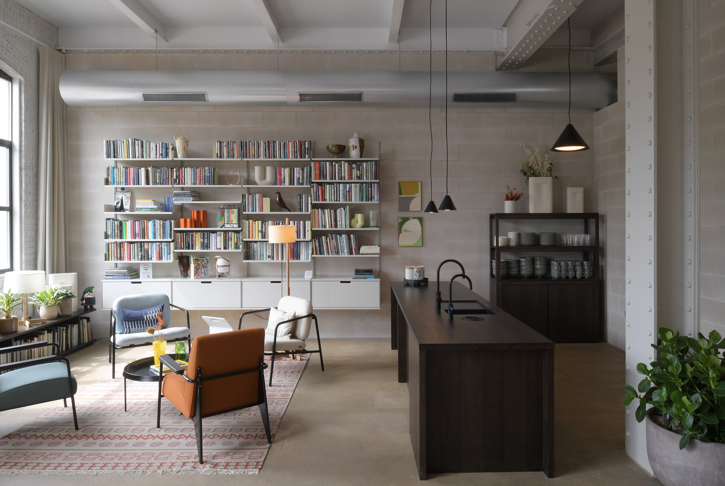
Living room in Lazlo offices by Henley HalebrownA living room with kitchen is shared by all tenants
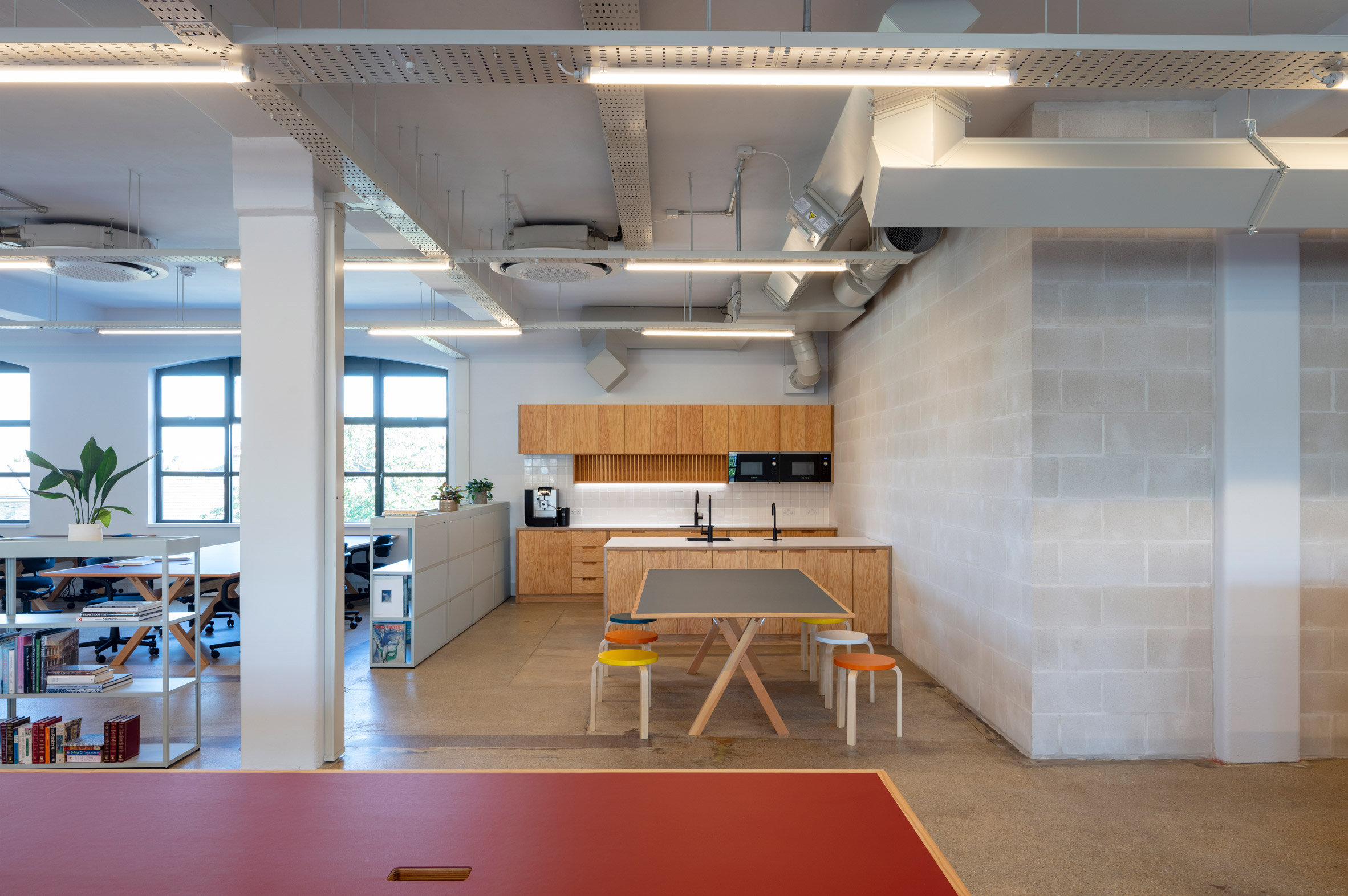
"Within the framework of the original structure, we composed a series of unconventional spaces with conventional building materials, mostly blockwork, lintels and paint," said Jack Hawthorne, an associate at Henley Halebrown.

"These spaces are occupied with pieces of furniture that are imagined and made as oversized elements of structure, 'furniture as structure', placing them in playful dialogue with the building's newly exposed frame."

Lazlo offices by Henley HalebrownOne of the office floors has already been furnished
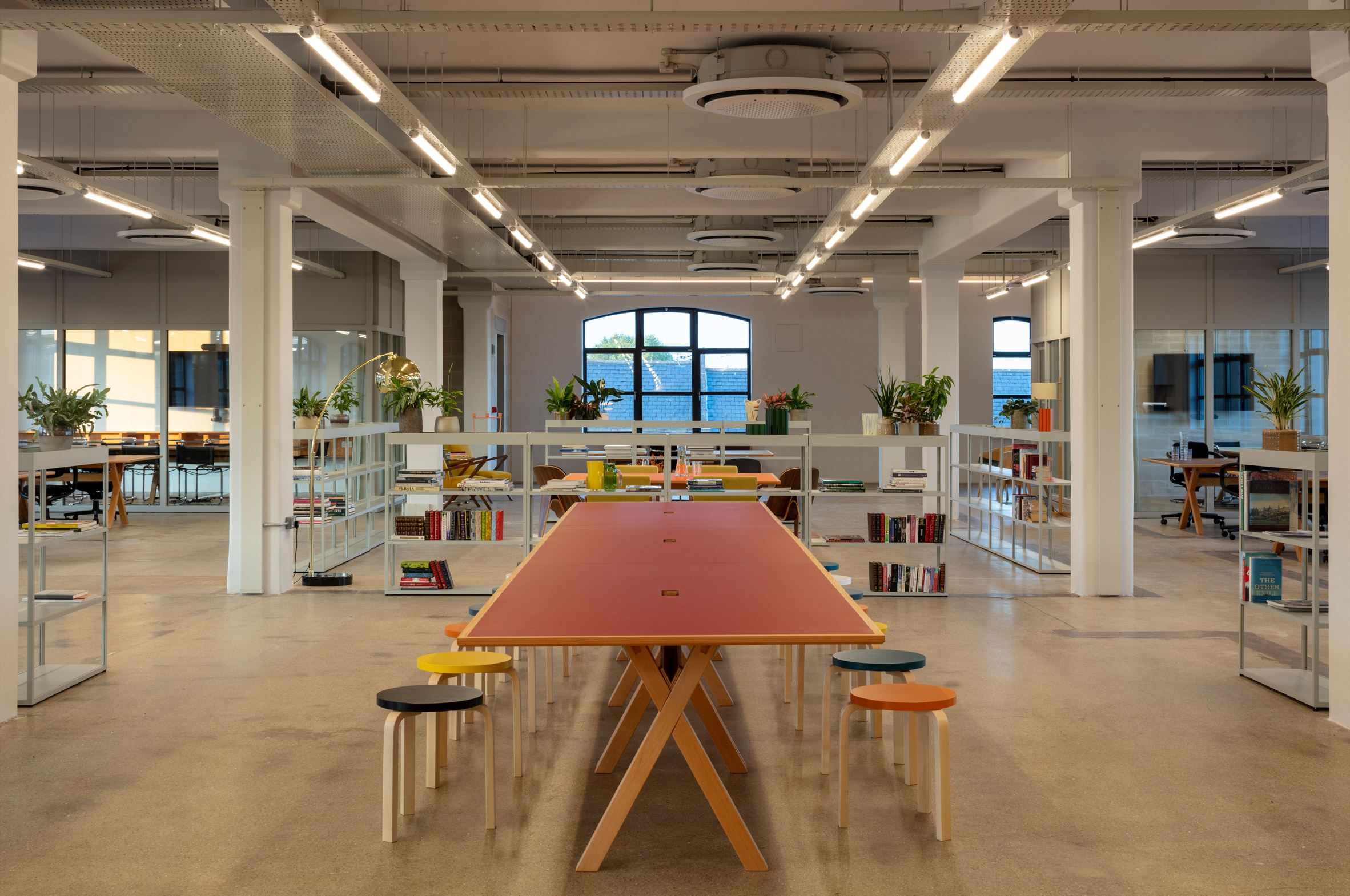
Photos of the project show one of the office floors already fitted out.

The light-touch approach includes glazed meeting rooms, a wooden kitchen and mobile shelves that function as room dividers. Desks and seats integrate bold flashes of colour that feel at home with the rest of the building.

Each floor is similar in layout and finish, although the fourth floor features an exposed steel and timber joisted roof and a balcony terrace.

Lazlo offices by Henley HalebrownThe space features colourful desks, open shelves and glazed meeting rooms

Laszlo is one of several innovative offices designs recently completed in London, as companies adapt to more flexible working policies following the impact of the pandemic.

Other recent examples include a co-working office that doubles as a "town hall" and an office with more meeting areas than desks.

The photography is by David Grandorge.

The post Henley Halebrown creates Bauhaus-inspired offices in converted London warehouse appeared first on Dezeen.

#all #interiors #london #uk #bauhaus #england #officeinteriors #henleyhalebrown #offices

dezeen@xn--y9azesw6bu.xn--y9a3aq

Studio Rhonda uses saturated colours and glass bricks to revamp Zetteler's headquarters

image

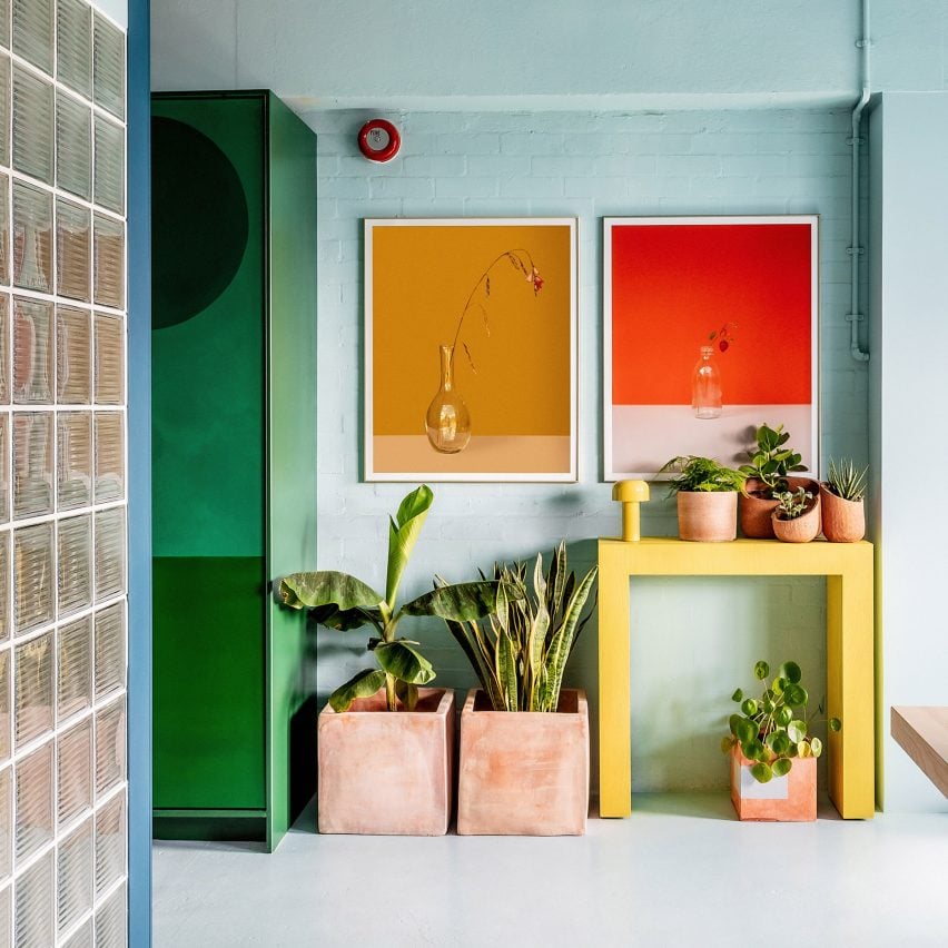
Bright colours in Zetteler London office

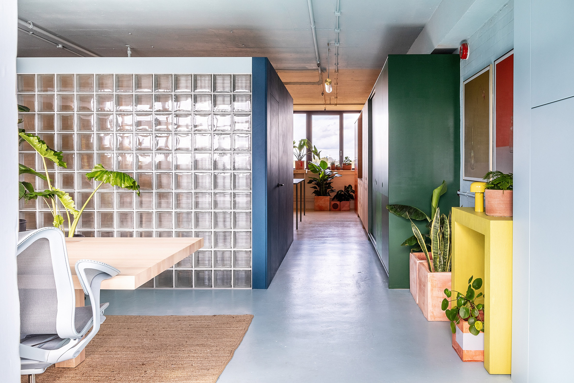
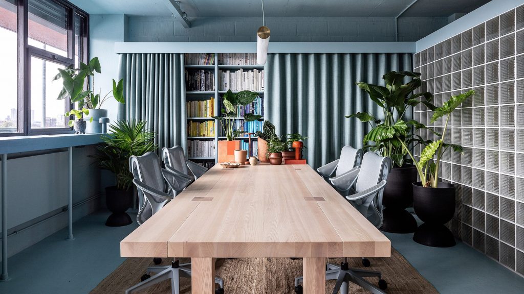
Interiors firm Studio Rhonda has redesigned communications agency Zetteler's London office using contrasting colours and tactile vegan and deaf-friendly materials.

The studio, which is led by Rhonda Drakeford, created a distinctive feeling for each of the headquarter's three zones – a main work area, a smaller cafe-style space for meals and relaxing, and a meeting space.

View of colourful Zetteler officeThe Zetteler headquarters is located in east London
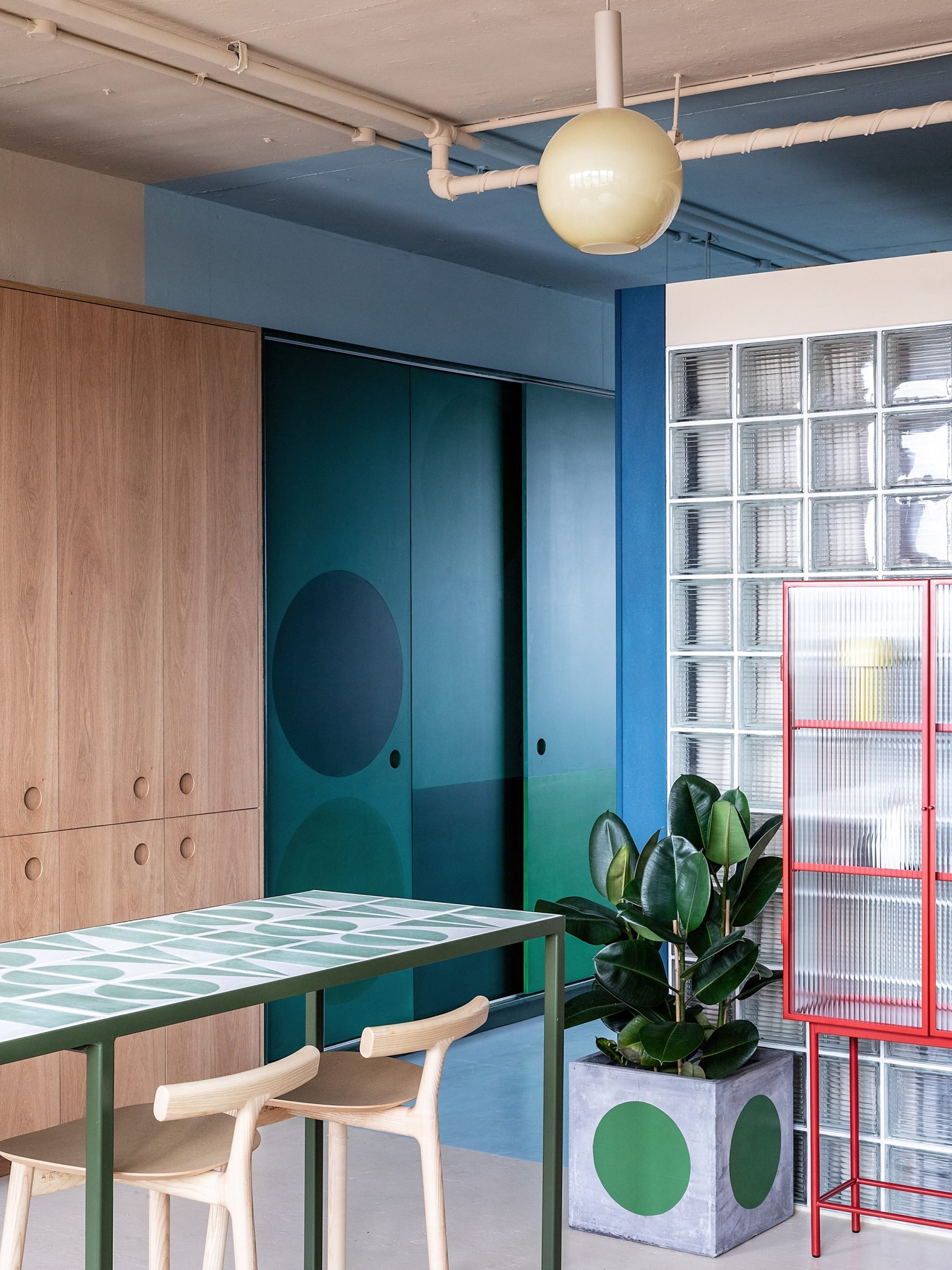
As Zetteler founder Sabine Zetteler has severe conductive hearing loss, it was also important that the office didn't feature details such as hard floors and high ceilings, which can create a disruptive atmosphere.

"The space was to be split into three zones, each with a different ambience and function, with an emphasis on the whole space to be deaf-friendly, plus there was the need for the materials used to be vegan," Drakeford explained.

Blue walls and wooden kitchen in London officePlants are dotted throughout the space

The choice to use vegan materials was based on the fact that most of Zetteler's staff is vegan or vegetarian.

"The research process was enlightening; for example, I was surprised to learn that some paints include casein, a dairy product," Zetteler told Dezeen.

"I'm proud that we've been able to find vegan options for all our integral building materials, but I would really like to see manufacturers take more responsibility for transparency, so we can all make more informed decisions."

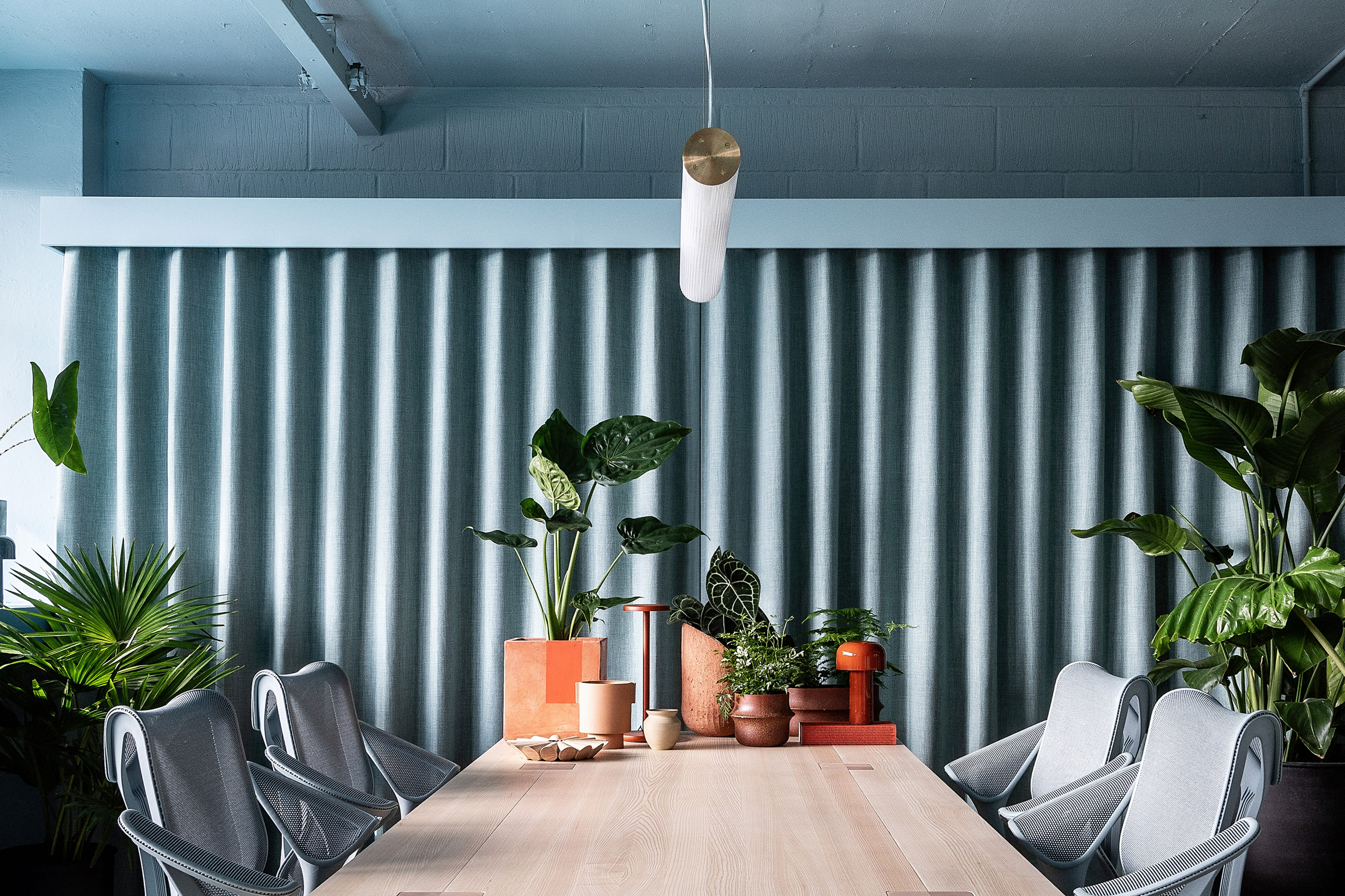
Duck-egg blue workspace in LondonA duck-egg blue decorates the main workspace
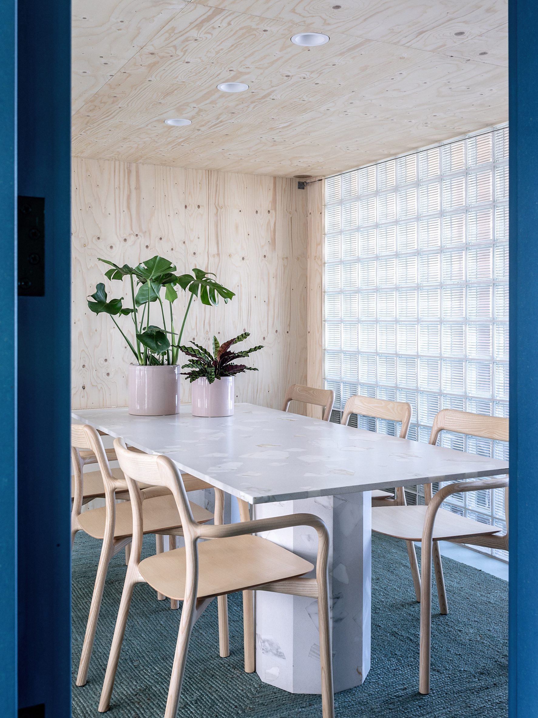
To create distinctive zones in the office, located in a mid-century industrial block off Broadway Market in east London, Drakeford used different colours and materials to define the spaces.

A pale duck-egg blue was used for the main work area, which also features a large desk in natural wood and a jute carpet that gives the room an organic feel.

Glass-brick meeting room at Zetteler's officeGlass bricks create a light meeting room
The adjacent meeting room is enclosed in glass brick walls, which Zetteler had requested to allow for light to flow through the space.

"I sourced some Czech glass bricks with graphic linear mouldings for a contemporary edge," Drakeford explained.

[ Kitchen and dining space in 6 Babmaes Street office for The Crown Estate by Fathom Architects

Read:

Fathom Architects designs London office with more meeting areas than desks

](https://www.dezeen.com/2021/12/28/fathom-architects-the-crown-estate-office-meeting-areas-remote-working/)

"I devised an anchor line of 2,300 millimetres from the ground as the top height of any structures so as to maintain coherence in all three zones and also to help the space retain an open-plan feel," she added.

"The roof of the glass-brick 'pod' stops at the 2,300 millimetres anchor line, allowing light to travel over it."

Wooden kitchen at Zetteler officeThe Zetteler kitchen features wood and Valchromat surfaces
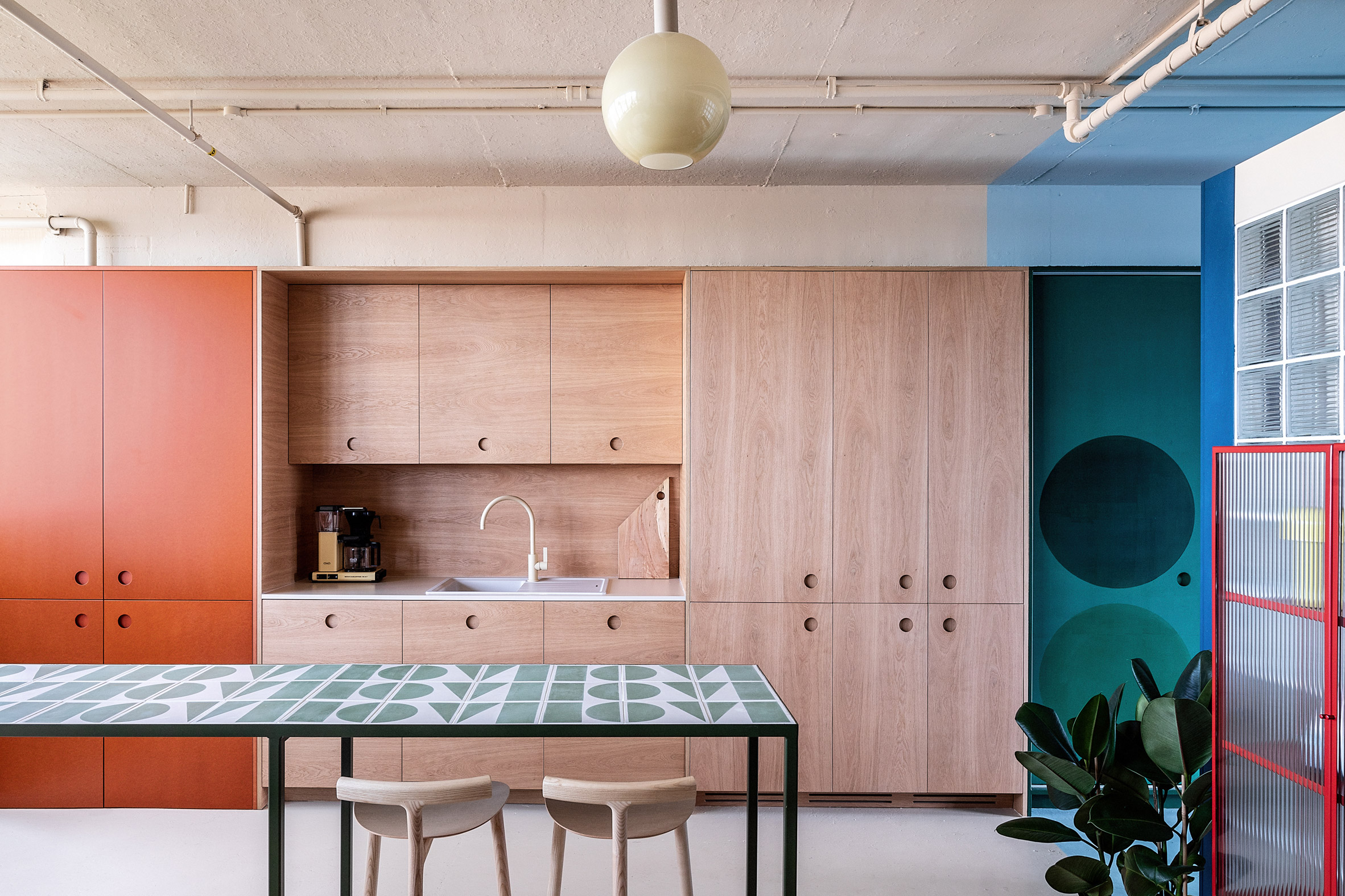
In the kitchen, the interior designer used furniture from brand Hølte, a Zetteler client whose showroom is close to the office.

"I specified custom oversize recessed handles and an unusual matching oak splash-back combined with a beige tap by Toniton for a mono-material/colour effect 'block'," Drakeford said.

"We also used the oversize circular handles on the adjoining orange Valchromat storage cupboards, which were also produced by Hølte, and the green Valchromat sliding doors to the right of the kitchen block,"

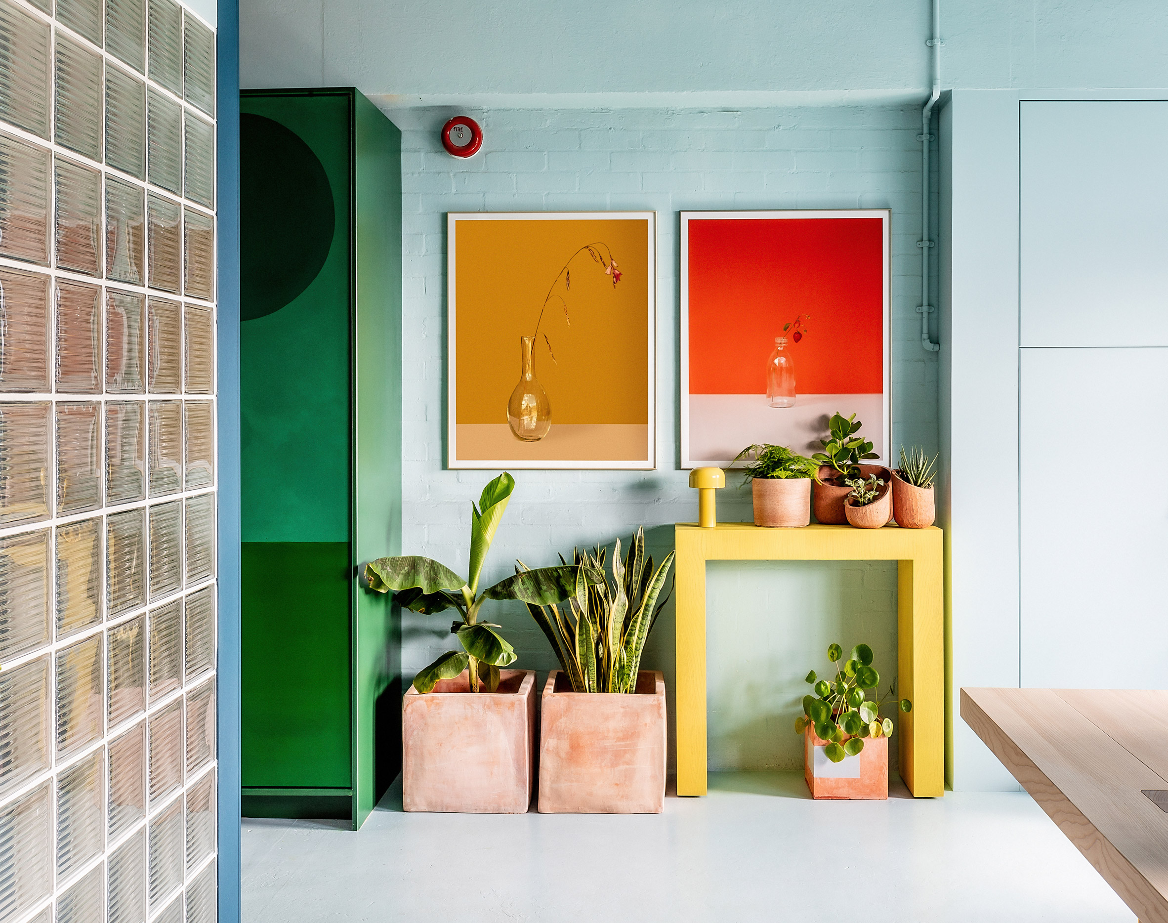
Colourful London officePale blue walls meet green storage spaces and a glass-brick meeting room
The use of colour was defined by the light in the different rooms of the office, which sits on a north-south axis.

"I worked with a cool, duck-egg blue at the front, south-facing area as I knew that the space tends to get very warm in the summer," Drakeford explained.

"A warmer, buff colour was used at the rear, north-facing section, to counteract how cold that area can feel in the winter months."

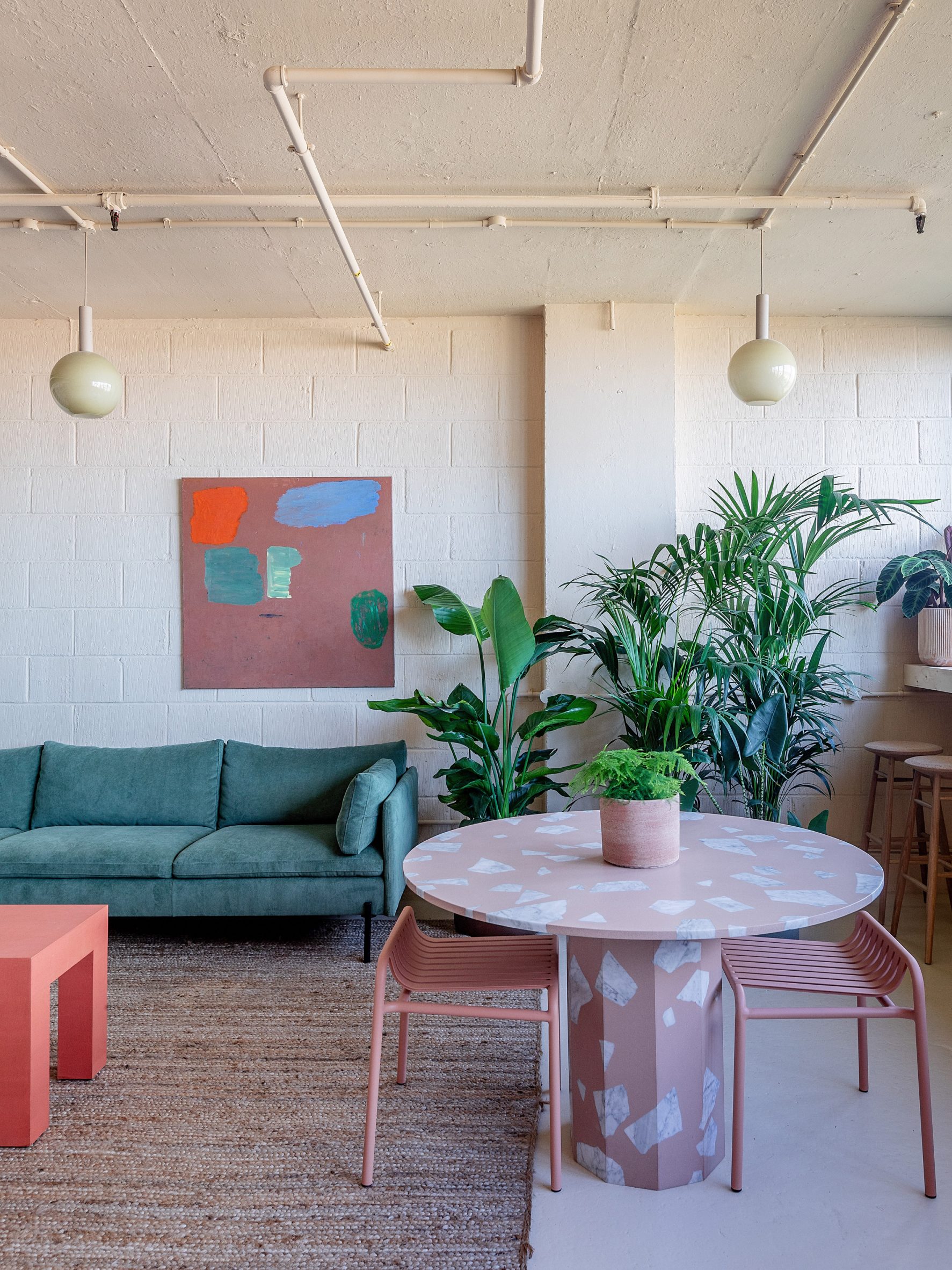
Soft materials and pastel colours in London officeWarmer hues were used at the north-facing rear of the building
The neutral backdrop hues were complemented by pops of colour in a variety of textured materials and chalky tones. To make the space deaf-friendly, the designer chose to add plenty of soft materials to the interiors.

"Curtains and rugs are used throughout to help with zoning and privacy as well as optimising the acoustics," Drakeford said.

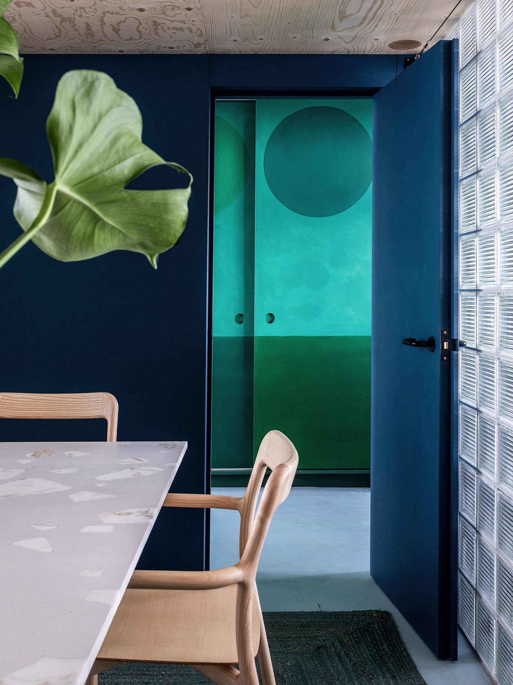
"The meeting pod is purpose-built, very solid and lined with acoustic vegan wool, creating a quiet sanctuary from the more open-plan spaces. Planting is also a key part of the acoustic softening, as well as making the space more welcoming."

Dark-blue office with glass-brick wallA deep blue hue makes the meeting room feel cosy
The overall design aimed to create an office that didn't have the "matchy-matchy" feel of many corporate office spaces, Drakeford said.

"I approached this space in the same way I would treat a residential interior, with the warmth and comfort of a mismatched but visually coherent family of furniture and materials," she added.

Other notable London offices include The Crown Estate's Fathom Architecture-designed space in St James's and a "homely" office in the brutalist Smithson Tower.

Photography is byTaran Wilkhu.

The post Studio Rhonda uses saturated colours and glass bricks to revamp Zetteler's headquarters appeared first on Dezeen.

#all #interiors #instagram #london #uk #officeinteriors #glassbricks #colour

dezeen@xn--y9azesw6bu.xn--y9a3aq

Ten offices with wooden bleachers that c​​ater for collaboration

image

Stepped seating at the Slack offices by Snøhetta

An industrial London workspace and the home of software company Slack feature in our latest lookbook, which spotlights 10 office interiors animated by wooden bleacher-style seating.

Traditionally found in sports stadiums, bleachers are an inexpensive form of stepped seating composed of rows of benches. They are accessed by built-in staircases or directly from the stepped seats themselves.

In recent years, bleachers have also become a workplace staple for many modern companies as they offer flexible auditorium-style spaces for presentations, impromptu meetings and collaboration.

While they are typically made from metal, many architects designing office bleachers are opting for a wooden finish instead.

This is the latest in our series of lookbooks providing curated visual inspiration from Dezeen's image archive. For more inspiration see previous lookbooks showcasing homely office interiors, workspaces filled with plants and garden studios for remote working.


Wooden bleachers at Millwall Ironworks

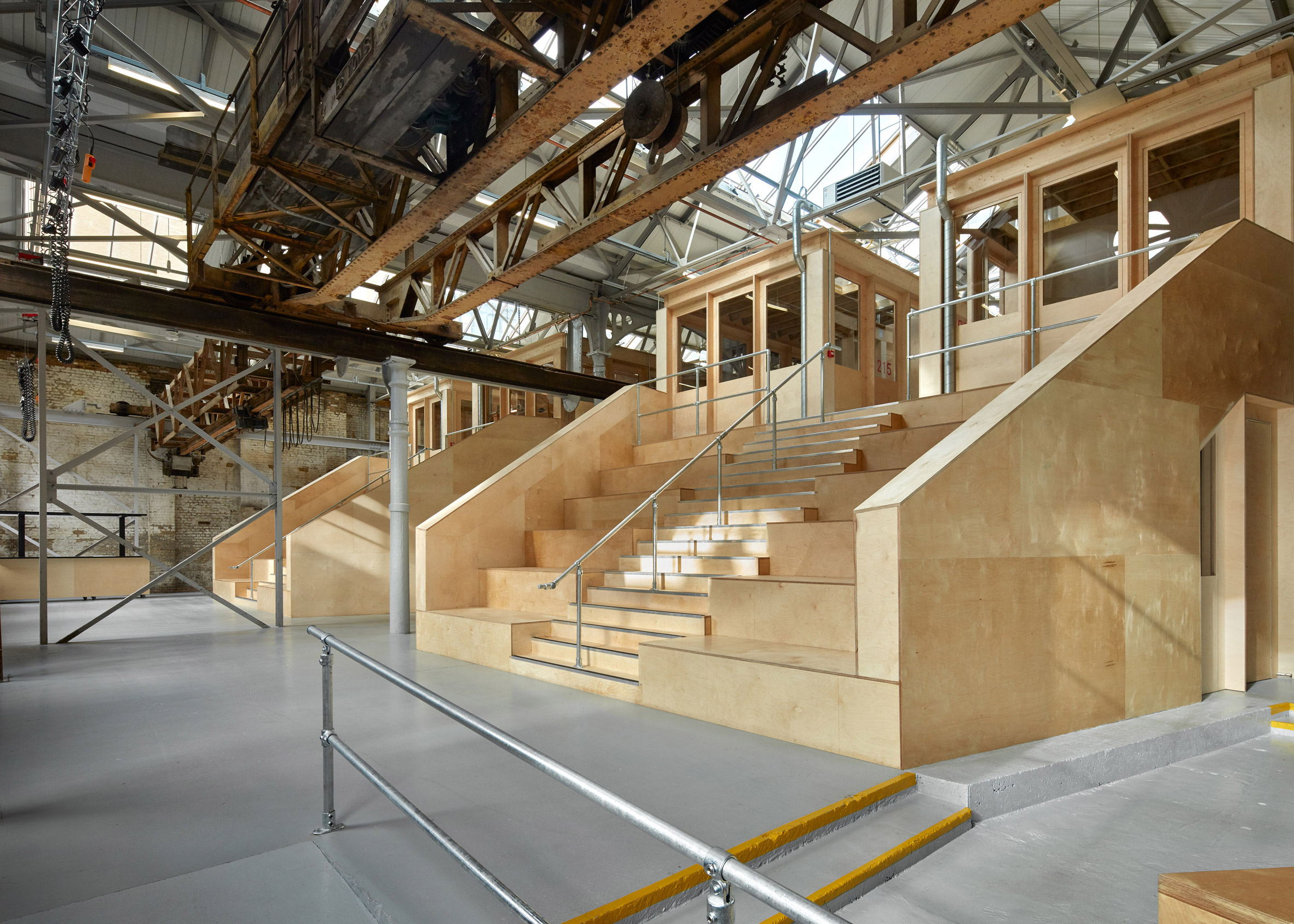
The Forge, UK, by Emrys Architects

Two banks of bleachers feature in this listed ironworks in London, which Emrys Architects transformed into a studio complex with co-working spaces and workshops.

Crafted from birch plywood, the seating is positioned at the building's heart to provide access to the first floor of the complex while doubling as a gathering point for occupants.

Find out more about Millwall Ironworks ›


Bleacher-like seating at Quartz office by Desai Chia ArchitecturePhoto is by Mark Craemer

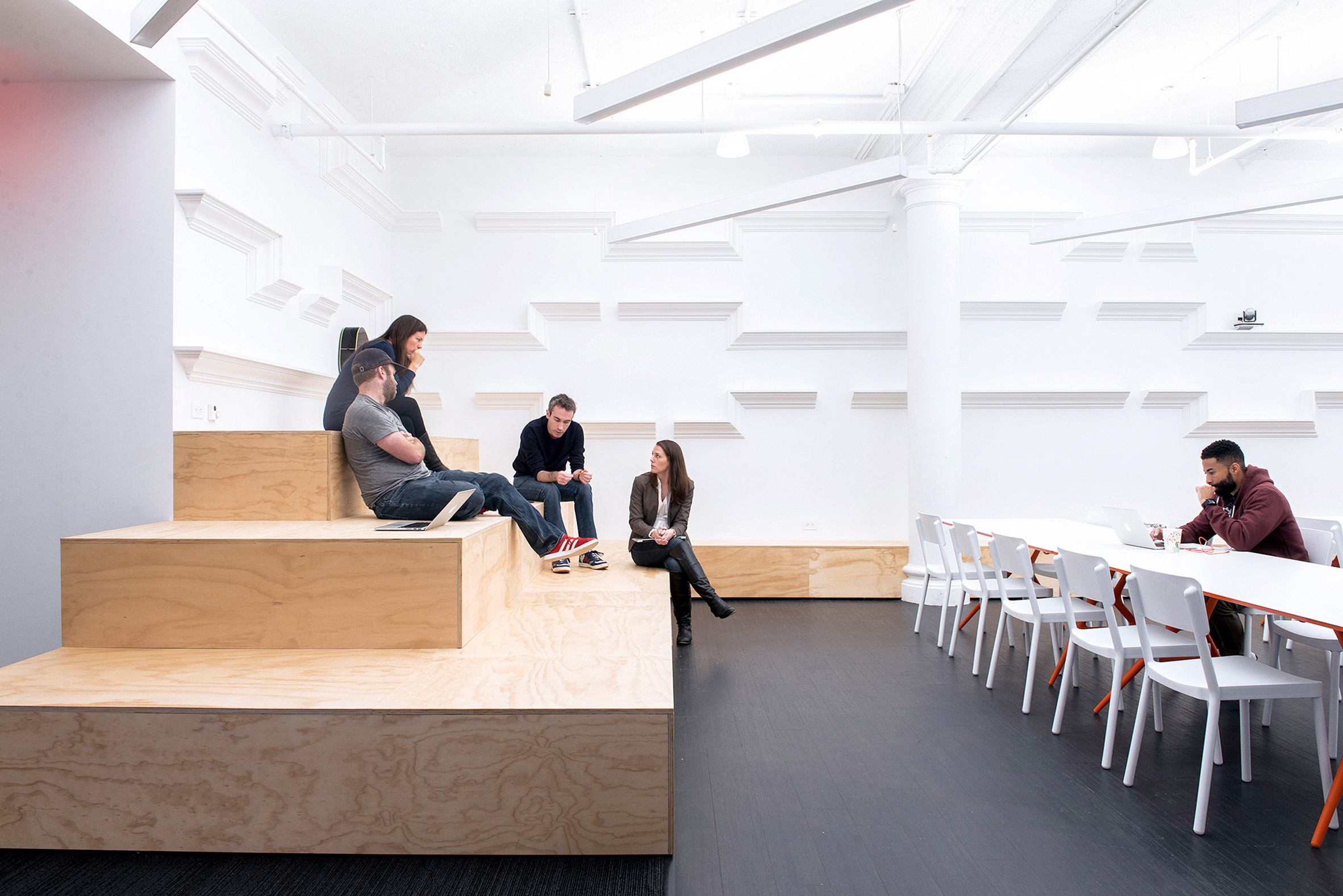
Quartz offices, USA, by Desai Chia Architecture

The Quartz offices in New York feature a large events space, lined on three sides with chunky bleacher seating made from plywood.

The seating was designed by Desai Chia Architecture to accommodate everything from parties to symposiums and is complemented by moveable furniture. It also incorporates hidden storage units at its base.

Find out more about Quartz offices ›


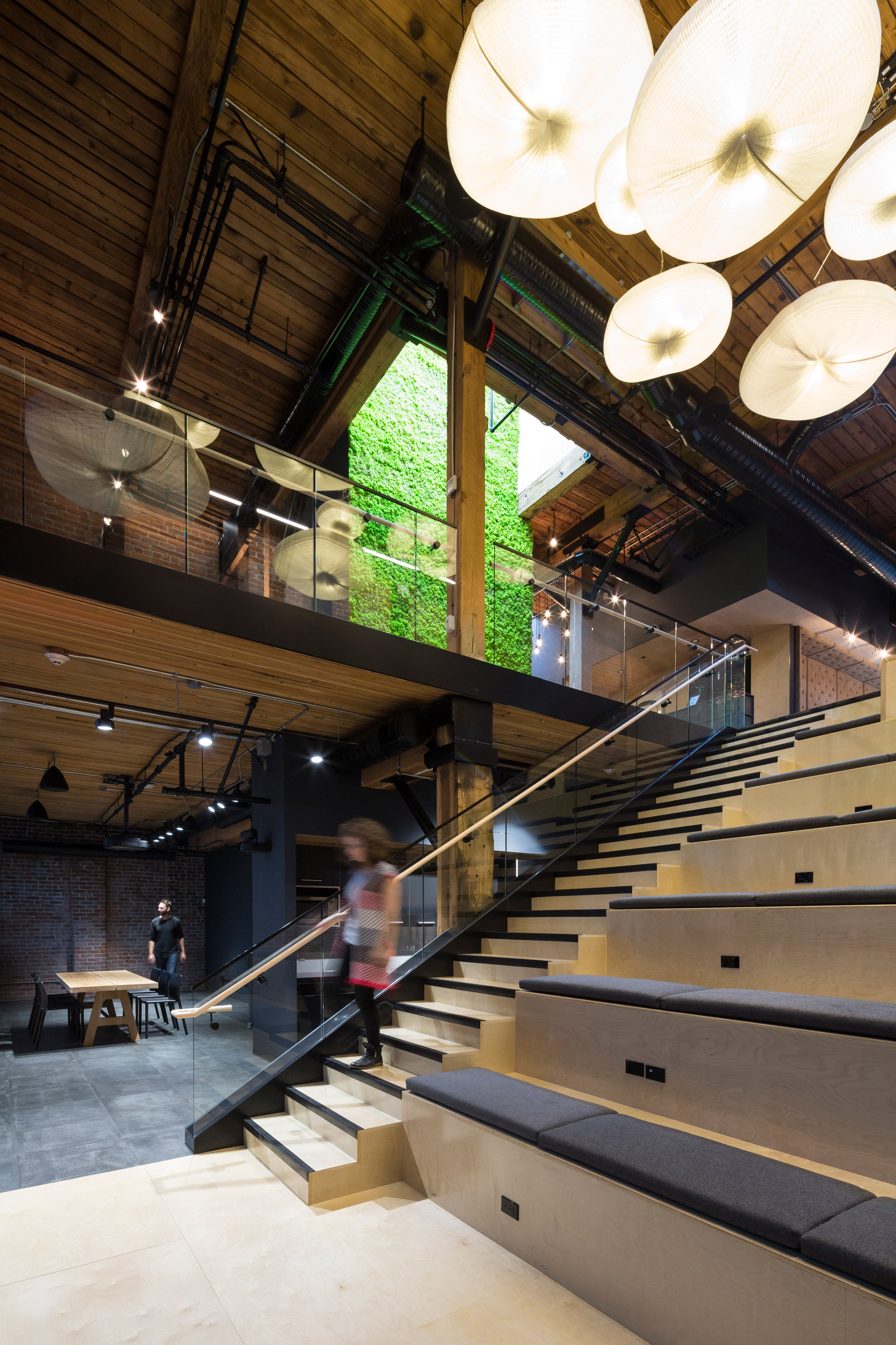
Central atrium of Slack Vancouver Photo is by Ema Peter

Slack offices, Canada, by Leckie Studio

Company-wide meetings are hosted on these cushioned bleachers, which form the focal point of the Slack offices designed by Leckie Studio in a Vancouver warehouse.

Set in a double-height atrium, the stadium-like seating runs alongside a staircase that links two floors of open-plan workspace and incorporates plug sockets to allow employees to work from the bleachers.

Find out more about Slack offices ›


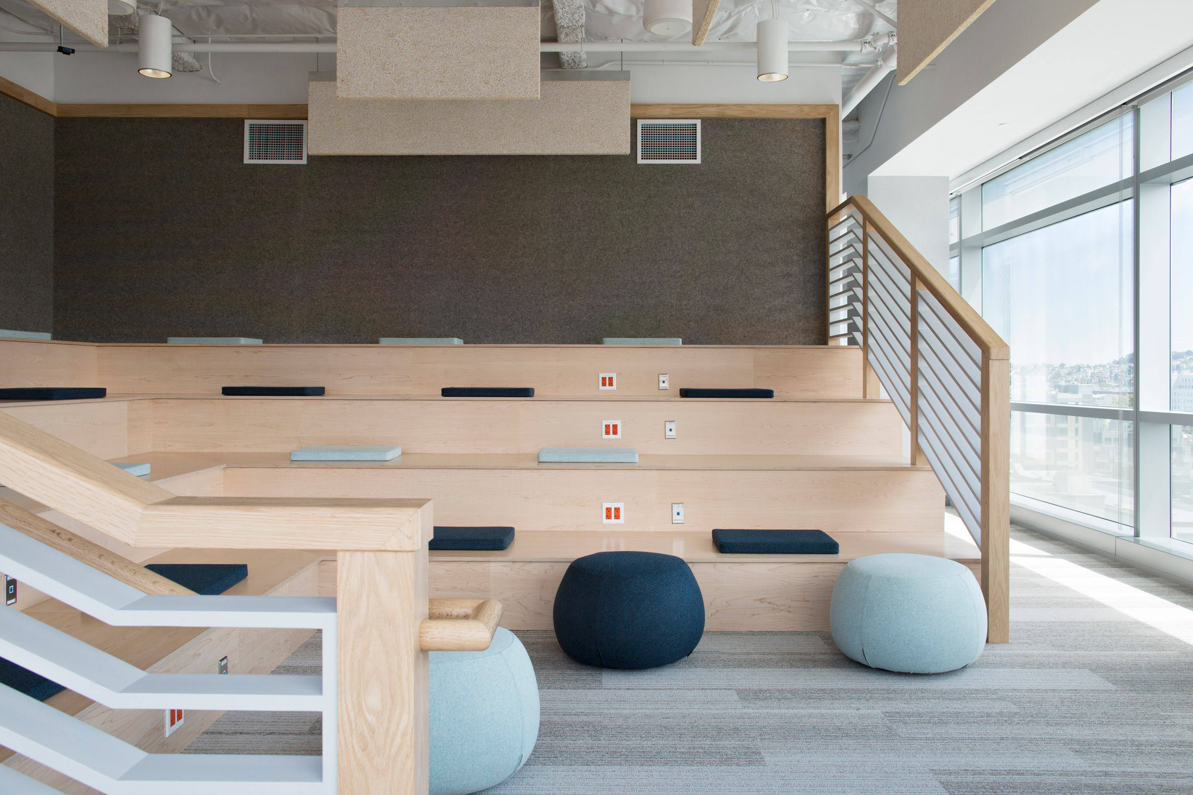
Stadium-like seating at Eventbrite offices by Rapt Studio

Eventbrite offices, USA, by Rapt Studio

Rapt Studio added cushions to the stadium-like seating that it designed for the offices of e-ticketing company Eventbrite in San Francisco.

Built from light wood, the seating was introduced to support large company meetings and offers a counterpoint to the one-on-one workrooms and quiet nooks elsewhere in the office. The cushions are upholstered in blue fabrics and teamed with matching ottomans.

Find out more about Eventbrite offices ›


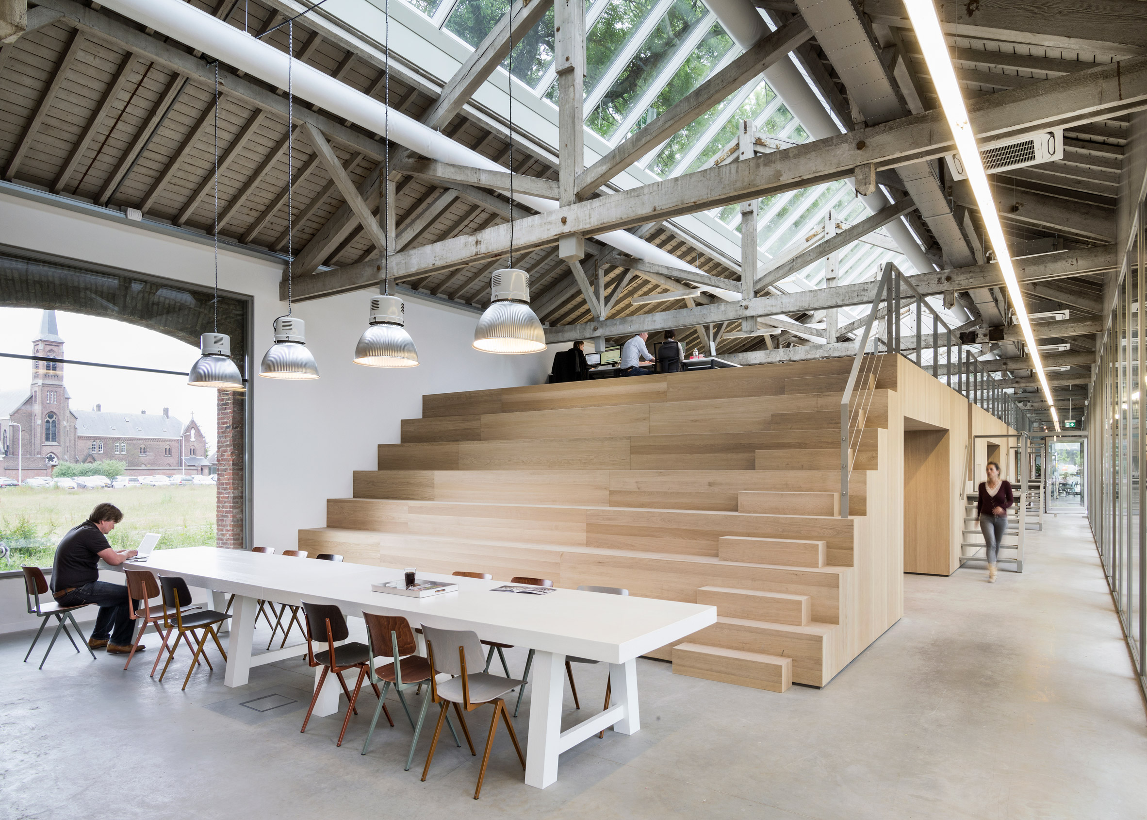
Tiered wooden seating by Bedaux de Brouwer ArchitectenPhoto is by Inpetto foto grafisch

The Houtloods, the Netherlands, by Bedaux de Brouwer Architecten

This wooden bleacher-style seating was designed by Bedaux de Brouwer to conceal private offices, toilets and storage at this advertising agency in an old railway building in Tilburg.

The seating also provides the office with an informal auditorium for group meetings. At the top of the structure are personal workstations for employees, accessed by a staircase built into its bleachers or metal stairs along its edge.

Find out more about The Houtloods ›


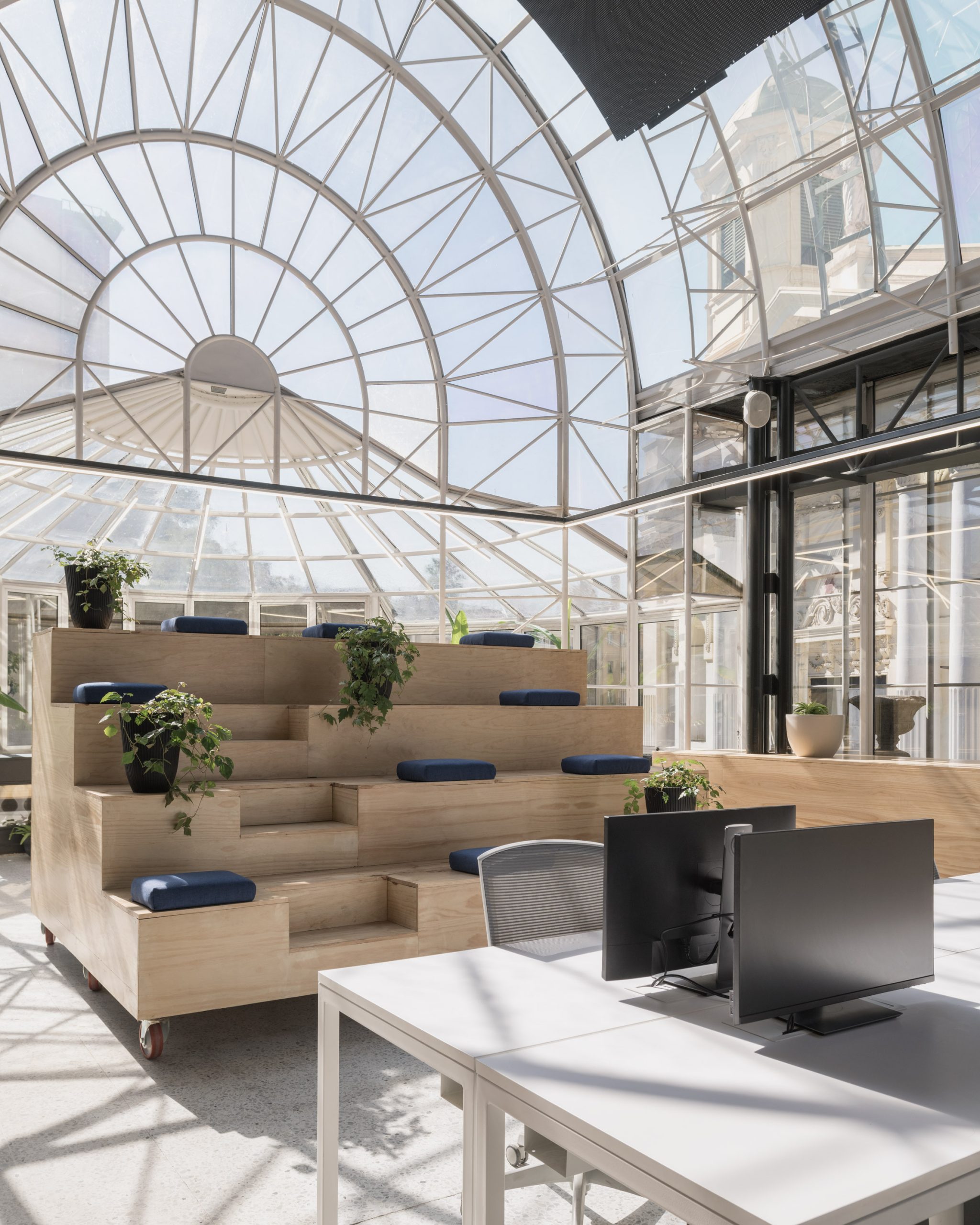
Bleacher seating on wheelsPhoto is by Bruno Giliberto

Fintual offices, Chile, by Studio Cáceres Lazo

Studio Cáceres Lazo mounted this small bank of bleachers on wheels to allow employees at Fintual in Santiago to move it around their office for group meetings or gatherings.

The office, which occupies an old mansion by architect Sergio Larraín García-Moreno, was designed as a flexible work environment for the financial startup. The stepped seating is made from laminated wooden boards and finished with square cushions and potted plants.

Find out more about Fintual offices ›


Nikken Space Design office interiorsPhoto is courtesy of Nacása & Partners

Nikken Space Design offices, Japan, by Nikken Sekkei

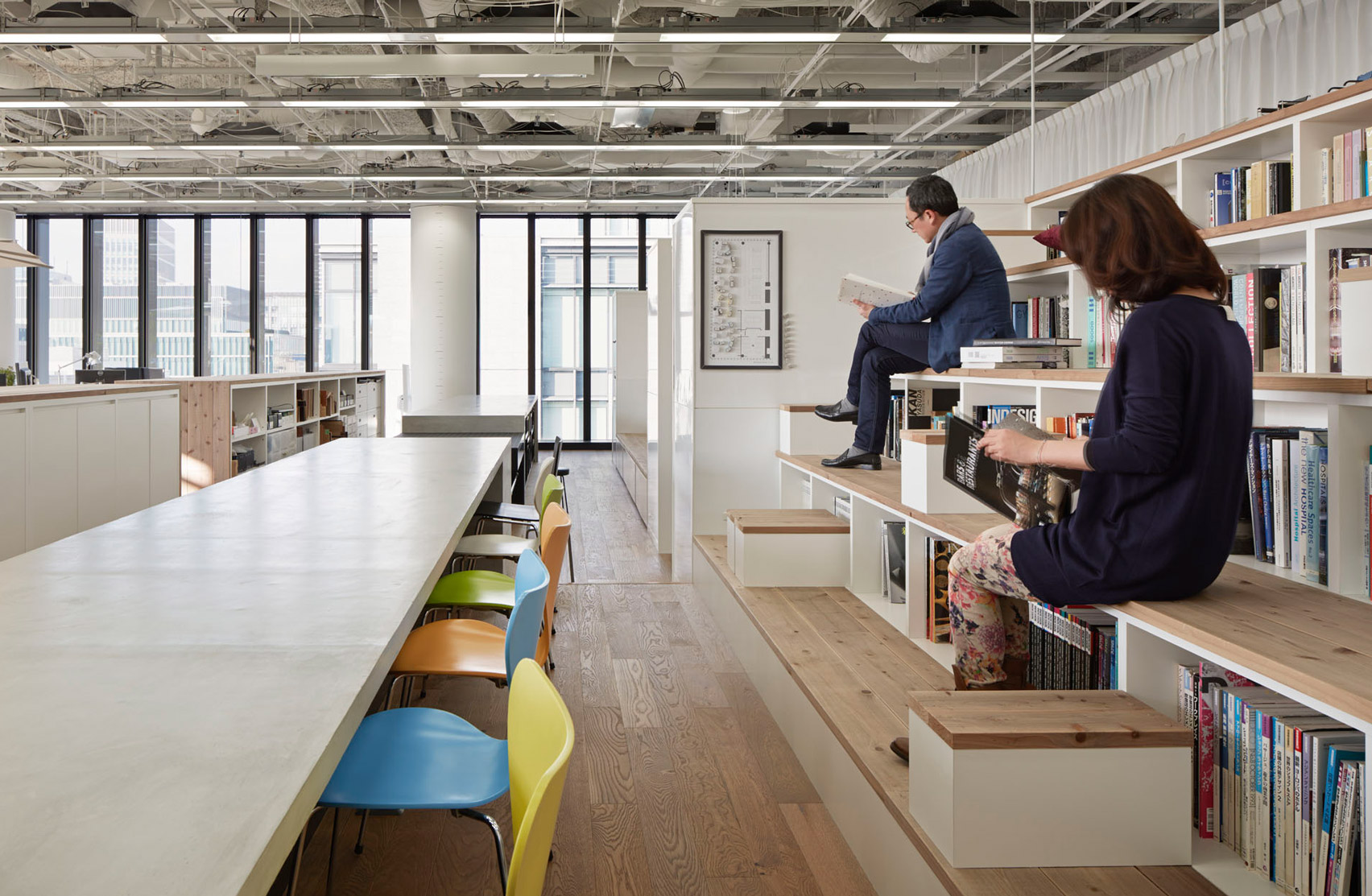
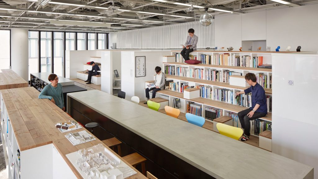
Books and magazines can be found in the hollowed-out steps of this bleacher-style seating structure, located at the centre of the Nikken Space Design offices in Osaka.

Built from recycled scaffolding planks and complete with small side tables, the rows of seating-cum-bookshelves encourage staff to pick up a book at any time to help support their creativity.

Find out more about Nikken Space Design offices ›


Bleacher seating at Airbnb Singapore

Airbnb offices, Singapore, by Farm

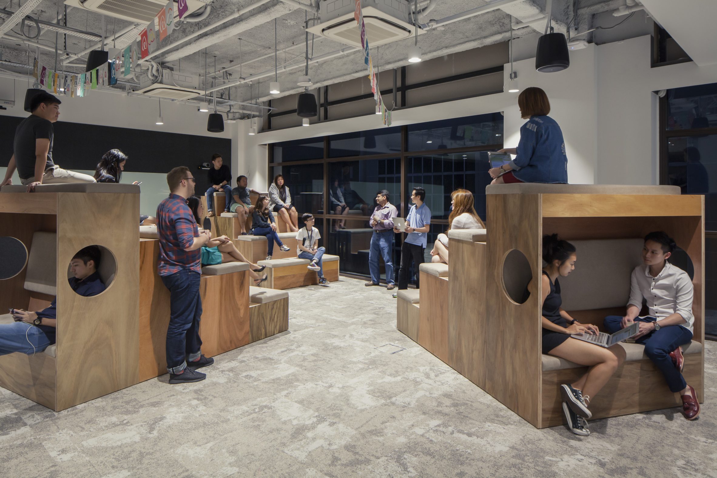
At Airbnb's Singapore office, local studio Farm positioned a group of small wooden bleachers in a room for informal meetings and presentations.

Each bank is lined with four rows of cushioned seating and also incorporates a small nook at its rear. Fitted with benches, these nooks provide employees with a cosy space to work alone or with colleagues.

Find out more about Airbnb offices ›


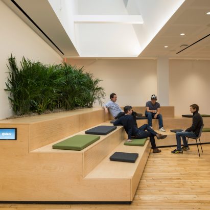
Stepped seating at the Slack offices by SnøhettaPhoto is by Michael Grimm

Slack offices, USA, by Snøhetta

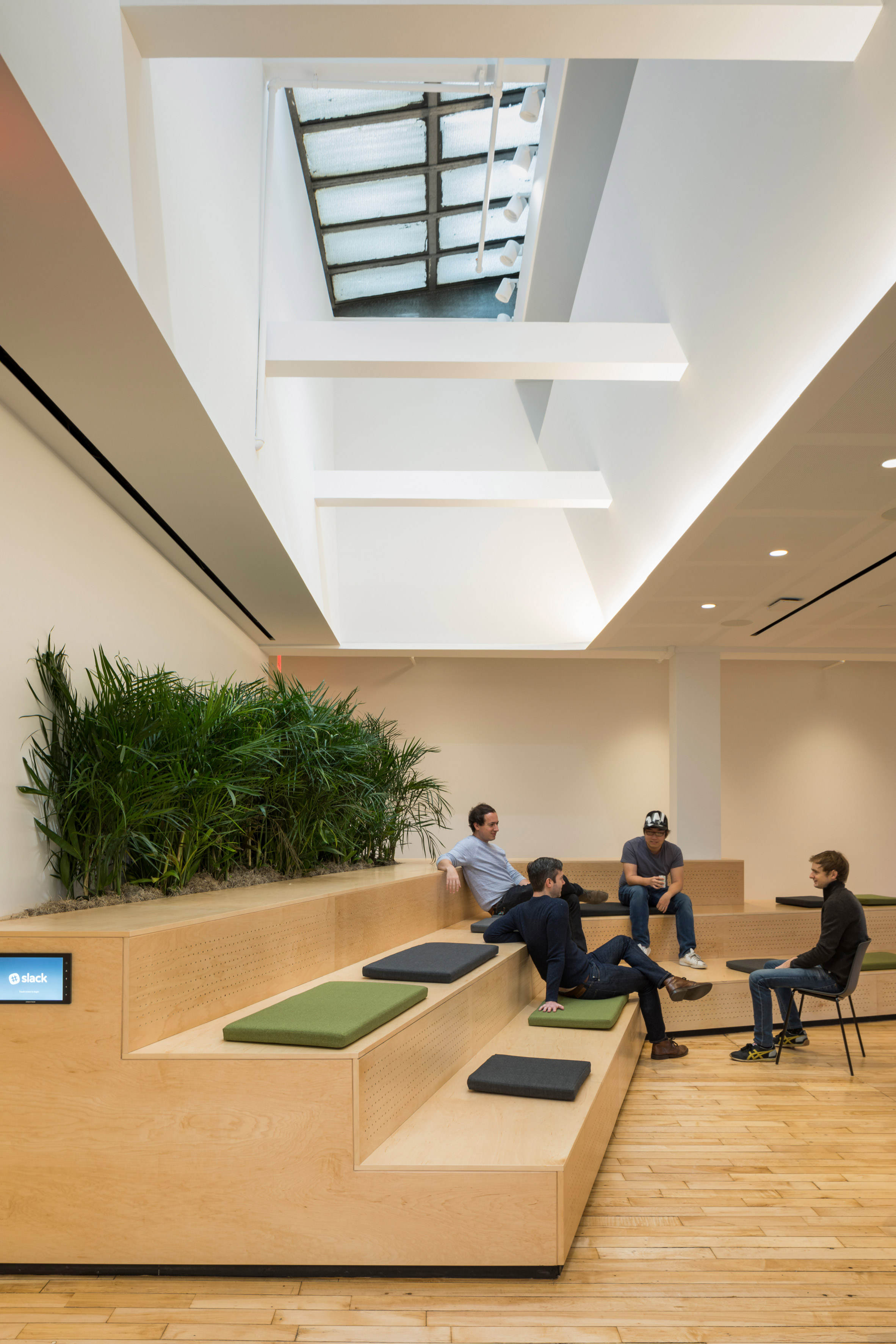
Wooden stadium-like seating also features at the Slack offices in New York, which Snøhetta created to suit "a variety of social interactions and work styles".

Positioned at the heart of the office, the large plywood steps are used for everything from informal conversations between colleagues to large company presentations. Snøhetta incorporated plants and a mix of cushions that help to soften its visual impact.

Find out more about Slack offices ›


Auditorium with stepped seating by COBEPhoto is by Rasmus Hjortshoj – COAST

Red Cross Volunteer House, Denmark, by Cobe

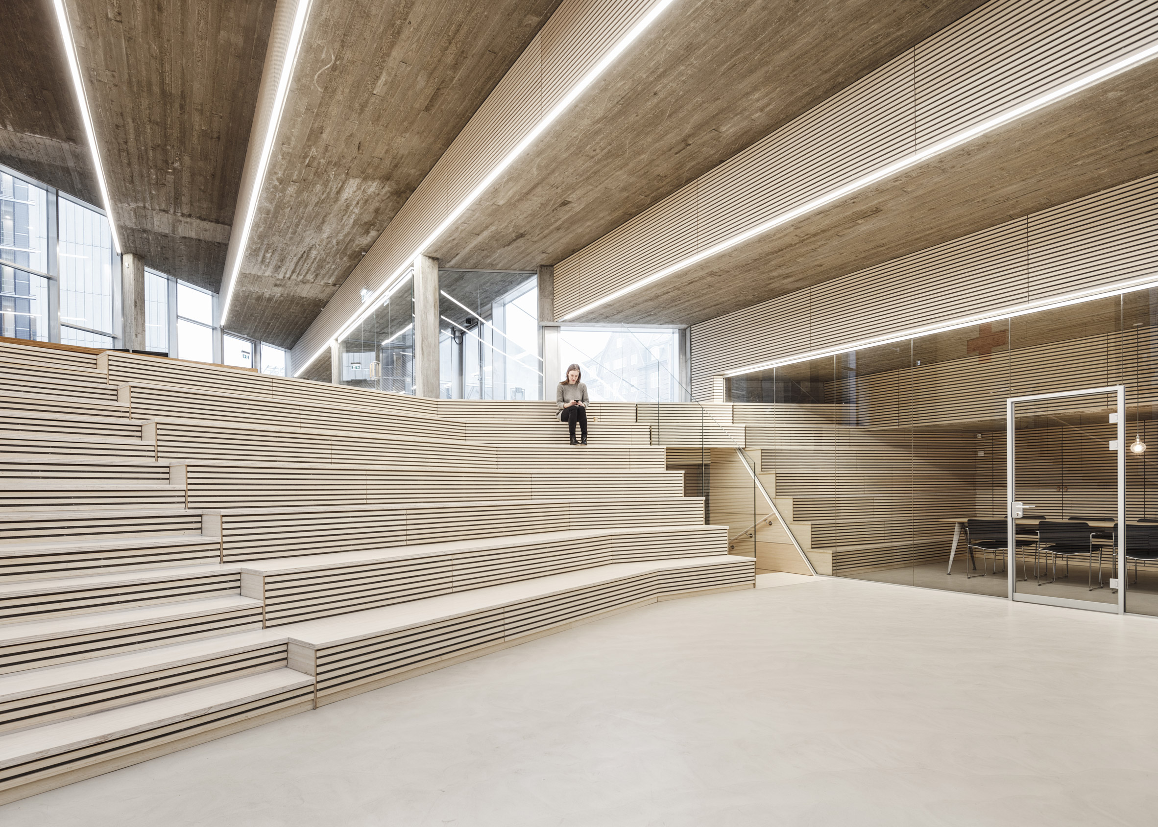
Architecture studio Cobe lined one side of this auditorium with tiered seating for the volunteer training, meetings and events held at the Red Cross Volunteer House in Copenhagen.

It is framed by a dramatic stepped ceiling cast from concrete, which is the inversion of the stepped seating on top of the building that acts as a public meeting place.

Find out more about Red Cross Volunteer House ›

This is the latest in our series of lookbooks providing curated visual inspiration from Dezeen's image archive. For more inspiration see previous lookbooks showcasinghomely office interiors, workspaces filled with plants and garden studios for remote working.

The post Ten offices with wooden bleachers that c​​ater for collaboration appeared first on Dezeen.

#all #interiors #lookbooks #instagram #bleachers #officeinteriors