#canadianhouses

dezeen@xn--y9azesw6bu.xn--y9a3aq

Toronto beach house by Odami resolves "contradictory" context between waterfront and city
image

Beach houses Odami

Canadian studio Odami has completed the interiors of a split-level home in Toronto, using light tones that nod to the nearby beaches of Lake Ontario.

The Beaches House was completed for a client living near the city's waterfront, which is lined with long stretches of sandy beaches.

Odami's design for the interiors drew inspiration from typical beach homes, while also offering a contemporary living environment in Canada's largest city.
The Beaches HouseThe Beaches House takes cues from typical beach homes

"Toronto's Beaches neighbourhood presents a peculiar condition within the city," said the studio, led by Aránzazu González Bernardo and Michael Norman Fohring.

"To experience the area is to seamlessly transition between a natural and calm landscape, and an urban and lively atmosphere," they added.
Split-level homeThe split-level home is located in Toronto

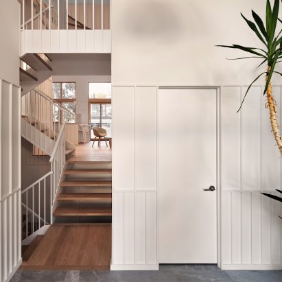
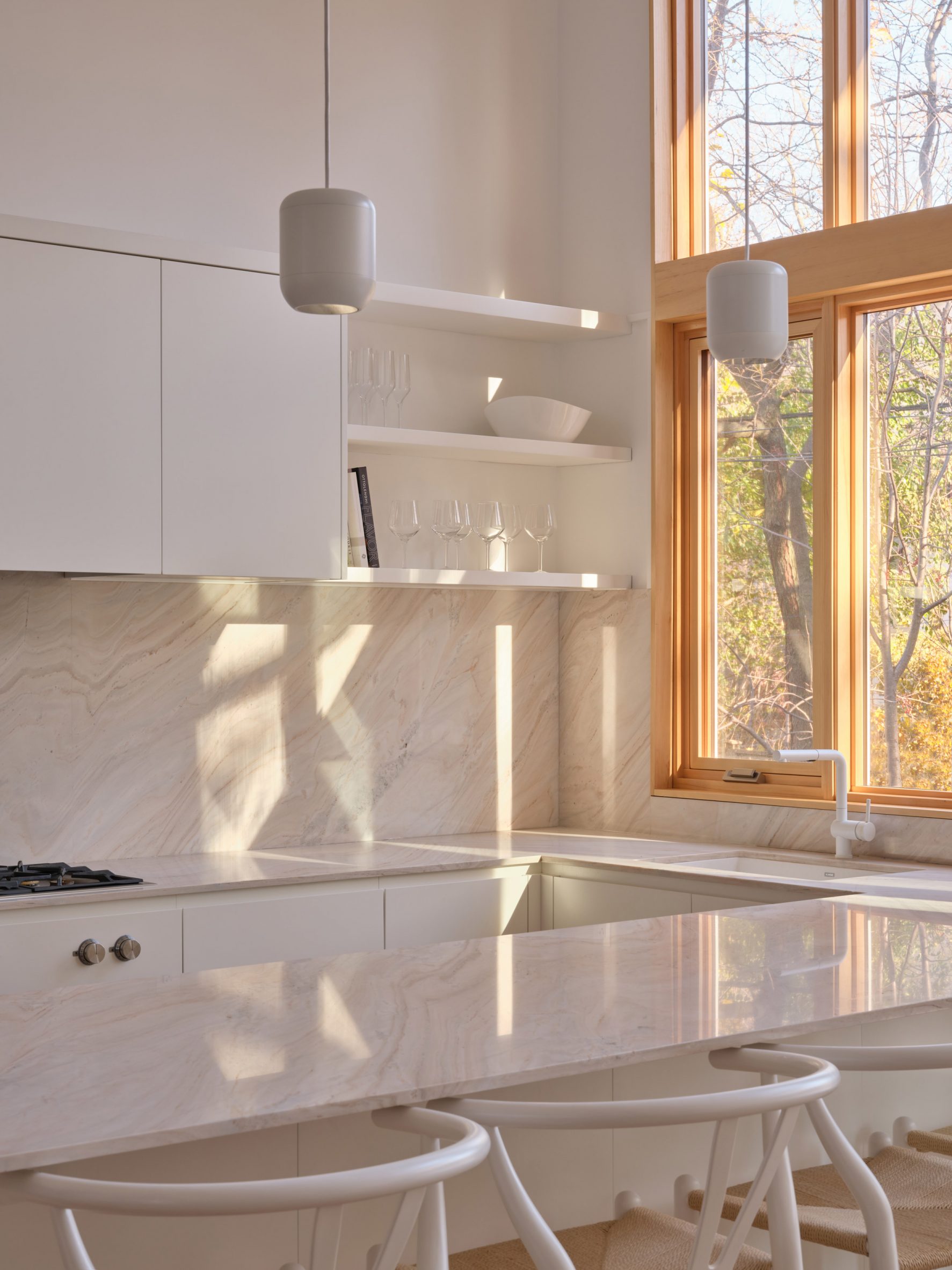
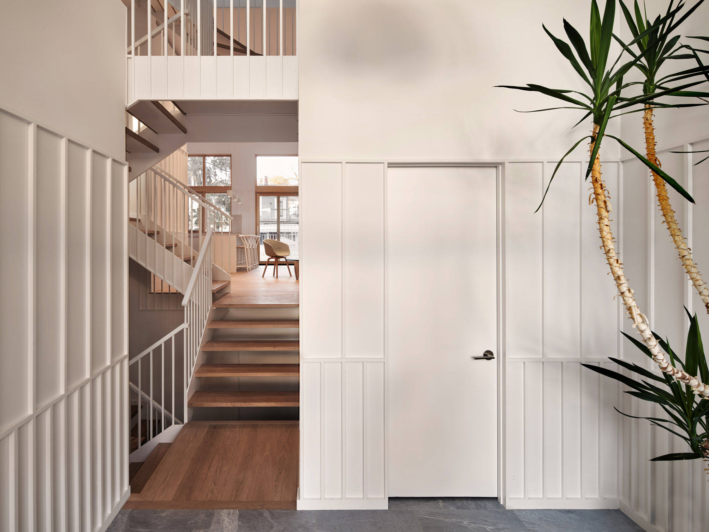
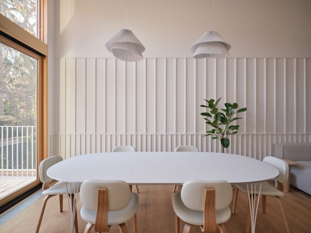
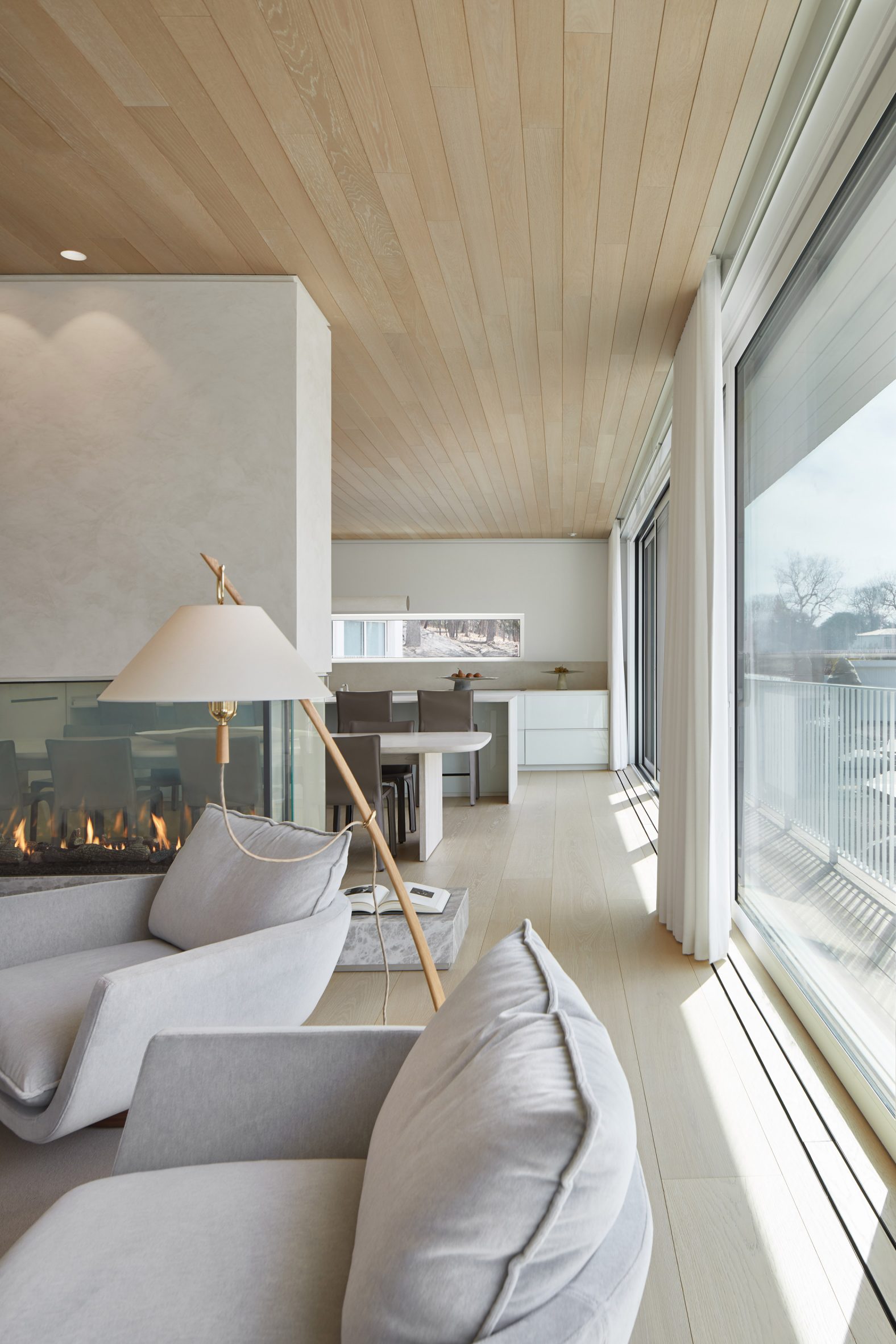
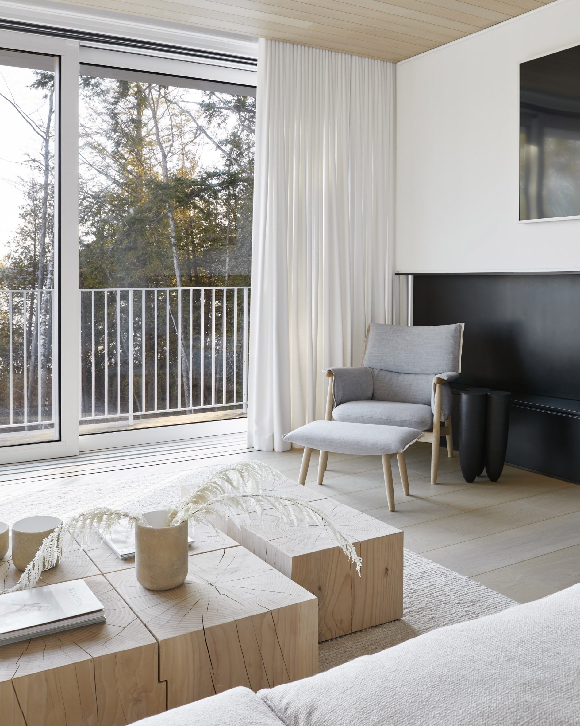
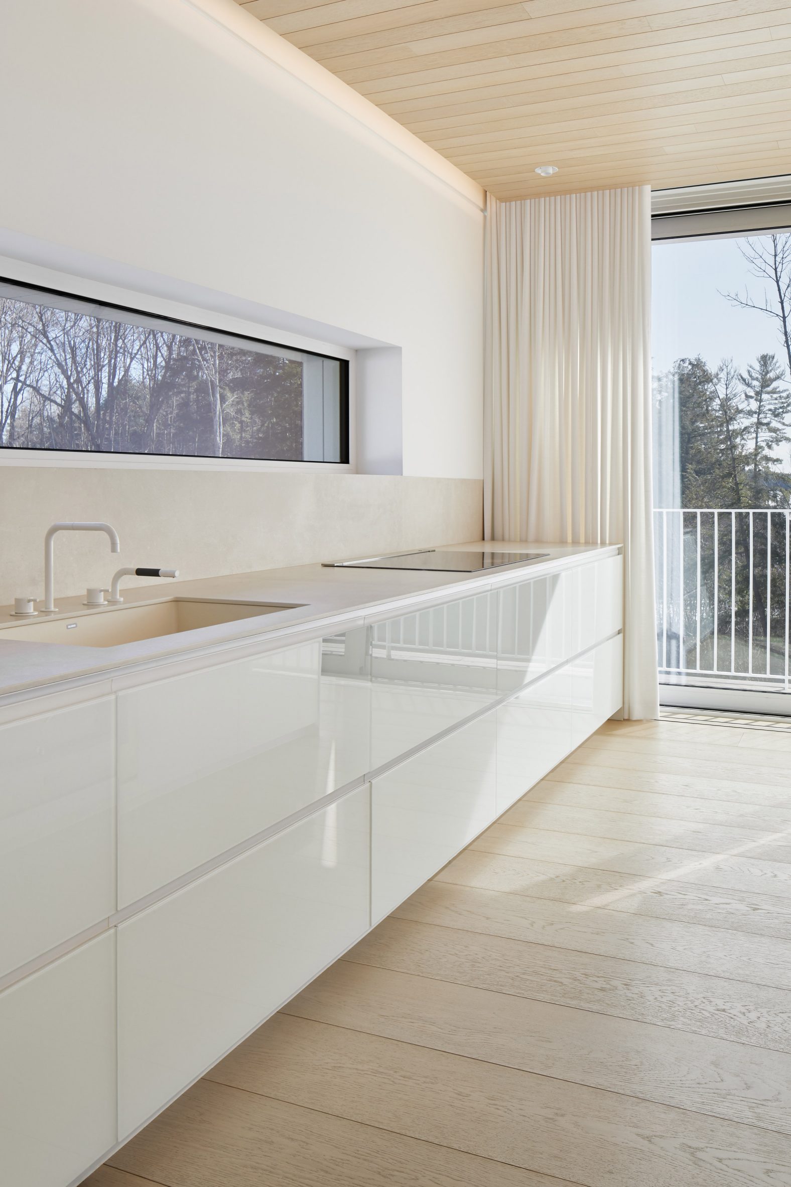
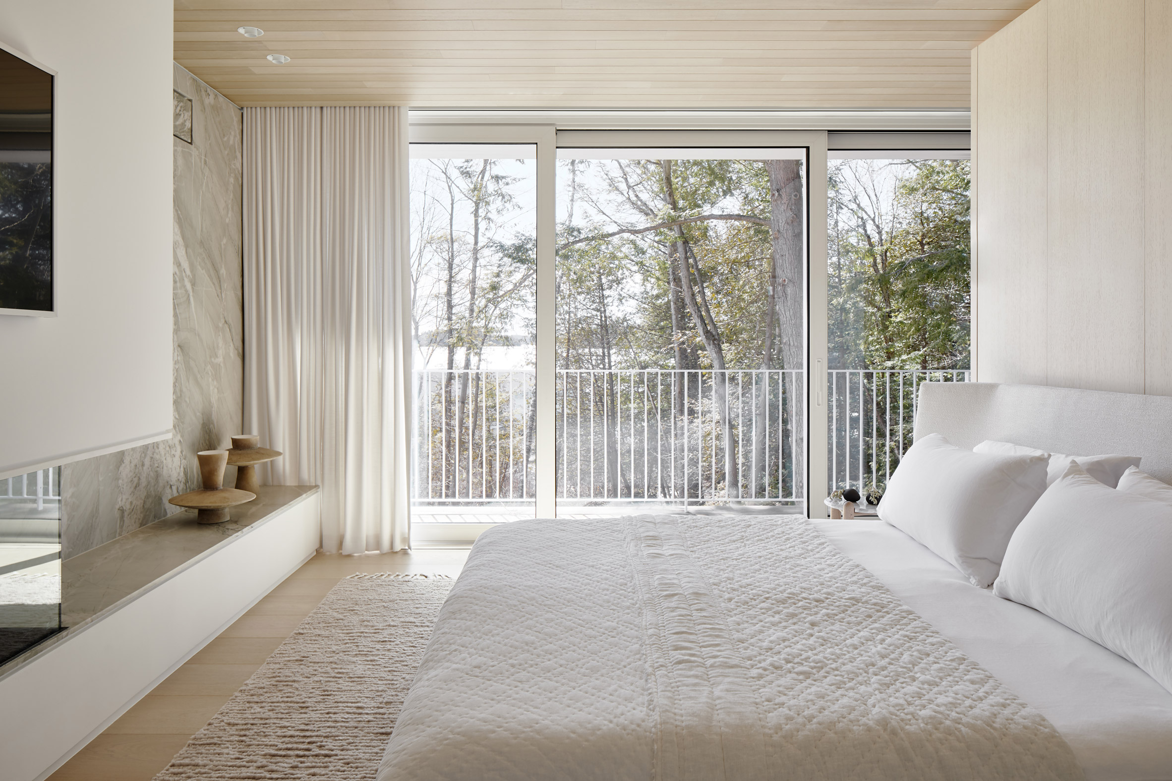
Odami's interior palette features typical beach-inspired finishes, such as textured wall panels of varying widths, sand-hued countertops, and plenty of tropical plants throughout the home.

Throughout the living space, light wooden floors and creamy tones offer a tranquil environment.
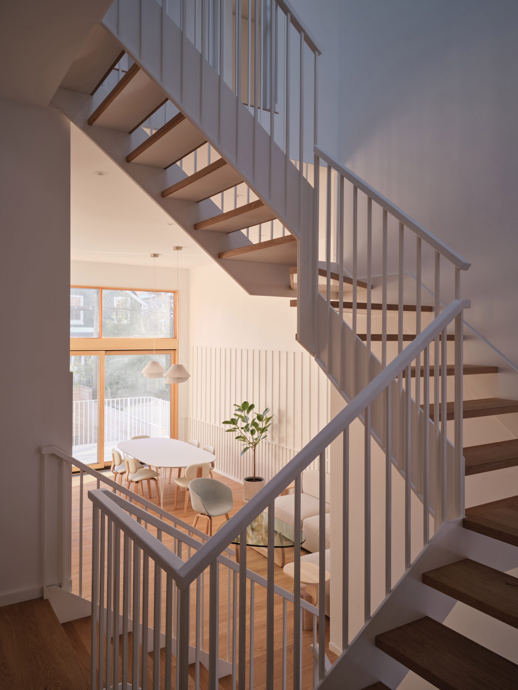
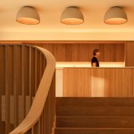
Staircase in Canadian houseA skylight illuminates the steel-and-wood staircase

"Responsible for the interior design, our goal was to create a home which would reflect this contradictory context: a house which would belong as much to the city as it would to a beach far removed from it," Odami explained.

At the centre of the house, a skylight illuminates the steel-and-wood staircase, helping to brighten the interiors and draw visitors upstairs as they move through the home.

[ Staircase leading up to oak kitchen
Read:

Oak staircase links split levels of Canadian house by Omar Gandhi

](https://www.dezeen.com/2022/02/07/1255-house-toronto-oak-staircase-omar-gandhi-architect/)

"The central staircase, which winds its way up through the split levels of the house, was detailed with thin steel pickets and floating treads, continuing the rhythmic language of the paneling," said the designers.

This calmer palette contrasts some darker materials that were used in circulation spaces, such as a grey stone in the entrance hallway, and a bathroom where the walls and floors are lined with a dark terrazzo.
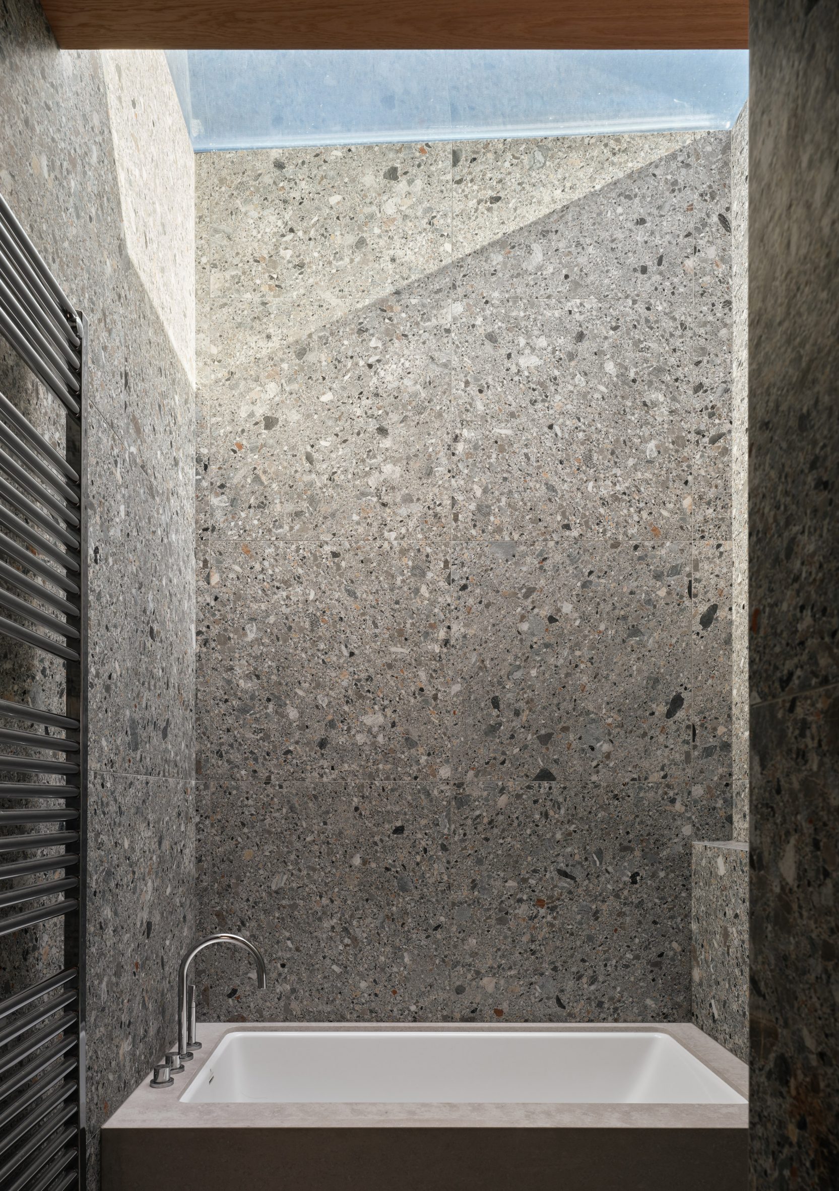
Odami showerOdami added dark terrazzo elements to the bathroom

"In the bedrooms and bathrooms of the last floor, the sequence comes to rest, as light, repetitive elements give way to moments of stillness, calm, and dense materiality," the studio explained.

Odami was founded in 2017 in Toronto. Other projects from the Canadian studio include a collection of wooden furniture that was crafted from the same dying tree, and a restaurant where the walls are lined with roughly troweled plaster.

Odami interiorThe darker tones contrast with the home's lighter elements

Also in Toronto, the Winter Stations design competition recently unveiled the pavilions for its 2022 edition.

The photography is byDoublespace Photography.

The post Toronto beach house by Odami resolves "contradictory" context between waterfront and city appeared first on Dezeen.

#all #interiors #residential #houses #canada #toronto #canadianhouses #odami
dezeen@xn--y9azesw6bu.xn--y9a3aq

Saunders Architecture designs "ribbon-like" Lily Pad house in Ontario

image

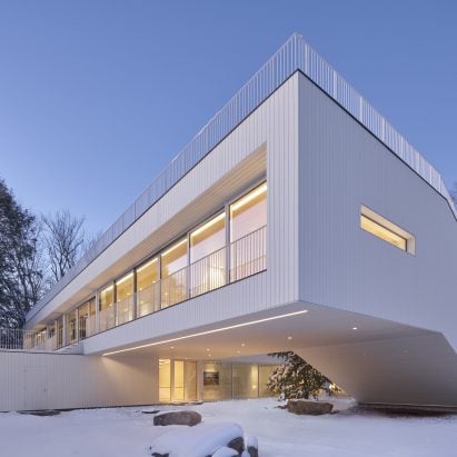
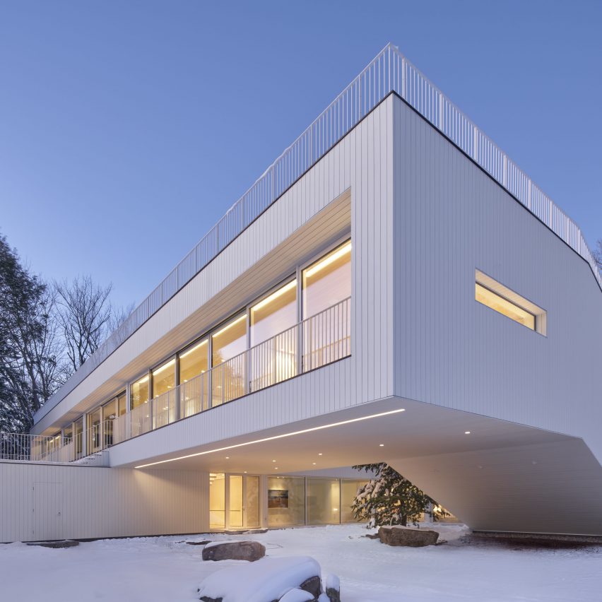
Canadian architect Todd Saunders has shaped this white house next to Lake Rousseau to create a continuous route through its interior and exterior spaces.

Saunders Architecture designed the Lily Pad residence for a Toronto couple that wanted a rural retreat in the Muskoka region north of the city.

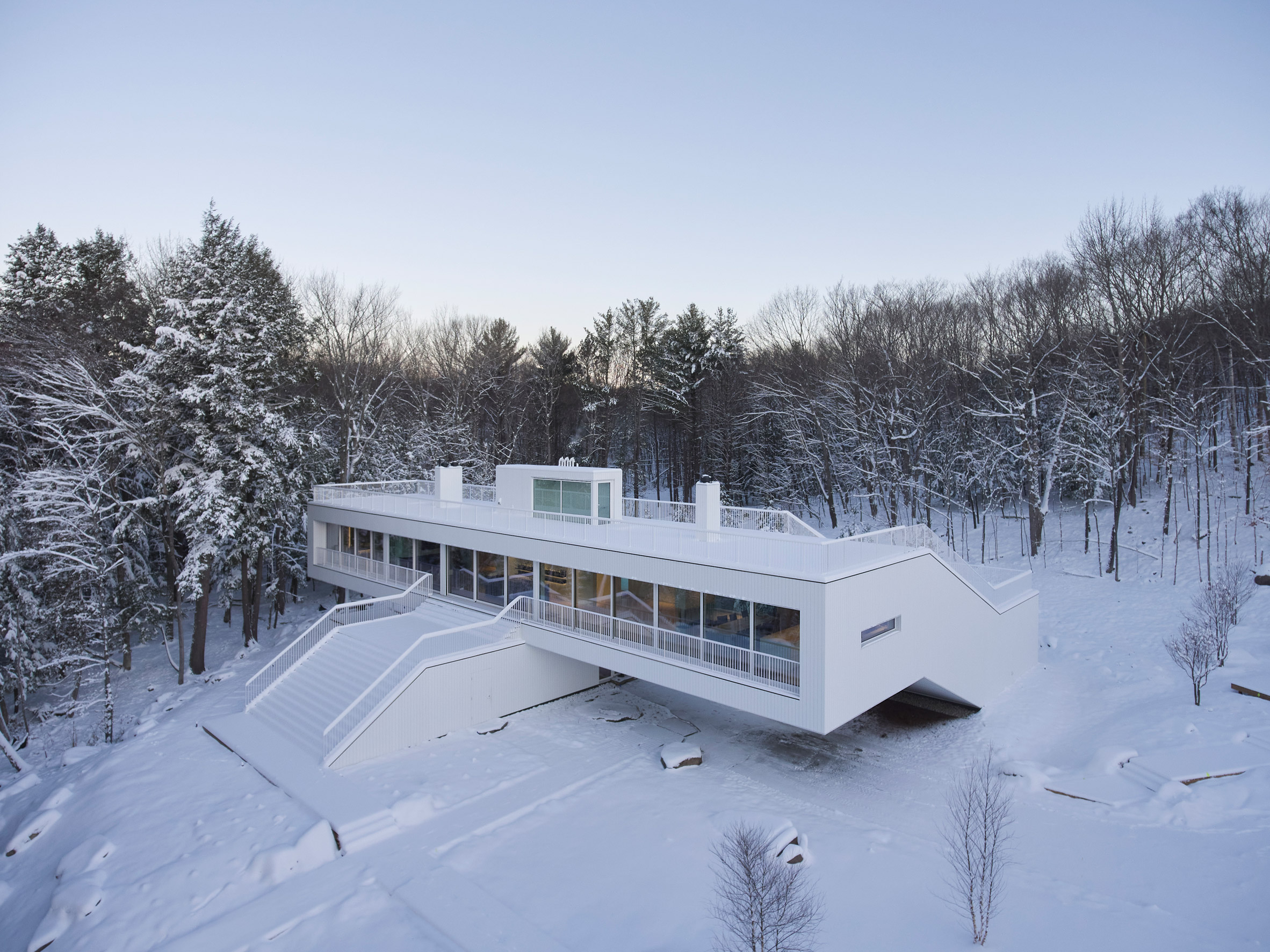
Aerial view of Lily Pad houseThe Lily Pad house wraps around and over on itself
The area is dotted with rivers and lakes, and has a particular architectural vernacular that includes cottages and boathouses with ample porches, decks and terraces.

"[The clients] found a 16-acre site on the edge of Lake Rosseau... and began thinking about building something for themselves that would integrate with the setting but also be decidedly modern," said the firm, which is based in Bergen, Norway.

Aerial view of Lily Pad houseSaunders Architecture designed the house as a modernist take on the vernacular of Muskoka
On a trip to Fogo Island – an artists' community off the coast of Newfoundland – the clients visited some of the studios designed by Saunders, and chose to commission him to design their house.

The project encompassed a five-bedroom residence, a separate guesthouse, and a boathouse on the lake. Matt Ryan served as the local architect of record.

Living room looking through to the kitchenLarge glazed panels on the upper floor overlook Lake Rosseau
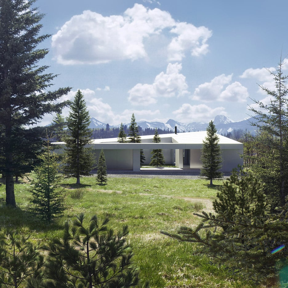
"Both the architect and his clients wanted to maximise the sense of connection with the landscape, while creating a home with a dynamic and original character of its own," the Saunders Architecture team said.

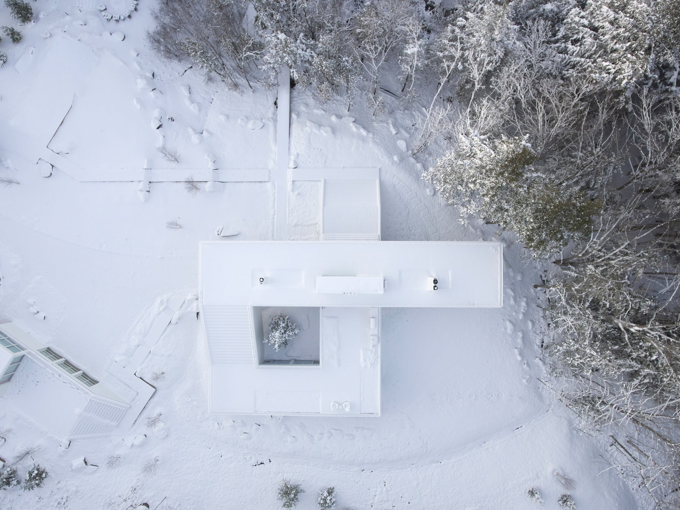
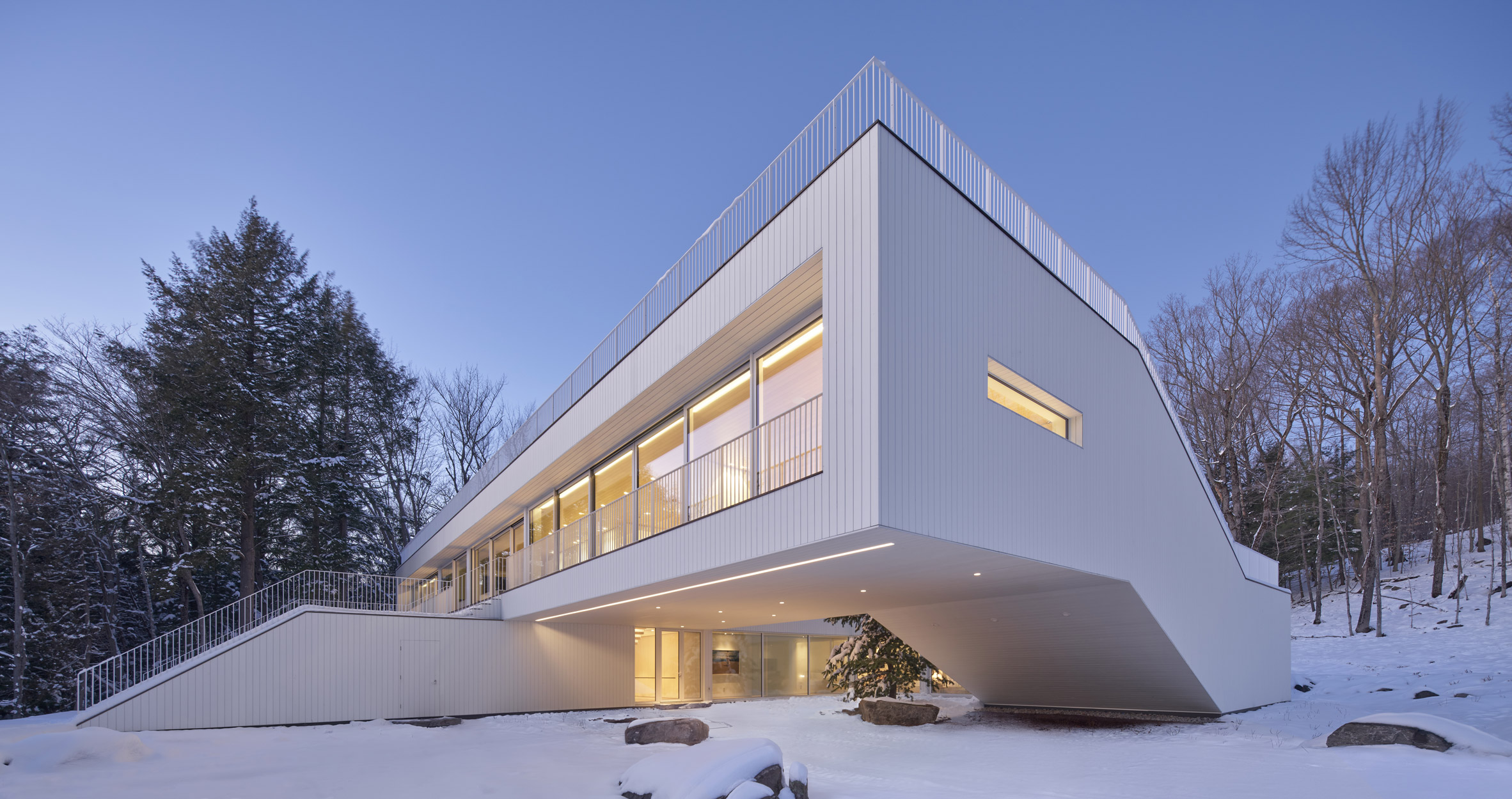
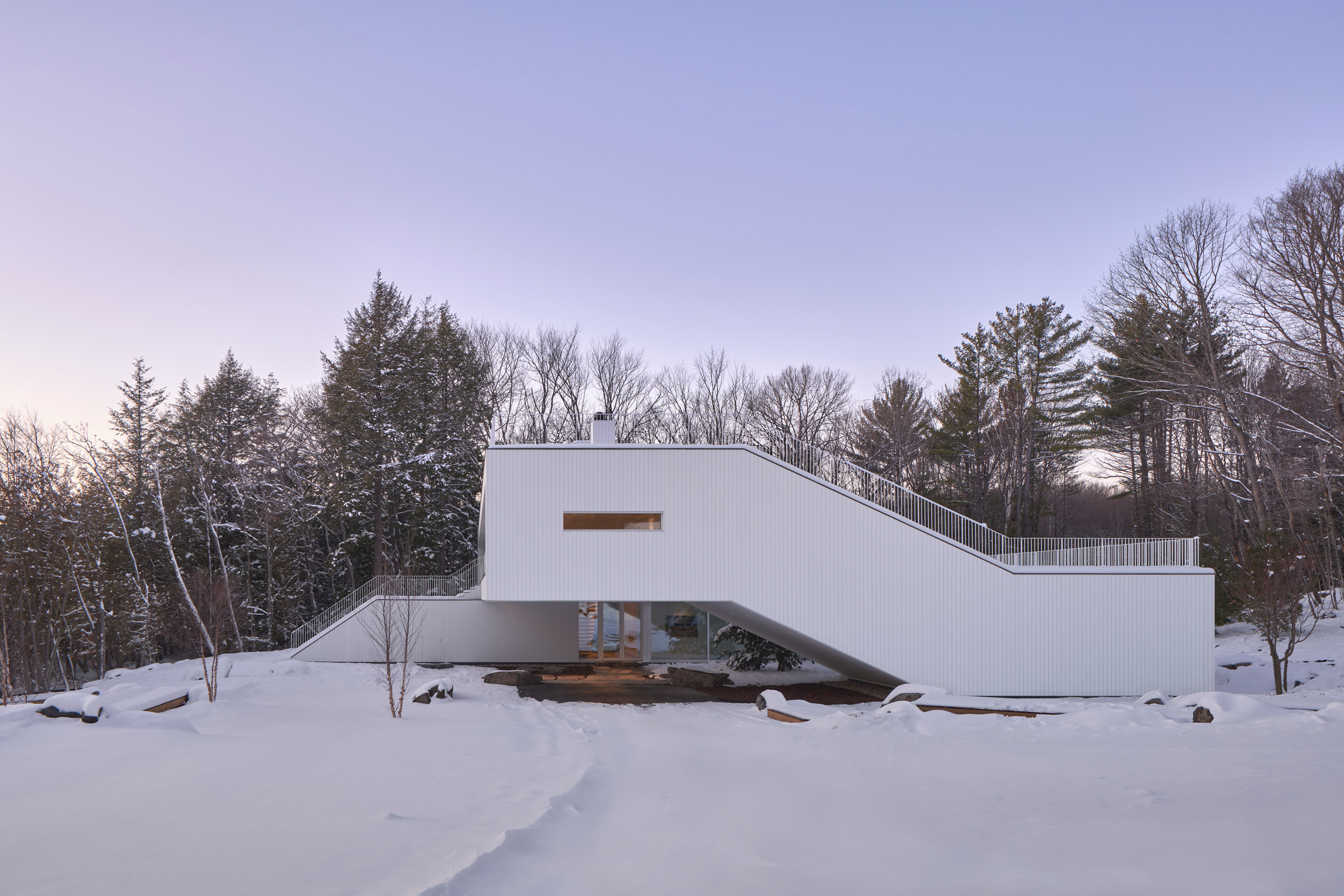
The main house comprises two rectangular bars arranged in a cross formation, one on top of the other.

Minimal furniture in the living roomThe glass doors open up to turn the living area into a giant porch
Two ends are joined together to form a square on one side, resulting in a continuous "ribbon-like" form thanks to an angled section that bridges the level change.

Entered via a covered carport, the ground level has four bedrooms and ensuite bathrooms. A staircase next to the door leads directly upstairs, thanks to its placement at the intersection of the main volumes.

Neutral finishes in the kitchenStudio Author designed the neutral interiors
An alternative route to the first floor is via the media room, where stairs and bleacher-style seating follow the inclined portion of the building.

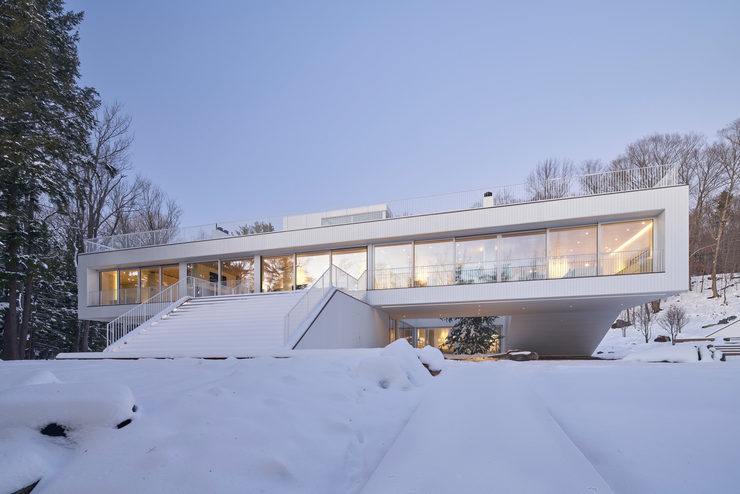
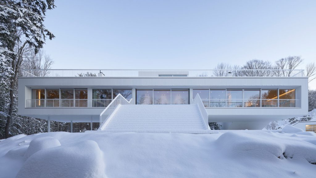
The house can also be accessed from a grand exterior staircase that rises from the lake to the glazed upper facade that overlooks it.

Main bedroom with views of the forestColours and materials were chosen to complement the surroundings
Sliding panels open to a formal dining area and more casual lounge seating on either side.

"When the glass slides back, this space becomes – in effect – an enticing open porch, or 'Muskoka room'," the studio said.

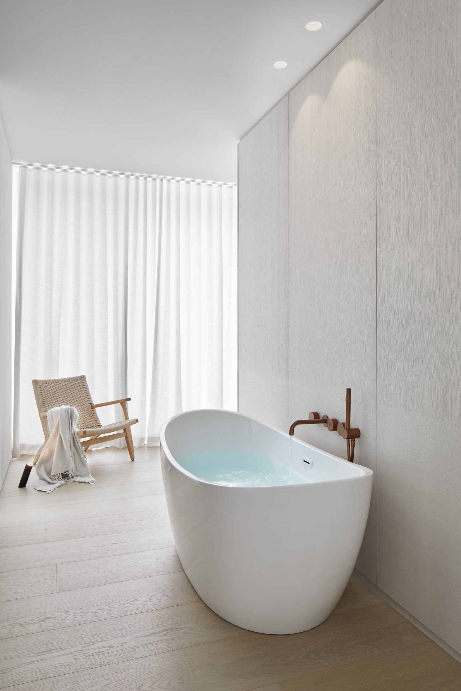
Freestanding bathtubThe interiors have a minimal yet cosy atmosphere
Fireplaces divide the open-plan living space from the kitchen on one side and the main bedroom suite on the other.

"Floating beyond the main body of the house, the master bedroom levitates in a dramatic manner, becoming a lookout station facing the lake view to the front," said the firm.

[ Carraig Ridge Houses by Saunders Architecture

Read:

Saunders Architecture unveils five house designs for Canadian wilderness development

](https://www.dezeen.com/2016/02/01/carraig-ridge-five-house-design-project-saunders-architecture-alberta-canada/)

Continuing the axis from the external stairs, more glass doors lead out to the roof.

An outdoor route traces the circulation path inside, rising up over the media room to reach the top terrace, which is also accessible by elevator.

Glazed upper storey facing the lakeA grand external staircase provides direct access to the first floor
"The roof terrace becomes the final destination within an ambitious 'promenade architecturale' – somewhat reminiscent of the journey seen at Le Corbusier's iconic Villa Savoye – that takes you up from the ground plane towards the floating first floor and, finally, to the roof," said Saunders Architecture.

The guest house has a similar modernist aesthetic as the main residence, while the boathouse is clad in timber to reference the local boat-building tradition.

Corner angle of Lily Pad houseArranged like a cross, the home's upper and lower volumes are joined by an angled portion
Interiors by Ontario-based Studio Author draw from the surroundings, with blond wood, white cabinetry, marbled stone and pale furniture used to create a neutral yet cosy atmosphere.

"The details and palette are reflective of the hues and patterns of the water, sand and stone native to Muskoka," the firm said.

Side view showing the inclined portion of the houseThe angled portion houses a media room with tiered seating that follows the incline
Originally from Newfoundland, Todd Saunders founded his studio in 1998 and has worked extensively across Norway, Canada and beyond.

He designed his own house in Bergen with blackened timber cladding, and recently completed a white house overlooking the city in collaboration with Swedish design practice Claesson Koivisto Rune.

The photography is courtesy of Saunders Architecture.

The post Saunders Architecture designs "ribbon-like" Lily Pad house in Ontario appeared first on Dezeen.

#all #architecture #residential #houses #canada #saundersarchitecture #ontario #canadianhouses #whitehouses

dezeen@xn--y9azesw6bu.xn--y9a3aq

TBA creates elevated extension for Berri House in Montreal

image

Berri House

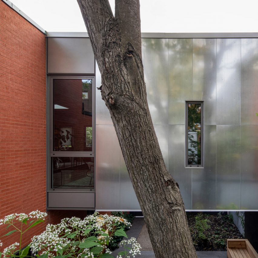
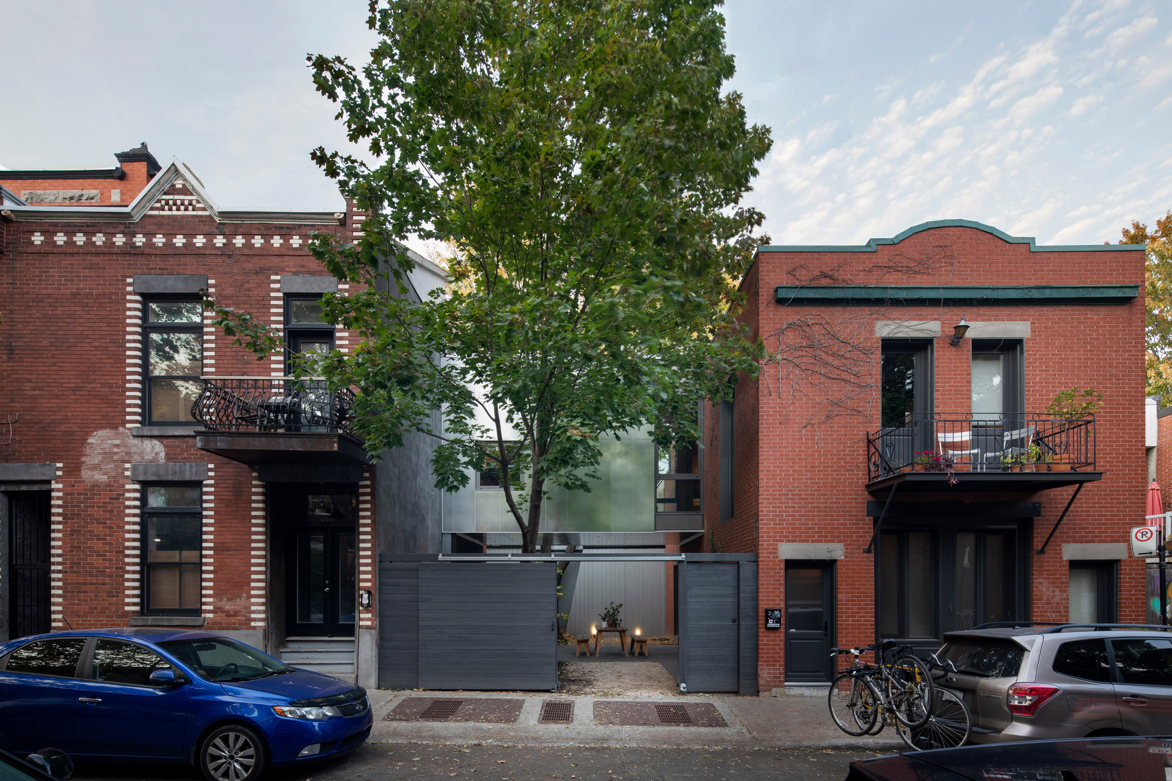
A residential extension wrapped in galvanised metal is positioned over a garden and attached to an old carriage house in this project by Montreal studio Thomas Balaban Architecte.

The Berri House is located on a short and narrow street in the city's Plateau Mont-Royal neighbourhood – a sought-after area with architectural preservation rules and height restrictions.

Berri House by TBAThe Berri House is located on a short street in Montreal
For a young family, local firm Thomas Balaban Architecte (TBA) was tasked with enlarging a former carriage house dating to 1910. The 130-square-metre brick building sits on a lot that is irregularly shaped due to the subdivision of a large property spanning two streets.

"The cadastral transaction left the new lot with only a small side yard and a boxed-in exterior space at the back," the studio said.

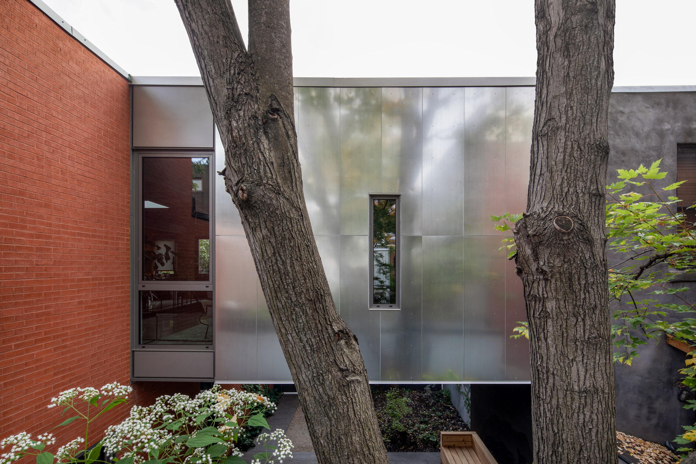
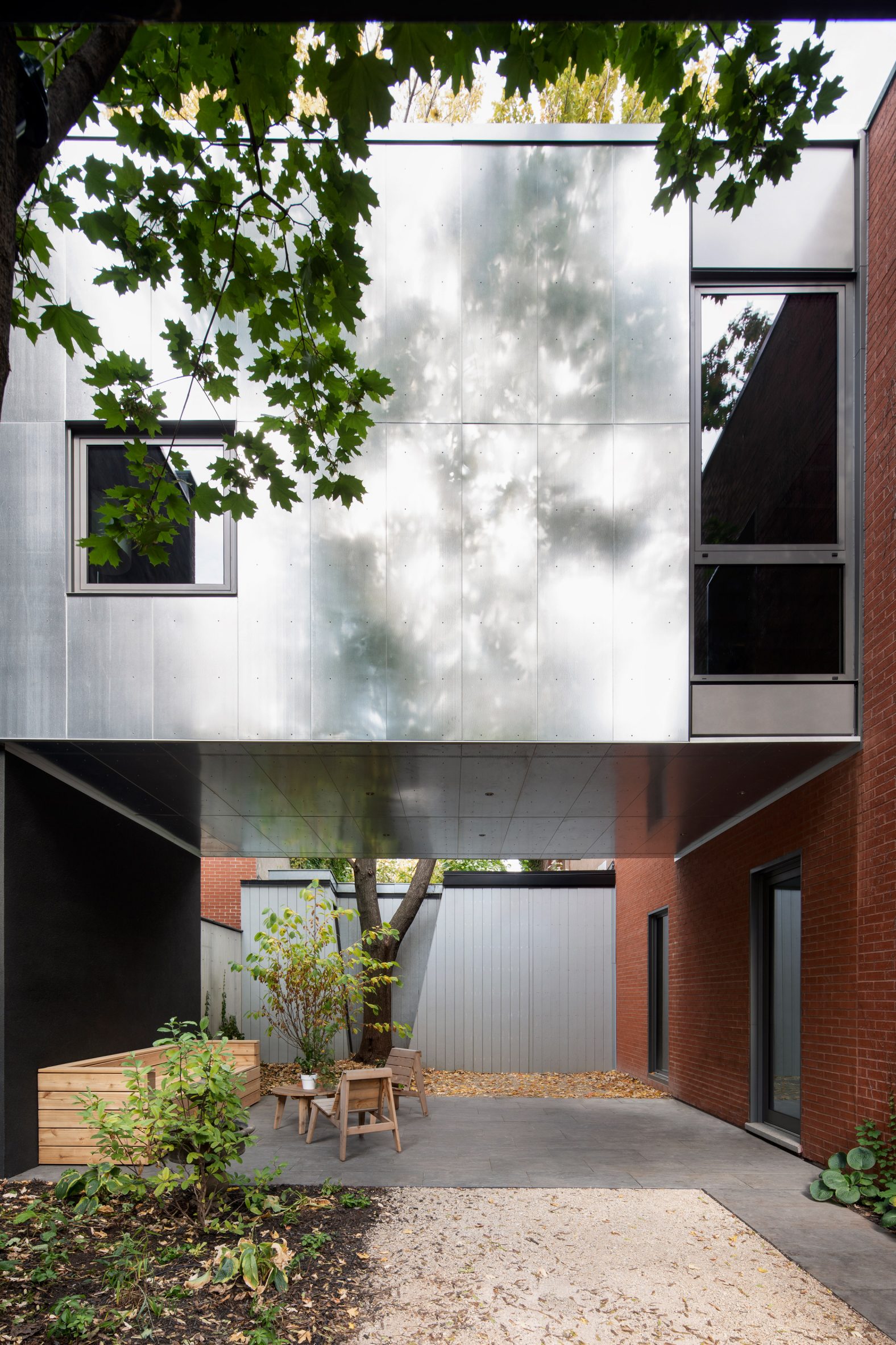
Galvanised metal buildingAn extension is wrapped in galvanised steel
"This brought about the project's principal challenge: how to expand the footprint of the building while preserving its character and its very limited outdoor space."

The architects conceived an extension that is adjoined to the home's first floor and positioned over the ground-level garden.

TBA extension at Berri HouseOpenings were strategically placed to usher in daylight while also giving privacy
Set back from the street behind a painted cedar fence, the extension yields to mature maple trees in the front and rear of the property.

"The position preserves the tree's important presence in the streetscape and prevents damage to their root systems while creating a sheltered private garden below," said TBA.

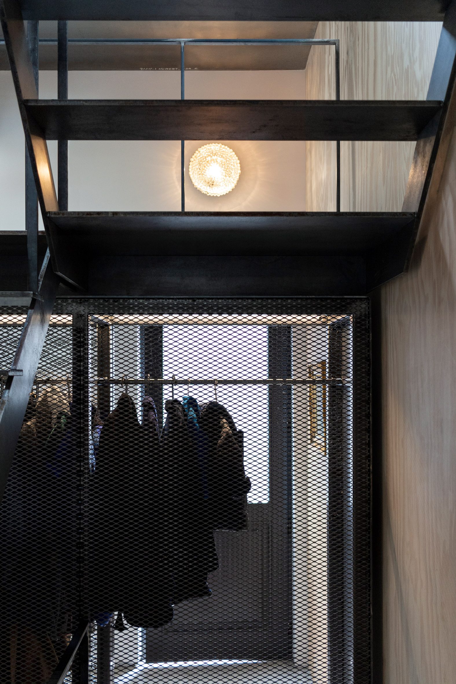
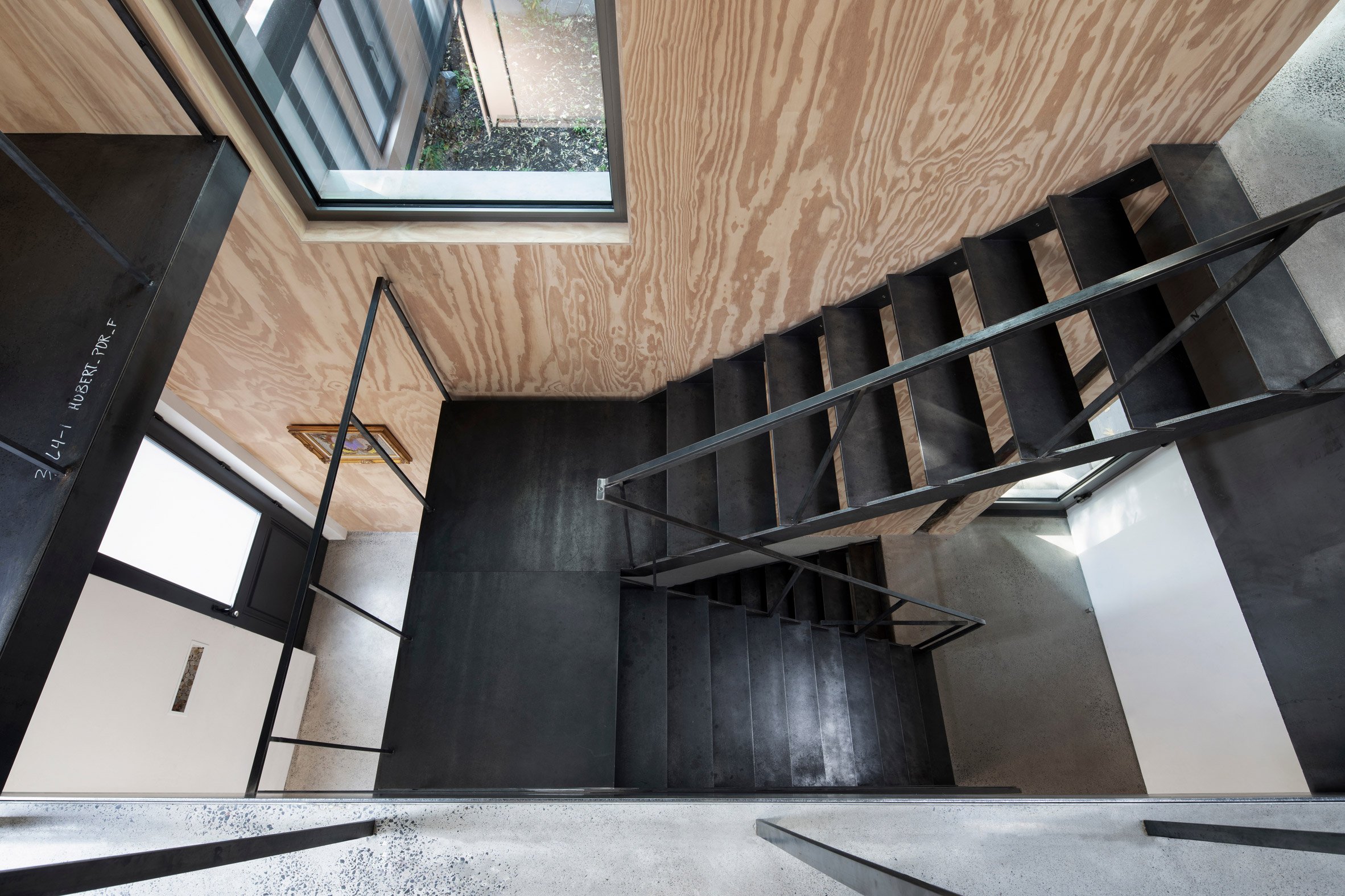
Steel staircaseThe three levels are connected by a new steel staircase near the home's entrance
The extension is clad in galvanised steel panels that reflect daylight into the garden and, visually speaking, endow the volume with a sense of lightness. Openings were strategically placed to usher in daylight while also giving privacy.

The addition's flat detailing and streamlined form are meant to contrast with the adjacent brick structure.

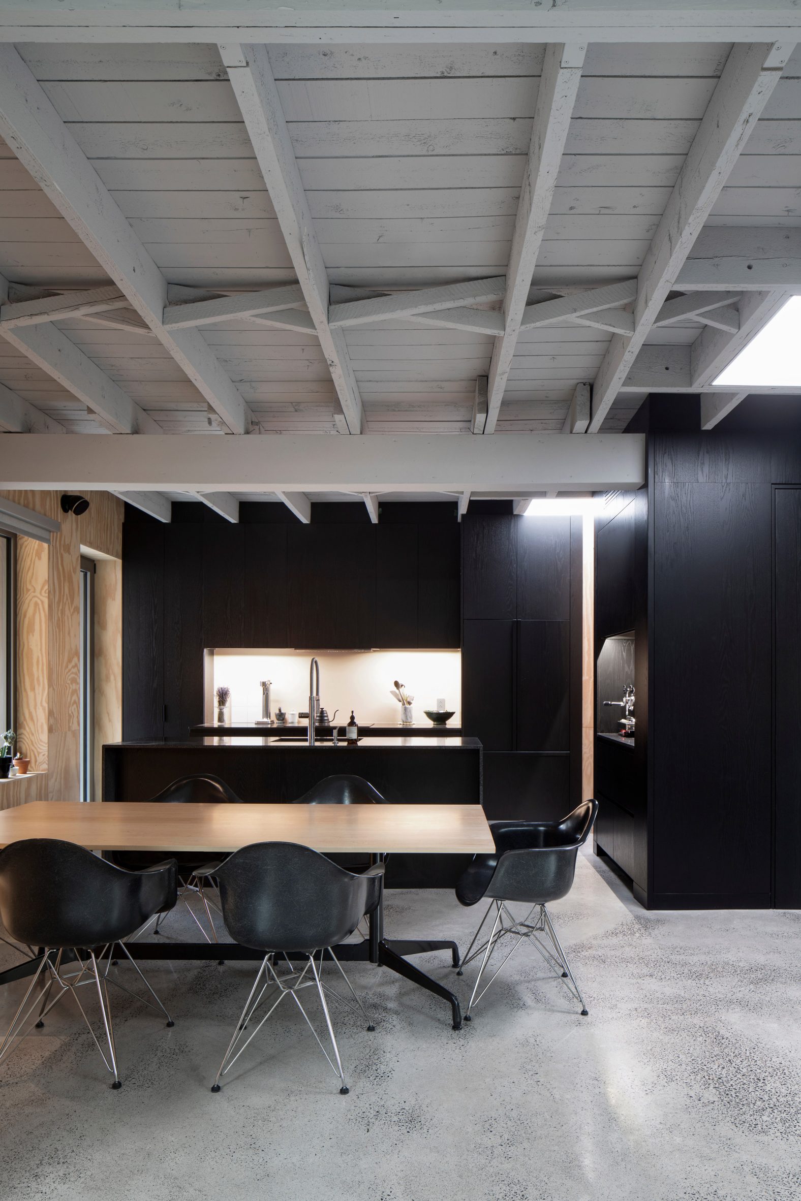
Kitchen in extensionBlack accents and plywood wall cladding feature in the kitchen
"It also reduces the visual impact on adjacent houses situated in tight quarters, showcasing an abstract palette of sky and foliage," the team added.

Over the past century, the carriage house underwent several renovations, although the exterior was largely kept intact. TBA repaired the brick facade and replaced windows.

[ Image of the snug and sleeping area at Loft 62

Read:

Studiotwentysix adds plywood-lined loft extension to Edwardian family home

](https://www.dezeen.com/2022/02/14/studiotwentysix-loft-62-residential-extension-architecture-uk/)

Extensive modifications took place indoors. "Inside, layers of interventions were removed," the team said.

"Stripped down to the original shell of the coach house, the new interiors seek to celebrate the natural qualities of the utilitarian structure and the beauty of everyday construction."

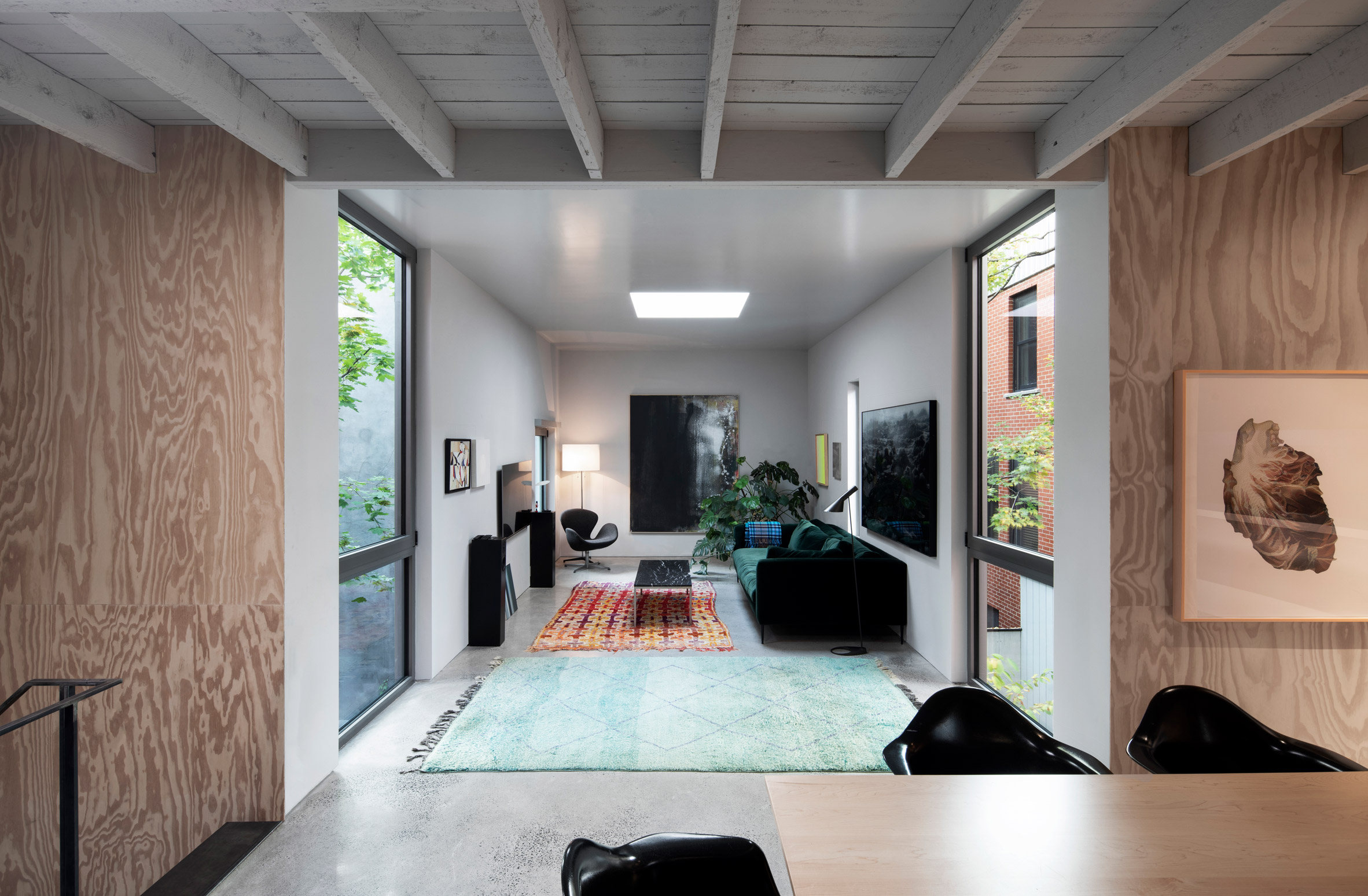
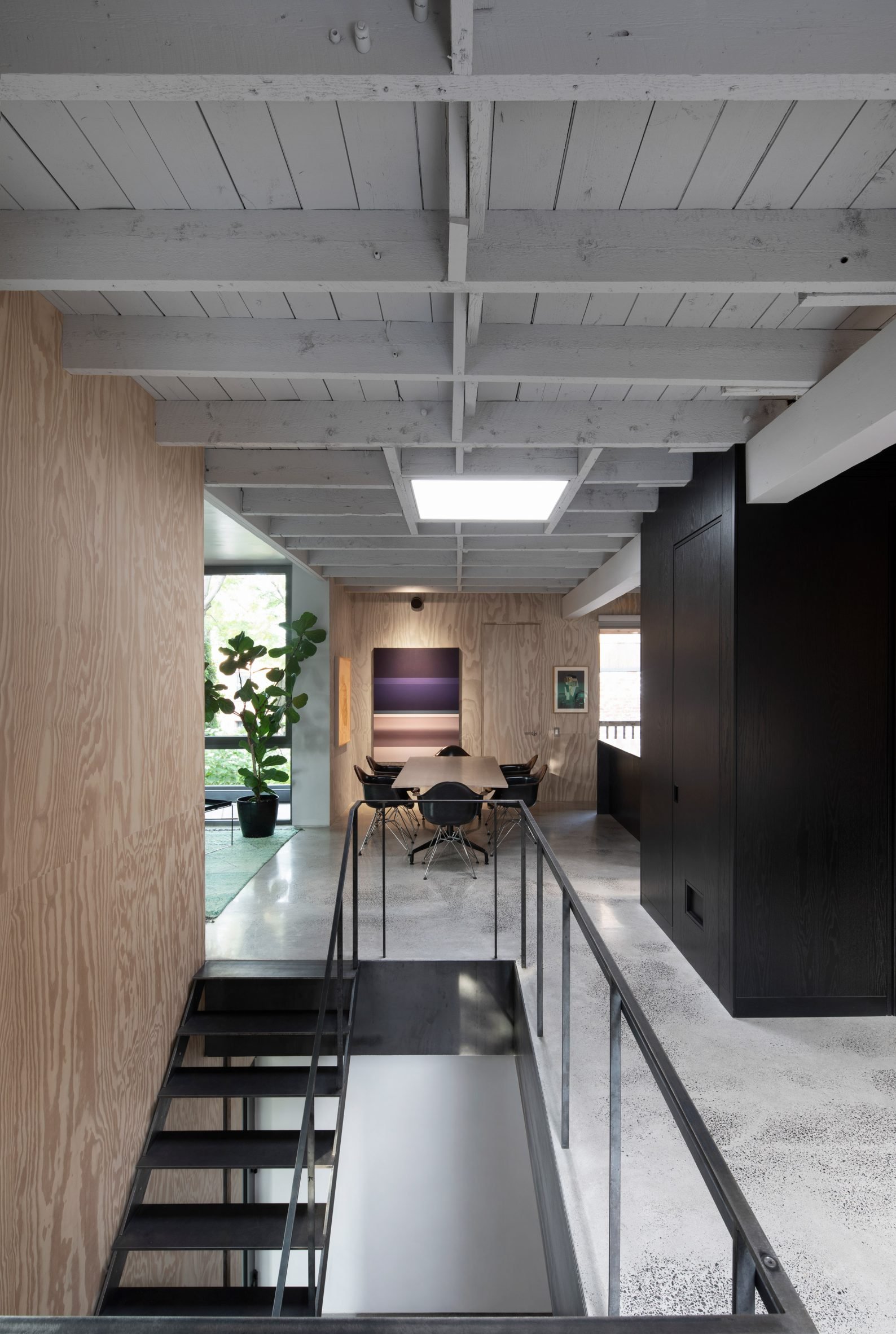
Extension by TBAThe upper level includes a dining room

The ground level holds sleeping areas, while the upper level encompasses a kitchen, dining room and office, along with a living room in the new 28-square-metre extension.

Also on the upper floor, a central structural column was built out to enclose a powder room, closet, stereo equipment and coffee station.

Sliding divisionsSliding divisions help the compact ground floor feel more expansive
The building also has a below-grade level that contains laundry facilities, storage space, a mechanical room and a wine cellar.

The three levels are connected by a new steel staircase near the home's entrance. Sliding divisions help the compact ground floor feel more expansive.

Berri House extensionThe extension is attached to the old carriage house above a garden

Throughout the home, the team used raw materials and minimal detailing to complement the owner's modern furnishings and extensive art collection.

Finishes include polished concrete flooring and plywood wall cladding. Various steel elements are meant to imitate wood joinery.

Windows and skylights bring in daylight and offer a connection to the exterior. Ultimately, they provide "a changing, natural counterpoint to the abstract artwork and photography on display in the house".

Established in 2009 by Tom Balaban, TBA has completed a number of residential projects in Montreal. They include a residential extension with curved glass doors, and a home with a three-tiered courtyard and shimmering aluminium facade.

The photography is byAdrien Williams.


Project credits:

Architect: Thomas Balaban Architecte

Project team: Thomas Balaban (project lead), Maxime Lefebvre, Julia Mana

Structural engineer: Lateral

The post TBA creates elevated extension for Berri House in Montreal appeared first on Dezeen.

#all #architecture #residential #instagram #extensions #houses #canada #residentialextensions #galvanisedsteel #montreal #canadianhouses

dezeen@xn--y9azesw6bu.xn--y9a3aq

L'Abri and Construction Rocket complete Saltbox Passive House in Quebec

image

Saltbox Passive House

This family house in Quebec is modelled on the region's vernacular architecture and was designed to Passive House standards of energy efficiency.

Canadian architecture firm L'Abri and contractor Construction Rocket collaborated closely on the creation of the Saltbox Passive House, the primary residence for a family of four.

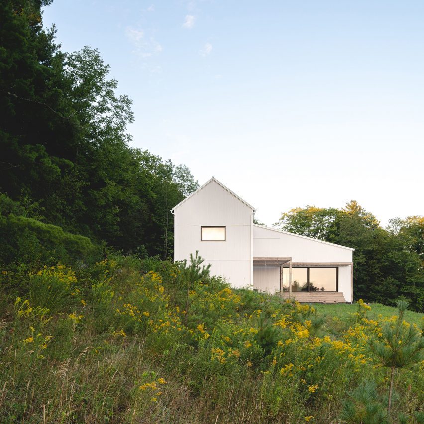
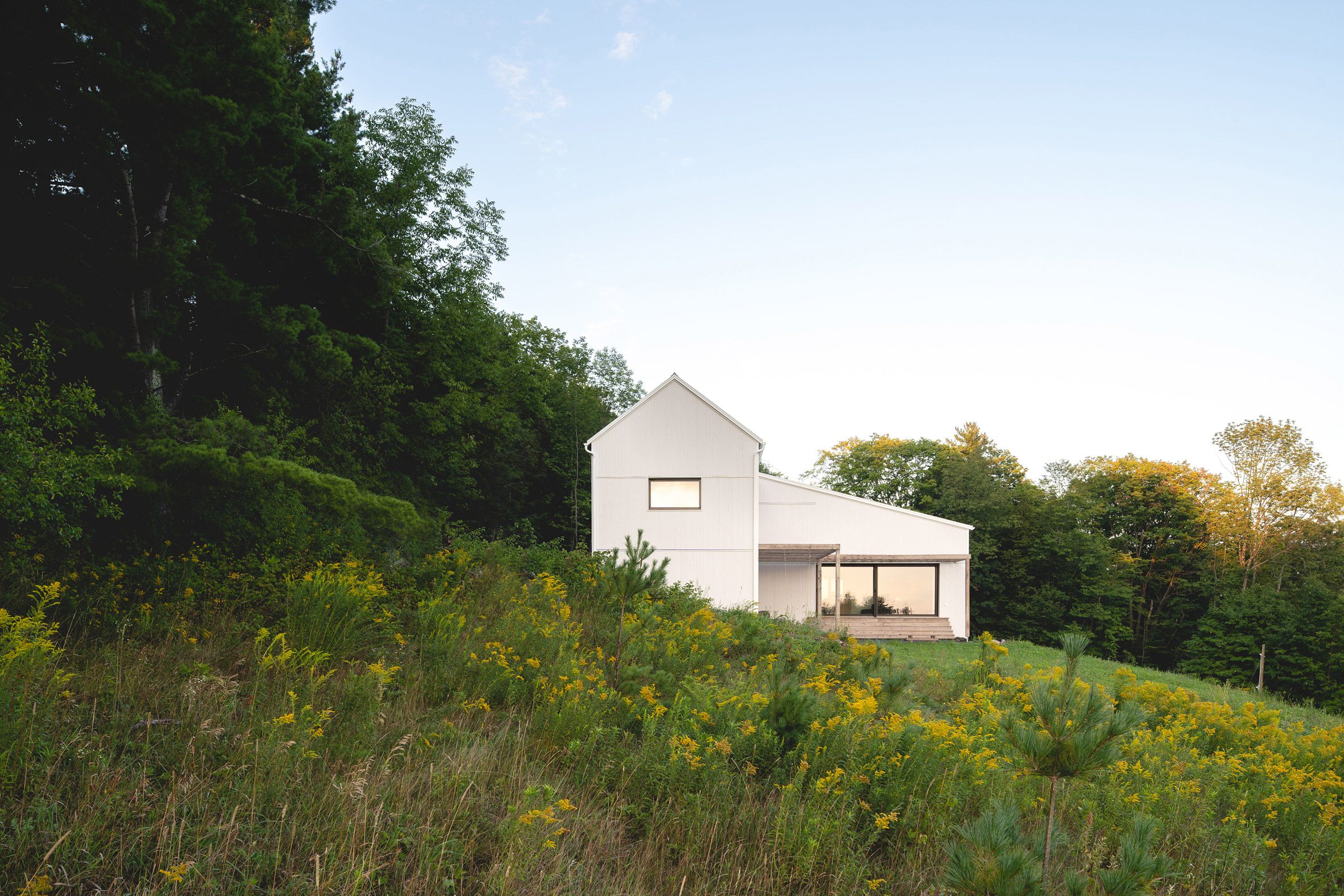
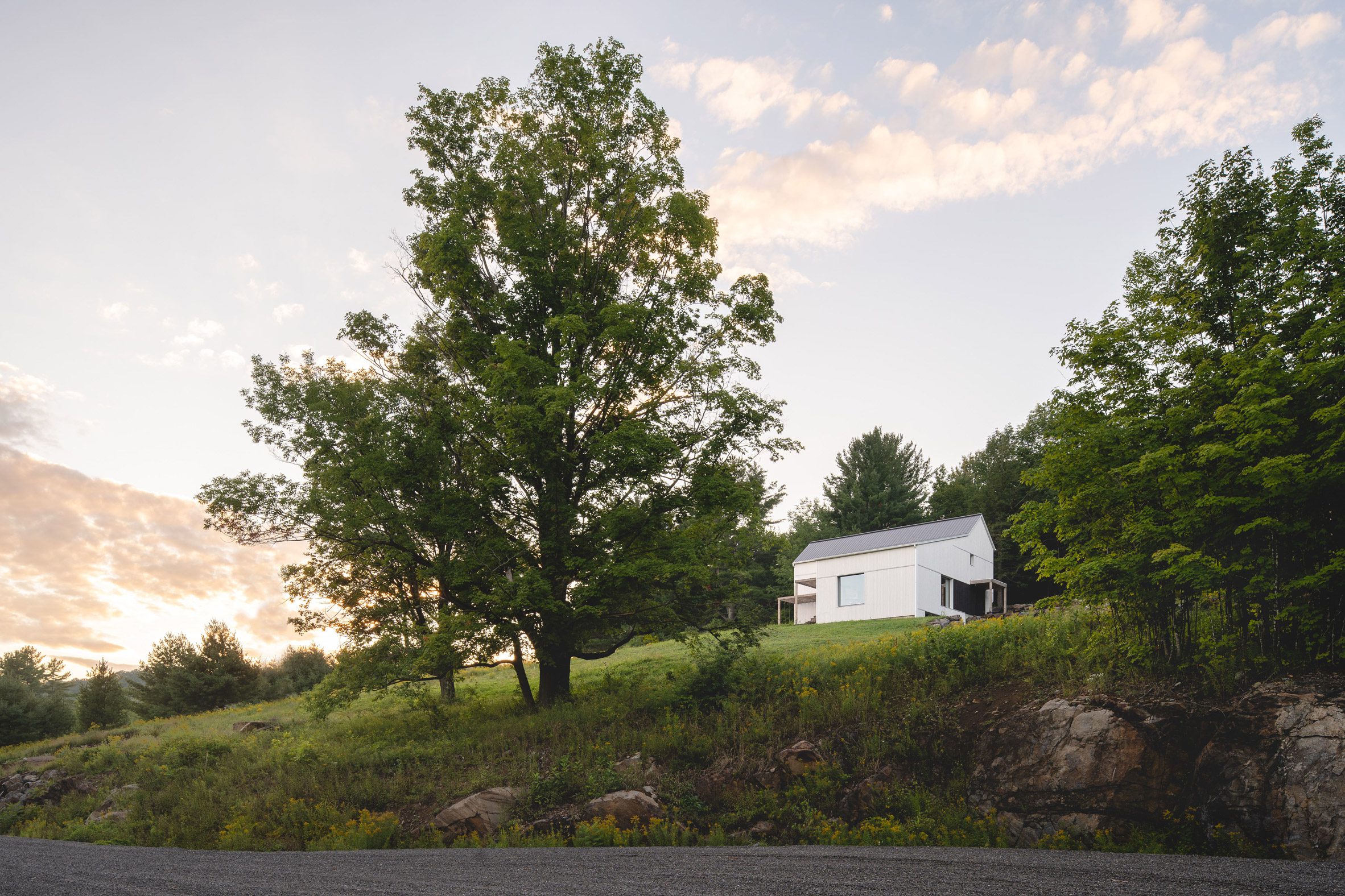
House nestled into sloping siteSaltbox Passive House nestles into a slope near Bremont, Quebec
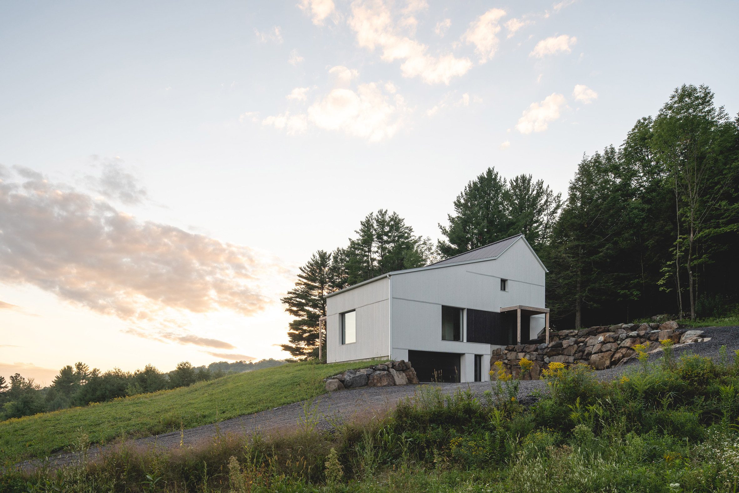
Located on the southern flank of Mont Gale in Bromont, in the Eastern Townships, the 3,100-square-foot home is built over three levels into the sloping 2.5-acre site.

The project achieved LEED Platinum and PHIUS 2018+ certifications, becoming the third house in Quebec to obtain Passive House certification.

View of the house from the drivewayThe house is split over three levels, the lowest of which is partially buried
Passivhaus, as it's also known, is a high-performance building standard that originated in Germany three decades ago.

Qualifying buildings are highly energy efficient and sustainable, achieving heating and cooling energy savings of around 80 per cent.

"The basic principles of the standard are simple: a highly insulated and very airtight envelope, superior heat recovery of the mechanical ventilation system and a design which optimises the orientation and sizing of openings to promote passive heating of the building," said L'Abri.

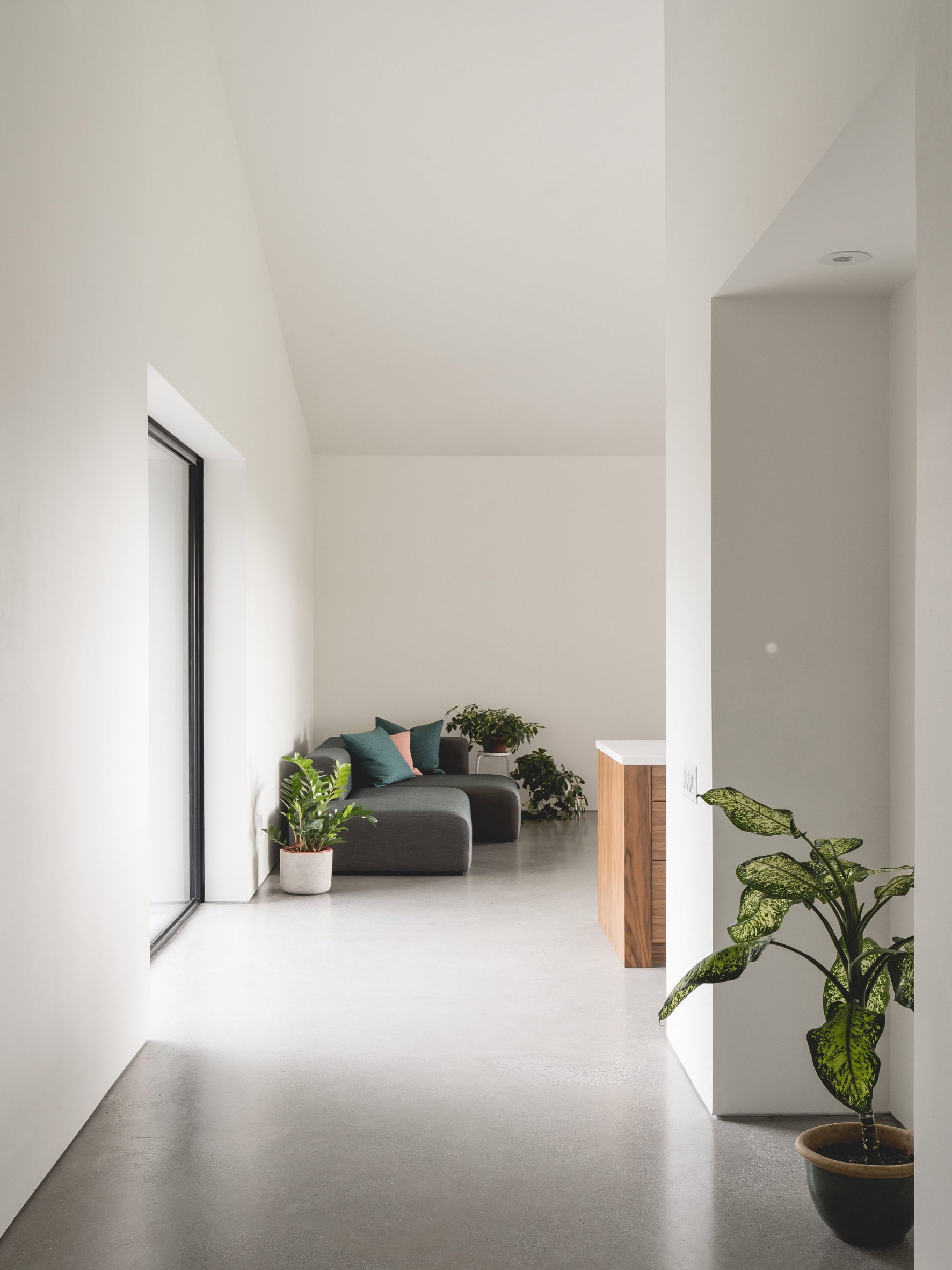
Entrance corridor looking towards the living roomThe entrance on the middle level leads into a double-height living space
This residence was designed to reference the region's historic saltbox-style houses, which originated in 17th-century New England and are still prevalent in this part of Canada.

Situated in a meadow surrounded by protected woodland, the home is laid out in a L-shape and has different roof styles over its perpendicular arms.

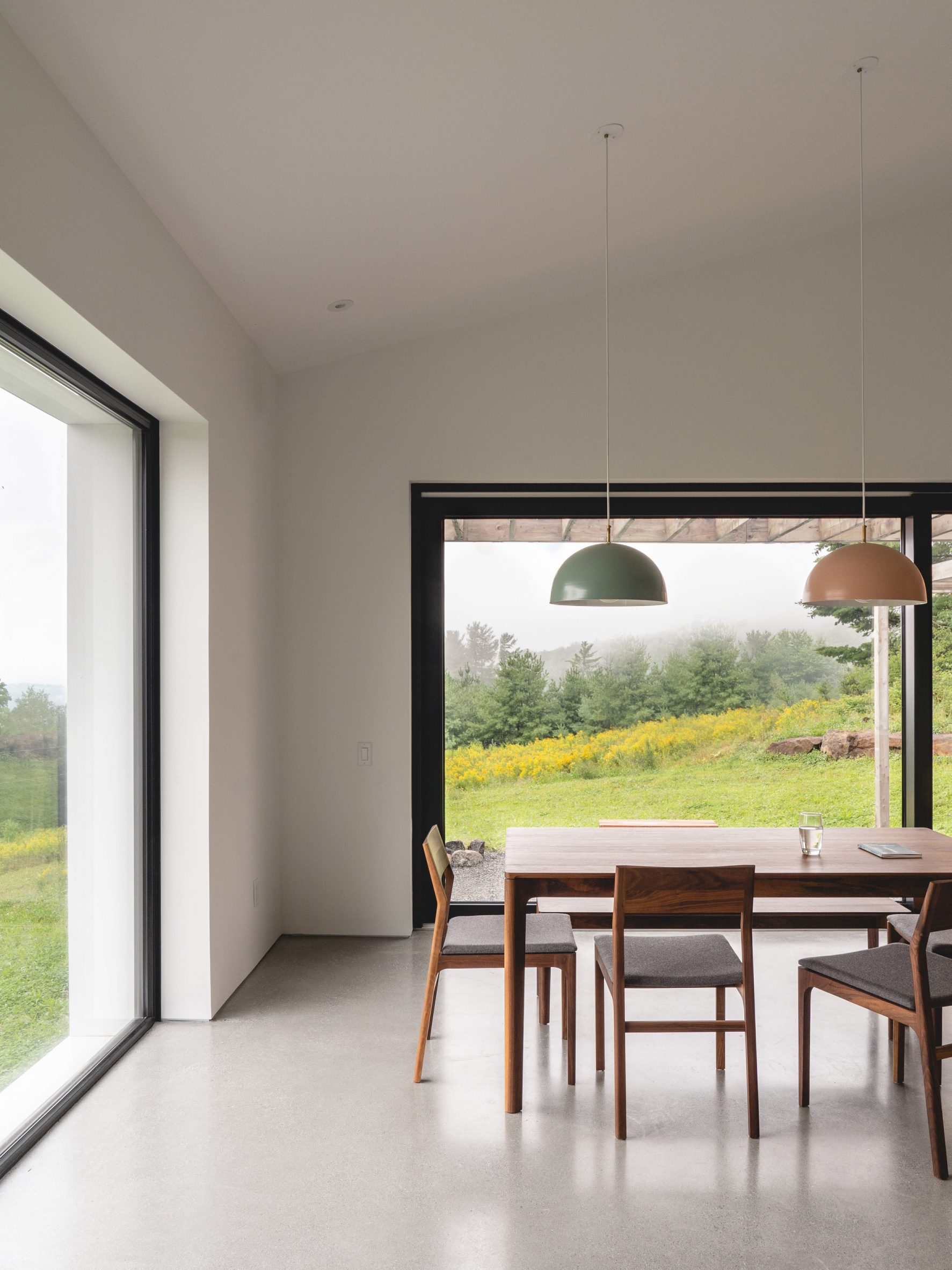
Large dining room windowsLarge windows in the dining room offer views of meadows and woodland
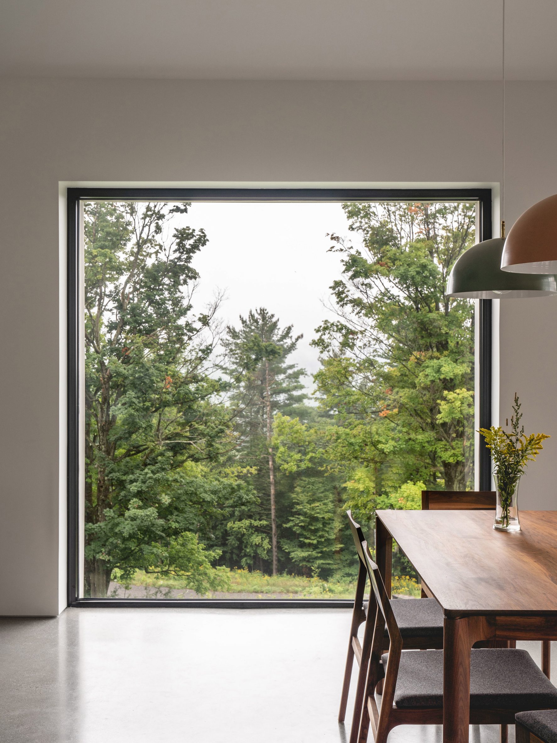
"The nature of the site and the local vernacular architecture prompted us to turn to a historical form," said the studio.

"With a gable roof on the main section and single pitch roof on the lower section, this colonial style takes its name from the lidded containers where salt was once kept above the hearth to keep it dry."

Forest view framed through dining room windowWooden furniture adds visual warmth to the white interiors
Nestled into the slope, the house faces south to aid passive solar heating and make the most of views.

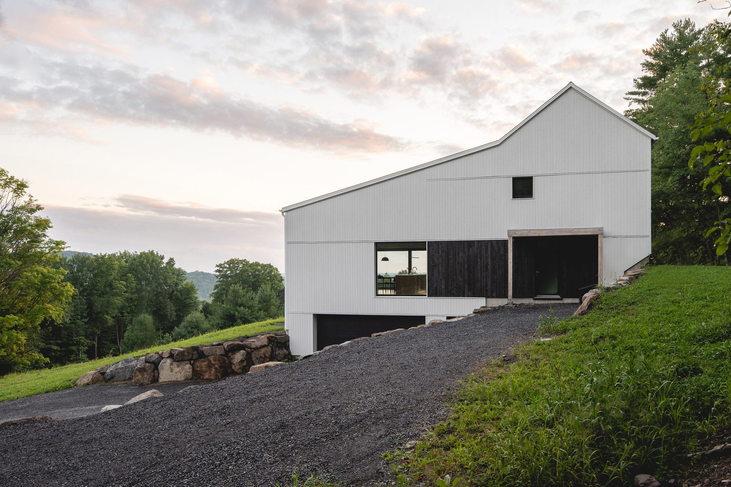
Retaining walls made from excavated stone are partially hidden by the landscape, as is a basement garage that only appears on the approach up the gravel driveway.

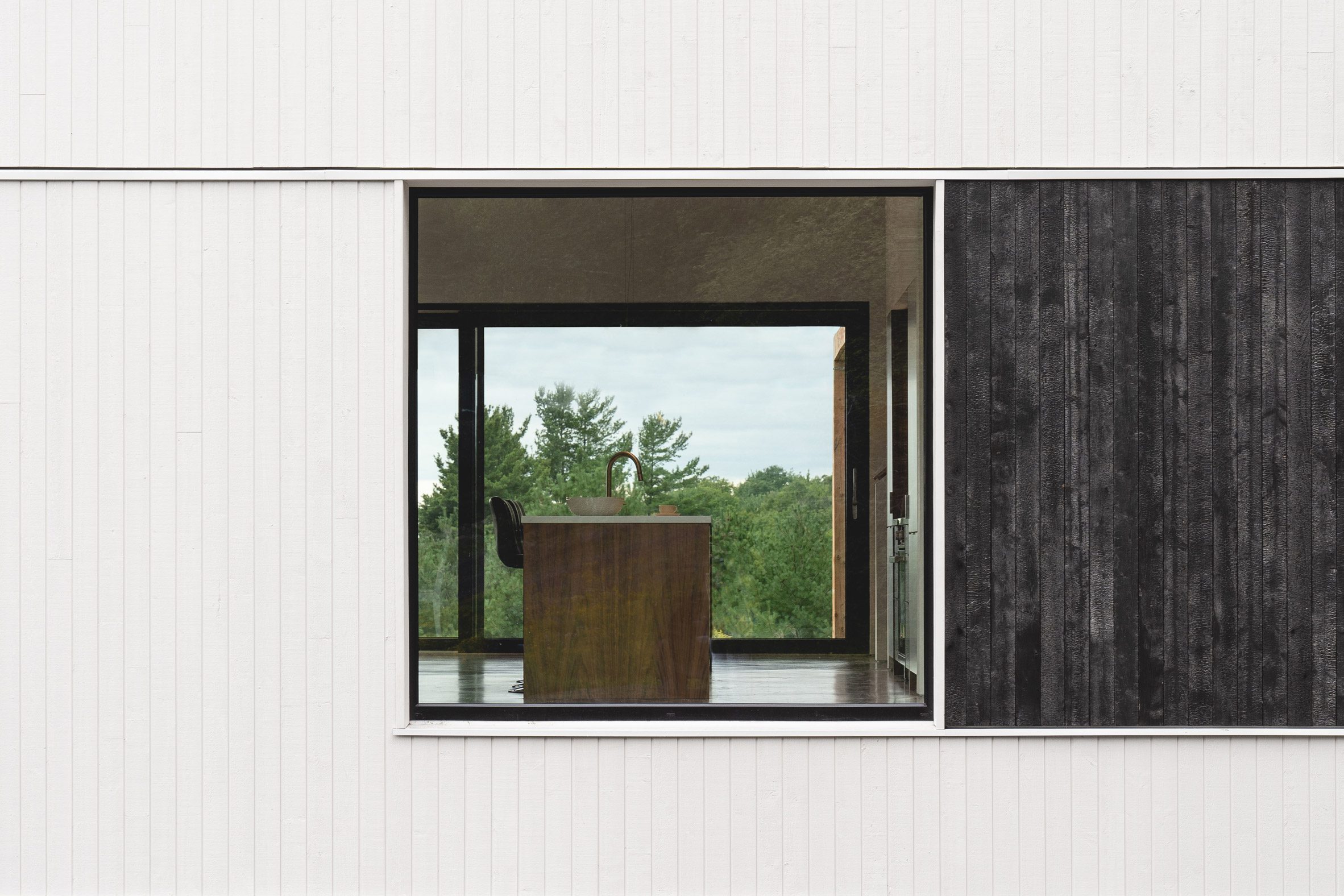
The ground-floor entrance is marked by a panel of burned cedar cladding – a stark contrast to the rest of the white wood-faced exterior.

The lobby leads through to a central double-height room that the architects describe as the heart of the home.

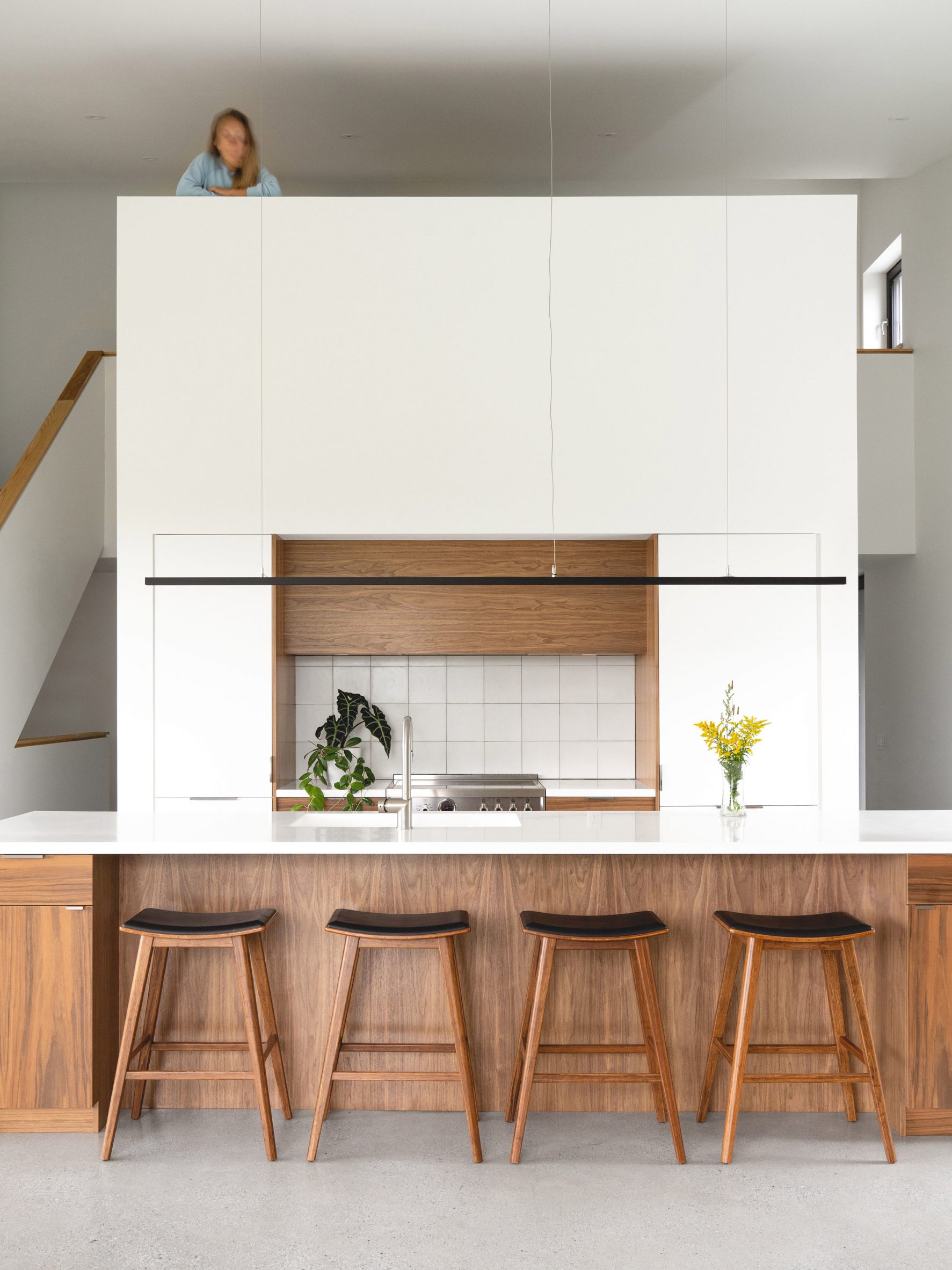
Kitchen with mezzanine space aboveThe kitchen is part of a central core that is topped with a mezzanine office space
Occupying the southern wing of the L, this space contains the kitchen, living and dining areas, bathed in light from large windows on three sides.

A pantry is tucked behind the kitchen, which is topped by a mezzanine office accessed from the level above, while a media room and guest room join a bathroom and laundry in the other wing.

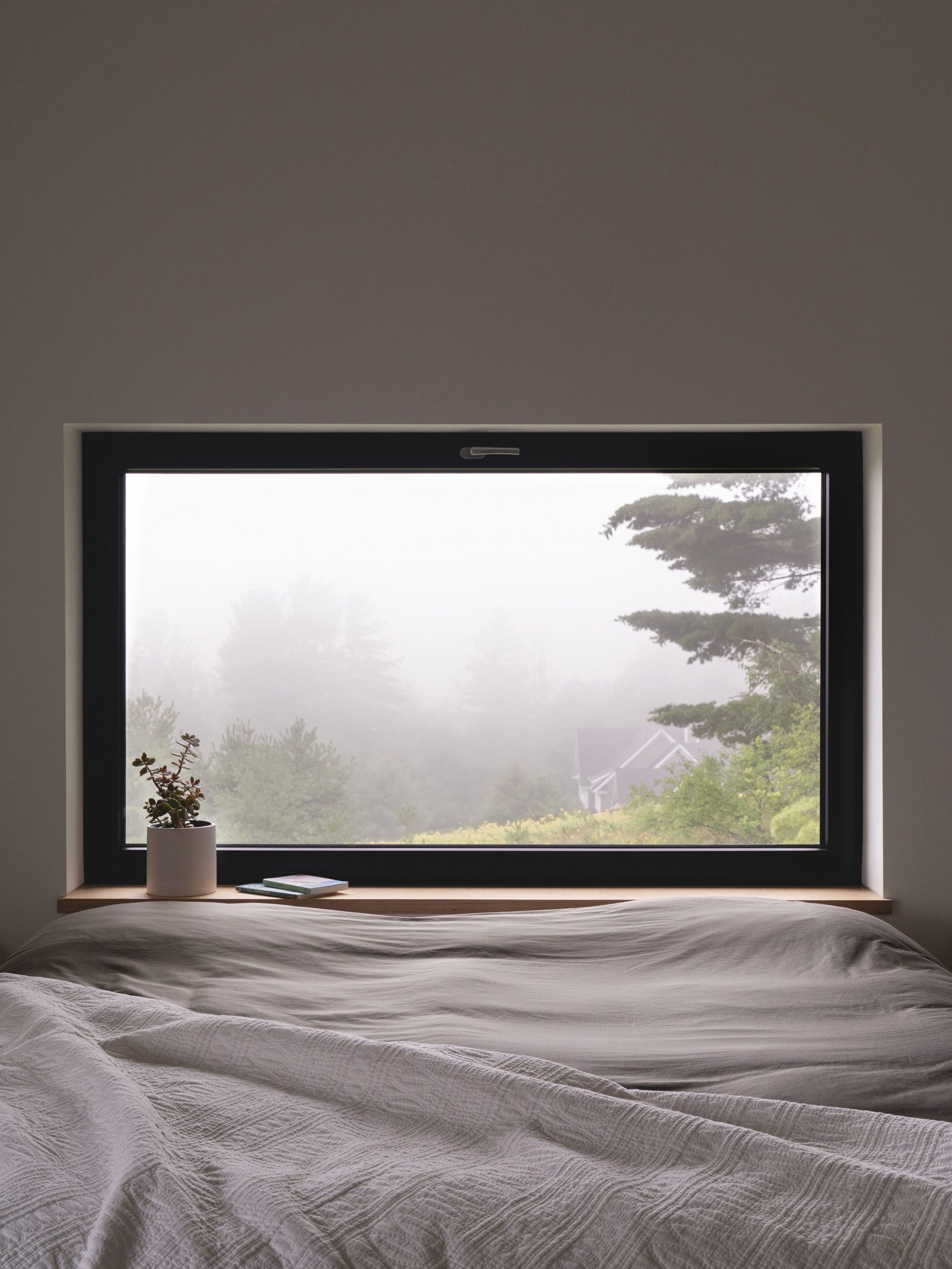
Bedroom window with misty viewBedroom windows are smaller to reduce heat loss
The pocket of outdoor space formed by the building's shape is accessed from both wings and covered by a wooden pergola, shading an al fresco dining area and passively regulating the internal temperature.

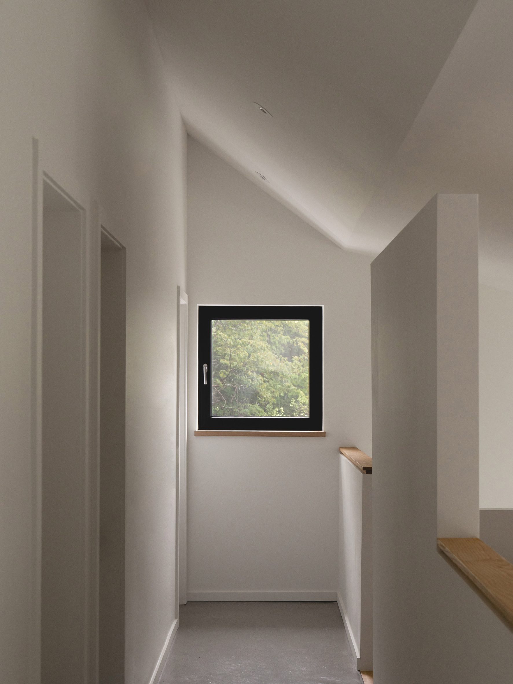
Upstairs, three bedrooms and two bathrooms are lined up under the gabled steel roof, connected by a corridor on one side.

Upstairs corridorThe upstairs corridor connects three bedrooms and two bathrooms
Thin window bands in the children's rooms frame forest views and minimise heat loss on the northern facade.

The majority of the rooms have white walls, black window frames and polished concrete floors. Wooden furniture, kitchen fixtures, stair treads and bannisters add touches of visual warmth.

White wood exterior with burnt cedar panelA blackened cedar panel marks the entrance on the white-painted exterior
The architects and contractor worked with a consultant from PHIUS, North America's largest Passive House Certification, during the design and construction of the house.

Decisions were tested using an energy model, informing the choice of a double-stud structure for above-ground walls and triple-glazed UPVC windows.

House seen from the drivewayThe house was designed to Passive House standards of energy efficiency
Wood siding and cellulose insulation also helped to reduce the building's carbon footprint.

"This experience confirmed to us that a building can be both aesthetic, in harmony with its environment and extremely efficient," said L'Abri.

Saltbox Passive House viewed from the streetThe design is modelled on the region's rural vernacular architecture

Although it originated in Germany, Passivhaus has gained traction in North America as a standard for many homes and other types of buildings.

Recently completed examples include a cidery in New York's Catskills Mountains, a townhouse in Brooklyn, and a residence designed by students in South Dakota.

The world's tallest Passivhaus building is also planned to be constructed in Vancouver.

The photography is byRaphaël Thibodeau.


Project credits:

Architects: L'Abri

Architecture team: Francis M Labrecque, Jérôme Codère, Vincent Pasquier, Antoine Mathys

Contractor: Construction Rocket

PHIUS consultant: Sarah Cobb

The post L'Abri and Construction Rocket complete Saltbox Passive House in Quebec appeared first on Dezeen.

#residential #all #architecture #houses #canada #québec #canadianhouses #passivhaus