#whitehouses

dezeen@xn--y9azesw6bu.xn--y9a3aq

Gluck+ covers Hollywood Hills home with an angular roof

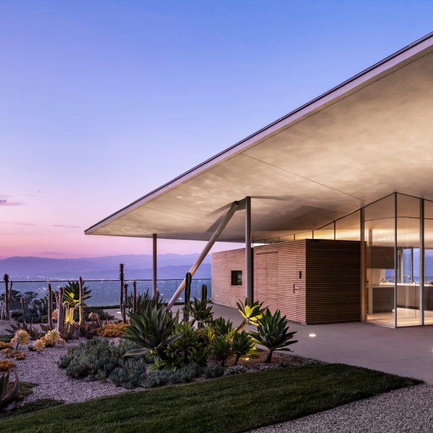
image

California house by Gluck+

A faceted roof on slender columns tops this home by Gluck+ in Los Angeles' Hollywood Hills neighbourhood, covering the residence "like a parasol".

Simply named California House, the single-family residence was completed by New York City firm Gluck+ on a "spectacular" steep site overlooking LA.
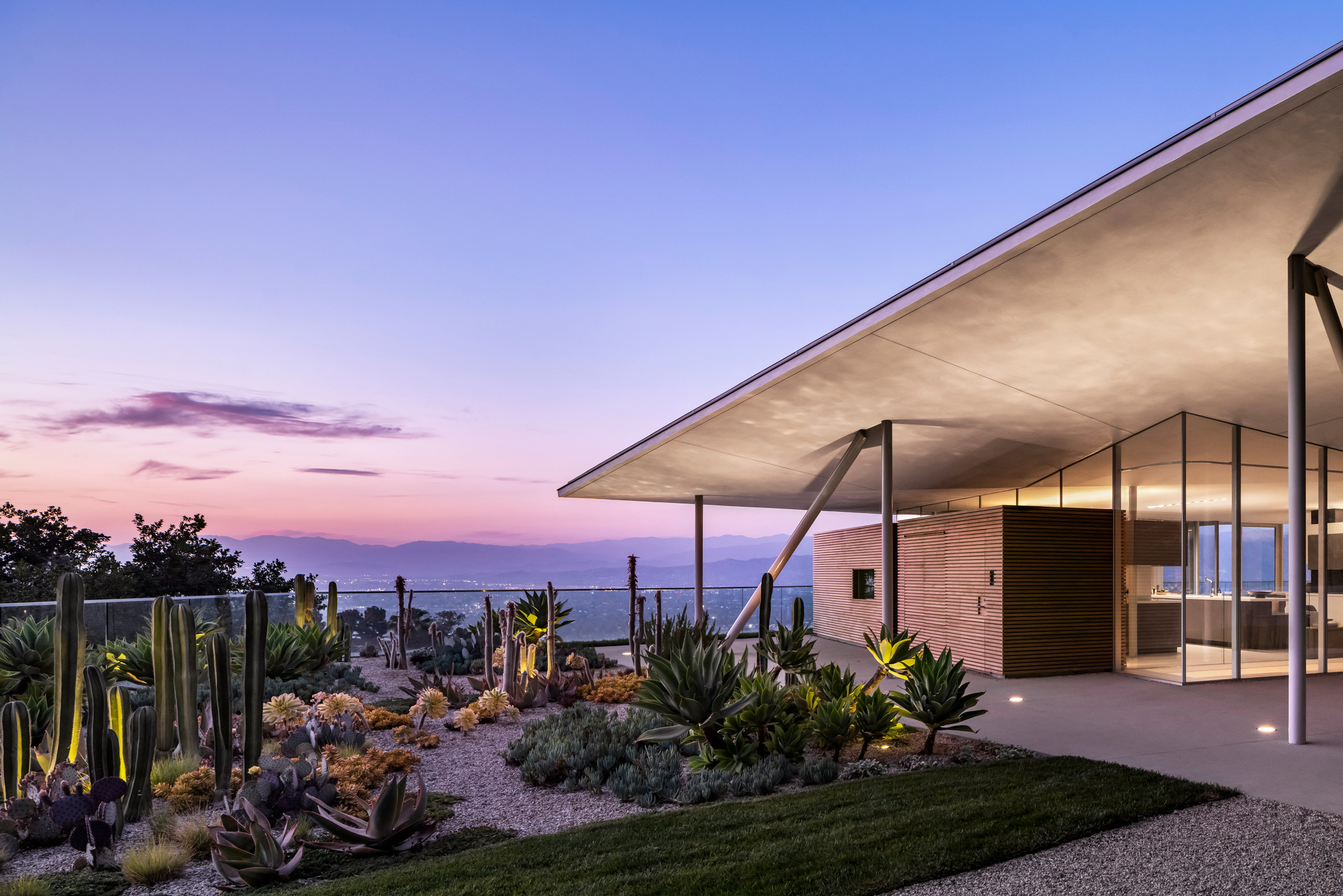
Califoria House by Gluck+An angular roof on slender columns tops California House

From the property, residents enjoy panoramic views of the surrounding mountains and the Hollywood Sign landmark.

"Building on this site, long considered unbuildable, presented two challenges," said Gluck+. "First, to minimise the impact of the house on the landscape and second, to create sufficient flat area to be comfortable for outdoor activities."
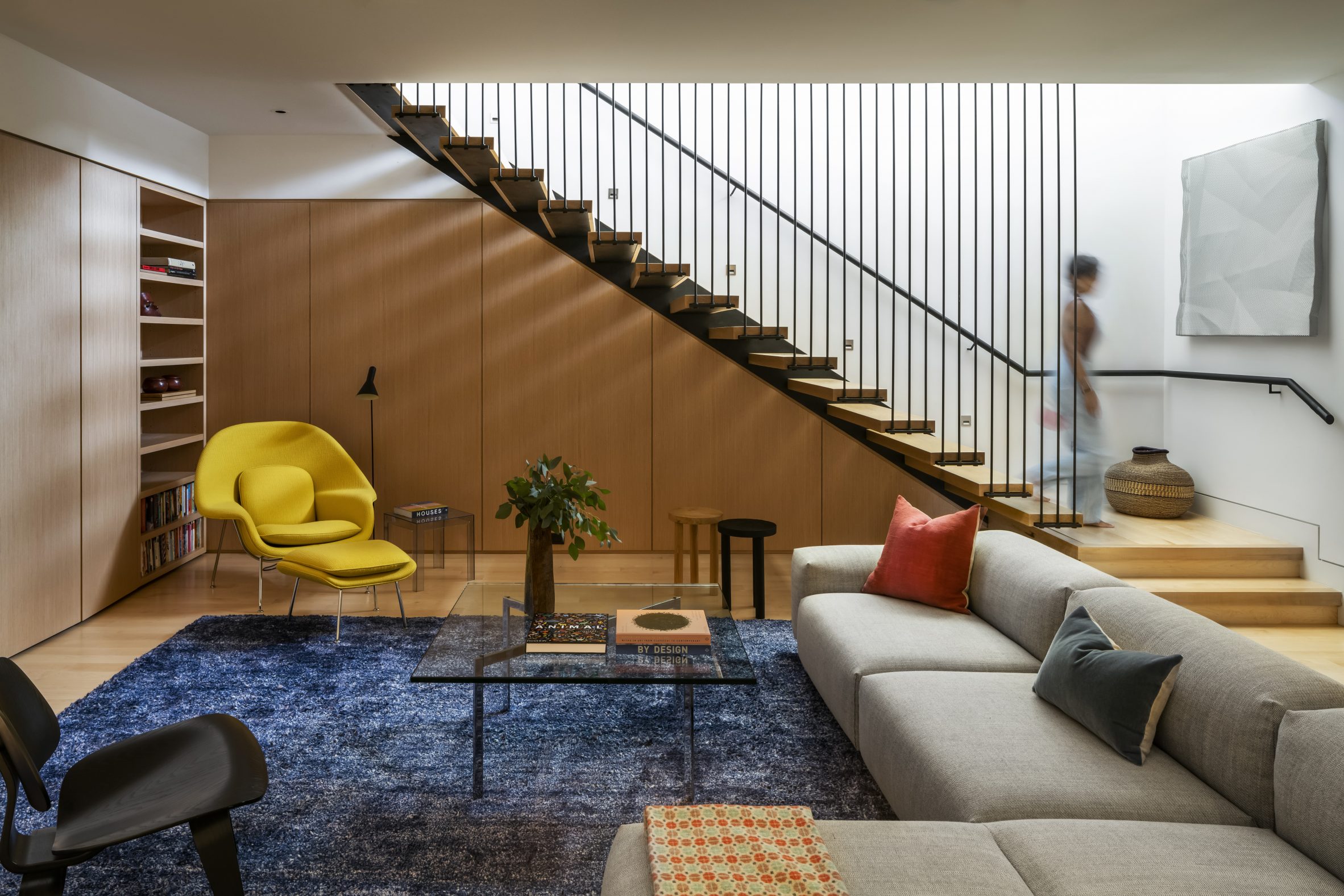
Family house by Gluck+ The project was designed for a family

The team resolved this by creating a strong separation between the upper and lower levels of the home. Burying the lower floor into the steep hillside created a plinth on which the top floor could be built.

Since the upper level's footprint is smaller than the storey beneath, it is surrounded by a flat exterior space surrounding on all sides.
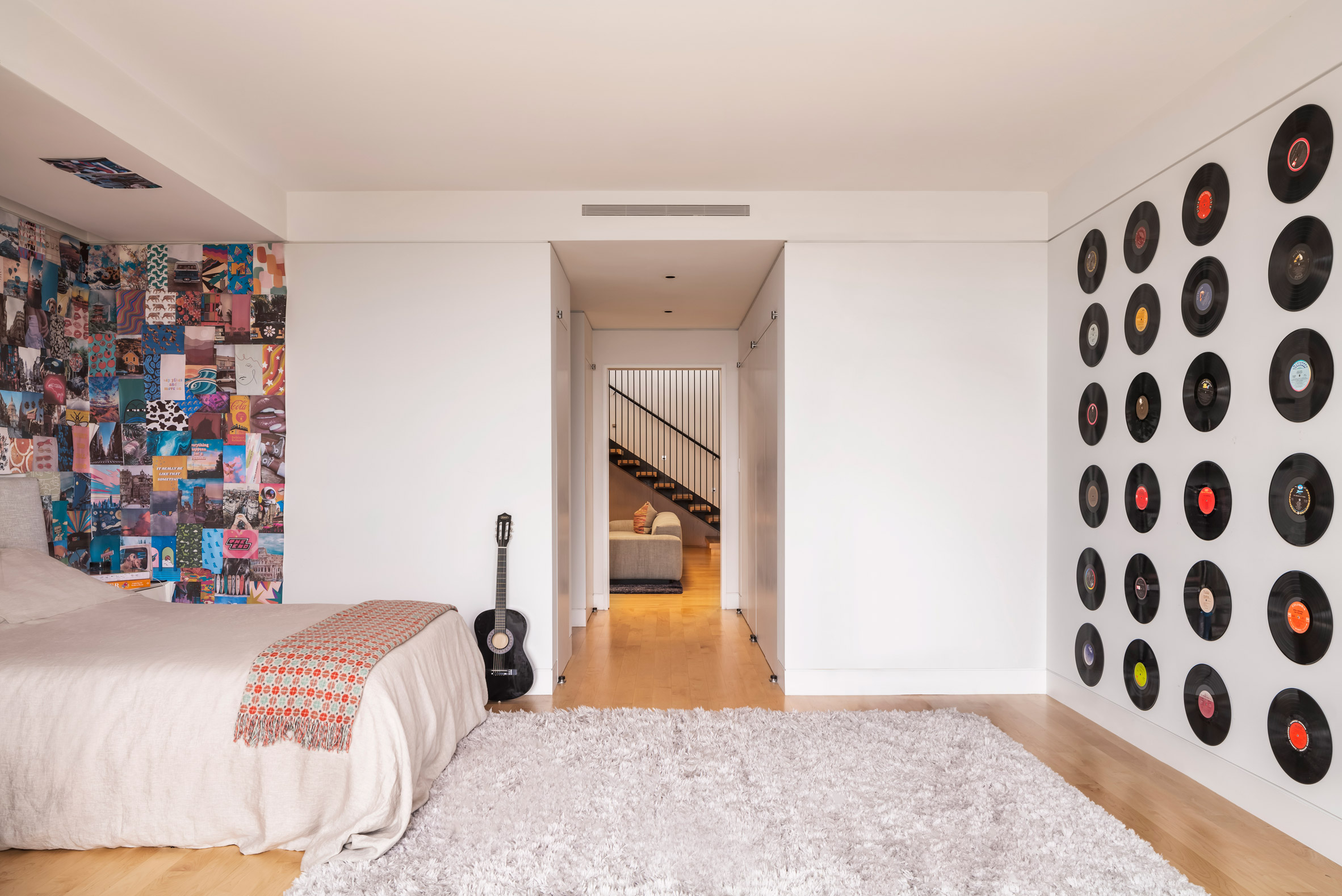
Bedroom at California HouseBedrooms are located on the lower level

"The lower floor is carved into the hill and with its expanse of green roof, it creates a strong ground-plane, or bench, in the steeply sloping land," the architects explained. "This section, though large, is meant to be essentially invisible."

Gluck+ included four bedrooms, six bathrooms, home offices, a theatre, and most of the private spaces on the lower level.
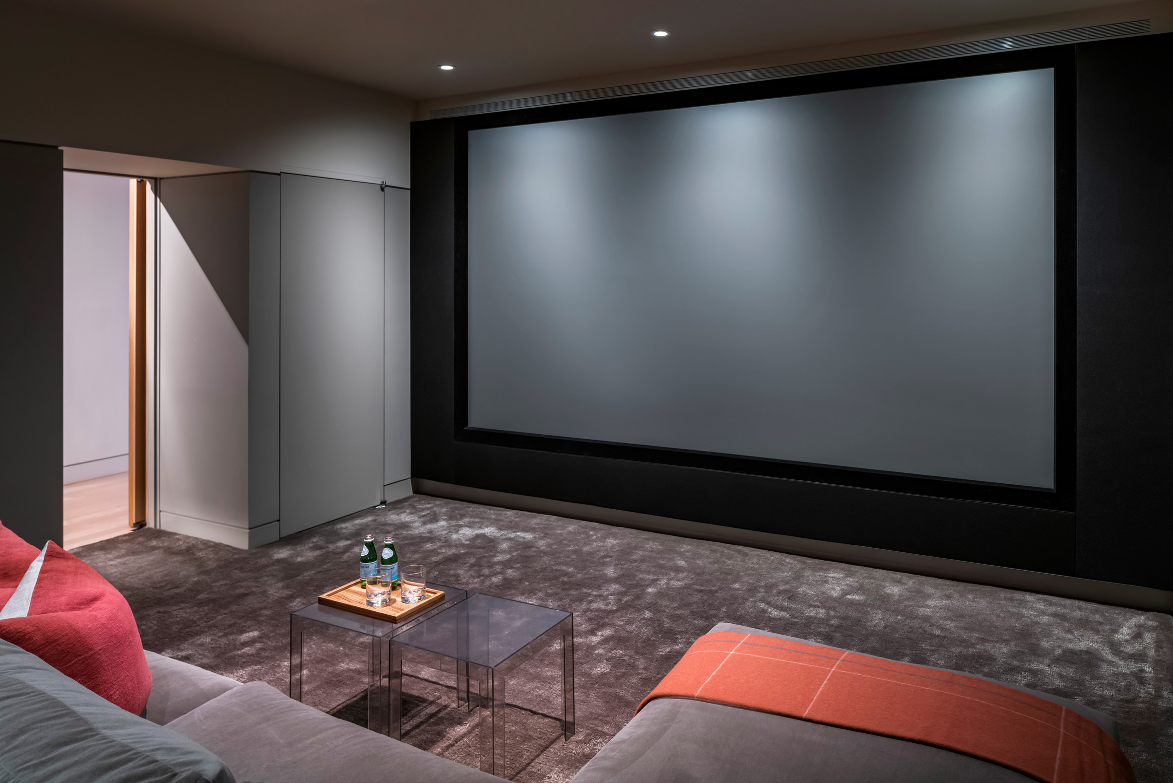
TheatreA home cinema is also located downstairs

The top floor contains areas for cooking, entertaining, and gathering as a family. This airy space is glazed on all sides and has tall, angled ceilings that follow the outline of the sculptural roof.

"Everything here is configured to maintain the simplicity and openness of the space," said Gluck+. "Kitchen and spatial divisions never touch the ceiling so that it seems to float above on independent steel supports."

[ Clive Wilkinson West Los Angeles Residence
Read:

Angular terrace tops Clive Wilkinson's self-designed Los Angeles home

](https://www.dezeen.com/2020/01/12/clive-wilkinsons-self-designed-los-angeles-home/)

The roof sits on slender steel columns, and offers plenty of shade both within the home and for the surrounding exterior spaces.

"Like a vast parasol, the roof of the house is a rectangle with upturned edges that extend well beyond the footprint of the rectangular pavilion," said team.
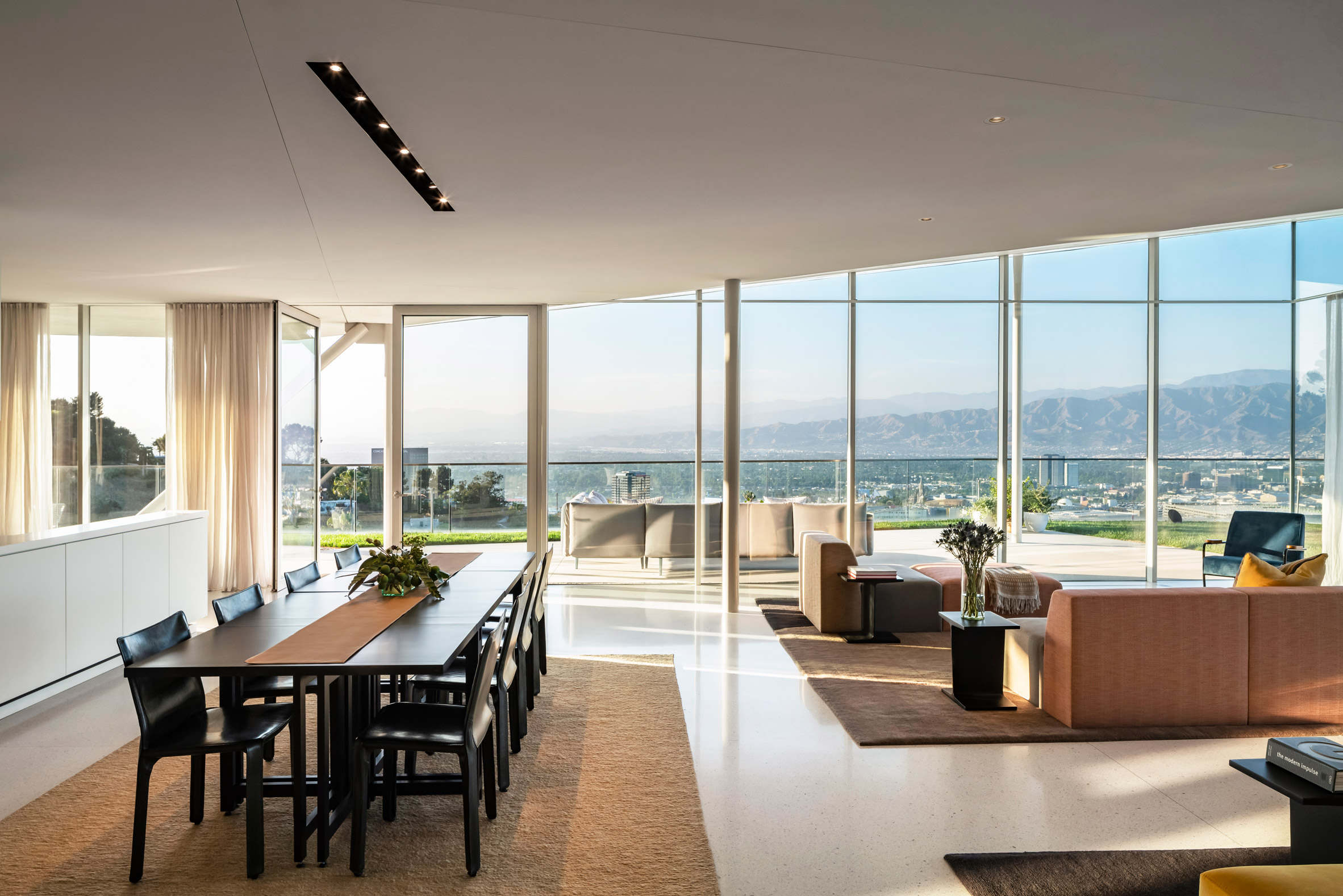
California House neutral interiorsNeutral interiors feature inside California House

Building so much of the 7,500-square-foot (696-square-metre) home underground helped Gluck+ meet California's Title 24 Energy Code, which sets some of the strictest efficiency standards in the US.

Among the building's other sustainable features are geothermal heating and cooling, as well as solar panels on the roof that are hidden in the upturned surfaces. According to the architects, these produce more energy than the home consumes.
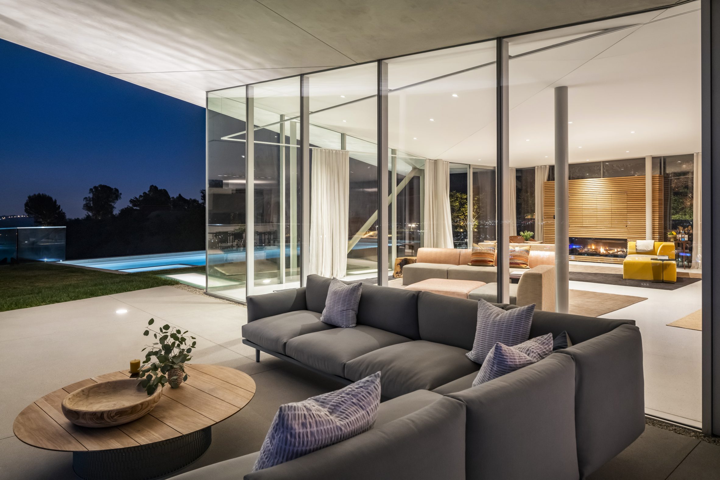
Hollywood Hills houseIt has expansive views of the Hollywood Hills

Gluck+ is an architecture and construction firm that was formerly known as Peter Gluck and Partners Architects.

Other projects by the studio include a laboratory and research centre in North Carolina that is meant to withstand harsh coastal weather, and an artist's residence in Upstate New York made up of wooden volumes connected by glass walkways.

The photography is byPaul Vu.


Project credits:

Gluck+ team: Austin Anderson, Ross Galloway, Thomas Gluck, Matthew Harmon, Narin Hagopian, Gonzalo Moran

Civil and structural engineer: Peck

Geotechnical engineer: Schick Geotechnical

Mechanical engineer: IBC Engineering Services, Inc. CES Engineering

Lighting design: Lux Populi

Interior design: Insight Environmental Design

Landscape design: Hoerr Schaudt

Expeditor: Kimberlina Whettam and Associates

The post Gluck+ covers Hollywood Hills home with an angular roof appeared first on Dezeen.

#all #architecture #residential #losangeles #california #usa #houses #greenroofs #americanhouses #gluck #whitehouses #californianhouses

dezeen@xn--y9azesw6bu.xn--y9a3aq

Saunders Architecture designs "ribbon-like" Lily Pad house in Ontario

image

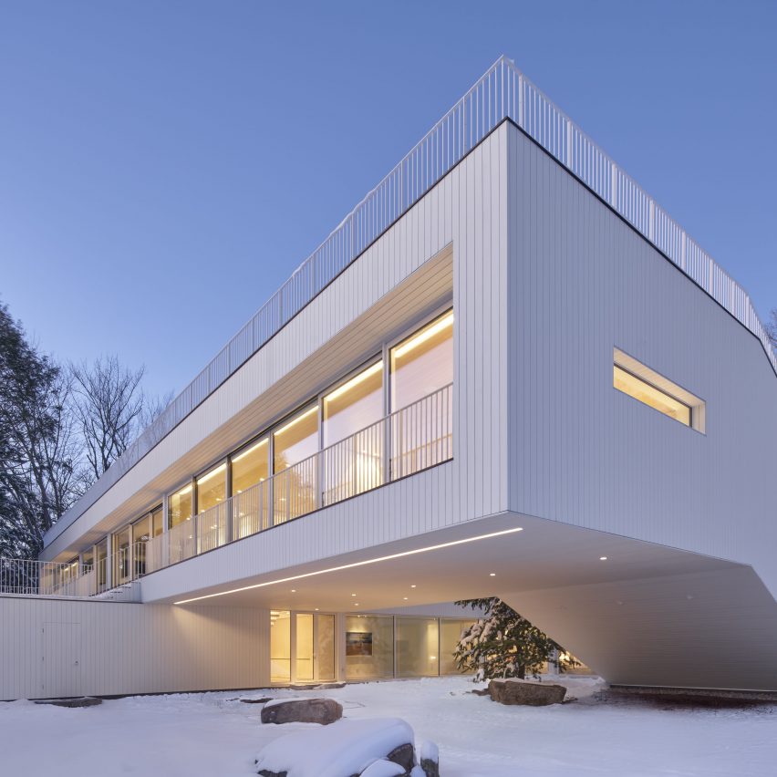
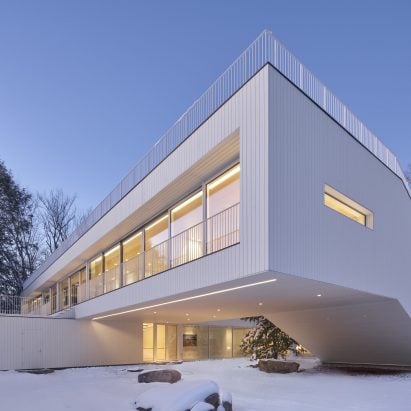
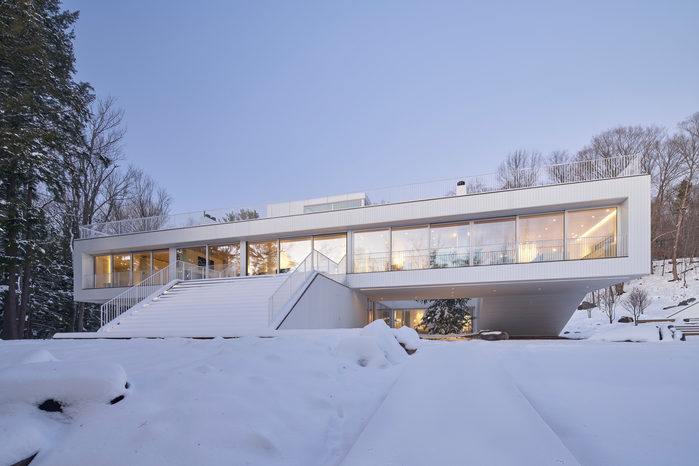
Canadian architect Todd Saunders has shaped this white house next to Lake Rousseau to create a continuous route through its interior and exterior spaces.

Saunders Architecture designed the Lily Pad residence for a Toronto couple that wanted a rural retreat in the Muskoka region north of the city.

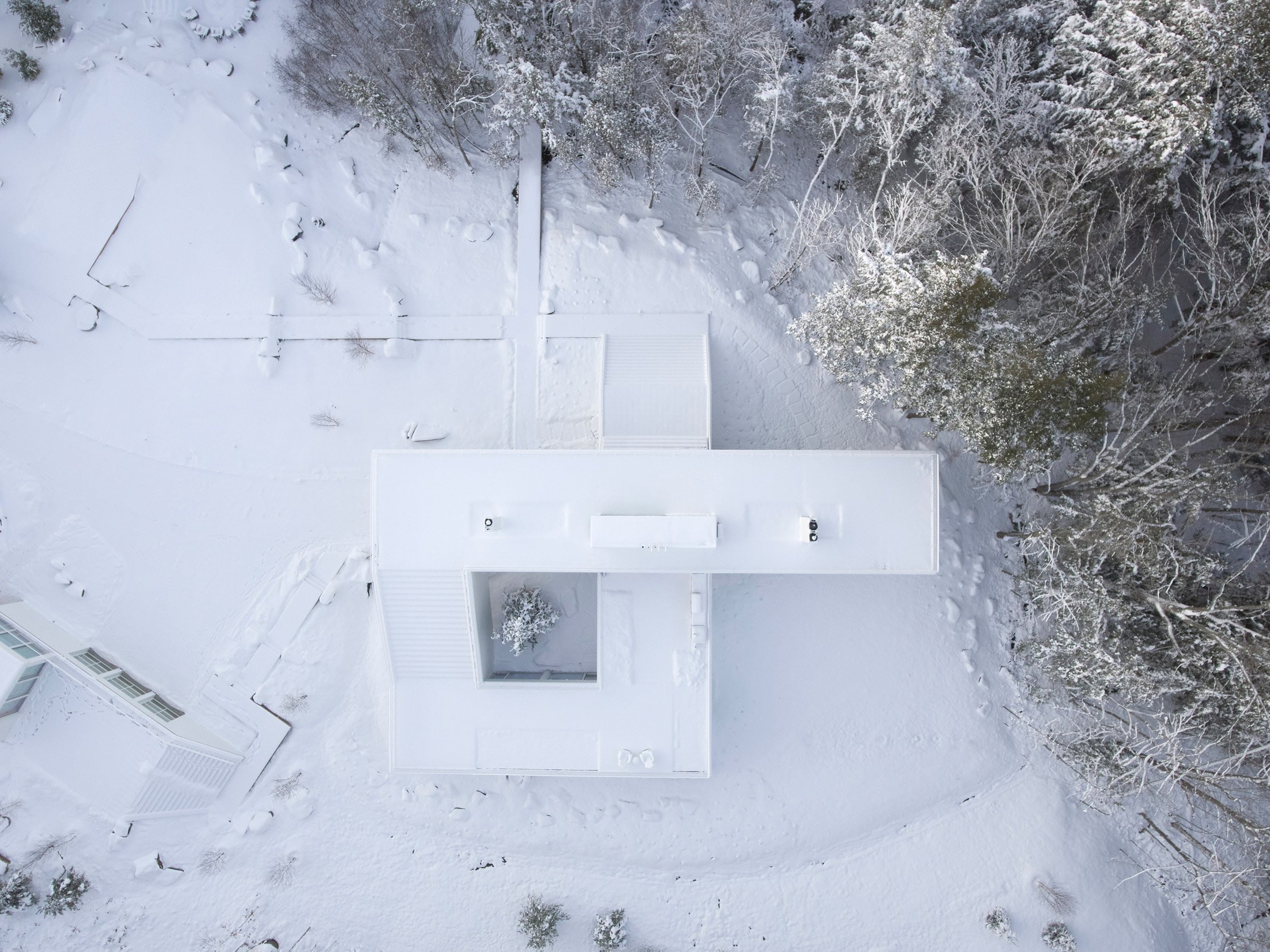
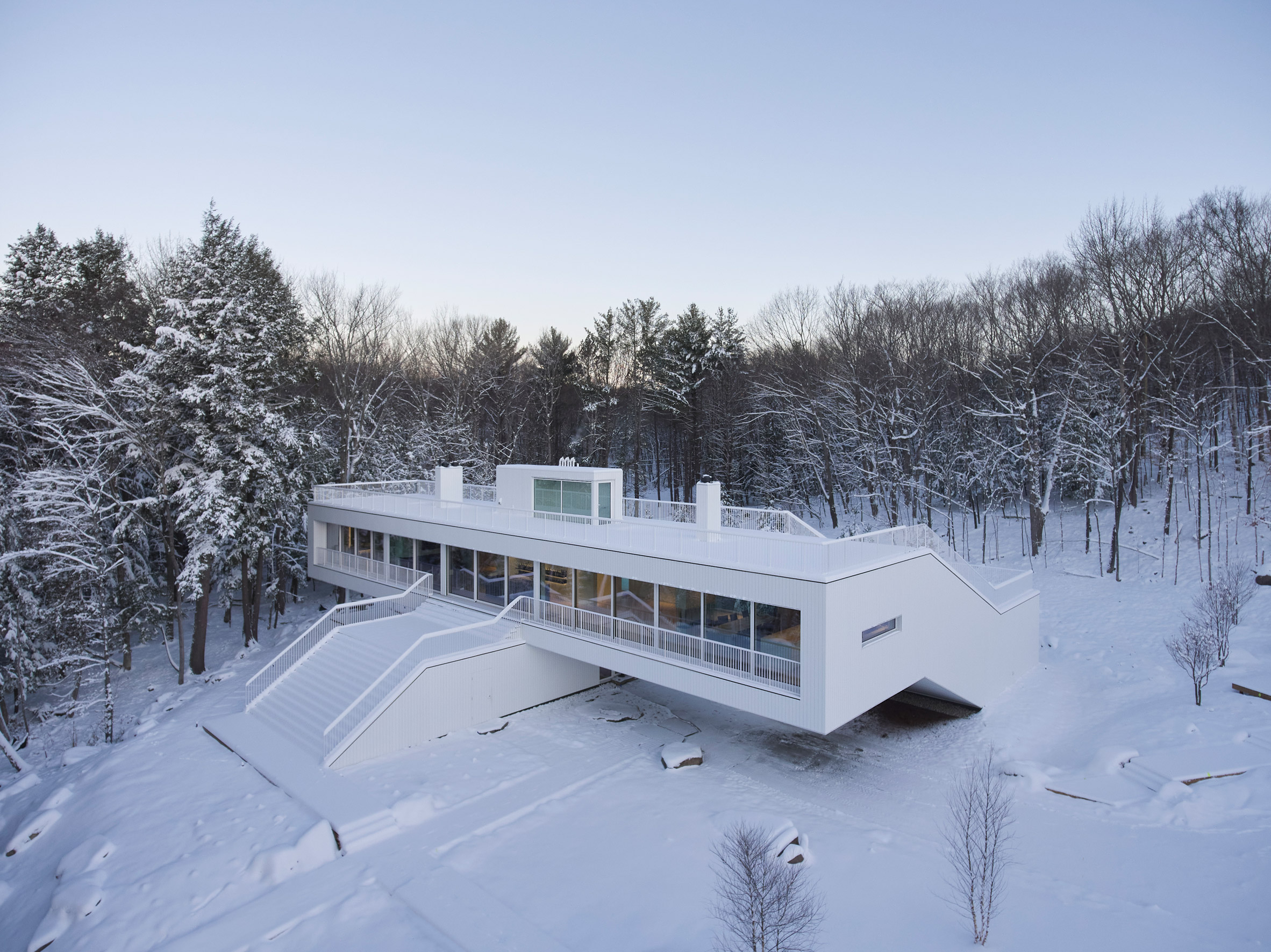
Aerial view of Lily Pad houseThe Lily Pad house wraps around and over on itself
The area is dotted with rivers and lakes, and has a particular architectural vernacular that includes cottages and boathouses with ample porches, decks and terraces.

"[The clients] found a 16-acre site on the edge of Lake Rosseau... and began thinking about building something for themselves that would integrate with the setting but also be decidedly modern," said the firm, which is based in Bergen, Norway.

Aerial view of Lily Pad houseSaunders Architecture designed the house as a modernist take on the vernacular of Muskoka
On a trip to Fogo Island – an artists' community off the coast of Newfoundland – the clients visited some of the studios designed by Saunders, and chose to commission him to design their house.

The project encompassed a five-bedroom residence, a separate guesthouse, and a boathouse on the lake. Matt Ryan served as the local architect of record.

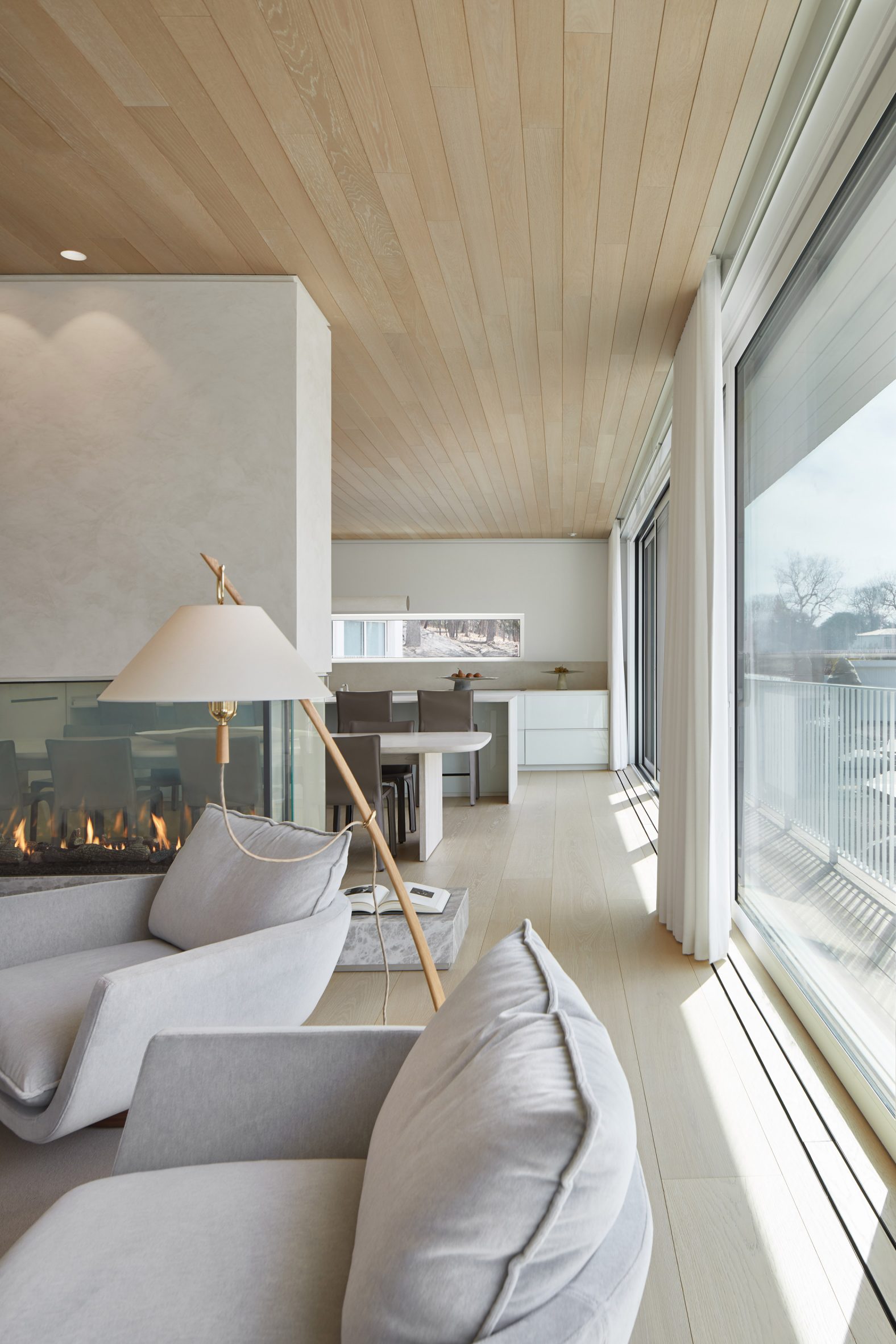
Living room looking through to the kitchenLarge glazed panels on the upper floor overlook Lake Rosseau
"Both the architect and his clients wanted to maximise the sense of connection with the landscape, while creating a home with a dynamic and original character of its own," the Saunders Architecture team said.

The main house comprises two rectangular bars arranged in a cross formation, one on top of the other.

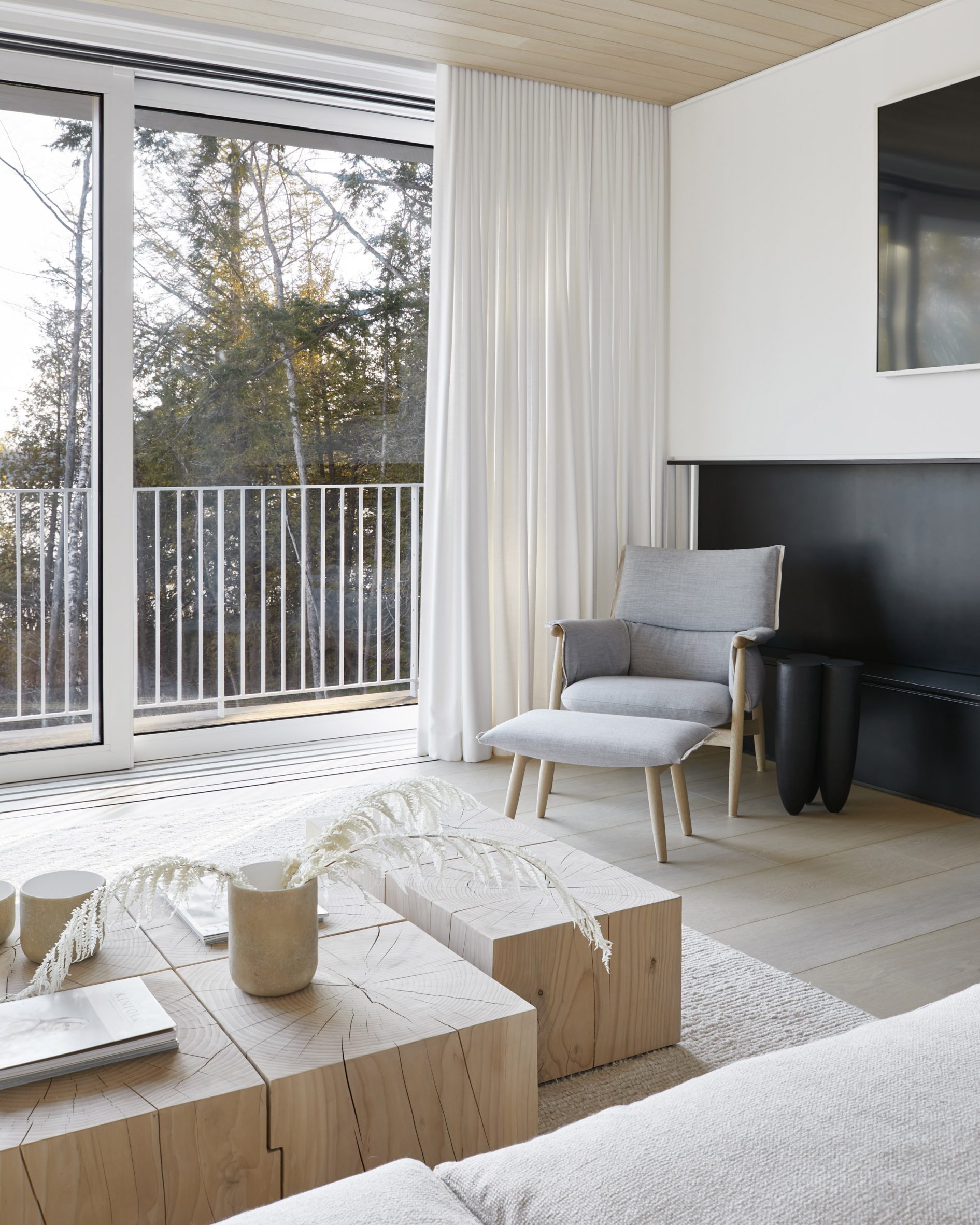
Minimal furniture in the living roomThe glass doors open up to turn the living area into a giant porch
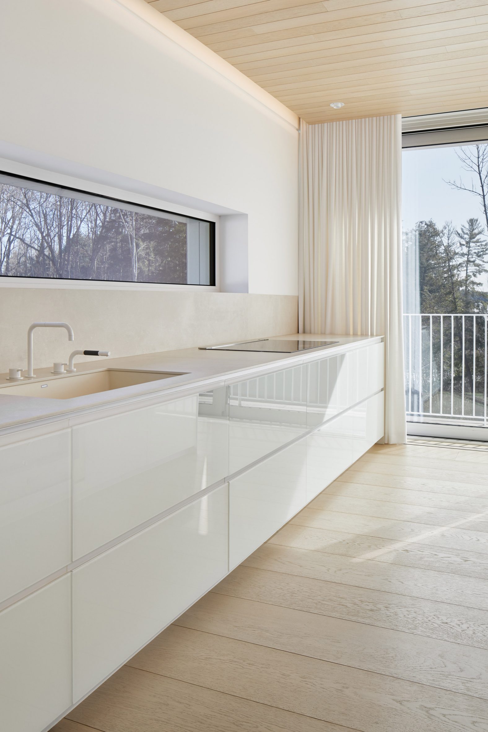
Two ends are joined together to form a square on one side, resulting in a continuous "ribbon-like" form thanks to an angled section that bridges the level change.

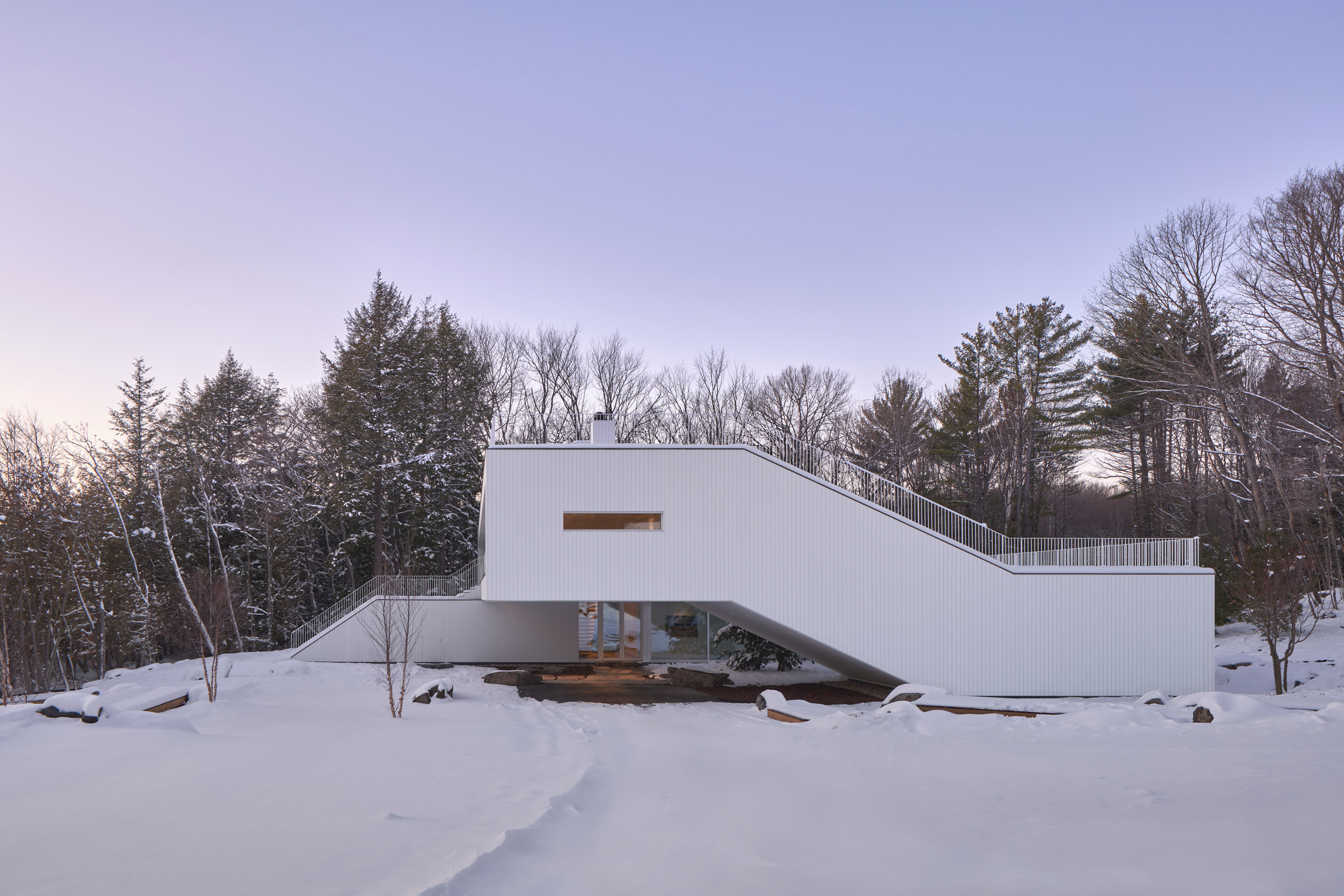
Entered via a covered carport, the ground level has four bedrooms and ensuite bathrooms. A staircase next to the door leads directly upstairs, thanks to its placement at the intersection of the main volumes.

Neutral finishes in the kitchenStudio Author designed the neutral interiors
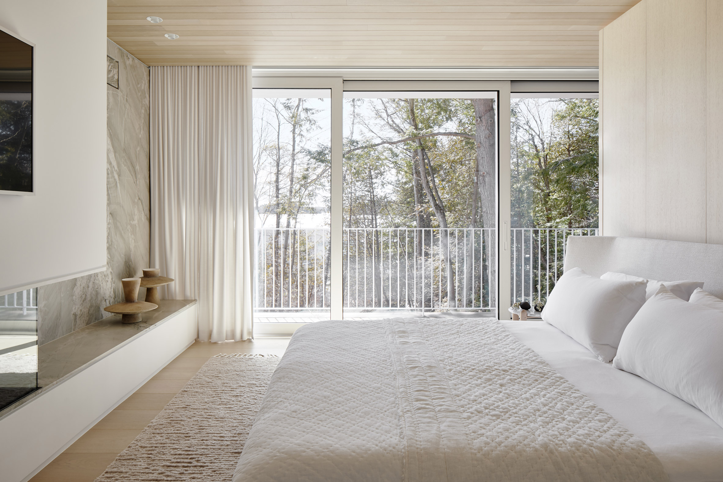
An alternative route to the first floor is via the media room, where stairs and bleacher-style seating follow the inclined portion of the building.

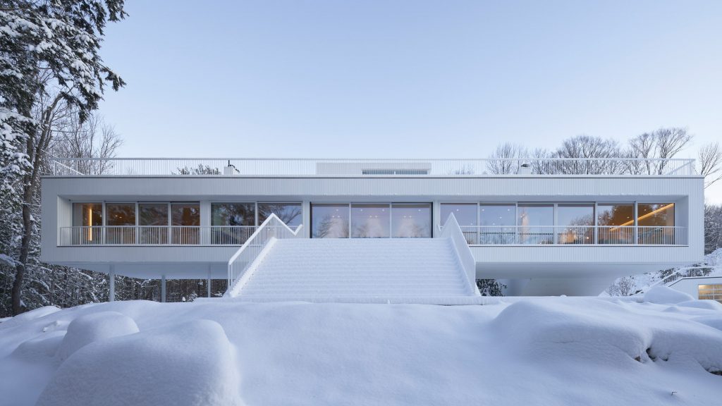
The house can also be accessed from a grand exterior staircase that rises from the lake to the glazed upper facade that overlooks it.

Main bedroom with views of the forestColours and materials were chosen to complement the surroundings
Sliding panels open to a formal dining area and more casual lounge seating on either side.

"When the glass slides back, this space becomes – in effect – an enticing open porch, or 'Muskoka room'," the studio said.

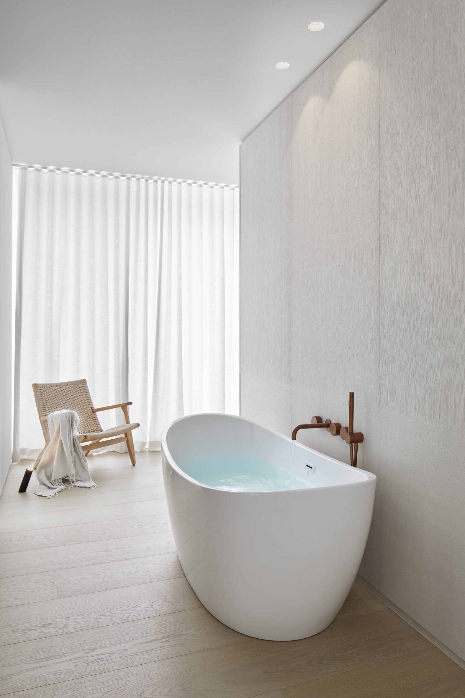
Freestanding bathtubThe interiors have a minimal yet cosy atmosphere
Fireplaces divide the open-plan living space from the kitchen on one side and the main bedroom suite on the other.

"Floating beyond the main body of the house, the master bedroom levitates in a dramatic manner, becoming a lookout station facing the lake view to the front," said the firm.

[ Carraig Ridge Houses by Saunders Architecture

Read:

Saunders Architecture unveils five house designs for Canadian wilderness development

](https://www.dezeen.com/2016/02/01/carraig-ridge-five-house-design-project-saunders-architecture-alberta-canada/)

Continuing the axis from the external stairs, more glass doors lead out to the roof.

An outdoor route traces the circulation path inside, rising up over the media room to reach the top terrace, which is also accessible by elevator.

Glazed upper storey facing the lakeA grand external staircase provides direct access to the first floor
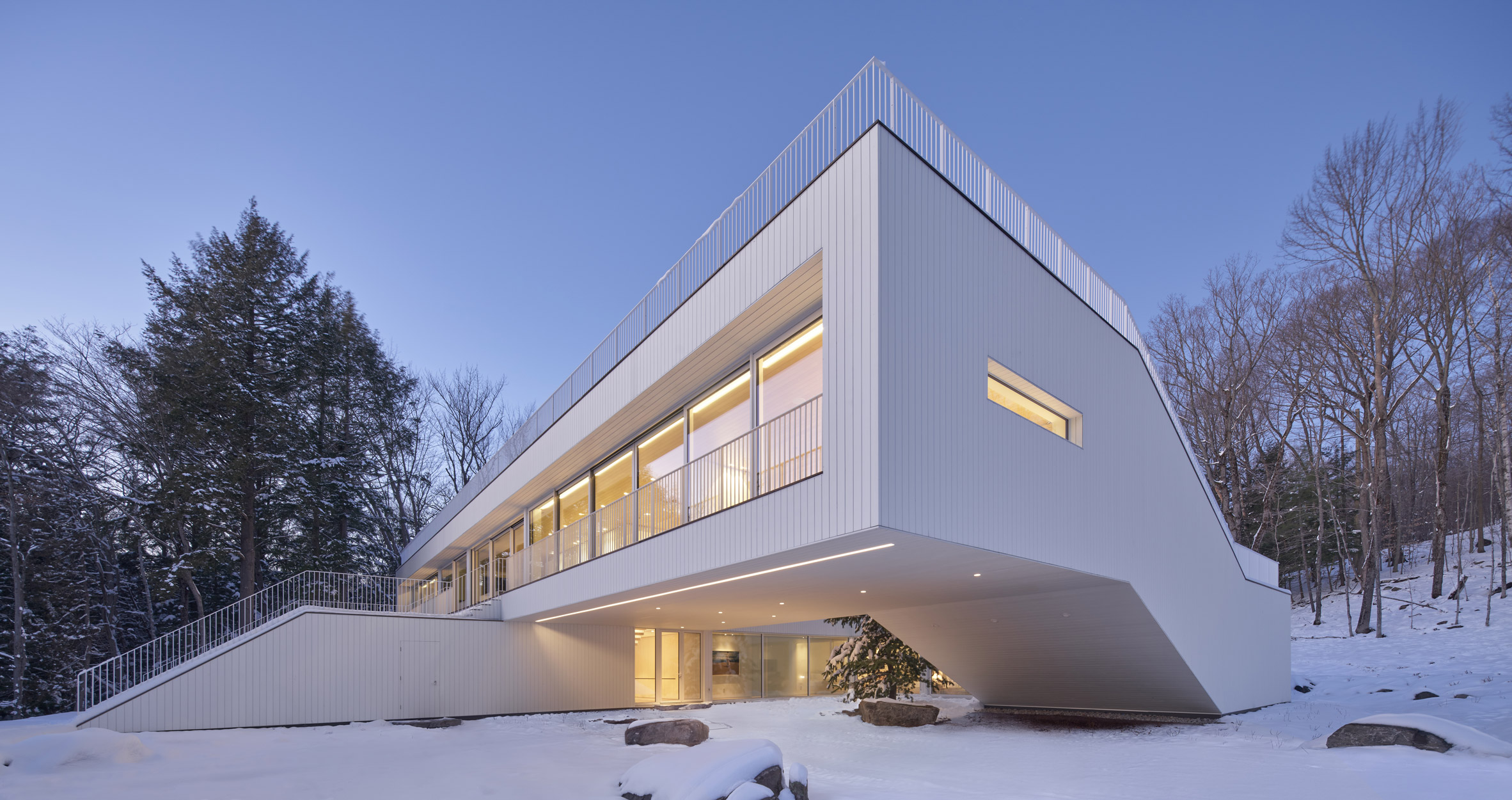
"The roof terrace becomes the final destination within an ambitious 'promenade architecturale' – somewhat reminiscent of the journey seen at Le Corbusier's iconic Villa Savoye – that takes you up from the ground plane towards the floating first floor and, finally, to the roof," said Saunders Architecture.

The guest house has a similar modernist aesthetic as the main residence, while the boathouse is clad in timber to reference the local boat-building tradition.

Corner angle of Lily Pad houseArranged like a cross, the home's upper and lower volumes are joined by an angled portion
Interiors by Ontario-based Studio Author draw from the surroundings, with blond wood, white cabinetry, marbled stone and pale furniture used to create a neutral yet cosy atmosphere.

"The details and palette are reflective of the hues and patterns of the water, sand and stone native to Muskoka," the firm said.

Side view showing the inclined portion of the houseThe angled portion houses a media room with tiered seating that follows the incline
Originally from Newfoundland, Todd Saunders founded his studio in 1998 and has worked extensively across Norway, Canada and beyond.

He designed his own house in Bergen with blackened timber cladding, and recently completed a white house overlooking the city in collaboration with Swedish design practice Claesson Koivisto Rune.

The photography is courtesy of Saunders Architecture.

The post Saunders Architecture designs "ribbon-like" Lily Pad house in Ontario appeared first on Dezeen.

#all #architecture #residential #houses #canada #saundersarchitecture #ontario #canadianhouses #whitehouses

dezeen@xn--y9azesw6bu.xn--y9a3aq

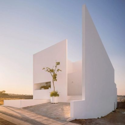
A minimalist white house in Mexico features in today's Dezeen Debate newsletter

image

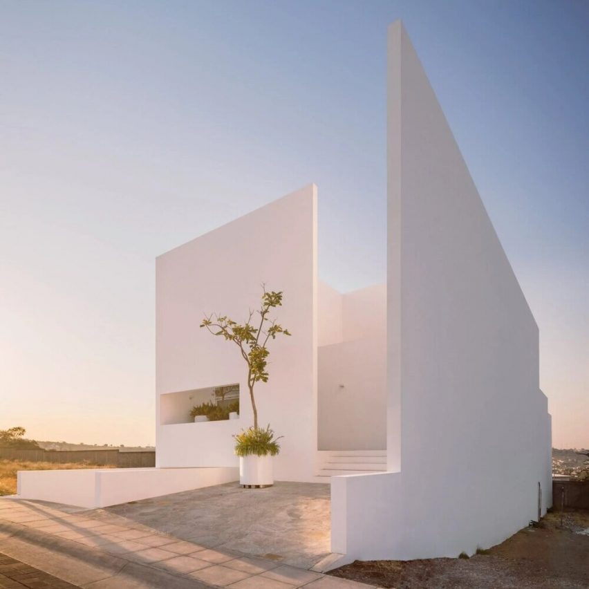
The latest edition of Dezeen Debate, the new name for our Dezeen Weekly newsletter, features a minimalist white house in Mexico.

Commenters are amazed by the Mexican villa, which Cotaparedes Arquitectos designed as "introspective architecture" focused on a pair of courtyards.

The house is located in La Piedad, a city that sits roughly halfway between Guadalajara and the capital Mexico City.

One reader called the project their "favourite" in the comments section.

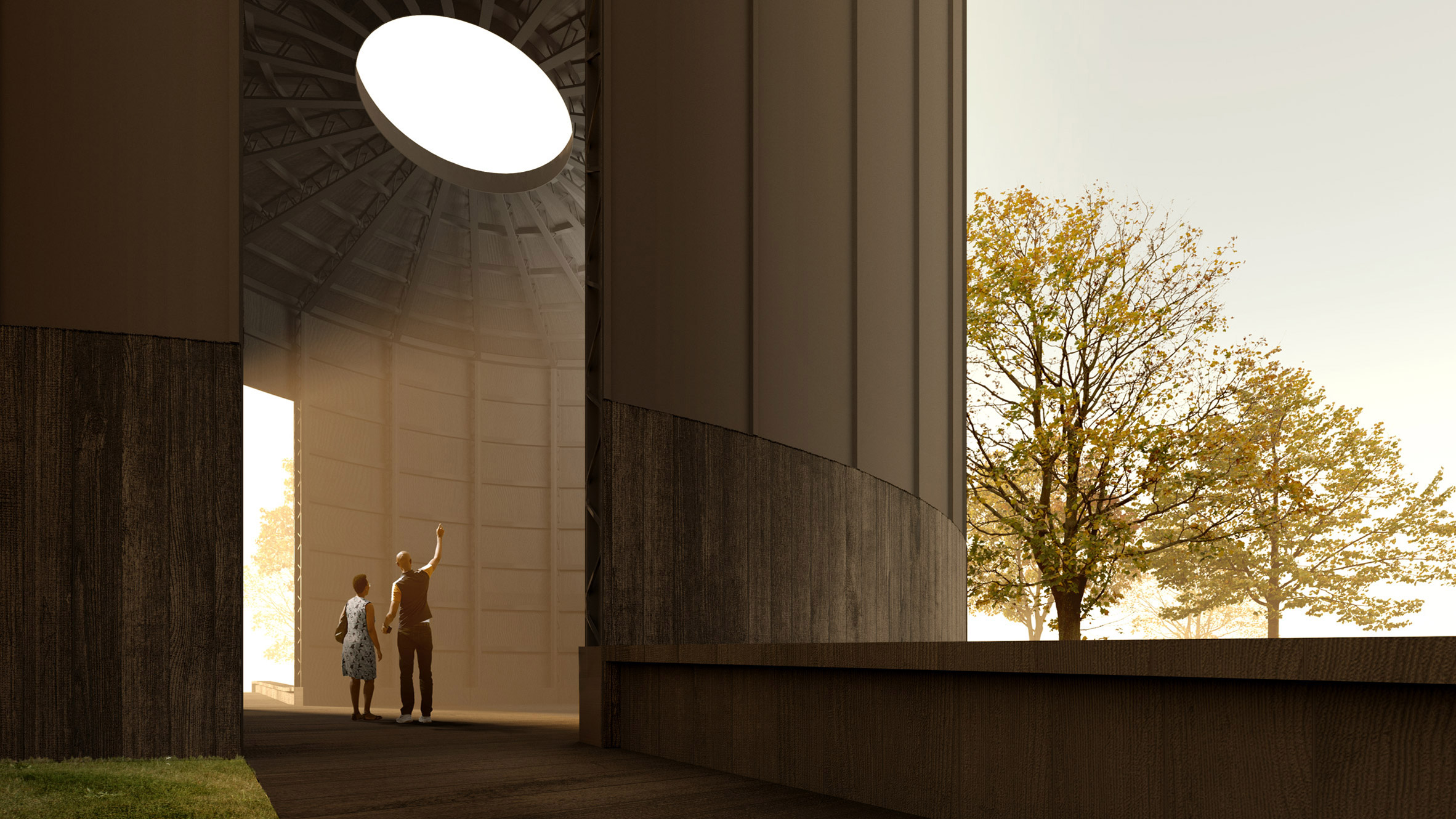
Render of Black Chapel by Theaster GatesTheaster Gates unveils Black Chapel as 2022 Serpentine Pavilion

Other stories in this week's newsletter include the design for this year's Serpentine Pavilion, MVRDV's claim that Westminster City Council's execution of Marble Arch Mound was "loveless", and the most architecturally significant venues for the Beijing 2022 Winter Olympics.

Subscribe to Dezeen Weekly

Dezeen Debate is a curated newsletter sent every Thursday containing highlights from Dezeen. [_Read the latest edition of Dezeen Debate](https://newsletter.dezeen.com/t/r-439AFE31540E365F2540EF23F30FEDED) _.

You can alsosubscribe to Dezeen Agenda, which is sent every Tuesday and contains a selection of the most important news highlights from the week, as well as [_Dezeen Daily](https://www.dezeen.com/dezeendaily/) _, our daily bulletin that contains every story published in the preceding 24 hours and Dezeen.

Subscribe to Dezeen Debate ›

The post A minimalist white house in Mexico features in today's Dezeen Debate newsletter appeared first on Dezeen.

#all #architecture #courtyards #mexico #dezeendebate #mexicanhouses #whitehouses