
Berlin studio Behles & Jochimsen Architekten has renovated and extended the Nuremberg Chamber of Commerce and Industry offices in Germany, adding sandstone-clad buildings that tie in with the area's historic architecture.
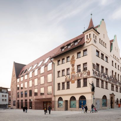
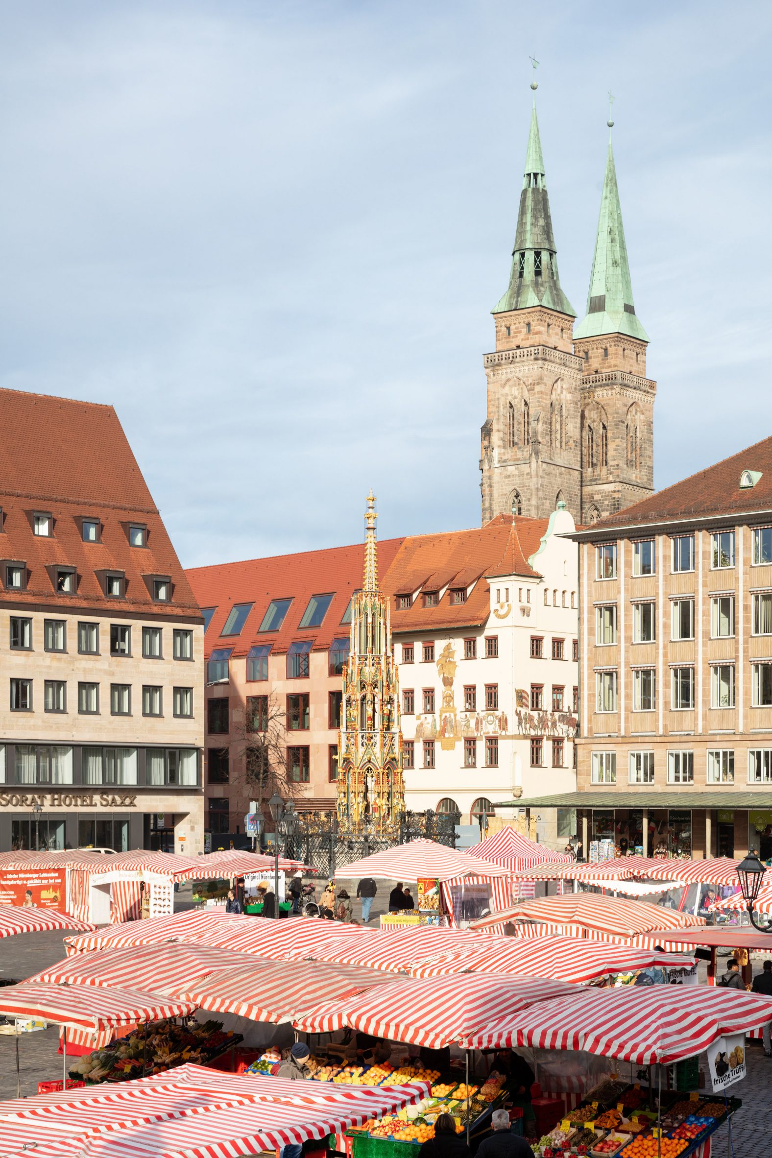
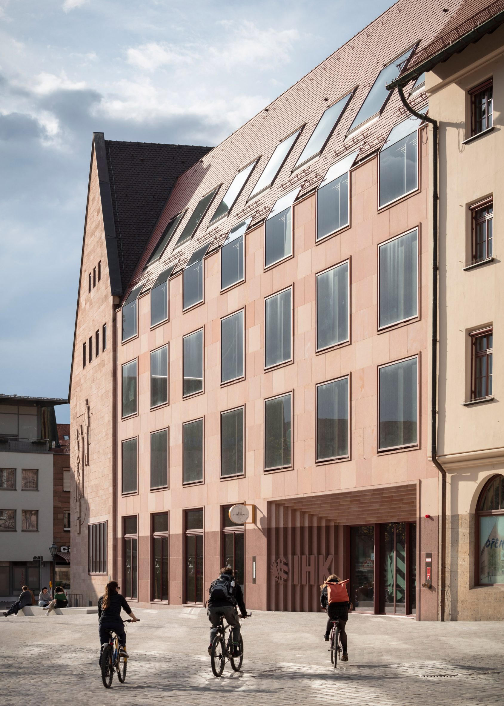
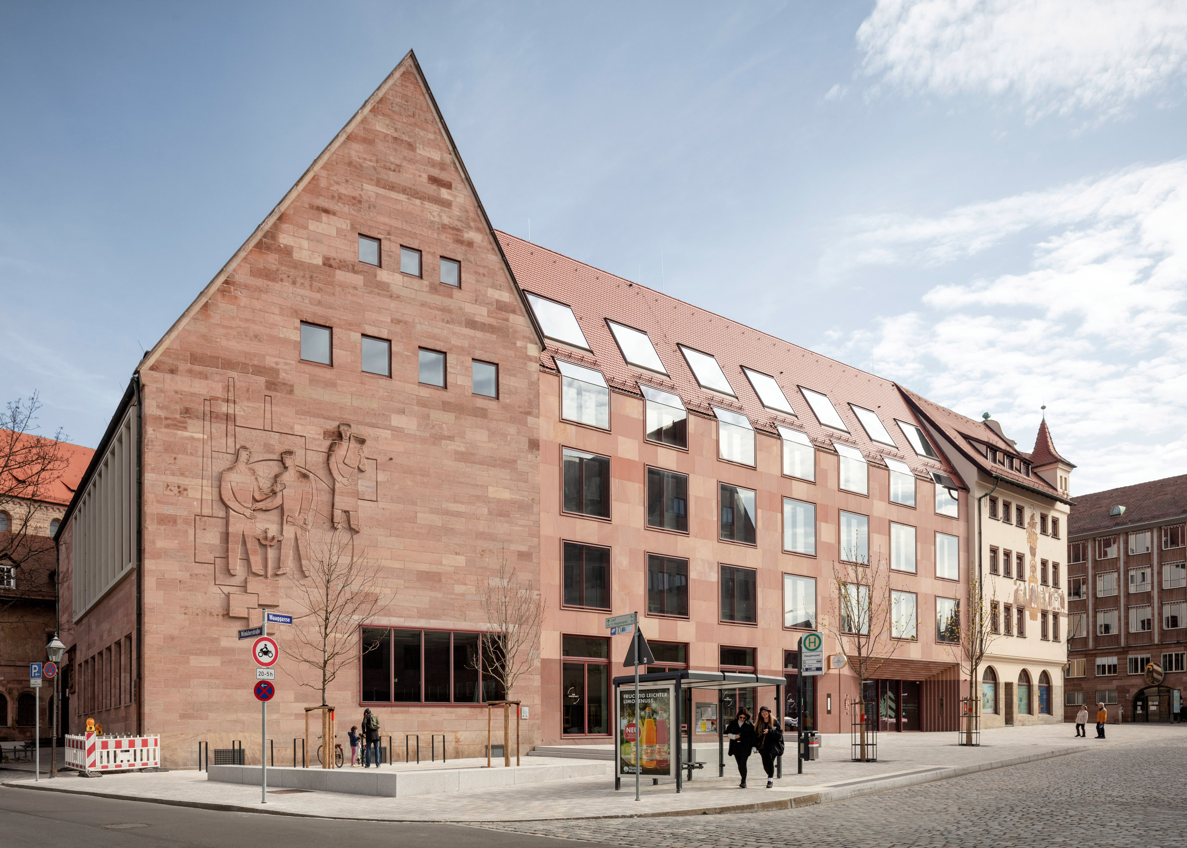
Named the House of Commerce, the headquarters is located on a prominent site in the oldest part of Nuremberg, between the main market square and the medieval church of St Sebald.
 The Nuremberg Chamber of Commerce and Industry headquarters have been renovated
Behles & Jochimsen Architekten was tasked with reorganising the existing headquarters to create more cohesive and practical offices for the organisation, which provides support to local businesses.
Several structures listed as historic monuments were preserved and restored as part of the scheme, while some modern additions to the site were demolished and replaced to improve circulation.
 The offices are positioned close to Nuremberg's main market square
Behles & Jochimsen Architekten's additions replace buildings that were not protected and had no significant architectural merit. Those that were restored date back to the 1950s and 1960s.
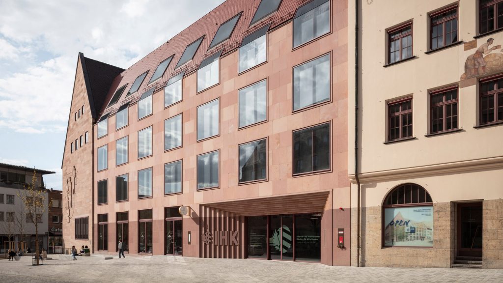
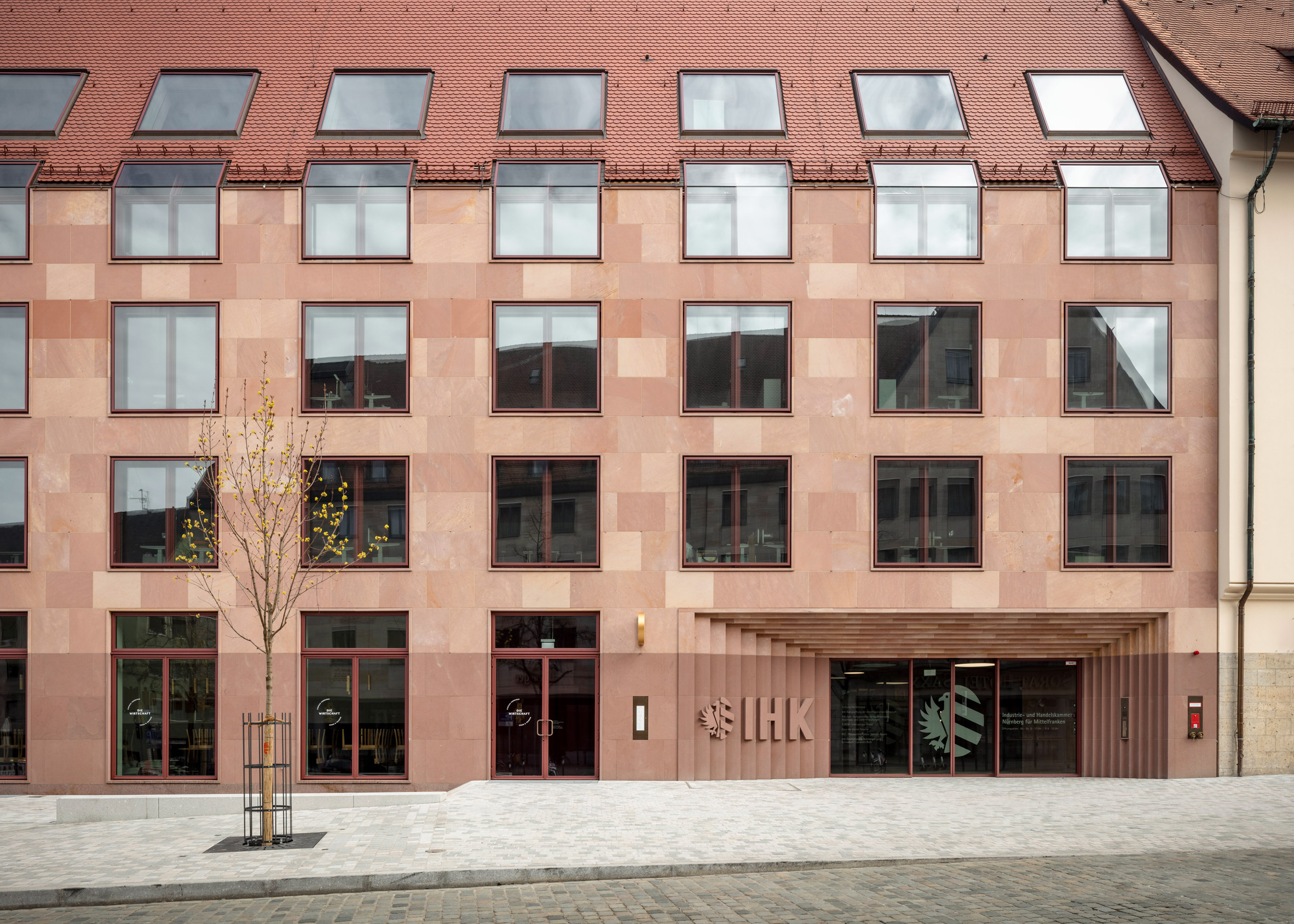
The extensions follow the original building line and align with the existing eaves, while their proportions and choice of materials also respect the heritage of the site.
 Behles & Jochimsen Architekten added sandstone-clad offices
"The new buildings adapt design features of the old town, such as the sandstone facade and the pitched roof with plain tiles," the architects explained.
"They pay homage to the architecture of the reconstruction after the war that characterises the townscape. The folded eaves windows respect the historic eaves heights."
 The sandstone cladding varies in colour
The headquarters' main entrance was moved to the busy Waaggasse street to give it greater prominence. Now visible from the nearby market square, it is set back from the facade and framed by a sculptural portal.
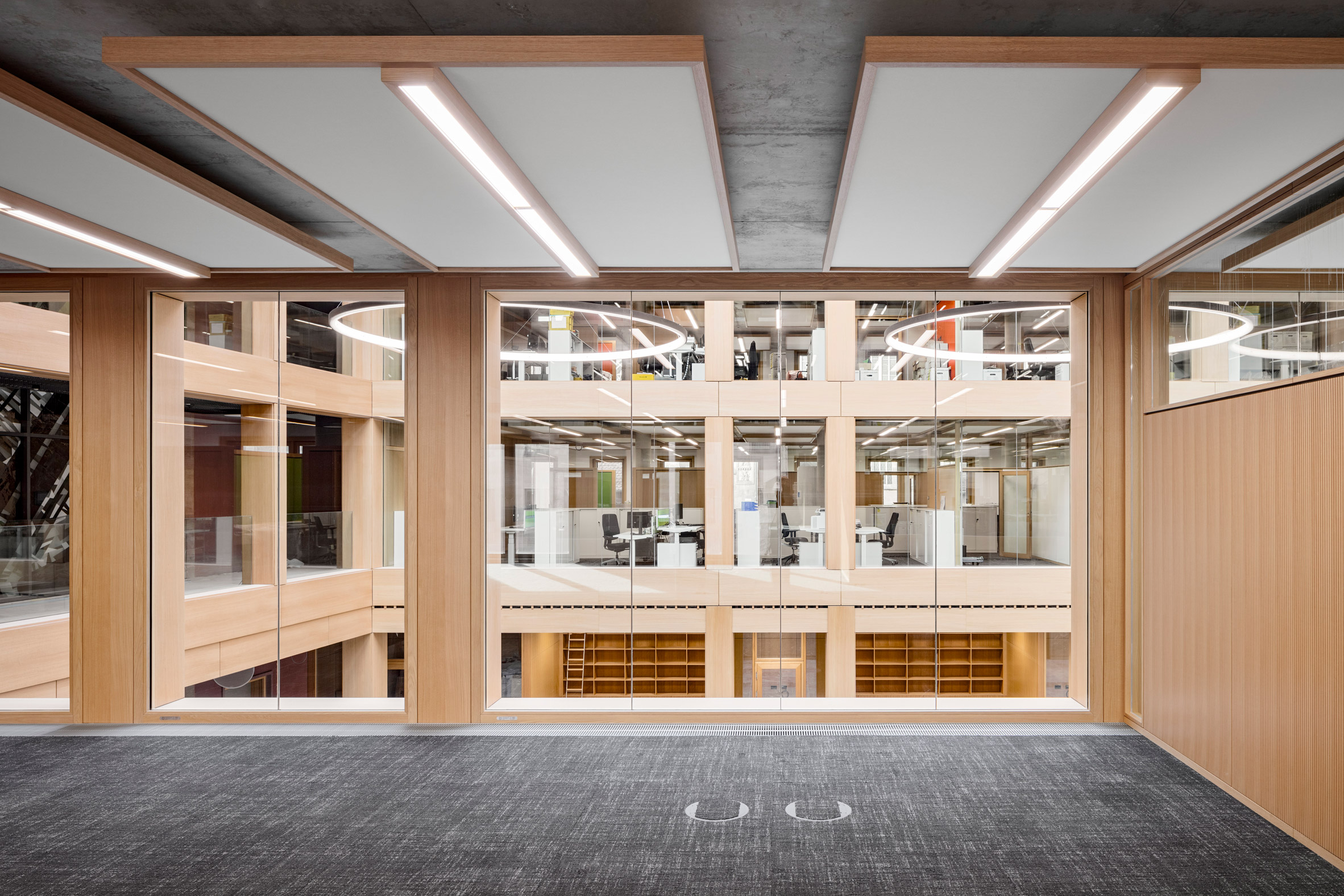
A previously open area on the west side of the site was filled in, allowing an existing central courtyard to be transformed into a glass-roofed atrium.
 The extensions are designed to align with the existing buildings
This four-storey atrium functions as a reception and service point for customers, as well as a flexible space for hosting exhibitions and events. It also helps to rationalise the previously complicated circulation between different parts of the headquarters.
The two new wings are positioned on opposite sides of the atrium, connected by bridges. The facades of the existing buildings remain visible behind the bridges, which recall the wooden arcades found within traditional Nuremberg houses.
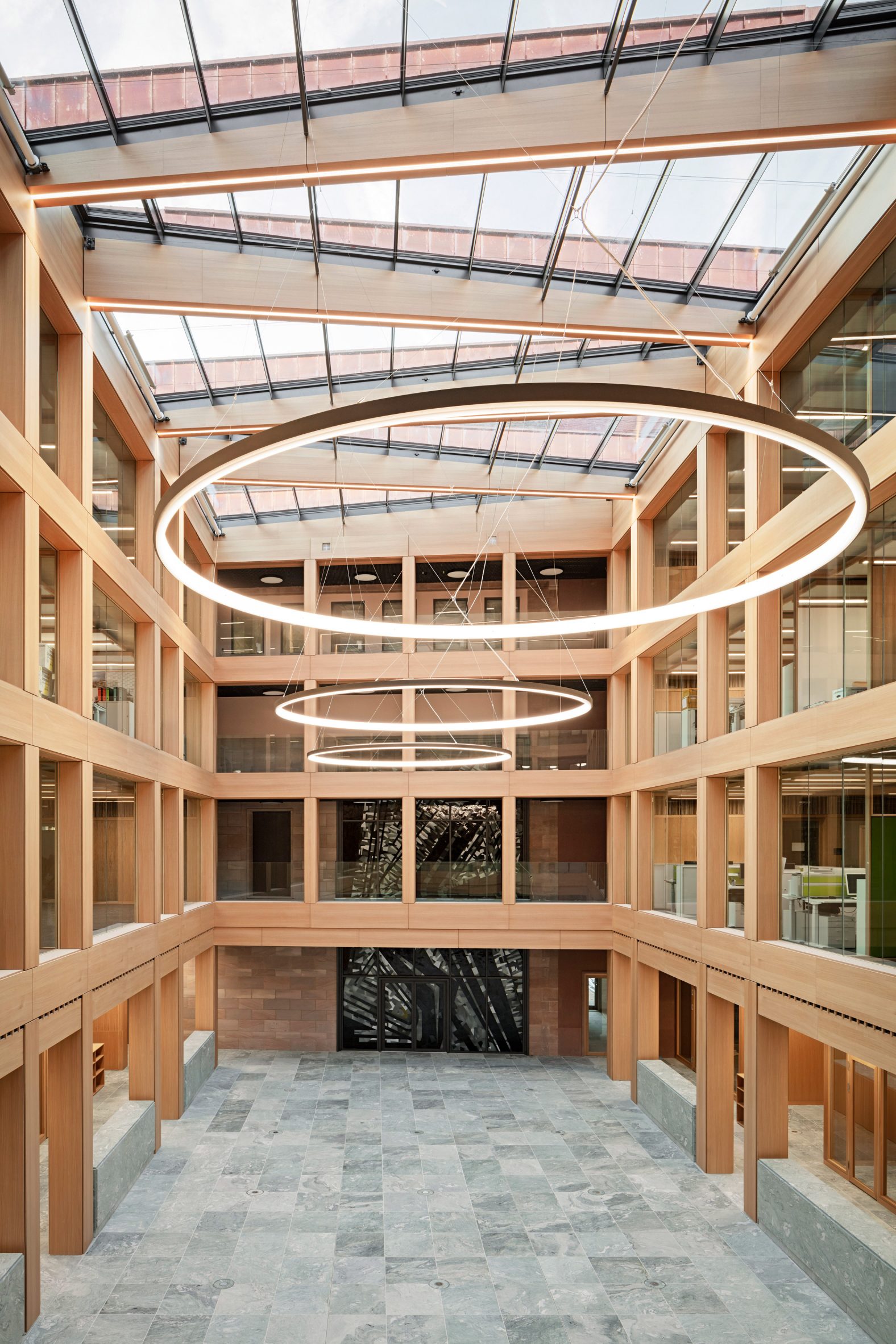 An atrium is positioned at the centre of the headquarters
Inside, the new wings contain spaces optimised for flexible office use, including areas beneath the eaves which are narrower than the main floors and benefit from higher ceilings.
In the older buildings, the original spatial organisation with a more traditional arrangement of rooms and corridors has been retained.
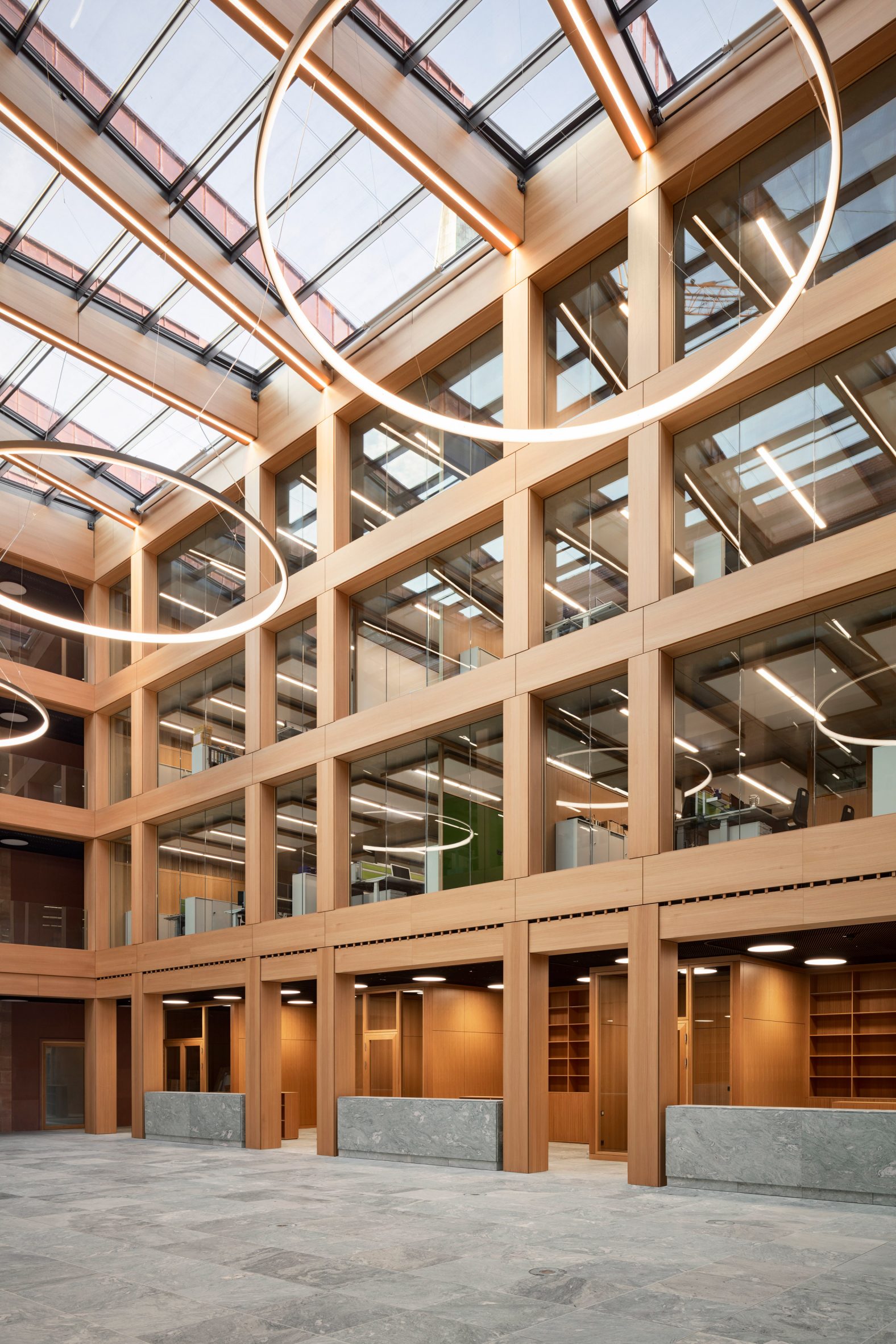 The atrium is lit by skylights
Materials used throughout the project reflect the region's traditional building methods. The bases of the extensions are clad in dark Wuestenzell sandstone and align with the plinth of the original corner building.
A lighter Schweinstaler sandstone used across the upper portion of the facades includes subtle tonal variations. Simple roof tiles were chosen to match those found on neighbouring buildings.
[ 
Read:
David Chipperfield adds limestone-clad extension to Kunsthaus Zurich
](https://www.dezeen.com/2020/12/16/david-chipperfield-kunsthaus-zurich-museum-extension/)
Oversized windows, which are flush-mounted into the stone cladding, introduce a modern detail to the facades. The windows fold over the building's eaves, with further skylights illuminating the interiors from above.
The building's interiors feature natural and hard-wearing materials such as the pale-green stone used for flooring and counters in the atrium. Jura stone used for the corridors and staircases references the floors of the old buildings.
 Flexible office spaces feature in the new wings
Light-coloured walls and wooden doors create a warm and muted atmosphere in the offices. Oak-framed ceiling panels with integrated lighting optimise the acoustics in these spaces.
Behles & Jochimsen Architekten was established in 1999 by Armin Behles and Jasper Jochimsen and has worked on several projects involving the conversion of listed historic buildings.
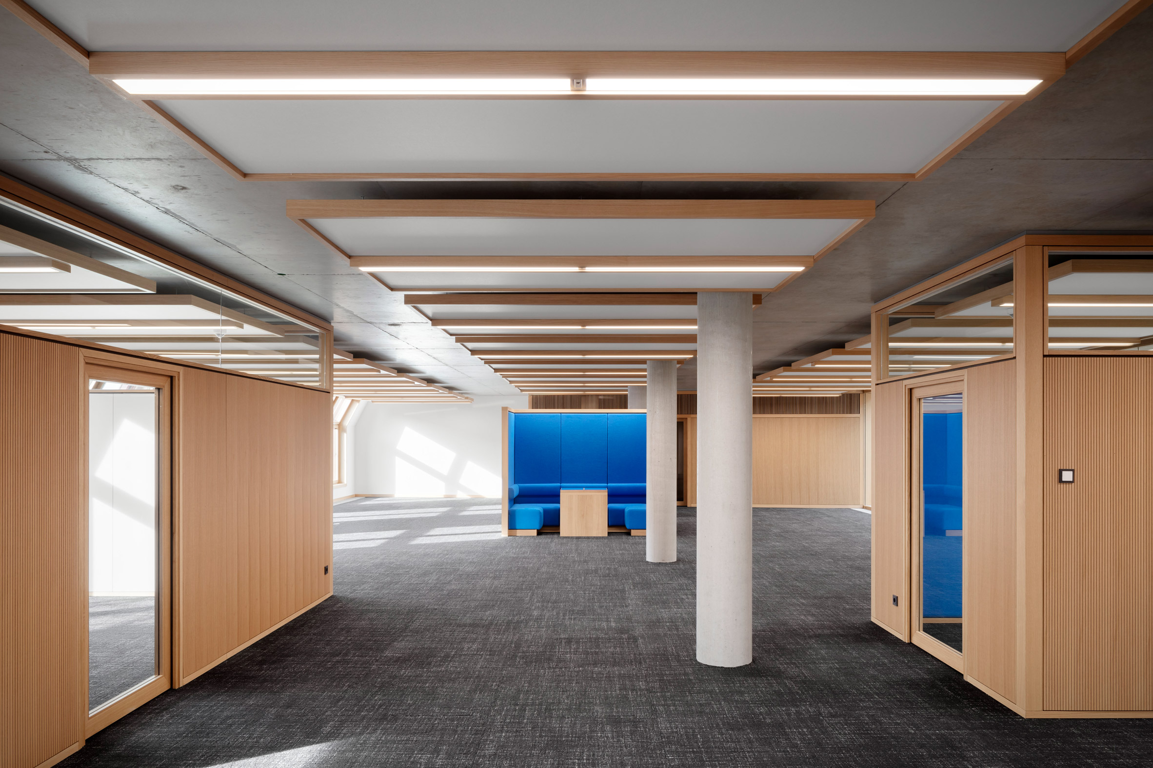 Oak-framed ceiling panels optimise the acoustics in the offices
In Perth, OMA and Hassell also recently took on the challenge of preserving and extending a group of heritage buildings.
The five existing buildings, which date back as far as the 19th century, were restored and linked by contrasting, contemporary structures to create a museum that celebrates the history of Western Australia.
The photography is byMarcus Bredt.
Project credits:
Client: Nuremberg Chamber of Industry and Commerce for Middle Franconia
Project management: GCA
Architect: Behles & Jochimsen Architekten
Team: Armin Behles, Laura Casado Albo, Jenny Dittrich, Matthias Hänsch, Jasper Jochimsen, Iva Kocheva, Bela Schwier, Simon Stahnke
Tendering and construction management: GanzWerk
Structural engineering: LAP Leonhardt, Andrä und Partner
Mecanical engineering: Rentschler Riedesser
Electrical engineering: Raible + Partner
Building physics: Müller BBM
Fire protection: Oehmke + Herbert
The post Modern extensions unify existing buildings at Nuremberg's House of Commerce appeared first on Dezeen.
#all #architecture #instagram #germany #officearchitecture #extensions #renovations #sandstone


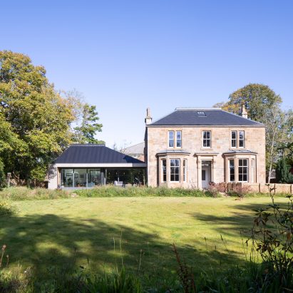

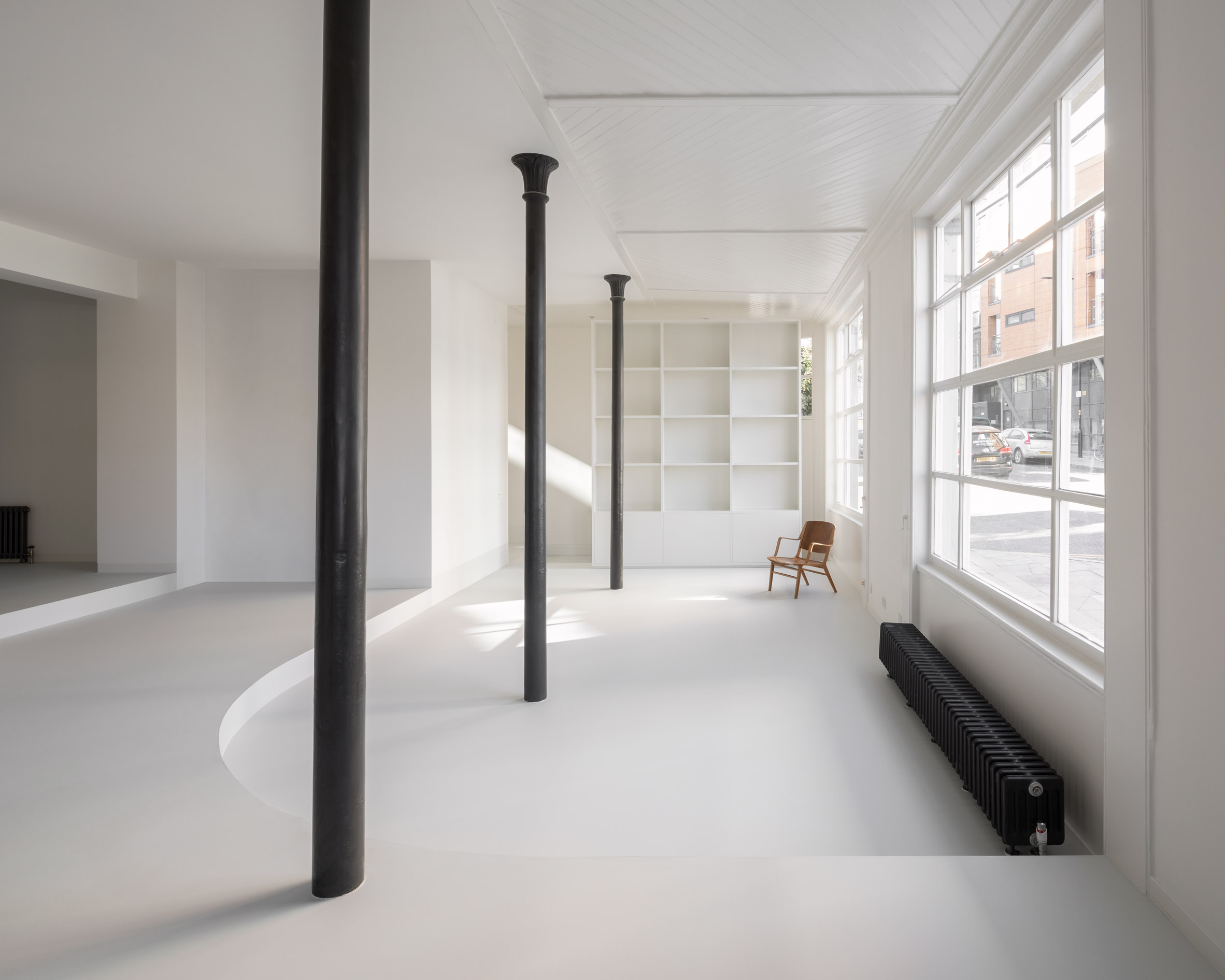
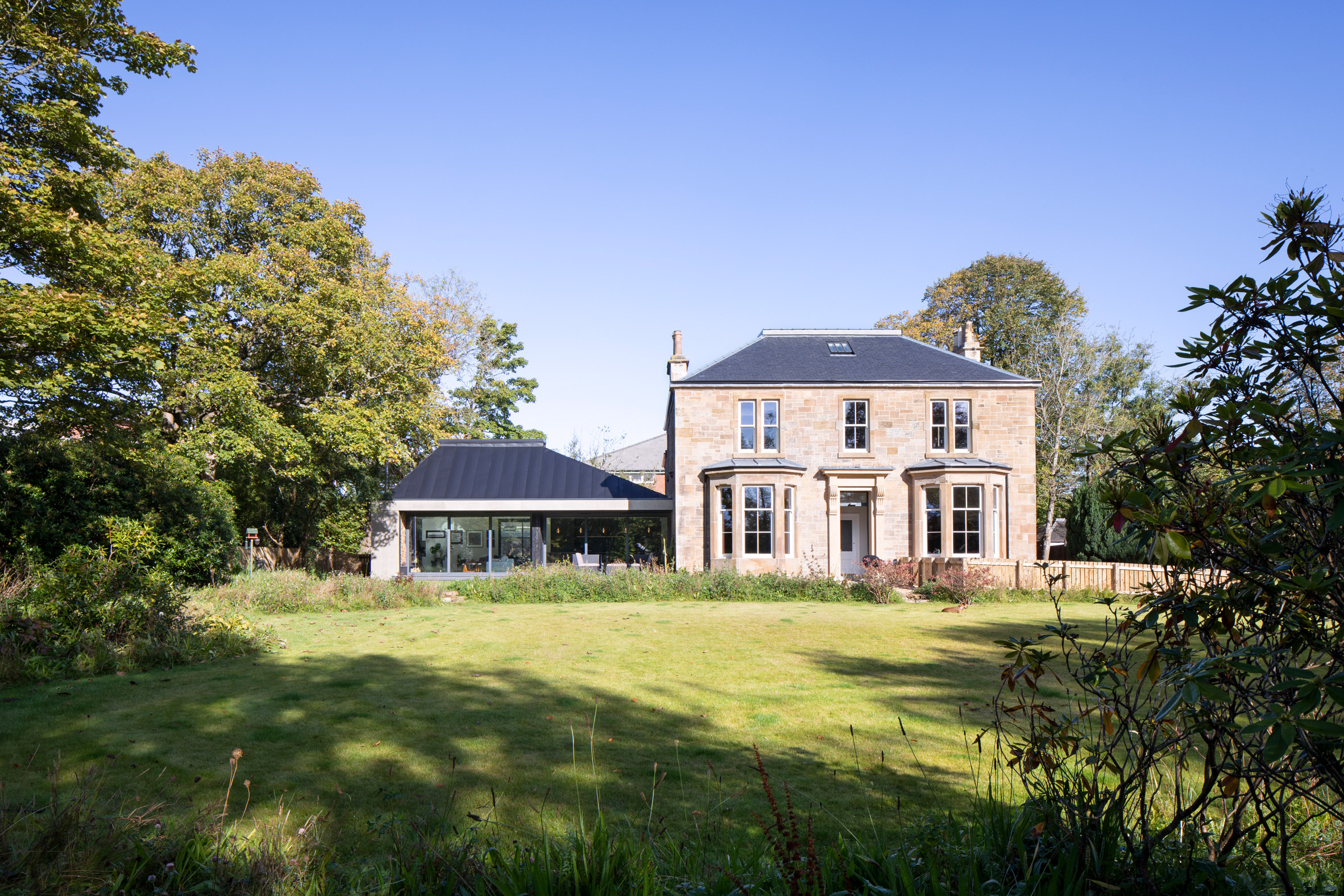 Loader Monteith has added a single-storey extension to a Victorian villa
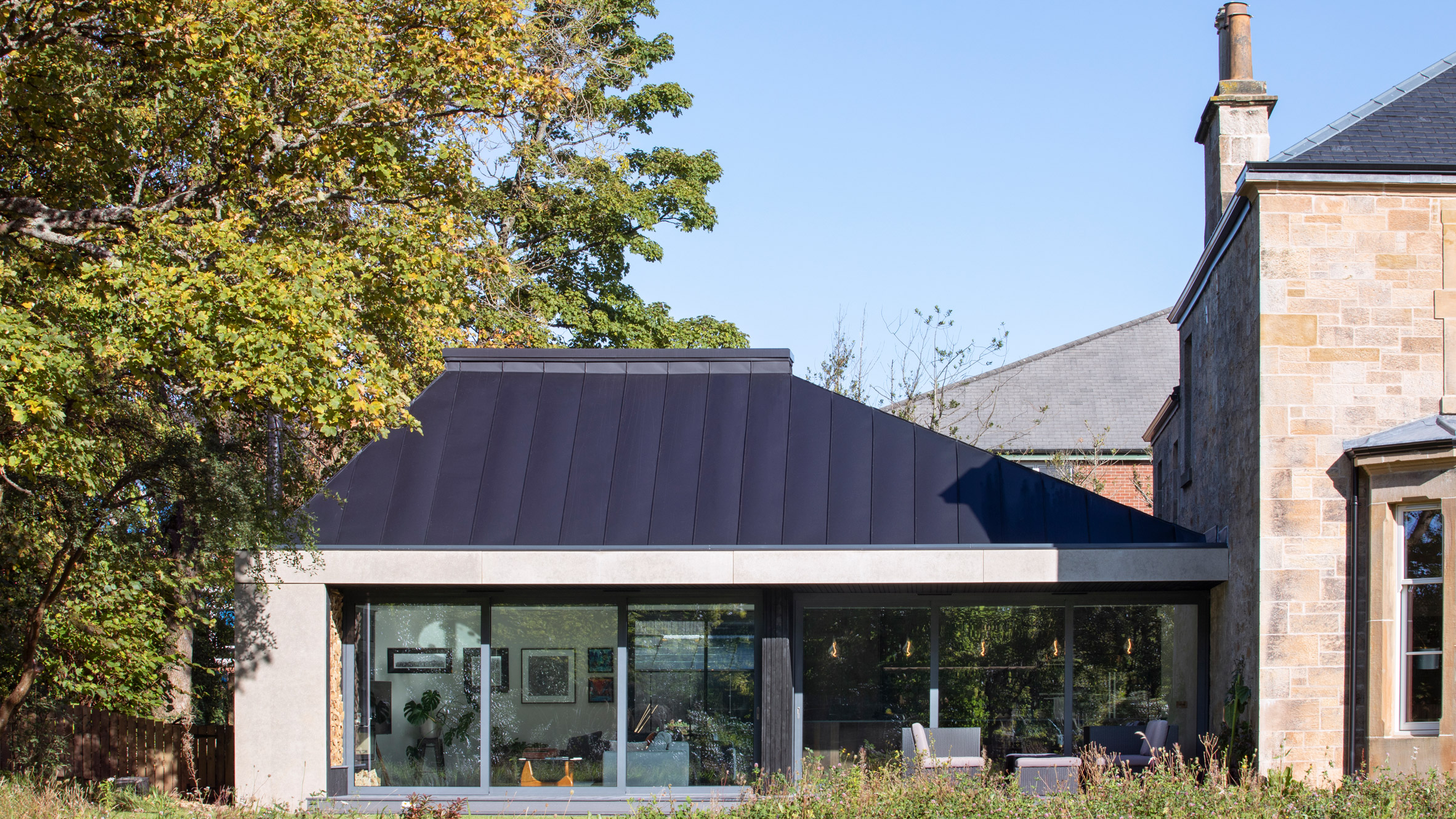 Its pitched roof and materials are designed to complement the existing house
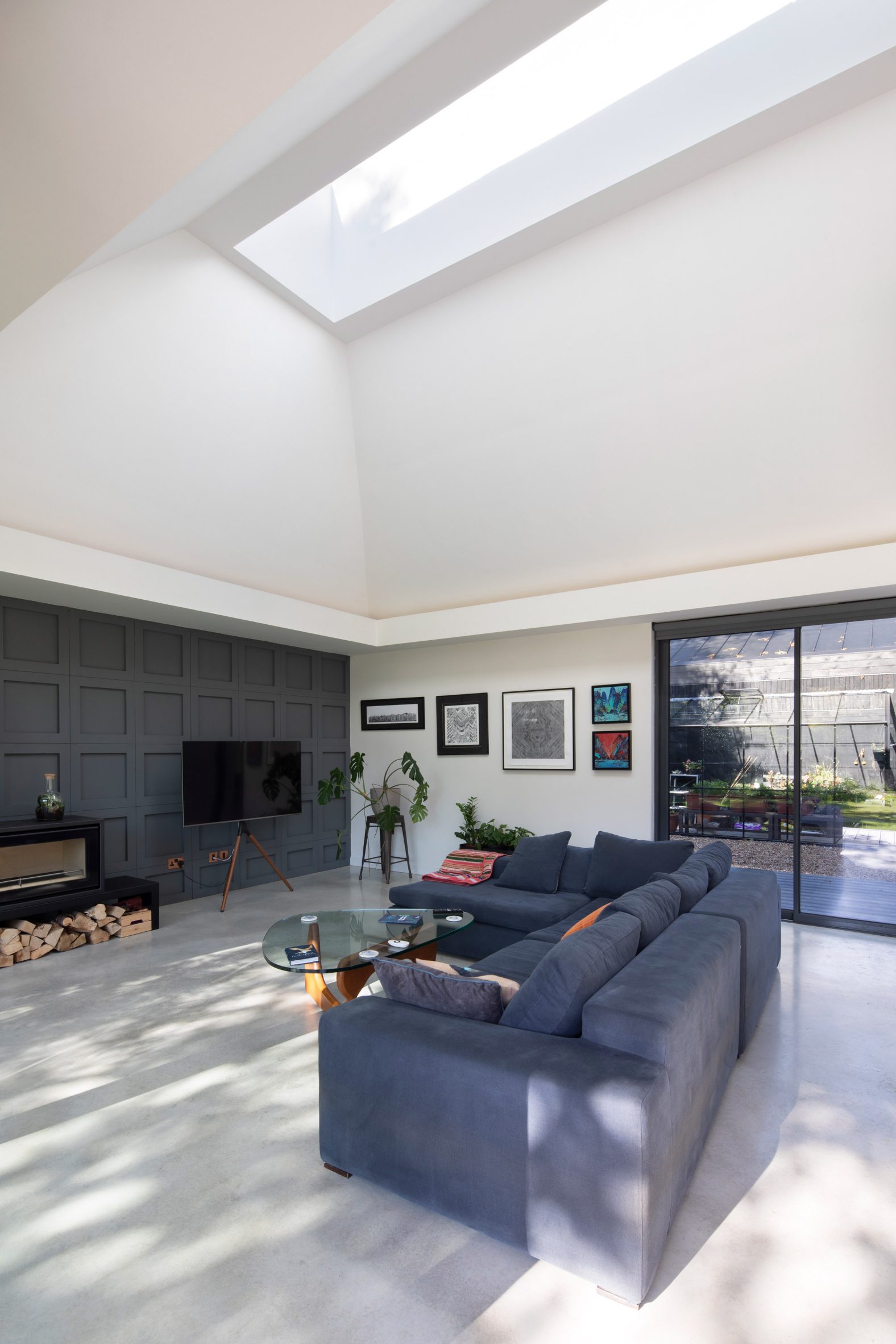 A living area has sliding glass doors that lead outside
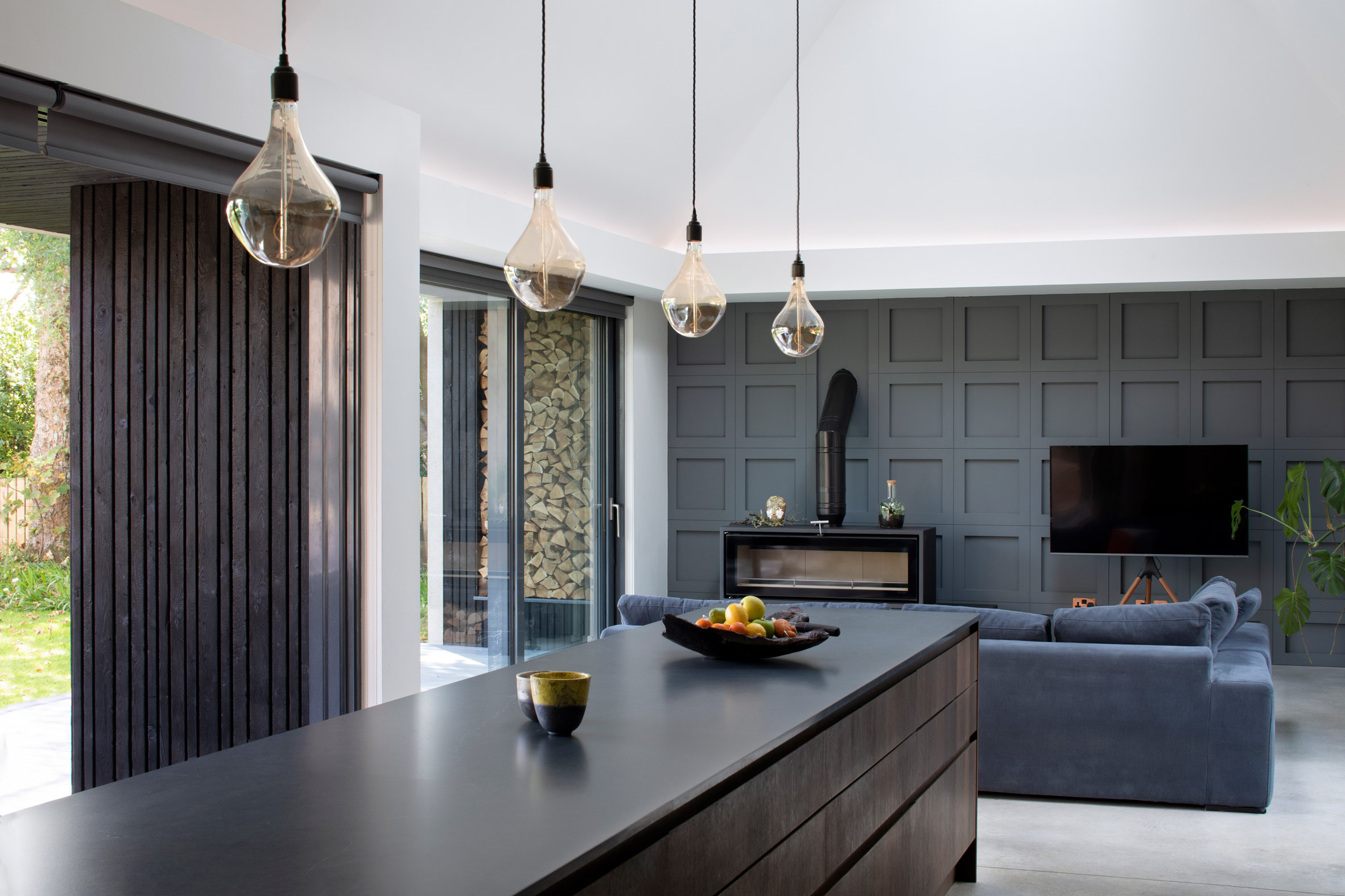 A skylight above the living area allows light to filter through
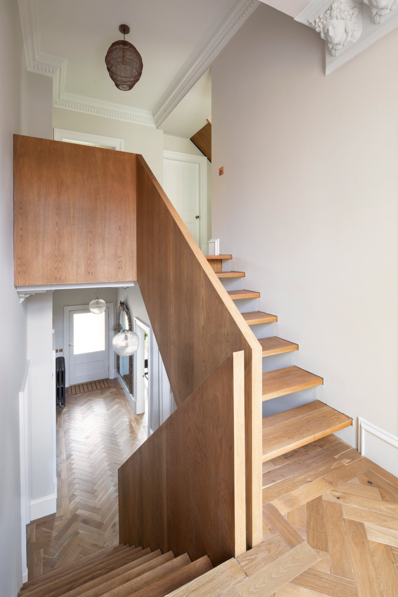 A wooden staircase has been introduced in the existing building
 The original building contains a study and sitting room
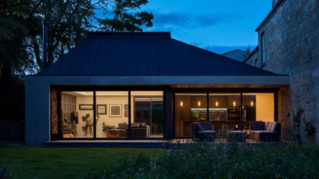


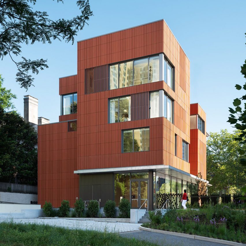
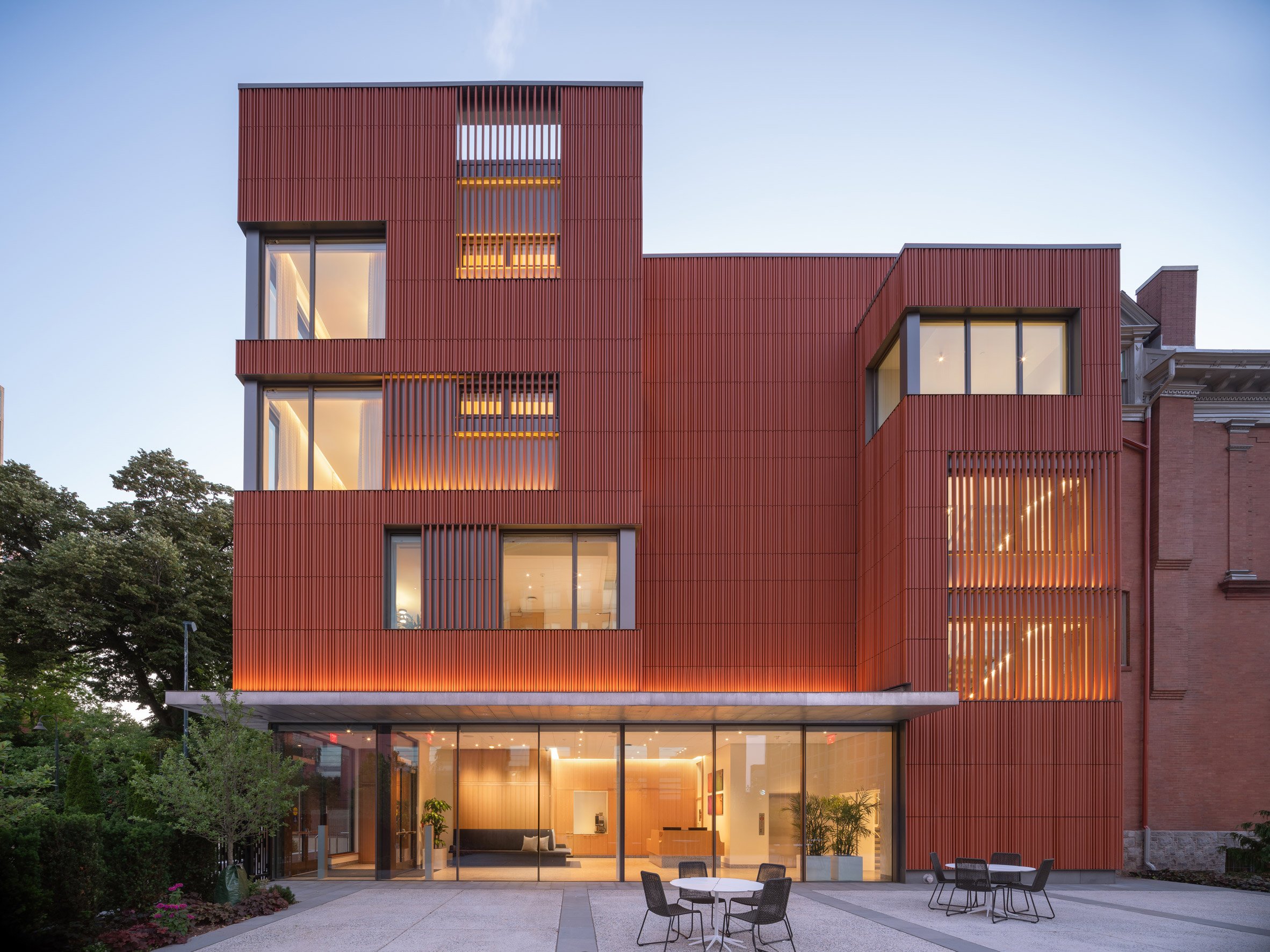
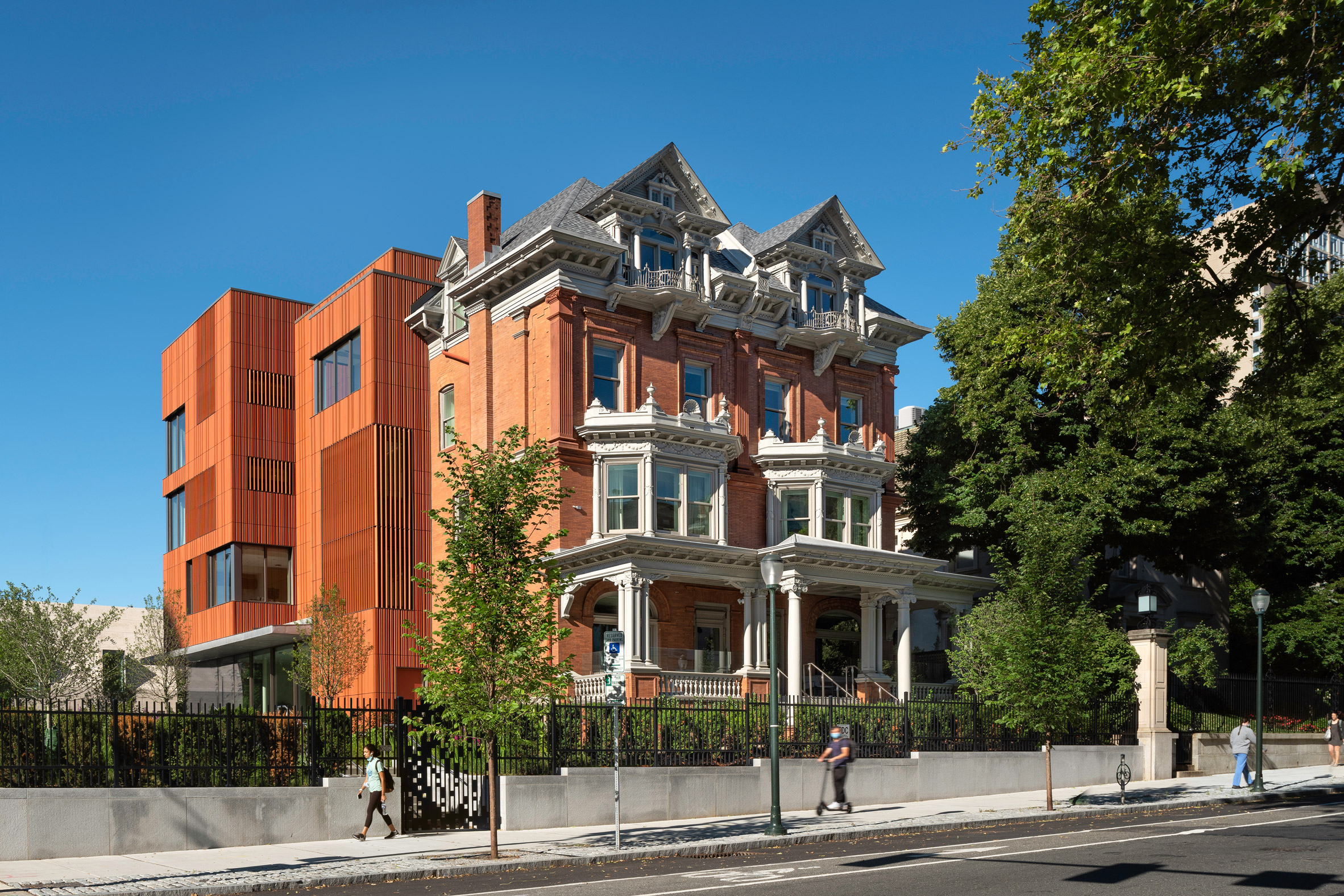 Meeting and Guesthouse building is located on the University of Pennsylvania campus in Philadelphia
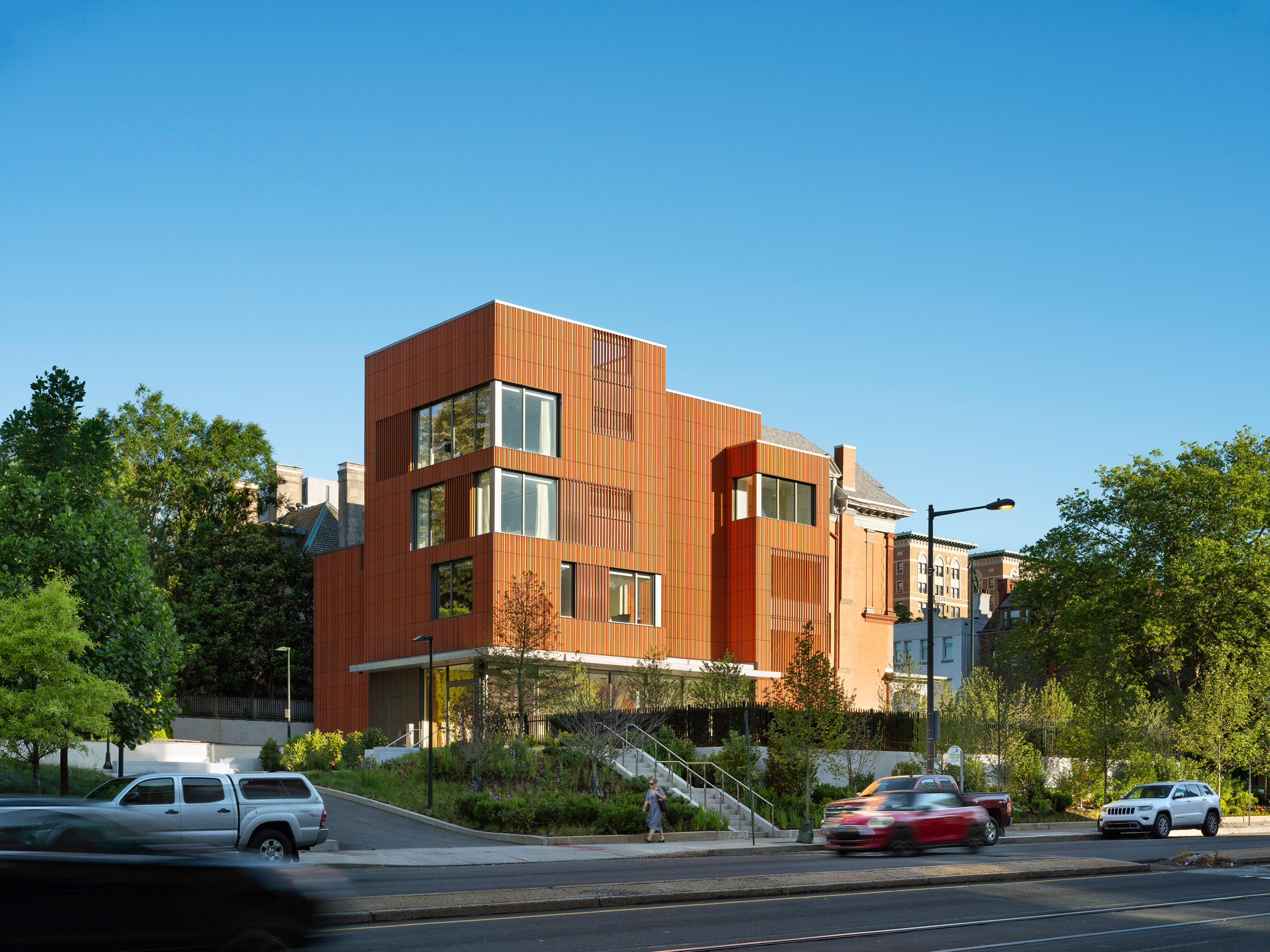 Deborah Berke Partners added a terracotta-clad extension to the Victorian-era buildings
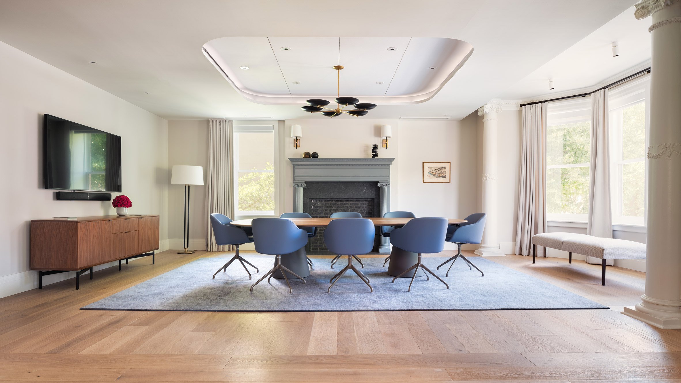 Rooms feature neutral tones with pops of colour
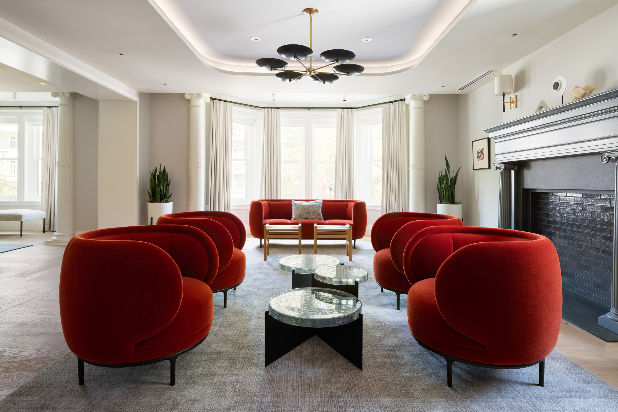 The project includes multiple meeting spaces
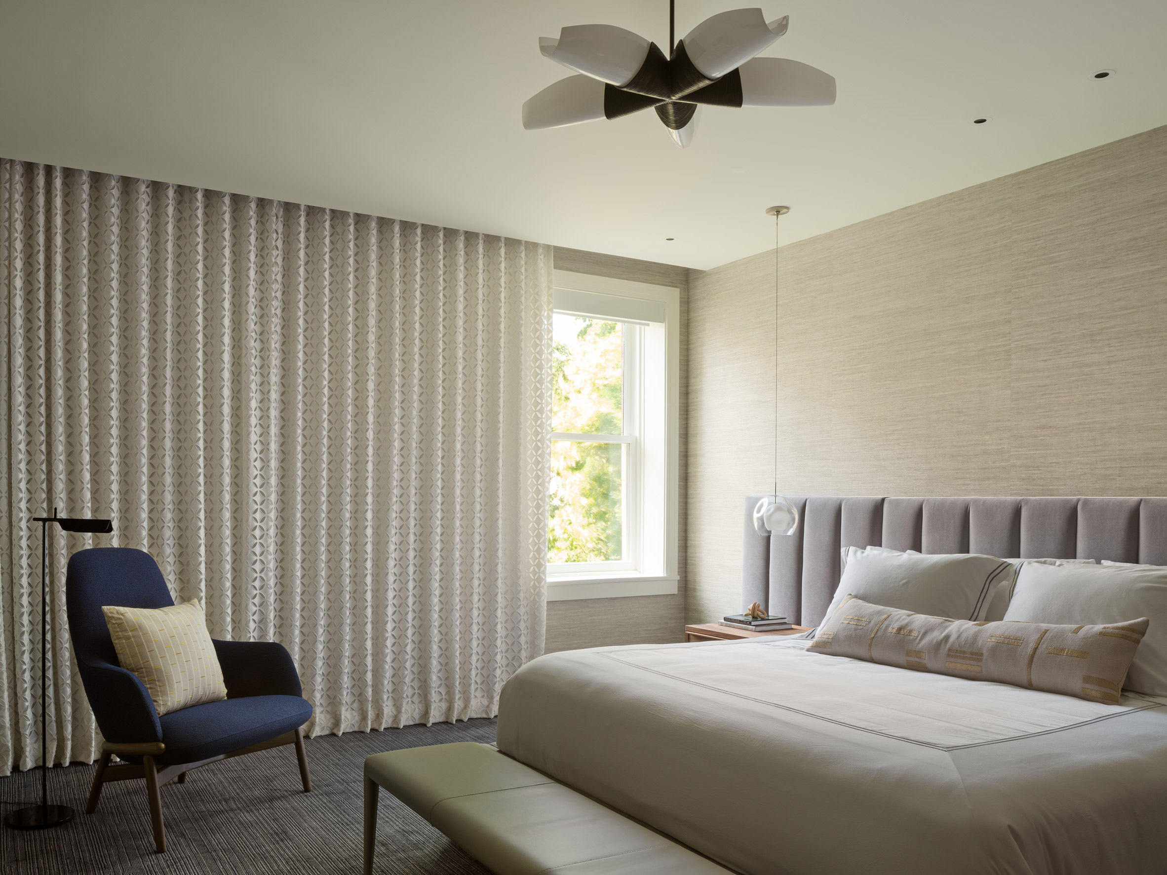 Four guest suites are located on the upper floor
 A former parking lot was converted into a terrace with bluestone paving


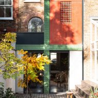
 Photo is by Adam Scott
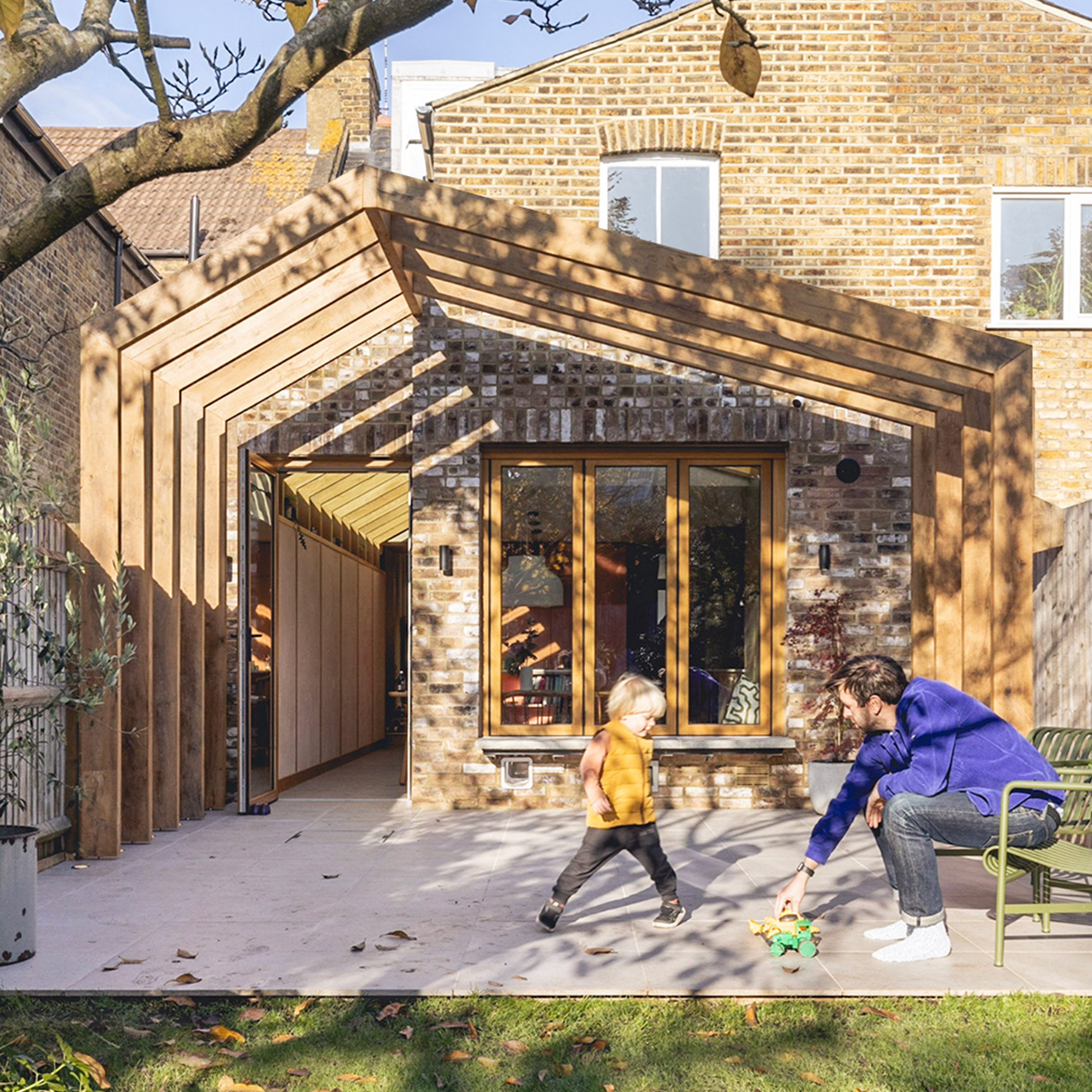 Photo is by Billy Bolton
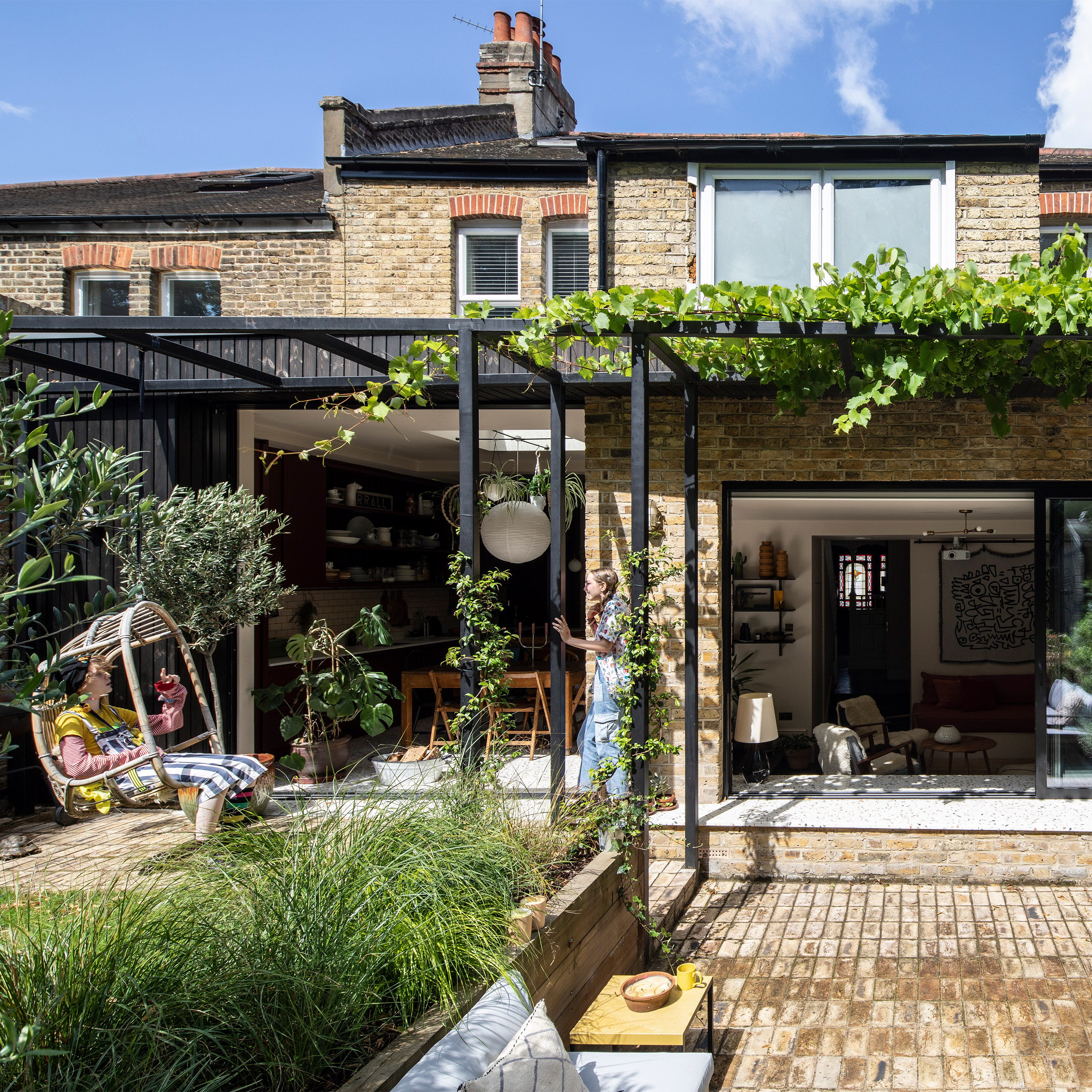 Photo is by Adelina Iliev
 Photo is by Nick Deardon
 Photo is by Megan Taylor
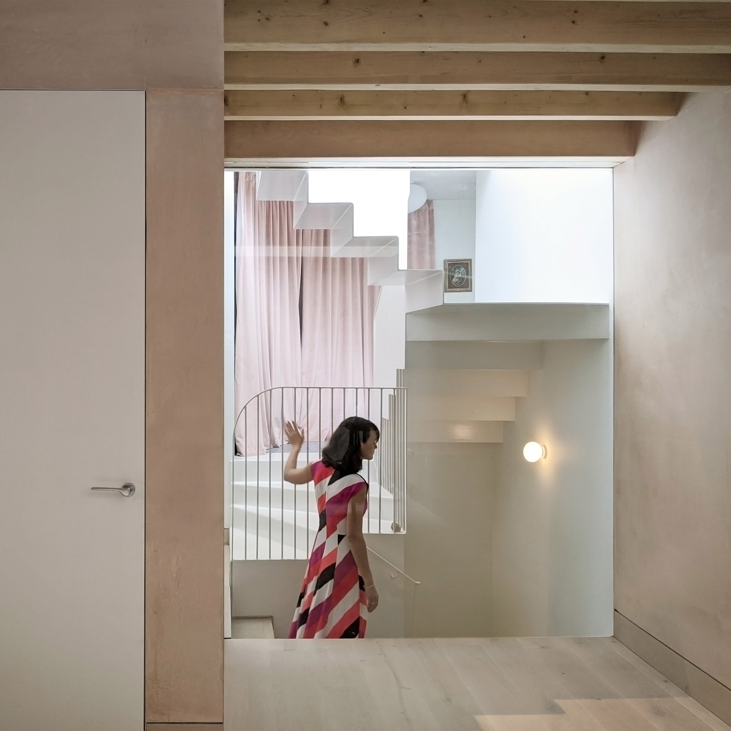 Photo is by VATRAA
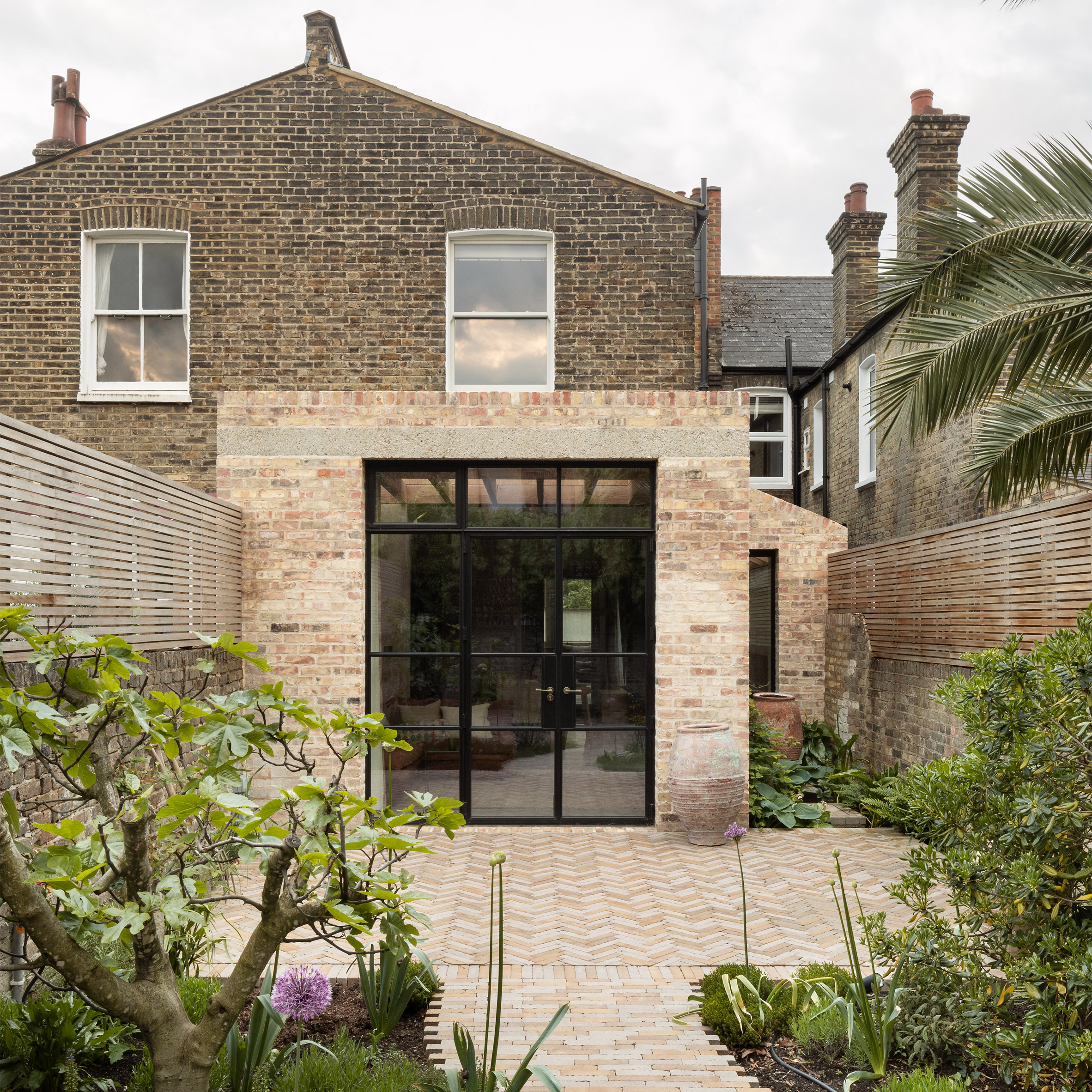 Photo is by Ståle Eriksen
 Photo is by Jim Stephenson
 Photo is by Building Narratives
 Photo is by Tim Soar
 Photo is by Ståle Eriksen
 Photo is by Andy Stagg
 Photo is by David Grandorge
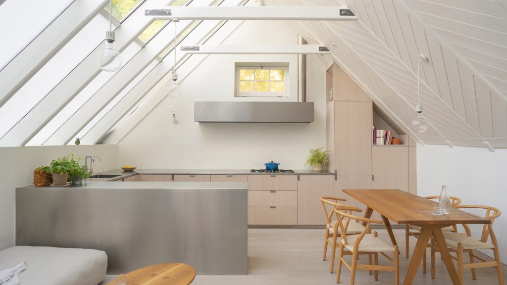
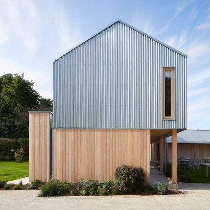

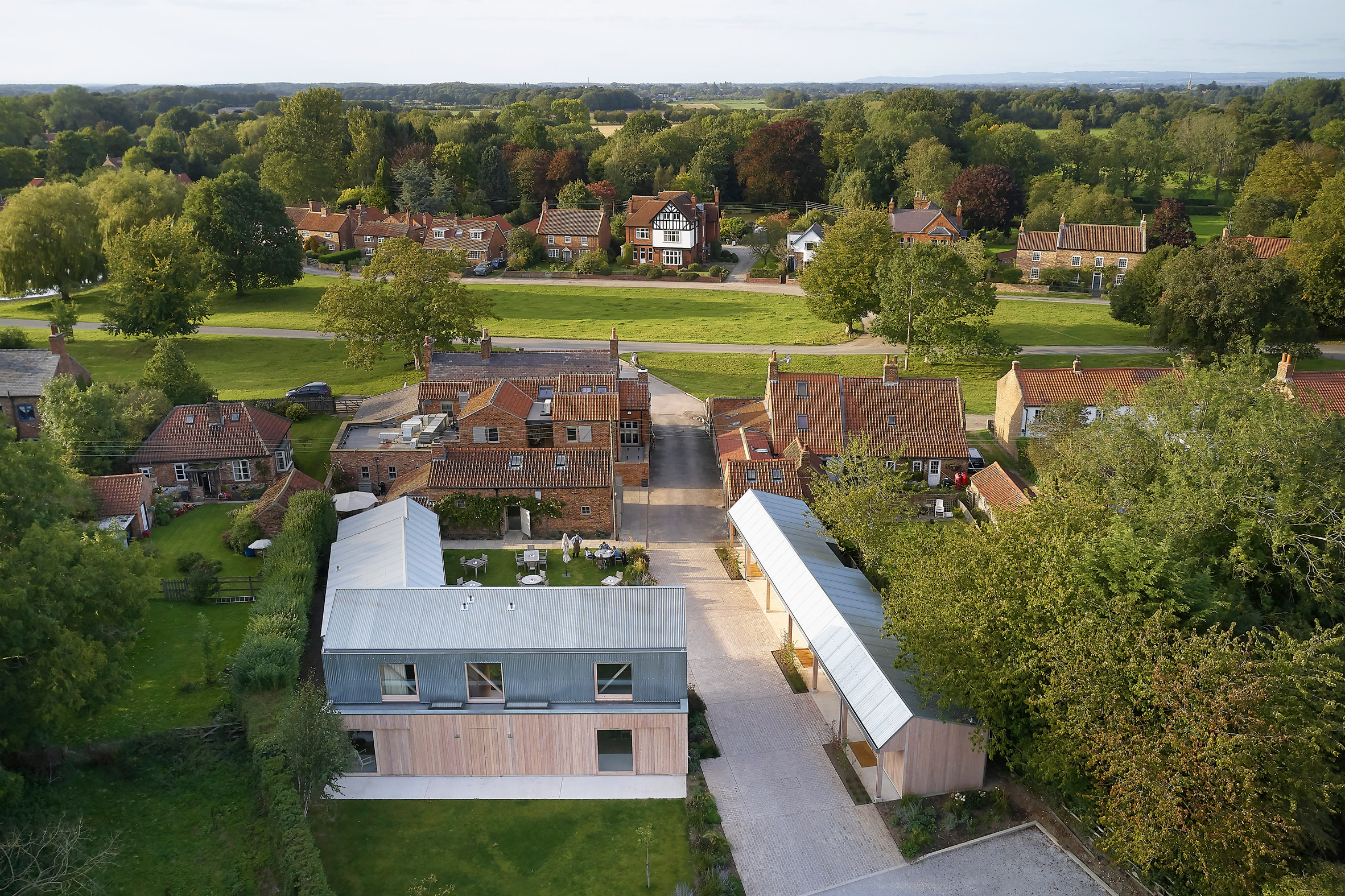 De Matos Ryan added guest suites to The Alice Hawthorn pub in Yorkshire
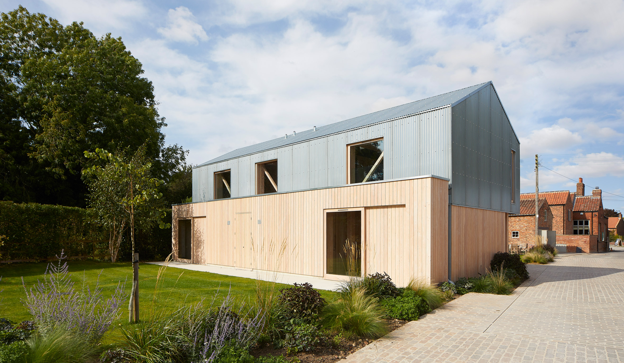 The new buildings are clad in larch and galvanised steel
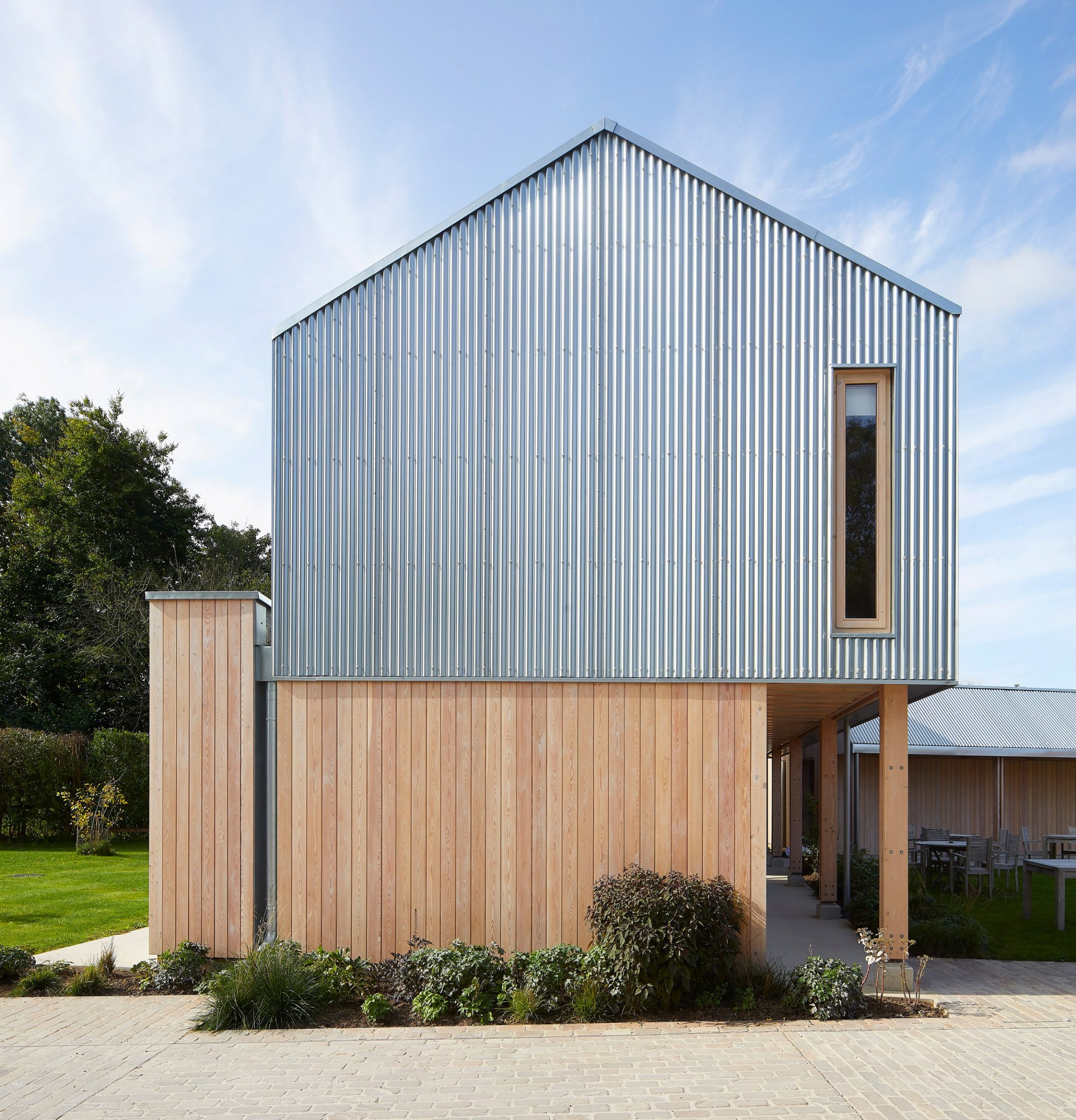 The additions are arranged around a courtyard
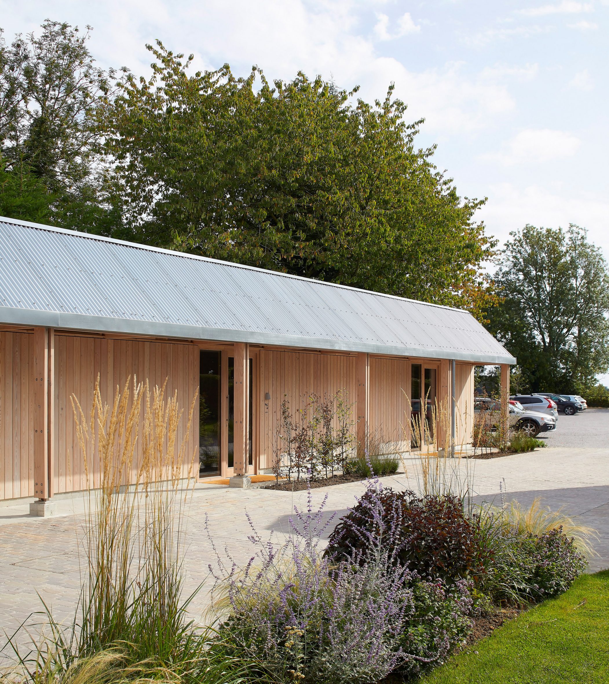 Single-storey guest suites were built to provide visitors with accessible spaces
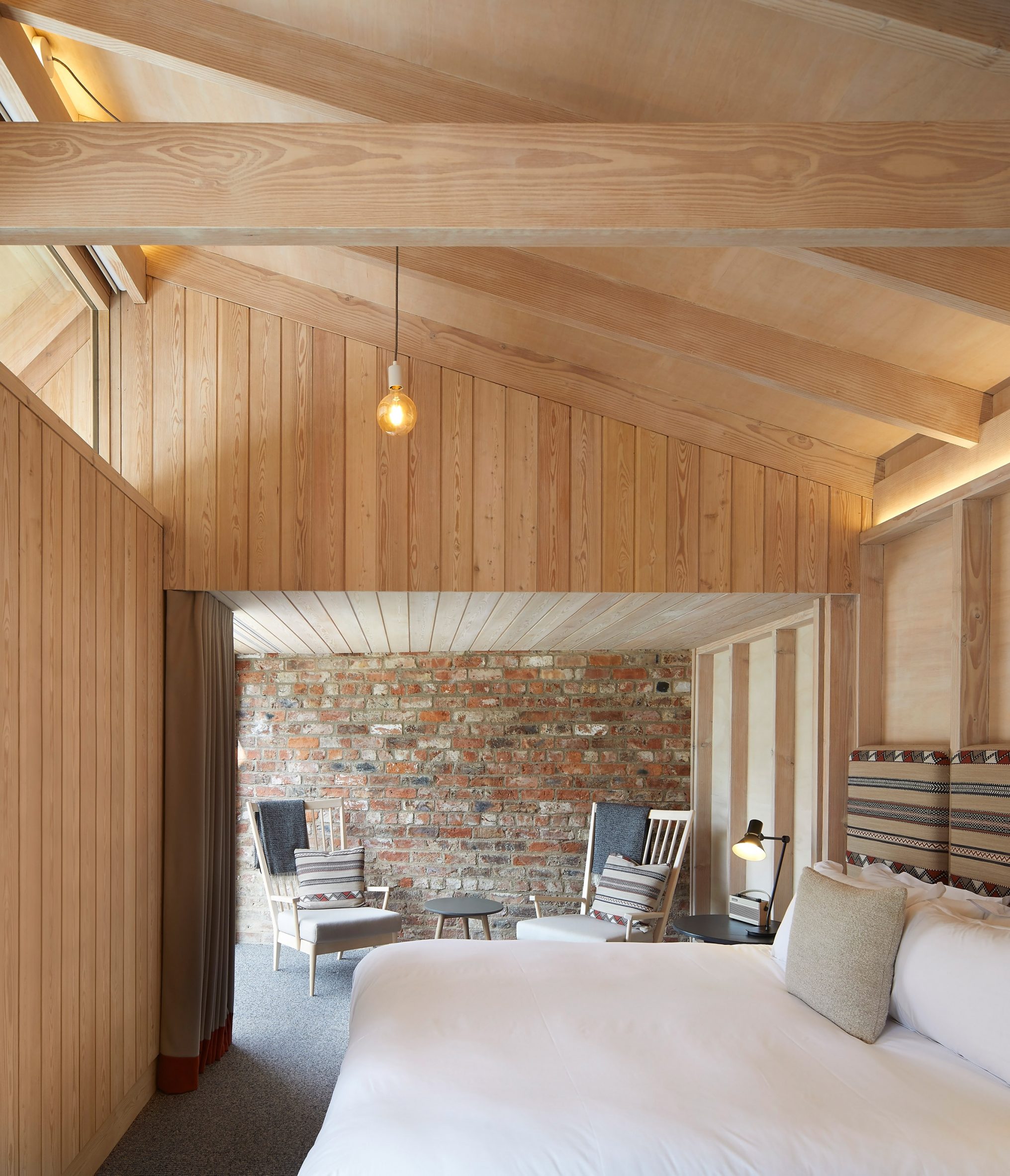 The site contains 12 ensuite guest bedrooms
 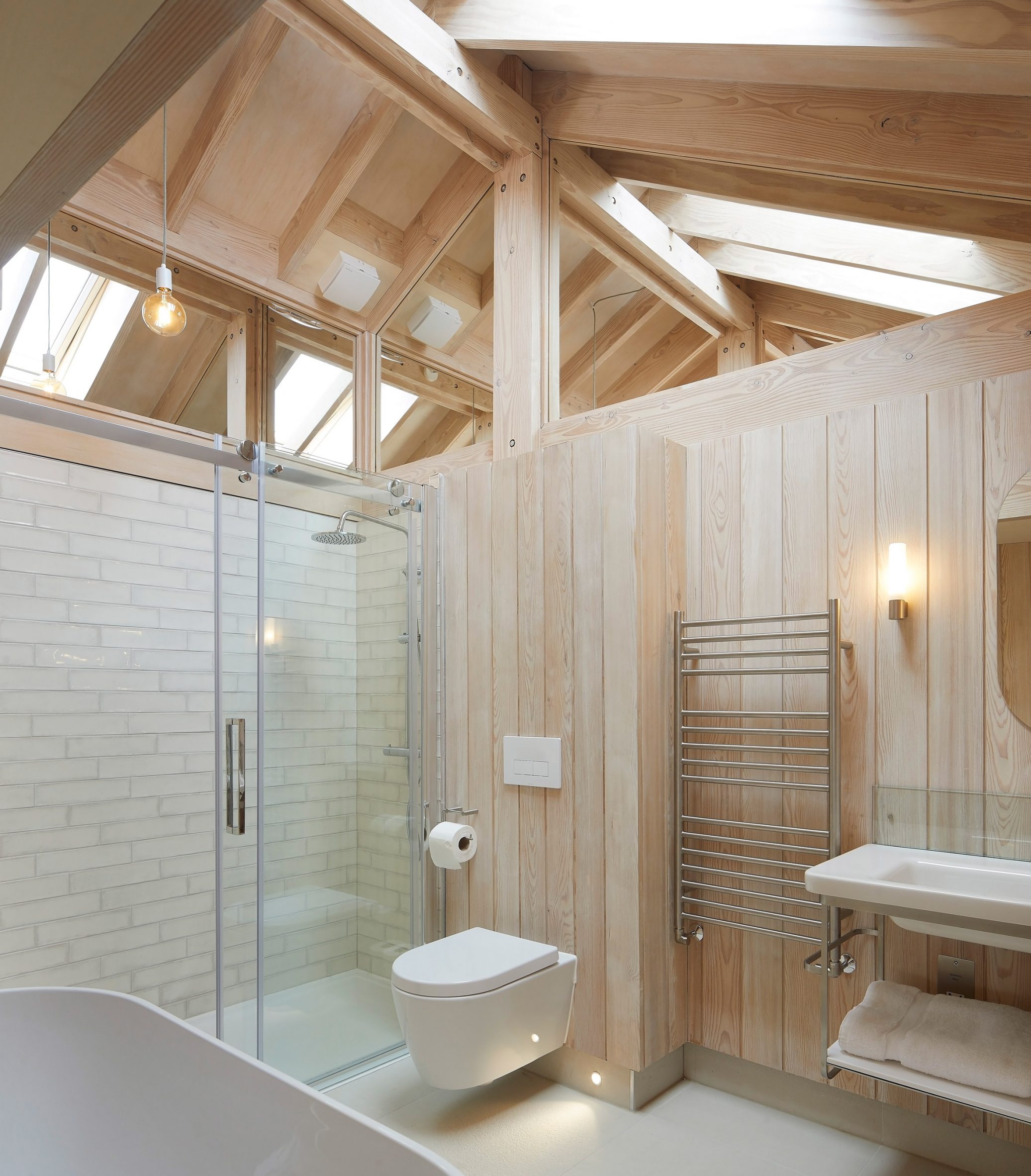 A natural palette was used throughout the interior
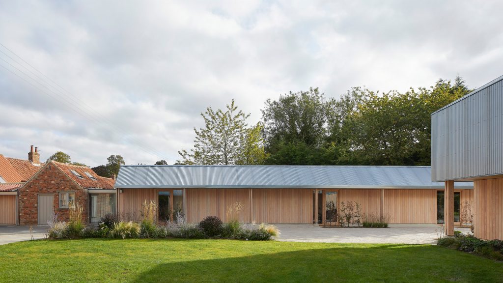
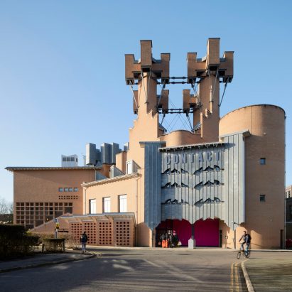

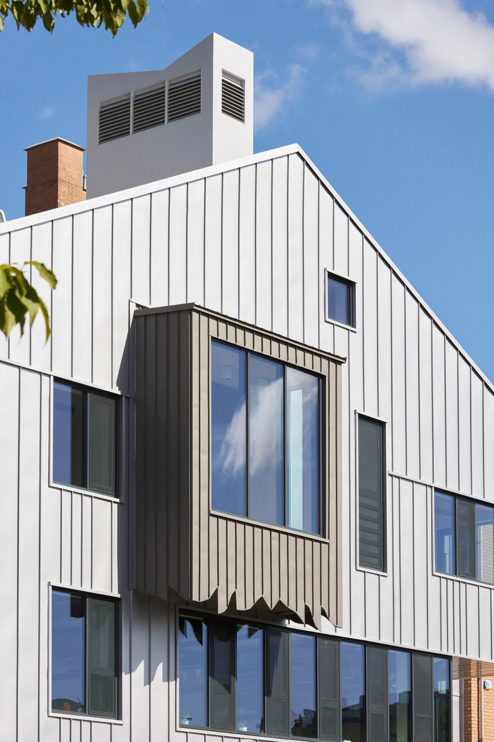 Sheppard Robson has extended the Contact theatre in Manchester
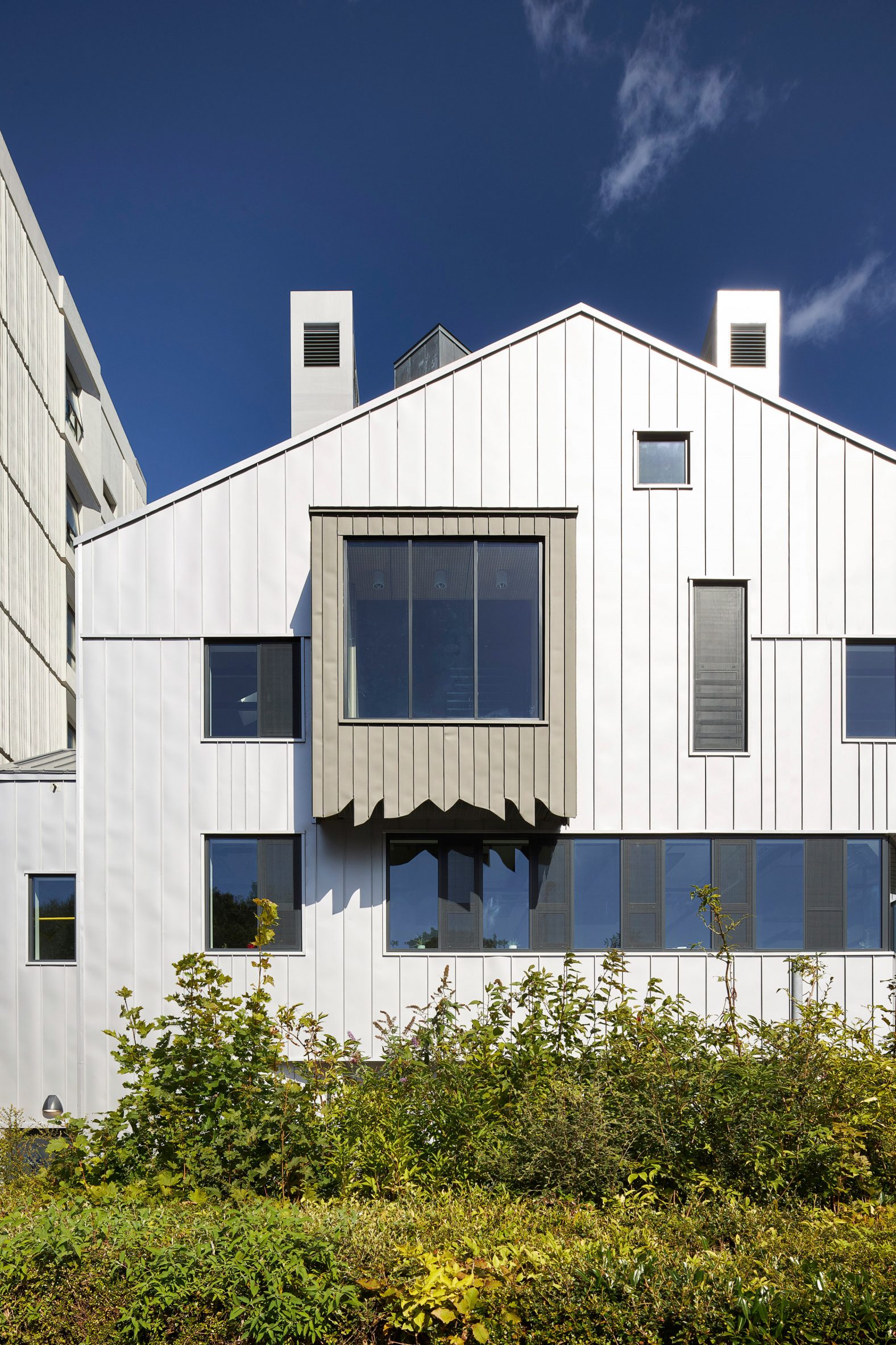 The extension is clad in metal
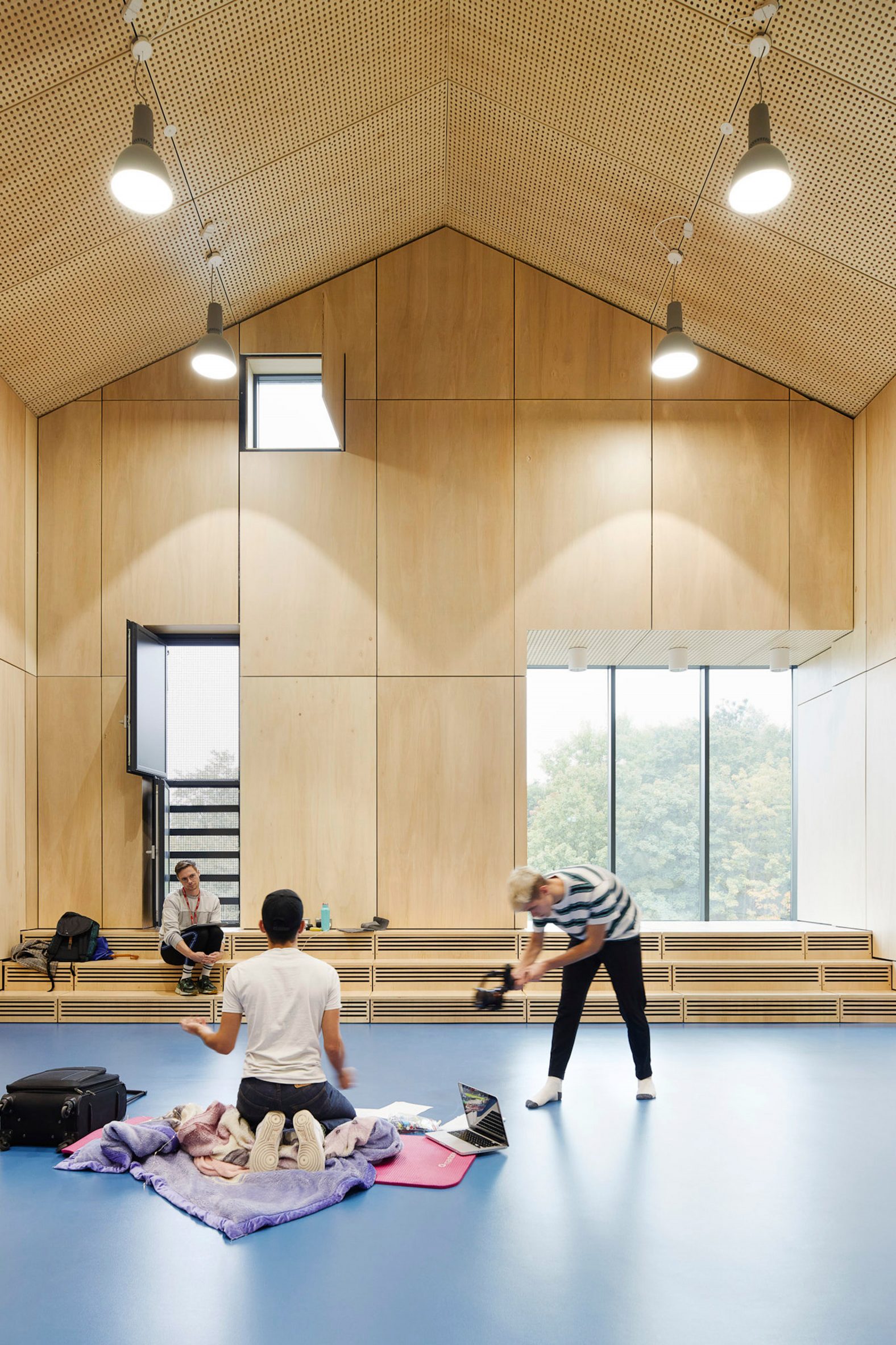 The extension contains performance spaces
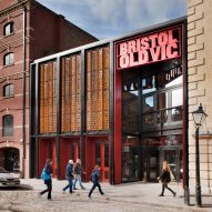
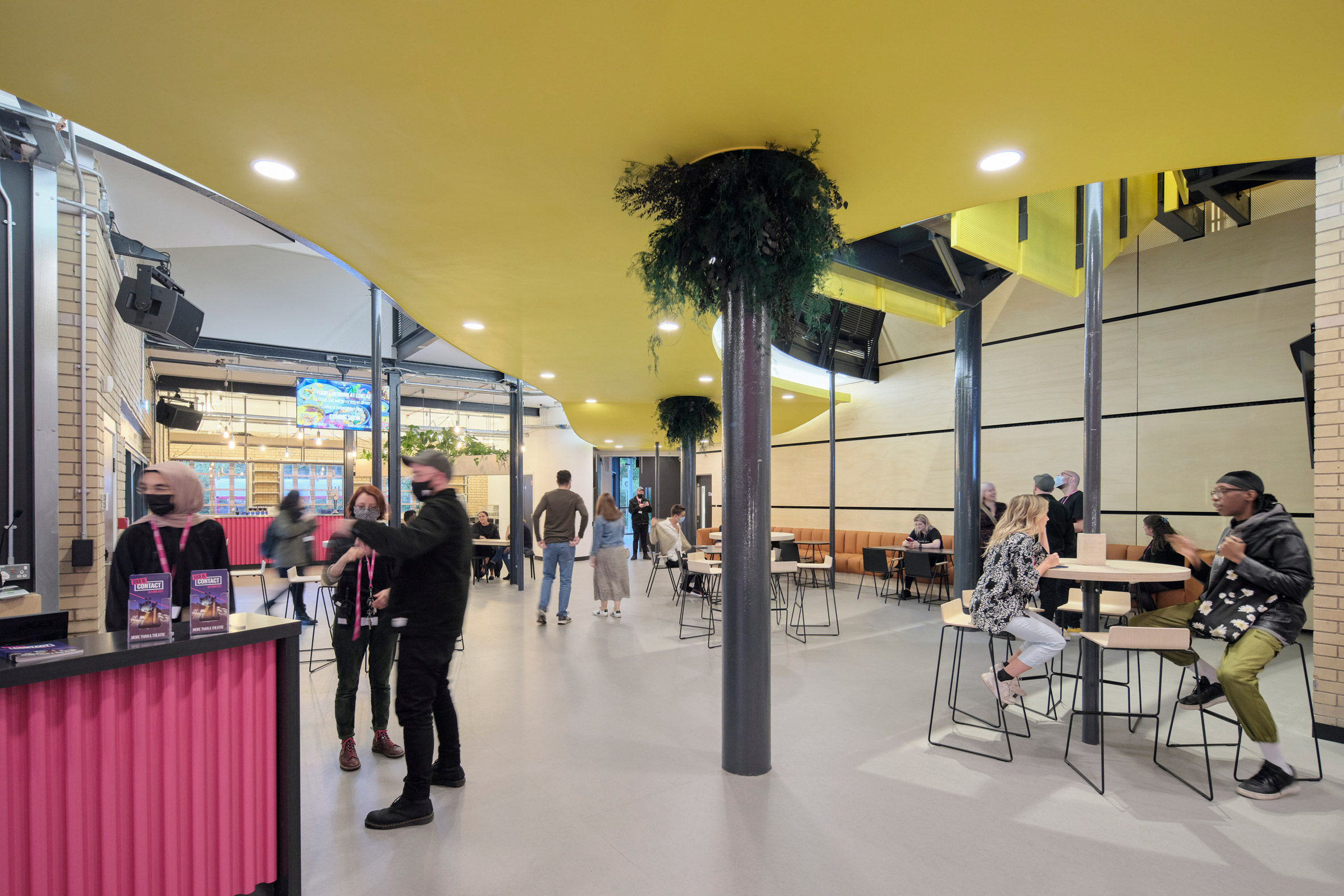 The existing building has also been remodelled
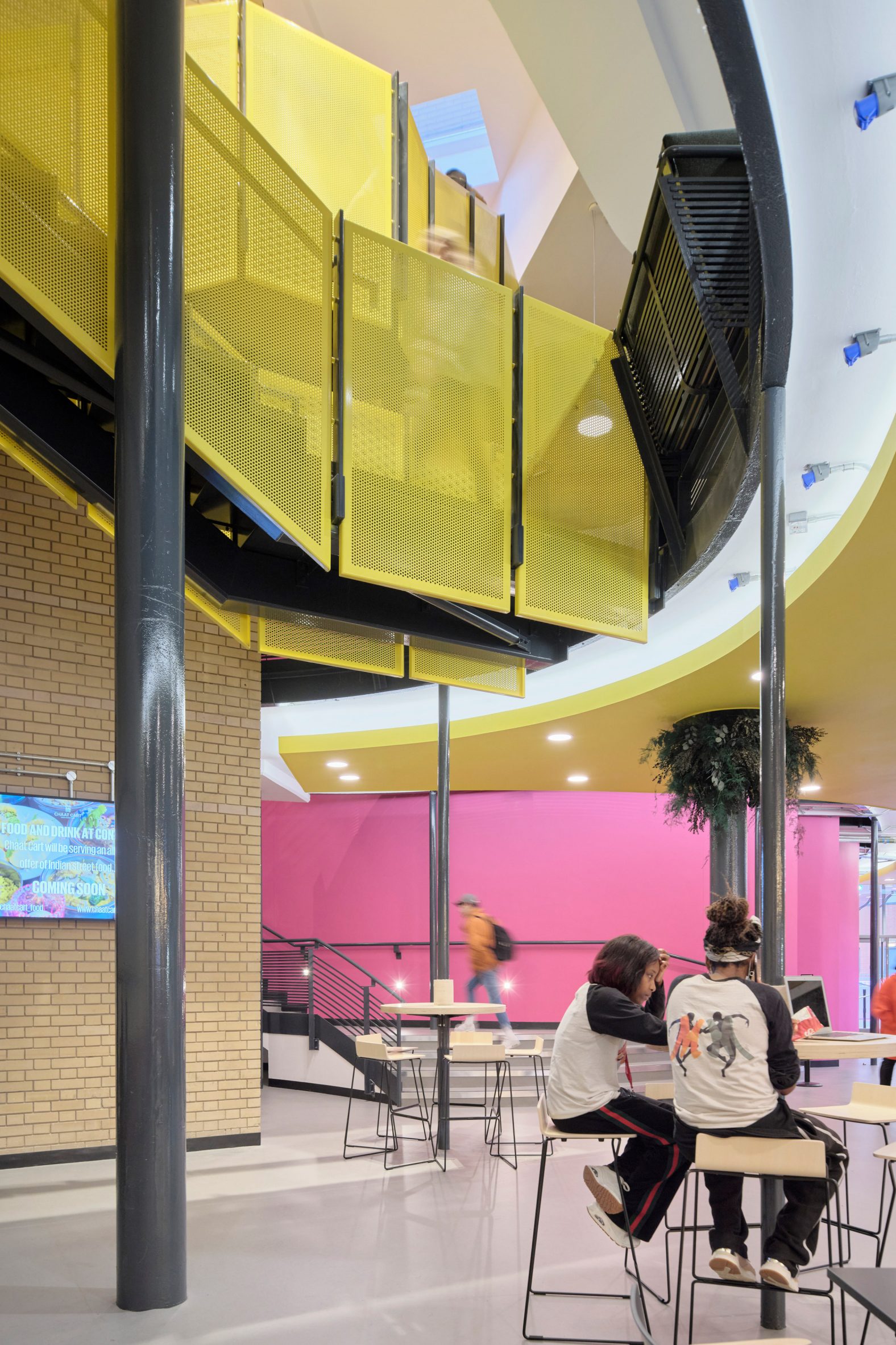 Circulation has been improved in the public areas
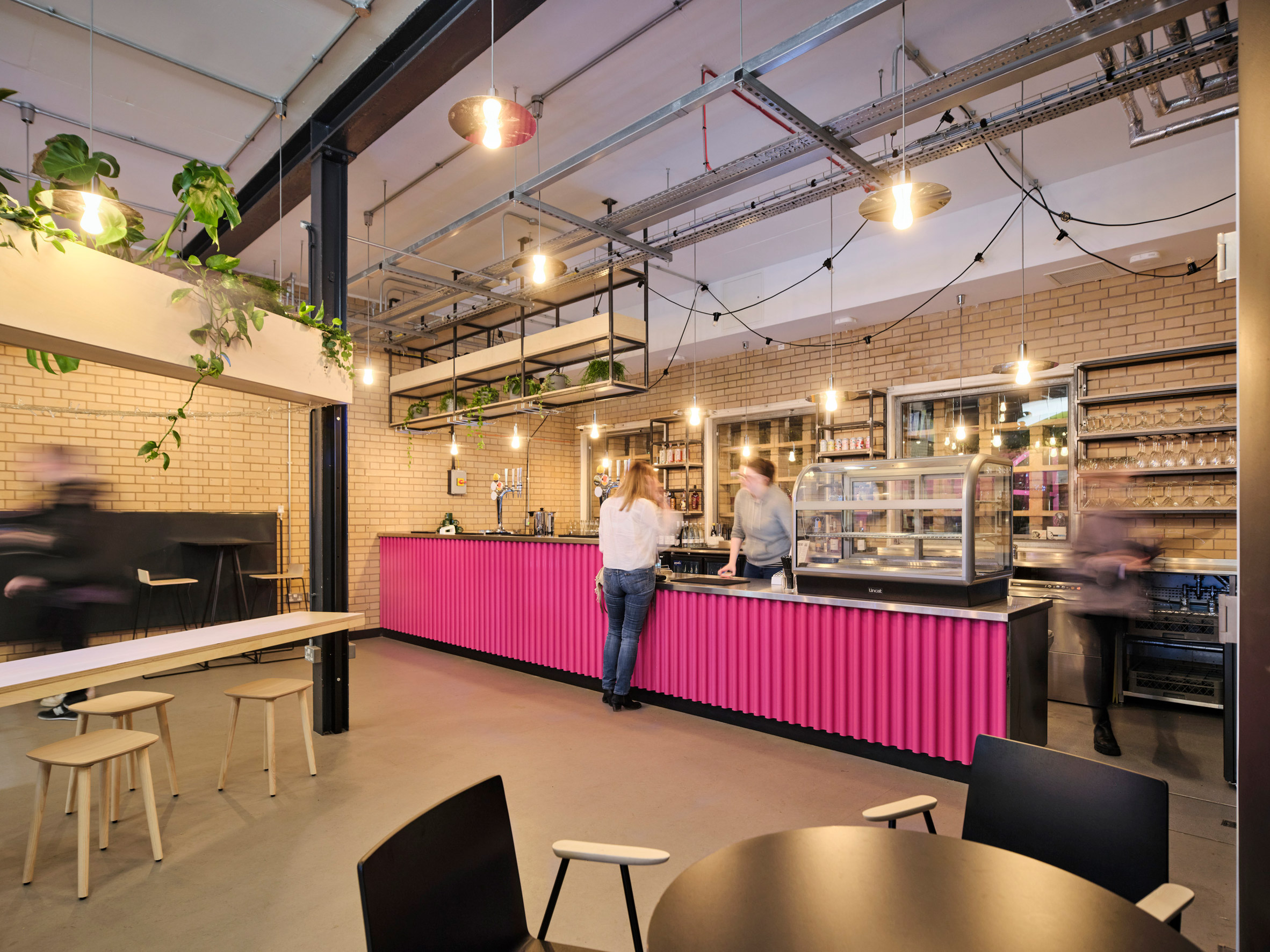 A new cafe and bar has been added to the entrance
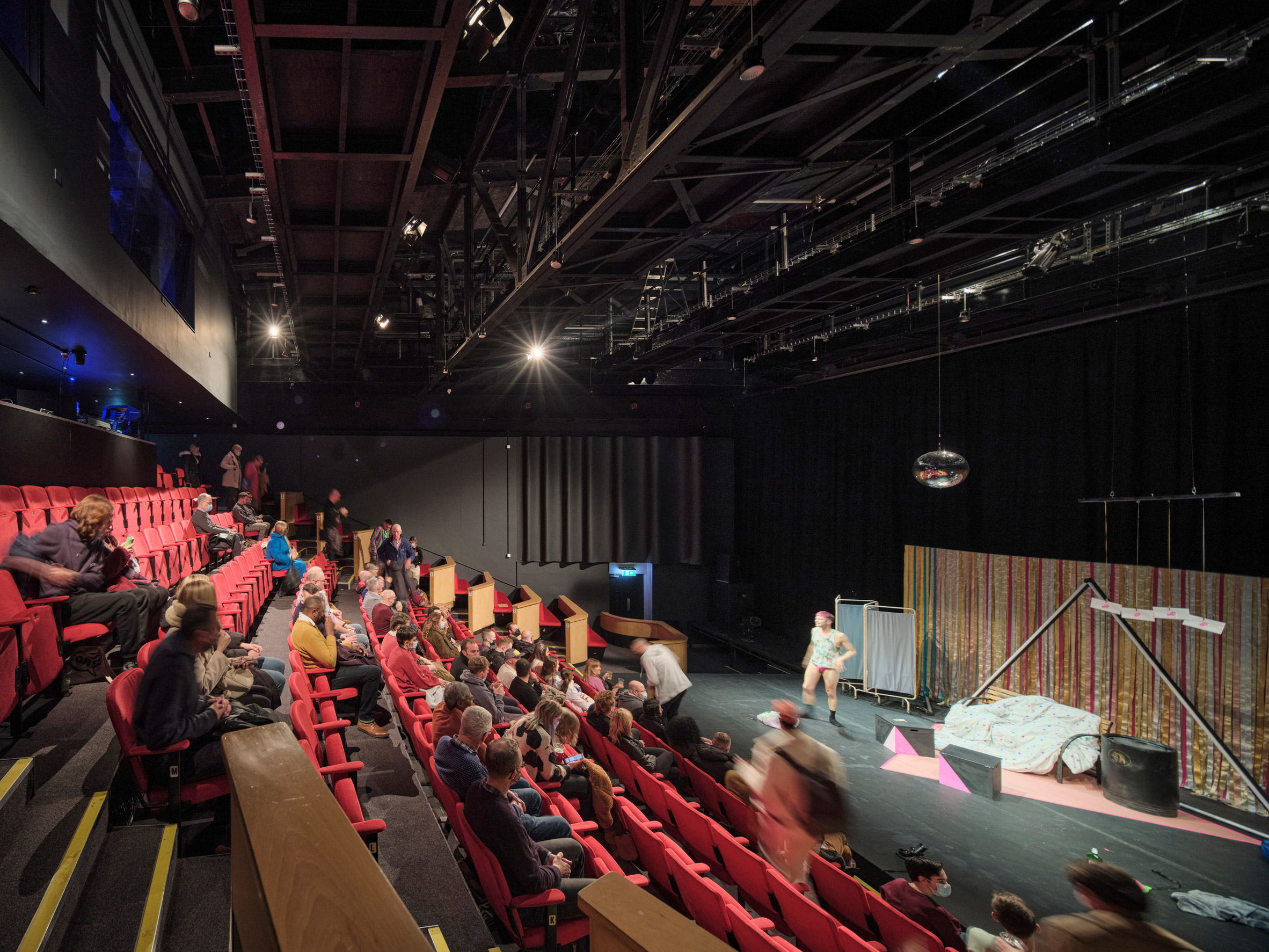 Lighting in the theatre now relies on LEDs
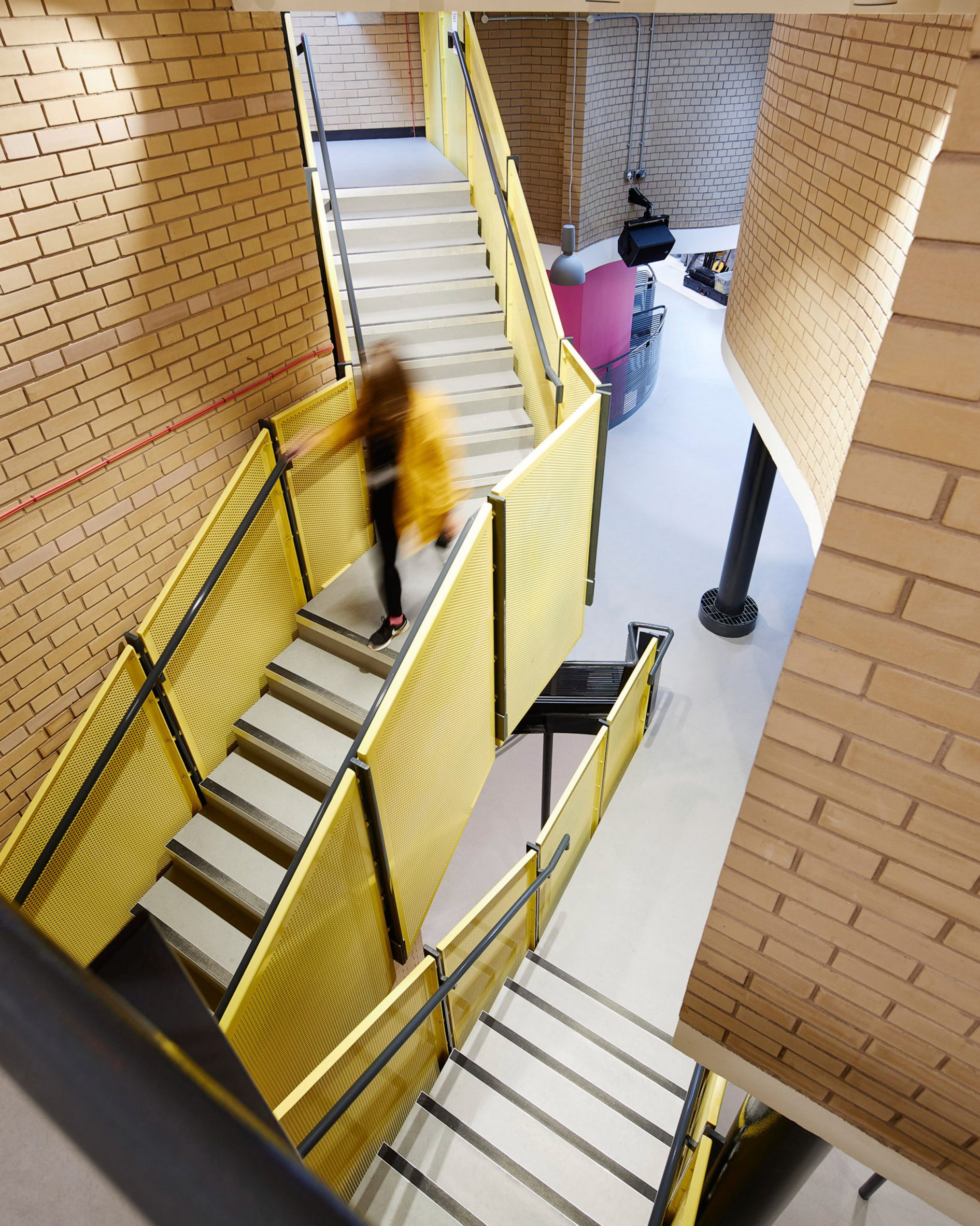 Sheppard Robson said the improvements "lift the arrival experience of the building"
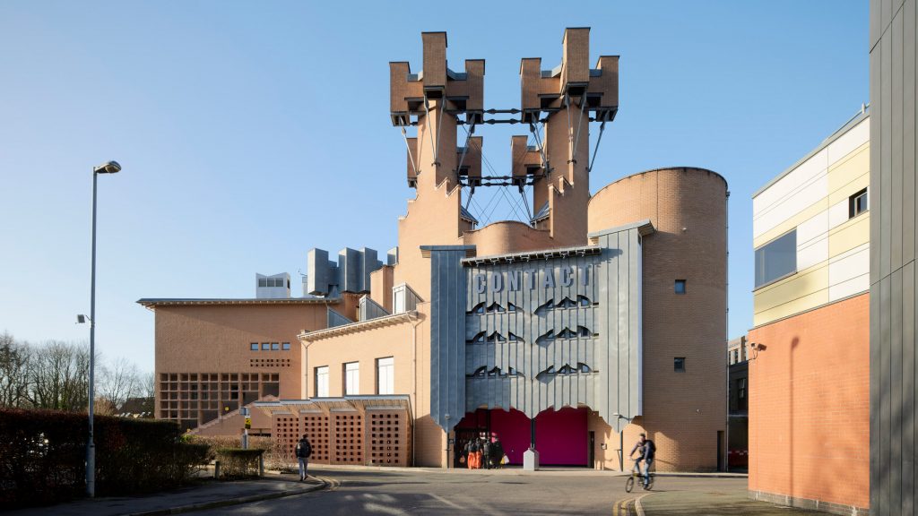

 Erbar Mattes has extended a pair of apartments in a former London pub
 The extension incorporates a loggia
 The extension has transformed two flats into a duplex
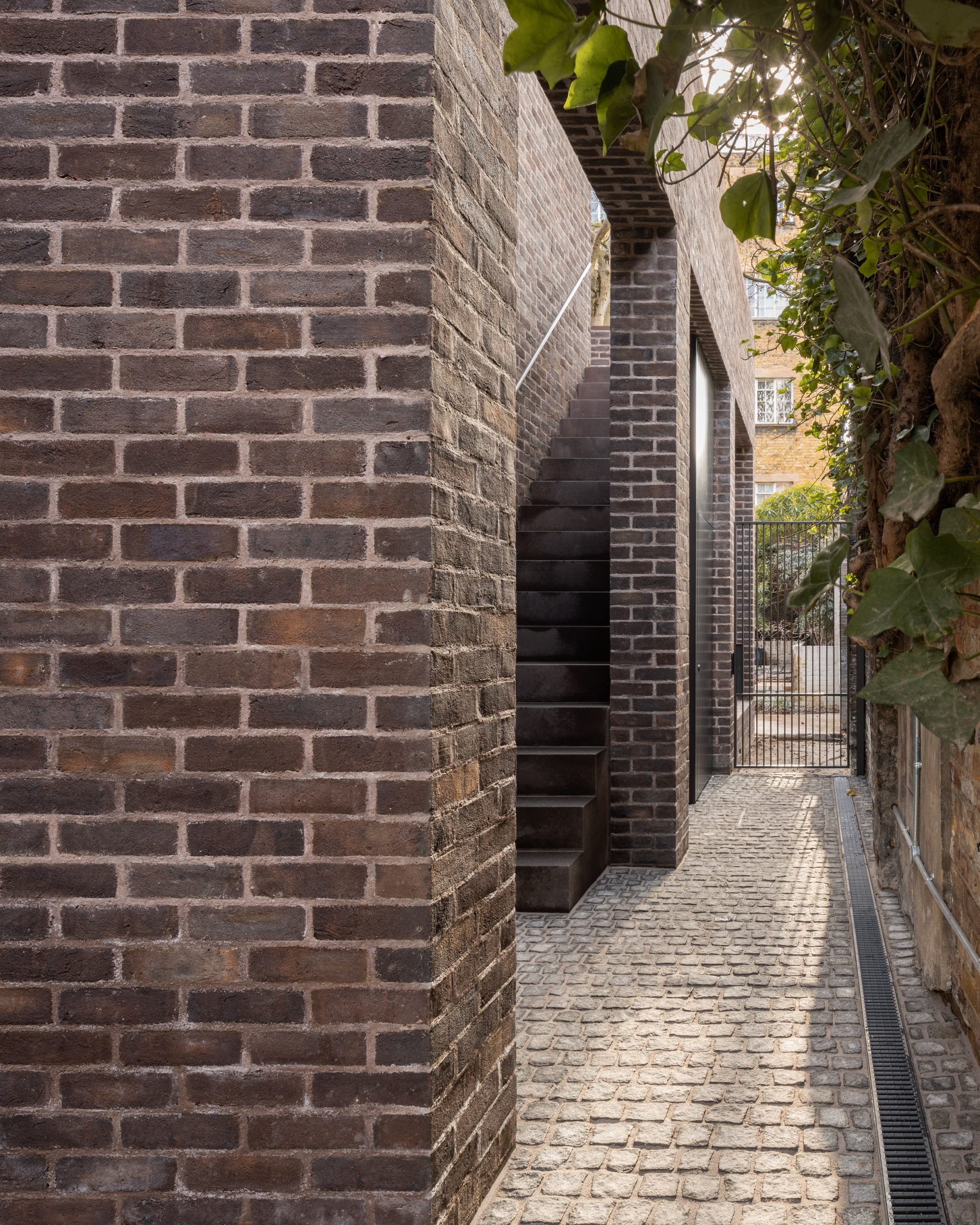 External circulation has been added to the side of the building
 Original details of the pub have been restored internally. Photo is by Ståle Eriksen
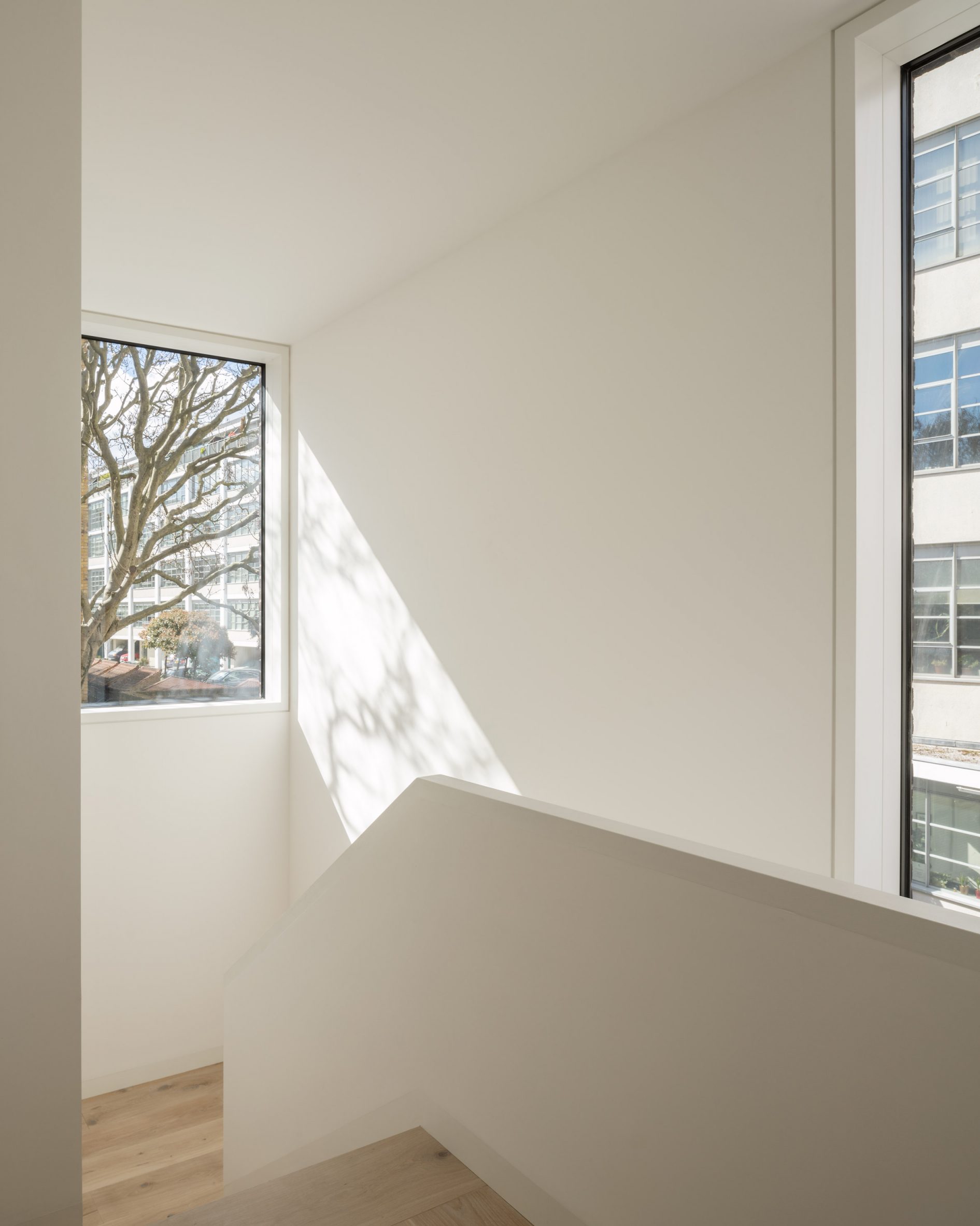 The internal staircase looks out over nearby trees. Photo is by Ståle Eriksen
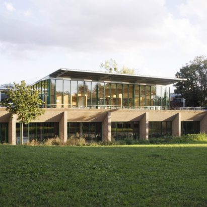
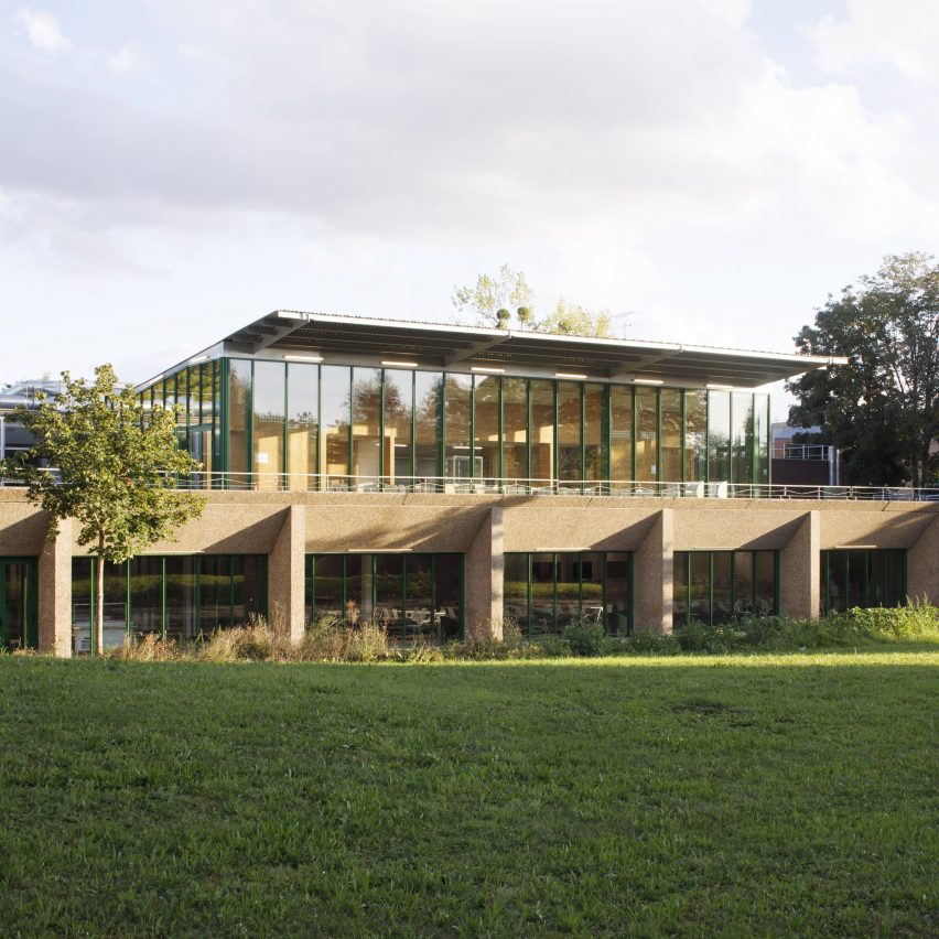
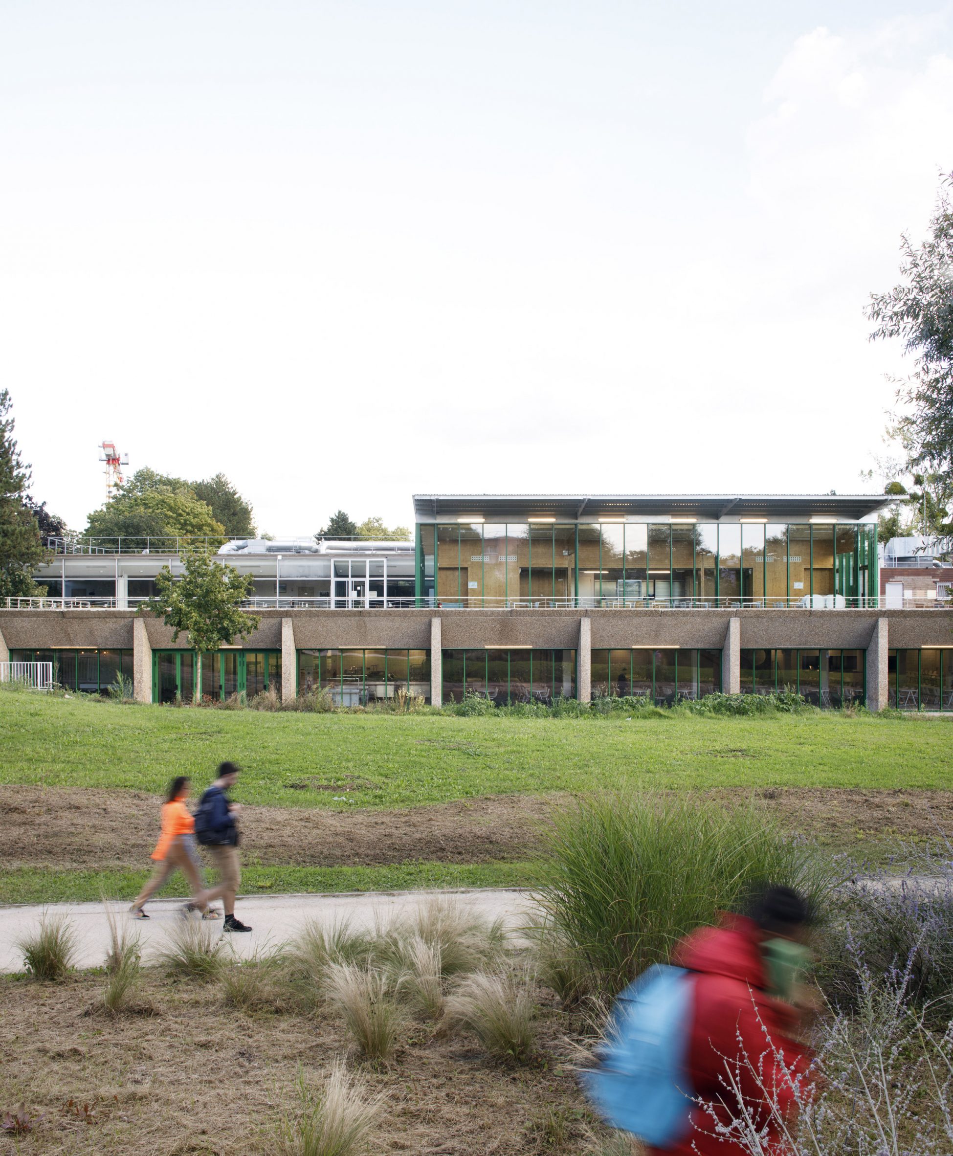 The Crous University Refectory was extended and renovated by Graal Architecture
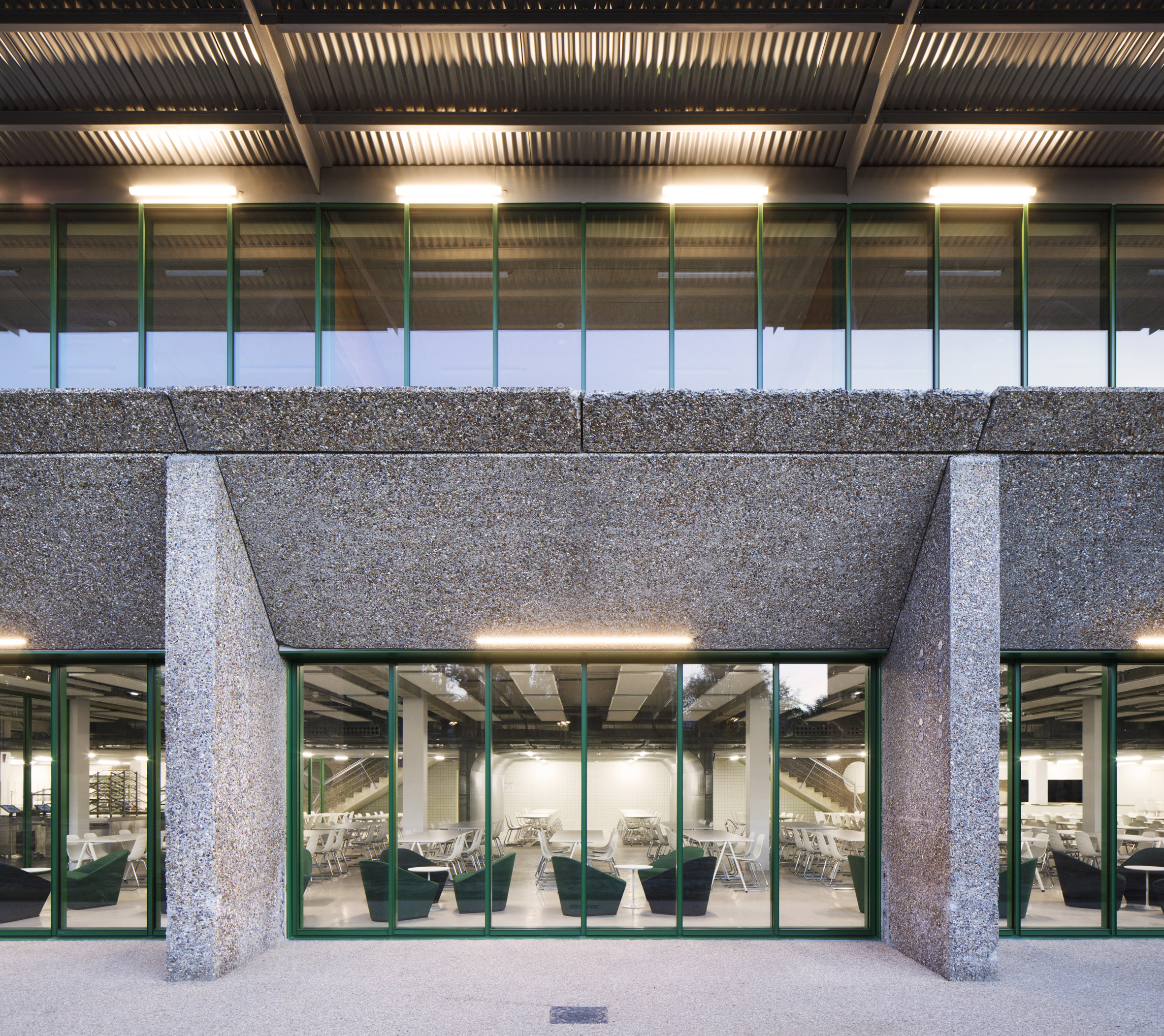 The practice added green steel structural work to the building
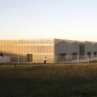
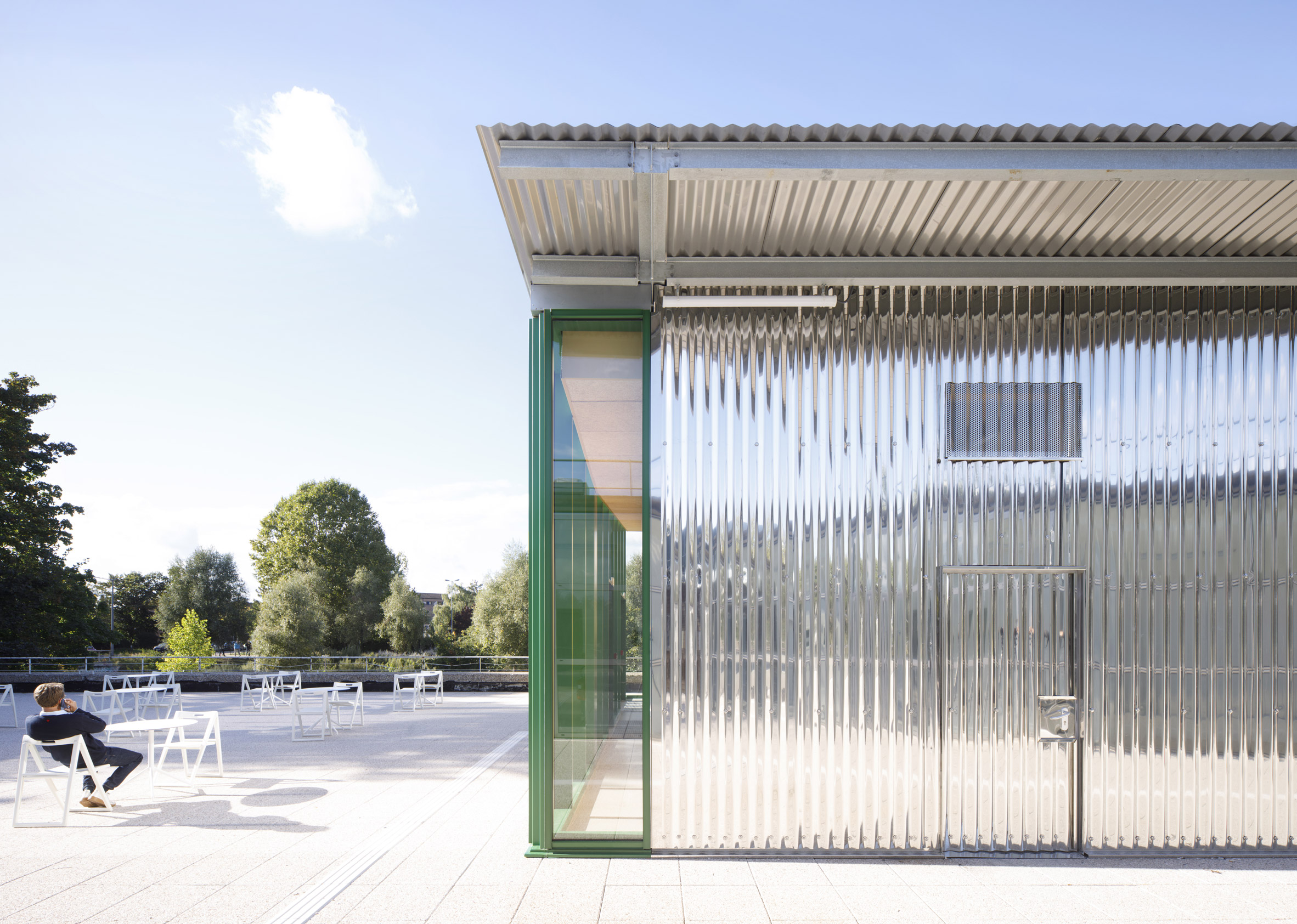 It is topped with a corrugated steel pavilion on the roof level
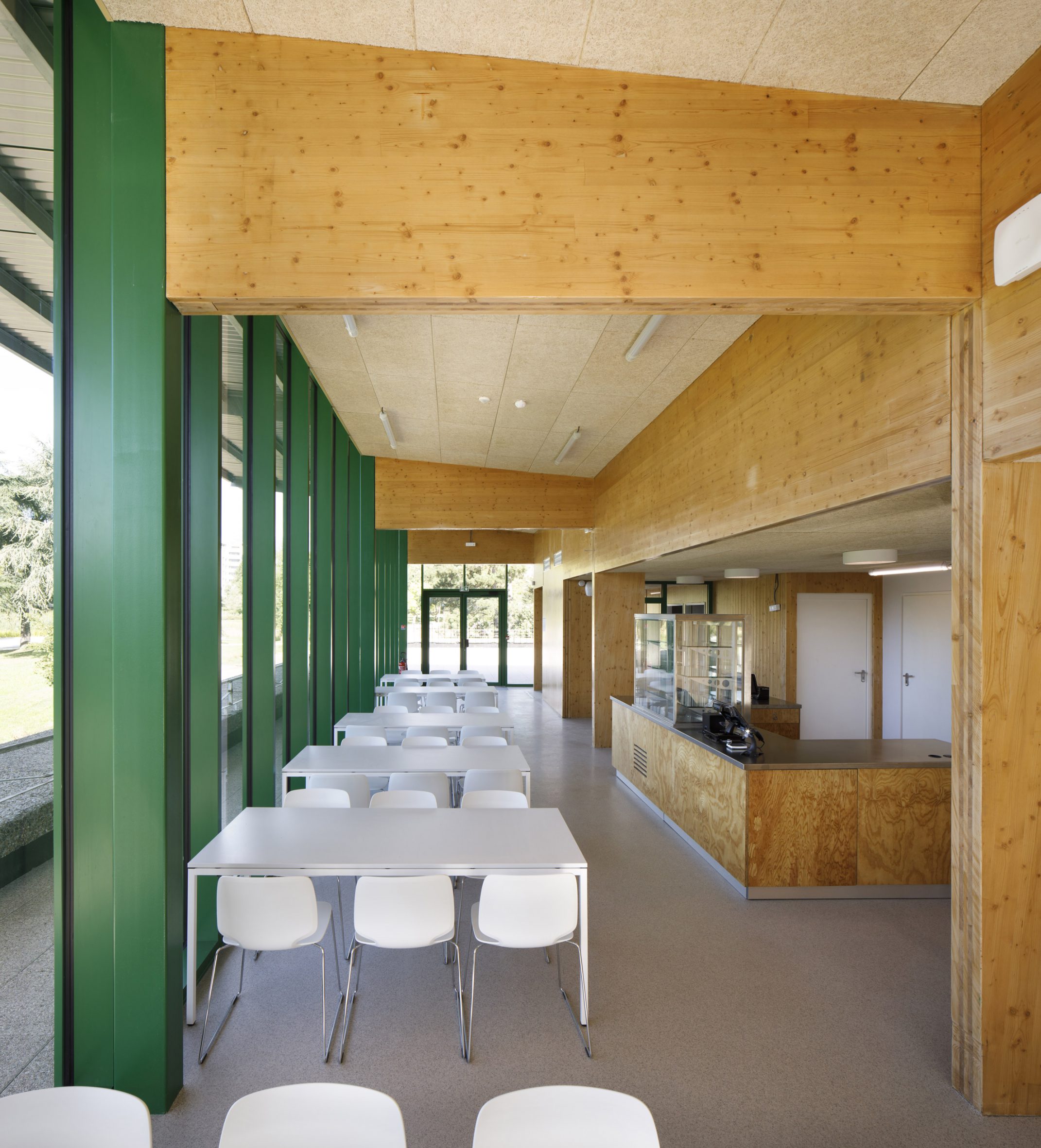 The interior features wooden and green-painted walls
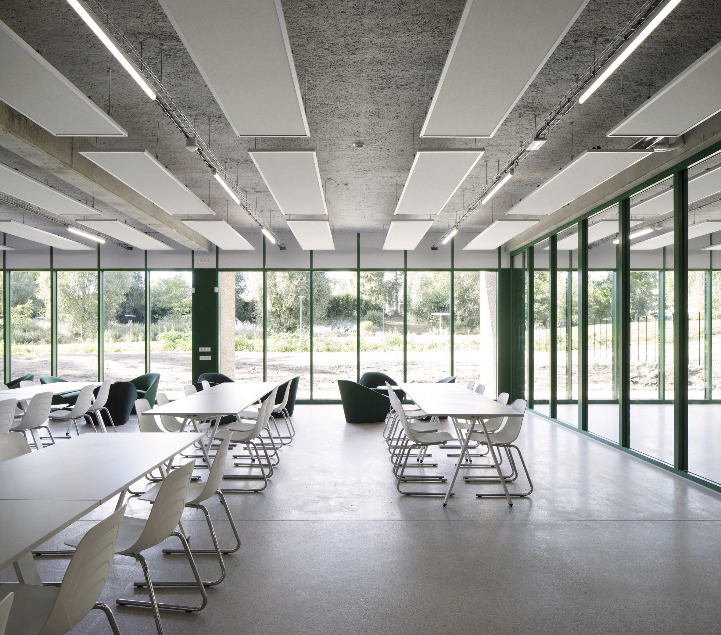 The building offers panoramic views of the park and gardens
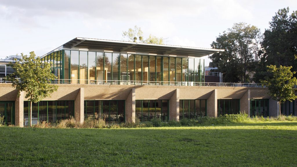

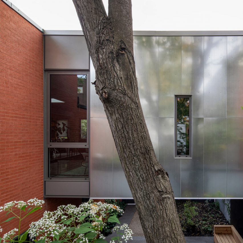
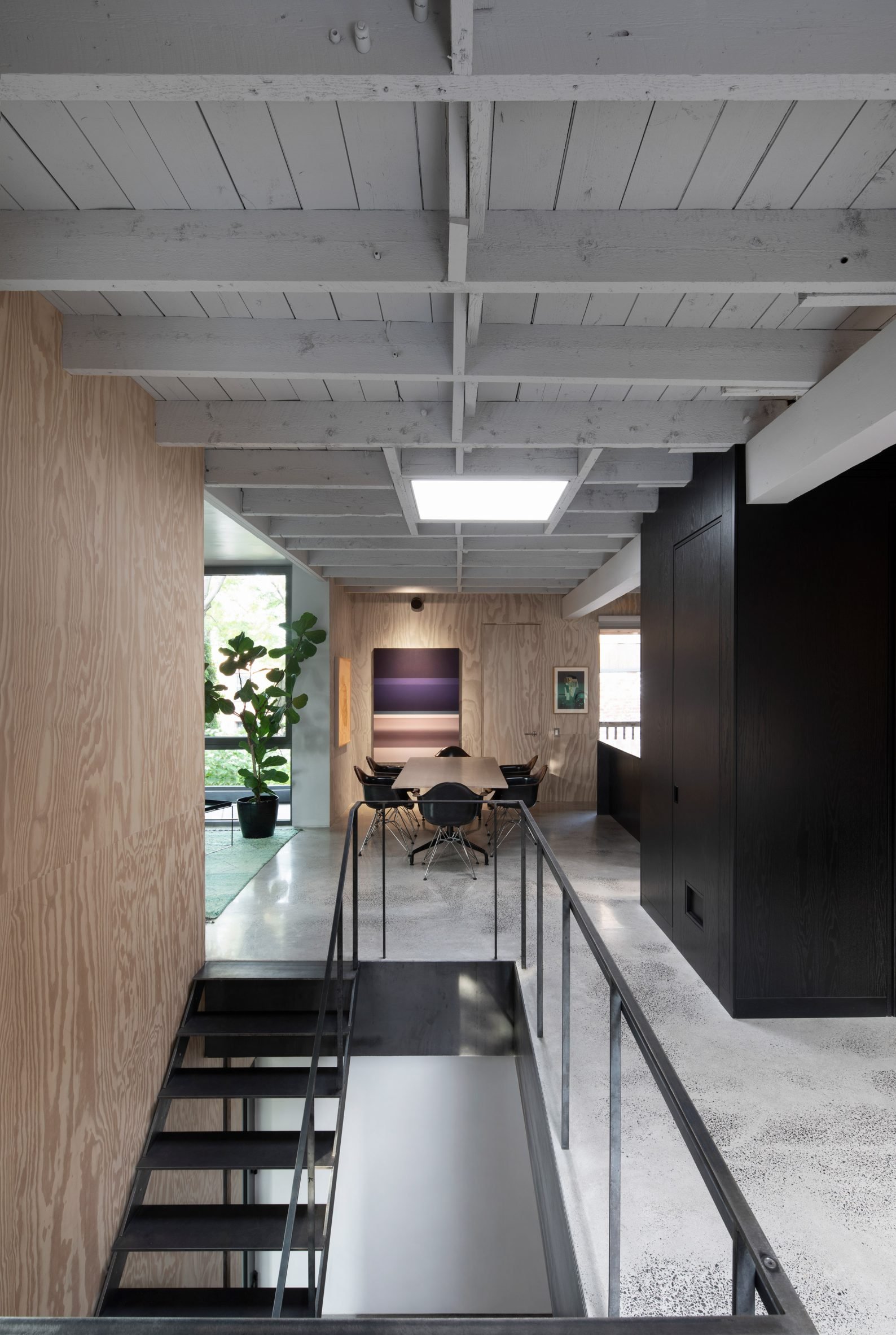
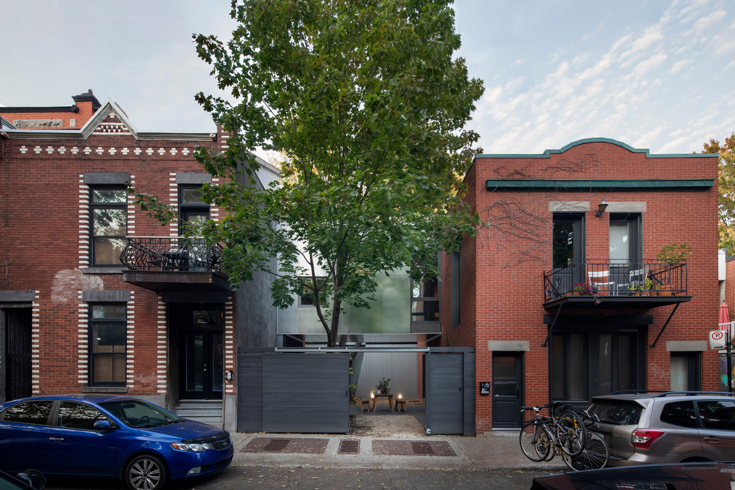 The Berri House is located on a short street in Montreal
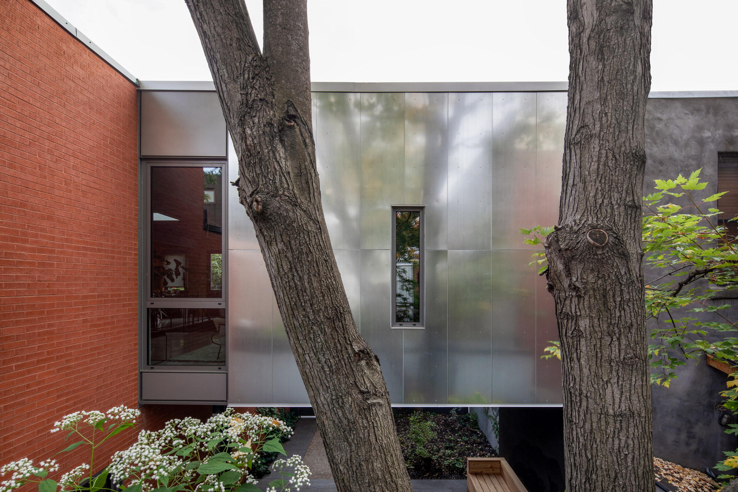 An extension is wrapped in galvanised steel
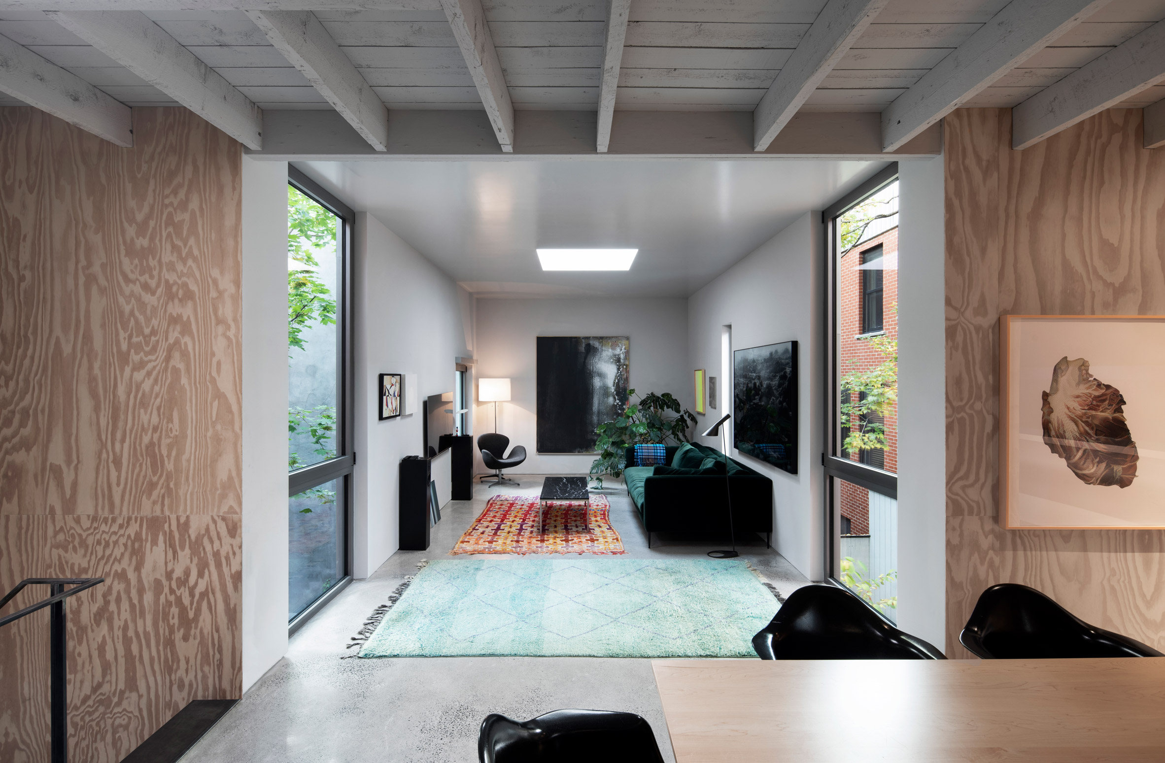 Openings were strategically placed to usher in daylight while also giving privacy
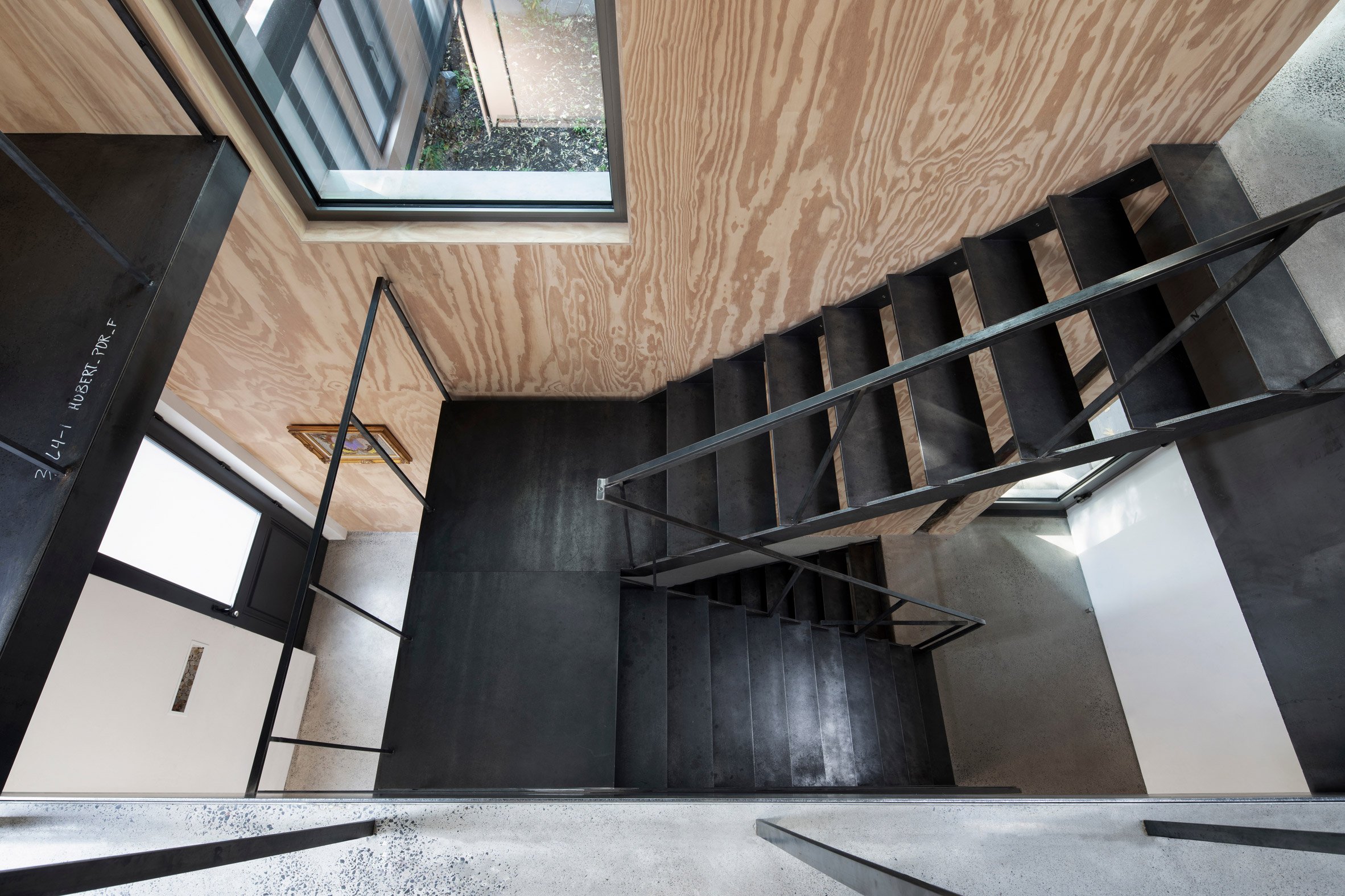 The three levels are connected by a new steel staircase near the home's entrance
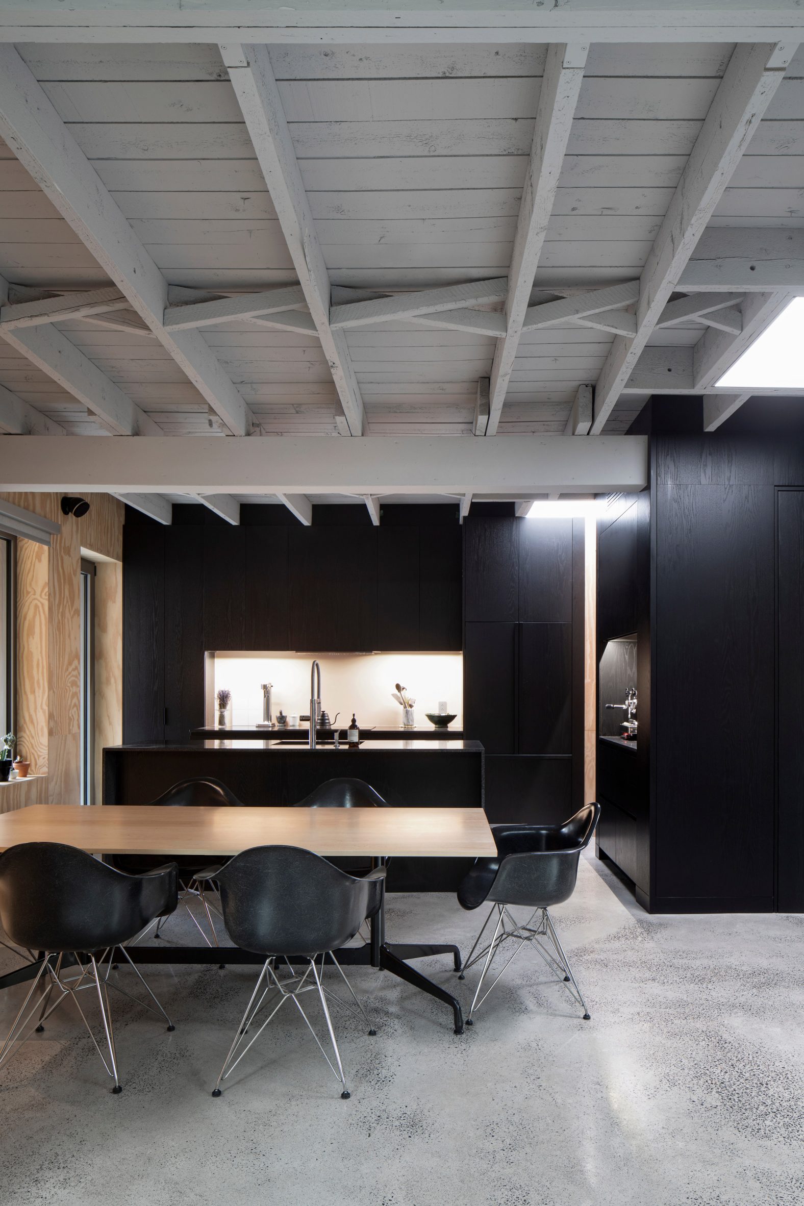 Black accents and plywood wall cladding feature in the kitchen
 The upper level includes a dining room
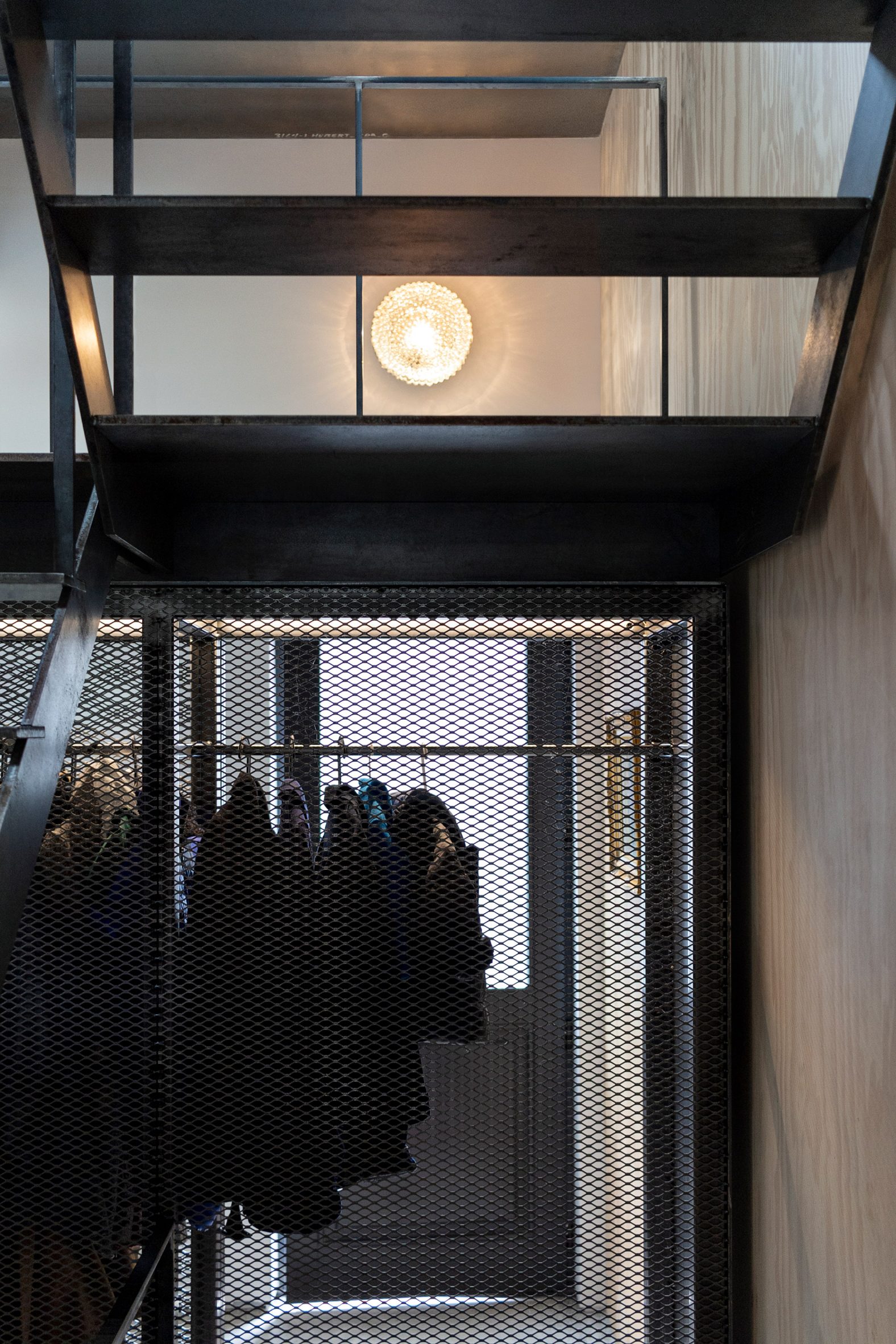 Sliding divisions help the compact ground floor feel more expansive
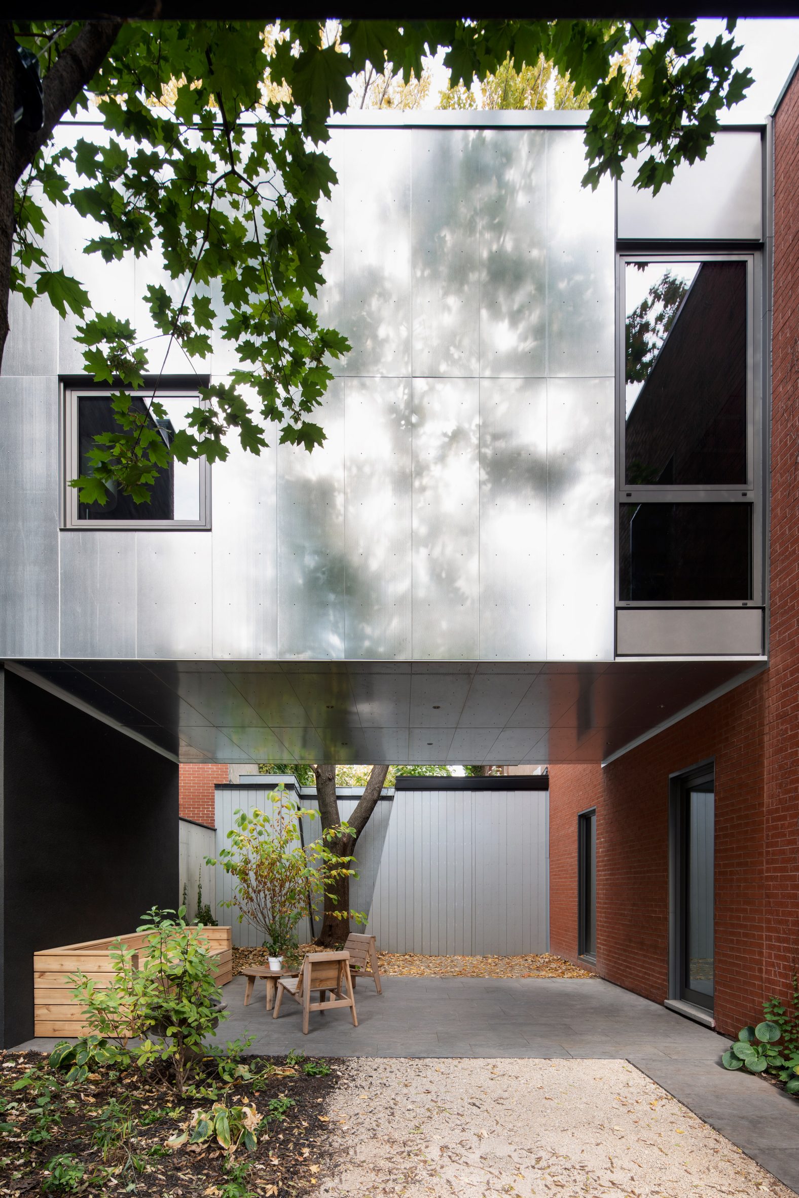 The extension is attached to the old carriage house above a garden