#usability

waynerad@diasp.org

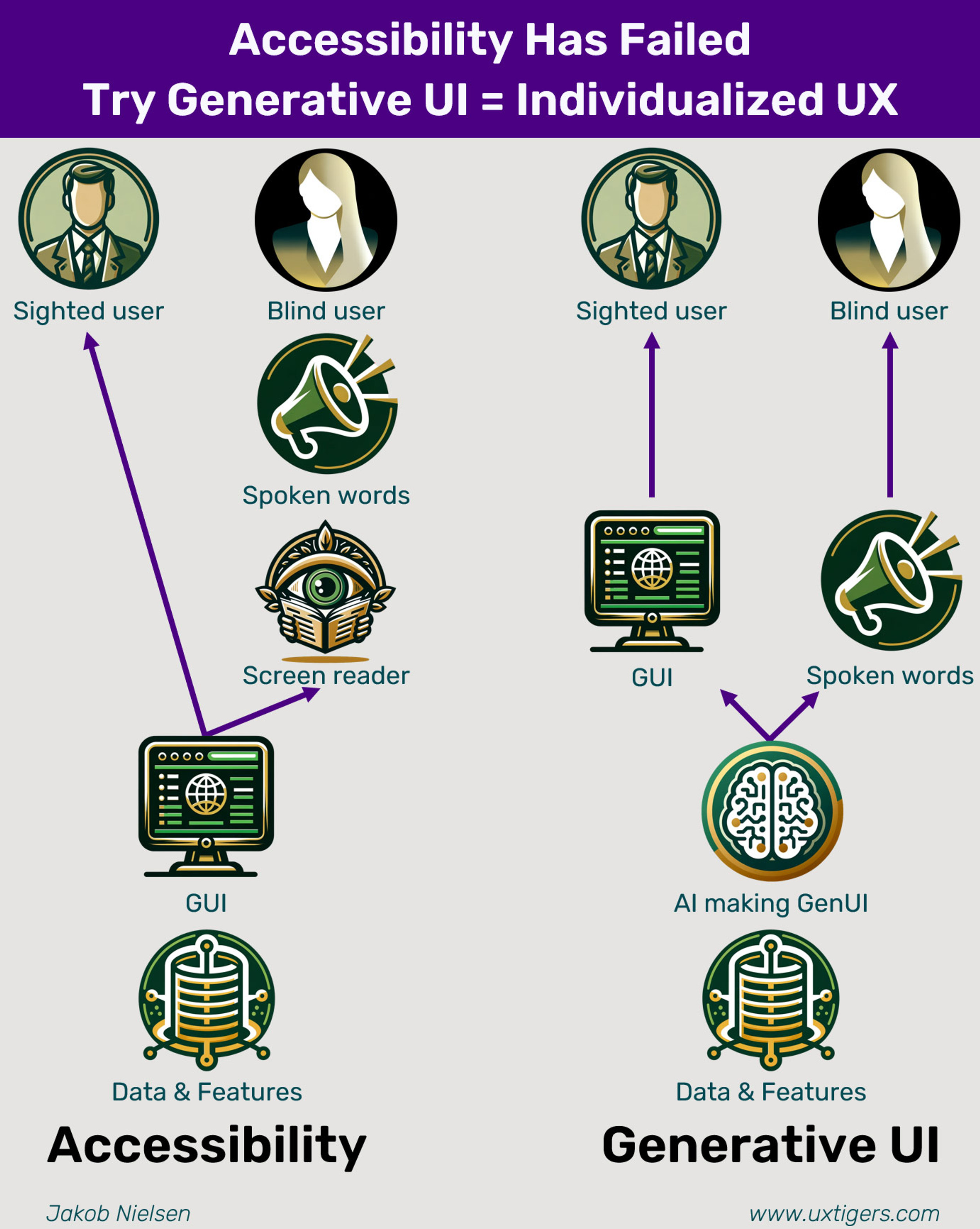
"Accessibility has failed: Try generative UI = individualized UX". Says legendary usability expert Jakob Nielsen. What he means by "accessibility" is borrowing the concept of "accessibility" in the physical world, where wheelchair ramps on buildings and busses are built, and so on, and applying it to the world of computing. This means, for example, making screen readers that translate screens into speech or braile, so blind or hearing-impared people can use computers. If you're a web developer you're supposed to fill in your "alt" attributes for all your image tags so screen readers can tell users what the image is. (Finishing out the headline, "UI" stands for "user interface" and "UX" stands for "user experience" -- most of you probably already know that.) Jakob Nielsen says:

"Accessibility has failed as a way to make computers usable for disabled users. My metrics for usable design are the same whether the user is disabled or not: whether it's easy to learn the system, whether productivity is high when performing tasks, and whether the design is pleasant -- even enjoyable -- to use."

"Assessed this way, the accessibility movement has been a miserable failure. Computers are still difficult, slow, and unpleasant for disabled users, despite about 30 years of trying. (I started promoting accessibility in 1996 when I worked at Sun Microsystems, but by no means claim to have been the first accessibility advocate.)"

"There are two reasons accessibility has failed:"

"Accessibility is too expensive for most companies to be able to afford everything that's needed with the current, clumsy implementation. There are too many different types of disabilities to consider for most companies to be able to conduct usability testing with representative customers with every kind of disability. Most companies either ignore accessibility altogether because they know that they won't be able to create a UX that's good enough to attract sufficient business from disabled customers, or they spend the minimum necessary to pass simplistic checklists but never run the usability studies with disabled users to confirm or reject the usability of the resulting design."

"Accessibility is doomed to create a substandard user experience, no matter how much a company invests, particularly for blind users who are given a linear (one-dimensional) auditory user interface to represent the two-dimensional graphical user interface (GUI) designed for most users."

"'Generative UI' is simply the application of artificial intelligence to automatically generate user interface design."

But he doesn't stop there. He goes on to envision "first-generation" and "second-generation" generative UI:

"'First-generation generative UI' for frozen designs where the AI only modifies the UI before shipping the product."

"I foresee a much more radical approach to generative UI to emerge shortly -- maybe in 5 years or so. In this second-generation generative UI, the user interface is generated afresh every time the user accesses the app. Most important, this means that different users will get drastically different designs. This is how we genuinely help disabled users."

Accessibility has failed: Try generative UI = individualized UX
#solidstatelife #hci #usability #ai #genai

christophs@diaspora.glasswings.com

Wow, EasyJet Plus has an AMAZING system for entering your phone number prefix.
(It's alphabetical by country.)

I just yesterday encountered this with Lufthansa as well. At least they had the country names in braces. But you cannot press e.g G on the keyboard to swtich to the number.
And as always: Will you find Germany under G for German or under D for Deutschland?

#usability #ux #programming

https://ohai.social/@evilrooster@wandering.shop/110000308313291375

anonymiss@despora.de

I am a big fan of #FDroid but the #error management is a #disaster.

source: https://f-droid.org

F-Droid is free #software and an alternative for the #Google Play Store on #Android on the #smartphone.

Most of the time, everything runs great, but sometimes apps cannot be installed or updated.

The error messages displayed are:
- internal error
- unknown error

So the user is left to find out the error by herself. Often the problem is the space on the device. From time to time, however, you are just guessing and have to wait until the next update. In my experience, this is always due to careless programming. Any error message, no matter how cryptic, is better than what is displayed.

#problem #usability #Criticism #interface #app

ravenbird@squeet.me

Info | Veränderung bei meinen Friendica Account

Nach langem Abwägen habe ich beschlossen den Schwerpunkt meiner Aktivitäten im Fediverse wieder zu Diaspora zu verlagern. Das ist auf der einen Seite sehr schade, da ich in meiner Zeit hier auf Friendica einiges an tollen Leuten die Mastodon, Pleroma etc. kennengelernt habe zu denen der Kontakt nun nicht mehr ganz so gut sein wird. Auf der anderen Seite komme ich bei Diaspora was das Look & Feel und die Usabilty betrifft immer noch wesentlich besser zurecht als bei anderen Plattformen. Dazu kommt das sich der Kontakt zu meinen vielen Kontakten auf Diaspora auf technischer Sicht ziemlich verschlechtert hat seit ich zu Friendica gewechselt bin, so als wenn nicht alles was ich geschrieben habe dort ankam. Vielleicht hat die Federation auch ein wenig länger gedauert, ich weiß es nicht.

Als Notlösung lasse ich meine Beiträge auf Diaspora jetzt über den Friendica Account laufen, damit sie auch ins ActivityPub basierte Fediverse federiert werden und schaue ein, zwei mal am Tag hier bei Friendica herein. Und vielleicht schafft es ja auch Diaspora irgendwann ActivityPub zu unterstützen, die Hoffnung stirbt zuletzt.

Allen Diaspora, Friendica und Hubzilla Usern die meinen Friendica-Account in ihren Kontakten haben kann ich nur empfehlen ihn zu entfolgen und meinem Diaspora Account ravenbird@nerdpol.ch bzw. @ravenbird@nerdpol.ch zu folgen. Den da schaue ich zukünftig entsprechend sehr viel häufiger herein und reagiere somit auch schneller auf Beiträge und Kommentare.

Tags: #Info #Veränderung #Friendica #Diaspora #Fediverse #Federation #Look-and-Feel #Usability #ActivityPub #Umzug #Ravenbird #2021-10-24

dredmorbius@joindiaspora.com

Dumb Phone

Elsewhere a friend laments:

The frequency with which I need my email and a notebook while I'm on the phone makes integrated devices foolish.

I'd covered that point a few years ago in a larger essay on the tyranny of the minimum viable user:

It's also interesting to consider what the operating environment of earlier phones was -- because it exceeded the device itself.

A business-use phone of, say, the 1970s, existed in a loosely-integrated environment comprising:

  • The user
  • The phone itself
  • A Rolodex or addressbook / contacts list
  • The local PBX -- the business's dedicated internal phone switch.
  • A secretary or switchboard operator, serving also as a message-taking (voice-to-text), screening, redirect, directory, interactive voice response, and/or calendaring service
  • A desk calendar
  • A phone book
  • A diary or organiser
  • Scratch paper

Critically: these components operated simultaneously and independently of the phone.

A modern business, software, or smartphone system may offer some, or even all, of these functions, but frequently:

  • They aren't available whilst a call is in process
  • They have vastly less capability or flexibility than the systems they replaced

https://old.reddit.com/r/dredmorbius/comments/69wk8y/the_tyranny_of_the_minimum_viable_user/

There's also the increasingly evident problem that having all your critical data on a communications device is a fundamental and intractable risk. The dis-integrated business telephony environment of the 1950s--1990s maintained data isolation between elements. Telephone numbers served as the reasonably-viable data-exchange-and-linking interface between components (map a name or address to a number, enter the number on a calendar or correspondence, etc.).

It's almost as if putting your filing system, personal diary, correspondence, photo album, and directory on a surveillance and exfiltration device was a Bad Idea.

And not just from a UI/UX / accessibility perspective.

It turns out that a chief affordance of the old POTS landline telephone was the air gap between it and everything else inside your office / home.

(We can talk about the solicitations, robocalls, and phishing issues separately.)

#telephony #telephones #risk #AirGap #data #DataAreLiability #UIUX #Usability #SmartPhones #DumbPhones #computers #communications #privacy #security #surveillance

dredmorbius@joindiaspora.com

The State of Search (or how Google is rapidly un-nailing its once stellar UI/UX)

As I noted on Hacker News regarding the statement "Google Search pretty much nailed UI,": It's rapidly in the process of un-nailing it.

Having used DDG as my primary search engine since June 2013, I now prefer its presentation to Google's. It also makes me feel better when people call me a quack. (Close: I'm a cat. More fur, fewer feathers, far superior house-training).

I find Google's dynamic "oh, we're going to clear the page while you're refining your search terms to focus on higher relevance based on the results you're looking at now while you're typing that up" particularly egregious....

Continued at the dreddit.

#uiux #google #archive.org #usability #interface #search #fail