#fineartlandscapephotography
Photographing ‘The Gap’ in Torndirrup National Park
The year was 2014. I was seven years younger and because of that, it was a very good year. Do you remember the time when it didn’t hurt to get out of bed? When camera bags didn’t feel like bags of wet cement, and when your eyesight was so good you could spot a discounted Cabernet Sauvignon from one hundred paces? Ah those were the days. I shall remember them fondly.
So how did I get this shot? I am glad you asked. It wasn’t without some serious risk-taking on my part. As you may know from previous lies, I mean stories, I take landscape photography very seriously – so much so my wife has recently purchased Frankincense and Rosehip oil to help straighten out my frown lines. Remember when you didn’t have frown lines?
So really, how was this photograph taken?
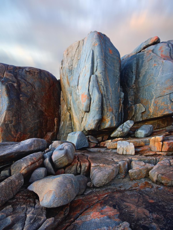
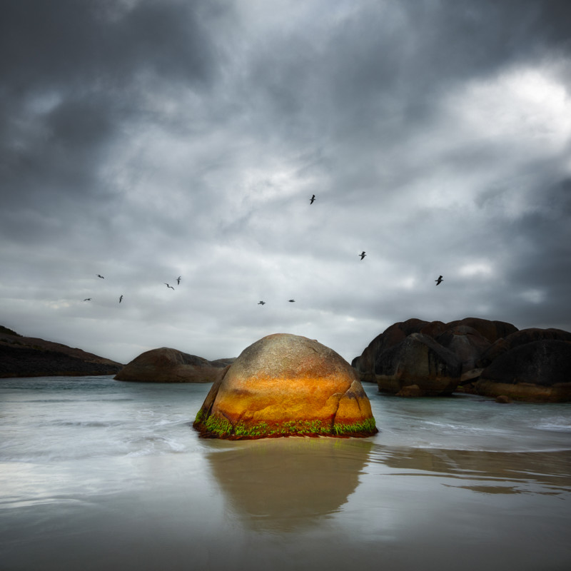
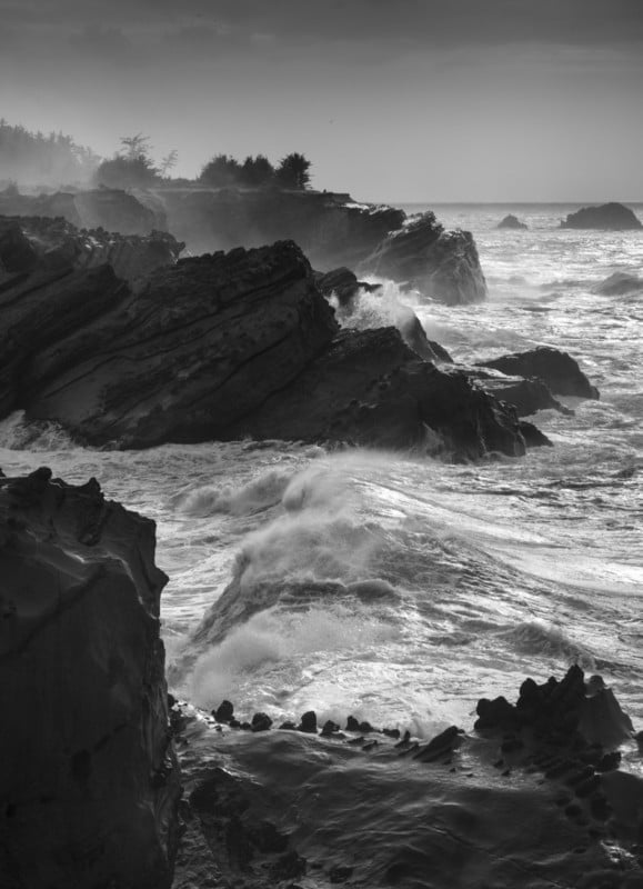
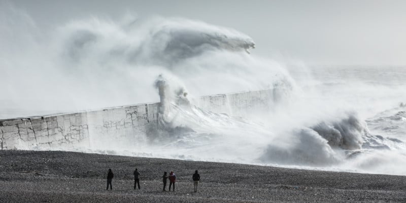
First, let me set the scene. It was in Torndirrup National Park at a spot called the Gap not far from the southern town of Albany in Western Australia. The coastline here is battered relentlessly by the Southern Ocean. If you go south from this spot the next landmass you hit is Antarctica. When the swell arrives, it is huge and angry. To say death is a likely outcome when photographing here might be an exaggeration, but it does help set the mood and make things rather more dramatic. What you don’t see behind the camera is the sheer drop into the cold dark water. If you take that drop, you won’t be developing the negs, if you know what I mean!
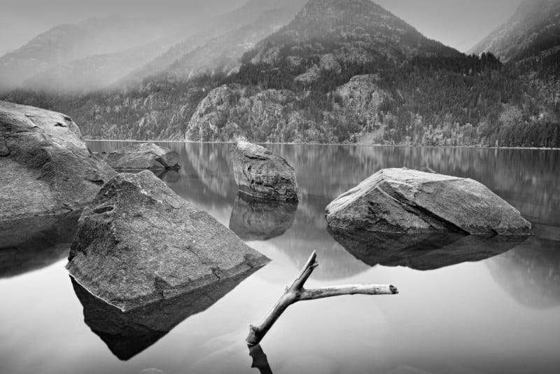
The coastline, because of all this extreme weather, is rugged and photogenic. This group of rocks are larger than they look. In fact, if you fell off these you would probably die horribly. Luckily, I was born with common sense, or is it just common? Anyway, I didn’t think the view from the top was as nice as the view from the bottom. I was then interested in trying to balance the composition and offer interest in the foreground that would lead your eye to the rocks behind. I used a vertical crop to allow more of the foreground to tell the story. This also allowed me to balance the three rocks with the central one as the main point of interest.
The image was shot on my Phase One IQ280 with the 28mm Phase One lens. The shutter was 2.5 seconds with an aperture of f/12 and ISO 35. The camera was secured to a tripod as the light was low; it was before sunrise. Now you say, “Those clouds look to be moving way more than the 2.5-second exposure would imply.” You would be right in that and please let me offer up a defense.
The clouds weren’t moving fast enough and as a result, the sky looked a little, as an Aussie would say, “poxie.” Roughly translated it means pretty average! So being the purist I am and by asking the viewers to “look away, nothing to see here,” I possibly, maybe, definitely added a bit of motion blur to the sky in Photoshop. I know, I know, I can see you now shaking your fists at the screen screaming, “WHY, WHY?” I guess I just got lazy and must have left the ND filter back in the Lamborghini. Still, it is only a little thing, and the real heroes are the rocks. I have also focus-stacked this image from five individual frames, all focused on different points and combined using PT GUI.
In Capture One I messed around (i.e., carefully selected) the white balance to set the color I wanted. I also wanted to lighten and bring out the detail in the rock. By having blues and oranges, two complementary colors, it added to the visual harmony and overall pleasing aesthetic. Photoshop was used to continue to refine the image and I used simple dodging and burning techniques to lighten the light areas and darken the shadows. This allowed me to make the rocks look more dimensional and increase depth and three-dimensionality.
I hope you have enjoyed my completely honest and unbiased technical report on how this image came together. What I haven’t mentioned was how I love what I do and how much fun I have doing it. Life is too short, so get out and enjoy the pure pleasure of making photographs. There are no rules, just pixels -- do with them what you want!
The article is courtesy ofELEMENTS Magazine. ELEMENTS is the monthly magazine dedicated to the finest landscape photography, insightful editorials and fluid, clean design. Inside you will find exclusive and in-depth articles and imagery by the best landscape photographers in the world such as Bruce Barnbaum, Edward Burtynsky, Michael Kenna, Erin Babnik, Chuck Kimmerle, Rachael Talibart, Charles Cramer, Hans Strand and Lynn Radeka, to name a few. Use the PETAPIXEL10 code for a 10% discount off the annual subscription.
About the author: Christian Fletcher has been a professional photographer for over 27 years, and remains dedicated to using photography as a way to reinforce our connection to our natural environment. Christian runs an award-winning gallery in Dunsborough, Western Australia, and teaches workshops both at home in Australia and internationally.
#spotlight #abstractlandscapephotography #elementsmagazine #fineart #fineartlandscapephotography #howitwasshot #landscapephotography #photographytechnique #technique
1 Shares
Dunes and Clouds: Photographing Symmetry in the Desert
In 1991, near the end of some book projects that took me on some lengthy photographic journeys through the American West by car for two years, I came up with the idea of creating posters of some of my black and white images for a few of our western National Parks.
My idea was to provide park visitors with a choice instead of the commonplace color posters. Some of those color posters were excellent but I felt there was a large audience who appreciate black and white. My idea, which I pitched to some of my favorite parks, was to provide the visitors with a "fine art" visual interpretation in black and white.
My original attempts were met with great interest by the various Natural History Associations. Most were already familiar with my photography because of various photographic projects such as magazine articles, gallery/museum shows, or word-of-mouth. I had completed a color slide show for Capitol Reef National Park a few years before, and my black and white work was already known by some Natural History executives of Canyonlands and Death Valley National Parks.
In this four-part series written for the ELEMENTS Magazine , I am discussing most of these posters (Read parts one and two). I'll give technical information where my memory serves me correctly, aesthetic considerations and some highlights of making the photographs on the scene. Please join me on this journey through the past!
Dunes and Clouds
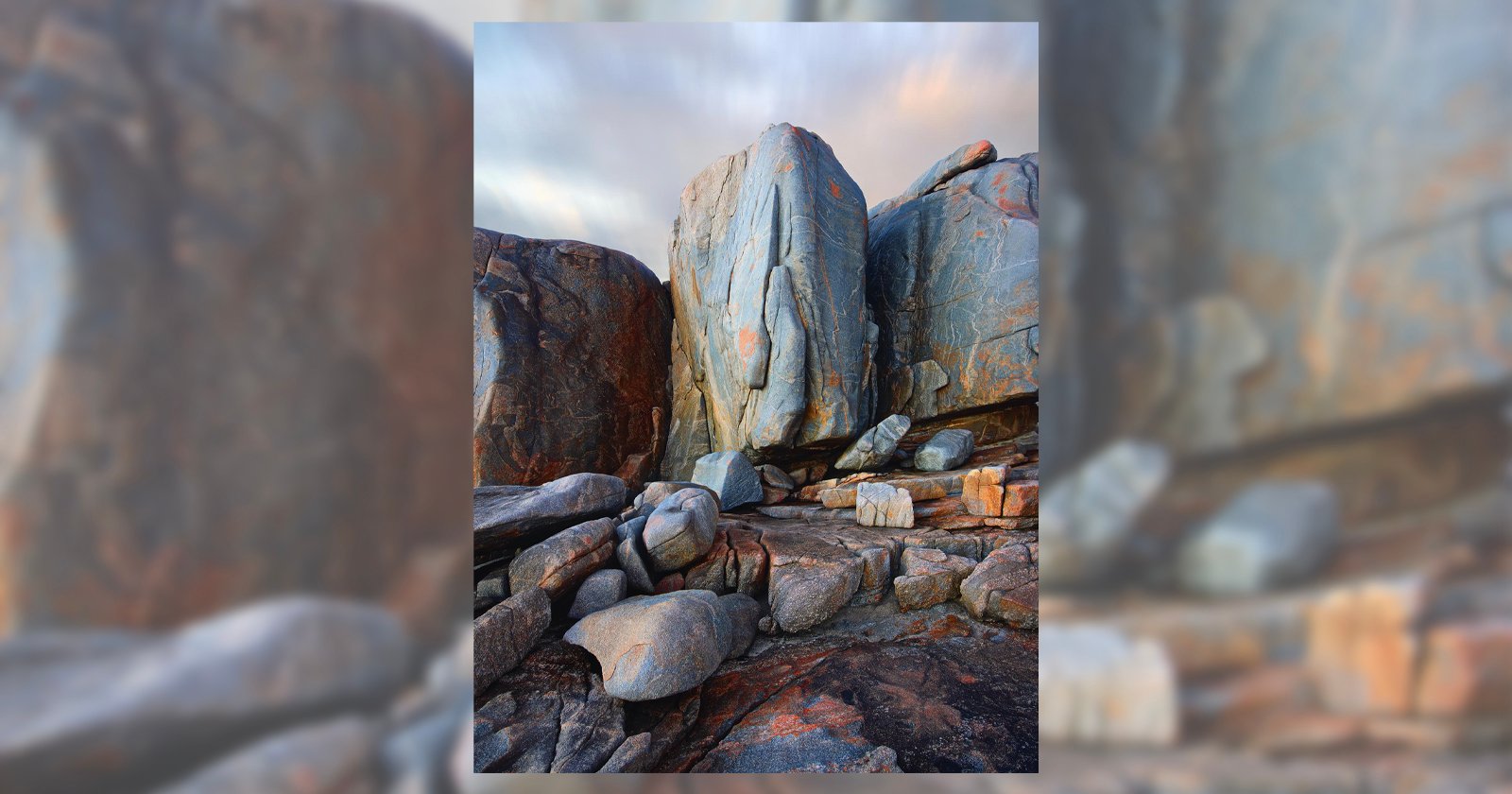
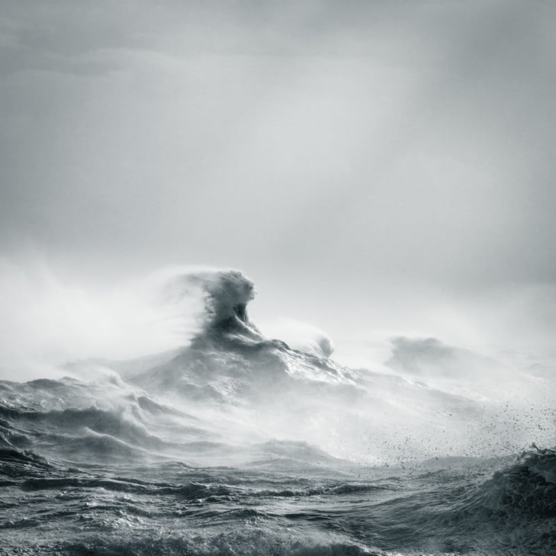
The third poster I made for Death Valley is Dunes and Clouds. This was the second dunes image that was made into a poster. The Park thought my first image did not show the expansive range of the dune environment, so I proposed making a new image. I got up before sunrise at the Stovepipe Wells campground, drove a short distance, packed up my 4×5 camera which I routinely fit into my backpack for short to medium distance hikes (with the front and rear stages disconnected to fit), set my heavy Bogen tripod across the top, hung my trusty viewing cut-out card from the tripod head, and trekked into the dunes.
Shortly after sunrise I found this interesting symmetrical composition. The dunes were not sufficient to make this an expressive image but the clouds, filling the sky with patterns contrary to the foreground sand ripples, and even some clouds echoing the sand ripples, immediately made this the image I had to make. My records indicate I used a graduated ND filter in the lens shade hoping to reduce the brightness of the sky and clouds, bringing them under control in the negative. I made the exposure on TMax 100 film just as a slight breeze got up. I decided to expose a sheet of Ektachrome 4×5 color transparency film. Just as I finished the color exposure, the wind became fierce, whipping sand into my face and onto the camera. I hastily put the camera into my backpack, which was no easy task in the now raging sandstorm! I could barely see, squinting to prevent the sand particles from getting in my eyes. On the way back to the car I had to lean against the blowing wind and sand to maintain my balance.
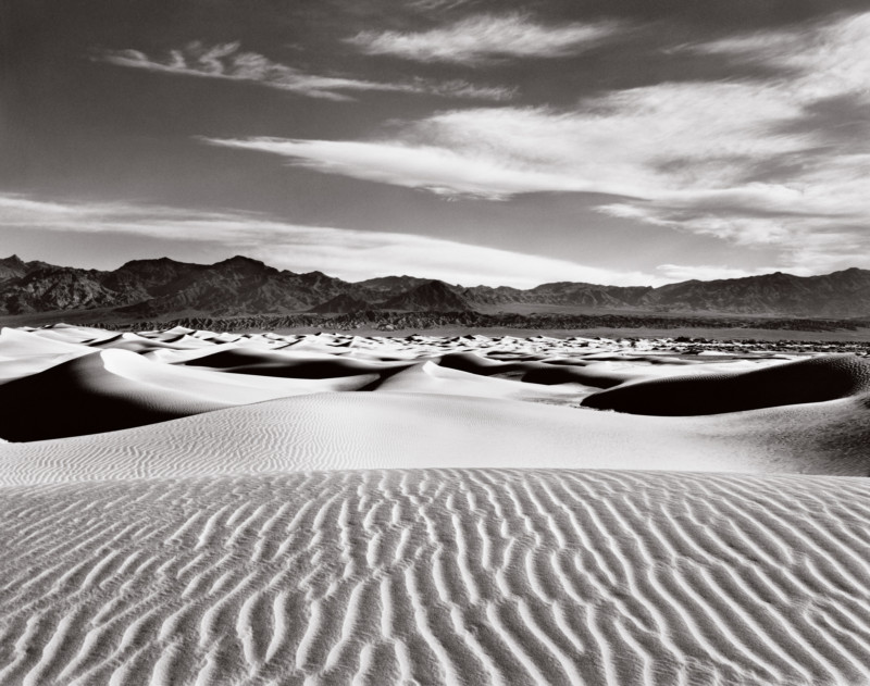
I developed the negative N+1 (over-develop) to increase contrast, knowing that the graduated neutral density filter would prevent the clouds from blowing out and losing detail. I was surprised to see minimal dust spots on the film, and the exposure was excellent! All the desired image values were recorded well on the film. Even so, this was a difficult print to make. The values were uneven, so substantial burning and dodging had to be done to achieve a well-balanced clean image (something I feel is necessary for a symmetrical composition like this).
I showed a mock-up to the Park personnel and was given the "thumbs up" for a sand dunes poster. Fortunately, the poster was relatively easy to print. Using a high-density black ink and pms409 grey ink (which the printers nicknamed "Radeka Grey"), on glossy paper, it was mainly a matter of printing with enough black density to yield a visually satisfying image. My trilogy of posters for Death Valley was complete!
The article is courtesy ofELEMENTS Magazine. ELEMENTS is a monthly magazine dedicated to elegant landscape photography, insightful editorials and fluid, clean design. Inside you will find an exclusive and in-depth articles and imagery by the best landscape photographers in the world such as Bruce Barnbaum, Christopher Burkett, Chuck Kimmerle, Christian Fletcher, Charlie Waite, Rachael Talibart, Erin Babnik and Freeman Patterson, to name a few. Use the PETAPIXEL10 code for a 10% discount off the annual subscription.
_About the author: Lynn Radeka’s professional photography career spans more than 50 years. Influenced in his early work by Ansel Adams and Wynn Bullock, both of whom critiqued his prints, he continues to pursue a technical and aesthetic mastery of the medium of photography. His love of the grand landscapes and intimate details of the American West was born on his first trip to Death Valley in 1966.
Lynn Radeka’s Black and White photography has been featured in eight National Park posters and is represented by several galleries throughout the United States and Europe. He also has the honor of being a featured photographer in the recent book publication "World's Top Photographers: Landscape." Lynn Radeka currently leads photography workshops in Death Valley, Utah and New Mexico with many more locations planned for the near future._
#inspiration #analog #deathvalley #desert #elements #elementsmagazine #film #filmphotography #fineartlandscapephotography #landscape #landscapephotographer #landscapephotography #lynnradeka #storybehindthephoto #storybehindtheshot #travel
1 Shares
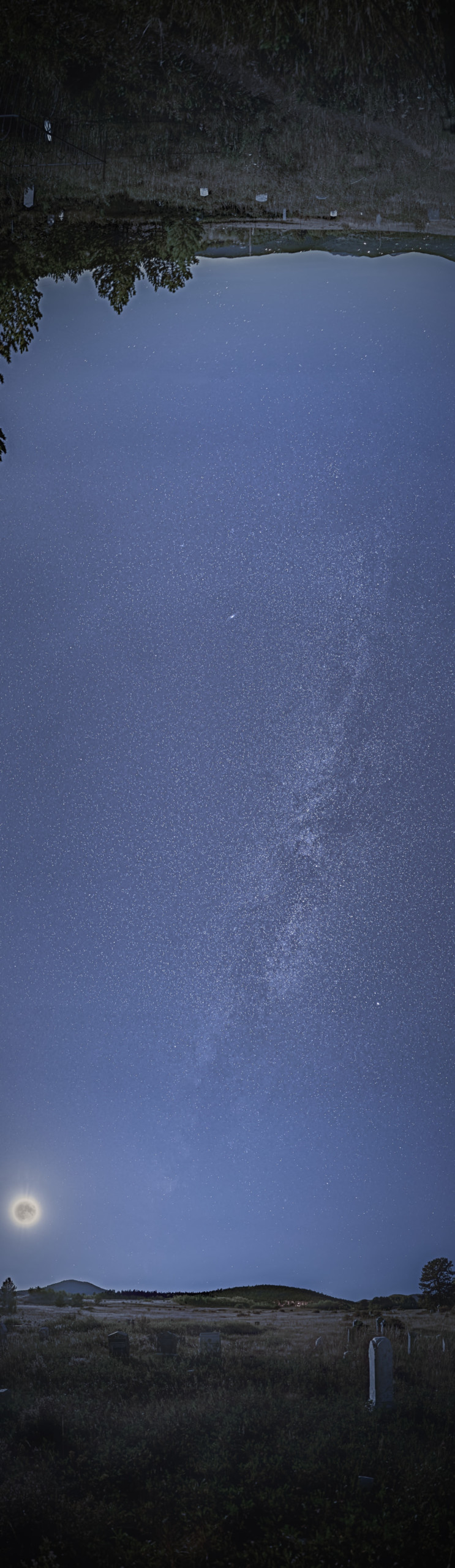
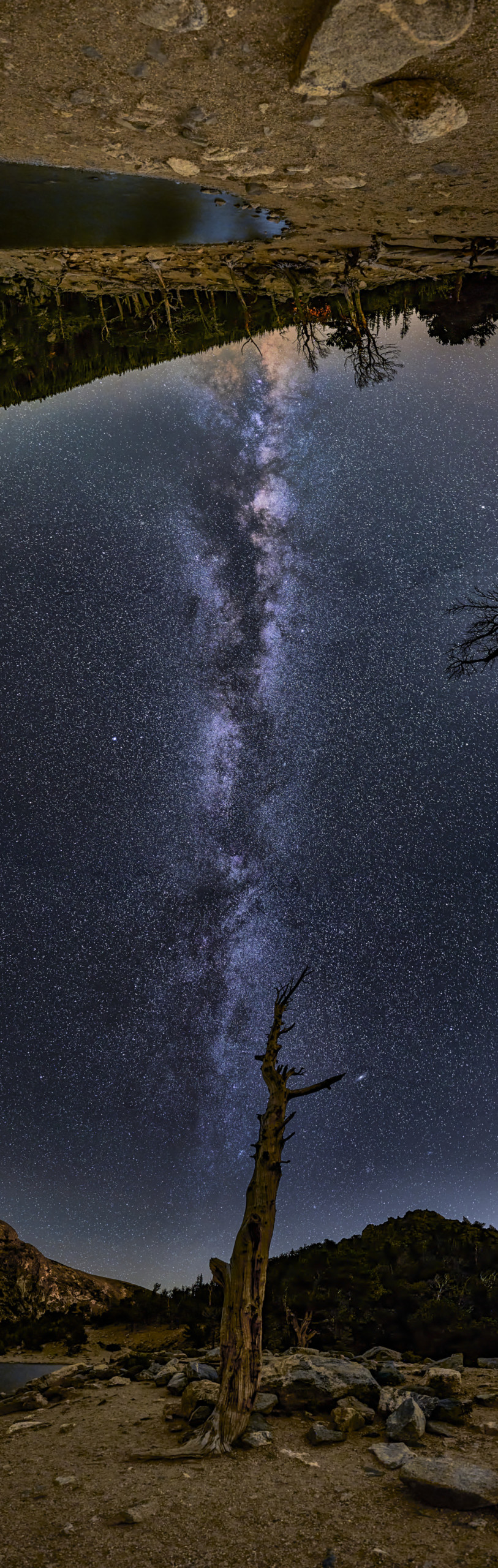
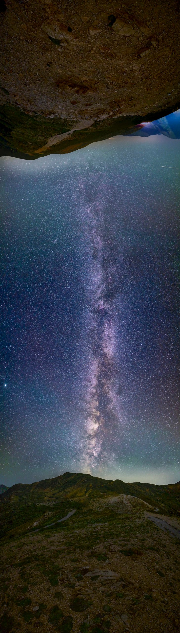
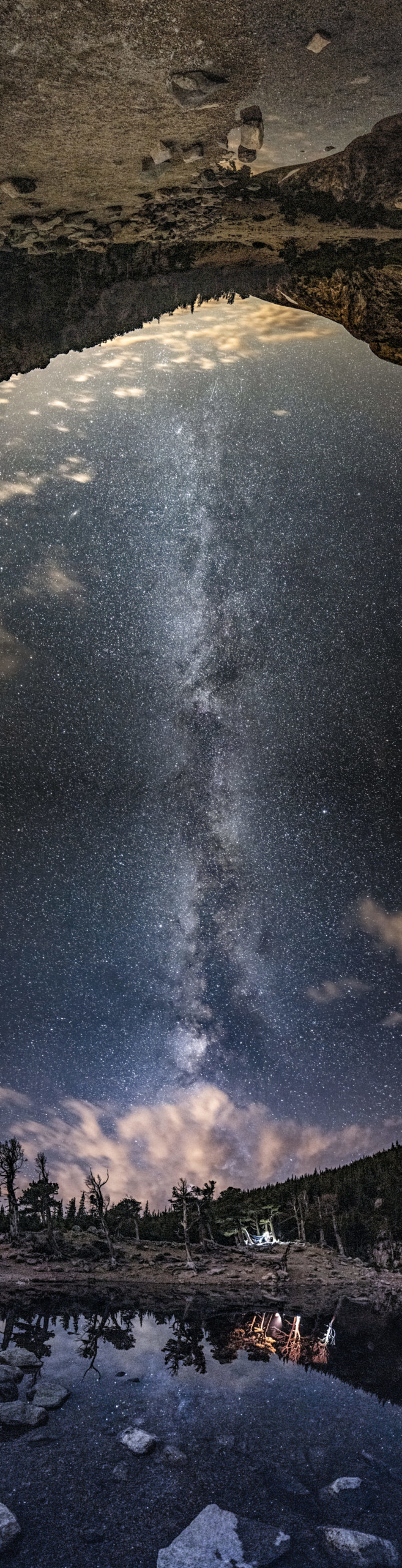
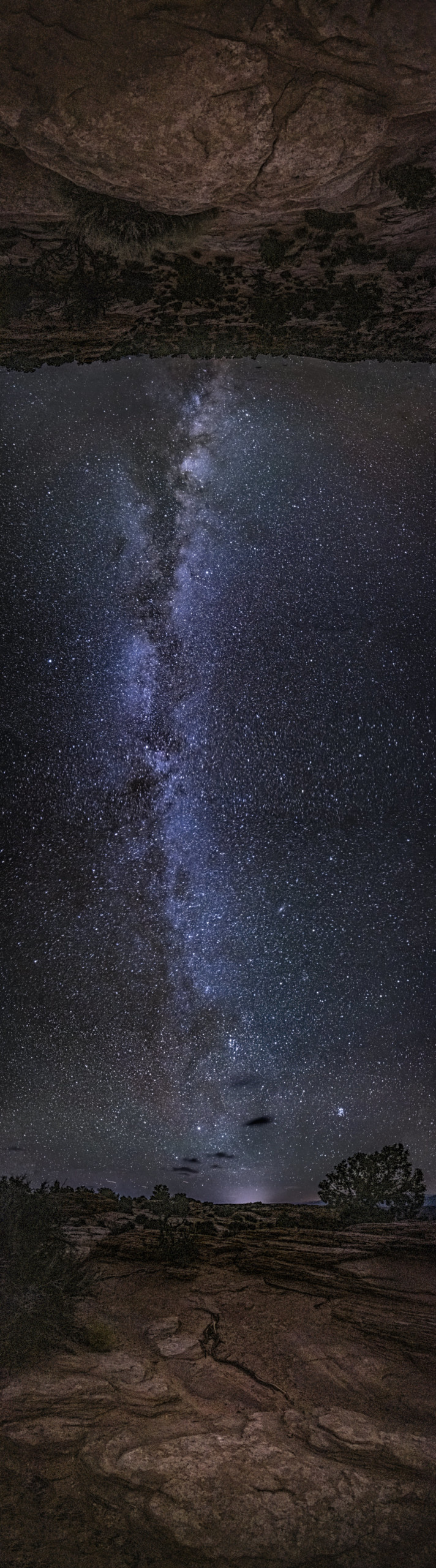
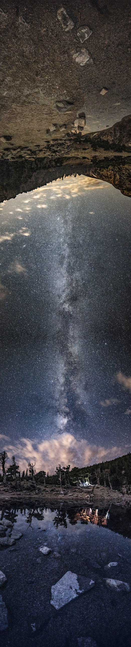
Nexus Panoramas: Two Landscapes Linked Together with the Milky Way
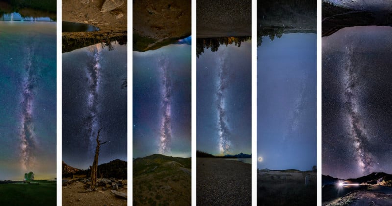
Photographer Geoff Decker has spent the last two years creating what he calls Nexus Panoramas: vertical photos that use the Milky Way to link two landscape foregrounds in a single image.
All images below can be clicked and viewed in higher resolution.
Decker calls the images Nexus Panoramas for two reasons. One, the term nexus is defined as "a connection or series of connections linking two or more things." He says he wanted to clearly define this type of images as a panorama where the Milky Way is used to link two lanscape forgrounds using a single series of images.
The second reason?
"Nexus honestly just sounds spacey," he tells PetaPixel. "It's used by a various number of space organizations and Sci-Fi material so it just fit the definition."
Decker says that he got the idea for these images in August of 2019 while going through old equipment. He came across an old Nodal Ninja, which is a spherical panorama head that was used to create "tiny planet" photos and virtual walkthroughs for realty companies before the modern methods used today became available. On that note, Decker says that about a month after he rediscovered his Nodal Ninja, the company announced it was closing its United States offices.

"At the time I was also practicing astrophotography, learning how to stack images to clean up noise and such. When I found it, a bit of inspiration just kind of hit that, in theory, I should be able to use this type of head to achieve a perfect vertical shot of the Milky Way," he says.
The idea made sense, but creating finished images was more of a challenge and revolved around his tripod setup and software issues.

"At the time, I was using an older steel Manfrotto tripod I had lying around. As I came to learn, the tripod was going to be pivotal to getting the image quickly and easily and this was not it. The thing, while sturdy, was impossible to level, and with these panoramas, you only have so long before the Milky Way is out of ideal alignment. I was still able to get my first Nexus Panorama the first go-around but it took a bit longer than what was ideal," Decker says.
"I went through a couple of test setups before I found the ideal one. I use a 3 Legged Thing Punks Brian as it's quite lightweight and fairly stable at its tallest setting (which comes in useful). I still use my Nodal Ninja, and between the Nodal Ninja and the tripod, I have a leveling base to expedite leveling the entire setup," he explains.
Decker says that on the software side, anyone who tries to stitch photos together for panoramas understands that it can be a pain. He explains that with this particular panoramic image, it is very easy for some of the automated options to get "lost" in the stitching process and as a result, fail. He says he took a lot of time finding the right software that wouldn't be terribly time-consuming but would also retain high image quality with minimum compression.
"At the time, Photoshop had a difficult time (and still does). Surprisingly, I found Lightroom’s Panorama function could resolve it most of the time. And any time I have a difficult one, such as the Tombstone panorama, I use Affinity with no issues," he says.
The time for an edit can take a while, and Decker says he's edited one in as little as a few hours while others can take a week or more to get right -- editing on and off during that span, of course.
Decker explains that the process for creating these images breaks down into eleven steps.
The process starts just as most typical astrophotography expeditions do:
- Find a location
- Check weather and cloud coverage
- Locate the milky way and locate an area with some nice foreground.
"With locations, it's hard to be picky because you have to be facing a very specific direction," he explains. "And honestly, I take a bit of a nomadic approach to astrophotography in general, where I find an area with a dark spot, travel there, and see what happens."
A good location for these photos means clear skies and low light pollution, which he says has been hard this past year in Colorado where he lives because of the smoke from forest fires.
"Next year, I do plan to experiment a bit more. Despite taken during a close to full moon, I do like the Tombstone panorama and plan on hitting up a few ghost towns to get some more interesting foregrounds."
After he has picked a location, next comes field planning:
- Figure out when the Milky Way will be directly overhead and verify you are in a location that shows it off well. You can use apps like Photopills to get an estimate, but its pretty easy to just observe the movement with either your eyes or your camera.
- Extend the tripod and level out the head.
- Attach the camera. Re-level the head.
- Move the nodal ninja with camera attached fully around. Make sure nothing shifts, make sure the lens does not hit the tripod. Knobs and platforms shift so it might be loose, it might not be set the same exact way you had it (or you put the camera on in the wrong position, ask me how I know).
- Set the camera up pointing to the core of the Milky Way. Test your astro exposure, focus, and foreground exposure. Adjust as needed.
- Once ready, point the camera at about 15 – 30 degrees down. Take one picture every 15 degrees (works the best for stitching), remembering to take two photos for the foreground photos (one at the astro ISO, one at a higher ISO to see the foreground). Step and repeat until you get all the way to the other side of the tripod.
- Review images.
- Import and edit.
Decker says that the number of photos he uses for his Nexus Panoramas varies depending on if he sets the camera in a landscape or portrait orientation. He says the landscape setup requires more images as it is a shorter image, but usually resolves better.
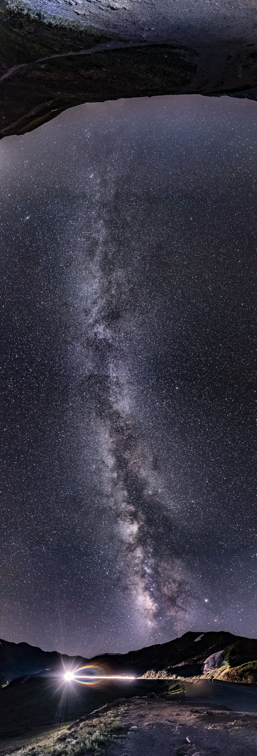
"At the Grand Tetons, I used 32 images in the session," he says. "Duplicates of the foreground were taken, one at the ISO used for the sky (1250) and one for a brighter foreground (4000)."
Decker says that ideally, the best medium to enjoy his photos is in print.
"I had one printed on metal this year for the annual Louisville Art Association National Photography show (won people’s choice award) and what's cool about these photos is that there is no right or wrong way to hang them. You can literally hang them on any side and each orientation makes it a different photo," he says. "You lose that in digital. Plus, they look really cool printed on metal.
"That being said, I bet they look great on ultra-wide monitors."
More of Decker's Nexus Panoramas and his full portfolio of photography can be seen on his website.
#features #inspiration #astronomy #astrophotography #fineart #fineartlandscapephotography #landscapephotography #milkyway #milkywaygalaxy #nodalninja #prints #space #ultrawide #vertical
1 Shares
Photographing in Black and White: Seeing Beyond Color
By removing color, we change how the viewer’s eyes see the photograph. No longer dependent upon color cues, we must find our visual information in the physical characteristics of shape, form, texture, and lines.
In my presentations, I often ask why, if color photography were so wonderful, black and white was invented first. It is, of course, a joke. A little friendly rivalry. The truth is that I love color photographs. They can be meaningful and inspirational. I have the utmost respect for those who do it well. But I was never one of them.
I am not alone. There are many photographers who, like me, photograph almost exclusively in black and white. We are in the minority, however. There are even more who photograph in black and white part-time. We have each chosen to create and present some or all of our work this way, and we do so for our own reasons. Some are rebelling against the popularity of color photography and others have a love for what are considered traditional landscapes. But many, like me, simply don’t have a meaningful creative response to color.
In order to understand what black and white photography has to offer, we need to get some perspective. When we look at a color photograph, the first thing we mentally process is that the scene is depicted in color. Only after that do we begin to study the physical characteristics of the objects in the frame such as shapes, forms, textures, and lines.
These attributes, along with color, help define the look and feel of everything in front of our camera. When we remove the layer of color, either in the field or during processing, what remains are the four descriptive physical attributes. It is in the study and presentation of these – shape, form, texture, and line – in which black and white photography excels. I refer to it not as working without color but seeing beyond it.
So, how can we recognize and make use of these characteristics to improve our black and white photographs?
Forms
In art terminology, a form is simply an object that appears three-dimensional. Forms show a range of tones and represent their subject matter. A tree looks like a tree, a rock like a rock, and a platypus like a… well.. like a duck mixed with a beaver, but you get the point. They look what they are and what we expect them to be. Forms are what we most often see when we are looking at traditional landscape photographs.
 The boulders, branches, and mountains in this scene all show three-dimensional characteristics; thus, would be considered artistic forms. | 24mm, f/8 @ 30 seconds, ISO100
Forms are easily recognized so people have little trouble in understanding what they are looking at. That accessibility brings the viewer into the scene, evoking feelings of inclusion, appreciation, and comfort.
Forms can be categorized as either geometric or organic. Geometric forms have regular, precise, structured outlines and often appear, even if natural, as being manmade. They include buildings, roads, telephone poles or automobiles. Naturally occurring objects such as crystals or basalt formations, with their straight edges and sharp angles, can also be considered geometric.
rganic forms such as a leaf, mountain range or meandering stream have irregular or wavy outlines and often appear to be from the natural world. As their outline is less mathematical than a geometric form, they have a softer, more relaxing presence in the photograph.
Shapes
Shapes are similar to forms but appear as two-dimensional and have little interior detail. For example, if a sphere were considered a form, then a simple, white circle would be considered a shape.
As with forms, shapes can be categorized as either geometric or organic. Due their precise structure, geometric shapes can be quite abstract and powerful. Organic shapes, because their outlines are more free form and less formulaic, are often less abstract but can still be a powerful compositional element, especially if juxtaposed against their geometric kin.
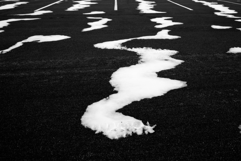 The organic shapes of the blown snow contrast with the decidedly geometric shapes of the parking lot lines. | 24mm, f/13 @ 1/60, ISO100
Of course, as with all things artistic, there is often no clear defining line between shapes and forms. Some elements, such as a smooth, dark tree trunk, might exhibit characteristics of both form and shape. The categorization, however, is not important. What is important is that we recognize the qualities of objects in our frame and what they add to or take away from our composition. Only then can we make smart and informed creative decisions while photographing and processing (printing).
Juxtaposing the accessibility of forms against the abstractness of shapes leads to unique and compelling compositions which will be sure to hold the viewer’s attention.
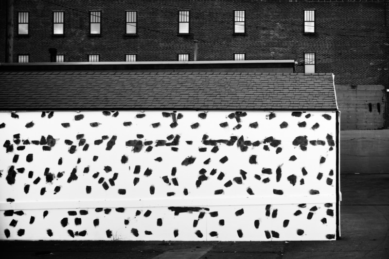 The uniformly spaced, rectangular windows against a dark background play against the haphazard brush marks on a bright white wall. | 45mm, f/8 @ 1/30, ISO100
Lines
When we think of lines, we often think of leading lines – roads, sunrays, fences, etc. – which orient us towards, and thus draw attention to, our main subject. But lines are much more. They are one of the most common elements in our compositions. Lines exist as individual objects which are often very strong and stark compositional elements, but also create the outlines and interiors of objects in our photograph and in this regard are often overlooked.
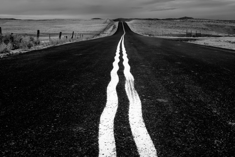 By getting a low angle, these wavy street lines become a strong focal point in an otherwise unremarkable scene. | 45mm, f/8 @ 1/60, ISO100
 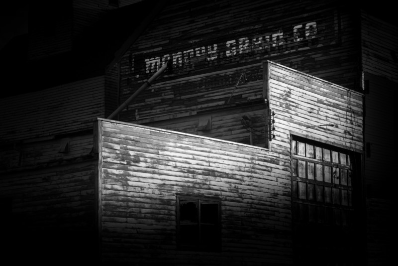 This old grain elevator is, due to heavy post-processing, reduced almost entirely to a study of lines. | 85mm, f/5.6 @ 1/125, ISO100
Lines can be as straight as an arrow or curved like a bow. They can wind lazily, be sharply angular or even form a circle. Their orientation is important. Lines which are parallel or level with the frame appear static and dull, but lines which are angled up at to the right often appear dynamic and energetic (at least in Western cultures whose text reads from left to right).
 The distant trees form lines which direct the viewer’s eye to the foreground evergreen which, in turn, points the eye towards the dynamic line at the top of the frame. | 24mm, f/11 @ 1/45, ISO100
Texture
Although not a stand-alone element like form, shape or line, texture plays a critical role in defining the visual characteristics of an object’s surface. Smooth objects such a birch tree or a patch of white snow on a cloudy day will show little texture, whereas rougher surfaces such as the trunk of an oak tree or a bale of hay may show rich texture.
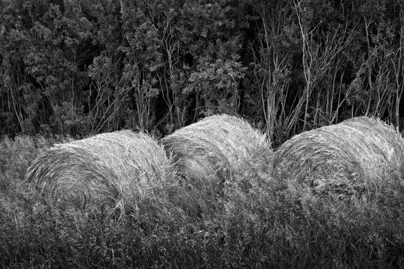 The rough texture of these hay bales integrates with the rough textures of both the foreground grasses and the background saplings. | 50mm, f/11 @ 1 second, ISO100
Textures can also be manipulated by technique. A body of water on a windy day, photographed with a fast shutter speed, will emphasize details of the water’s surface (texture). That same body of water, photographed with a shutter speed measured in many seconds, appears smooth and silky. Either is a valid creative decision.
Texture is necessary to help define a form’s structure, and to give it a three-dimensional look. Without texture, objects appear flat, metallic, plastic or even glassy. That is why the heavily edited, overly smoothed faces of social media influencers look so phony to our eyes.
The visual impact of texture is highly dependent upon lighting and post-processing. It is essential to defining form so it is not something we can ignore. As with everything else in our frame, we need to be aware of the way it affects our composition. Too much texture may well be distracting. Go easy on that structure slider in Lightroom; likewise, too little may look odd.
Each of these four elements plays a critical role in black and white photography and is what the medium does best. It is our responsibility, as creative photographers, to not only recognize their presence and power, but to compose these various elements into a cohesive and compelling photograph.
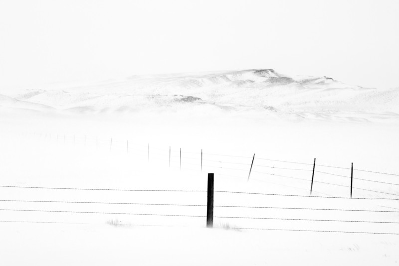 The foreground lines and shapes direct the viewer’s eye to the start of the soft-textured, distant hills. | 120mm, f/11 @ 1/250, ISO100
P.S. -- There are some scenes – no matter how compelling the shapes, forms, textures or lines – in which color is important and so defining that the image fails without it. In that case, no matter the skill or talent of the dedicated black and white photographer, the fight was over before it even began. So if we can’t beat the color photographers we will, at least in these cases, join them.
 The garish and contrasting colors of this room are vital to the identity of this image. If we remove these colors, this image is destined to fail. | 24mm, f/8 @ 1/6, ISO100
**The article is courtesy ofELEMENTS Magazine. **ELEMENTS is the new monthly magazine dedicated to the finest landscape photography, insightful editorials, and fluid, clean design. Inside you will find exclusive and in-depth articles and imagery by the best landscape photographers in the world such as Freeman Patterson, Bruce Barnbaum, Rachael Talibart, Charles Cramer, Hans Strand, Erin Babnik, and Tony Hewitt, to name a few. Use the PETAPIXEL10 code for a 10% discount off the annual subscription.
_About the author: Chuck Kimmerle is a U.S.-based, fine art landscape photographer who prefers to work in the reticent and quiet areas located in between the popular, overcrowded, and over photographed, destinations of grand beauty. While his style is rooted within the foundations of traditional landscape photography, his observations and interactions are both contemporary and introspective.
If you feel a connection to Chuck's work, please consider supporting him by purchasing one of his exquisitely crafted prints, or by simply sending a note of appreciation. _
#editorial #educational #blackandwhite #chuckkimmerle #elements #elementsmagazine #fineart #fineartlandscapephotography #fineartphotography #landscapephotography #techniques
1 Shares
Photographing Waves: One of The Most Rewarding Subjects
Waves are some of the most rewarding subjects for photography that I know. For starters, if you miss one, another will be along very soon! Of course, they are also unpredictable and can be dangerous. What is fascinating is that no single wave will be exactly the same as any other wave that has existed since the beginning of time. Mind-blowing stuff.
When you’re starting out in wave photography, it is helpful to have a rudimentary understanding of different types of waves and what you’re likely to encounter on different beaches. Wide beaches with shallow falls typically experience long, rolling breakers. These graceful waves are a pleasure to photograph. The curl of a rolling wave is attractive but this perspective can be elusive as the topography of the coast often fails to offer a side-on angle.
This story is brought to you byELEMENTS Magazine. ELEMENTS is the new monthly magazine dedicated to the finest landscape photography, insightful editorials and fluid, clean design. Use the PETAPIXEL10 code for a 10% discount off the annual subscription.
Some photographers take to the water with waterproof camera housings and capture amazing moments within or even underneath waves (although not on the beaches where I make photos!). Obviously, this approach is for confident swimmers and, if you want to try it out, I strongly recommend that you first spend time getting to know your location and how to navigate the waves there safely. However, if it isn’t safe to swim or you’d simply prefer to stay on terra firma, don’t give up just because you can’t access the popular “curl.” A front-on perspective can also work; the moment a breaker starts to drop is often all that’s needed to break the line and add visual interest.
On steeper, narrower beaches, there may be backwash. This is when water that has travelled up the beach falls back with enough power that, when it meets another wave, the water is pushed upwards, creating a wall. This is a marvellous subject and you can go wide to show the impact in its setting or zoom in tight to explore the textures. “Clapotis” is a sort of backwash wave. This lovely French word describes the moment that a wave, having bounced off a quay or cliff, crashes into another wave. The shapes often seem to defy gravity. This sort of photography is more like sports or wildlife than landscape work. Fast shutter speeds, responsive focusing and quick reflexes are the order of the day. I suggest you use high-speed continuous or burst mode and run off 3 or four frames for each wave.
As with everything, it pays to know your location and to have done your research. For example, if the wind is blowing from the north, there’s little point in visiting a south-facing beach backed by cliffs. However, if the land behind the beach is flat, a strong offshore wind may be ideal as it will hold back the waves, making them pile higher, and you’ll get spindrift off the top. Equally, think about the tide and the light. There are usually fewer waves at low tide. Harsh midday sun is difficult, and you’ll likely need a polariser to mitigate the shiny patches of water whereas backlit waves can be gorgeous when the sun is low.
Point of view makes all the difference and there are so many variations on the standard, head-height position. If you can get low, your waves will stand proud of the horizon. Not every beach gets big waves, but they all get waves of some sort, even if just from the wake of passing vessels. If you lie on the beach, even small waves can look mighty.
Alternatively, try a higher point of view, a clifftop perhaps. Photos taken from above are no longer about the size of the waves. Instead, they make the pattern the star of the show. Waves leave in their wake wonderful shapes that we never see from beach level. Next time you watch the sea from a cliff, notice the beauty of a wave’s footprint.
The sea is always moving so shutter speed is probably your biggest decision; 1/800 or faster will freeze the waves, capturing all the detail. However, slower shutter speeds are also hugely enjoyable. I particularly like ¼” as it keeps the wave’s overall shape, but the details seem like brushstrokes. In my photos, “Theia” and “Twist,” the waves are the same basic shape, but one is caught at 1/800 and one at ¼”. While we’re experimenting, how about adding some intentional camera movement. I like shutter speeds close to 1” and subtle movement so that I can still see the idea of a wave within the blur. I prefer not to use a tripod for ICM. I’m not looking for perfection here – I want the result to look like a painting and paintings aren’t perfect, at least the good ones aren’t.
If you’ve ever tried to photograph waves and been disappointed, I suggest you try a longer focal length. It will suck the viewer into the action and the wave will almost certainly look more exciting. Most of my storm waves were captured using a 70-200mm lens. More recently, I’ve been using a 100-400mm. This is harder because, at 400mm, it’s difficult to see enough of the sea to find the best waves. I’m enjoying the challenge. Long focal lengths offer a way to create difference. The casual viewer will see the big scene, but they won’t notice the curious textures within a wave. For this kind of work, you have to compose like a photographer of abstracts, thinking only of shape and colour, rather than the subject as a whole.
So far, I’ve concentrated on waves alone but waves as they break against the shore also make exciting subjects, stirring our imagination with awe and even fear. As these photographs tend to reference scale and location, they are often more documentary in style; however, that’s not always the case. I happened to publish my photograph, “Face-of” during the voting for the U.S. presidential election. This was entirely coincidental (I’m British), but several people commented that the picture represented the clash of candidates and ideologies! People will always find metaphors in the sea.
I’ve outlined just a few of the possible ways to photograph waves. As with any subject, the best approach is to be open-minded and willing to experiment. Try everything and see what happens, then make changes based on your experience. Be prepared to make a lot of bad photos (remember, this is more like sports than landscape photography). Above all, make sure you take time to just watch and listen to the waves. The sea’s music is beautiful and inspiring and I firmly believe you will make better art if you let it into your soul.
Safety
I don’t want to spoil the flow of the article with a homily on safety but I feel it would be irresponsible not to mention it at all. Waves can be dangerous. It’s important that you know the relevant tides, wind direction and speed. Working on a falling tide is safest. If it’s not safe to get as close to the waves as you would like, come back another day with a longer lens. Trust your instincts – if you feel at risk, you probably are. Lens hoods are good for keeping spray off the lens and I recommend that you always wipe everything down with fresh water after you leave the beach.
**The article is courtesy ofELEMENTS Magazine. **ELEMENTS is the new monthly magazine dedicated to the finest landscape photography, insightful editorials, and fluid, clean design. Inside you will find exclusive and in-depth articles and imagery by the best landscape photographers in the world such as Freeman Patterson, Bruce Barnbaum, Rachael Talibart, Charles Cramer, Hans Strand, Erin Babnik, and Tony Hewitt, to name a few. Use the PETAPIXEL10 code for a 10% discount off the annual subscription.
About the author: Rachael Talibart is a professional seascape and coastal photographer. Her critically acclaimed photographs of the ocean and coast have been featured in the press all over the world. Rachael is represented by galleries in Europe and the USA, her work is frequently exhibited and her limited-edition prints are collected internationally. She is the author of three monographs, including ‘Sirens’ and, most recently, Tides and Tempests. Rachael owns f11 Workshops, providing location and online photography training and she leads international photography tours for Ocean Capture. You will find Rachael Talibart’s series “Oceans and Odysseys” in the ELEMENTS Magazine.
#editorial #tips #travel #abstractlandscapephotography #abstractlandscapes #elements #elementsmagazine #fineart #fineartlandscapephotography #fineartphotography #landscapephotographer #landscapephotography #oceans #rachaeltalibart #waves
1 Shares
Examining Social Media’s Impact on Landscape and Nature Photography
As a landscape and nature photographer with a Master’s Degree in Clinical Psychology, I often enjoy trying to blend the two disciplines to better understand the human experience as it relates to photography. One subject that particularly intrigues me is the impact of social media on photography and photographers.
My journey as a photographer began in 2008 just before the explosion of social media. This was the heyday of forums, blogs, and magazines; if you wanted to find great photography, you had to search for it.
Today, it’s everywhere. Photographers are faced with a problem: How do we stand out? One solution it seems can be found in post-processing. Many photographers chose to push their images to greater and greater extremes vying for the increasingly limited attention of their audiences.
Read more: When is Photography No Longer Photography?
What we have seen unfold in the past 10 years has been extraordinary. Photographs that were once lauded are now largely ignored by the masses in favor of digitally created spectacle. Realistic photographs of natural phenomena, incredible moments in time, or those representing exceptional experiences witnessed by the photographer, suddenly seem mundane.
Change Through Social Media
So how did we get here? In my opinion, this all began with the website 500px, which emerged in 2012. 500px, for those that are unfamiliar, possessed an algorithm they called “Pulse” which measured the popularity of the photograph based on likes, comments, views, and other metrics which then acted as a vehicle by which the photograph would make it onto their “Popular” page or even be selected as “Editor’s Choice.”
The images that were garnering the attention of the algorithm often possessed extraordinary qualities: splashy post-processing, composite elements, and saturated colors, all tied together in a near-perfect fantasy-like style. Photographers who had mastered various techniques in Photoshop such as compositing, warping, and sky-swapping were heavily rewarded with views, likes, and more attention on the platform. Indeed, groups of photographers quickly learned how the algorithm was tailored and banded together in social groups to game the algorithm and maximize the likelihood of making it onto the popular page. This solidified these images as representing the Zeitgeist of landscape photography.
It was obvious for any photographer paying attention that if you wanted to shoot to stardom between 2012 and 2016, your photographs needed to possess this dreamy, fantastical look.
Indeed, images became increasingly perfect by the day, with each group of photographs making it onto the popular page requiring more and more manipulation in the digital darkroom to attract attention. A post-processing arms race began and those photographers that presented nature as they actually experienced it were left behind. Extreme digital manipulation became the norm.
I, too, got swept up in this movement and began compositing images in the hopes they would get noticed. As Facebook, and later Instagram, arrived on the scene, so the trend accelerated. Monster moons, dropped in skies, auroras and Milky Ways, stretched mountains, composites of vastly different focal lengths, painted light rays -everything aimed at creating a perfect final product of nature that never has and never will exist.
On the positive side, these approaches have opened new avenues for artistic expression. It can even be argued that a new photographic genre has been created, valid in its own right. Many of the innovative post-processing techniques that have been developed in pursuing these extremes have become useful to photographers with more understated styles often helping them to present reality in an even more natural way. As a community, we’ve also developed a different understanding of light and color, and the qualities of a scene that transform it into the sublime. Like any disruptive artistic movement, a lot has been gained.
But if there are "losers," then they are those talented photographers who find nature to be sufficient without significant embellishment. Creating work primarily for yourself should be the goal of any artist, but for those working professionally, there is a stark reality that they must court popularity in order to survive -- or even enter the profession in the first place! When the viewer can’t distinguish between experiential scenes and digital fantasies, the latter will always become more popular. It’s a difficult conundrum to solve -- should they try to keep up or just accept their new normal and the potential downsides that come with it?
Why We Post on Social Media
What motivates photographers to post on social media to begin with? In a recent Medium article titled The Psychology of Social Sharing, the authors examined the psychological incentives for sharing content:
- Physiological needs: Sometimes we post to benefit the health or well-being of our friends and family.
- Safety: Physical, mental, and financial security are important for people when they choose to post some material on their social media. This certainly makes sense - photographers operating as business people have a vested interest in maximizing their income.
- Love & belonging: Users generally want to post to feel some kind of social acceptance from a group or a particular individual. I have found this particularly true of photographers who want to be accepted by their peers.
- Esteem: People want to satisfy the rewards-oriented parts of their brains, which helps explain why some people post “me-centric” content regularly.
- Self-actualization: This aspect of social media posting manifests when people share their successes -- selling a print, winning a photography competition, or completing a book, to name a few examples.
By examining these psychological incentives, one can begin to understand why landscape and nature photography has been pushed to such digitally-manipulated extremes: because in order to gain these benefits wholly and consistently, a photographer looking to gain the same benefits from social media is forced to edit their photographs in a way that garners the most attention.
To garner positive feedback, photographs must rise to popularity, which requires the photograph to compete with “best” at any given moment. One way to guarantee this is to make the “photograph” perfect in every possible way for the broadest possible audience. This is why we commonly see focal length blended foregrounds with stretched mountains combined with drone perspectives, all in one “photo.” The more extreme the better!
More directly, the quest for likes or follows on social media heavily influences why people post and why they create the “artwork” they do. The positive attention some users receive for posting inspires more and more social sharing in many users.
The Lure of Popularity
So why do we chase popularity as photographers? It is only natural to want people to like our artwork. The human brain is wired for it and social media is the powderkeg. Social media affects brain functions in unique ways - it contains combinations of stimuli that can trigger different reactions, and because of this, social media has numerous consequential effects on the brain.
Positive attention online has an acute effect on the brain. According to an article in Social Cognitive and Affective Neuroscience, accruing likes on Facebook, Twitter, or Instagram causes “activation in brain circuitry implicated in reward.” When social media users receive positive feedback (likes and comments), their brains fire off dopamine receptors, which are the same neurochemical receptors involved with sexual pleasure, enjoying a good meal, or using cocaine. Additionally, where researchers used MRIs to look at the brains of adolescents using Instagram, “viewing photos with many (compared with few) likes is associated with greater activity in neural regions implicated in reward processing, social cognition, imitation, and attention.” ( Psychological Science)
Social exclusion also plays a role. When we share our photographs online and they don’t receive the same amount of praise as others, we can feel excluded. A study observing brain activity published in Nature Communications found that parts of the brain that deal with emotional and sensory processing had a significant negative reaction to a sense of exclusion on social media.To avoid these experiences, some photographers conform to popular trends in order to avoid the negative emotions associated with exclusion.
None of this should come as a surprise. Social media companies have been clued into human psychology from the outset. Understanding and manipulating online viewers is a key means of business growth. Social media channels have even harnessed the psychology of gambling to increase our screen time through the addictive effects of variable rewards. Essentially, the fact that our photos are not rewarded with likes in a consistent way makes us even more prone to spend time on these sites. Well-established research has shown that rewards for behavior that are varied and random have a much more powerful influence on repeating said behavior. The purest example of this can be found in slot machines in casinos.
What’s Next?
What are we to do if we value both styles of landscape and nature photography (extremely digitally manipulated vs. more natural / representative of reality)? I believe there is room for both styles to exist simultaneously without the constant back and forth beating of the dead horse we constantly find ourselves engaging in.
First of all, we need to make some attempts to identify and separate these two approaches, though this will have to be done sensitively. Photographers preferring the truth-to-nature approach risk coming across as elitist if, for example, they start suggesting that their work is real, unlike those who “fake” their work.
Similarly, many photographers who prefer total freedom to manipulate a scene will be resistant to labeling their work as composites, or admitting that a scene never existed. The best we can hope for at this stage is increased openness from both "sides" and respect for their differing approaches.
Secondly, we need platforms, social circles, groups, and competitions that promote more understated photography for what it is so that this work isn’t totally drowned out by other, more hyper-realistic work. Not only would this help to level the playing field for current photographers, but it would also encourage new photographers to consider both approaches, not just the approach that garners the most attention.
With that in mind I, and three other photographers, have created a competition, the Natural Landscape Photography Awards, which will recognize, reward and promote the more natural eyewitness style. This entire article will now of course come across as an advertisement for our competition; however, this competition is born out of love and passion for this style of photography. It is our hope that the competition will be aspirational to those choosing to work in this way, but also for those new to landscape photography. We also hope to create an outstanding collection of work representing the best the landscape photography community has to offer through our panel of experienced judges. It’s not quite the seismic change that social media brought about, but it’s a small step in the right direction.
The opinions expressed in this article are solely those of the author.
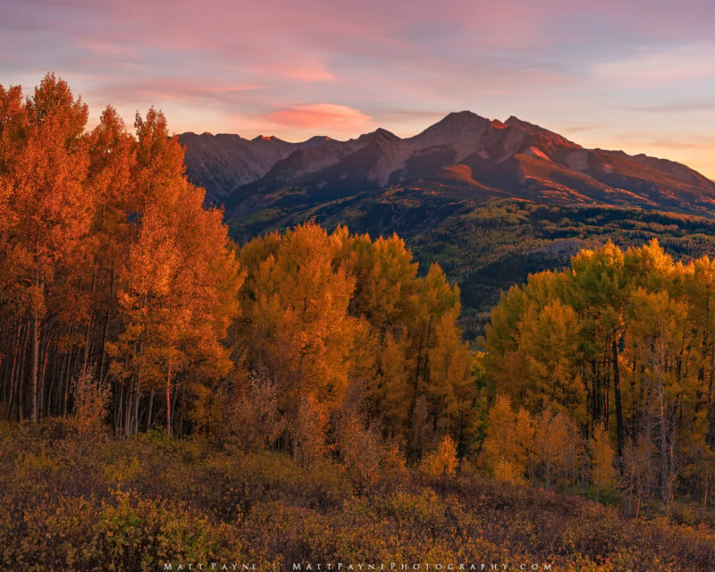
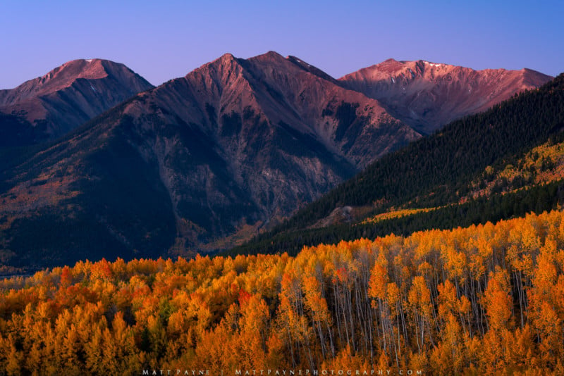
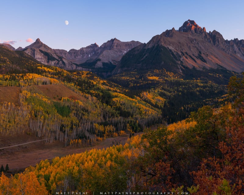
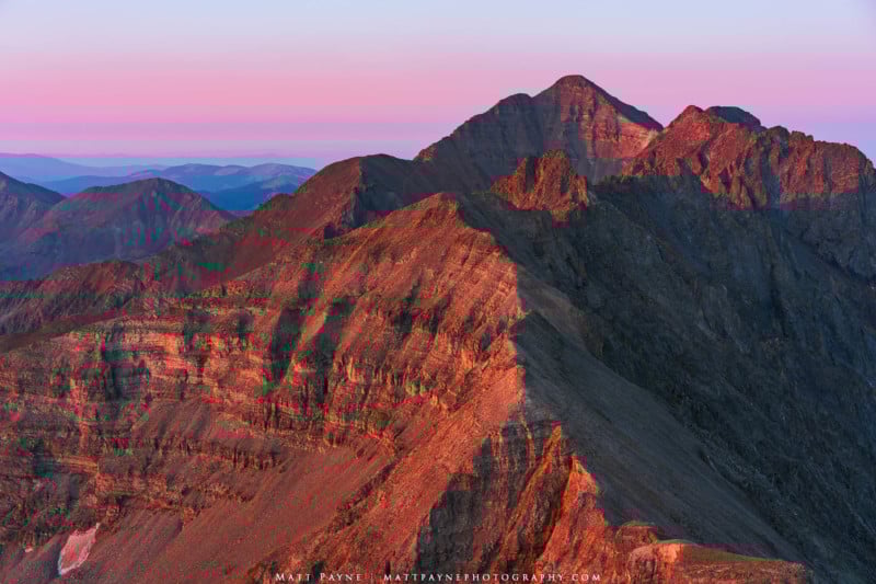
_About the author: Matt Payne is a landscape photographer living in Durango, Colorado, USA. Much of his photography has focused on his life-long goal to climb the one-hundred highest mountains in Colorado which he completed in 2017. Matt is a co-founder of the Nature First Photography Alliance.
Matt hosts a weekly podcast dedicated to landscape photography called F-Stop Collaborate and Listen, where he has meaningful conversations with other landscape photographers all over the world._
#editorial #opinion #fineartlandscapephotography #landscape #landscapephotography #mattpayne #nature #naturephotography #oped
1 Shares