#interiors

dezeen@xn--y9azesw6bu.xn--y9a3aq

Graypants converts slender space near Seattle into Tomo restaurant
image

Tomo by Graypants

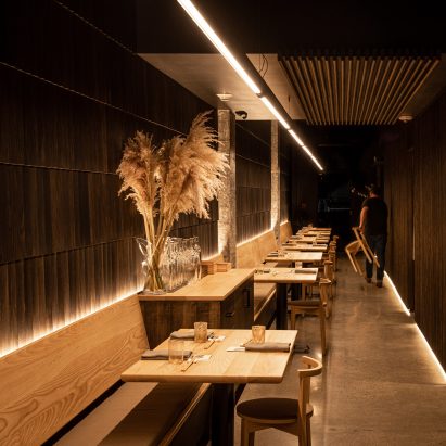
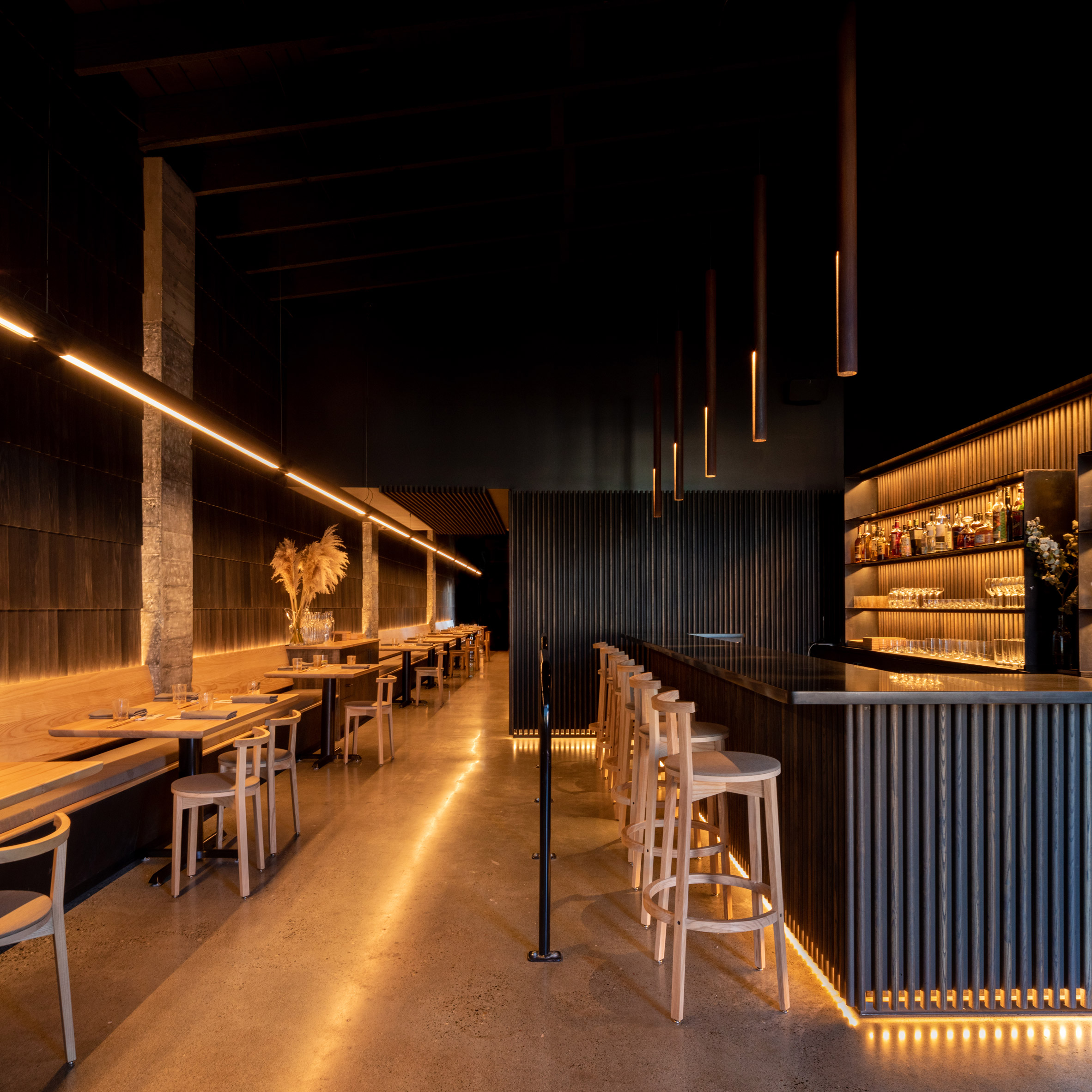
Dark-toned wood and golden light are found in this Washington bar and eatery by design firm Graypants that alludes to a Japanese urban alleyway.

Tomo is located in the community of White Center, which lies just south of Seattle. The dining establishment – which specialises in eclectic, seasonal cuisine – is named after the owner's grandmother, Tomoko, and the Japanese word for friend, tomodachi.
Tomo restaurantDark-toned wood and golden light define Tomo restaurant

Graypants, which has offices in Seattle and Amsterdam, was charged with creating a distinctive space on a limited budget.

"The brief was to create something handcrafted in a short amount of time, using a modest budget, offering room for as many guests as possible, while ensuring each seat felt like the best one in the house," the team said.
Restaurant by GraypantsGraypants created the space on a minimal budget

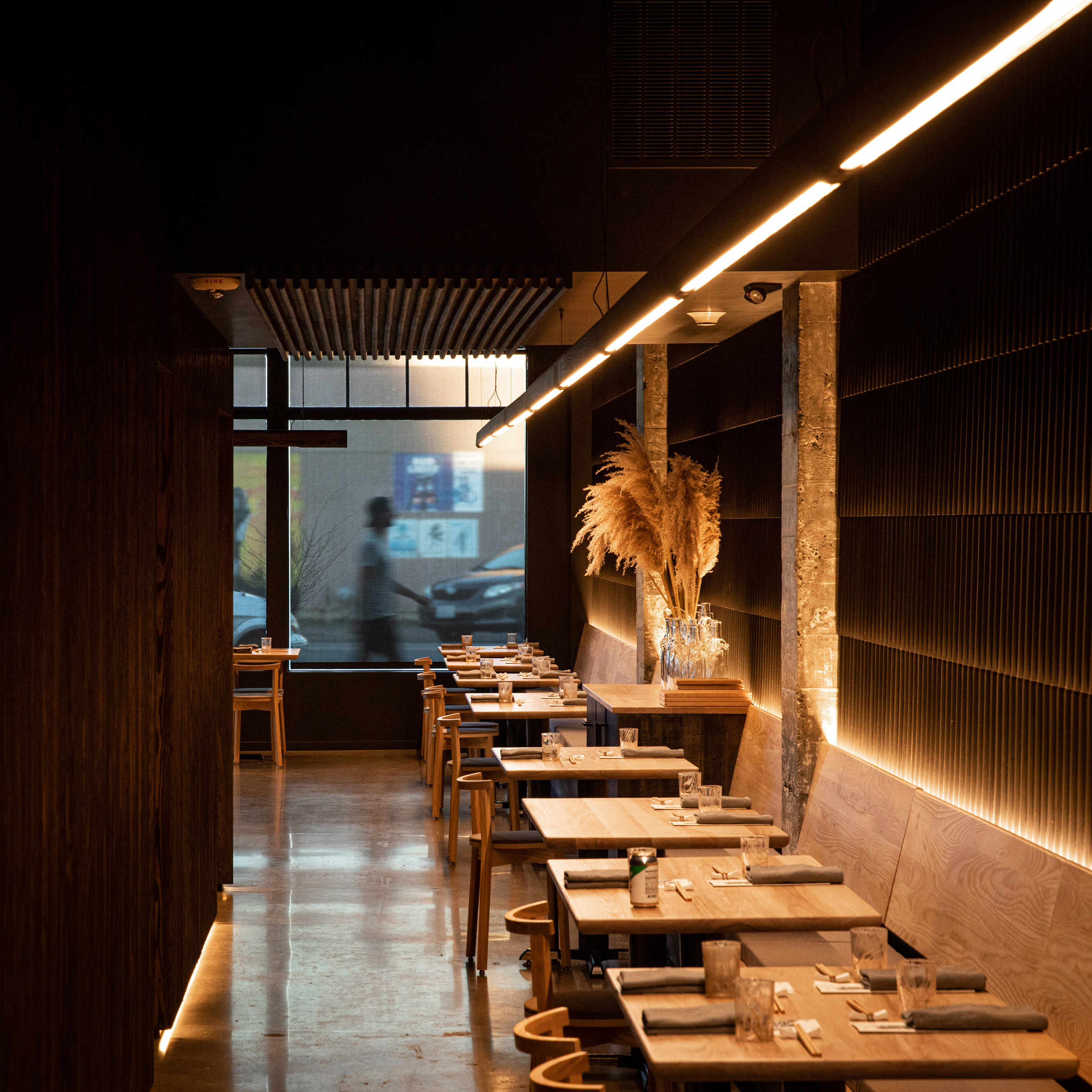
Housed in a low-slung building along a main thoroughfare, the restaurant has a long and slender floor plan. The front facade features storefront-style glazing and charcoal-coloured brick.

Guests step into a dark-toned room with golden lighting and ample wood.
Alleyway-like spaceThe design alludes to a Japanese urban alleyway

"Narrow and inviting, the experience references an evening in one the endless alleyways of Japanese cities," the studio said.

"The architecture aims to be demure and humble, letting the food be the centre of the experience," the team added.
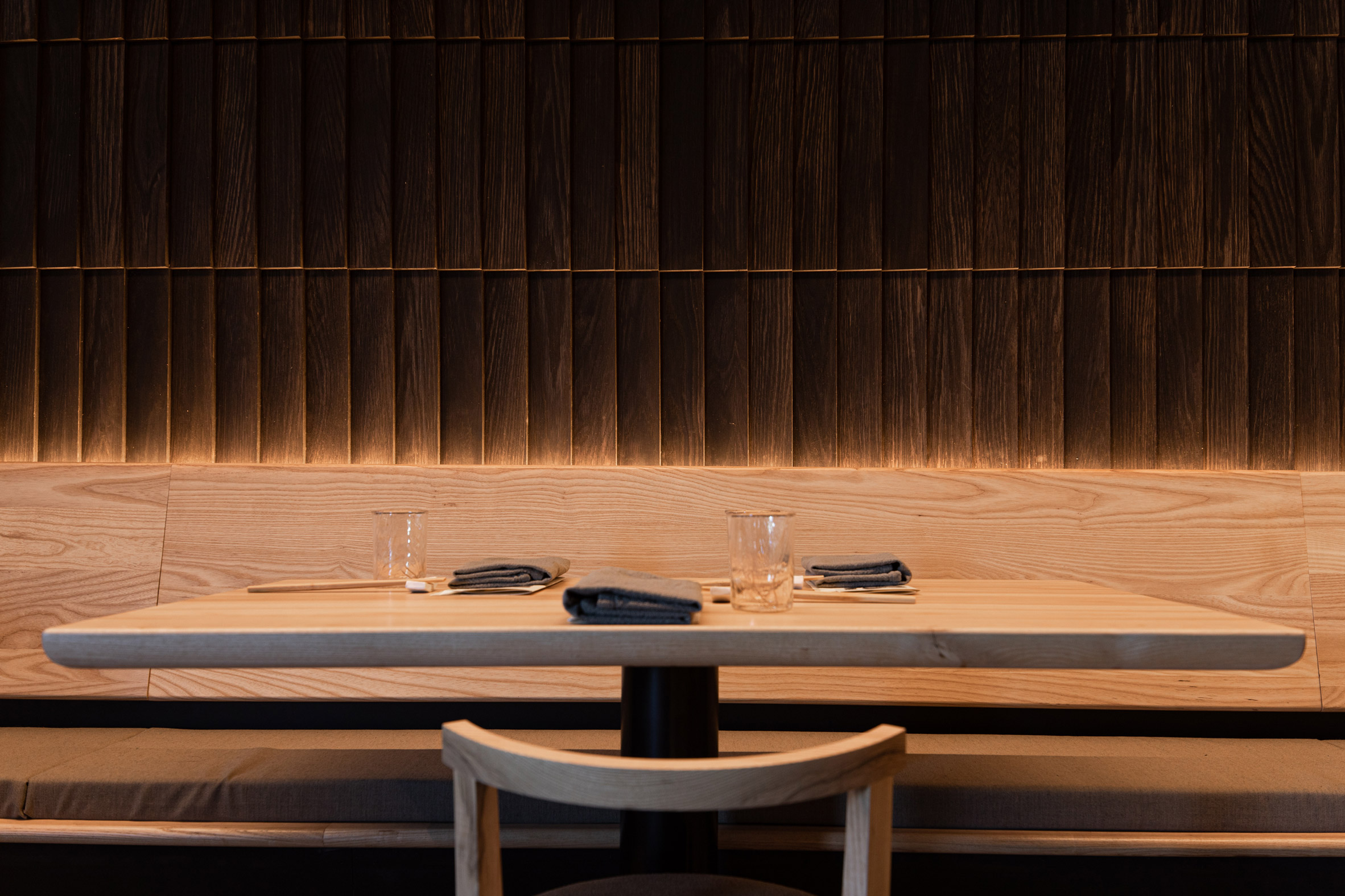
Graypants fish scale wallOak shingles arranged like fish scales line the wall with seating

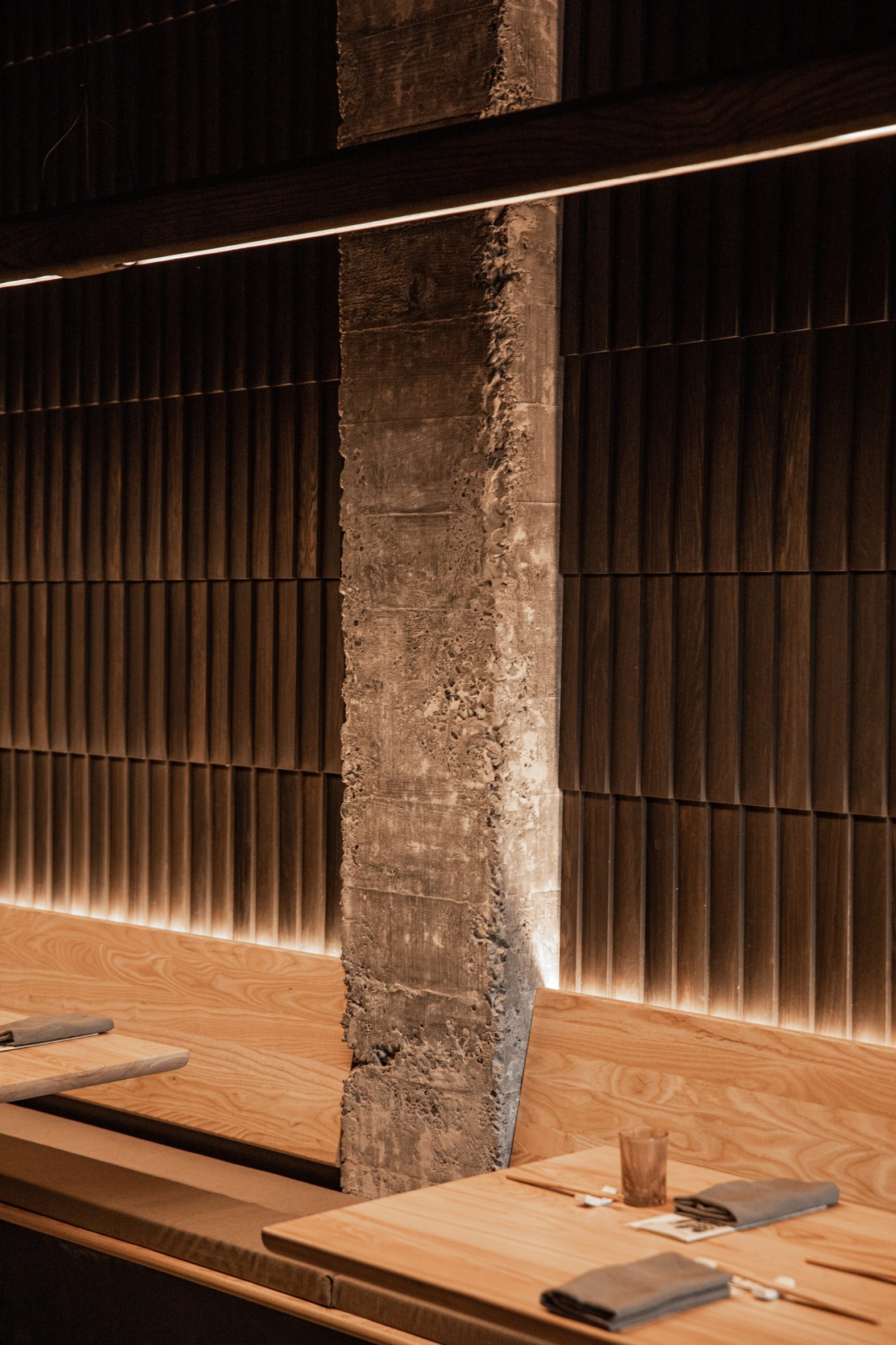
Lining one side of the restaurant is seating, which stretches along a wall clad in oak shingles arranged like fish scales.

To the other side is a bar, along with a kitchen enclosed within slatted walls made of ebony-stained ash.
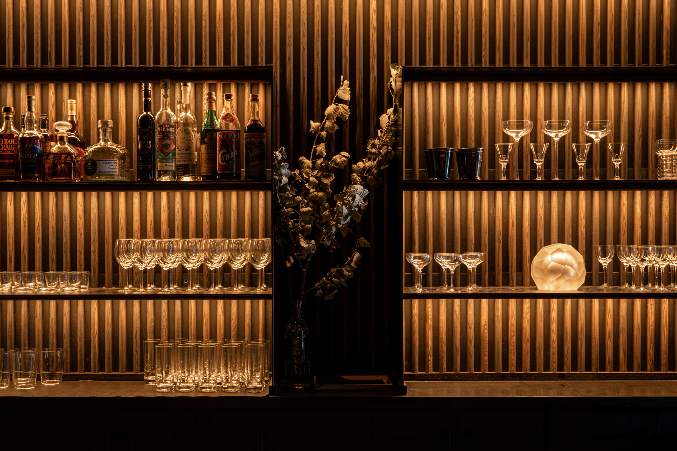
Ebony-stained ash barThe bar features ebony-stained ash

"Wood is a centrepiece of the space," the team said. "The mingling of wood throughout the space creates an understated, monochrome texture."

Most of the lighting elements were integrated directly into wall panels, bench seating and bar shelves, enabling them to be "felt but not seen", the designers said.

[
Read:

Roth Sheppard inserts unexpected elements into Hapa Sushi restaurant

](https://www.dezeen.com/2021/03/20/roth-sheppard-inserts-unexpected-elements-into-hapa-sushi-restaurant/)

The exception is an 80-foot (24-metre) linear fixture that extends the length of the restaurant.

The team sought to save money wherever possible, without compromising on design quality.
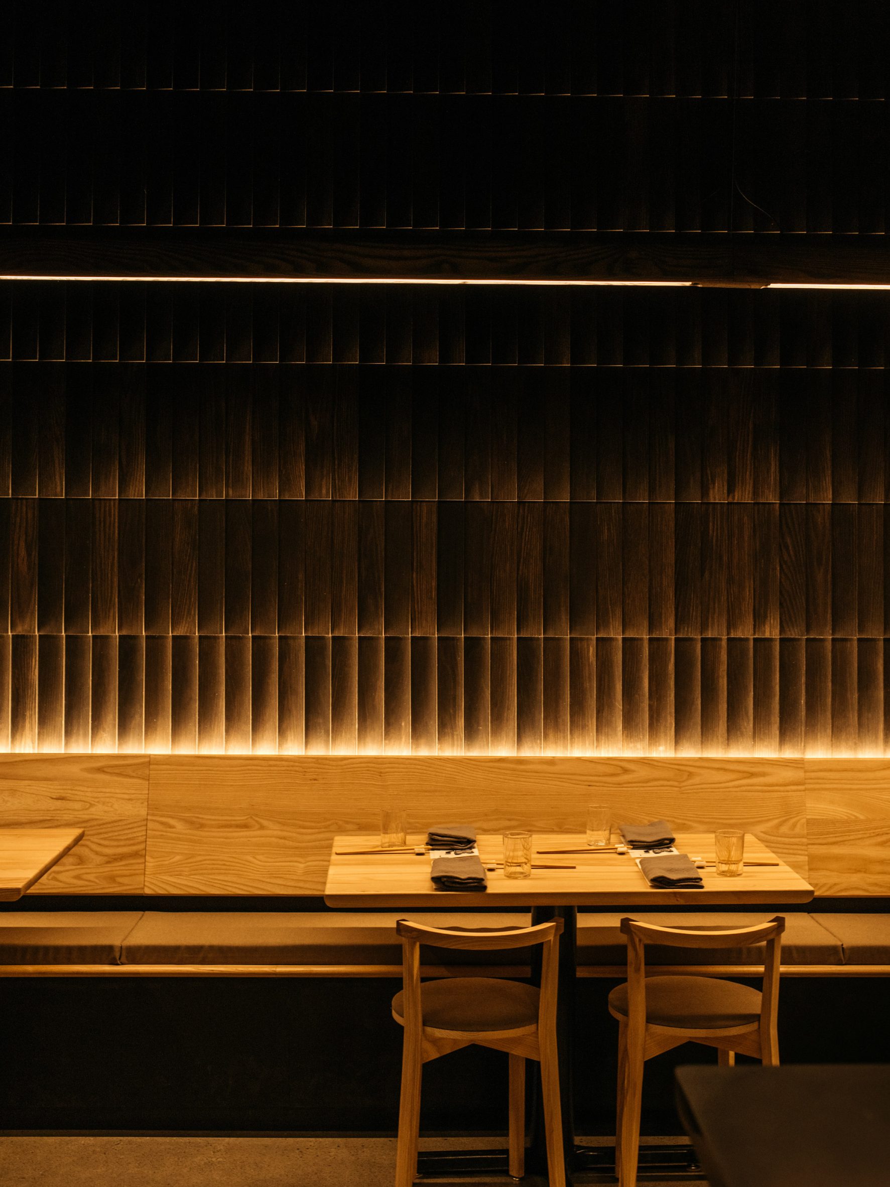
Bespoke furnitureMost of the furniture was designed by Graypants

Graypants, with help from the studio Fin, designed and fabricated most of the fixtures and furniture, including the lighting, seating and tabletops. This helped reduce costs and shorten the construction timeframe.

Each piece of furniture was finished with a zero-VOC topcoat.
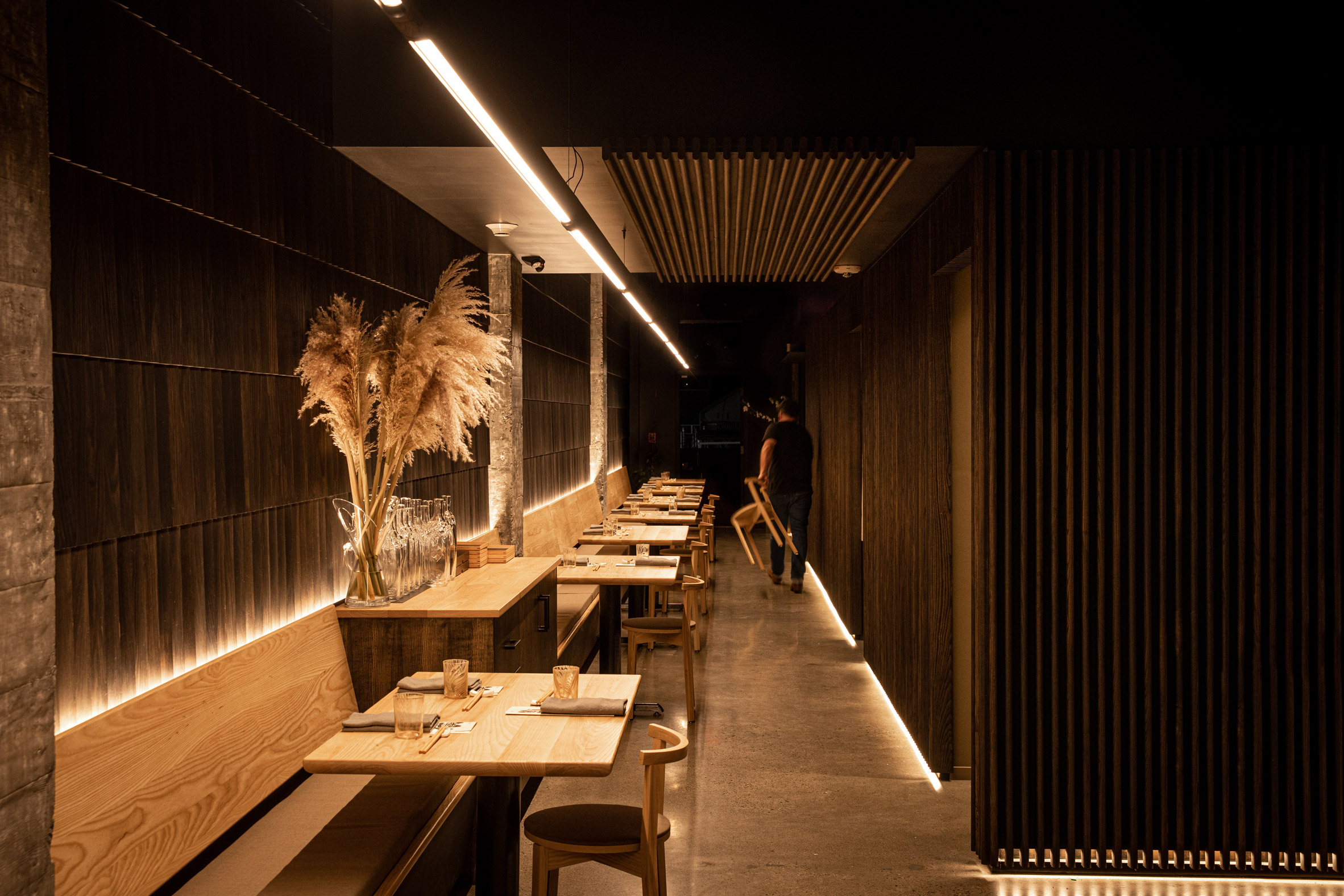
Demure and humble interiorsThe architecture aims to be demure and humble, according to its designers

The outdoor tables, kitchen cladding and bar-back were fabricated using Richlite, a durable and locally sourced material that is made of resin-infused paper.

"The team carefully chose their moves – like simply polishing existing concrete floors and investing in finishes that feel complex but are efficient to install, lowering construction cost," the studio said.

"The cost per square feet of this project is, conservatively, 35 per cent below the benchmark."
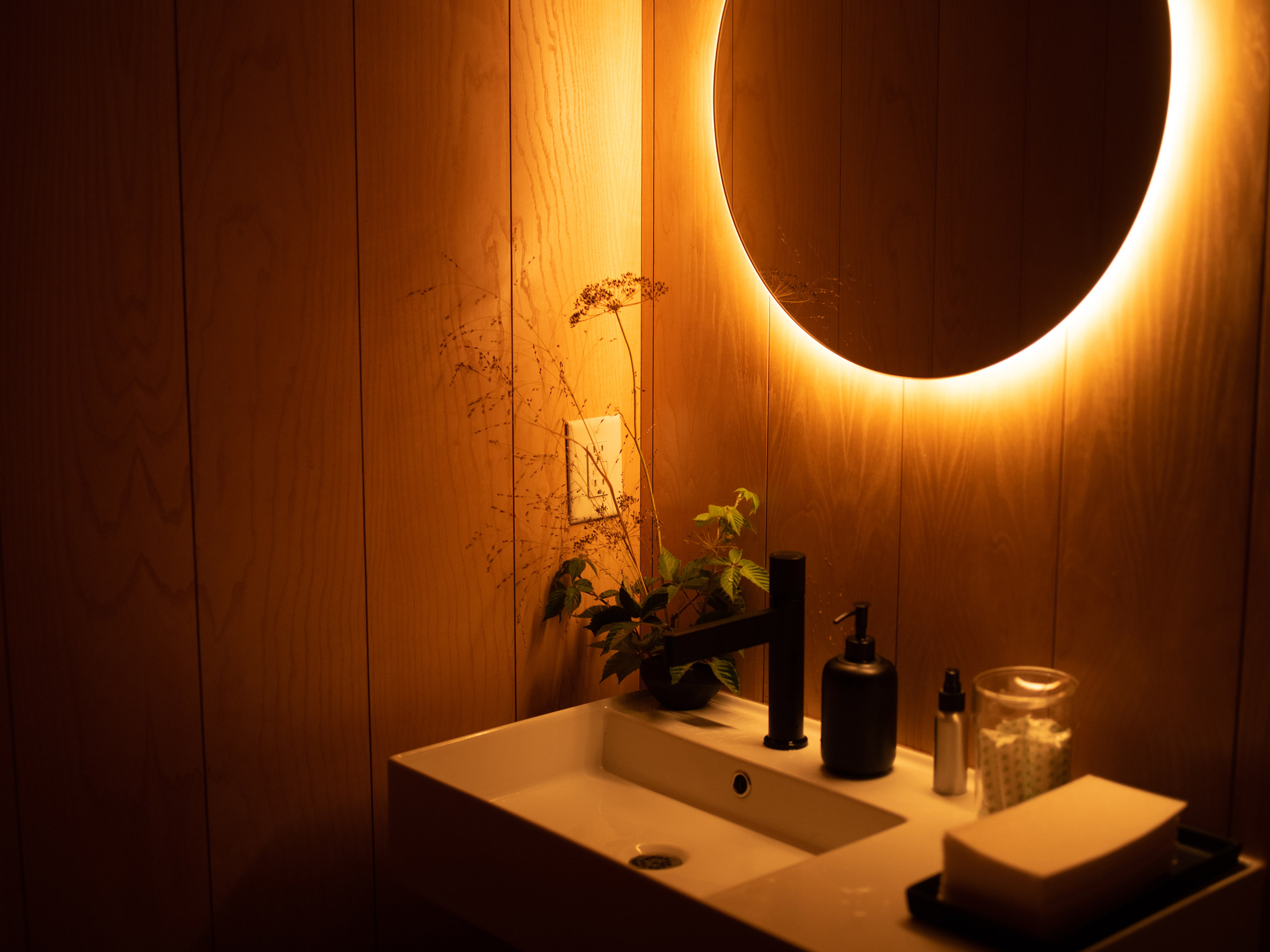
Low-lit bathroomLow lighting is used throughout the restaurant

Other restaurants in the Seattle area include the Samara bistro by Mutuus Studio, which features rustic materials and earth tones that create a "sense of timelessness and comfort".

The photography is byAdam Joseph Wells.


Project credits:

Designer: Graypants

Design team: Seth Grizzle, Bryan Reed, Caleb Patterson, Alan Marrero

Furniture designer and manufacturer: Fin

Owner and chef: Brady Williams

Operations: Jessica Powers

General contractor: Shawn Landis

The post Graypants converts slender space near Seattle into Tomo restaurant appeared first on Dezeen.

#restaurantsandbars #all #interiors #usa #restaurants #washingtonstate #graypants

dezeen@xn--y9azesw6bu.xn--y9a3aq

Studio Rhonda uses saturated colours and glass bricks to revamp Zetteler's headquarters

image

Bright colours in Zetteler London office

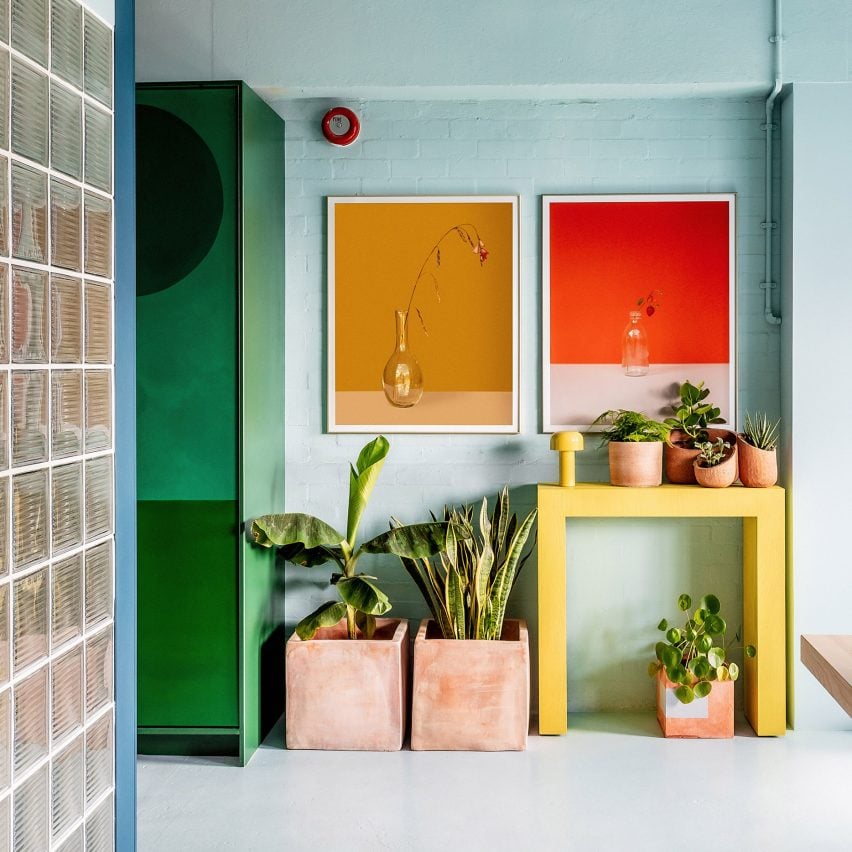
Interiors firm Studio Rhonda has redesigned communications agency Zetteler's London office using contrasting colours and tactile vegan and deaf-friendly materials.

The studio, which is led by Rhonda Drakeford, created a distinctive feeling for each of the headquarter's three zones – a main work area, a smaller cafe-style space for meals and relaxing, and a meeting space.

View of colourful Zetteler officeThe Zetteler headquarters is located in east London
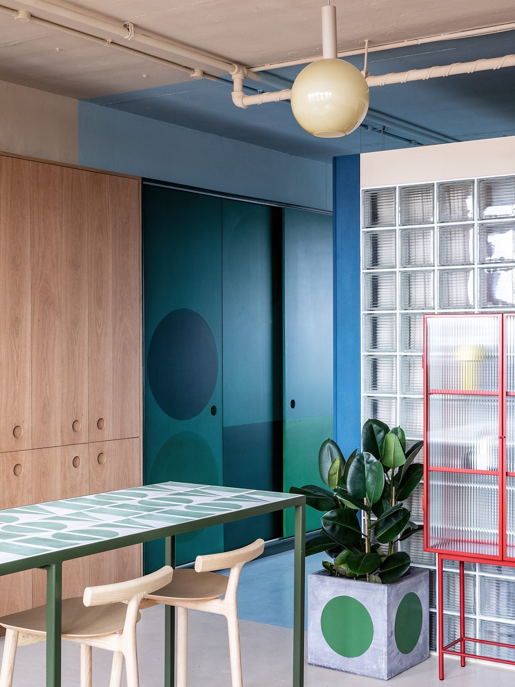
As Zetteler founder Sabine Zetteler has severe conductive hearing loss, it was also important that the office didn't feature details such as hard floors and high ceilings, which can create a disruptive atmosphere.

"The space was to be split into three zones, each with a different ambience and function, with an emphasis on the whole space to be deaf-friendly, plus there was the need for the materials used to be vegan," Drakeford explained.

Blue walls and wooden kitchen in London officePlants are dotted throughout the space

The choice to use vegan materials was based on the fact that most of Zetteler's staff is vegan or vegetarian.

"The research process was enlightening; for example, I was surprised to learn that some paints include casein, a dairy product," Zetteler told Dezeen.

"I'm proud that we've been able to find vegan options for all our integral building materials, but I would really like to see manufacturers take more responsibility for transparency, so we can all make more informed decisions."

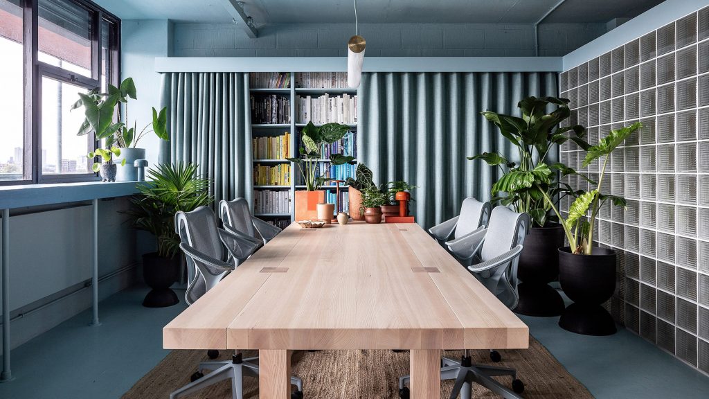
Duck-egg blue workspace in LondonA duck-egg blue decorates the main workspace
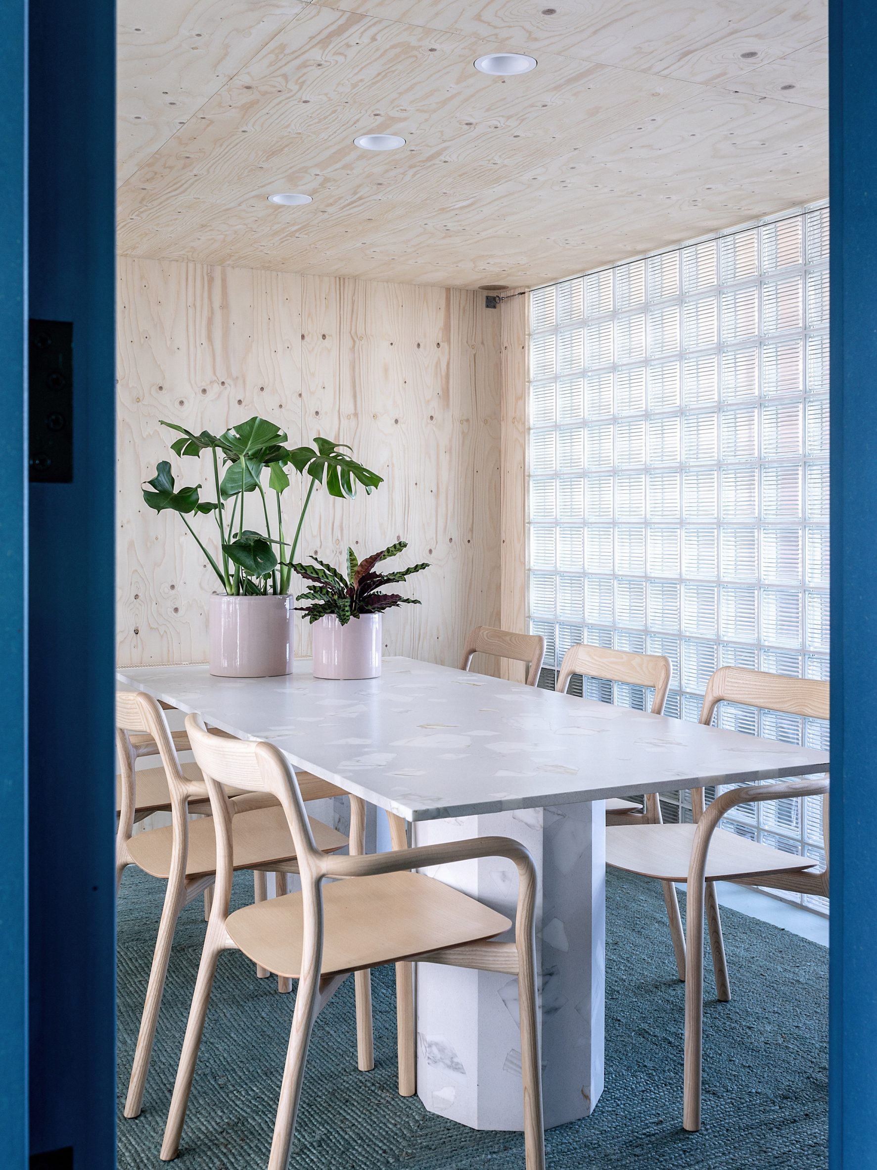
To create distinctive zones in the office, located in a mid-century industrial block off Broadway Market in east London, Drakeford used different colours and materials to define the spaces.

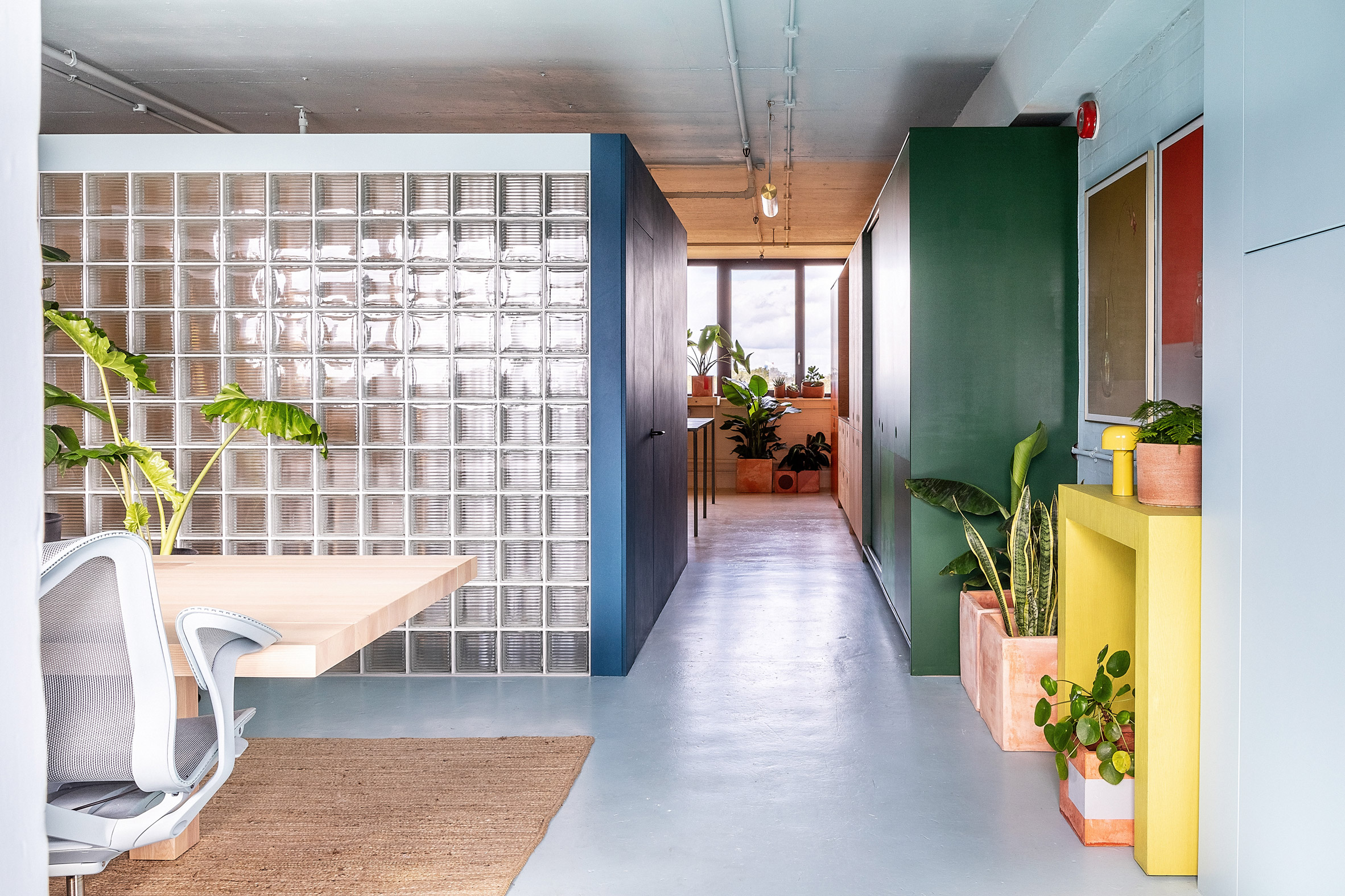
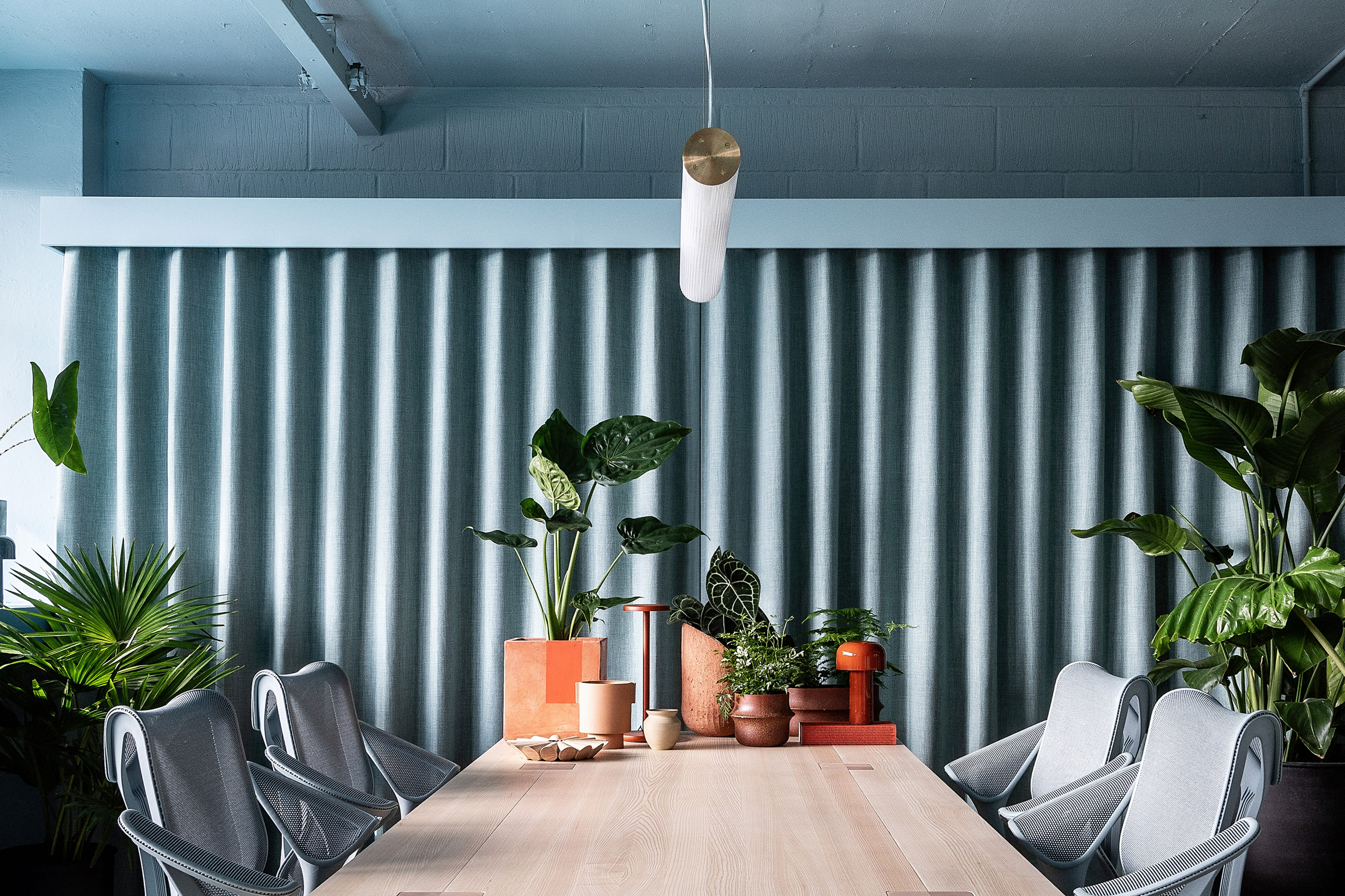
A pale duck-egg blue was used for the main work area, which also features a large desk in natural wood and a jute carpet that gives the room an organic feel.

Glass-brick meeting room at Zetteler's officeGlass bricks create a light meeting room
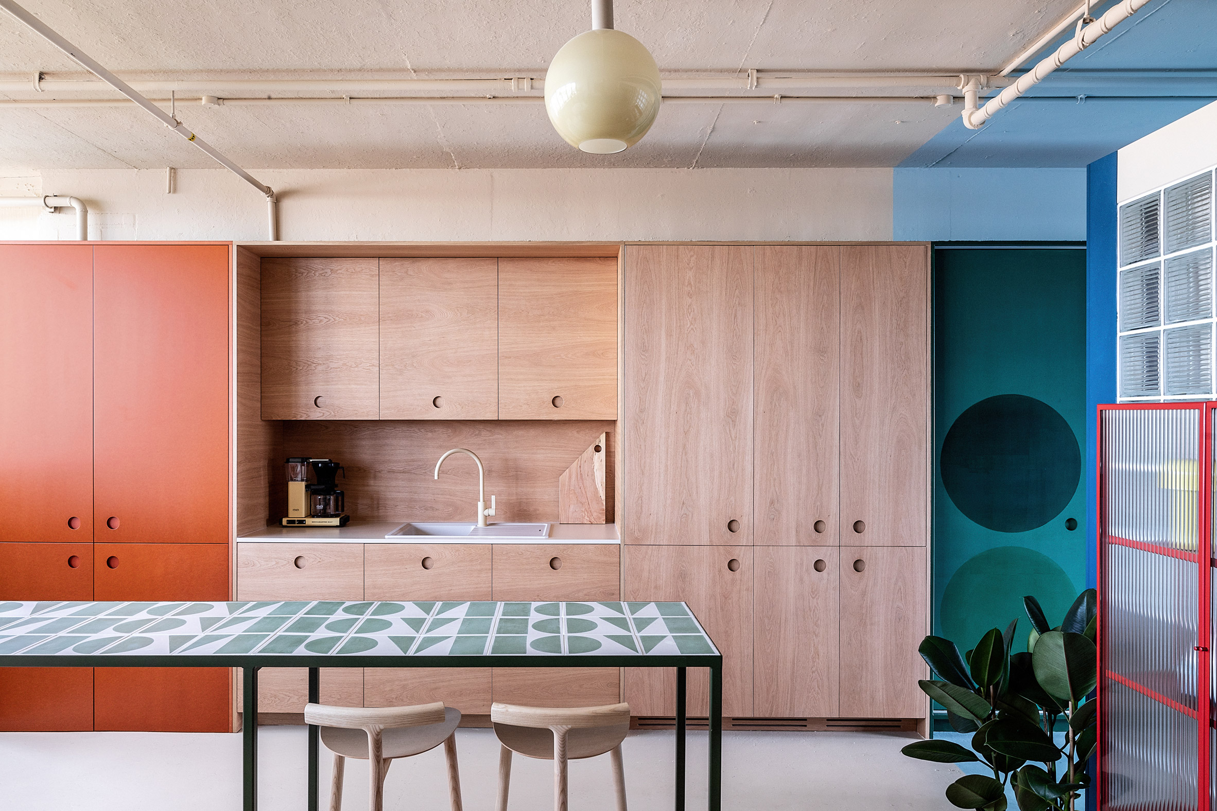
The adjacent meeting room is enclosed in glass brick walls, which Zetteler had requested to allow for light to flow through the space.

"I sourced some Czech glass bricks with graphic linear mouldings for a contemporary edge," Drakeford explained.

[ Kitchen and dining space in 6 Babmaes Street office for The Crown Estate by Fathom Architects

Read:

Fathom Architects designs London office with more meeting areas than desks

](https://www.dezeen.com/2021/12/28/fathom-architects-the-crown-estate-office-meeting-areas-remote-working/)

"I devised an anchor line of 2,300 millimetres from the ground as the top height of any structures so as to maintain coherence in all three zones and also to help the space retain an open-plan feel," she added.

"The roof of the glass-brick 'pod' stops at the 2,300 millimetres anchor line, allowing light to travel over it."

Wooden kitchen at Zetteler officeThe Zetteler kitchen features wood and Valchromat surfaces
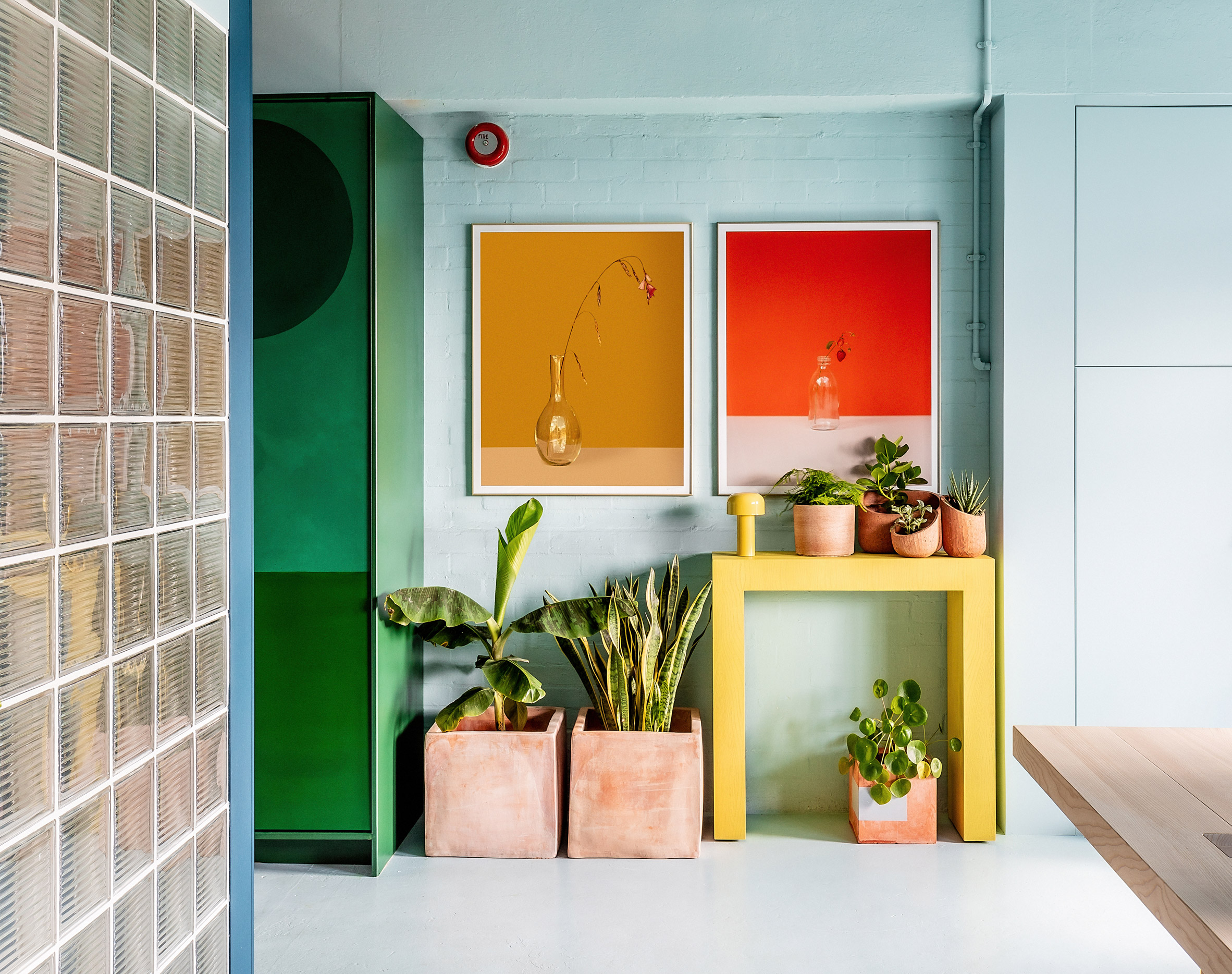
In the kitchen, the interior designer used furniture from brand Hølte, a Zetteler client whose showroom is close to the office.

"I specified custom oversize recessed handles and an unusual matching oak splash-back combined with a beige tap by Toniton for a mono-material/colour effect 'block'," Drakeford said.

"We also used the oversize circular handles on the adjoining orange Valchromat storage cupboards, which were also produced by Hølte, and the green Valchromat sliding doors to the right of the kitchen block,"

Colourful London officePale blue walls meet green storage spaces and a glass-brick meeting room
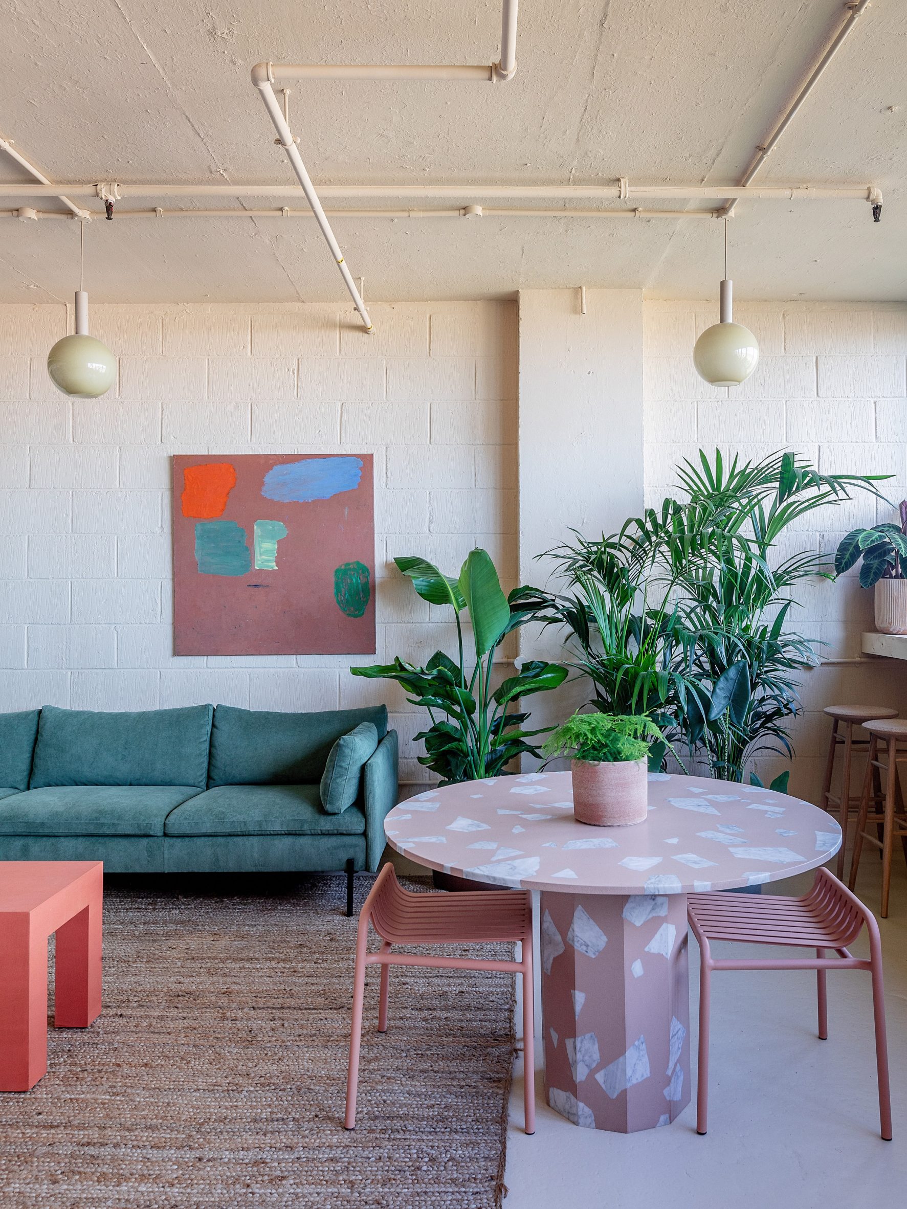
The use of colour was defined by the light in the different rooms of the office, which sits on a north-south axis.

"I worked with a cool, duck-egg blue at the front, south-facing area as I knew that the space tends to get very warm in the summer," Drakeford explained.

"A warmer, buff colour was used at the rear, north-facing section, to counteract how cold that area can feel in the winter months."

Soft materials and pastel colours in London officeWarmer hues were used at the north-facing rear of the building
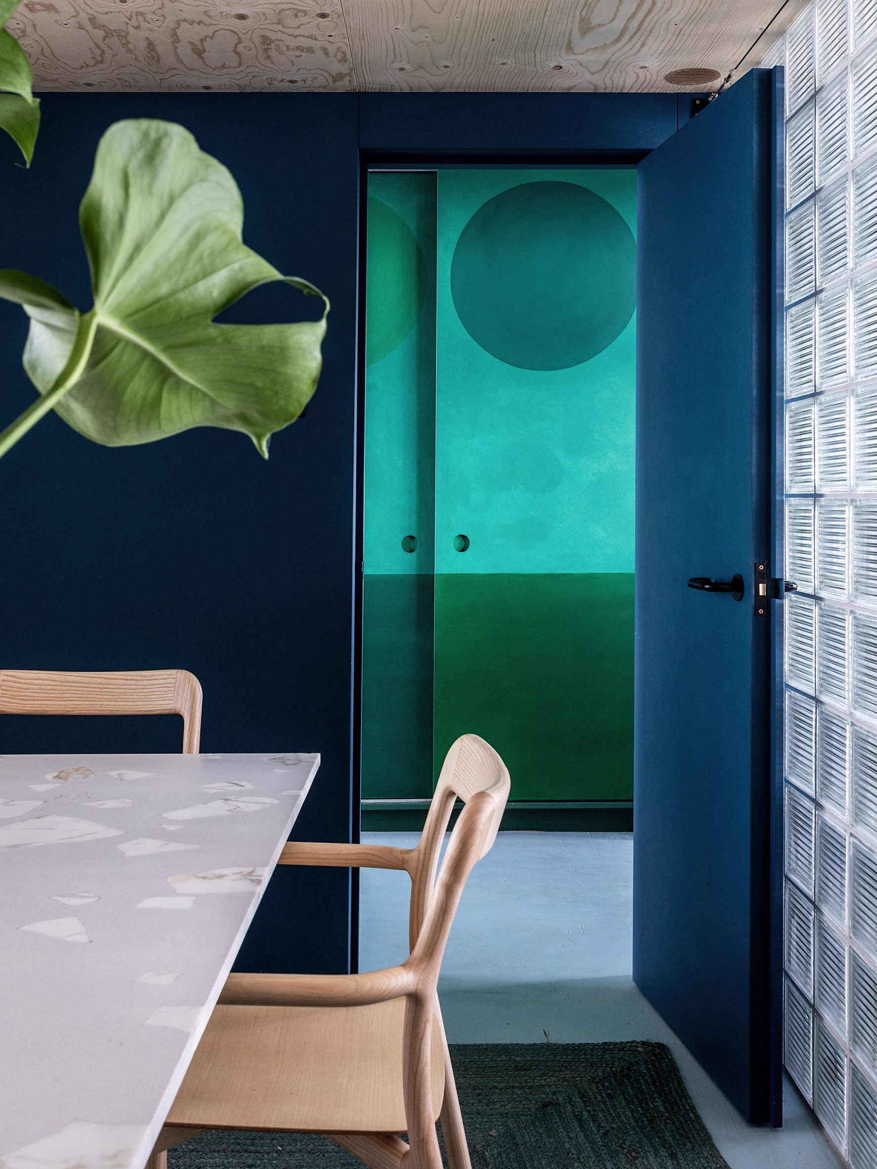
The neutral backdrop hues were complemented by pops of colour in a variety of textured materials and chalky tones. To make the space deaf-friendly, the designer chose to add plenty of soft materials to the interiors.

"Curtains and rugs are used throughout to help with zoning and privacy as well as optimising the acoustics," Drakeford said.

"The meeting pod is purpose-built, very solid and lined with acoustic vegan wool, creating a quiet sanctuary from the more open-plan spaces. Planting is also a key part of the acoustic softening, as well as making the space more welcoming."

Dark-blue office with glass-brick wallA deep blue hue makes the meeting room feel cosy
The overall design aimed to create an office that didn't have the "matchy-matchy" feel of many corporate office spaces, Drakeford said.

"I approached this space in the same way I would treat a residential interior, with the warmth and comfort of a mismatched but visually coherent family of furniture and materials," she added.

Other notable London offices include The Crown Estate's Fathom Architecture-designed space in St James's and a "homely" office in the brutalist Smithson Tower.

Photography is byTaran Wilkhu.

The post Studio Rhonda uses saturated colours and glass bricks to revamp Zetteler's headquarters appeared first on Dezeen.

#all #interiors #instagram #london #uk #officeinteriors #glassbricks #colour

dezeen@xn--y9azesw6bu.xn--y9a3aq

Stitched brick wall welcomes guests to Uchi Miami restaurant by Michael Hsu

image

Uchi Miami sushi restaurant interior

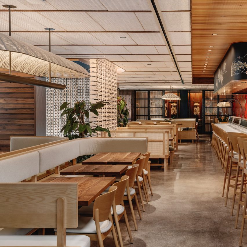
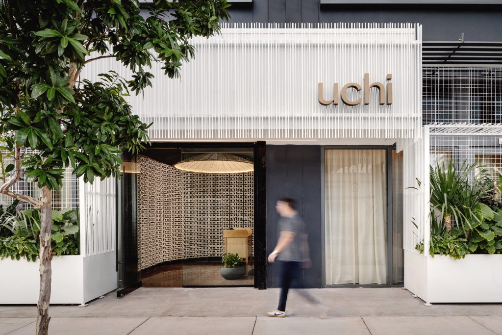
Masonry bricks are tied together to form a curved entryway at this sushi restaurant in Miami's Wynwood neighbourhood, by Michael Hsu Office of Architecture.

At Uchi Miami, the American firm aimed to create a "perfect contrast" between the materials, techniques and styles of Japan and Florida.

Uchi Miami entranceUchi Miami in Wynwood is fronted by a white structure wrapped in slats
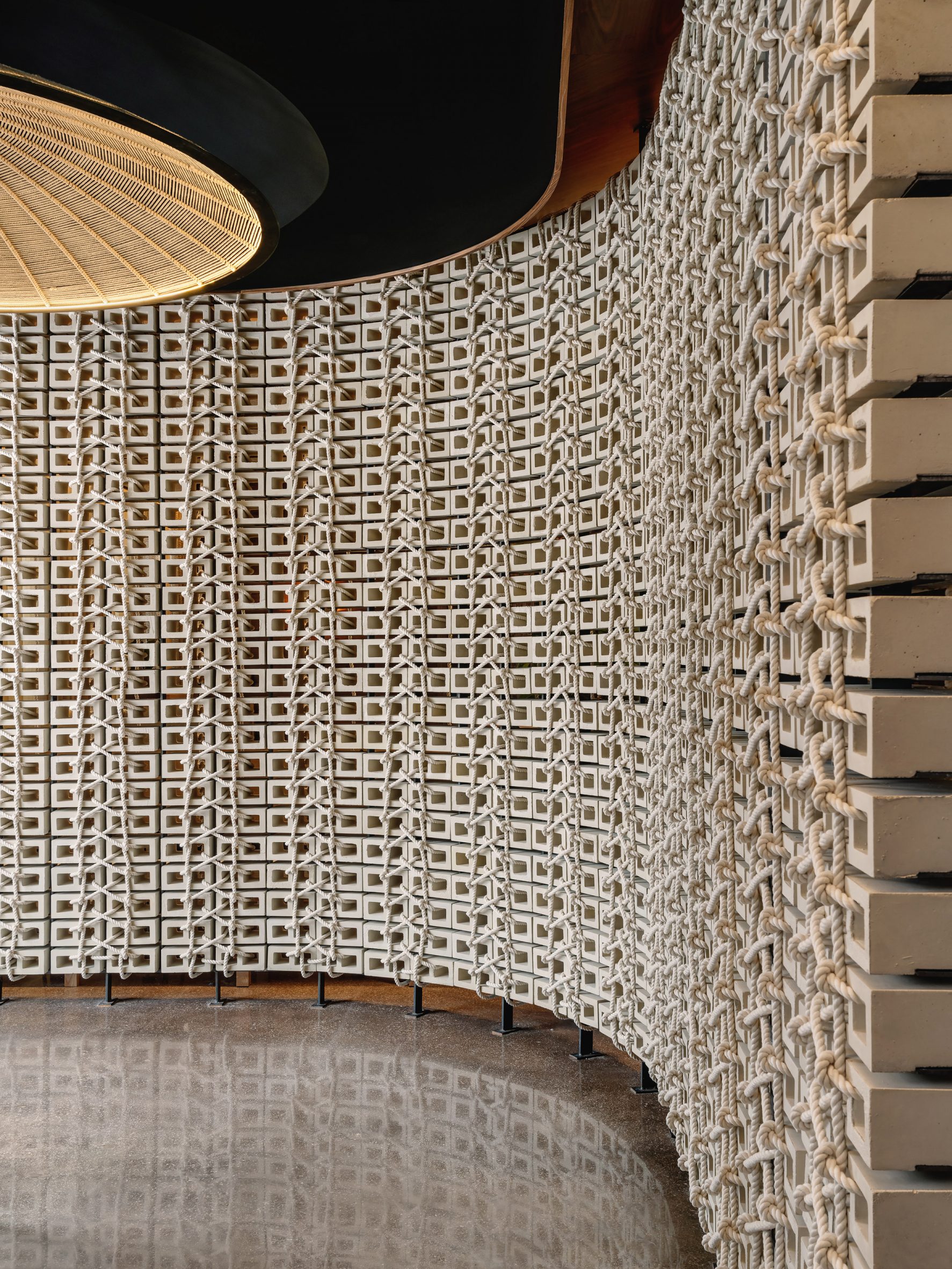
"Uchi tells a story of tactility, honoring Japanese tradition, but has been infused with local notes," said Michael Hsu Office of Architecture.

"Wrapping, layering and stitching, inspired by native art forms, apply sophisticated design to simple objects to elevate ordinary materials found in daily life."

Wall of woven bricksA wall of woven bricks by Vas Bets greets guests upon entry
Flanked by troughs filled with tropical plants, the entrance is surrounded by a pure white frame wrapped with vertical slats.

Once through the glass doors, guests are guided around to the host stand by a curved wall of concrete blocks created by locally based artist Vas Bets.

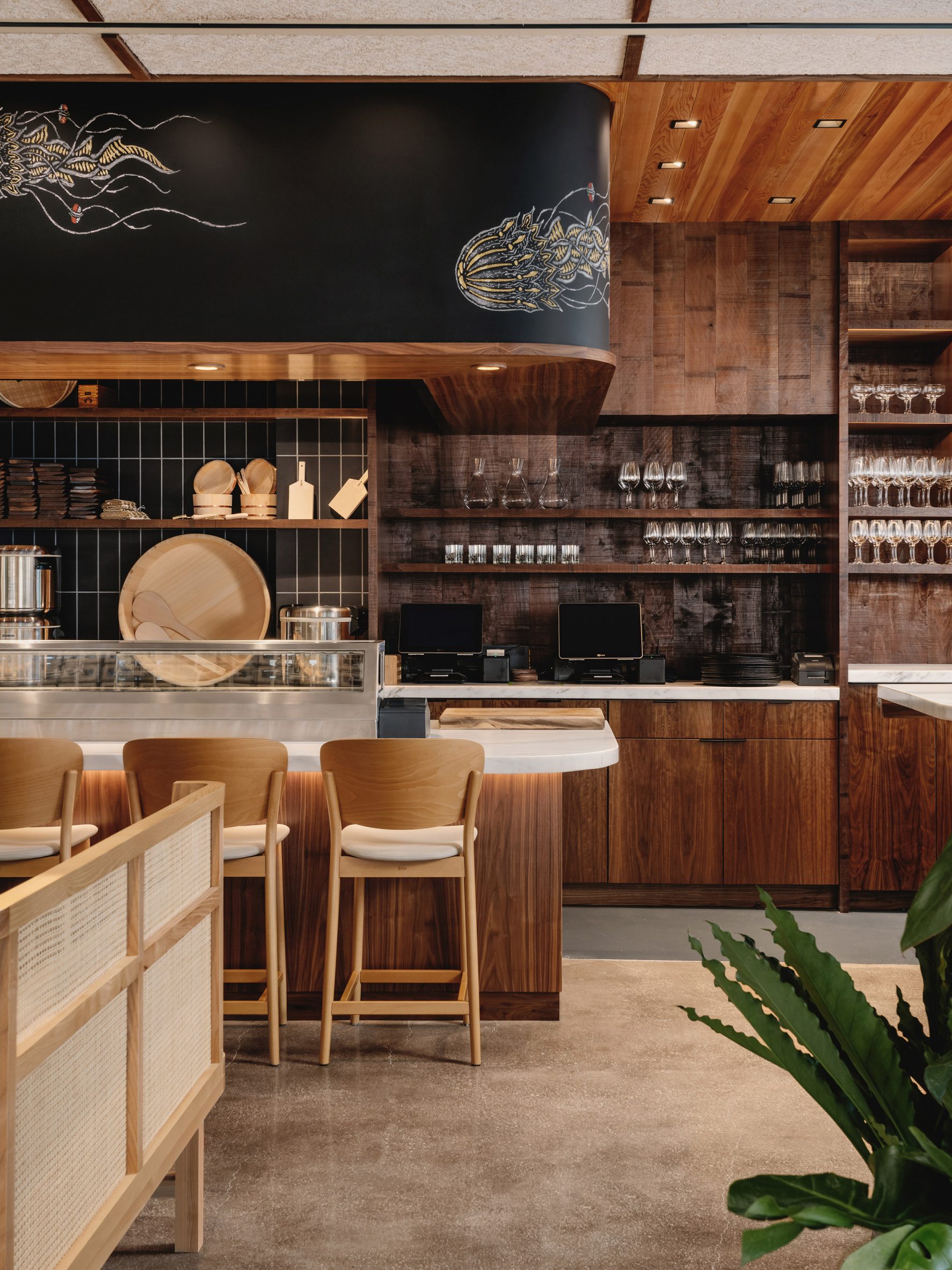
Dining area entrance facing the barA chalk mural by Sam Angus Jackson is found above the sushi bar
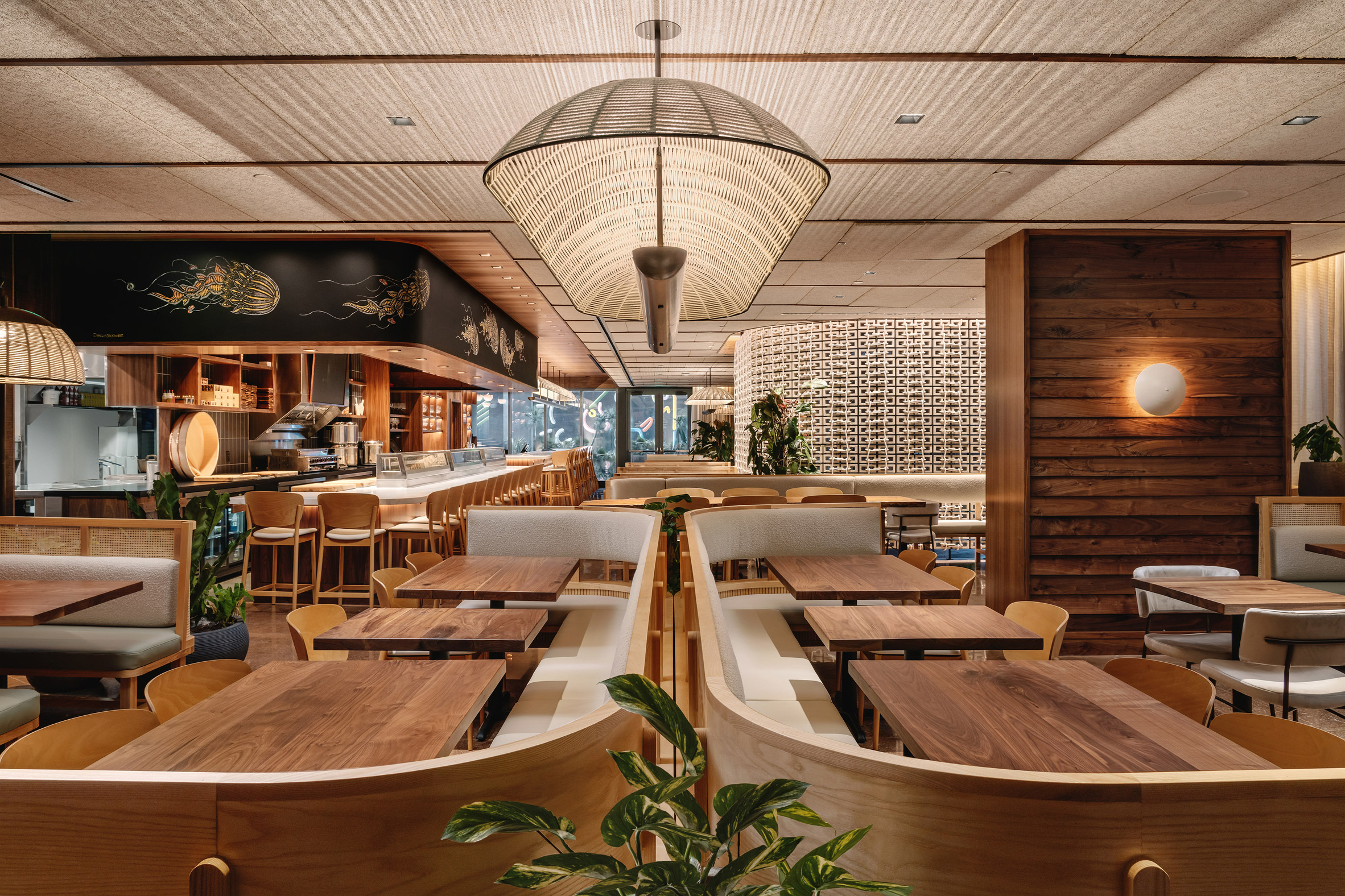
The blocks are tied together with rope, which weaves through their holes in a repeated pattern that is reflected in the polished floor.

In the main dining area, a mix of banquettes, bar seating and high-top tables offers a variety of configurations for parties of different sizes.

Wide view of the restaurant banquettesWarbach's woven light fixtures create patterns across the ceiling
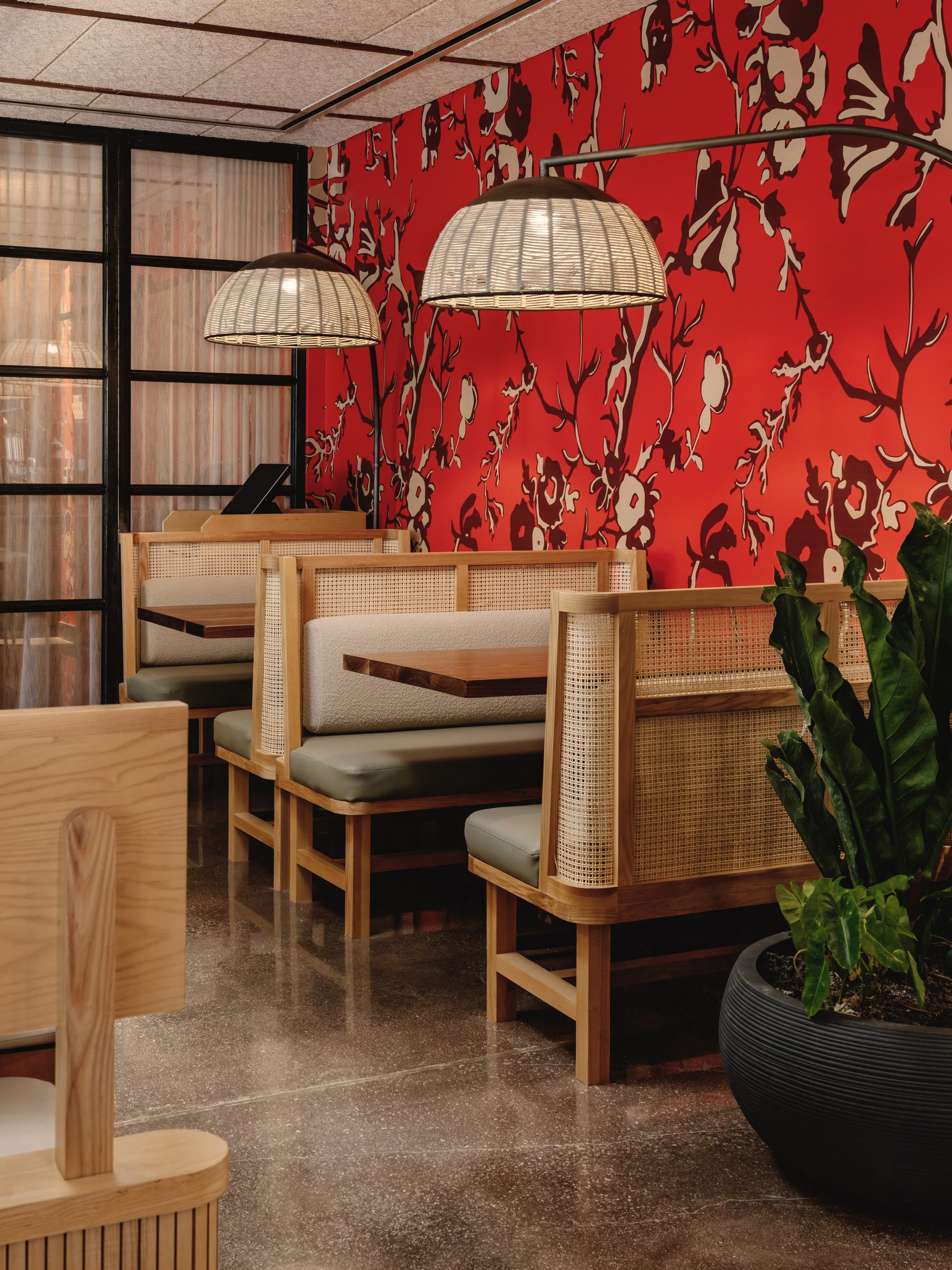
The wooden banquettes feature curved woven back panels and grey upholstered cushions – in a bouclé fabric for the backs and leather for the seats.

Walnut table tops and ash chairs match panelling on the walls and ceiling, while other surfaces are lined with bright red and orange wallpaper.

[ Mimi Kakushi restaurant by Pirajean Lees

Read:

Pirajean Lees channels 1920s Japan in ornate Dubai restaurant interior

](https://www.dezeen.com/2021/09/05/pirajean-lees-mimi-kakushi-dubai-restaurant/)

Other artist collaborations within the restaurant include a hand-drawn chalk mural of jellyfish by artist Sam Angus Jackson, found above the sushi bar.

Hand-woven wall hangings by Miami artist Elan Byrd decorate the series of private dining areas, which run along one end of the restaurant behind black-framed glass panels.

Bright red wallpaper behind the tablesBright red wallpaper offers a contrast to the natural materials
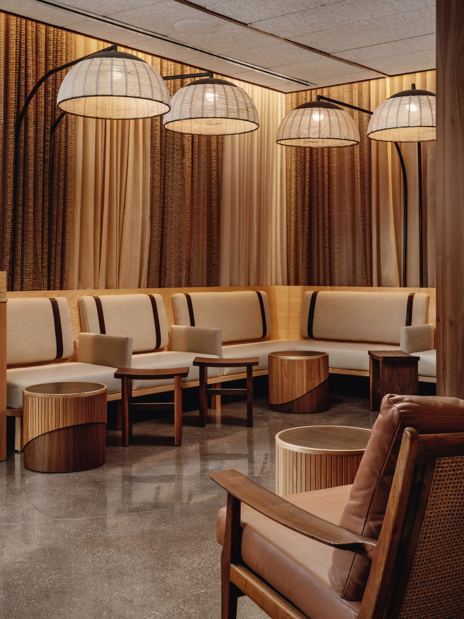
Positioned over the bars and dining tables, lighting studio Warbach's bespoke fixtures continue the woven motif.

"The overhead large, custom basket light provides a warm glow to illuminate the wall's shapes and textile-inspired characteristics," said Michael Hsu's team.

Casual seating areaThe studio aimed to blend a variety of textures and materials throughout the restaurant
Michael Hsu Office of Architecture has previously completed a restaurant with a curved wooden ceiling in its home city of Austin, Texas.

The studio has also designed a remote home in Texas Hill Country and the interiors for Shake Shack's headquarters in New York City.

The photography is byChase Daniel.


Project credits:

Owner: Hai Hospitality

Architect of record: Form Group Architecture

General contractor: City Construction Group

Project management: Amicon Management

Kitchen consultant: Trimark USA

MEP: RPJ Engineering

Landscape designer: Plant the Future

The post Stitched brick wall welcomes guests to Uchi Miami restaurant by Michael Hsu appeared first on Dezeen.

#restaurantsandbars #all #interiors #usa #miami #bricks #restaurants #florida #michaelhsuofficeofarchitecture #japaneserestaurants

dezeen@xn--y9azesw6bu.xn--y9a3aq

Ten offices with wooden bleachers that c​​ater for collaboration

image

Stepped seating at the Slack offices by Snøhetta

An industrial London workspace and the home of software company Slack feature in our latest lookbook, which spotlights 10 office interiors animated by wooden bleacher-style seating.

Traditionally found in sports stadiums, bleachers are an inexpensive form of stepped seating composed of rows of benches. They are accessed by built-in staircases or directly from the stepped seats themselves.

In recent years, bleachers have also become a workplace staple for many modern companies as they offer flexible auditorium-style spaces for presentations, impromptu meetings and collaboration.

While they are typically made from metal, many architects designing office bleachers are opting for a wooden finish instead.

This is the latest in our series of lookbooks providing curated visual inspiration from Dezeen's image archive. For more inspiration see previous lookbooks showcasing homely office interiors, workspaces filled with plants and garden studios for remote working.


Wooden bleachers at Millwall Ironworks

The Forge, UK, by Emrys Architects

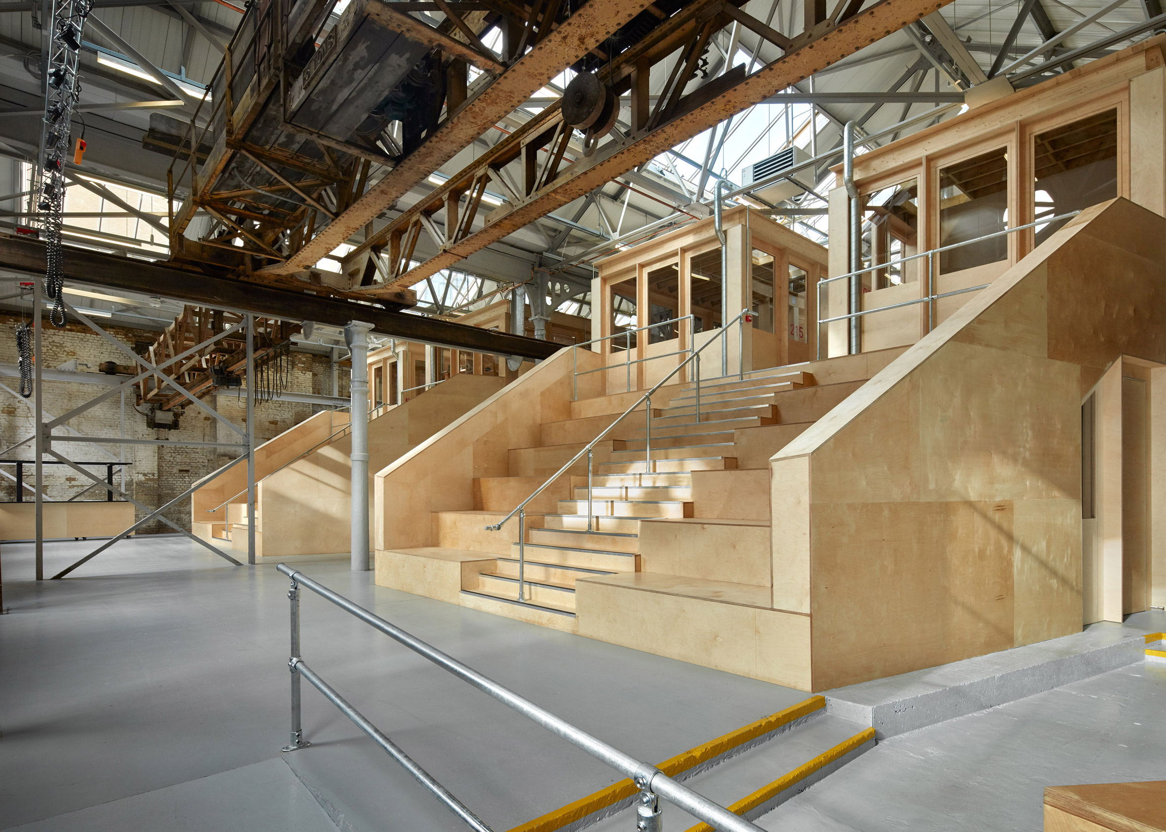
Two banks of bleachers feature in this listed ironworks in London, which Emrys Architects transformed into a studio complex with co-working spaces and workshops.

Crafted from birch plywood, the seating is positioned at the building's heart to provide access to the first floor of the complex while doubling as a gathering point for occupants.

Find out more about Millwall Ironworks ›


Bleacher-like seating at Quartz office by Desai Chia ArchitecturePhoto is by Mark Craemer

Quartz offices, USA, by Desai Chia Architecture

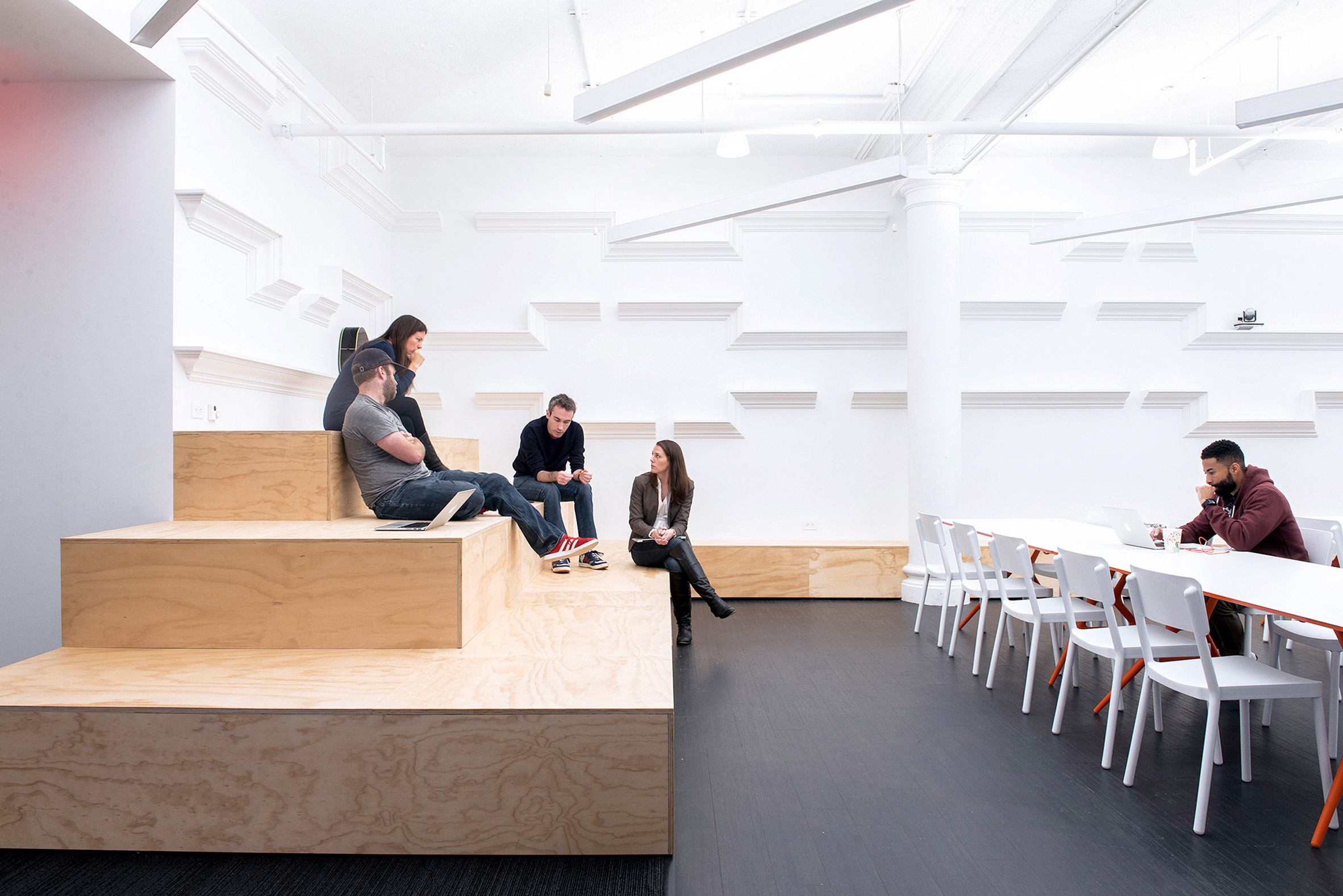
The Quartz offices in New York feature a large events space, lined on three sides with chunky bleacher seating made from plywood.

The seating was designed by Desai Chia Architecture to accommodate everything from parties to symposiums and is complemented by moveable furniture. It also incorporates hidden storage units at its base.

Find out more about Quartz offices ›


Central atrium of Slack Vancouver Photo is by Ema Peter

Slack offices, Canada, by Leckie Studio

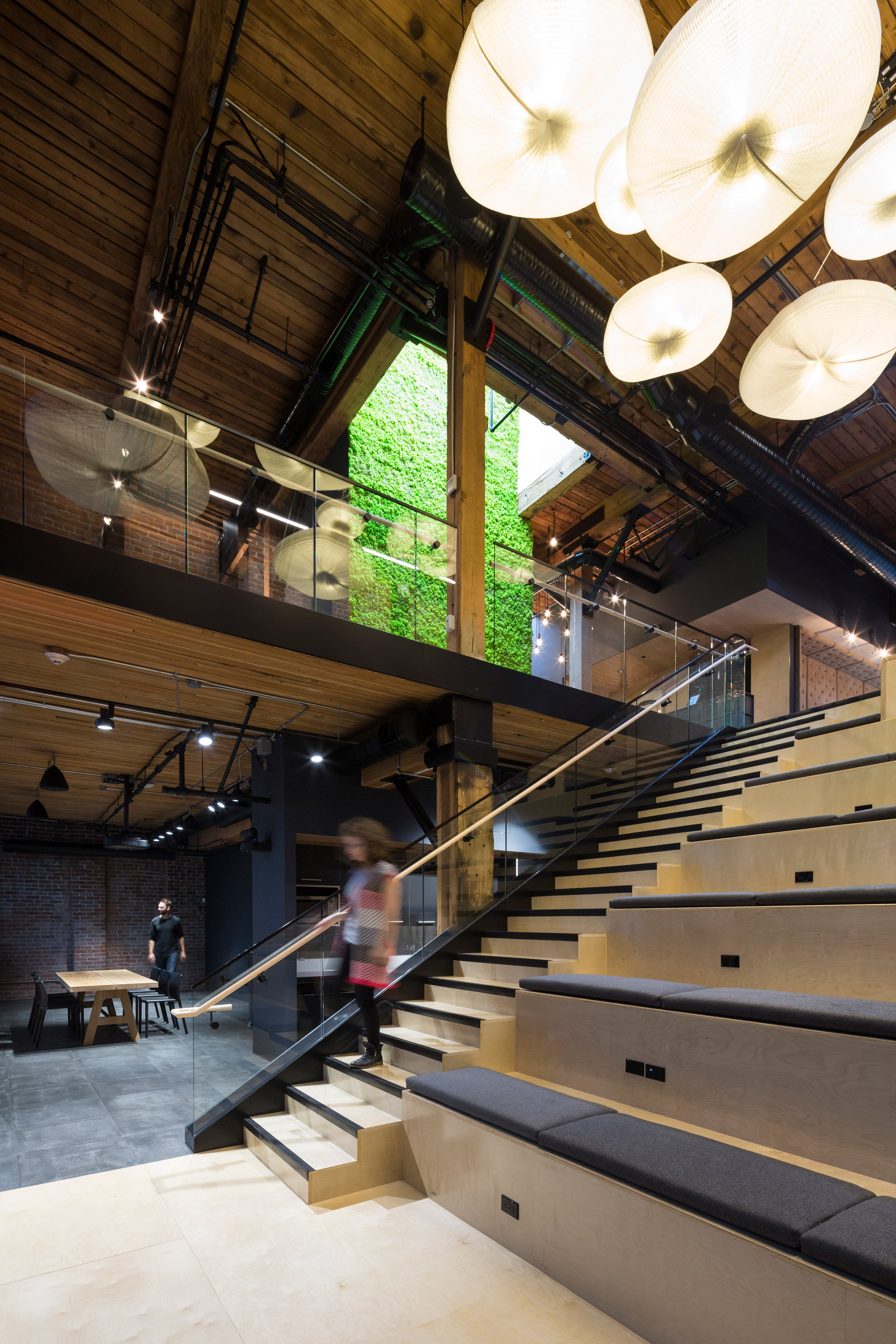
Company-wide meetings are hosted on these cushioned bleachers, which form the focal point of the Slack offices designed by Leckie Studio in a Vancouver warehouse.

Set in a double-height atrium, the stadium-like seating runs alongside a staircase that links two floors of open-plan workspace and incorporates plug sockets to allow employees to work from the bleachers.

Find out more about Slack offices ›


Stadium-like seating at Eventbrite offices by Rapt Studio

Eventbrite offices, USA, by Rapt Studio

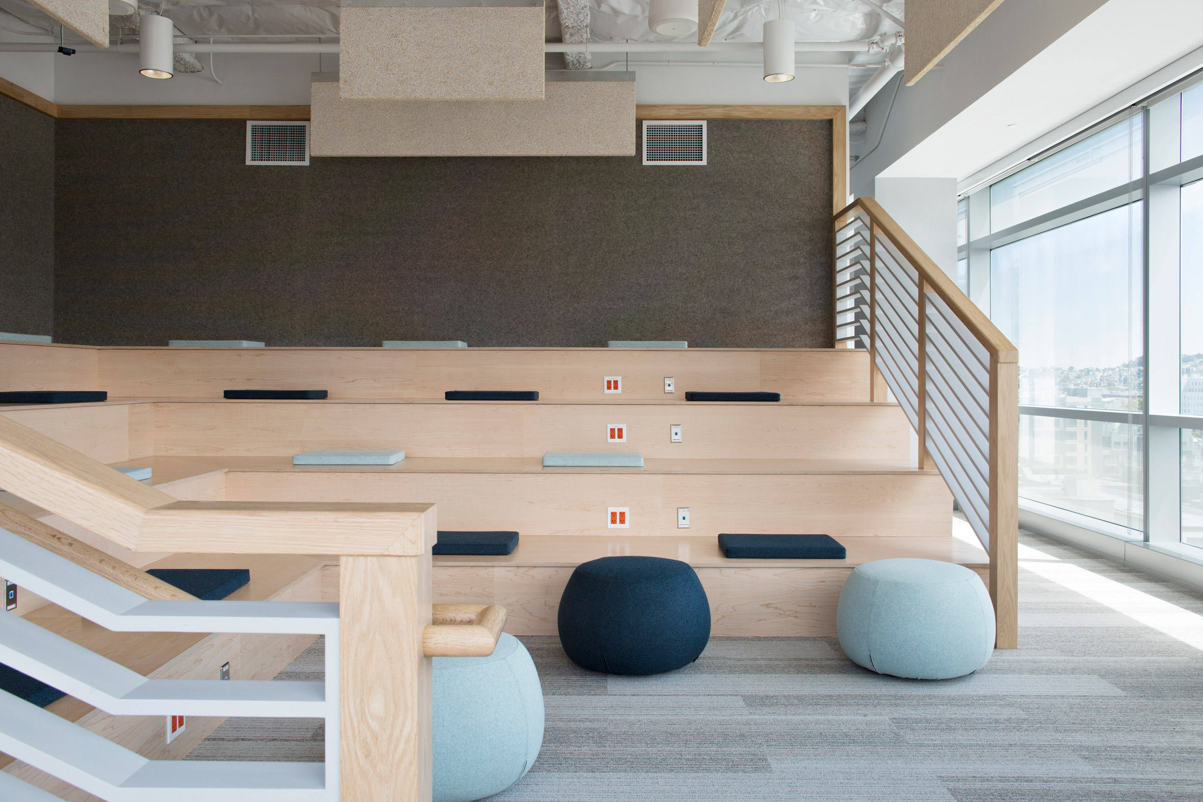
Rapt Studio added cushions to the stadium-like seating that it designed for the offices of e-ticketing company Eventbrite in San Francisco.

Built from light wood, the seating was introduced to support large company meetings and offers a counterpoint to the one-on-one workrooms and quiet nooks elsewhere in the office. The cushions are upholstered in blue fabrics and teamed with matching ottomans.

Find out more about Eventbrite offices ›


Tiered wooden seating by Bedaux de Brouwer ArchitectenPhoto is by Inpetto foto grafisch

The Houtloods, the Netherlands, by Bedaux de Brouwer Architecten

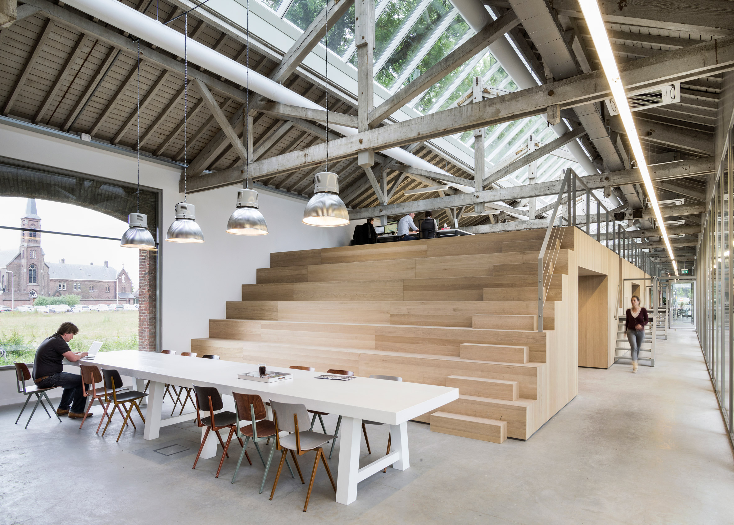
This wooden bleacher-style seating was designed by Bedaux de Brouwer to conceal private offices, toilets and storage at this advertising agency in an old railway building in Tilburg.

The seating also provides the office with an informal auditorium for group meetings. At the top of the structure are personal workstations for employees, accessed by a staircase built into its bleachers or metal stairs along its edge.

Find out more about The Houtloods ›


Bleacher seating on wheelsPhoto is by Bruno Giliberto

Fintual offices, Chile, by Studio Cáceres Lazo

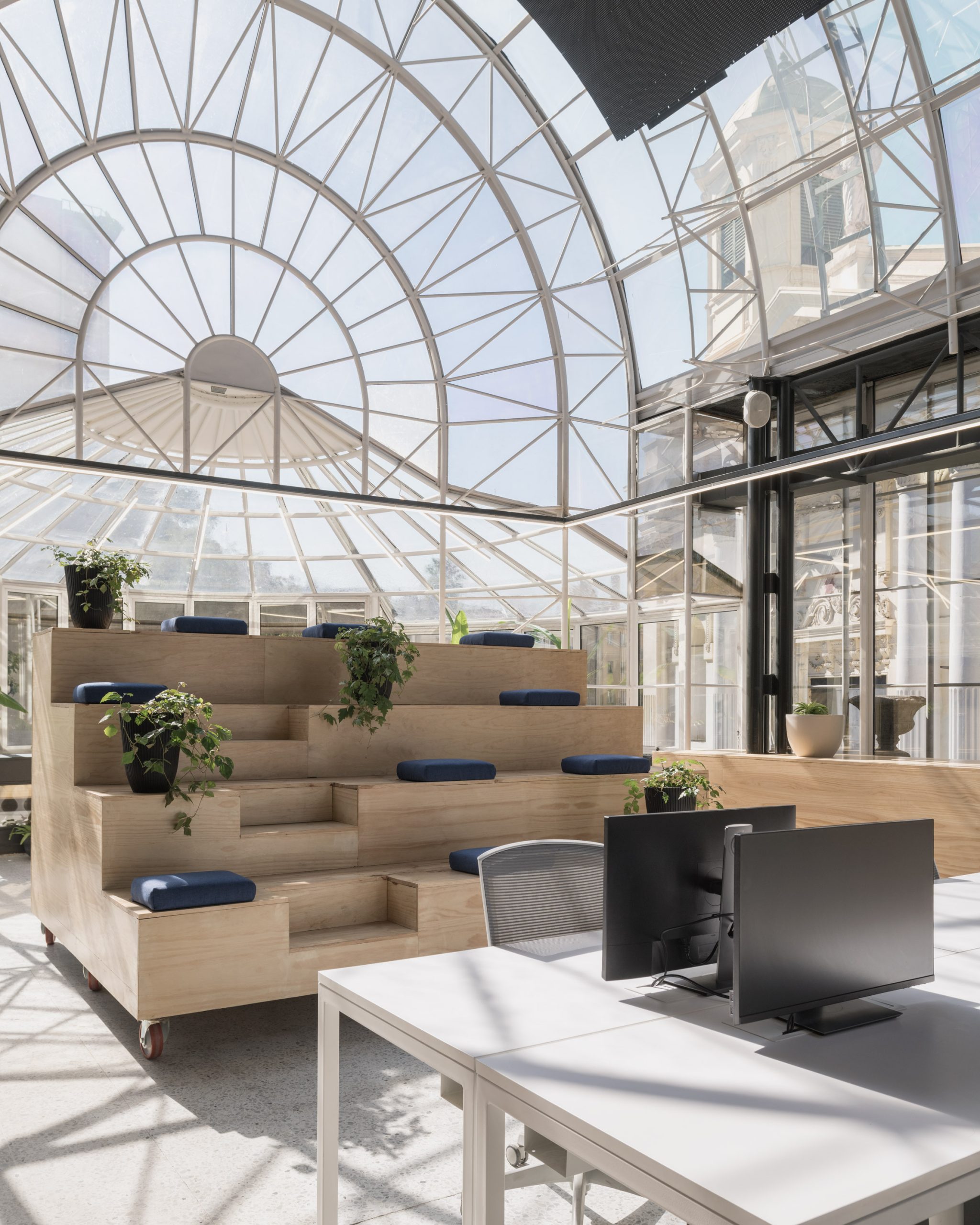
Studio Cáceres Lazo mounted this small bank of bleachers on wheels to allow employees at Fintual in Santiago to move it around their office for group meetings or gatherings.

The office, which occupies an old mansion by architect Sergio Larraín García-Moreno, was designed as a flexible work environment for the financial startup. The stepped seating is made from laminated wooden boards and finished with square cushions and potted plants.

Find out more about Fintual offices ›


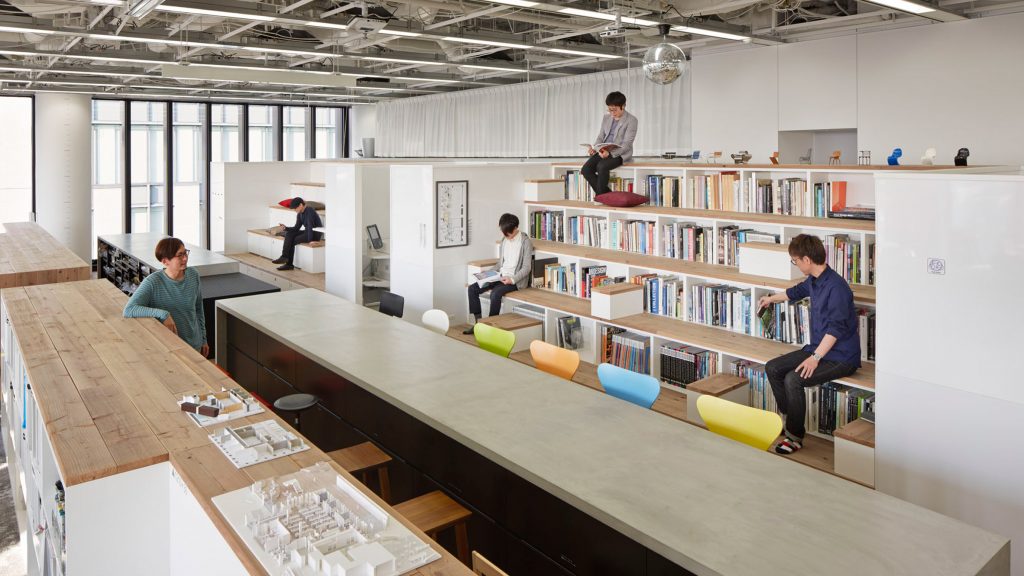
Nikken Space Design office interiorsPhoto is courtesy of Nacása & Partners

Nikken Space Design offices, Japan, by Nikken Sekkei

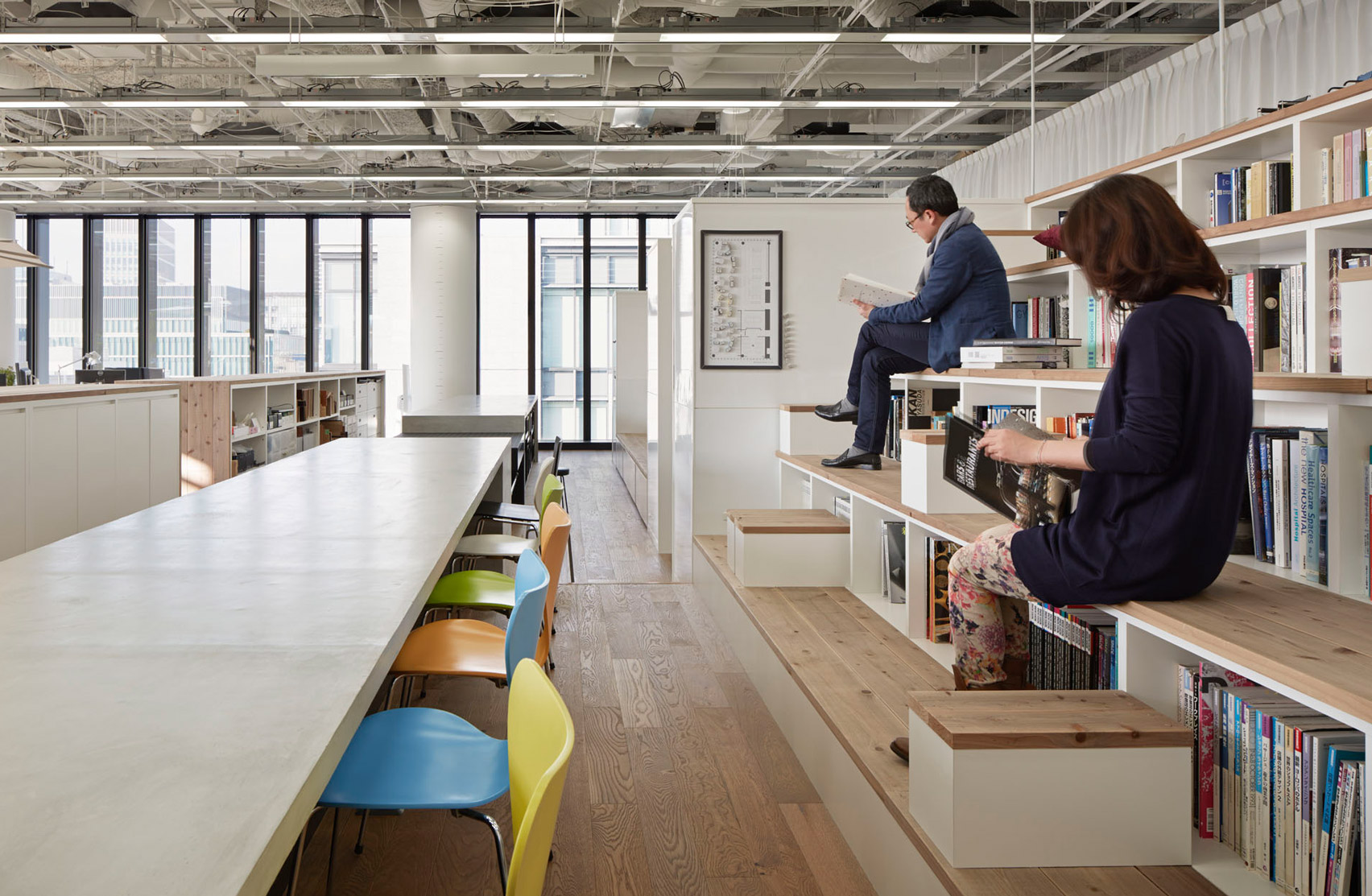
Books and magazines can be found in the hollowed-out steps of this bleacher-style seating structure, located at the centre of the Nikken Space Design offices in Osaka.

Built from recycled scaffolding planks and complete with small side tables, the rows of seating-cum-bookshelves encourage staff to pick up a book at any time to help support their creativity.

Find out more about Nikken Space Design offices ›


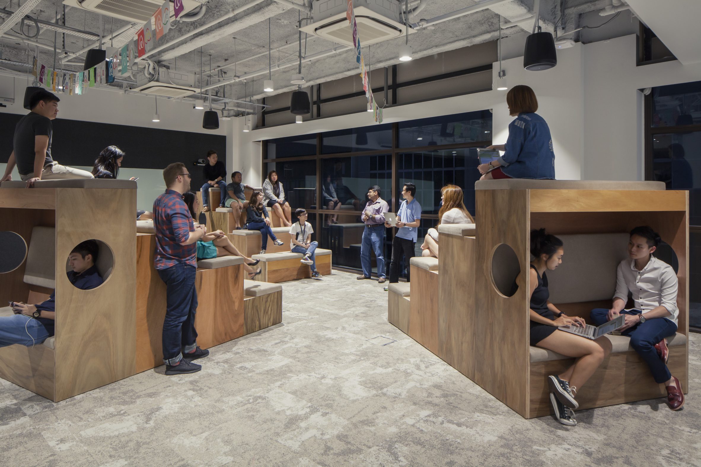
Bleacher seating at Airbnb Singapore

Airbnb offices, Singapore, by Farm

At Airbnb's Singapore office, local studio Farm positioned a group of small wooden bleachers in a room for informal meetings and presentations.

Each bank is lined with four rows of cushioned seating and also incorporates a small nook at its rear. Fitted with benches, these nooks provide employees with a cosy space to work alone or with colleagues.

Find out more about Airbnb offices ›


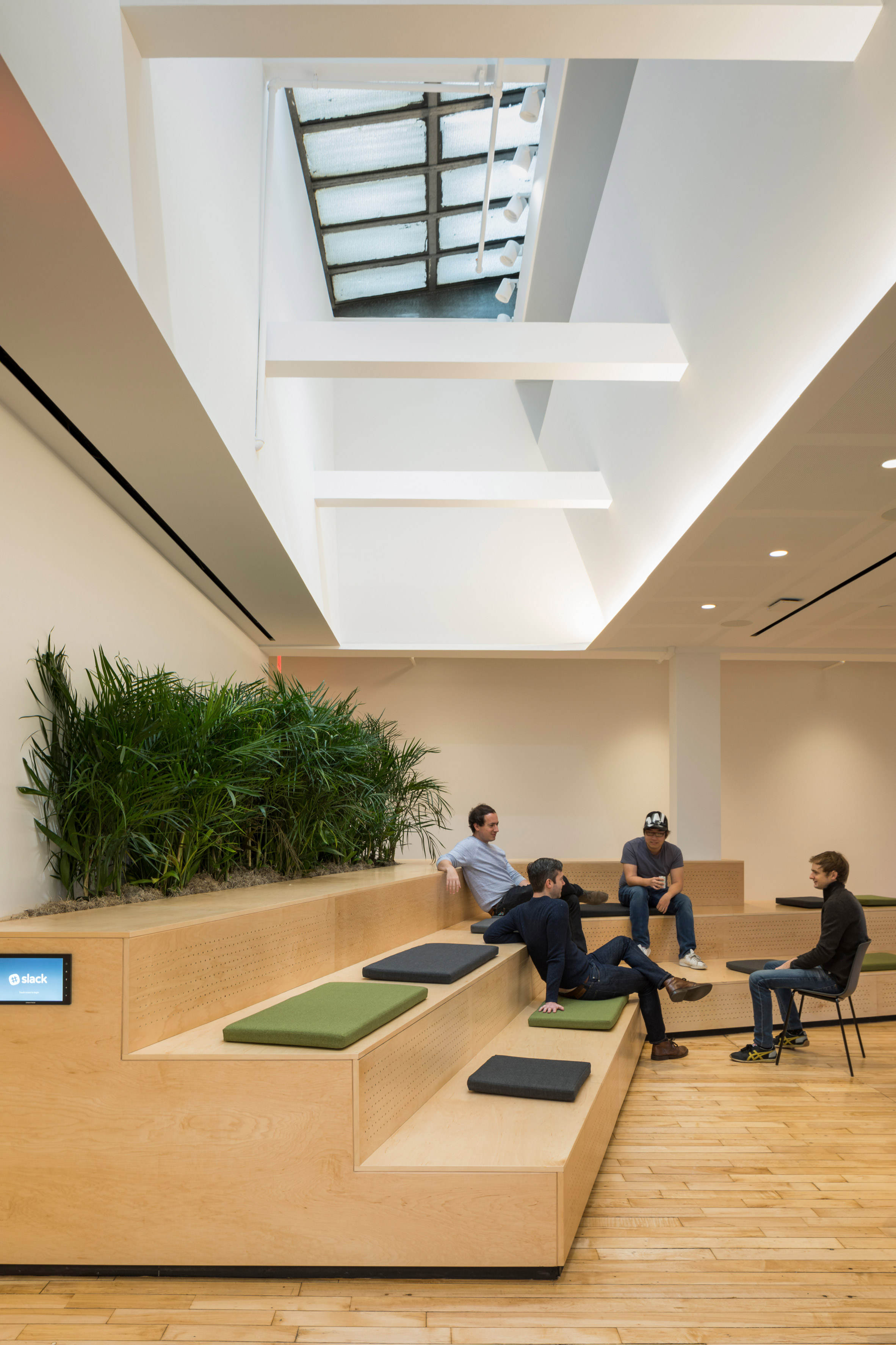
Stepped seating at the Slack offices by SnøhettaPhoto is by Michael Grimm

Slack offices, USA, by Snøhetta

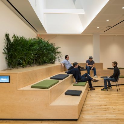
Wooden stadium-like seating also features at the Slack offices in New York, which Snøhetta created to suit "a variety of social interactions and work styles".

Positioned at the heart of the office, the large plywood steps are used for everything from informal conversations between colleagues to large company presentations. Snøhetta incorporated plants and a mix of cushions that help to soften its visual impact.

Find out more about Slack offices ›


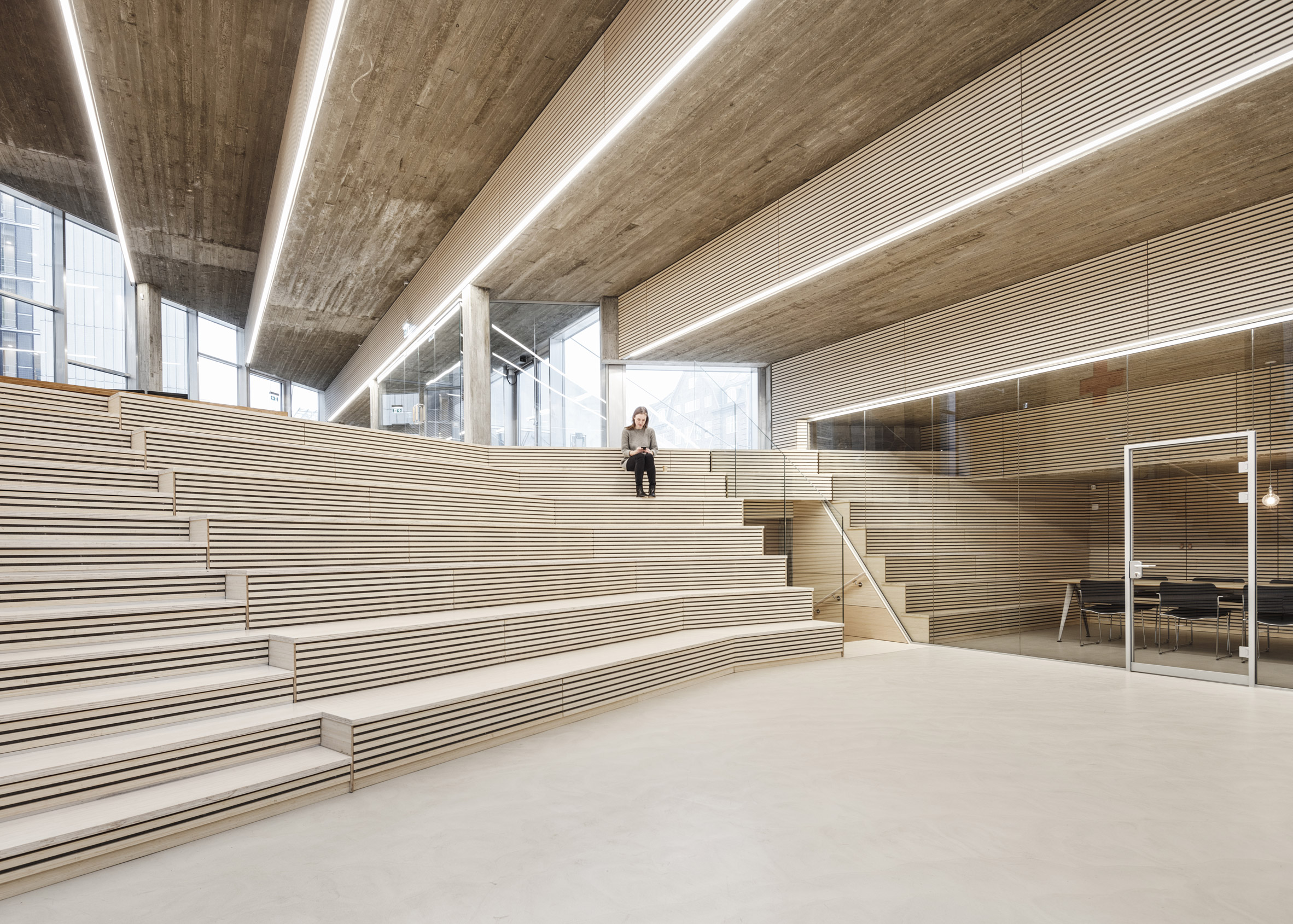
Auditorium with stepped seating by COBEPhoto is by Rasmus Hjortshoj – COAST

Red Cross Volunteer House, Denmark, by Cobe

Architecture studio Cobe lined one side of this auditorium with tiered seating for the volunteer training, meetings and events held at the Red Cross Volunteer House in Copenhagen.

It is framed by a dramatic stepped ceiling cast from concrete, which is the inversion of the stepped seating on top of the building that acts as a public meeting place.

Find out more about Red Cross Volunteer House ›

This is the latest in our series of lookbooks providing curated visual inspiration from Dezeen's image archive. For more inspiration see previous lookbooks showcasinghomely office interiors, workspaces filled with plants and garden studios for remote working.

The post Ten offices with wooden bleachers that c​​ater for collaboration appeared first on Dezeen.

#all #interiors #lookbooks #instagram #bleachers #officeinteriors

dezeen@xn--y9azesw6bu.xn--y9a3aq

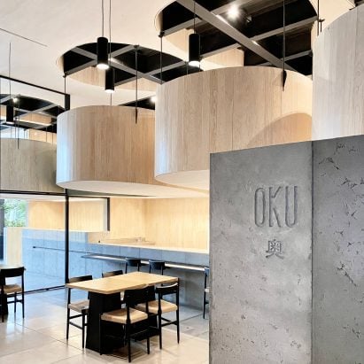
Oku restaurant in Mexico City features "floating tables" made of wood and steel

image

Oku restaurant

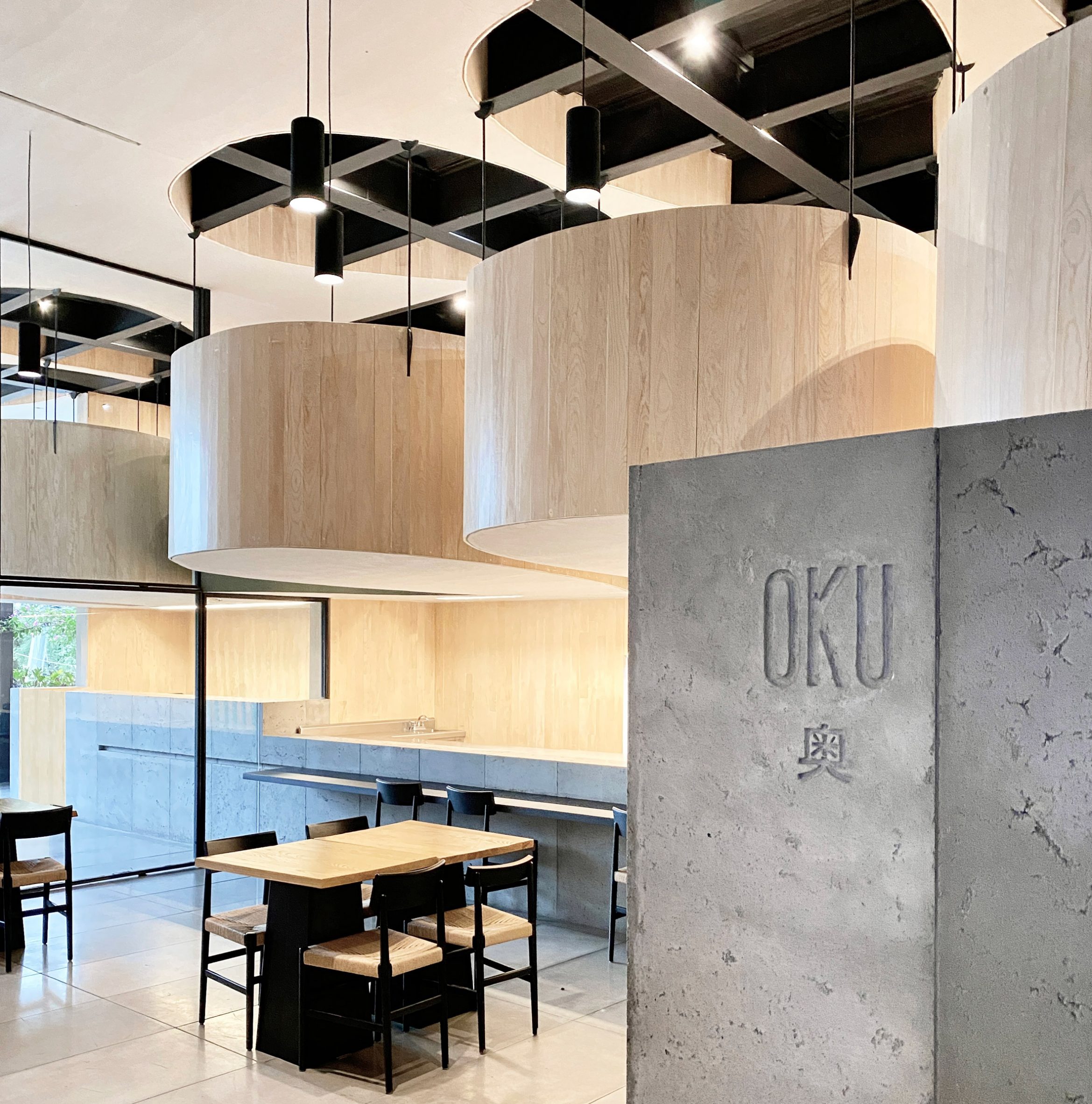
Curved booths are suspended over a dining room at a Japanese restaurant in Mexico City designed by local firms Michan Architecture and Escala Arquitectos.

The sushi eatery is located in the upscale neighbourhood of Jardines del Pedregal, across from a famed church known as Parroquia de la Santa Cruz del Pedregal.

Oku restaurantOku is a sushi restaurant in Mexico City

It is the second Oku restaurant designed by Michan Architecture. The other – which features a cave-like ceiling made of huge concrete lights – is found in the district of Lomas de Chapultepec.

For the Pedregal location, the architects worked with another local firm, Escala Arquitectos. The team aimed to elongate the space's proportions and take advantage of its height.

Restaurant by Michan ArchitectureThe restaurant is Michan Architecture's second of its kind
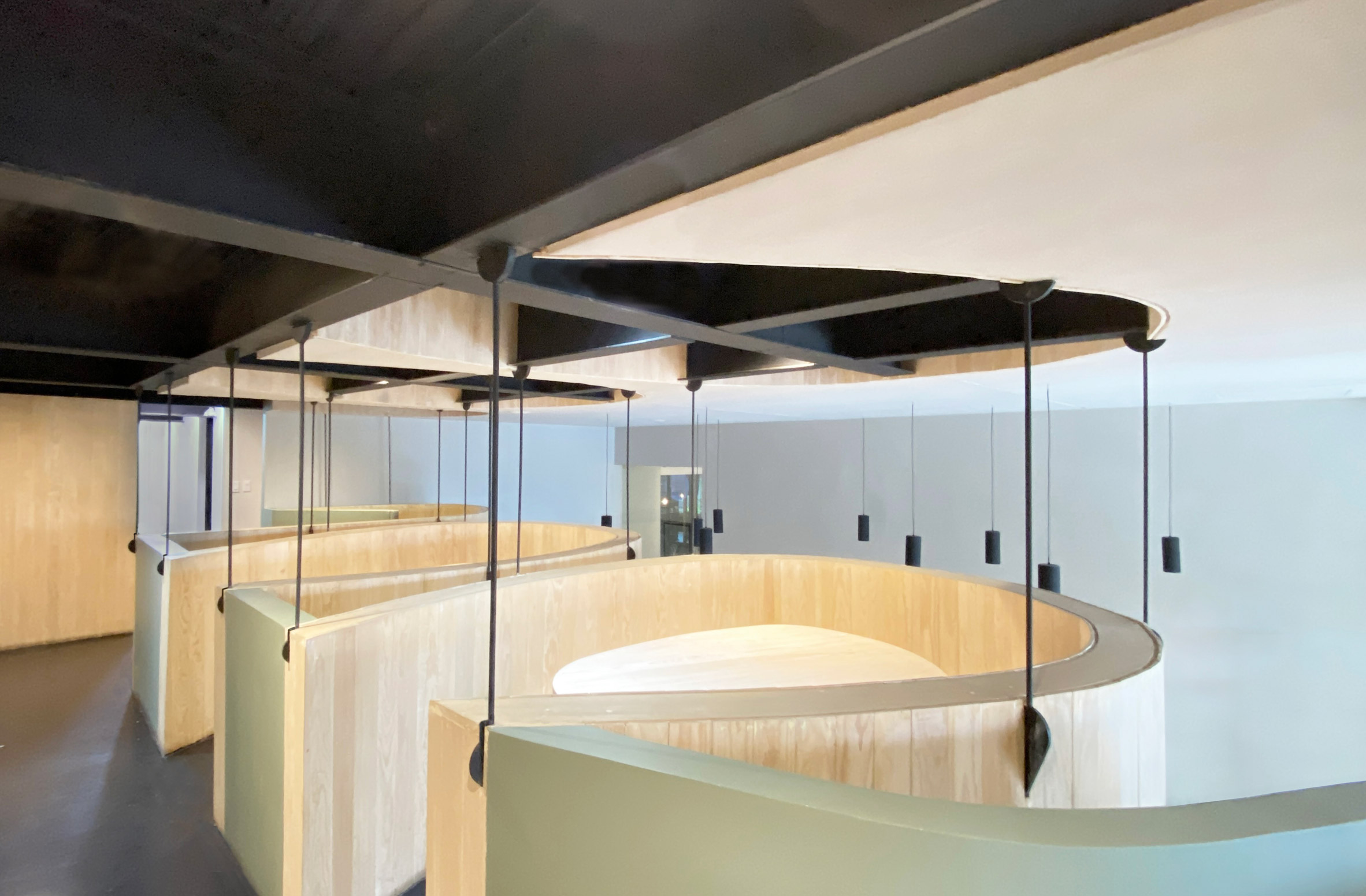
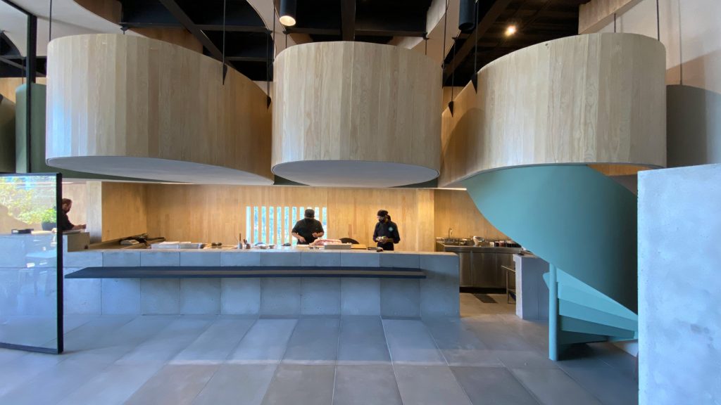
Rectangular in plan, the eatery has two levels. The lower level encompasses a sushi bar, indoor and outdoor seating, and a back-of-house zone.

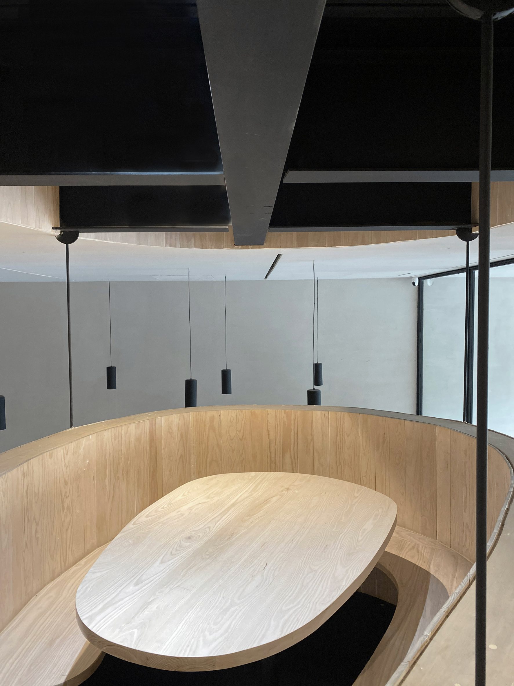
Additional seating is found upstairs, where a series of "floating tables" are arrayed along a corridor.
Floating tables"Floating tables" are arrayed along a corridor

"The mezzanine level features individual tables hung from the existing structure, giving guests a unique dining experience," the studio said.

Two of the tables hover above the sushi bar, and two extend over the outdoor terrace. Each has wooden walls that enclose a single booth.

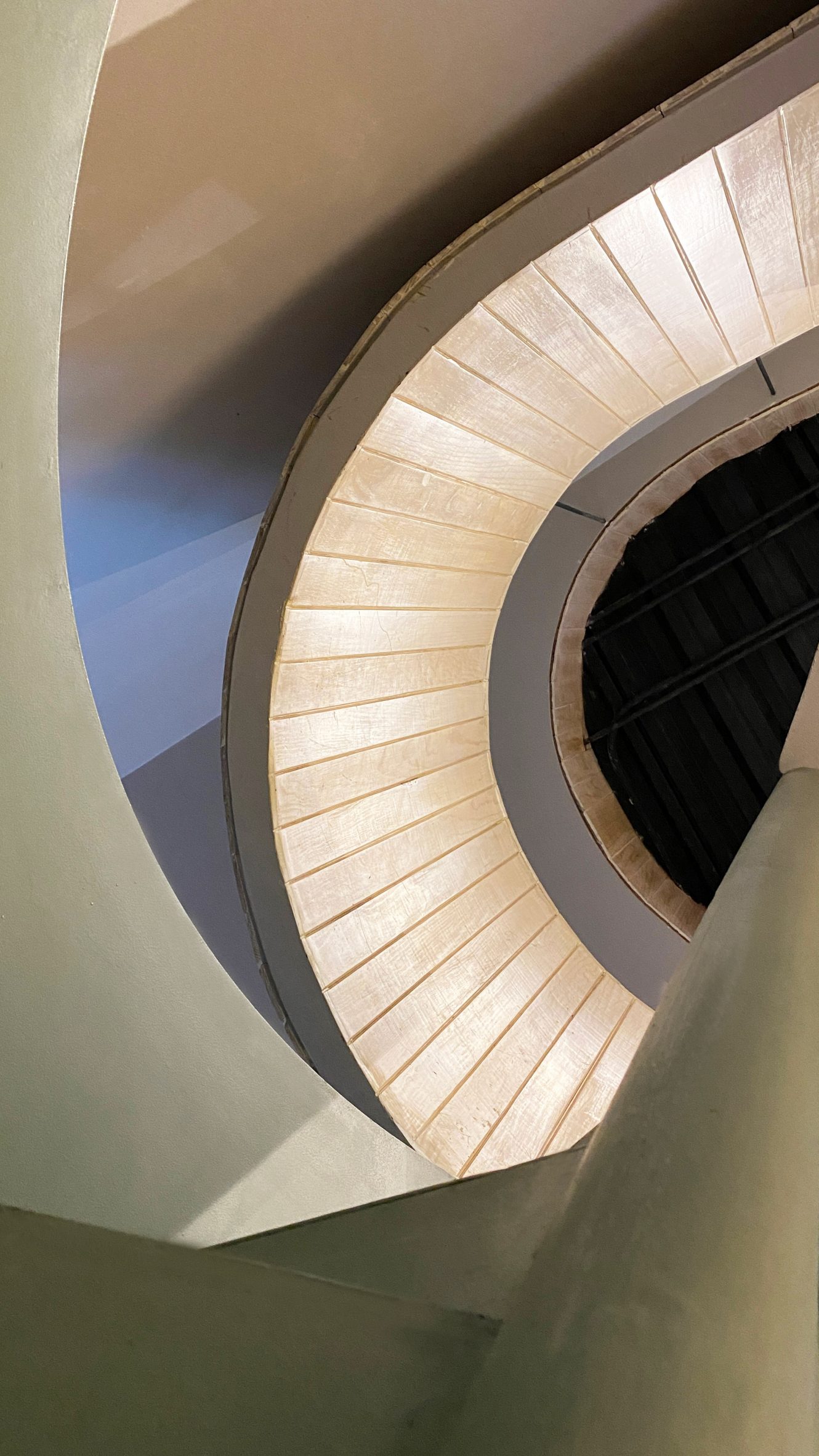
Curved staircaseCurved stairs connect Oku's two levels

A similar enclosure was used for the stairs connecting the restaurant's two levels.

The dining pods are supported by light steel members that are welded into the building's existing steel structure.

[ Tori Tori by Esrawe

Read:

Samurai armour and Kanji characters inform Mexico City's Tori Tori restaurant by Esrawe Studio

](https://www.dezeen.com/2020/03/29/tori-tori-restaurant-esrawe-studio-mexico-city/)

Above the mezzanine is a drop ceiling with curved cutouts that expose the steel framing and add height to the space.

Moreover, the openings provide a "sensation of cutting and pasting the ceiling onto the tables", the architects said.

Black lighting fixturesCylindrical black lighting fixtures hang from the ceiling

Hung from the ceiling are cylindrical, black lighting fixtures, which merge electrical cables with structural elements.

Throughout the restaurant, the team used neutral colours and clad surfaces in pine, pigmented stucco and panels made of glass-fibre-reinforced concrete (GFRC).

Oku pine wood restaurantThe team used neutral colours and clad surfaces in pinewood throughout Oku
The effect is a "light and open atmosphere that plays with polished and raw finishes", the team said.

Other Japanese eateries in Mexico include Mexico City's Tori Tori by Esrawe Studio, which features elements inspired by Samurai armour, and a restaurant by TAX Architects in the coastal town of Puerto Escondido that is topped with a thatched roof.

The photography is by Alexandra Bové.


Project credits:

Architect: Michan Architecture and Escala Arquitectos

Project team: Narciso Martinez, Benjamin Espindola, Emilio Gamus, Isaac Michan

Structural engineer: Arturo Rosales + MdO

Mechanical, electrical, plumbing: RAGER, Rafael Barra

The post Oku restaurant in Mexico City features "floating tables" made of wood and steel appeared first on Dezeen.

#restaurantsandbars #all #interiors #instagram #wood #steel #mexicocity #restaurants #mexico #japaneserestaurants

dezeen@xn--y9azesw6bu.xn--y9a3aq

h2o Architectes converts storage space into colourful studio for Louvre museum

image

Red-painted workshop inside The Studio at the Louvre museum designed by h2o Architectes

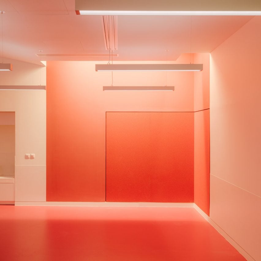
French firm h2o Architectes has designed a brightly-hued educational facility, hosting art classes for young and old inside Paris's Musée du Louvre.

Over 1,200-square-metres, The Studio encompasses a common area and nine studio spaces on the lower ground floor of the Louvre's Richelieu wing.

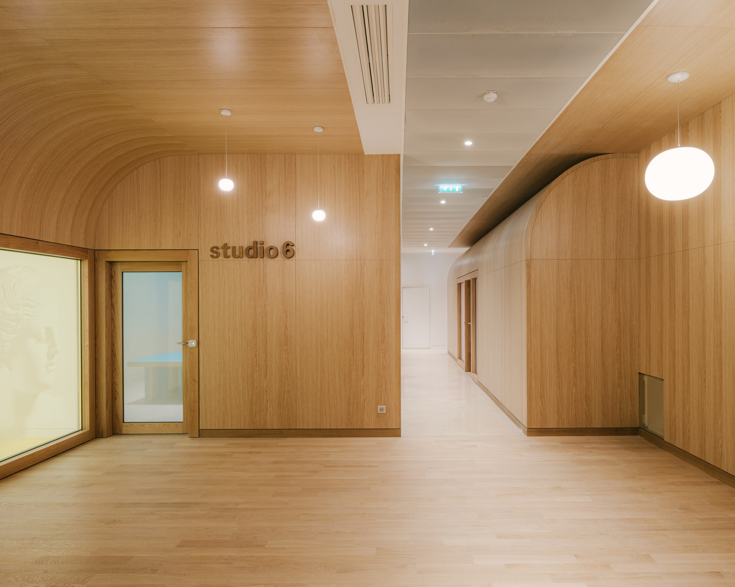
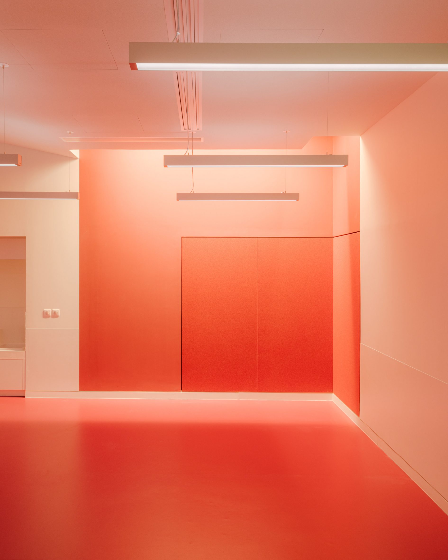
Wood-panelled hallway of an education area inside the LouvreThe Studio (top image) has nine workshop rooms (above)
What was once a storage depot for the Islamic art department is now a space for learning, where anyone from school children to professionals can expand on their own artistic skills and find out more about the artworks displayed in the museum.

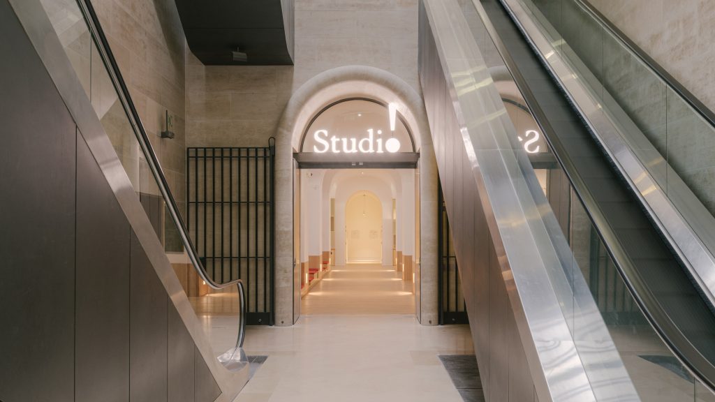
The Studio's grand arched entrance leads visitors into The Forum, which functions as a reception and plays host to a changing roster of free 20-minute workshops.

Red-painted workshop inside The Studio at the Louvre museum designed by h2o ArchitectesWorkshop rooms towards the rear of The Studio are painted in bright hues
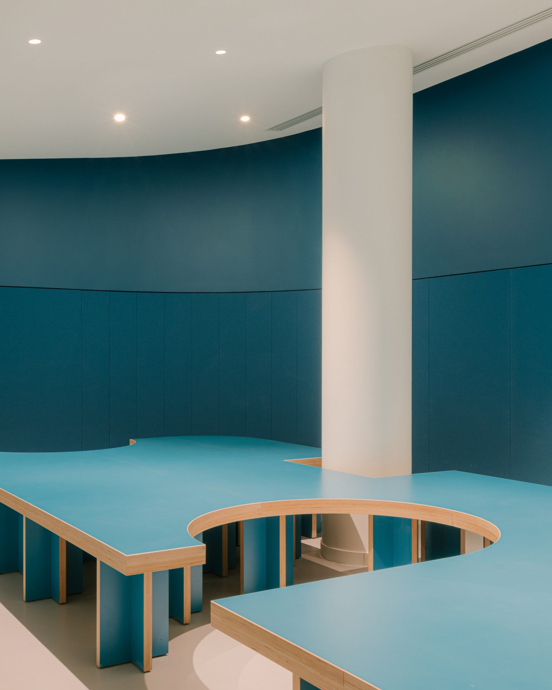
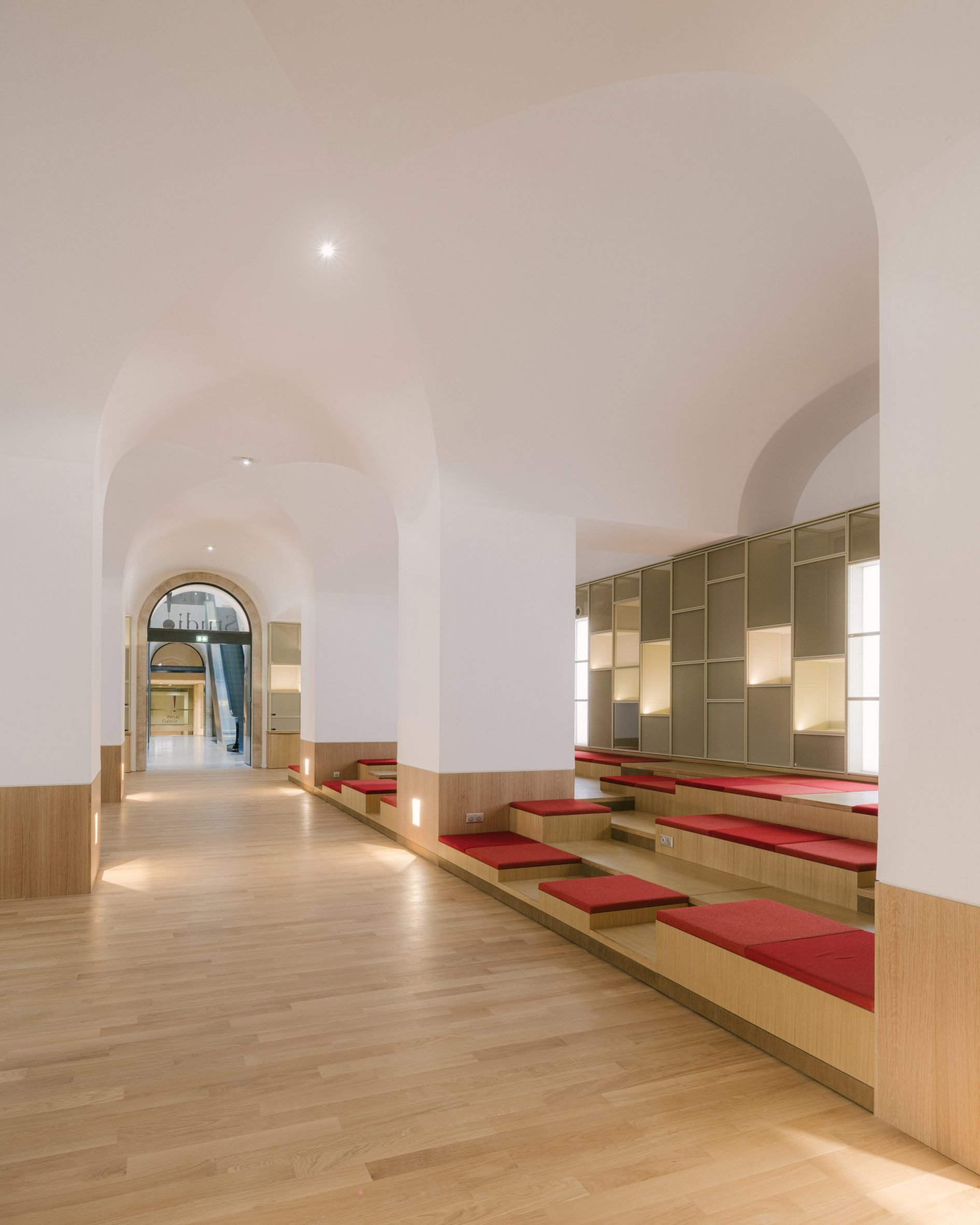
h2o Architectes designed the interior as "a place for conviviality and exchange", with a broad bank of tiered wooden seating allowing visitors to perch and chat.

The cushioned seats can be lifted up to reveal storage boxes for workshop participants to stow away their jackets and other personal items.

Teal-blue bench seating inside The Studio by h2o Architectes One of the rooms is vermillion teal blue
Built into the surrounding walls is a series of backlit niches.

These showcase work by members of the public, as well as small-scale pieces made by the Louvre's in-house roster of expert guilders, painters, framers, metalworkers and other craftsmen.

[ Virgil Abloh creates streetwear collection for the Musée du Louvre

Read:

Virgil Abloh creates Off-White streetwear collection for the Musée du Louvre

](https://www.dezeen.com/2019/12/29/virgil-abloh-louvre-off-white-streetwear/)

Towards the back of The Studio are nine rooms for hosting lengthier workshops and training courses in everything from art history to project management.

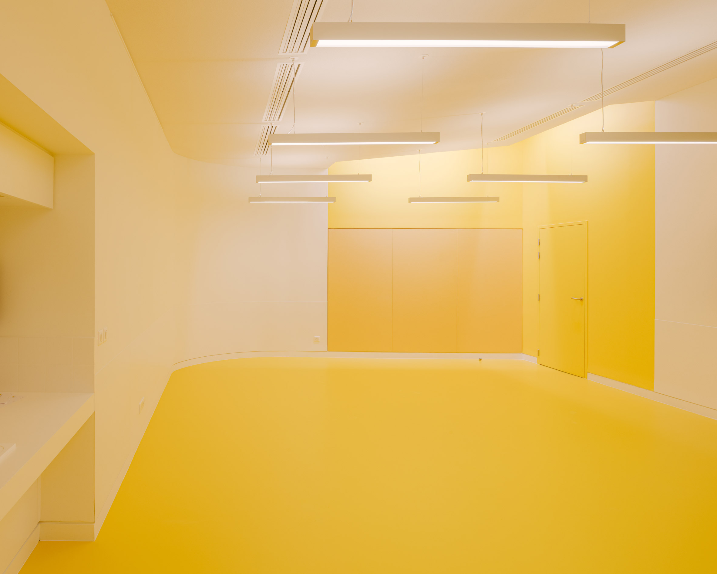
These rooms have been painted in bright, punchy colours like lemon yellow, teal blue and vermillion red.

Empty yellow workshop room inside the Louvre museum, ParisAnother of the rooms is lemon yellow

In contrast, the corridors connecting the rooms are much more neutral-toned and entirely lined in wood.

Their curved walls meet to form snug corners where visitors can stop and socialise while simple spherical pendant lights cast a warm glow throughout the interior.

Forum of The Studio designed by h2o Architectes with tiered bench seatingThe Forum doubles as a reception area with tiered seating
h2o Architectes was established by Jean Jacques Hubert and Charlotte Hubert in 2005.

Since then, the studio has completed a diverse array of projects in France including an angular timber wine-tasting pavilion, a nursery extension topped with a fabric canopy and an apartment with hidden space-saving storage.

_The photography is byMaxime Verret. _


Project credits:

Architect: h2o Architectes

Structural consultant: Équilibre Structures

Construction economist: Cabinet Pilté

Fluid engineering office: INEX

Lighting designer: Agence On

Multimedia: Labeyrie & Associés

Signage: Wanja Ledowski Studio

Acoustics: ABC Decibel

Fire prevention and safety: CASSO & Associés

Supervision unit: Alpha Contrôle

Health and saftey coordination: Qualiconsult

The post h2o Architectes converts storage space into colourful studio for Louvre museum appeared first on Dezeen.

#all #interiors #cultural #instagram #france #h2oarchitectes #paris #louvremuseums

dezeen@xn--y9azesw6bu.xn--y9a3aq

Ten white kitchens with clean and bright interiors

image

Pyramid House, Switzerland, by DF_DC

Our latest lookbook highlights 10 homes from the Dezeen archive that feature white kitchens including a Brooklyn townhouse and home in Switzerland.

White kitchens can provide homes with a minimal and clean look as well as brightening rooms in spaces where light may be limited.

The kitchens in these projects range from paired back and minimal to rustic and textural and are often combined with pops of colour through kitchen finishings and hardware.

This is the latest in our Dezeen Lookbooks series providing curated visual inspiration from Dezeen's image archive. For more inspiration see previous lookbooks showcasing modernist living rooms, kitchen extensions and homes designed by architects and designers.


Bartolomeu Dias House by Aurora Arquitectos 

Bartolomeu Dias House, Portugal by Aurora Arquitectos

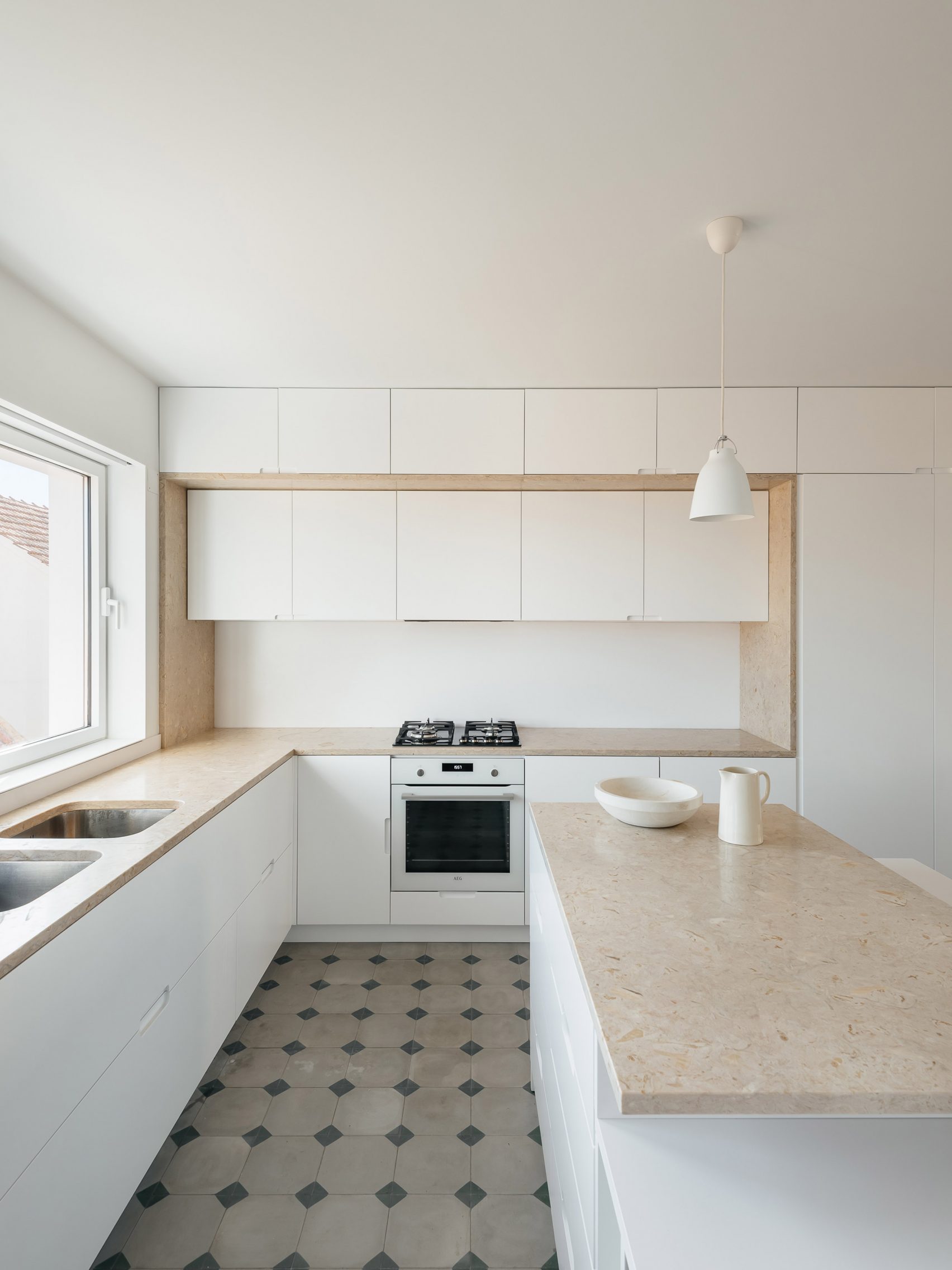
Located in Lisbon, this Portuguese townhouse renovated by Aurora Arquitectos combines paired-back interiors with original Portuguese finishings.

The kitchen has a largely neutral palette with white walls, white cabinetry and beige work surfaces. Original tiling on the floor was restored to give the kitchen subtle pops of green.

Find out more about Bartolomeu Dias House ›


Pyramid House, Switzerland, by DF_DC

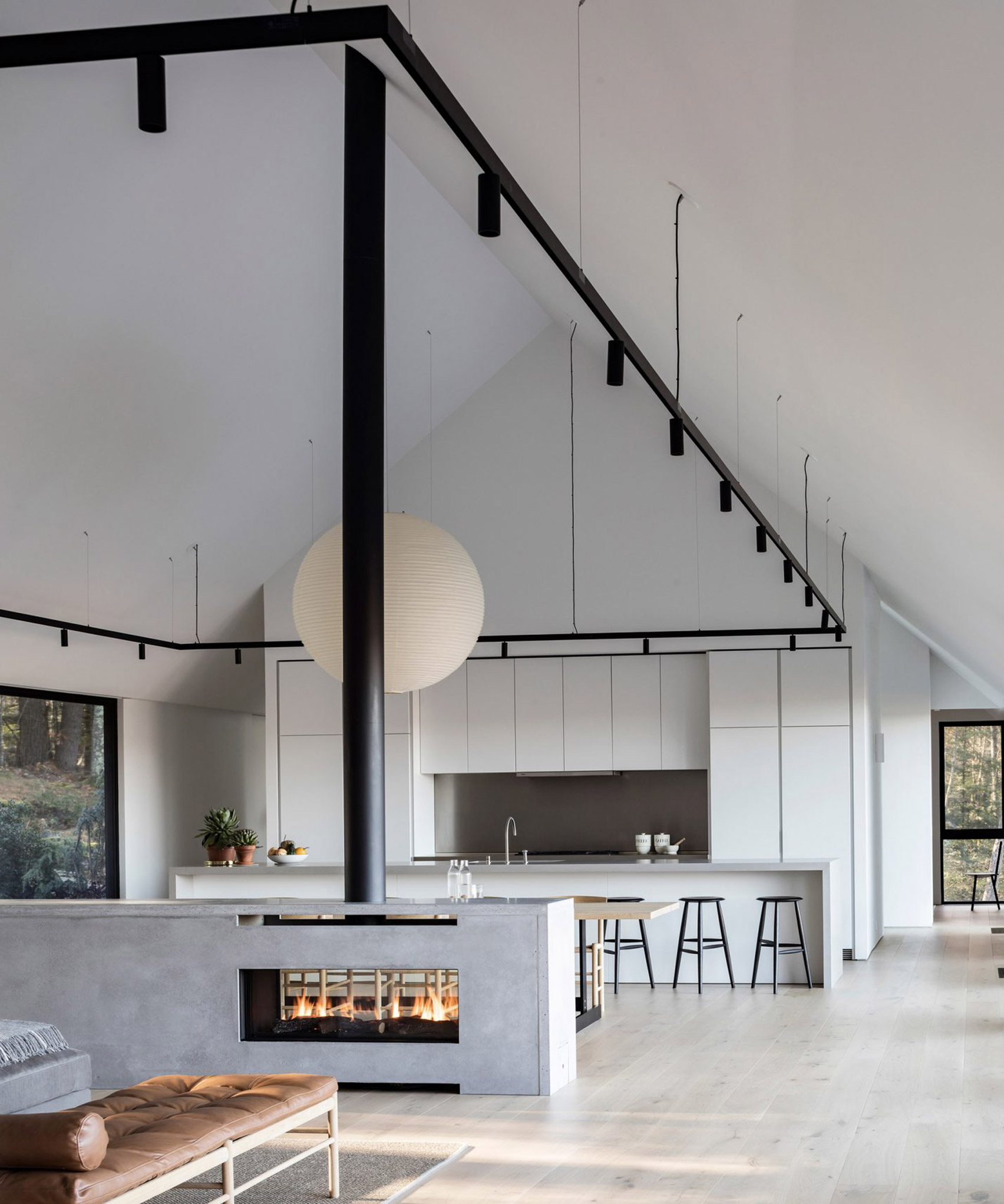
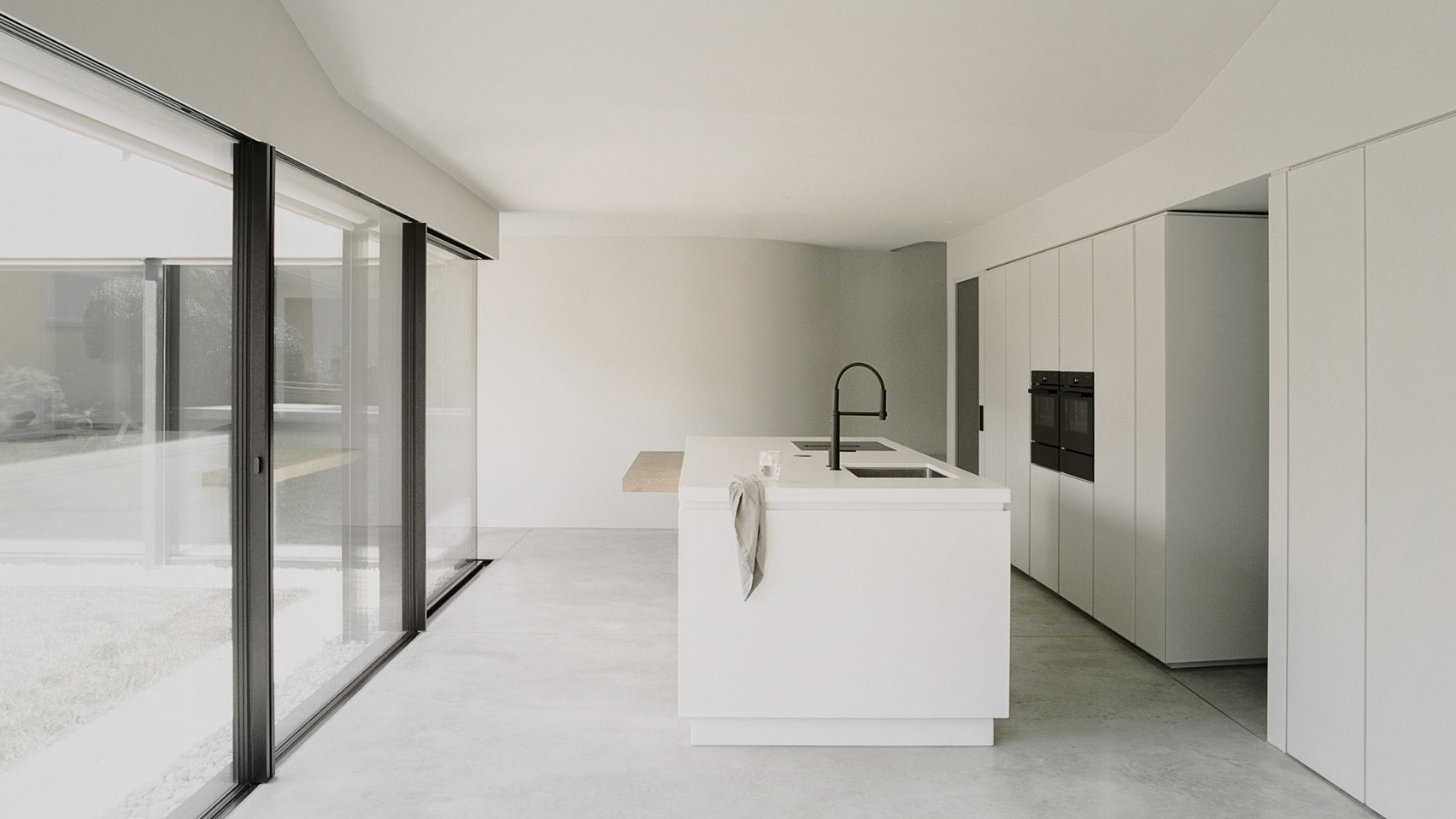
The kitchen at the monolithic Pyramid House by DF_DC was oriented to look out onto the home's garden.

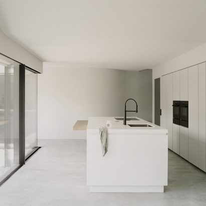
Cabinetry walls and worktops were finished in white and placed on top of a pale concrete floor. A large island at the centre of the space contains a built-in sink, faucet and also an electric hob. A wooden plane extends from the island and forms a breakfast bar.

Find out more about Pyramid House ›


Sackett Street townhouse by The Brooklyn Home Company

Sackett Street townhouse, US, by The Brooklyn Home Company

Located in New York's Carroll Gardens neighbourhood, Sackett Street townhouse combines a rustic and contemporary aesthetic.

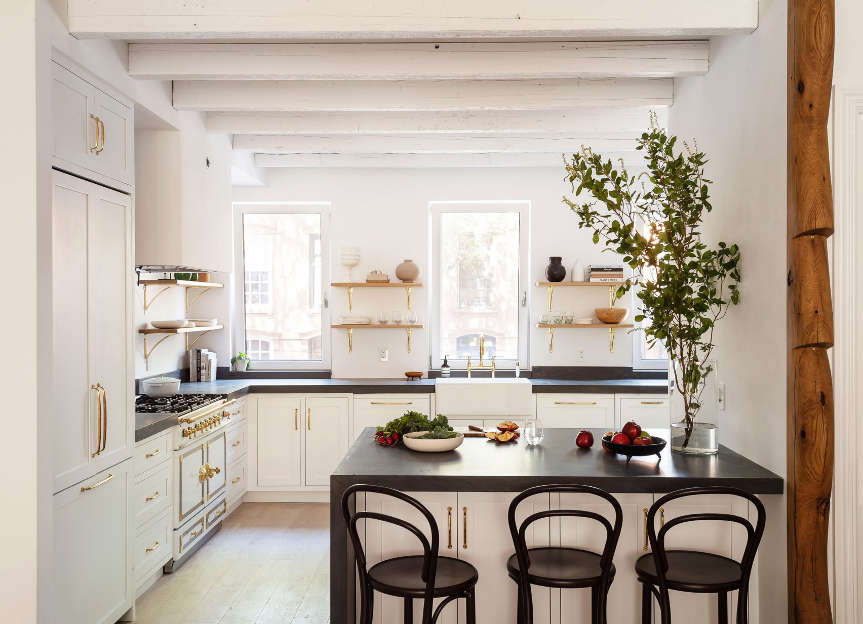
The kitchen, which is set beneath whitewashed ceiling beams, features Pietra Cardosa countertops, a range cooker and metallic fixtures that contrast against its white cabinetry and walls.

Find out more about Sackett Street townhouse ›


Ledge House by Desai Chia Architecture

Ledge House, US, by Desai Chia Architecture

New York practice Desai Chia Architecture blanketed the interior of Ledge House in Connecticut in pale materials and finishes.

The open plan kitchen is divided from the living space by a large linear island fitted with a grey coloured countertop. The island faces a wall of full-height white cabinetry that discreetly conceals appliances.

Find out more about Ledge House ›


Studio apartment by Ruetemple

Studio apartment, Russia, by Ruetemple

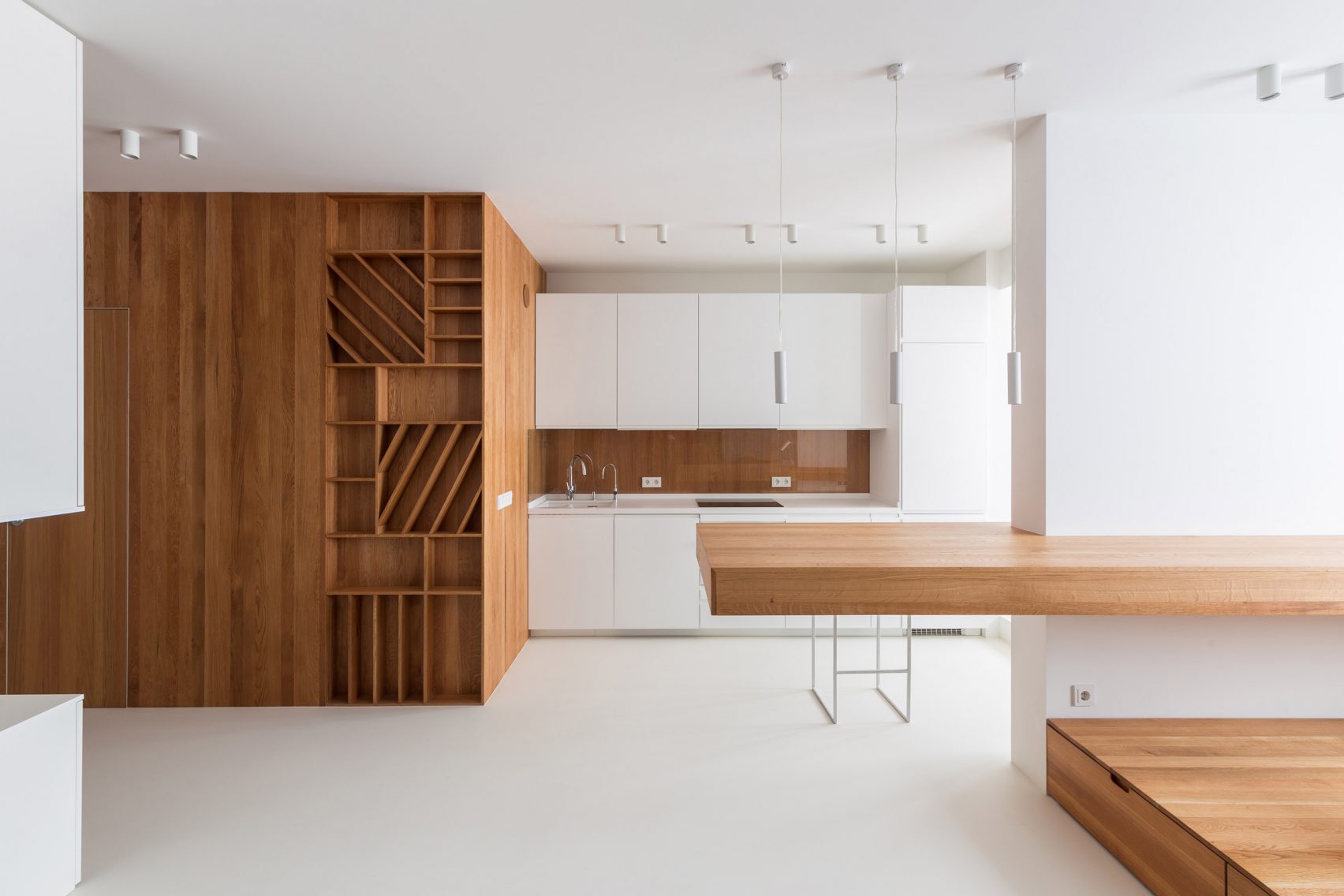
Oak furnishings and finishing were paired with white-washed walls and white cabinetry in the kitchen of this Moscow studio apartment designed by Ruetemple.

Built-in cabinetry crafted from solid oak marks contrasts the largely white. A small dining table extends from the wall between the kitchen and bedroom to clearly divide the spaces.

Find out more about the studio apartment ›


Swedish house by Sandellsandberg

Swedish house, Sweden, by Sandellsandberg

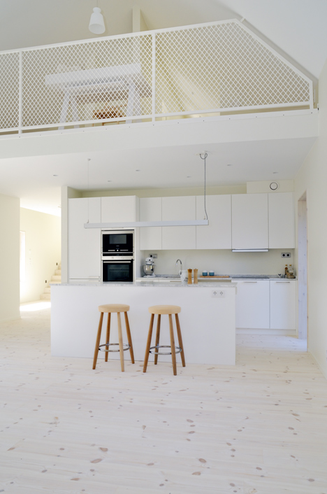
Ranged along a single wall below a mezzanine level, this kitchen designed by Swedish studio Sandellsandberg combines white cabinetry and veined marble countertops.

Its open plan design makes the most of the home's small and compact plan. Overhead lighting is suspended from the dropped ceiling above an island that doubles as a breakfast bar.

Find out more about the Swedish house ›


Comandante Ferraz Antarctic Station by Estúdio 41

Comandante Ferraz Antarctic Station, Antarctica, by Estúdio 41

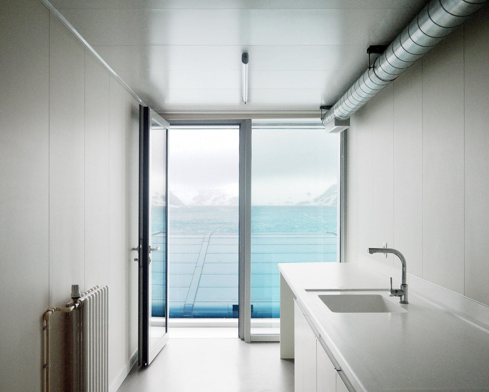
Much like the majority of this prefabricated Antarctic research station, the kitchen is comprised of only the essential furnishings, finishings and functions.

The room, which is rectangular in shape, features a glazed wall that opens to a terrace and frames views of the frozen landscape. A sink and worktop are contained within one unit with a single row of cabinetry fitted below.

Find out more about Comandante Ferraz Antarctic Station ›


TS-H_01 by Tom Strala

TS-H_01, Switzerland, by Tom Strala

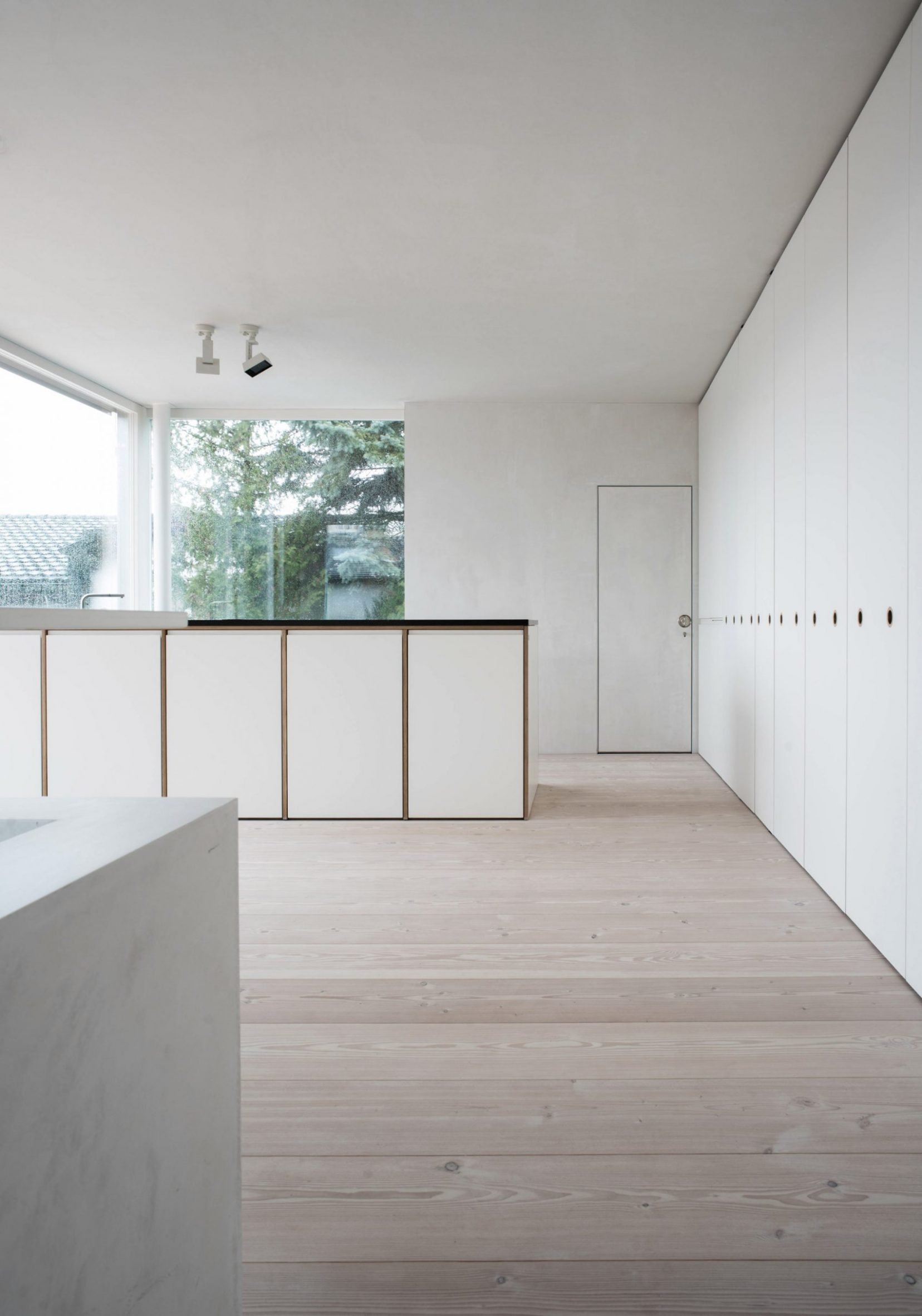
Architect Tom Strala used a neutral and minimal material palette for the interior of this family home near Bern.

Bold, clean lines define the kitchen with rows of white cabinetry and wooden details spanning beneath worktops. Recessed and sunken handles and fixtures provide a sleek and minimal look.

Find out more about TS-H_01 ›


South Yarra Townhouse by Winter Architecture

South Yarra Townhouse, Australia, by Winter Architecture

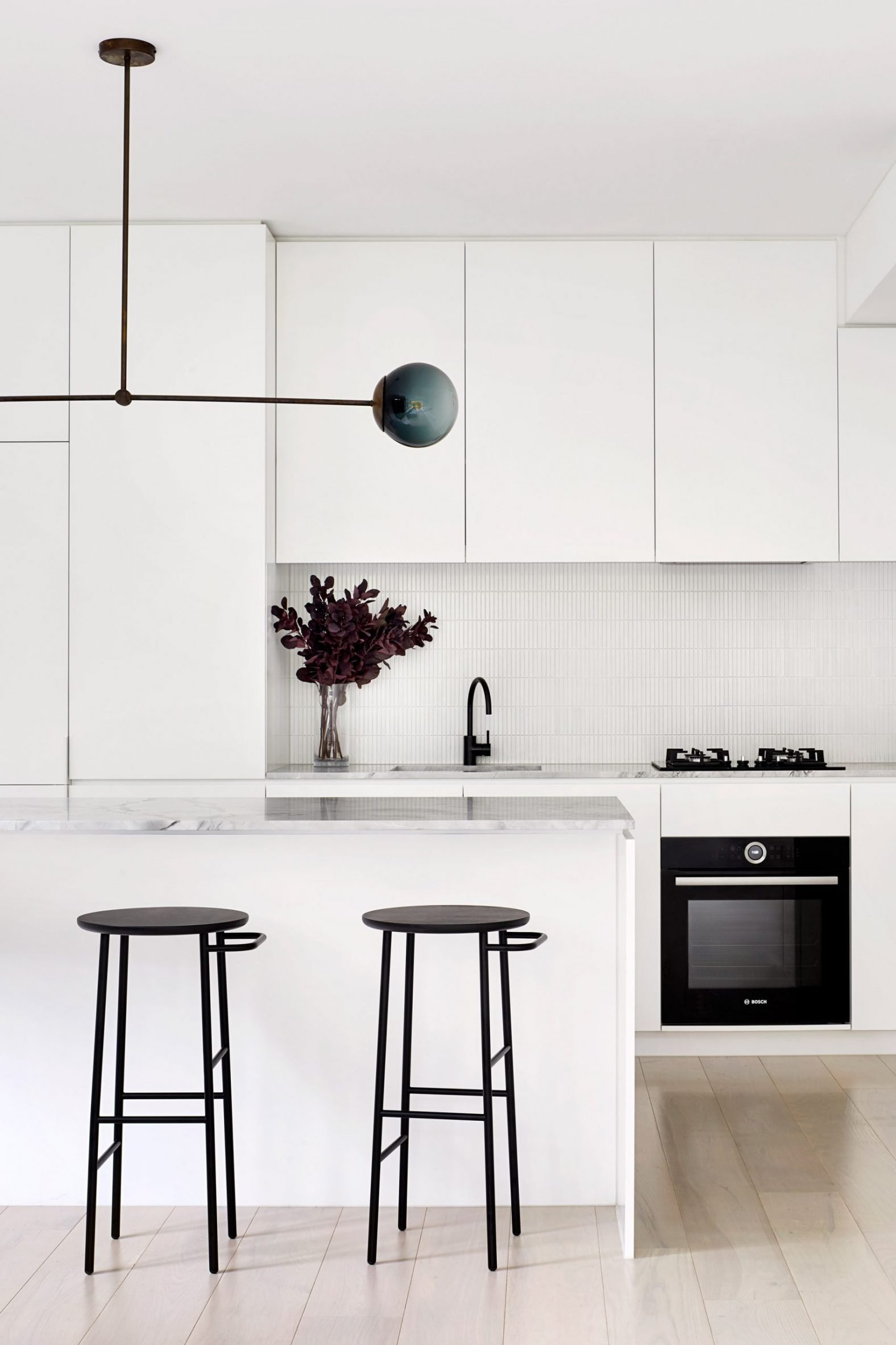
Clean white lines and shapes fill the kitchen at this townhouse in Melbourne by Winter Architecture. The kitchen has an all-white palette that is defined by its use of different textures and finishes.

Black finishes and furnishings, including slender breakfast bar stools and a sculptural overhead pendant light, juxtapose the stark white cabinetry and tiling.

Find out more about South Yarra Townhouse ›


Hubert by Septembre

Hubert, France, by Septembre

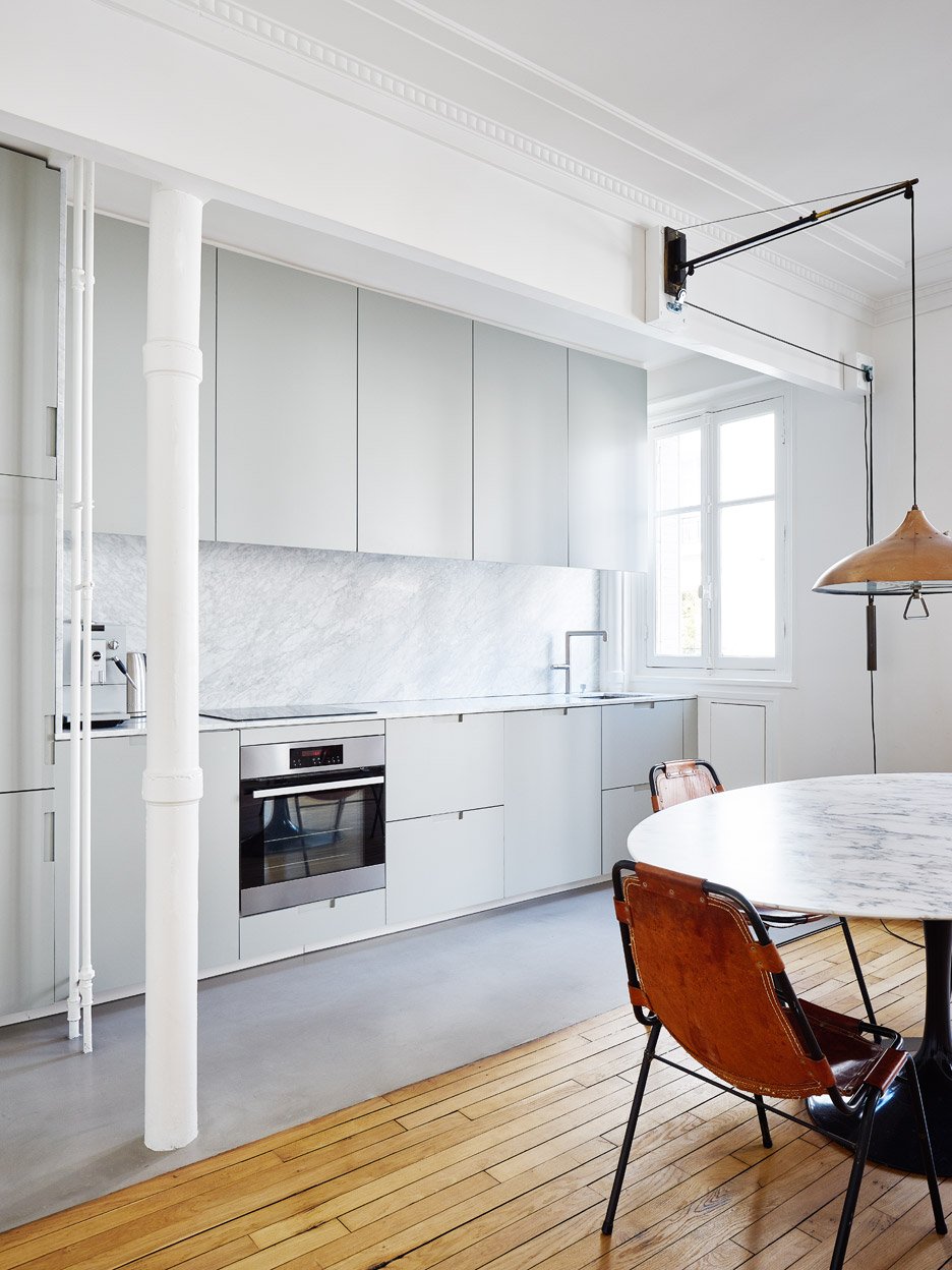
This kitchen dining room in this apartment is zoned by its use of poured concrete flooring and cabinetry that contrasts against the wood-lined living area.

White cabinetry units are ranged above and below a marble countertop and splashback with wall-mounted cabinetry staggered near the window to allow light to enter as well as open.

Find out more about Hubert ›

This is the latest in our series of lookbooks providing curated visual inspiration from Dezeen's image archive. For more inspiration see previous lookbooks showcasinghomes centred around courtyards, original hotel bathrooms and glass block walls.

The post Ten white kitchens with clean and bright interiors appeared first on Dezeen.

#all #lookbooks #instagram #interiors #residential #kitchens

dezeen@xn--y9azesw6bu.xn--y9a3aq

Danielle Brustman creates yellow highlights in sunny Melbourne hair salon

image

Mitch Studio hair salon by Danielle Brustman

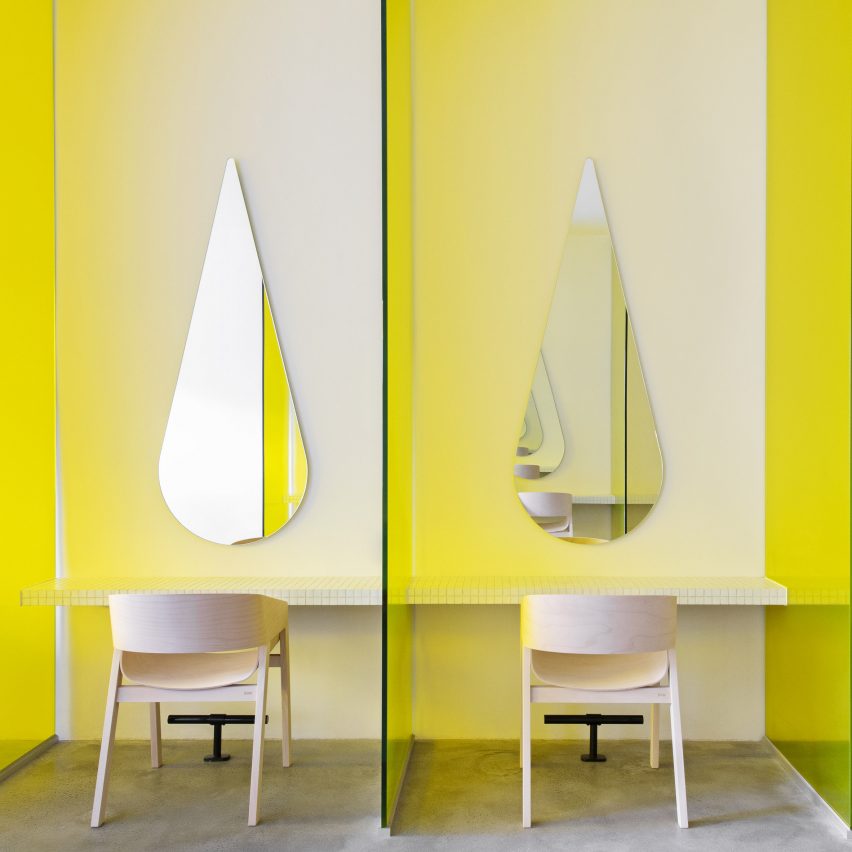
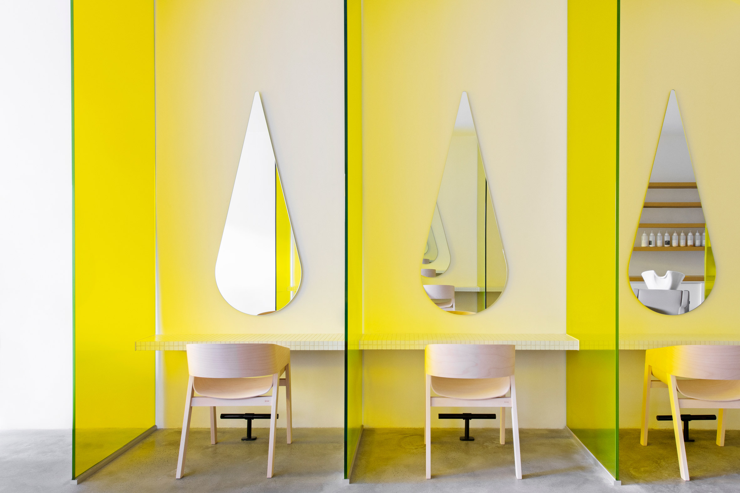
Yellow-tinted glass partitions and droplet-shaped mirrors give a unique personality to Australian hair salon Mitch Studio, renovated by interior designer Danielle Brustman.

Mitch Studio is located in a double-storey 1950s building in the Melbourne suburb of Ashburton, in a shopfront that had already operated as a hairdressers for a number of years.

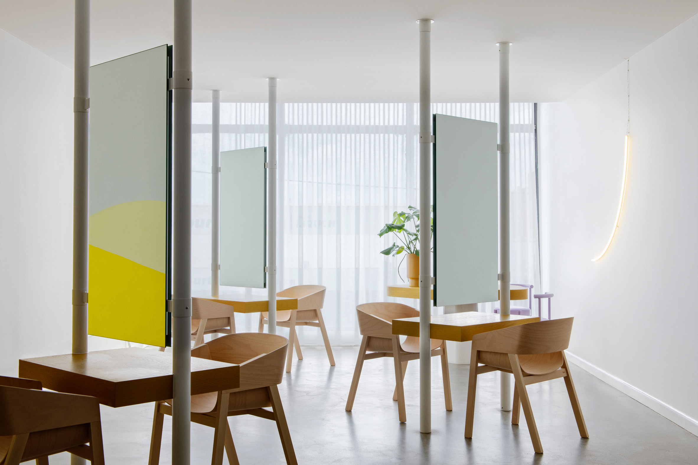
Yellow tinted glass partitions separate hair cutting stations at a hair salon, with pale timber chairs and teardrop-shaped mirrors in each stationDanielle Brustman wanted to use Mitch Studio's brand colour, yellow, in the interior design
Brustman's client wanted to update the space to reflect their brand, which uses yellow as its signature colour. The designer set out to give the space a fresh and modern feel while using the sunny hue as a key part of the colour palette.

The designer started by gutting the space entirely, leaving only the original concrete floor, which has been polished to achieve its final look.

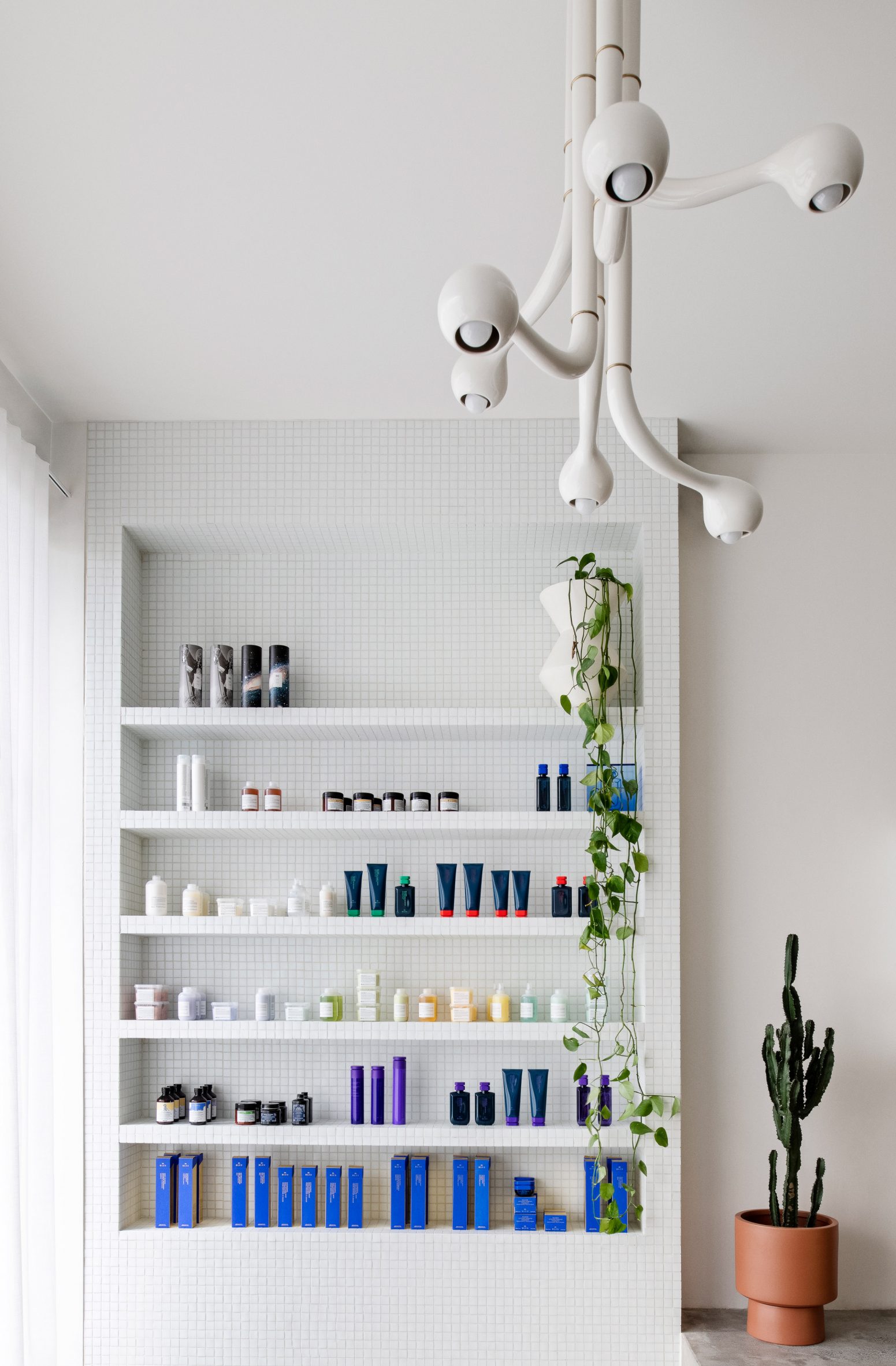
Reception area of Mitch Studio salon in Melbourne, with white-tiled custom-built retail display shelf and six-globe white chandelier by EntlerThe reception area includes a custom-built retail display shelf and a six-globe chandelier by Entler
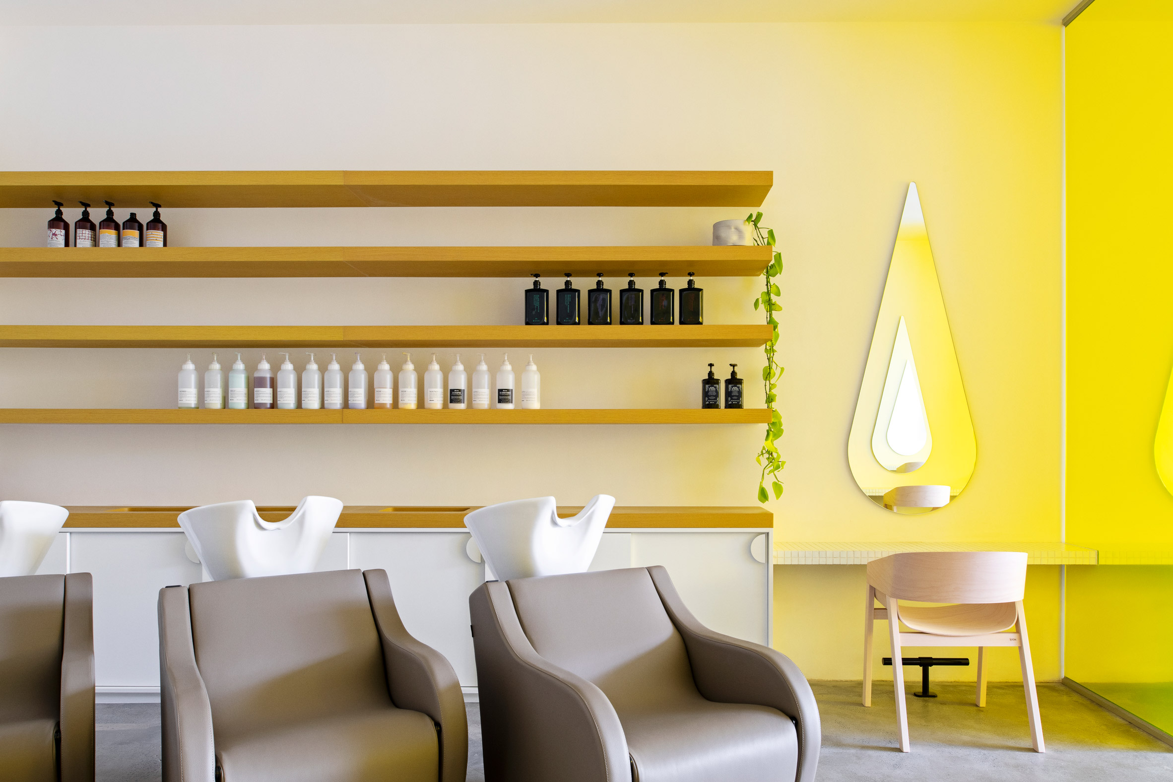
She reconfigured the layout across two floors: on the ground floor is the reception and waiting area along with hair washing and cutting stations – the latter separated with the distinctive yellow glass partitions.

The partitions create privacy and personal space while also, Brustman points out, proving useful when social distancing is required.

Hair washing stations with timber shelving at Mitch Studio hair salonThe ground floor area includes hair washing and cutting stations
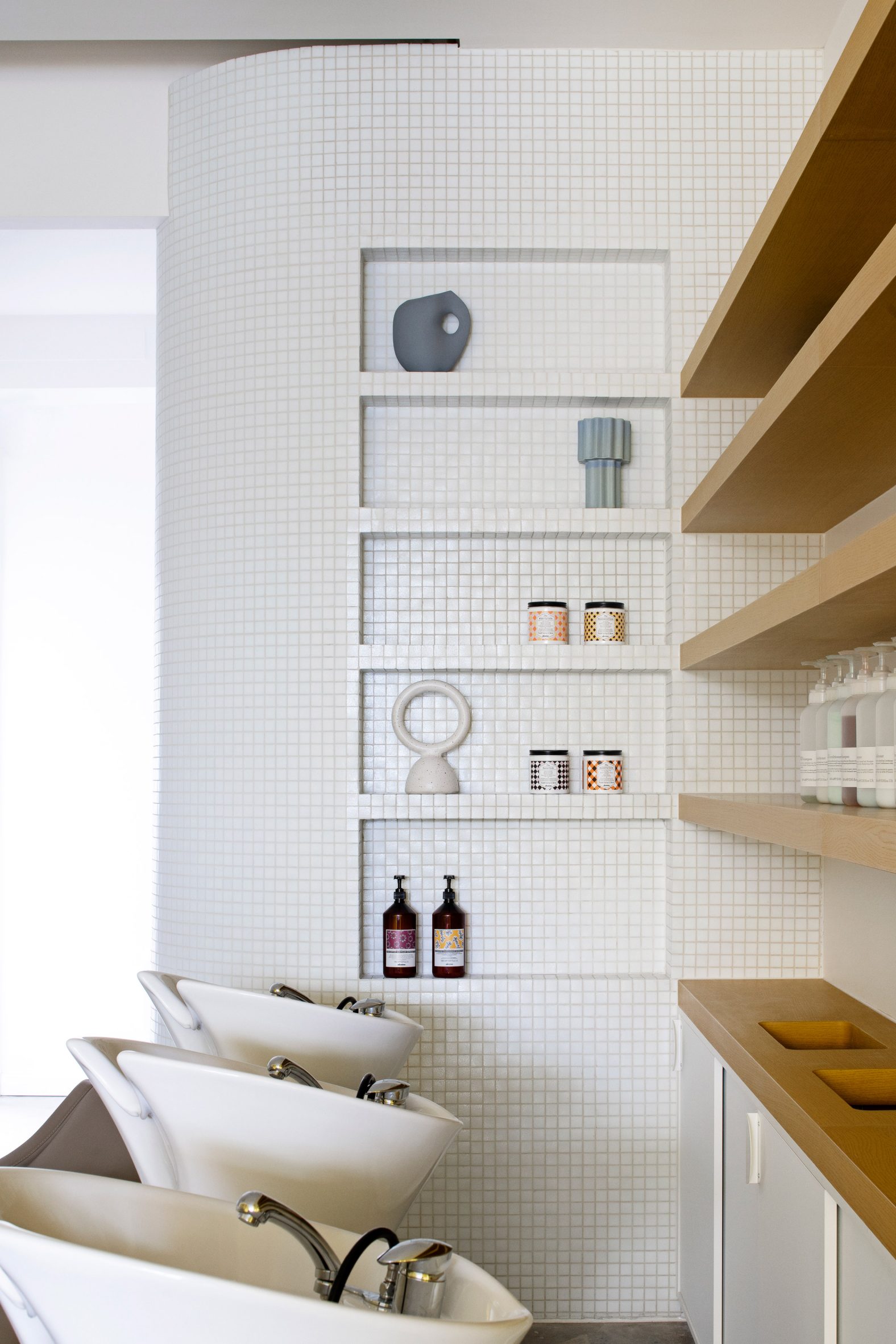
The droplet-shaped mirrors at these stations were chosen to give the salon a bespoke touch, while referencing ideas of water and washing.

"There is something lovely about the way the droplet mirrors create an infinity effect in the space, adding to the spaciousness," Brustman told Dezeen.

White-tiled built-in display shelf with decorative objects beside hair washing stations at Mitch Studio hairdressersThe space is designed to facilitate an easy flow of movement for the stylists throughout the day
All the joinery on the ground floor is bespoke, including a reception desk clad in mustard-yellow glass mosaic tiles and a retail display shelf with similar white tiles.

Most of the surfaces and finishes are in white, as is the sculptural six-arm chandelier by US design studio Entler.

[ Qali by Studio Roslyn has a lounge

Read:

Qali hair salon by Studio Roslyn is "the lovechild of art deco and Cyndi Lauper"

](https://www.dezeen.com/2021/03/24/qali-hair-salon-studio-roslyn/)

Upstairs, there are additional haircutting stations along with bathrooms, a kitchen and a small worktable – meant for customers who want to pull out their laptops while waiting for their hair treatments to take effect.

The haircutting stations here have a different configuration, facing each other but divided by mirrors. Completed with pale moulded plywood chairs, they give the space an almost cafe-like appearance.

Upstairs area with hair cutting stations and a worktable at Mitch Studio hair salon in MelbourneThe upstairs haircutting stations have a different configuration

"We wanted to keep the spaces light and airy with a great deal of airflow and enough room for the clients and staff to feel spacious and comfortable in their surrounds," Brustman said.

She also paid attention to the employees' workflow and aimed to design the space to be intuitive and relaxing for them. For instance, there are hair-recycling bins integrated into the joinery, so that stylists can dispose of waste on the spot.

Timber worktable surrounded by four lilac chairs by the window at Mitch salon MelbourneThere is also a worktable that customers can use while they wait for their hair dye to take

Brustman is a Melbourne-based interior designer whose previous work has included the Brighton Street Early Learning Centre – a childcare centre with a different bright colour palette in every room.

The photography is by Nicole England.

The post Danielle Brustman creates yellow highlights in sunny Melbourne hair salon appeared first on Dezeen.

#all #salonsandspas #interiors #australia #melbourne #salons #hairsalons #daniellebrustman

dezeen@xn--y9azesw6bu.xn--y9a3aq

Norm Architects conceives Xiamen's Basao tea parlour as an oasis of calm

image

Speckled stone counter surrounded by wooden stools in interior of Basao Tea store in Xiamen, China designed by Norm Architects

Danish practice Norm Architects has created an understated interior for the Basao teahouse in Xiamen that was designed to offer a "clear antidote" to the hustle and bustle of the Chinese port city.

Basao takes its name from Baisao, a Japanese monk who lived during the Edo period and spent the latter part of his life wandering around Kyoto and selling tea.

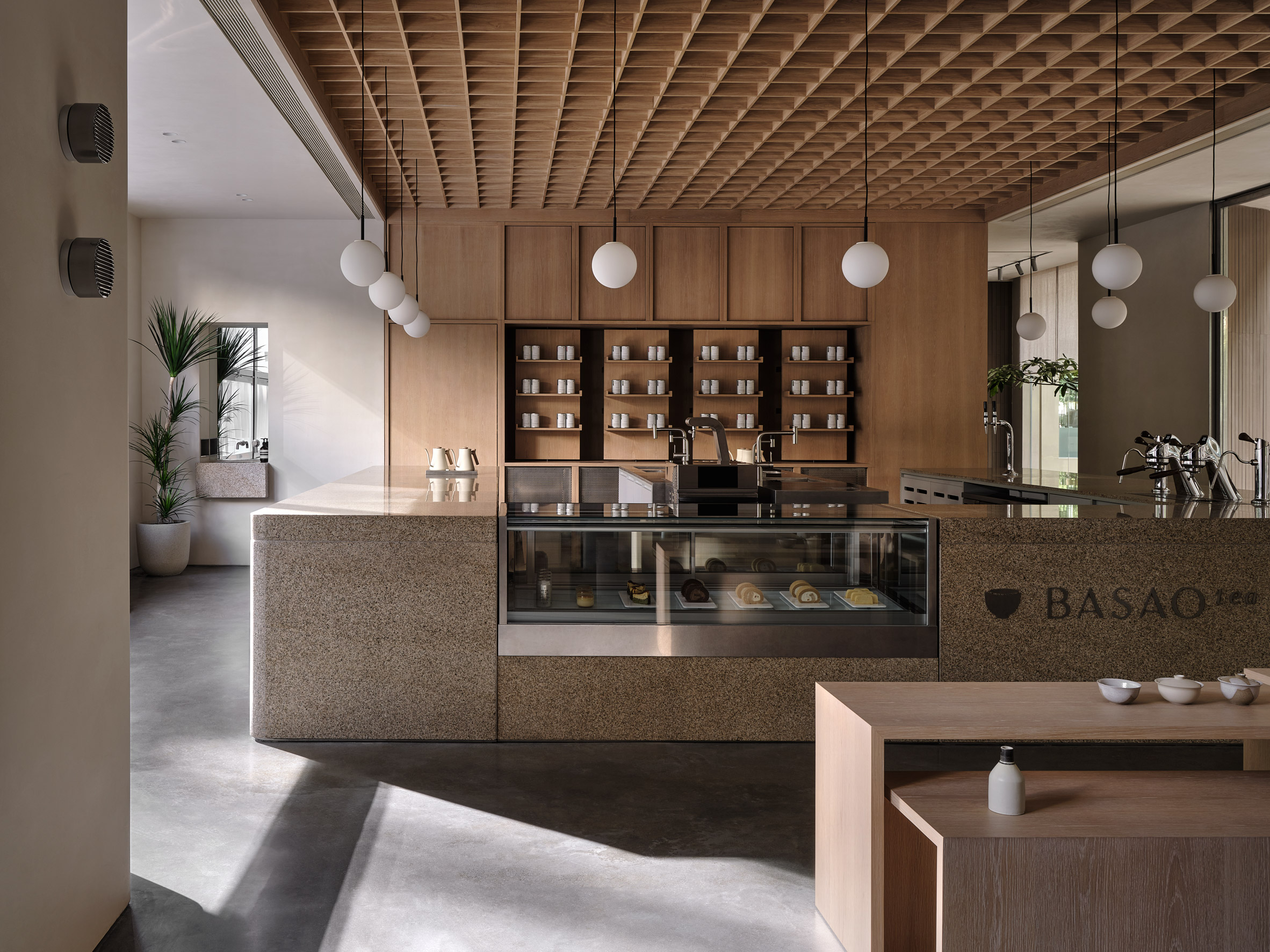
Chunky stone counter under a coffered oak ceiling in Xiamen teahouse designed by Norm ArchitectsThe Basao tea lounge is arranged around a Chinese stone counter
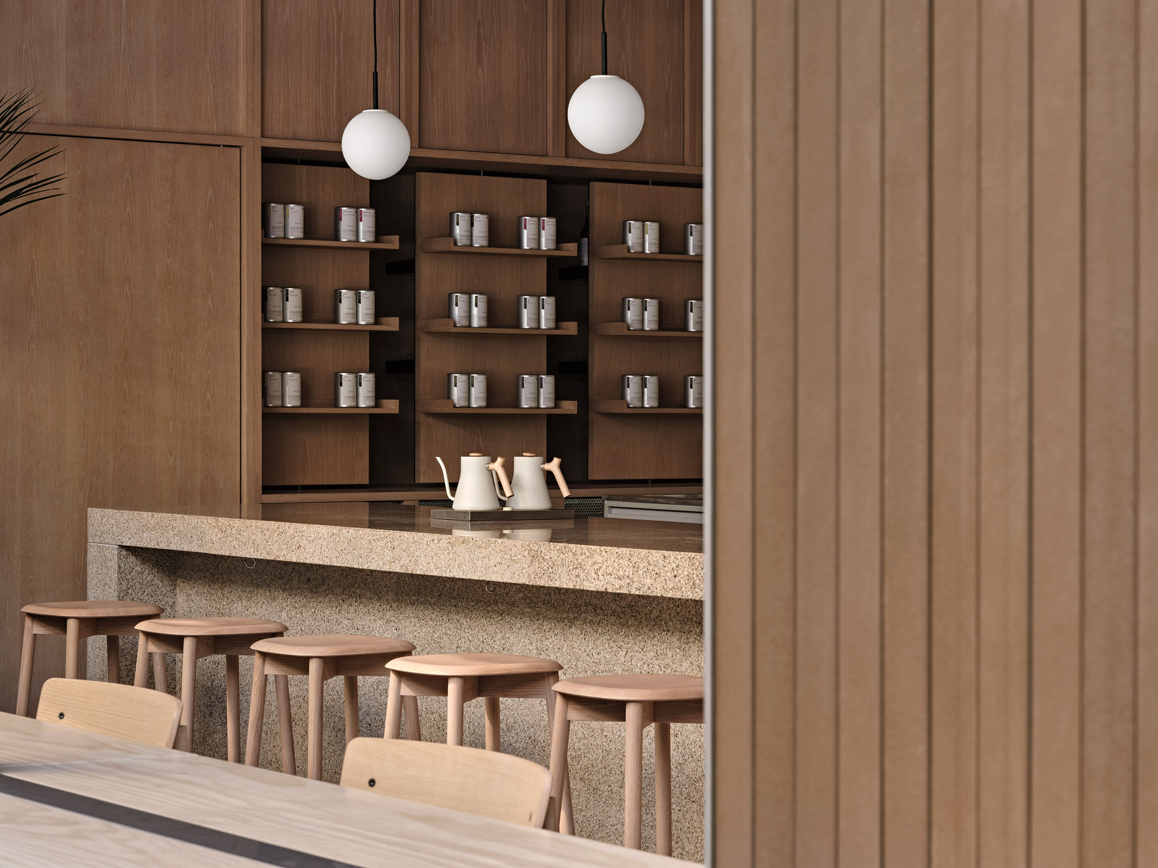
His Zen Buddhist writings were a key reference point for Norm Architects in the design for the "tea lounge", which is meant to evoke a sense of tranquillity.

"With room for quiet contemplation, the space is a clear antidote to our fast-paced on-the-go culture, instead immersing its visitors in the calming sounds of tea being prepared, poured and enjoyed," the studio said.

Speckled stone counter surrounded by wooden stools in interior of Basao tea storeSeating around the counter provides views of the brewing process
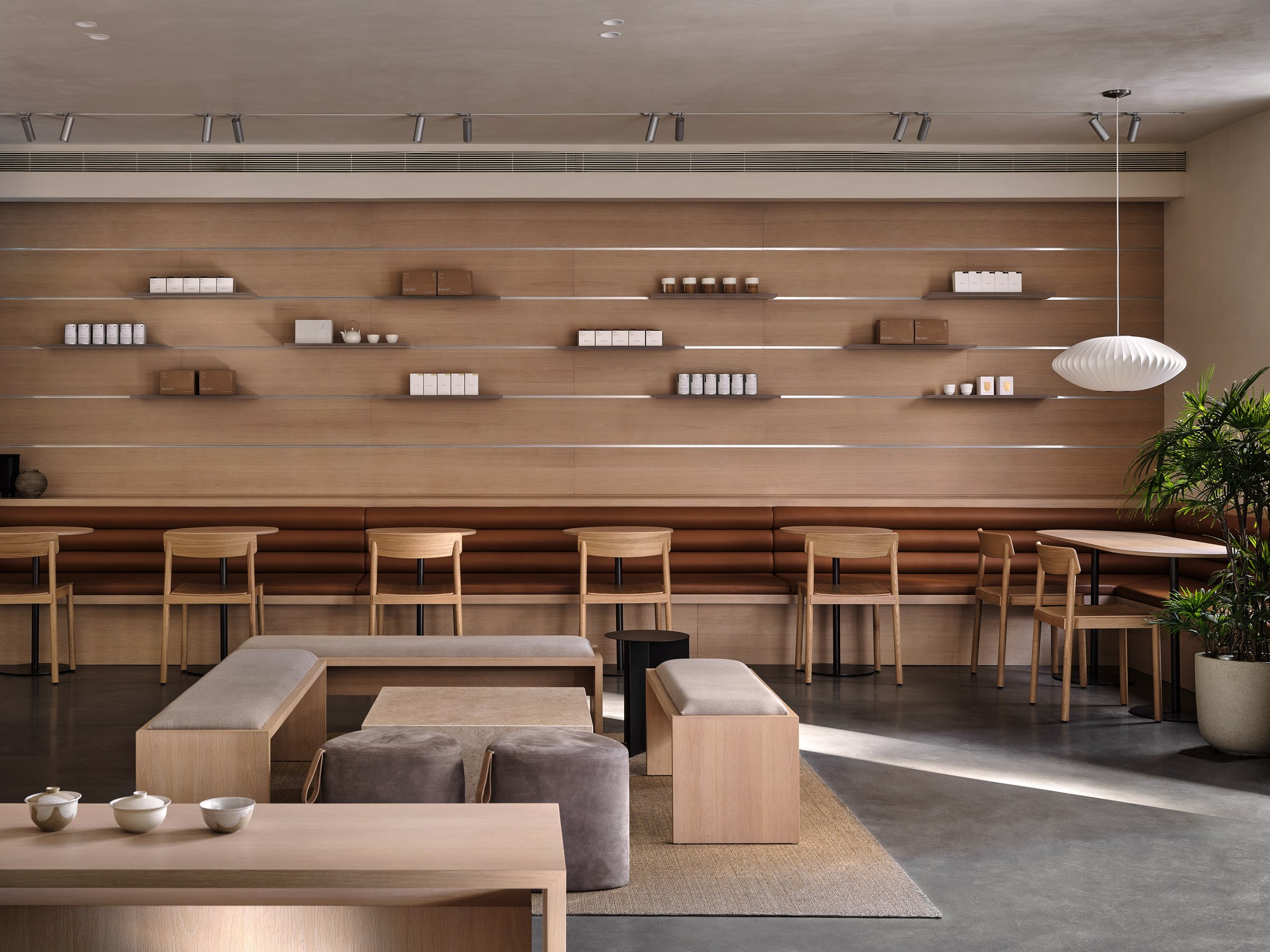
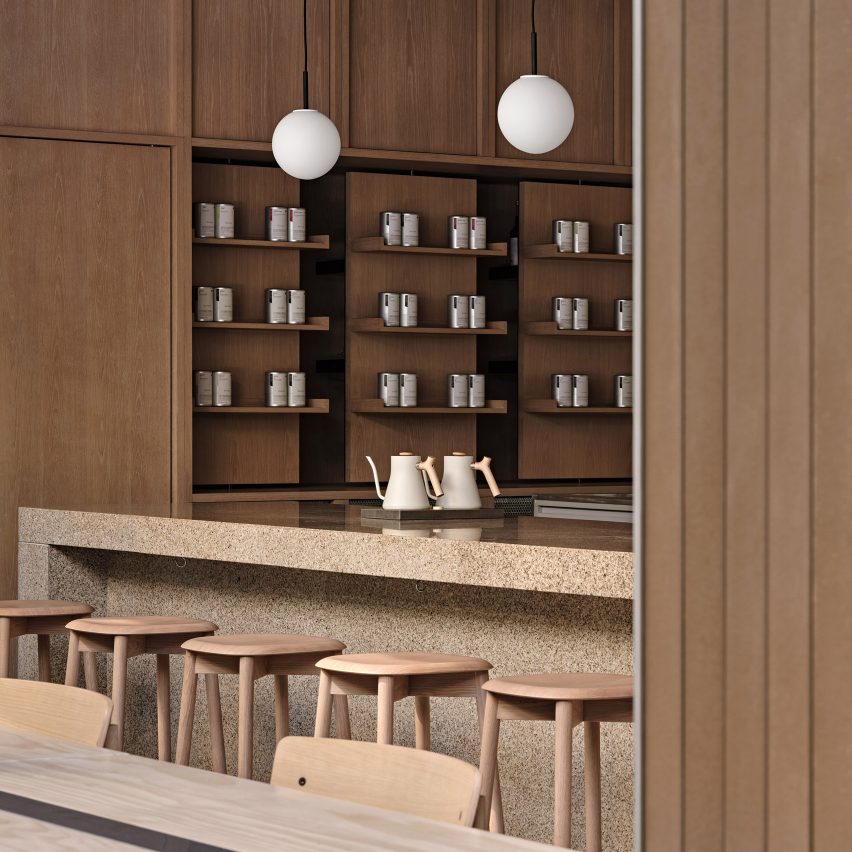
At the heart of the store is a chunky counter crafted from speckled Chinese stone that is positioned beneath a coffered oak ceiling.

Here, customers can order drinks and observe them being prepared from a couple of high stools.

A wider variety of seating is assembled on one side of the room, incorporating different tactilities and shapes from suede poufs to wooden benches and a long banquette upholstered in chestnut-brown leather.

Leather-upholstered banquette next to suede covered benches and poufs in Xiamen teahouse designed by Norm ArchitectsMore seating lies at the room's periphery
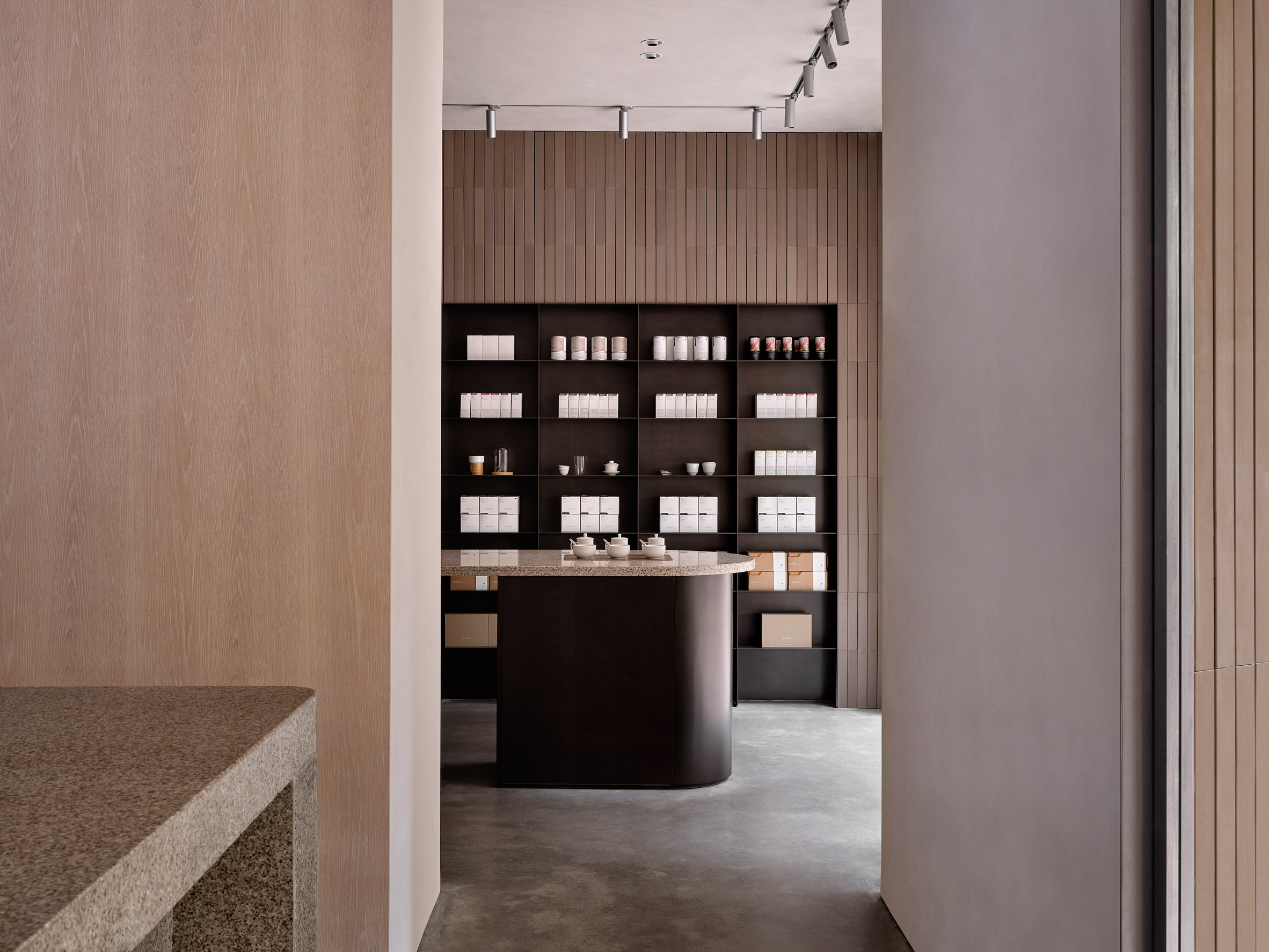
"Carefully considering the sense of touch, the experience of the space becomes an interplay of textures and temperatures in combination with contrasting polished and raw surfaces," Norm Architects explained.

To the other side of the lounge is a retail space, where Basao merchandise is showcased on black steel shelves.

[ Interior of New Mags in Copenhagen

Read:

Norm Architects designs New Mags bookstore in Copenhagen to reference old libraries

](https://www.dezeen.com/2021/10/19/norm-architects-new-mags-bookstore-copenhagen/)

More products can be presented on slim metal ledges and pivoting displays built into the tea parlour's oak-panelled walls.

Oakwood also covers the building's facade, which was modified so that its walls are sloped invitingly towards the entrance.

Back steel shelving displaying teas behind matching counter in interior of Basao Tea storeBlack steel shelves display Basao's products in the retail space
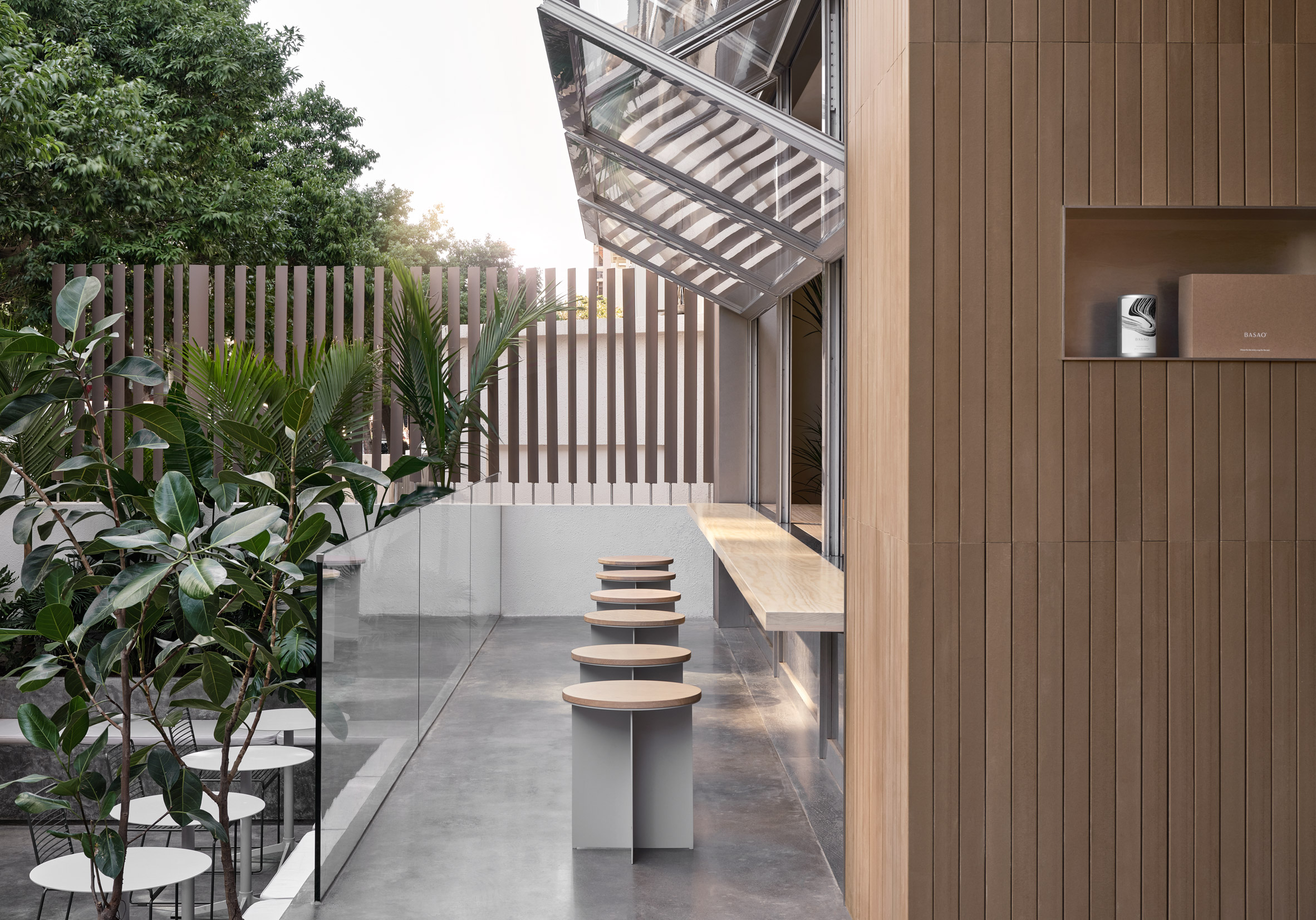
The facade is punctuated by huge windows that can be pushed up concertina-style to let fresh air and natural light into the interior.

Alternatively, customers have the option of sitting outdoors on the terrace, which is decorated with a number of leafy plants.

Row of stools in front of window of Basao Tea storeA large window allows the tea parlour's interior to be opened up to the outdoors
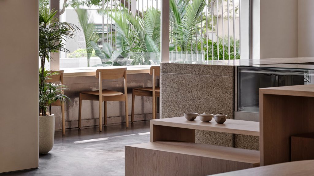
Basao is Norm Architects' first project in China.

The Copenhagen-based practise has recently completed a number of interiors in its hometown including Notabene, a shoe store with warm industrial interiors, and a bookstore that takes design cues from old-school libraries.

The photography is byJonathan Leijonhufvud.

The post Norm Architects conceives Xiamen's Basao tea parlour as an oasis of calm appeared first on Dezeen.

#restaurantsandbars #all #interiors #china #teahouses #normarchitects #hospitalitydesign #xiamen