#interiors
RCKa designs Nourish Hub to tackle food poverty in London
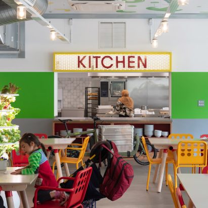

Architecture studio RCKa has transformed a row of vacant shop units in west London into a community kitchen and learning space that hopes to reduce dependency on food banks.
Located on the Edward Wood Estate in Hammersmith, Nourish Hub provides the first permanent home for UKHarvest, a charity that uses food as a tool for social impact.
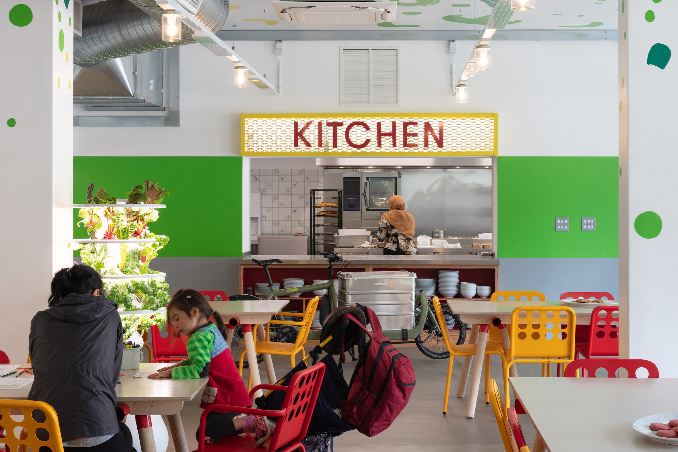 Nourish Hub is designed to feel open and accessible
With Hammersmith & Fulham the London borough with the highest dependency on food banks, Nourish Hub's ambition is not only to provide food for vulnerable local residents. It offer opportunities for people to practice cooking skills, learn about nutrition and access jobs in the food industry.
The space includes a commercial kitchen, a teaching kitchen and a flexible space that can be used as a dining room, workspace, classroom or event venue.
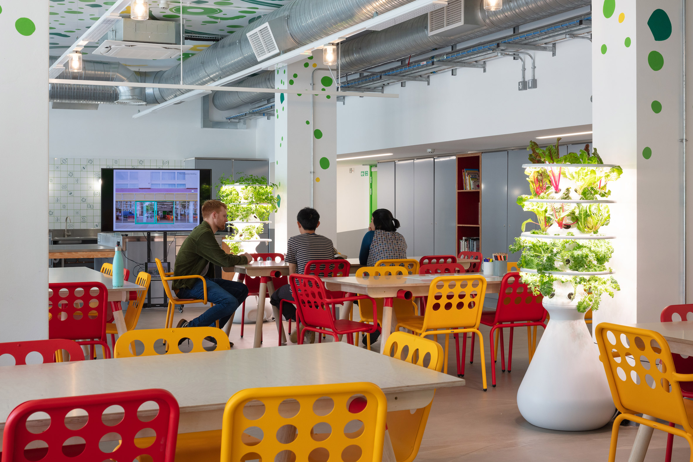 A flexible interior can be used as a dining room, classroom, workspace or event venue
RCKa's role was not only to plan the interior, but to find ways of empowering the local community to get involved in the facility and make it their own.
The design strategy focused on making the space – which previously housed a post office and a supermarket – feel as accessible as possible.
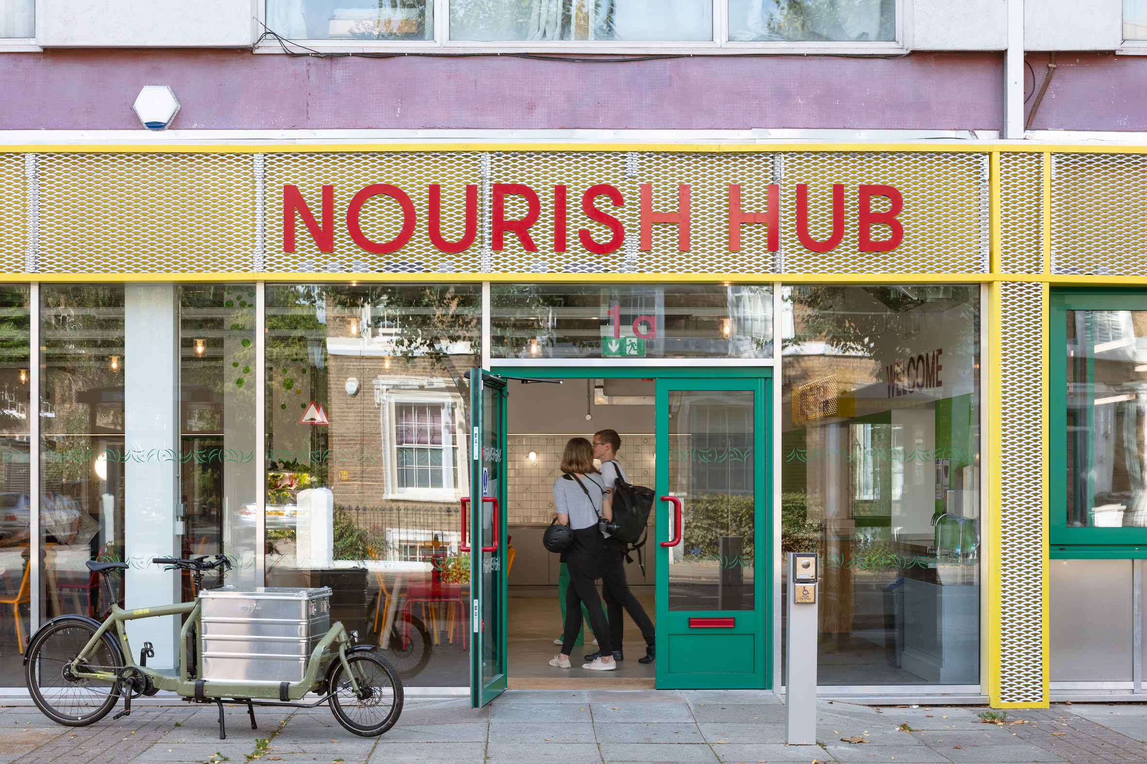 Vibrant colours and bold signage make the space more welcoming
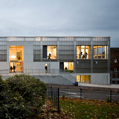
The facade can be opened up, thanks to sliding glass doors and a serving hatch, while bright colours and bold signage create a friendly feel throughout.
"Getting people through the door is the first challenge, so the Hub had to seem open and welcoming to the entire community," said RCKa director Dieter Kleiner.
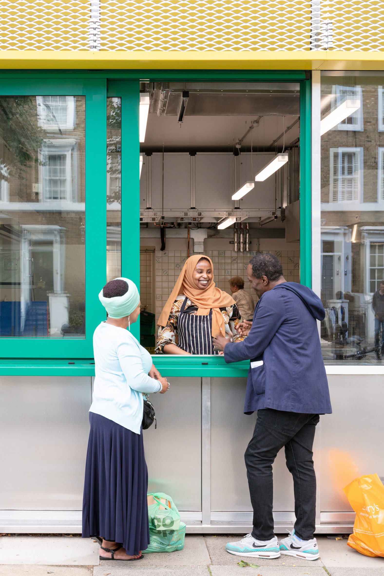 The facade integrates a serving hatch and large sliding doors
When developing the design, the architects decided against a traditional community engagement programme. Instead, they hosted a range of pop-up activities to attract the interest of local residents and learn about their experiences.
They started by painting a graphic mural over the old shutters. They also set up an outdoor kitchen, created playful questionnaire cards and hosted workshops with children.
[ 
Read:
London youth centre by RCKa features a translucent polycarbonate facade
"It wasn't about co-designing the space with local people; that wasn't what we needed," explained project architect Anthony Staples during a press tour.
"We had three aims: to raise awareness of the project, to test ideas and to establish a local identity."
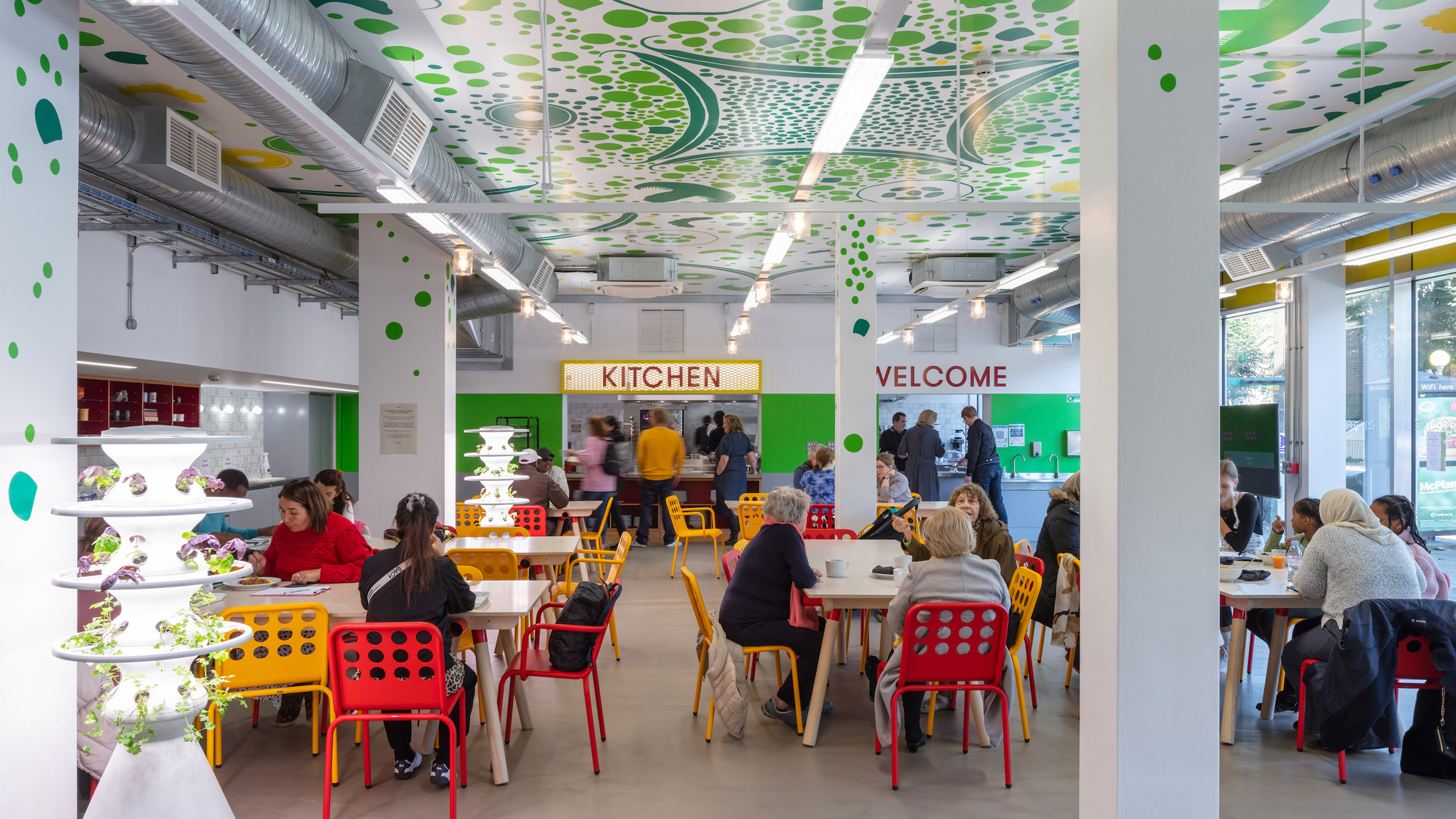 A ceiling mural design came out of a children's workshop
In one children's workshop, participants created graphic designs out of raw fruit, vegetables and grains.
One of these designs is now painted on the ceiling, while another has been turned into ceramic wall tiles.
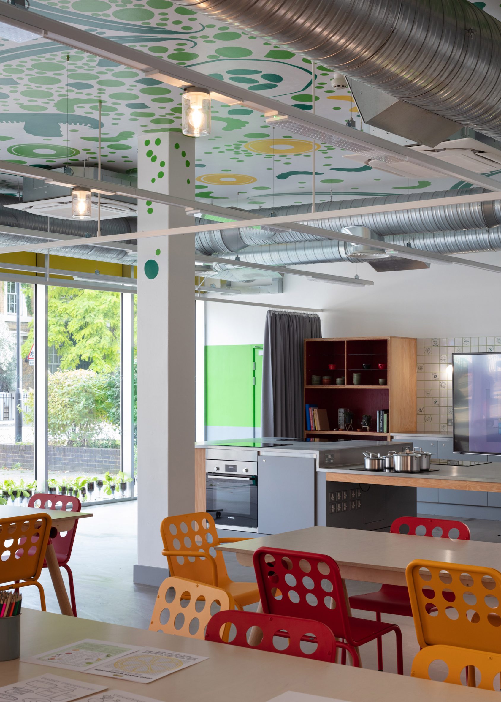 The training kitchen includes wheelchair-accessible surfaces
For the interior layout, RCKa took cues from Victorian kitchens. The teaching kitchen takes the form of a large island, while open cabinets display tableware and cookbooks.
"We were really inspired by old-fashioned kitchens, which are very performative," said Staples.
"Everything is on display, so when you go in, you feel like you want to touch and grab things."
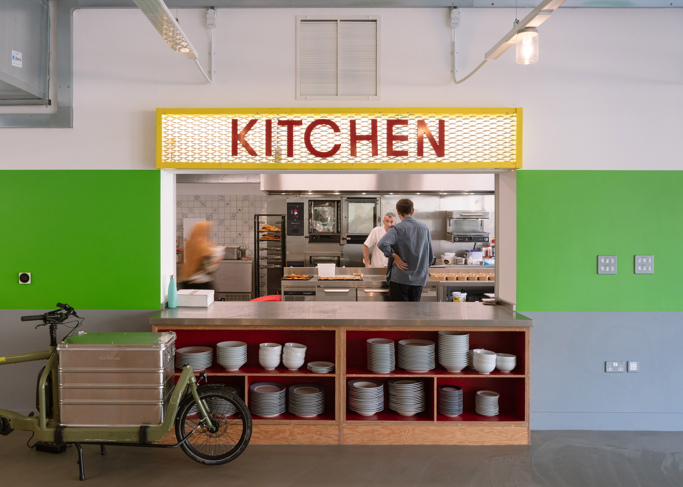 Open shelving was favoured over cupboards
The space is furnished with wooden tables, and chairs in bold shades of red and yellow.
There are also various details added in to make the space accessible to a wide range of users. These include lowered surfaces that cater to wheelchair users and a curtain that supports those with specific privacy needs.
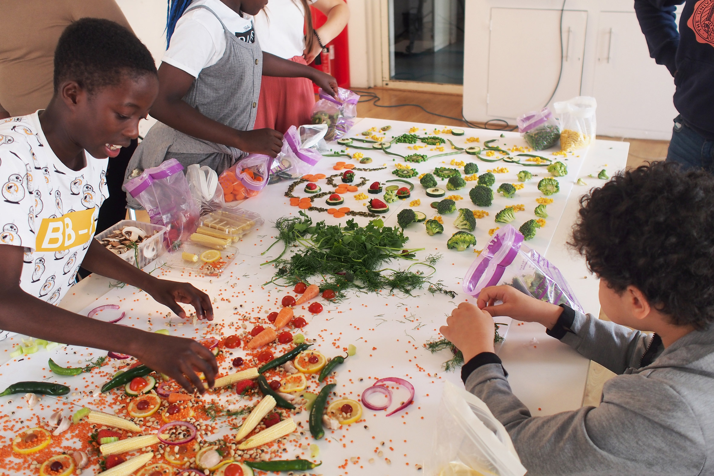 The children's design workshop also provided graphics for ceramic wall tiles
Yvonne Thomson, the CEO of UKHarvest, believes the concept can help to tackle issues of food poverty and insecurity, which impact an estimated 8.4 million people in the UK.
The project was realised with funding support from the Mayor of London's Good Growth Fund, as well as the borough, but the target is for Nourish Hub to become financially self-sufficient within three years.
"Great care has been taken to create a versatile space that enables us to facilitate positive change and meet the needs of different community groups," Thomson said.
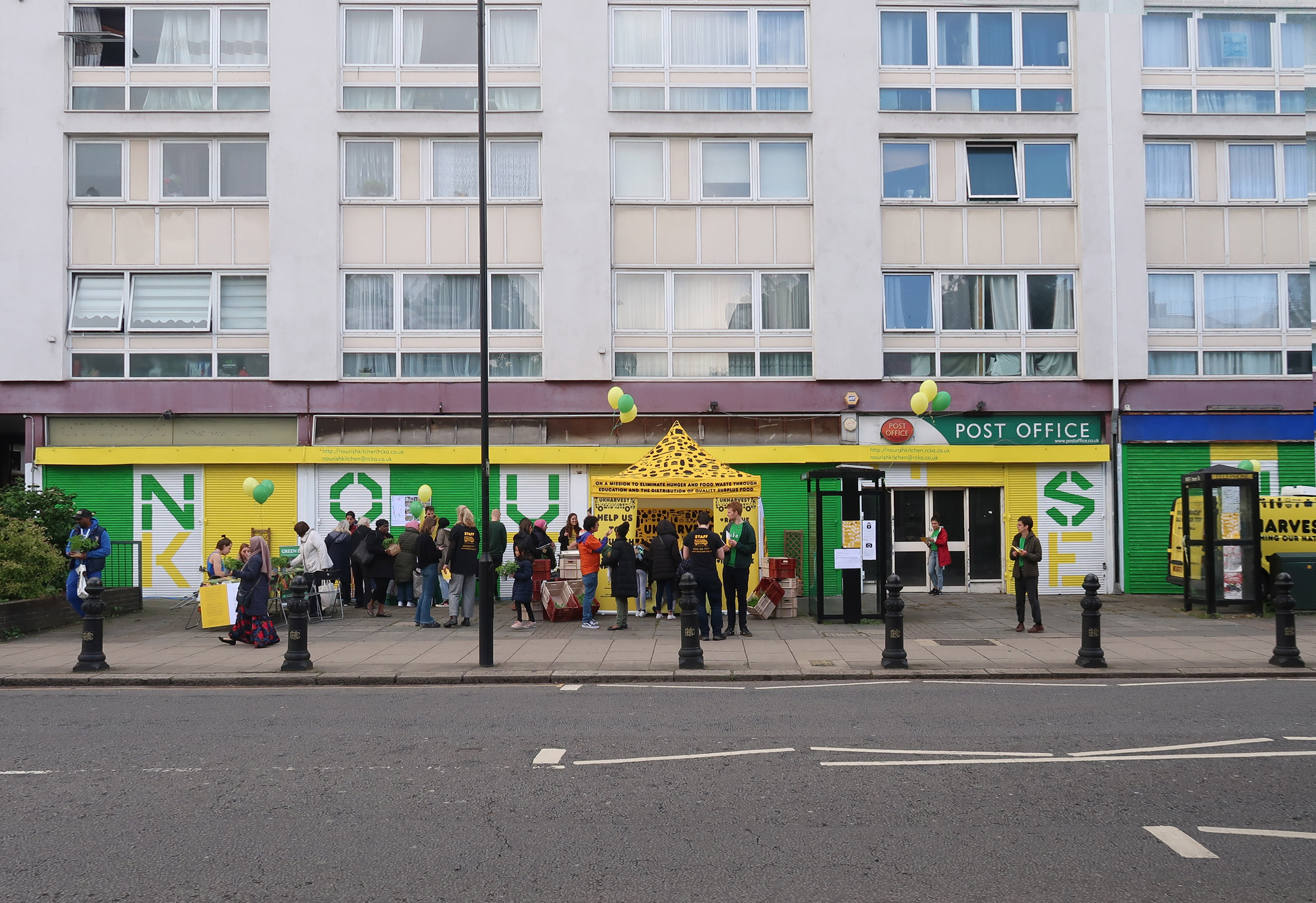 The architects began the community engagement process by painting the old shutters
RCKa compares the project with its previous work on The Granville, a community centre with the purpose of providing accessible workspace for local startups.
Staples believes these types of projects could easily be replicated across the UK, to bring change at a large scale.
"This project is totally replicable," he said. "We could roll them out in a lot of London boroughs and beyond."
Photography is byFrancisco Ibáñez Hantke.
The post RCKa designs Nourish Hub to tackle food poverty in London appeared first on Dezeen.
#all #interiors #london #uk #england #communitycentres #rcka
Ten cavernous interiors that swap corners for curves

A nursery by Junya Ishigami and MAD's Cloudscape of Haikou feature in our latest lookbook, which highlights 10 softly contoured interiors from the Dezeen archive that were modelled on the sinuous shapes of clouds and wind-smoothed caves.
Whether crafted from plaster, concrete or wooden panels, undulating walls can help to bring a sense of intimacy to otherwise large, impersonal spaces.
Beyond just looking pretty, they can also be a practical solution to integrate everything from seating to storage into the fabric of the interior, while concealing unsightly mechanical and electrical systems.
This is the latest in our series of lookbooks providing curated visual inspiration from Dezeen's image archive. For more inspiration see previous lookbooks showcasing bright-white kitchens, cosy conversation pits and self-designed homes by architects and designers.
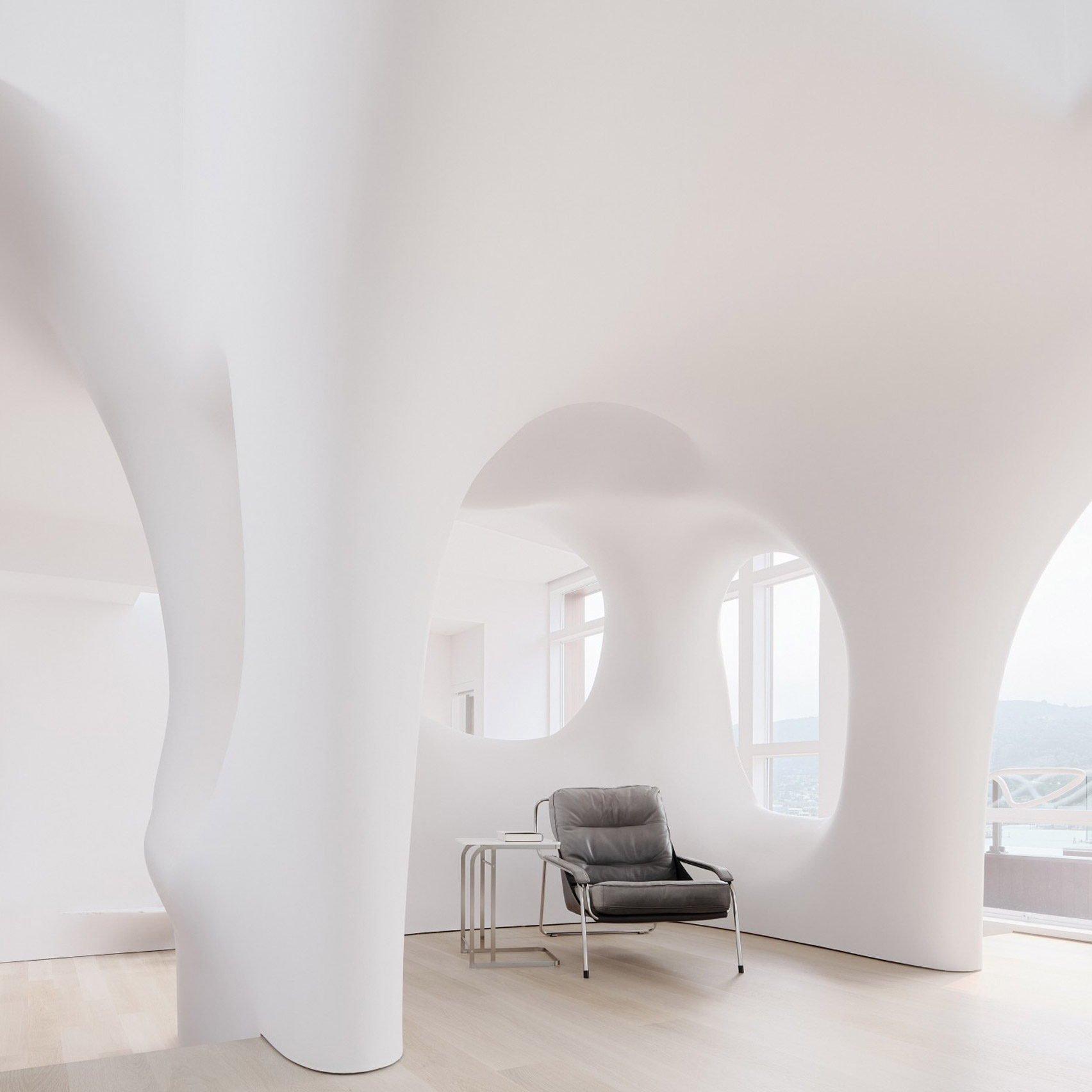
Design studio OPA subverted the rational modernist grid of this house near San Francisco by overlaying a series of cloud-like architectural features on top of its existing structural shell.
Its load-bearing columns are now enveloped by bulging white walls, while ceilings droop down to form a series of intimate seating nooks as well as a cove that surrounds the freestanding circular tub in the bathroom.
Ferrari flagship, Italy, Sybarite
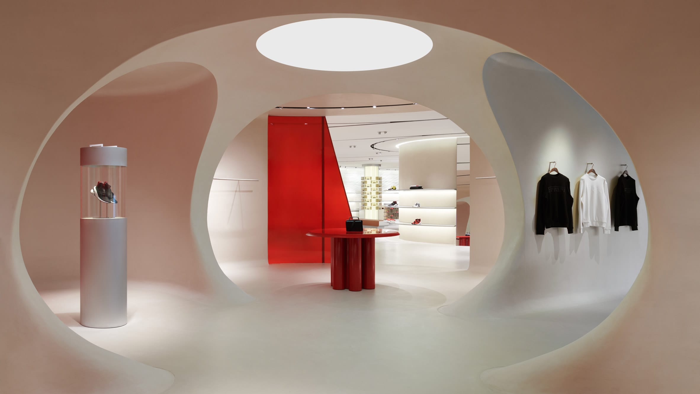
Going down a sleeker, more space-age-style route, London studio Sybarite carved out a sinuous display area at the centre of Ferrari's lifestyle concept store in Maranello to house the carmaker's debut fashion collection.
The otherwise open-plan interior is cast in shades of glossy red and white and also incorporates touches of mahogany, which was used to make Ferrari's original Enrico Nardi steering wheels of the 1950s and 1960s.
Find out more about the Ferrari flagship ›
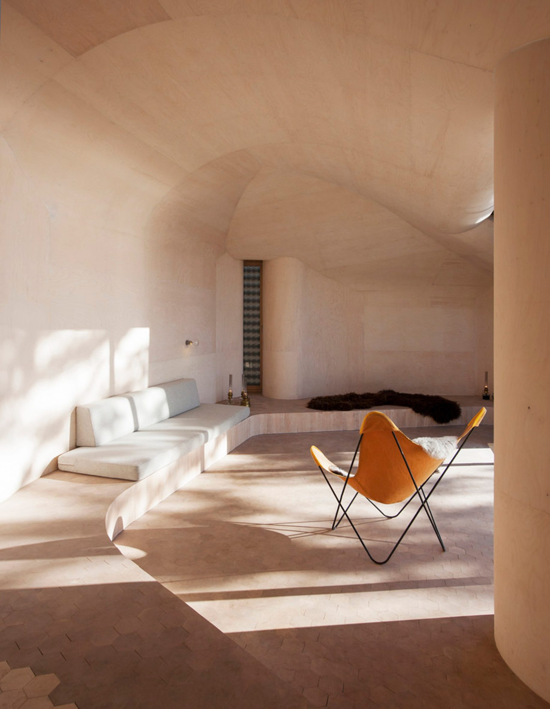 Photo is by Lars Petter Pettersen
Cabin at Norderhov, Norway, by Atelier Oslo
Curved birchwood panels engulf the walls and ceilings of this cabin, turning it into a cosy refuge on the banks of Norway's Lake Steinsfjorden while sweeping windows provide panoramic views over the natural landscape.
Like a winding tunnel, the interior was designed as one continuous space, with the bedroom cordoned off from the open floor plan by a heavy grey curtain.
Find out more about the Cabin at Norderhov ›
Two Holiday Houses in Firostefani, Greece, by Kapsimalis Architects
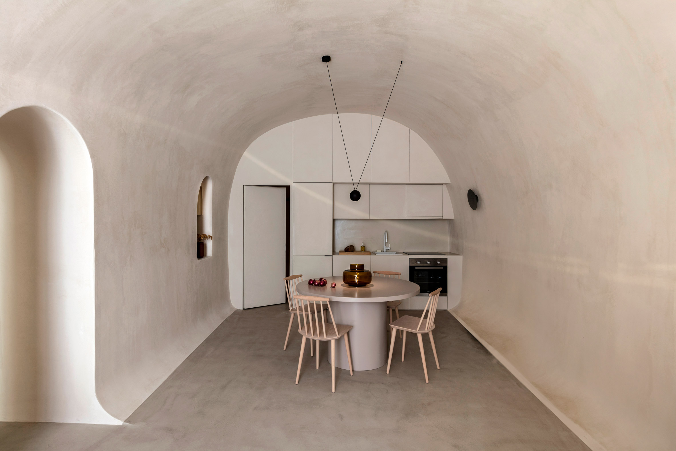
Three rocky vaulted caves, which once provided additional storage space for a traditional dwelling on Santorini, were smoothed out and finished with earthy-hued plaster to create this summer house by local practice Kapsimalis Architects.
Colours, finishes and fittings throughout the interior were designed to reflect the building's humble origins, incorporating arched niches and doorways, flush built-in storage and furniture made by local craftsmen.
Find out more about Two Holiday Houses in Firostefani ›
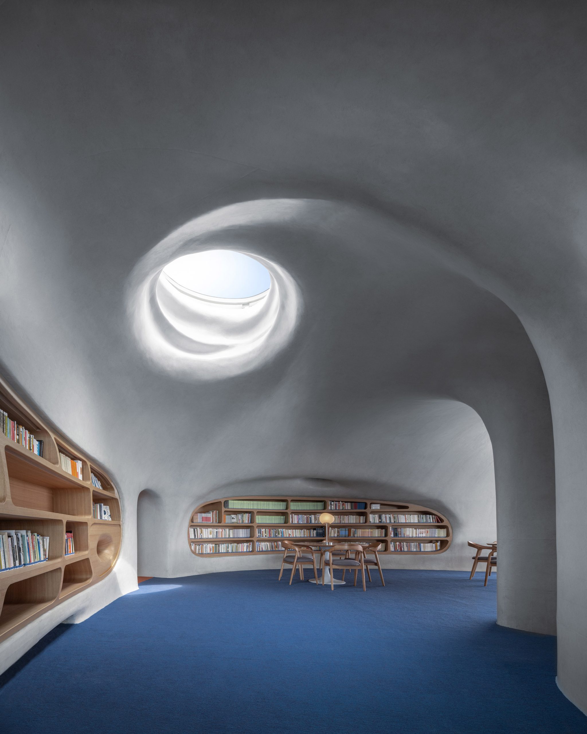
Cloudscape of Haikou, China, by MAD
Designed to evoke "a wormhole that transcends time and space", the interior and exterior of MAD's library on Hainan Island were cast as one continuous vessel without any right angles.
On the inside, the sinuous white concrete shell forms small reading nooks and bookcases recessed into the walls, while concealing all of the building's electrics and plumbing.
Find out more about Cloud of Haikou ›
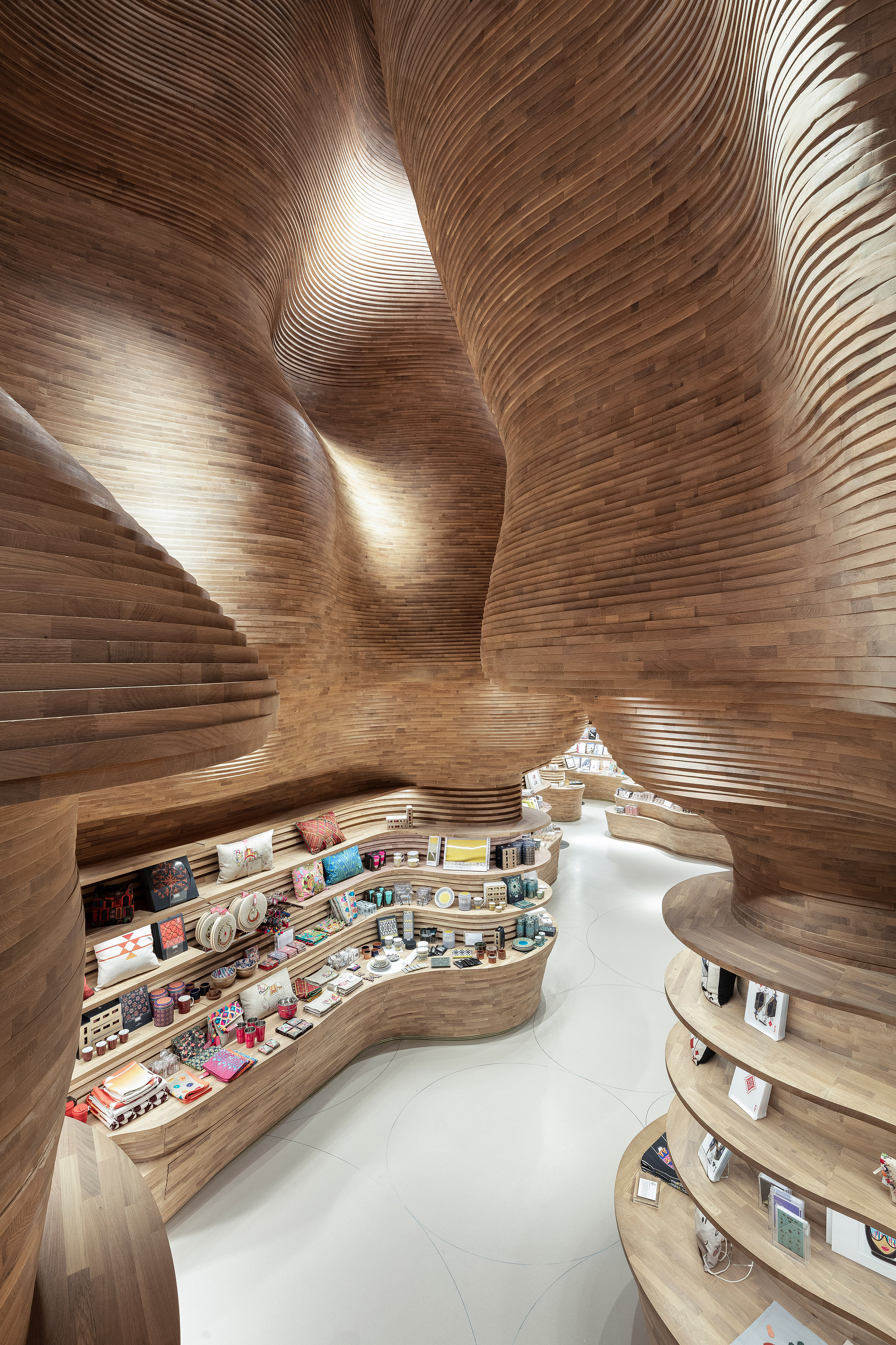
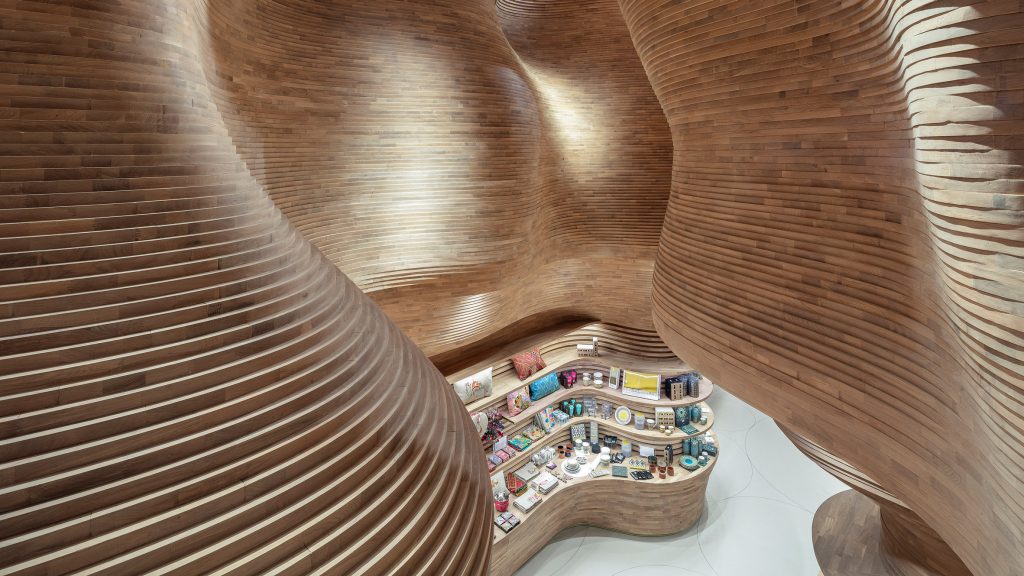
National Museum of Qatar gift shop, Qatar, by Koichi Takada Architects
Around 40,000 slabs of wood were stacked on top of each other and assembled by hand to form the soaring walls and built-in shelves of the gift shop in the National Museum of Qatar.
The interior, much like the Jean Nouvel-designed building, pays homage to Qatar's desert landscape – particularly the crystal-crusted cavern of Dahl Al Misfir, which tunnels deep into the earth outside Doha.
Find out more about the gift shop ›
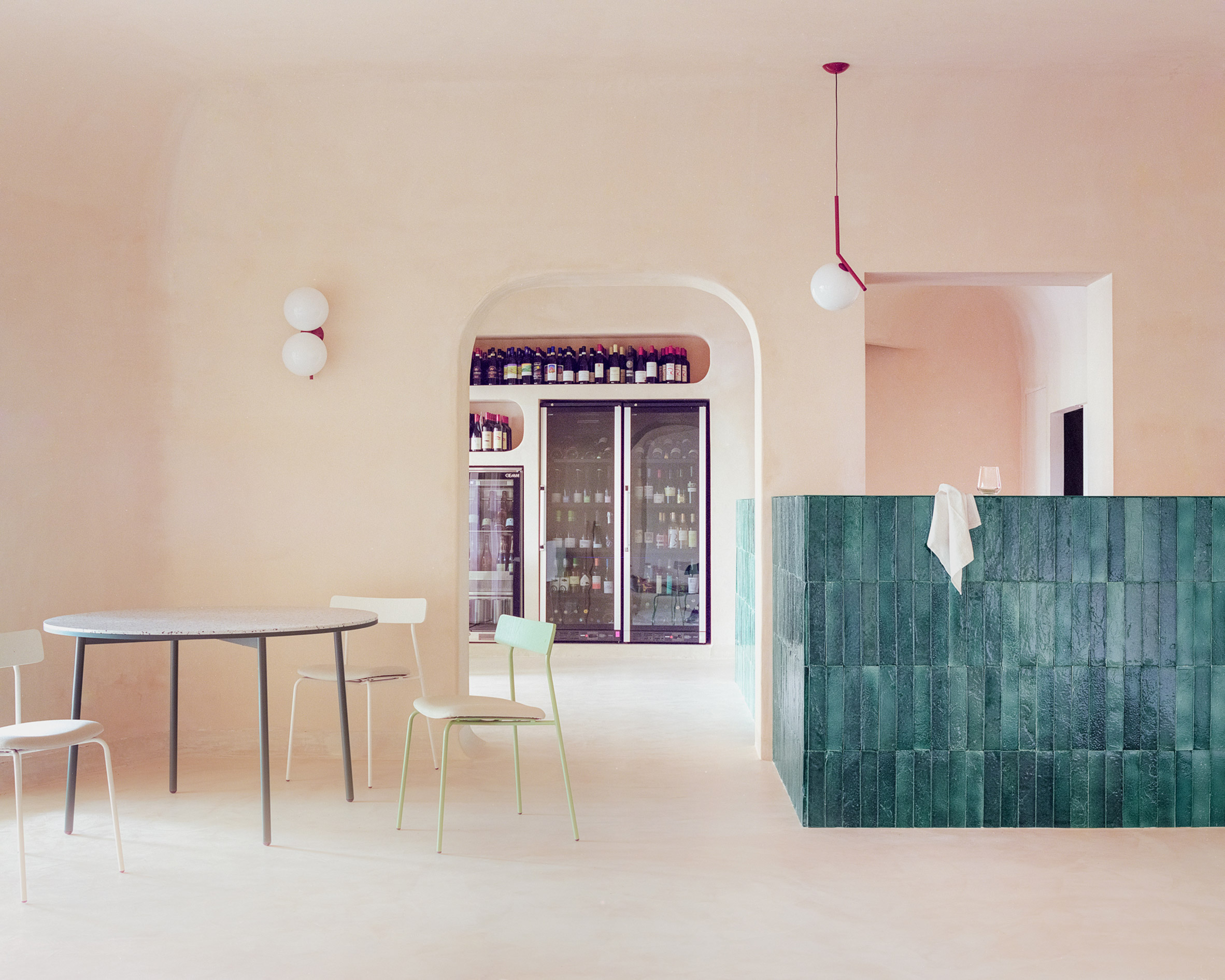
Myrto, Sardinia, by Studio Wok
Studio Wok looked to the way that the wind carves granite rocks on the Sardinian coast into sinuous, almost architectural structures when designing this pizzeria, set in the island's port town of Porto Cervo.
This erosive process is referenced in the restaurant's curved, sandy pink plaster walls and arched windows, which are complemented by custom furnishings including a tiled counter in varying shades of green that echo the colours of local shrubs.
Cloud Garden, Japan, by Junya Ishigami
Rather than covering up the bulky columns found in this high-rise office block in Atsugi, Junya Ishigami converted its former cafeteria into a nursery by inserting wiggly concrete partitions, creating archways and pathways as well as various spaces for play.
"There are crevices that only children can pass through, and absent spaces that are considered large even for adults," Ishigami said. "It is a space that softly ties in various objects and scales."
Find out more about Cloud Garden ›
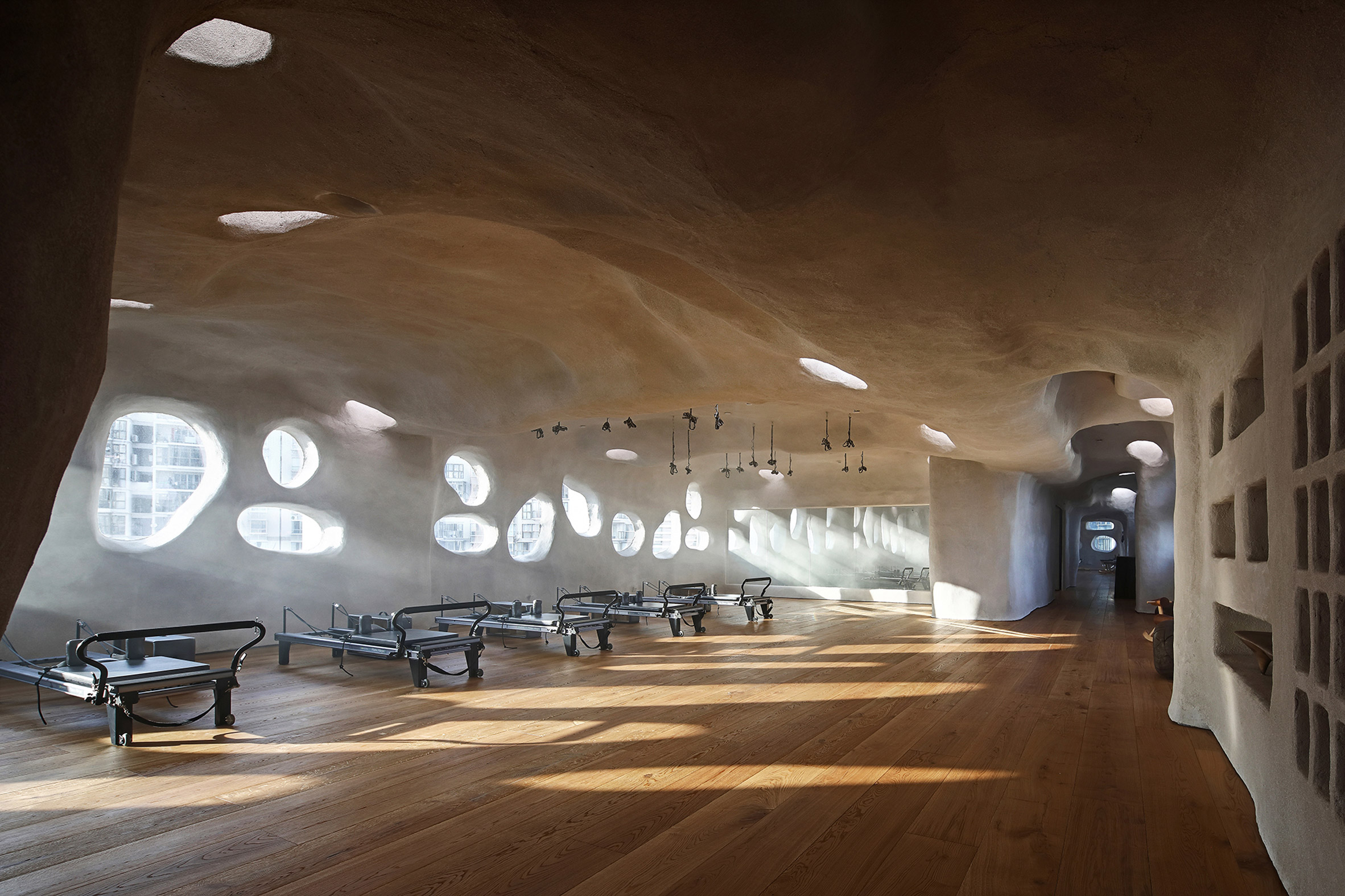 Photo is by 1988 Photography Studio
TT Pilates, China, by Wanmu Shazi
Designer Wanmu Shazi used micro-cement to cover up not just the walls but also most of the windows in the TT Pilates studio, which is located in a typical high-rise office building in Xiamen.
Only a few organically-shaped openings allow visitors to catch glimpses of the sky while letting light dapple into the interior, in a bid to shut out the usual hustle and bustle of the Chinese port city.
Find out more about TT Pilates ›

Cedarwood panelling creates an undulating terrain inside this sauna in Canada, curving up from the floor to form stepped seating and skewed porthole windows as well as enveloping the wood-burning stove.
Set on a craggy outcrop on the shore of Lake Huron, it was designed to resemble a seaside grotto carved out by the water, while its exterior was moulded perfectly to the rock formation using a 3D scanner.
This is the latest in our series of lookbooks providing curated visual inspiration from Dezeen's image archive. For more inspiration see previous lookbooks showcasingbright-white kitchens, cosy conversation pits and self-designed homes by architects and designers.
The post Ten cavernous interiors that swap corners for curves appeared first on Dezeen.
#all #interiors #lookbooks #instagram #clouds #caves #roundups
GS Design repeats arch motifs throughout Sumei Skyline Coast hotel on Hainan Island

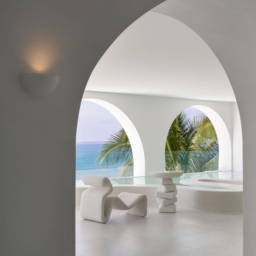
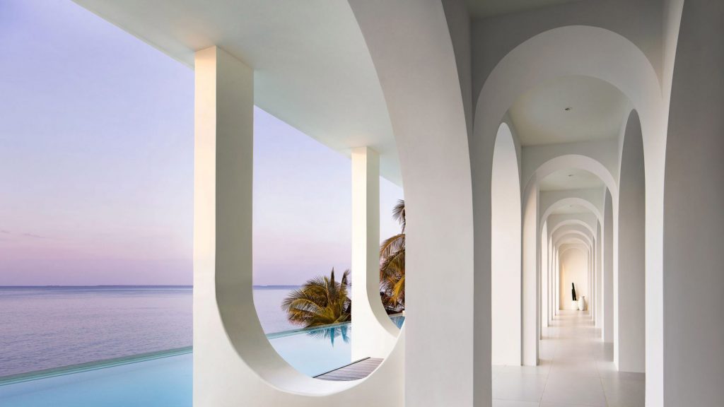
Cresting ocean waves served as a blueprint for the arched forms found on the interior and exterior of this beachside hotel that GS Design has created in Sanya, China.
Located on the tropical island of Hainan, the Sumei Skyline Coast hotel was designed to reference its immediate environment.
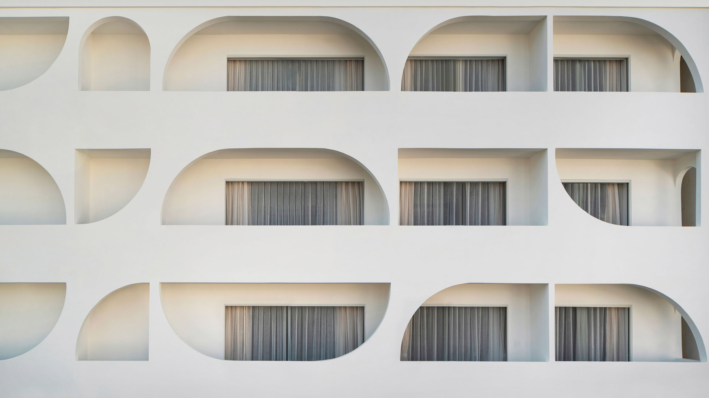 Arches feature on the interior and exterior of the Sumei Skyline Coast hotel
The building's facade is punctuated by curved windows and balconies that suggest rolling waves, and is painted in a crisp shade of white to contrast the rich blues of the surrounding sea and sky.
"We worked to craft the space into a timely and sophisticated art piece with a long lifespan of usage by adopting this classic colour," explained Chinese architecture firm GS Design.
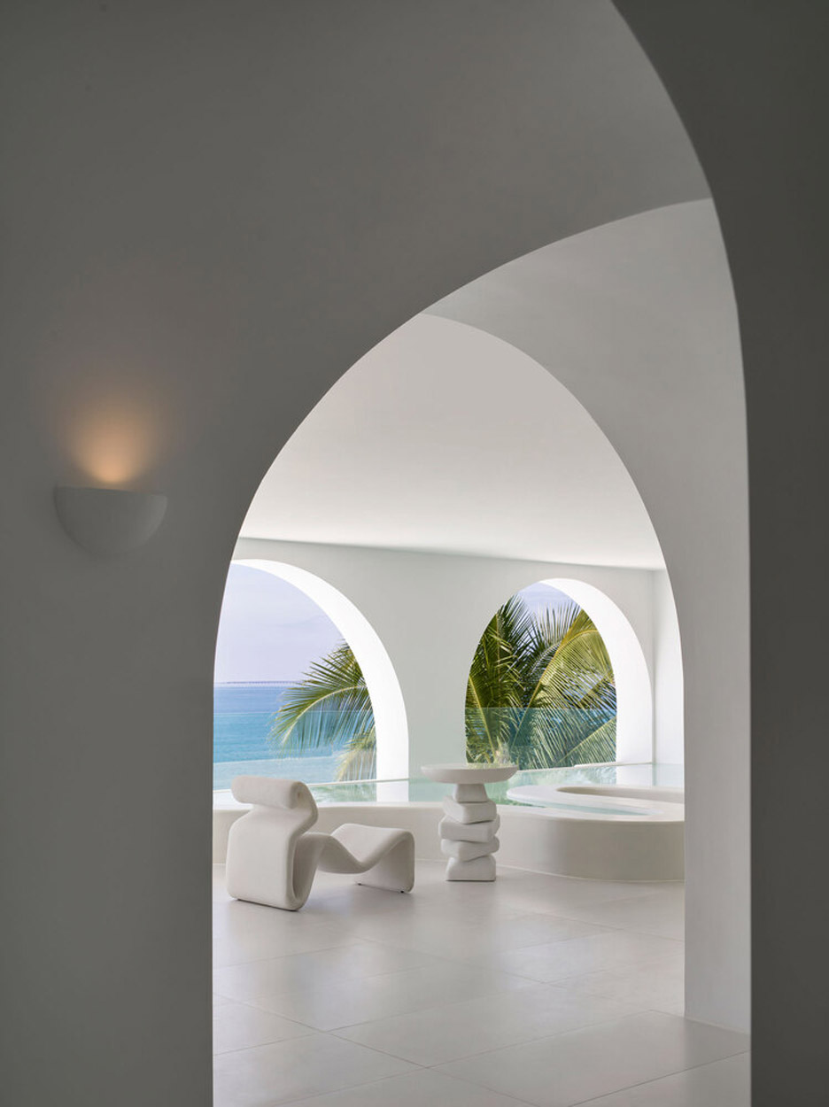 Sculptural white furnishings decorate the lounge area
On the ground floor, a series of upside-down arches runs along the wooden decking adjoining the infinity pool.
More spots for swimming are found on the expansive roof terrace as well as in the first-floor lounge, where stepping stones lead over a curvy-edged indoor pool.
The light-filled room is otherwise dressed with a couple of potted plants and an array of sculptural white armchairs with matching side tables.
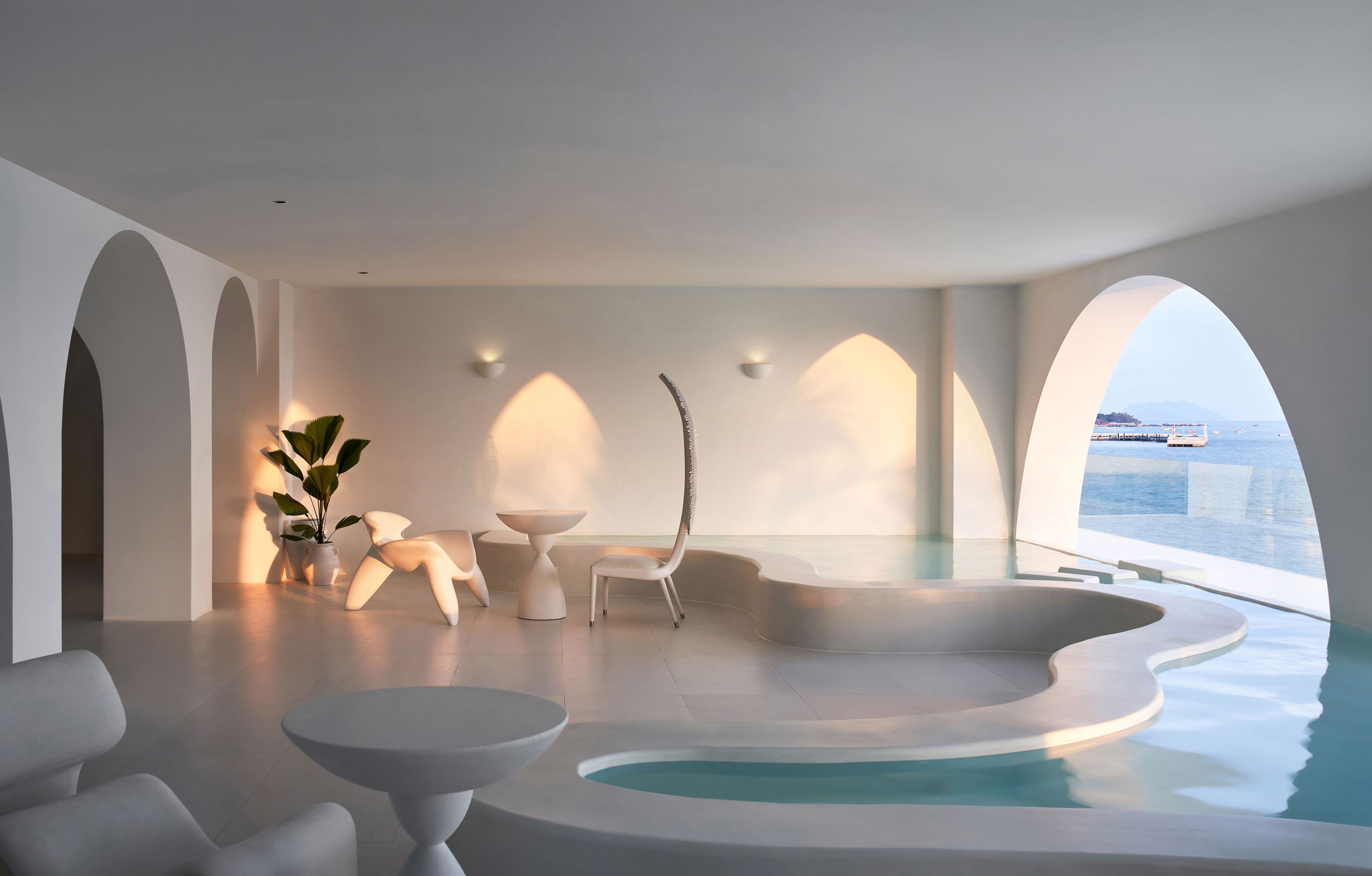 Stepping stones lead over the curvy-edged pool
The curved shapes seen on Sumei Skyline Coast's exterior are echoed throughout its guest rooms, which are accessed via vaulted corridors.
Some rooms have circular skylights or huge round headboards that project over the beds. Others feature arched recesses accommodating cushioned bench seats or vanities.
[ 
Read:
Anonimous and JAHS repurpose historic Querétaro villa as a boutique hotel
](https://www.dezeen.com/2022/01/27/ta-hotel-de-diseno-historic-villa-queretaro-mexico-anonimous-jahs/)
All bathrooms come complete with a standalone tub, positioned next to the windows to give guests optimum views of the island beyond.
In keeping with the rest of the hotel, the guest rooms are finished completely in white with textural interest provided by tufted beige decorative cushions that are scattered over the soft furnishings.
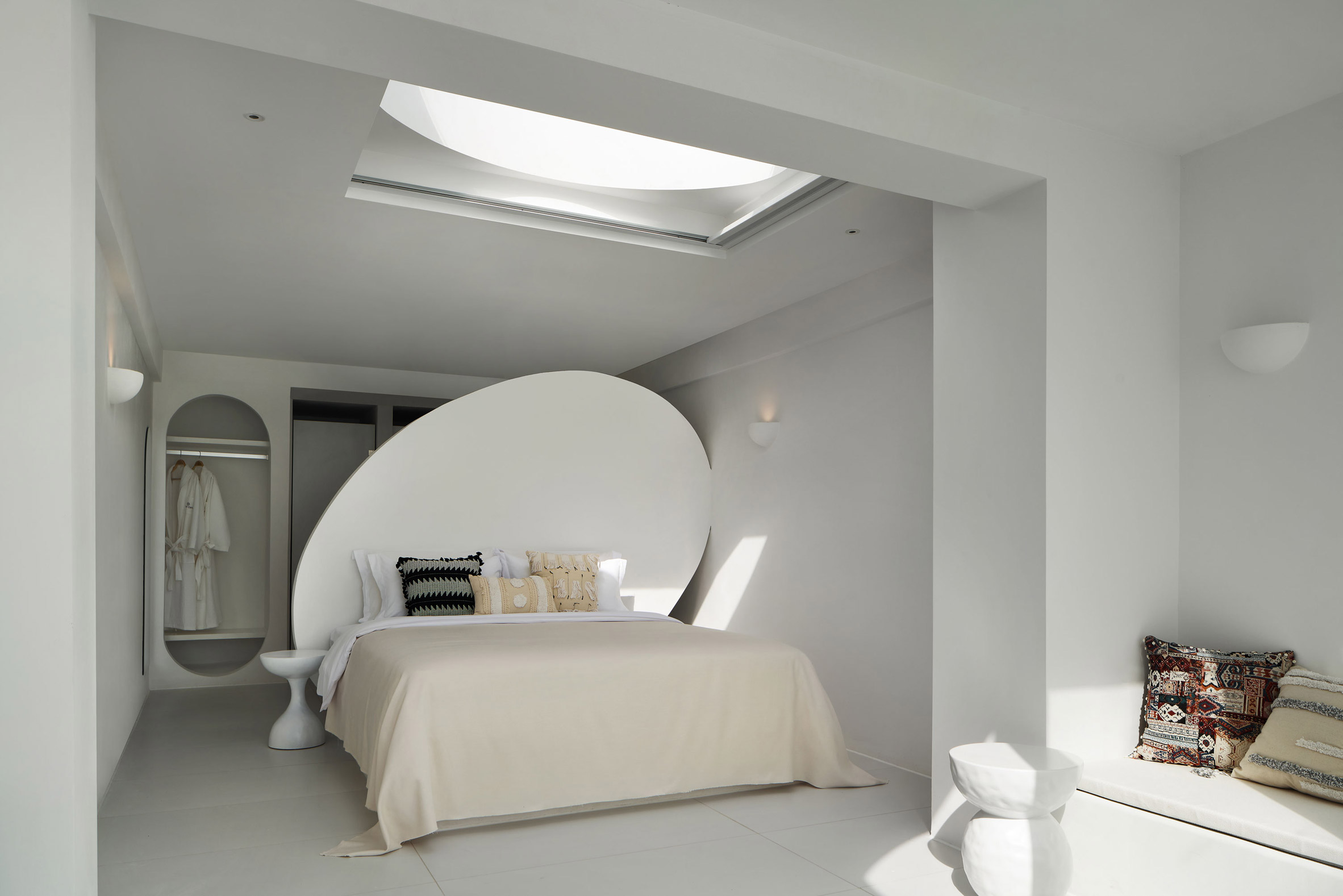 Arched or rounded forms are incorporated into the guest rooms
GS Design was established in 2014 and is based in Shenzhen.
The studio's Sumei Skyline Coast project joins a number of hotels that have recently opened across China. Among them is BAN Villa, which was designed to look like a "floating village", and Grotto Retreat Xiyaotou, a hotel modelled on ancient cave dwellings.
The photography is by Ao Xiang.
Project credits:
Architecture, interiors and furnishing: GS Design
Design directors: Liangchao Li, Yuanman Huang
Design team: Chao Li, Zigeng Luo
Furnishing director: Yu Feng
The post GS Design repeats arch motifs throughout Sumei Skyline Coast hotel on Hainan Island appeared first on Dezeen.
#all #interiors #hotels #instagram #china #arches #sanya #hainanisland
Ten home interiors with distinctive terrazzo floors
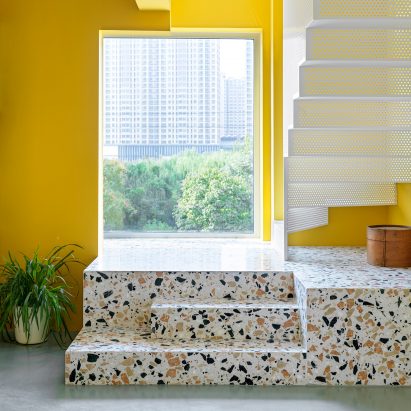

Terrazzo flooring adds character to the home and can be used everywhere from living rooms to bathrooms. For our latest lookbook, we've collected 10 interiors that make effective use of the sturdy material.
Durable and easy to clean, terrazzo has been used to make floors for centuries since the composite material first originated in Venice.
Traditionally, it has consisted of chunks of marble or granite set in cement with a ground and polished surface, but modern resin-based versions have allowed for a huge variety of shapes, colours and formations.
This lookbook features terrazzo floors in living rooms, kitchens, bathrooms, hallways and staircases, in a number of different shades and styles.
It is the latest roundup in our Dezeen Lookbooks series providing visual inspiration for the home. Previous lookbooks feature interiors with conversation pits, glass block walls and wood panelling.
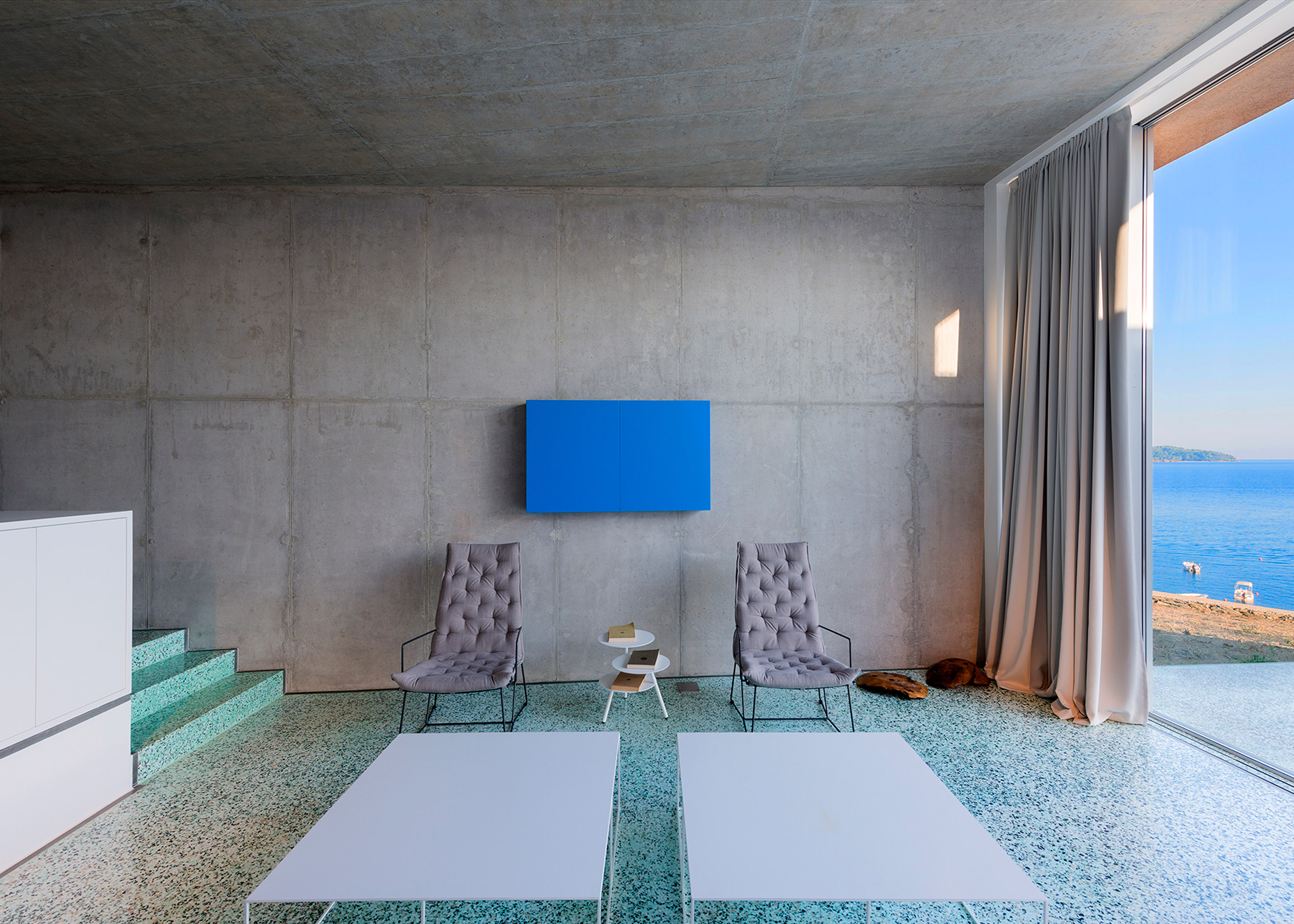 Photo is by Yiorgis Yerolymbos
House in Achladies, Greece, by Lydia Xynogala
This house, perched on a hillside overlooking the ocean on the Greek island of Skiathos, has striking aquamarine terrazzo flooring throughout.
Architect Lydia Xynogala hoped to draw upon the region's history by using the material alongside marble and plaster render.
Find out more about House in Achladies ›
RaeRae House, Australia, by Austin Maynard Architects
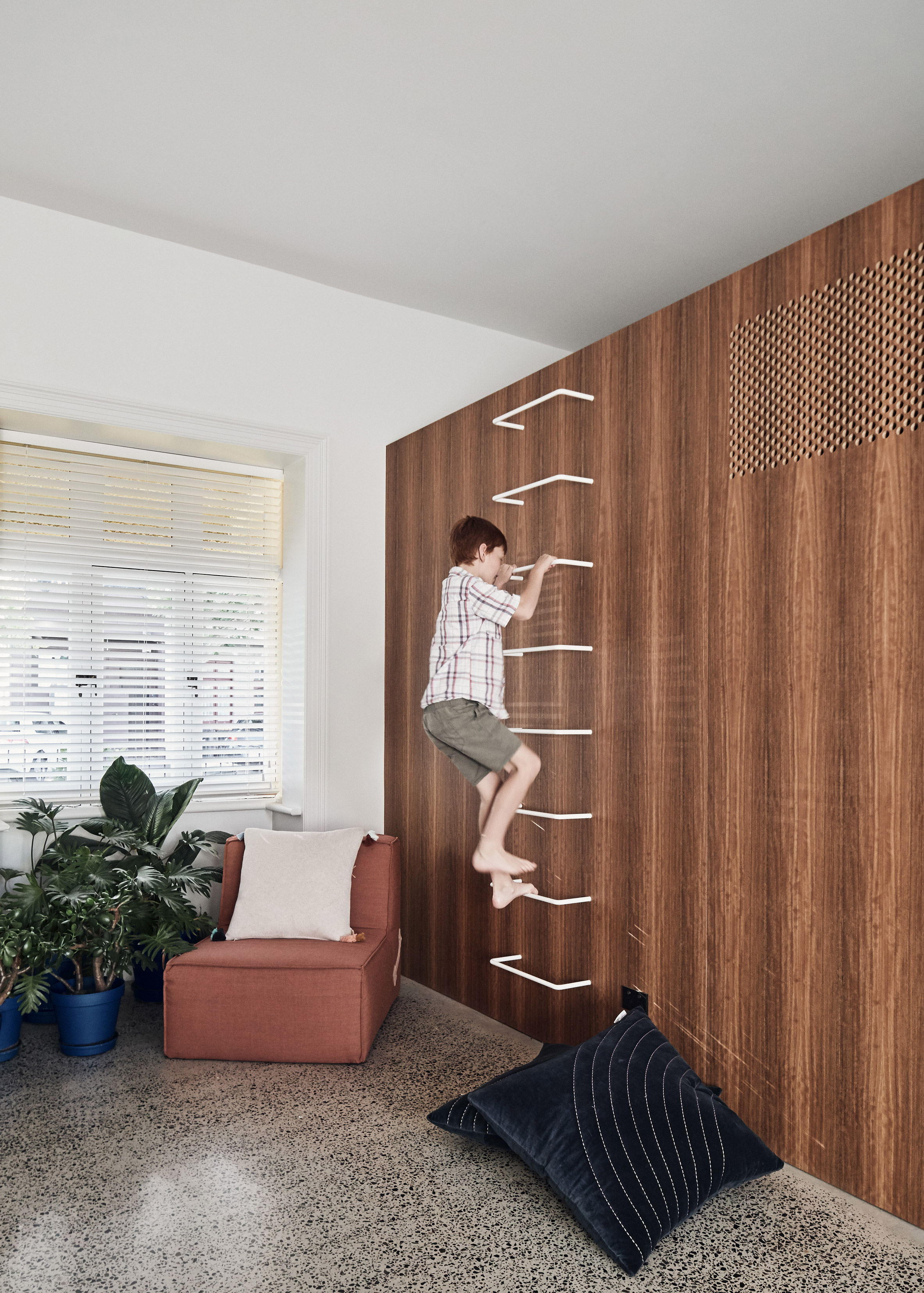
Terrazzo flooring was used in the common areas of this large family home in Melbourne, designed by Austin Maynard Architects.
It was combined with wooden panelling and white walls and ceilings to create spaces that feel bright and open.
Find out more about RaeRae House ›
House C-DF, Belgium, by Graux & Baeyens Architecten
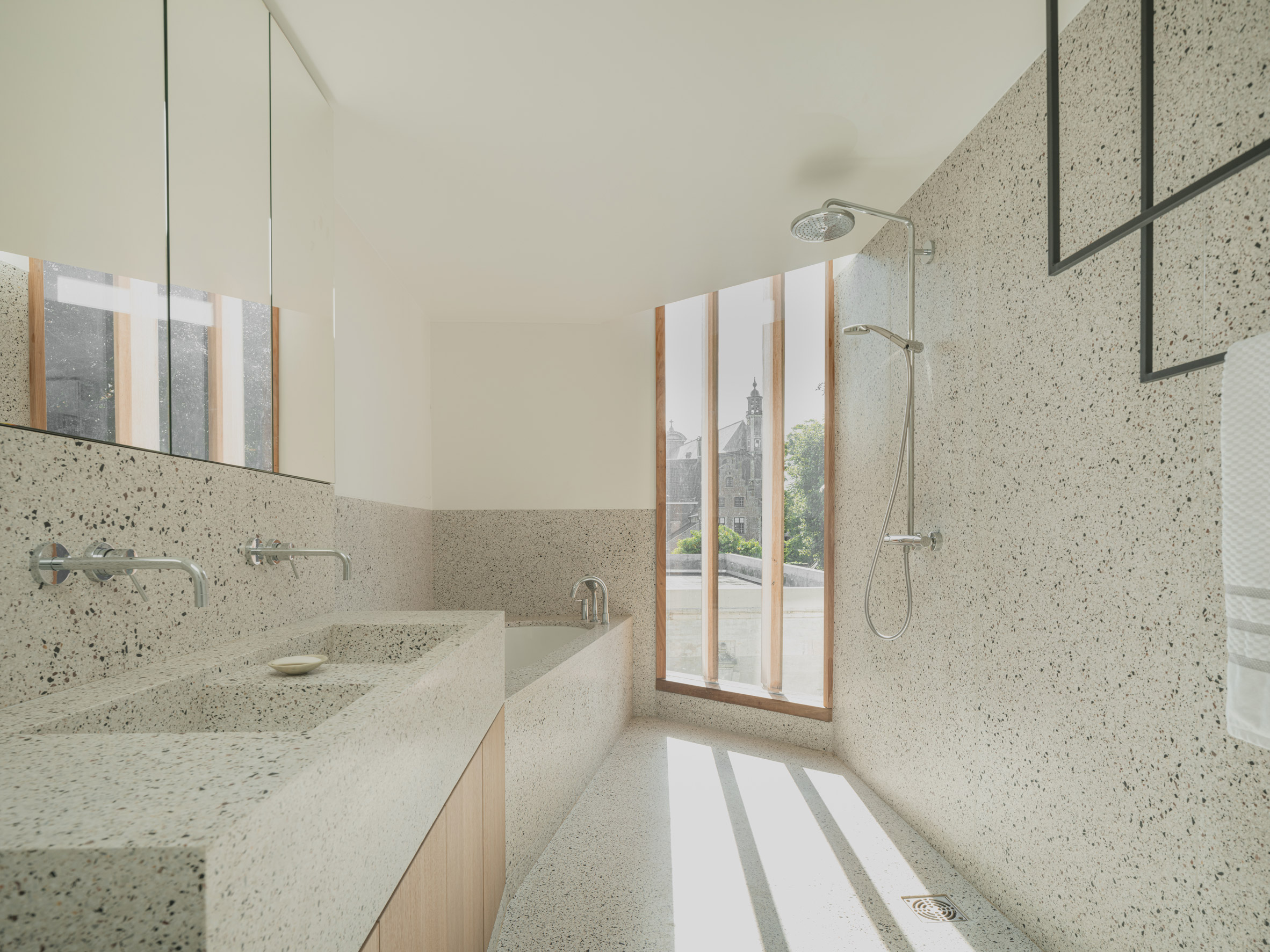
Belgian studio Graux & Baeyens Architecten used terrazzo flooring throughout its extension to this canalside townhouse in Ghent, contrasting with the wooden floorboards of the old structure.
In the bathroom, the fresh white terrazzo extends up the walls and also forms the bathtub and double sink.
Find out more about House C-DF ›
White Rabbit House, England, by Gundry & Ducker
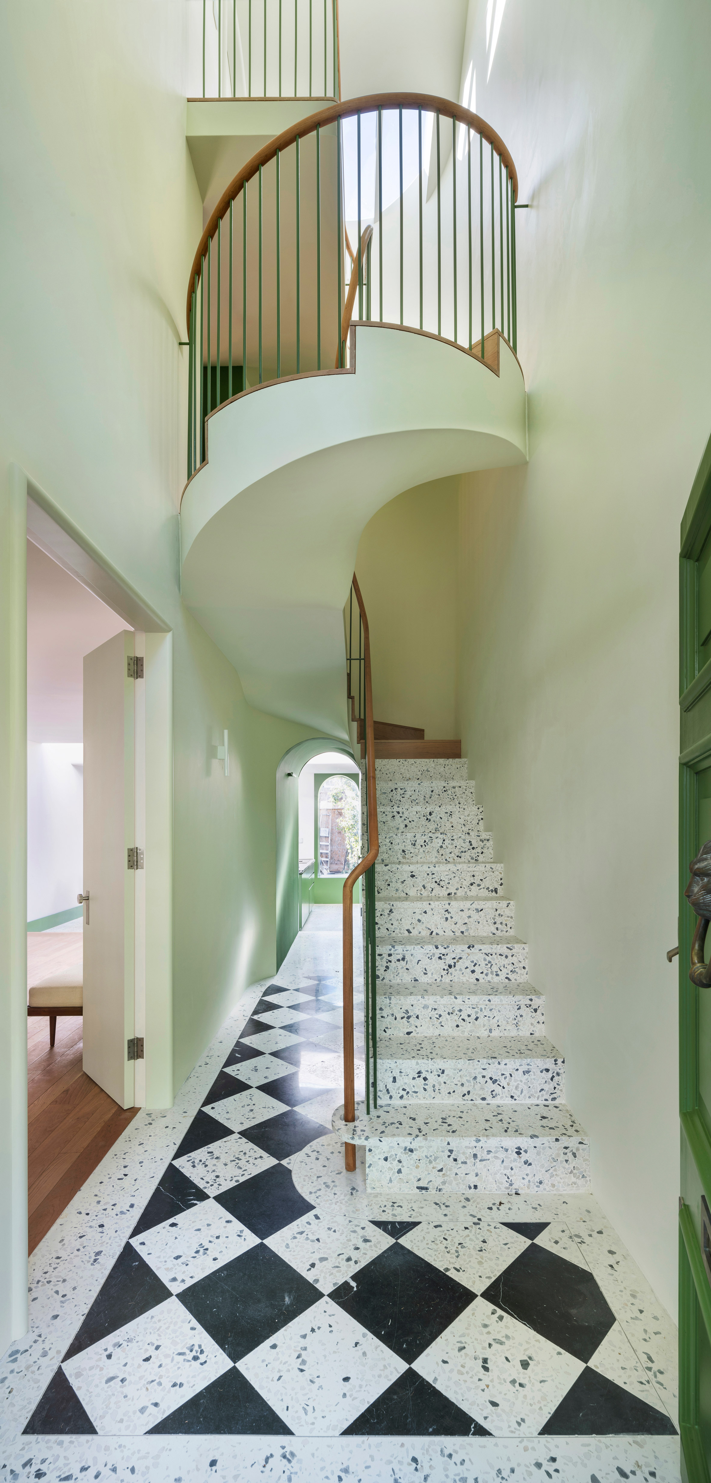
Diagonal chequerboard terrazzo flooring and a staircase greet visitors to this house in north London renovated by Gundry & Ducker.
The terrazzo has been paired with green walls and railings as part of the studio's attempt to create a "modern interpretation of a Georgian house".
Terrazzo was also used to clad an extension at the rear.
Find out more about White Rabbit House ›
Brown Box, Vietnam, Limdim House Studio
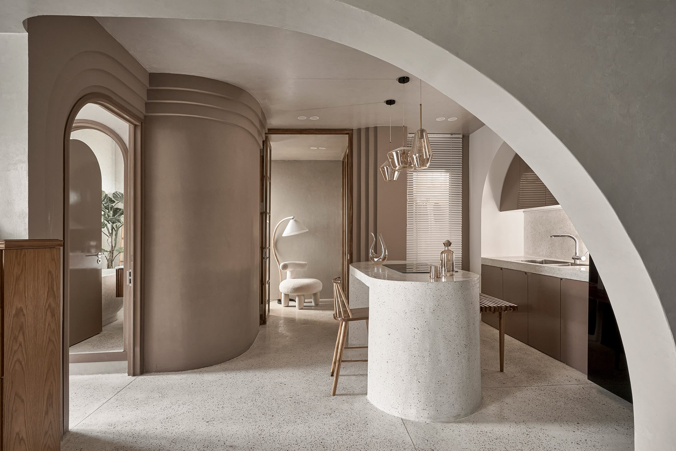
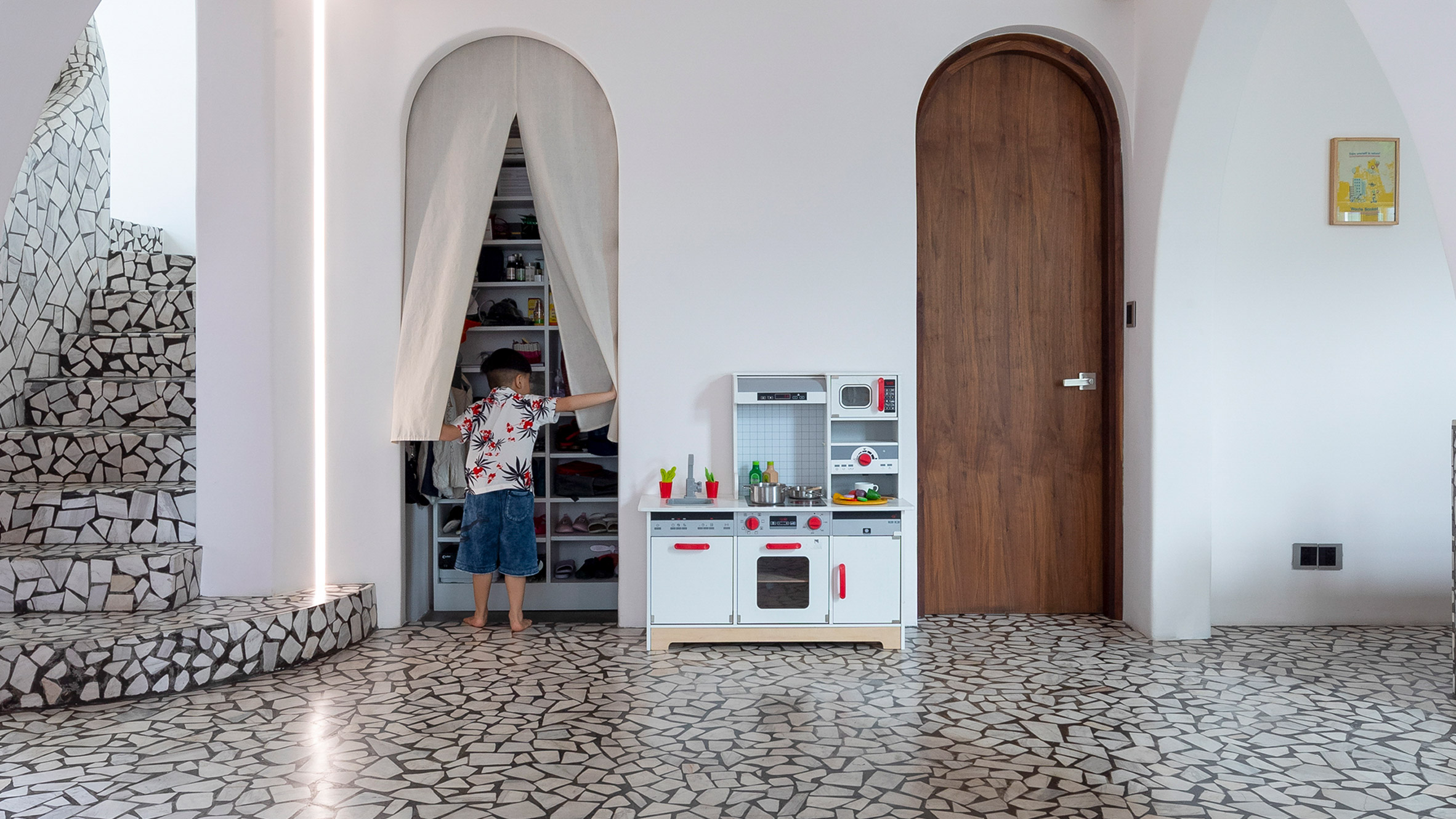
In this apartment in Vietnam, terrazzo flooring and surfaces were used alongside curving walls and arched niches to produce a space described by the design team as "calm" and "gentle".
"We use terrazzo all the way from the kitchen island, like a stream going down the floor and spreading everywhere," said Lindim House Studio founder Tran Ngo Chi Mai.
"Physically, terrazzo has good hardness, just enough gloss, and more heat dissipation than wooden floors, so it creates a cool feeling, especially in tropical areas," she added.
Find out more about Brown Box ›
Victoria Road, Northern Ireland, by Hall McKnight
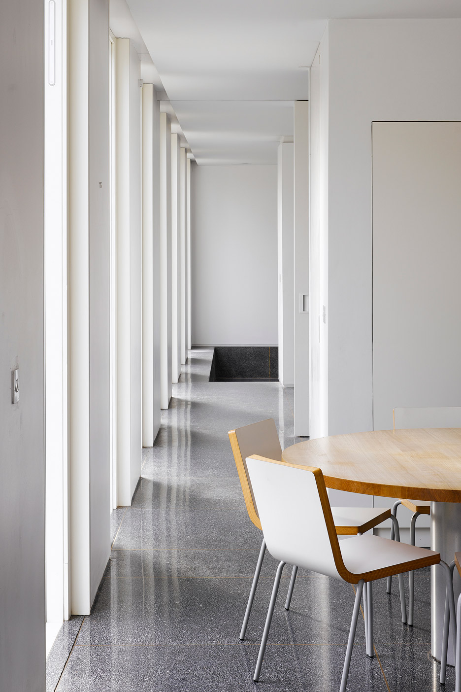
Terrazzo tiles made with black marble chippings provide flooring through the living areas of this house in Holywood, Northern Ireland, designed by Hall McKnight.
Their charcoal colour offers a bold contrast to the white-painted walls and ceilings.
Find out more about Victoria Road ›
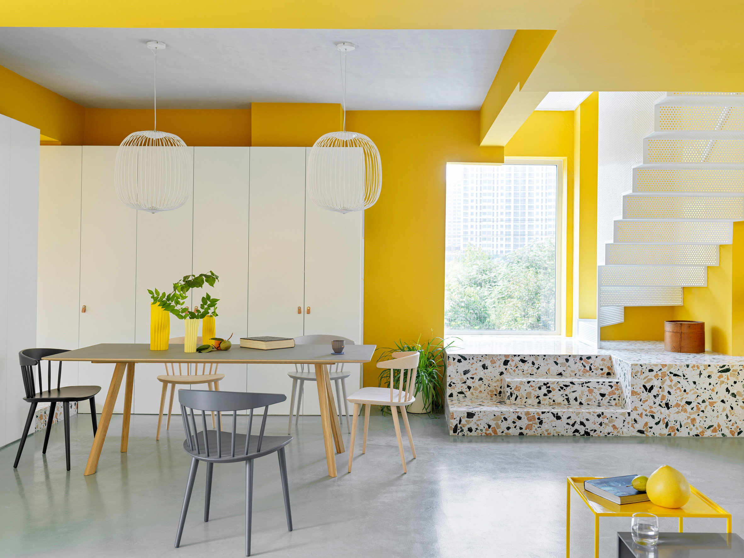 Photo is by Jonathan Leijonhufvud
House P, China, by MDDM Studio
MDDM Studio interspersed colourful terrazzo flooring made with green, orange and beige stones throughout this bright Beijing apartment, including for the base of a staircase and in the bathroom.
Together with bright yellow-painted walls, the material produces a vibrant colour palette designed to suit the young family that lives in the home, tempered with cement flooring and white fixtures.
"We wanted to use a material that could bring together the cement finishing of the floor and ceiling with the yellow walls," MDDM co-founder Momo Andrea Destro told Dezeen.
House BL, Belgium, by Graux & Baeyens Architecten
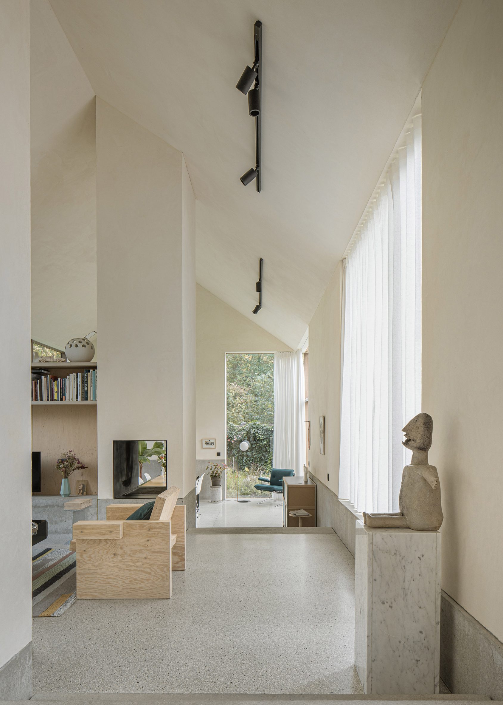
Belgian practice Graux & Baeyens Architecten renovated and extended a 1960s chalet as a family home for one of the studio's co-founders.
Terrazzo covers the floor of the interior, including in the sunken living space, contributing to the soothing natural colour scheme and creating a beautiful backdrop for the art pieces and sculptural furniture on show in the home.
Find out more about House BL ›
Mài Apartment, Vietnam, by Whale Design Lab
This unusual terrazzo, made with large white marble chunks, was chosen by Whale Design Lab to help give this Ho Chi Minh City duplex a modernist feel.
The material became trendy in the Vietnamese city during the 1950s and 1960s, when modernist architecture was introduced into the south of Vietnam, the studio told Dezeen.
Terrazzo with finer flecks of aggregate was also used for floors and even walls in the rest of the house.
Find out more about Mài Apartment ›
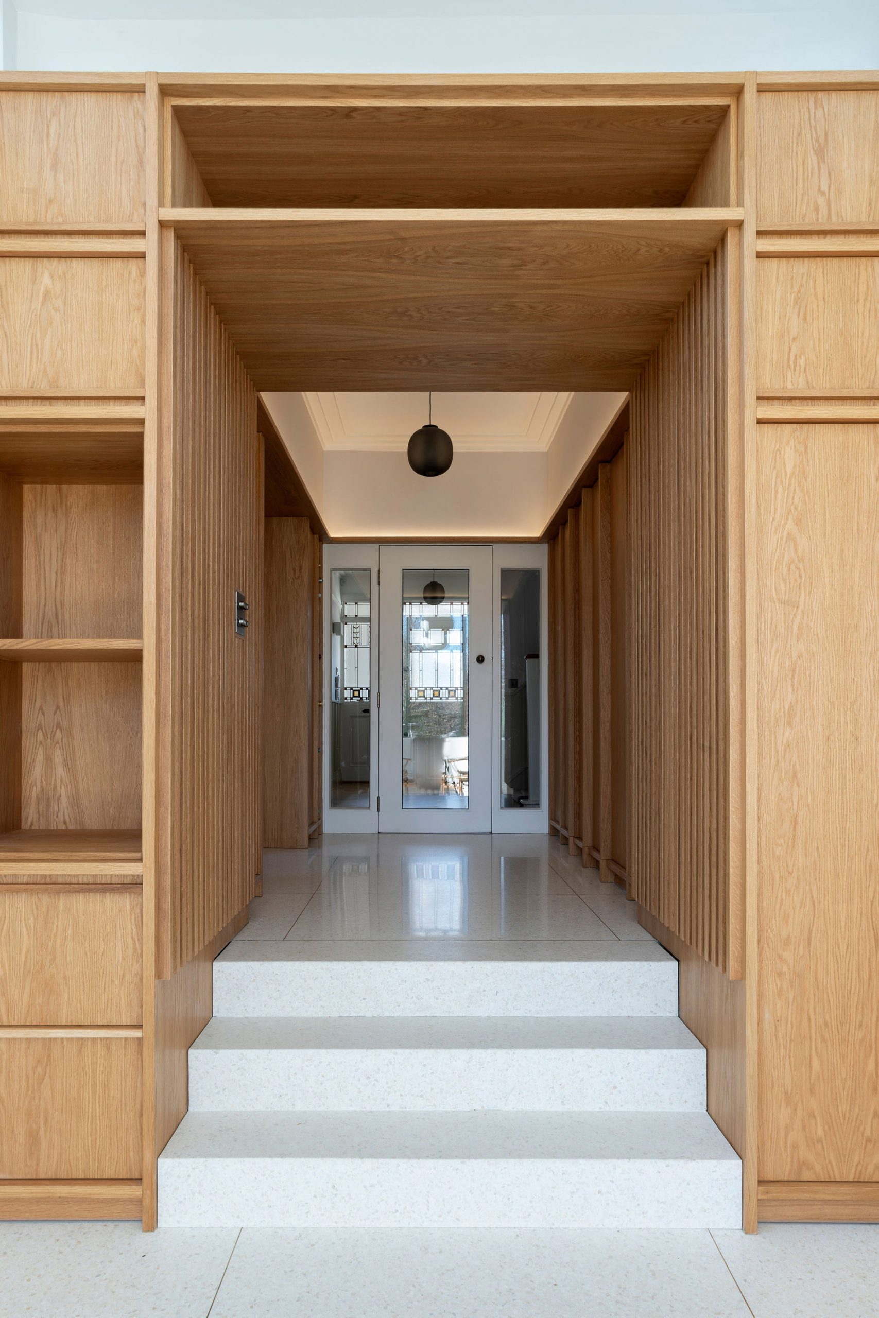
Scullion Architects contrasted white terrazzo flooring with stained oak panelling for this conservatory-like extension to a 1930s semi in the Dublin suburbs.
The studio sought to take materials typically found in homes built during the period and adapt their application in unconventional ways.
Find out more about Churchtown ›
This is the latest roundup in our series of lookbooks providing visual inspiration for the home. See previous lookbooks featuring interiors withconversation pits, glass block walls and wood panelling.
The post Ten home interiors with distinctive terrazzo floors appeared first on Dezeen.
#all #lookbooks #instagram #interiors #residential #terrazzo #flooring
Linehouse designs Shanghai restaurant informed by New Wave art movement
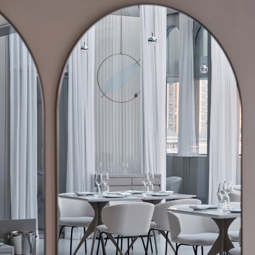
Design studio Linehouse has filled a restaurant in a Shanghai art museum with mirrors and arched details informed by eastern and western art and design.
Located inside the UCCA Edge museum, the New Wave by Da Vittorio restaurant was named after the original UCCA museum's opening exhibition The New Wave Art Movement, which also set the tone for its interiors.
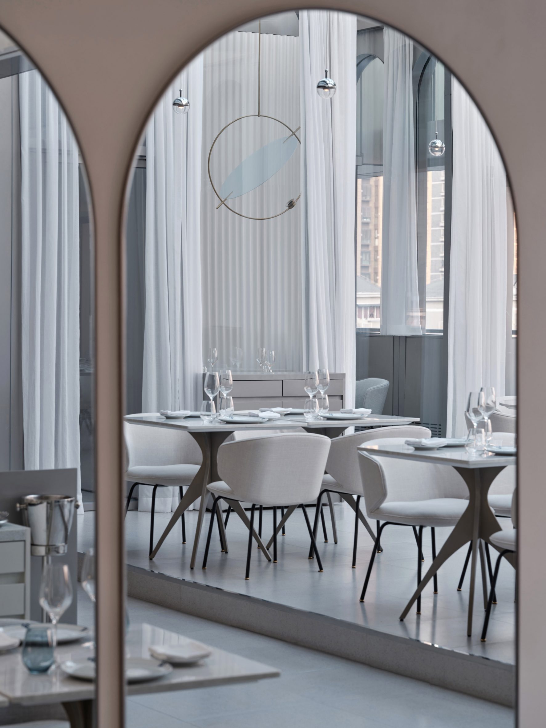 Arched shapes are used throughout the restaurant
New Wave, a 20th-century art movement in China, is renowned for its bold experimentation that brought Chinese art into the modern art world.
“The concept for the restaurant comes from the collision of these opposing elements and the process of change,” said Shanghai-based Linehouse.
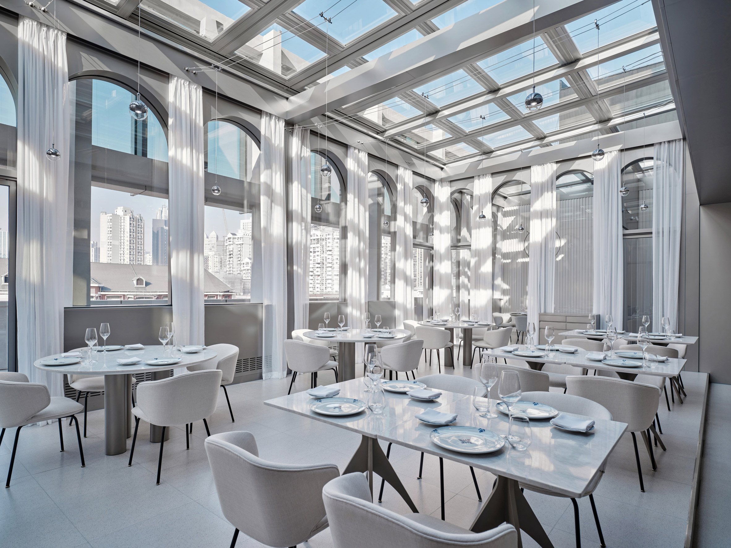 New Wave by Da Vittorio is located inside Shanghai's UCCA Edge museum
To enter the restaurant, guests pass through a narrow passage that leads from the public museum space into a more intimate dining area.
The restaurant, which measures 620 square metres, also holds a bar, private dining rooms and an outdoor terrace.
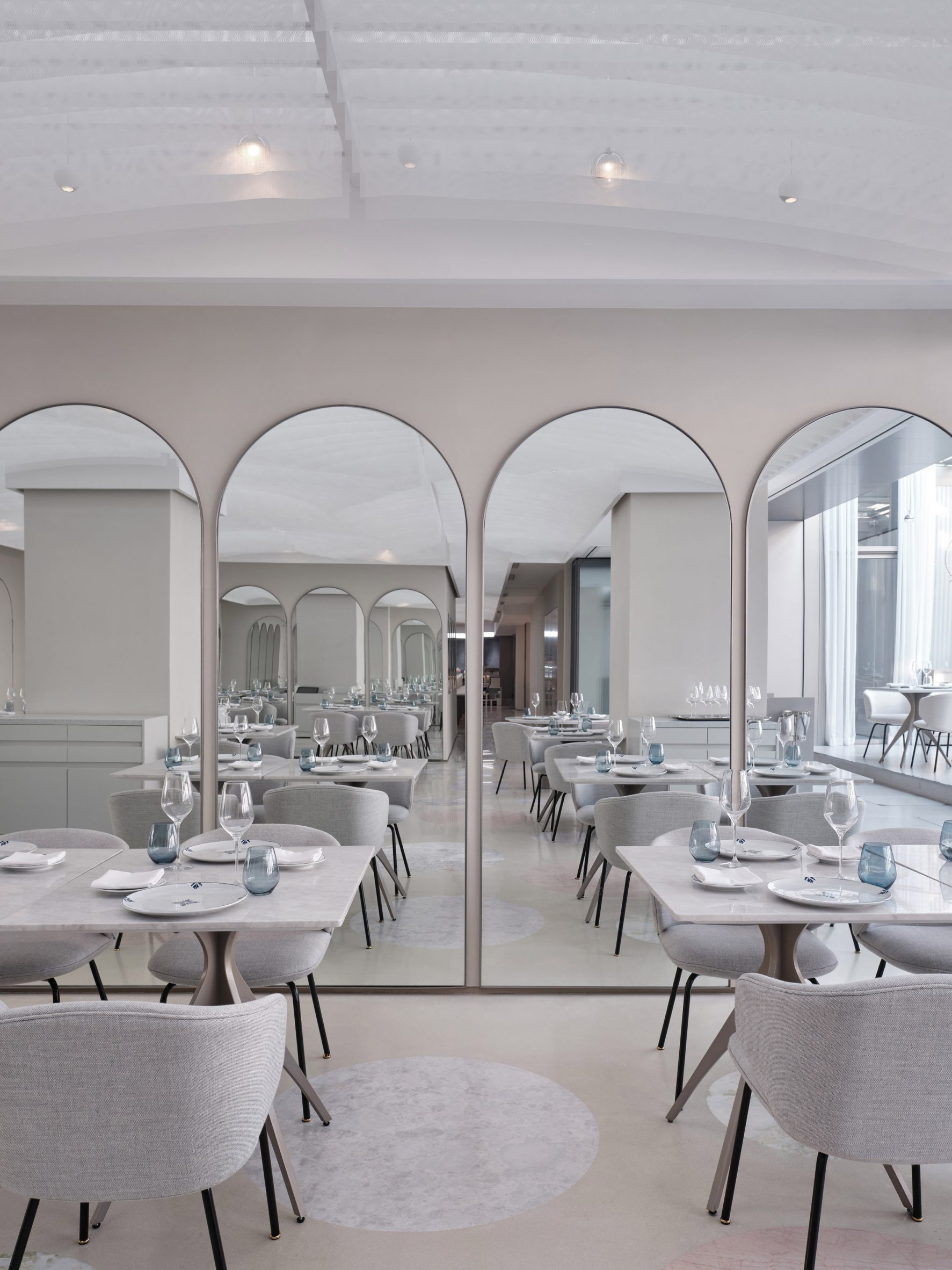 Mirrors create an illusion of more space
A sequence of arches was added to the restaurant in reference to the use of colonnades in classical architecture, while matching arched mirrors create an illusion of spatial progression.
New Wave by Da Vittorio also features a ceiling installation formed by arches designed in a more eastern style.
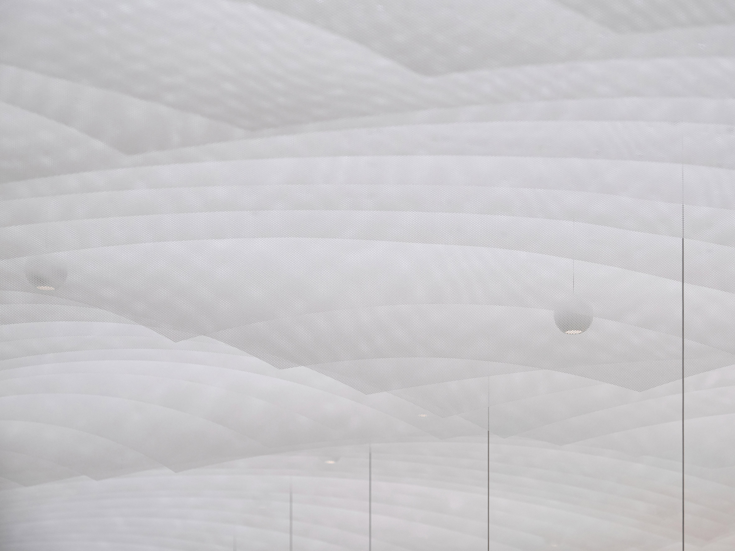 Hanging fabric was cut into curved shapes to match the arches in the interior
The installation consists of hanging fins made from a Japanese triaxle fabric with a woven texture, which has been cut into vaulted shapes to create a softness that evokes floating clouds.
The sheets of fabric are placed in a repetitive order with a pattern that only emerges once you see through one sheet to the next. The studio hoped this would evoke the contradiction between order and chaos.
[ 
Read:
Linehouse designs space-themed cafe in Shanghai for creator of "Australia's most Instagrammed dessert"
](https://www.dezeen.com/2022/01/12/black-star-pastry-shanghai-linehouse-cafe/)
“Throughout the restaurant, we seek contradiction in materiality to create qualities of soft and hard, rough to smooth, order to unordered and solid to transparent,” Linehouse co-founder and lead designer Alex Mok told Dezeen.
The studio used stone for the main bar counter, which it sculpted into a curved, fluid shape to further explore the juxtaposition between soft and hard surfaces.
Linehouse deliberately chose a stone with a smaller repetitive pattern to create a continuous piece.
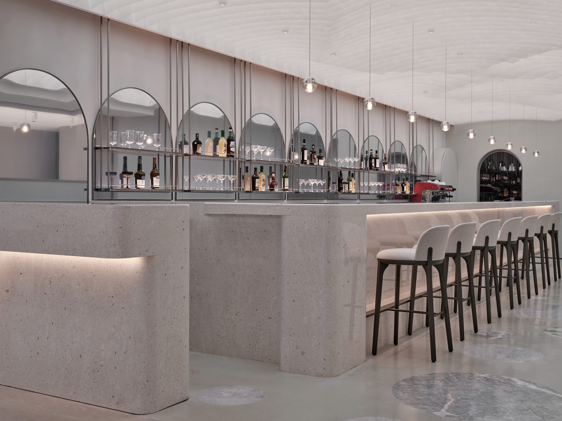 A stone bar is decorated with mirrors
The bar area also has a floor patterned with different kinds of stone while in the private dining rooms, precision-machined stainless steel and curved lacquered timber were paired to create another form of contradiction.
“Materials are manipulated as a catalyst for creating disorder, dissipation, fragmentation and surprise,” Mok said.
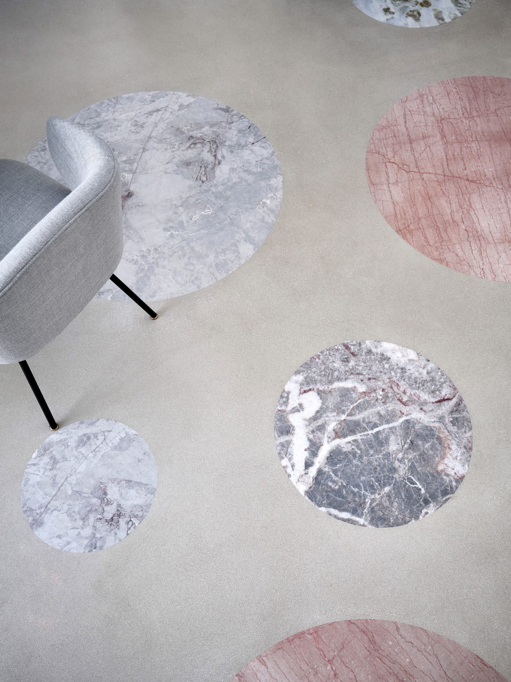 Different types of stone create a polka-dot pattern on the floor
Linehouse also recently finished a space-theme cafe for Australian chain Black Star Pastry's first Chinese outpost.
The studio was named emerging interior designer of the year at the 2021 Dezeen Awards.
The photography is byJonathan Leijonhufvud.
Project credits:
Architect: Linehouse
Design lead: Alex Mok, Briar Hickling
Design team: Jingru Tong, Inez Low, Aiwen Shao, Leah Lin, Jiabao Guo, Cherngyu Chen
The post Linehouse designs Shanghai restaurant informed by New Wave art movement appeared first on Dezeen.
#retail #all #interiors #china #shanghai #restaurants #linehouse
Kelly Wearstler makes "bold and eclectic choices" for Downtown LA Proper hotel
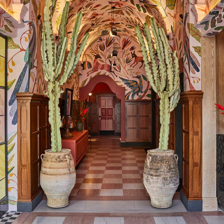
American interior designer Kelly Wearstler paired the rich history of Downtown Los Angeles with other colourful global influences when creating this hotel, which features 136 unique types of tile.
Part of the Proper hotel group, Downtown LA Proper sits between Downtown Los Angeles' South Park District and the city's Fashion District.
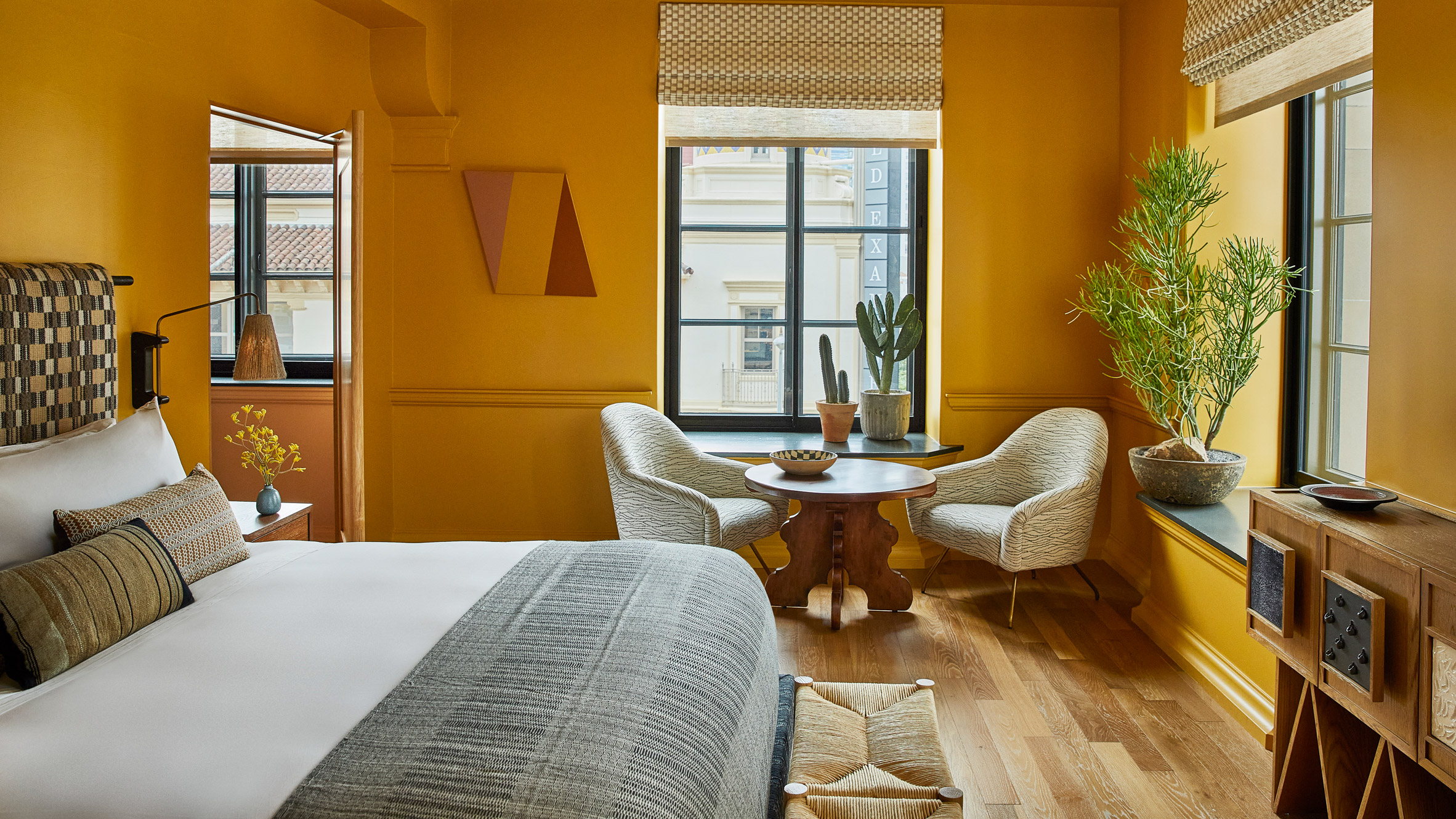 Kelly Wearstler designed the eclectic interiors of Downtown LA Proper
The 148-room hotel is located within a former private club that was designed by architecture studio Curlett & Beelman in the 1920s.
Real estate developer The Kor Group teamed up with Wearstler to transform the building into Downtown LA Proper, with Wearstler spearheading the interior design.
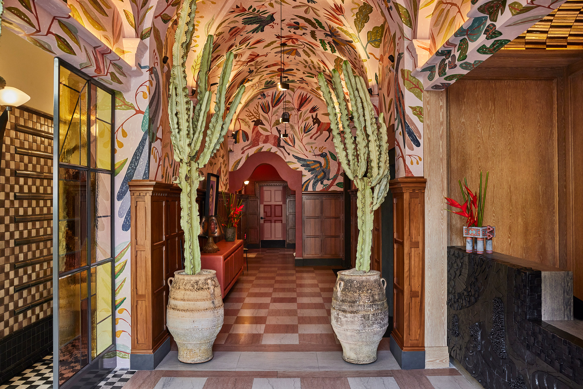 Morgan Peck created a chunky graphite reception desk
According to Wearstler, the hotel's interiors take cues from LA's "creative scene", as well as the colours and forms of Mexican, Moroccan, Spanish and Portuguese design.
"My point of reference for the Proper Hotels is always the location, so Downtown LA Proper really called for bold and eclectic choices," she told Dezeen.
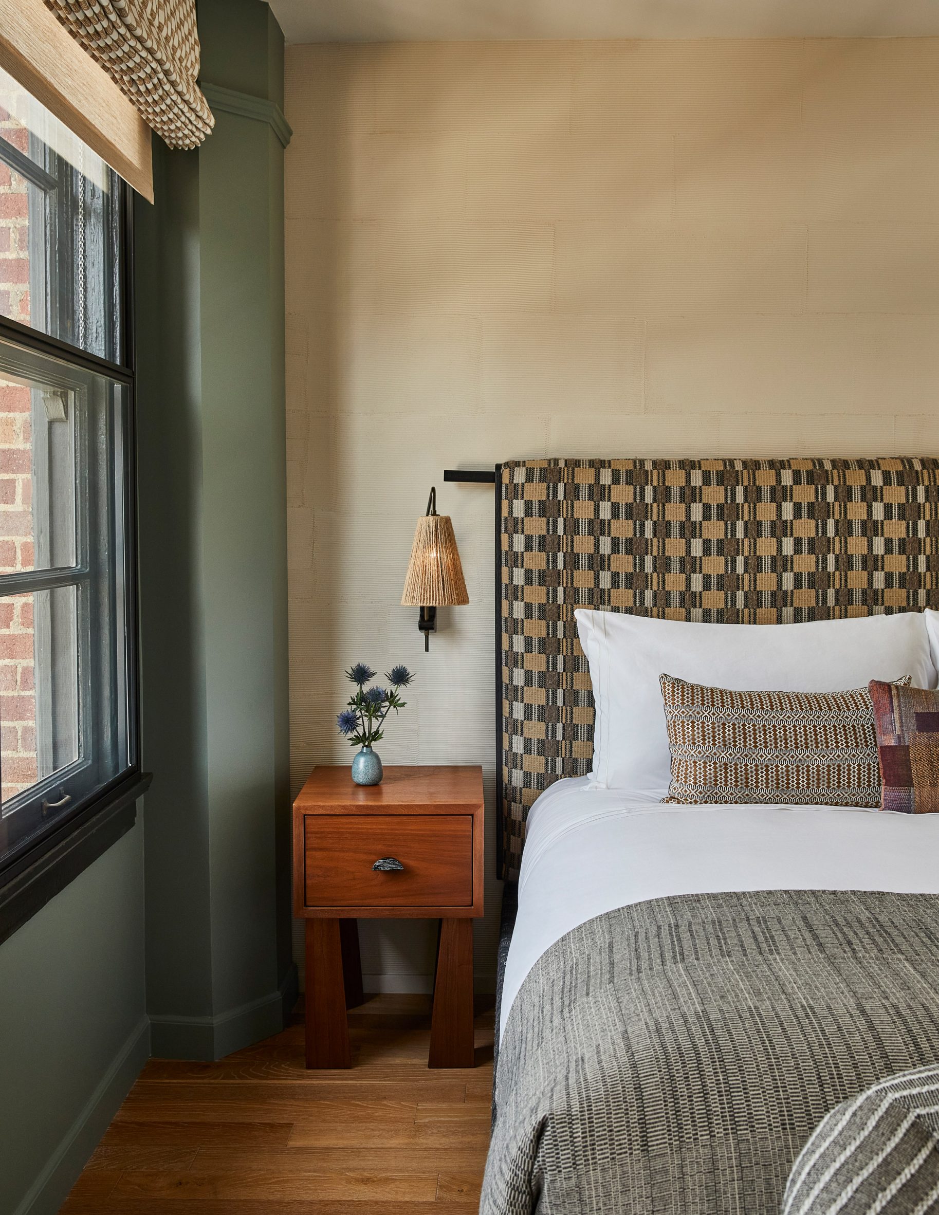 Guest rooms feature patterned headboards
"As the design of the hotel was greatly inspired by the community and history of the area, I used a deep, warm, colour and feel throughout to speak to this rich culture and history," added Wearstler.
"The [hotel's overall] design comprises 136 unique types of tile, from vintage to custom."
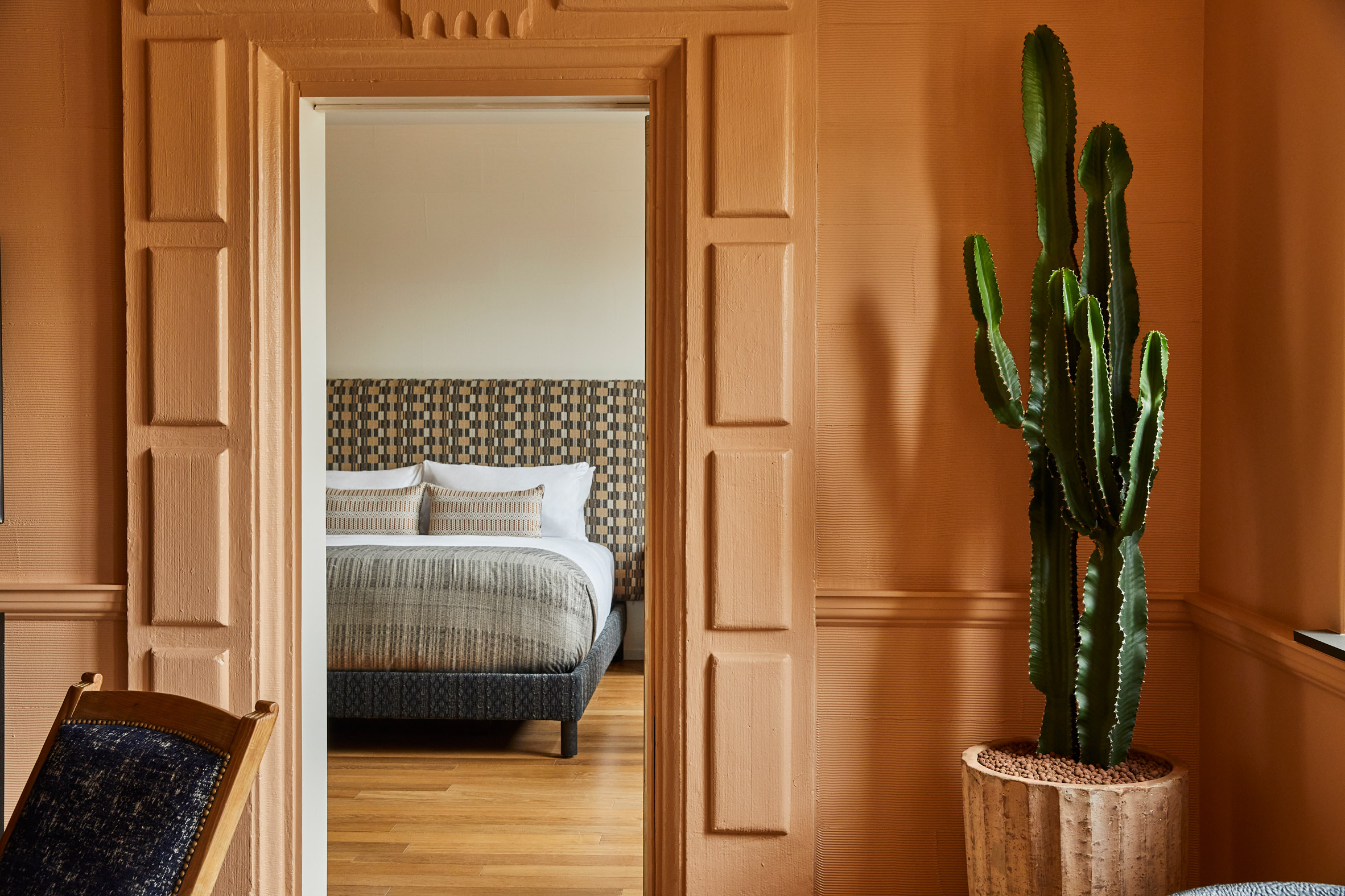 Wearstler used a colourful palette throughout the hotel
Visitors enter the hotel via the building's original ornate archway, which is flanked by column-like cacti in rustic pots, where they are met with a graphite reception desk designed by ceramicist Morgan Peck.
The original pink and white checkerboard floor tiling was retained in this area, while the ceiling is decorated with a hand-painted multicoloured mural designed by Abel Macias, which drew on the flora and fauna of Mexican folktales.
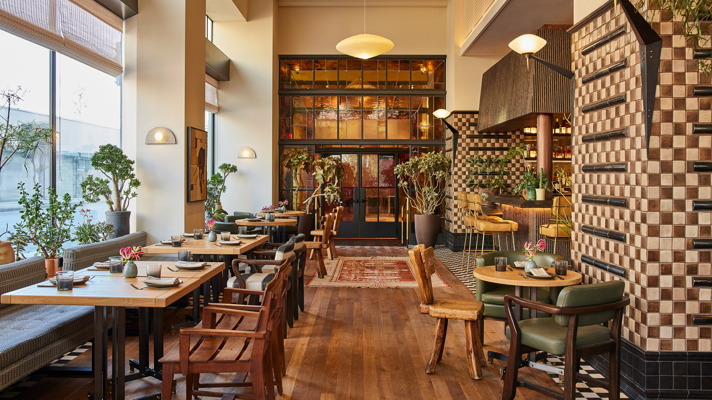 Caldo Verde includes a bespoke stained-glass doorway
This eclecticism is also reflected in Downtown LA Proper's guest rooms. Wearstler blended contrasting elements such as chunkily-patterned headboards with smooth wooden floors, while the walls vary within a spectrum of charcoal, mauve, dusty blue, umber and ecru.
The building contains three eateries including the lobby-level Caldo Verde restaurant and bar, which Wearstler designed to reflect the rest of the hotel's interiors.
[ 
Read:
Kelly Wearstler creates sculptural oak staircase for hotel in Austin
](https://www.dezeen.com/2021/03/05/austin-proper-hotel-residences-kelly-wearstler/)
A collection of vintage rugs and seating, cocoa and sandstone tiles and jungle-like plants are set against a bespoke stained-glass installation by Judson Studios that makes up the restaurant's doorway.
Other design elements that create Downtown LA Proper's bright and bold atmosphere include Mexican brutalist hand-carved chairs, woven pendant lights from the south of France and stone mosaic tables.
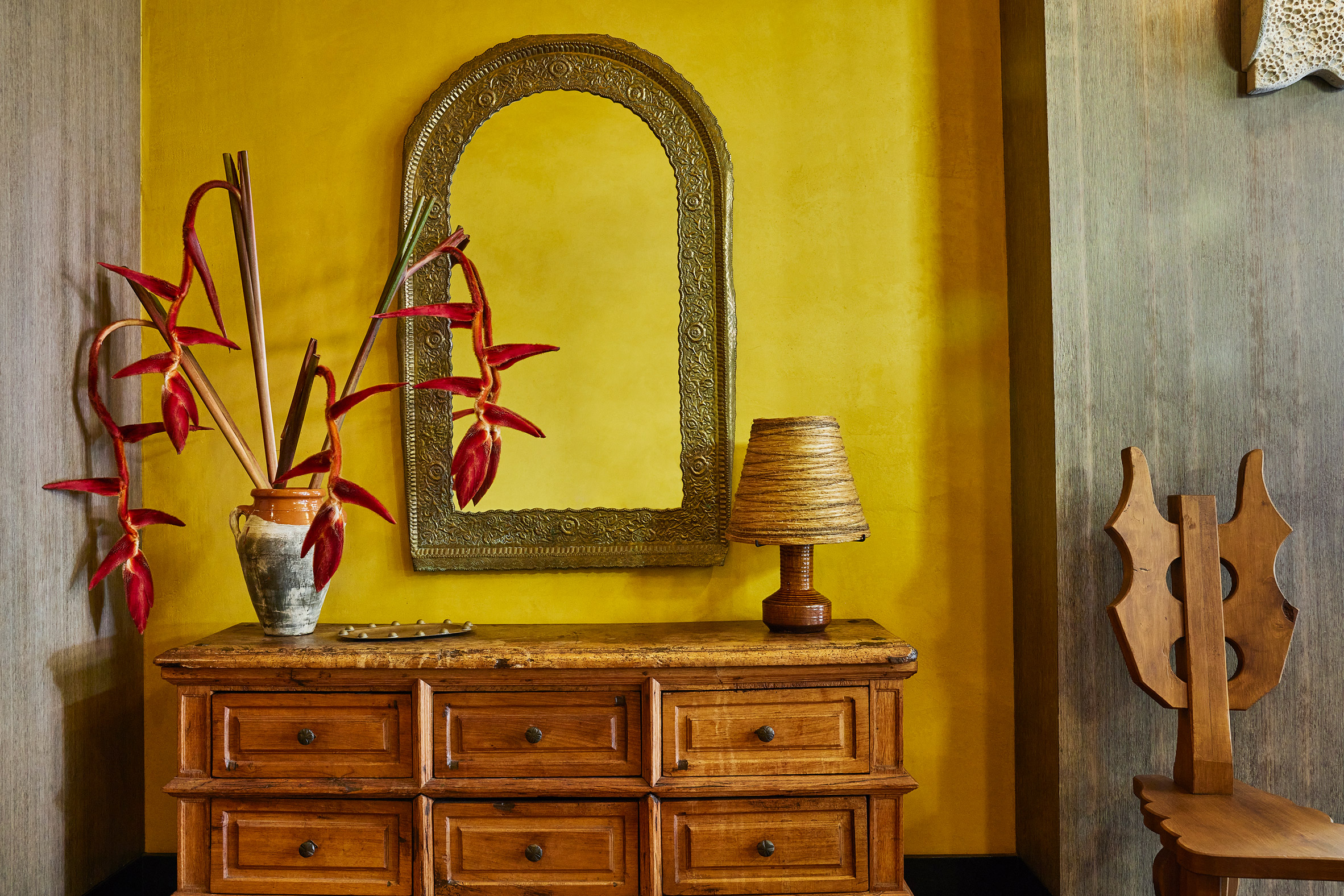 Brutalist hand-carved chairs add to the project's eclecticism
"The building itself is a historic-cultural monument, so we wanted to maintain some of the original integrity and fabric, like the window casing and brickwork, while elevating it with contemporary jewel tones, patterns and plasterwork," said Wearstler.
"I truly wanted to embark on a spirited exploration of materiality, colour and form, to share with guests a hyper-localised flavour of the city and create a hub for local creatives."
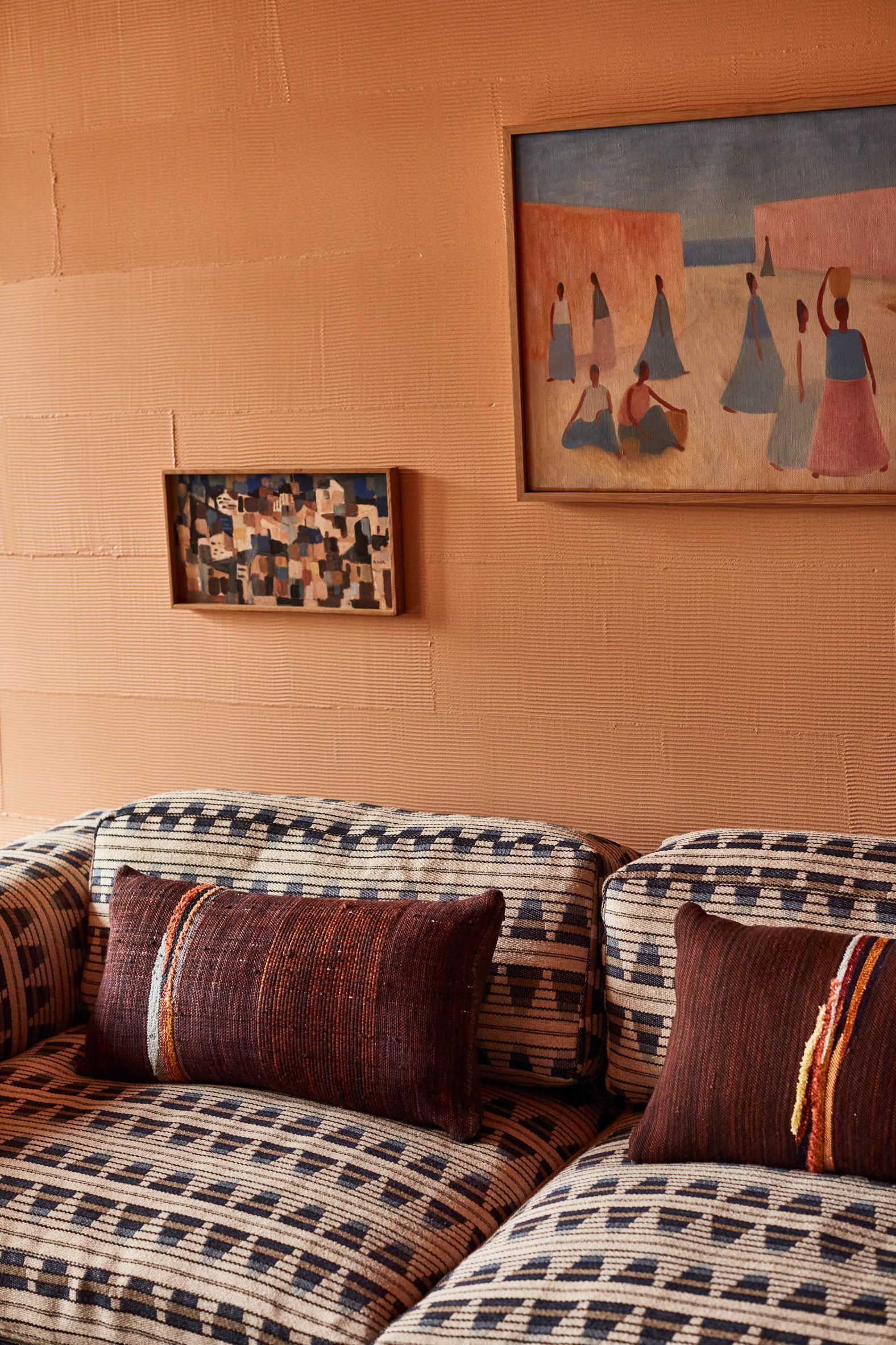 The work of emerging artists features throughout the hotel
Wearstler founded her eponymous interior design studio in 1995 and is responsible for the eclectic interiors of several other Proper hotels including its San Francisco and Santa Monica outposts.
The designer also recently transformed a 1950s beachfront cottage in California into a bohemian retreat for her family.
The images are courtesy of Kelly Wearstler.
The post Kelly Wearstler makes "bold and eclectic choices" for Downtown LA Proper hotel appeared first on Dezeen.
#all #interiors #hotels #instagram #usa #tiles #downtownlosangeles #kellywearstler
NOA creates tailor-made interior for pied-à-terre in Le Marais

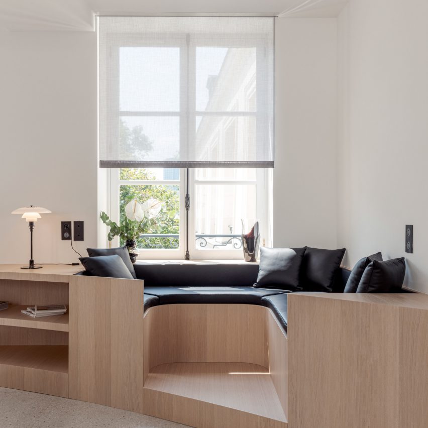
Network of Architecture has used curved lines, custom oak furniture and marble details to heighten the character of an apartment in a converted hotel in Le Marais, Paris.
NOA has created a completely custom interior for Nicolai Paris, located in the former Hotel Nicolai, which serves as a pied-à-terre for an Italian family.
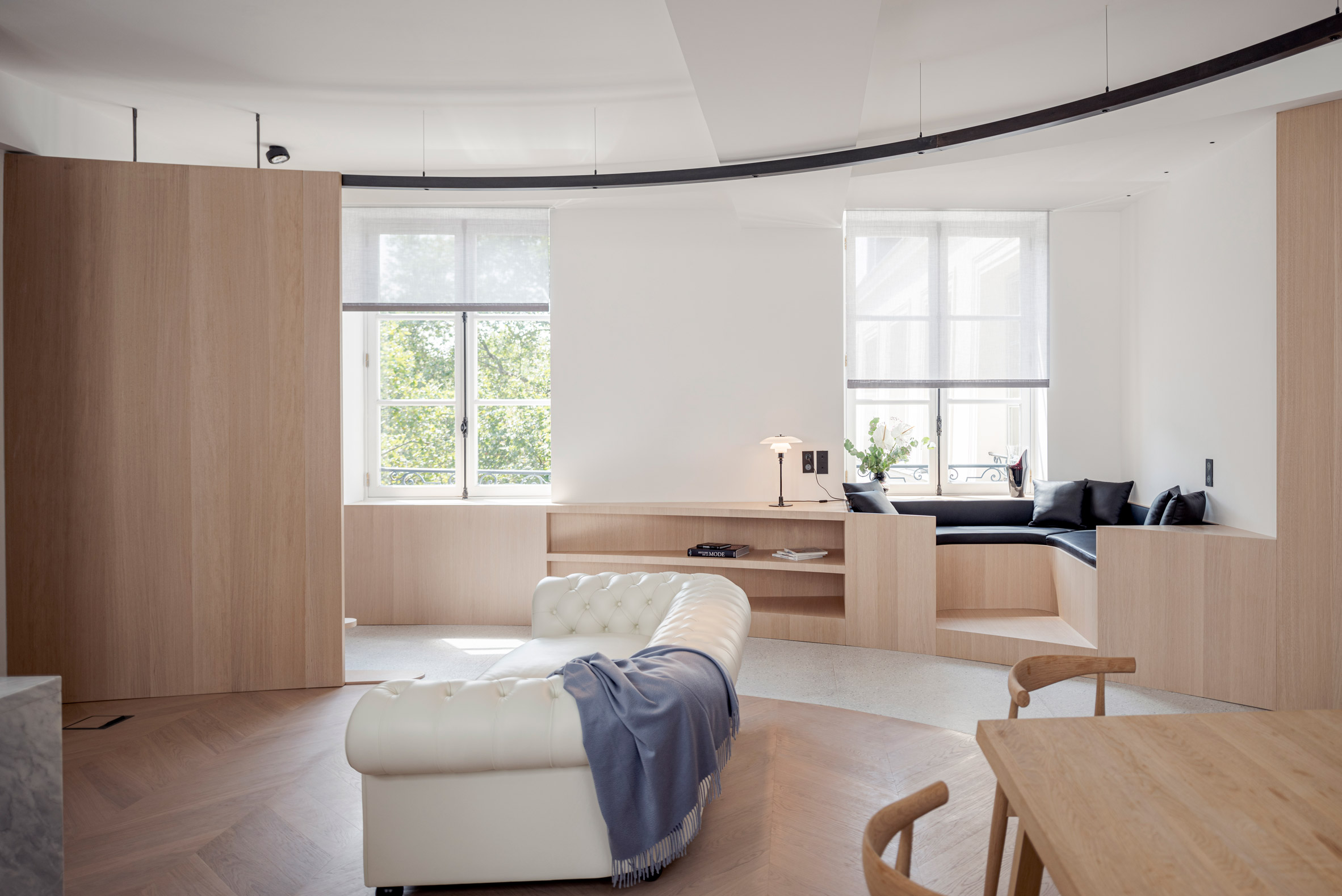 Nicolai Paris is located in a converted hotel
The renovation involved designing the layout of the two-level home, then adding playful furniture elements that help to optimise the functionality of each space.
"We started by defining the final atmosphere of the future apartment," explained architect and NOA co-founder Lukas Rungger.
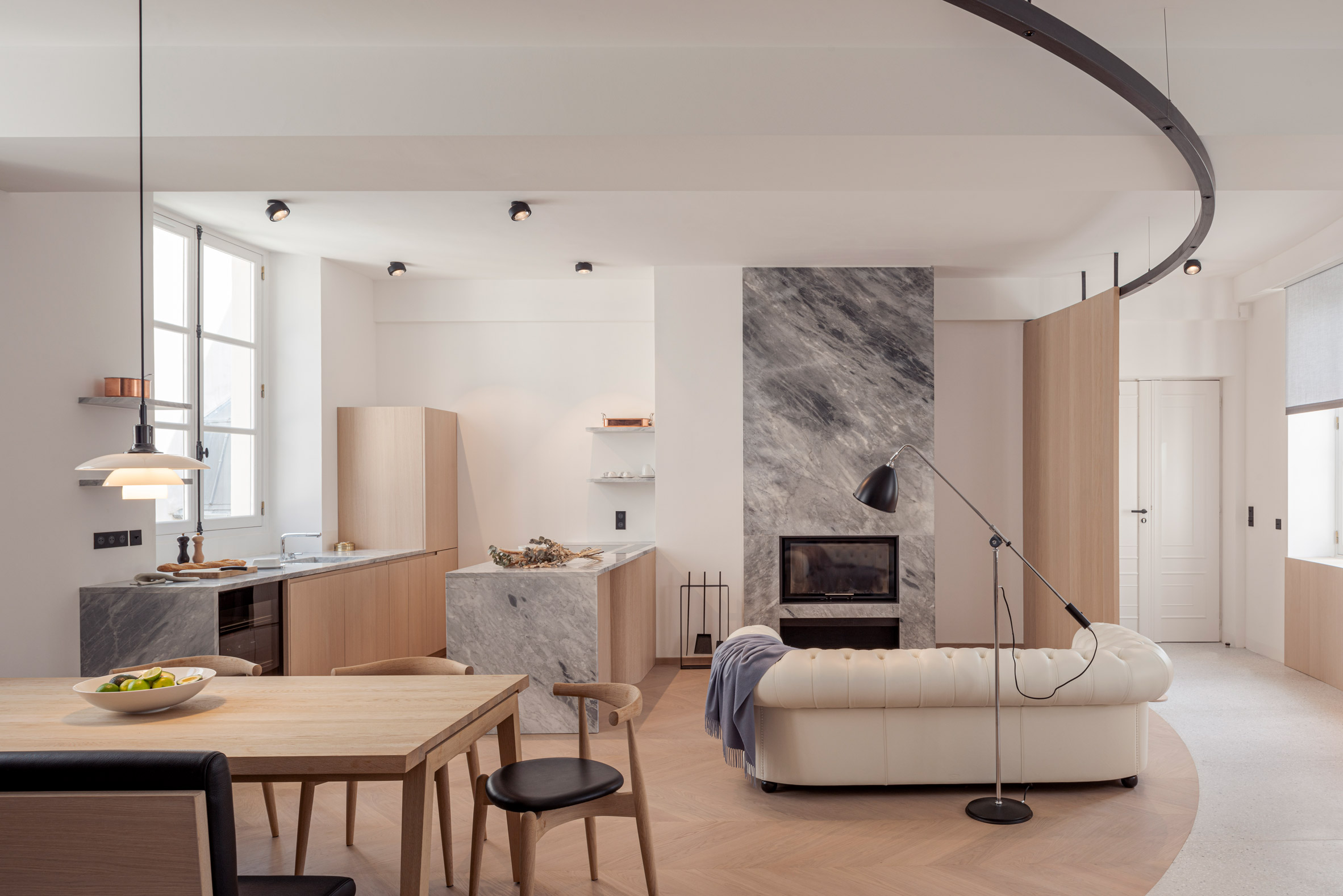 The Le Marais apartment has a completely custom interior
"It was essential that the space would feel cosy, 'hyggelig', and convey a feeling of wellbeing," he told Dezeen.
"The choice of interior layout, materials and geometry all serve this purpose."
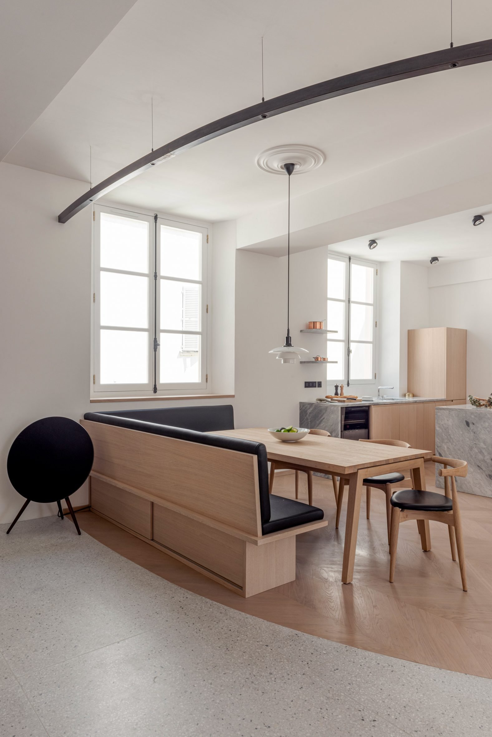 A mix of terrazzo and parquet flooring helps to define different zones
Built in the 17th century, the property has plenty of quirks. What's particularly unusual about this apartment is that it has an L-shaped layout, with most of its windows located at one end.
As a result, it made sense to locate the family living spaces here, nearest the entrance, and two large bedrooms in the back.
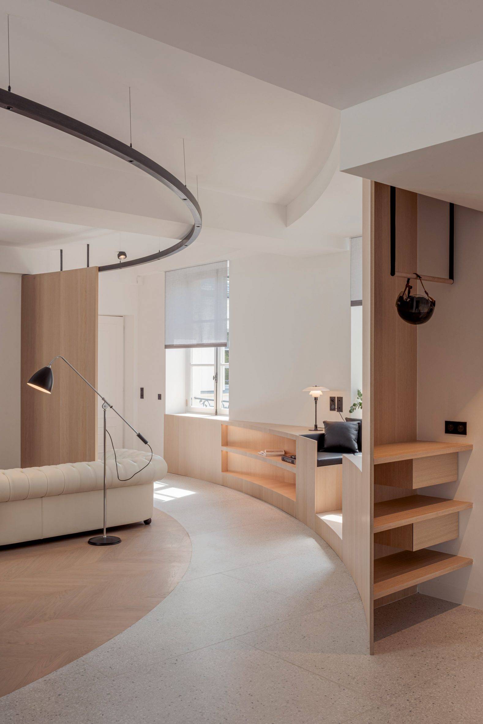 A curved line is defined by flooring, walls, lighting and furniture
A staircase in the centre of the floor plan leads up to a snug and a third bedroom on the smaller attic floor, which are both lit by skylights rather than windows.
To avoid creating wasteful corridors, NOA used two different floor surfaces to subtly mark the distinction between rooms and the connecting spaces in between.
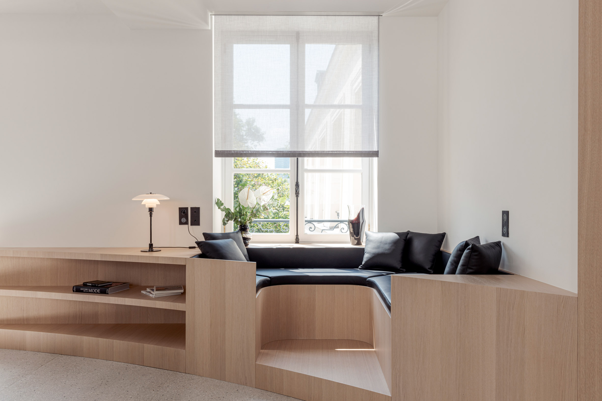 Custom oak furniture pieces include an in-built window seat
A strong curve of terrazzo cuts through the living space, which is defined by bleached oak parquet in a chevron pattern, known as French herringbone. This divides the room into two "islands".
The larger island contains a lounge, dining area and kitchen, while the smaller one is occupied by a single piece of in-built furniture, providing a window seat and shelving nooks.
[ 
Read:
Wood Ribbon apartment in Paris features an undulating timber wall
](https://www.dezeen.com/2020/02/28/wood-ribbon-apartment-plywood-interiors-paris/)
The terrazzo curve is emphasised by other elements, including a screen wall beside the entrance and a partition wall that encloses a cloakroom, laundry room and toilet.
It is also matched by lighting fixtures overhead and the organically-shaped staircase.
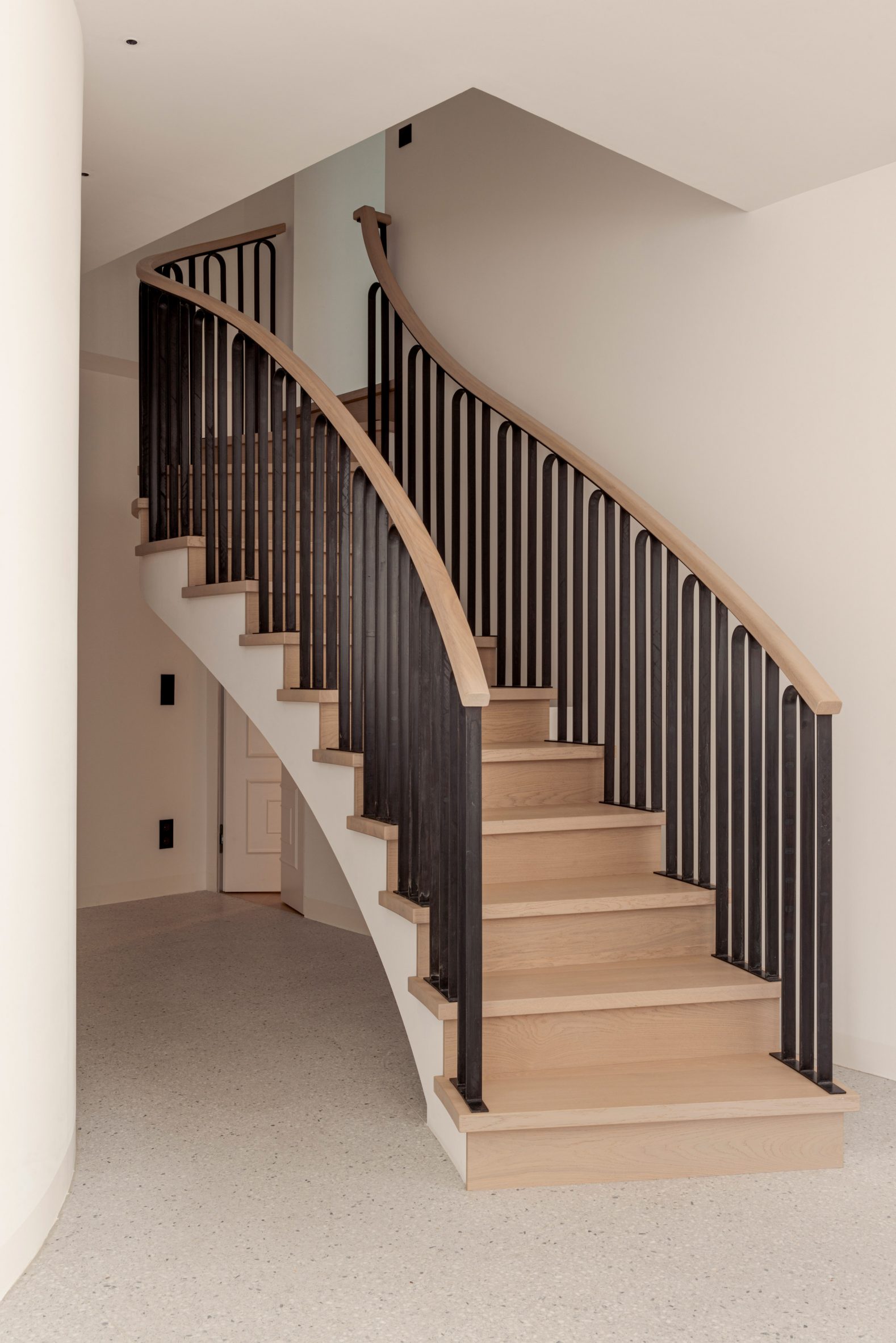 A double-curved staircase leads up to the attic
"The layout of the interior spaces was definitely the biggest challenge," said Rungger.
"We wanted to create a space of comfort within a bigger space," he explained. "Each island is a space within a space, intimate in itself but in dialogue with the rest."
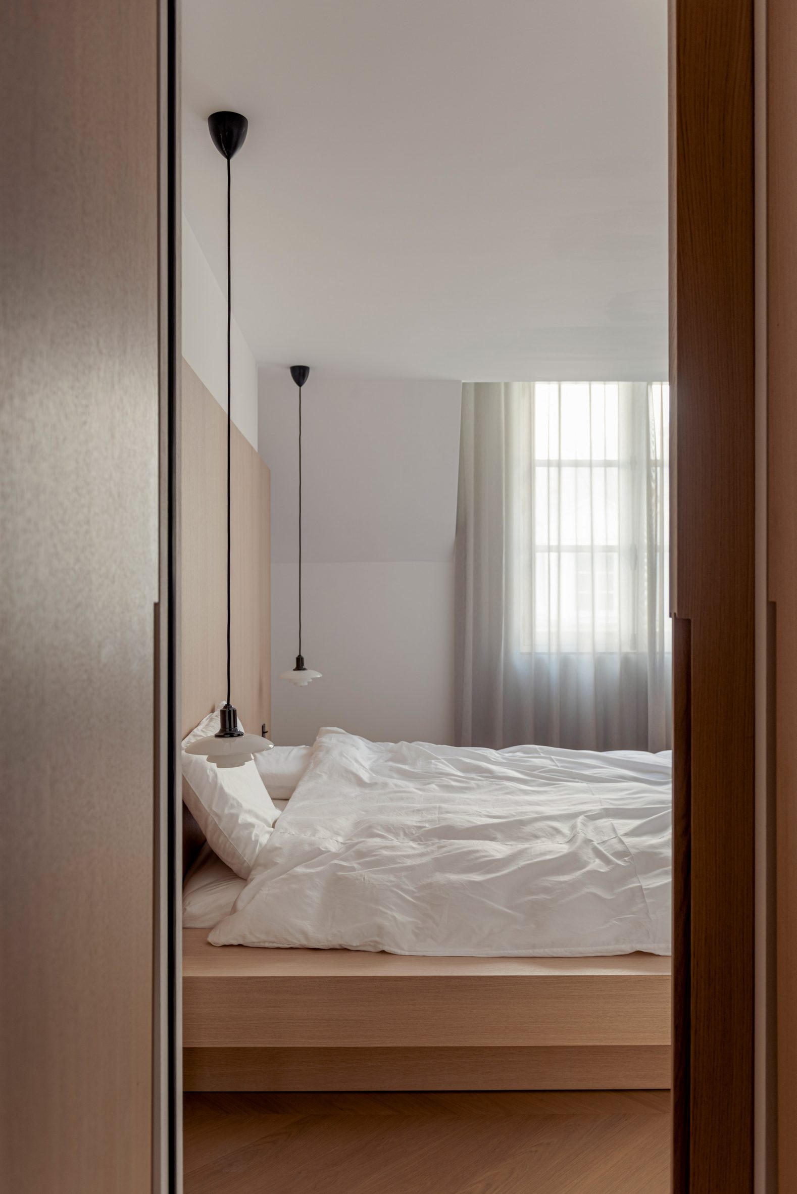 Beds are set on oak platforms and defined by oak wall panelling
Custom oak furniture features in every room. The beds are set on tiered platforms, continuing the islands concept, while the dining table is framed by an upholstered L-shaped bench.
Marble is also dotted throughout. A grey-blue Bardiglio Imperiale features in the kitchen and around the fireplace, and the main bedroom boasts a bathtub carved from a single block of Botticino Fiorito.
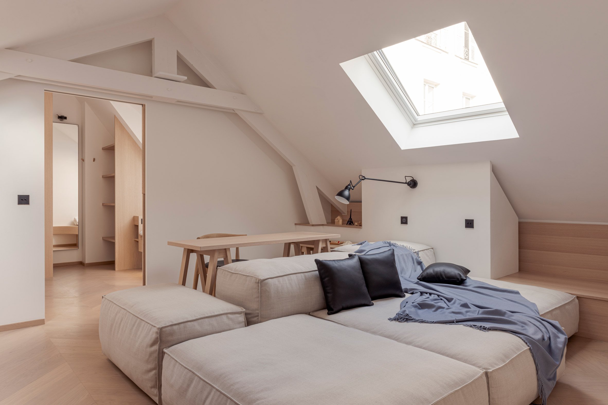 An attic room can be used as a snug, study or home cinema
"We wanted to reflect the elegance of the Parisian ambience in the flat," said Rungger.
"The colours of the Parisian rooftops influenced the choice of fabrics and marble colours, especially in the living area."
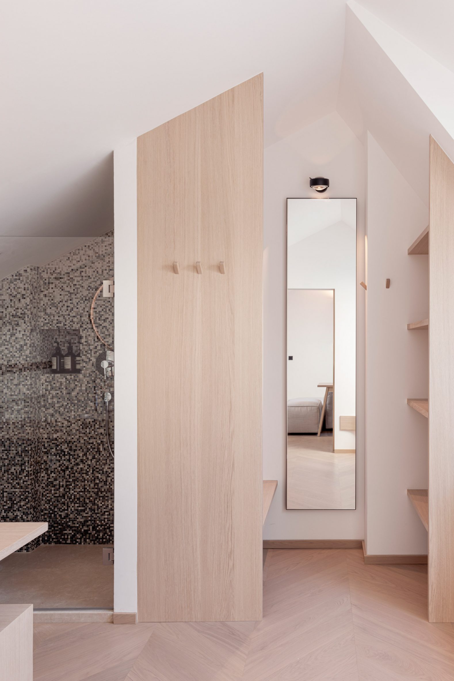 Bathrooms and washroom feature mosaic tiles in varying shades of gray
NOA has offices in Berlin and Turin, so typically works on projects in other parts of Europe. The studio recently completed a hotel and wellness centre and a glacier-top viewing platform, both in South Tyrol.
With this project, they hope to show a more craft-focused side to their practice.
"From the furniture's roundness to the staircase's double curvature, we have consistently drawn a line that fluidly touches the whole flat," added Rungger.
The photography is byAntoine Huot.
The post NOA creates tailor-made interior for pied-à-terre in Le Marais appeared first on Dezeen.
#all #interiors #residential #apartments #france #paris #parisapartments #noa
Henley Halebrown creates Bauhaus-inspired offices in converted London warehouse

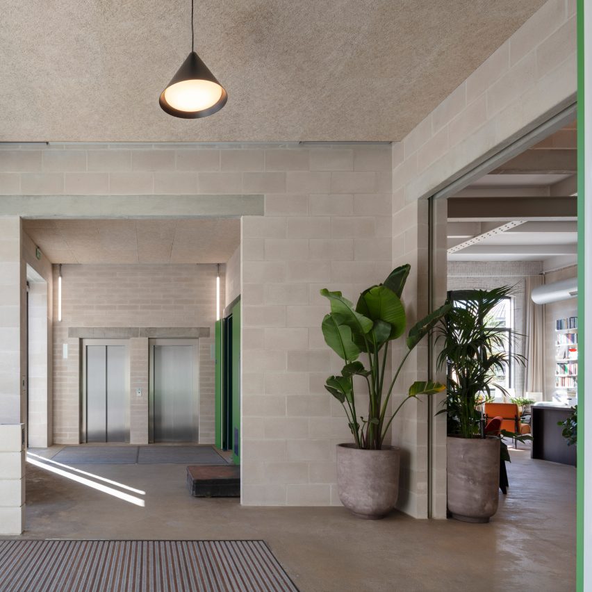
The colours and craft techniques of the Bauhaus movement were the inspiration behind Laszlo, a century-old warehouse building transformed into workspaces by London studio Henley Halebrown.
Located in north London, the renovated building now contains five floors of flexible offices, ranging from 482 square metres up to 647 square metres.
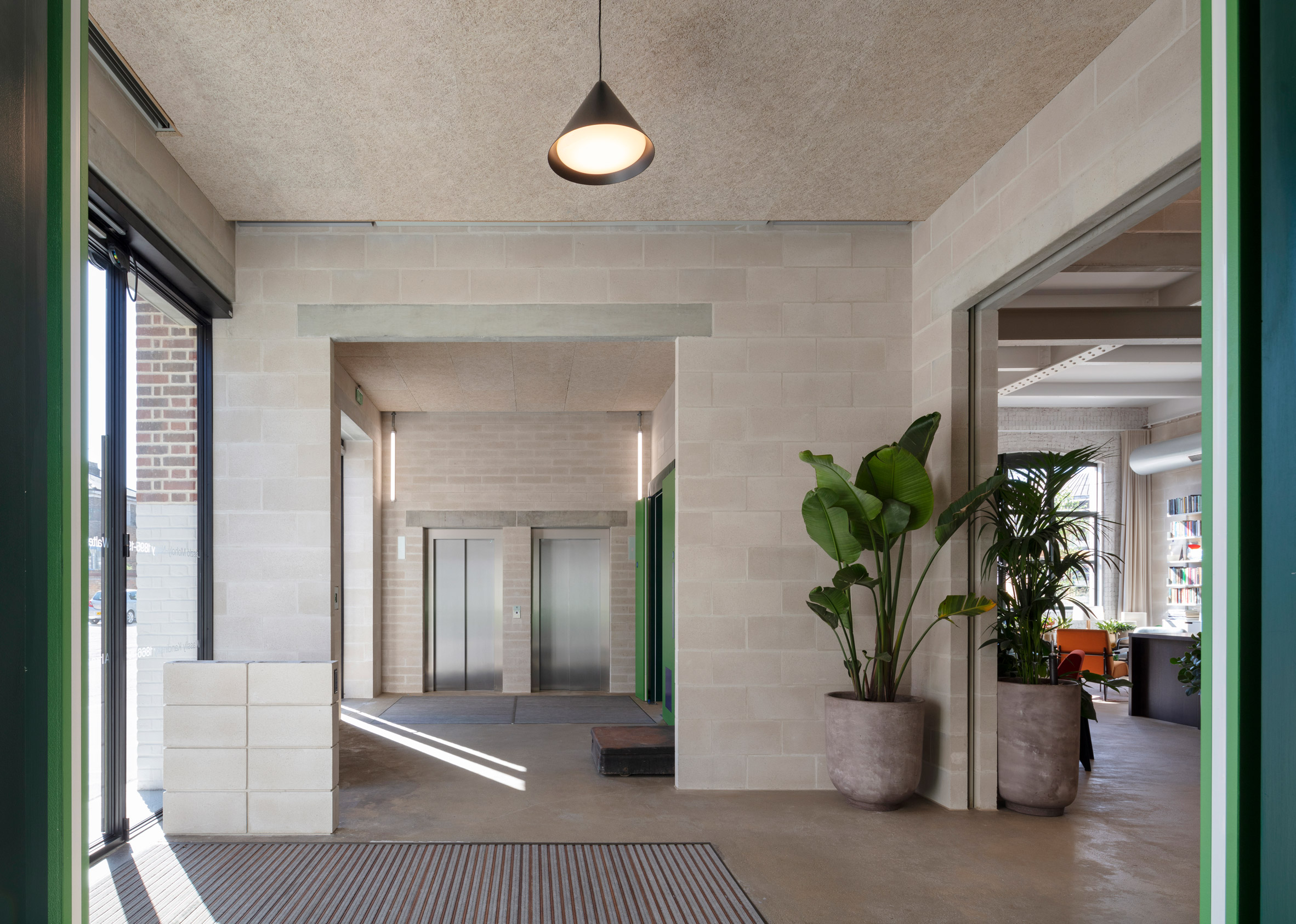 Structural elements are left exposed through Laszlo's interiors
Henley Halebrown approached the project differently to a standard office conversion.
Instead of a "shell and core" approach, where tenants have no choice but to complete a fit-out, the architects have made spaces that can be occupied simply as they are.
They did this by exposing the building's internal structure – its concrete floor slabs and steel I beams – and bringing order to the elements around. Services are neatly organised, while low-tech materials like concrete and timber are used to make adjustments.
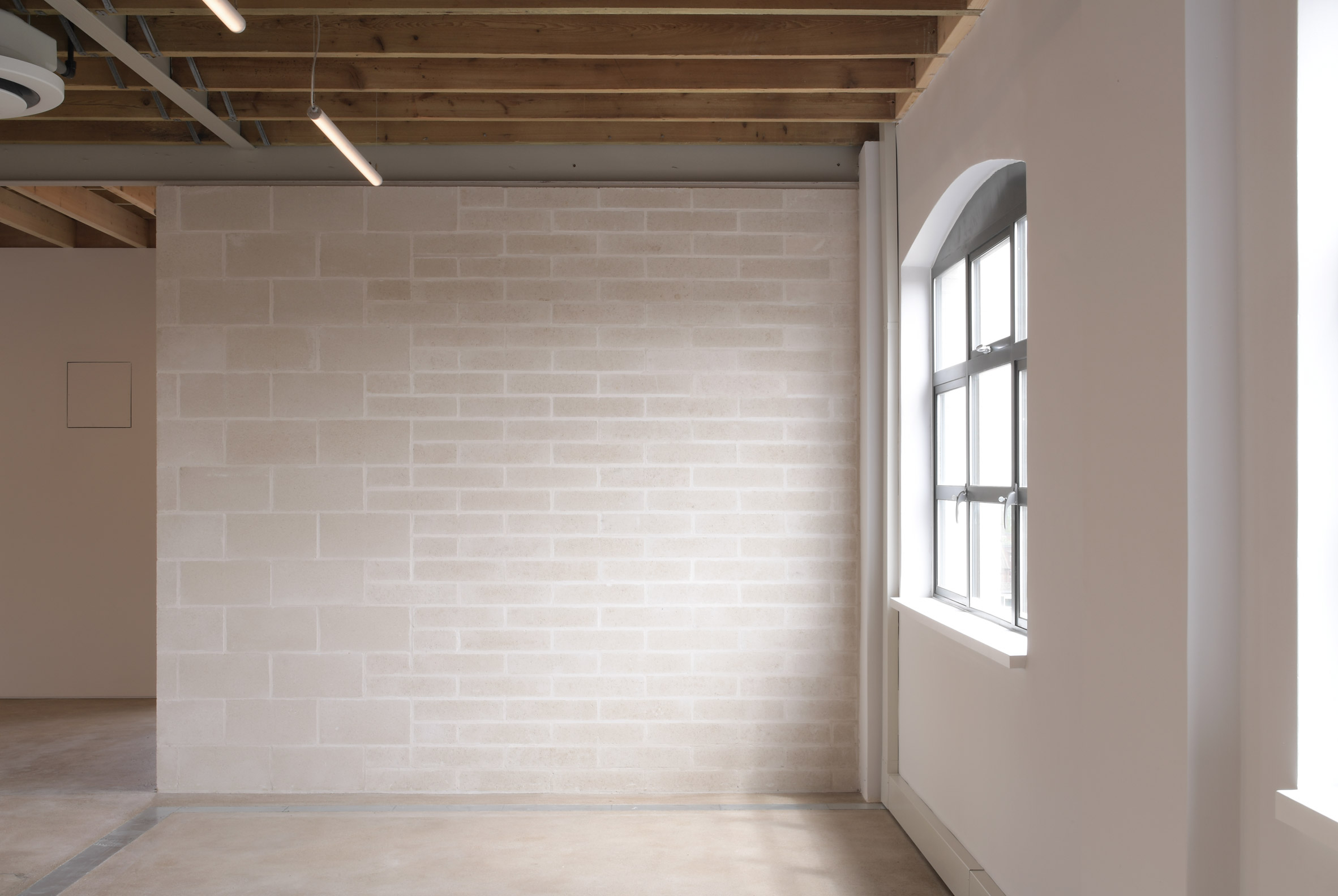 Offices are designed to require minimal additional fit-out
Studio founders Simon Henley and Gavin Hale-Brown describe the approach as seeking "to illustrate how elementary the construction of an office might be".
The idea is that companies would only need to add their own branding, plus furniture, which would significantly reduce the amount of waste generated when tenants move out.
[ 
Read:
Waugh Thistleton Architects creates fully demountable office block next door to Dezeen
](https://www.dezeen.com/2020/07/08/waugh-thistleton-architects-demountable-clt-6-orsman-road/)
"Working on adaptive reuse buildings like Laszlo is second nature to us as a practice," said Henley.
"It builds on our interest in how you create new layers of life within a city while celebrating both its past and future, and of course, the great thing is that the huge environmental benefits that come through reuse are now more widely understood."
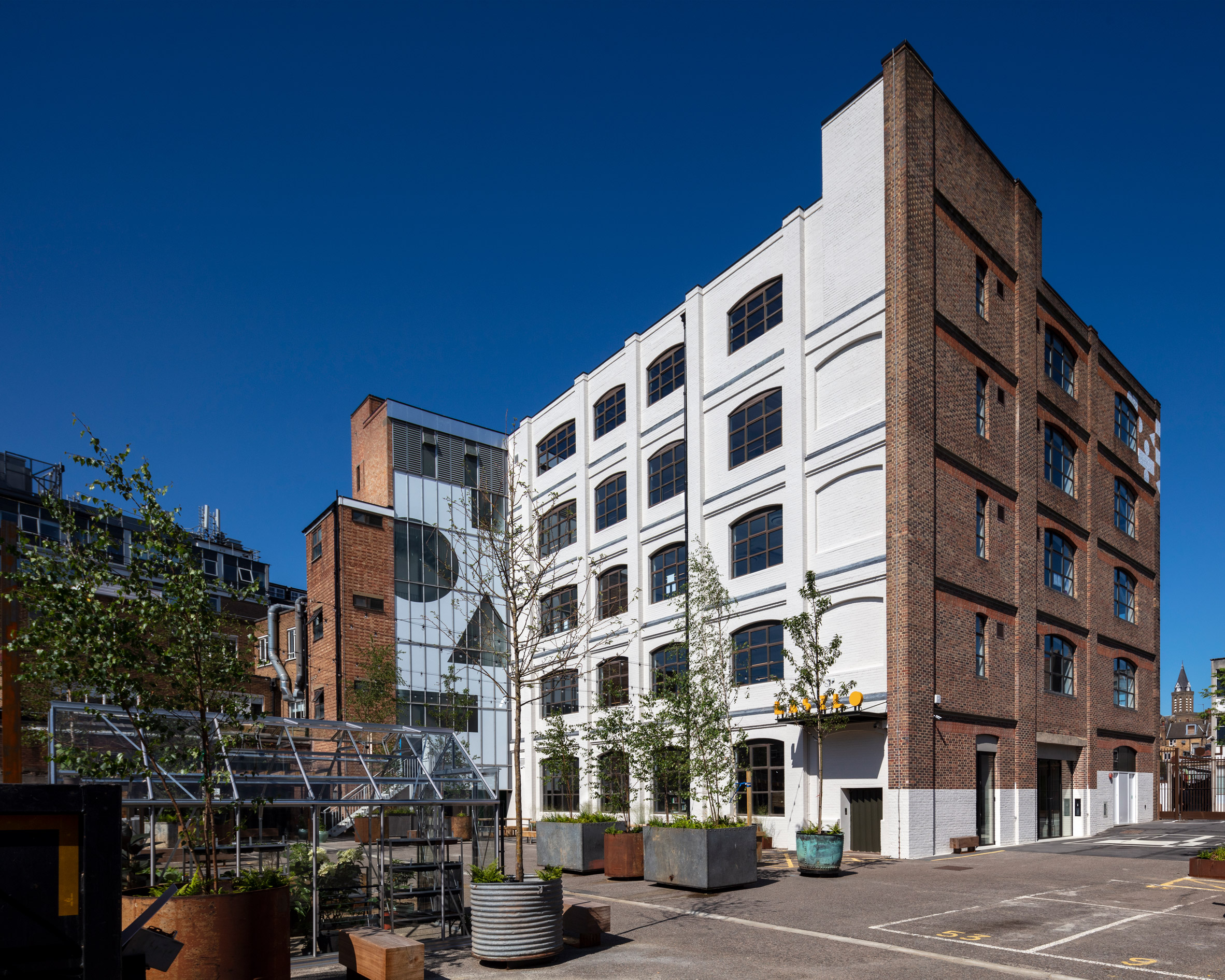 Geometric graphics signal the building's change of use
Originally known as Batavia Mills, Laszlo was built in the early 20th century as a facility for manufacturing and printing, although it also served as storage for gas masks during the second world war.
The Bauhaus become an obvious point of reference for the renovation; not only does it date from the same period, but its core ethos was about being true to materials and finding beauty in craft.
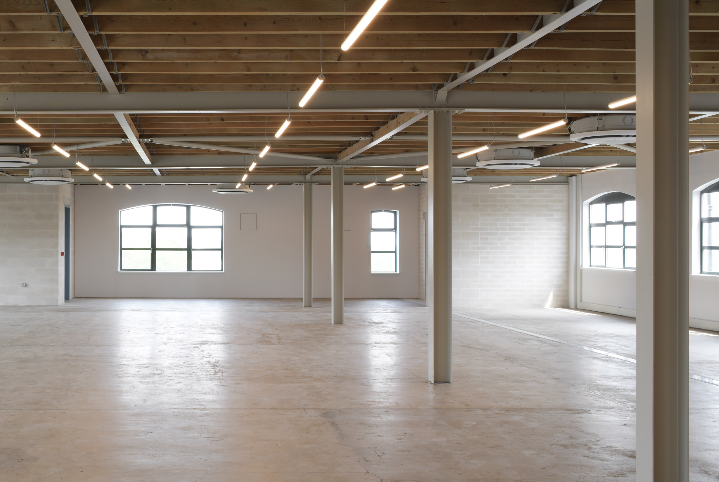 A steel and timber joisted roof is now exposed on the fourth floor
A painting by Bauhaus artist Laszlo Moholy Nagy – who the building is named after – provided the cues for repairs made to the concrete floors.
There were various gaps created where partition walls had been removed. Instead of infilling these with concrete, Henley Halebrown chose an earth-coloured screed that highlights these marks as traces of history.
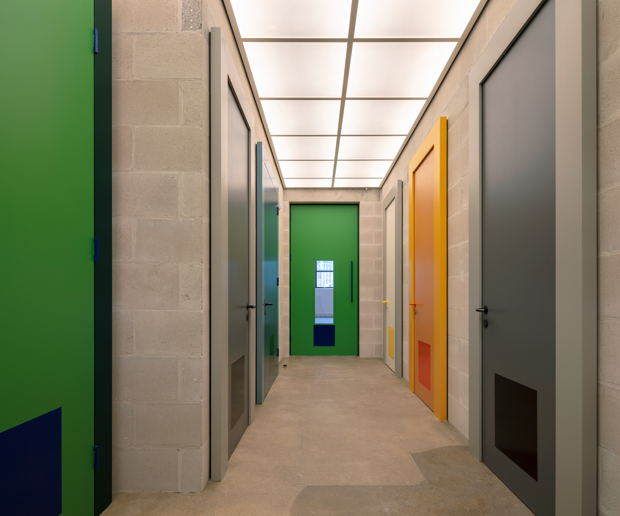 Doors throughout the interior borrow tones from Josef Albers' colour studies
The building refers to the colour studies of Bauhaus teacher Josef Albers with a series of doors painted in bold but complementary shades of green, yellow, grey and blue.
Another Bauhaus reference can be found on the exterior, where the brickwork and glazing have been subtly decorated with the same graphic shapes and lettering that give the building its brand identity.
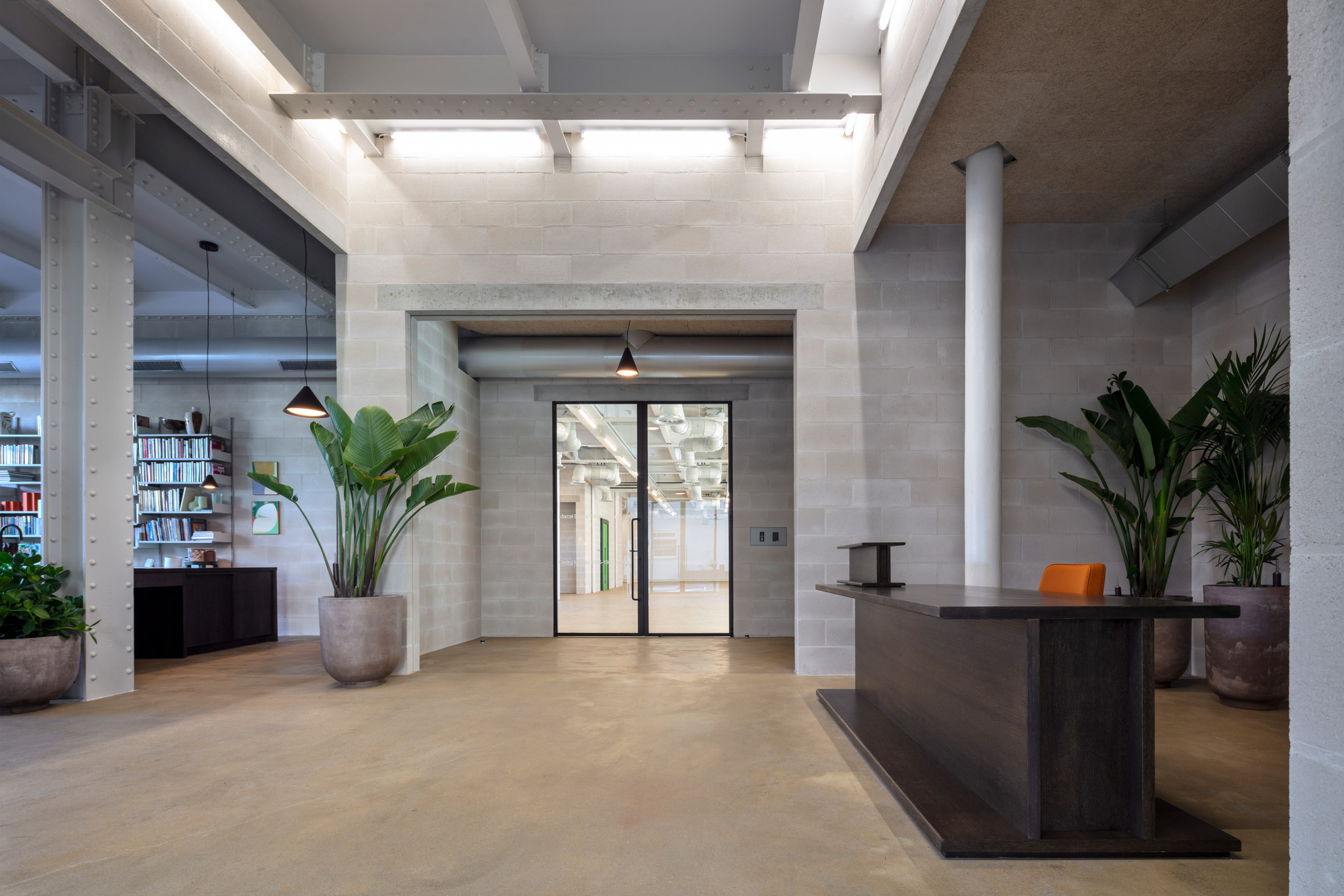 The reception features a desk shaped like an I beam
Laszlo offers various amenities to its tenants, including a large outdoor seating area, bicycle parking and showers. There are also shared spaces on the ground floor, including a reception and an area known as the living room.
Furniture in these ground floor spaces is designed to feel like part of the structure, with highlights including a reception desk and bookshelf that both look like giant I beams.
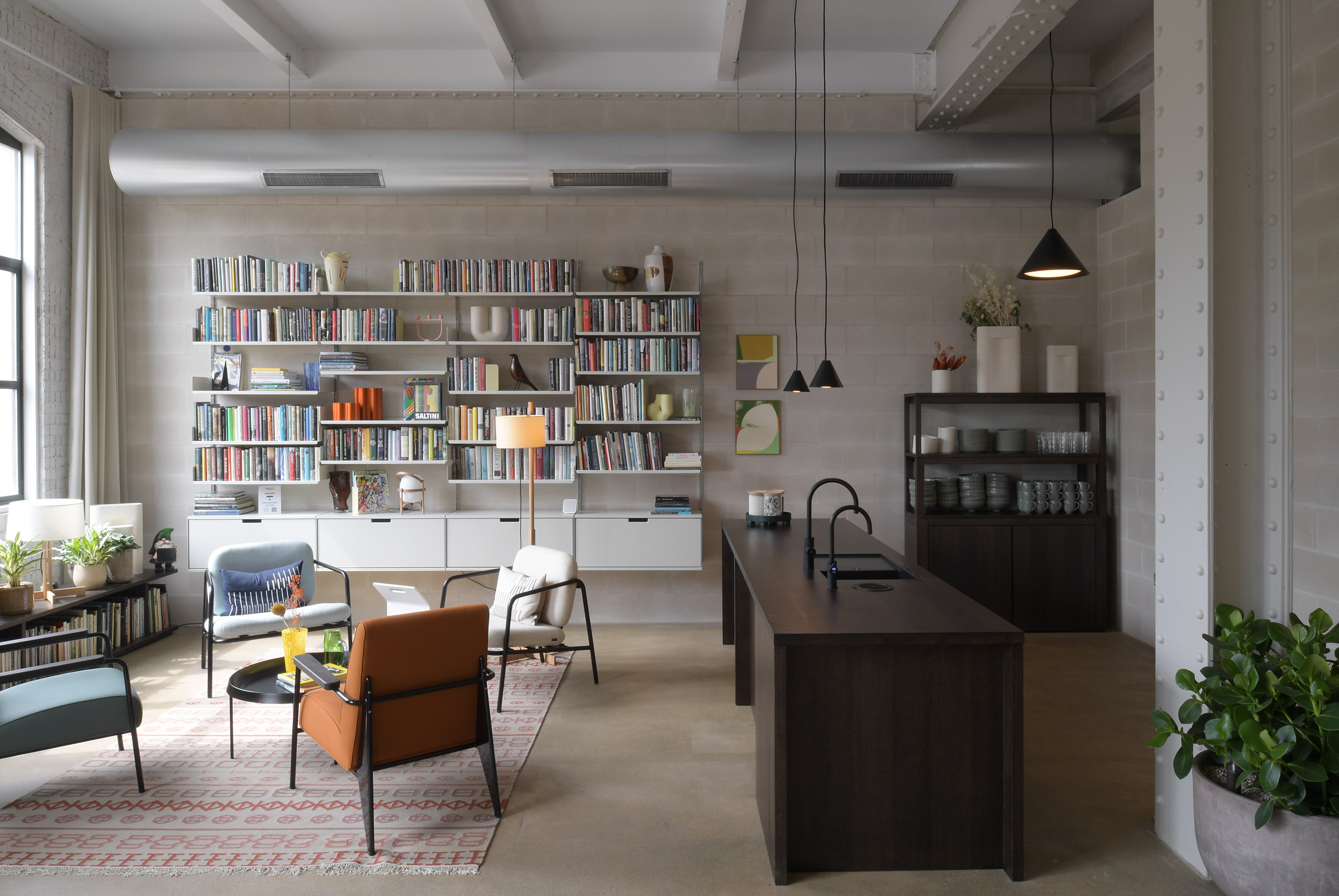 A living room with kitchen is shared by all tenants
"Within the framework of the original structure, we composed a series of unconventional spaces with conventional building materials, mostly blockwork, lintels and paint," said Jack Hawthorne, an associate at Henley Halebrown.
"These spaces are occupied with pieces of furniture that are imagined and made as oversized elements of structure, 'furniture as structure', placing them in playful dialogue with the building's newly exposed frame."
 One of the office floors has already been furnished
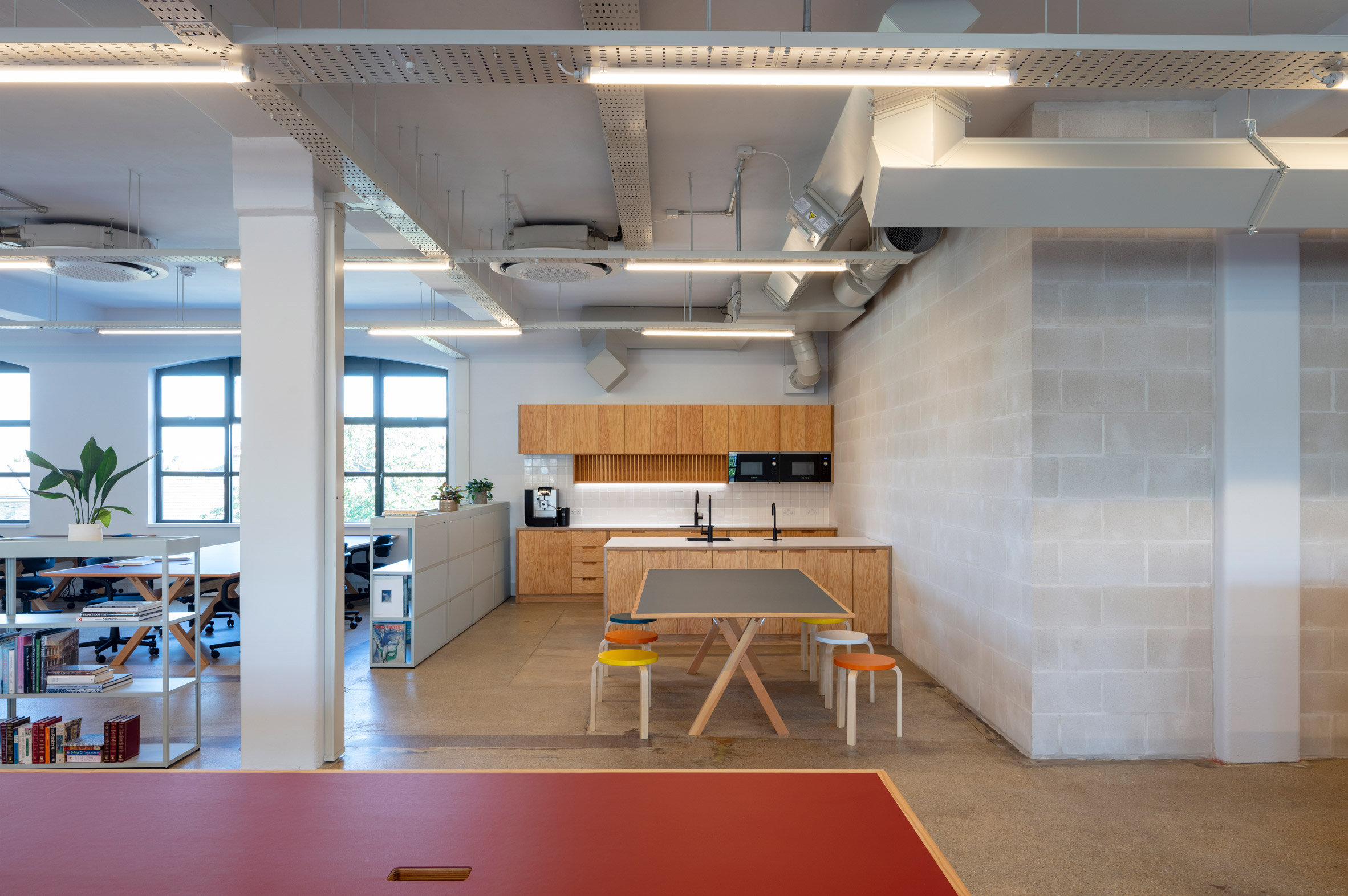
Photos of the project show one of the office floors already fitted out.
The light-touch approach includes glazed meeting rooms, a wooden kitchen and mobile shelves that function as room dividers. Desks and seats integrate bold flashes of colour that feel at home with the rest of the building.
Each floor is similar in layout and finish, although the fourth floor features an exposed steel and timber joisted roof and a balcony terrace.
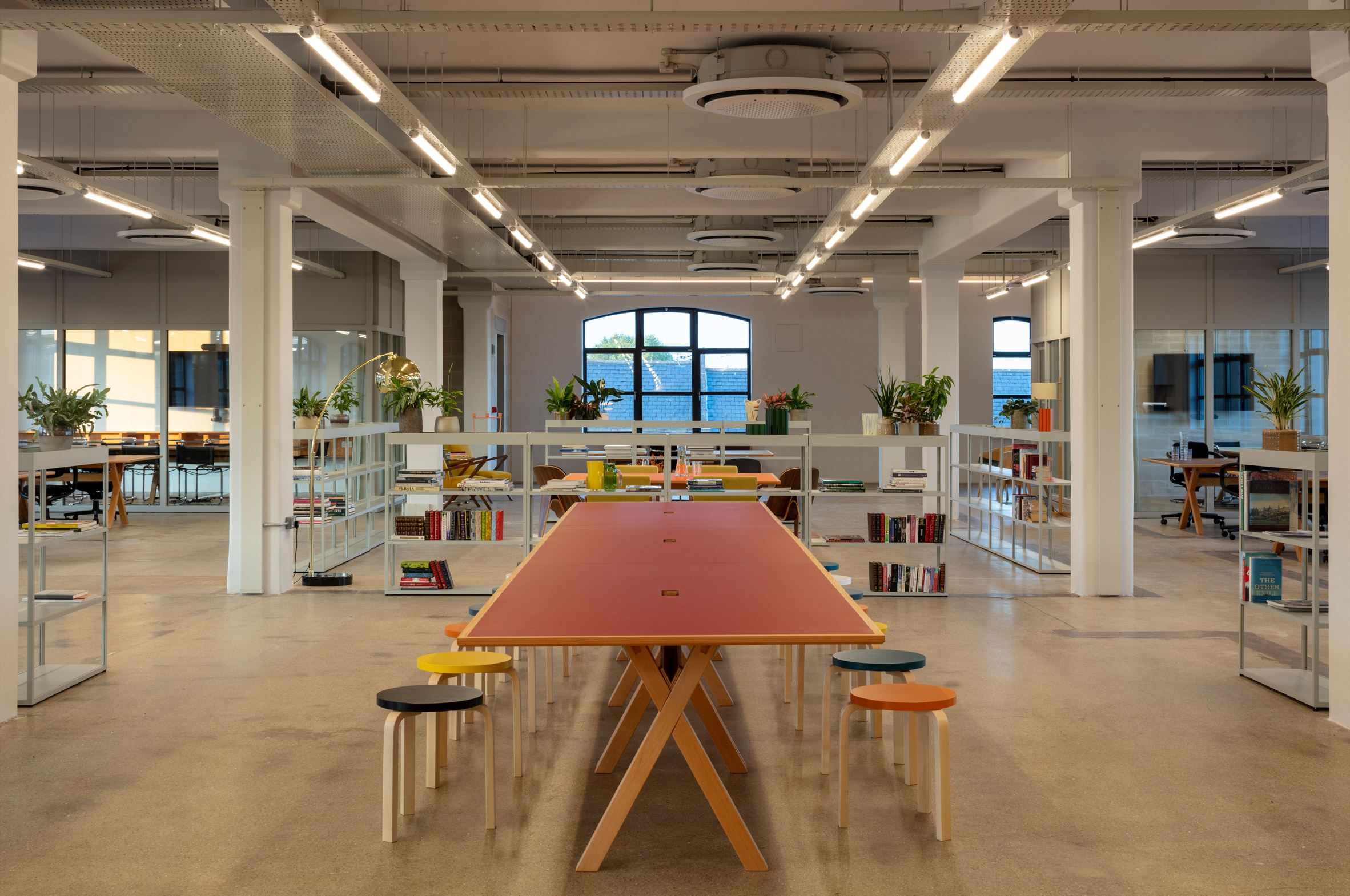 The space features colourful desks, open shelves and glazed meeting rooms
Laszlo is one of several innovative offices designs recently completed in London, as companies adapt to more flexible working policies following the impact of the pandemic.
Other recent examples include a co-working office that doubles as a "town hall" and an office with more meeting areas than desks.
The photography is by David Grandorge.
The post Henley Halebrown creates Bauhaus-inspired offices in converted London warehouse appeared first on Dezeen.
#all #interiors #london #uk #bauhaus #england #officeinteriors #henleyhalebrown #offices
Takk perches communal bedroom on stilts in Madrid apartment renovation

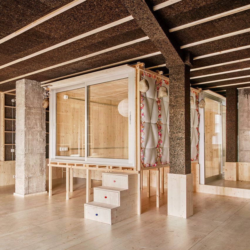
Spanish architecture studio Takk has pulled back the walls of an apartment in Madrid to create an outdoor terrace alongside an insulated space that contains a bedroom on stilts.
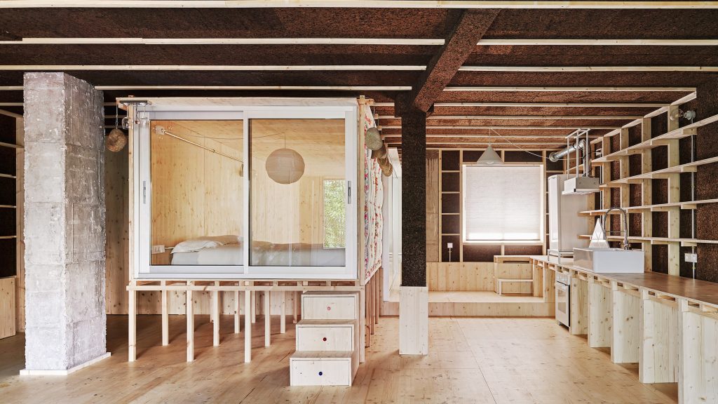
Takk removed all of the 110-square-metre flat's interior walls to create a new 60-square-metre space enclosed with insulated pinewood walls, dubbed the winter house.
This space contains an open-plan kitchen and living room as well as a self-enclosed bedroom perched on stilts, which is designed to be shared by a couple and their young daughter.
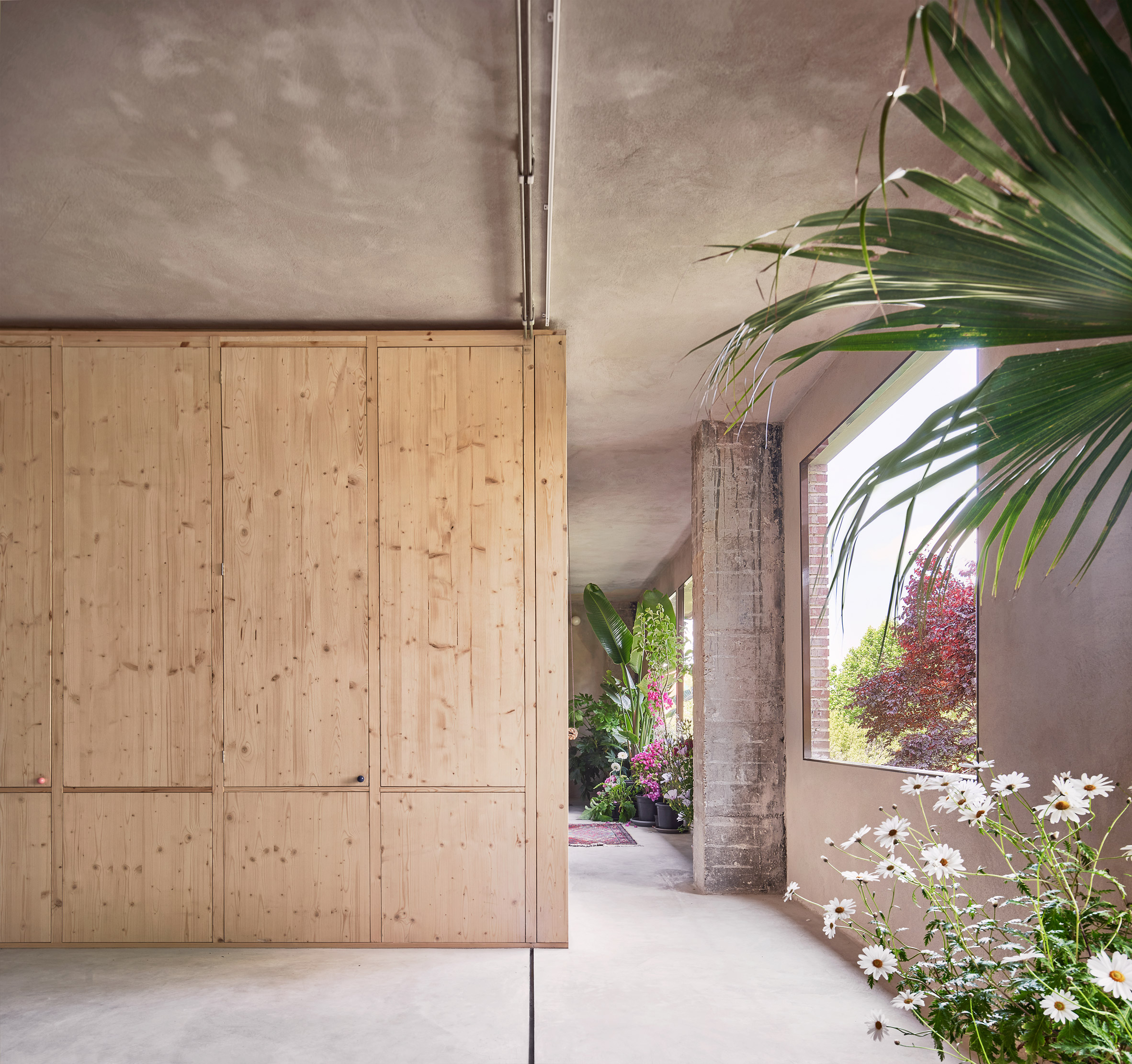 Takk has pulled back the walls of a Madrid apartment to divide it into two spaces
Both the bedroom and the flat's new exterior walls are made from low-carbon, heat-retaining materials, with pinewood frames sourced from Spain's famed winemaking region of La Rioja and insulation made from duvets and charred cork.
Takk nested the spaces in the winter house inside each other like the "layers of an onion" to retain heat and conserve energy during the colder months.
Alongside the apartment, the studio created an exterior terrace by relocating the external walls and removing the previous north-facing windows.
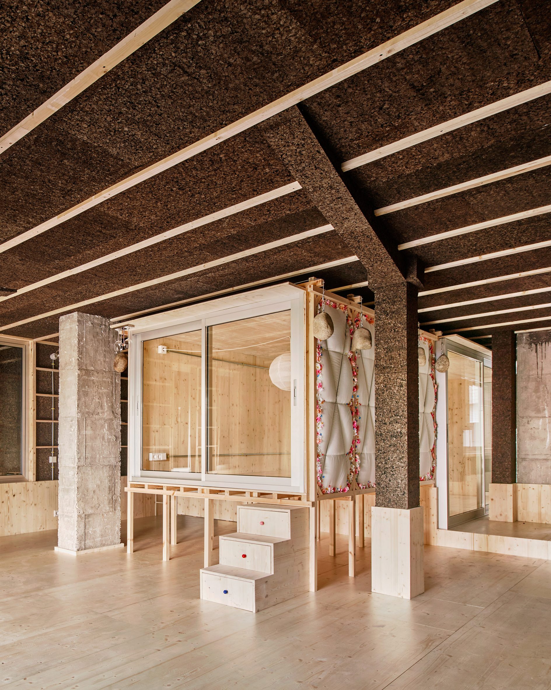 The apartment's self-enclosed bedroom is raised on stilts
Named the summer house, this space is connected to the inner areas of the home by sliding glass doors.
According to the studio this arrangement eliminates the need for air-conditioning by passively cooling the interior and helping to lower the apartment's carbon emissions in operation.
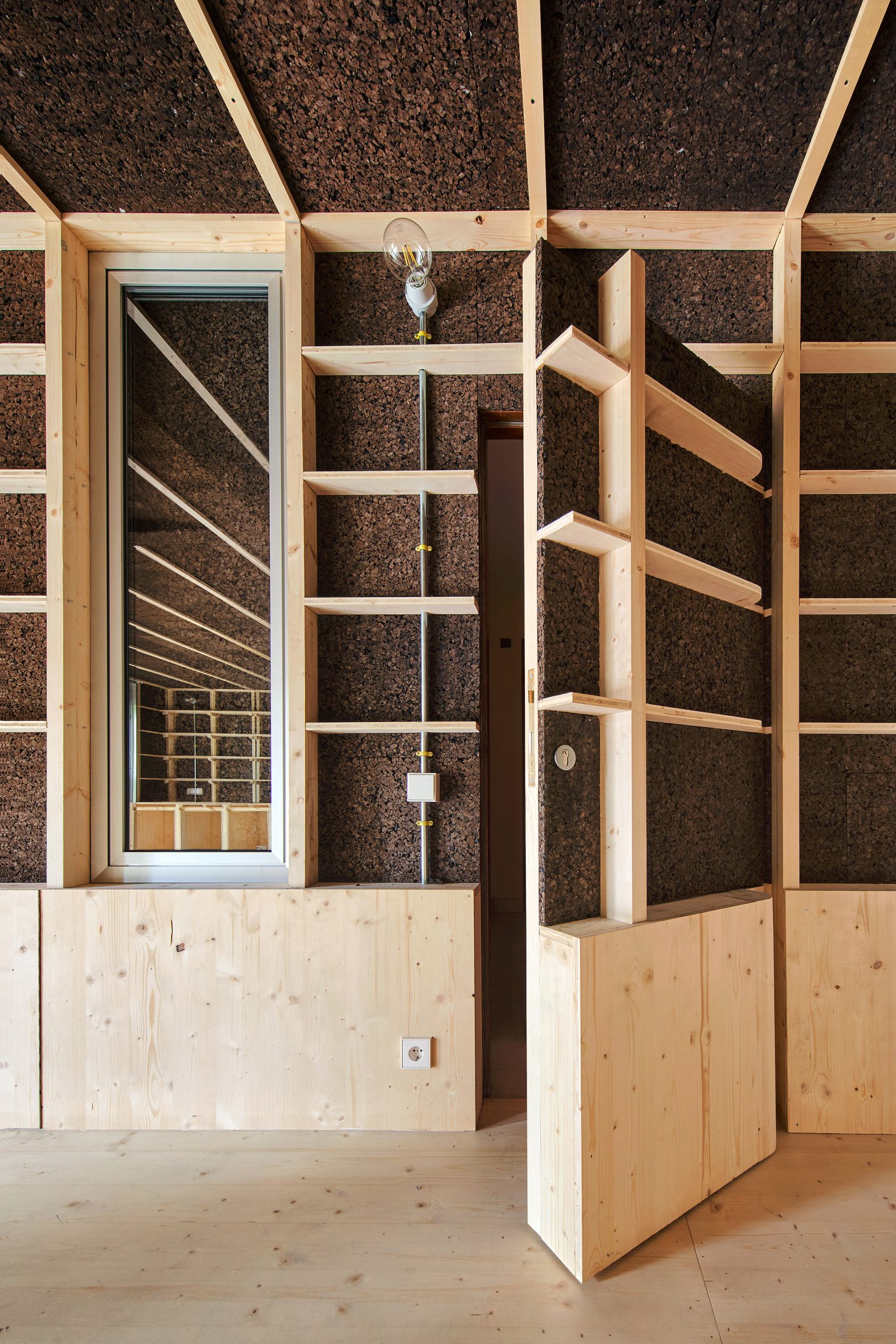 Its door is hidden inside a book shelf
"Climate change will modify all the routines of our existence," Takk co-founder Mireia Luzárraga told Dezeen. "The way we think and build our environments should also adapt to this new situation."
"The project tests possible ways of organising a house to minimise energy consumption while using materials with a low carbon footprint."
From the outside, the door leading to the apartment looks like any other in the residential block. But on the interior of the flat, the entrance is hidden inside a built-in shelving system that runs along one side of the winter house.
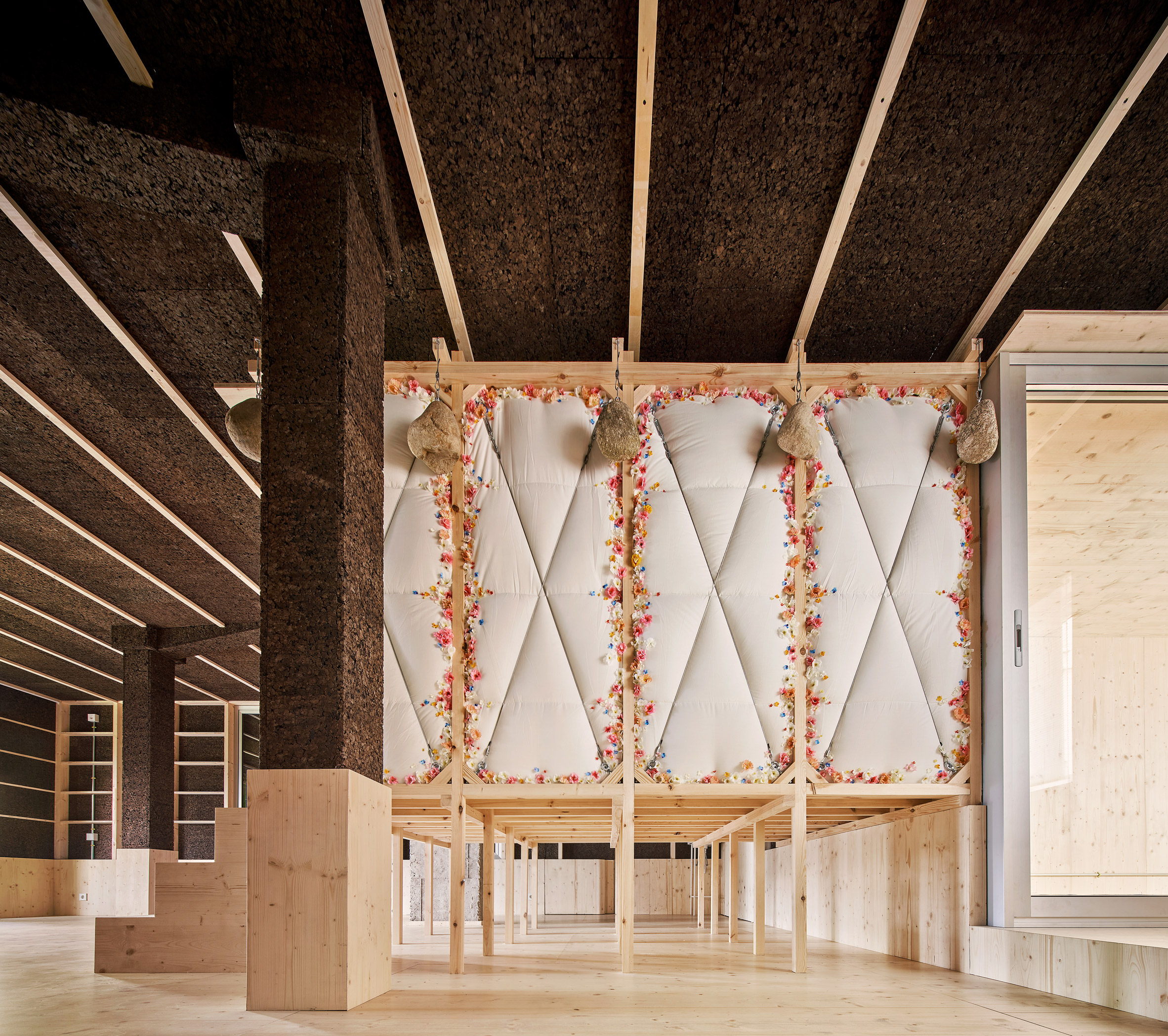 Surfaces throughout the apartment are clad in cork insulation
A similar storage wall is mirrored on the other side of the open-plan space, forming a low counter that functions as a kitchen worktop on one side and a dining table and work desk on the other.
Like most surfaces in the winter house, this is almost entirely clad in blackened cork panelling, which stores carbon and holds onto heat in the winter due to its colour and porous structure.
In contrast, the summer house external space is finished with cement mortar, which doesn't hold onto heat from the sun during the warmer months.
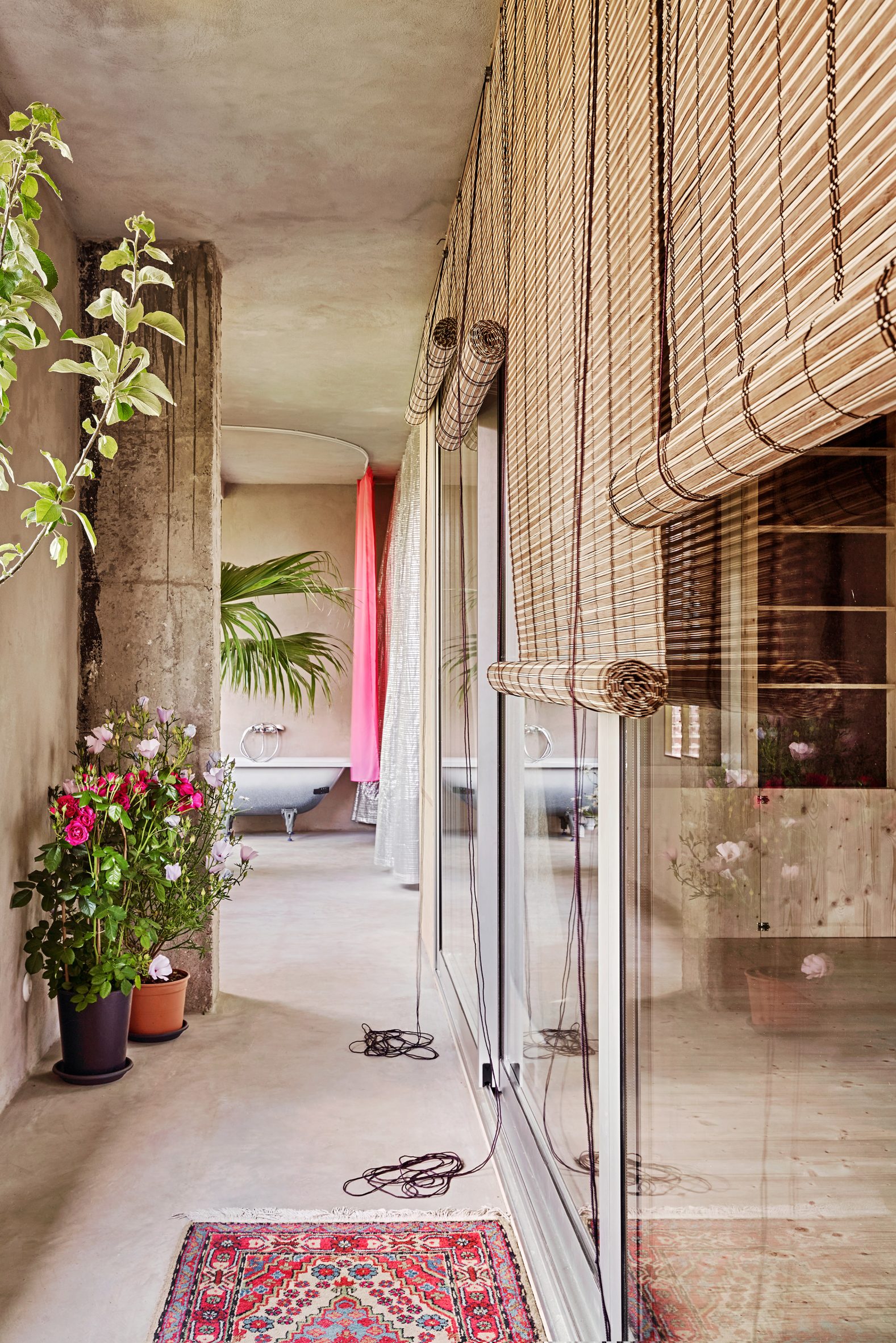 An open-air terrace lies beyond the apartment's pinewood walls
This outdoor area consists of a narrow plant-filled porch that runs along the apartment's entire north-facing wall to maximise natural light.
At one end, it opens up into a covered terrace, separated from the interior by a pinewood wall with a row of tall vertical vents that can be opened to create a through-draft.
In summer, the space can be shielded from the sun by an aluminium-foil thermal curtain normally used in greenhouses, while folding glass doors allow it to be turned into a kind of winter garden once temperatures drop.
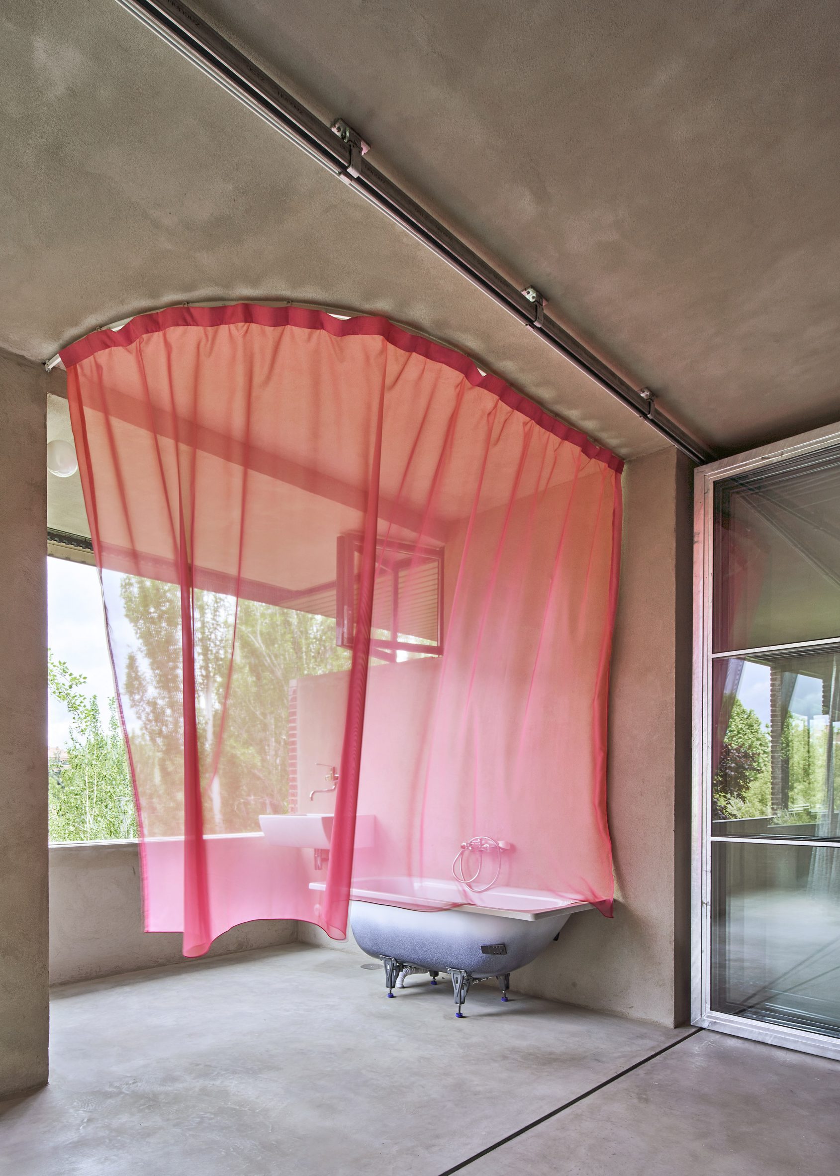 A communal outdoor bathtub is hidden behind a sheer pink curtain
On the other side of the folding doors lies a balcony housing a speckled bathtub, which is shielded from view only by a sheer pink gossamer curtain.
This bathroom is designed to be used only in summer and by multiple members of the family at the same time, much like the open-plan living area and bedroom.
[ 
Read:
Ten buildings on stilts that raise the stakes
](https://www.dezeen.com/2018/08/18/10-buildings-on-stilts-raised-architecture/)
"The aim is to test the benefits, both energetic and emotional, of sleeping, playing or working together," said Takk's other half Alejandro Muiño.
"In the past, rooms used to be bigger because they were communal and easier to heat. We want to recover this popular knowledge that was forgotten due to the emergence of cheap energy."
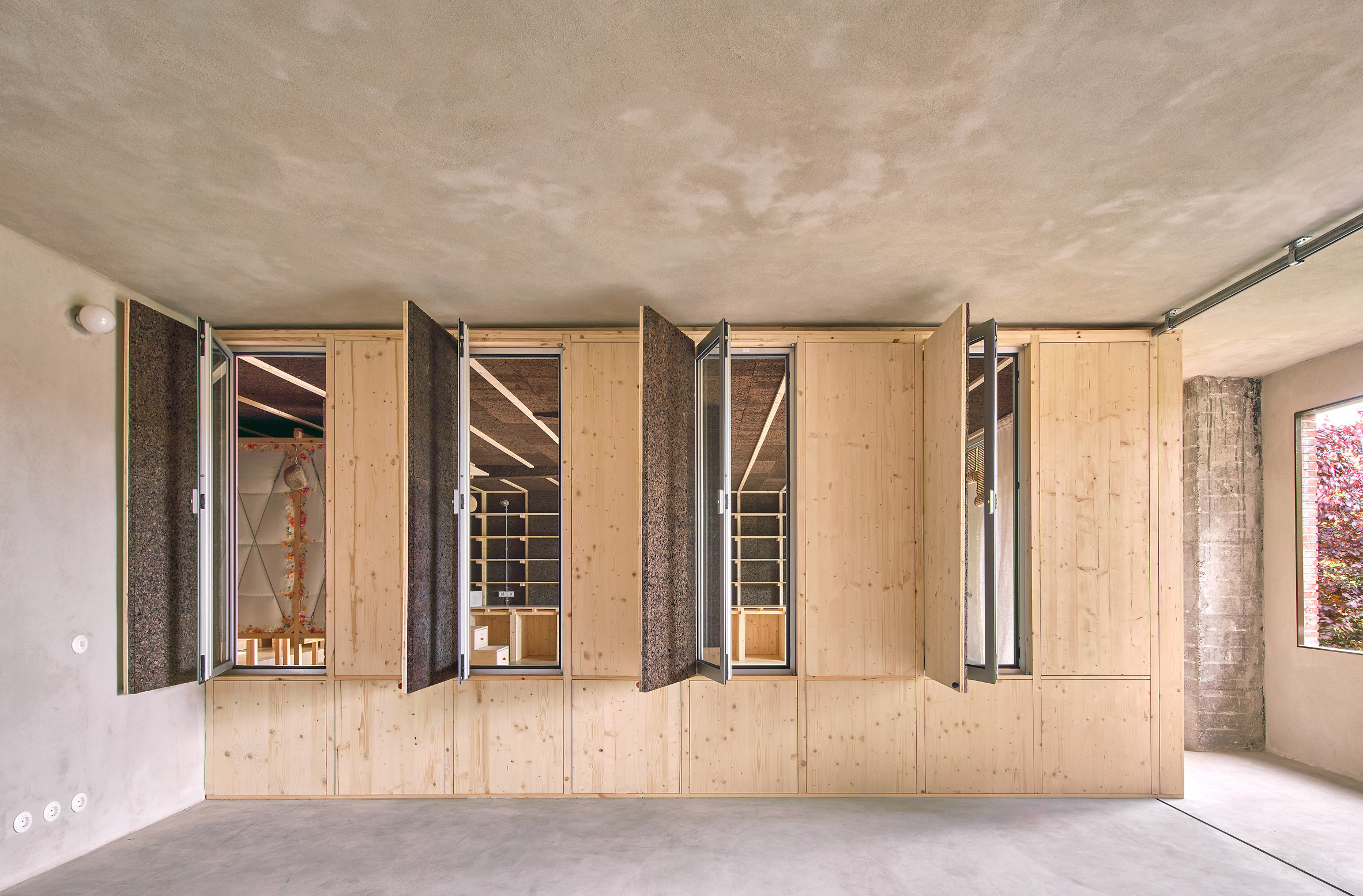 Vents in one of the terrace's walls can be opened to create a draft
The stilted bedroom is the warmest part and the centrepiece of the home contained within the cork-panelled winter house and fitted with an extra layer of insulation in the form of duvets.
These are strapped to the outside of the pinewood box alongside garlands of fake flowers, while huge stones from a quarry outside Madrid dangle from the ceiling, acting as a structural counterweight to prevent the thin wooden panel from bending.
On the inside, the bedroom is entirely panelled in pinewood and split over two levels.
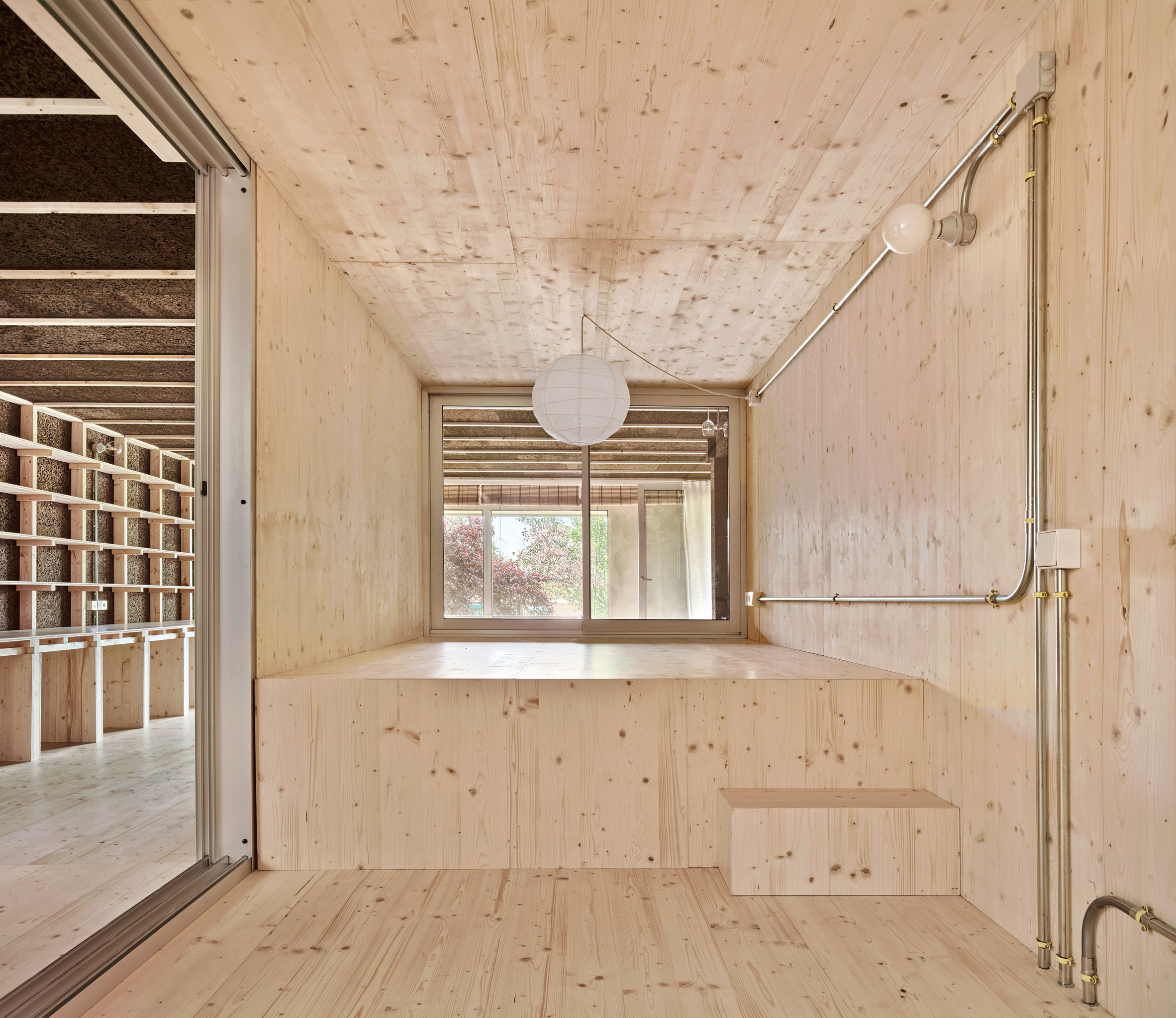 The pinewood bedroom has two different levels
"The advantages of sleeping together are countless, both for climatic and energy-saving reasons and for the reinforcement of emotional links," Takk explained.
"Elevating the bedroom also allows the kitchen to be more present in the daily routine of the residents because it is visible from any part of the house, which helps fight the gender and class cliches associated with these kinds of spaces."
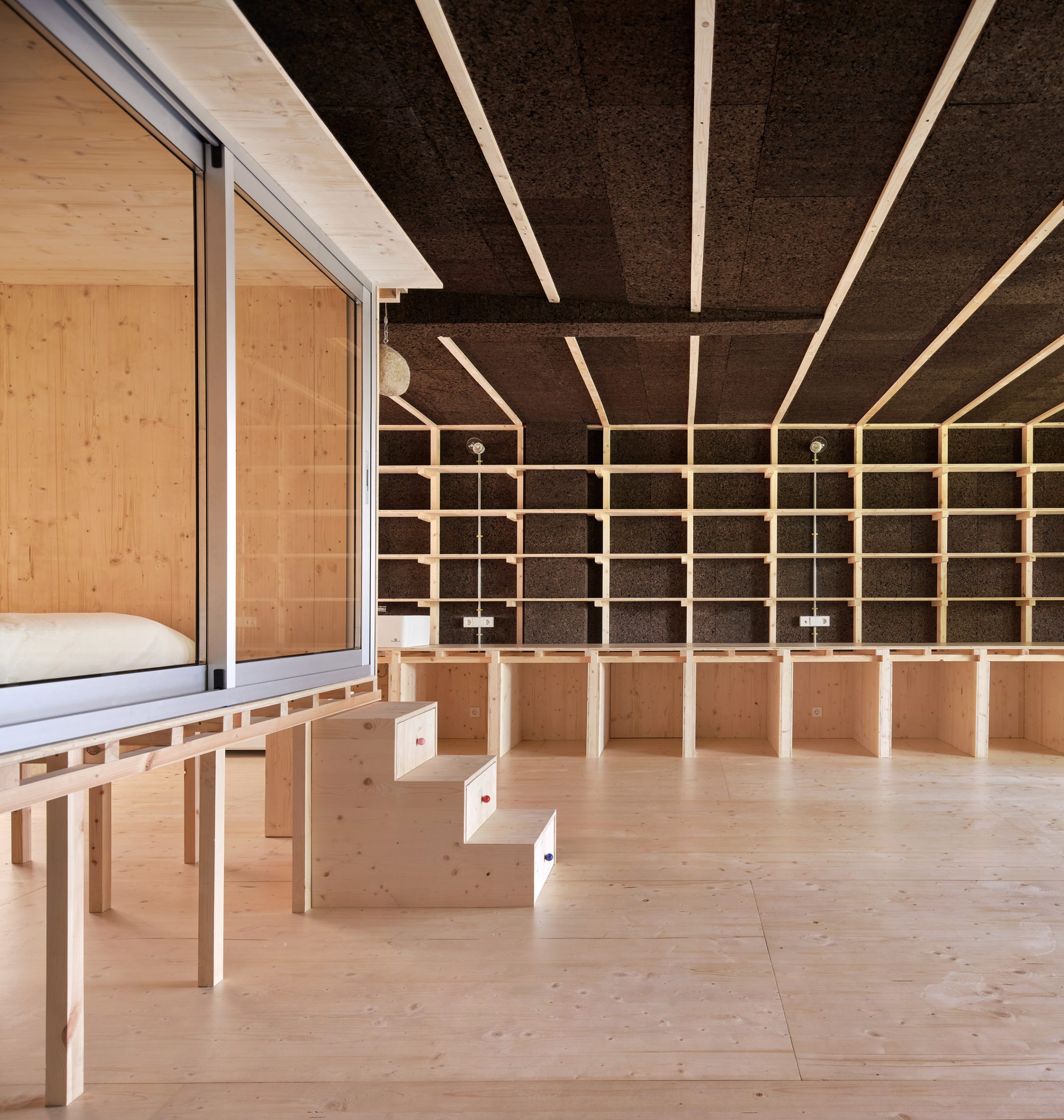 The bedroom is fronted by sliding glass doors
Although elevated rooms such as this are rarely found in interiors, a number of architects have raised entire homes up on stilts in a bid to tread lightly on their surrounding environment.
Dezeen has rounded up 10 of the most impressive examples, from a cork-clad cabin above a tidal salt marsh to a summer house perched on the rocky edge of a Norwegian island.
The photography is byJosé Hevia.
The post Takk perches communal bedroom on stilts in Madrid apartment renovation appeared first on Dezeen.
#all #architecture #residential #interiors #apartments #spain #stilts #madrid #renovations #pine

