#renovations

dezeen@xn--y9azesw6bu.xn--y9a3aq

Studio Okami Architecten exposes brutalist skeleton of Antwerp apartment

image

Blue spiral staircase

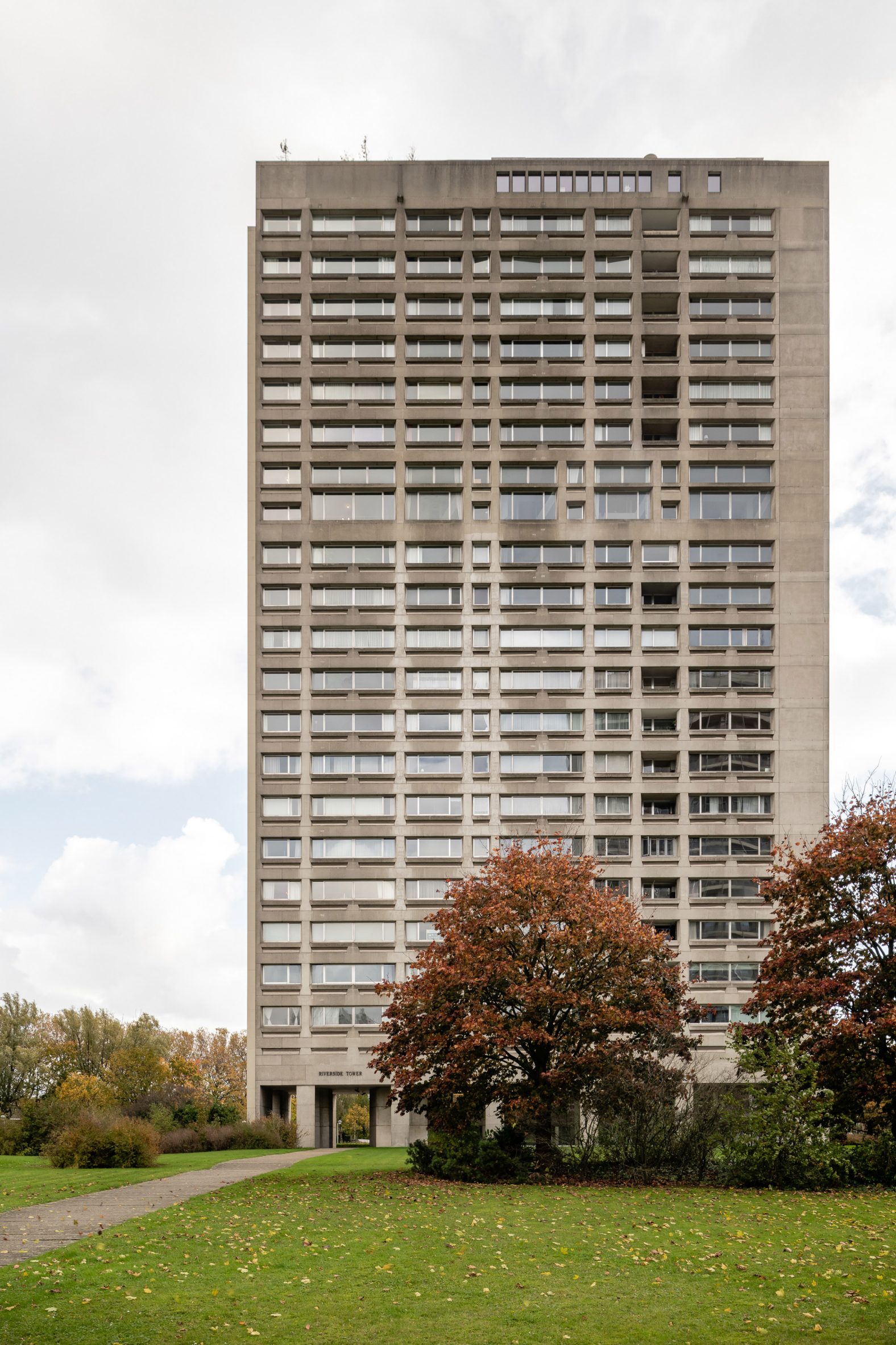
Belgian studio Studio Okami Architecten has renovated a duplex apartment in the brutalist Riverside Tower in Antwerp, allowing its original concrete structure to take centre stage.

The project was led by and designed for Bram Van Cauter, founding partner of Studio Okami Architecten, who lives there with his partner, art collector Doris Vanistendael.

Brutalist duplex apartment in AntwerpStudio Okami Architecten has renovated a duplex apartment in Antwerp

Riverside Tower is a 20-storey apartment building positioned in the bend of the river Scheldt, completed by architects Leon Stynen & Paul De Meyer in the 1970s.

The 230-square-metre apartment is on the thirteenth and fourteenth floors of the building, three storeys above the Studio Okami Architecten office. The couple also owns a duplex in the same building, which contains a guest suite and Vanistendael's art gallery named Soon.

Riverside Tower in AntwerpThe apartment is located in the brutalist Riverside Tower

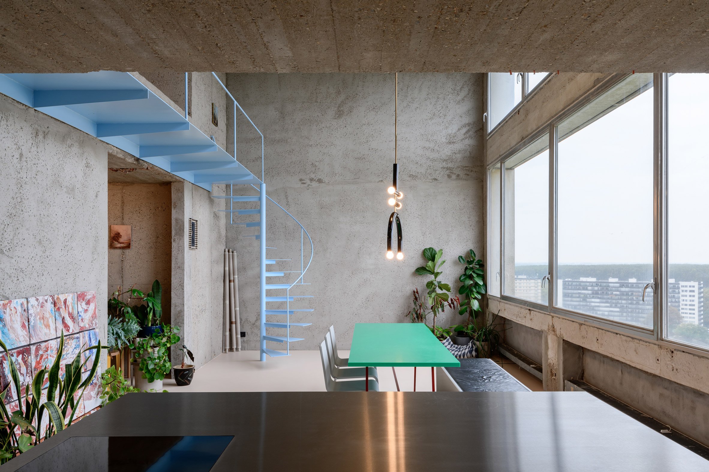
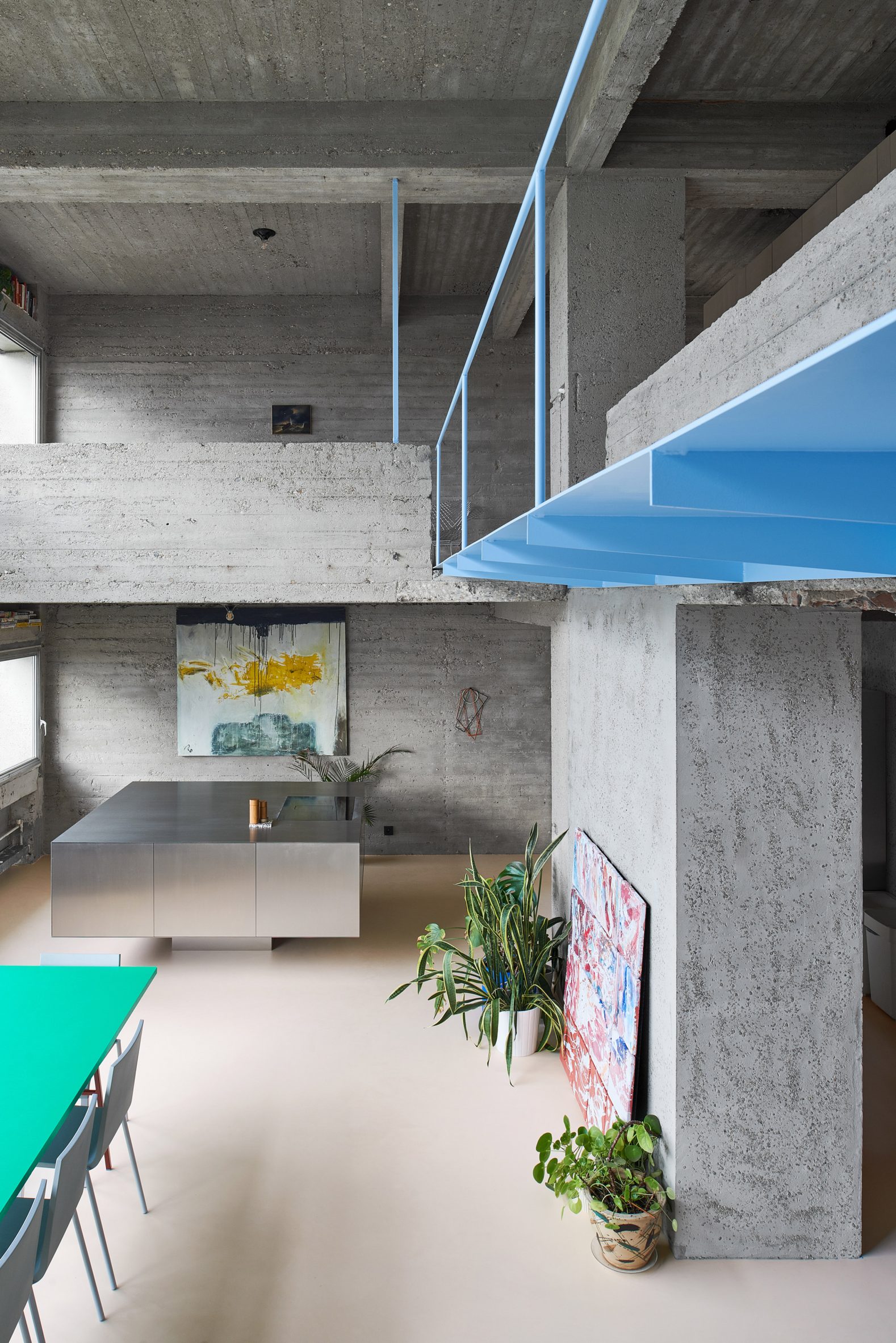
Studio Okami Architecten's first step of the renovation was to tear down the walls of the apartment and strip away all the surface coverings.

While revealing the concrete structure of the apartment, this transformed its layout from a five-bedroom dwelling to a lofty open-plan space with a single bedroom.

Kitchen of Riverside Tower apartment
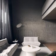
All of its concrete surfaces were exposed

"With the Riverside Tower being a brutalist building, it seemed logical to strip the apartment to the bare concrete, showing the space in its most honest and raw form," Van Cauter told Dezeen.

"Removing the walls allows for unobstructed views over the city," the architect added. "Being childfree, an open-plan space was a logical choice."

Kitchen of Riverside Tower apartmentA sculptural kitchen island was added. Photo is by Matthijs van der Burgt

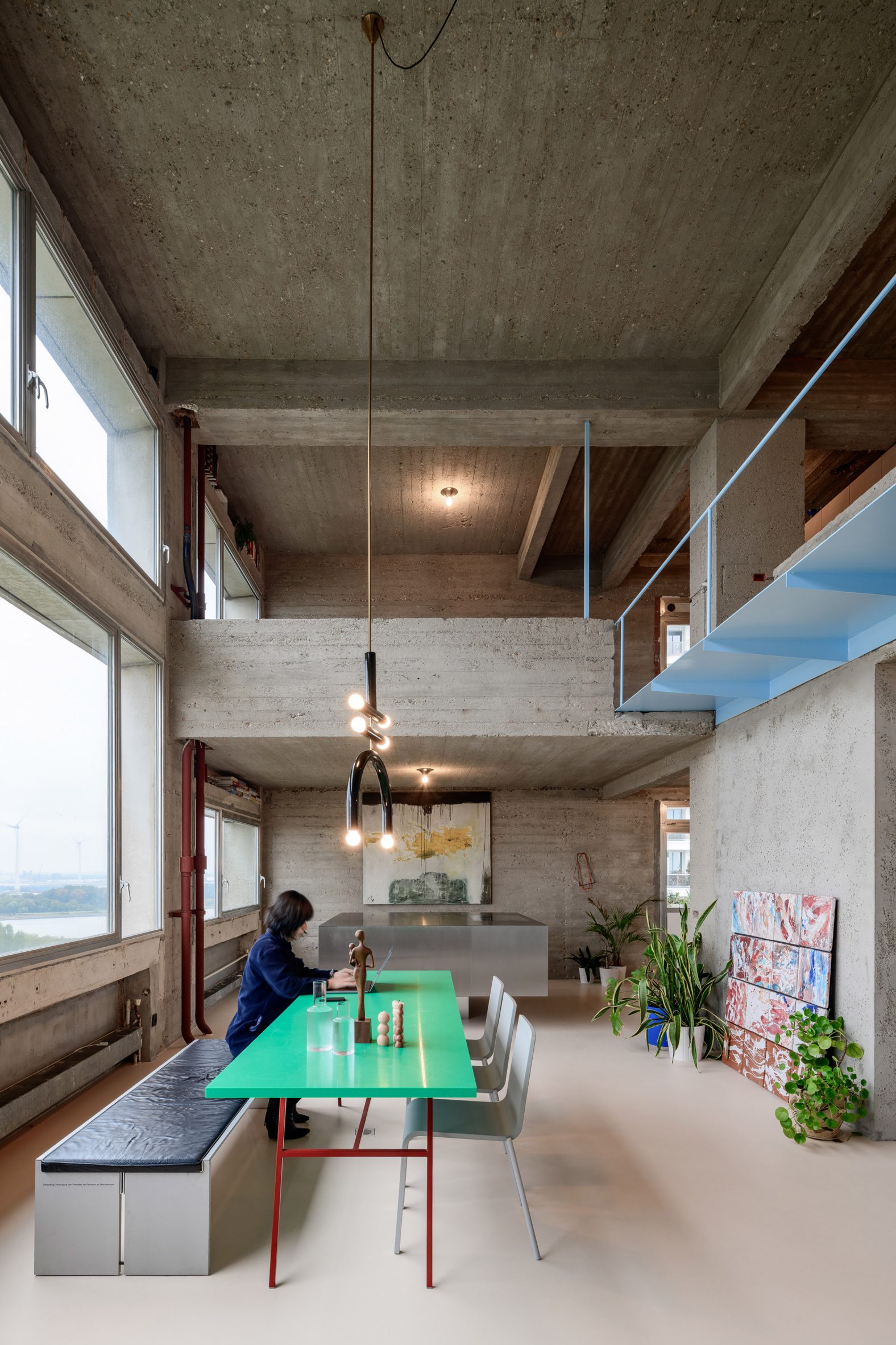
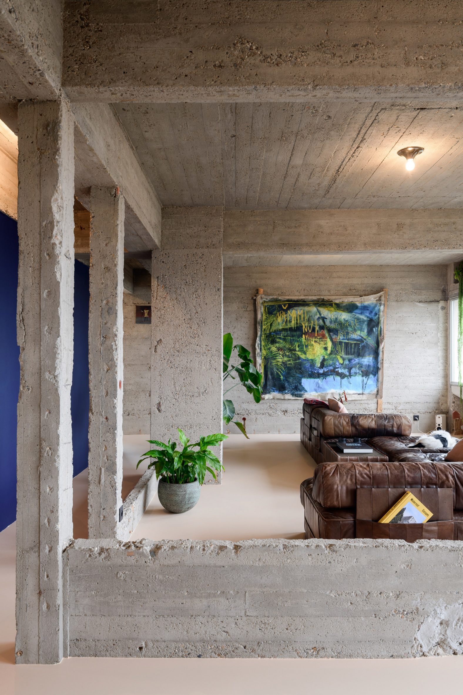
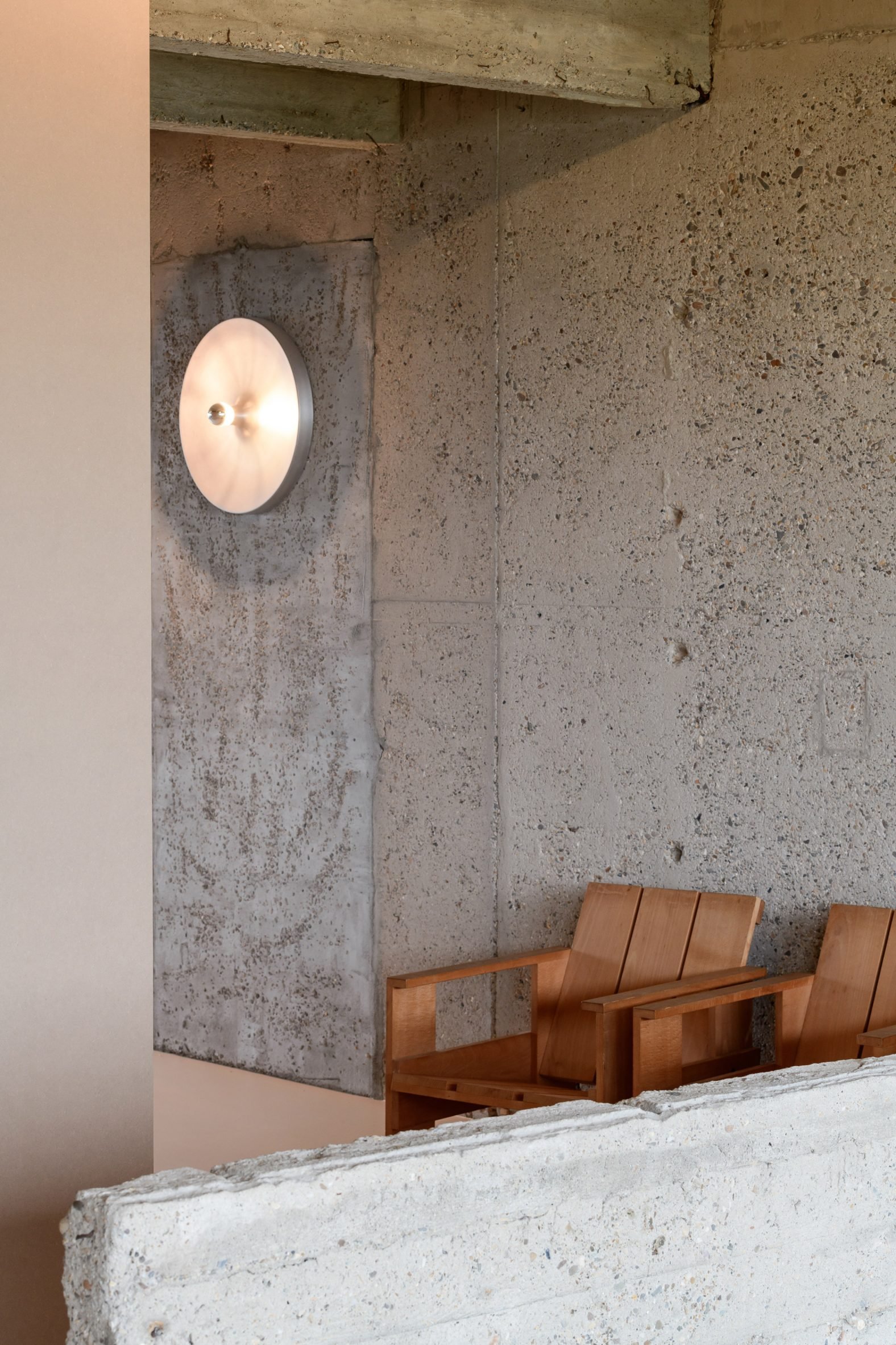
A few brick walls in the dwelling were retained but covered with cement mixed with small stones, creating a finish that matches the original concrete structure.

To counterbalance the rough concrete surfaces, a peach-hued resin floor has been added alongside plants and artworks hung from existing holes in the concrete.

Blue spiral staircase
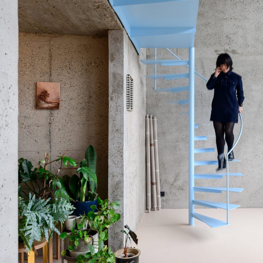
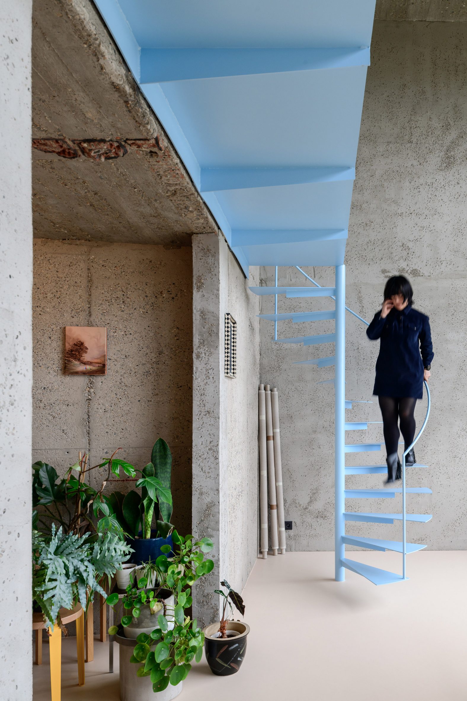
A pastel blue staircase links the two floors of the duplex

"The aim was to balance out the rough concrete by adding colourful elements to the space," Van Cauter explained. "The artworks, furniture and plants all combine to create a homey atmosphere."

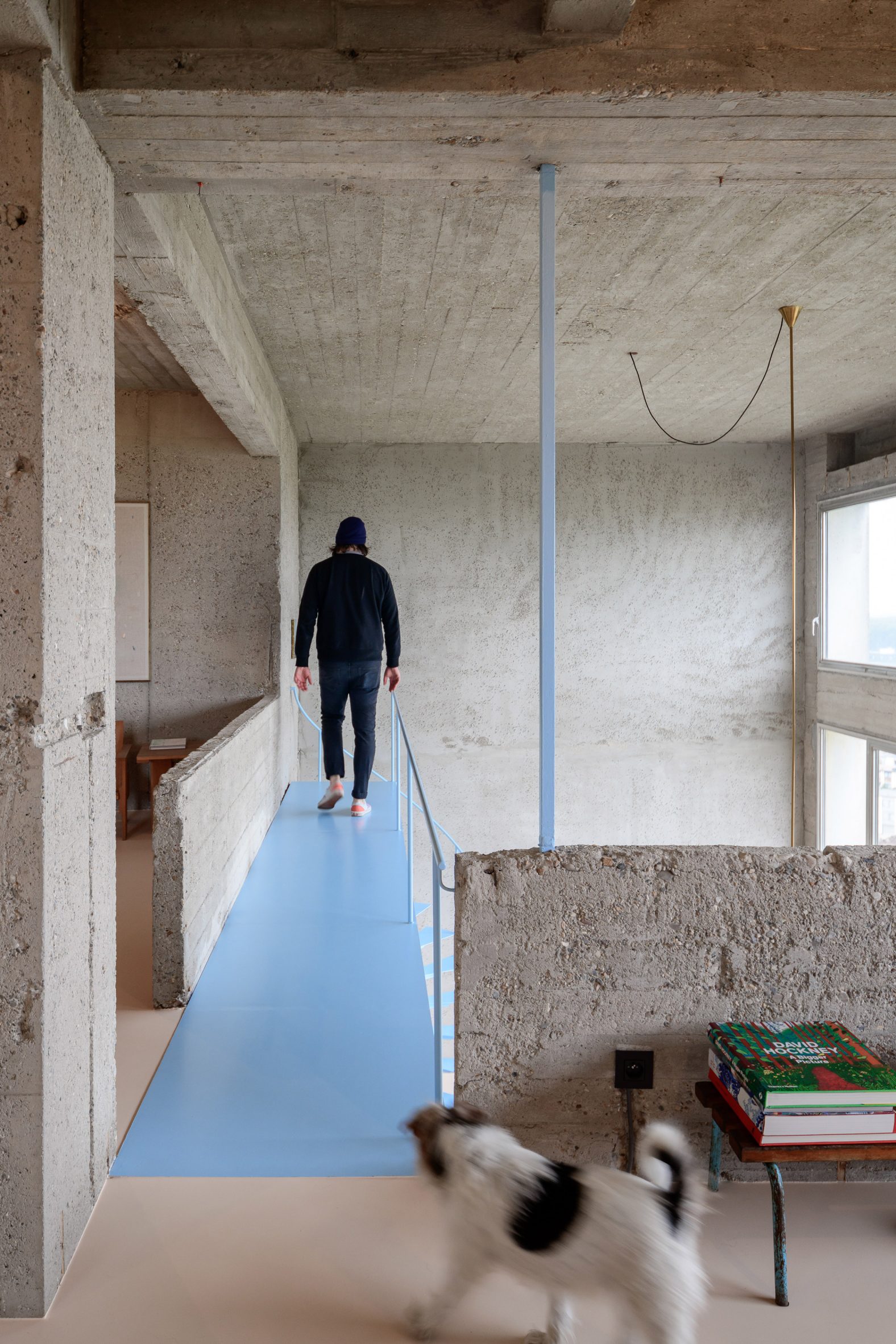
Double-height pivoting windows also brighten the space by providing natural light and views out over the river and a neighbouring forest.

Duplex apartment in the Riverside TowerPops of colour contrast with the concrete

On the lower floor of the apartment is an open-plan kitchen and dining area. Above it is the living room, bedroom and home office.

The apartment's upper level, which is intended to feel more secluded than the floor below, is arranged around a technical block containing the bathroom, storage and utility facilities.

Living room with exposed concrete wallsThe upper level contains more private spaces

"The duplex setup creates a special division between the downstairs entertainment area and the more private upstairs functions like a home office, living and bedroom," Van Cauter explained.

Linking the two levels is a pastel blue spiral staircase, chosen to stand out against the concrete. It was welded and painted in place due to the limited size of the tower's circulation areas.

[ White Togo sofa and armchair in living room of Roseneath Street apartment by Studio Goss

Read:

Studio Goss exposes concrete shell of converted Melbourne apartment

](https://www.dezeen.com/2021/11/23/roseneath-street-apartment-studio-goss/)

The pastel colour palette continues in the bathroom, which is lined with smooth peach pink surfaces.

These surfaces ensure the bathroom is watertight, but they also create a sharp contrast with the rough concrete beams overhead.

Rietveld Crate Chairs set against concreteRietveld Crate Chairs are among the furnishings

Studio Okami Architecten chose a mixture of contemporary vintage furnishings to complete the apartment. Among the classic furniture are the patchwork De Sede DS88 sofa and Rietveld Crate Chairs, while contemporary pieces include a Long Table by Muller Van Severen and a red Bold chair by Big-Game.

There are also a series of bespoke elements, including the kitchen island, designed by Studio Okami Architecten to resemble "a sculpture in the room when out of use". This is teamed with cabinetry that references the work of American artist Donald Judd.

A pastel pink bathroom 
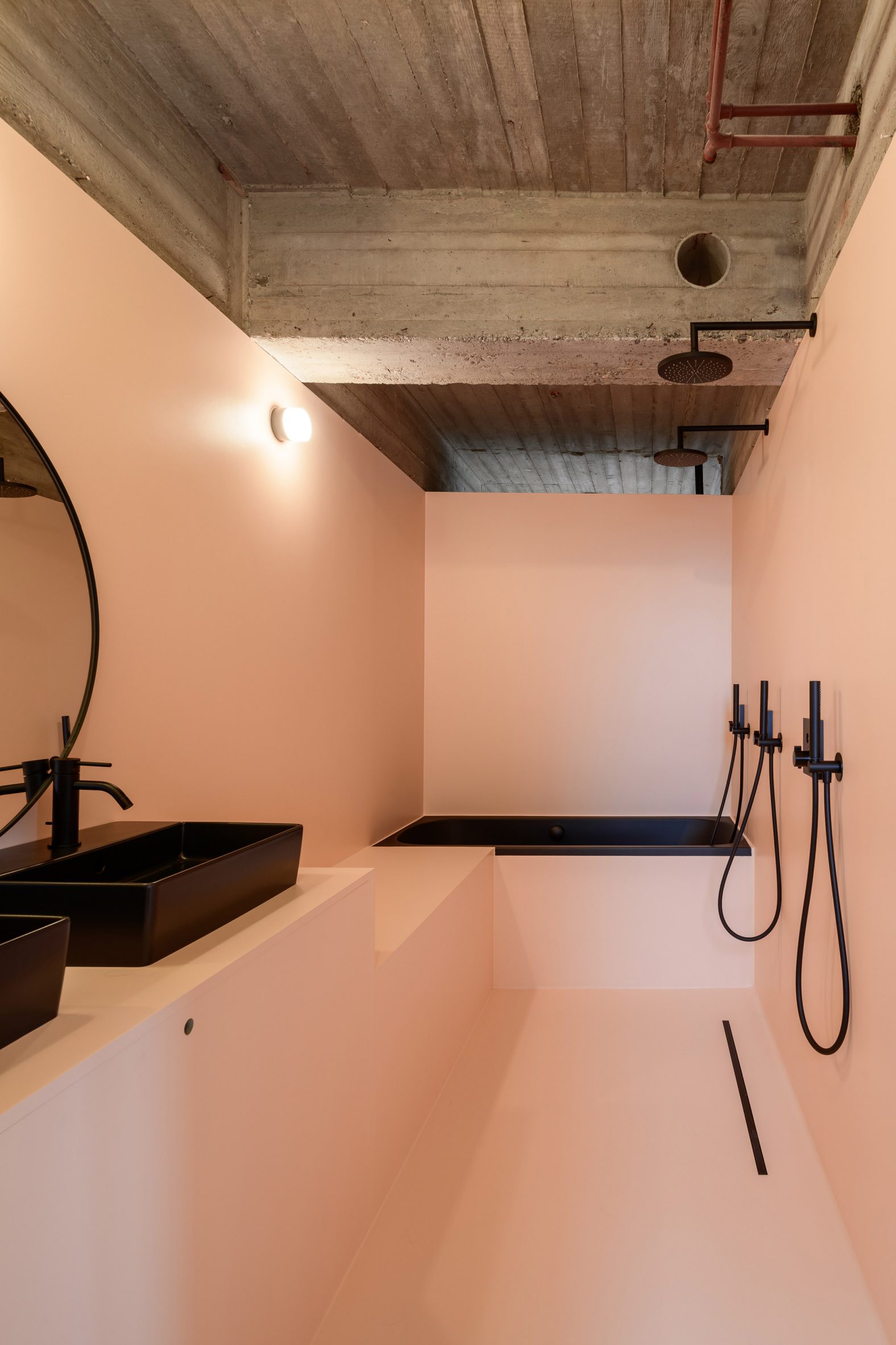
A pastel pink bathroom features upstairs

Other apartment renovations featured on Dezeen that are located in brutalist buildings include a New York residence by General Assembly in a 1970s tower block and a flat at the Barbican estate in London that Takero Shimazaki Architects infused with Japanese details.

Alongside the Riverside Tower apartment renovation, Studio Okami Architecten also recently completed a brick and concrete home that is embedded into a sloping hillside in Belgium.

The photography is byOlmo Peeters unless stated.

The post Studio Okami Architecten exposes brutalist skeleton of Antwerp apartment appeared first on Dezeen.

#all #interiors #residential #apartments #concrete #belgium #antwerp #renovations #brutalism #studiookamiarchitecten

dezeen@xn--y9azesw6bu.xn--y9a3aq

Dezeen Debate newsletter features London's best home renovations

image

The latest edition of Dezeen Debate features the 15 home shortlisted for the 2022 edition of Don't Move, Improve!

A converted artist's studio and a pastel-hued extension with Romanesque arches are among the projects vying to be named London's best home renovation in this year's Don't Move, Improve! competition.

Organised by New London Architecture (NLA), the contest celebrates the "most innovative home improvement projects" in the capital.

Commenters are impressed. One said, "Great works. I am inspired".

International Women's Day graphicWomen make up just one in five top positions at biggest architecture firms despite "huge jump"

Other stories in this week's newsletter include research conducted by Dezeen to mark International Women's Day, a story about a vulva-shaped spaceship concept, and BIG's design for its first building in the metaverse.

Dezeen Debate

Dezeen Debate is a curated newsletter sent every Thursday containing highlights from Dezeen. [_Read the latest edition of Dezeen Debate](https://newsletter.dezeen.com/t/r-4078E56A7D2BDCC82540EF23F30FEDED) _.

You can alsosubscribe to Dezeen Agenda, which is sent every Tuesday and contains a selection of the most important news highlights from the week, as well as [_Dezeen Daily](https://www.dezeen.com/dezeendaily/) _, our daily bulletin that contains every story published in the preceding 24 hours and Dezeen.

The post Dezeen Debate newsletter features London's best home renovations appeared first on Dezeen.

#all #architecture #london #residential #extensions #renovations #dezeendebate #londonhouses #londonhouseextensions #dontmoveimprove

dezeen@xn--y9azesw6bu.xn--y9a3aq

Patricia Urquiola turns Michigan’s Haworth Hotel into a “design showcase”

image

Patricia Urquiola Haworth Hotel Michigan

European brands intermingle with furniture from US company Haworth in a Michigan hotel that has been reimagined by Spanish designer Patricia Urquiola.

The Haworth Hotel is housed within a multi-level brick building in downtown Holland, a small city along Lake Macatawa. The hotel sits within the campus of the private school Hope College.

Patricia Urquiola Haworth Hotel Exterior
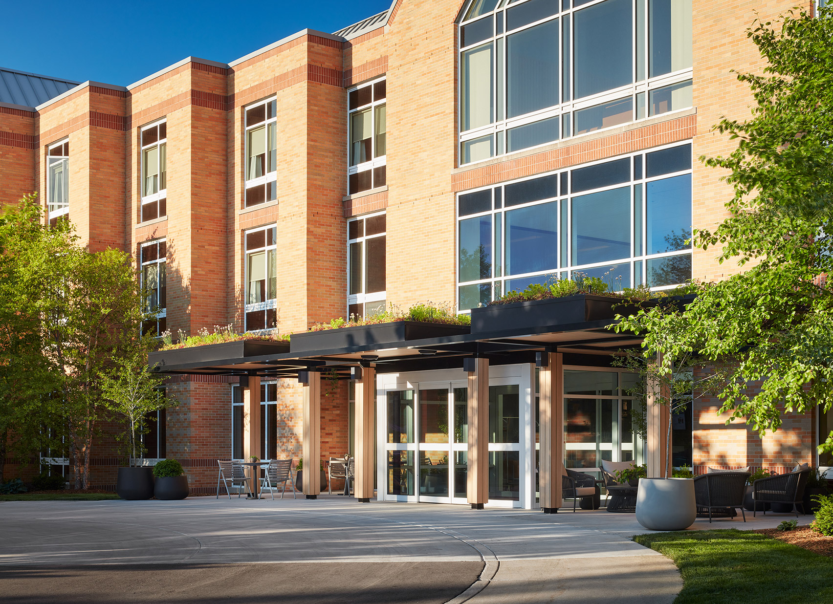
The historic Haworth Hotel in Michigan was renovated by Patricia Urquiola

The renovation was backed by the Haworth family, which owns the office furniture brand by the same name. The hotel is meant to accommodate visitors to the company's global headquarters in Holland, along with visitors to the college.

"The hotel was completely redone as part of a large initiative to turn a campus hotel into a design showcase while enhancing the guest experience," the company said.

Patricia Urquiola Haworth Hotel Stair
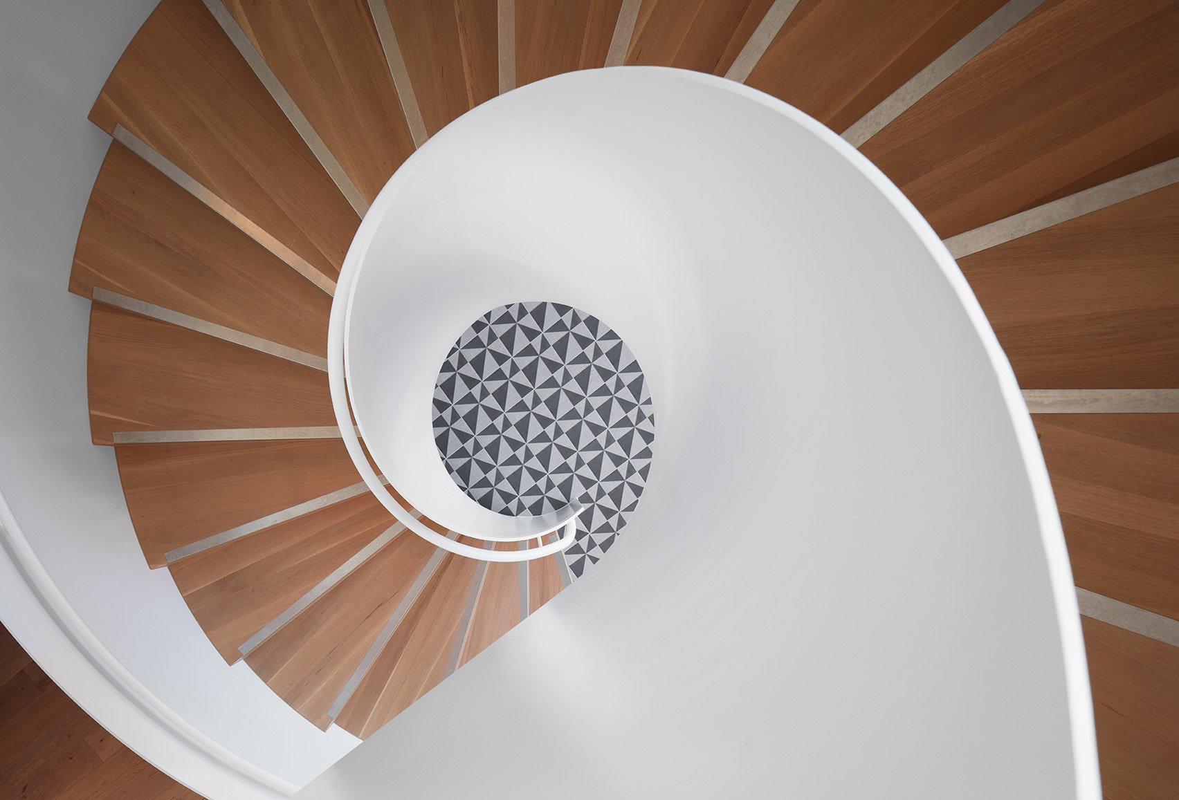
The staircase is made of bent metal and oak

To revitalise the hotel, the company turned to Spanish designer Patricia Urquiola, who runs a studio in Milan. Urquiola has created several products for Haworth, including a sofa and pouf, and has a knack for balancing "warmth, playfulness, sophistication and multiple brand experiences".

For the hotel project – Urquiola's first in the US – the designer was charged with creating a distinctive space that is both durable and comfy.

Patricia Urquiola Haworth Hotel Interior
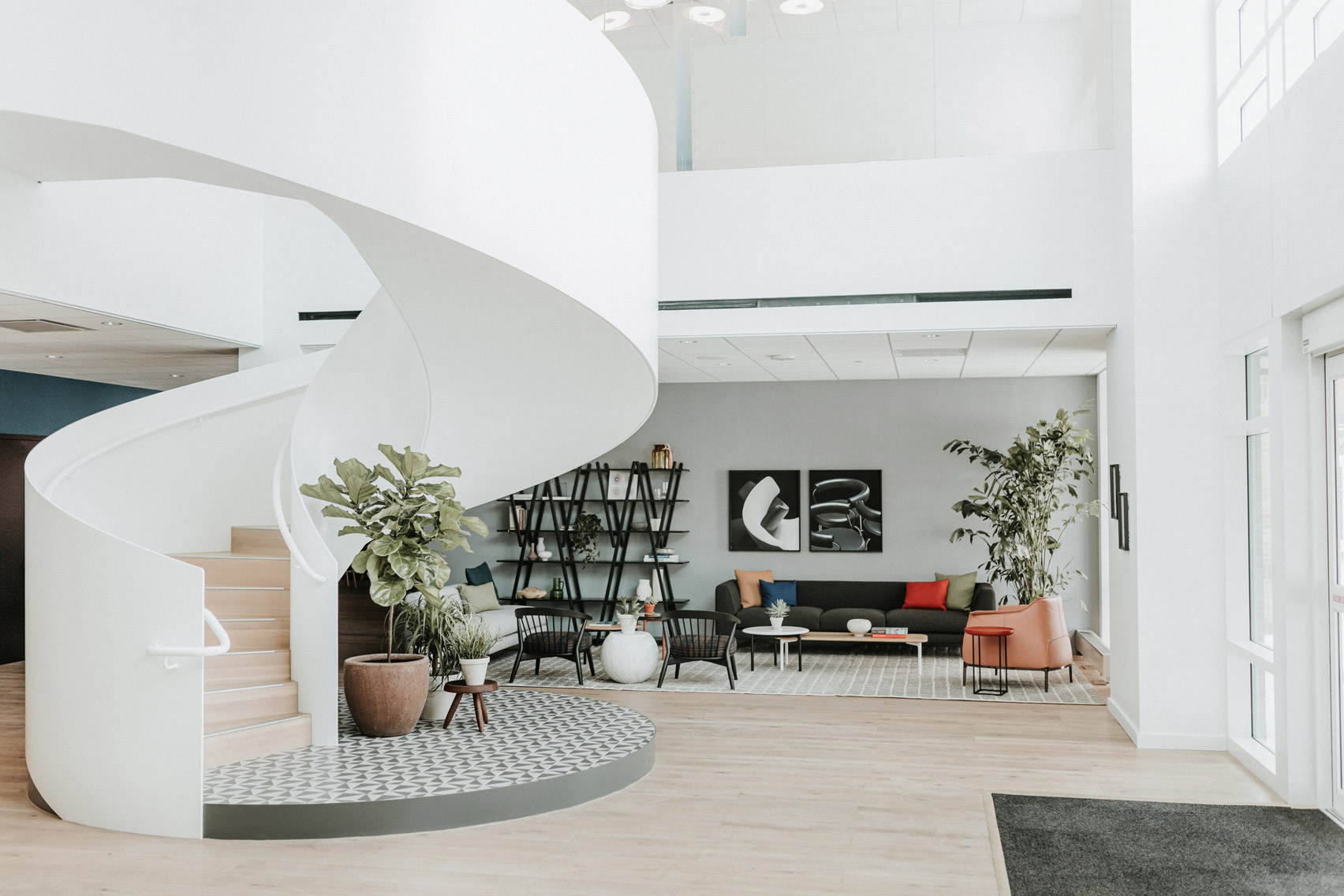
The hotel lobby has furniture brands like Cappellini

The property contains 48 guest rooms, a range of meeting spaces, a fitness centre and a newly added coffeeshop that is open to the public. There also is a ballroom that doubles as a student dining space.

Guests step into a bright lobby featuring pale wooden flooring and white walls. Daylight streams in through street-facing windows.

Patricia Urquiola Haworth Hotel Interior
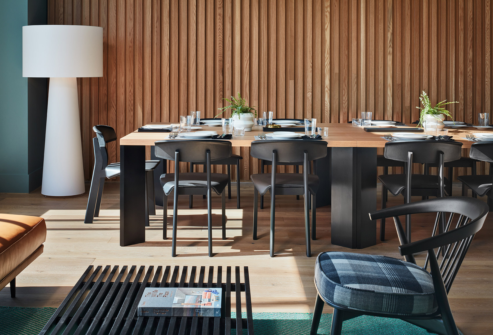
The accent wall of the dining room is clad in white oak

A centerpiece of the lobby is a wide, spiral staircase made of bent metal and oak. The stair rises up from a podium with geometric tile designed by Urquiola for Mutina.

Just off the entrance is a lounge space fitted with furniture from Cappellini, Cassina, Poltrona Frau and Haworth. Underfoot is a grey rug from Gan, a division of Gandia Blasco.

[ Hotel Grand Stark

Read:

Palisociety and North 45 Projects return grand Portland hotel to its original use

](https://www.dezeen.com/2021/09/02/hotel-grand-stark-portland-palisociety-north-45-projects/)

Similar brands are featured in other areas of the hotel.

For instance, a room with powder blue walls is fitted with poufs and stools from Haworth, Cappellini tables made of terrazzo and faux marble, and a modular sofa system designed by Urquiola for Haworth. Affixed to the walls are disc-shaped lighting fixtures from Pablo Designs.

Patricia Urquiola Haworth Hotel Interior
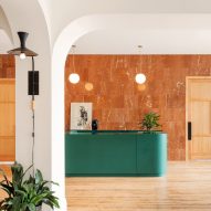
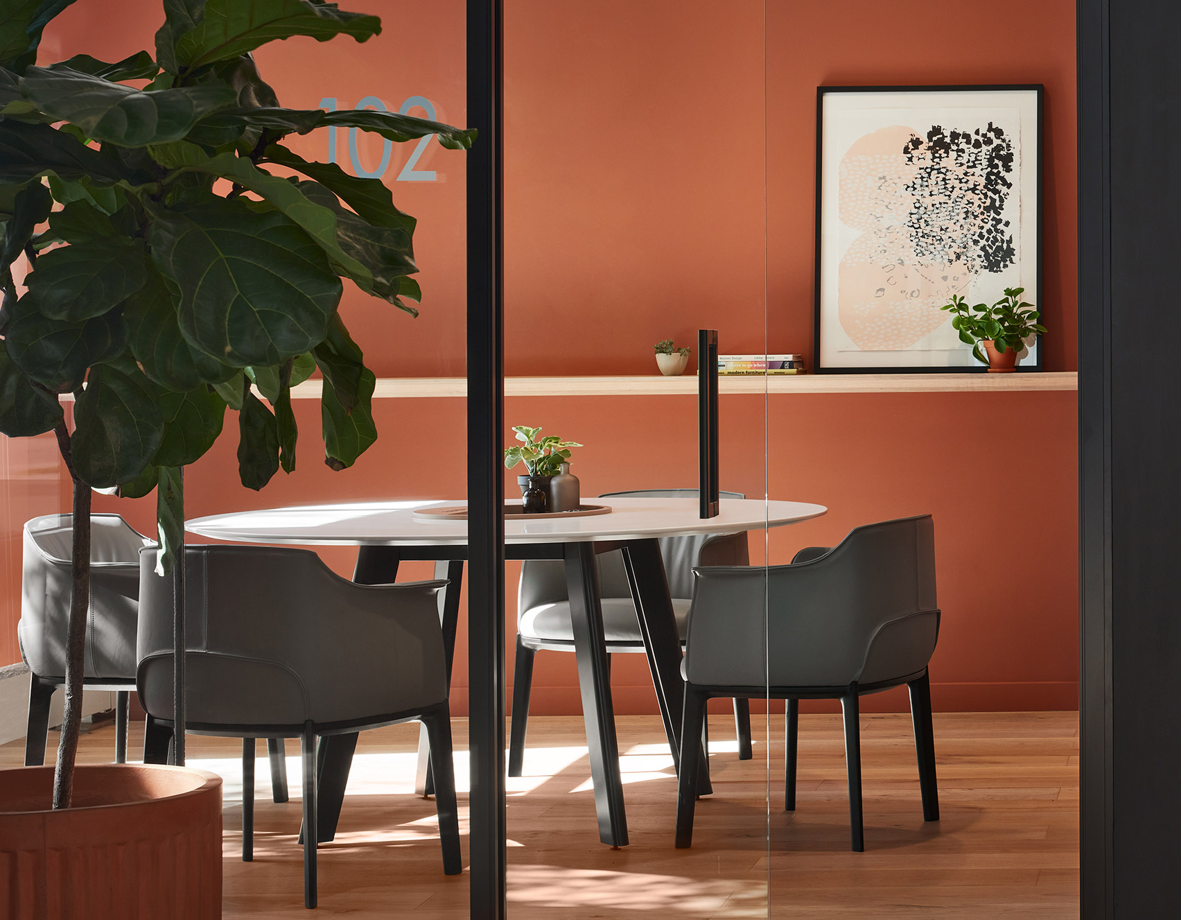
Meeting rooms were part of the renovation of the Haworth Hotel

In a dining area, the designer placed tables and chairs from Cassina and a Big Shadow lamp by Marcel Wanders for Cappellini. An accent wall is clad in white oak.

Guest rooms are intended to foster relaxation. Furnishings include Haworth poufs and chairs, bedside sconces by Louis Poulsen, and millwork designed by Urquiola and fabricated by Cassina Contract.

Patricia Urquiola hotel room Interior
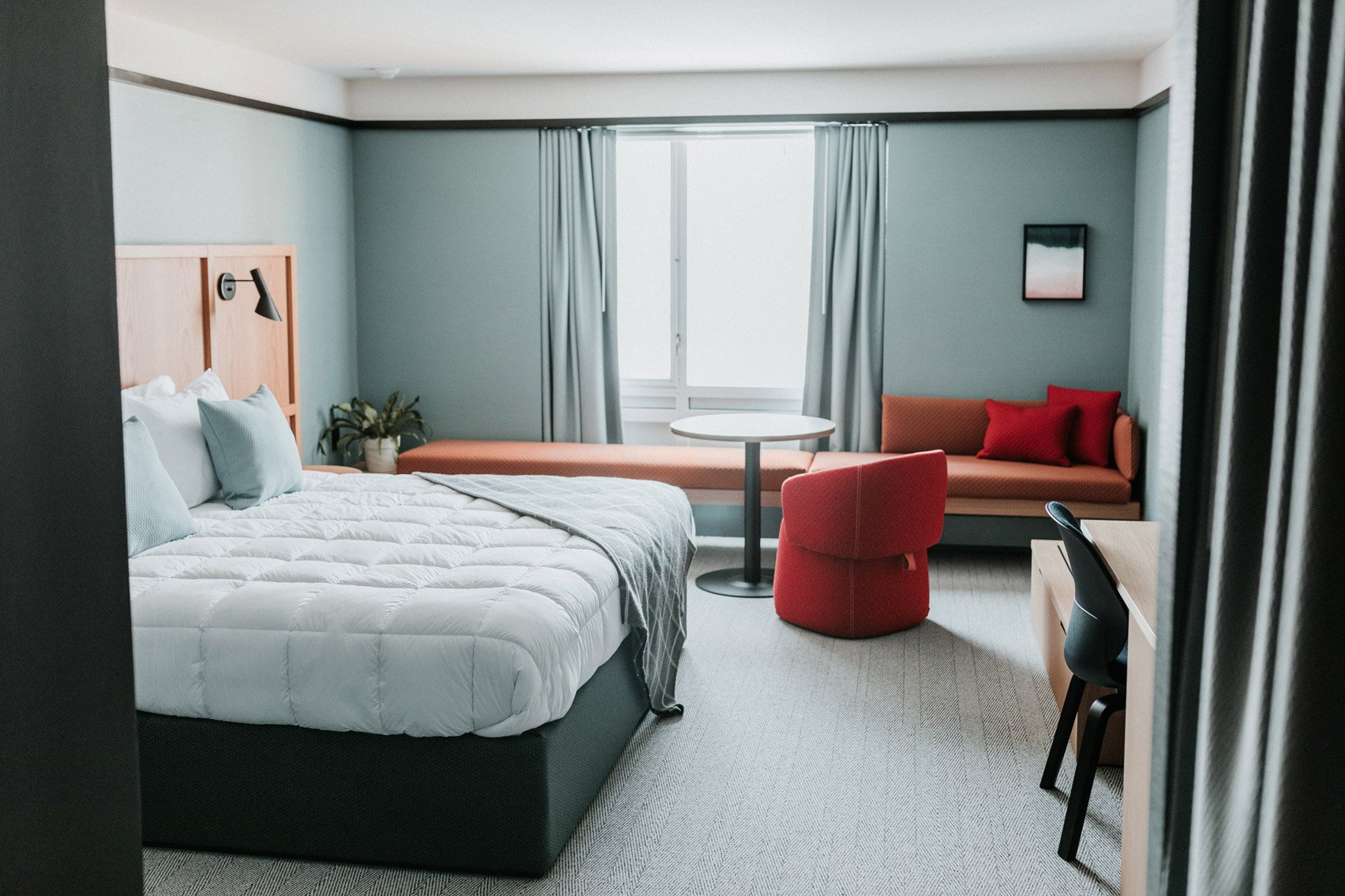
The rooms include millwork designed by Urquiola

"The Haworth Hotel is a blend of residential and commercial solutions – durable enough to withstand years of accommodating guests and with a vibe that feels like home," the team said.

Other interior design projects by Patricia Urquiola include a Maggie Centre for cancer care in Barcelona that has a bright and homely atmosphere. The building was designed by Benedetta Tagliabue of EMBT.

The photography is by Haworth Hotel.


Project credits:

Interior design: Studio Urquiola

Architectural design: GMB Architecture + Engineering

General contractor: Owen-Ames-Kimball

The post Patricia Urquiola turns Michigan’s Haworth Hotel into a “design showcase” appeared first on Dezeen.

#all #interiors #hotels #usa #patriciaurquiola #renovations #michigan #haworth #boutiquehotels

dezeen@xn--y9azesw6bu.xn--y9a3aq

Nintendo's former HQ to reopen as hotel designed by Tadao Ando

image

Interior of former Nintendo headquarters in Kyoto

Japanese architect Tadao Ando has transformed a building that was once home to video game giant Nintendo into a boutique hotel.

Due to open on 1 April, Marufukuro Hotel will be located in Kyoto in a building that was occupied by Nintendo between 1933 and 1959, when the company was called Yamauchi Nintendo.

At the time, the company was a manufacturer of Japanese playing cards called "hanafuda" and Western-style playing cards called "karuta" and "toranpu".

Interior of former Nintendo headquarters in Kyoto
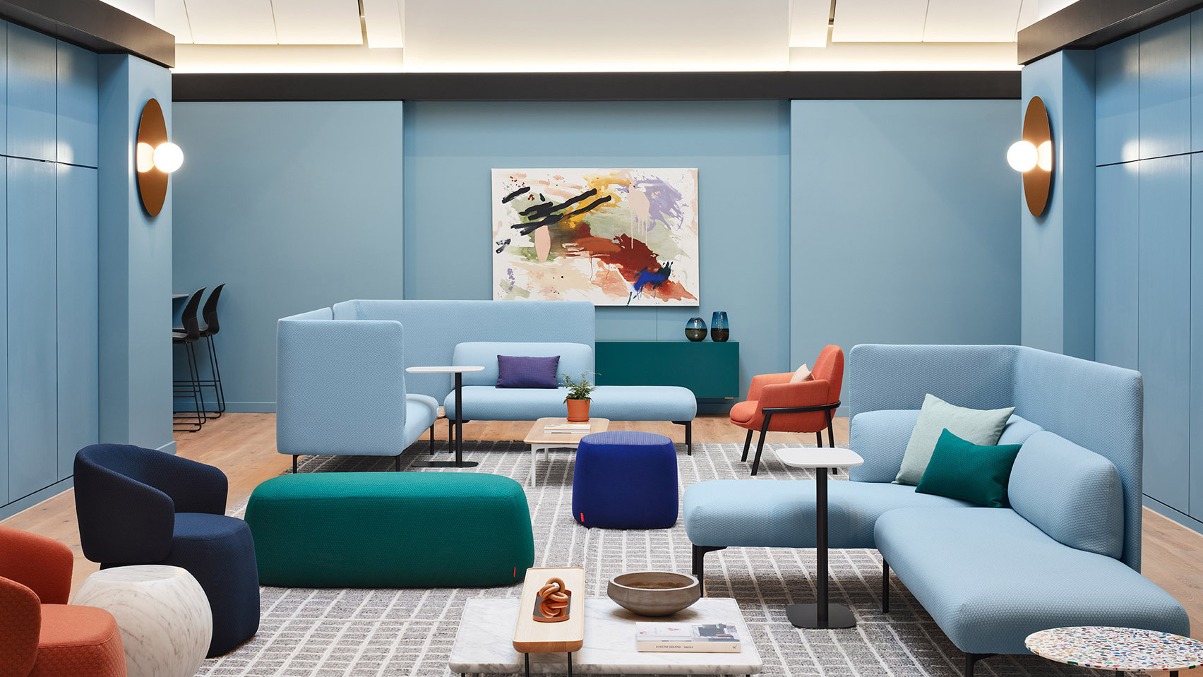
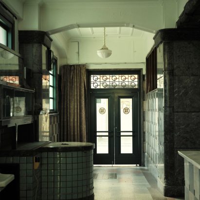
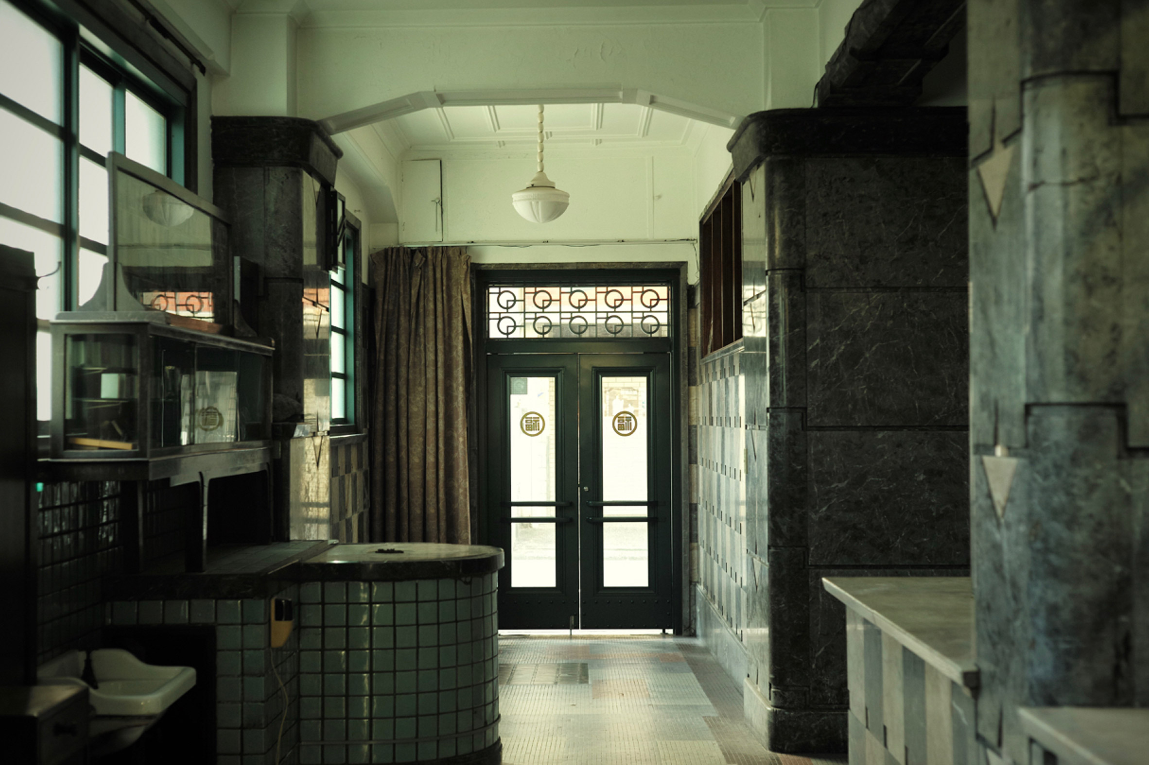
The building was home to Nintendo from 1933 to 1959

Located in the Kagiyacho neighbourhood, just north of Kyoto railway station, the building has been unoccupied ever since Nintendo vacated it.

Ando has renovated and extended the old structure, converting it into an 18-room hotel including a restaurant, bar, spa and gym.

The building's exterior has remained largely unchanged, retaining elements such as old Yamauchi Nintendo entrance plaques and window grilles patterned with details from the old playing cards.

Ando's task was to reimagine the building's interior but incorporate many of its original 1930s details, which include decorative tiling and art-deco lighting fixtures.

Fireplace in former Nintendo headquarters in Kyoto
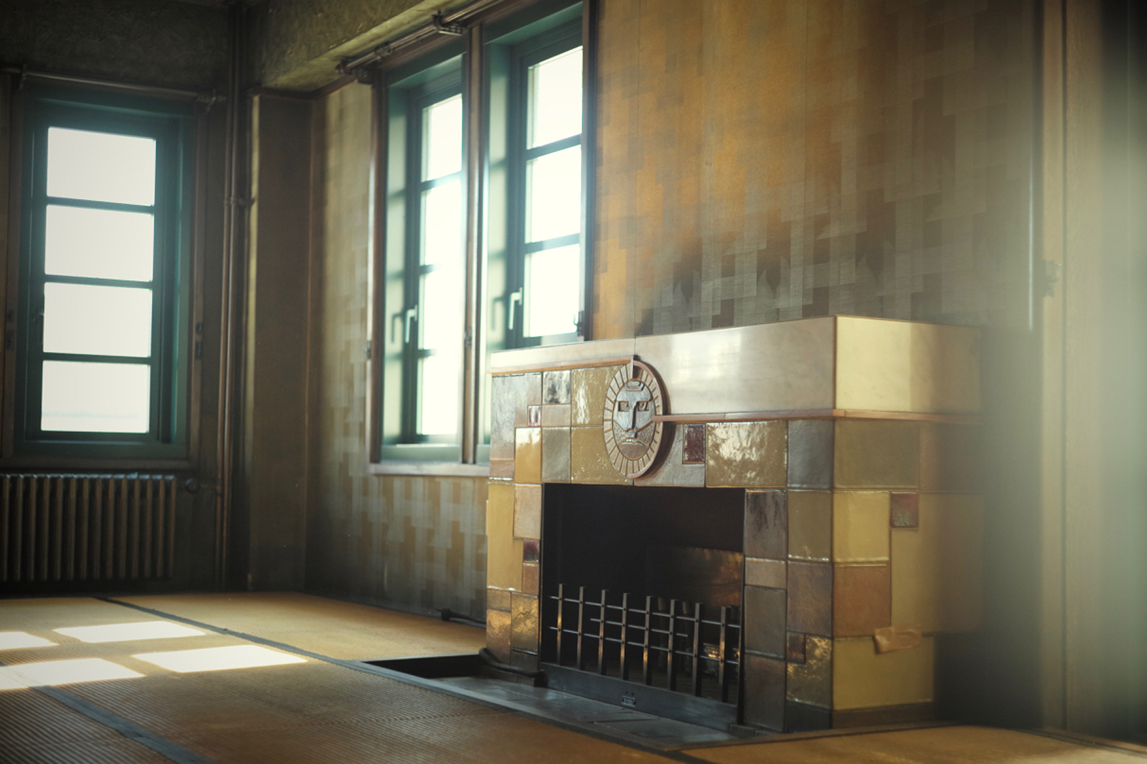
Art-deco details are retained in the renovation

For the annex, the architect has adopted a more modern approach with floor-to-ceiling windows and elements in raw concrete, the material he is famous for.

Photos of the completed Marufukuro Hotel have so far been kept under wraps, but the hotel is already taking bookings and has released some visuals showing layout and furniture details in the guest rooms.

[ Ace Hotel Kyoto interiors by Kengo Kuma and Commune

Read:

Ace Hotel Kyoto reveals interiors designed by Kengo Kuma and Commune

](https://www.dezeen.com/2020/02/08/ace-hotel-kyoto-interiors-kengo-kuma-commune/)

Guests can choose to stay in either the old or new parts of the building, in rooms ranging in size between 33 and 79 square metres.

The project is backed by property developer Plan Do See.

Hotel in Kyoto that was Nintendo's HQTadao Ando converted the existing building into an 18-room hotel

Ando is among Japan's most prolific architects. Awarded the Pritzker Prize in 1995, his best-known projects include Church of the Light and Naoshima Contemporary Art Museum.

Recent projects include the renovation of the Bourse de Commerce building in Paris, which proved controversial, and art centre Casa Wabi in Mexico.

It was recently announced that Ando is designing a Palm Springs home for reality TV star Kim Kardashian.

The post Nintendo's former HQ to reopen as hotel designed by Tadao Ando appeared first on Dezeen.

#all #interiors #hotels #news #japan #renovations #kyoto #tadaoando

dezeen@xn--y9azesw6bu.xn--y9a3aq

15 London home renovations shortlisted for Don't Move, Improve! 2022

image

Pastel-hued kitchen extension

A pastel-hued extension with Romanesque arches and a converted artist's studio are among the projects vying to be named London's best home renovation in this year's Don't Move, Improve! competition.

A total of 15 dwellings are shortlisted for the 2022 edition of Don't Move, Improve!, an annual contest held by independent organisation New London Architecture (NLA) to celebrate the "most innovative home improvement projects" in the capital.

Other projects in the running include the Concrete Plinth House by DGN Studio and a 1920s semi-detached residence that Nimtim Architects has remodelled with playful joinery.

An apartment with a translucent sleeping pod and a Victorian loft extension by the award's previous winner Proctor & Shaw have also been shortlisted.

Don't Move, Improve! is open to home renovations or extensions in London's 33 boroughs that have reached completion in the last two years.

This year's shortlist was selected from over 200 entries by a jury chaired by NLA's director Amy Chadwick Till and including Phil Coffey, the director of Coffey Architects, Sebastian Wood, director of Whitby Wood, journalist Anna White and property expert Kunle Barker.

[ A colourful concrete-clad house

Read:

The House Recast by Studio Ben Allen wins Don't Move, Improve! 2021

](https://www.dezeen.com/2021/05/27/the-house-recast-studio-ben-allen-dont-move-improve-2021/)

According to the panel, this year saw a number of entries with indoor-outdoor living spaces, as well as ones that make use of wood and natural materials. The presence of statement ceilings, colourful structures and bold shapes was another key trend.

"This year's submissions delighted our jury with innovative approaches to structure, layout, materials and colour," reflected Chadwick Till.

"Don't Move, Improve! aims to encourage great domestic-scale design across the city, so we are really pleased to have another shortlist that showcases a wide range of budgets, building styles, locations and home-owner needs."

The winner of this year's competition will be announced in May 2022. Alongside the overall prize for the best new home improvement, there will be five special awards for the best compact design, urban oasis, materiality and craftsmanship, unique character and transformation.

Previous overall winners of Don't Move, Improve! include The House Recast by Studio Ben Allen, a "beautifully understated" rear extension by Proctor & Shaw and a dwelling in the shell of a derelict chapel.

Here's the full Don't Move, Improve! 2022 shortlist:


Pastel-hued kitchen extension
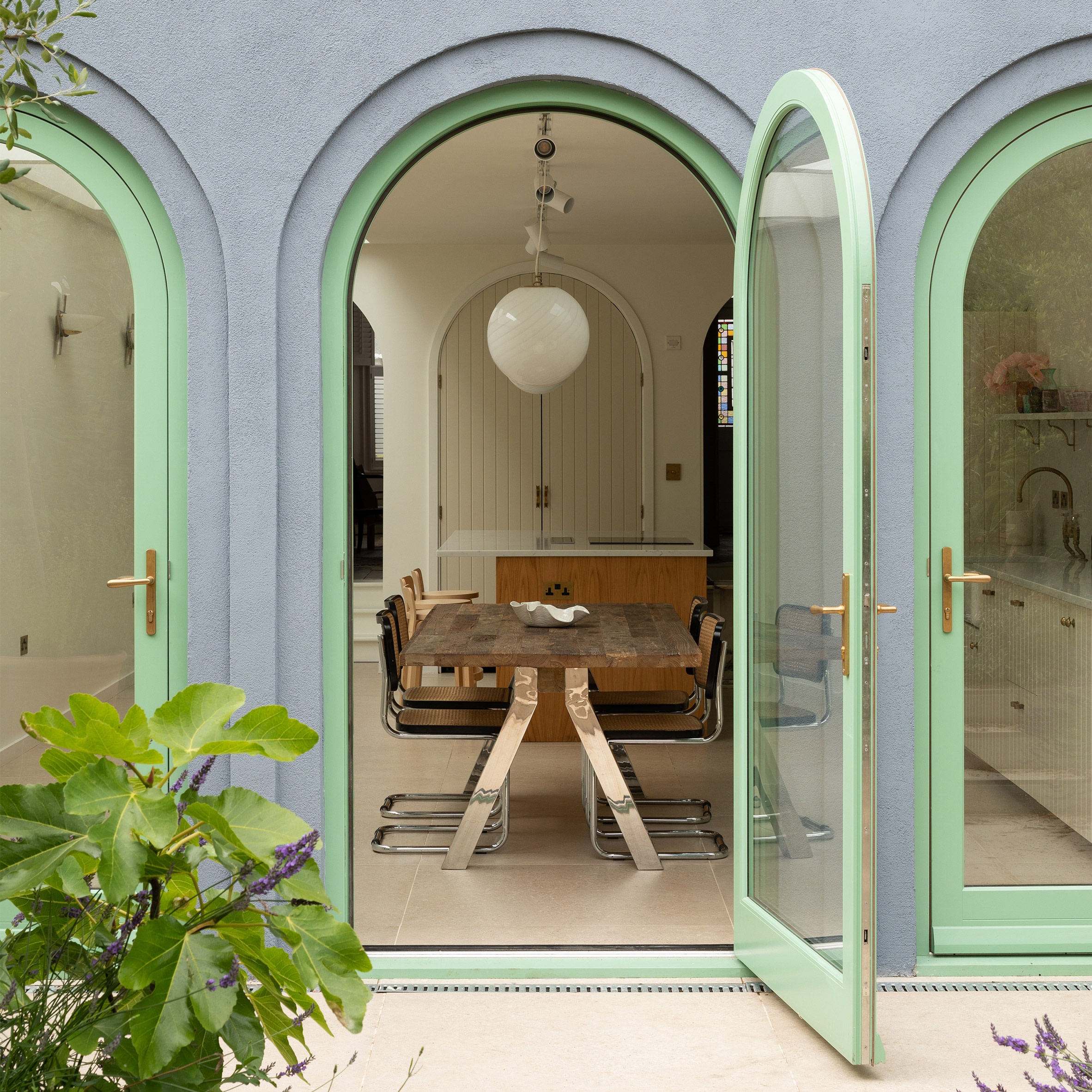
Photo is by Adam Scott

A Tuscan Veranda by Turner Architects


Little Brownings kitchen by Archmongers Architects

Little Brownings by Archmongers Architects


Loft renovation by Fraher & Findlay

Non Boxy Lofty by Fraher & Findlay


House extension with pergolaPhoto is by Billy Bolton

Pergola House by Benjamin Wilkes


Stained timber extensionPhoto is by Adelina Iliev

Transitions by Red Squirrel Architects


Wood-lined bathroomPhoto is by Nick Deardon

Coffered House by Proctor & Shaw


Bookcase joineryPhoto is by Megan Taylor

Curve Appeal by Nimtim Architects


Artist Studio Conversion by VATRAAPhoto is by VATRAA

Artist Studio Conversion by VATRAA


Brick house extension by Oliver Leech ArchitectsPhoto is by Ståle Eriksen

Pink House by Oliver Leech Architects


Interior of Bay Window House by Gundry + DuckerPhoto is by Jim Stephenson

Bay Window House by Gundry + Ducker


Interior of Concrete Plinth House by DGN StudioPhoto is by Building Narratives

Concrete Plinth House by DGN Studio


Stained timber extension by RuffarchitectsPhoto is by Tim Soar

Church Road by Ruffarchitects


Shoji Apartment sleeping podPhoto is by Ståle Eriksen

Shoji Apartment by Proctor & Shaw


Black house extensionPhoto is by Andy Stagg

Slide and Slot House by Ashton Porter Architects


Forest House interior by AOC
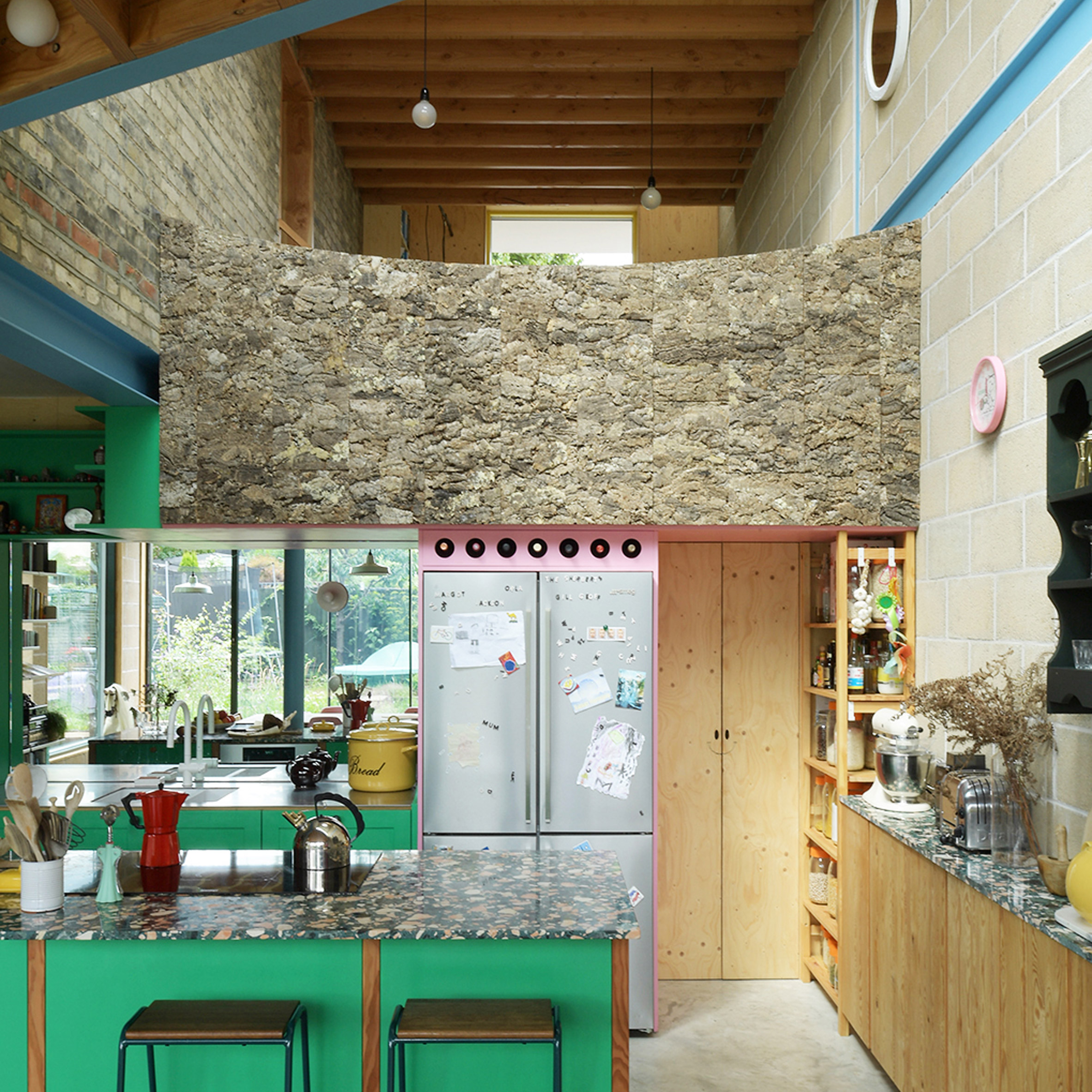
Photo is by David Grandorge

Forest House by AOC

The post 15 London home renovations shortlisted for Don't Move, Improve! 2022 appeared first on Dezeen.

#all #architecture #residential #news #london #extensions #renovations #residentialextensions #britishhouses #londonhouses #londonhouseextensions

dezeen@xn--y9azesw6bu.xn--y9a3aq

De Matos Ryan adds buildings clad with larch and galvanised steel to historic Yorkshire pub

image

Elevation of steel clad pub by De Matos Ryan

Architecture firm De Matos Ryan has modernised a traditional pub in the English village of Nun Monkton, adding a collection of guest suites that take their design cues from agricultural buildings.

London-based De Matos Ryan was tasked with renovating and extending the heritage-listed pub in North Yorkshire, which is the last remaining hostelry in a village that was once an important trade hub for the medieval river transport network.

Named after a 19th-century racehorse, The Alice Hawthorn is an important meeting point for the villagers, but had been neglected and even closed for a period before being taken on by new owners in 2013.

Aerial image of The Alice Hawthorn
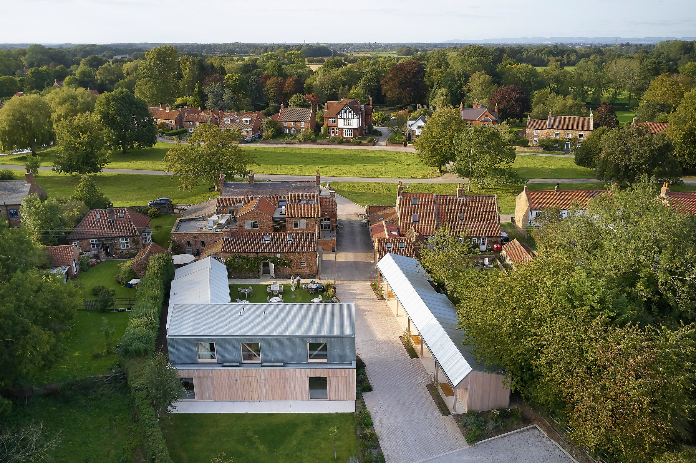
De Matos Ryan added guest suites to The Alice Hawthorn pub in Yorkshire

The new landlords recognised that saving the pub from extinction required a more modern strategy focused on increasing its appeal to a broader audience. In 2017, they commissioned De Matos Ryan to oversee upgrades to the existing building and the development of several new accommodation blocks.

"The brief was to provide tourists, as well as the local community, with a high-quality but affordable basecamp from which to enjoy the surrounding landscape and visitor attractions," explained De Matos Ryan director Angus Morrogh-Ryan.

The project provides 12 ensuite guest bedrooms, including four on the first floor of the existing pub and eight arranged around a new courtyard that extends the village green into the pub's rear garden.

The Alice Hawthorn guest suites are two storeys tall
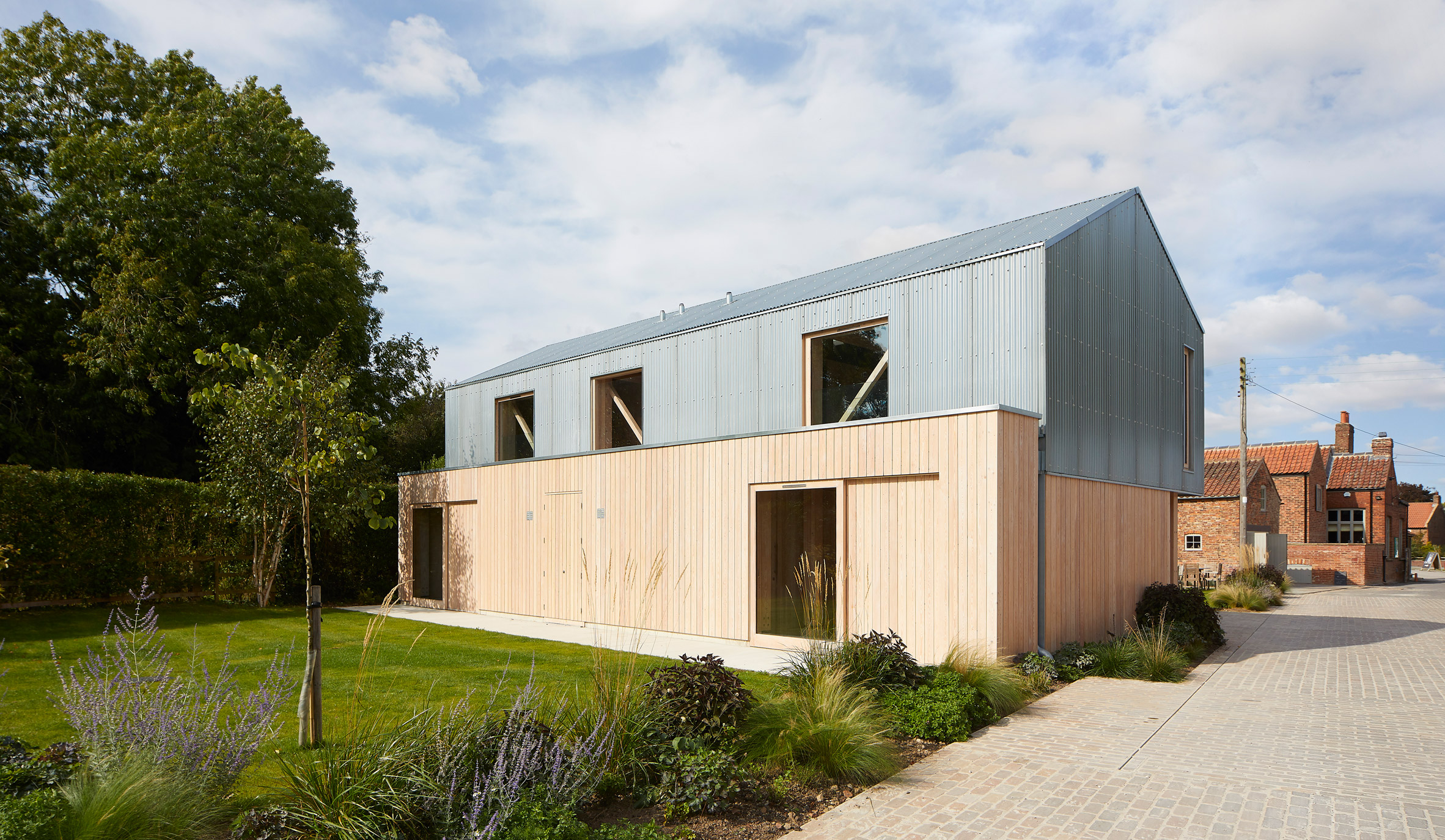
The new buildings are clad in larch and galvanised steel

Drawing inspiration from the Norse word "garth", meaning an enclosed garden, the communal green is surrounded by buildings that evoke the region's agricultural architecture.

"The design reflects the character of the various informal farmsteads that surround the green, which continues to be grazed by cows and other animals," the architects pointed out.

"The home-grown Douglas fir framed buildings use authentic agricultural building materials, such as galvanised corrugated steel roofing and larch cladding, to create the sense that the animals have only recently moved out."

The ground level is wrapped in timber and the second in seel
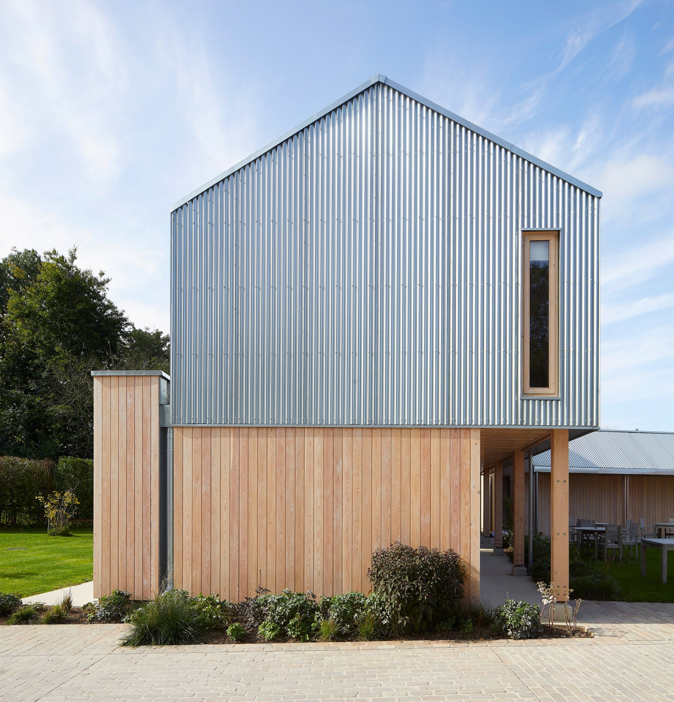
The additions are arranged around a courtyard

The timber-framed buildings feature cloister-like passages facing the garden. Double-member columns resting on cast-concrete upstands support overhanging eaves that extend beyond the wooden facades.

The new amenities include a single-storey staff accommodation block that is slotted between two existing brick buildings near the site's entrance. The structure is clad with larch and features a pan-tile roof to match the surrounding outbuildings.

[ The Garden House by De Matos Ryan

Read:

Sunken house by De Matos Ryan nestles in a secret garden

](https://www.dezeen.com/2014/04/11/garden-house-london-de-matos-ryan-sunken/)

A two-storey building called The Field Barn is located at the southern end of the garden and contains two en-suite guest bedrooms on each floor.

The single-level Tack Room accommodates a wheelchair accessible guest room, along with space for an outdoor kitchen, pizza oven and bar on the western edge of the garden.

Image of The Alice Hawthorn and paved entrance
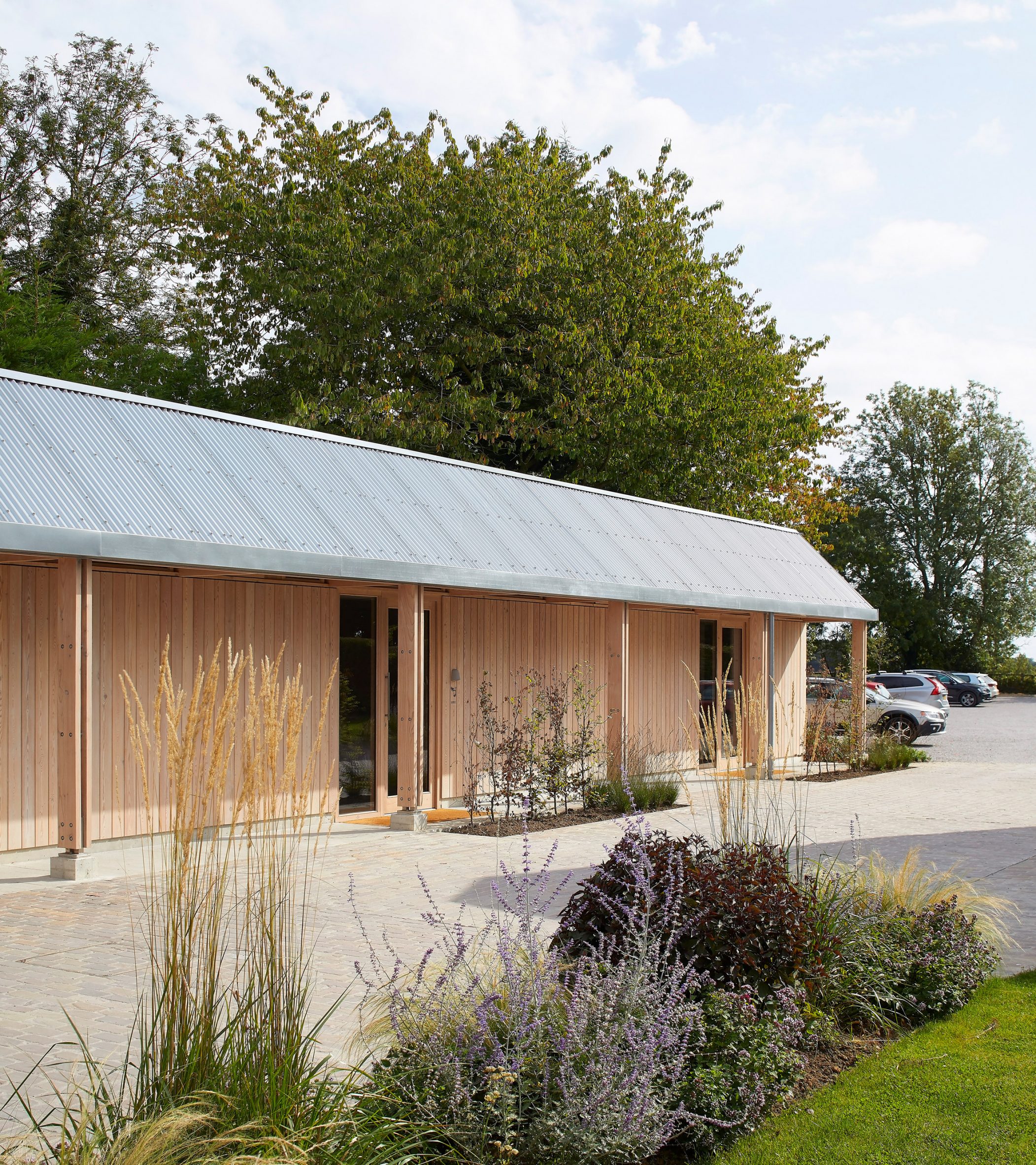
Single-storey guest suites were built to provide visitors with accessible spaces

The Stables is a single-storey extension to the existing row of buildings on the eastern side of the site. It contains three guest bedrooms separated from the green space by brick pavers that form a driveway leading to the car park.

The Field Barn, Tack Room and The Stables all feature larch cladding and sinusoidal galvanised-steel roofs. The metal wraps around the whole of the Field Barn's upper floor, which is windowless to prevent overlooking and light pollution to the neighbours.

The interior of The Alice Hawthorn is clad in timber
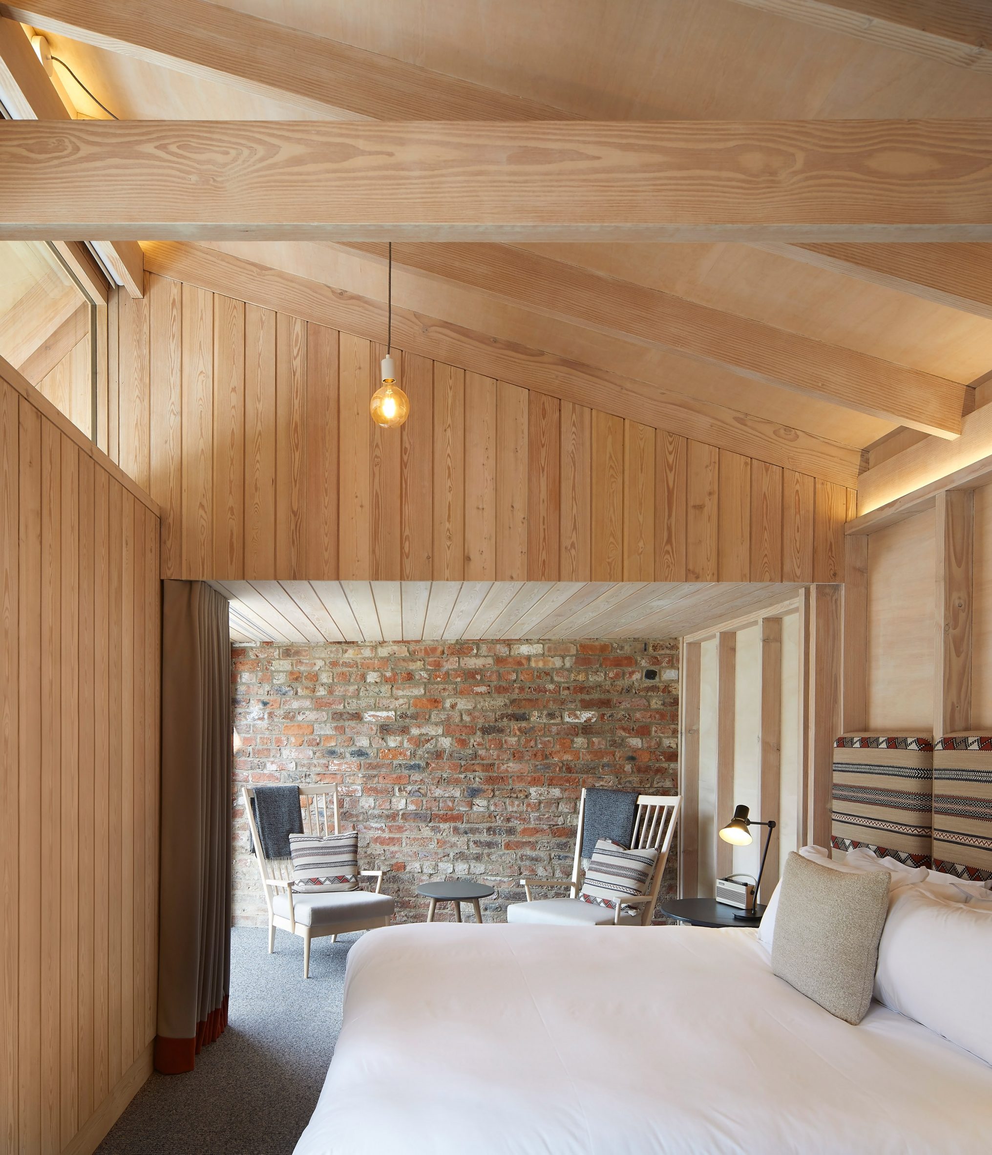
The site contains 12 ensuite guest bedrooms

The interiors of the new spaces feature a contemporary material palette that intentionally contrasts with the more traditional pub areas.

Internal walls are lined with larch boards and poplar plywood that complements the exposed Douglas fir structure. Curtains and upholstered headboards add softness and texture to the bedrooms.

The central courtyard features planted borders that contribute to the site's biodiversity, while an orchard next to the car park will eventually be used to supply the pub's kitchen with freshly grown fruit.

Interior image of the bathroom
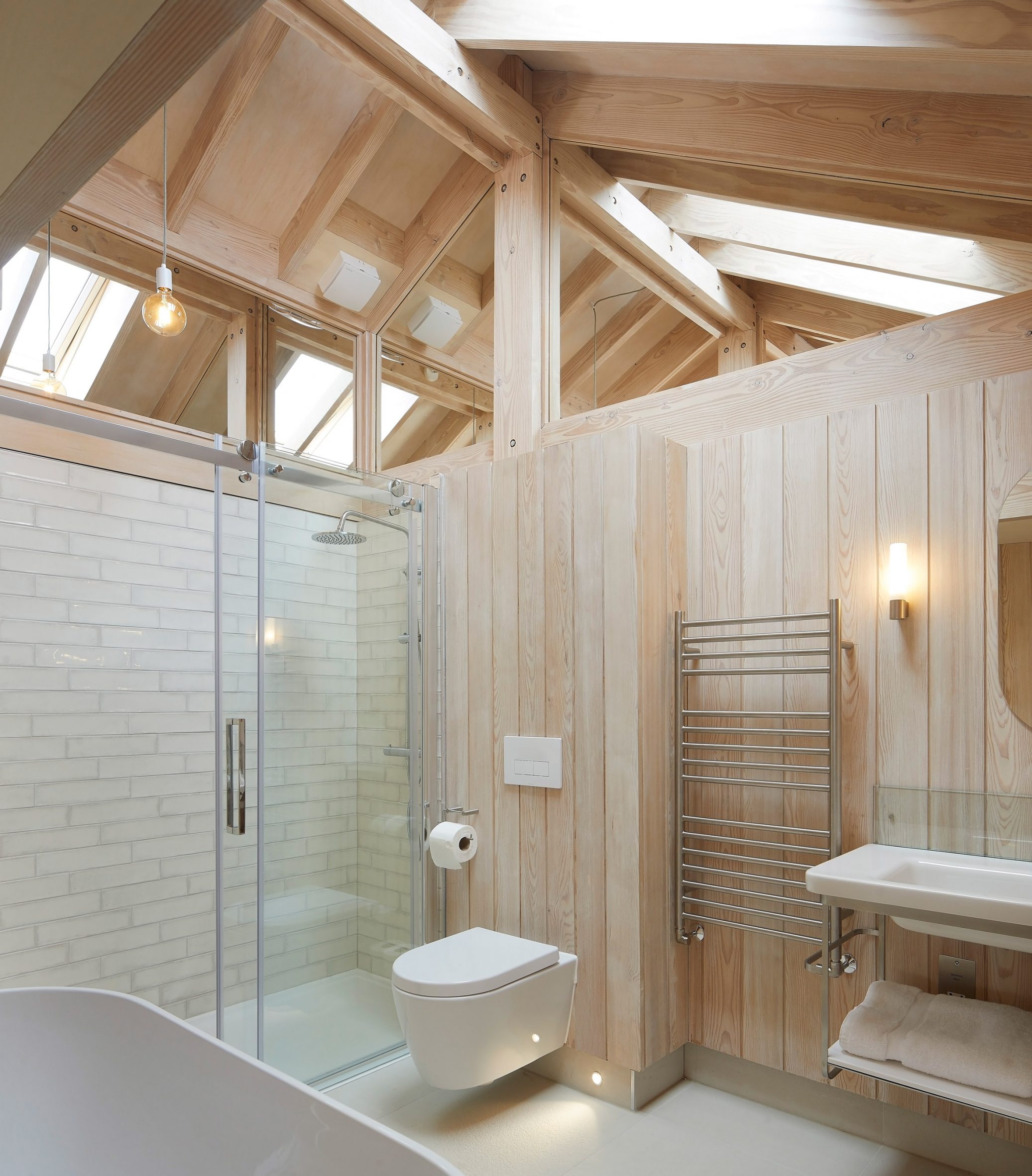
A natural palette was used throughout the interior

De Matos Ryan was founded in 1999 by architects Jose Esteves De Matos and Angus Morrogh-Ryan. The multidisciplinary studio creates contemporary solutions for a wide range of environments, often working within historic and culturally sensitive contexts.

The office previously designed a house in London that sits within a sunken courtyard, and oversaw the modernisation of the 18th-century York Theatre Royal and its 1960s extension.

The photography is byHufton + Crow.


Project credits:

Architect: De Matos Ryan

Project manager: Russell Pickering, R Pickering

Quantity surveying: Aspect 4

Structural engineering: Price Myers

MEP services: P3r

Acoustics: Gillieron Scott Acoustic Design

Sustainability: Award Energy

Main contractor: Gem Construction

Douglas Fir timber framing: Timber Workshop

Galvanised steel cladding: Varla

Timber cladding, doors, windows and carpentry: Lee & Micklethwaite

Mechanical services: Warmaway

Electrical services: Switched Solutions

Garden designer: Kate Guillebard

The post De Matos Ryan adds buildings clad with larch and galvanised steel to historic Yorkshire pub appeared first on Dezeen.

#all #architecture #publicandleisure #yorkshire #uk #extensions #hotels #renovations #huftoncrow #pubs #dematosryan

dezeen@xn--y9azesw6bu.xn--y9a3aq

Sheppard Robson updates and extends Alan Short-designed theatre in Manchester

image

Contact Theatre by Alan Short in Manchester

Architecture studio Sheppard Robson has remodelled the eccentric Contact theatre in Manchester, UK, stitching in a "new and distinct" metal-clad extension.

The overhaul was carried out by Sheppard Robson to improve the layout and energy performance of the building that was completed by British architect Alan Short in 1999.

Contact theatre's metal-clad extension 
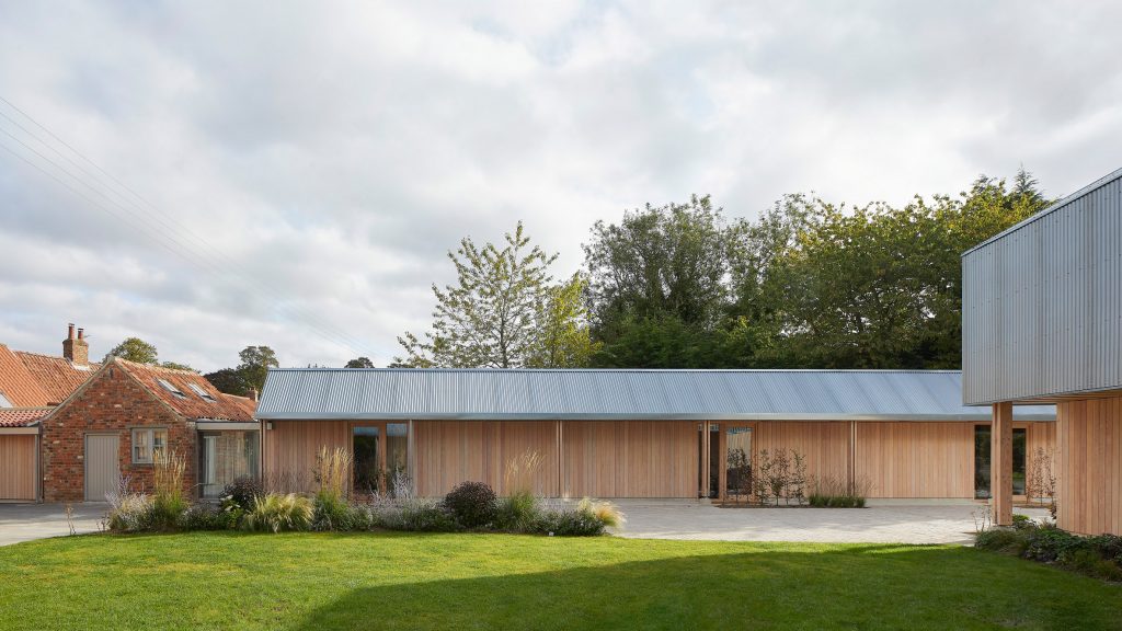
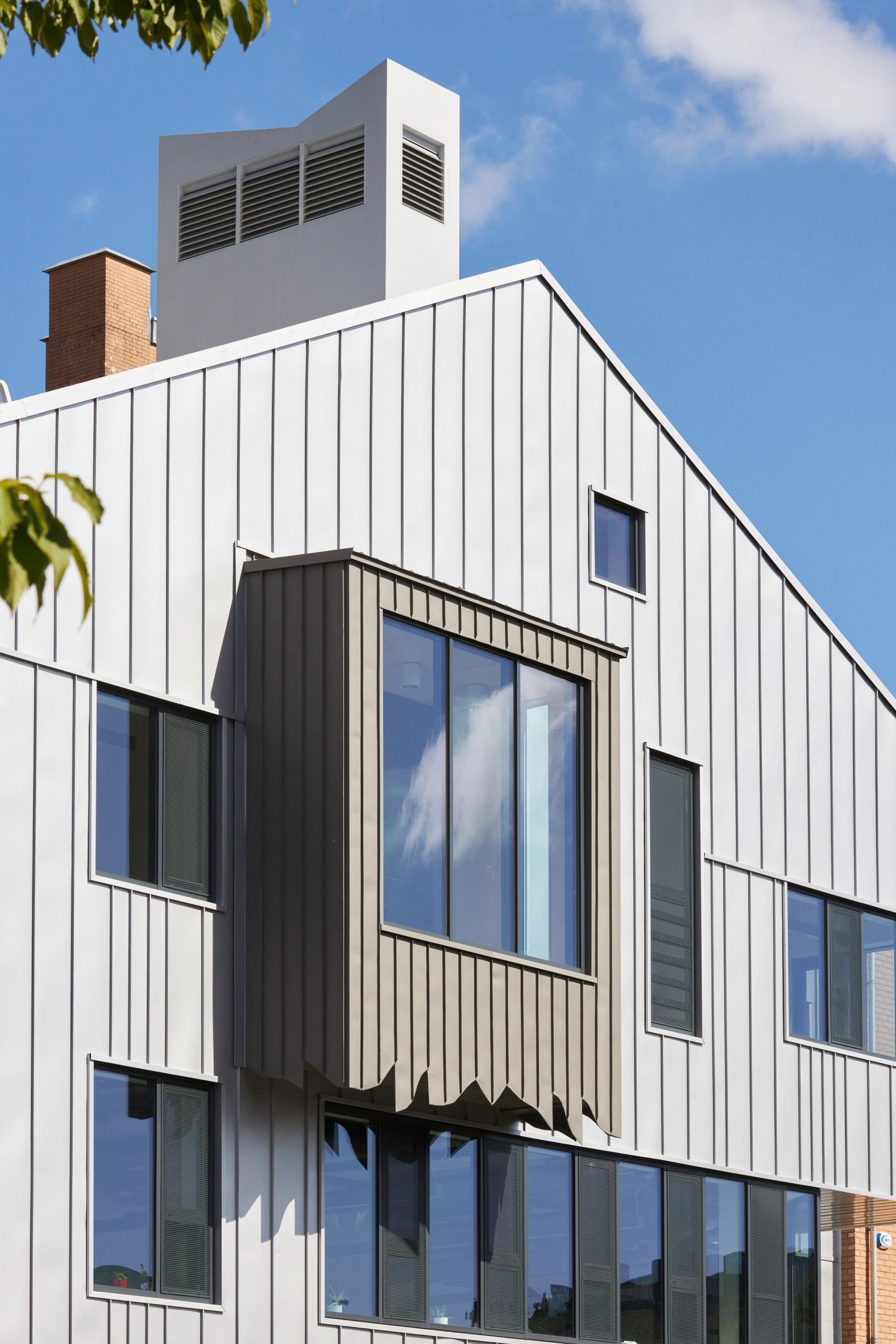
Sheppard Robson has extended the Contact theatre in Manchester

Sheppard Robson's goal for the project was to refresh the Contact theatre while preserving Short's original vision for the building.

Working with ME engineers at Max Fordham, the project also enhances the efficiency of the building's original sustainable design features, such as the chimneys that made it the first naturally ventilated theatre in the UK.

Metal-clad extension
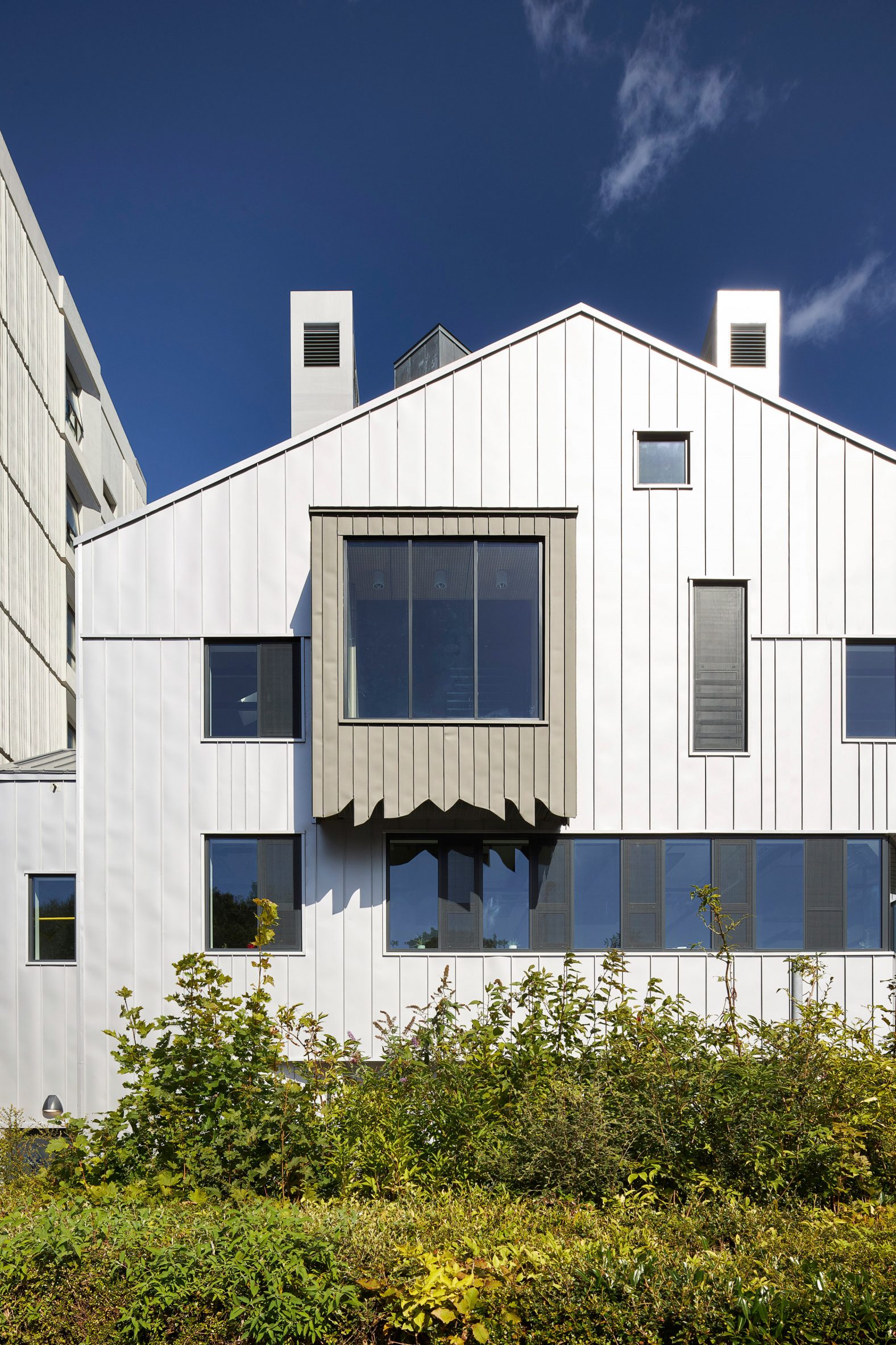
The extension is clad in metal

"At the heart of the brief was to extend and refresh Contact whilst carefully preserving the building and organisation's progressive spirit," Sheppard Robson partner James Jones told Dezeen.

"Overall, the refurbishment and extension together work to make the building more accessible, future-focused, economically and environmentally sustainable."

Contact theatre performance space
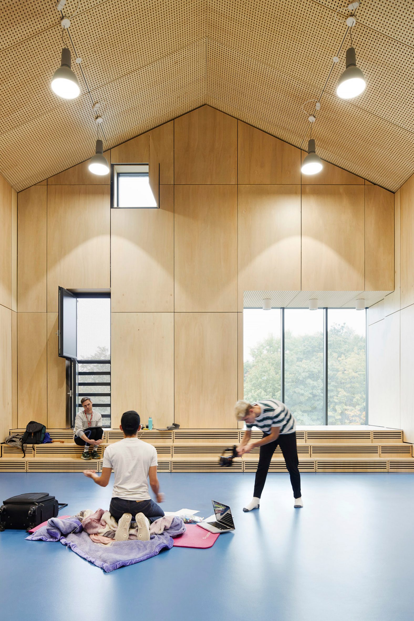
The extension contains performance spaces

Contact was established in 1972, but its Short-designed home was created following an investment from Arts Council England in the 1990s.

The theatre and arts venue is best known for championing youth leadership and creativity. To reflect this, Sheppard Robson consulted with a group of young people associated with the theatre throughout the redesign.

[ Bristol's Old Vic Theatre by Haworth Tompkins

Read:

Haworth Tompkins creates public foyer for Bristol Old Vic Theatre

](https://www.dezeen.com/2019/01/15/haworth-tompkins-bristol-old-vic-theatre-extension/)

"The [co-creation] process ensured that the building continues to be more than just a space to see a performance," Jones explained.

"It is far more deeply embedded with the community and new ways of engaging young people in the arts."

Theatre lobby by Sheppard Robson
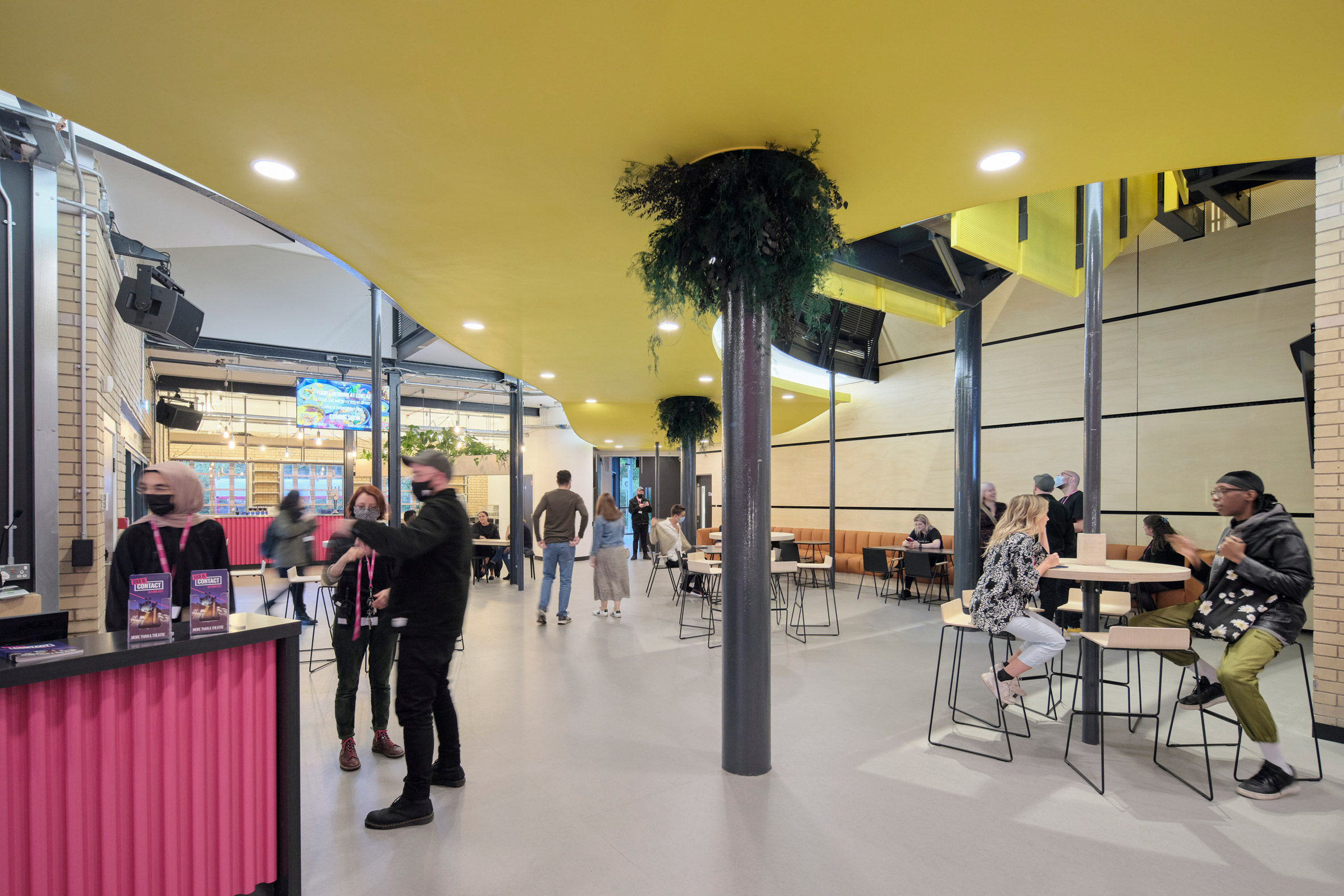
The existing building has also been remodelled

The 300-square-metre extension to the theatre is designed to complement Short's original quirky design, while also boasting its own unique aesthetic.

To achieve this, Sheppard Robson covered it with standing-seam aluminium and zinc cladding that echoes details of the existing building that are also finished with metal, such as the main entrance.

"Externally, we read the Alan Short design to be a complex 'village' of forms that articulate the range of spaces within the building," Jones explained.

"We wanted to add to this with a form that was clearly new and distinct, but still part of the village – the use of materials helped achieve this."

Inside Contact theatre in Manchester
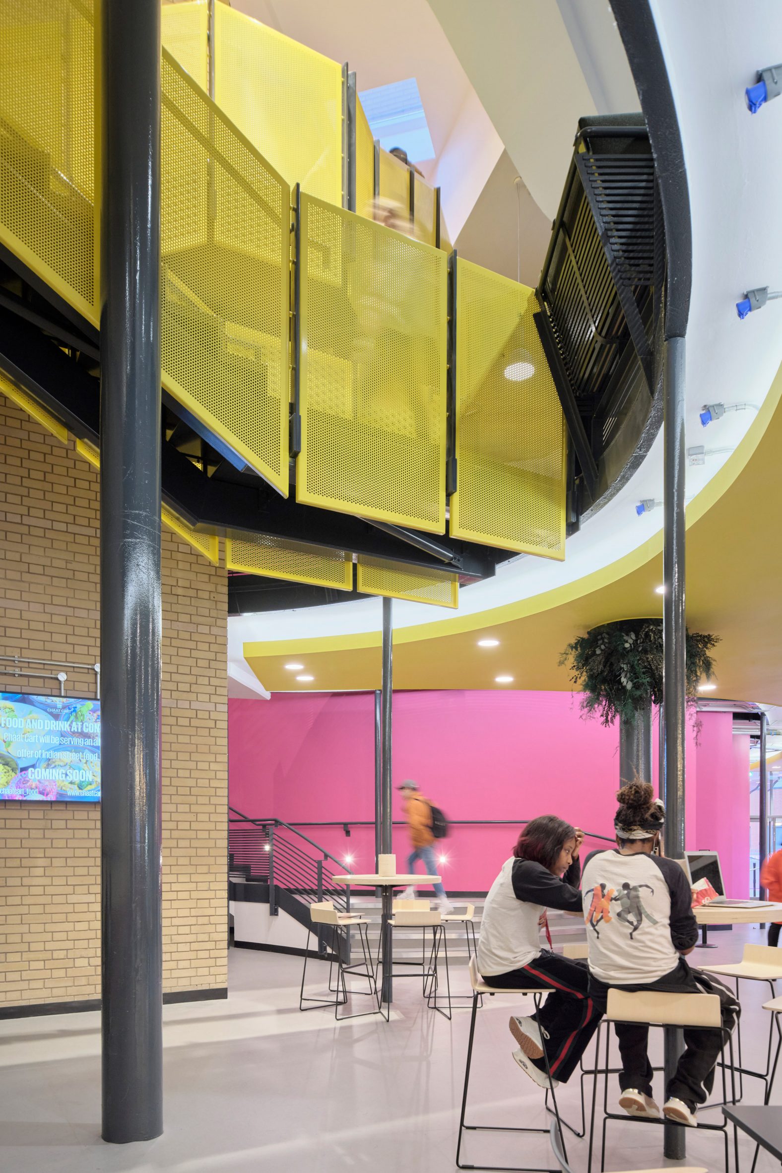
Circulation has been improved in the public areas

The extension comprises three storeys and is topped by a pitched roof arranged around two ventilation chimneys that nod to those on the original buildings.

In the same way as Short's original design, these chimneys are used to naturally ventilate the extension's interiors.

Inside, the ground floor of the extension comprises performance spaces as well as a health and science development created in partnership with the Wellcome Trust.

The first floor has offices for Contact staff, while the top floor contains rehearsal spaces and workspaces for artists and cultural organisations.

Brick-walled bar by Sheppard Robson
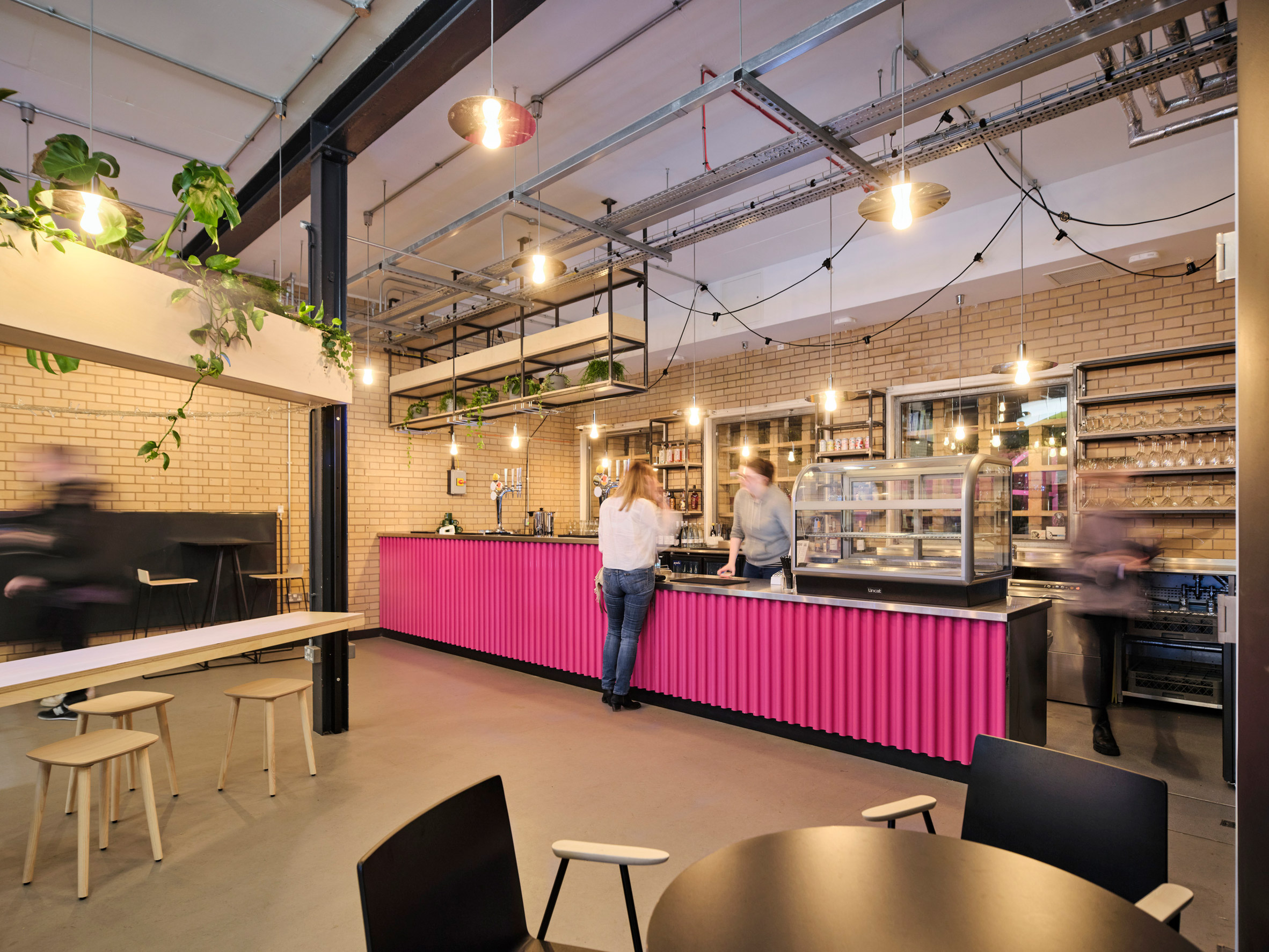
A new cafe and bar has been added to the entrance

Sheppard Robson's alterations to the Contact theatre's existing building included the improvement of sound insulation and circulation in the building's public areas. A new cafe and bar have been introduced at its entrance to "lift the arrival experience of the building", Jones said.

Upgrades were also made to reduce the building's overall carbon emissions, which the studio has predicted will see an annual drop of 13 per cent.

These improvements included changes in the way users can monitor and control air quality and airflow rates of the building's original natural ventilation system to minimise heat loss.

Theatre interior
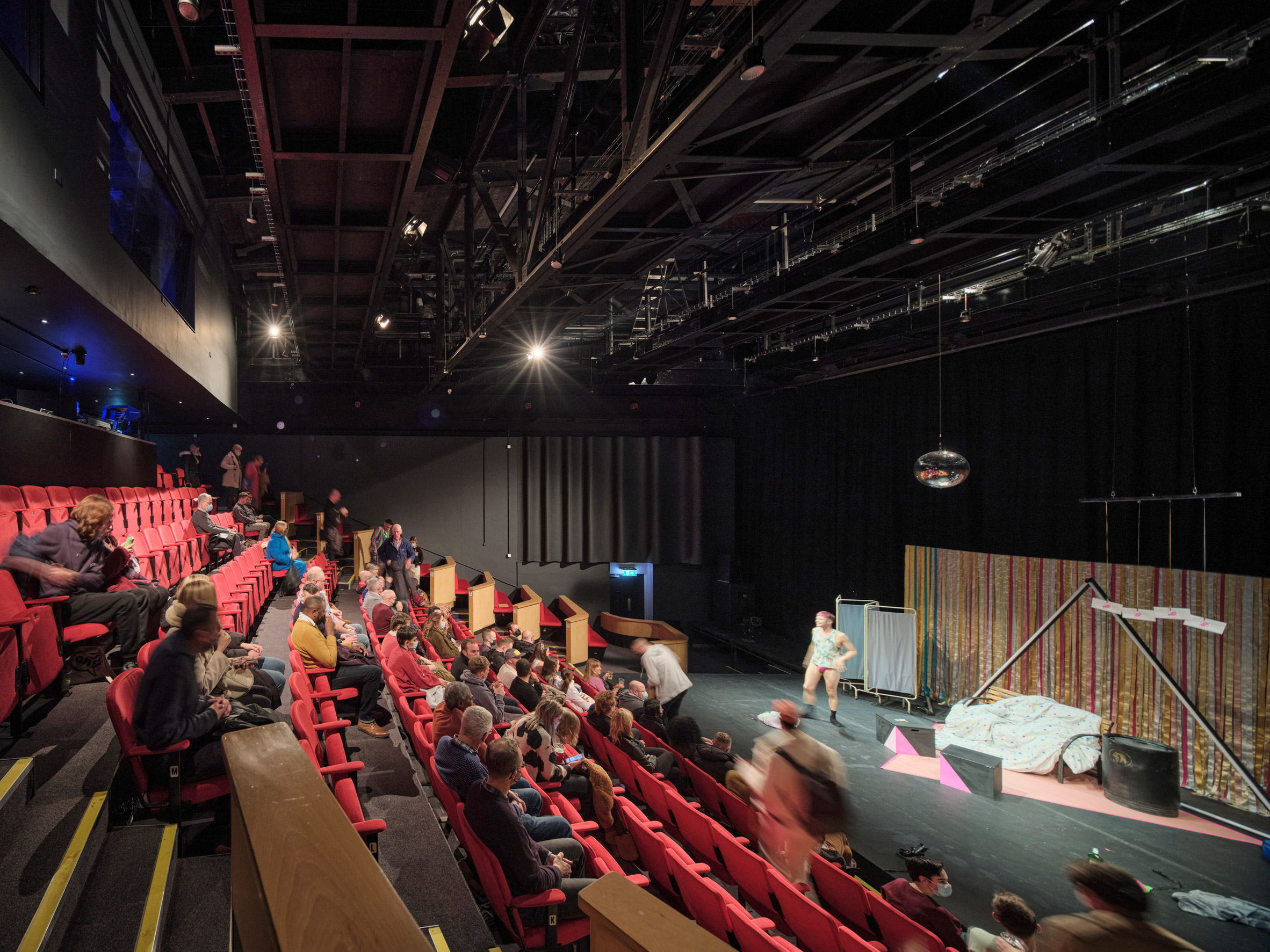
Lighting in the theatre now relies on LEDs

The new naturally-lit offices replace old cellular workspaces in the original building, and feature external shading to reduce overheating. All lighting has been swapped for LED technology, while an efficient central heating plant was introduced in place of 20-year-old boilers.

To track the reductions in the theatre's carbon emissions, Max Fordham will now monitor the building's energy consumption over the next two years and provide advice for optimisation.

Yellow staircase
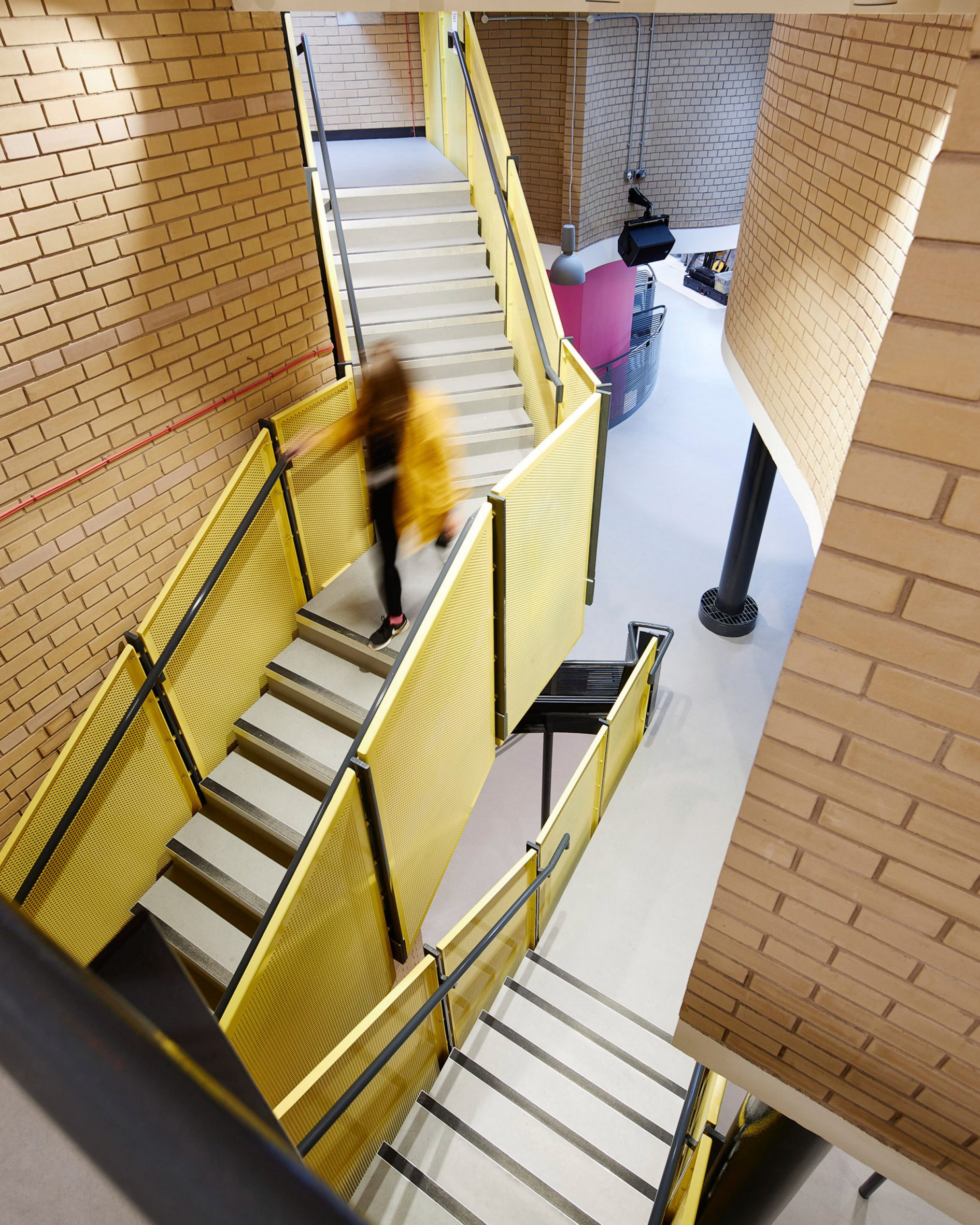
Sheppard Robson said the improvements "lift the arrival experience of the building"

Sheppard Robson is a British architecture studio founded in 1938 by Richard Herbert Sheppard. It has offices in London, Manchester, and Glasgow.

Other projects by the studio include the Nelson Mandela Children's Hospital in Johannesburg and a barn-style extension for a horse hospital in Edinburgh.

Elsewhere, architecture studio Haworth Tompkins also recently completed a number of theatre renovations, including the revamp of Bristol's Grade I-listed Old Vic theatre and the overhaul of the historic Theatre Royal Drury Lane in London's West End.

The post Sheppard Robson updates and extends Alan Short-designed theatre in Manchester appeared first on Dezeen.

#all #architecture #cultural #uk #extensions #manchester #theatres #renovations #culturalbuildings #sheppardrobson

dezeen@xn--y9azesw6bu.xn--y9a3aq

Mid-century Phoenix home receives updates and expanded living space

image

Phoenix home

This home at the foot of Camelback Mountain in Arizona has been thoroughly renovated by 180 Degrees Design + Build and CBTWO Architects with updated finishes and a new double-height living room.

Located in Phoenix, the Brandaw Residence was originally built in the 1960s, and in need of a refresh.

Local architects 180 Degrees Design + Build teamed up with Oregon-based CBTWO to update the home.

Phoenix home
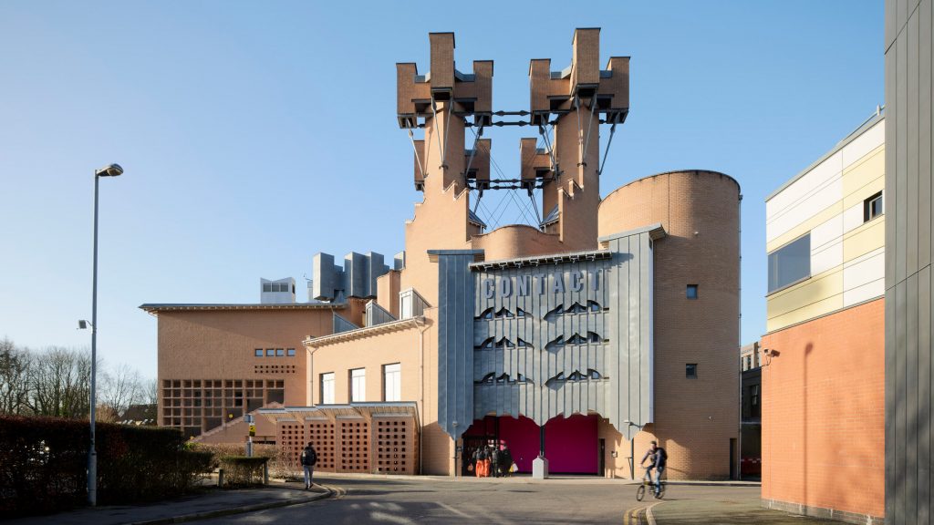
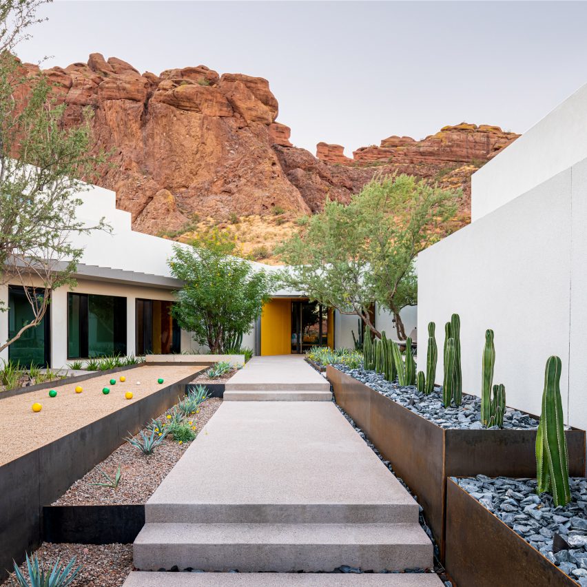
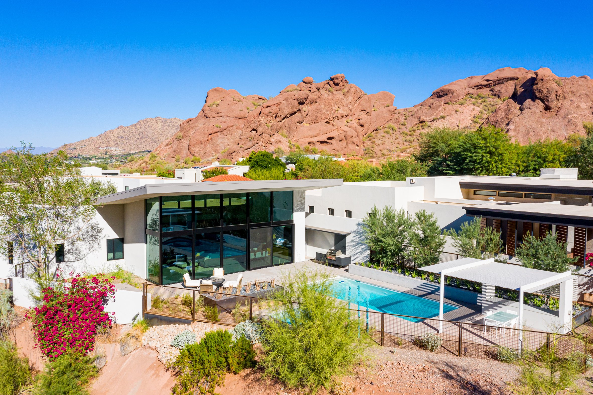
The Brandaw Residence sits at the foot of Arizona's Camelback Mountain

The team completely re-clad the exterior of the 4,930-square-foot (458-square-metre) home in a white stucco finish. They also took this opportunity to simplify its form, creating orthogonal corners and a consistent line at the parapet.

"Our goal was to focus less on the architecture, and allow the beauty of the site dictate the organisation of space, both horizontal and vertical," said the team. "From here it was an exercise in restraint and subtraction."

Dramatic fireplace in Phoenix home
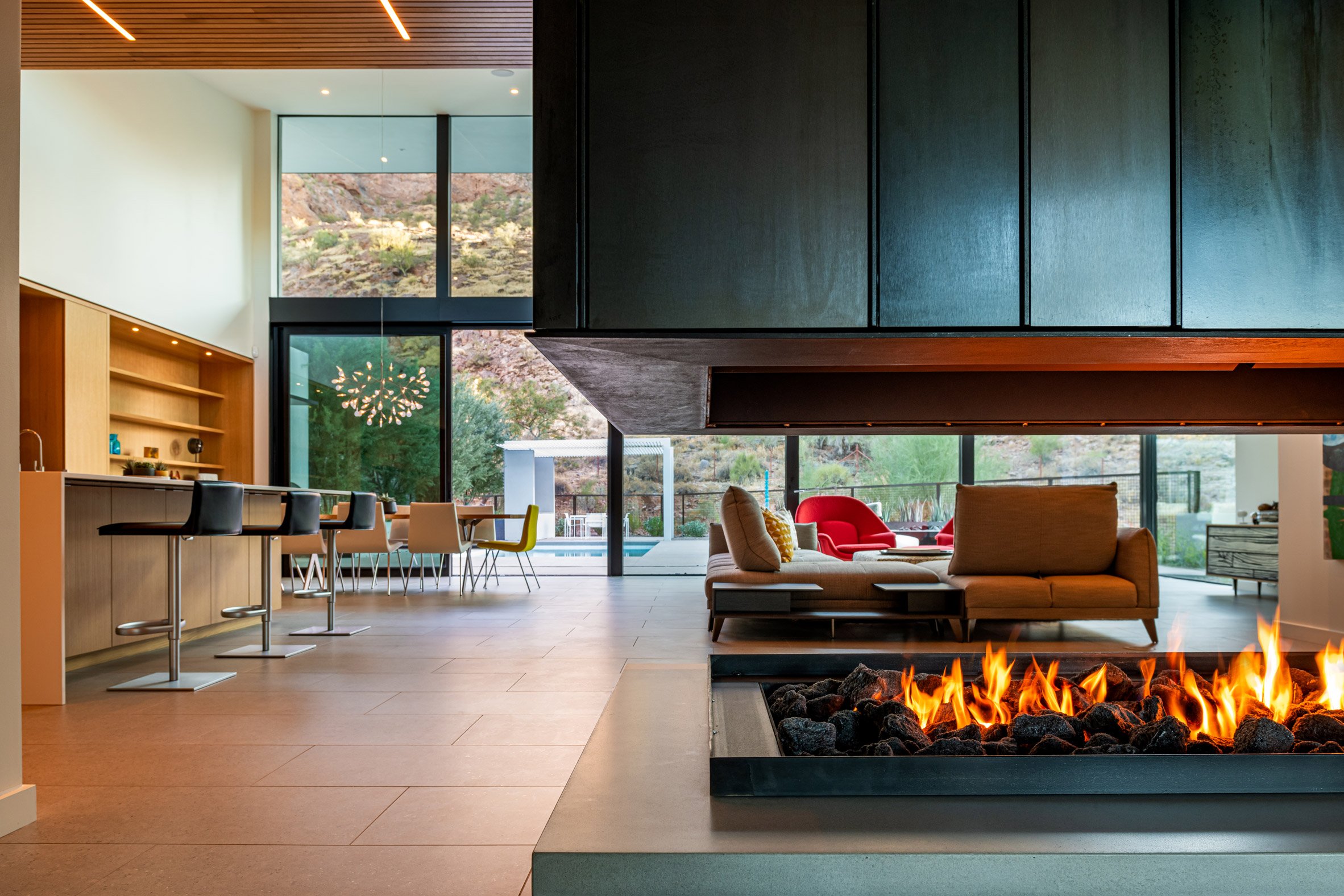
There is a dramatic fireplace in the living room

The residence is V-shaped in plan, with two wings that meet at a central living room.

This space was demolished and rebuilt completely, receiving a new pitched roof that directs the gaze upwards and towards the mountain behind the home.

Full-height glazing
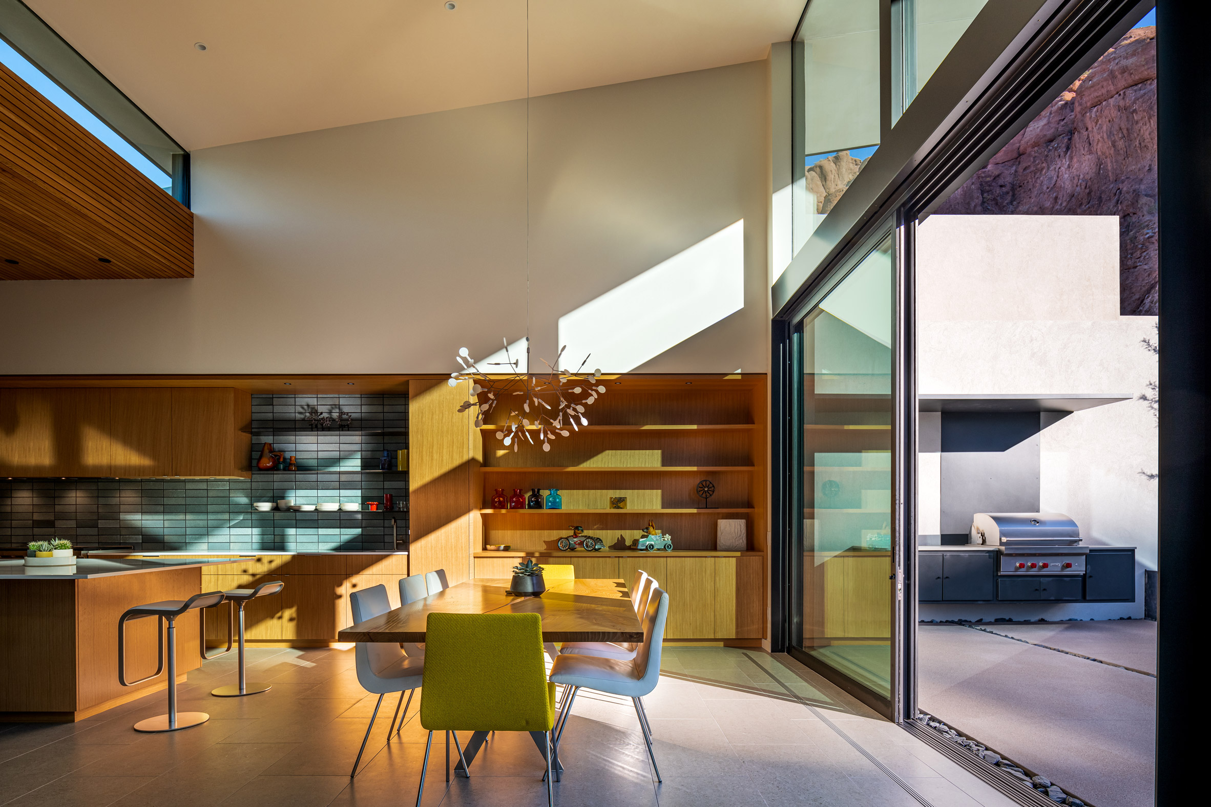
Full-height glazing wraps the living space on two sides

"The design team, along with the owner, agreed to reorganise much of the interior uses to create a stronger relationship to its environment, allowing the interior spaces to capture the incredible dynamics of the surrounding mountains and distant views," the architects explained.

The entrance to the home is at the intersection of both wings, which now is highlighted by a yellow steel portal.

Private area
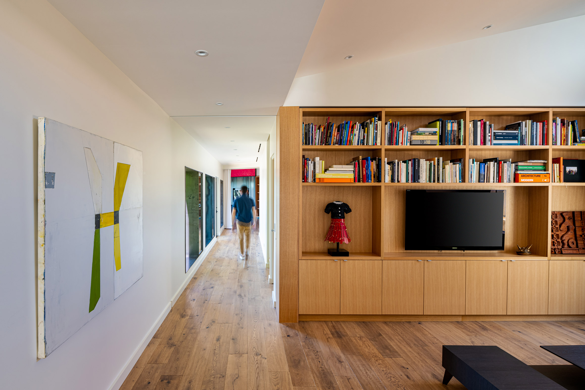
Private areas received a lighter touch during the renovation

"The steel portal, painted in vibrant yellow to mimic the yellow blooms of the desert plants, compresses as you enter the home," said the architects.

Immediately through the door is a dramatic fireplace that creates a separation from the entrance and the living room beyond.

[ Ventana House by HK Associates

Read:

Concrete home by HK Associates looks onto the Arizona desert

](https://www.dezeen.com/2021/09/15/ventana-house-hk-associates-tuscon-arizona-desert/)

Full-height glazing wraps this room on two sides, helping to connect the interior living spaces to the back yard, which was also overhauled as part of the renovation.

"The beauty of the architecture now becomes a canvas on which the desert environment and mountain can exist," said the architects.

White stucco facade
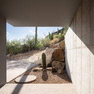
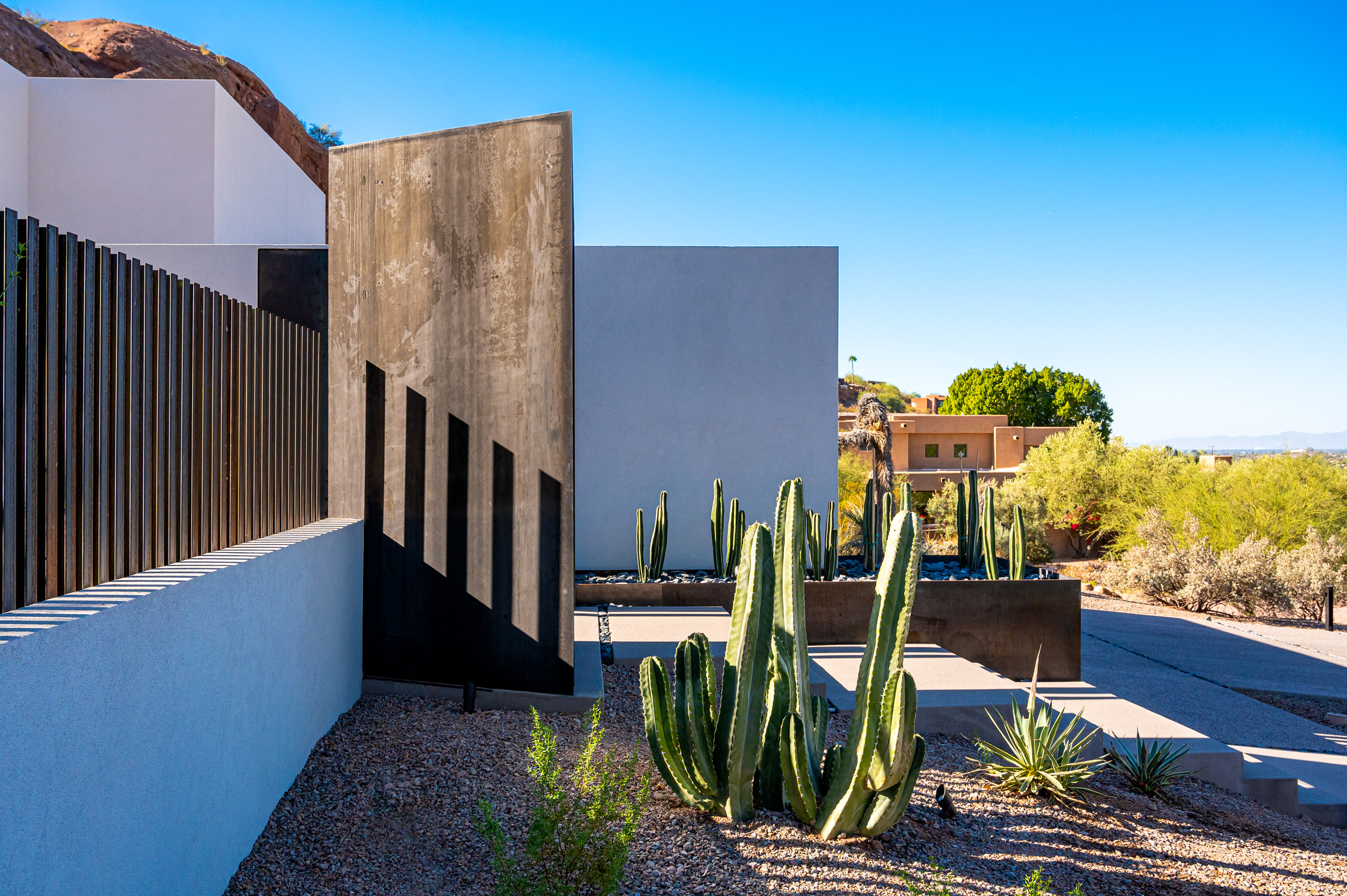
The architects re-clad the Brandaw Residence in white stucco

The wings of the home contain four bedrooms and other private areas, with the primary bedroom enjoying its own wing for additional privacy.

These areas received a lighter touch but were still updated with new flooring, finishes, and simplified windows that give the residence a cohesive feel.

Yellow steel door
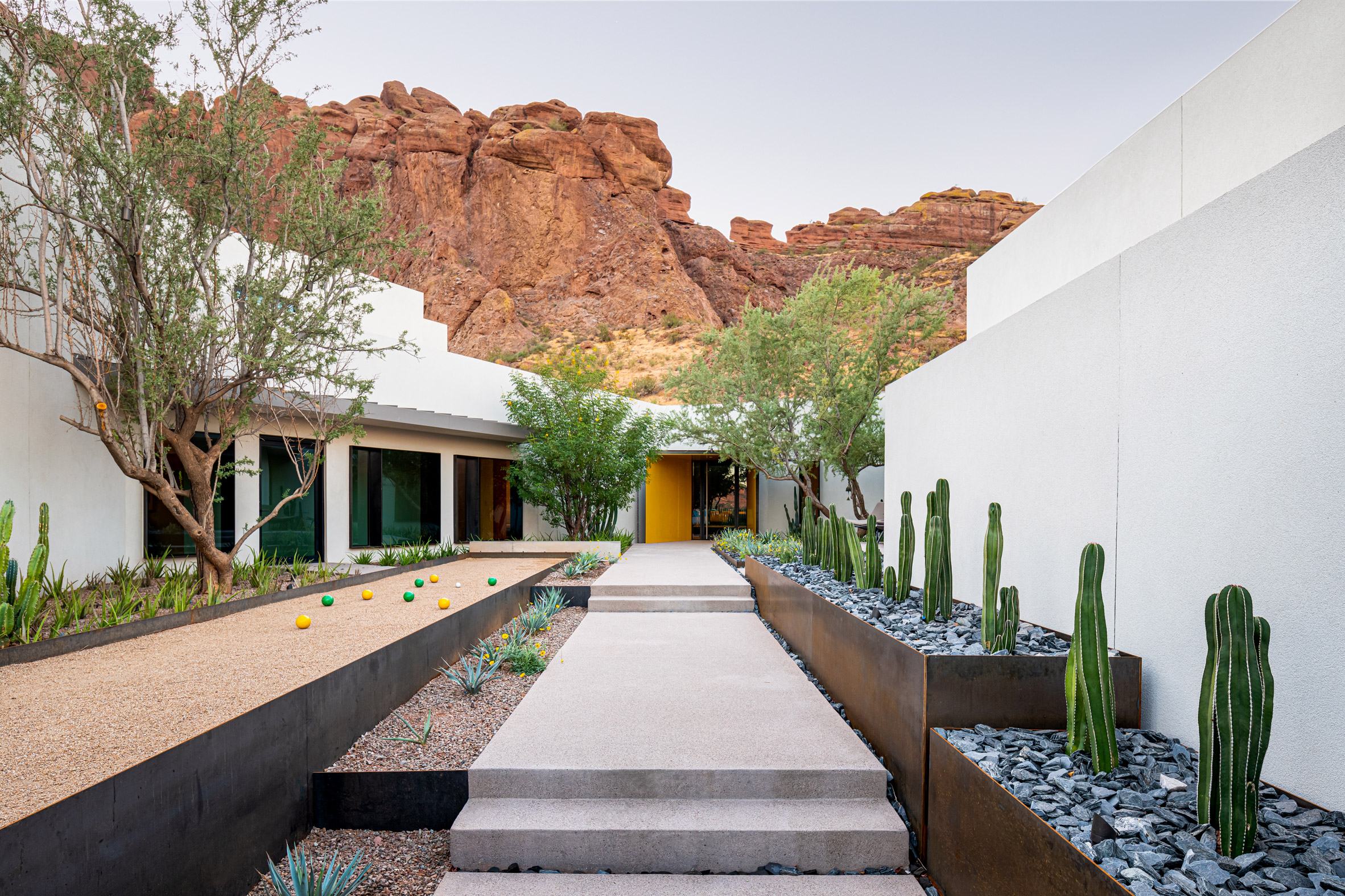
The entrance to the home is now highlighted by a yellow steel portal

Phoenix is among the fastest-growing US cities, resulting in many new-build and renovation projects.

Others to recently complete include a home with a "zen-like" quality and a board-marked concrete residence for a ceramicist.

The photography is byAn Pham.


Project credits:

Architecture firms: 180 Degrees Design + Build, CBTWO Architects

Design team: James Trahan

Structural engineer: Cartwright Architects & Engineers

Environmental & MEP engineering: Otterbein Engineering

Lighting: Woodward Engineering

Construction: 180 Degrees Design + Build

The post Mid-century Phoenix home receives updates and expanded living space appeared first on Dezeen.

#all #architecture #residential #instagram #arizona #usa #houses #renovations #americanhouses #midcenturyrenovations #phoenix

dezeen@xn--y9azesw6bu.xn--y9a3aq

Graal Architecture extends university refectory with green steel pavilion

image

Crous University Refectory was designed by Graal Architecture

Graal Architecture has renovated and extended a university refectory building in France, adding a lightweight rooftop pavilion of glass and green-painted steel overlooking the surrounding parkland.

The Parisian studio was commissioned to both update and extend the original 1993 prefabricated concrete refectory building, which sits within the Francois Mitterrand Park in Cergy.

Image of Crous Univeristy Refectory from the gardens
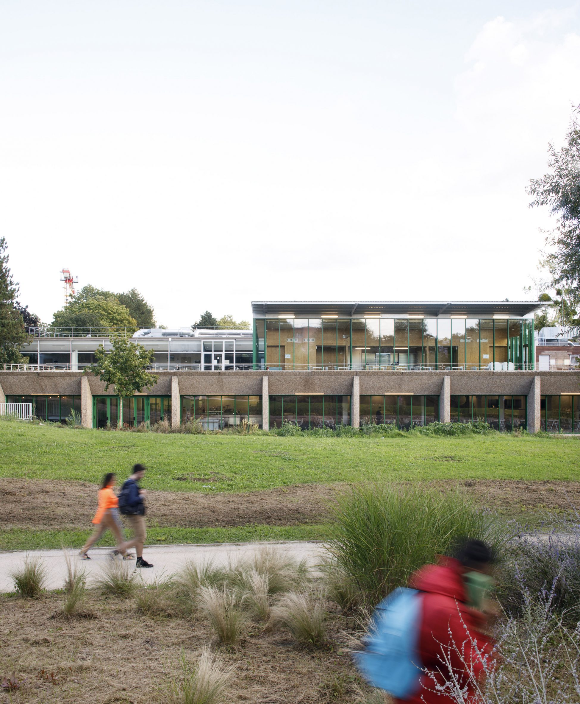
The Crous University Refectory was extended and renovated by Graal Architecture

The project was completed for the Regional Centre for University and School Works, or CROUS — an organisation which provides burseries, accommodation, restaurants and cultural activities to students across France.

Despite its prominent position at the centre of the park, the original refectory building suffered from a poor connection to the outdoors and gloomy interiors.

Green window frames line the openings in the concrete structure at Crous University Refectory
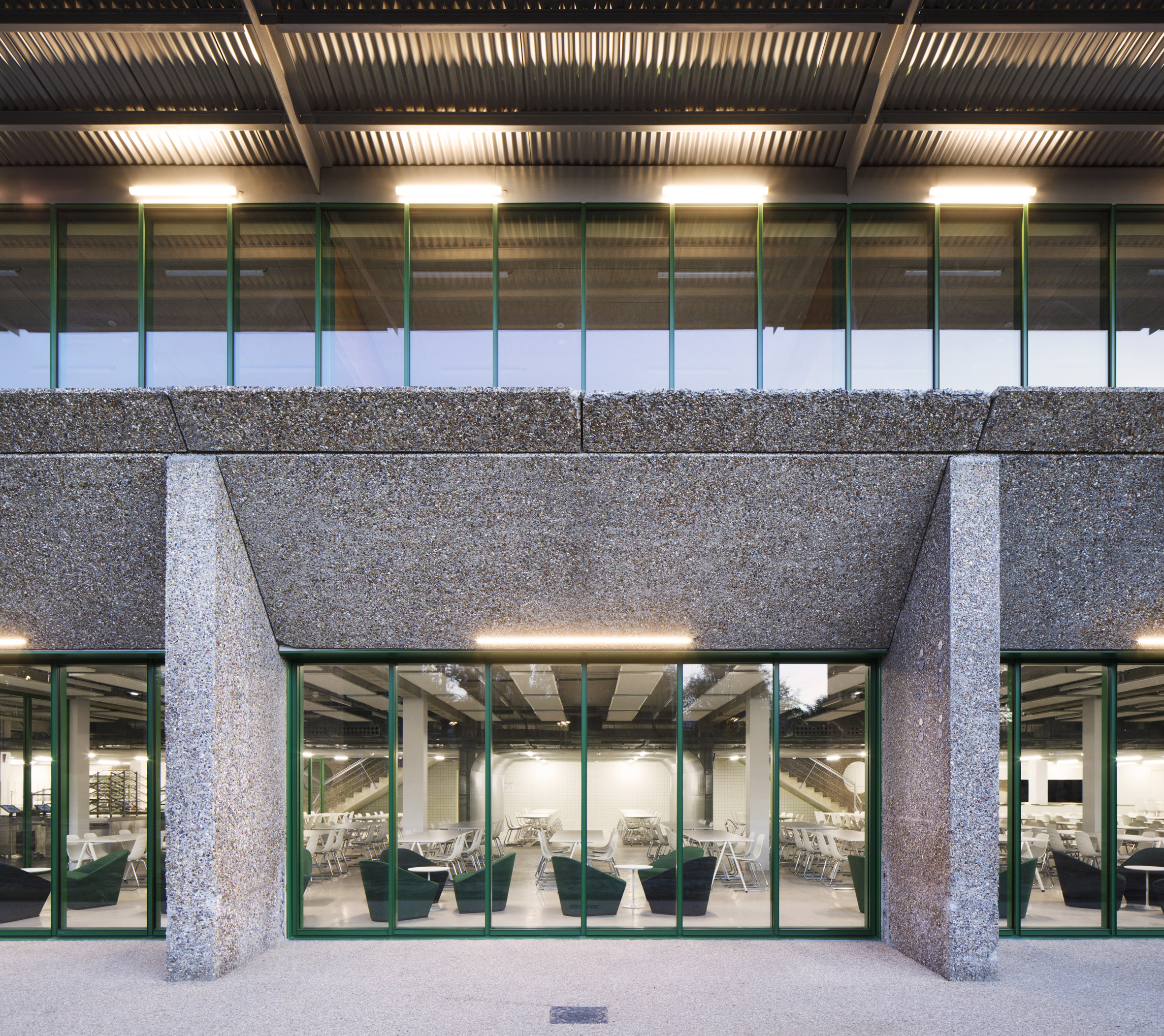
The practice added green steel structural work to the building

Graal Architecture's approach involved both opening-up and highlighting the "intrinsic qualities" of the original building, while also adding a terrace and rooftop extension, called the Kiosk, which enjoys panoramic views over the park.

"Discreetly embedded in the topography, the original building faced a paradox," said the practice.

"While benefitting from a privileged position, the refectory suffered on the one hand from a lack of visibility and on the other from interior spaces that are little enhanced by its lack of links with the outside," it continued.

[ Orly Festival Hall by Graal Architecture

Read:

Graal Architecture's Orly Festival Hall references residential and industrial buildings

](https://www.dezeen.com/2022/02/15/graal-architecture-orly-festival-hall-france/)

On the ground floor, sunk slightly into the ground, the "garden level" houses a large dining room overlooking the park to the north. Kitchens, bathrooms and offices wrap the southern edge of the building.

Removing a retaining wall, flattening the ground level and removing spandrels to expand the glazed areas all contributed to opening-up this ground floor space, characterised by the green-painted steelwork that frames the new windows.

"The interior is sequenced in three programmatic bands - relaxation, dining and kitchen areas - allowing the creation of a dynamic threshold between interior and exterior, notably through the new transparency of the facade," said the practice.

The corrugated steel pavilion has a mirror effect at Crous University Refectory
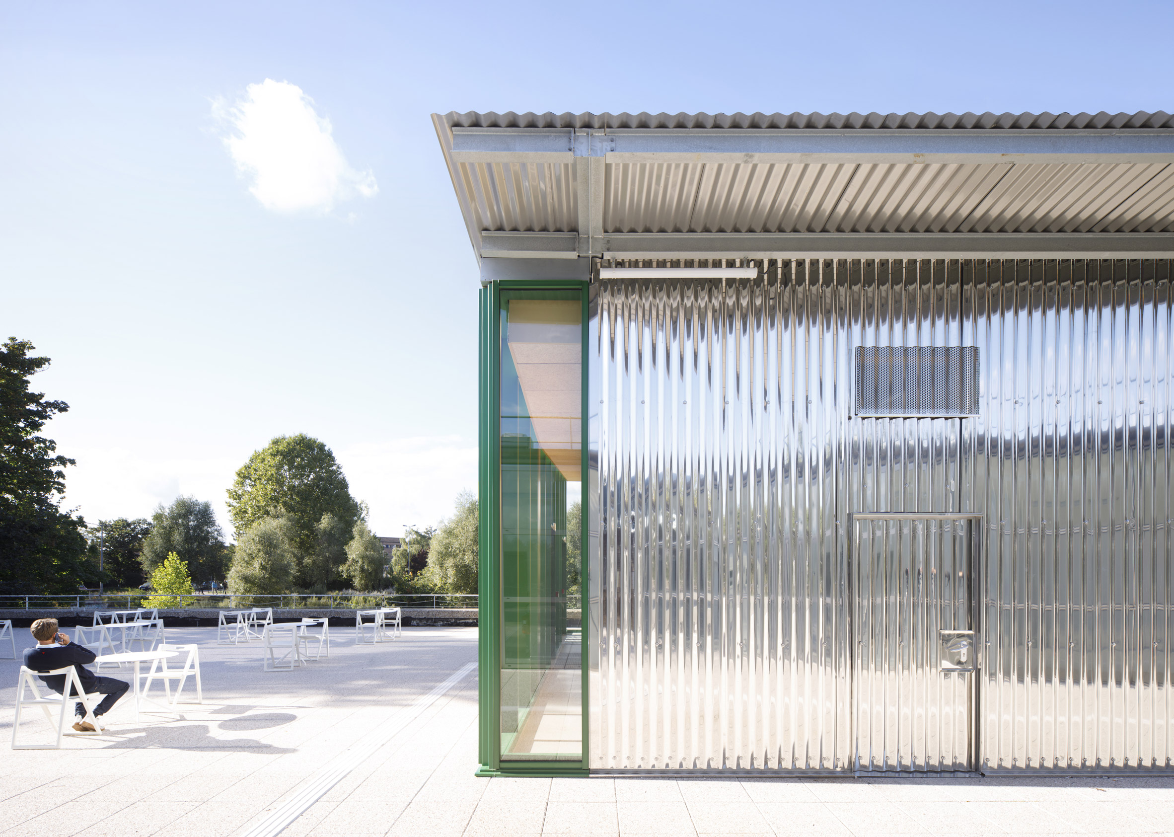
It is topped with a corrugated steel pavilion on the roof level

Inside, material choices were made to reflect the light around the space as much as possible, with a grey resin floor and glossy white tiles

Above, the Kiosk pavilion houses a new fast-food restaurant, built using a steel frame and finished in shiny corrugated sheet metal.

Interior image of a dining area at Crous University Refectory
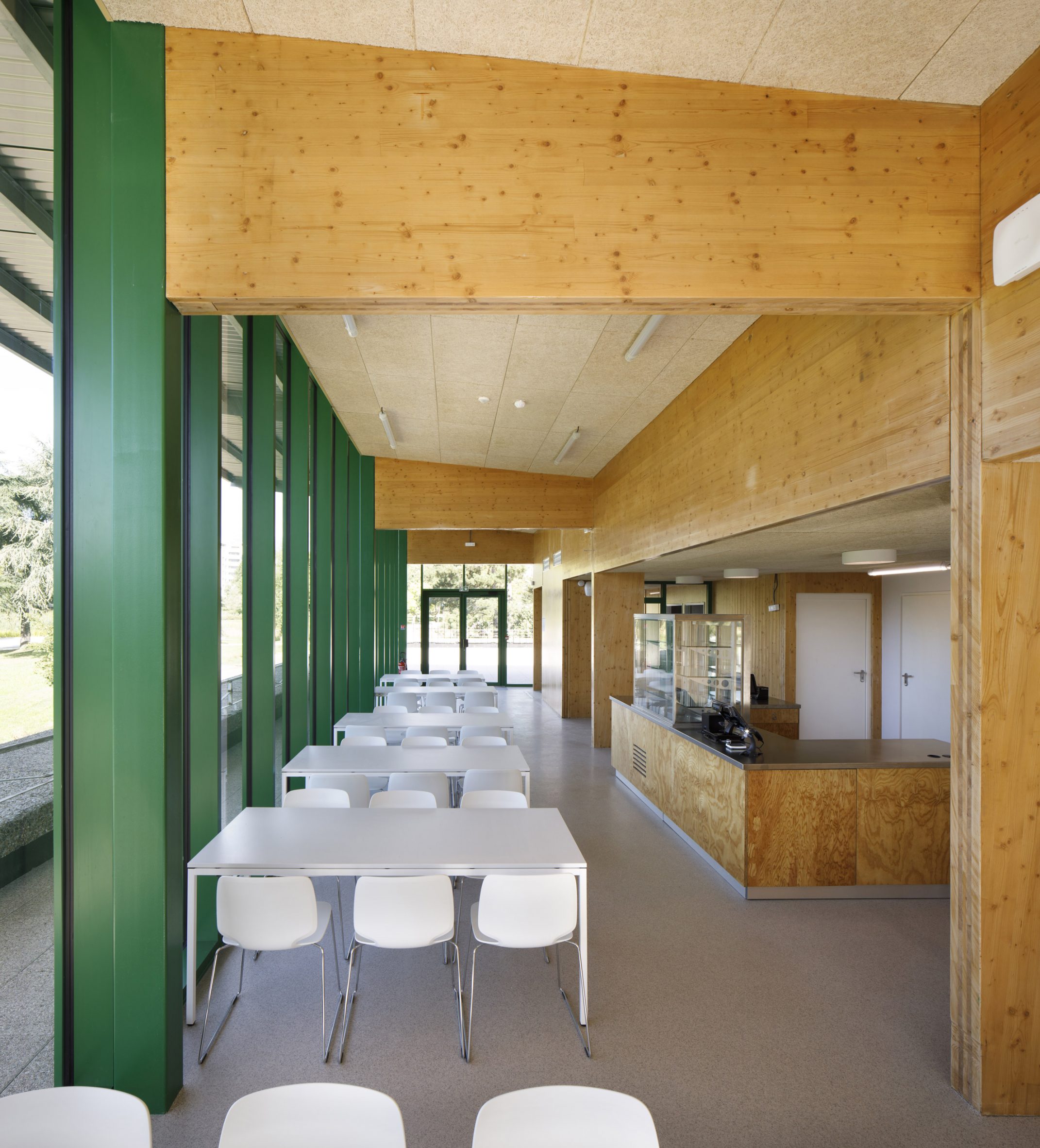
The interior features wooden and green-painted walls

"Designed as a light pavilion on a topographic mineral base, the Kiosk becomes a unifying element between the different parts of the refectory, allowing it to assert its presence while ensuring the architectural coherence of the whole," said the practice.

"Through a sober and economical design, the project demonstrates how work on an existing building can accompany the repositioning of an ordinary programme," it continued.

Floor-to-ceiling windows line the walls of the university building
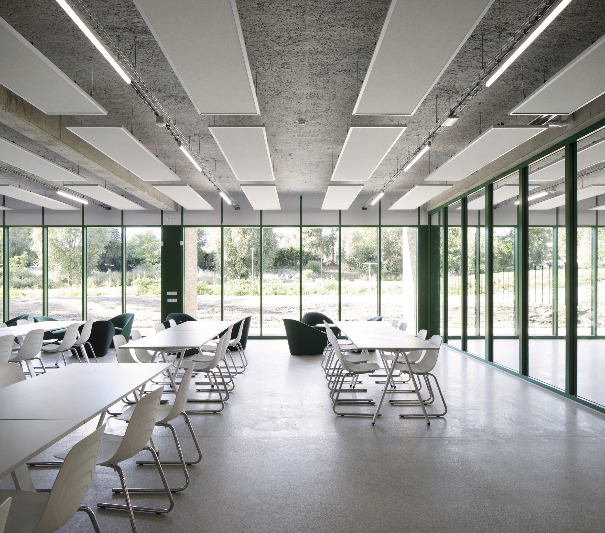
The building offers panoramic views of the park and gardens

Earlier this year, Graal Architecture completed a multipurpose events hall that mimics the look of typical gabled houses as well as the industrial sheds found nearby.

Other projects by the studio include a kindergarten extension in France made up of galvanised steel cabins.

The photography is byClement Guillaume.

The post Graal Architecture extends university refectory with green steel pavilion appeared first on Dezeen.

#all #architecture #education #france #steel #extensions #universities #renovations #graalarchitecture

dezeen@xn--y9azesw6bu.xn--y9a3aq

Modern extensions unify existing buildings at Nuremberg's House of Commerce

image

Exterior of The Nuremberg Chamber of Commerce and Industry headquarters

Berlin studio Behles & Jochimsen Architekten has renovated and extended the Nuremberg Chamber of Commerce and Industry offices in Germany, adding sandstone-clad buildings that tie in with the area's historic architecture.

Named the House of Commerce, the headquarters is located on a prominent site in the oldest part of Nuremberg, between the main market square and the medieval church of St Sebald.

Exterior of The Nuremberg Chamber of Commerce and Industry headquarters
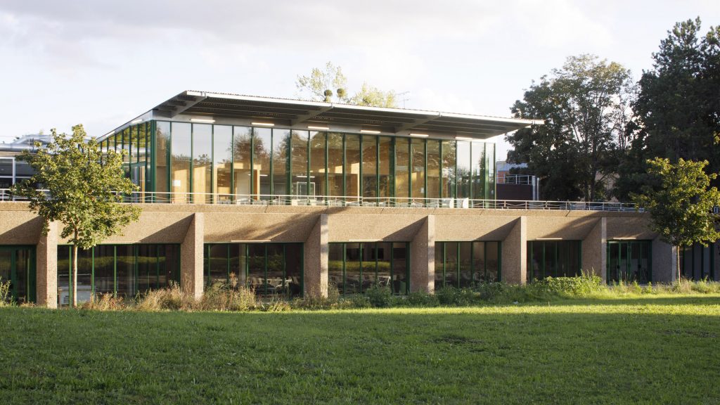
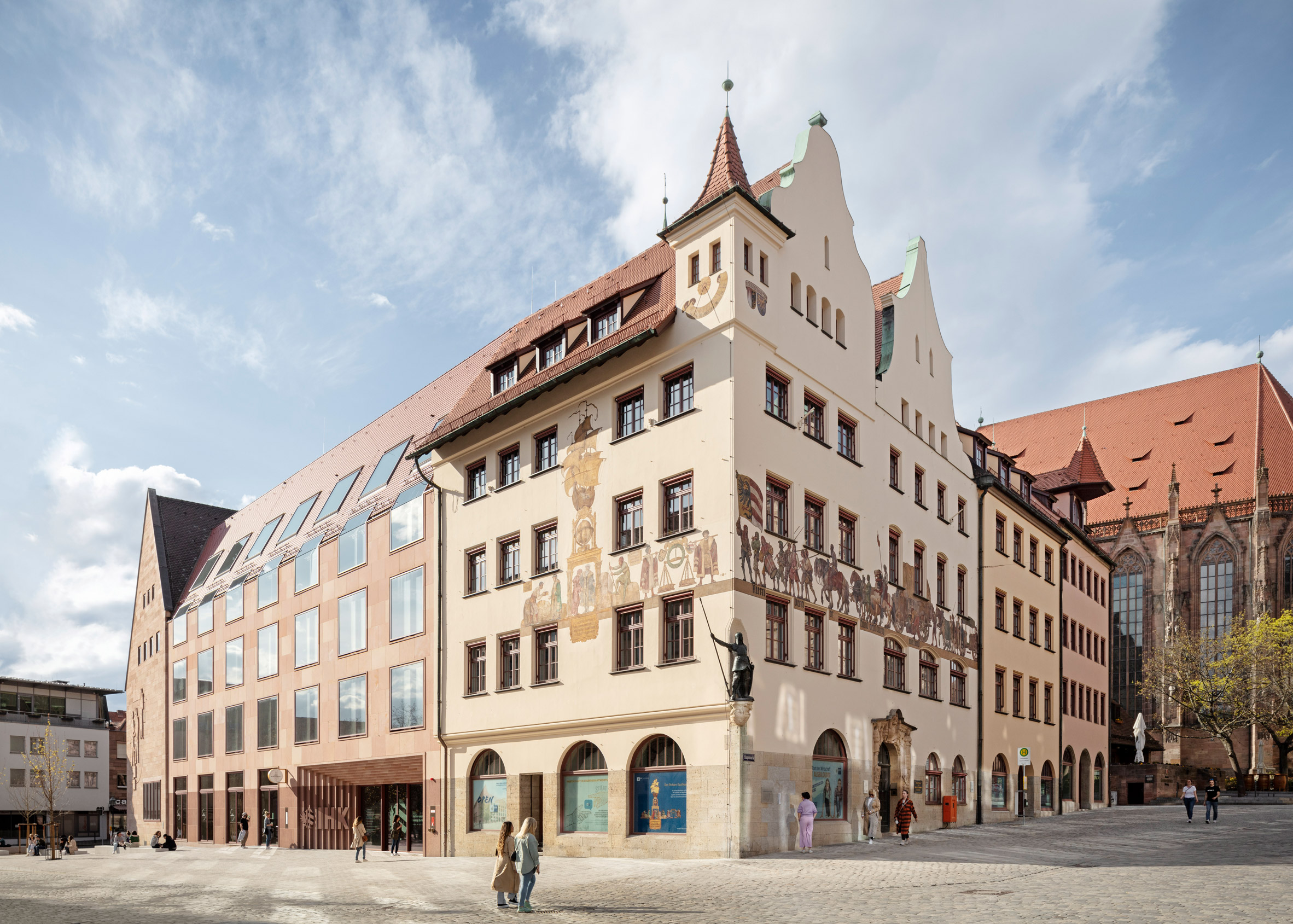
The Nuremberg Chamber of Commerce and Industry headquarters have been renovated

Behles & Jochimsen Architekten was tasked with reorganising the existing headquarters to create more cohesive and practical offices for the organisation, which provides support to local businesses.

Several structures listed as historic monuments were preserved and restored as part of the scheme, while some modern additions to the site were demolished and replaced to improve circulation.

Nuremberg market square
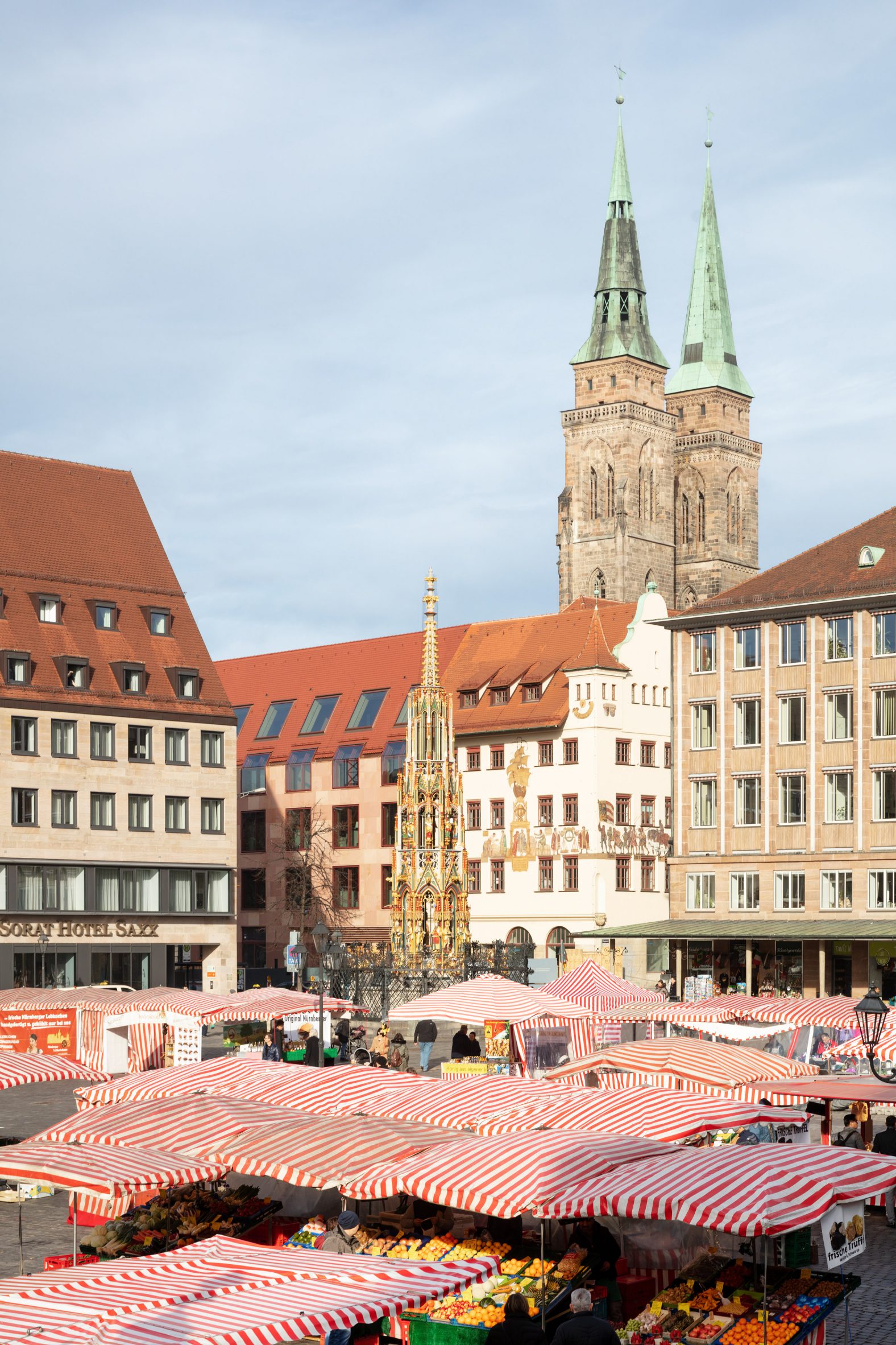
The offices are positioned close to Nuremberg's main market square

Behles & Jochimsen Architekten's additions replace buildings that were not protected and had no significant architectural merit. Those that were restored date back to the 1950s and 1960s.

The extensions follow the original building line and align with the existing eaves, while their proportions and choice of materials also respect the heritage of the site.

Sandstone-clad office
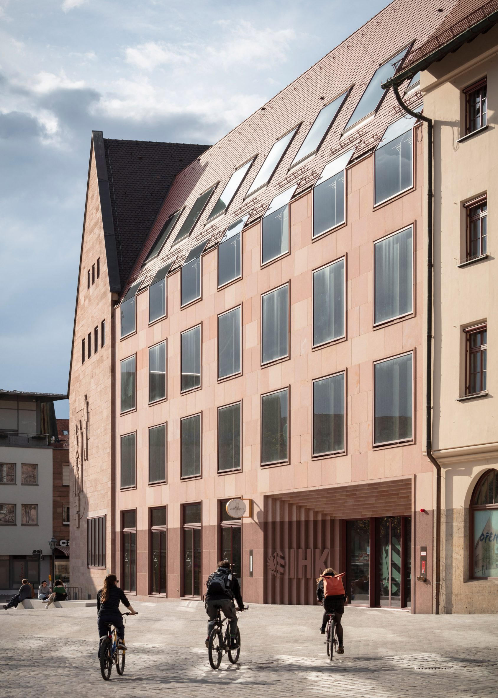
Behles & Jochimsen Architekten added sandstone-clad offices

"The new buildings adapt design features of the old town, such as the sandstone facade and the pitched roof with plain tiles," the architects explained.

"They pay homage to the architecture of the reconstruction after the war that characterises the townscape. The folded eaves windows respect the historic eaves heights."

Entrance to The Nuremberg Chamber of Commerce and Industry headquarters
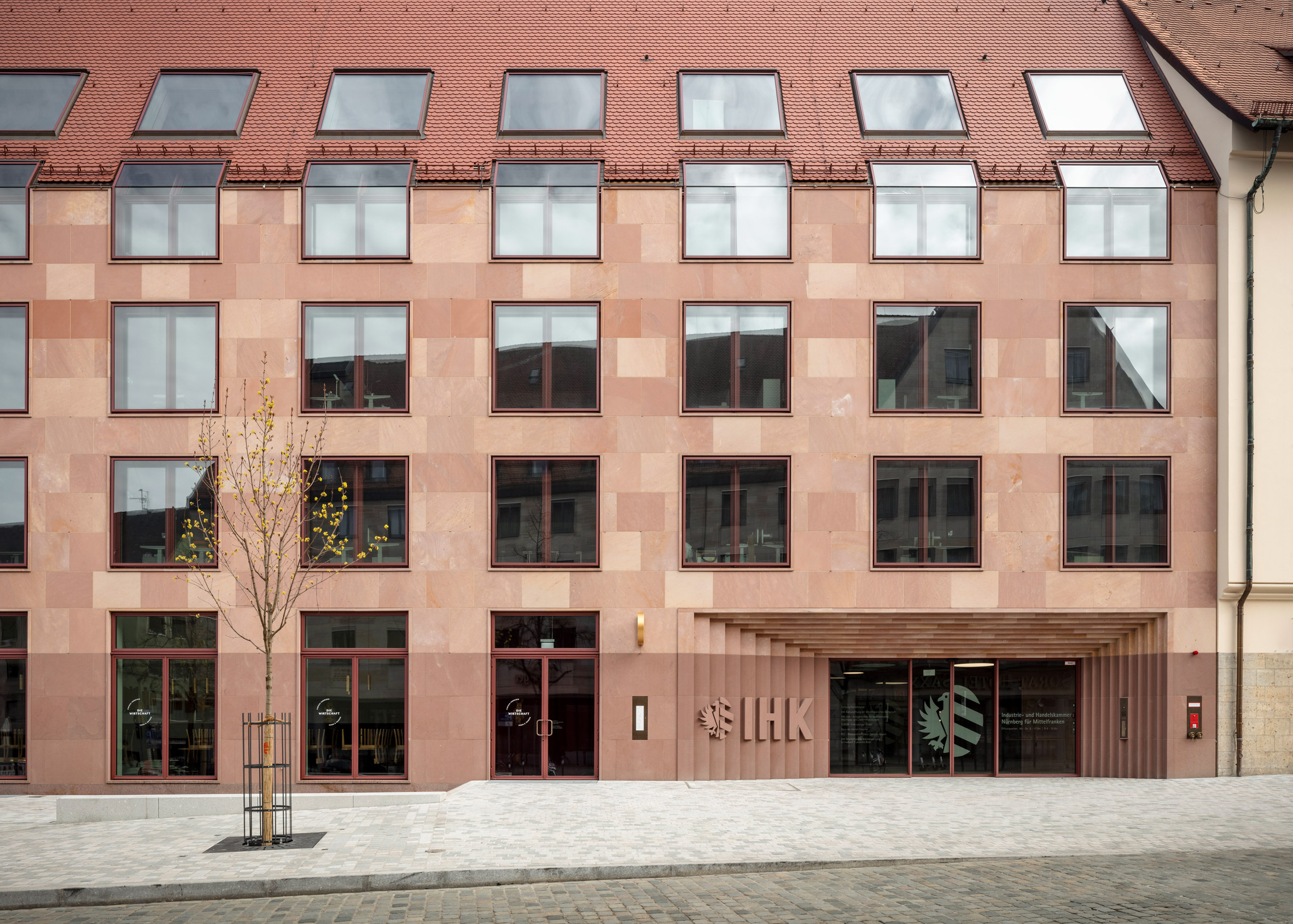
The sandstone cladding varies in colour

The headquarters' main entrance was moved to the busy Waaggasse street to give it greater prominence. Now visible from the nearby market square, it is set back from the facade and framed by a sculptural portal.

A previously open area on the west side of the site was filled in, allowing an existing central courtyard to be transformed into a glass-roofed atrium.

Exterior of the House of Commerce in Nuremberg
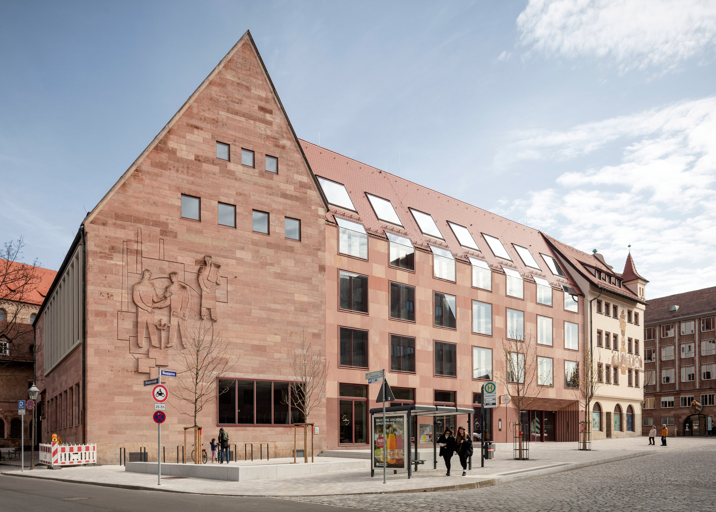
The extensions are designed to align with the existing buildings

This four-storey atrium functions as a reception and service point for customers, as well as a flexible space for hosting exhibitions and events. It also helps to rationalise the previously complicated circulation between different parts of the headquarters.

The two new wings are positioned on opposite sides of the atrium, connected by bridges. The facades of the existing buildings remain visible behind the bridges, which recall the wooden arcades found within traditional Nuremberg houses.

Glass-roofed office atrium
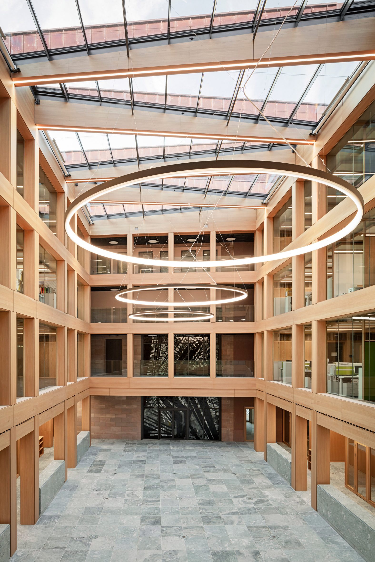
An atrium is positioned at the centre of the headquarters

Inside, the new wings contain spaces optimised for flexible office use, including areas beneath the eaves which are narrower than the main floors and benefit from higher ceilings.

In the older buildings, the original spatial organisation with a more traditional arrangement of rooms and corridors has been retained.

Glass-roofed atrium
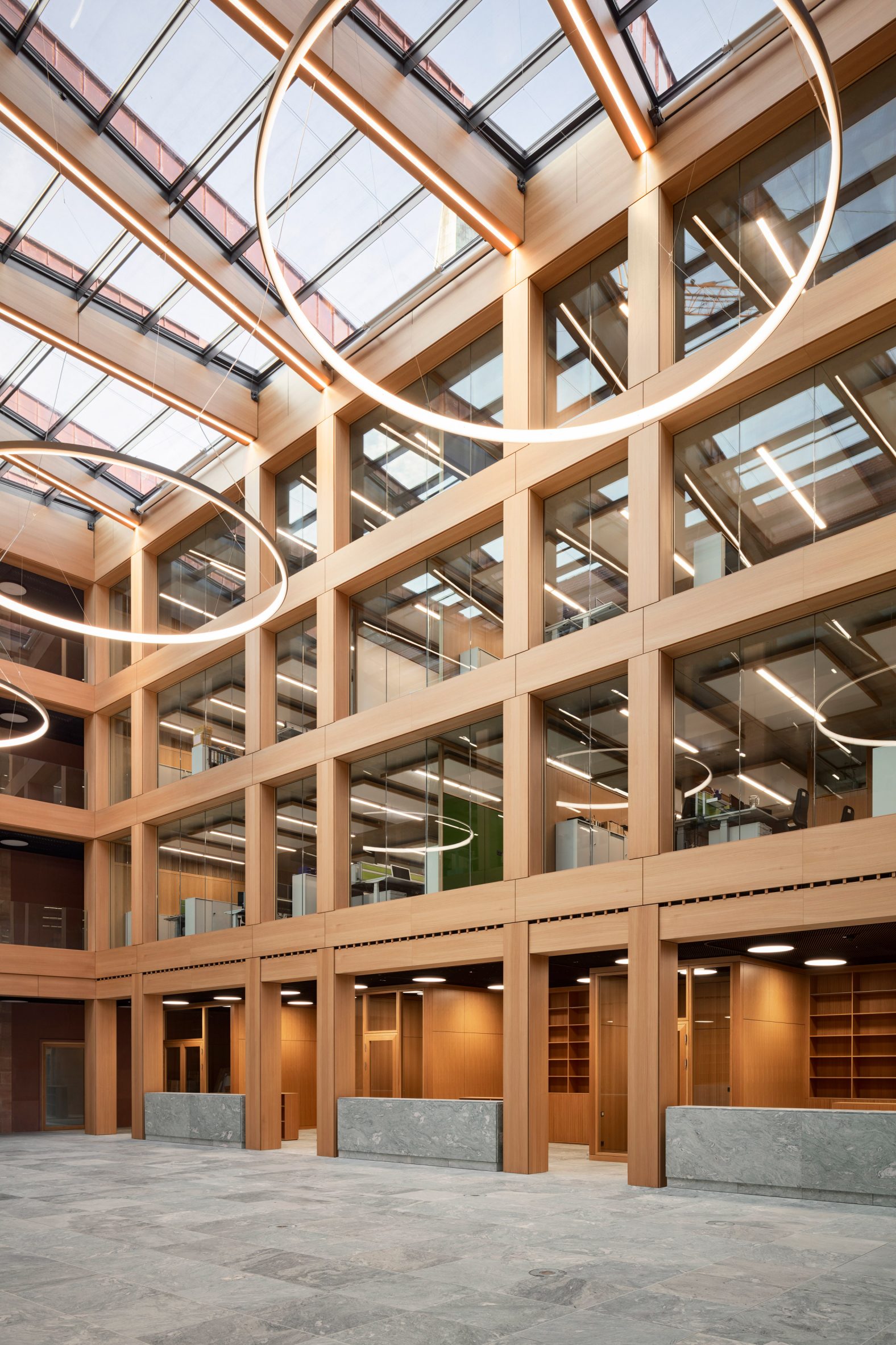
The atrium is lit by skylights

Materials used throughout the project reflect the region's traditional building methods. The bases of the extensions are clad in dark Wuestenzell sandstone and align with the plinth of the original corner building.

A lighter Schweinstaler sandstone used across the upper portion of the facades includes subtle tonal variations. Simple roof tiles were chosen to match those found on neighbouring buildings.

[ The limestone exterior of the Kunsthaus Zurich museum extension by David Chipperfield

Read:

David Chipperfield adds limestone-clad extension to Kunsthaus Zurich

](https://www.dezeen.com/2020/12/16/david-chipperfield-kunsthaus-zurich-museum-extension/)

Oversized windows, which are flush-mounted into the stone cladding, introduce a modern detail to the facades. The windows fold over the building's eaves, with further skylights illuminating the interiors from above.

The building's interiors feature natural and hard-wearing materials such as the pale-green stone used for flooring and counters in the atrium. Jura stone used for the corridors and staircases references the floors of the old buildings.

Office in The Nuremberg Chamber of Commerce and Industry headquarters
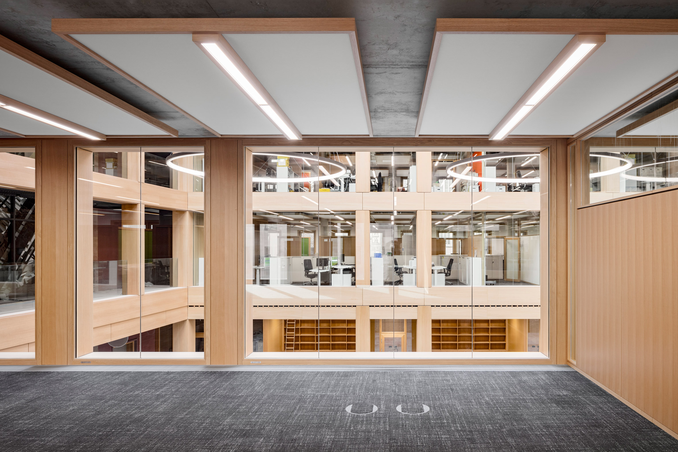
Flexible office spaces feature in the new wings

Light-coloured walls and wooden doors create a warm and muted atmosphere in the offices. Oak-framed ceiling panels with integrated lighting optimise the acoustics in these spaces.

Behles & Jochimsen Architekten was established in 1999 by Armin Behles and Jasper Jochimsen and has worked on several projects involving the conversion of listed historic buildings.

Office in The House of Commerce
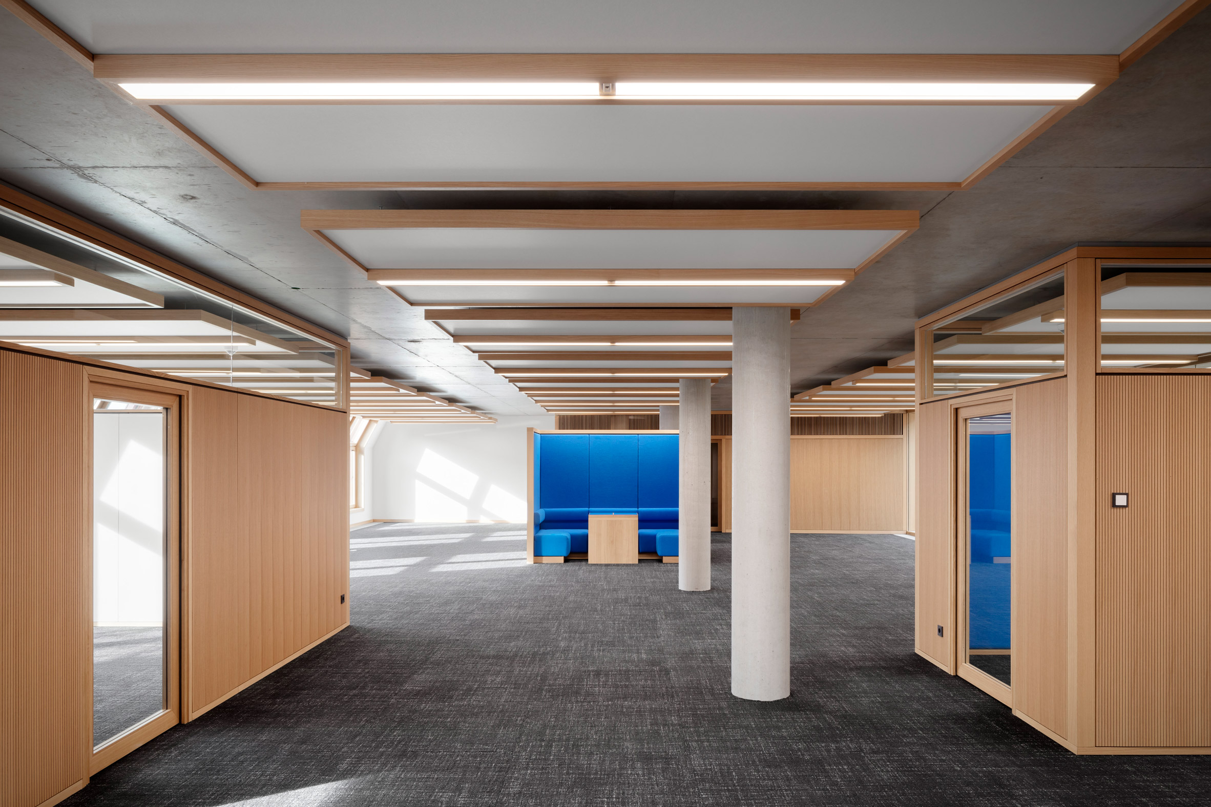
Oak-framed ceiling panels optimise the acoustics in the offices

In Perth, OMA and Hassell also recently took on the challenge of preserving and extending a group of heritage buildings.

The five existing buildings, which date back as far as the 19th century, were restored and linked by contrasting, contemporary structures to create a museum that celebrates the history of Western Australia.

The photography is byMarcus Bredt.


Project credits:

Client: Nuremberg Chamber of Industry and Commerce for Middle Franconia

Project management: GCA

Architect: Behles & Jochimsen Architekten

Team: Armin Behles, Laura Casado Albo, Jenny Dittrich, Matthias Hänsch, Jasper Jochimsen, Iva Kocheva, Bela Schwier, Simon Stahnke

Tendering and construction management: GanzWerk

Structural engineering: LAP Leonhardt, Andrä und Partner

Mecanical engineering: Rentschler Riedesser

Electrical engineering: Raible + Partner

Building physics: Müller BBM

Fire protection: Oehmke + Herbert

The post Modern extensions unify existing buildings at Nuremberg's House of Commerce appeared first on Dezeen.

#all #architecture #instagram #germany #officearchitecture #extensions #renovations #sandstone

dezeen@xn--y9azesw6bu.xn--y9a3aq

SHED gives mid-century Golden House in Seattle an extensive update

image

SHED Golden House

American firm SHED Architecture and Design has transformed a 1950s building that formerly served as an adult living facility into a contemporary home for a family of five.

The Golden House is located in Shoreline, a community just north of Seattle, and sits on a large lot with views of the Olympic Mountains and Puget Sound.

The Golden House
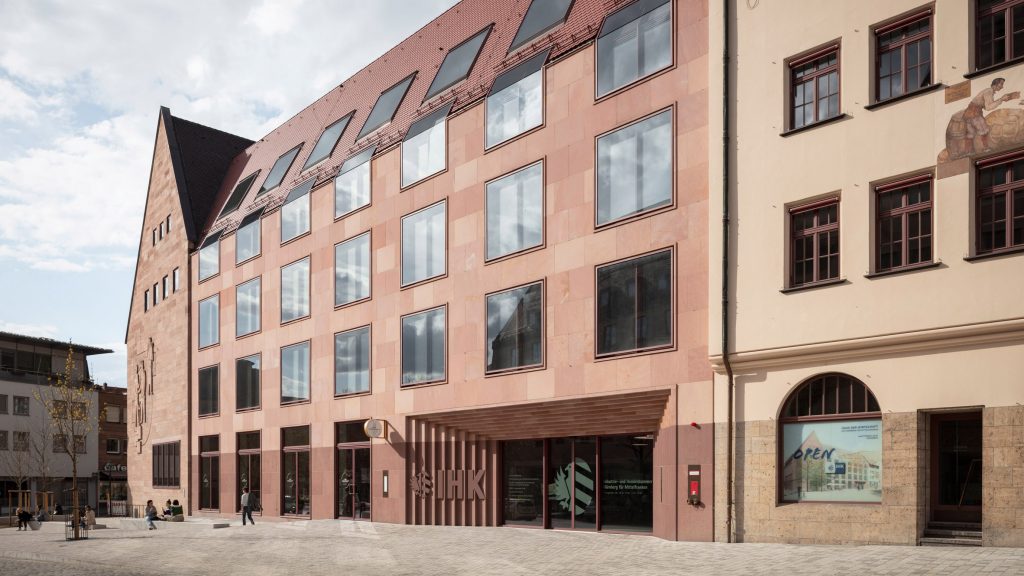
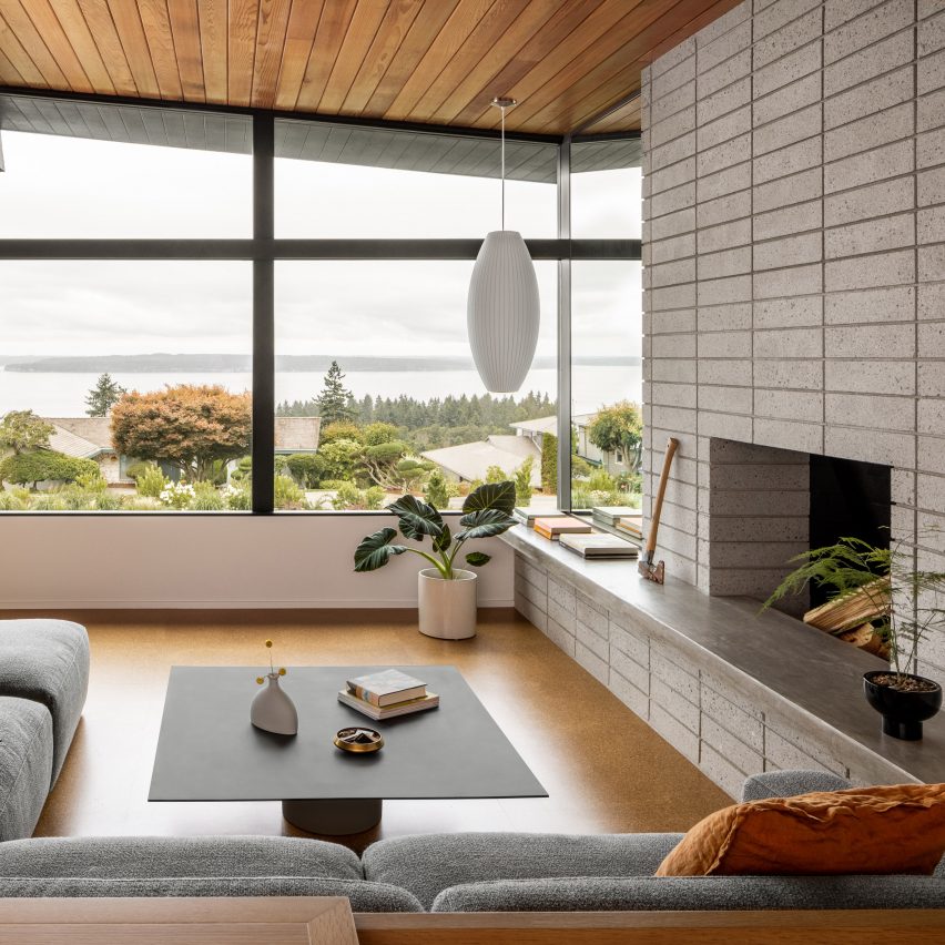
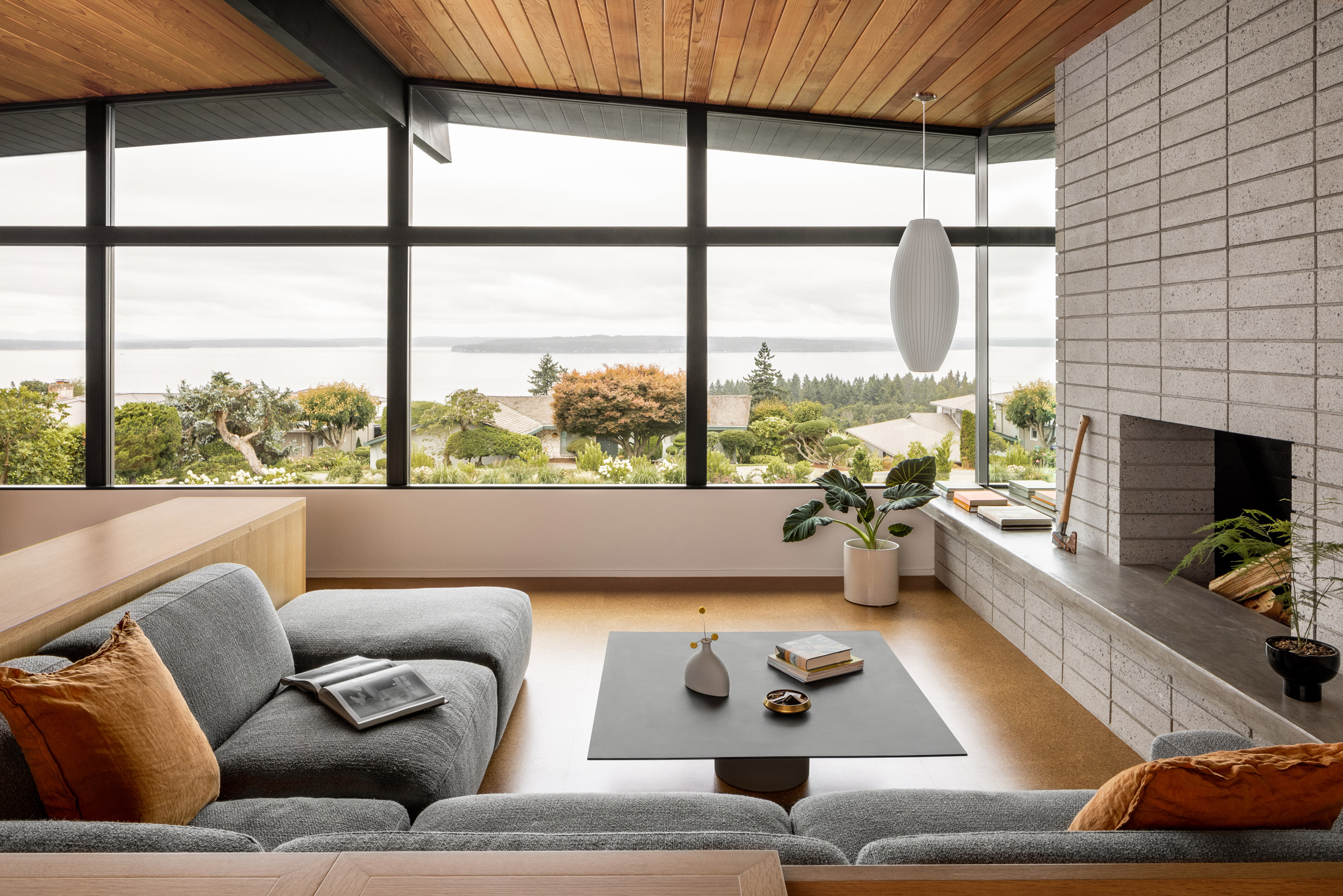
The Golden House sits on a large lot with views of the Olympic Mountains and Puget Sound

Designed by an unknown architect in 1959, the 4,080-square-foot (379-square-metre) house was converted into an adult living facility years ago.

Local firm SHED Architecture and Design was charged with turning the two-storey building back into a single-family house for a couple and their three children.

Golden House by SHED
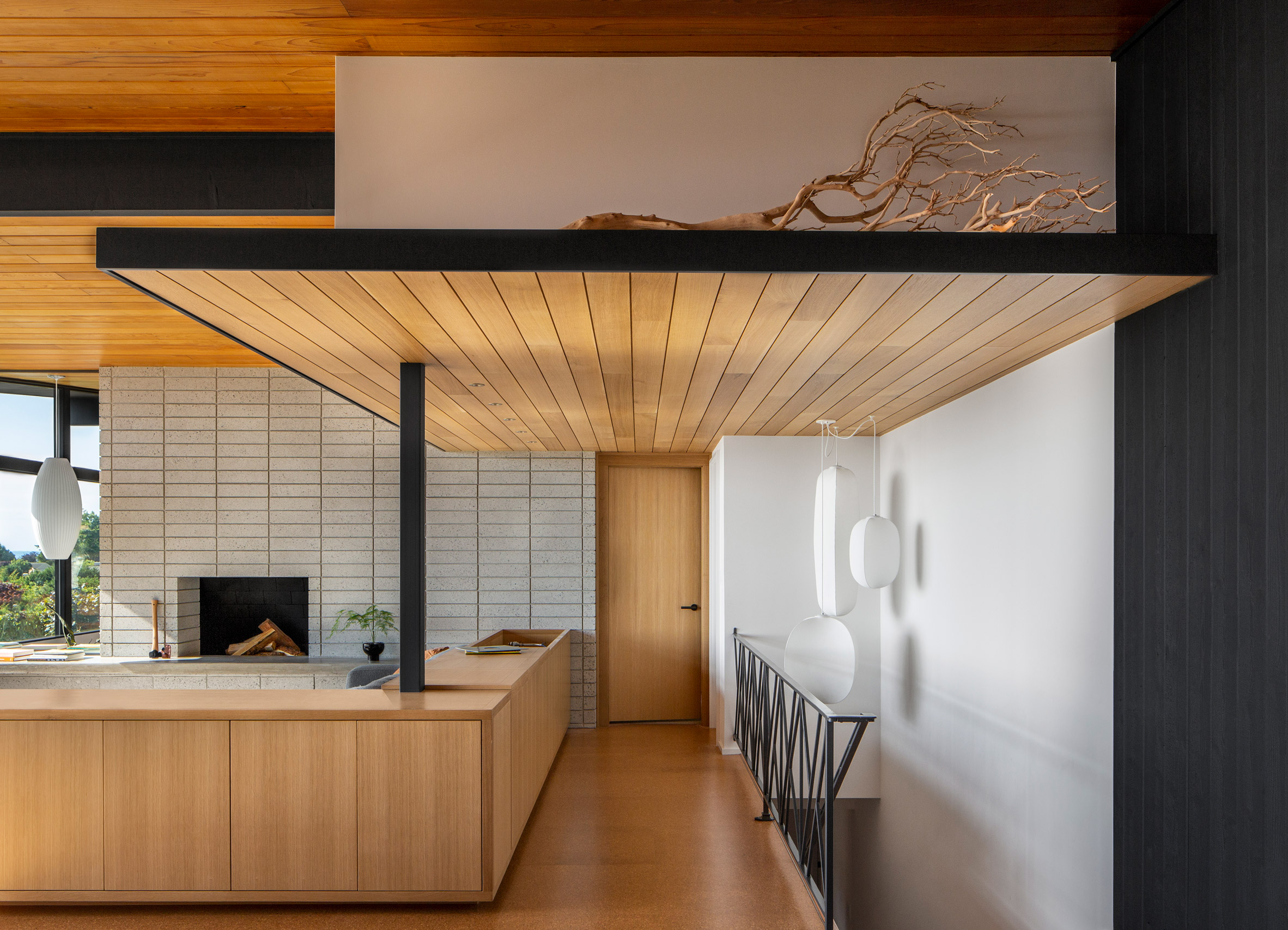
SHED reconfigured the layout of the home's upper level

"Although the house had good bones, modifications adapting the original layout for use as an adult living facility – combined with deferred maintenance – had tarnished the structure inside and out," the team said.

The most extensive changes took place indoors. The upper level holds the public zone, an office and the main bedroom suite, while the lower floor holds sleeping areas.

Kitchen with central island
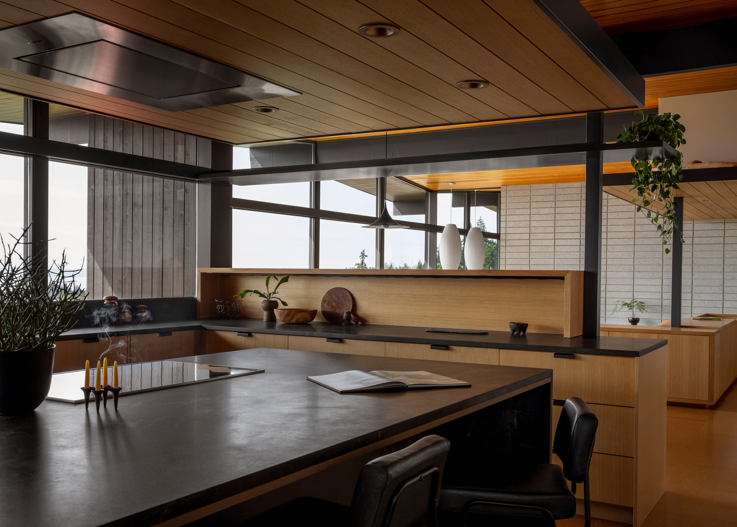
The kitchen is organised around a central island

Working around the existing post-and-beam structure, the team reconfigured the upper level's layout by removing walls and built-in casework. An emphasis was placed on providing natural light and views.

"Although the structure is re-engineered to work with the revised floor plan, the post- and-beam structure was retained as a principle organising system and integrated into the design," the team said.

Powder room by SHED
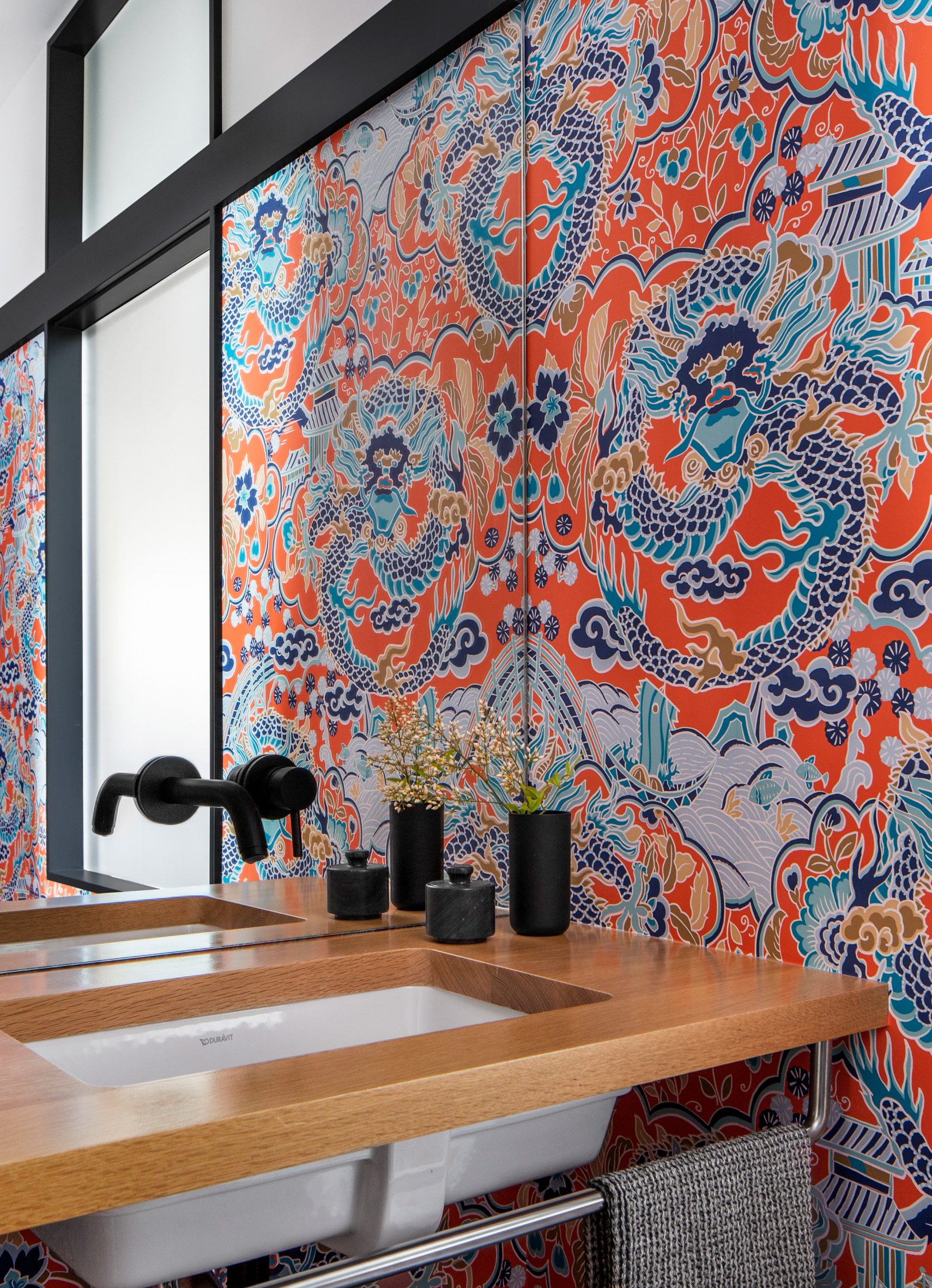
Dragon-themed wallpaper wraps the powder room

The kitchen was moved and enlarged, with the new space organised around a central island that overlooks the dining and living area.

Just off the kitchen is an office, pantry and coat closet, along with a powder room wrapped in dragon-themed wallpaper.

Terrazzo tiles by SHED
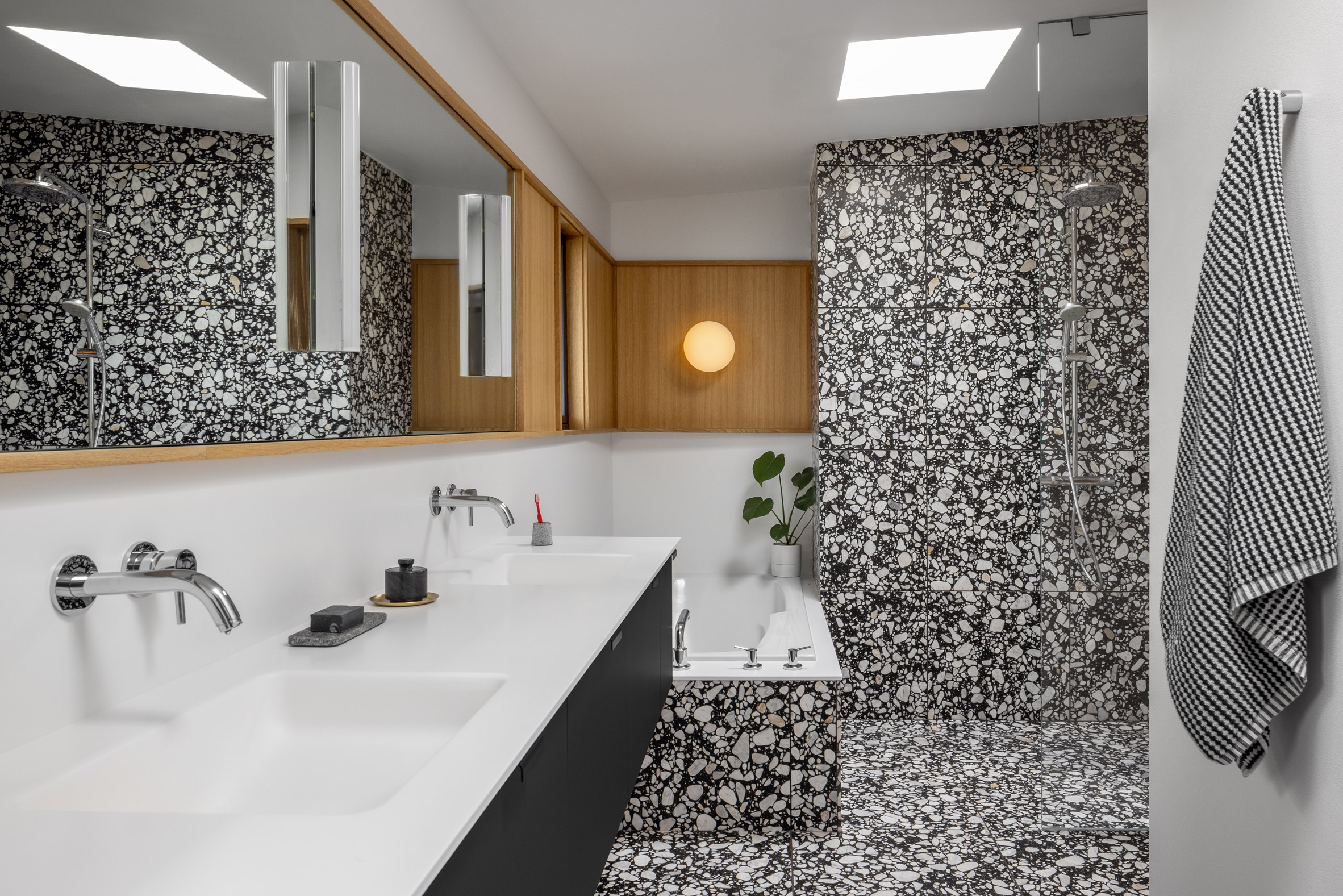
Bathroom tiles are formed from black and white terrazzo

In the living area, where casework had been removed, the team placed a wooden "soffit" that extends over a circulation area and helps proportion the room. The team also installed low-lying cabinetry with a built in DJ station.

An old fireplace was redesigned and faced with concrete masonry units (CMUs) with a ground-down surface. A new concrete bench surrounds the hearth.

[ Inside Me-Kwa-Mooks Net-Zero house by SHED

Read:

Circus tents and Japanese architecture inform Seattle house renovation

](https://www.dezeen.com/2020/10/15/me-kwa-mooks-net-zero-house-shed-seattle-usa/)

The team used a restrained palette of materials throughout the public area, including cork flooring, rift-sawn white oak paneling, and white sheetrock walls. Trim was painted black to create visual consistency.

"As a nod to the past, the original natural slate tile and metal railing were preserved in the entryway," the team added.

Children's bedroom
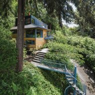
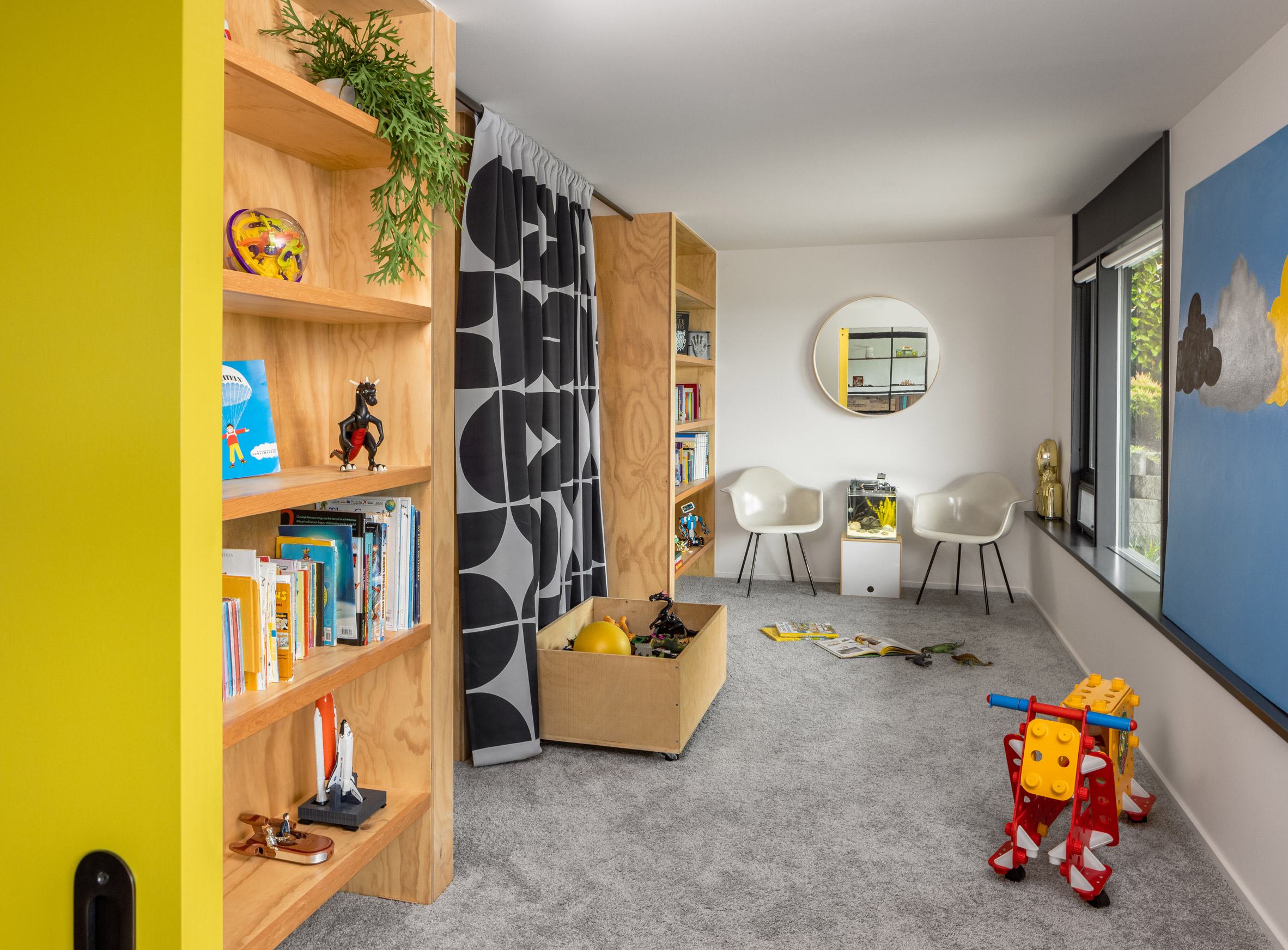
Downstairs, a storage room was made into a children's bedroom

In the main bedroom suite are elements such as a grasscloth wall panel and bathroom tile made of black-and-white terrazzo. A "connecting datum" made of white oak wraps behind the mirrors and the tub.

Downstairs, the team made changes to accommodate three children. A storage room was turned into a shared bedroom, and bed cubbies made of plywood were installed.

Black trim for visual consistency
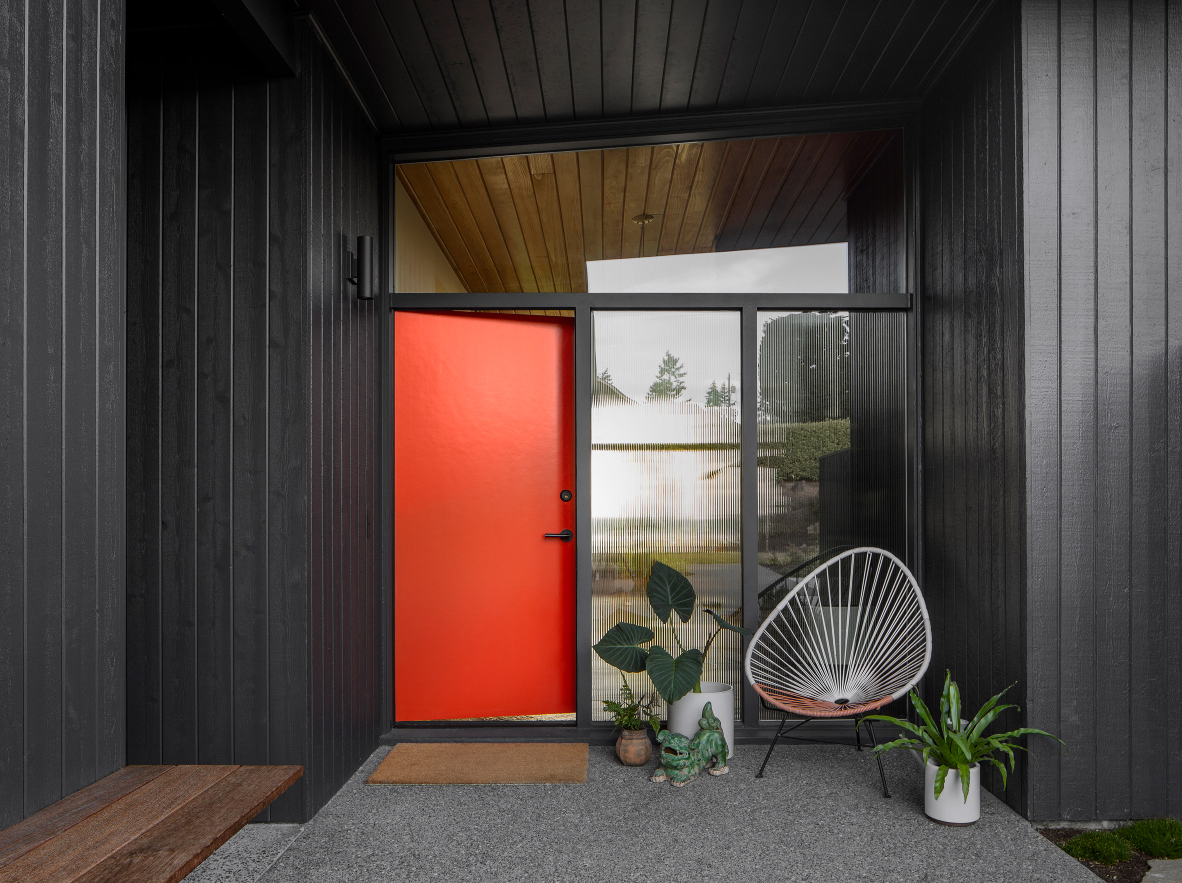
Golden House's trim was painted black to create visual consistency

A small bathroom was cleverly reconfigured to be more suitable for multiple users.

Outside of the house, a wheelchair-accessible entrance and driveway were removed to create a large lawn. The team also updated the building envelope by installing new windows and insulation, along with automated blinds on the west to cut down on solar heat gain.

Natural light and views
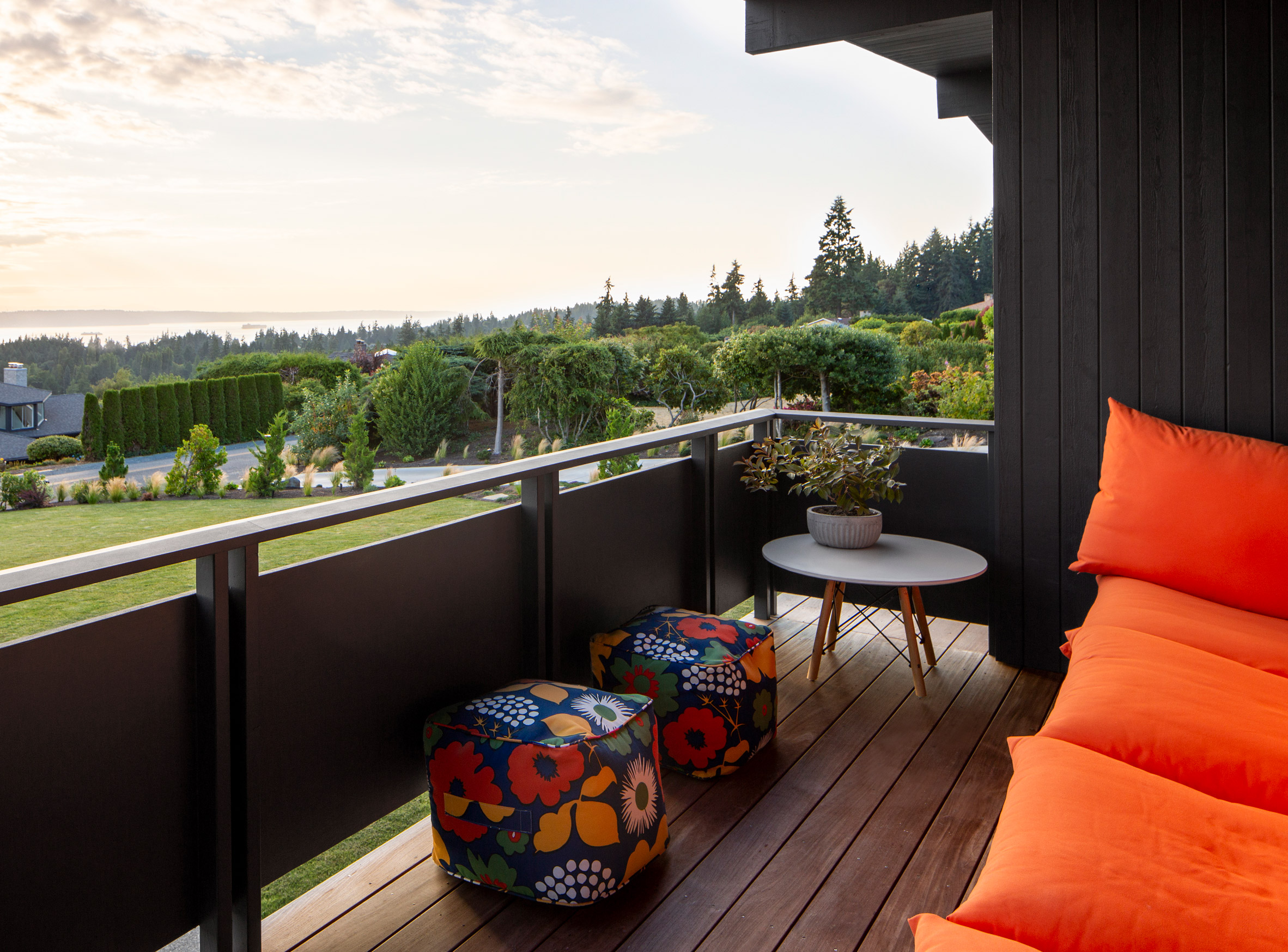
An emphasis was placed on providing natural light and views during the renovation

Founded in 1998, SHED has completed a number of residential projects in Washington, including a home on a bluff clad in rough-sawn cedar, a compact dwelling in a backyard, and a sensitive renovation of a 1950s abode.

The photography is byRafael Soldi.


Project credits:

Architect: SHED Architecture and Design

Contractor: Ambrose Construction

Structural engineer: Todd Perbix

Landscape designer: Susan Papanikolas

Lighting designer: Sparklab Lighting Design

Casework: Beechtree Woodworks

The post SHED gives mid-century Golden House in Seattle an extensive update appeared first on Dezeen.

#all #architecture #residential #usa #houses #seattle #washingtonstate #renovations #americanhouses #midcenturyrenovations #shedarchitectureanddesign

dezeen@xn--y9azesw6bu.xn--y9a3aq

Takk perches communal bedroom on stilts in Madrid apartment renovation

image

Bedroom in a wooden box raised on stilts in a cork-clad apartment by Takk

Spanish architecture studio Takk has pulled back the walls of an apartment in Madrid to create an outdoor terrace alongside an insulated space that contains a bedroom on stilts.

Takk removed all of the 110-square-metre flat's interior walls to create a new 60-square-metre space enclosed with insulated pinewood walls, dubbed the winter house.

This space contains an open-plan kitchen and living room as well as a self-enclosed bedroom perched on stilts, which is designed to be shared by a couple and their young daughter.

Wooden volume inserted into shell of apartment with plant-filled corridor running along its length 
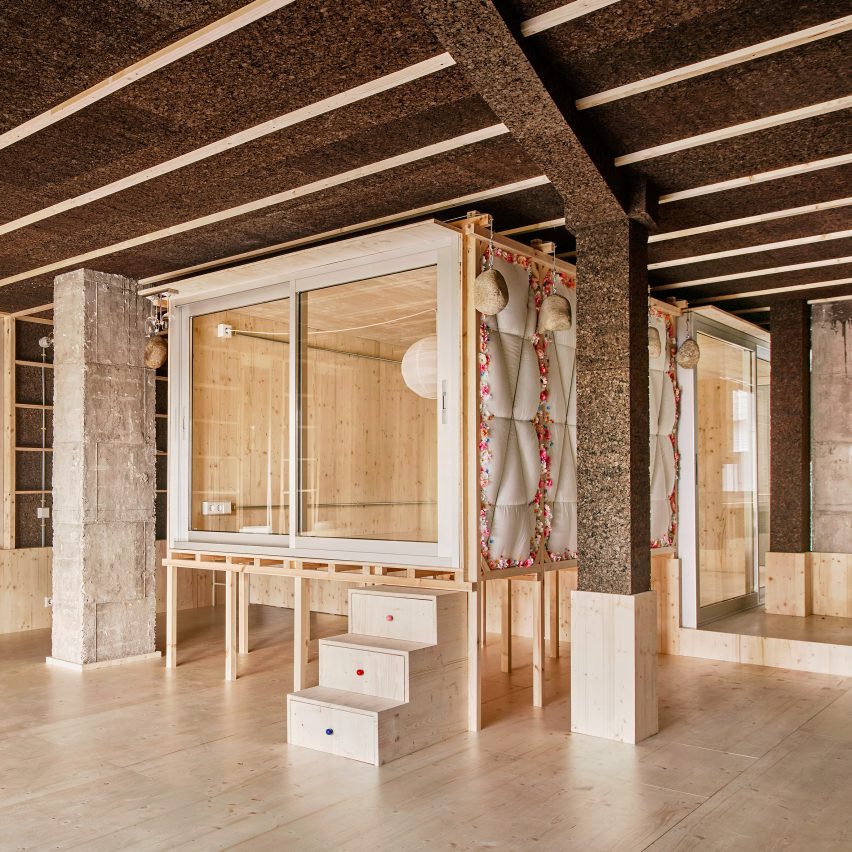
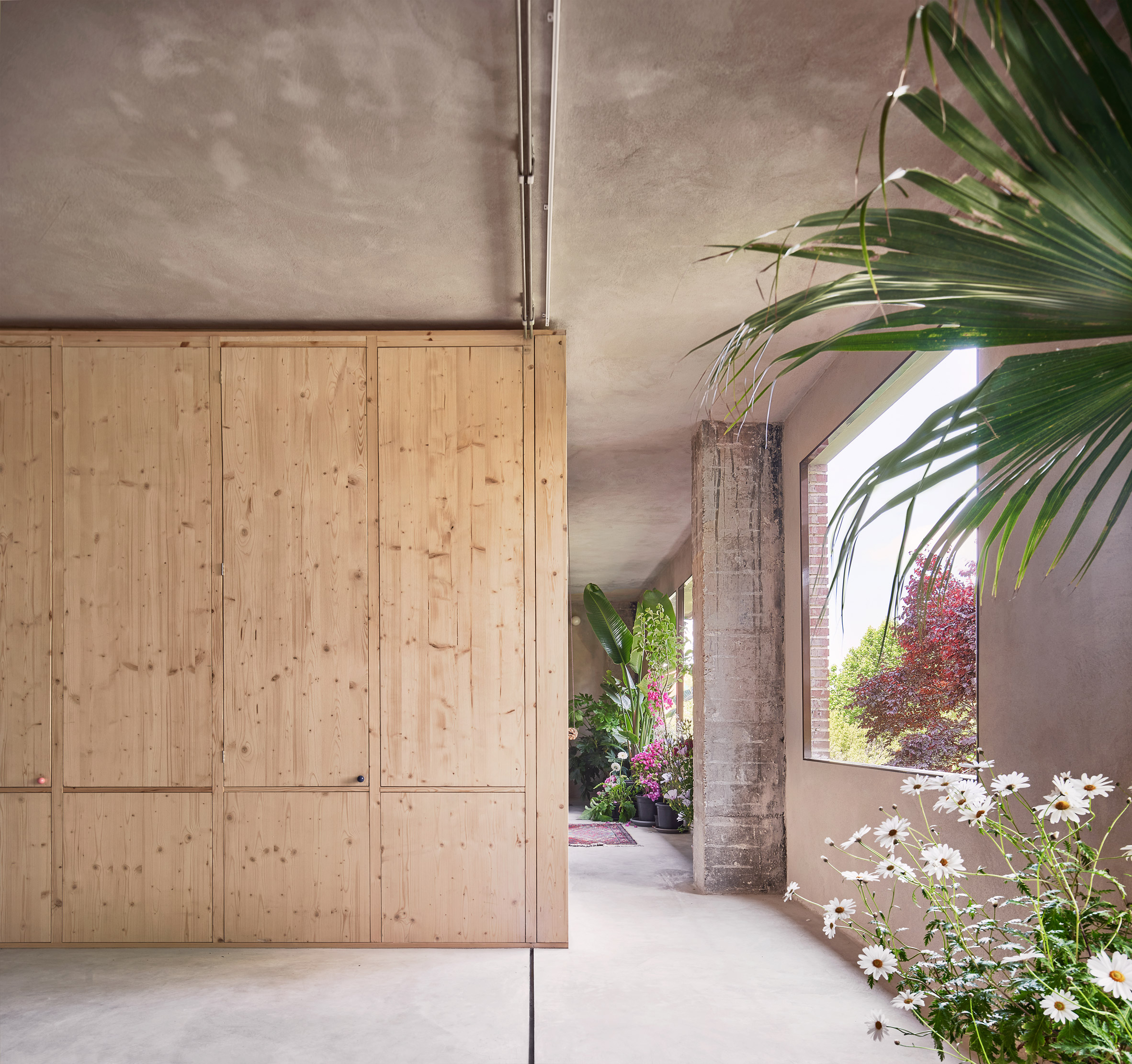
Takk has pulled back the walls of a Madrid apartment to divide it into two spaces

Both the bedroom and the flat's new exterior walls are made from low-carbon, heat-retaining materials, with pinewood frames sourced from Spain's famed winemaking region of La Rioja and insulation made from duvets and charred cork.

Takk nested the spaces in the winter house inside each other like the "layers of an onion" to retain heat and conserve energy during the colder months.

Alongside the apartment, the studio created an exterior terrace by relocating the external walls and removing the previous north-facing windows.

Bedroom in a wooden box raised on stilts in a cork-clad apartment by Takk
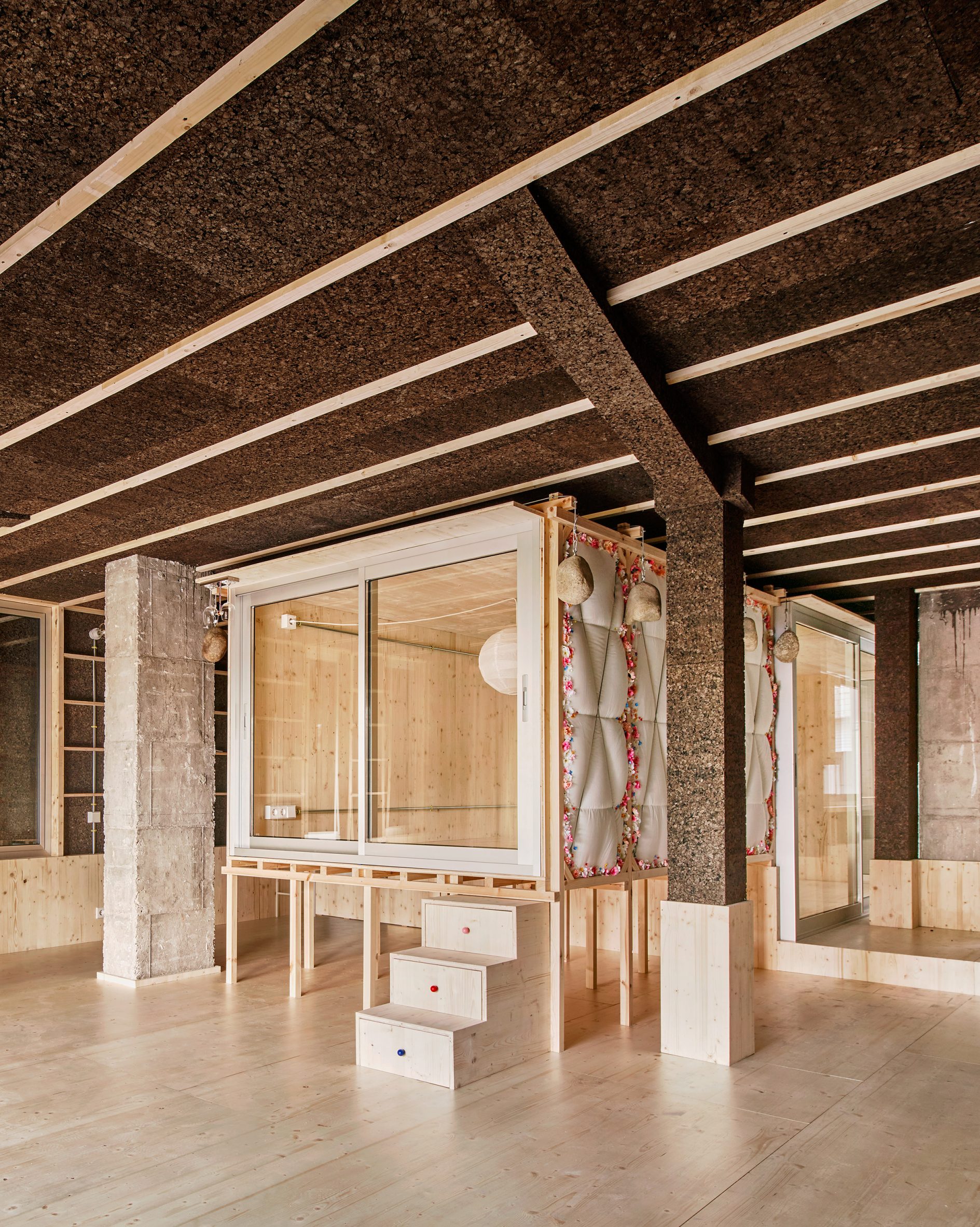
The apartment's self-enclosed bedroom is raised on stilts

Named the summer house, this space is connected to the inner areas of the home by sliding glass doors.

According to the studio this arrangement eliminates the need for air-conditioning by passively cooling the interior and helping to lower the apartment's carbon emissions in operation.

Door hidden in a cork and wood storage wall by Takk
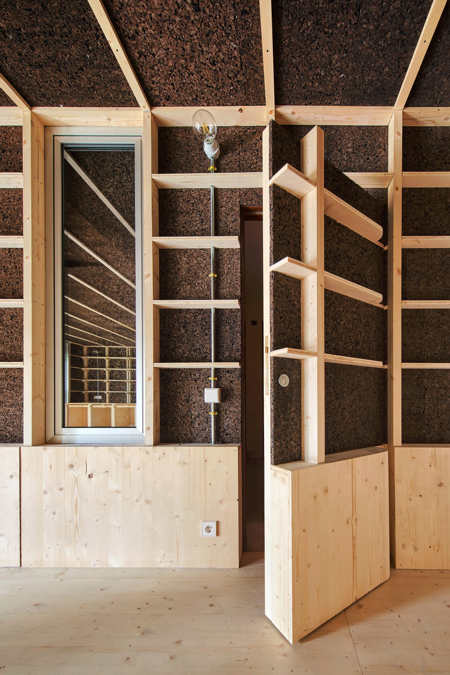
Its door is hidden inside a book shelf

"Climate change will modify all the routines of our existence," Takk co-founder Mireia Luzárraga told Dezeen. "The way we think and build our environments should also adapt to this new situation."

"The project tests possible ways of organising a house to minimise energy consumption while using materials with a low carbon footprint."

From the outside, the door leading to the apartment looks like any other in the residential block. But on the interior of the flat, the entrance is hidden inside a built-in shelving system that runs along one side of the winter house.

Raised bedroom on stilts with fake flower garlands in Day after House by Takk
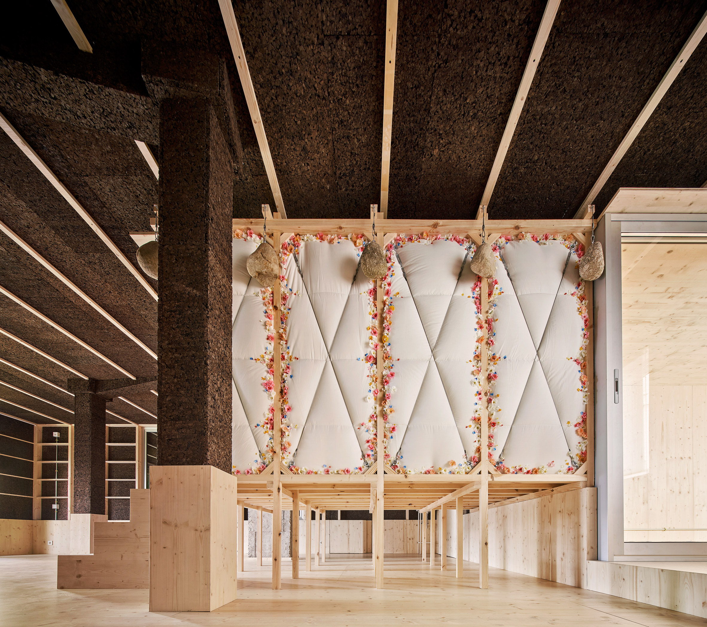
Surfaces throughout the apartment are clad in cork insulation

A similar storage wall is mirrored on the other side of the open-plan space, forming a low counter that functions as a kitchen worktop on one side and a dining table and work desk on the other.

Like most surfaces in the winter house, this is almost entirely clad in blackened cork panelling, which stores carbon and holds onto heat in the winter due to its colour and porous structure.

In contrast, the summer house external space is finished with cement mortar, which doesn't hold onto heat from the sun during the warmer months.

Plant-filled terrace next to wall of glazing leading to an outdoor bath tub
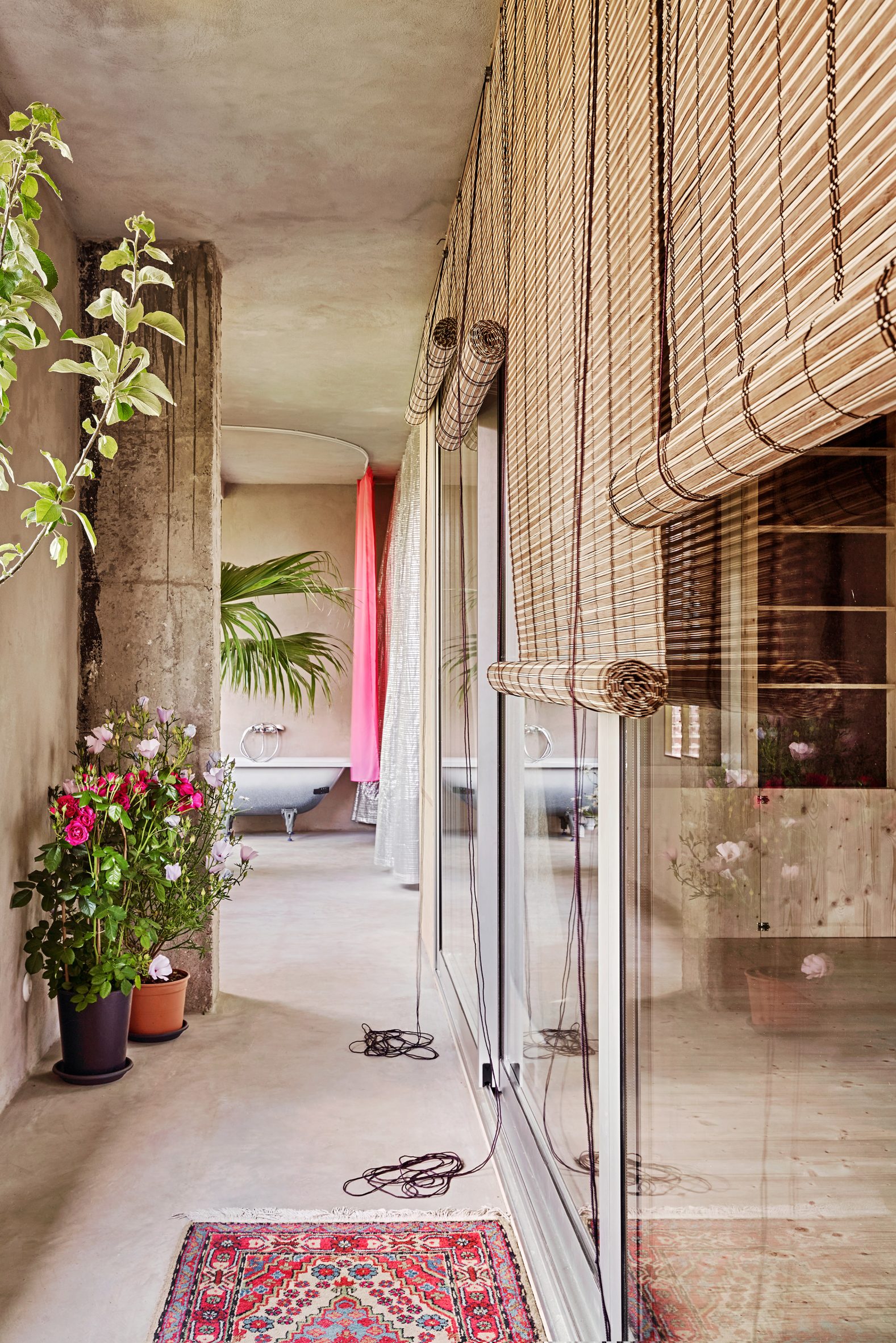
An open-air terrace lies beyond the apartment's pinewood walls

This outdoor area consists of a narrow plant-filled porch that runs along the apartment's entire north-facing wall to maximise natural light.

At one end, it opens up into a covered terrace, separated from the interior by a pinewood wall with a row of tall vertical vents that can be opened to create a through-draft.

In summer, the space can be shielded from the sun by an aluminium-foil thermal curtain normally used in greenhouses, while folding glass doors allow it to be turned into a kind of winter garden once temperatures drop.

Bathtub on a balcony surrounded by a sheer pink curtain in apartment interior by Takk
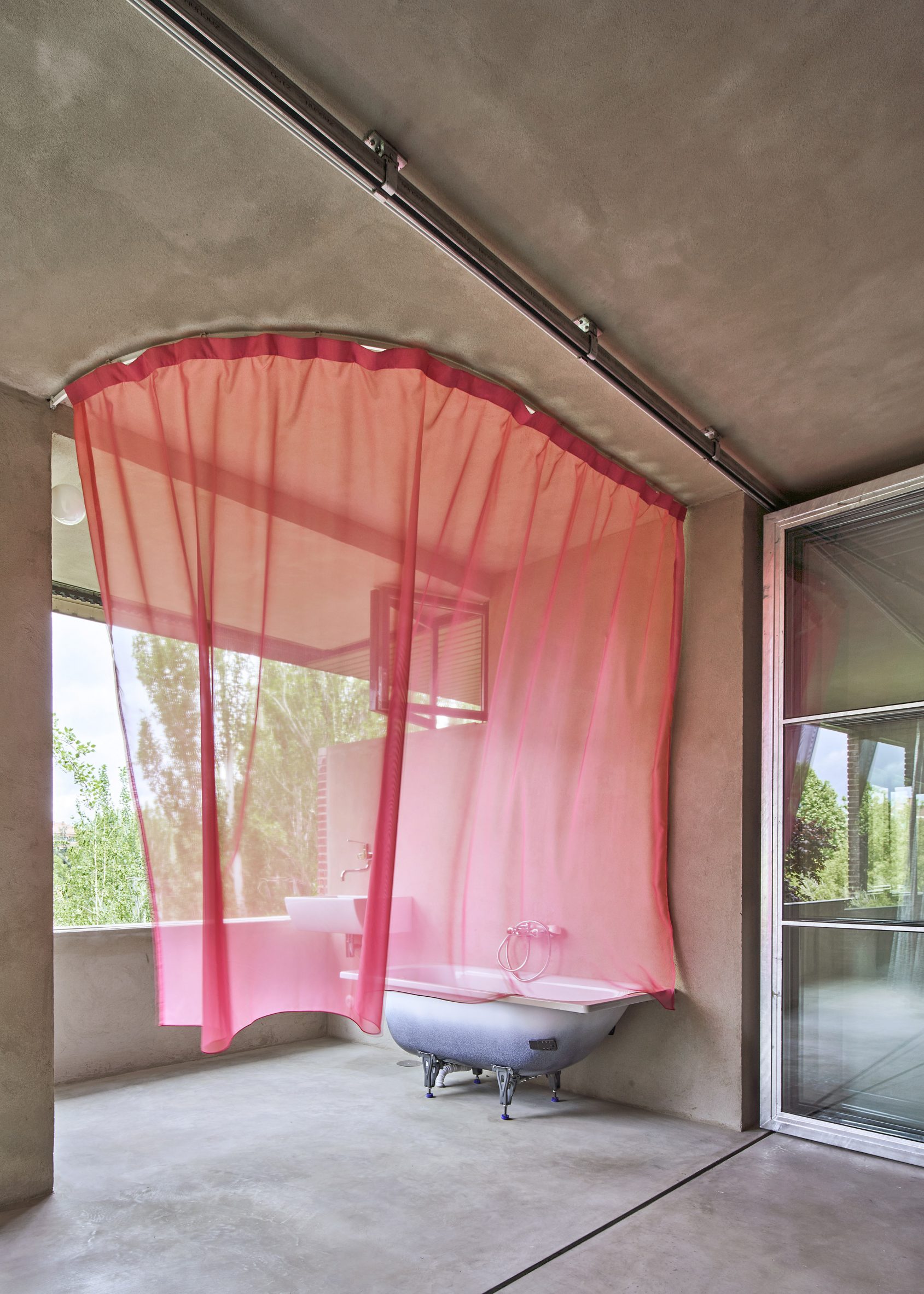
A communal outdoor bathtub is hidden behind a sheer pink curtain

On the other side of the folding doors lies a balcony housing a speckled bathtub, which is shielded from view only by a sheer pink gossamer curtain.

This bathroom is designed to be used only in summer and by multiple members of the family at the same time, much like the open-plan living area and bedroom.

[

Read:

Ten buildings on stilts that raise the stakes

](https://www.dezeen.com/2018/08/18/10-buildings-on-stilts-raised-architecture/)

"The aim is to test the benefits, both energetic and emotional, of sleeping, playing or working together," said Takk's other half Alejandro Muiño.

"In the past, rooms used to be bigger because they were communal and easier to heat. We want to recover this popular knowledge that was forgotten due to the emergence of cheap energy."

Apartment with pinewood wall with open vents to create a draft 
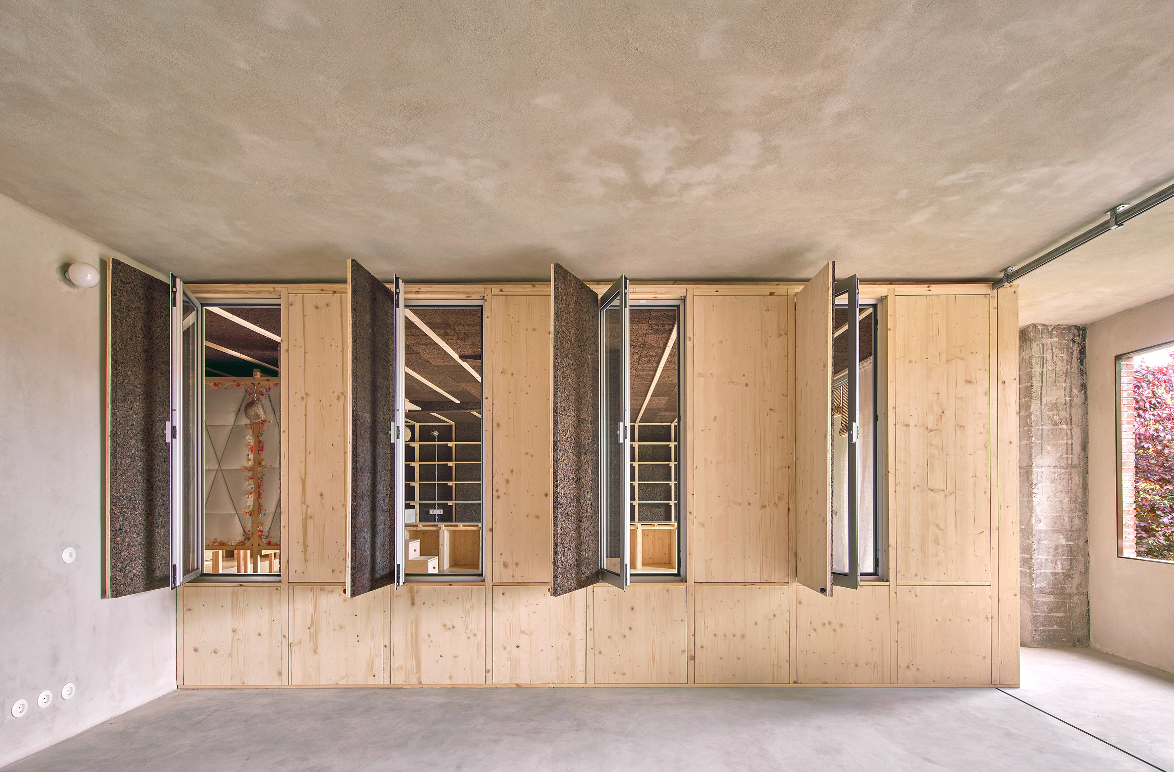
Vents in one of the terrace's walls can be opened to create a draft

The stilted bedroom is the warmest part and the centrepiece of the home contained within the cork-panelled winter house and fitted with an extra layer of insulation in the form of duvets.

These are strapped to the outside of the pinewood box alongside garlands of fake flowers, while huge stones from a quarry outside Madrid dangle from the ceiling, acting as a structural counterweight to prevent the thin wooden panel from bending.

On the inside, the bedroom is entirely panelled in pinewood and split over two levels.

Pinewood bedroom with two levels in apartment interior by Takk
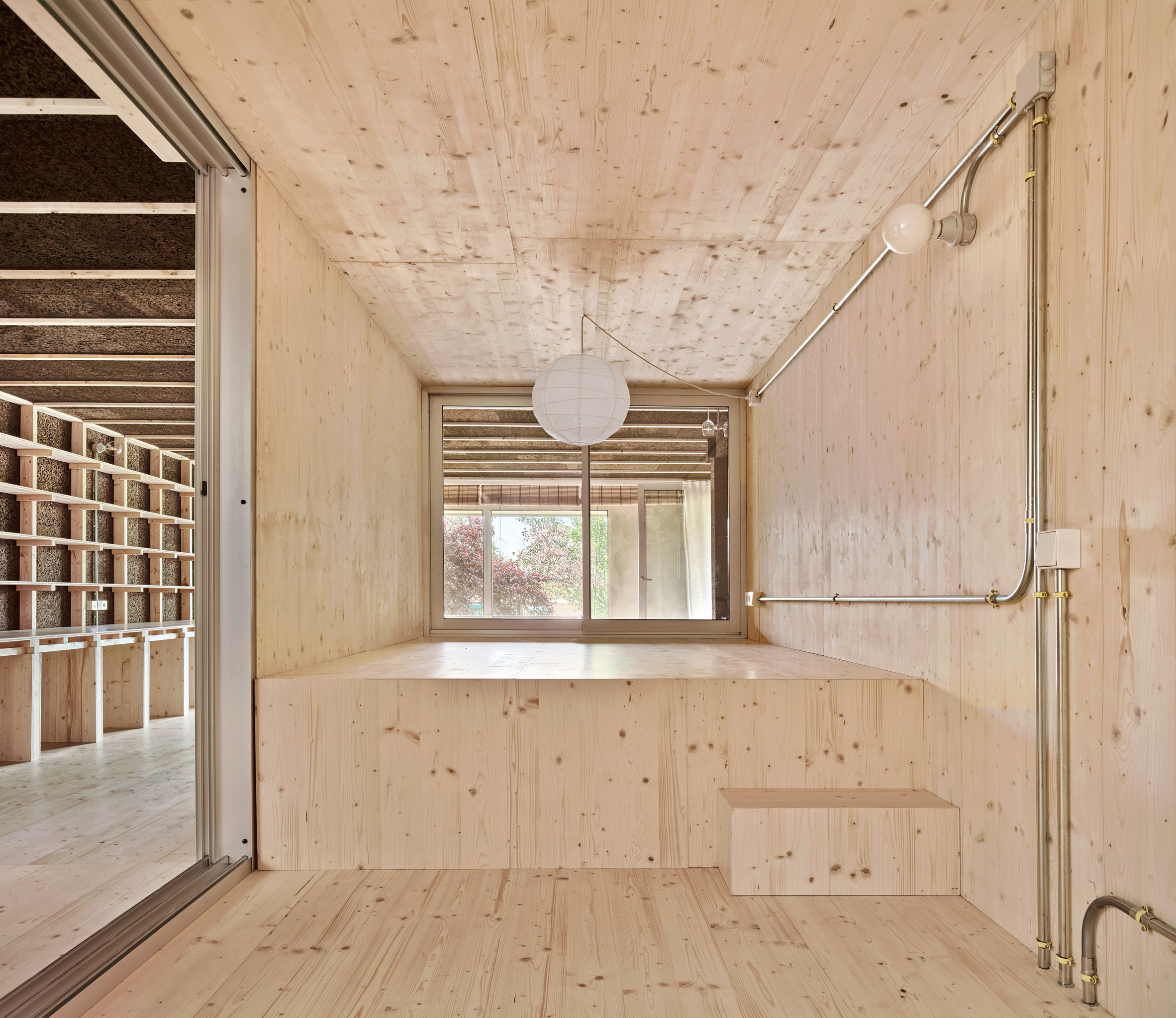
The pinewood bedroom has two different levels

"The advantages of sleeping together are countless, both for climatic and energy-saving reasons and for the reinforcement of emotional links," Takk explained.

"Elevating the bedroom also allows the kitchen to be more present in the daily routine of the residents because it is visible from any part of the house, which helps fight the gender and class cliches associated with these kinds of spaces."

Cork and wood storage wall behind stairs leading up to a bedroom on stilts
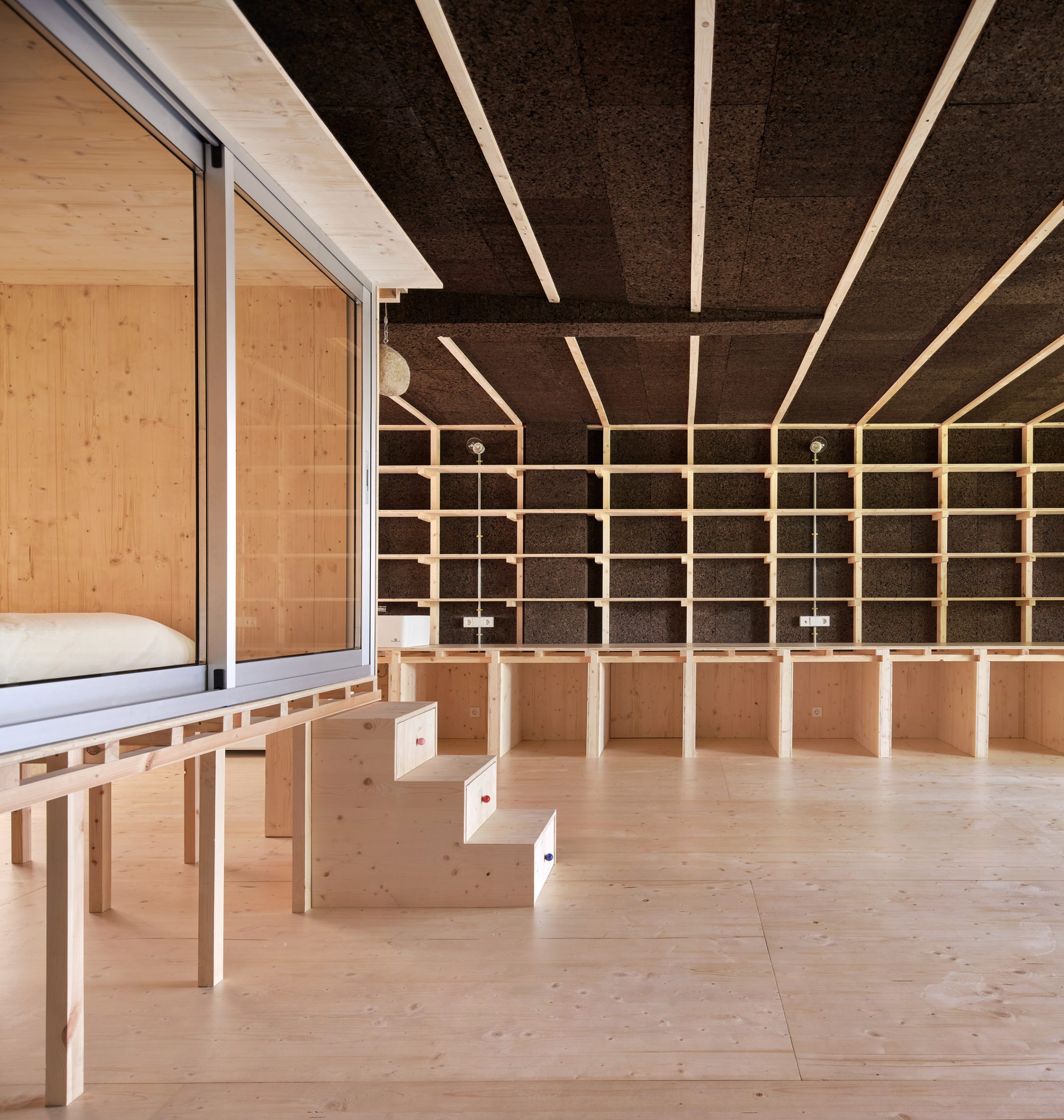
The bedroom is fronted by sliding glass doors

Although elevated rooms such as this are rarely found in interiors, a number of architects have raised entire homes up on stilts in a bid to tread lightly on their surrounding environment.

Dezeen has rounded up 10 of the most impressive examples, from a cork-clad cabin above a tidal salt marsh to a summer house perched on the rocky edge of a Norwegian island.

The photography is byJosé Hevia.

The post Takk perches communal bedroom on stilts in Madrid apartment renovation appeared first on Dezeen.

#all #architecture #residential #interiors #apartments #spain #stilts #madrid #renovations #pine

dezeen@xn--y9azesw6bu.xn--y9a3aq

Palma reorganises San Ignacio beach home in Mexico around circular pool

image

San Ignacio

Mexican design studio Palma has renovated and extended a home on the Pacific coast, reorganising the living spaces around a central circular swimming pool.

The San Ignacio project is located near Sayulita, a popular beach destination in the Mexican state of Nayarit.

San Ignacio
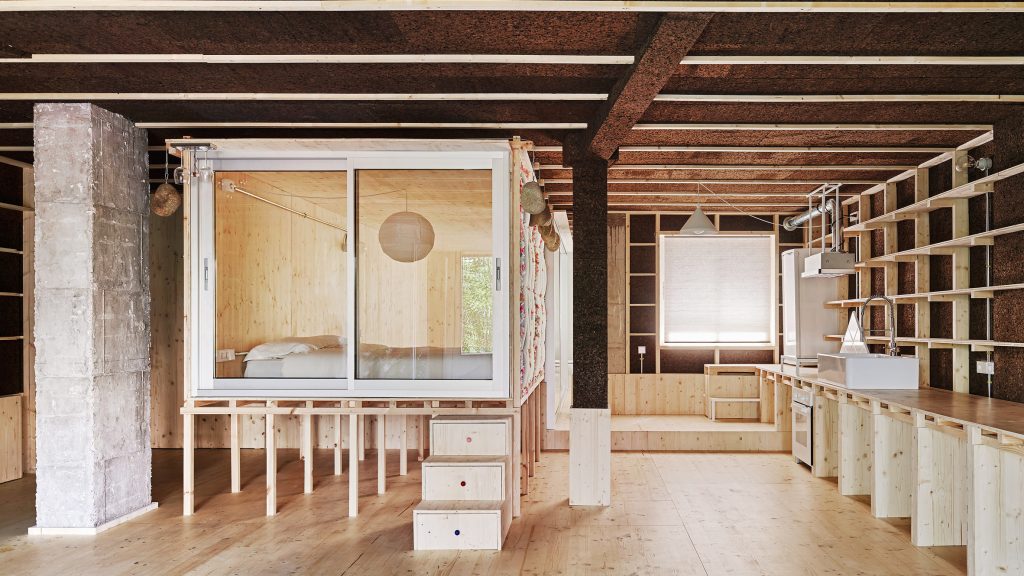
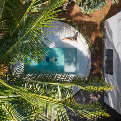
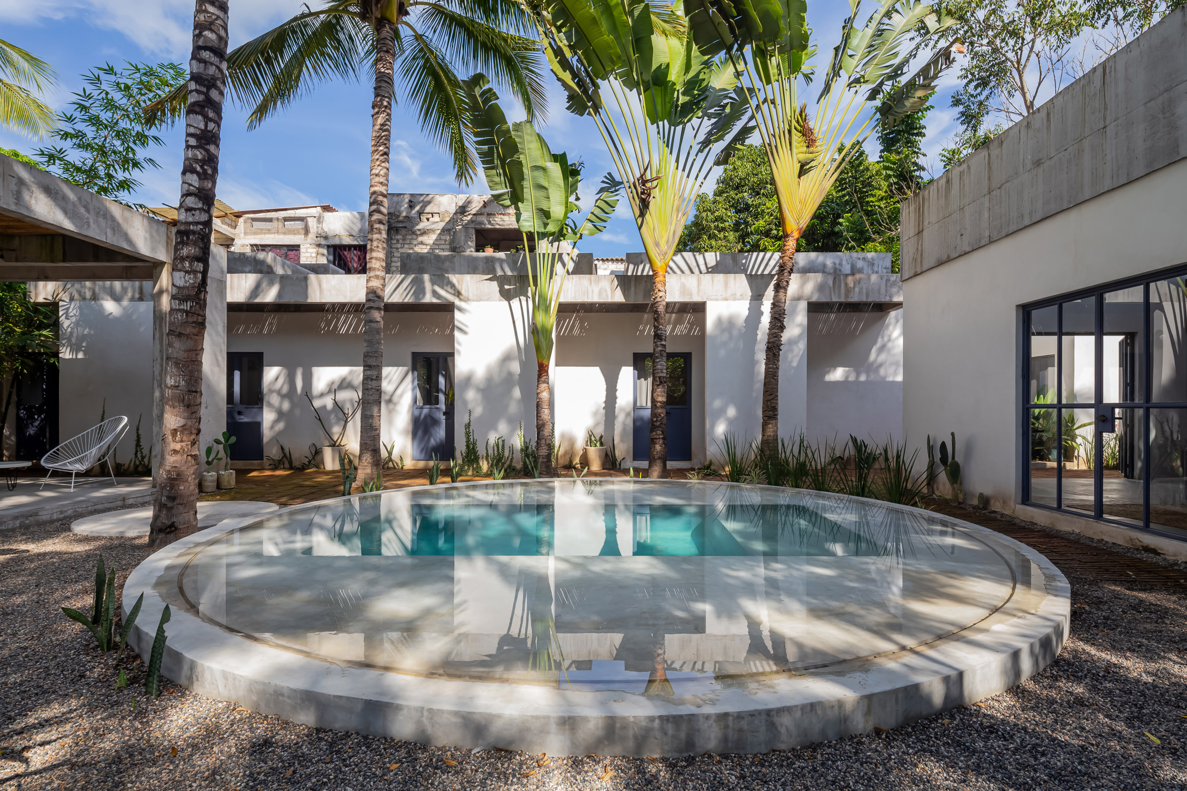
The San Ignacio home is arranged around a circular swimming pool

Palma, a local design studio, was commissioned by the homeowners to refurbish a property that was in disrepair, as well as to extend the home with two flexible rooms.

Located on a lush wooded lot, the existing volume contained the home's bedrooms, but was covered in a corrugated metal roof that leaked during the rainy months, and overheated in the summer.

Swimming pool
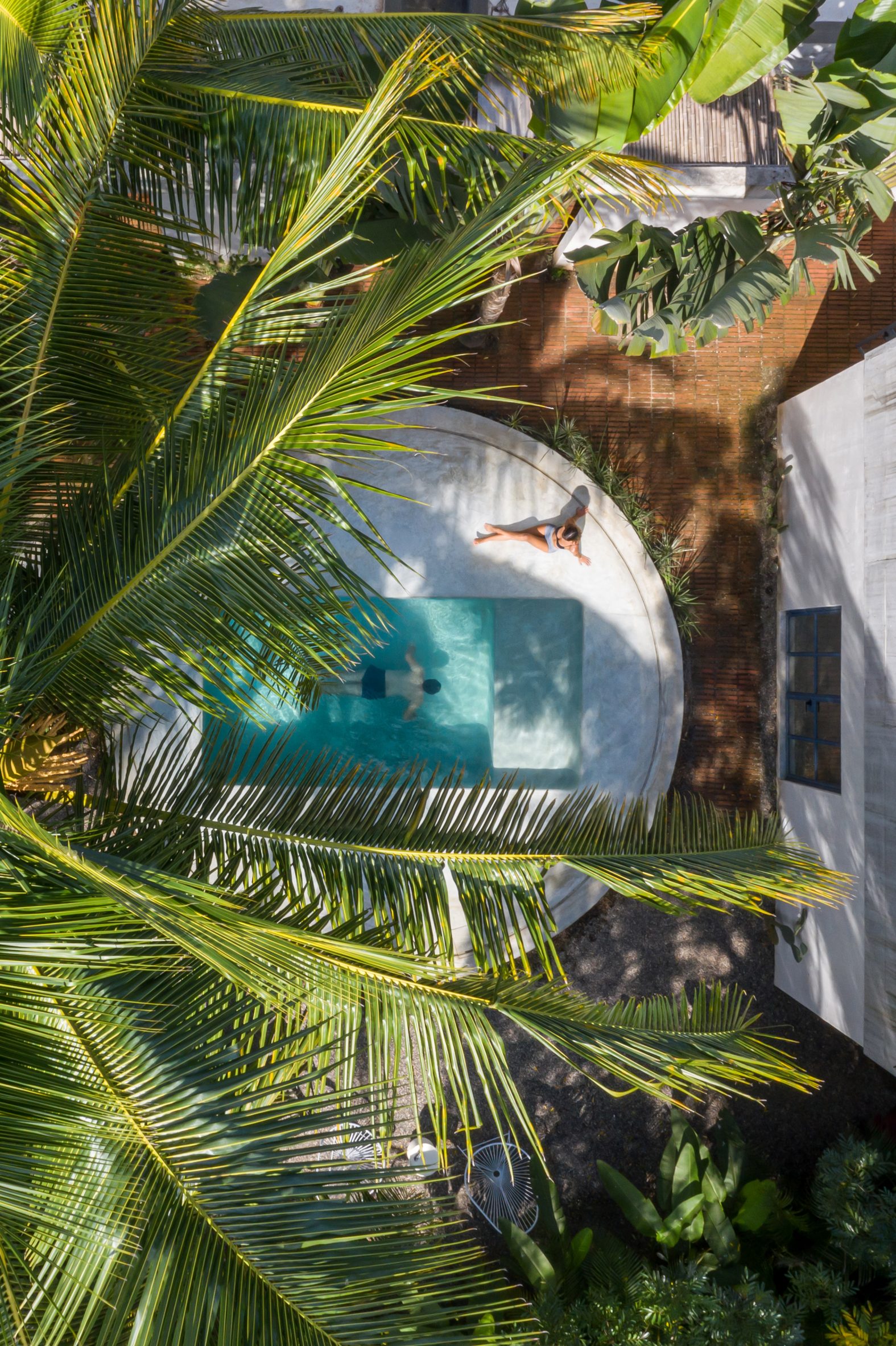
The swimming pool is now the focal point of the house

Palma's first intervention was to replace the roof with a new concrete slab, which includes skylights to provide more light to the interiors.

The centre of the property now contains a circular swimming pool. Its shallow edges create a reflective illusion, while a deeper portion in the centre allows for the residents to cool off properly.

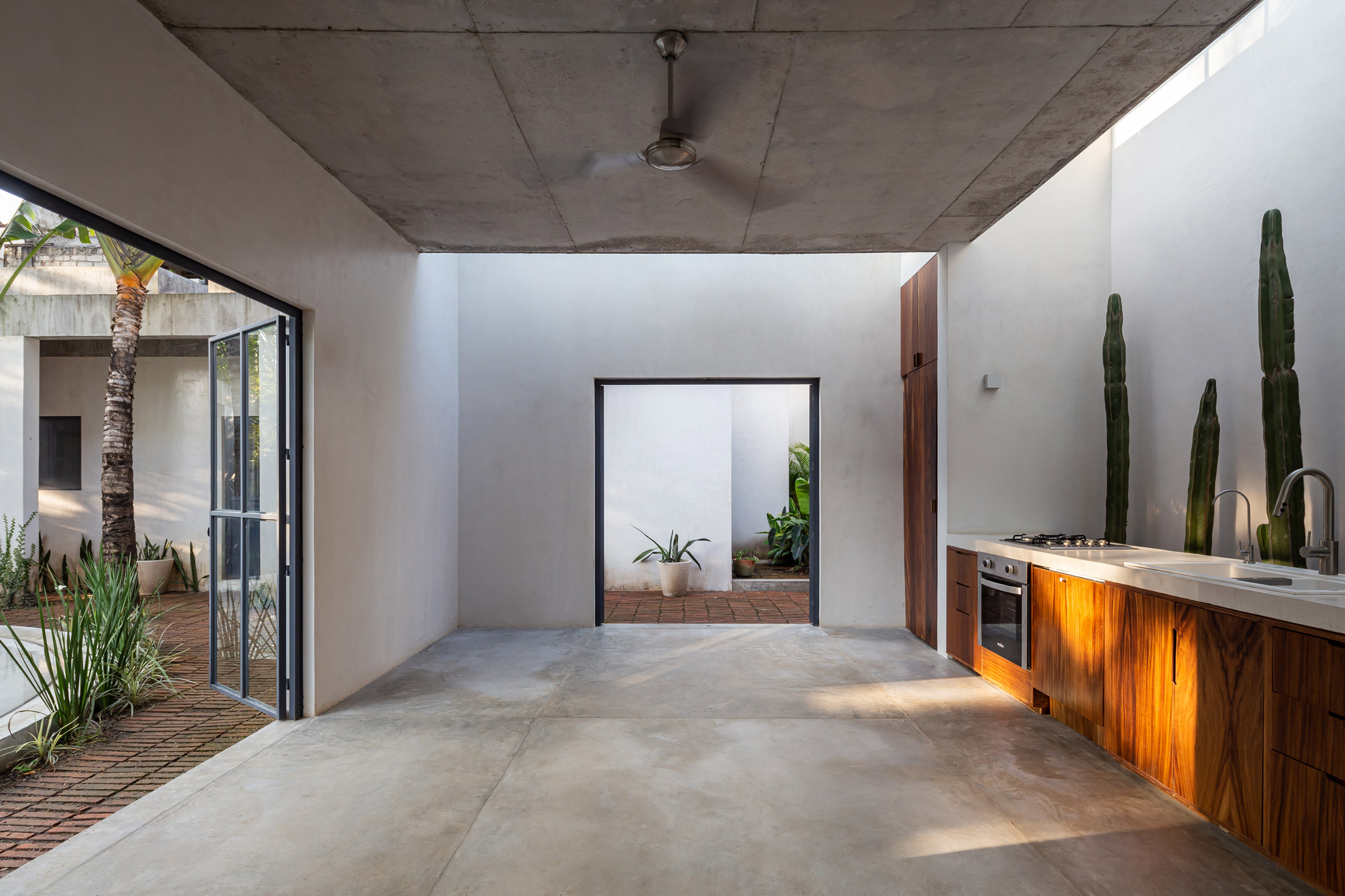
More light was introduced into the interior

On either side of the pool are two new structures built as part of Palma's brief.

"One functions as a flexible space for photoshoots and different creative expressions, and the second as an outdoor living space that allows a direct relationship with the pool," the architects explained.

Concrete roofA concrete slab replaced the home's previous metal roof

"The newly built volumes, one closed and the other open, serve as flexible spaces for different activities in the daily use of the house and maintain a constant relationship with the circular pool placed in the middle of both," Palma added.

The construction of these small buildings resembles the original home, ensuring that the entire project matches harmoniously.

[ Litibu by Palma

Read:

Circular opening illuminates patio for yoga in coastal Mexican holiday house

](https://www.dezeen.com/2020/10/05/litibu-house-palma-mexico/)

The architects further unified the three structures by improving the landscaping, which involved adding new trees and plants to the already verdant site.

"A landscape project weaves together the existing house and the new additions, mainly through the use of a pavement with buried bricks that seems to disappear as one walks from the house into the garden," Palma explained.

Trees and plants by poolTrees and plants were added to the already verdant site

Within the new outdoor living room, the architects designed a thatched roof, which has an opening for an existing palm tree to grow through.

Palma was founded in 2016 by Ilse Cárdenas, Regina de Hoyos, Diego Escamilla, and Juan Luis Rivera. The firm is based in Mexico City, and also operates an office in Sayulita.

Palma beach home structuresOn either side of the pool are two newly built structures

Other houses on Mexico's west coast include a series of beach homes built with coloured concrete by Revolution, and a vacation residence with a meditation room topped by a massive circular skylight by Colectivo Lateral de Arquitectura.

The photography is byLuis Young.


Project credits:

Team: Adrián Rámirez, Nia Jorquera

Construction: Cimento Constructora

The post Palma reorganises San Ignacio beach home in Mexico around circular pool appeared first on Dezeen.

#all #architecture #residential #concrete #houses #mexico #renovations #swimmingpools #mexicanhouses #palma

dezeen@xn--y9azesw6bu.xn--y9a3aq

McCloy + Muchemwa adds timber-framed "orangery" to renovated garage

image

Greenhouse and garage by McCloy + Muchemwa

Architecture studio McCloy + Muchemwa has renovated a dilapidated garage in Norwich, England, adding a greenhouse extension with a bright-orange framework wrapped in polycarbonate cladding.

The London-based studio McCloy + Muchemwa was tasked with transforming the dark, dusty and asbestos-riddled garage into a safe and attractive outbuilding in the clients' rear garden.

Renovated garage by McCloy + Muchemwa
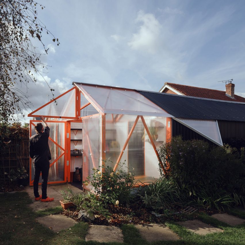
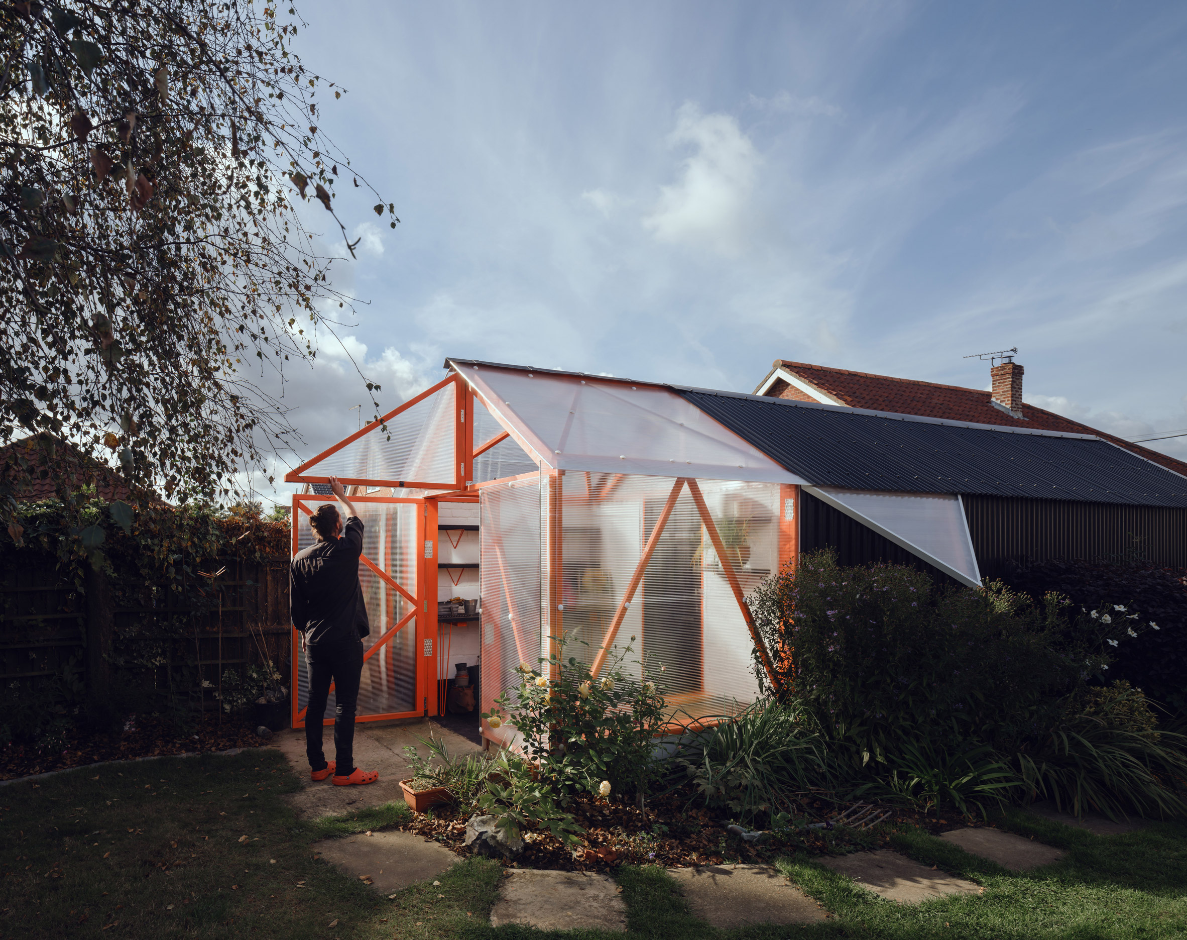
McCloy + Muchemwa has renovated an old garage in Norwich

As a consequence of spending more time at home during the Covid-19 lockdowns, the clients wanted to restore the existing outbuilding into a usable space for hobbies and DIY.

The self-build project's small budget informed an approach that focused on simple adaptations, upgrading the existing structure and reusing materials wherever possible.

Garden shed with polycarbonate greenhouse
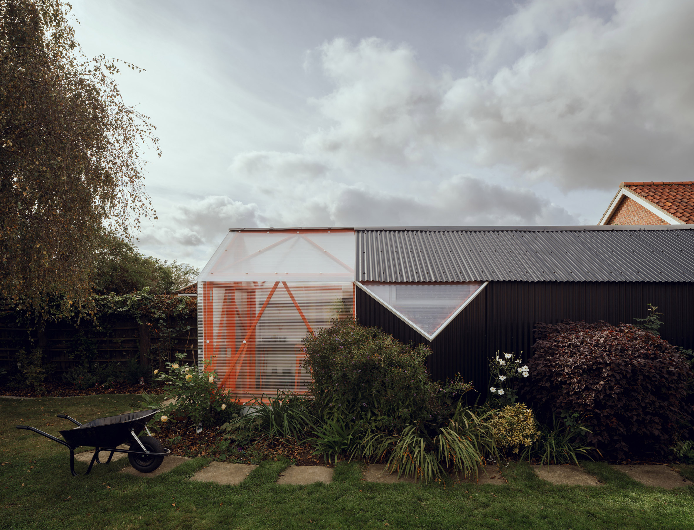
The studio added a timber-framed "orangery" to one side

"The internal timber structure was largely sound, if a little haphazard, so to minimise the quantity of new materials added, a 'surgical' approach to refurbishment was chosen," explained McCloy + Muchemwa.

"Improvements to the building fabric promise to extend the working life of the structure and have been undertaken to minimise the waste taken off site."

Garden greenhouse by McCloy + Muchemwa
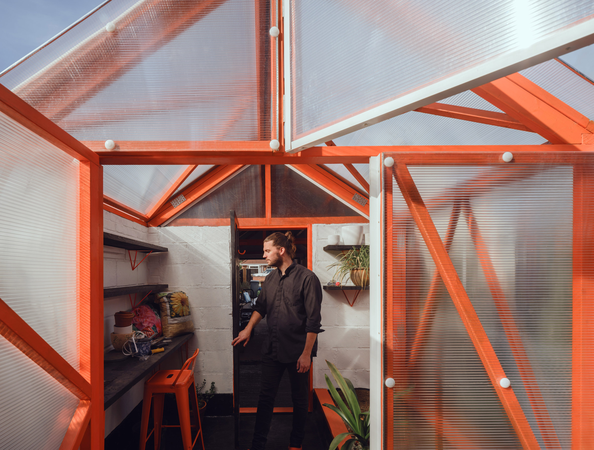
The new structure has a bright orange frame

A priority of the renovation was the removal of the damaged roof, which contained asbestos. Sections of timber affected by rot were also replaced.

The original blockwork walls were retained and sealed with exterior-grade paint to improve their longevity.

Polycarbonate-clad greenhouse
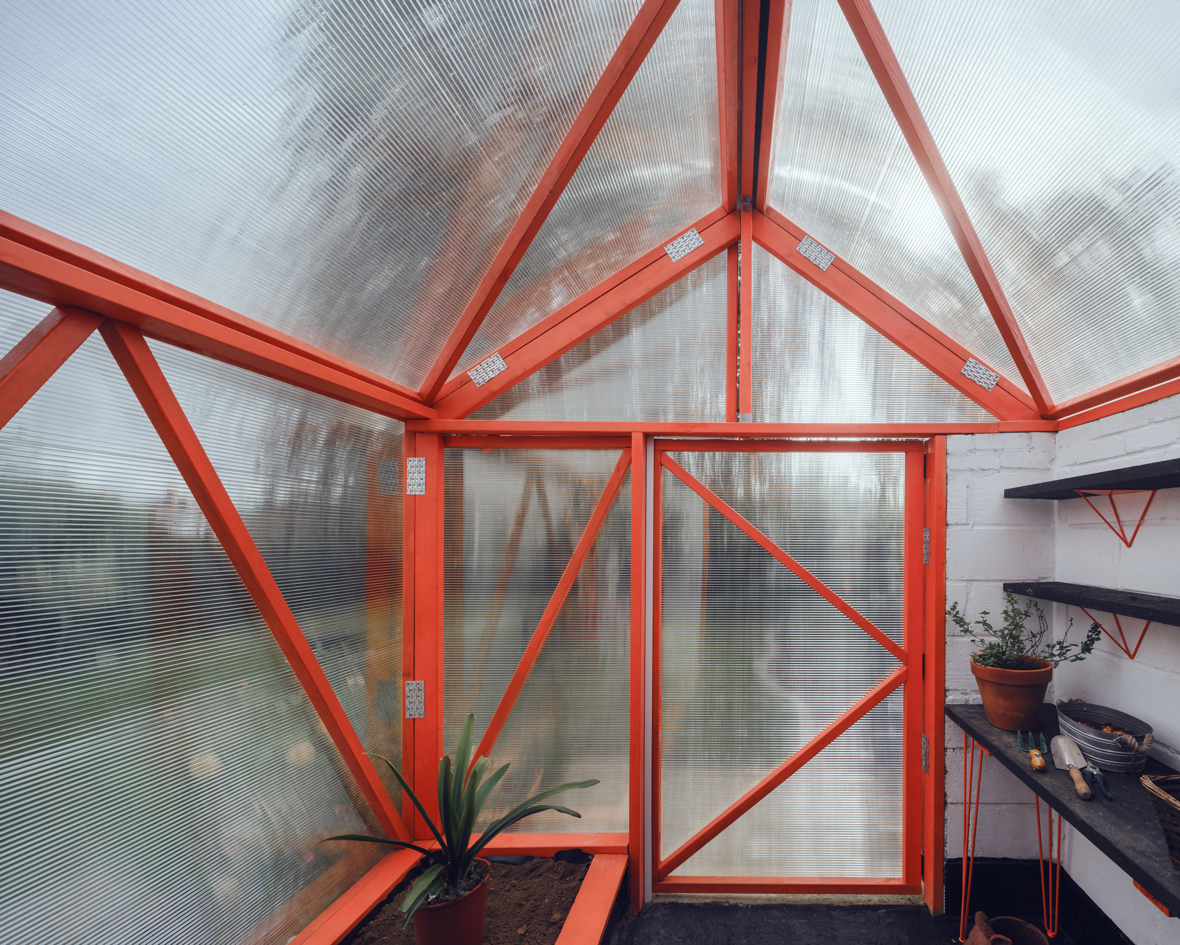
The greenhouse is clad in polycarbonate

The converted garage, named The Orangery, now houses a storage area for large items such as bikes and lawnmowers, alongside a hobby zone with a workbench and further storage for power tools and gardening equipment.

Much of the furniture used inside is either upcycled or made from recycled building materials. Storage units are raised off the floor on wheels and can be reconfigured if required.

Inside The Orangery by McCloy + Muchemwa
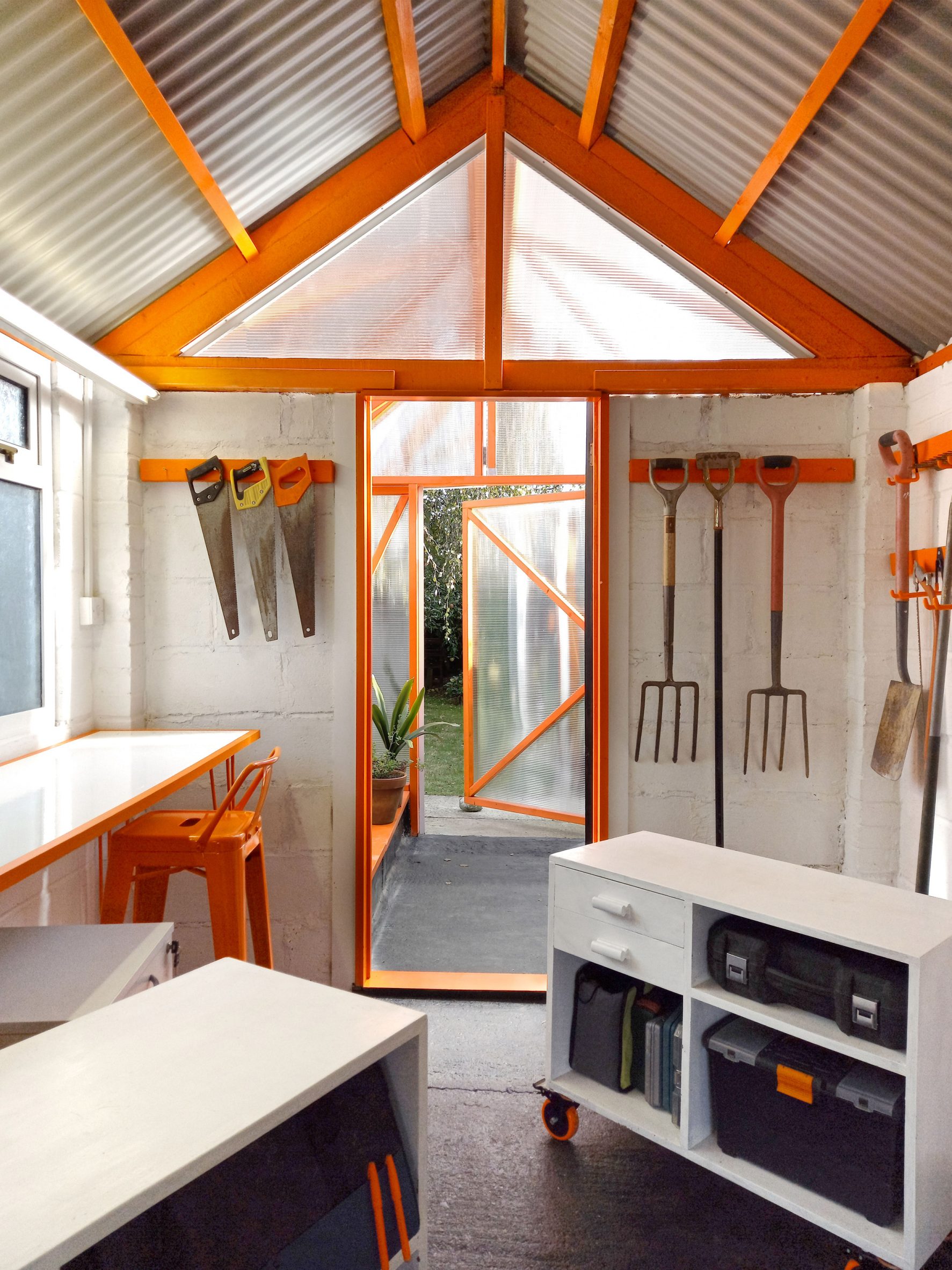
The garage now functions as a hobby zone and storage area. Photo is by McCloy + Muchemwa

An extension to the existing structure contains an "orangery", or greenhouse, which is used for growing food. This timber-framed addition is clad with polycarbonate panels that allow light to reach the planters, shelves and potting table inside.

The woodwork inside the greenhouse and garage is painted a vibrant shade of orange to evoke the aesthetic of the high-tech architecture movement and, in particular, the work of the late architect Richard Rogers.

[ Ghost Barn by Invisible Studio

Read:

Invisible Studio builds fibreglass prototyping workshop at its growing woodland campus

](https://www.dezeen.com/2017/03/31/ghost-barn-invisible-studio-prototype-architecture-workshop-bath-uk/)

Elements such as the angular shelf brackets, simple hairpin table legs and castors are finished in the same industrial orange hue.

The garage is illuminated naturally by daylight entering through a triangular opening on the gable end connected to the greenhouse and a new pyramid-shaped window on one side.

Renovated garage with exposed timber frame
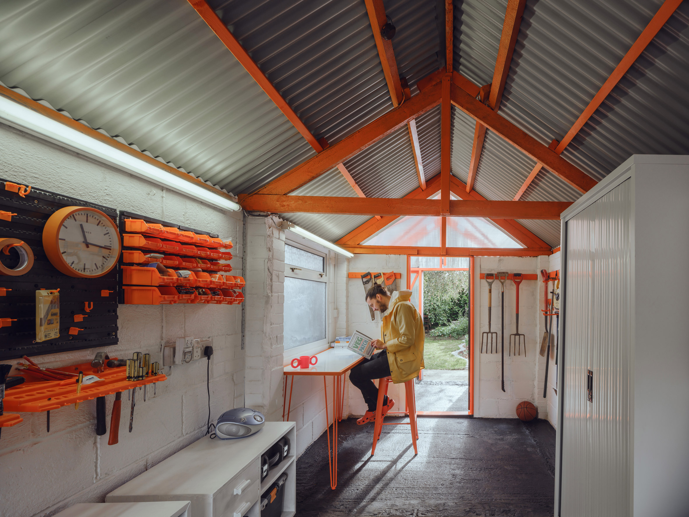
The orange structure continues inside the renovated garage

Corrugated black metal cladding applied to the building's walls and roof was chosen to emphasise the colours in the garden – an approach that the architects said "references classical still-life paintings".

The simple colour palette of orange and black creates consistency throughout the design, along with a recurring triangular motif.

Exterior of The Orangery by McCloy + Muchemwa
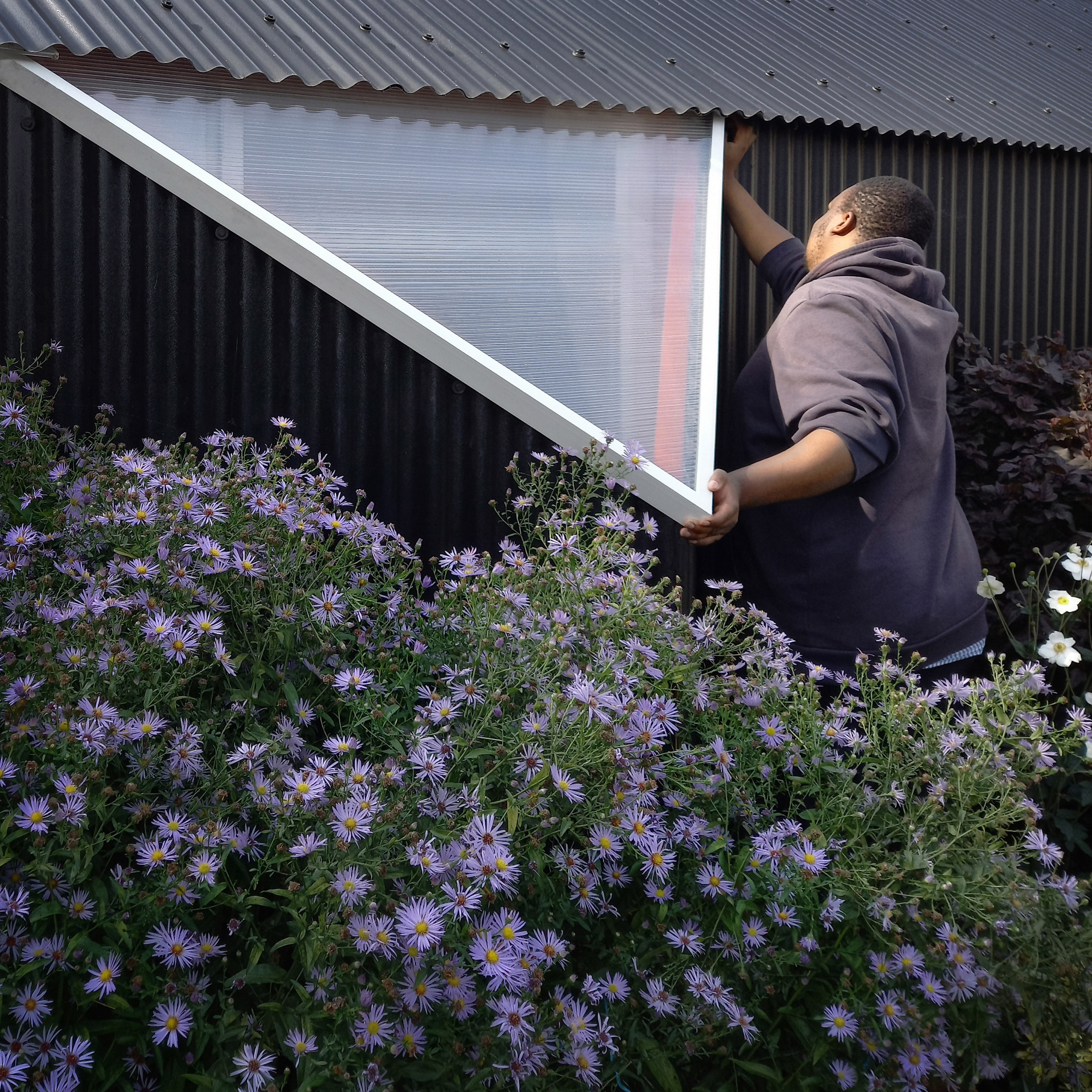
A pyramid-shaped window has been added. Photo is by McCloy + Muchemwa

The same colour scheme and design language are applied to a pergola added to the rear wall of the clients' house.

This seven-metre-long structure provides a sheltered outdoor space and incorporates drainage for collecting rainwater used in the garden.

A view of The Orangery garage in Norwich
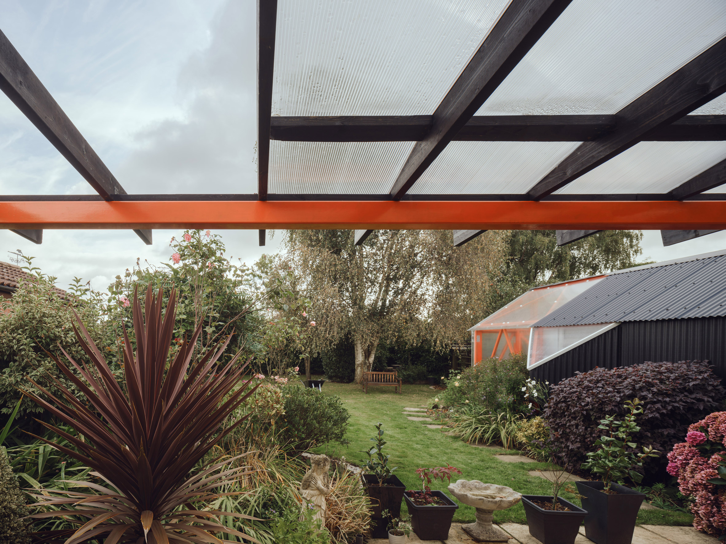
A matching pergola has been added to the clients' house

Elsewhere in England, architect Richard John Andrews also recently completed a multifunctional outbuilding for his garden in east London, and Invisible Studio created a translucent model-making shed for its self-built studio in Bath.

McCloy + Muchemwa was founded by Steve McCloy and Bongani Muchemwa in London in 2017. Its work ranges in scale from architecture to objects, such as the undulating yellow bench that it designed for the London Festival of Architecture in 2018.

The photography is bySimon Kennedy unless stated.

The post McCloy + Muchemwa adds timber-framed "orangery" to renovated garage appeared first on Dezeen.

#all #architecture #residential #uk #england #garages #polycarbonate #sheds #renovations #greenhouses

dezeen@xn--y9azesw6bu.xn--y9a3aq

Chinese steel factory transformed into exhibition centre with polycarbonate walls

image

Chinese steel factory conversion

Architecture office Kokaistudios has slotted a polycarbonate structure into the shell of a former factory in Shanghai, China, to create the Baoshan Exhibition Center.

The exhibition space occupies one of few factory buildings that have been preserved on a large industrial site in the Baoshan District, which was once used to produce steel.

Exterior of Baoshan WTE Exhibition Center by Kokaistudios
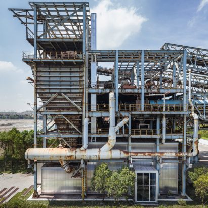
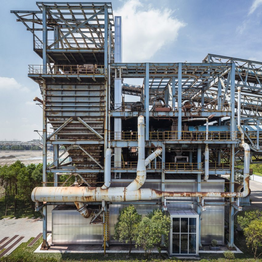
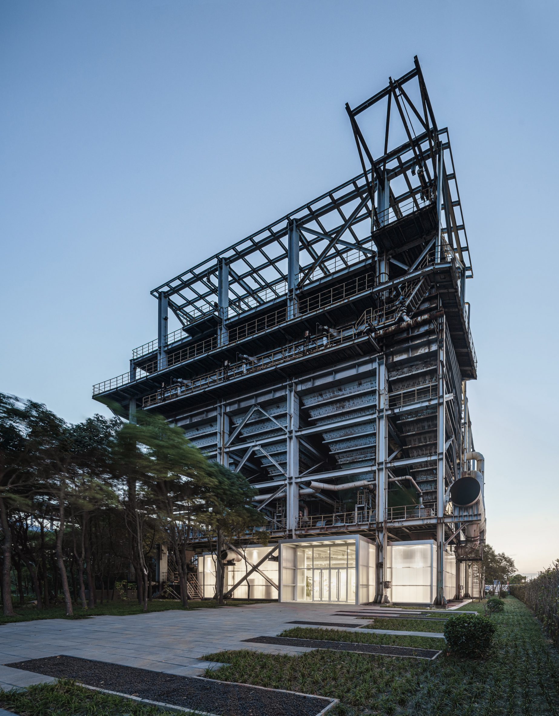
Kokaistudios has adaptively reused a former factory in Shanghai

Shanghai-based Kokaistudios' goal for the 725-square-metre factory was to create a flexible interior while preserving all of the structure's original details.

The project is shortlisted for the cultural building of the year in the Dezeen Awards 2021.

Converted steel factory 
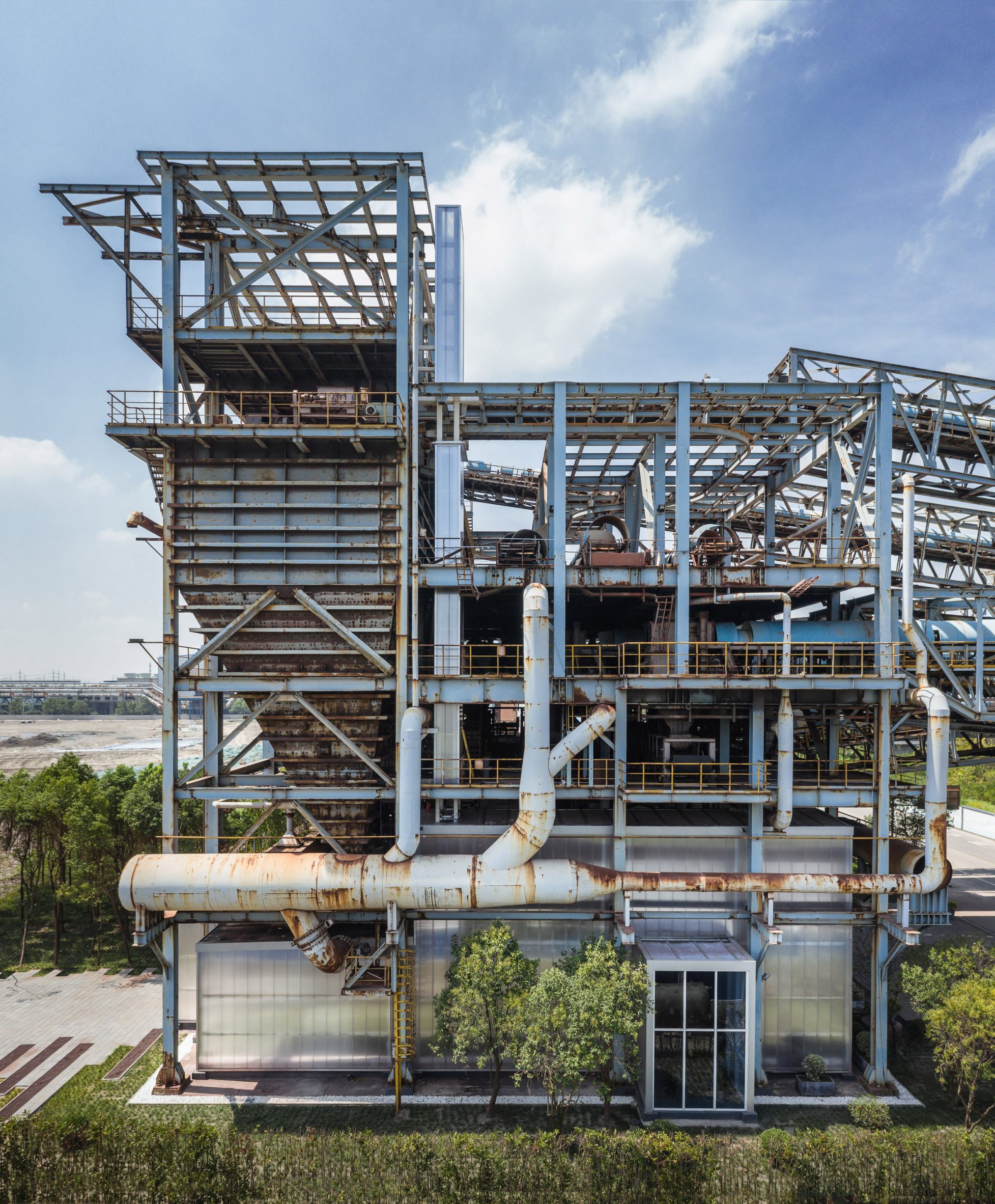
The studio inserted a polycarbonate structure

The factory building chosen for the project is positioned at the gateway of the 450,000-square-metre site.

It was commissioned by its owner Baosteel to promote the redevelopment of the remaining factories on the site, as well as other disused industrial buildings in Shanghai.

Converted factory in China
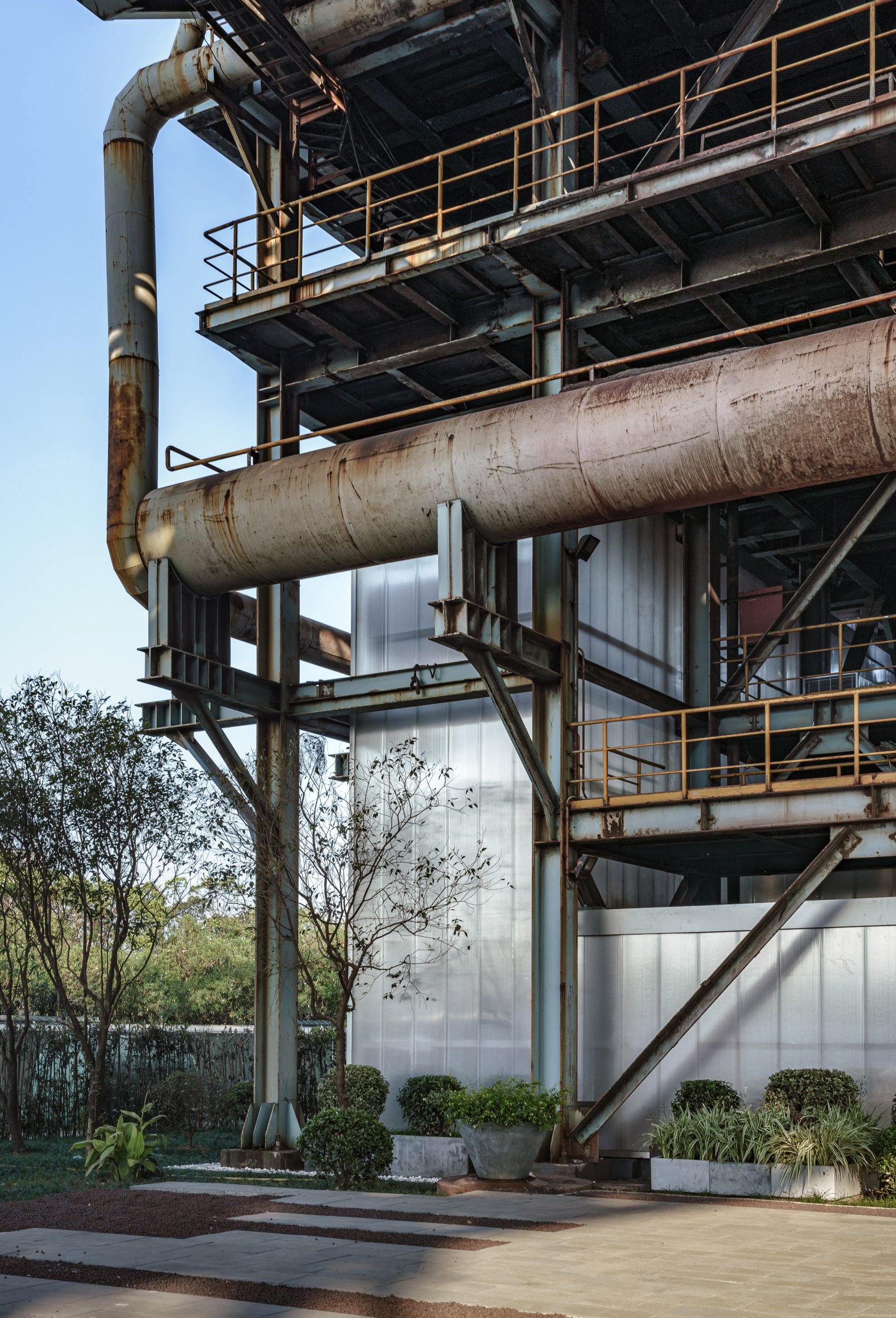
The polycarbonate volume sits independently from the original building

"Baoshan Exhibition Center preserves the industrial legacy in Shanghai, while setting the stage for its future functions," said Kokaistudios.

"Through embedding new architecture volume, as well as in-built flexibility, Kokaistudios' structure sets a precedent for this landmark project."

Baoshan WTE Exhibition Center by Kokaistudios
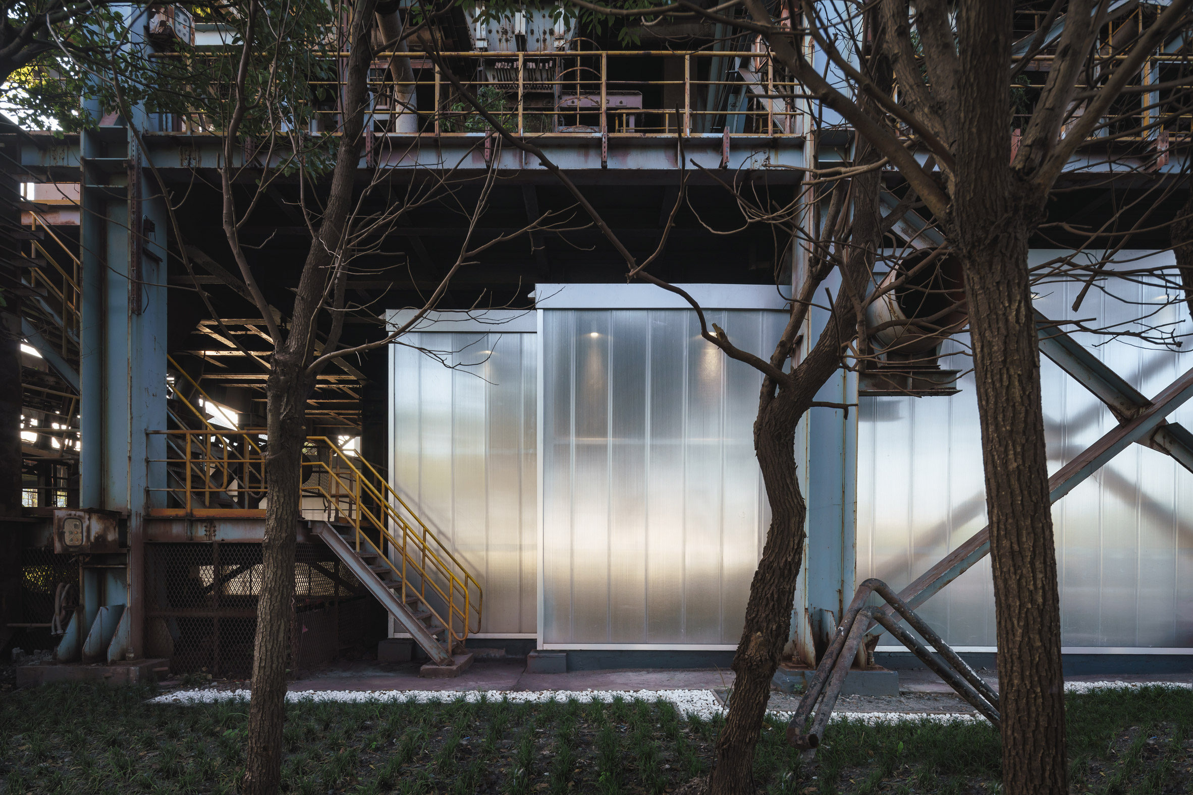
The intervention was designed to preserve the existing building

According to Kokaistudios, Baosteel's vision for the site is to create an "eco-industrial park".

Alongside the exhibition centre, it is expected to include a new waste-to-energy power plant, a museum, offices, a park and a series of wetland areas.

Polycarbonate exhibition centre
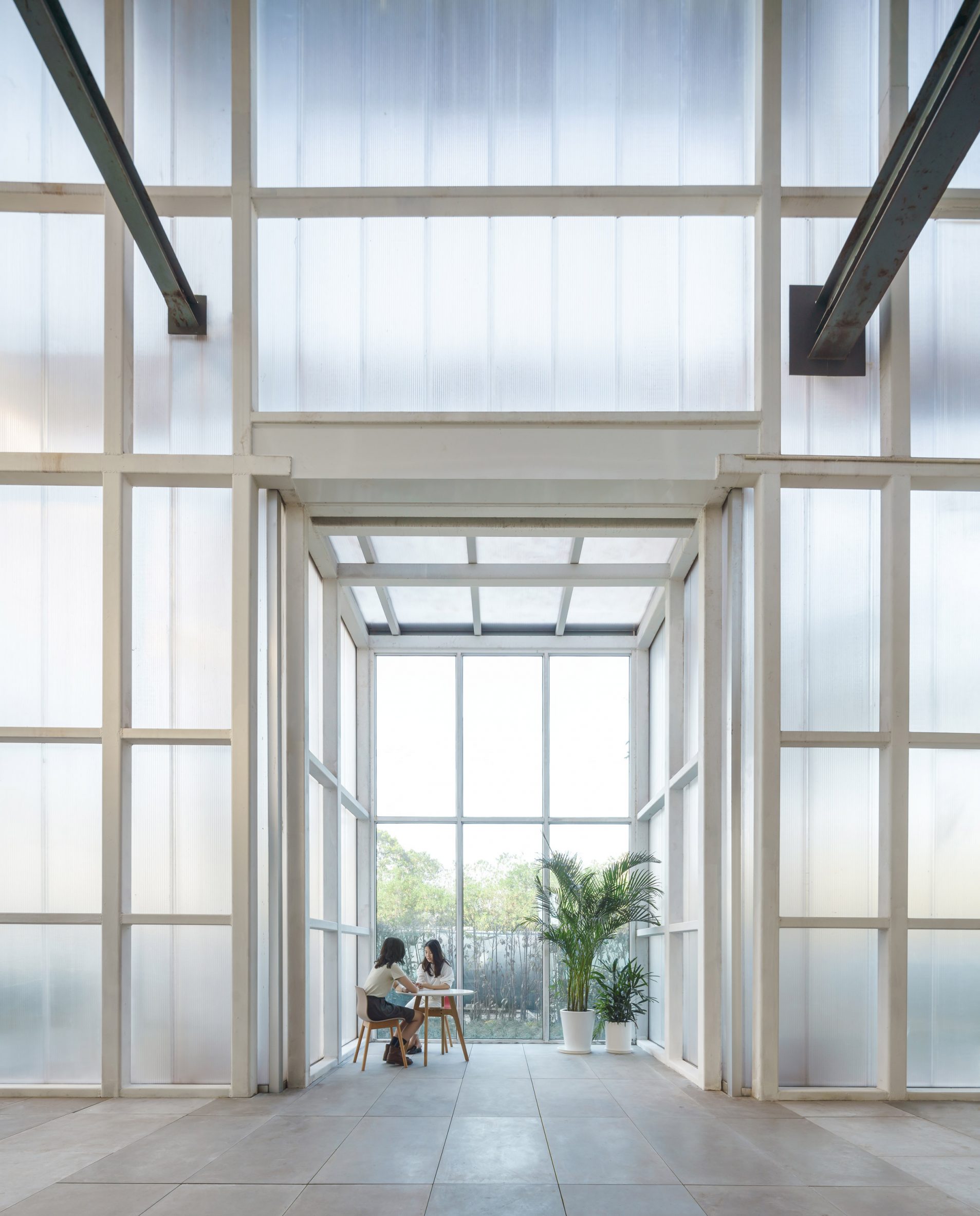
It contains an exhibition centre inside

The polycarbonate structure inserted into the factory is designed as a fully separate element, meaning it sits independently from the building's original envelope.

The structure forms a watertight and flexible interior while preserving the factory's original details, which include bulky pipes and machinery inside and out.

[ A red steel ramp

Read:

Rede Architects and Moguang Studio turn abandoned factory into youth activity centre

](https://www.dezeen.com/2021/05/16/the-youth-activity-center-rede-architects-moguang-studio-china/)

According to the studio, polycarbonate was chosen to create "a powerful contrast between the heaviness of the existing steel building and the lightness of the new building".

Polycarbonate is also lightweight, reusable and could be prefabricated, reducing costs and construction times.

Baoshan WTE Exhibition Center
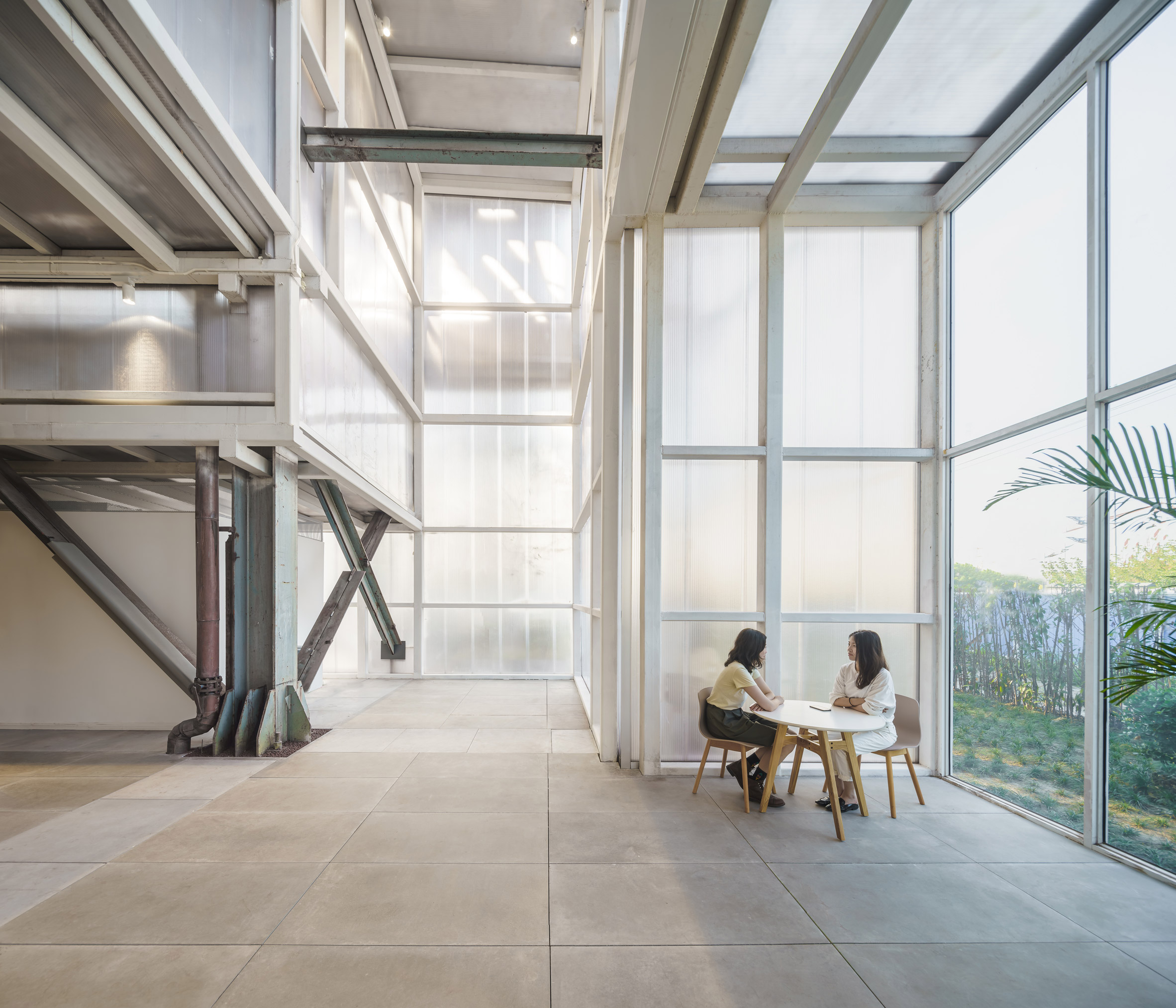
Concrete tiles are paired with the polycarbonate walls

Inside, the main exhibition space is filled with freestanding furniture to maximise its adaptability.

Elsewhere, there is a small coffee lounge, meeting room and smaller spaces for use as other exhibition spaces.

Polycarbonate meeting rooms
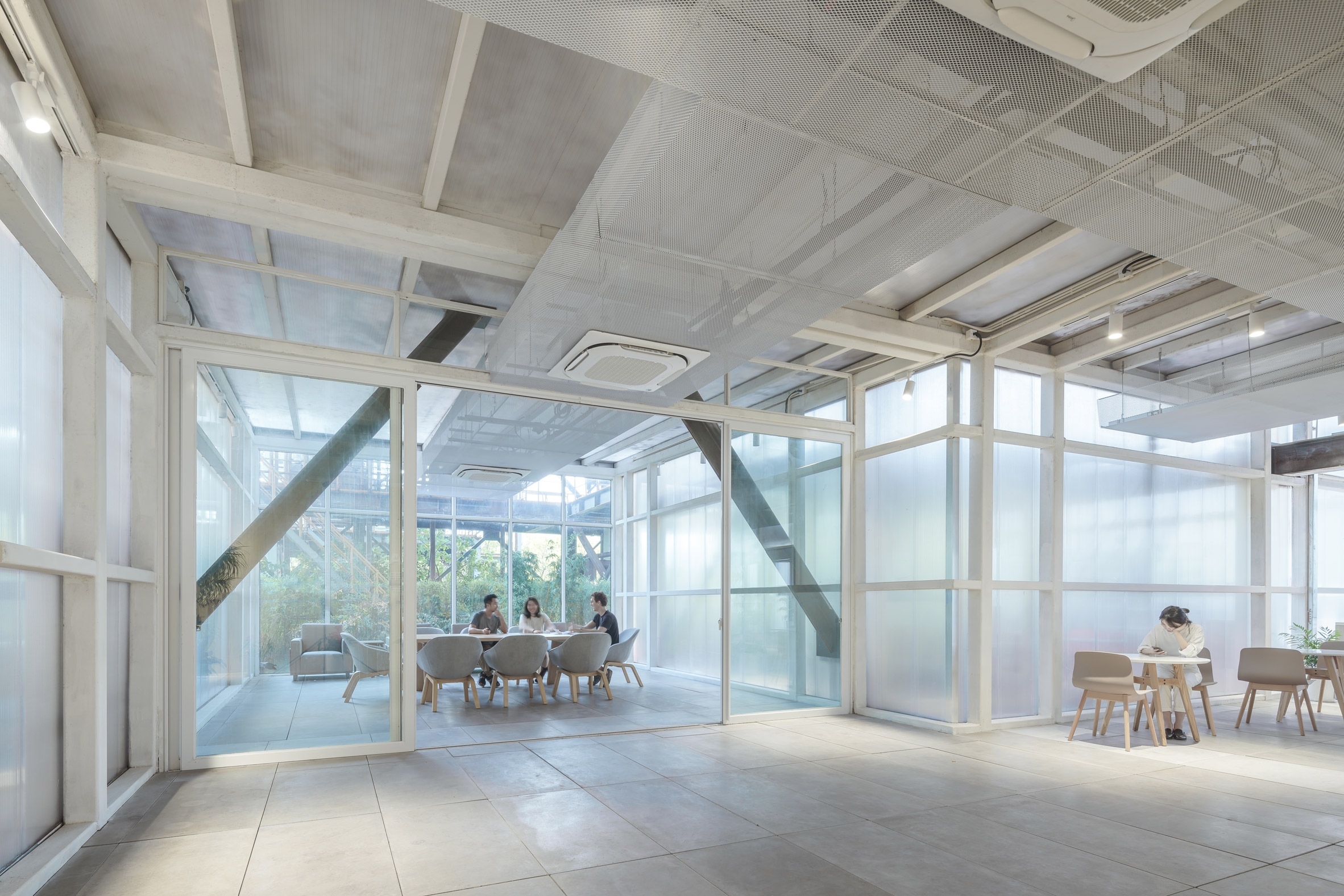
A meeting room is among other spaces created inside

Alongside the polycarbonate, the studio has introduced a material palette that includes concrete and stainless steel, chosen for their "cooler tones".

"Throughout, cooler tones contrast with the structure's former associations of blasting furnaces," the studio explained.

Polycarbonate exhibition centre
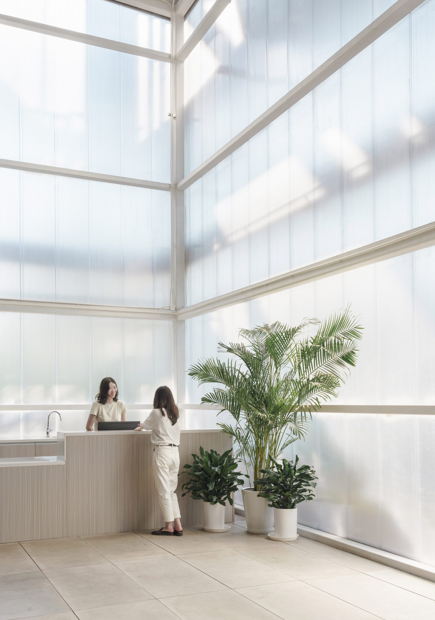
Materials with "cooler tones" were selected

The main exhibition hall is the only space to feature natural materials, including wooden veneer that nods to the trees surrounding the site.

Kokaistudios' renovation of the factory is completed with a landscape design that includes simple stone pavers arranged in a striped formation.

Old steel factory
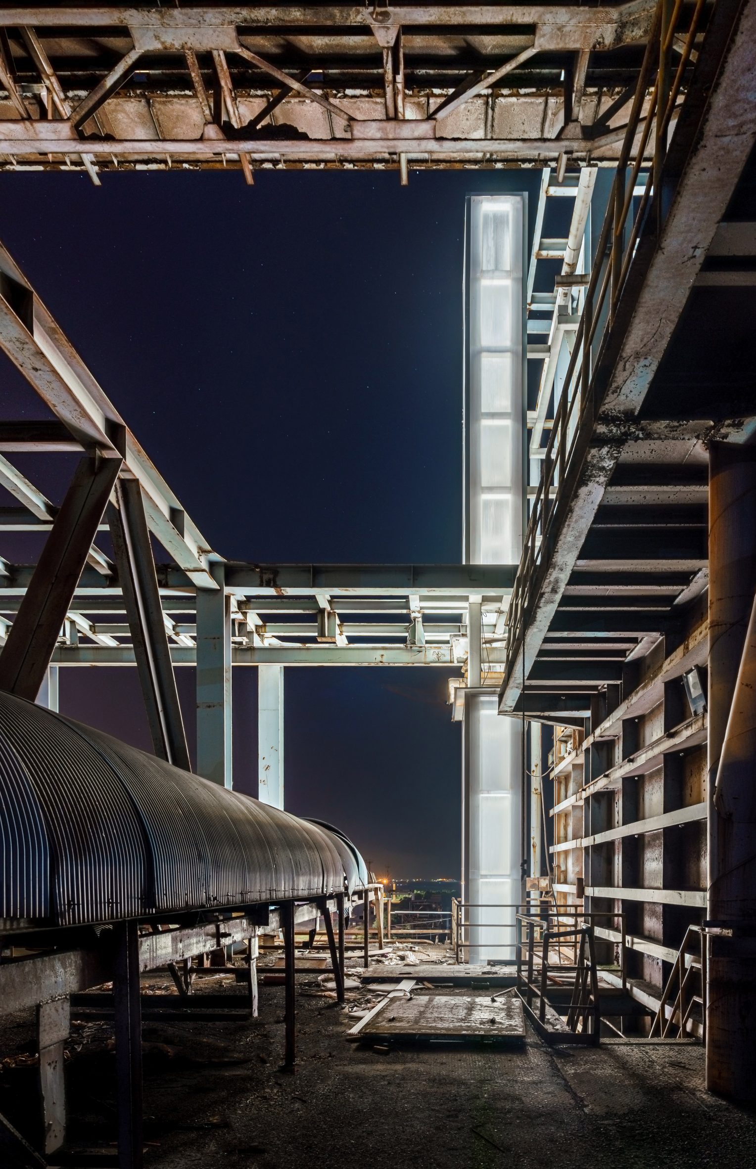
Original details of the factory have been preserved

Other shortlisted projects in the cultural building of the year in the Dezeen Awards 2021 include the Yabuli Conference Center by MAD Architects and the Babyn Yar Synagogue by Manuel Herz Architects, which won the public vote for the same category.

Elsewhere in China, Rede Architects and Moguang Studio also recently adaptively reused a factory in Beijing to create a youth centre filled with ramps and slides.

The photography is byTerrence Zhang.


Project credits:

Architect: Kokaistudios

Chief architects: Andrea Destefanis, Filippo Gabbiani

Design director: Li Wei

Architecture design manager: Andrea Antonucci

Design team: Lu Tian, Qu Hao

Client: SIIC Bao Steel Environmental Resources Technology Co., Ltd.

The post Chinese steel factory transformed into exhibition centre with polycarbonate walls appeared first on Dezeen.

#cultural #all #architecture #chinesearchitecture #china #shanghai #renovations #factories #adaptivereuse #kokaistudios

dezeen@xn--y9azesw6bu.xn--y9a3aq

Wisconsin train station becomes The Harvey House restaurant by Home Studios

image

Harvey House restaurant interior

Brooklyn-based Home Studios has turned a former rail baggage handlers' building in Madison into dining spaces that evoke "the golden age of train travel".

Hidden behind an old train depot in the Wisconsin capital, The Harvey House is a 5,000-square-foot restaurant that nods to the Midwestern state's supper club culture of the 1930s and 40s.

Ground floor of The Harvey House restaurant
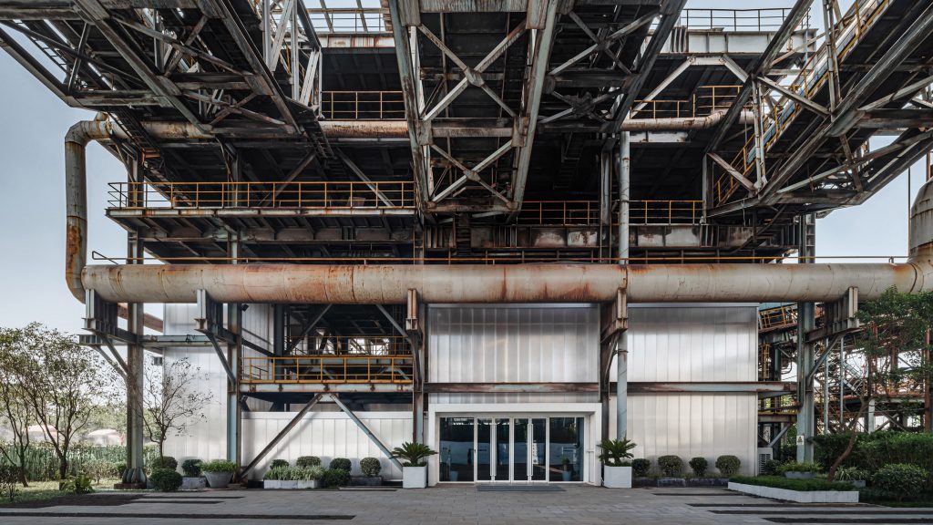
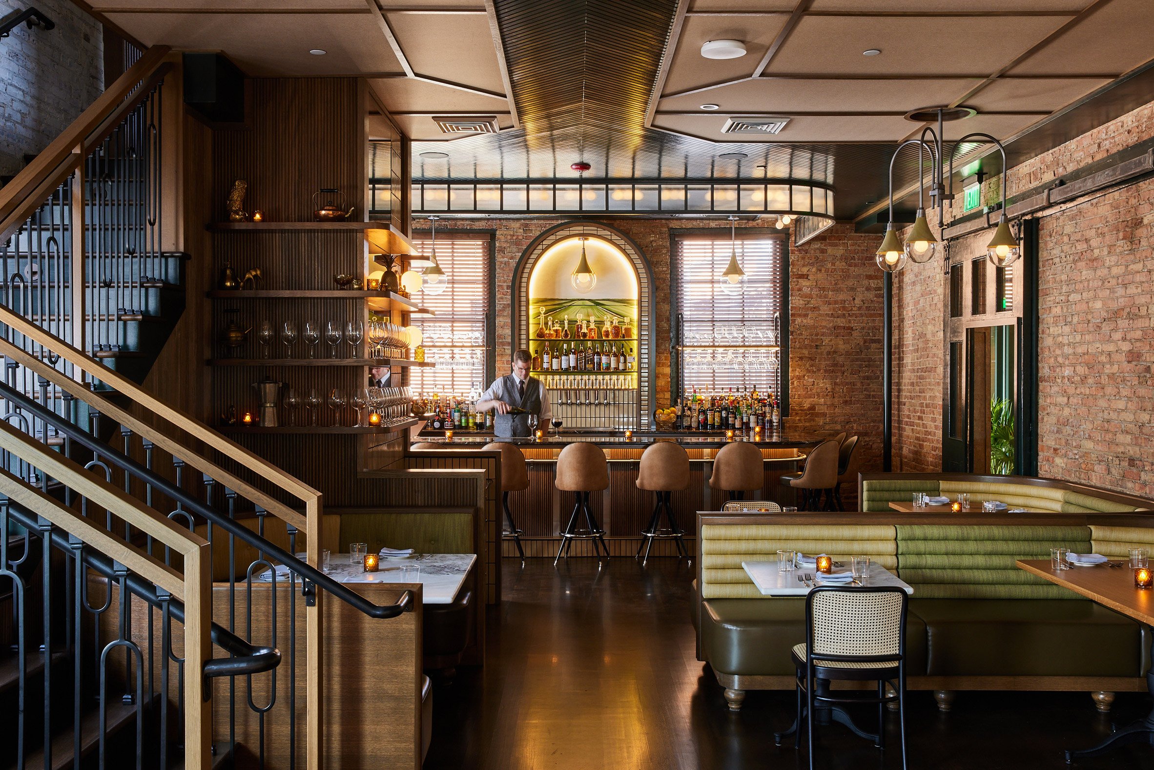
The Harvey House occupies a two-storey baggage claim building at the old Madison train station

American cuisine is served over two levels of the old baggage claim house, each with its own bar, which Home Studios renovated with the building's history in mind.

Additional dining spaces are located in a glass-enclosed area on one of the shuttered station's platforms, and in a 1960s train car that sits on the tracks.

View into the open kitchen
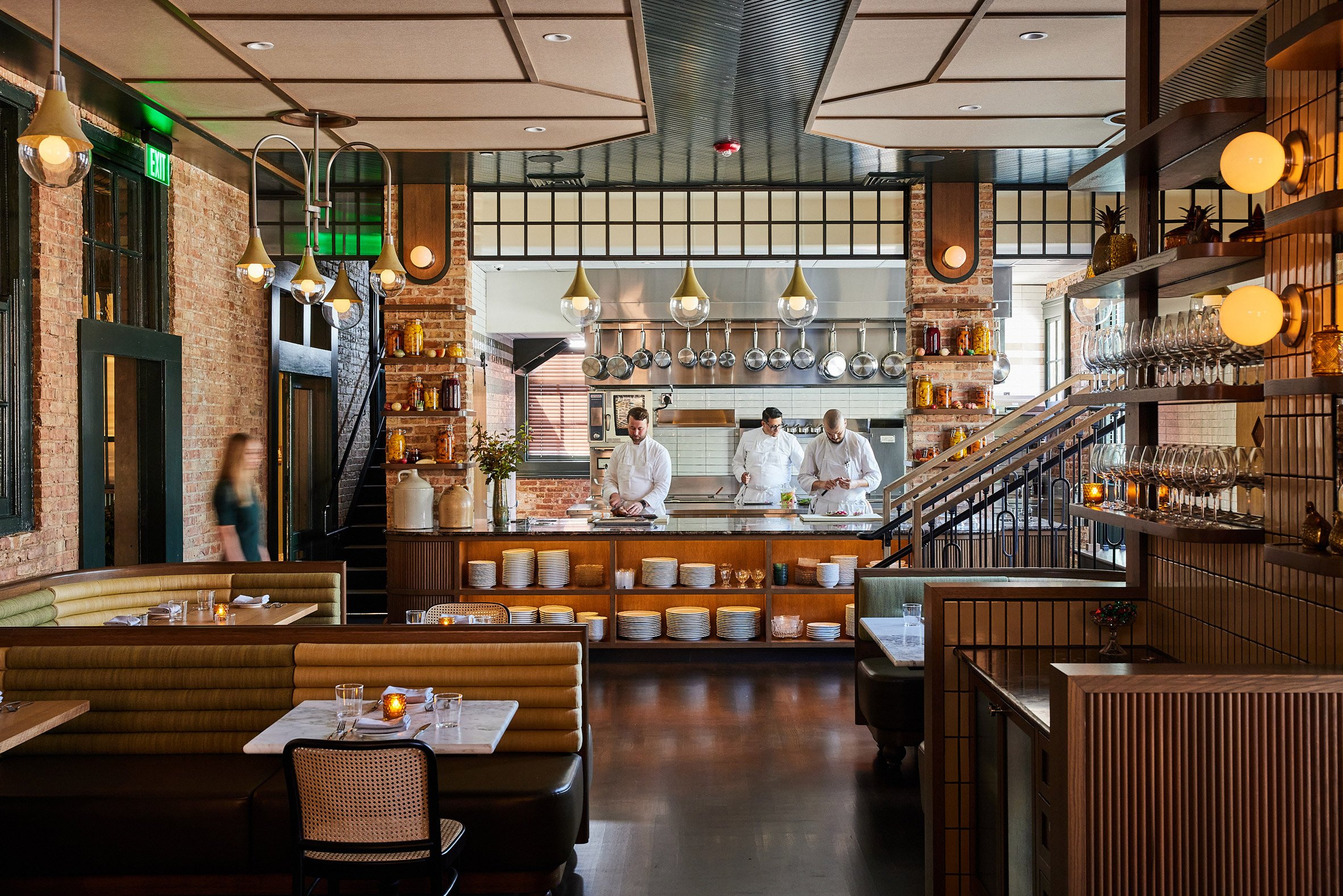
Home Studio retained many of the original features

Many of the building's original features were retained, including ceiling beams, windows, and the station's sliding wood doors.

The brickwork and dark green window trims guided the colour and material palette for the project, which includes dark woods and tactile upholstery, as well as custom millwork and commissioned artworks.

"Home Studios' primary design goal for The Harvey House was to create a warm and inviting restaurant that marries the familiar comfort of a Wisconsin supper club with a uniquely transportive experience evocative of the golden age of train travel," said the studio.

Dining area on the station platform at The Harvey House restaurant
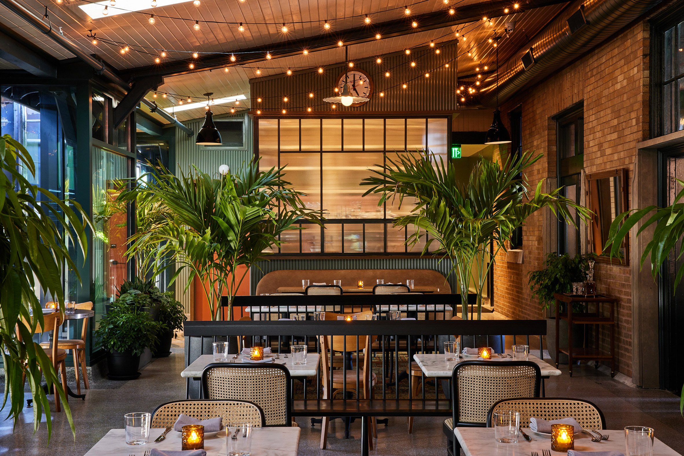
The restaurant includes a dining area on the former station platform

In the downstairs dining room, patrons can watch the chefs at work through a large opening to the kitchen. Wooden banquettes are cushioned with upholstered backs and seats in various tones of green.

Custom light fixtures reference those found in Paris metro stations, giving off a soft glow that adds to the moody ambience.

An open doorway leads through to the platform patio area, where black benches and rattan chairs accompany marble-topped tables.

Planting, string lights and vintage rugs give this space a more casual feel.

The decommissioned train carriage can be seen through the glass wall that runs parallel to the tracks.

Upstairs bar with custom artworks
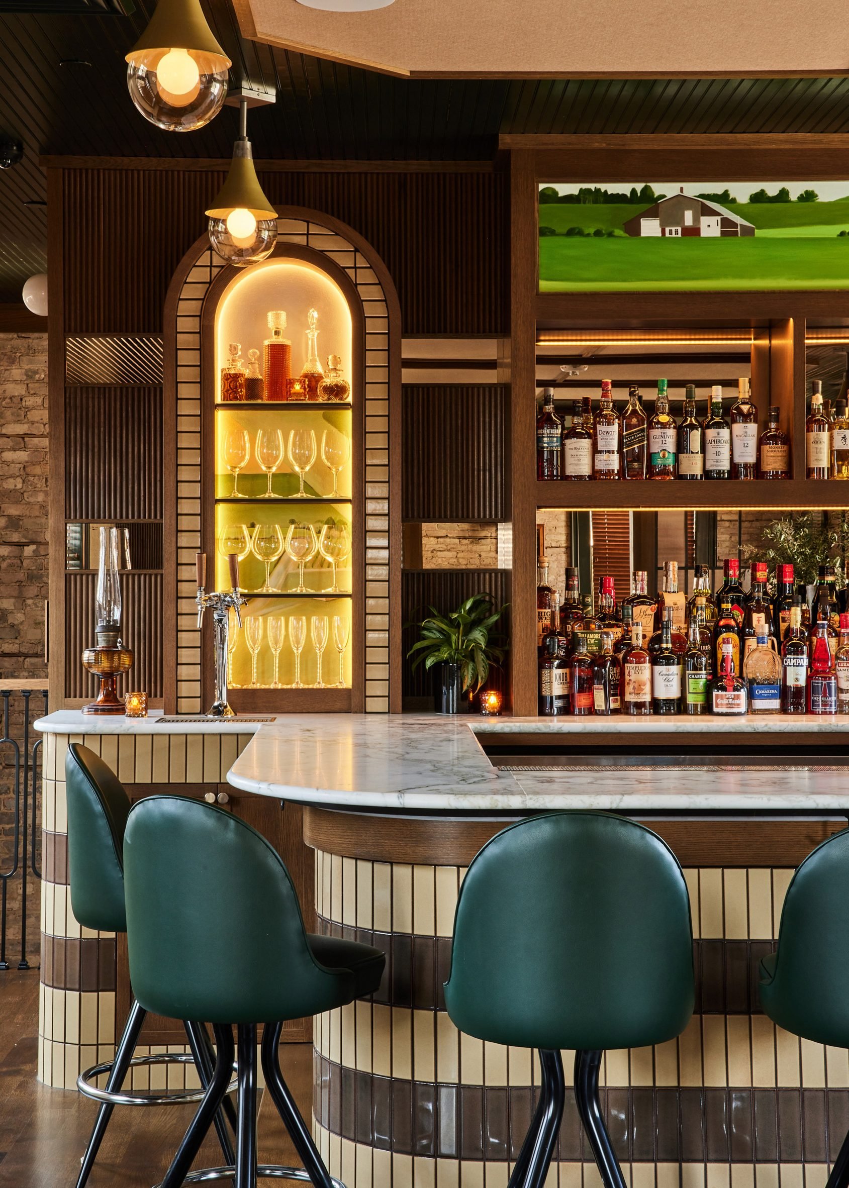
Works by a local artist decorate panels behind the upstairs bar and its equivalent on the floor below

Upstairs, light-brown leather seating and teal bar stools continue the colour palette found below.

The almost symmetrical layout includes wood and glass partitions that delineate different dining areas.

Dining area separated by wood and glass partitions
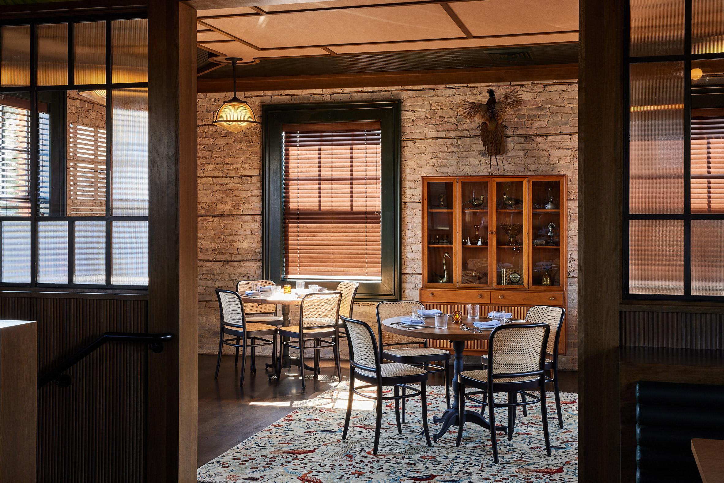
Wood and glass partitions divide the upstairs dining areas

Behind both of the restaurant's bars are works by local artist Jessica Niello-White, created specifically for The Harvey House.

Placed above the liquor selves and in the flanking arches, her images are based on scenes of the Wisconsin countryside as they might be seen from a train window.

Host station at the restaurant entrance
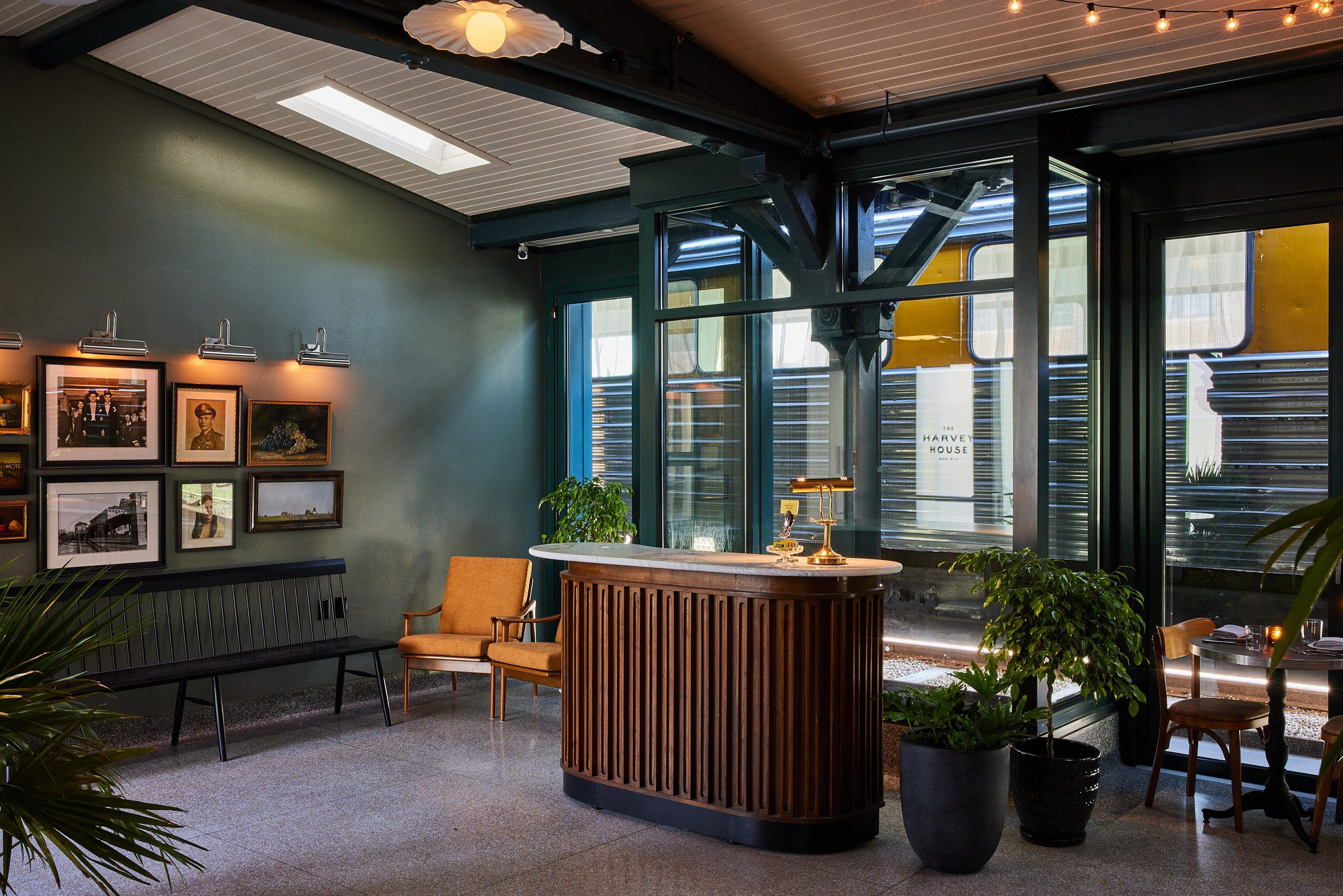
The converted train car can also be seen behind the host stand at the entrance

Home Studios was founded by former book editor Oliver Haslegrave in 2009, with a focus on residential and hospitality interiors.

Previously completed projects include a cocktail bar in West Hollywood and an apartment in Manhattan, while the studio's range of collectible furniture and lighting debuted at Sight Unseen Offsite in 2017.

Photography is byNicole Franzen.

The post Wisconsin train station becomes The Harvey House restaurant by Home Studios appeared first on Dezeen.

#restaurantsandbars #all #interiors #usa #restaurants #renovations #wisconsin #adaptivereuse #homestudios