One person like that
1 Comments

Ich find #Akzentfarben bescheurt, und sehr unnotwendig!
#Darkmode auf der anderen seite kann ich durchaus relativ viel sinn abgewinnen.
If you're engaged in application or Web UI/UX design for E-Ink devices or displays, it helps to keep in mind what these displays' capabilities are. They're quite good in some regards, somewhat limited in others.
I've looked for existing sets of guidelines without luck, so apparently I get to draw my own line in the sand. An earlier version of this post proved popular on Mastodon, I'm expanding it here. This is a first effort and some of my suggestions may not hold up, though I hope most will. Further discussion on that point at the end of this post.
Keep in mind that e-ink is not just limited to digital signage, e-book readers, and tablets, but increasingly to e-ink monitors for desktop and laptop systems. You will likely find e-ink in places and uses you didn't expect, and detecting e-ink from a developer or Web-designer perspective is itself challenging.
Once set, the display will continue to show specific static content indefinitely, with no power applied. This is good if you plan on leaving output visible, somewhat less so if the content is sensitive. Applications with data sensitivity should best detect and overwrite displays when the device / display suspends.
DPI is typically 200 or higher, devices with well over 300 DPI are available, though not necessarily common. This is equivalent to many laser-printers' dot resolution. Individual pixels are typically visible only under strong magnification. High-detailed serif fonts render quite well, much better than on most emissive displays. Pixel density does tend to fall with larger devices which are typically viewed from greater distances from which the visual angle generally remains equivalent.
In terms of energy use (battery life), time, and disruption (display ghosting / flickering, varying with display mode), any screen changes impose technical or cognitive costs. Animation is at best distracting, and often a complete disaster. Many devices offer a range of display modes which exchange speed for quality (resolution and ghosting).
Rather than 60--120 Hz, displays typically update in the range of 0.5 -- 10 Hz, and perhaps slower for some devices or modes. Most devices / modes can accomplish fairly rapid (> 4 Hz) updates, but that's not guaranteed. Again, trade-offs exist with display mode.
Colour e-ink devices do exist, though they're a small subset of the total, palettes are limited, with some display characteristics lower than B&W: roughly one quarter the pixel density and slower refresh. Many current high-end devices offer a limited greyscale palette, ranging from 1--16 shades (1-4 bits). High-contrast colours (e.g., deep blue on deep red) may render as uniform dark grey on e-ink. Using colours to distinguish elements or information is generally ineffective. Gradients near white or black may be entirely indistinguishable. Designs which differ from stright black-on-white which otherwise work well on emissive displays are often suboptimal on e-ink, including my own entry into a popular theme. Text/background contrast ratios should be maximised as #FFF and #000.
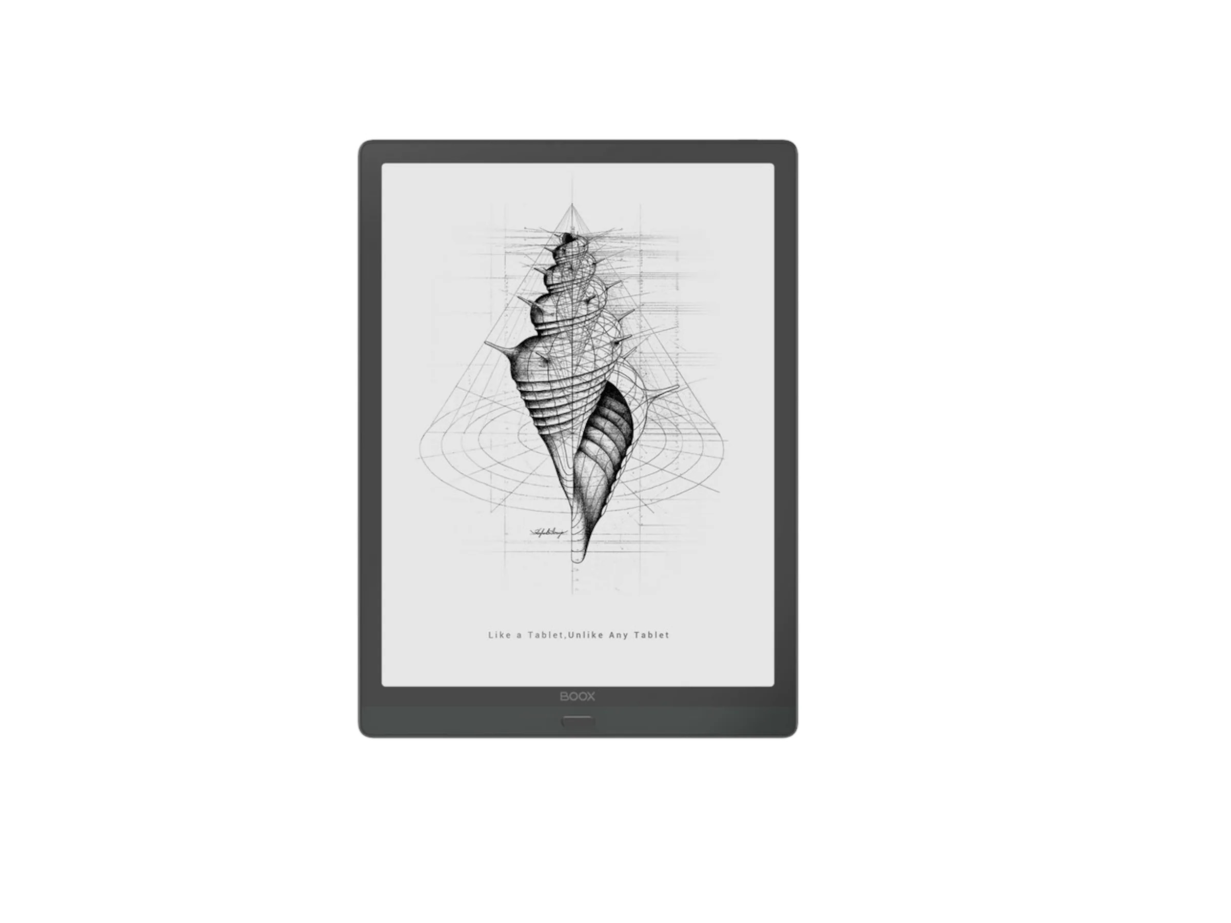
Line art works exceptionally well on e-ink, and there is a reason it is featured in promotional materials and screensavers: it looks delicious. (See this post's hero image for an example.) Most raster images require dithering or halftones for best effect -- and with the high DPI, halftoning may well be the best option, though it can lead to Moire effects. Halftone density should be half the display DPI for best results. For most text, any background shading, image, or patterns are exceptionally distracting. Distinguishing application windows from pop-up dialogues, particularly under "flat" UI/UX paradigms, is often quite difficult. Border regions help, and this is one place where shading or crosshatching may be appropriate, perhaps applied to the background window rather than the foreground dialogue. Dark-mode themes work poorly in most e-ink applications, please provide a light-mode option. Ironically, several theme-management tools commit this error.
Change the entire screen in one fell swoop, or if this isn't possible, a specific region, rather than scrolling or animated transitions. Devices and drivers typically support partial-screen updates. It's much harder to regain reading point when scrolling in e-ink than with emissive displays. This means providing interfaces for paginated movement, and for desktops, window management based on fixed window positions and full-window refresh rather than extensive movement and scrolling. Window contents should not be shown whilst repositioning or resizing. For touch devices / tablets, touch regions or physical buttons work better than gestures. The EinkBro web browser, optimsed for e-ink is far more pleasant to read and use than mainstream Android browsers. Its developer, Daniel Kau, has expressed several design considerations which correspond with mine.
You cannot pour light into portions of your display, you can only remove it. Colour mixing is pigment, not light (if it exists at all). For graphics designers, you're working in pigment rather than light colour space. Readability increases with direct sunlight / bright ambient light. Many consumer devices do have illumination (backlight / frontlight) for low-light environments. External task lighting may also be applied.
Many devices incorporate a Wacom layer and can use a stylus in addition to capacitive touch response. Do with this what you can / may. Be aware the usual pitfalls of touch interfaces.
There are relatively few tools for actually determining the characteristics of a display as pertains to e-ink. For Web development, there are CSS \@\media queries which may be useful such as the color media feature query. Display size and DPI may also be available, as well as preferences such as prefers-reduced-motion.
For a sense of raw display characteristics, independent of specific products, this video is highly informative. The displays show range from digital signage with minimal capabilities to high-performance large-format interactive displays, ordered by time through the video:
E-Ink display and refresh rates — a technical demonstration
https://yewtu.be/watch?v=KdrMjnYAap4
I am a space alien cat of questionable veracity. I've used e-ink intensively for about a year and a half on an Android tablet (Onyx BOOX Max Lumi), for e-book, Web browsing, and applications, and I'd had occasional interactions with the technology for over a decade prior to that. I've been in and around the technology field for most of 50 years, working professionally for over 30. Whilst not specialising in UI/UX work, much of both my own work --- back-end and some front-end design, and all of my use is informed by interface considerations.
E-ink seems to be an expanding though still niche field. In particular, there has been a breakout from dedicated single-purpose e-ink book readers to e-ink tablets and displays. Sales numbers are all but impossible to find (and if anyone has insights these would be appreciated). E-ink is also being incorporated in a range of devices from phones (LightPhone and numerous e-ink smartphones), along with devices simply better suited to e-ink than emissive displays.
As noted at the top, the question of e-ink design principles seems curiously underserved. Useability expert Jacob Nielson has almost entirely ignored the topic other than rubbishing e-book readers a quarter century ago. I'm reasonably confident that the suggestions I make here will hold up reasonably well, but as with any first effort, some, possibly much, may be in error.
Time will tell.
Post image: Onyx BOOX Max Lumi showing power-off screen line art.
#eink #displays #WebDesign #AppDesign #UI #UX #Interfaces #DesignPrinciples
A few weeks ago, I realized that I no longer use graphical applications.
That’s right. I don’t do anything with gui apps anymore, except surf the Web. And what’s interesting about that, is that I rarely use cloudy, ajaxy replacements for desktop applications. Just about everything I do, I do exclusively on the command line. And I do what everyone else does: manage email, write things, listen to music, manage my todo list, keep track of my schedule, and chat with people. I also do a few things that most people don’t do: including write software, analyze data, and keep track of students and their grades. But whatever the case, I do all of it on the lowly command line. I literally go for months without opening a single graphical desktop application. In fact, I don’t — strictly speaking — have a desktop on my computer. ...
-- Stephen Ramsay
For my own uses, whilst I heavily use Android tablets, my preference is a full Linux desktop or laptop. On Android the single most useful application I have, and The One Thing Which Does Not Precisely Suck, is Termux, a Linux userland environment with nearly 2,000 installable Free Software packages.
I'd make heavier use of console-based web clients (w3m) if less of the Web wasn't broken using one. I'm ... begining to explore Gemini.
HN discussion: https://news.ycombinator.com/item?id=30389399
#CommandLine #Productivity #UI #UX #Linux #GUI #StephenRamsay
“Congrats! You’re using the latest version of Firefox Browser.”
Rats! I’m using the latest version of Firefox Browser.
You know, the one with the oh-so-wonderfully “slick” and “modern” (spit) Proton UI?
#firefox #ui #crapdesign #changeforchangessake #callmeresistanttochangeandthenfuckoff
Il est une opinion commune selon laquelle les réseaux sociaux alternatifs et décentralisés (Diaspora, Hubzilla, Mastodon,...) permettraient de sortir du système de surveillance de masse. Ils ont bien des avantages sur les plate-formes mainstream : l'accès au code-source, la décentralisation, l'absence d’algorithmes de suggestions, l'aspect réellement communautaire et pas de rétention des données. Ces quelques points, et j'en oublie peut-être, sont bien des avancées souhaitables en terme de vie privée, mais ça s'arrête à la vie privée. En dehors du fait que cela nécessite aussi une éducation (ne doutons pas que les géants du web aient mis en place des robots pour récolter un maximum d'infos sur les pages publiques des réseaux alternatifs), cela ne permet pas de guérir de la maladie que les GAFAM ont volontairement imposée au public depuis quelques années : l'addiction aux écrans.
L'autre point essentiel, qui est de libérer notre cerveau de l'addiction à la dopamine et autres phénomènes induits par les réseaux sociaux modernes, n'est pas au programme. Quand on arrive sur ces plate-formes alternatives, il est possible d'être moins stimulé que sur Facebook par exemple, mais cela n'est qu'une conséquence des quelques points cités au dessus. Rien n'est fait dans l'interface pour sortir de l'addiction au flux de scroll infini, aucune incitation à ralentir pour faire des commentaires réfléchis au lieu de réactions à chaud, pas d'éducation à la dynamique des rumeurs, entre autres problèmes qui existent probablement ici et dont je n'ai pas encore conscience.
L'addiction aux réseaux sociaux est devenue un problème énorme. Avons-nous réellement besoin de reproduire le flux incessant des notifications ? Penser de nouveaux outils de partage radicalement différents de ce que nous proposent les GAFAM me semble une priorité. Reprenons entièrement le contrôle de notre vie numérique, revenons à des interfaces simples, pourquoi pas carrément moches mais fonctionnelles comme celle d'Audacity en passe d'être "modernisée" et rendue lucrative par Muse Group, dénonçons l'influence des interfaces sur notre cerveau, favorisons enfin l'émergence de la liberté de penser par des communautés accueillantes et ouvertes à la remise en question.
Est-il possible d'avoir une pensée libre et autonome alors que notre cerveau est constamment occupé à recevoir sa dose de dopamine ? Alors qu'il contribue à endormir notre corps sur un fauteuil dernier cri, pouvons-nous parler de logiciel libre ?
#diaspora #logiciel-libre #FOSS #linux #hubzilla #mastodon #gnusocial #GAFAM #addiction #facebook #partage #design #UI #UX
Schon wieder eine #Stellenausschreibung
Die #taz war die erste online lesbare #Tageszeitung Deutschlands. Sie bietet nach wie vor alltäglich die Möglichkeit Dinge anders zu machen und ist immer noch #Konzern-unabhängig.
Willst Du mit uns die zunehmend digitale #Zukunft des #Journalismus gestalten? Wir bieten ein kooperatives #Umfeld, das Raum für #Weiterentwicklung und #Kreativität lässt, aber auch strategisches #Denken erfordert und die Bereitschaft, alltägliche Probleme auch eigenverantwortlich zu lösen.
Wir suchen zeitnah ein:e Kolleg:in mit praktischer Berufserfahrung in der Webentwicklung, gerne auch als Quereinsteiger:in. Wichtig ist uns, dass Du nicht nur teamfähig bist, sondern bevorzugt gemeinsam arbeitest, auch mit technischen Laien.
Im #Frontend-Bereich von taz.de stehen viele Veränderungen an. Derzeit gestalten und bauen wir unseren Verlagsbereich neu. Als nächstes plant die #taz, den redaktionellen Bereich zu relaunchen. Dabei werden wir vieles überdenken und verändern. Neben der Pflege und der Weiterentwicklung von taz.de erwartet dich ein bunter Strauß an Themen: #Datenschutz, #Tracking, #Ads, #SEO, strukturierte #Daten, #Feeds, #Barrierefreiheit und vieles mehr.
Anforderungen:
Wenn Du Lust darauf hast, in einem nach wie vor politisch motivierten Umfeld als Teil des Web-Entwickler:innen-Teams auch abteilungsübergreifend mit vielfältig interessanten Menschen, mit Produktentwicklung, EDV, Redaktion und Verlag zusammenzuarbeiten, melde Dich.
Bei der taz bieten wir nicht nur ein kollegiales Arbeitsumfeld, sondern auch familienfreundliche #Arbeitszeiten (flexible #Vollzeit 36,5h/Woche, remote-Arbeit aktuell bis auf Weiteres aufgrund von #Corona erwünscht, auch danach ist prinzipiell #Home-Office möglich, 30 Tage #Urlaub) – es gibt ein ordentliches (und subventioniertes) #Mittagessen im taz-Café.
Wir wollen diverser werden. Deshalb freuen wir uns besonders über Bewerbungen von People of Color und Menschen mit Behinderung. Deine Perspektiven sind uns wichtig und sollen in der taz vertreten sein. Die Arbeitsplätze und Toiletten sind weitestgehend #barrierefrei. Das taz-Café ist mit dem #Rollstuhl erreichbar.
Schicke uns deine #Bewerbung und zeige uns, welche Kenntnisse und Erfahrungen Du gerne bei der taz entfalten würdest.
Es handelt sich um eine volle unbefristete Stelle ab taz-Lohngruppe V. Auch Teilzeit wäre denkbar, wenn Vollzeit für dich nicht möglich ist. Arbeitsaufnahme zum nächst möglichen Zeitpunkt. Schreibe uns gerne, ab wann Du einsteigen könntest und richte Deine Bewerbung an webjob@taz.de.
Wir freuen uns auch über Weiterleitung, ihr findet die Stellenausschreibung auch unter https://taz.de/jobs