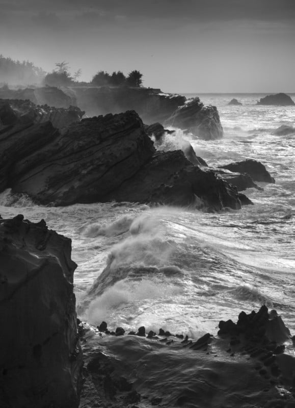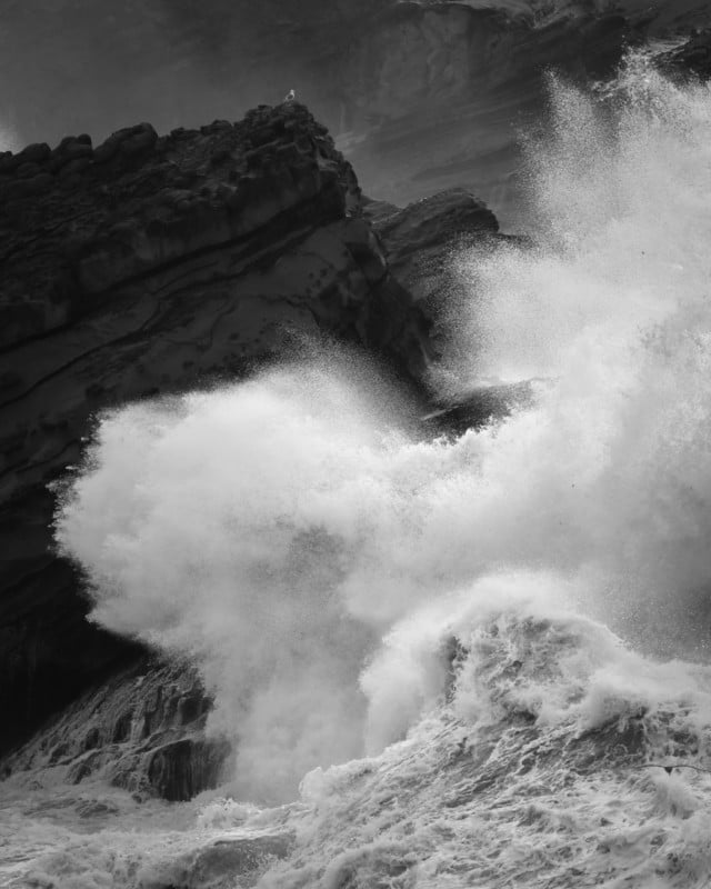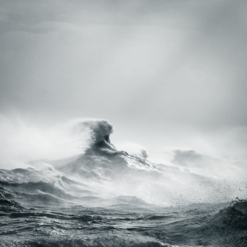
By removing color, we change how the viewer’s eyes see the photograph. No longer dependent upon color cues, we must find our visual information in the physical characteristics of shape, form, texture, and lines.
In my presentations, I often ask why, if color photography were so wonderful, black and white was invented first. It is, of course, a joke. A little friendly rivalry. The truth is that I love color photographs. They can be meaningful and inspirational. I have the utmost respect for those who do it well. But I was never one of them.
I am not alone. There are many photographers who, like me, photograph almost exclusively in black and white. We are in the minority, however. There are even more who photograph in black and white part-time. We have each chosen to create and present some or all of our work this way, and we do so for our own reasons. Some are rebelling against the popularity of color photography and others have a love for what are considered traditional landscapes. But many, like me, simply don’t have a meaningful creative response to color.
In order to understand what black and white photography has to offer, we need to get some perspective. When we look at a color photograph, the first thing we mentally process is that the scene is depicted in color. Only after that do we begin to study the physical characteristics of the objects in the frame such as shapes, forms, textures, and lines.
These attributes, along with color, help define the look and feel of everything in front of our camera. When we remove the layer of color, either in the field or during processing, what remains are the four descriptive physical attributes. It is in the study and presentation of these – shape, form, texture, and line – in which black and white photography excels. I refer to it not as working without color but seeing beyond it.
So, how can we recognize and make use of these characteristics to improve our black and white photographs?
Forms
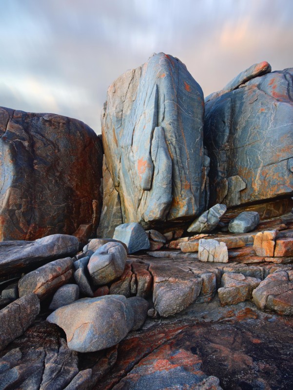
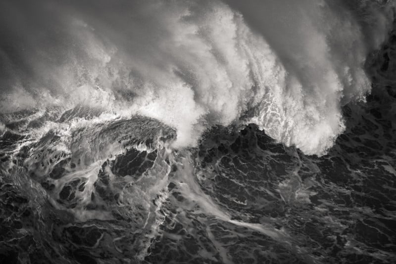
In art terminology, a form is simply an object that appears three-dimensional. Forms show a range of tones and represent their subject matter. A tree looks like a tree, a rock like a rock, and a platypus like a… well.. like a duck mixed with a beaver, but you get the point. They look what they are and what we expect them to be. Forms are what we most often see when we are looking at traditional landscape photographs.
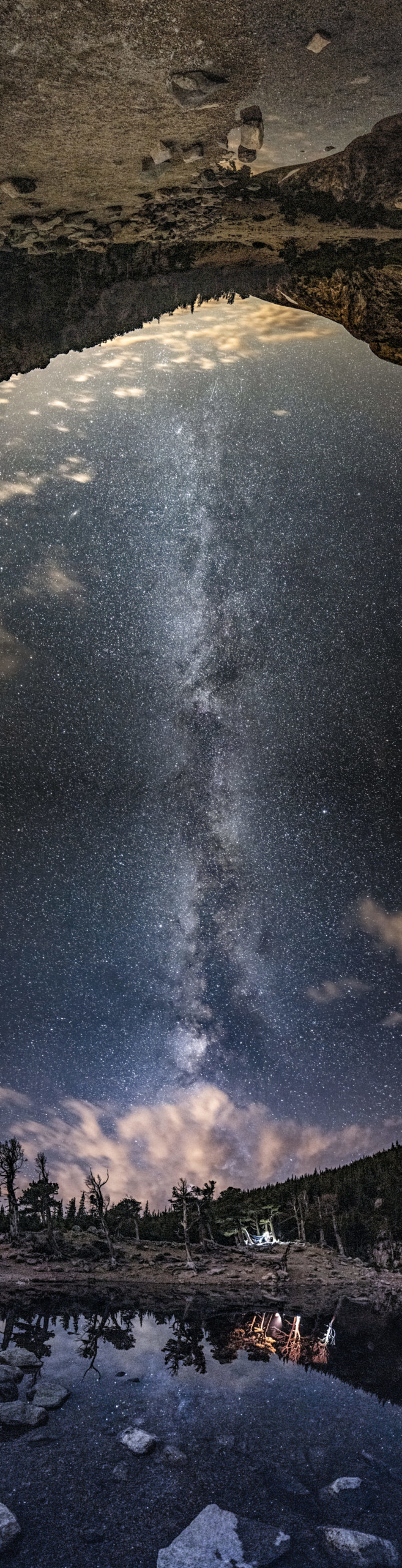
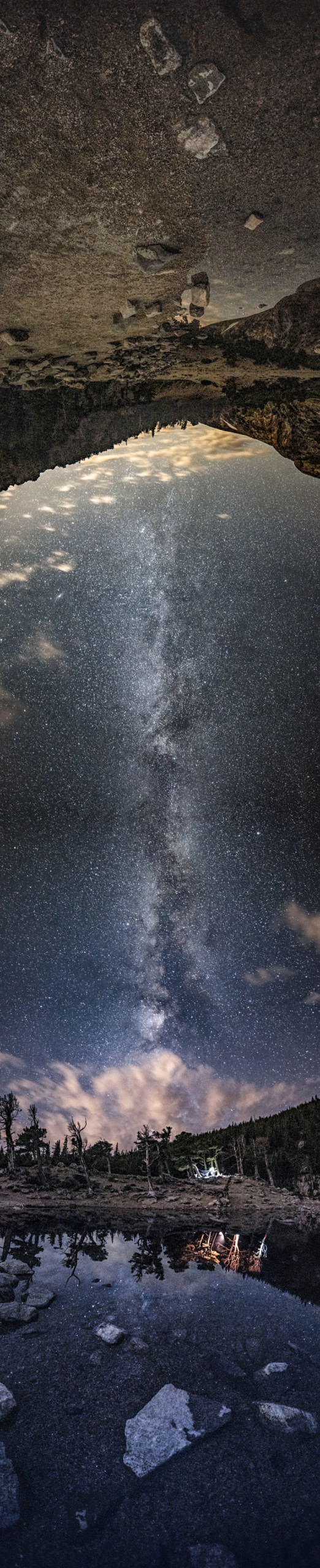
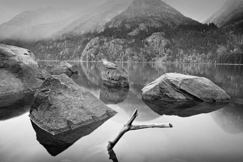 The boulders, branches, and mountains in this scene all show three-dimensional characteristics; thus, would be considered artistic forms. | 24mm, f/8 @ 30 seconds, ISO100
Forms are easily recognized so people have little trouble in understanding what they are looking at. That accessibility brings the viewer into the scene, evoking feelings of inclusion, appreciation, and comfort.
Forms can be categorized as either geometric or organic. Geometric forms have regular, precise, structured outlines and often appear, even if natural, as being manmade. They include buildings, roads, telephone poles or automobiles. Naturally occurring objects such as crystals or basalt formations, with their straight edges and sharp angles, can also be considered geometric.
rganic forms such as a leaf, mountain range or meandering stream have irregular or wavy outlines and often appear to be from the natural world. As their outline is less mathematical than a geometric form, they have a softer, more relaxing presence in the photograph.
Shapes
Shapes are similar to forms but appear as two-dimensional and have little interior detail. For example, if a sphere were considered a form, then a simple, white circle would be considered a shape.
As with forms, shapes can be categorized as either geometric or organic. Due their precise structure, geometric shapes can be quite abstract and powerful. Organic shapes, because their outlines are more free form and less formulaic, are often less abstract but can still be a powerful compositional element, especially if juxtaposed against their geometric kin.
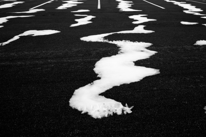 The organic shapes of the blown snow contrast with the decidedly geometric shapes of the parking lot lines. | 24mm, f/13 @ 1/60, ISO100
Of course, as with all things artistic, there is often no clear defining line between shapes and forms. Some elements, such as a smooth, dark tree trunk, might exhibit characteristics of both form and shape. The categorization, however, is not important. What is important is that we recognize the qualities of objects in our frame and what they add to or take away from our composition. Only then can we make smart and informed creative decisions while photographing and processing (printing).
Juxtaposing the accessibility of forms against the abstractness of shapes leads to unique and compelling compositions which will be sure to hold the viewer’s attention.
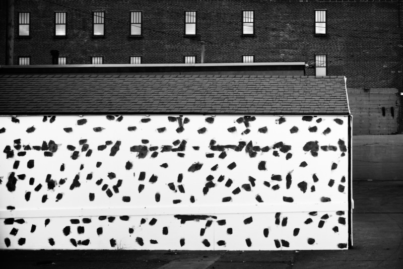 The uniformly spaced, rectangular windows against a dark background play against the haphazard brush marks on a bright white wall. | 45mm, f/8 @ 1/30, ISO100
Lines
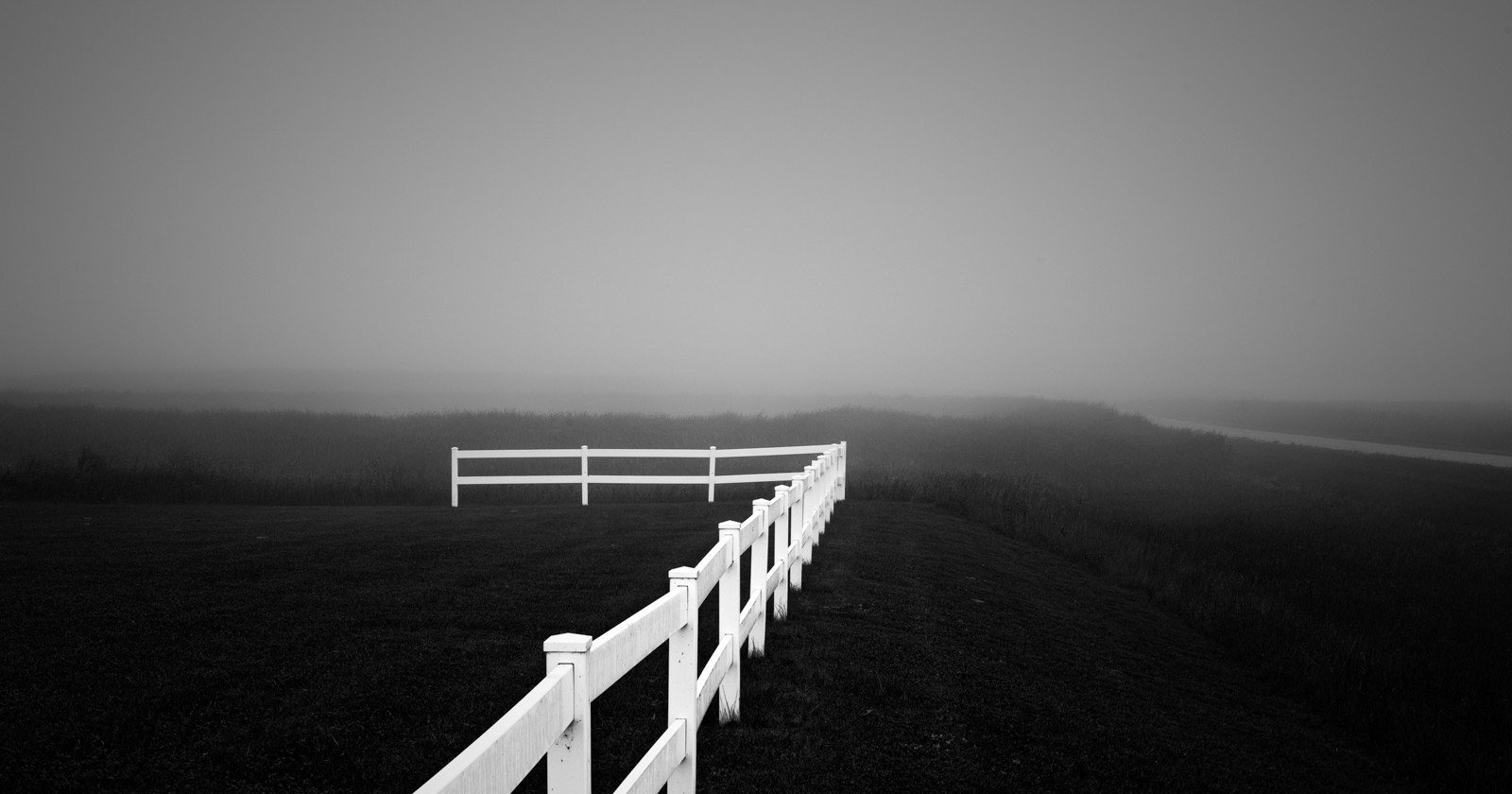
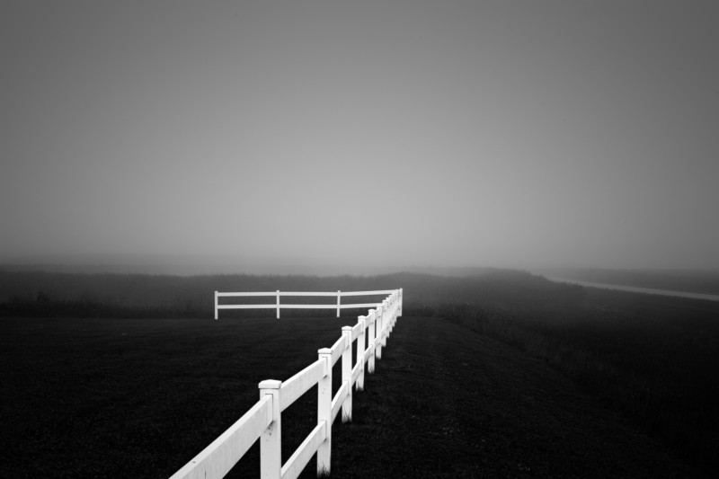
When we think of lines, we often think of leading lines – roads, sunrays, fences, etc. – which orient us towards, and thus draw attention to, our main subject. But lines are much more. They are one of the most common elements in our compositions. Lines exist as individual objects which are often very strong and stark compositional elements, but also create the outlines and interiors of objects in our photograph and in this regard are often overlooked.
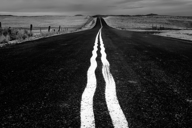 By getting a low angle, these wavy street lines become a strong focal point in an otherwise unremarkable scene. | 45mm, f/8 @ 1/60, ISO100
 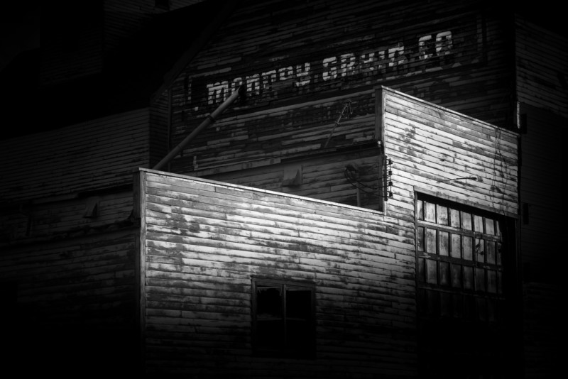 This old grain elevator is, due to heavy post-processing, reduced almost entirely to a study of lines. | 85mm, f/5.6 @ 1/125, ISO100
Lines can be as straight as an arrow or curved like a bow. They can wind lazily, be sharply angular or even form a circle. Their orientation is important. Lines which are parallel or level with the frame appear static and dull, but lines which are angled up at to the right often appear dynamic and energetic (at least in Western cultures whose text reads from left to right).
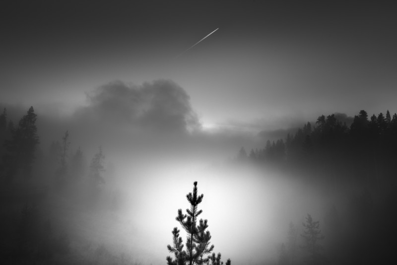 The distant trees form lines which direct the viewer’s eye to the foreground evergreen which, in turn, points the eye towards the dynamic line at the top of the frame. | 24mm, f/11 @ 1/45, ISO100
Texture
Although not a stand-alone element like form, shape or line, texture plays a critical role in defining the visual characteristics of an object’s surface. Smooth objects such a birch tree or a patch of white snow on a cloudy day will show little texture, whereas rougher surfaces such as the trunk of an oak tree or a bale of hay may show rich texture.
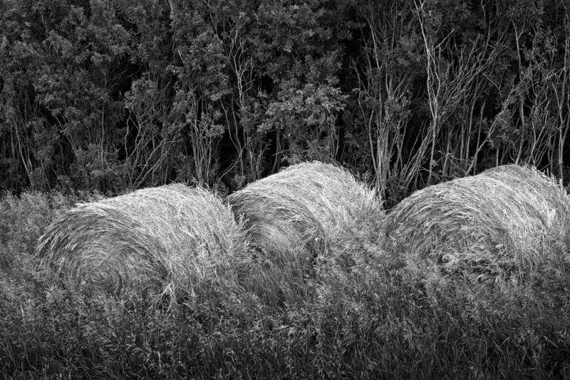 The rough texture of these hay bales integrates with the rough textures of both the foreground grasses and the background saplings. | 50mm, f/11 @ 1 second, ISO100
Textures can also be manipulated by technique. A body of water on a windy day, photographed with a fast shutter speed, will emphasize details of the water’s surface (texture). That same body of water, photographed with a shutter speed measured in many seconds, appears smooth and silky. Either is a valid creative decision.
Texture is necessary to help define a form’s structure, and to give it a three-dimensional look. Without texture, objects appear flat, metallic, plastic or even glassy. That is why the heavily edited, overly smoothed faces of social media influencers look so phony to our eyes.
The visual impact of texture is highly dependent upon lighting and post-processing. It is essential to defining form so it is not something we can ignore. As with everything else in our frame, we need to be aware of the way it affects our composition. Too much texture may well be distracting. Go easy on that structure slider in Lightroom; likewise, too little may look odd.
Each of these four elements plays a critical role in black and white photography and is what the medium does best. It is our responsibility, as creative photographers, to not only recognize their presence and power, but to compose these various elements into a cohesive and compelling photograph.
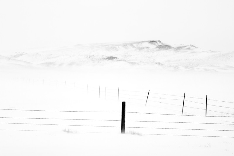 The foreground lines and shapes direct the viewer’s eye to the start of the soft-textured, distant hills. | 120mm, f/11 @ 1/250, ISO100
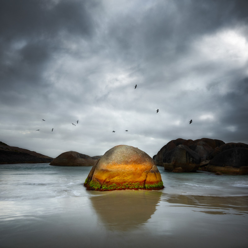
P.S. -- There are some scenes – no matter how compelling the shapes, forms, textures or lines – in which color is important and so defining that the image fails without it. In that case, no matter the skill or talent of the dedicated black and white photographer, the fight was over before it even began. So if we can’t beat the color photographers we will, at least in these cases, join them.
 The garish and contrasting colors of this room are vital to the identity of this image. If we remove these colors, this image is destined to fail. | 24mm, f/8 @ 1/6, ISO100
**The article is courtesy ofELEMENTS Magazine. **ELEMENTS is the new monthly magazine dedicated to the finest landscape photography, insightful editorials, and fluid, clean design. Inside you will find exclusive and in-depth articles and imagery by the best landscape photographers in the world such as Freeman Patterson, Bruce Barnbaum, Rachael Talibart, Charles Cramer, Hans Strand, Erin Babnik, and Tony Hewitt, to name a few. Use the PETAPIXEL10 code for a 10% discount off the annual subscription.
_About the author: Chuck Kimmerle is a U.S.-based, fine art landscape photographer who prefers to work in the reticent and quiet areas located in between the popular, overcrowded, and over photographed, destinations of grand beauty. While his style is rooted within the foundations of traditional landscape photography, his observations and interactions are both contemporary and introspective.
If you feel a connection to Chuck's work, please consider supporting him by purchasing one of his exquisitely crafted prints, or by simply sending a note of appreciation. _


#editorial #educational #blackandwhite #chuckkimmerle #elements #elementsmagazine #fineart #fineartlandscapephotography #fineartphotography #landscapephotography #techniques


 Architecture - Photo by Albrecht Voss
  Art - Photo by Gavin Goodman
  Beauty Fashion - Photo by Ramon Vaquero
 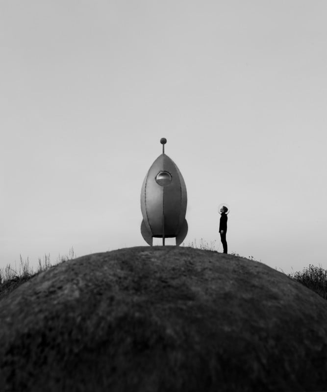 Heritage - Photo by Marcus Bitsch
 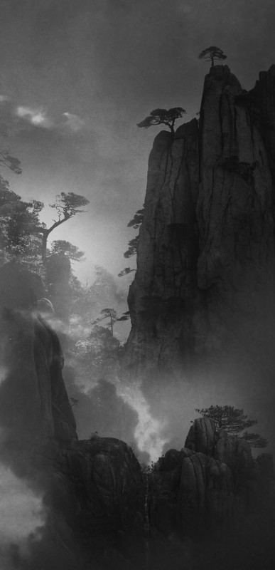 Landscape/Nature - Photo by Honghua Shi
 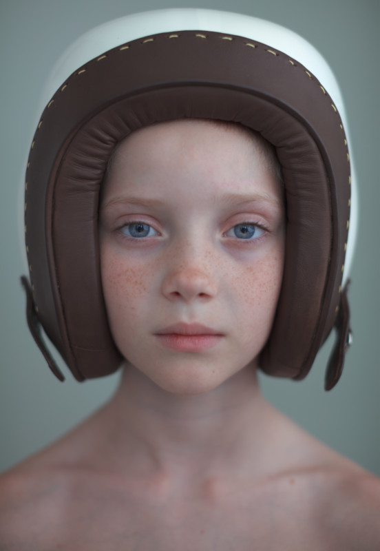 Portrait - Photo by Marek Würfl
  Product - Photo by Paul Fuentes
  Project 21 - Photo by Yihao Wang
 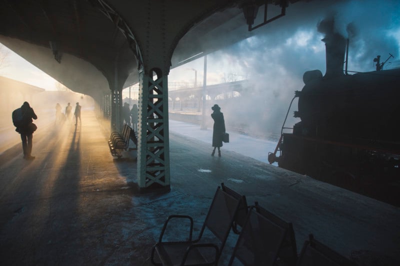 Street Urban - Photo by Nikolay_Schegolev
 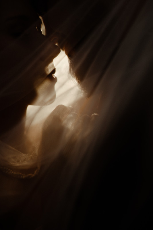 Wedding - Photo by Matthäus Machner
 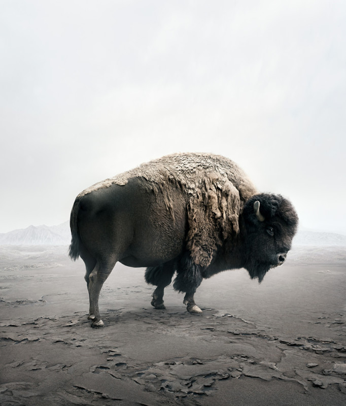 Wildlife - Photo by Alice Zilberberg