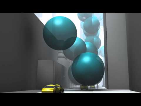

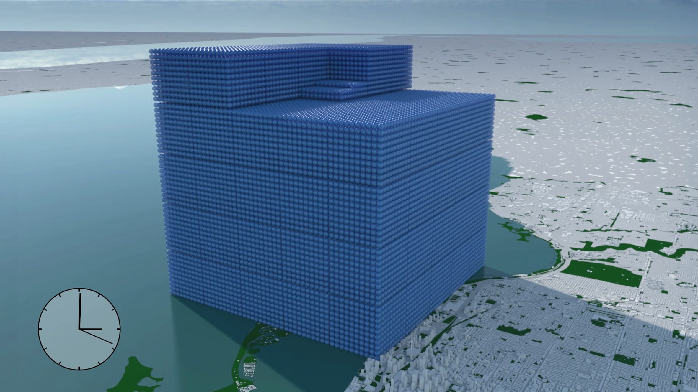
A 2012 animation showing New York City being buried under a mountain of giant bubbles allowed people to appreciate the scale of carbon emissions for the first time, according to its creators Real World Visuals.
Released in 2012, the computer-generated timelapse shows the city being buried under a mountain of bubbles representing the city's 54 million tonnes of annual CO2 emissions.
"Carbon emissions are invisible and that's a core part of the problem," said Real World Visuals co-founder Antony Turner. "If carbon dioxide was purple, we would start taking notice."
Making abstract concept of emissions more understandable
In the video, the communications agency depicted the city's annual emissions as 54 million bubbles, each ten metres in diameter, which gradually subsume the city.
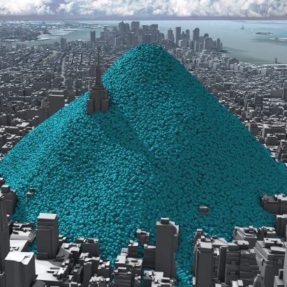
Nine years later, the iconic image of the blue mountain towering above the Empire State Building remains one of the highest-ranking climate change images on the internet.
Despite the fact that the three-minute video features almost no audio, it has been viewed almost half a million times on YouTube and was picked up by outlets including the Guardian and Scientific American.
The simple animation helps to make the abstract concept of carbon dioxide equivalent (CO2e) emissions more understandable to the general public.
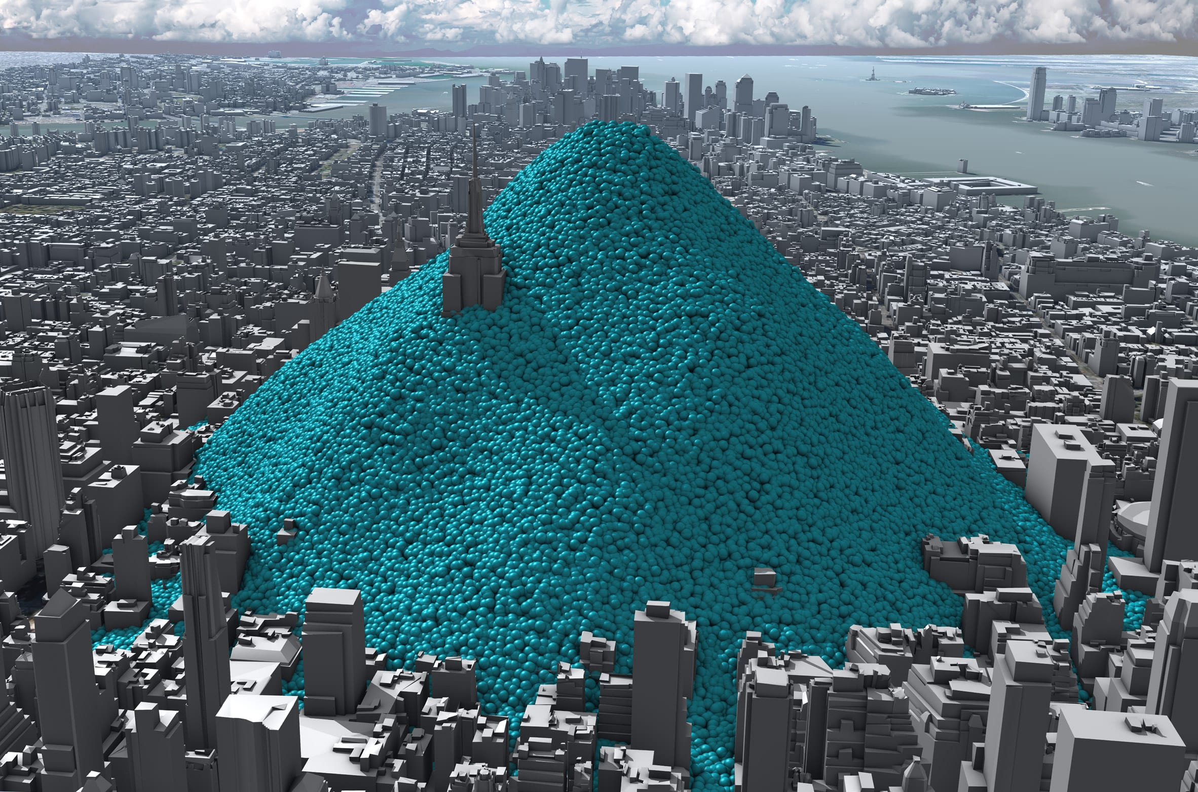 The animation shows New York being buried under a mountain of blue bubbles representing its carbon emissions
"Part of the problem is that some people are very cut off from quantitative information," said the agency's creative director Adam Nieman.
"You put numbers and graphs in front of people and they bounce straight off."
This is compounded when it comes to the issue of atmospheric carbon, he argues, which is "a problem with an invisible cause".
"Our [aim] is to make the cause of climate change visible because very few other people are approaching it like that," Nieman added.
Viewers can relate to spheres on a physical level
Based in England, Real World Visuals was originally founded in 2009 under the name Carbon Visuals with the aim of visualising imperceptible environmental challenges such as emissions, air pollution and ozone depletion.
The New York City emissions animation, which the agency created for the Environmental Defense Fund, is its most successful project to date.
Since it was published, the city of New York has managed to decrease its carbon emissions slightly to 50.7 million tonnes of CO2e in 2017 and committed to becoming carbon neutral by 2050.
 Real World Visuals has also used the blue spheres to represent the rate of global emissions for the 2018 G7 Summit
Meanwhile, Real World Visuals has used the same blue spheres to show the carbon footprint of entire countries from Ireland to the United States, as well as visualising the rate of all global emissions – 112 million tonnes of CO2e a day – for the G7 summit in 2018.
The agency has also been using the spheres to demonstrate how much carbon can be captured and stored in timber building elements or aquatic "blue carbon" sinks such as salt marshes and peatlands.
"We've been doing this for a long time so we've thought through all of the different ways you can show quantities of carbon dioxide gas," said Nieman.
"And the nice thing about spheres is you can relate to the shape," he added. "Because you can relate to it on a physical, visceral level, people were responding to it."
Showing emissions in real-time
Real World Visuals calculated that each tonne of CO2 would fill a sphere with a diameter of 10 metres.
New York City emissions amounted to two of these bubbles every second in 2010, which is the year the animation's data is based on.
The video initially shows these spheres ballooning up in real-time, before visualising the emissions that are generated after an hour, a day and ultimately a year when a panoramic view from the Statue of Liberty shows the city's skyline buried underneath a mountain of the blue balls.
"A really powerful way to turn an abstract number like 54 million tonnes a year into something that people can relate to is to show it in real-time," Neiman explained.
"A day is a period of time that we can imagine and feel like we inhabit. A year is an accountancy term but it's not something we can relate to that well."
Using a mountain of smaller spheres rather than one large sphere to represent the emissions helps to give viewers a more accurate sense of scale, Neiman said.
"As human beings, we're quite good at estimating discrete quantities but we're really bad at comparing volumes," he said."If you put two spheres with twice the volume next to each other, people will think that they're pretty much the same."
Prompting rather than answering questions
Contrary to most data visualisations, which Neiman says provide answers to specific questions, Real World Visuals hopes to provoke questions instead.
This is achieved by stripping back any evaluations of the data and letting the visuals speak for themselves. The New York animation, for example, is presented without any context about climate change.
"People responded by saying 'this is rubbish because climate change isn't real', which is an interesting response because we didn't mention climate change at all," Neiman explained.
"We just said: this is the carbon dioxide that is entering the atmosphere as a result of human activity in New York City. We didn't say this is a lot, we didn't say it's good or bad. And that provoked lots of discussions."
Carbon revolution
This article is part of Dezeen'scarbon revolution series, which explores how this miracle material could be removed from the atmosphere and put to use on earth. Read all the content at: www.dezeen.com/carbon.
The sky photograph used in the carbon revolution graphic is byTaylor van Riper via Unsplash.
The post Blue bubbles helped "make the cause of climate change visible" say visualisers behind viral video appeared first on Dezeen.
#carbonrevolution #interviews #graphics #all #design #videos #graphicdesign #animations #designvideos #climatechange #datavisualisations


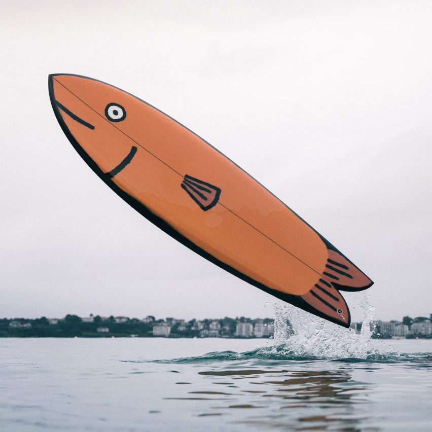
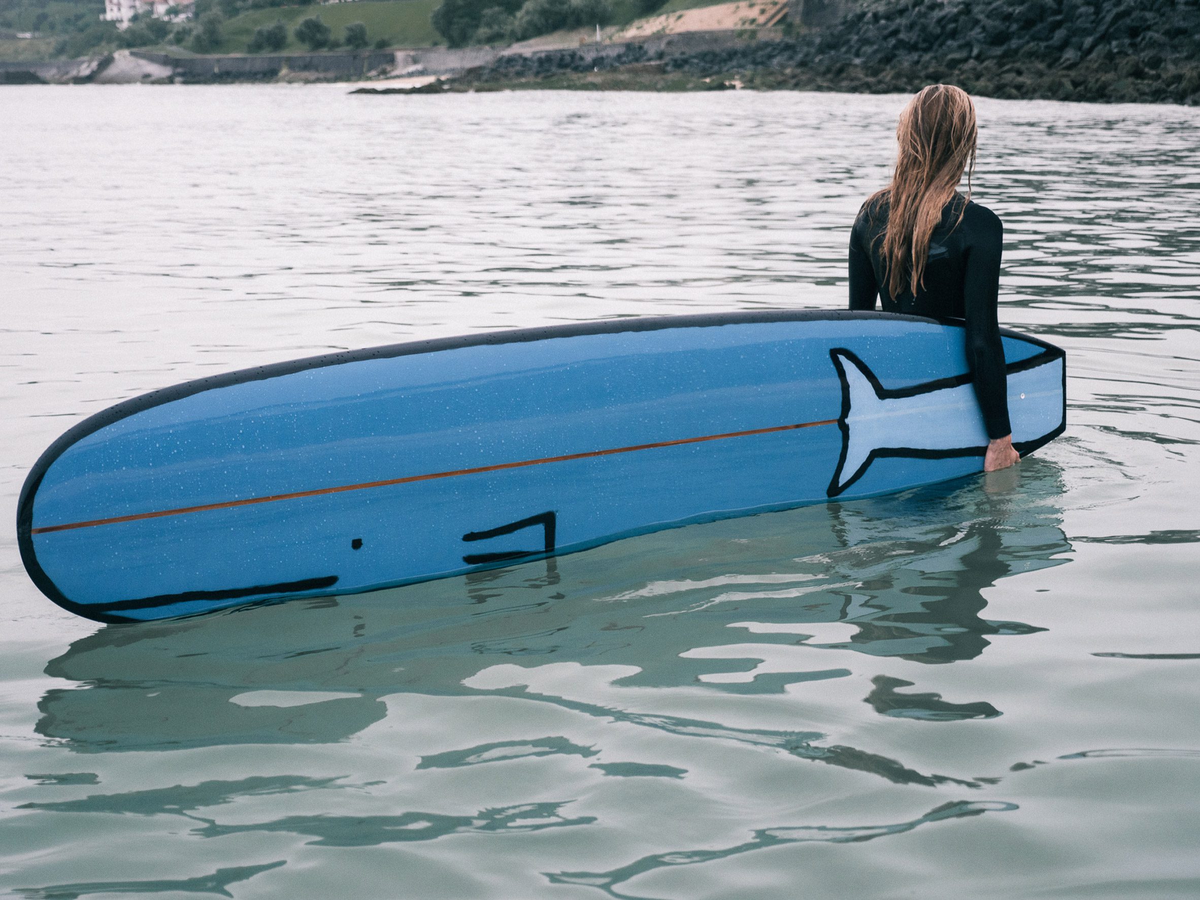 Jullien's surfboards are painted like sea animals
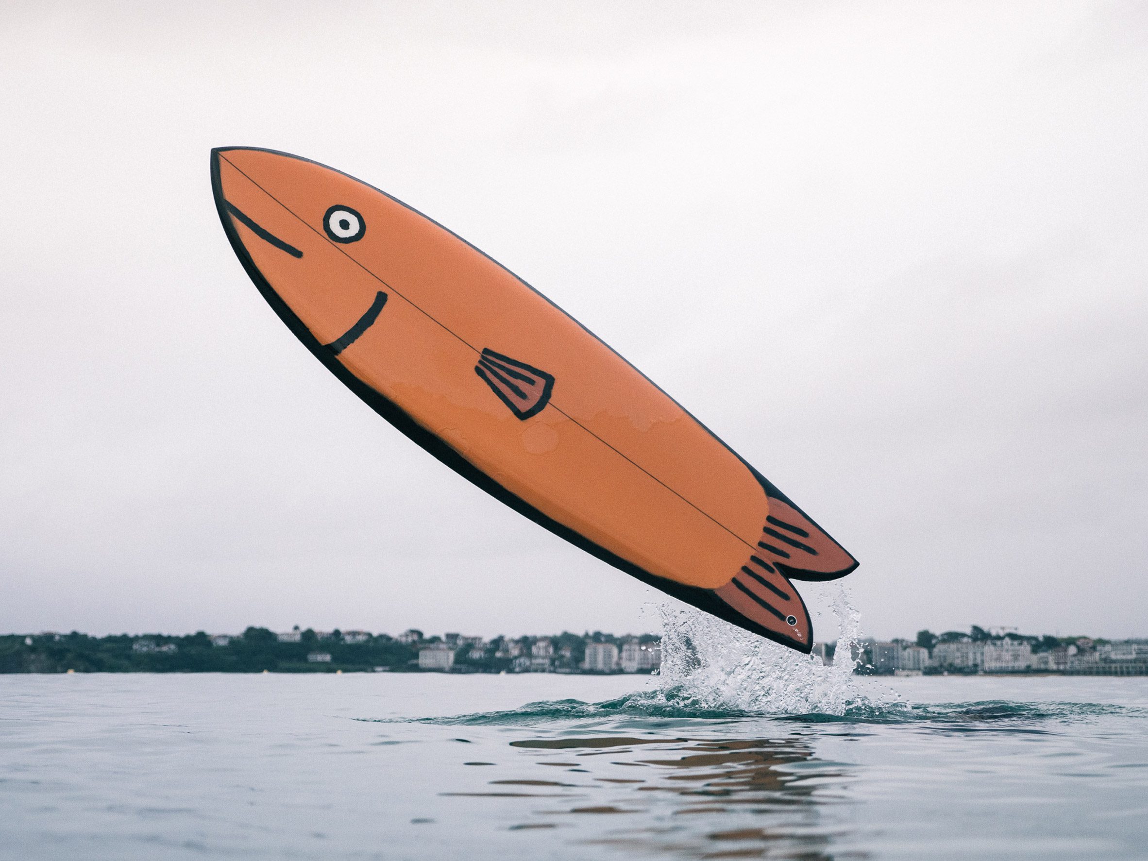 One painted board is a fish surfboard design
 An illustration of a smiley seal
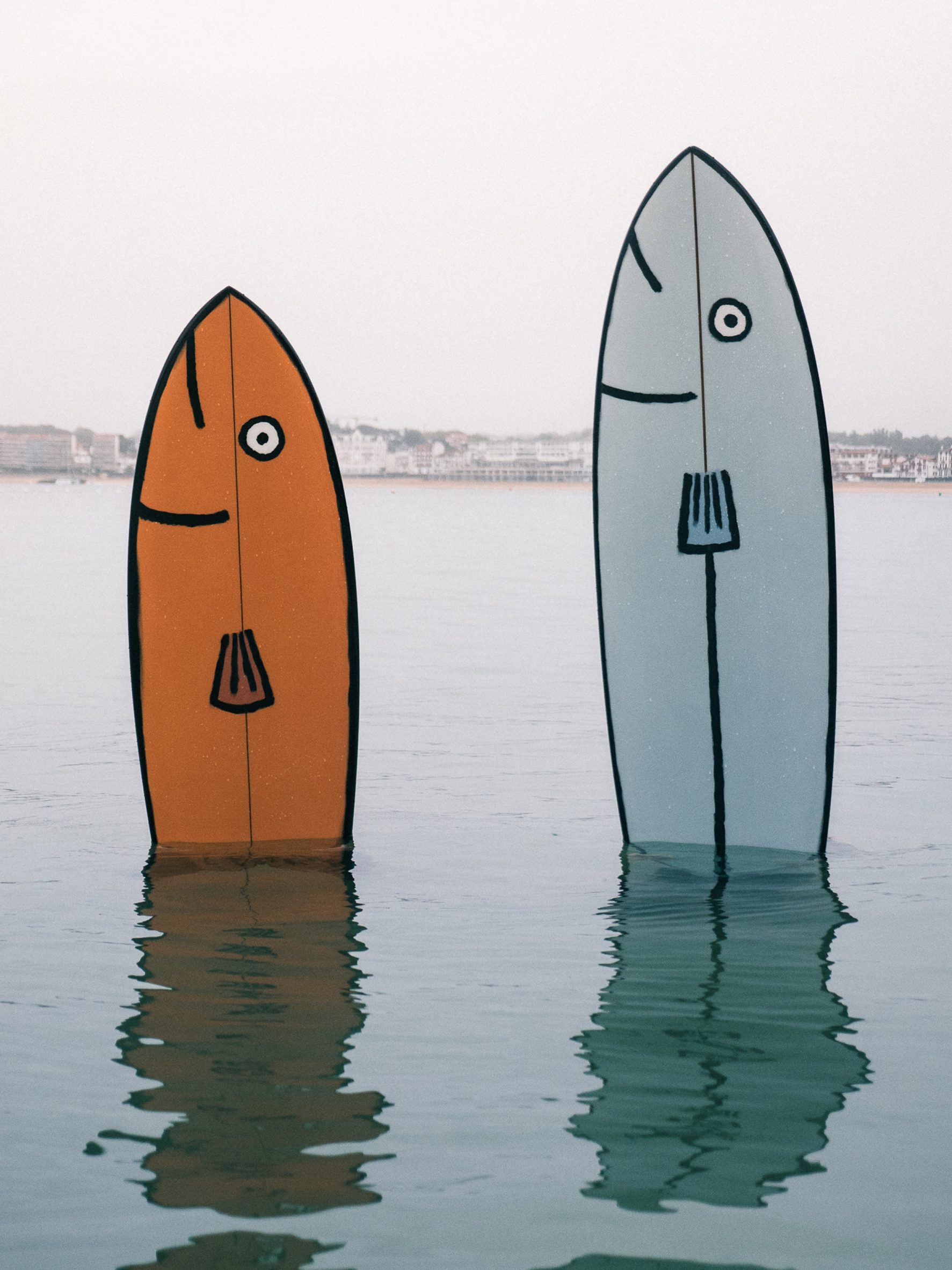 Jullien likened the experience of painting to surfing