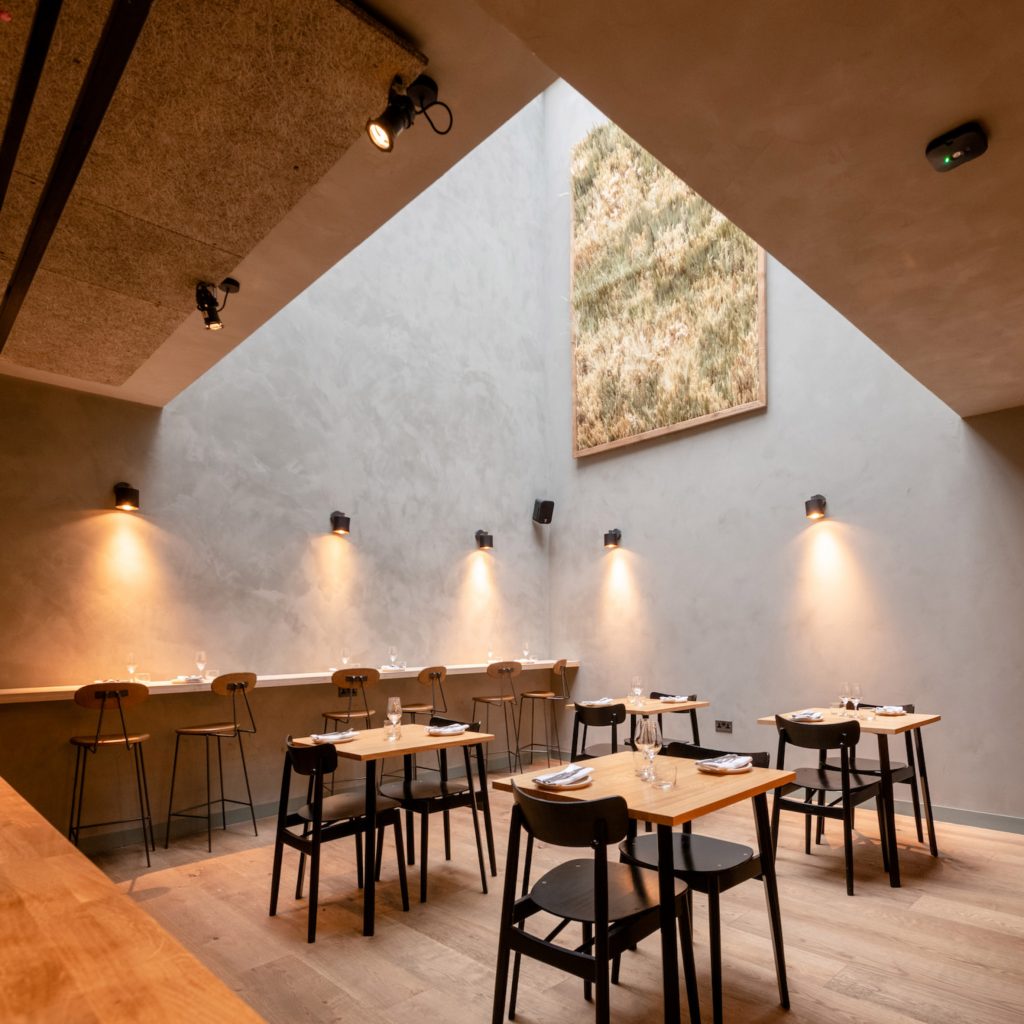
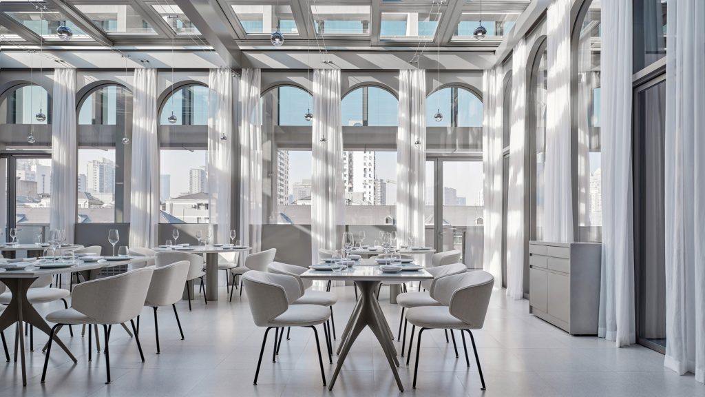
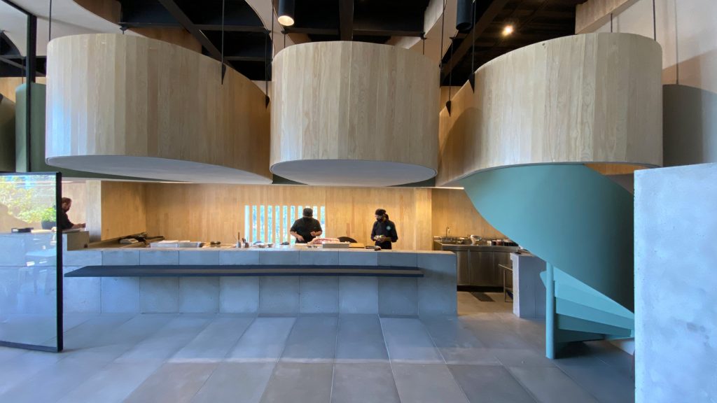
#restaurants
Die #Essensretter – weniger #Foodwaste in der #Großküche
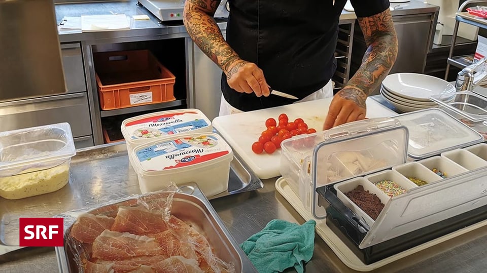
Fast drei Millionen Tonnen vermeidbare #Lebensmittelabfälle verursacht die #Schweiz pro Jahr. Rund ein Zehntel der #Lebensmittelverschwendung fällt gemäss Verband Gastrosuisse in der #Gastronomie an – in #Restaurants, Hotels, Spitälern, Heimen oder Autobahnraststätten.
Der Verein «United Against Waste» hilft Gastrobetrieben in einem rund zweijährigen Programm, ihre essbaren #Abfälle zu reduzieren.

Baldeneysee / Lake Baldeney
Essen, Juni 2010
#Ruhrstausee #Stausee #Ruhrverband #Architektur #Gaststätten #Essen #Ruhrgebiet #Baldeneysee #foto #photo #fotografie #photography
#architecture #buildings #restaurants
Gastgewerbe im Dilemma: Touristenboom bei Fachkräftemangel | DW | 14.04.2022
Die Reiselust der Deutschen ist nach zwei Jahren Pandemie größer als je zuvor. Die Osterreisewelle rollt, Hoteliers und Gastronomen frohlocken. Aber es fehlen die Fachkräfte, um den Ansturm zu bändigen.#Tourismus #Hotels #Gaststätten #Restaurants #Arbeitskräftemangel #DEHOGA #IngridHartges
Gastgewerbe im Dilemma: Touristenboom bei Fachkräftemangel | DW | 14.04.2022
Wie in Kiew langsam wieder Leben einkehrt | DW | 06.04.2022
In Kiews Straßen sind wieder mehr Menschen und Autos zu sehen. Die Regale der Supermärkte füllen sich, Friseure, Cafés und Restaurants öffnen wieder. Ein Stimmungsbild aus der ukrainischen Hauptstadt.#Ukraine #Russland #Krieg #Kiew #Hauptstadt #Autos #Staus #Supermärkte #Lebensmittel #Restaurants #Friseure #Soldaten
Wie in Kiew langsam wieder Leben einkehrt | DW | 06.04.2022
Lore Group creates seafood restaurant with "playful sense of nostalgia" within One Hundred Shoreditch hotel

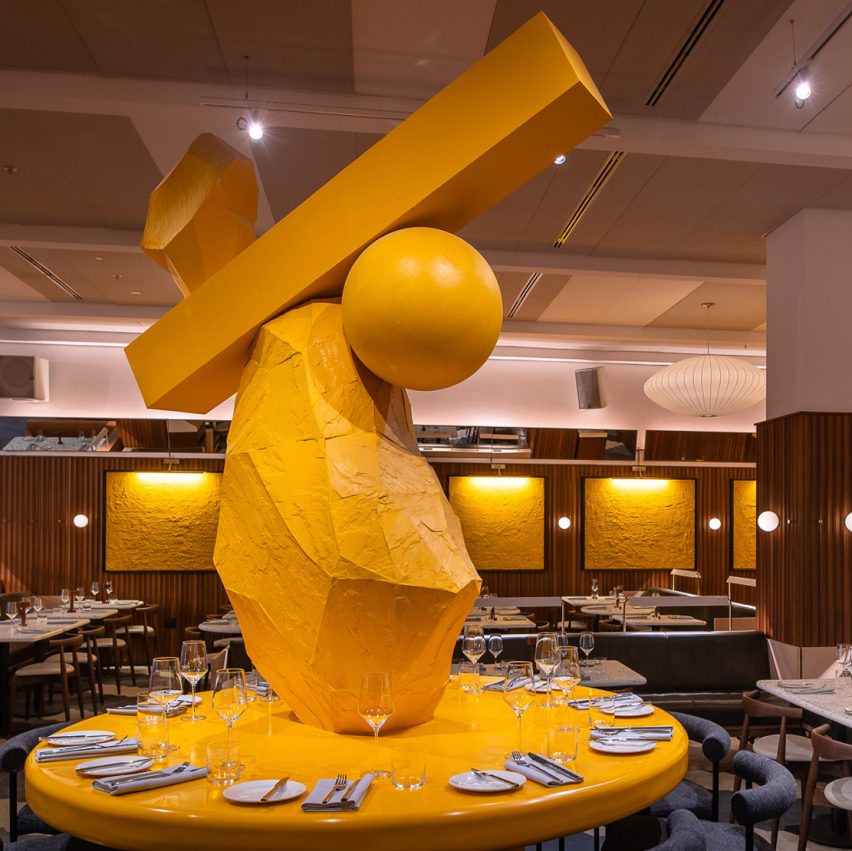
Hospitality chain Lore Group has opened the Goddard & Gibbs seafood restaurant within the One Hundred Shoreditch hotel, which occupies the former Ace Hotel London Shoreditch building.
Lore Group's creative director Jacu Strauss designed the restaurant within the recently opened hotel on Shoreditch High Street, London, to evoke the seaside to be in keeping with its seafood menu.
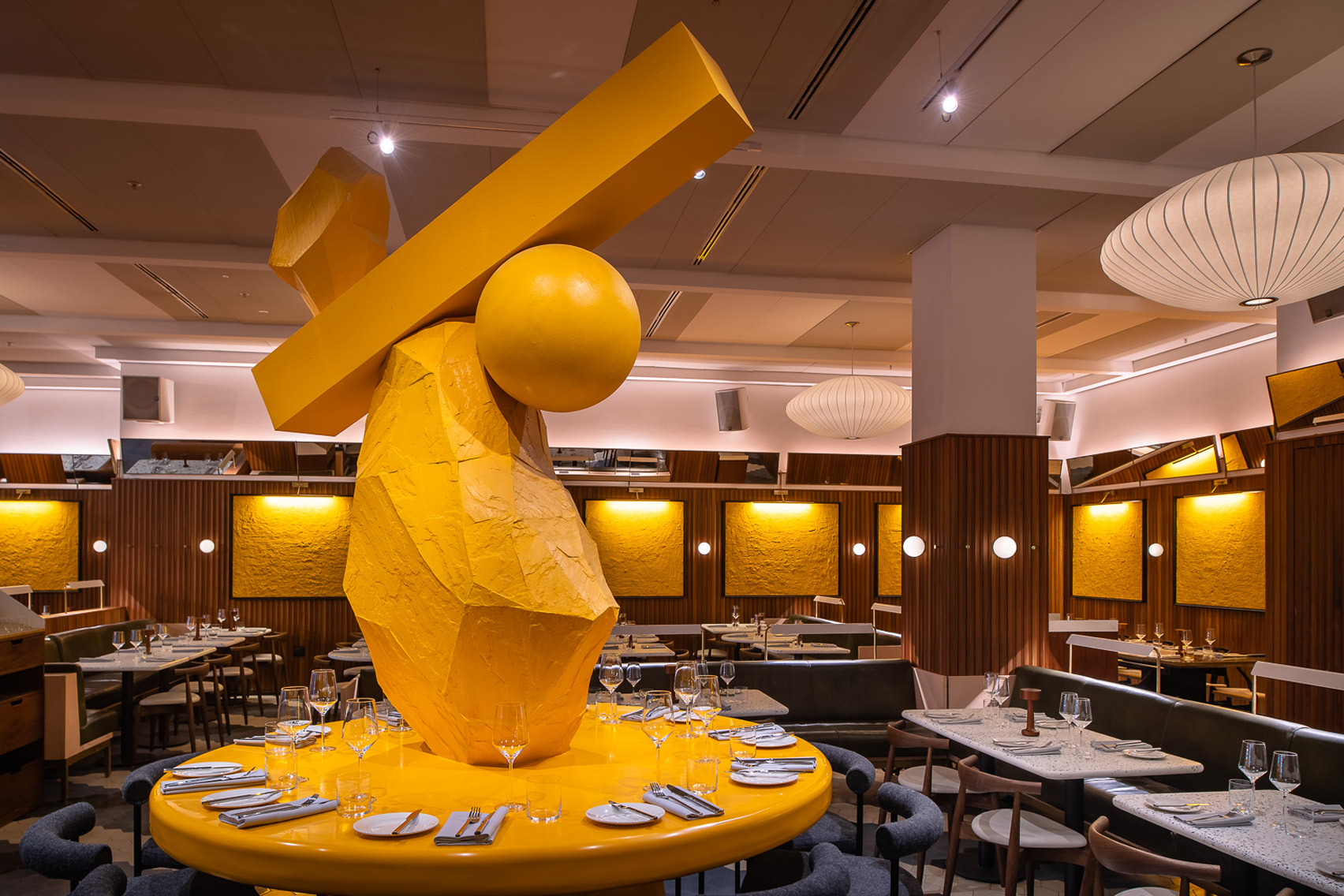 A yellow rock sculpture and sandy artworks give the restaurant a beachy feel
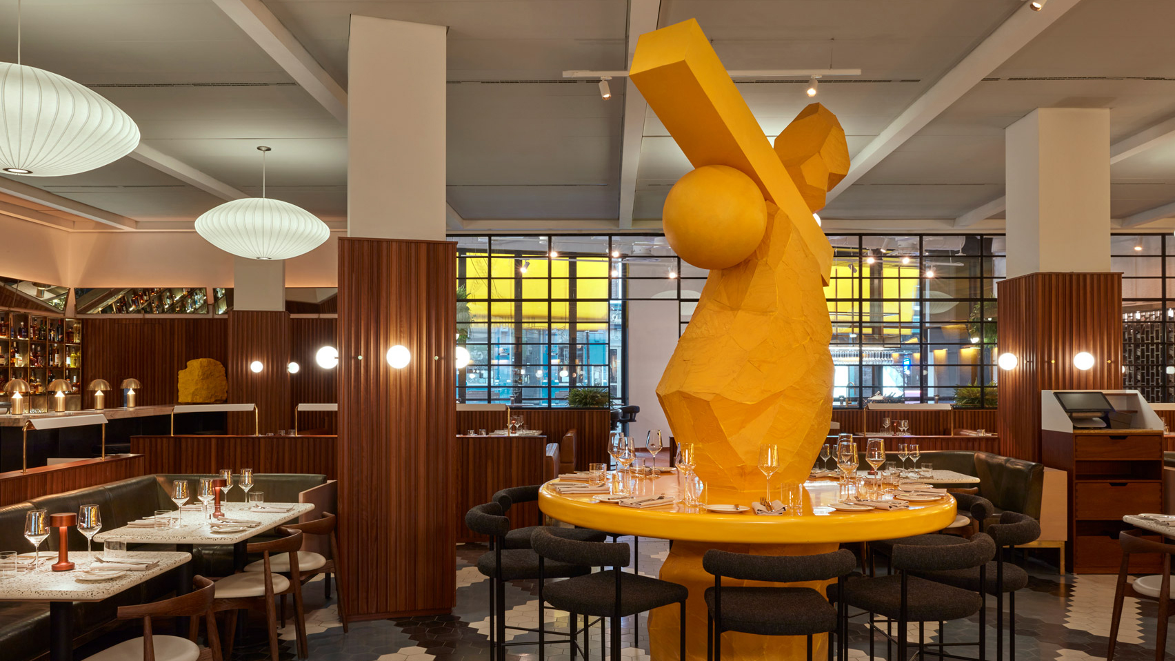
A gigantic yellow sculpture, created from a sketch drawn by Strauss, stands on a table at the centre of the restaurant.
"The sculpture is based on my memories of trips to the seaside as a child and making towers from piles of rocks on the beach," Strauss said.
"I wanted the space to have a playful sense of nostalgia to which our guests could relate."
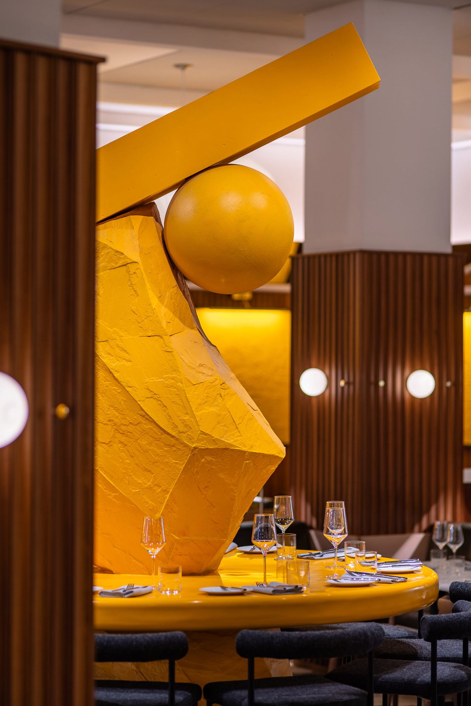 The central sculpture is based on the designer's childhood trips to the seaside
Continuing the theme, wood-panelled walls of the restaurant were adorned with "sandscape" artworks made from sand that have been painted yellow and framed.
Parasol-like pendant lights from Herman Miller hang from the ceiling, alongside pearly spherical bulbs.
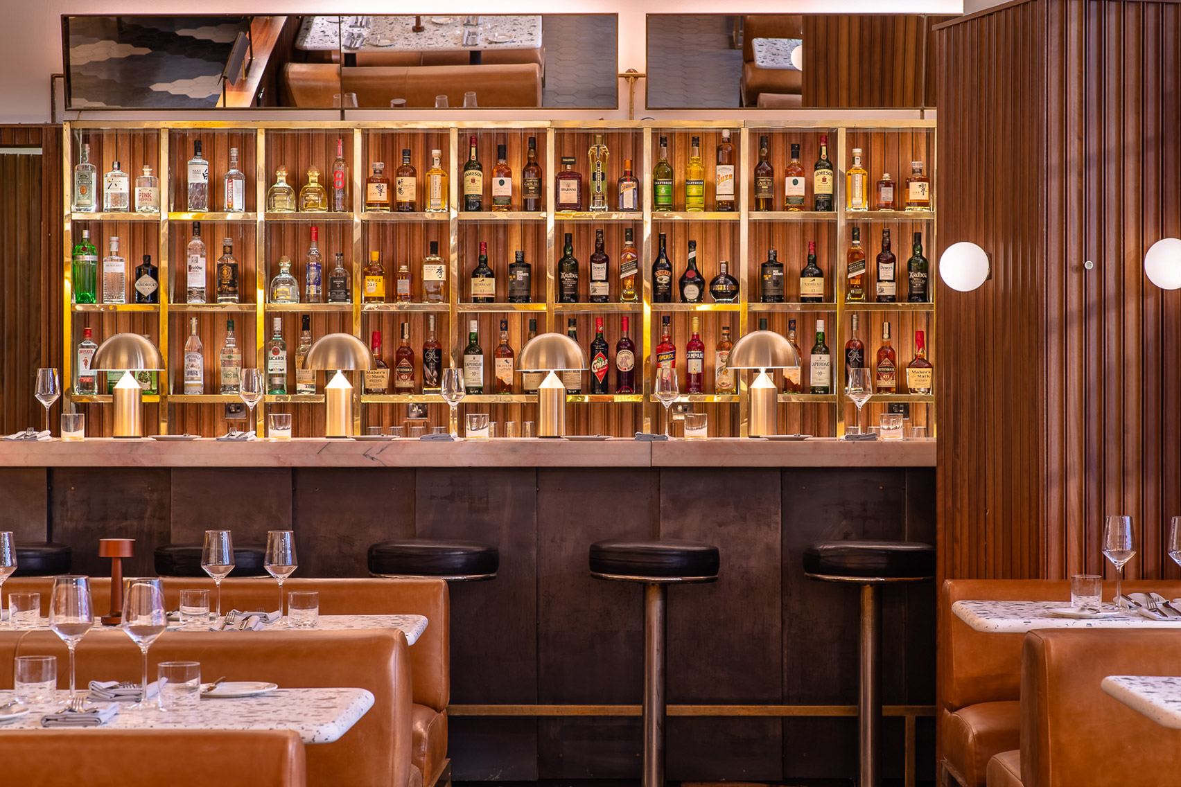 Angled mirrors run the perimeter of the restaurant
Angled mirrors around the top of the wall panelling direct attention back onto the central sculpture.
Another bright yellow boulder is stationed in the corner of the room, while seaweed-green banquettes are interspersed among the seating.
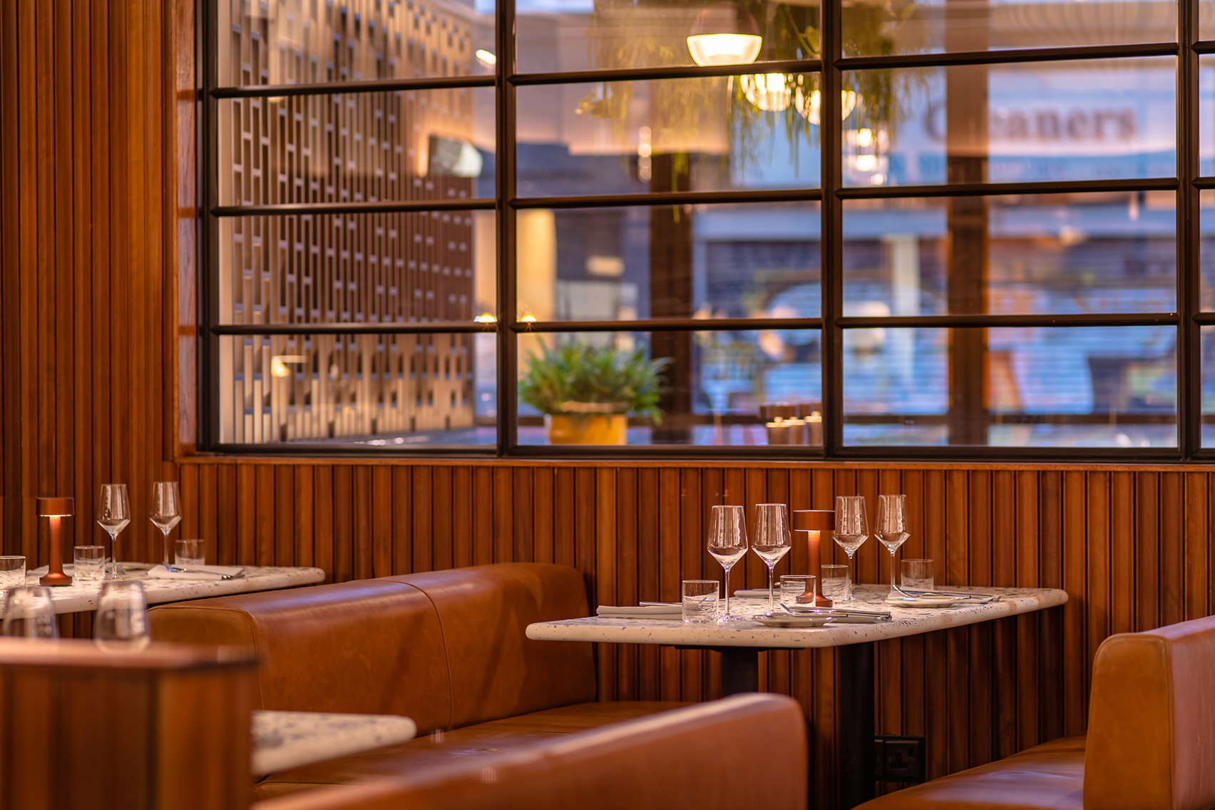 The walls are clad in a strip-textured wood panelling
The tabletops are fashioned from black and white aggregate terrazzo, with hexagonal tiles making up the floor.
At the entrance to the restaurant from the street, what was formerly a flower shop has been converted into a wine bar characterised by terracotta tiles.
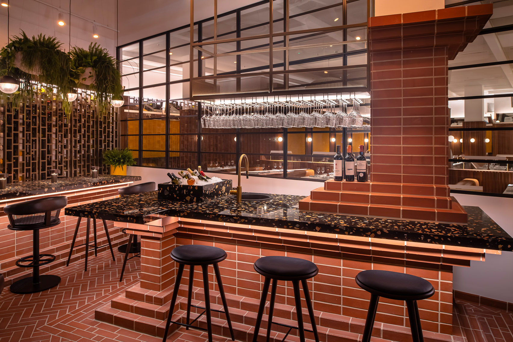 A wine bar area has been set up in the street entrance
The restaurant's dishes are intended to reference the fishing villages and seaside towns of the British coastline, with a focus on ethically sourced ingredients.
Goddard & Gibbs opened last week as part of the One Hundred Shoreditch hotel.
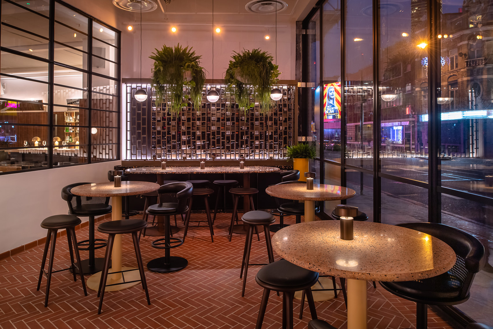 Terrazzo table tops are used throughout the restaurant
One Hundred Shoreditch occupies the same building as Ace Hotel's London outpost, which closed in 2020 having been initially shuttered as a result of the coronavirus pandemic.
Lore Group also operates Sea Containers, a hotel on London's Southbank with interiors designed by Tom Dixon, as well as the Pulitzer in Amsterdam and the Riggs and Lyle hotels, both in Washington DC.
With One Hundred Shoreditch it hopes to mirror Shoreditch's "new, grown-up feel while retaining the buzz and vibrance synonymous with the area".
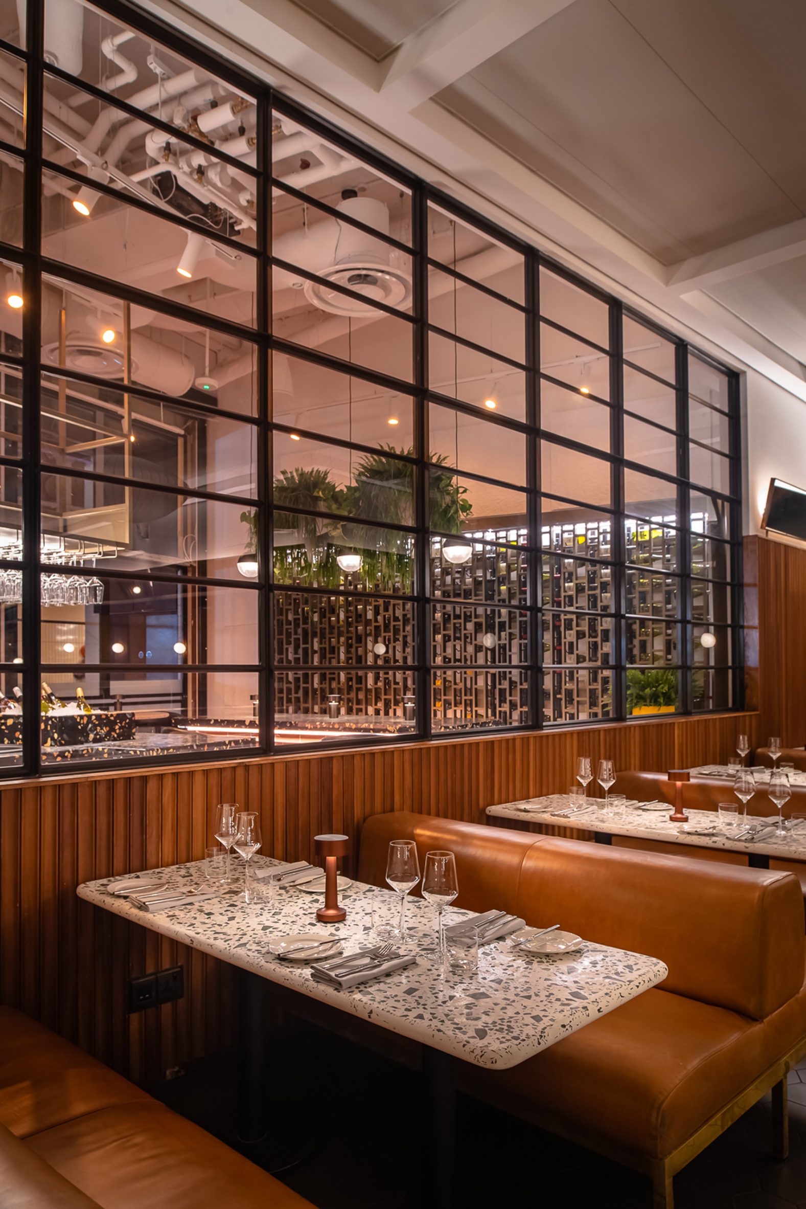 Lore Group has opened the restaurant as part of its new One Hundred Shoreditch hotel
Other recently opened hotels in London include Buckle Street Studios, designed by Grzywinksi+Pons and a Room2 outpost in Chiswick designed by Project Orange, which is claimed to be the world's first whole-life net-zero hotel.
The images are courtesy of One Hundred Shoreditch.
The post Lore Group creates seafood restaurant with "playful sense of nostalgia" within One Hundred Shoreditch hotel appeared first on Dezeen.
#restaurantsandbars #all #interiors #hotels #london #uk #restaurants
Masquespacio puts colourful spin on traditional Italian restaurant concept
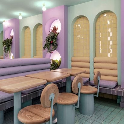

Colourful marble accents and looming arches characterise this restaurant by Spanish studio Masquespacio, which takes cues from traditional Italian eateries.
Called Piada, the restaurant sells Italian flatbreads and is the second of its kind to be designed by Masquespacio in the French city of Lyon.
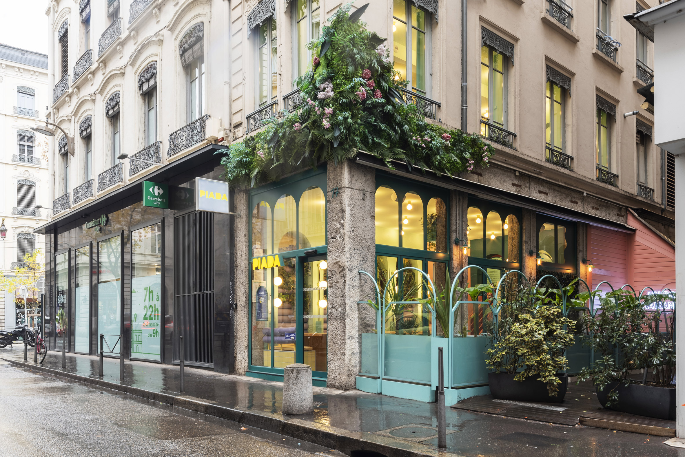 Piada is a restaurant in Lyon
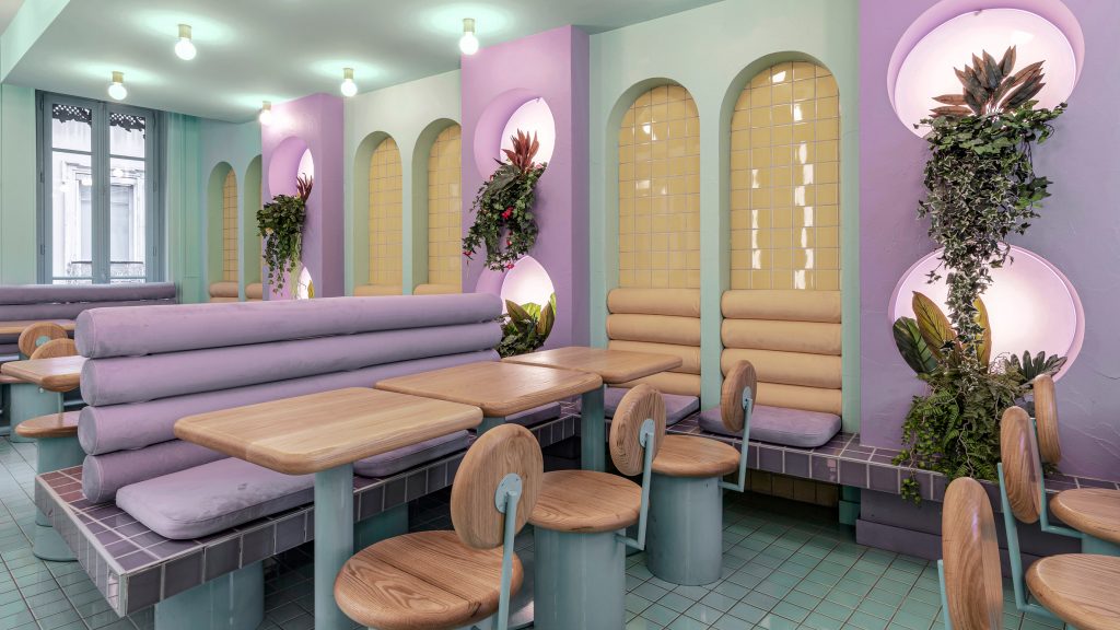
The interiors of the latest Piada blends retro design elements borrowed from traditional Italian restaurants, such as marble and gold finishes, with colours and materials that were chosen to echo the eatery's healthy food menu.
"First, we investigated ancient Italian restaurants and bars to bring the traditional concept into the design," Masquespacio co-founder Christophe Penasse told Dezeen.
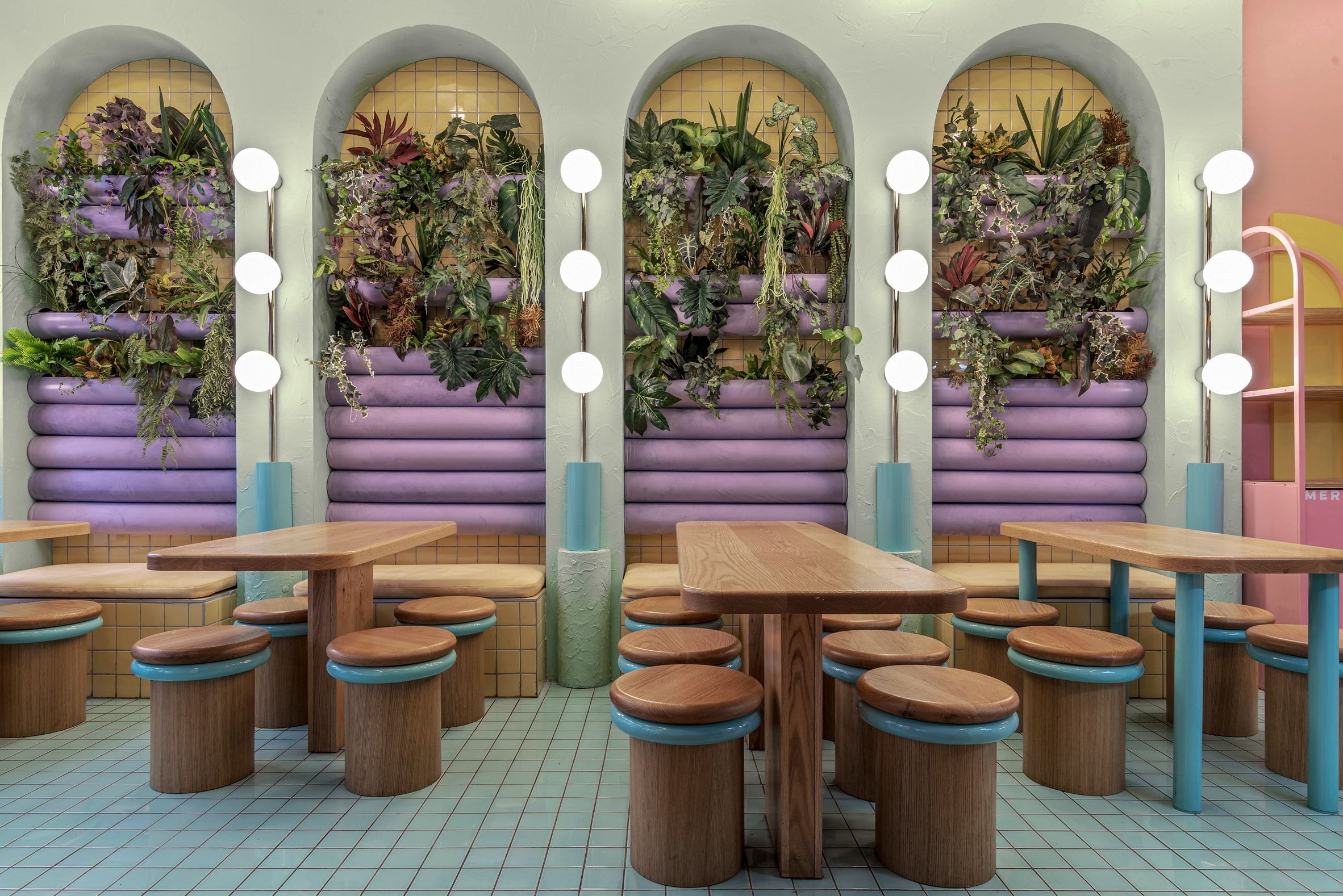 Masquespacio took cues from traditional Italian eateries
"Then, we sought elements that could represent a sort of healthy aspect, which at the same time have a splashy and young colour concept that represents the brand's identity," he added.
A garland of lush plants and flowers is suspended above the entrance to the two-storey restaurant, under which floor-to-ceiling arched windows were designed to draw visitors in from the street.
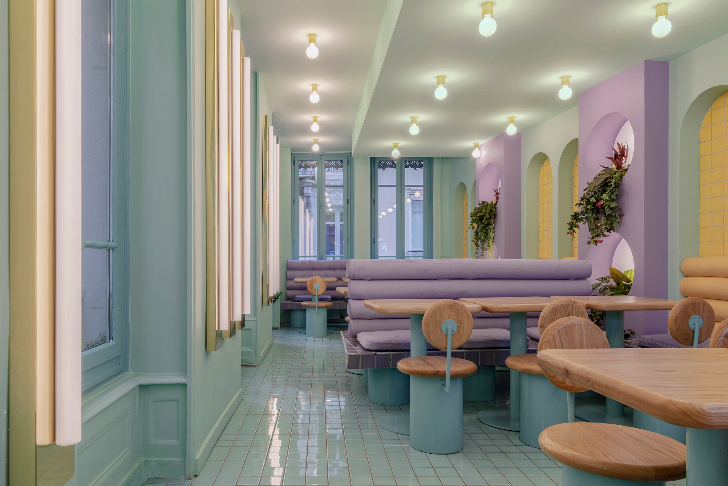 Bold blocks of colour define the space
Inside, guests are met with a collection of booth-like tables that offer a mixture of built-in seating, including banquette benches and rounded wooden stools.
This area is defined by a bold palette of sugary pastel colours, ranging from pale lilac seat cushions to mint-green walls.
[ 
Read:
Stucco walls and terracotta tiles form a winding pathway through Huesca restaurant
Piada's external arch motif is also continued in its interiors, where curved alcoves have been outlined with columns of bulbous sconce lights that resemble oversized Hollywood-style mirrors.
"We used five elements to represent the traditional Italian bar and restaurant – arches, light bulbs with gold finishes, marble and mirrored menus," explained Penasse.
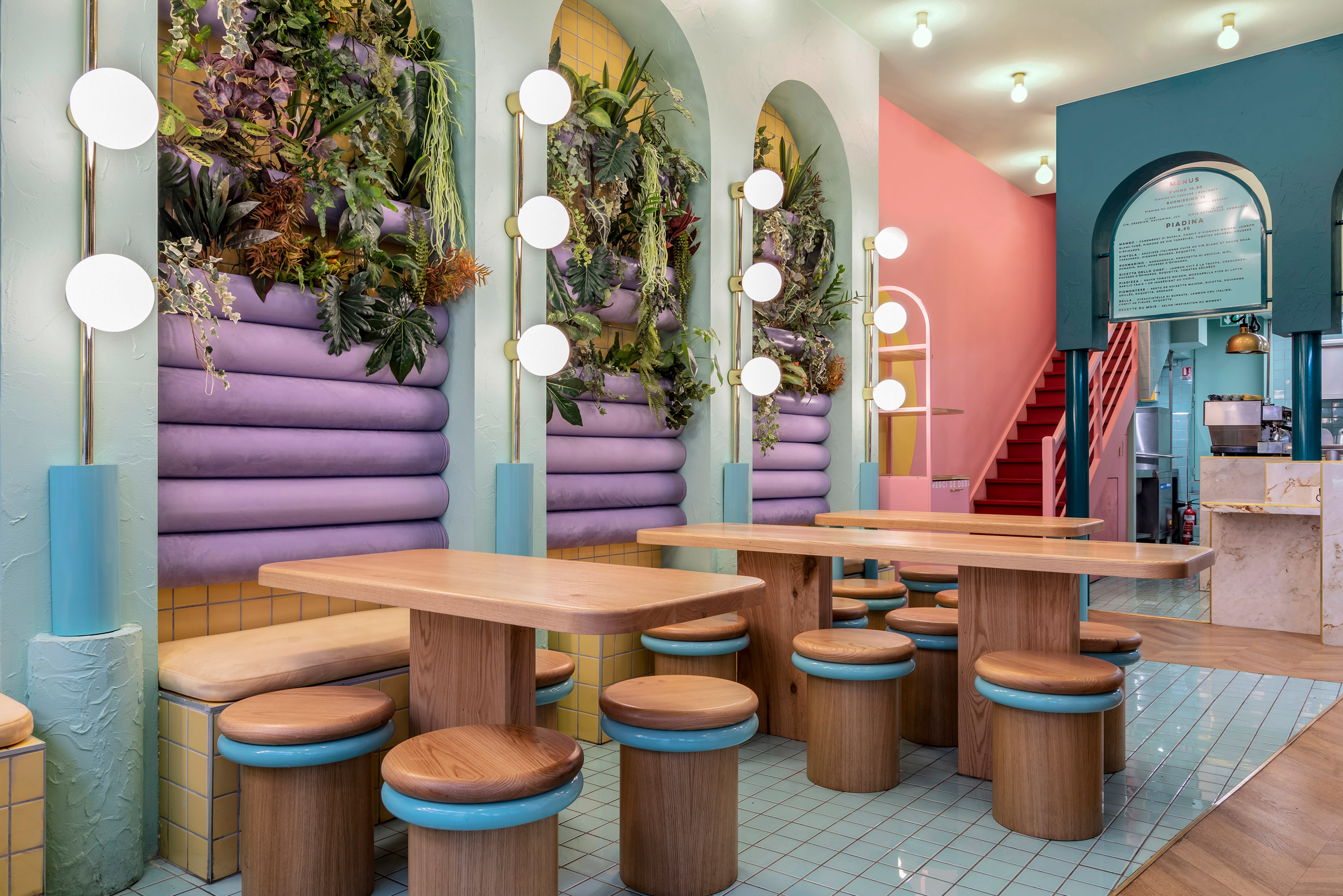 Piada's design is also influenced by its healthy food menu
In a nod to Piada's healthy food concept, Masquespacio added clusters of plants that spill out of backlit rounded nooks behind the seating areas both upstairs and downstairs.
The studio also incorporated stucco on the walls and tiles with a handmade effect to create a more organic feel to the restaurant interior. All of Piada's furniture was custom-made by Masquespacio to match the restaurant's eclectic themes.
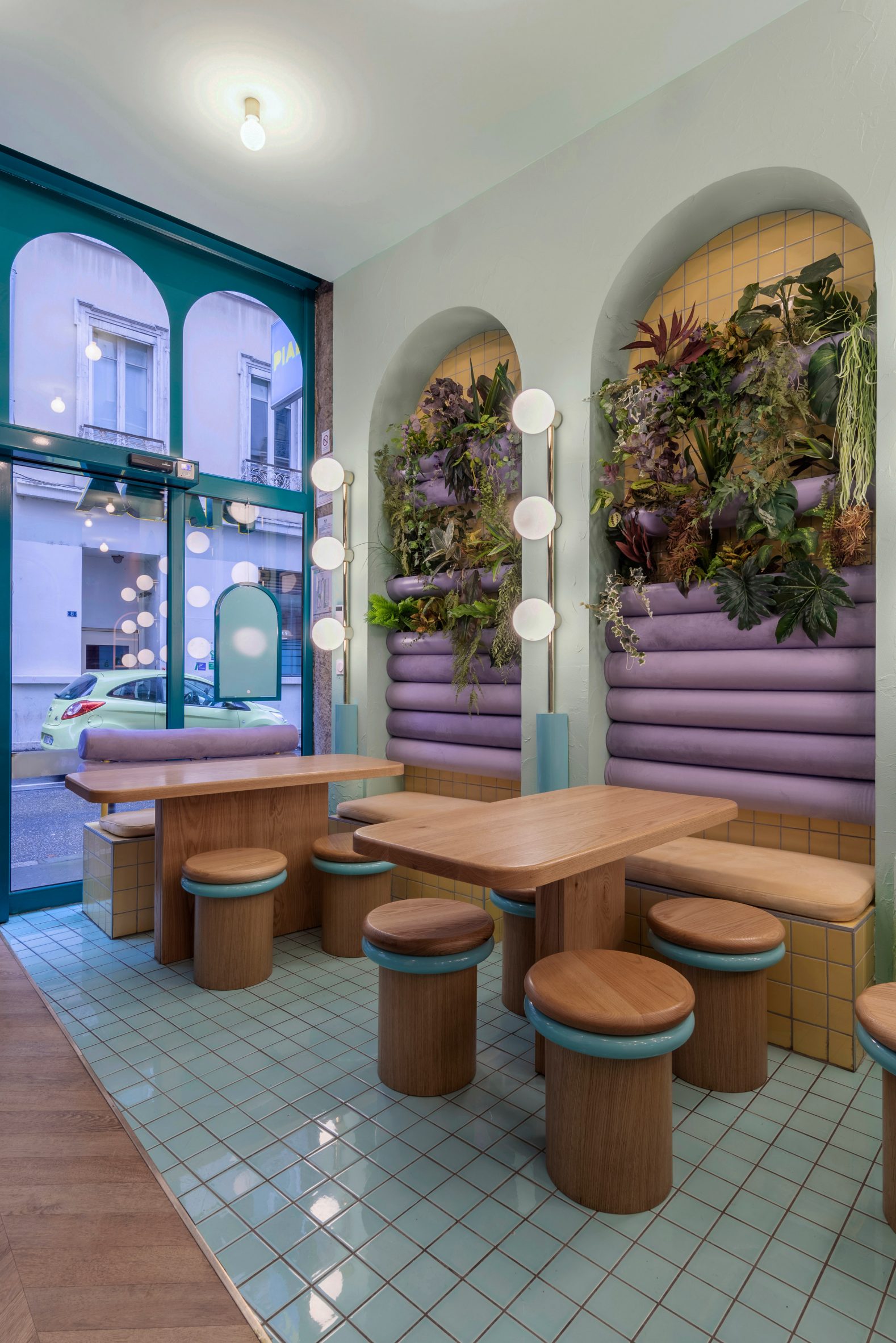 The restaurant is the second of its kind in the French city
Founded in 2010 by Penasse and Ana Milena Hernández Palacios, the Spanish studio has completed a number of other interior projects with designs rooted in bright colour.
These include a playful burger joint in Turin, multi-hued student housing in Bilbao and a colour-clashing phone repair shop in Valencia.
The photography is byGregory Abbate.
The post Masquespacio puts colourful spin on traditional Italian restaurant concept appeared first on Dezeen.
#restaurantsandbars #all #interiors #france #restaurants #marble #lyon #masquespacio #colour #arches #retrodesign
Studio Nor scatters chunky stucco walls throughout Qinhuangdao hotpot restaurant
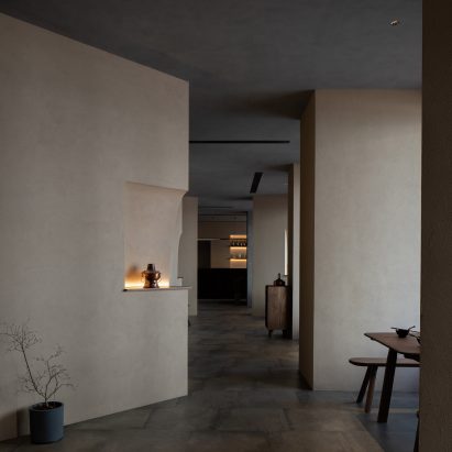

Thickset stucco walls hide unsightly structural panels inside this branch of restaurant chain Jin Sheng Long, which Studio Nor has designed in Qinhuangdao, China.
Jin Sheng Long is a historic eatery known for serving hotpots and baodu – a traditional tripe dish. Since opening its first outpost in Beijing in the late 19th century, the restaurant has expanded into a chain with a number of outlets nationwide.
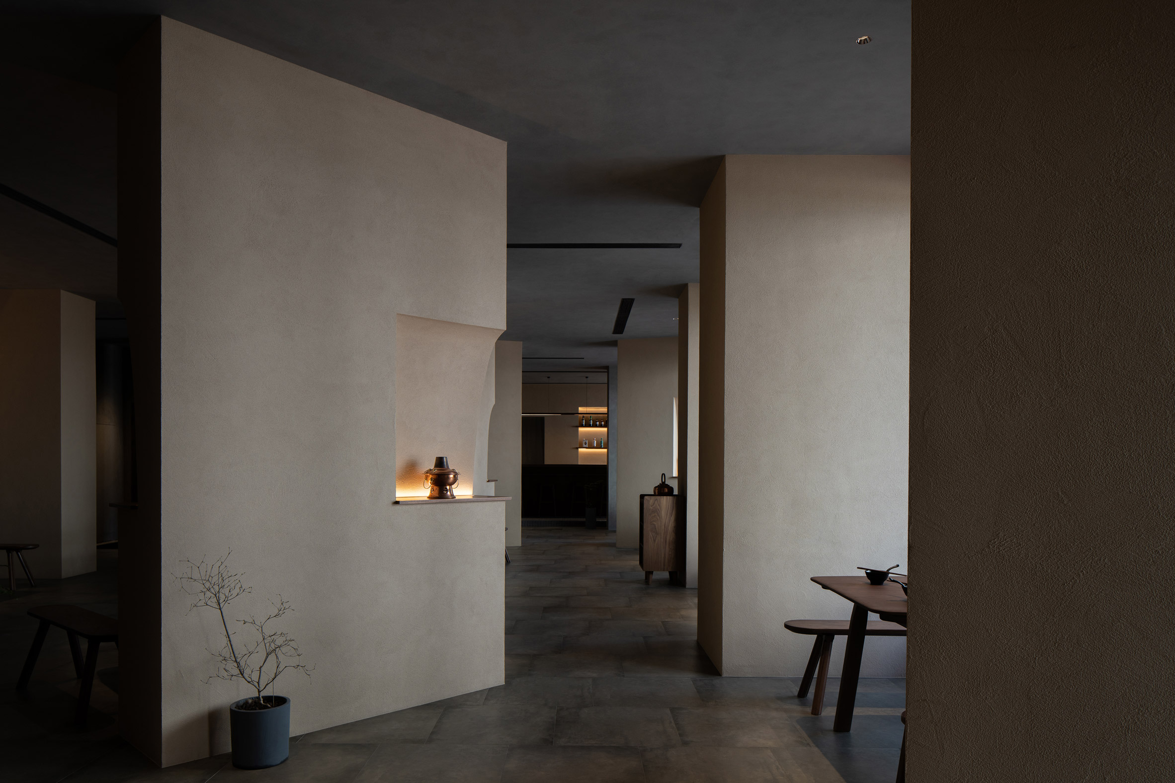 Structural panels found throughout Jin Sheng Long are now enclosed by stucco walls
Its latest outpost in the port city of Qinhuangdao occupies a trio of former retail units on the ground floor of a residential tower.
As a result, the interior is plagued by a number of awkwardly placed structural panels, which Chinese practice Studio Nor chose to retain and turn into key design features by encasing them within chunkier stucco-coated walls.
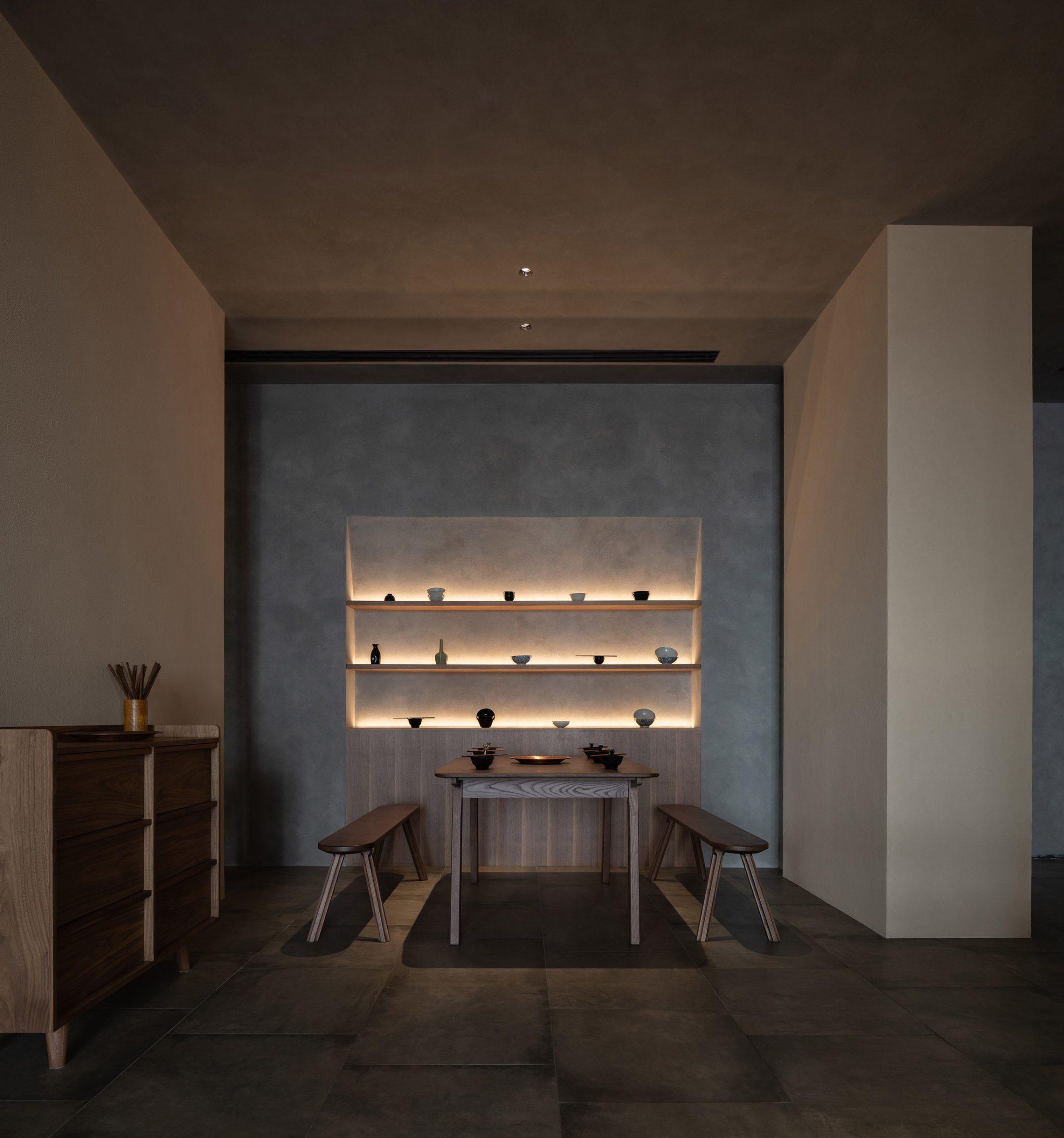 The walls demarcate cosy dining nooks
These walls now form a labyrinth of cosy dining nooks that diners can explore, mimicking what Studio Nor describes as the "intricate and meandering" arrangement of stalls in a Chinese food market.
Even the restaurant's wooden tables and benches were chosen to resemble the furniture found in these markets.
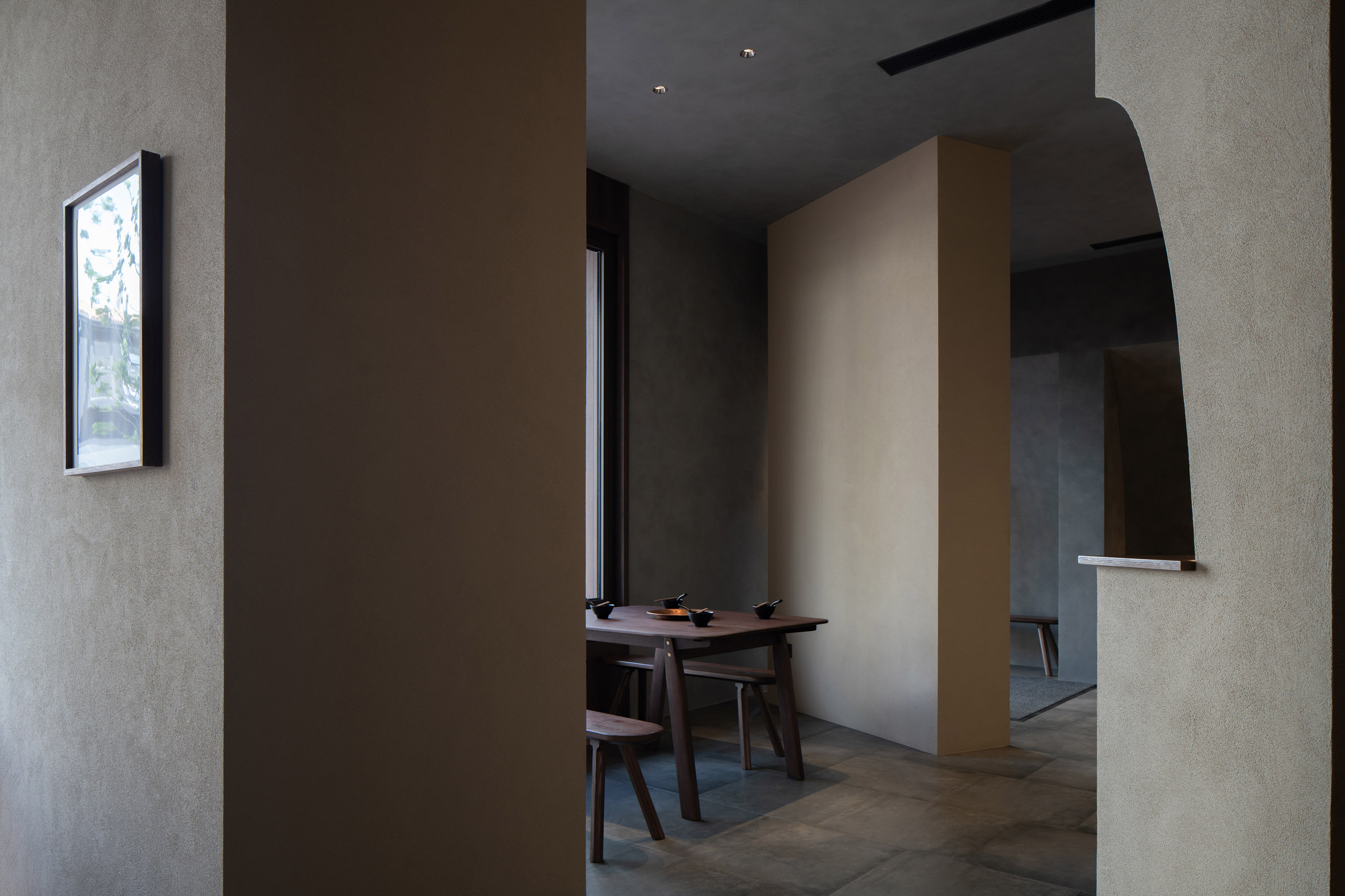 The restaurant's tables and chairs resemble those found in a food market
"We got inspiration from Jin Sheng Long's history," the studio said.
"Back in the late Qing Dynasty, the founder of the restaurant started his business by setting up street stalls in Beijing's famous old Dong'an Market – a then-popular destination full of dazzling attractions and bustling with life and activities."
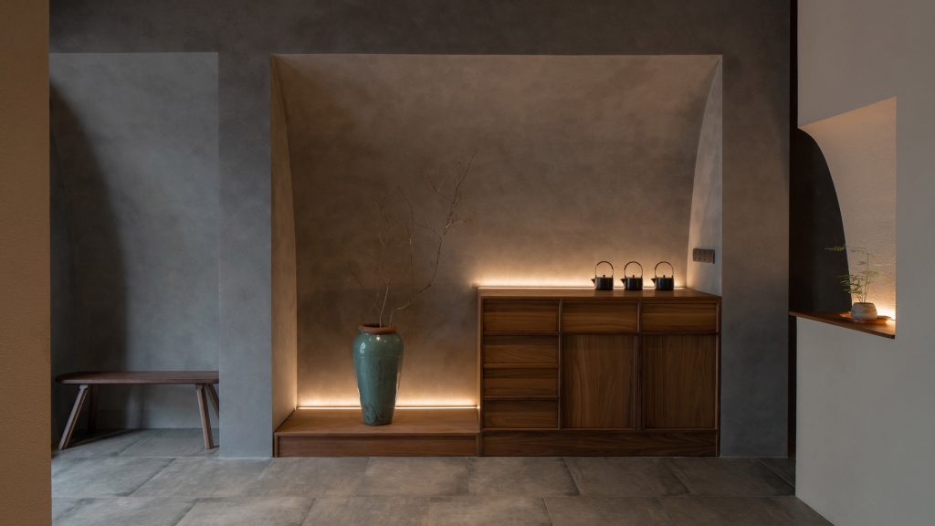
The structural panels located in the centre of the room also serve a decorative function, with their enclosing walls set at unexpected angles and finished with curved niches for displaying bonsai trees, vases and other ornaments.
[ 
Read:
BLUE Architecture Studio erects rocky columns inside Zolaism cafe in Aranya
](https://www.dezeen.com/2021/12/27/zolaism-cafe-blue-architecture-studio/)
A bar is located towards the rear of Jin Sheng Long's Qinhuangdao restaurant, in the only part of the room that is uninterrupted by structural panels.
This area is anchored by an eight-metre-long counter, which is raised up on a stage-like brick plinth to highlight the theatricality of the drinks preparation process.
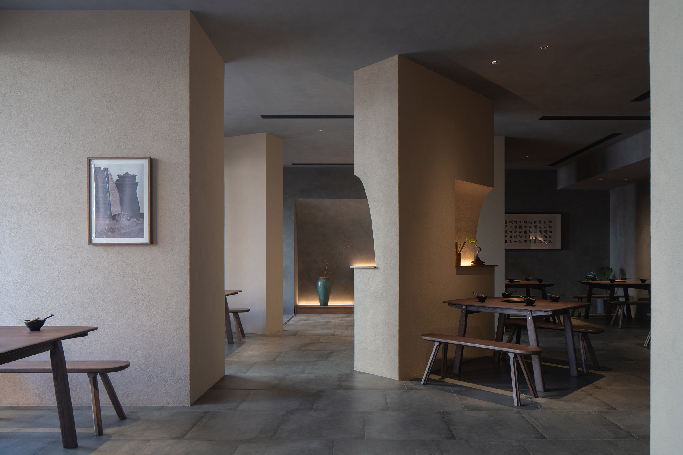 Walls at the centre of the restaurant feature curved niches
Studio Nor expanded the restaurant's windows to bring in more natural light and lined their inner frames with copper in a nod to the traditional cookware used to serve hotpot.
Artificial lighting, on the other hand, was kept to a minimum in a bid to draw attention to the few illuminated areas that pop up throughout the interior.
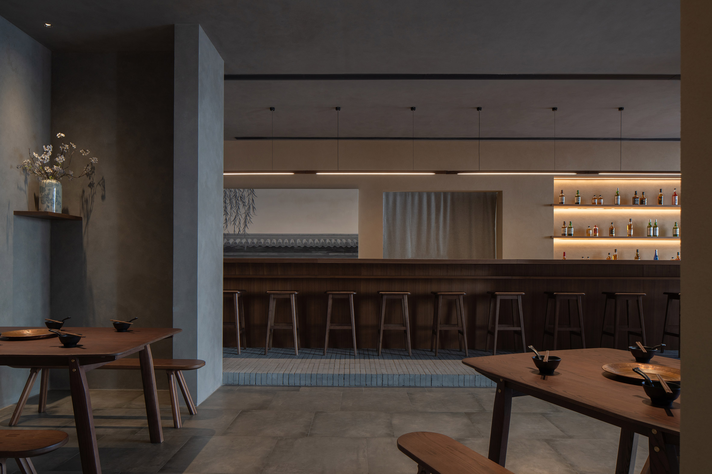 A brick plinth raises up the bar counter
Elsewhere in Qinhuangdao, BLUE Architecture Studio found another clever way of concealing unattractive structural elements when designing the Zolaism cafe.
Here, the studio disguised the building's support columns as huge craggy boulders.
The photography is bySongkai Liu.
Project credits:
Architecture firm: Studio NOR
Lead architects: Boyuan Jiang, Jingwen Wang
Design team: Zhongyuan Liu, Wenxuan Xu, Yiming Lu, Shuo Yang
Lighting consultant: Chloe Zhang
Construction team: QX Group
Construction documents consultant: Shanghai C-Yuspace Design
The post Studio Nor scatters chunky stucco walls throughout Qinhuangdao hotpot restaurant appeared first on Dezeen.
#restaurantsandbars #all #interiors #china #restaurants #chainrestaurants #qinhuangdao #chineserestaurants
Soho House Nashville opens in Music City hosiery factory

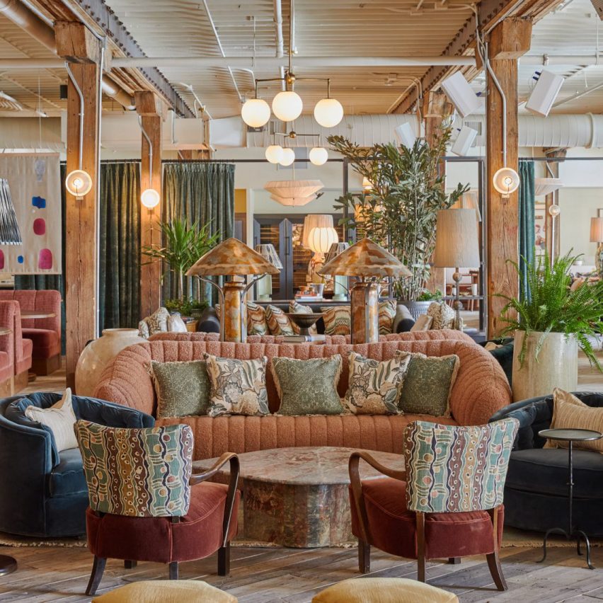
A former hosiery factory in Nashville has been converted into a Soho House hotel and members' club, designed with nods to its industrial setting and the city's musical heritage.
The launch of Soho House Nashville earlier this week marks the company's second location in the American South, following the opening of the Austin house in 2021.
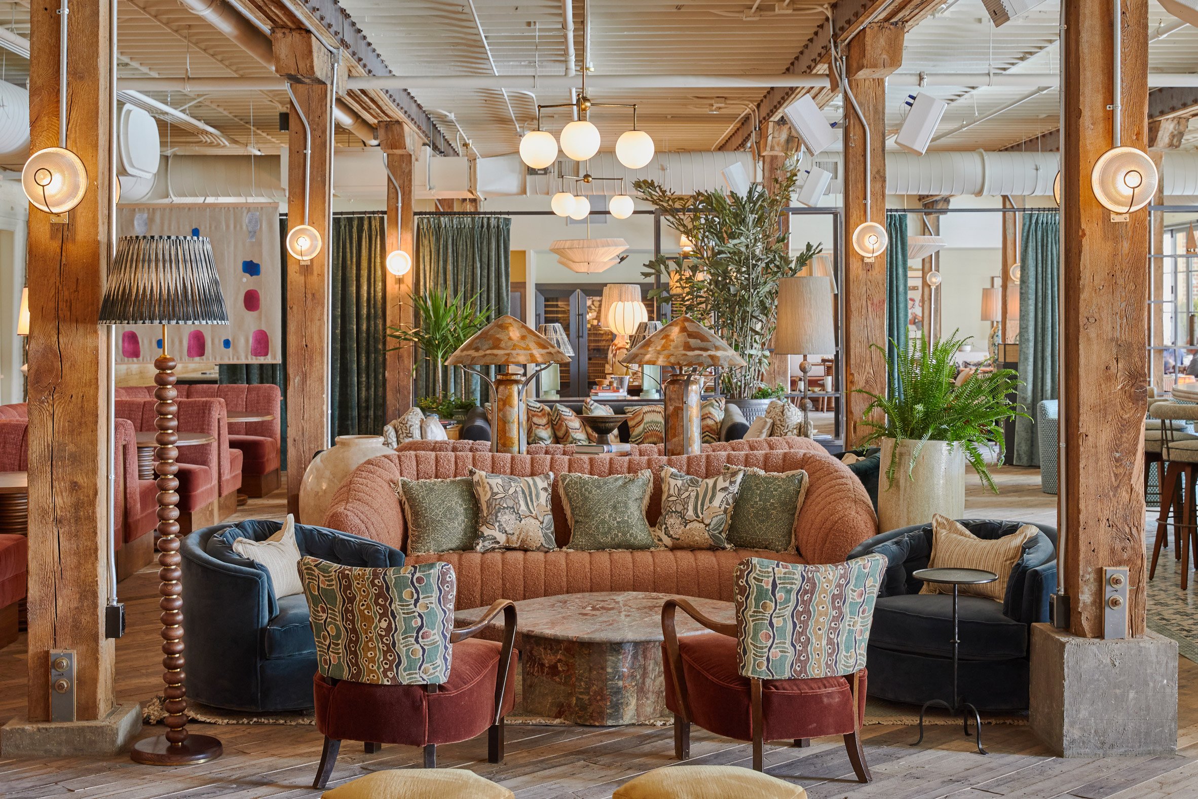 Soho House Nashville has opened in the May Hosiery Building
The May Hosiery Building, constructed in the early 1900s in the Tennessee city's artsy Wedgewood-Houston neighbourhood, now contains a series of club spaces and accommodation.
The Soho House design team used the building's industrial past and Nashville's reputation as the Music City to inform the renovation and decor.
"The house design is influenced by a strong pre-war, European aesthetic, connecting to the building's history with Bauhaus-inspired, striking geometric patterns, bold industrial finishes, and bespoke fixtures," said the team.
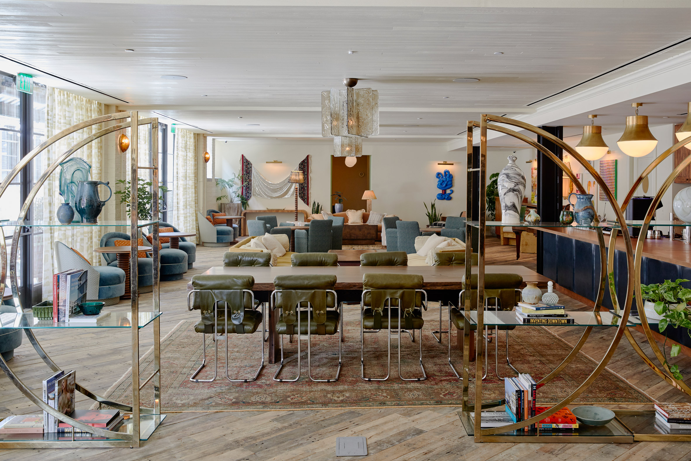 Metal shelving divides spaces in the Club Room
Playing on the colour of original verdigris copper doors, various teal shades were used across the different spaces to visually tie them together.
Meanwhile, the striped tiling around the swimming pool evokes the pattern of a guitar string board.
"Music City influences do not escape Soho House Nashville with its warm, rich textures of the rock and roll era and decorative patterns that nod to the jazz and blues genres," the design team said.
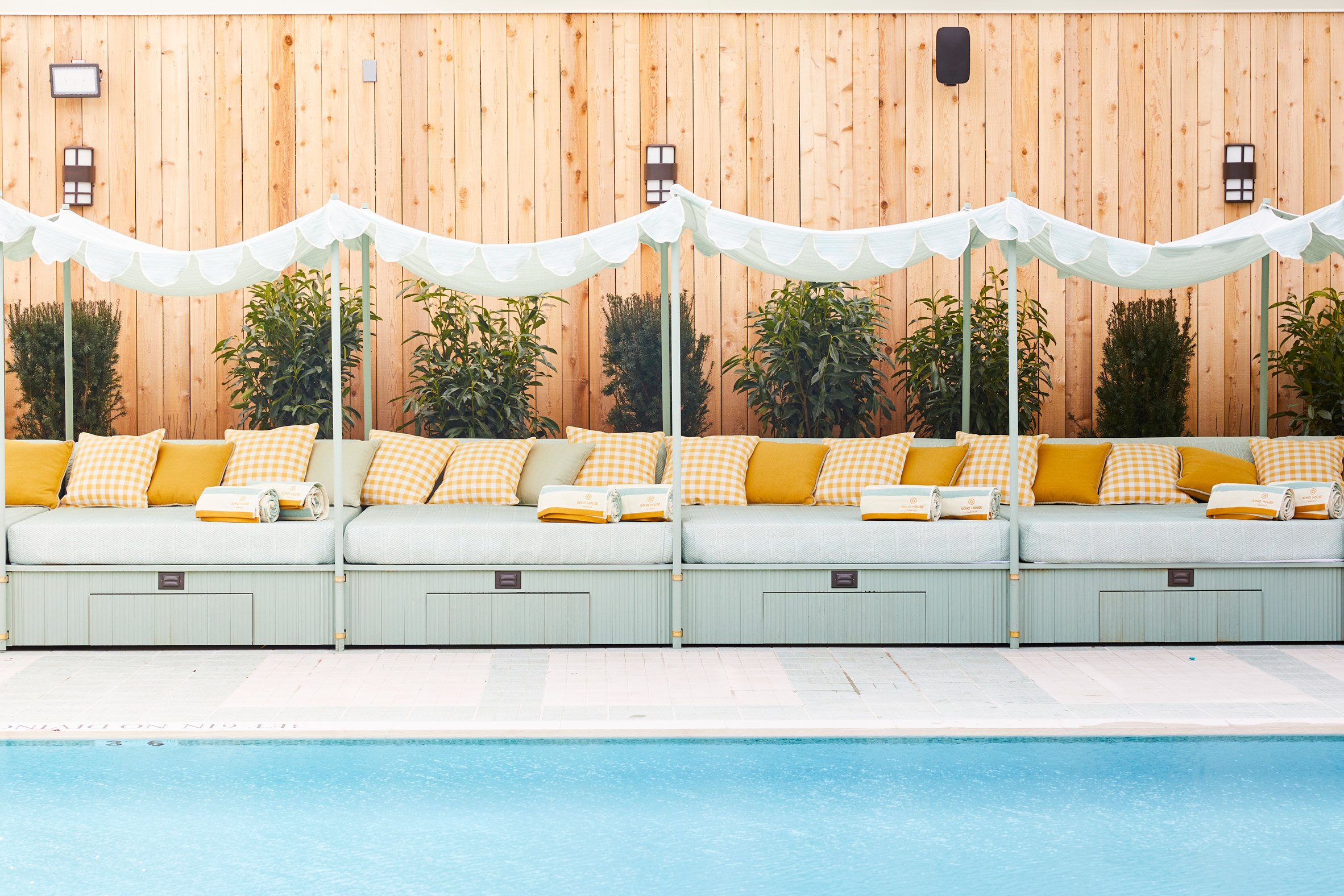 Striped tiling around the pool is designed to mimic a guitar string board
The building contains three indoor and outdoor performance spaces, a pool, a health club and a screening room.
Food is offered at Club Cecconi's, the first in-house restaurant of the Cecconi's chain of Italian eateries owned by the Soho House group.
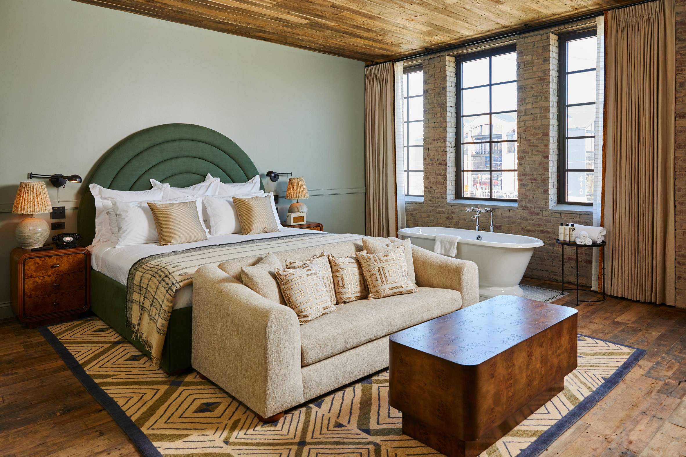 Soho House Nashville's hotel has 47 bedrooms that vary in size
At the heart of the building, the Club Room is divided by industrial metal shelving into intimate spaces including a library with a fireplace and a games area.
The Sock Room also celebrates the factory's prior use for producing socks that astronauts wore to the moon, and now hosts live music and events.
[ 
Read:
Soho House Austin blends Texas modernism with Spanish influences
](https://www.dezeen.com/2021/08/09/soho-house-austin-members-club-texas-modernism/)
Referencing the machinery once housed in the space, bespoke bar lamps with an industrial aesthetic contrast softer materials like velvet and textured sheer linen.
Soho House Nashville has 47 bedrooms that range in size, including a large loft suite that spans over three floors.
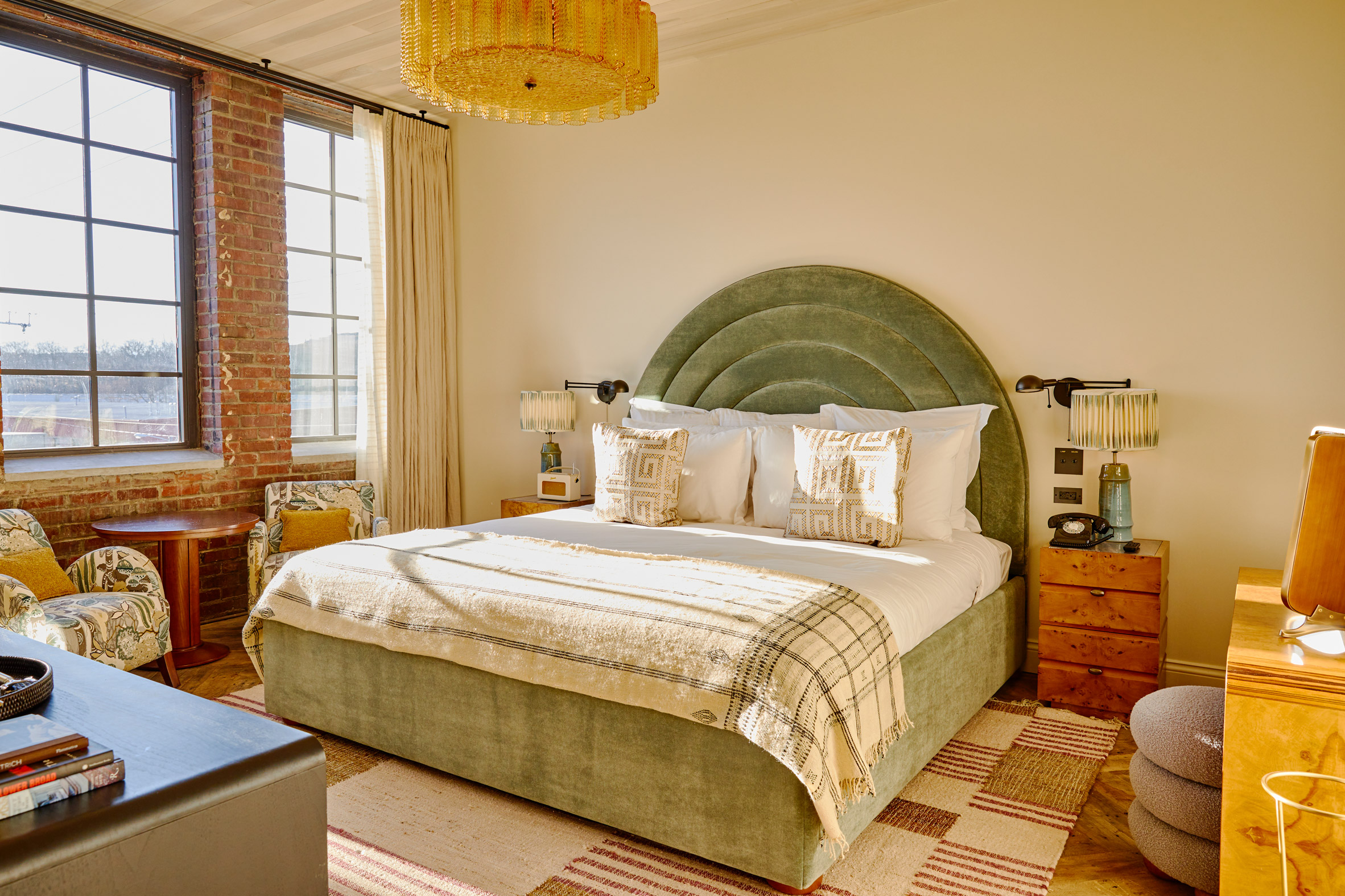 Bedrooms all have large chandeliers and a variety of textiles
The rooms are furnished with bespoke, locally made designs and vintage accessories, as well as large chandeliers and metal screens that conceal the bathrooms.
"Each bedroom has been designed to feel traditional and cosy with woven tapestries, made with bespoke fabric designed in Nashville specifically for the house, to hide all TVs," said the team.
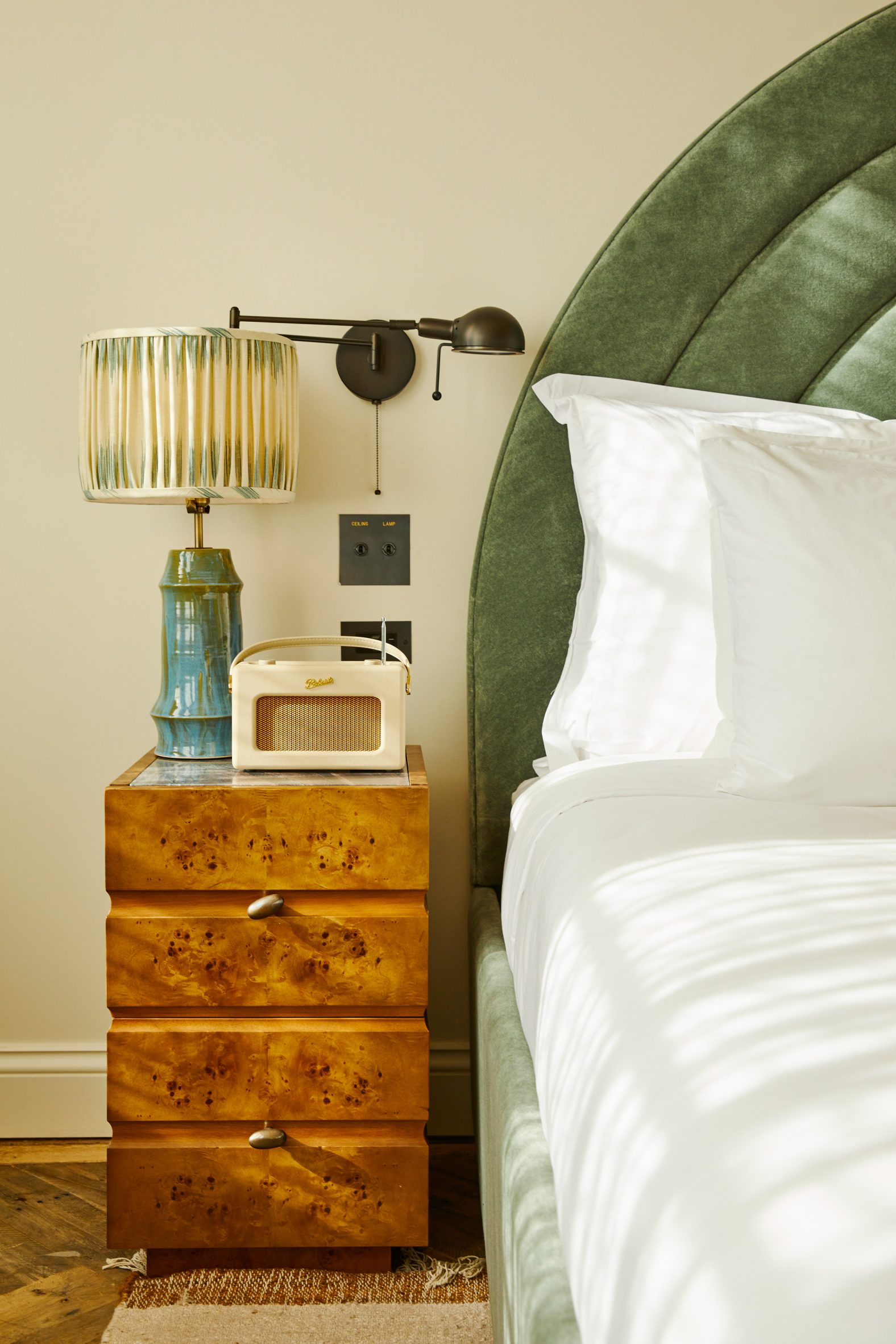 The rooms feature a mix of bespoke local furniture and vintage accessories
A total of 170 pieces were acquired from 41 local artists to be displayed throughout the hotel and club areas.
They join the wider art collection exhibited in the Soho House locations across the globe, which the company has gradually added to its portfolio since its founding in London in 1995.
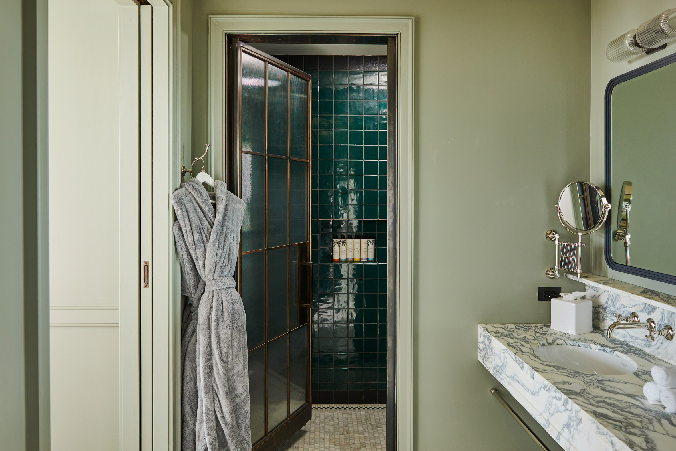 Metal screen doors enclose the bathrooms
Along with Austin, the group's outposts in North America include Soho Warehouse in Downtown Los Angeles and Dumbo House in Brooklyn.
It's not surprising that the brand chose to open in Nashville – one of several southern US cities that has seen a recent influx of young creative people, and therefore an expanded repertoire of cultural and entertainment venues.
Also new to the city's dining and drinking scene is The Twelve Thirty Club , which is owned by restauranteur Sam Fox and musician Justin Timberlake.
The photography is byAndrew Joseph Woomer.
The post Soho House Nashville opens in Music City hosiery factory appeared first on Dezeen.
#restaurantsandbars #all #interiors #hotels #instagram #usa #restaurants #bars #adaptivereuse #tennessee #sohohouse #membersclubs #nashville
Rise Design Studio opts to "reuse and recycle" for Carousel restaurant interior


London restaurant Carousel has moved to a new venue but taken many of its old fixtures and fittings with it, thanks to an environmentally conscious approach from Rise Design Studio.
Founded seven years ago by brothers Ollie and Ed Templeton, the restaurant has moved into three converted Georgian townhouses in Fitzrovia, with dining rooms on two floors.
Rise Design Studio designed the original Carousel restaurant in Marylebone, so the architects decided to be as resourceful as possible when repeating the formula in a new location.
 Carousel occupies three converted Georgian townhouses in Fitzrovia
Several design elements from the original restaurant have been repurposed in the new location.
These include the tall metal-clad entrance door, which can now be found at the entrance to one of the dining rooms, and a copper light window that is now installed internally rather than externally. A set of Spanish wall tiles were also carefully removed and now serve as floor tiles.
These are combined with new colours and textures, from materials such as painted brickwork and terrazzo-style tiles.
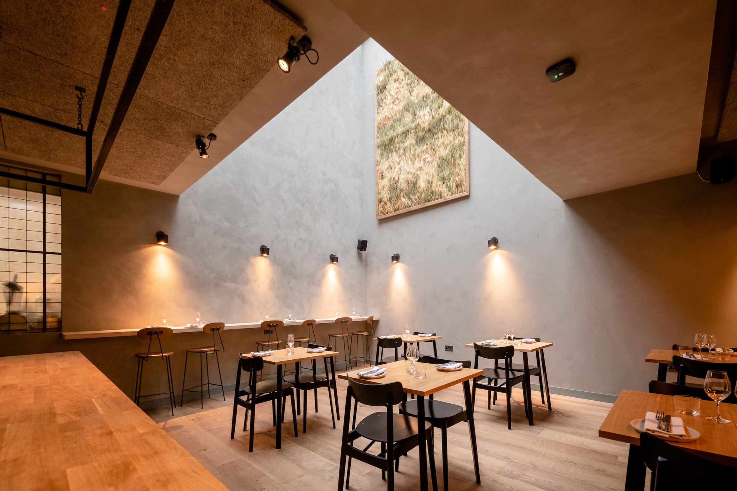
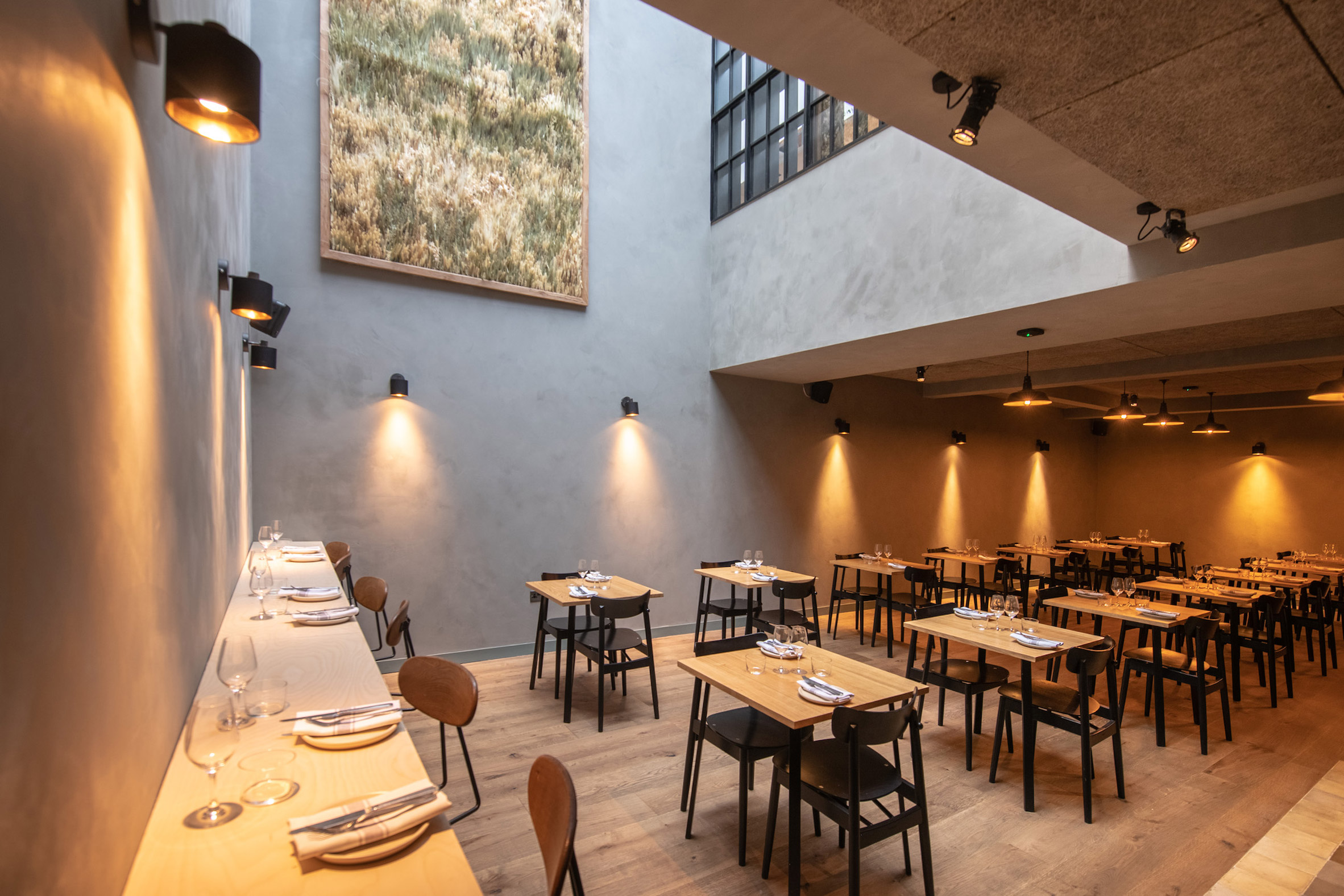 A guest kitchen and dining room is lit from above by a large skylight
"Carousel 2.0 was an opportunity to create new spaces which didn't exist in the original Carousel," said Rise Design Studio director Imran Jahn. "But we also did not want to lose the feel of the original."
"We wanted to re-use and recycle," he told Dezeen. "We wanted previous customers and returning guest chefs to be reminded of Carousel 1.0, so we proposed to retain finishes, fixtures and fittings and use them again here."
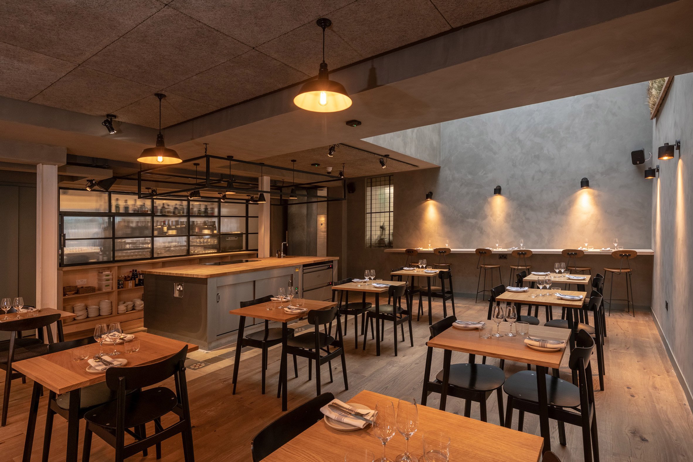 Wall tiles from the previous Carousel venue have been reused here as floor tiles
The new property gives the restaurant enough space for several dining rooms and kitchens plus, for the first time, a wine bar.
On the ground floor, the bar sits in between an all-day dining room and a space for Carousel's ever-changing roster of guest chefs. The former faces the street, while the latter is lit from above through a lightwell.
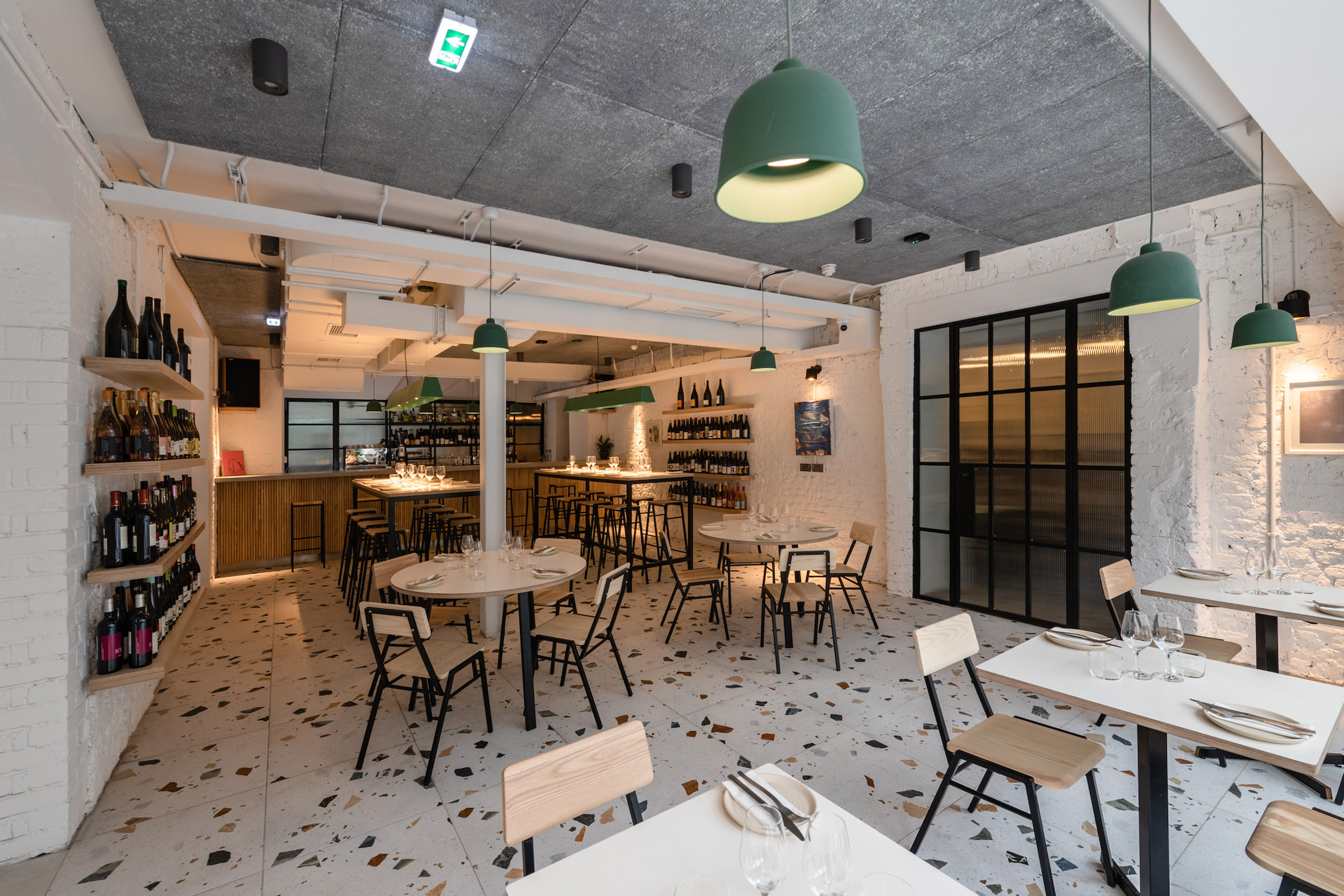 The all-day dining room features painted brickwork and terrazzo-style tiles
There's also a separate diner-style restaurant space intended for new dining concept launches, which is currently occupied by Goila Butter Chicken.
Upstairs, a subdividing lounge/events space leads through to a private dining room.
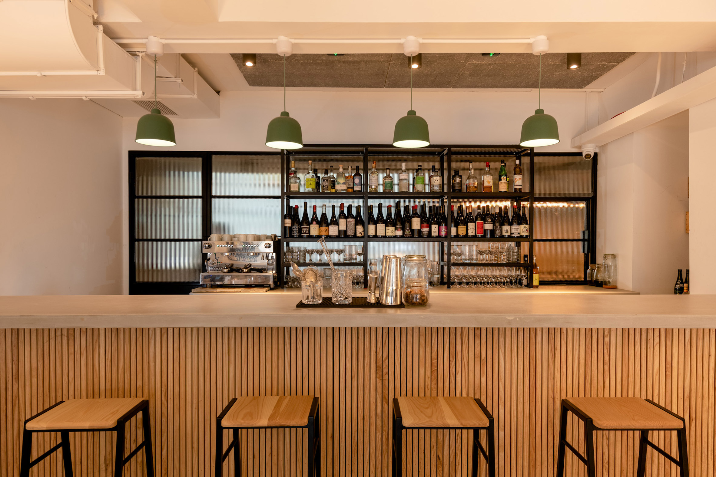 A wine and cocktail bar is sandwiched between the two ground-floor spaces
"Ed and Ollie had scoped out a draft layout of the various zones they wanted to create before we were introduced to the project," said Jahn. "They needed our design expertise in interiors to help bring it all together."
A consistent element throughout the interior is the use of industrial-style Crittall screens and doors, which are infilled with fluted glass.
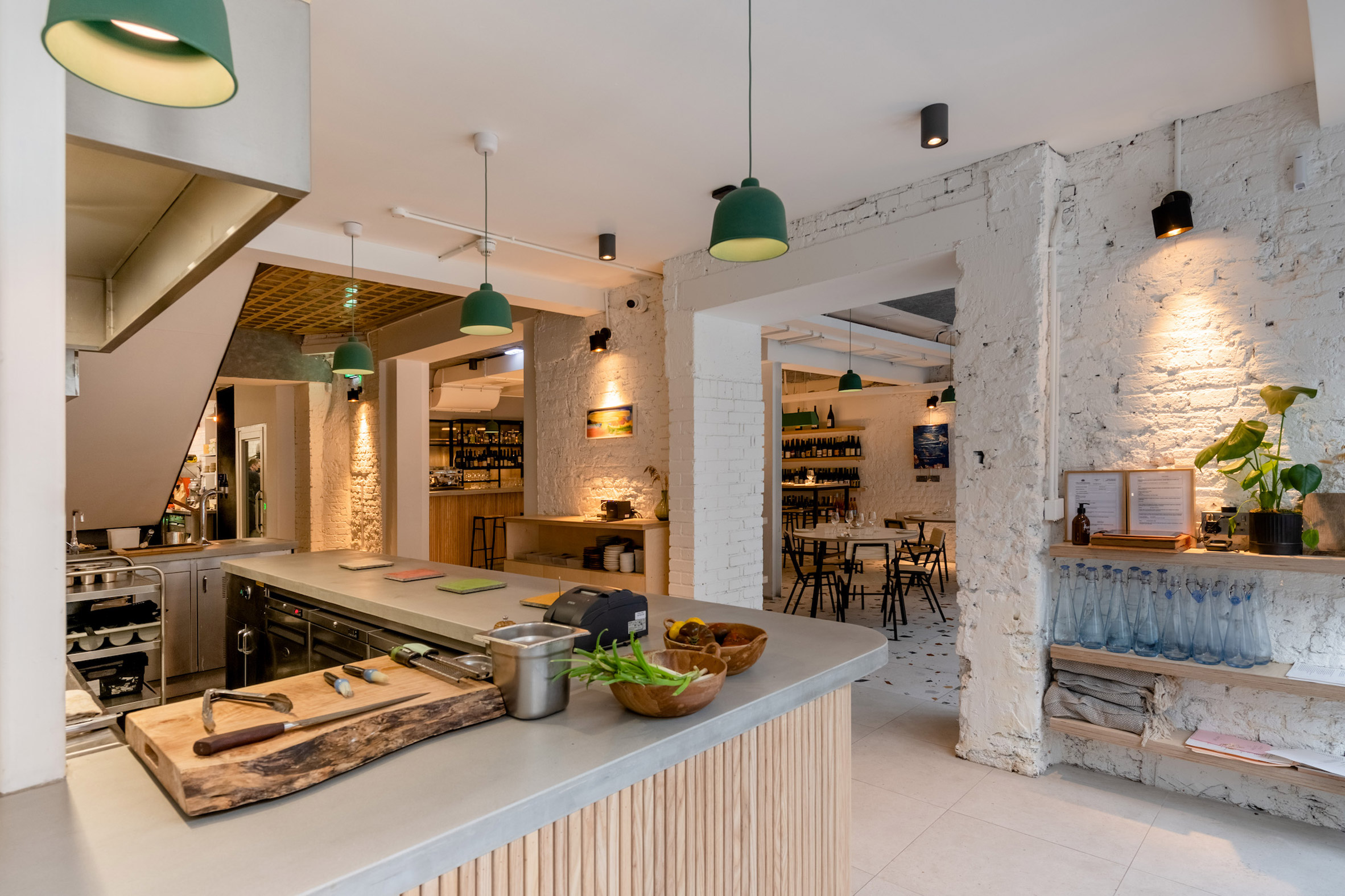 Concrete counters feature slatted wooden fronts
Several rooms feature walls finished with a type of Nordic plaster that comes in different colours and creates a smooth, durable and multi-tonal surface. The guest kitchen is a mid-grey shade, while the private dining room is soft green.
Other details include concrete counters with wooden slatted fronts, exposed steel structural beams and formica tables.
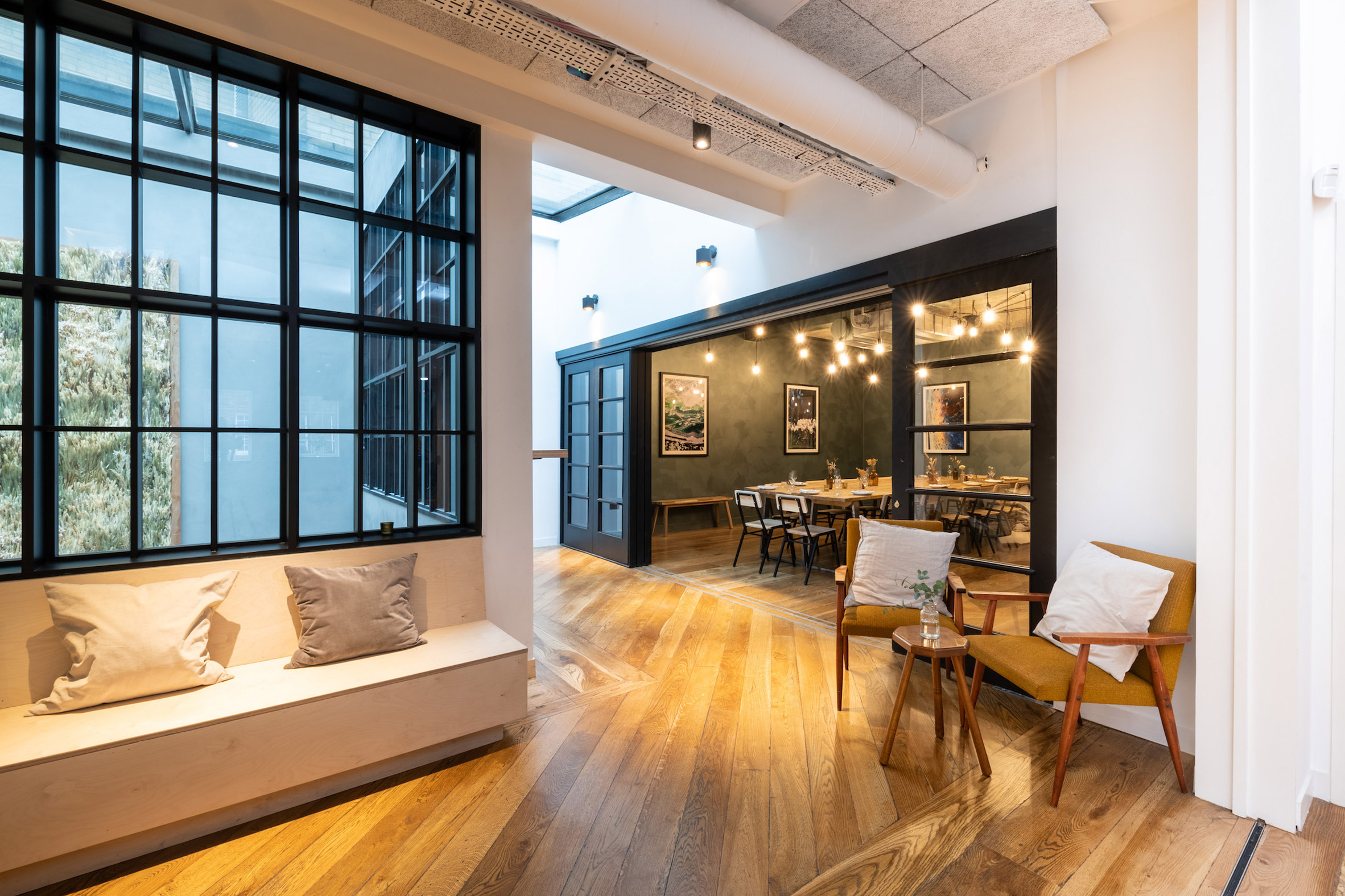 An events space leads through to a private dining room
"The overall tone of the proposals brings together the distinct spaces but allows them to sit happily in their individuality," said Jahn.
"The use of Crittall screens throughout and reeded glazing provides for continuity but also an air of mystery for the viewer wanting to find out more about the partially hidden spaces within."
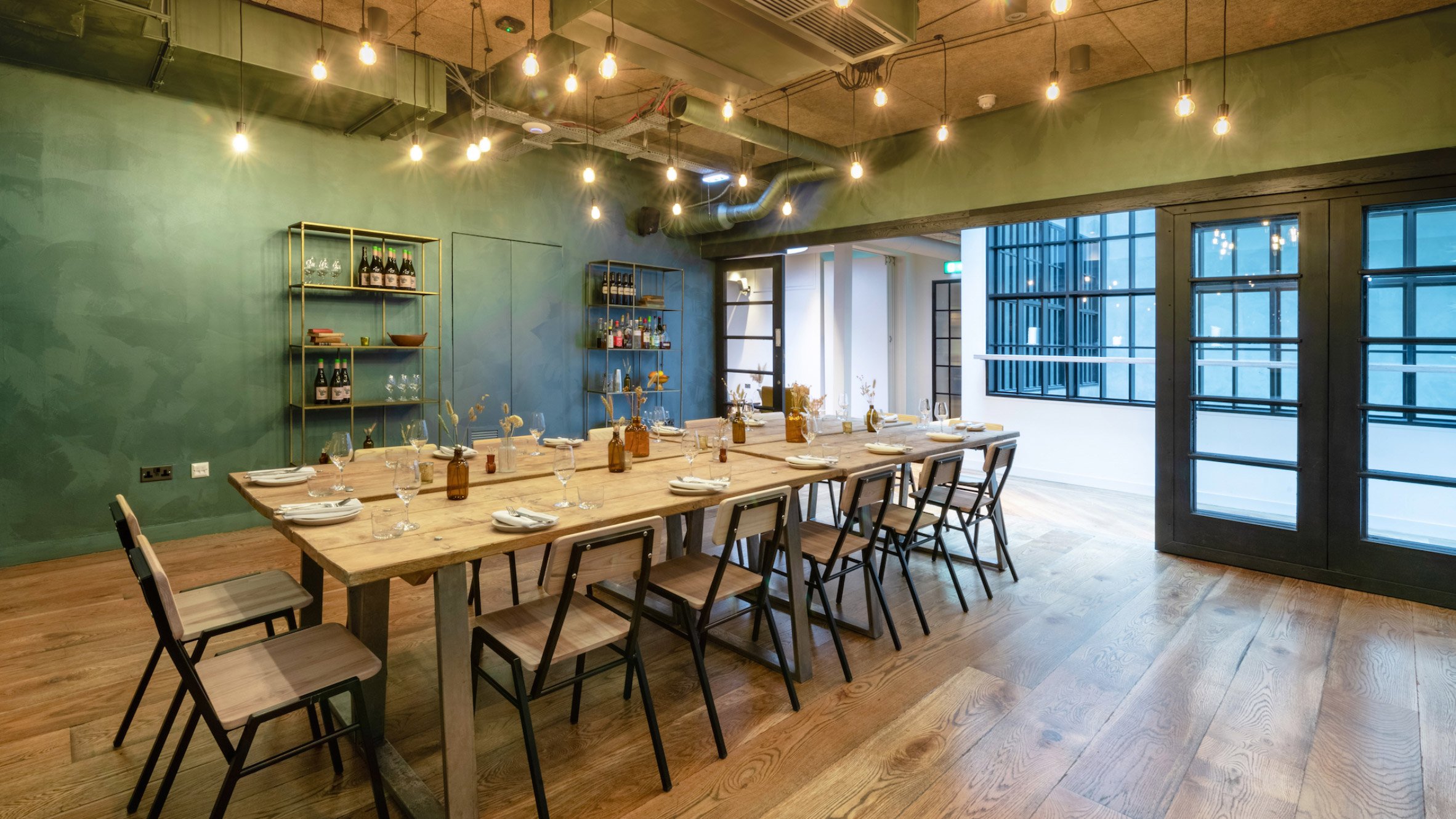 A special type of plaster gives a multi-tonal quality to the walls
The new Carousel location welcomed its first diners in November 2021. The all-day menu, prepared by Ollie, includes a range of small plates including beef tartare toast, confit pumpkin with burrata and sage, and grilled mackerel flatbread.
"We've been dreaming about this move for a long time," said Ed. "We loved being a part of the Marylebone community, but we genuinely couldn't have imagined a more exciting neighbourhood, or a more fitting home, to be moving into."
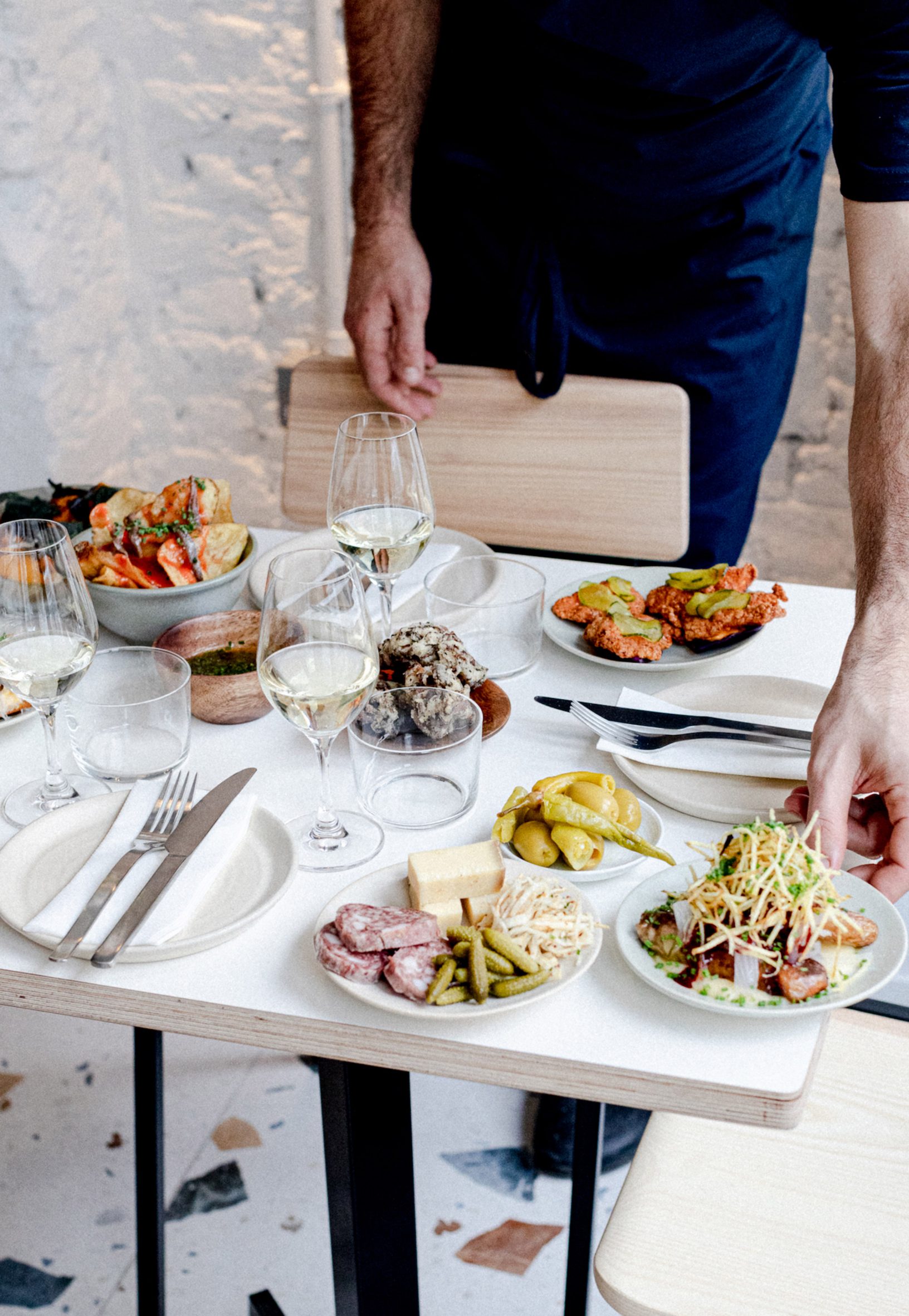 Carousel offers an all-day menu and also hosts a roster of guest chefs
"You'll find all the best bits of the old Carousel in the new space, with some fun additions like the neighbourhood wine bar, where you'll finally be able to experience the kind of food that Ollie likes to cook, in an easygoing all-day setting," he added.
Other recent restaurant openings in London include Kol, a Marylebone eatery with a Mexican menu, and Maido, a sushi restaurant in St John's Wood.
Photography is byJoe Okpako. Video is by Henry Woide.
The post Rise Design Studio opts to "reuse and recycle" for Carousel restaurant interior appeared first on Dezeen.
#restaurantsandbars #all #interiors #videos #london #uk #england #restaurants #interiorsvideos #risedesignstudio
Linehouse designs Shanghai restaurant informed by New Wave art movement
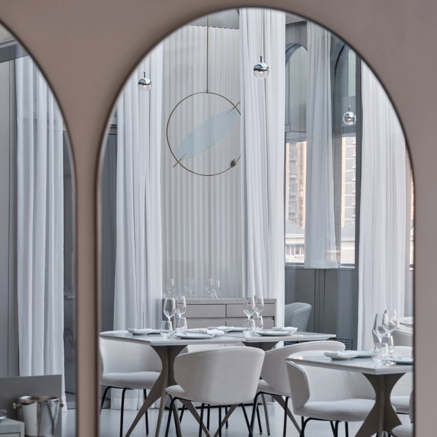
Design studio Linehouse has filled a restaurant in a Shanghai art museum with mirrors and arched details informed by eastern and western art and design.
Located inside the UCCA Edge museum, the New Wave by Da Vittorio restaurant was named after the original UCCA museum's opening exhibition The New Wave Art Movement, which also set the tone for its interiors.
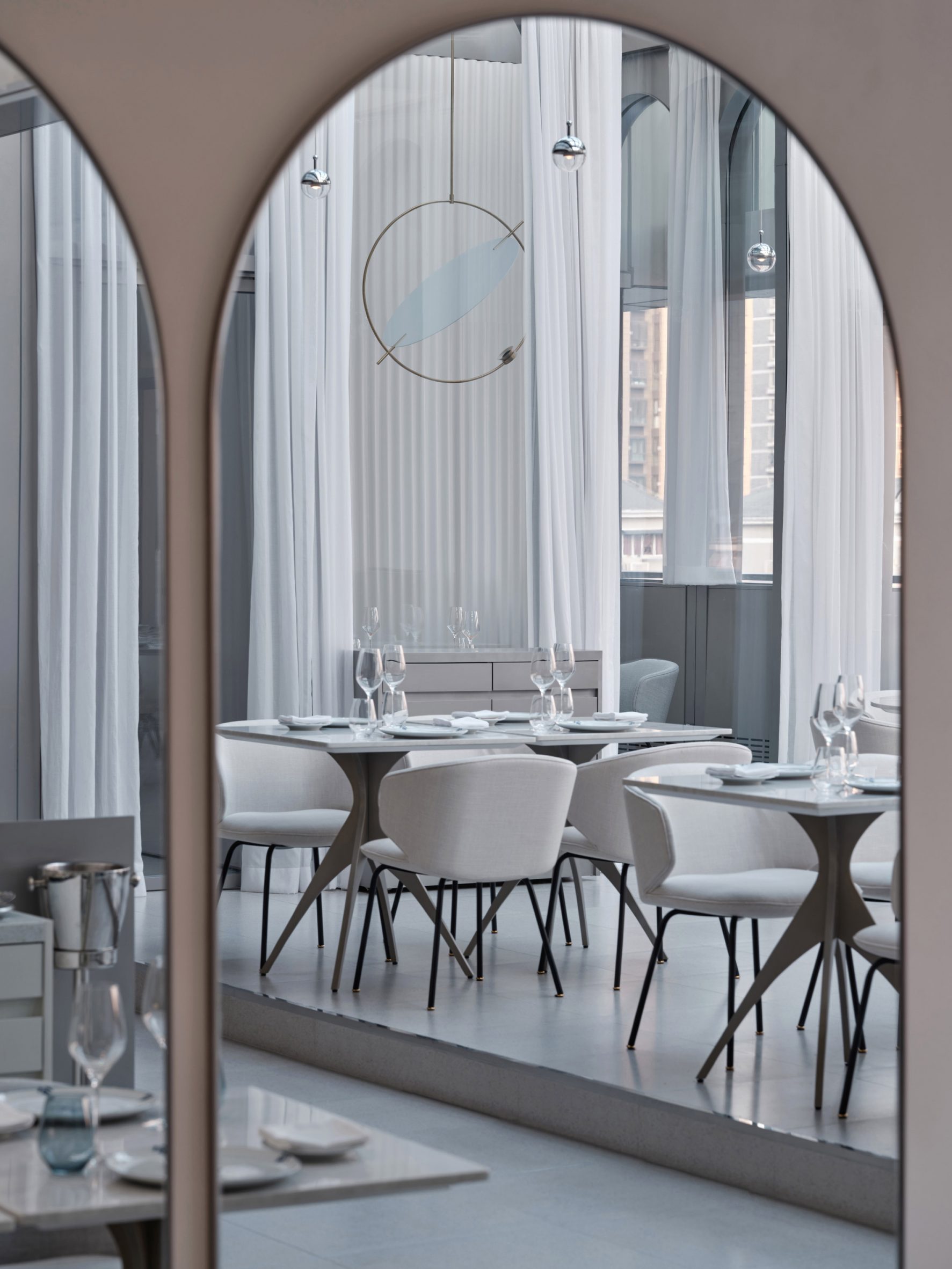 Arched shapes are used throughout the restaurant
New Wave, a 20th-century art movement in China, is renowned for its bold experimentation that brought Chinese art into the modern art world.
“The concept for the restaurant comes from the collision of these opposing elements and the process of change,” said Shanghai-based Linehouse.
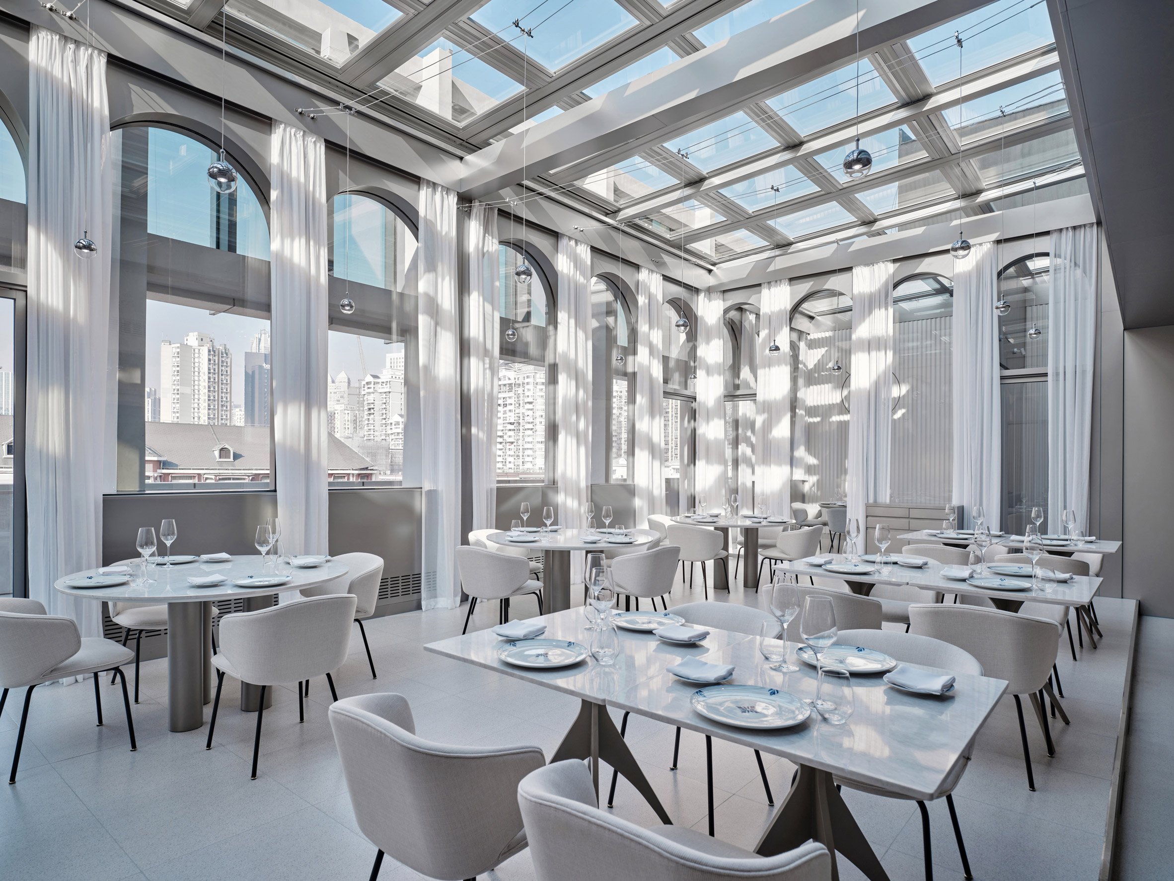 New Wave by Da Vittorio is located inside Shanghai's UCCA Edge museum
To enter the restaurant, guests pass through a narrow passage that leads from the public museum space into a more intimate dining area.
The restaurant, which measures 620 square metres, also holds a bar, private dining rooms and an outdoor terrace.
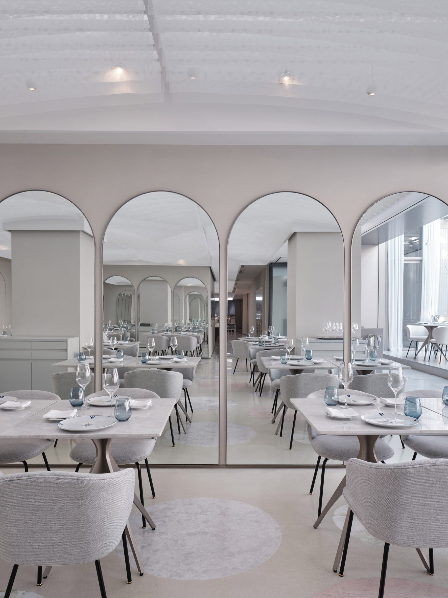 Mirrors create an illusion of more space
A sequence of arches was added to the restaurant in reference to the use of colonnades in classical architecture, while matching arched mirrors create an illusion of spatial progression.
New Wave by Da Vittorio also features a ceiling installation formed by arches designed in a more eastern style.
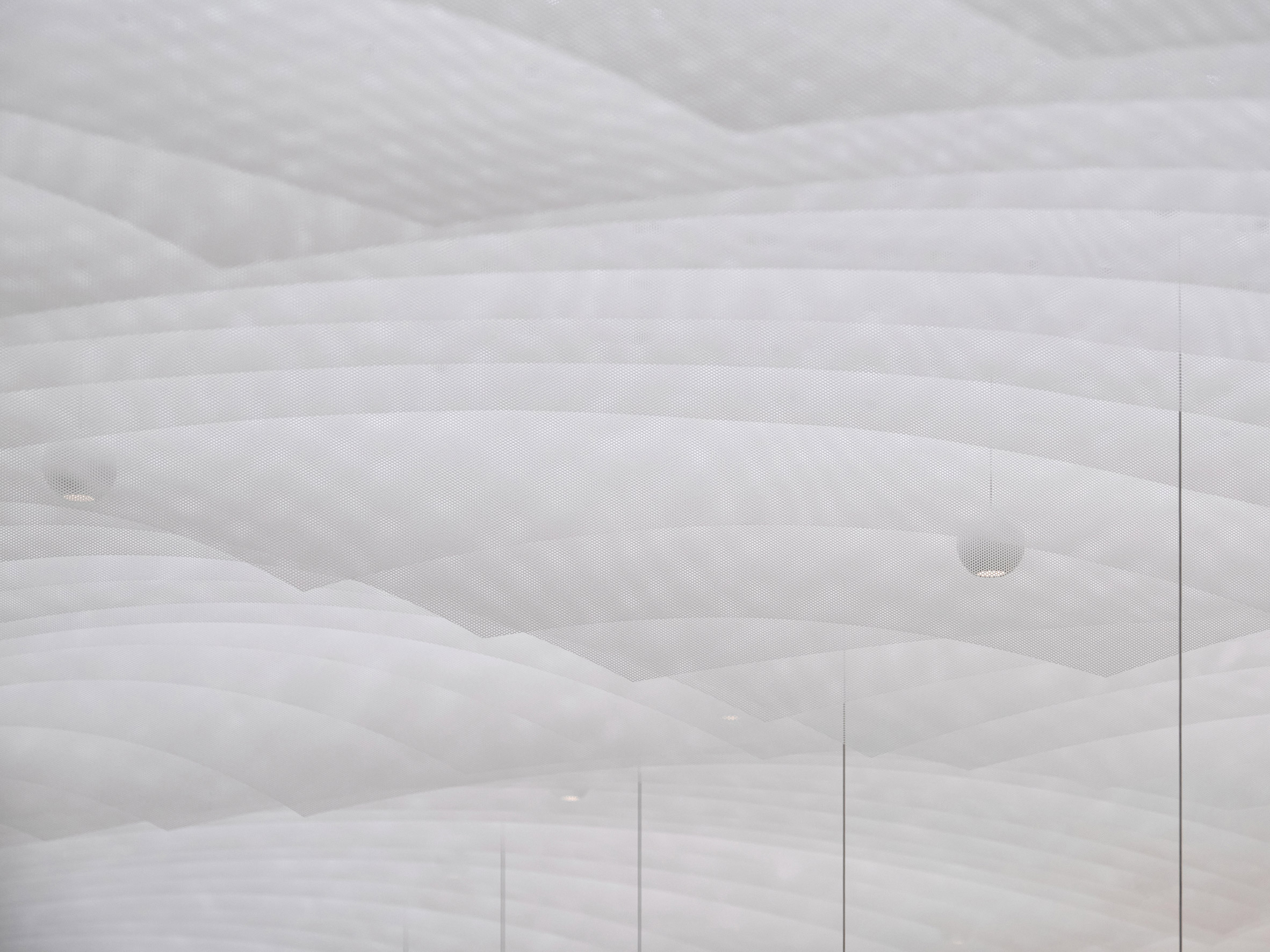 Hanging fabric was cut into curved shapes to match the arches in the interior
The installation consists of hanging fins made from a Japanese triaxle fabric with a woven texture, which has been cut into vaulted shapes to create a softness that evokes floating clouds.
The sheets of fabric are placed in a repetitive order with a pattern that only emerges once you see through one sheet to the next. The studio hoped this would evoke the contradiction between order and chaos.
[ 
Read:
Linehouse designs space-themed cafe in Shanghai for creator of "Australia's most Instagrammed dessert"
](https://www.dezeen.com/2022/01/12/black-star-pastry-shanghai-linehouse-cafe/)
“Throughout the restaurant, we seek contradiction in materiality to create qualities of soft and hard, rough to smooth, order to unordered and solid to transparent,” Linehouse co-founder and lead designer Alex Mok told Dezeen.
The studio used stone for the main bar counter, which it sculpted into a curved, fluid shape to further explore the juxtaposition between soft and hard surfaces.
Linehouse deliberately chose a stone with a smaller repetitive pattern to create a continuous piece.
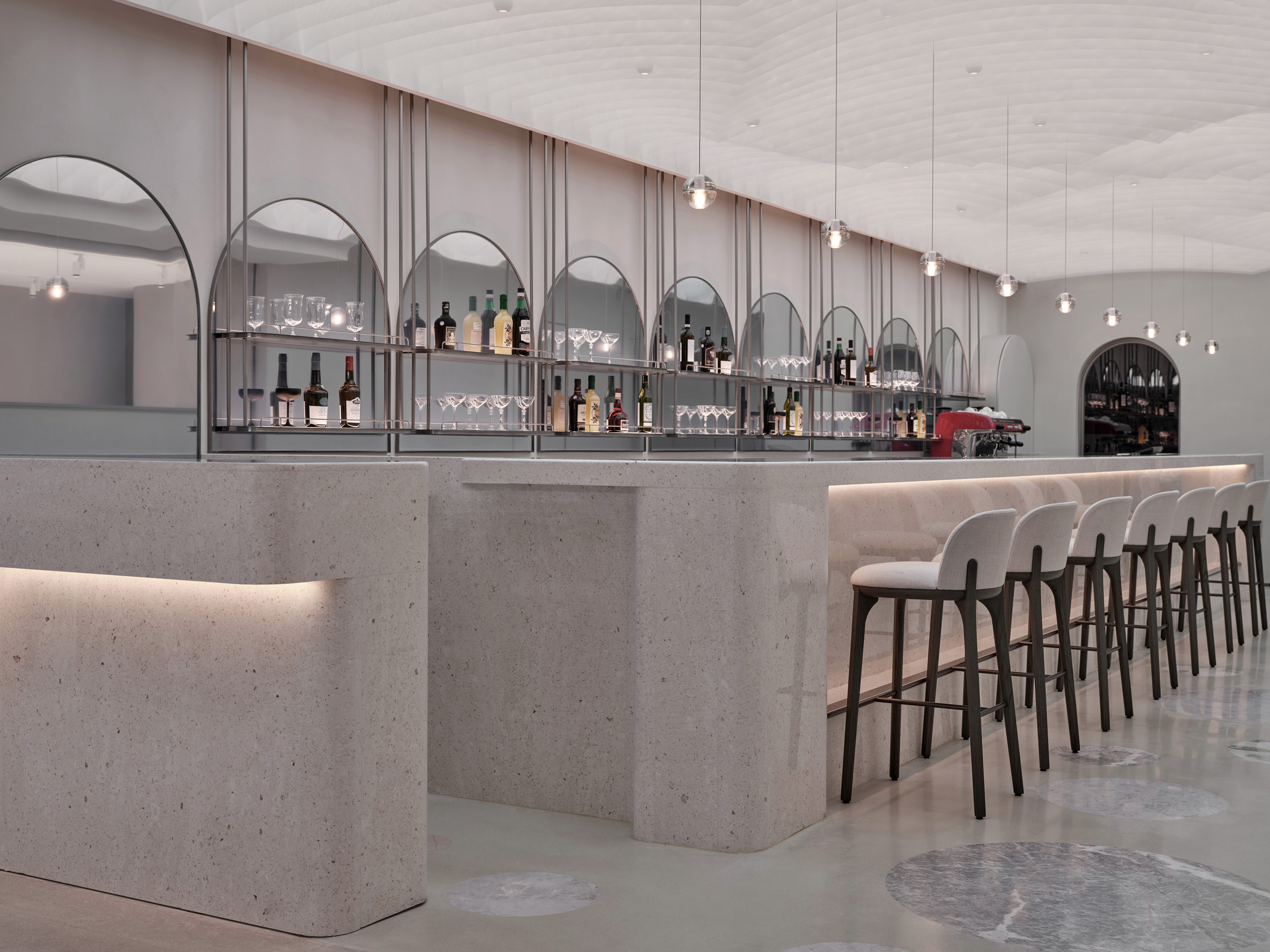 A stone bar is decorated with mirrors
The bar area also has a floor patterned with different kinds of stone while in the private dining rooms, precision-machined stainless steel and curved lacquered timber were paired to create another form of contradiction.
“Materials are manipulated as a catalyst for creating disorder, dissipation, fragmentation and surprise,” Mok said.
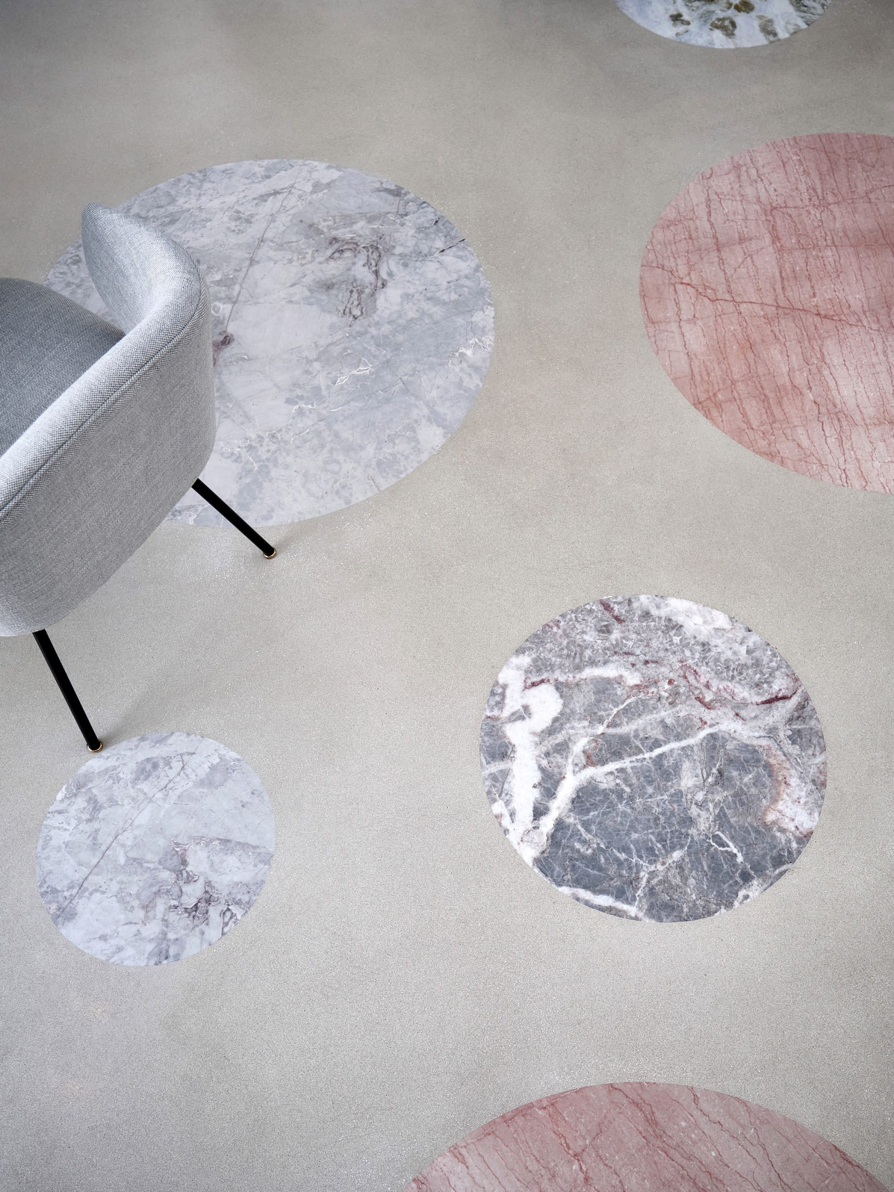 Different types of stone create a polka-dot pattern on the floor
Linehouse also recently finished a space-theme cafe for Australian chain Black Star Pastry's first Chinese outpost.
The studio was named emerging interior designer of the year at the 2021 Dezeen Awards.
The photography is byJonathan Leijonhufvud.
Project credits:
Architect: Linehouse
Design lead: Alex Mok, Briar Hickling
Design team: Jingru Tong, Inez Low, Aiwen Shao, Leah Lin, Jiabao Guo, Cherngyu Chen
The post Linehouse designs Shanghai restaurant informed by New Wave art movement appeared first on Dezeen.
#retail #all #interiors #china #shanghai #restaurants #linehouse
Graypants converts slender space near Seattle into Tomo restaurant
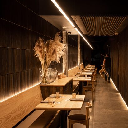

Dark-toned wood and golden light are found in this Washington bar and eatery by design firm Graypants that alludes to a Japanese urban alleyway.
Tomo is located in the community of White Center, which lies just south of Seattle. The dining establishment – which specialises in eclectic, seasonal cuisine – is named after the owner's grandmother, Tomoko, and the Japanese word for friend, tomodachi.
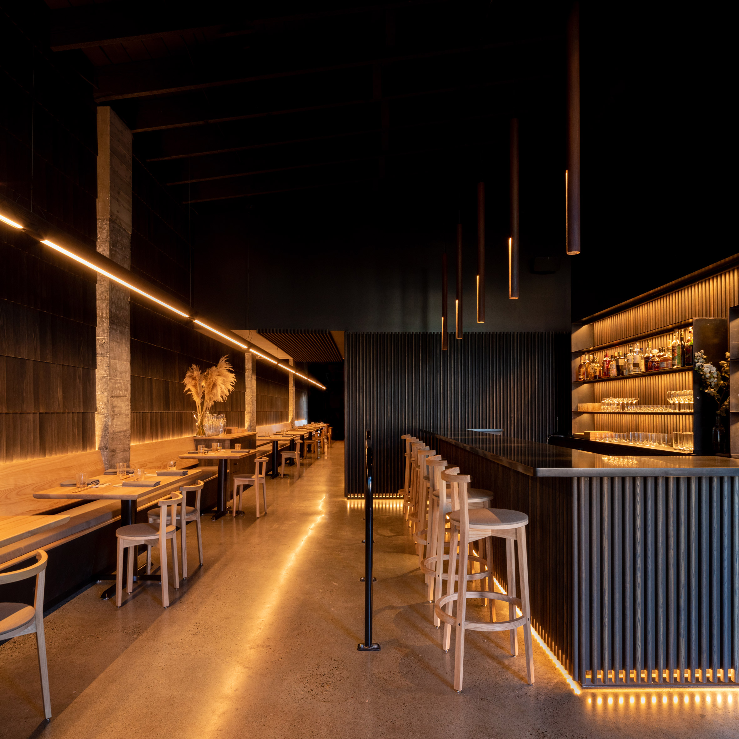 Dark-toned wood and golden light define Tomo restaurant
Graypants, which has offices in Seattle and Amsterdam, was charged with creating a distinctive space on a limited budget.
"The brief was to create something handcrafted in a short amount of time, using a modest budget, offering room for as many guests as possible, while ensuring each seat felt like the best one in the house," the team said.
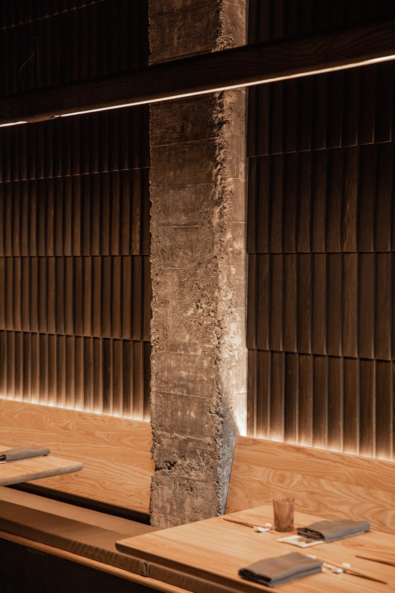 Graypants created the space on a minimal budget
Housed in a low-slung building along a main thoroughfare, the restaurant has a long and slender floor plan. The front facade features storefront-style glazing and charcoal-coloured brick.
Guests step into a dark-toned room with golden lighting and ample wood.
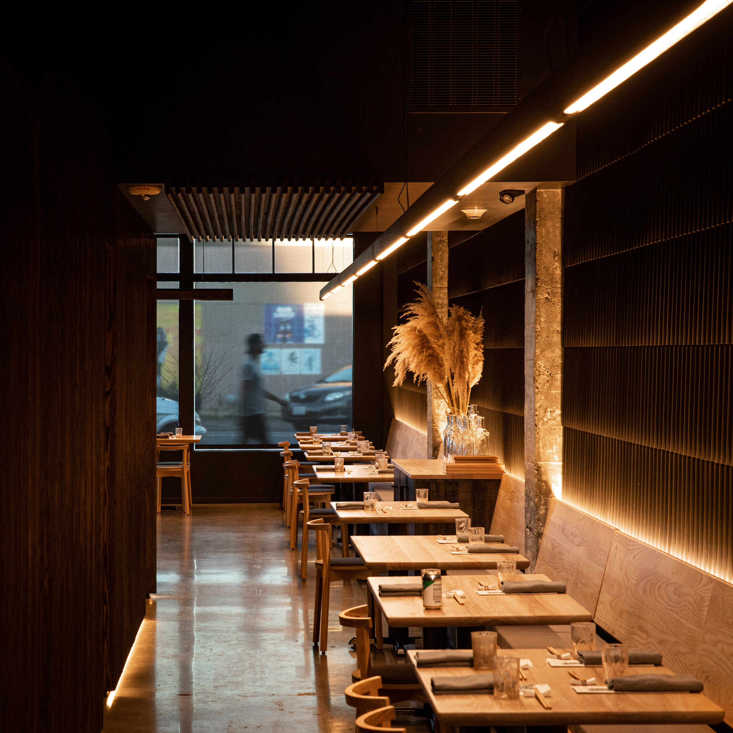 The design alludes to a Japanese urban alleyway
"Narrow and inviting, the experience references an evening in one the endless alleyways of Japanese cities," the studio said.
"The architecture aims to be demure and humble, letting the food be the centre of the experience," the team added.
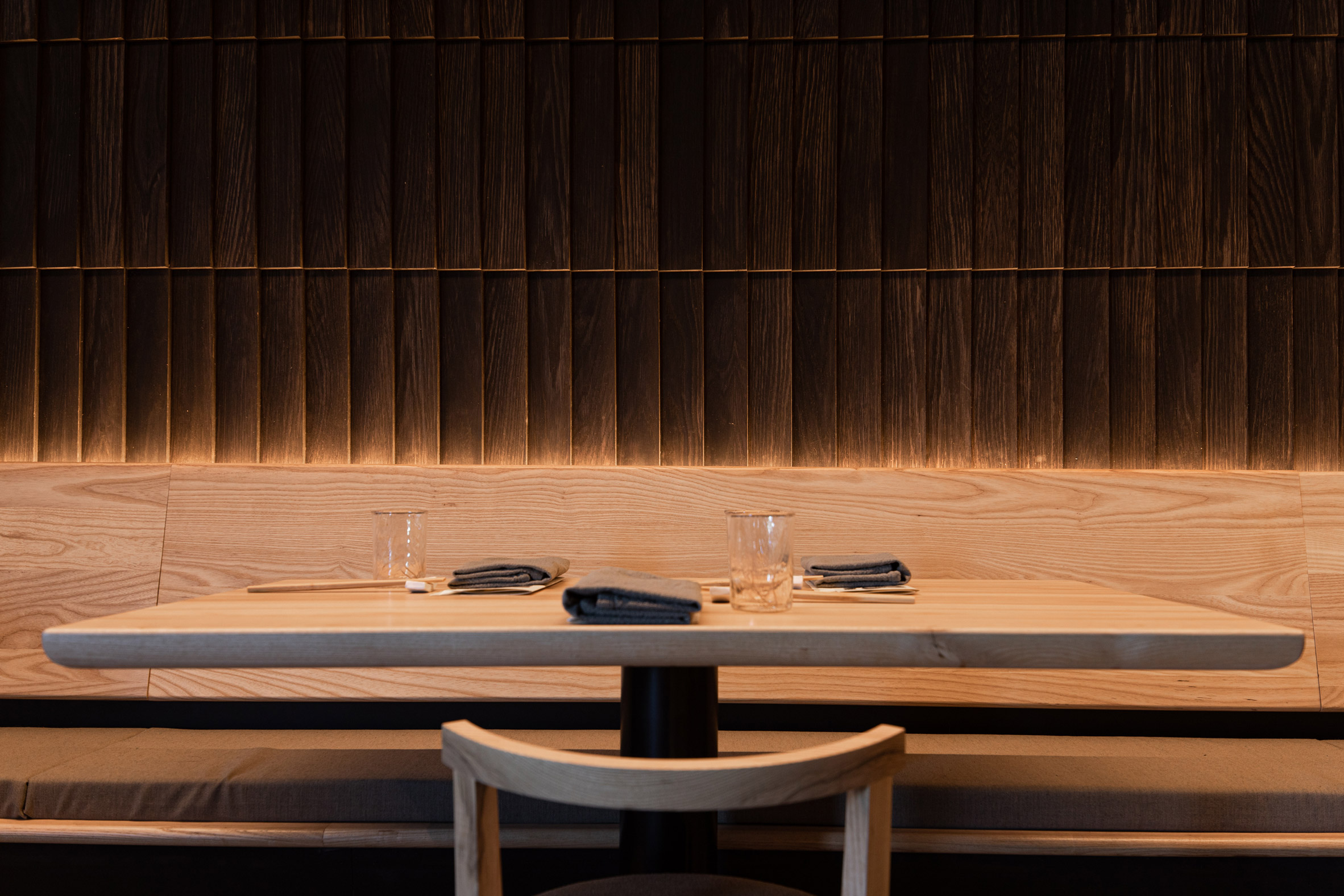 Oak shingles arranged like fish scales line the wall with seating
Lining one side of the restaurant is seating, which stretches along a wall clad in oak shingles arranged like fish scales.
To the other side is a bar, along with a kitchen enclosed within slatted walls made of ebony-stained ash.
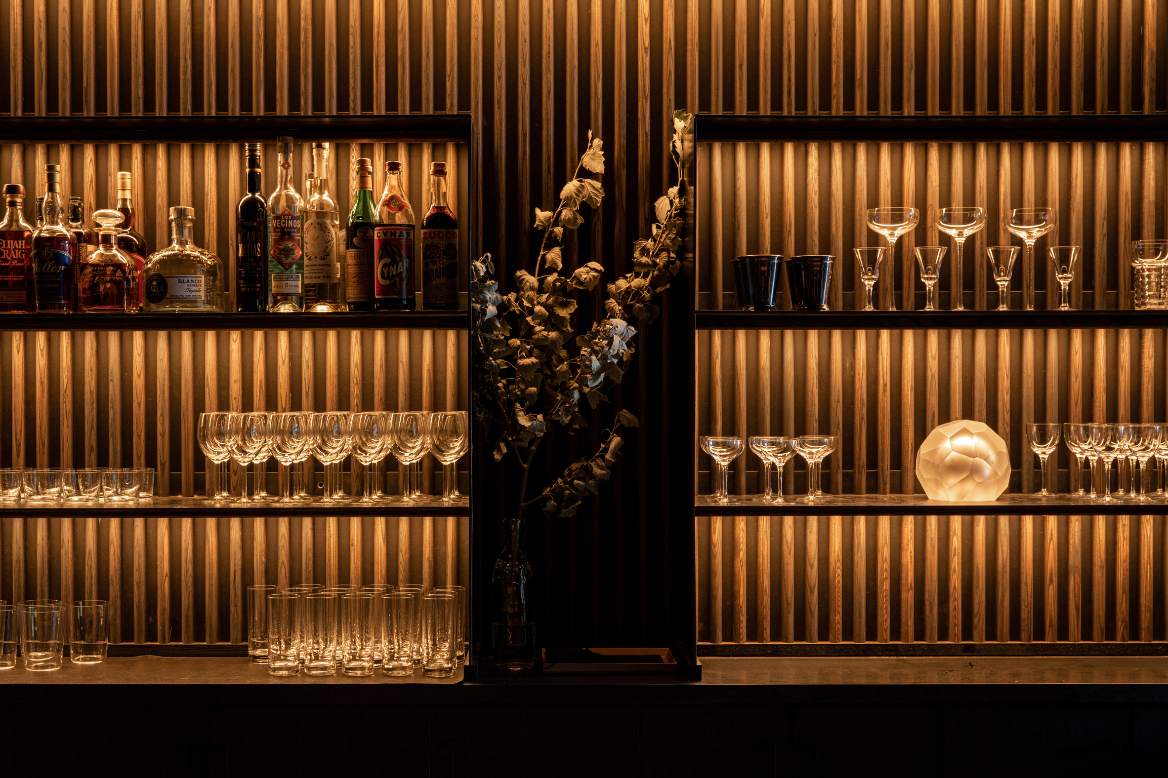 The bar features ebony-stained ash
"Wood is a centrepiece of the space," the team said. "The mingling of wood throughout the space creates an understated, monochrome texture."
Most of the lighting elements were integrated directly into wall panels, bench seating and bar shelves, enabling them to be "felt but not seen", the designers said.
[ 
Read:
Roth Sheppard inserts unexpected elements into Hapa Sushi restaurant
The exception is an 80-foot (24-metre) linear fixture that extends the length of the restaurant.
The team sought to save money wherever possible, without compromising on design quality.
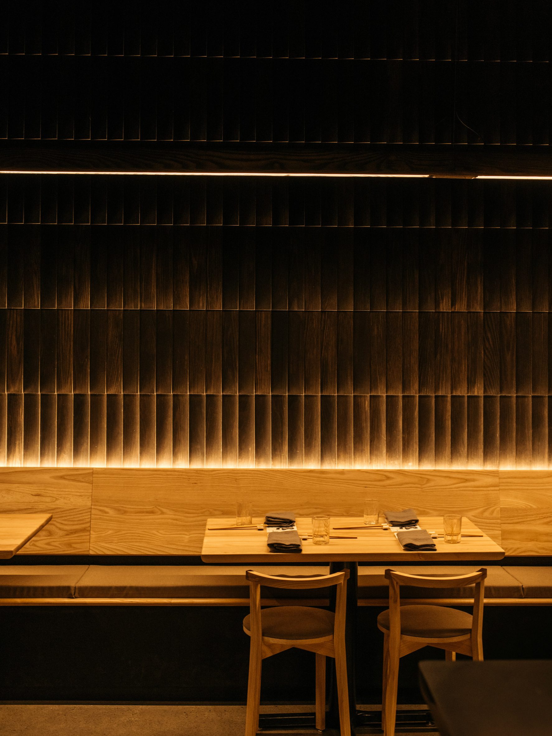 Most of the furniture was designed by Graypants
Graypants, with help from the studio Fin, designed and fabricated most of the fixtures and furniture, including the lighting, seating and tabletops. This helped reduce costs and shorten the construction timeframe.
Each piece of furniture was finished with a zero-VOC topcoat.
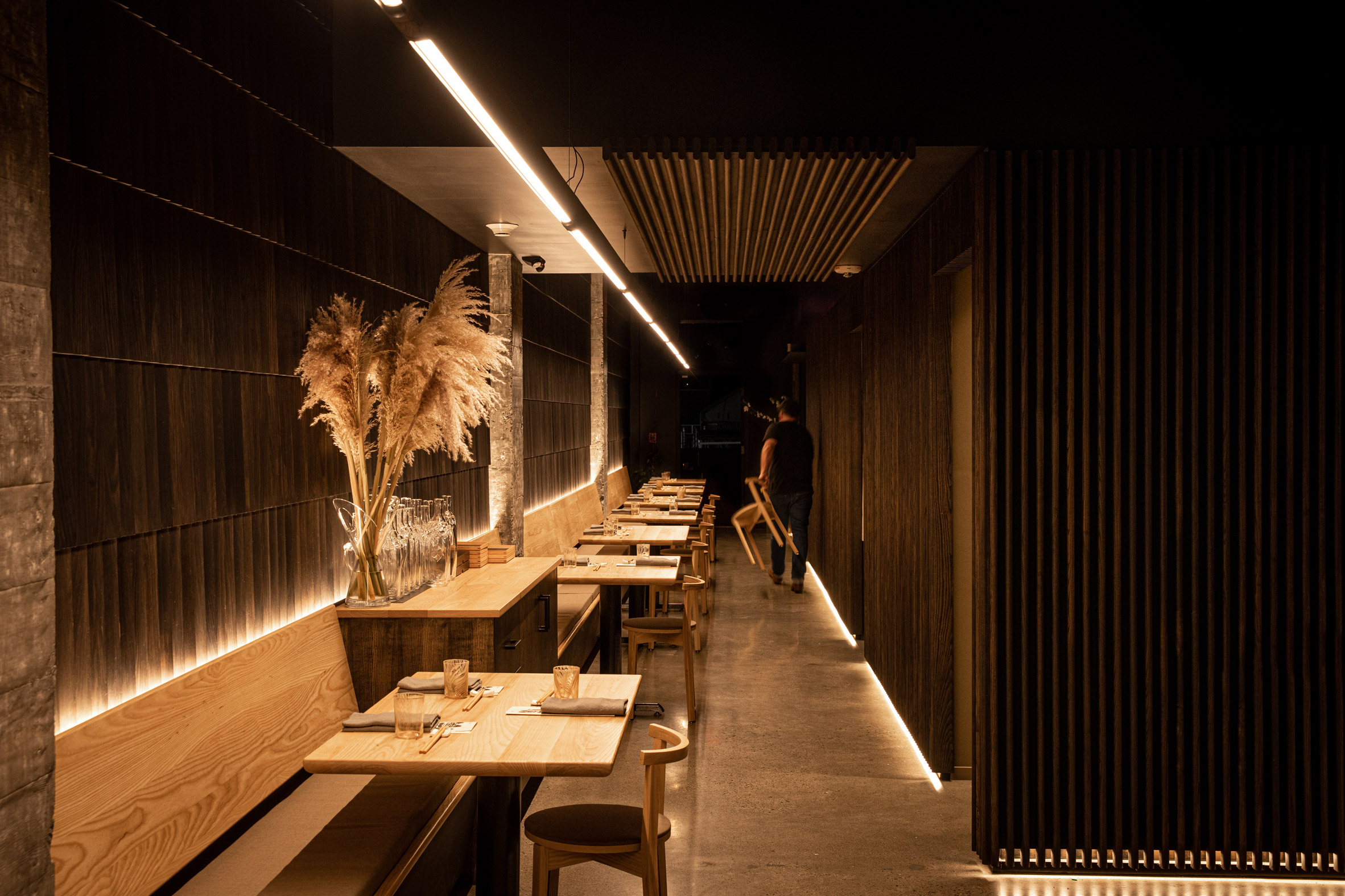 The architecture aims to be demure and humble, according to its designers
The outdoor tables, kitchen cladding and bar-back were fabricated using Richlite, a durable and locally sourced material that is made of resin-infused paper.
"The team carefully chose their moves – like simply polishing existing concrete floors and investing in finishes that feel complex but are efficient to install, lowering construction cost," the studio said.
"The cost per square feet of this project is, conservatively, 35 per cent below the benchmark."
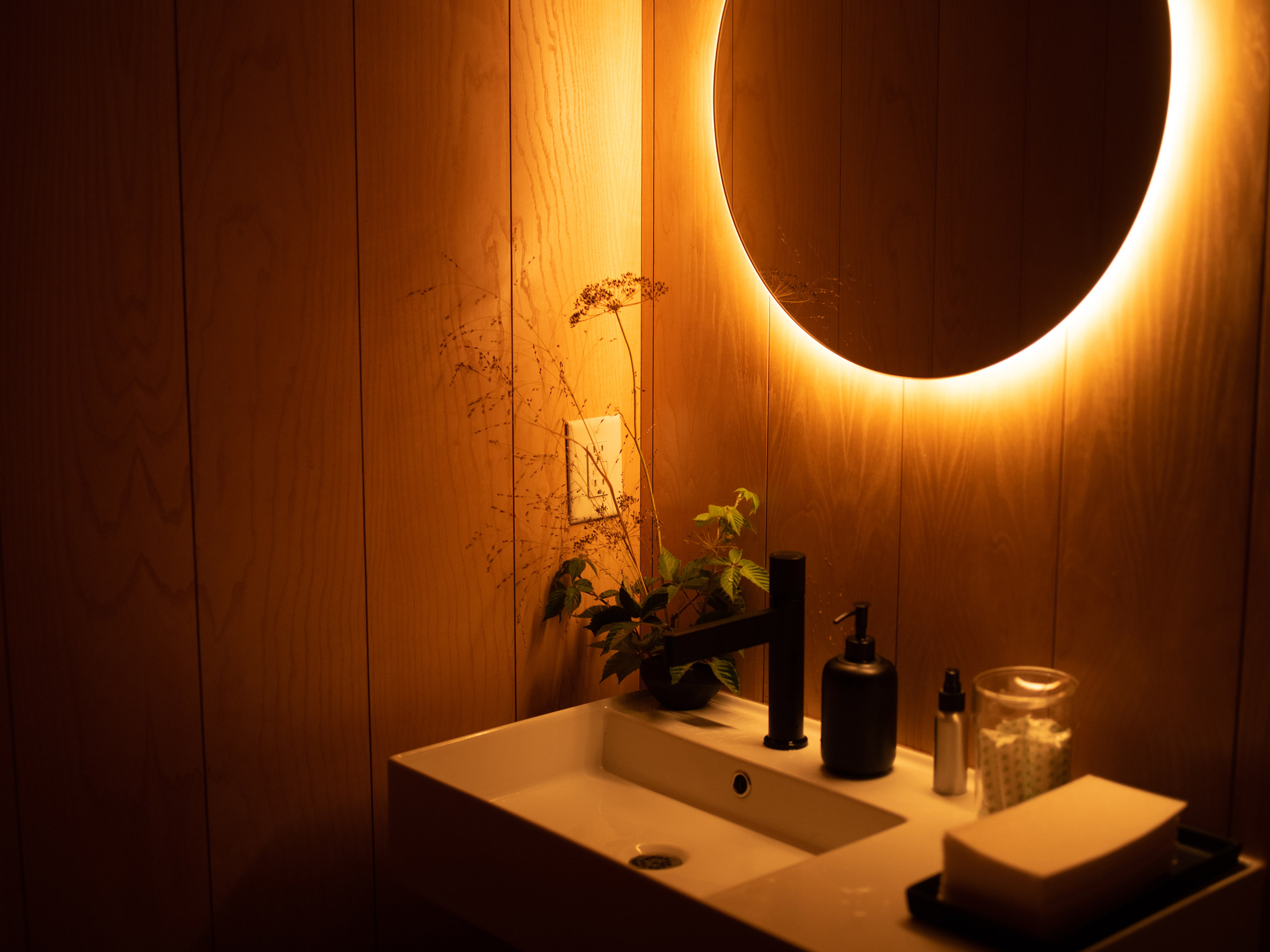 Low lighting is used throughout the restaurant
Other restaurants in the Seattle area include the Samara bistro by Mutuus Studio, which features rustic materials and earth tones that create a "sense of timelessness and comfort".
The photography is byAdam Joseph Wells.
Project credits:
Designer: Graypants
Design team: Seth Grizzle, Bryan Reed, Caleb Patterson, Alan Marrero
Furniture designer and manufacturer: Fin
Owner and chef: Brady Williams
Operations: Jessica Powers
General contractor: Shawn Landis
The post Graypants converts slender space near Seattle into Tomo restaurant appeared first on Dezeen.
#restaurantsandbars #all #interiors #usa #restaurants #washingtonstate #graypants
Stitched brick wall welcomes guests to Uchi Miami restaurant by Michael Hsu
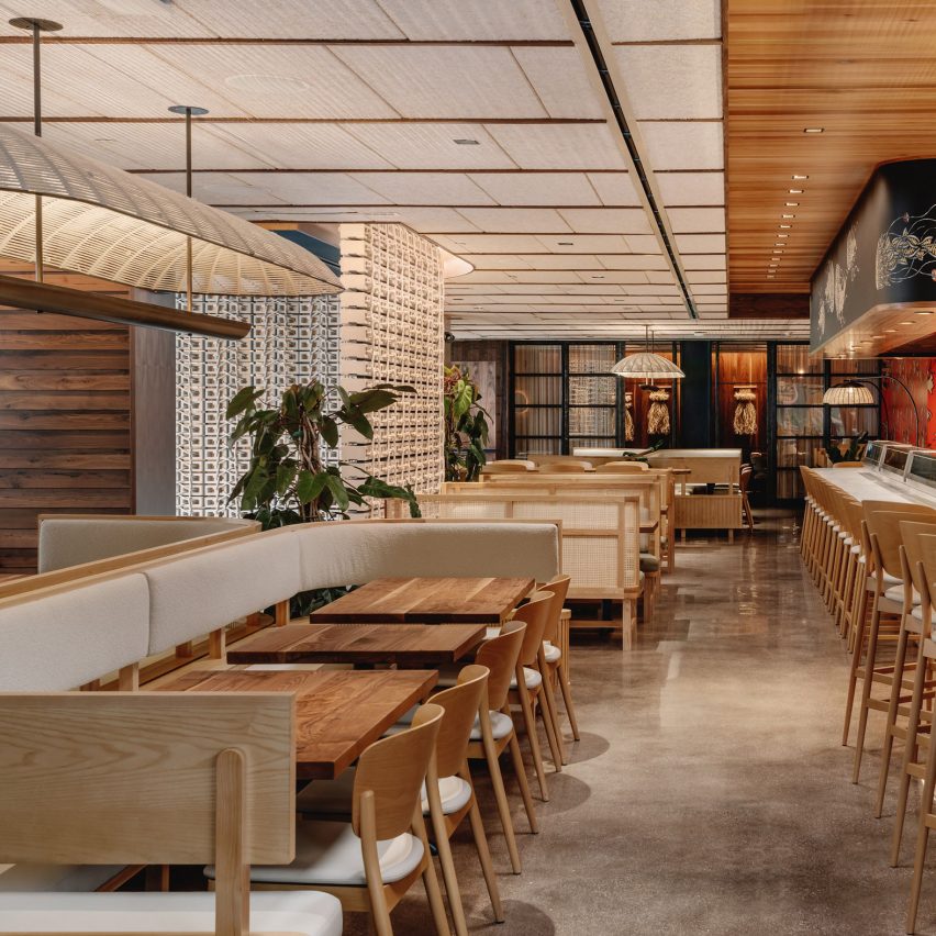
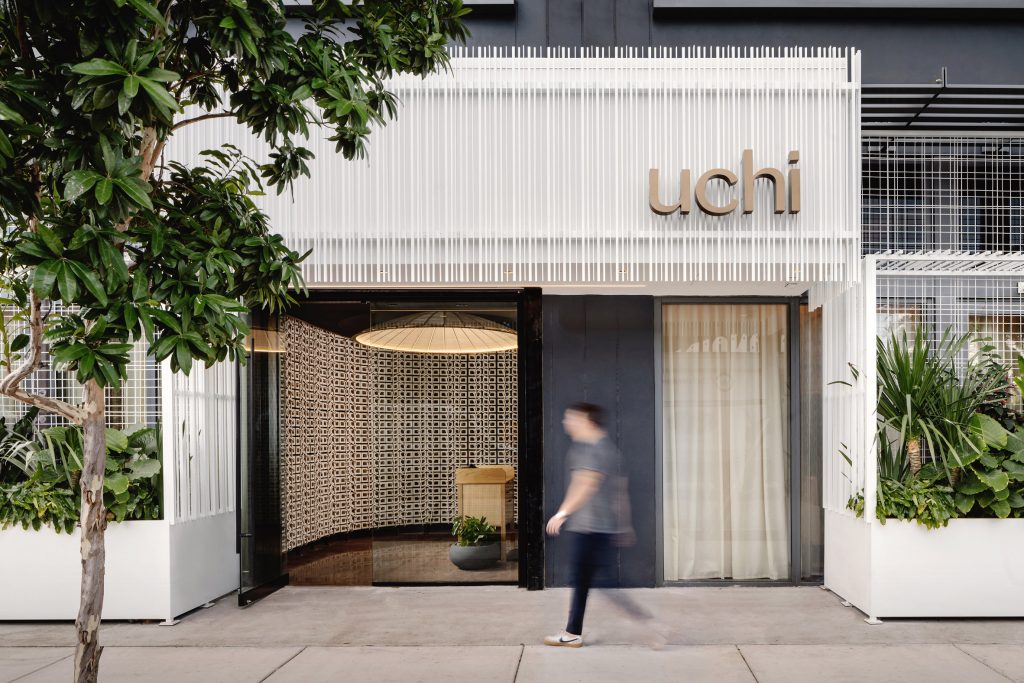
Masonry bricks are tied together to form a curved entryway at this sushi restaurant in Miami's Wynwood neighbourhood, by Michael Hsu Office of Architecture.
At Uchi Miami, the American firm aimed to create a "perfect contrast" between the materials, techniques and styles of Japan and Florida.
 Uchi Miami in Wynwood is fronted by a white structure wrapped in slats
"Uchi tells a story of tactility, honoring Japanese tradition, but has been infused with local notes," said Michael Hsu Office of Architecture.
"Wrapping, layering and stitching, inspired by native art forms, apply sophisticated design to simple objects to elevate ordinary materials found in daily life."
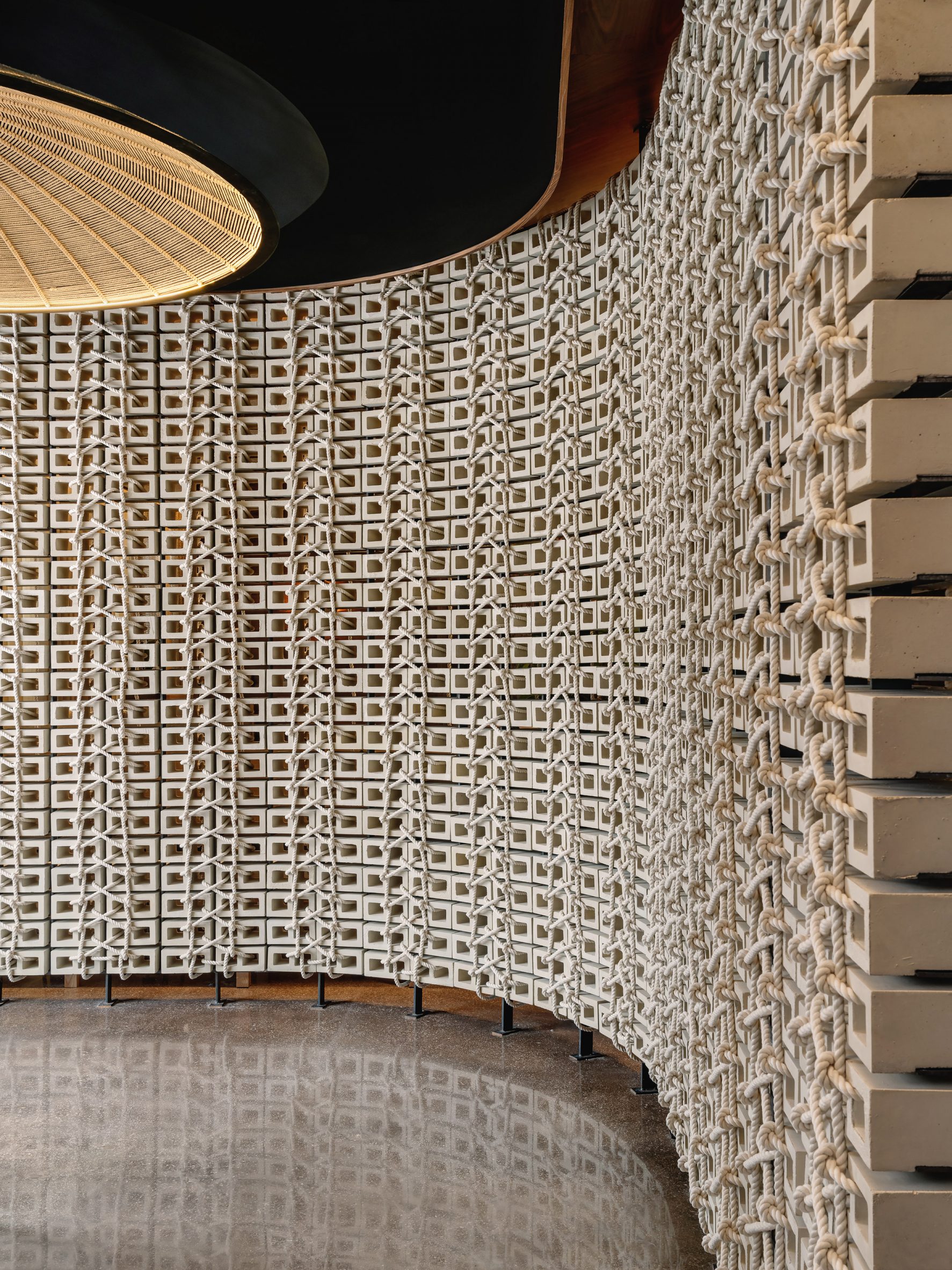 A wall of woven bricks by Vas Bets greets guests upon entry
Flanked by troughs filled with tropical plants, the entrance is surrounded by a pure white frame wrapped with vertical slats.
Once through the glass doors, guests are guided around to the host stand by a curved wall of concrete blocks created by locally based artist Vas Bets.
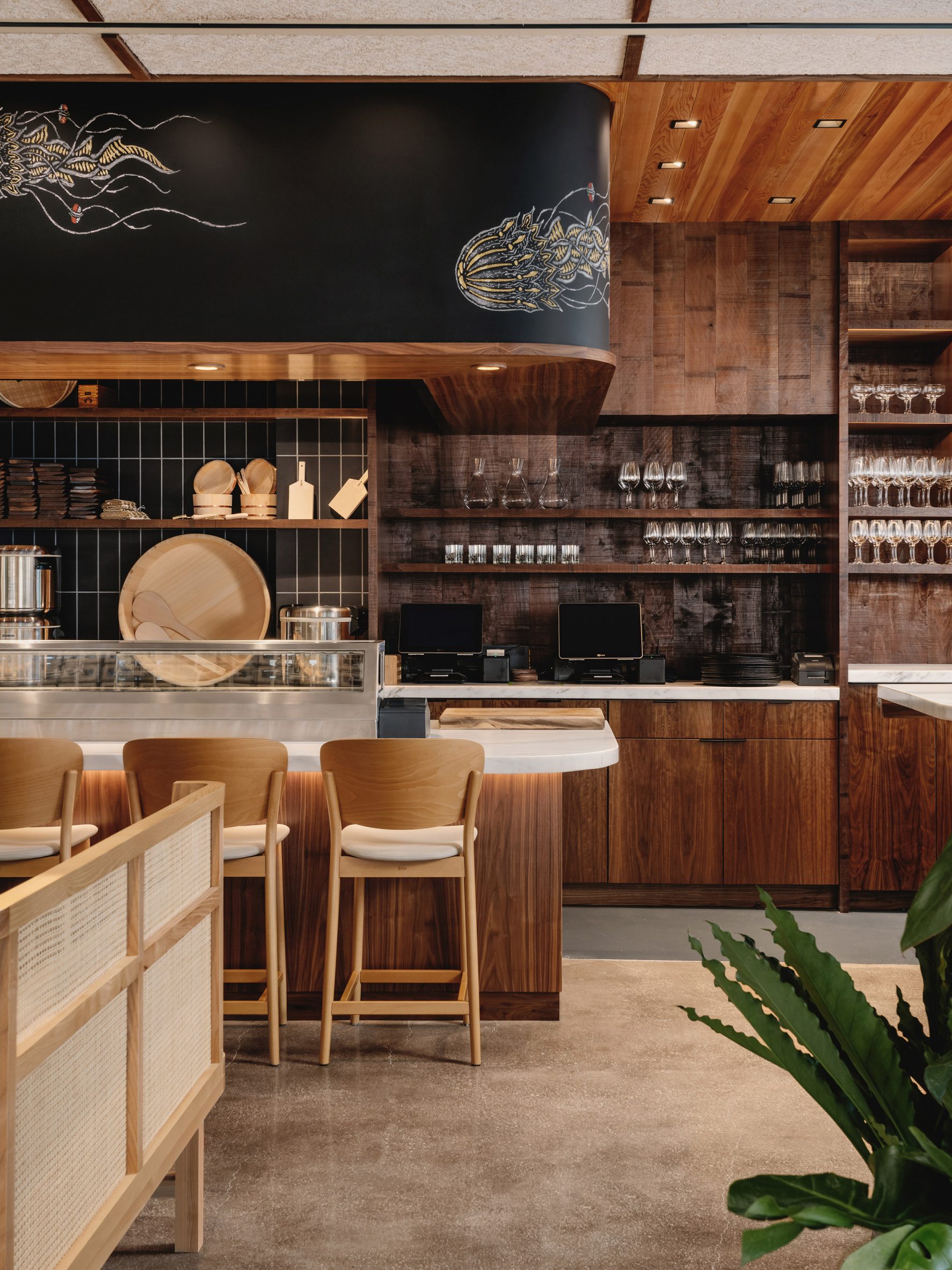 A chalk mural by Sam Angus Jackson is found above the sushi bar
The blocks are tied together with rope, which weaves through their holes in a repeated pattern that is reflected in the polished floor.
In the main dining area, a mix of banquettes, bar seating and high-top tables offers a variety of configurations for parties of different sizes.
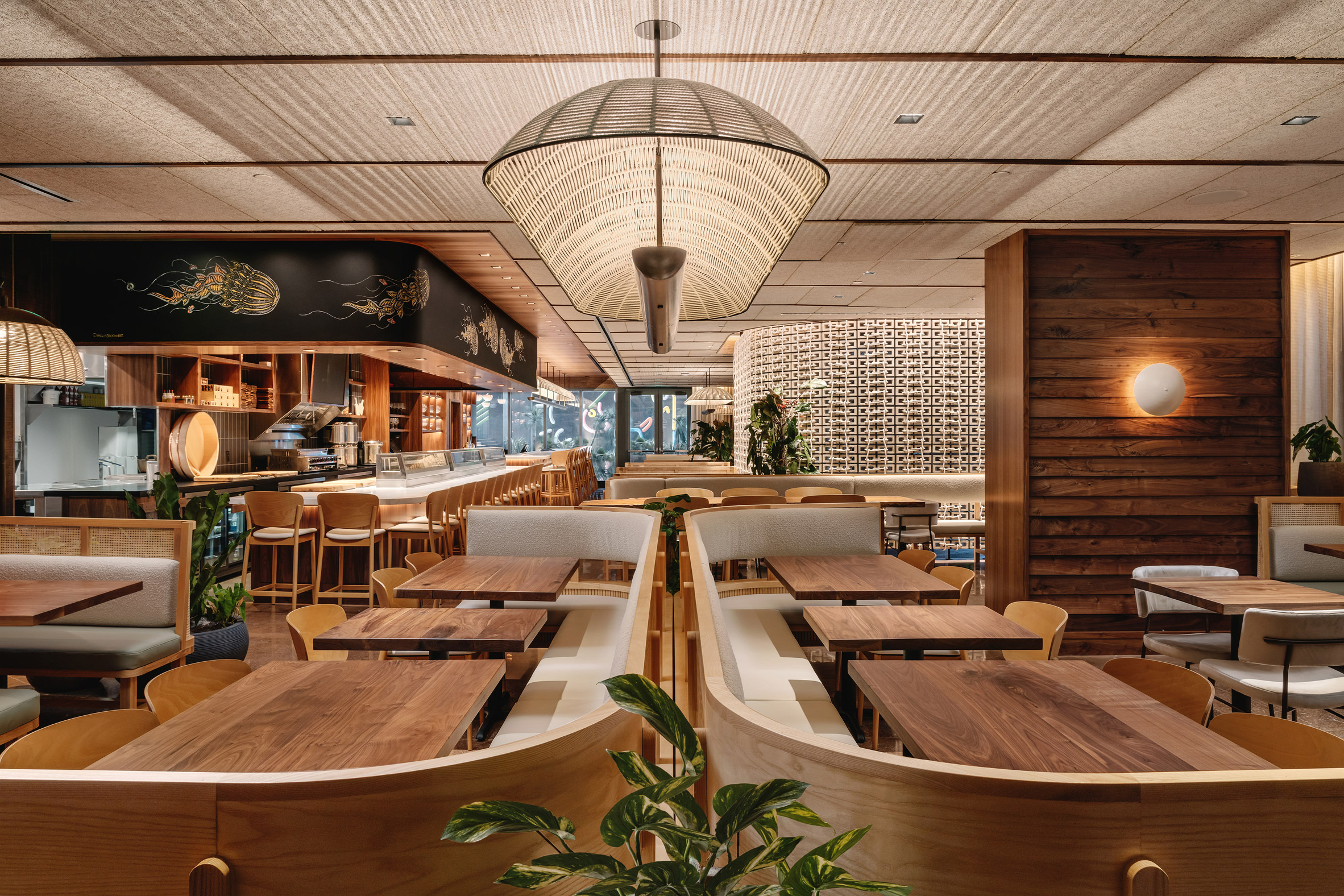 Warbach's woven light fixtures create patterns across the ceiling
The wooden banquettes feature curved woven back panels and grey upholstered cushions – in a bouclé fabric for the backs and leather for the seats.
Walnut table tops and ash chairs match panelling on the walls and ceiling, while other surfaces are lined with bright red and orange wallpaper.
[ 
Read:
Pirajean Lees channels 1920s Japan in ornate Dubai restaurant interior
](https://www.dezeen.com/2021/09/05/pirajean-lees-mimi-kakushi-dubai-restaurant/)
Other artist collaborations within the restaurant include a hand-drawn chalk mural of jellyfish by artist Sam Angus Jackson, found above the sushi bar.
Hand-woven wall hangings by Miami artist Elan Byrd decorate the series of private dining areas, which run along one end of the restaurant behind black-framed glass panels.
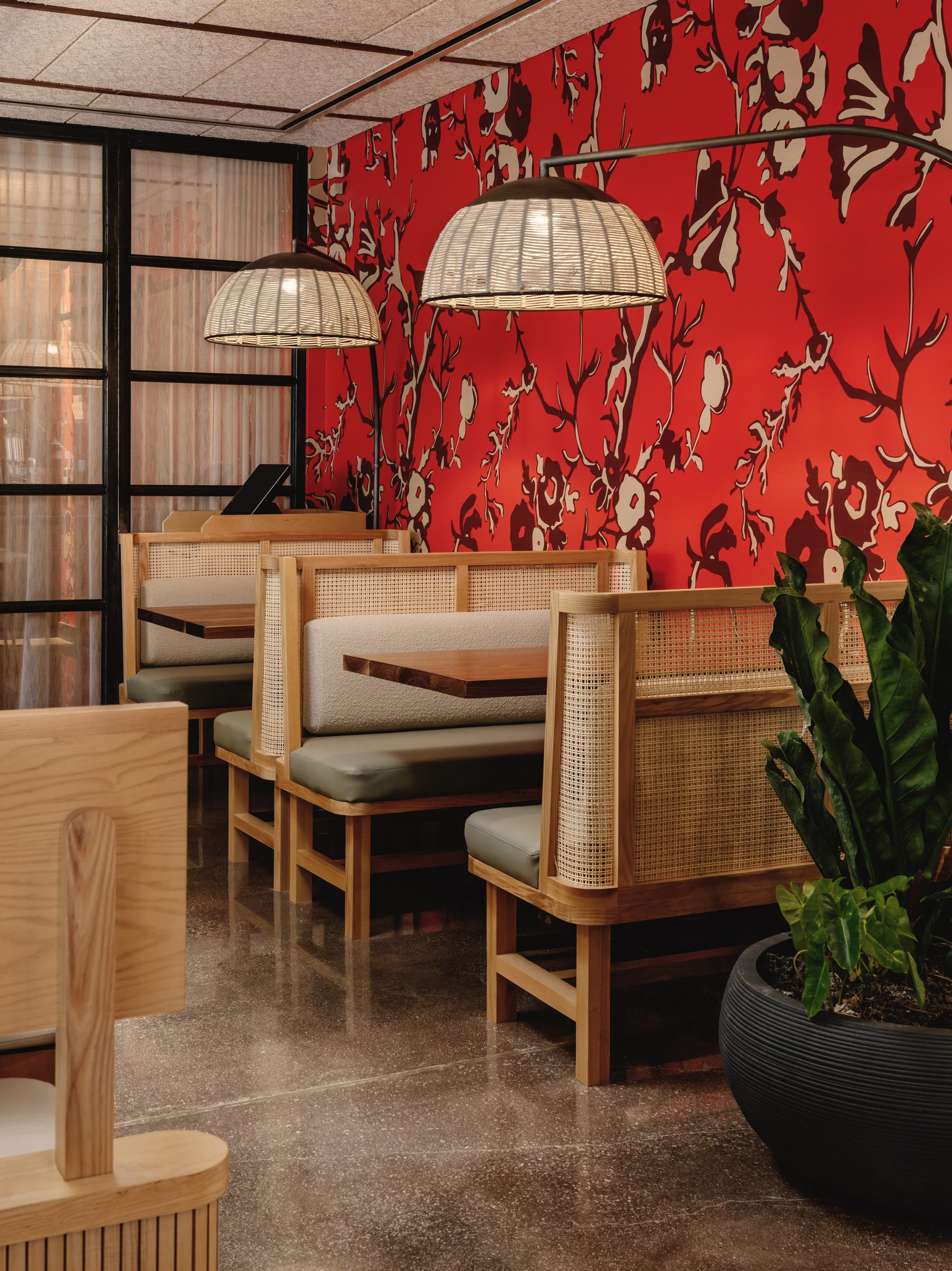 Bright red wallpaper offers a contrast to the natural materials
Positioned over the bars and dining tables, lighting studio Warbach's bespoke fixtures continue the woven motif.
"The overhead large, custom basket light provides a warm glow to illuminate the wall's shapes and textile-inspired characteristics," said Michael Hsu's team.
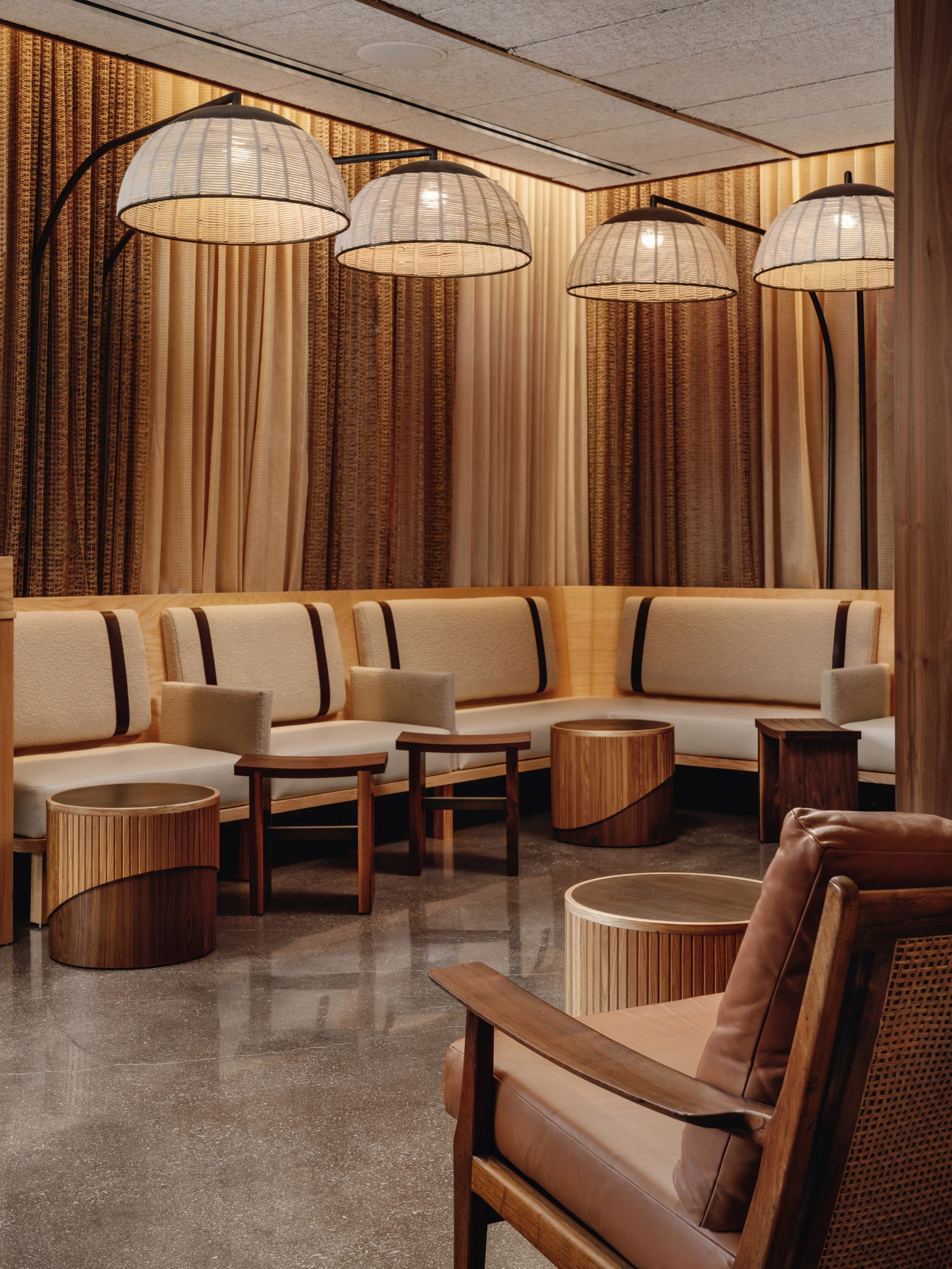 The studio aimed to blend a variety of textures and materials throughout the restaurant
Michael Hsu Office of Architecture has previously completed a restaurant with a curved wooden ceiling in its home city of Austin, Texas.
The studio has also designed a remote home in Texas Hill Country and the interiors for Shake Shack's headquarters in New York City.
The photography is byChase Daniel.
Project credits:
Owner: Hai Hospitality
Architect of record: Form Group Architecture
General contractor: City Construction Group
Project management: Amicon Management
Kitchen consultant: Trimark USA
MEP: RPJ Engineering
Landscape designer: Plant the Future
The post Stitched brick wall welcomes guests to Uchi Miami restaurant by Michael Hsu appeared first on Dezeen.
#restaurantsandbars #all #interiors #usa #miami #bricks #restaurants #florida #michaelhsuofficeofarchitecture #japaneserestaurants
Oku restaurant in Mexico City features "floating tables" made of wood and steel

Curved booths are suspended over a dining room at a Japanese restaurant in Mexico City designed by local firms Michan Architecture and Escala Arquitectos.
The sushi eatery is located in the upscale neighbourhood of Jardines del Pedregal, across from a famed church known as Parroquia de la Santa Cruz del Pedregal.
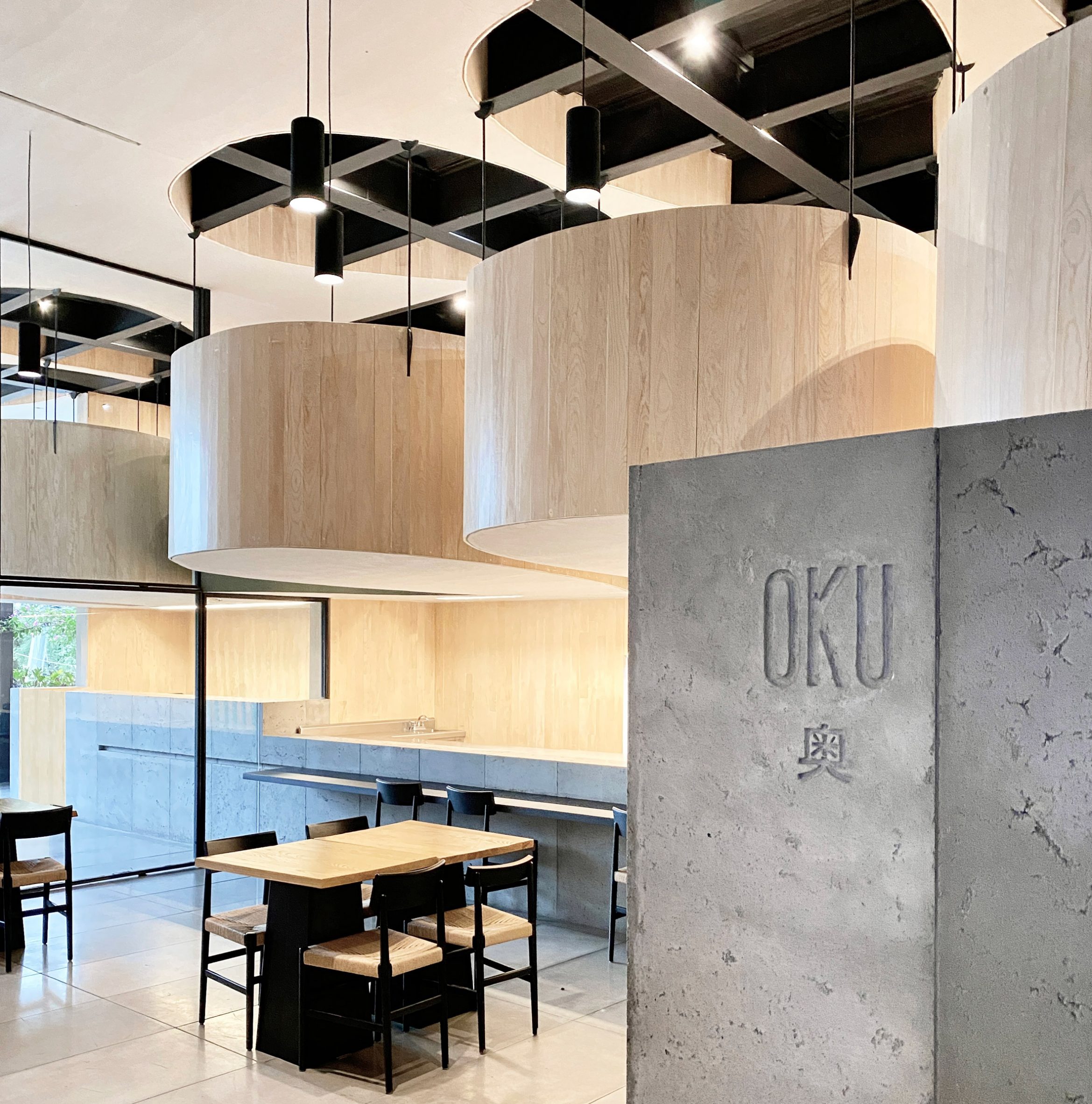 Oku is a sushi restaurant in Mexico City
It is the second Oku restaurant designed by Michan Architecture. The other – which features a cave-like ceiling made of huge concrete lights – is found in the district of Lomas de Chapultepec.
For the Pedregal location, the architects worked with another local firm, Escala Arquitectos. The team aimed to elongate the space's proportions and take advantage of its height.
 The restaurant is Michan Architecture's second of its kind
Rectangular in plan, the eatery has two levels. The lower level encompasses a sushi bar, indoor and outdoor seating, and a back-of-house zone.
Additional seating is found upstairs, where a series of "floating tables" are arrayed along a corridor.
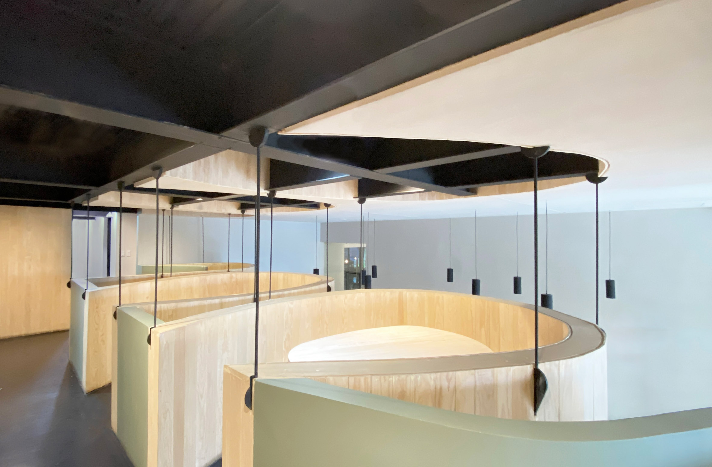 "Floating tables" are arrayed along a corridor
"The mezzanine level features individual tables hung from the existing structure, giving guests a unique dining experience," the studio said.
Two of the tables hover above the sushi bar, and two extend over the outdoor terrace. Each has wooden walls that enclose a single booth.
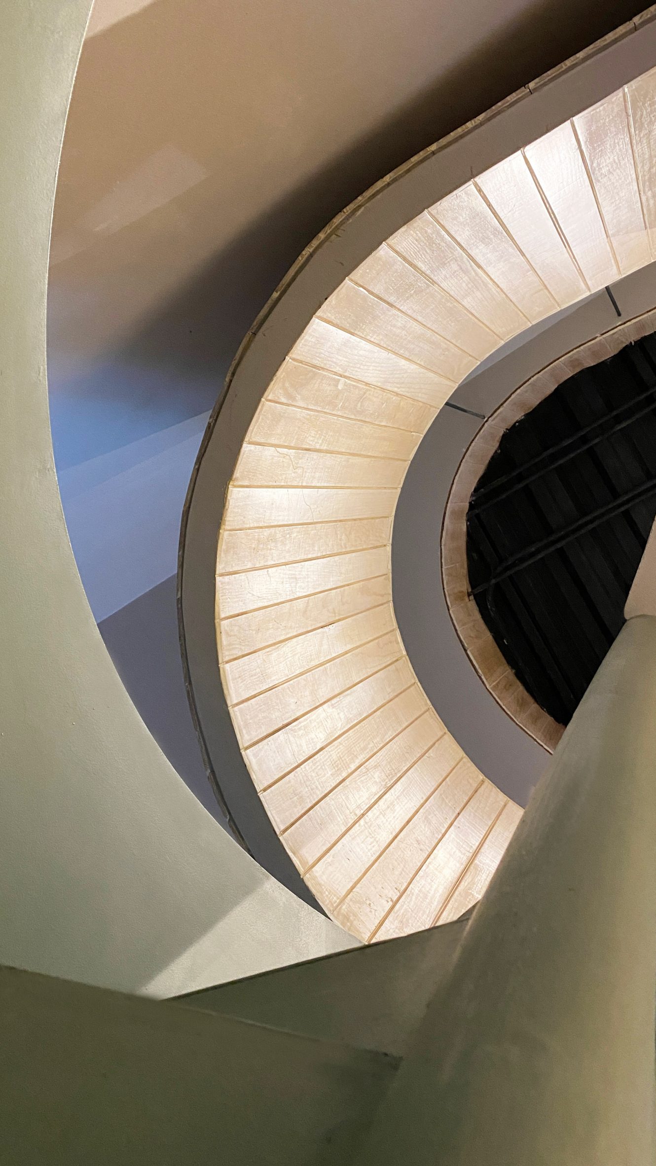 Curved stairs connect Oku's two levels
A similar enclosure was used for the stairs connecting the restaurant's two levels.
The dining pods are supported by light steel members that are welded into the building's existing steel structure.
[ 
Read:
Samurai armour and Kanji characters inform Mexico City's Tori Tori restaurant by Esrawe Studio
](https://www.dezeen.com/2020/03/29/tori-tori-restaurant-esrawe-studio-mexico-city/)
Above the mezzanine is a drop ceiling with curved cutouts that expose the steel framing and add height to the space.
Moreover, the openings provide a "sensation of cutting and pasting the ceiling onto the tables", the architects said.
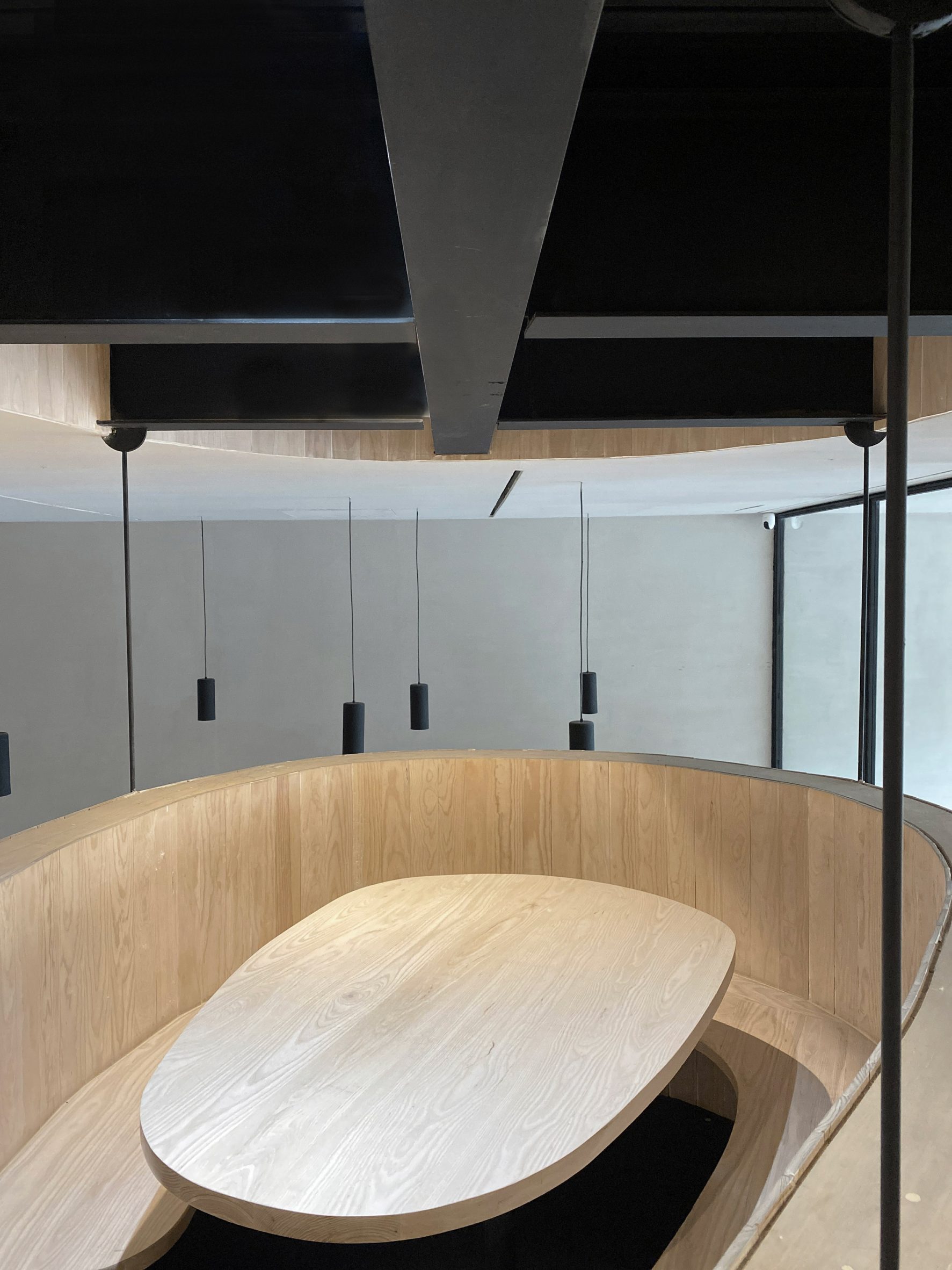 Cylindrical black lighting fixtures hang from the ceiling
Hung from the ceiling are cylindrical, black lighting fixtures, which merge electrical cables with structural elements.
Throughout the restaurant, the team used neutral colours and clad surfaces in pine, pigmented stucco and panels made of glass-fibre-reinforced concrete (GFRC).
 The team used neutral colours and clad surfaces in pinewood throughout Oku
The effect is a "light and open atmosphere that plays with polished and raw finishes", the team said.
Other Japanese eateries in Mexico include Mexico City's Tori Tori by Esrawe Studio, which features elements inspired by Samurai armour, and a restaurant by TAX Architects in the coastal town of Puerto Escondido that is topped with a thatched roof.
The photography is by Alexandra Bové.
Project credits:
Architect: Michan Architecture and Escala Arquitectos
Project team: Narciso Martinez, Benjamin Espindola, Emilio Gamus, Isaac Michan
Structural engineer: Arturo Rosales + MdO
Mechanical, electrical, plumbing: RAGER, Rafael Barra
The post Oku restaurant in Mexico City features "floating tables" made of wood and steel appeared first on Dezeen.
#restaurantsandbars #all #interiors #instagram #wood #steel #mexicocity #restaurants #mexico #japaneserestaurants
Ich gehe seit Beginn der #Pandemie sehr selten in #Restaurants, ich gehe nur wenn es sehr leer ist, wenn es sich nicht vermeiden lässt oder wenn sehr genau kontrolliertes #2G+ umgesetzt wird (was nie passiert).
Das sind bei mir einige gesparte Euro.

