#tiles

psychmesu@diaspora.glasswings.com

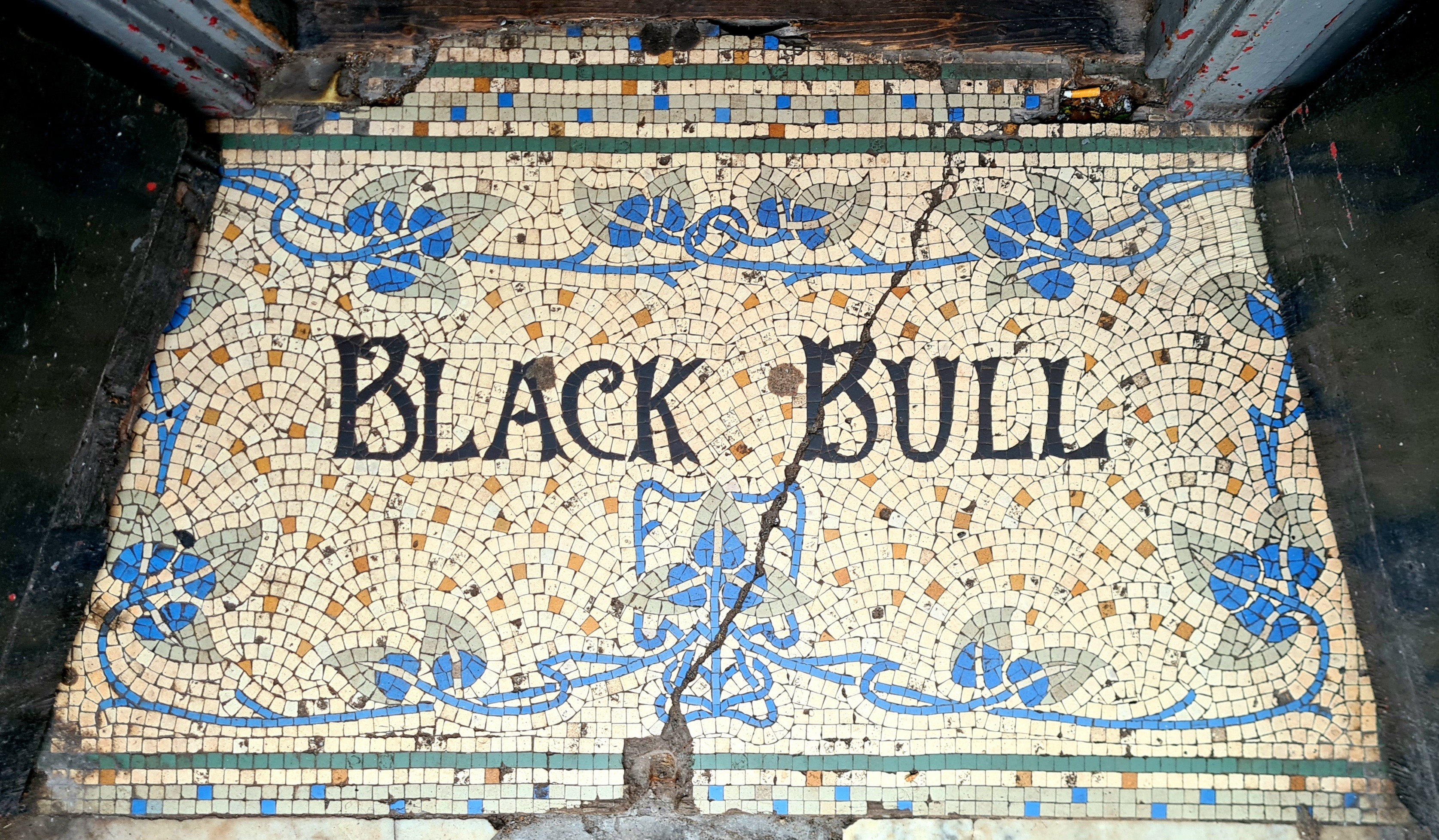
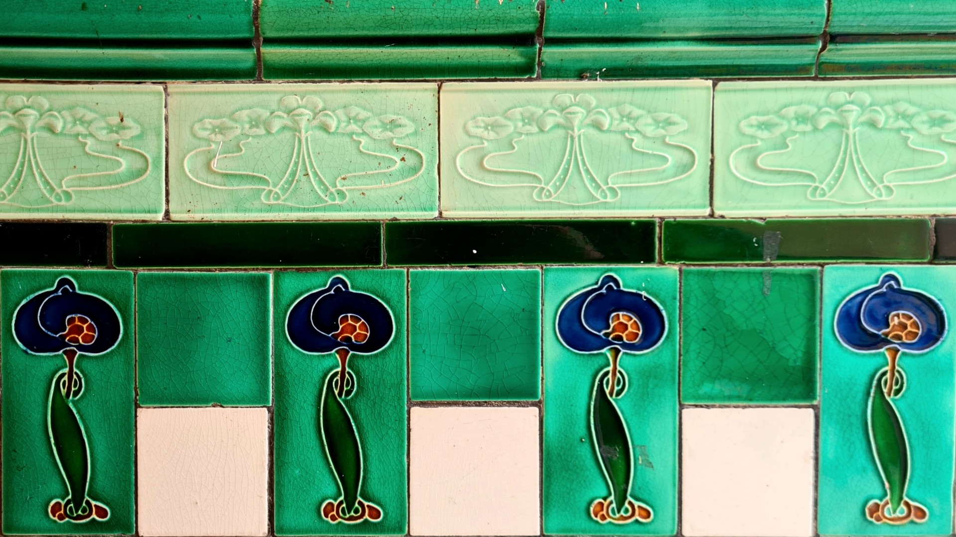
https://mastodon.scot/@thisismyglasgow/113364531153228244 thisismyglasgow@mastodon.scot - Love this threshold at the entrance to the Old Black Bull pub in the Parkhead area of Glasgow. There's been a pub with this name on this site since 1760. In the 1860s, it was run by Andrew Stout who also made his own aerated water and ginger beer. He sold this side business to A.G. Barr, the makers of Iru-Bru, Scotland's other national drink, in 1887.

Cont./

#glasgow #glasgowpubs #parkhead #mosaic #tiles #glasgowhistory

psych@diasp.org

Now for something different..

Central Park

Sunday in the Park - Pt 2 - A serene Erhu Concert, in Bethesda Arcade, Central Park (NYC)

Heavenly #erhu #music in Central Park - Part 2

My 1st goal - aside from exercise & enjoying a beautiful Sunday in the Park- was to inaugurate & test a new camera.
✔︎
A 2nd goal was to get some more/better images of the famous and beautiful ceiling.

Designed by Jacob Wrey Mould and created in the 1860s, the Arcade features a stunning tiled ceiling with more than 15,000 colorful, patterned encaustic tiles from England’s famous Minton Tile Company. These elaborate tiles were originally used on the floors of European cathedrals. Bethesda Arcade is the only place in the world where these special tiles are used for a ceiling! [cenralpark.com]

Video1 was grabbed with an iPhone, which I must say did a nice job. This 2nd one, after scrambling to set up the new camera, is in true 4K and (for me) 'feature length' - long compared to my nature snippets. Be sure, if viewing on hi-res-big/bright screen, to set the YT player (gear at bottom of picture) to 4K, if it didn't choose it with the 'auto-set'). It makes a difference in "being there", as the mix of serene music and people and pets strolling by and up/down the Bethesda Terrace stairs... Serene. And I guess the camera works ok.
Sorry for the shake - hand-held and trying to realistically 'look around' and also get some screen-grab-quality images of the tiles.]

Enjoy!

#Fenfotos #NYC #NewYork #CentralPark #erhu #MusicalInstruments #Music #BethesdaArcade #tiles #musica #musique

berternste2@diasp.nl

Stoomlocomotief

Foto van tegeltableau met stoomlocomotief

Porto (Portugal) 2023

Portugal is beroemd om zijn tegeltableaus (azulejos). Deze bevindt zich in de hal van station São Bento in Porto, waar veel van die azulejos te vinden zijn. Toen ik er was, was er ook een fototentoonstelling:

Foto van stationshal met tegeltableaus en foto’s uitgestald op ezels.

Porto (Portugal) 2023

#architecture #architectuur #azulejos #foto #fotografie #photo #photography #porto #portugal #railway #spoorwegen #tegeltableau #tiles #train #trein

Originally posted at: https://blog.ernste.net/2024/06/27/stoomlocomotief/

berternste2@diasp.nl

Edelsmid

Foto van tegeltableau met edelsmeden

Utrecht 2022

Dit tableau met edelsmeden is te vinden aan het pand waar vroeger de zaak in goud- en zilverwerken van A.J. Cral zat. Het is geïnspireerd door een schilderij van Hans Holbein (1497/8-1543), zo lees ik hier.

#architecture #architectuur #edelsmid #foto #fotografie #goldsmith #netherlands #photo #photography #silversmith #tegels #tiles #utrecht

Originally posted at: https://blog.ernste.net/2023/09/14/edelsmid/

berternste2@diasp.nl

Tijl Uilenspiegel

Foto van tegeltableau met Tijl Uilenspiegel

Utrecht 2022

Tijl Uilenspiegel (Duits: Till Eulenspiegel) is een personage uit onder meer de Duits-Nederlandse folklore. Volgens de Duitse sage van rond 1500 was Uilenspiegel een schelm die vrij als een vogel in de veertiende eeuw door Duitsland trok en iedereen voor de gek hield met zijn streken. De Belgische schrijver Charles De Coster herschiep Tijl Uilenspiegel in 1867 in de roman La légende et les aventures héroiques, joyeuses et glorieuses d’Ulenspiegel et de Lamme Goedzak au pays de Flandres et ailleurs (De Legende van Uilenspiegel). In dat verhaal is hij een zestiende eeuwse Vlaamse vrijheidsstrijder, mogelijk een nazaat van de vorige Uilenspiegel, die aan de zijde van de geuzen tegen de Spaanse overheersing vecht.

Dit citaat komt van Wikipedia, waar nog veel meer valt te lezen over deze figuur.

#folklore #foto #fotografie #literature #literatuur #netherlands #photo #photography #tegels #tijl-uilenspiegel #tiles #utrecht

Originally posted at: https://blog.ernste.net/2023/05/31/tijl-uilenspiegel/

dezeen@xn--y9azesw6bu.xn--y9a3aq

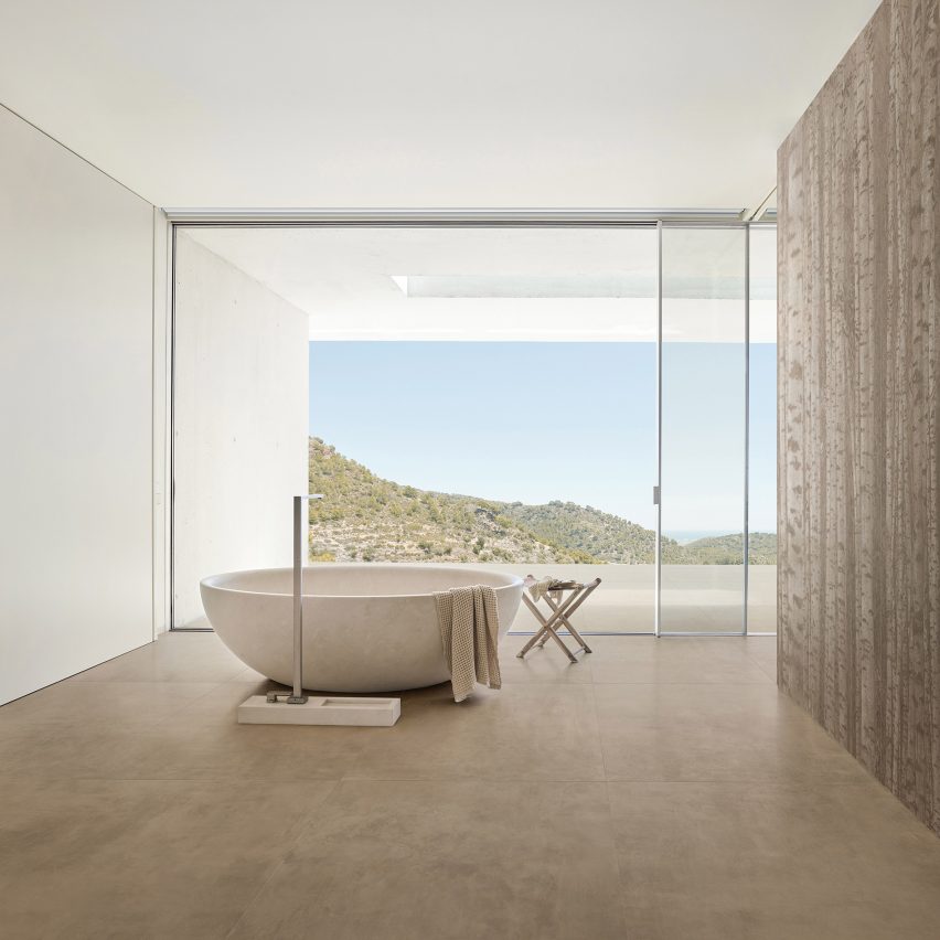
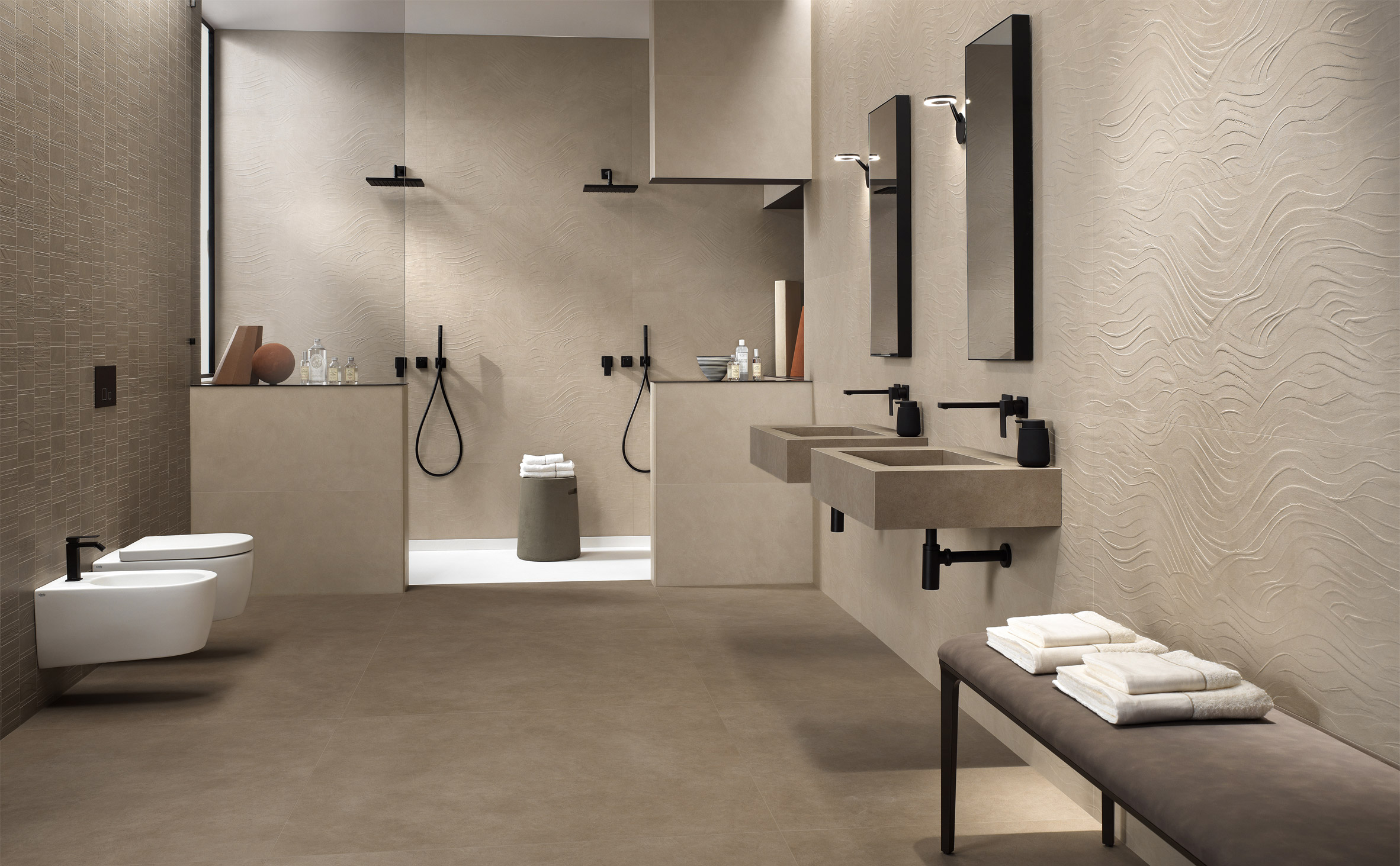
Dawson tile collection by Parkside Architectural Surfaces

image

Dawson tiles by Parkside Architectural Surfaces used in a bathroom

Dezeen Showroom: British tile brand Parkside Architectural Surfaces has released a new wall and floor tile collection designed to mimic the appearance of concrete and stone.

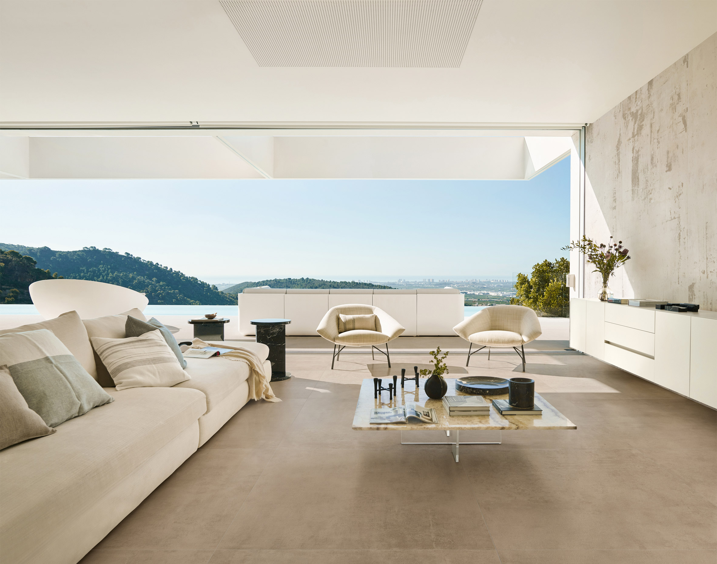
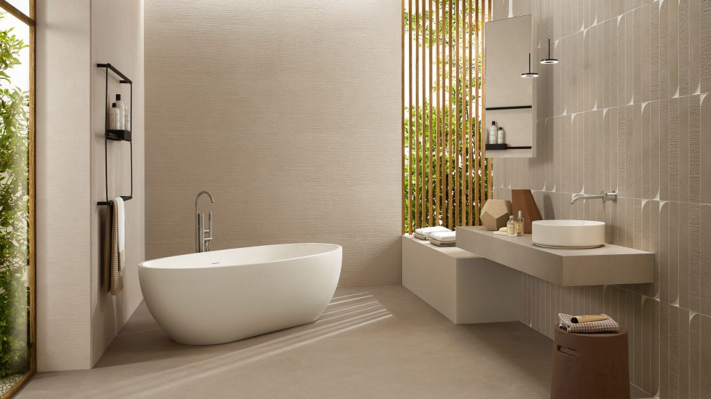
Named Dawson, the tiles are suitable for both indoor and outdoor surfaces and come in a range of neutral colours.

Dawson tiles by Parkside Architectural Surfaces used in a bathroomThe Dawson tile collection is available in a number of finishes, including a 3D textured surface

The collection includes Dawson Stone, a porcelain tile informed by limestone found in the Pyrenees mountain range.

It also features Dawson Natural, which was designed to have an earthy look and is described by Parkside Architectural Surfaces as having a neutral, powdery appearance.

The collection also has a selection of concrete-effect tiles, which come in five warm-toned shades of grey.

Dawson tiles by Parkside Architectural Surfaces used in a living room and terraceDawson tiles can be used on both interior and exterior surfaces, creating a continuous flow of space

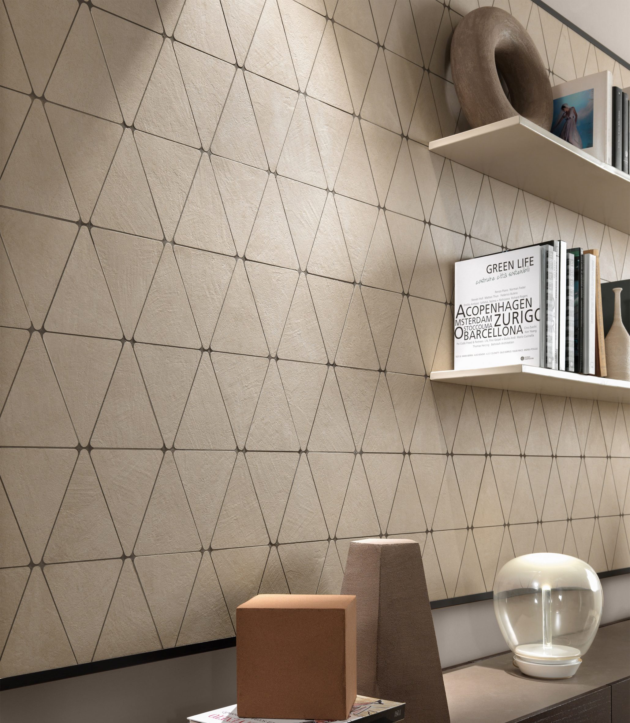
The Dawson tile range is available in a variety of sizes and formats, including a selection of mosaic tiles. These can be mixed and matched to create coordinated interiors.

"With technical features that ensure design continuity between indoors and out, the collection makes it easier to approach tile specifications that connect spaces," said Parkside Architectural Surfaces.

Dawson tiles by Parkside Architectural Surfaces in mosaic formatThe tiles come in a neutral colour palette and in a number of shapes and sizes

Dawson tiles can be finished with grip, textured or matt surfaces, and are suitable for use in wet areas.

The wall tiles can also be finished with textured 3D effect surfaces that create distinctive feature walls.

Product: Dawson

Brand: Parkside Architectural Tiles

Contact: info@parkside.co.uk

Dezeen Showroom

Dezeen Showroom offers an affordable space for brands to launch new products and showcase their designers and projects to Dezeen's huge global audience. For more details emailshowroom@dezeen.com.

Dezeen Showroom is an example of partnership content on Dezeen. Find out more about partnership contenthere.

The post Dawson tile collection by Parkside Architectural Surfaces appeared first on Dezeen.

#parksidearchitecturalsurfaces #all #flooring #tiles #design #wallcoverings #products #donotshowonthehomepage #dezeenshowroom #finishes

dezeen@xn--y9azesw6bu.xn--y9a3aq

Kompas completes tile-clad house and gallery for art collector in Japan

image

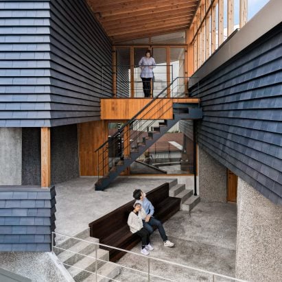
Terrace of house in Chiba

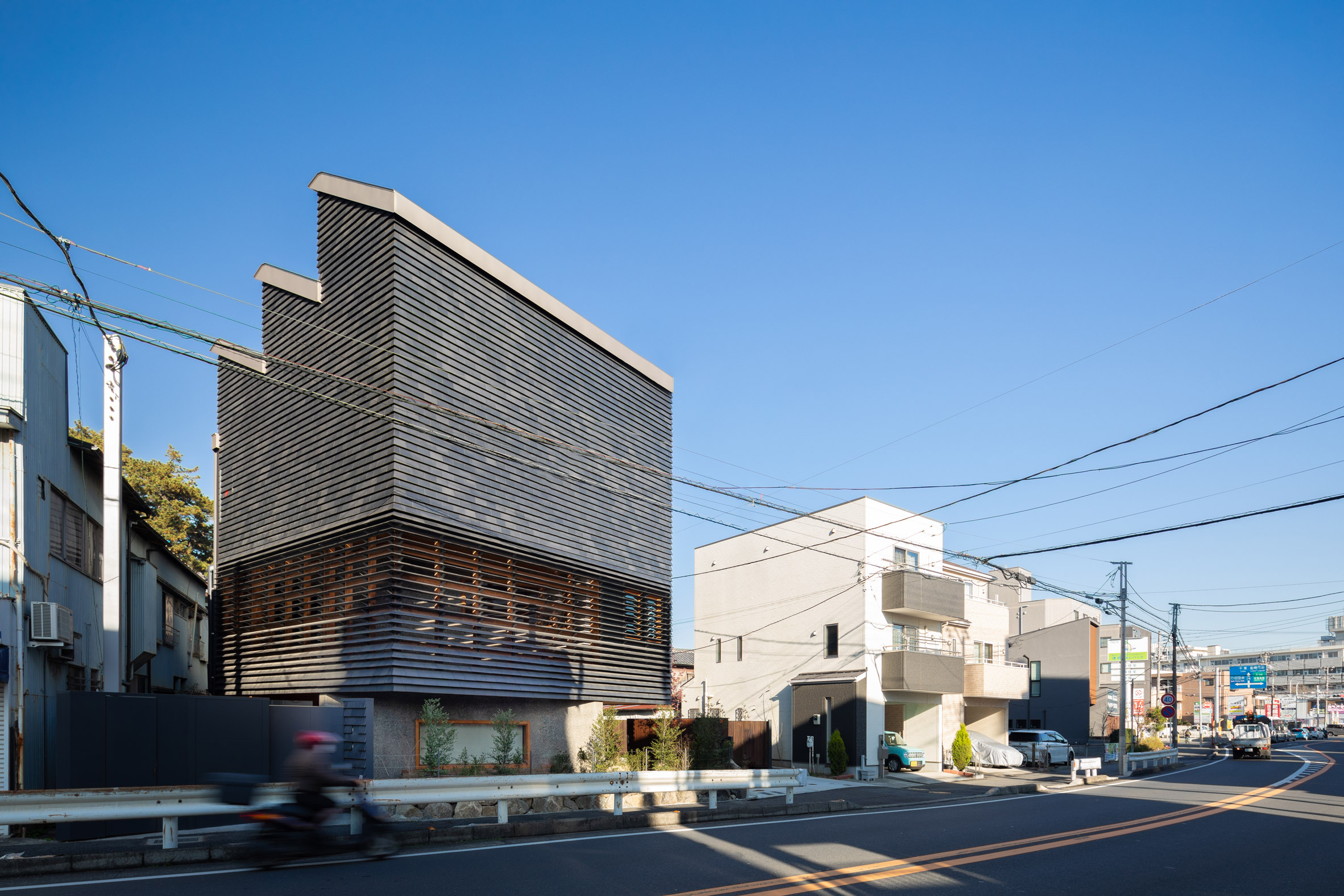
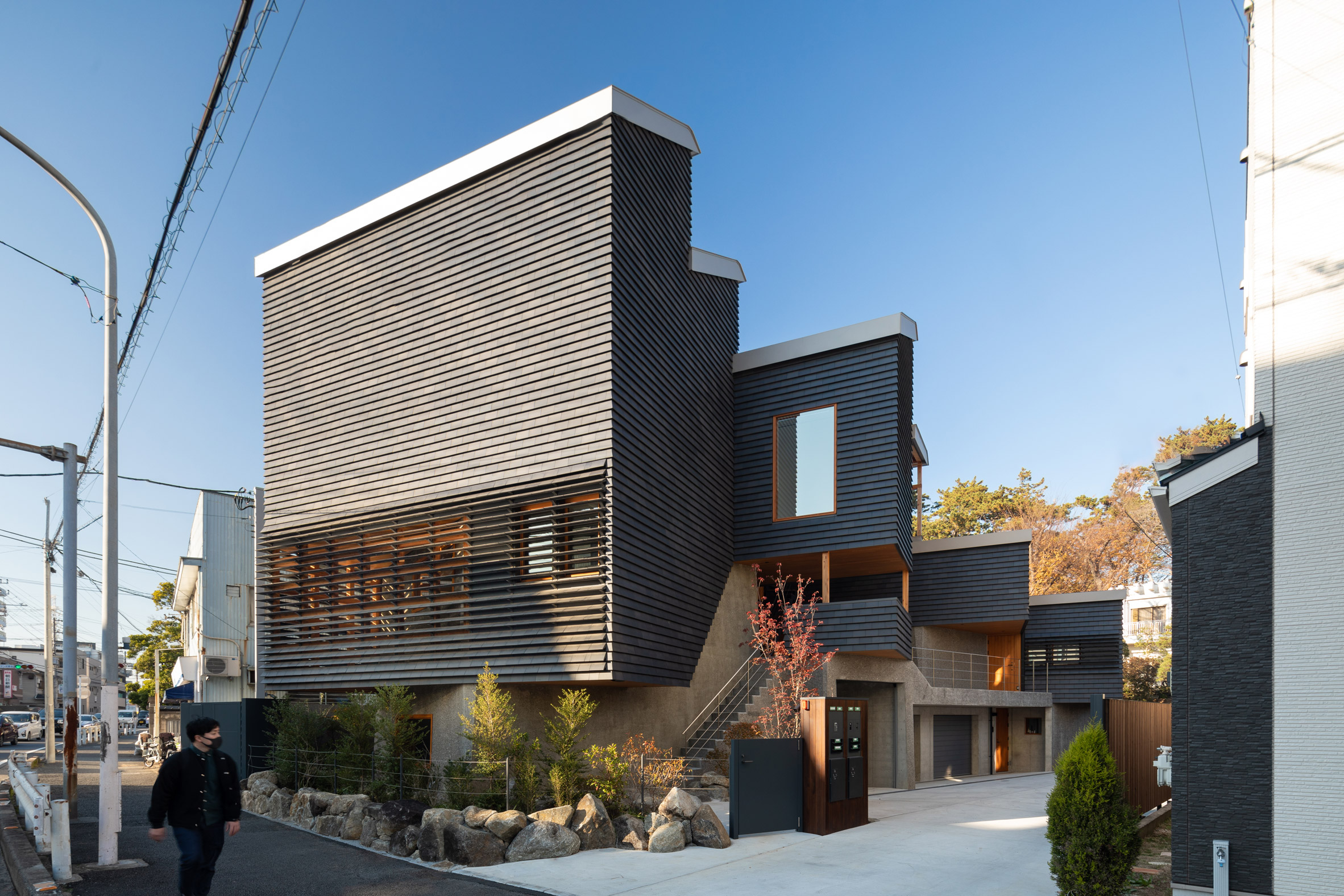
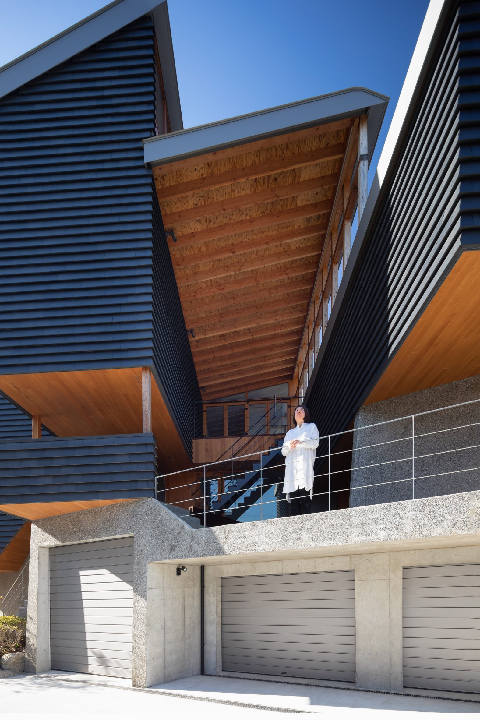
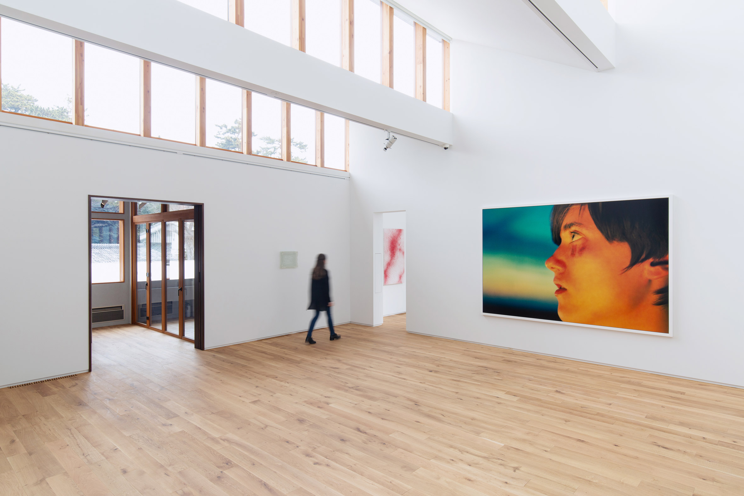
Architecture studio Kompas has completed a house and art gallery in Chiba, Japan, featuring a sawtooth roof and a facade clad in black tiles that are angled to create louvred openings.

Named the Nishiji Project, the residence was designed by Kompas for a real estate developer and art collector who wanted a family home that could double as his company's offices and a gallery.

Black-tiled house and gallery in ChibaKompas has created a house and art gallery called the Nishiji Project

The site in Chiba's historic Nishifunabashi neighbourhood was owned by the client's parents and already contained their home, alongside several old warehouses and a parking area.

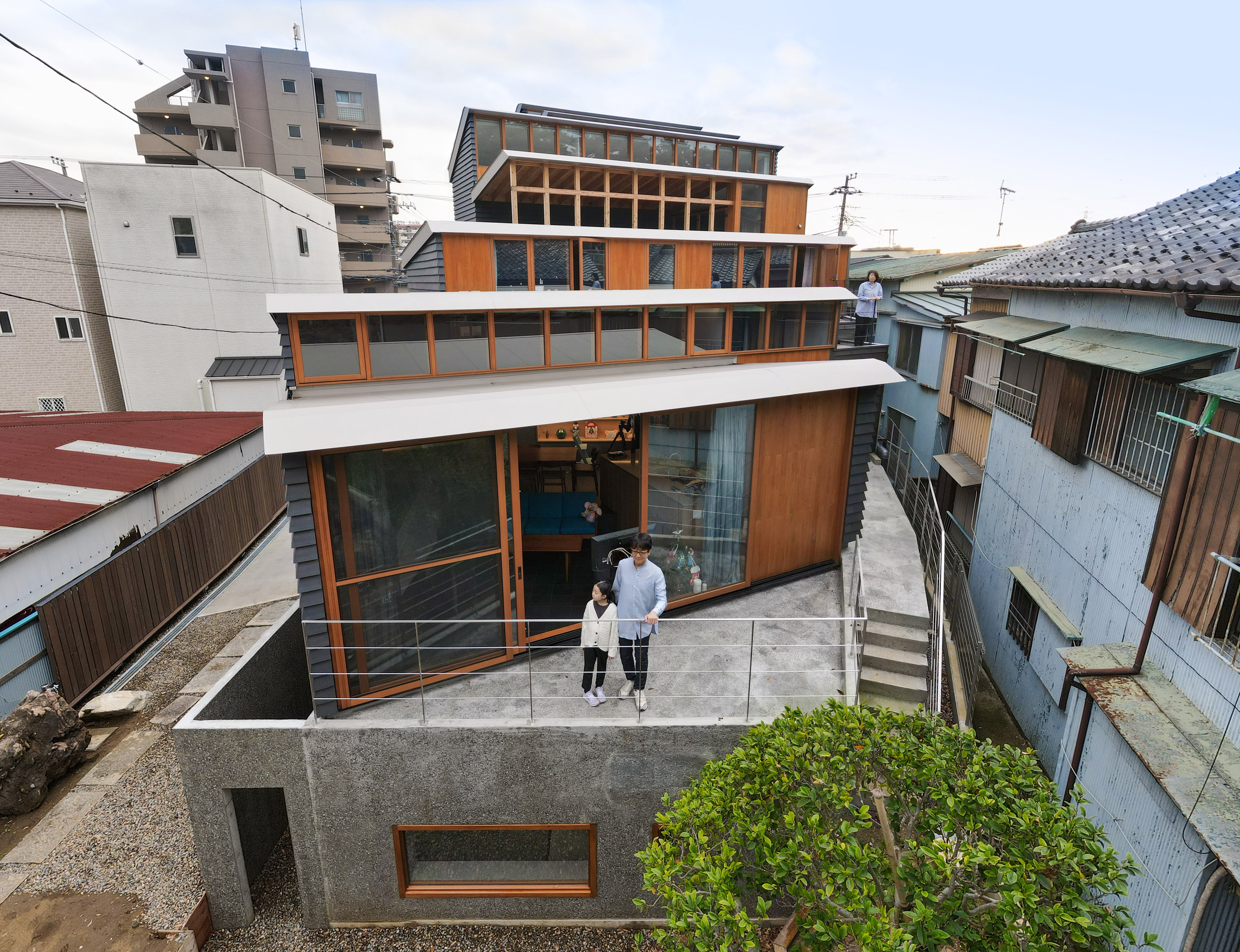
Kompas positioned the new building at the opposite end of the site from the existing house and orientated the plan so the living areas look onto a quiet central garden.

Nishiji Project house in JapanIt is clad in black tiles

"Our first approach was to organise the entire site so that the two families' lives and the workspaces coexist comfortably, arranging site circulation and developing a sloped garden moderating the level differences between the two buildings," said Kompas.

The Nishiji Project contains garages at the centre of its ground floor, while the galleries and offices are arranged vertically across three storeys on the south side facing the main road.

Japanese house with sawtooth roof by KompasThe building features a sawtooth roof

The client was keen for the building to engage with the neighbourhood, so the prominent southern elevation features a public entrance that invites visitors to enter from the adjacent street.

Traditional Japanese kawara tiles clad most of the exterior and were chosen to recall an old warehouse that had occupied the site since the owner's grandparents' generation.

Tiled exterior of Nishiji Project house by KompasIts tile-clad elevations rest on a monolithic concrete base

A special version of the tiles called Kuroibushi kawara, which are blackened to resist salt damage, was used to cover the upper portion of the facades.

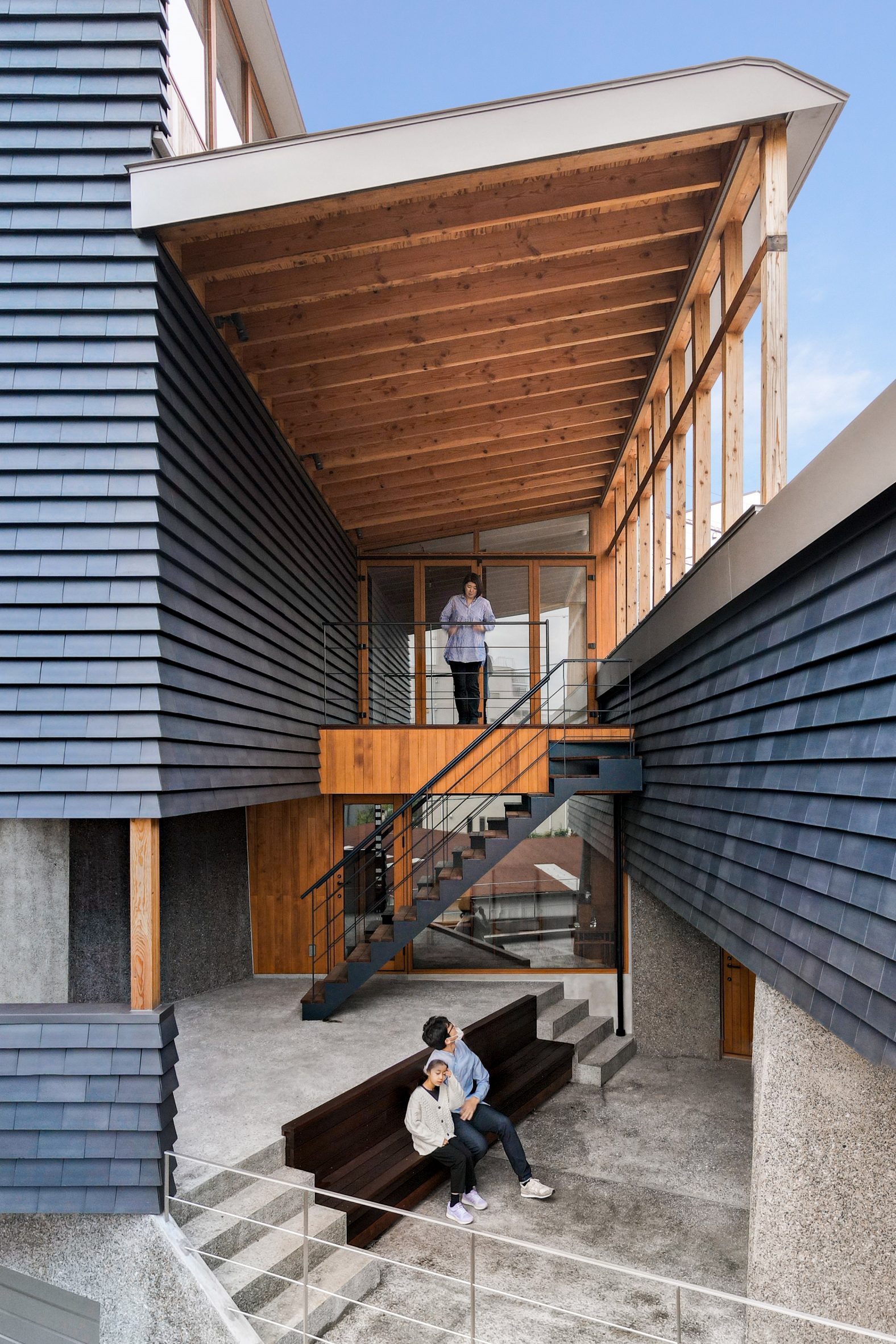
Most of the tiles are laid in a typical overlapping pattern, but in places where light and views are required, they are rotated outwards to form louvred openings.

Terrace of Japanese house by KompasThere is an outdoor terrace at the centre of the building

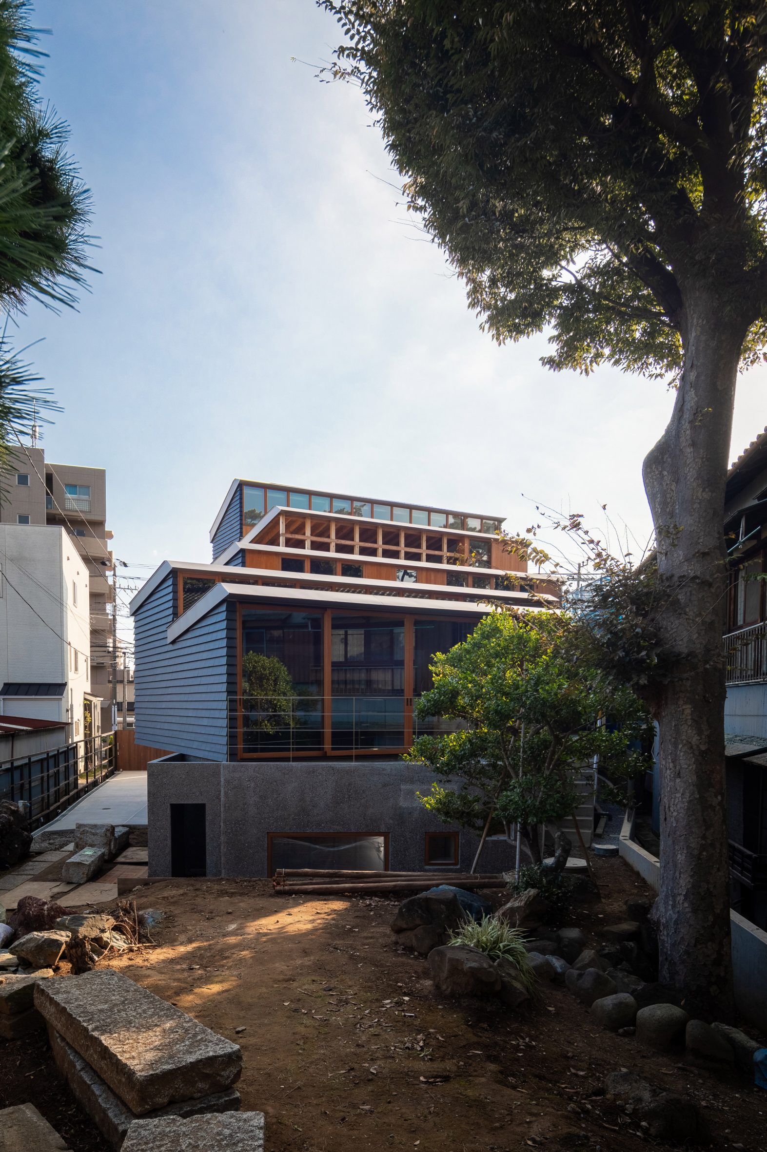
The tile-clad elevations rest on a monolithic concrete base and extend up to the sawtooth roof, which allows consistent northern light to flood into the gallery and living spaces.

Behind the three-storey elevation facing the street, the building steps down towards the north to follow the local building code and create spaces with a more residential scale.

[ Oeuf by Flat House

Read:

Live-in gallery and studio by Flat House hides utility rooms in a central cylinder

](https://www.dezeen.com/2014/11/11/oeuf-house-art-gallery-japan-flat-house-architects/)

The pitch and height of the sawtooth roofs vary depending on the usage and daylight requirements of the internal spaces below.

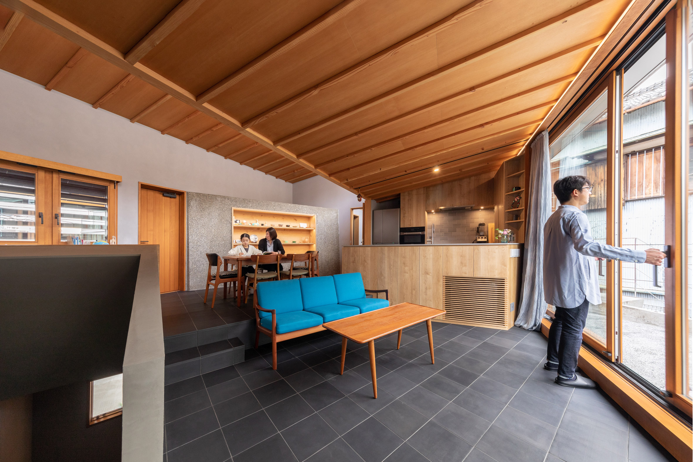
The three uppermost windows flood the large gallery with natural light, while a bedroom and the main living space below feature openings that look out towards the garden.

Tiled exterior of Nishiji Project house by KompasThe dwelling is positioned at the back of a plot owned by the client's parents

An outdoor terrace at the centre of the building provides a shortcut between the living spaces and the offices. The sheltered first-floor terrace can be used as an additional exhibition space or as a play area for the children.

Several other interstitial spaces incorporated between the main rooms will allow the Nishiji Project to adapt over time, potentially providing additional galleries to house the owner's growing art collection.

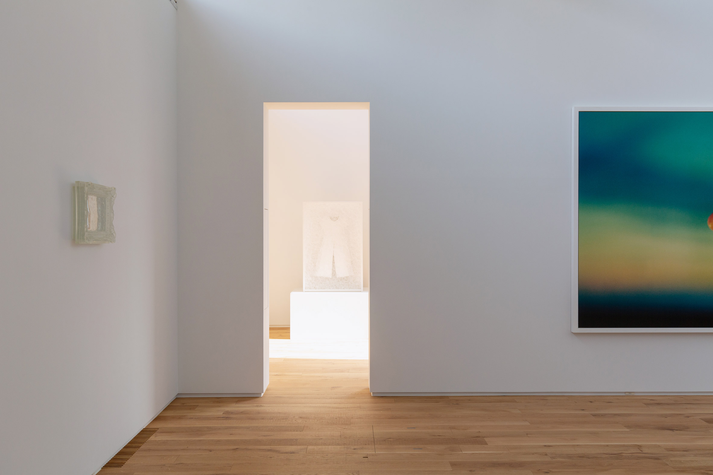
Nishiji Project gallery in ChibaThe gallery is lit by the sawtooth roof. Photo is by Munemasa Takahashi

The arrangement of spaces over multiple levels and the creation of rooms with varying sizes and daylight conditions enhances the building's flexibility.

According to the architects, following Nishiji Project's completion, the owner made the decision to open the spaces to the public rather than using the building solely as a private gallery.

Japanese living roomThe private living spaces look out to the garden

"This new cluster with the kawara facade and the sawtooth roofs begins a new era in this historical site as a generous field to comfortably mix artworks, residents, and visitors," claimed Kompas.

"We hope this architecture to be the reliable base for art and culture appealing to the world, besides supporting joyful and abundant daily life like living in a museum."

Nishiji Project gallery in ChibaThe exhibition spaces are open to the public. Photo is by Munemasa Takahashi

Other homes featured on Dezeen that double as art galleries include Oeuf by Flat House in Tokyo and the Cambridge Residence in Massachusetts by Stern McCafferty Architects.

Elsewhere in Japan, Apollo Architects & Associates designed the Fleuve house for a client who wanted to combine their home with a small salon space from which to operate his business.

The photography is byVincent Hecht unless stated.

The post Kompas completes tile-clad house and gallery for art collector in Japan appeared first on Dezeen.

#all #architecture #residential #japan #japanesearchitecture #houses #galleries #tiles #japanesehouses #blackhouses #sawtoothroofs

dezeen@xn--y9azesw6bu.xn--y9a3aq

Kelly Wearstler makes "bold and eclectic choices" for Downtown LA Proper hotel

image

Kelly Wearstler hotel

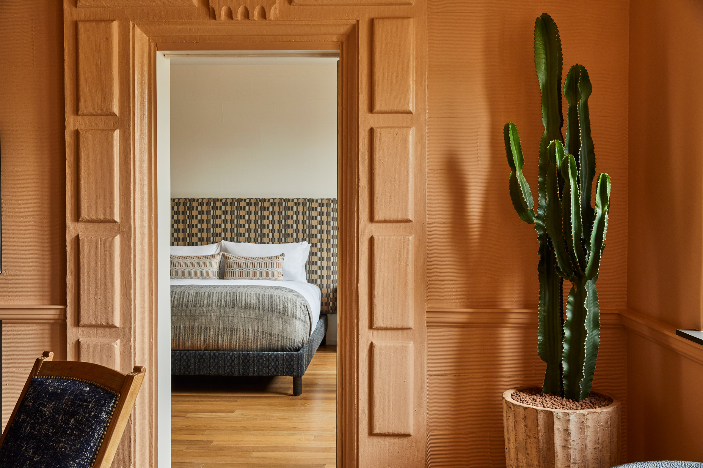
American interior designer Kelly Wearstler paired the rich history of Downtown Los Angeles with other colourful global influences when creating this hotel, which features 136 unique types of tile.

Part of the Proper hotel group, Downtown LA Proper sits between Downtown Los Angeles' South Park District and the city's Fashion District.

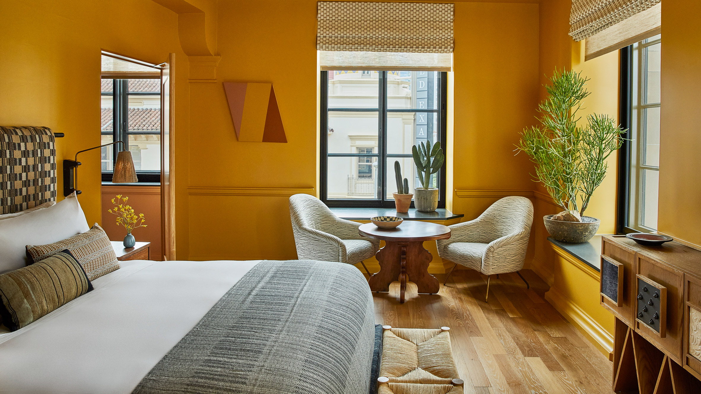
Hotel bedroomKelly Wearstler designed the eclectic interiors of Downtown LA Proper

The 148-room hotel is located within a former private club that was designed by architecture studio Curlett & Beelman in the 1920s.

Real estate developer The Kor Group teamed up with Wearstler to transform the building into Downtown LA Proper, with Wearstler spearheading the interior design.

Reception deskMorgan Peck created a chunky graphite reception desk

According to Wearstler, the hotel's interiors take cues from LA's "creative scene", as well as the colours and forms of Mexican, Moroccan, Spanish and Portuguese design.

"My point of reference for the Proper Hotels is always the location, so Downtown LA Proper really called for bold and eclectic choices," she told Dezeen.

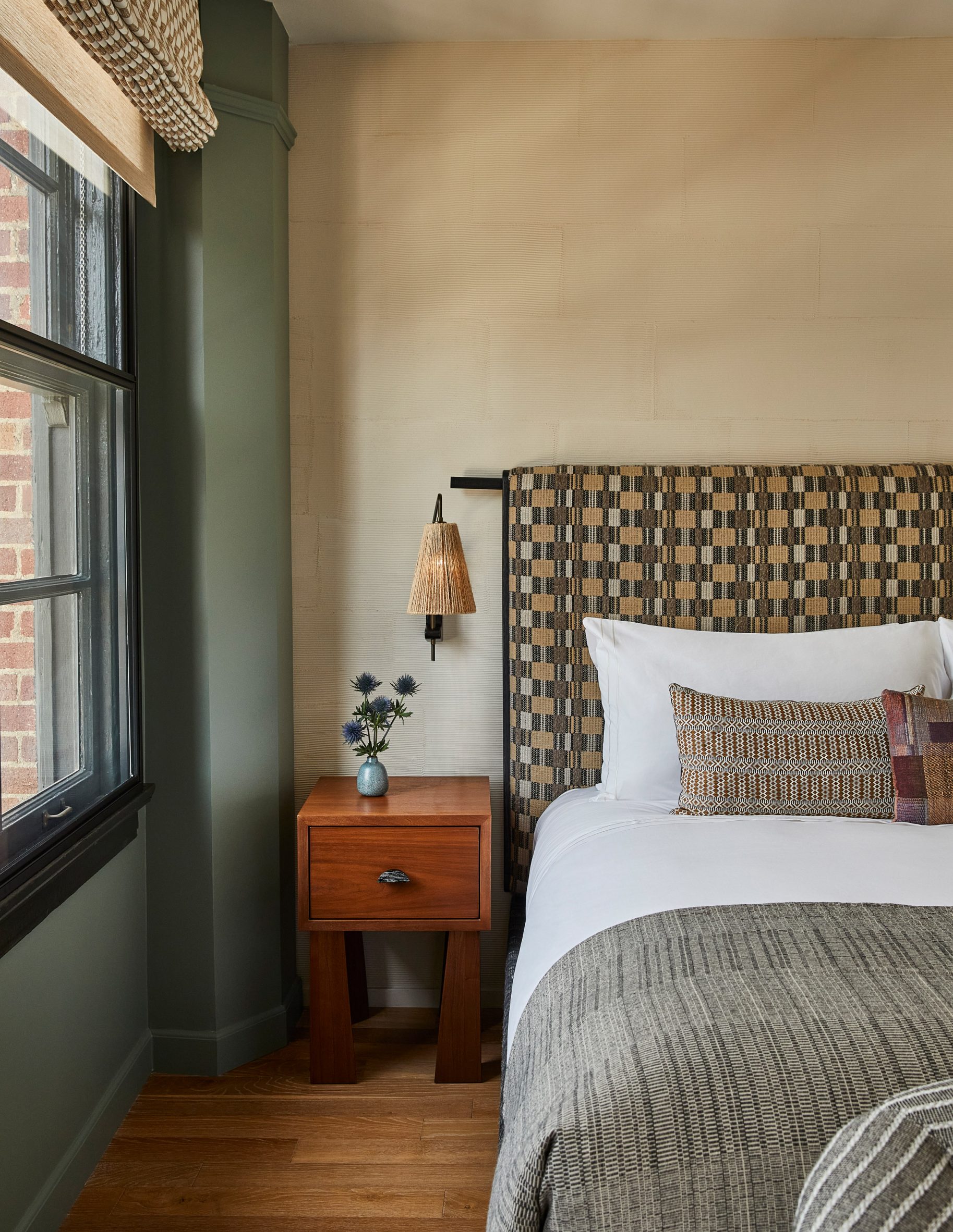
Los Angeles hotel roomGuest rooms feature patterned headboards

"As the design of the hotel was greatly inspired by the community and history of the area, I used a deep, warm, colour and feel throughout to speak to this rich culture and history," added Wearstler.

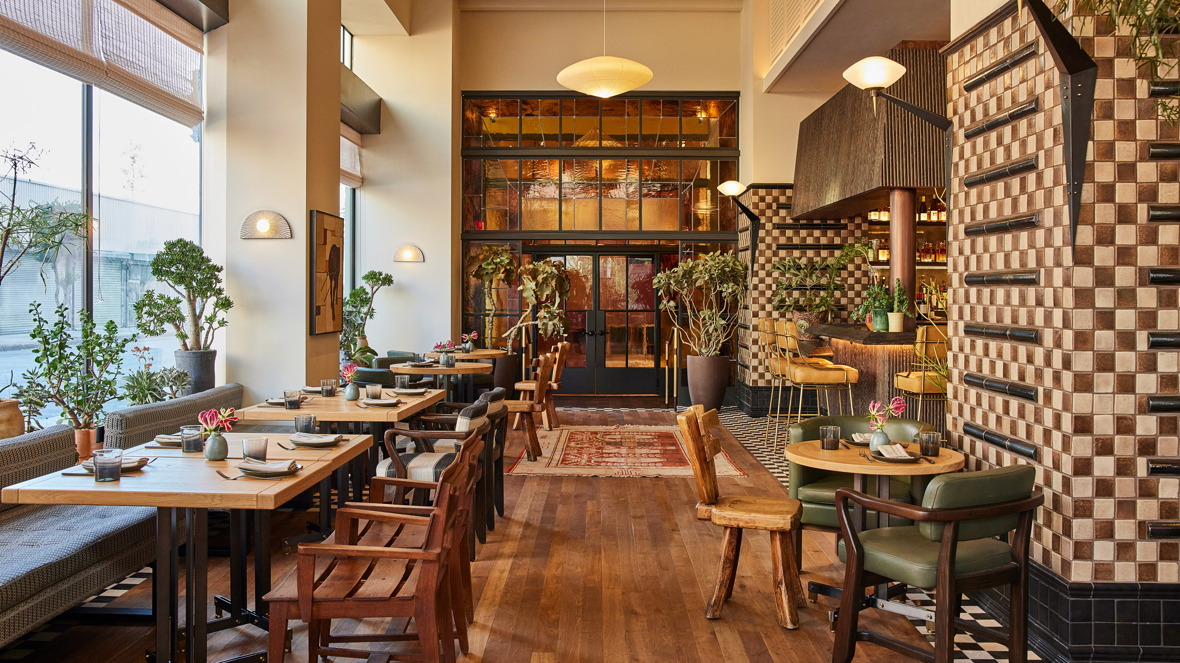
"The [hotel's overall] design comprises 136 unique types of tile, from vintage to custom."

Kelly Wearstler hotel roomWearstler used a colourful palette throughout the hotel

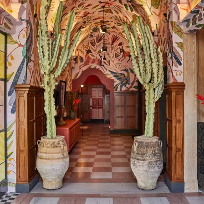
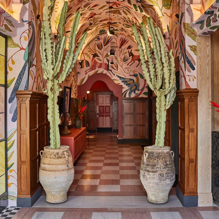
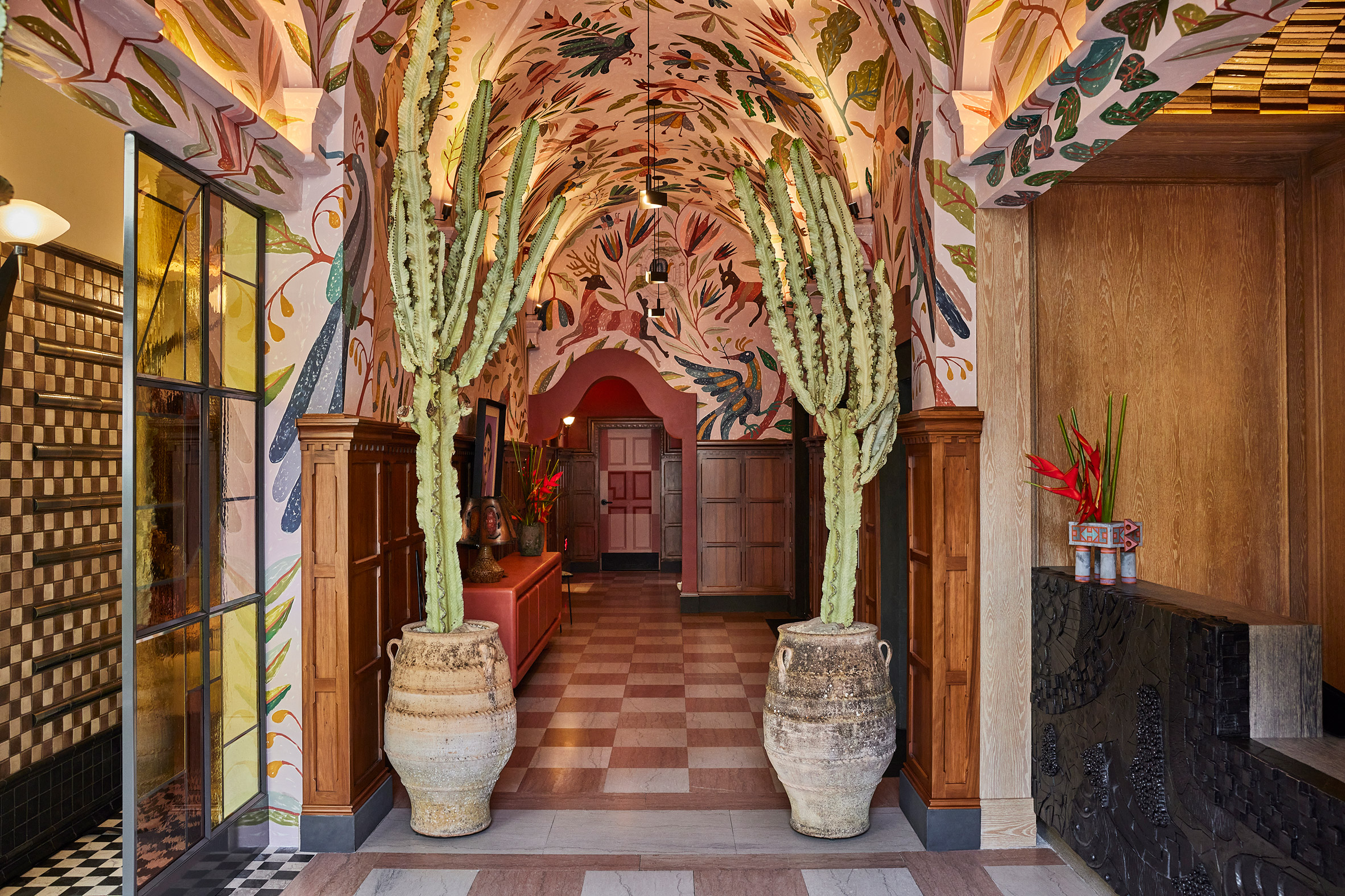
Visitors enter the hotel via the building's original ornate archway, which is flanked by column-like cacti in rustic pots, where they are met with a graphite reception desk designed by ceramicist Morgan Peck.

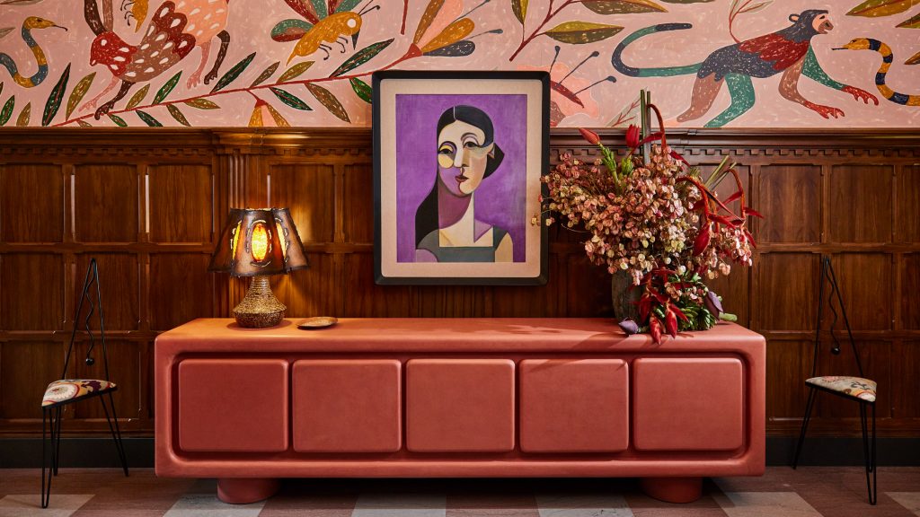
The original pink and white checkerboard floor tiling was retained in this area, while the ceiling is decorated with a hand-painted multicoloured mural designed by Abel Macias, which drew on the flora and fauna of Mexican folktales.

Stained-glass doorwayCaldo Verde includes a bespoke stained-glass doorway

This eclecticism is also reflected in Downtown LA Proper's guest rooms. Wearstler blended contrasting elements such as chunkily-patterned headboards with smooth wooden floors, while the walls vary within a spectrum of charcoal, mauve, dusty blue, umber and ecru.

The building contains three eateries including the lobby-level Caldo Verde restaurant and bar, which Wearstler designed to reflect the rest of the hotel's interiors.

[ Austin Proper Hotel staircase

Read:

Kelly Wearstler creates sculptural oak staircase for hotel in Austin

](https://www.dezeen.com/2021/03/05/austin-proper-hotel-residences-kelly-wearstler/)

A collection of vintage rugs and seating, cocoa and sandstone tiles and jungle-like plants are set against a bespoke stained-glass installation by Judson Studios that makes up the restaurant's doorway.

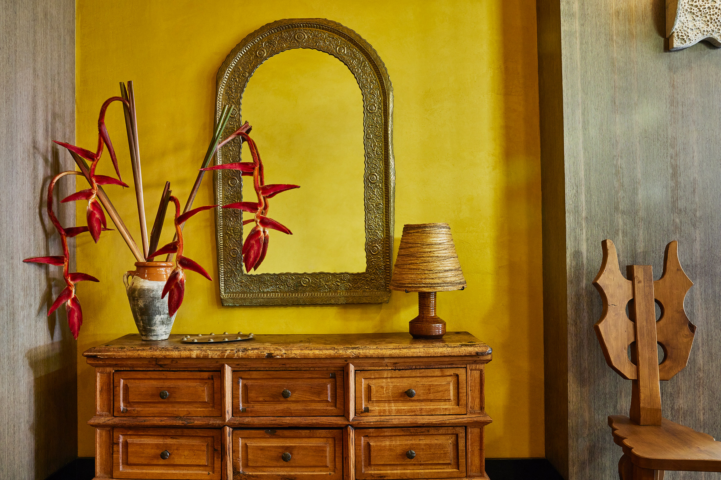
Other design elements that create Downtown LA Proper's bright and bold atmosphere include Mexican brutalist hand-carved chairs, woven pendant lights from the south of France and stone mosaic tables.

Hand-carved chairsBrutalist hand-carved chairs add to the project's eclecticism

"The building itself is a historic-cultural monument, so we wanted to maintain some of the original integrity and fabric, like the window casing and brickwork, while elevating it with contemporary jewel tones, patterns and plasterwork," said Wearstler.

"I truly wanted to embark on a spirited exploration of materiality, colour and form, to share with guests a hyper-localised flavour of the city and create a hub for local creatives."

Artwork at Downtown LA ProperThe work of emerging artists features throughout the hotel

Wearstler founded her eponymous interior design studio in 1995 and is responsible for the eclectic interiors of several other Proper hotels including its San Francisco and Santa Monica outposts.

The designer also recently transformed a 1950s beachfront cottage in California into a bohemian retreat for her family.

The images are courtesy of Kelly Wearstler.

The post Kelly Wearstler makes "bold and eclectic choices" for Downtown LA Proper hotel appeared first on Dezeen.

#all #interiors #hotels #instagram #usa #tiles #downtownlosangeles #kellywearstler

dezeen@xn--y9azesw6bu.xn--y9a3aq

Ten interiors with Mediterranean-style statement tiling

image

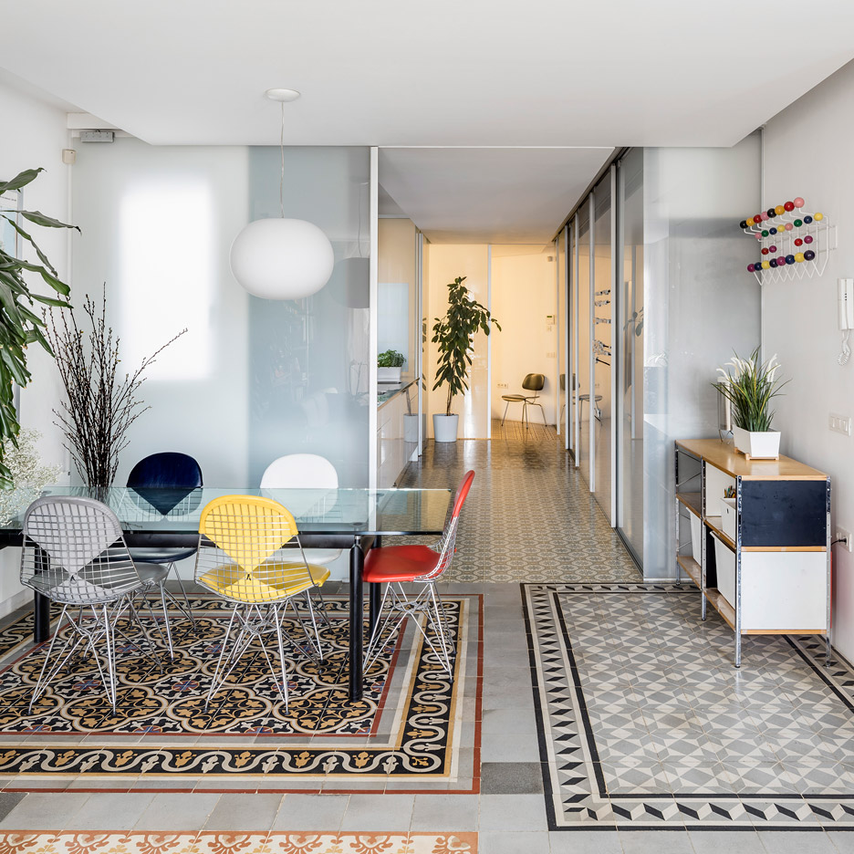
Barcelona apartment renovation by Narch revealing mosaic floors

For our latest lookbook, we have collected ten examples from the Dezeen archive of interiors where vibrant, patterned tiles take centre stage.

Often seen in southern European countries such as Spain and Italy, patterned ceramic or encaustic tiles can be used to create striking decorations for floors and walls.

Durable and easy to clean, in warmer climates tiles can even function as a decorative alternative to rugs, as seen in these ten projects from Dezeen's archive.

This is the latest roundup in our Dezeen Lookbooks series providing visual inspiration for the home. Previous recent lookbooks have showcased broken-plan layouts and hotel bedrooms.


Barcelona apartment renovation by Narch revealing mosaic floors

Barcelona apartment, Spain, by Narch

Narch Architects removed a number of internal walls to create the interior for this apartment in Barcelona, shining a spotlight on its encaustic tile floors, which back to the 20th century.

Without the walls to mark the boundaries between the different rooms, the tiled floors, previously in separate rooms, now sit together to form rug-like floor decorations.

Find out more about Barcelona apartment ›
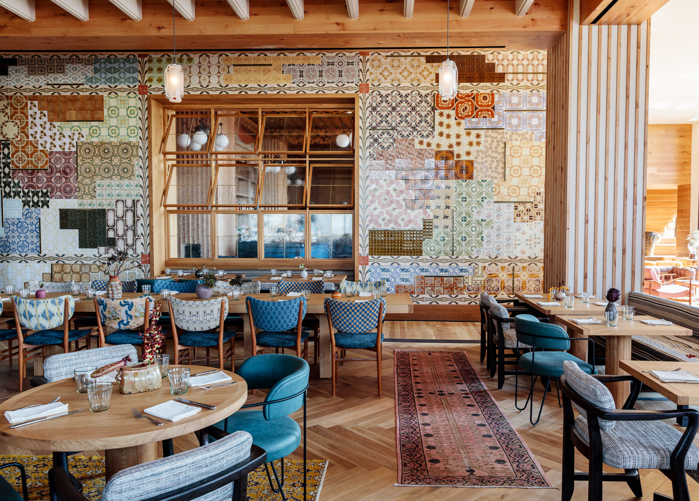

Austin Proper Hotel and Residence, US, by Kelly Wearstler

Kelly Werstler's warm interior design for this hotel in Austin, Texas features a wall clad in joyful Portuguese-style tiles.

Vintage rugs have been placed on the wooden floors, creating a vibrant pattern clash that adds to the hotel's bohemian vibe.

Find out more about Austin Proper Hotel and Residence ›
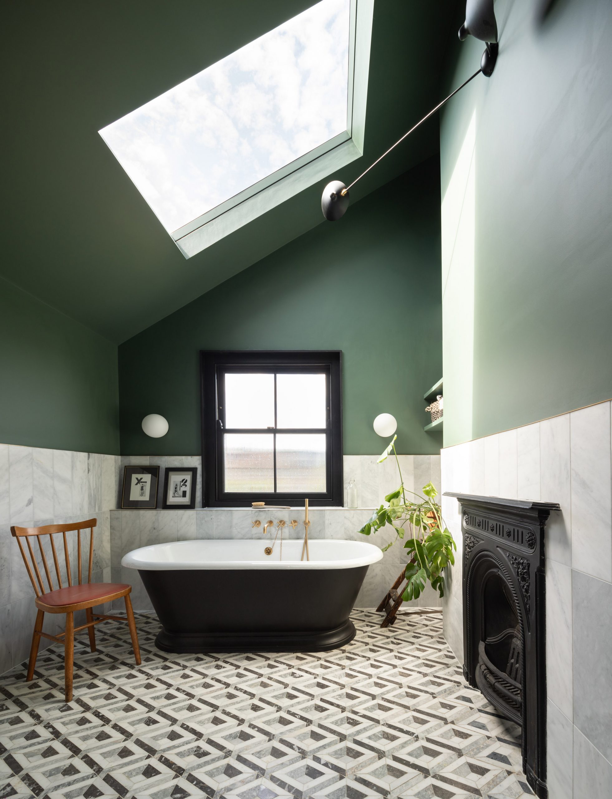

Tsubo House designed by Fraher & Findlay

Tsubo House, UK, by Fraher & Findlay

A more subtle take on patterned tiling can be found in this bathroom in London's Tsubo House. The graphic pattern of the tiles creates a trompe l'oeuil effect that complements the jet-black bathtub.

Monochromatic floor tiles were used in all bathrooms of the house, which was originally built during the Victorian era but has undergone a complete renovation.

Find out more about Tsubo House ›
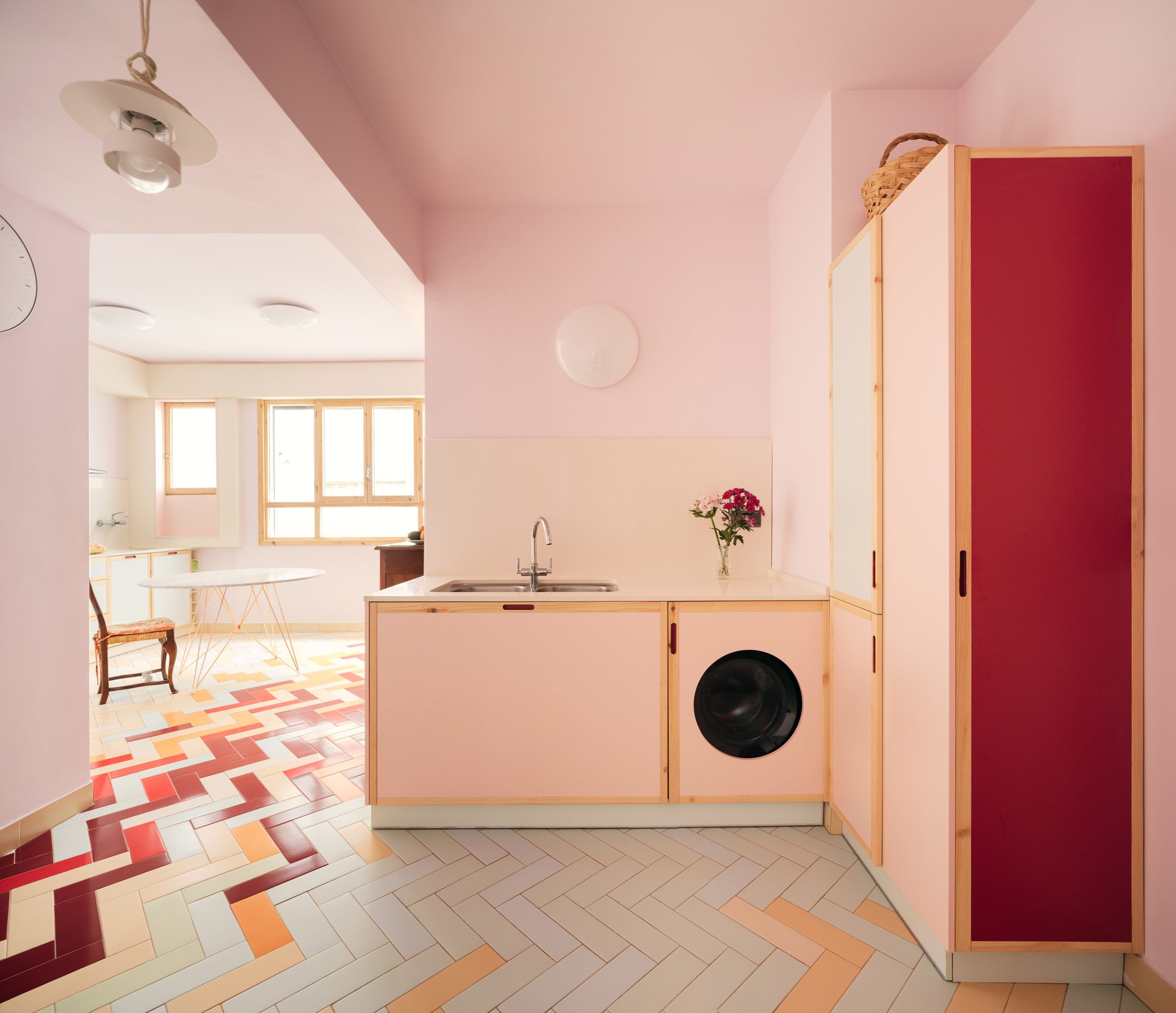

Mixtape Apartment by Azab

Mixtape Apartment, Spain, by Azab

Architecture studio Azab gave this apartment in Bilbao, Spain, an update to complement the existing elements of the house, including its hardwood floors and window frames.

In the kitchen, a herringbone floor was given a playful feel with a mix of different-coloured tiles.

Some tiles are peachy orange or minty green, while others are cherry red, in a nod to the colour of the communal staircase at the centre of the apartment block.

Find out more about Mixtape Apartment ›
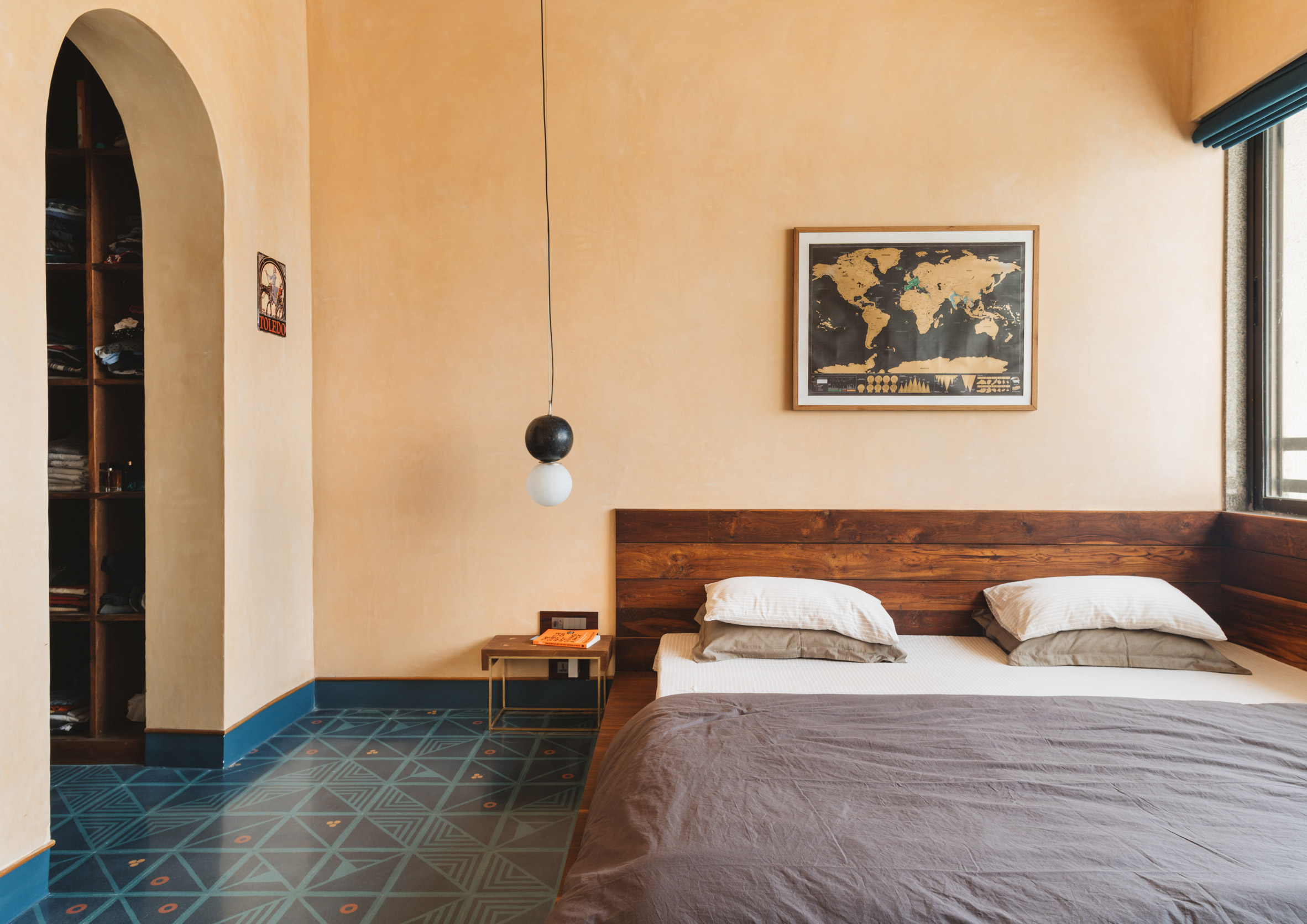

MD Apartment by Saransh

MD Apartment, India, by Sāransh

The bedroom of this apartment in Ahmedabad, India, features a patterned tile floor in dark blue and turquoise hues with orange details.

The tiles complement the dark-brown teak wood used throughout the flat and, together with an arched doorway, help demarcate the sleeping area of this studio apartment.

Find out more about MD Apartment ›
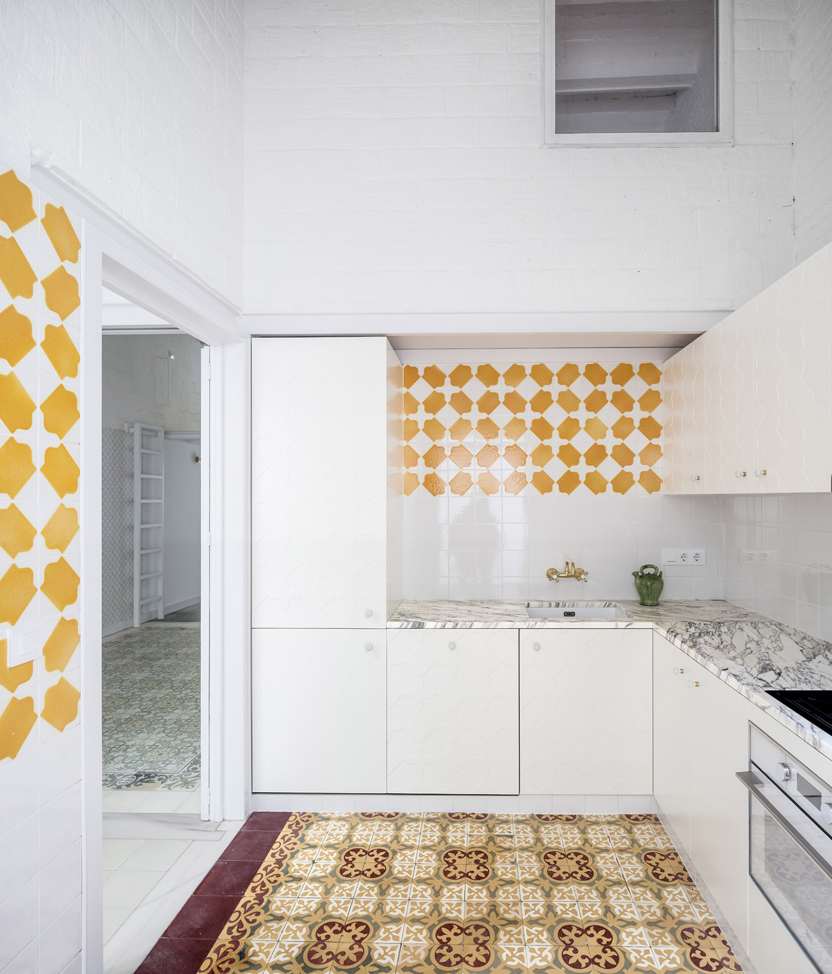

Vallirana 47 apartment by Vora

Vallirana 47, Spain, by Vora

Architecture studio Vora renovated this apartment in Barcelona by arranging the walls to highlight its original patterned tile floors.

The surrounding walls and ceilings were painted white so as to not draw attention from the flooring. In the kitchen space, new patterned tiles were added to create a splashback with a playful graphic pattern.

Find out more about Vallirana 47 ›
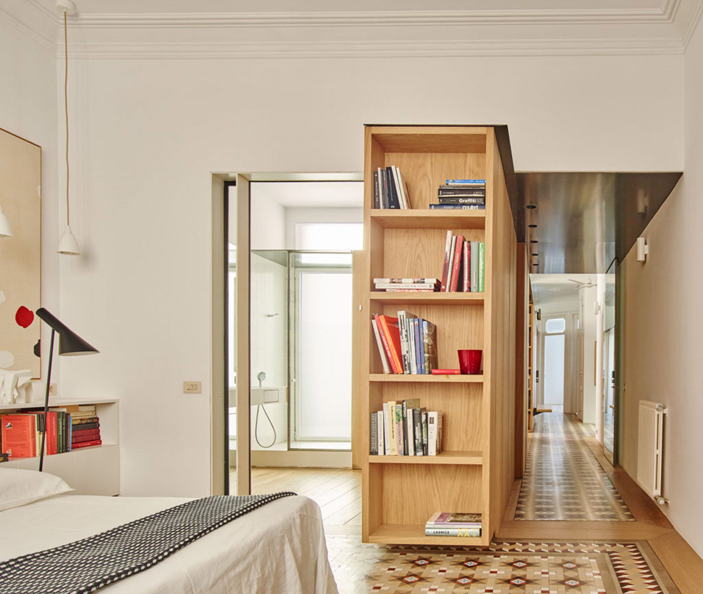

Casa AB in Barcelona

Casa AB, Spain, by Built Architecture

Original mosaic tiles decorate the floor in this 19th-century Barcelona apartment, which was renovated by local studio Built Architecture.

The tiles were used in the bedroom as well as the bathroom and hallway of the modernist apartment, giving each room a different feel.

Find out more about Casa AB ›
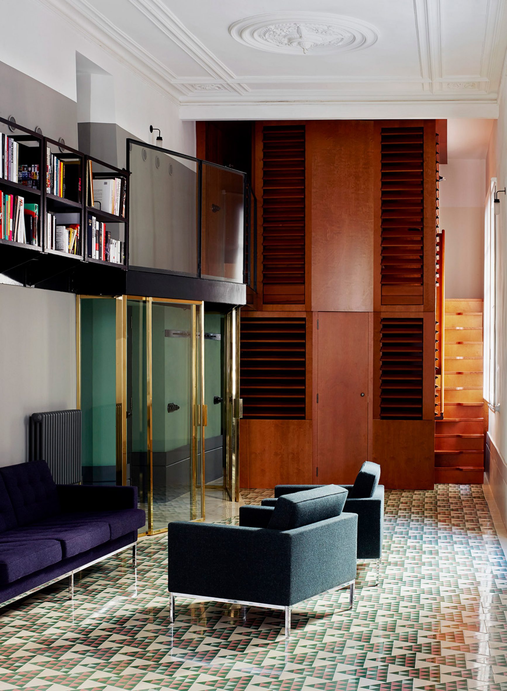

Carrer Avinyo in Barcelona

Carrer Avinyo 34, Spain, by David Kohn Architects

London studio David Kohn Architects went for a modern graphic effect when designing the floor of this Spanish apartment.

The decorative floor tiles are made up of 25 different designs and gradually change in tone, with green tiles by the two bedrooms and red tiles framing the kitchen.

Find out more about Carrer Avinyo 34 ›
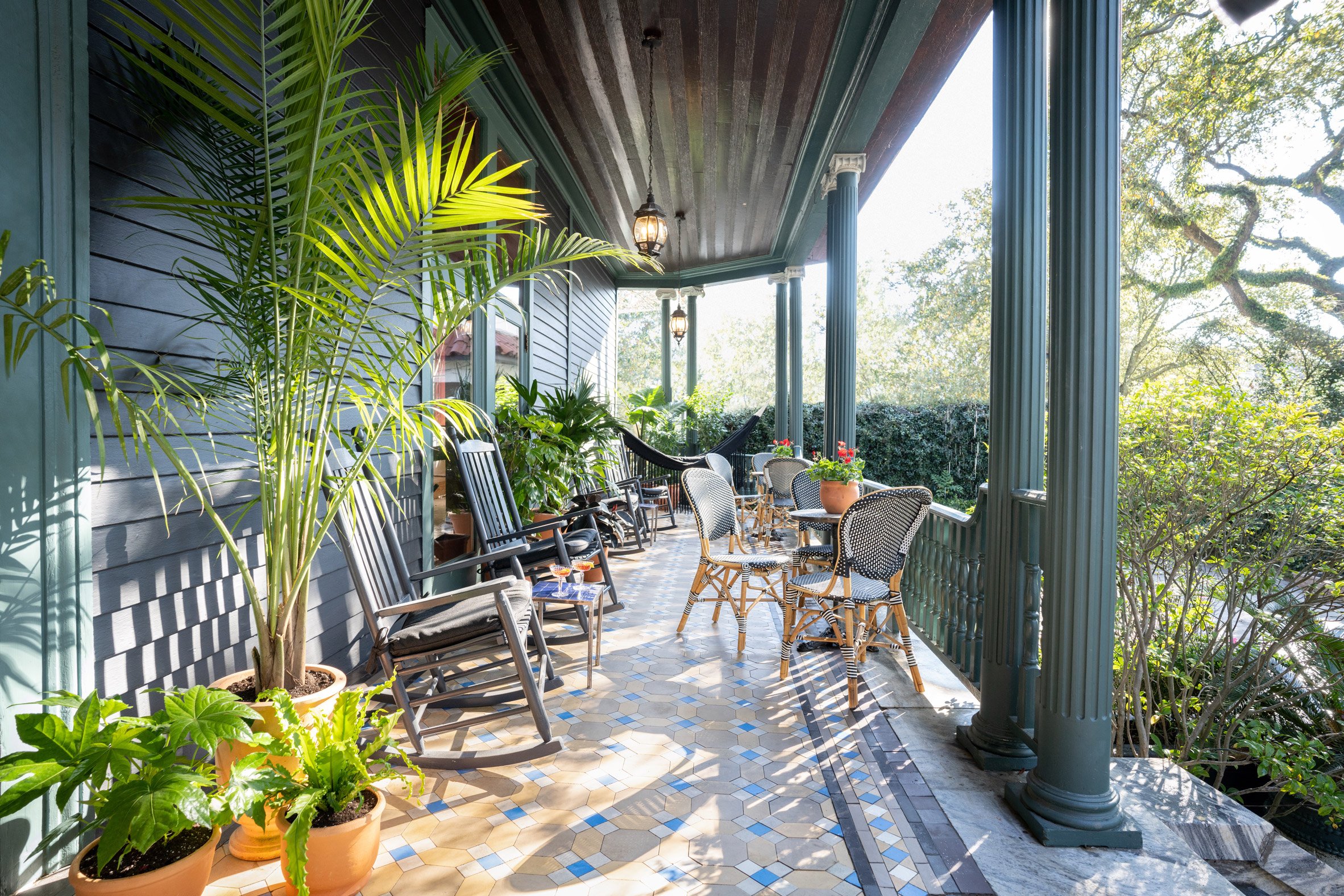

Outdoor patio of The Chloe hotel in New Orleans

The Chloe Hotel, US, by Sara Ruffin Costello

This New Orleans hotel features original tile work, including a porch with tiles from 1861. The pale yellow and clear blue hues of the tiles contrast against the surrounding greenery of the plants and the porch's dark-green painted pillars.

The patterned floor livens up the outdoor space and is also a hardwearing solution for a high-traffic area.

Find out more about The Chloe Hotel ›
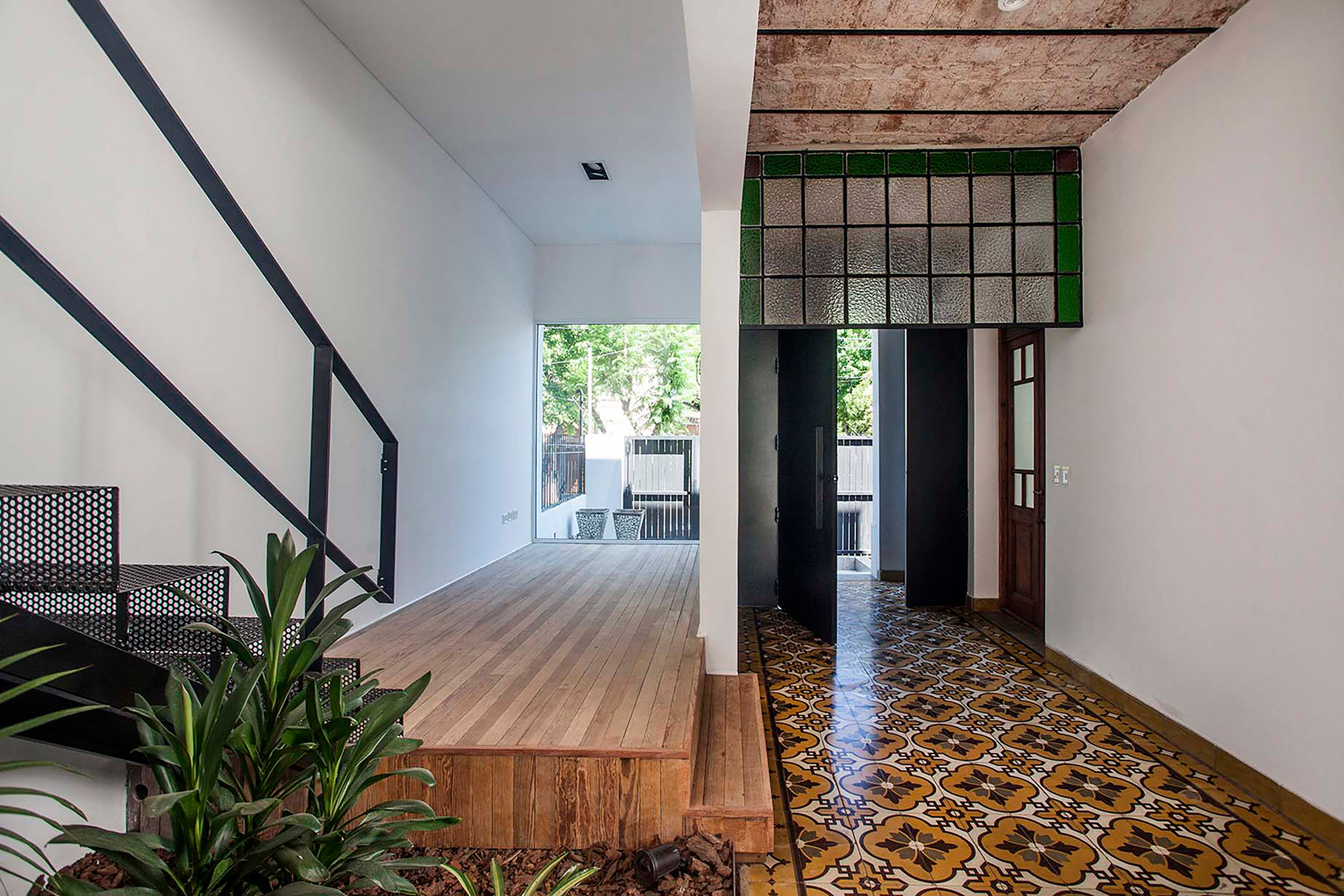

Casa Nido by PK Arquitectos

Casa Nido, Argentina, by PK Arquitectos

This art deco home in Buenos Aires, Argentina, was extended by PK Arquitectos, which kept its decorative orange tiling to show the house's history.

The tiled floor runs along the house's entryway and adds a warm, welcoming feel to the space.

Find out more about Casa Nido ›


This is the latest in our series oflookbooks providing curated visual inspiration from Dezeen's image archive. For more inspiration see previous lookbooks showcasing mezzanines, U-shaped kitchens and calm living rooms.

The post Ten interiors with Mediterranean-style statement tiling appeared first on Dezeen.

#lookbooks #all #interiors #tiles