#england

dezeen@xn--y9azesw6bu.xn--y9a3aq

Alex Meitlis uses plaster and terrazzo to create pink tones in Ottolenghi Chelsea

image

Red banquette seating at Ottolenghi Chelsea

London deli chain Ottolenghi has taken a new approach with its latest venue, styled by interior designer Alex Meitlis with a palette of warm pink and red hues.

Ottolenghi Chelsea features bare plaster walls, pink terrazzo tiles, red upholstered seating and rattan seats.

The look is a departure from the other Ottolenghi delis, where the design is typically more bright and minimal.

Chairs and tables in Ottolenghi ChelseaPink and red tones feature throughout Ottolenghi Chelsea

Meitlis has been behind the design of all the other delis, as well as sister restaurants Nopi and Rovi, which all feature the food of Israeli chef Yotam Ottolenghi and business partners Noam Bar and Sami Tamimi.

Here the idea was to make more of a statement, using colours that match the Ottolenghi tableware collection recently launched by Serax.

In the same spirit, the shopfront and exterior signage bring in vibrant shades of yellow, blue and turquoise.
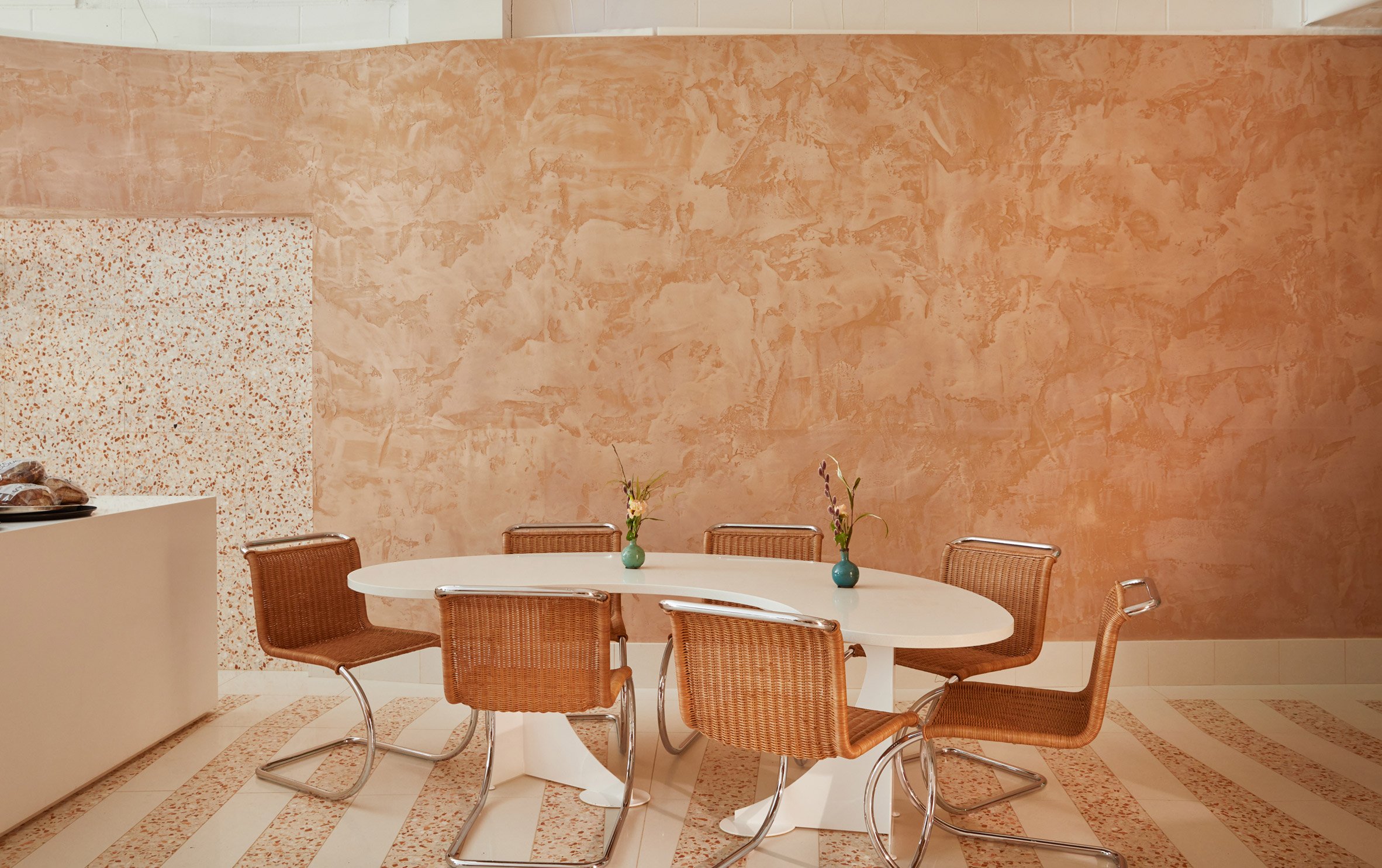
Ottolenghi ChelseaClay plaster walls are left exposed

"I take my approach from looking very closely at Yotam's approach to his food," said Meitlis, who has studios both in London and Tel Aviv.

"It's about taking very basic ingredients but using them in a slightly different way."
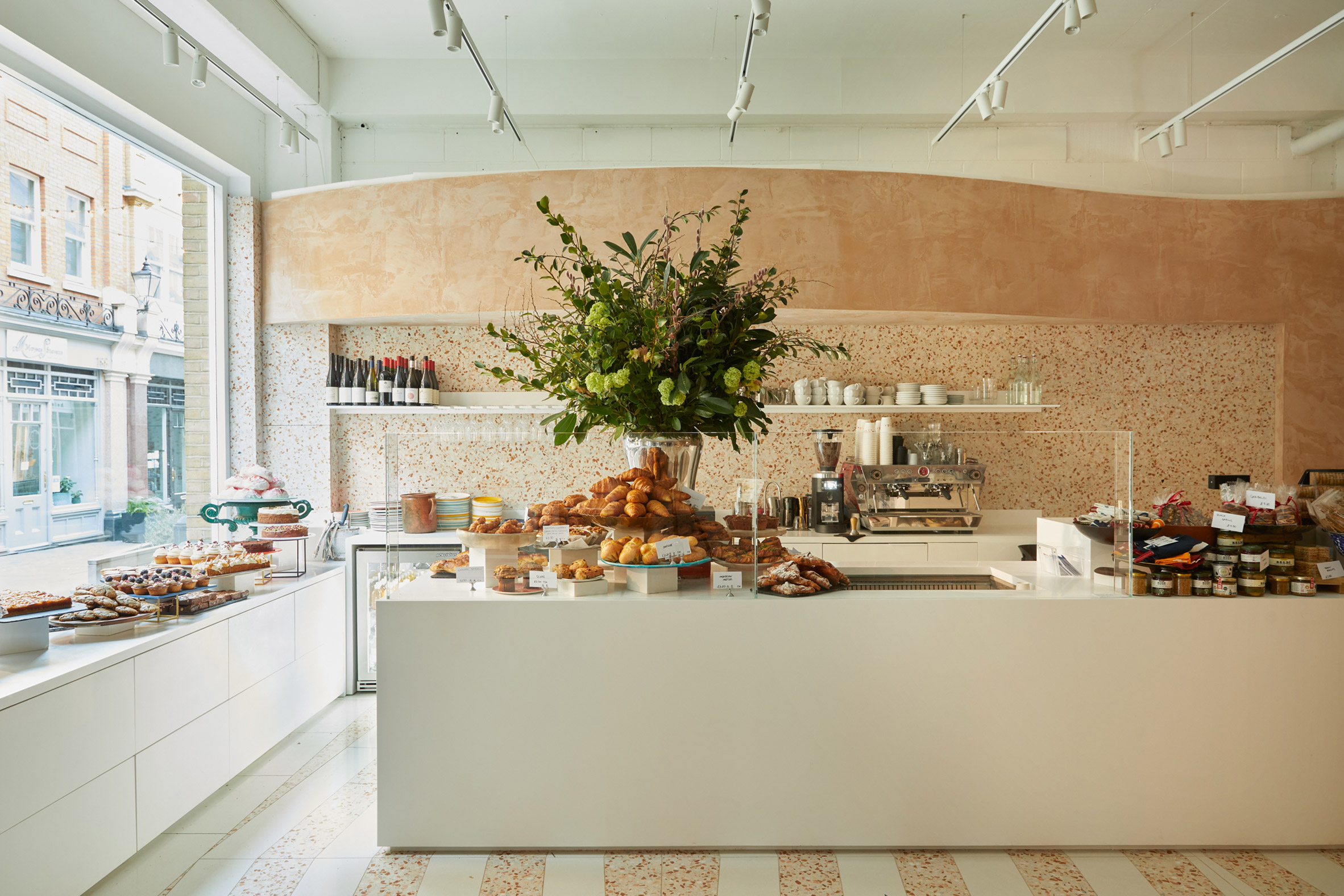
Deli counter at Ottolenghi ChelseaPink terrazzo features on the walls and floors

The clay plaster on the walls was made using recycled bricks, which provide the warm terracotta colour.

The multi-tonal character of this material is emphasised by curving walls that offer a play of light and shadow.

[ 28 Posti restaurant designed by Cristina Celestino
Read:

Cristina Celestino uses plaster and terracotta for 28 Posti restaurant interior

](https://www.dezeen.com/2020/03/03/28-posti-restaurant-interiors-milan/)

Meitlis worked with artist Ivo Bisignano – who also designed the tableware collection – to create the restaurant's distinctive floor, where pink terrazzo alternates with white tiles to create a striped effect.

The same terrazzo also features on wall surfaces at the front of the space and behind the deli counter.
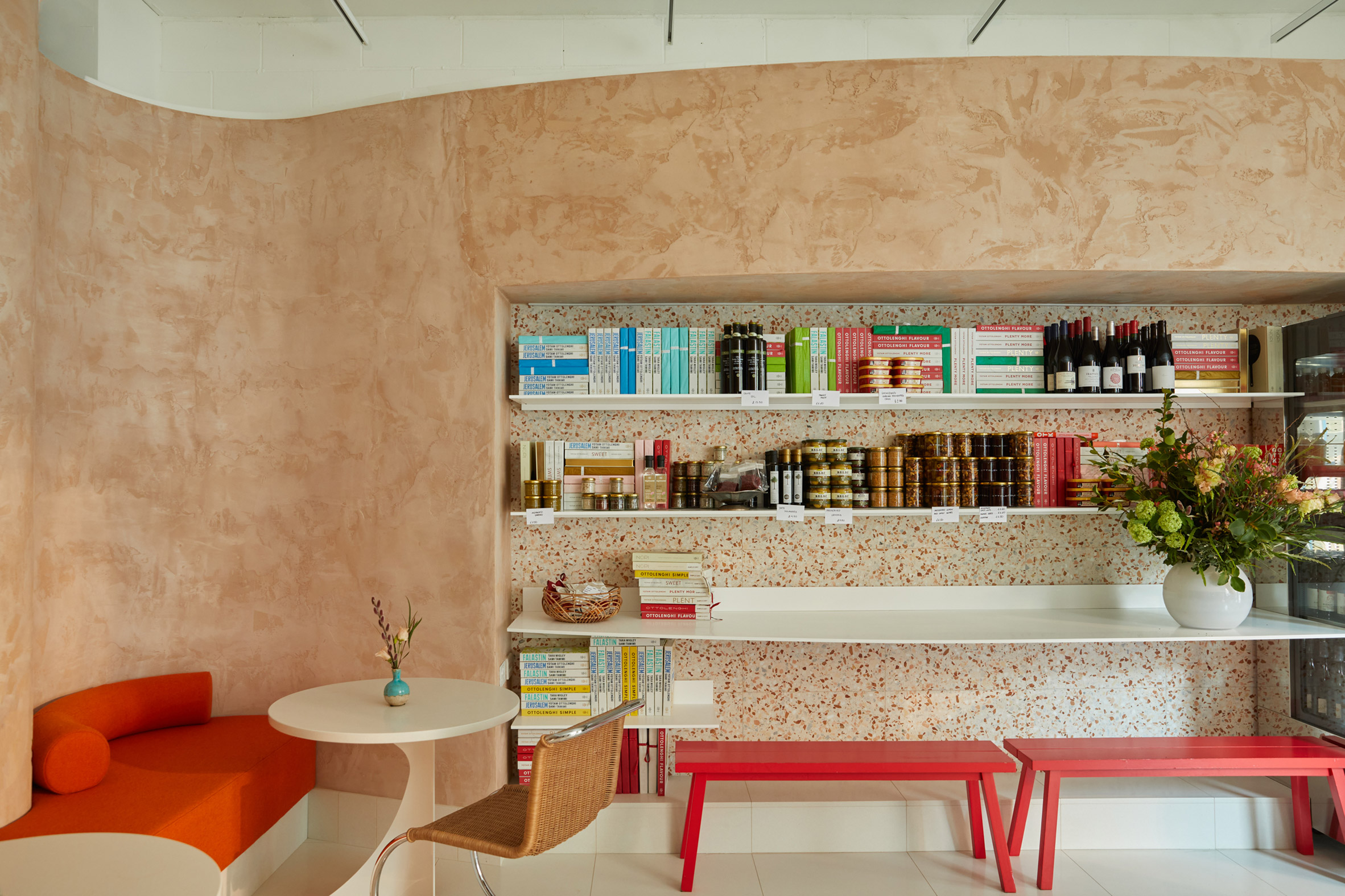
Entrance and waiting area in Ottolenghi ChelseaUpholstered banquettes have a graphic feel, with cylindrical cushions

The upholstered banquettes bring a geometric element to the design, combining blocky seats with cylindrical cushions. The choice of red fabric allows these to become the most eye-catching elements in the space.

They are paired with white circular tables and Mies van der Rohe-designed MR Chairs, which introduce more curves.

Clay plaster walls in Ottolenghi ChelseaCurves are integrated in the walls

Other elements include the familiar deli counter, where the cakes, pastries and salads create an appetising display.

"We usually start from scratch; almost all elements of the design are made specifically," Meitlis told Dezeen. "The only items we bought were the iconic Mies chairs."

"Once again, it's about mirroring the brand's attitude; all the food is made in the kitchen, with few elements pre-prepared."
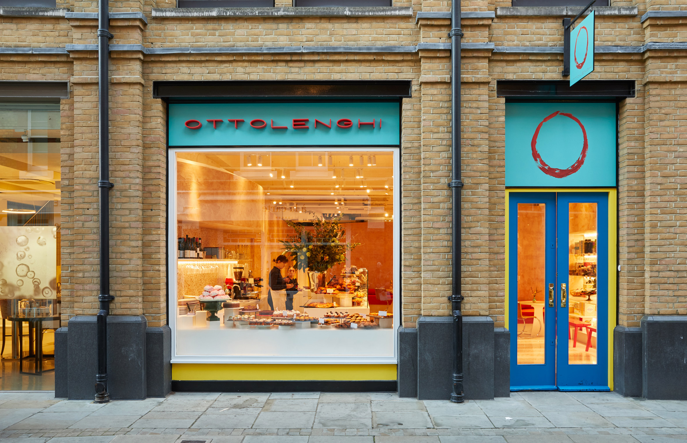
Exterior of Ottolenghi ChelseaThe facade features shades of yellow, blue and turquoise

Ottolenghi Chelsea opened in January 2022 and is located on Pavilion Road, in a converted Victorian stable building that is now home to various independent retail brands.

Dishes for Ottolenghi delis and restaurants are developed at the brand's test kitchen in Holloway, which was recently overhauled by Studiomama with pops of saffron yellow and raspberry red.

The post Alex Meitlis uses plaster and terrazzo to create pink tones in Ottolenghi Chelsea appeared first on Dezeen.

#restaurantsandbars #all #interiors #london #uk #england #cafes #delis

dezeen@xn--y9azesw6bu.xn--y9a3aq

Jubilee Pool in Penzance reinvented as UK's first heated seawater lido

image

Art Deco architecture of Jubilee Pool Penzance

An art deco swimming pool in Cornwall has been given a new lease of life thanks to the addition of geothermal heating and community facilities designed by Scott Whitby Studio.

The Jubilee Pool in Penzance is the largest of only five seawater lidos remaining in the UK and the first to be upgraded with a geothermal borehole, which provides a natural and low-energy method of heating the water.

Diver at Jubilee Pool PenzanceThe Jubilee Pool is the largest of five seawater pools in the UK

Scott Whitby Studio aimed to capitalise on this new addition, to create community facilities that support but don't overshadow the building's 1930s architecture.

The cafe and bar was extended, while a second building provides a community hall that can be used for a range of activities, from art exhibitions to fitness classes.

Jubilee Pool PenzanceGeothermal heating has been installed in the corner pool
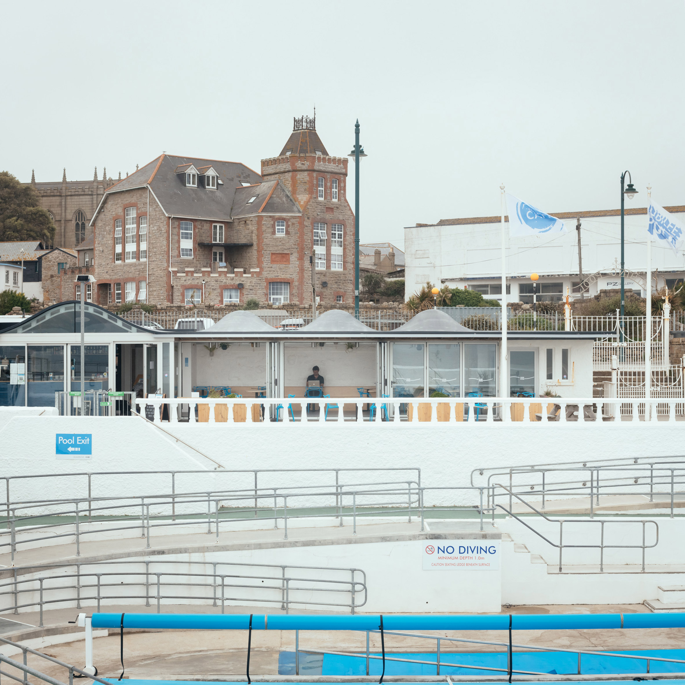
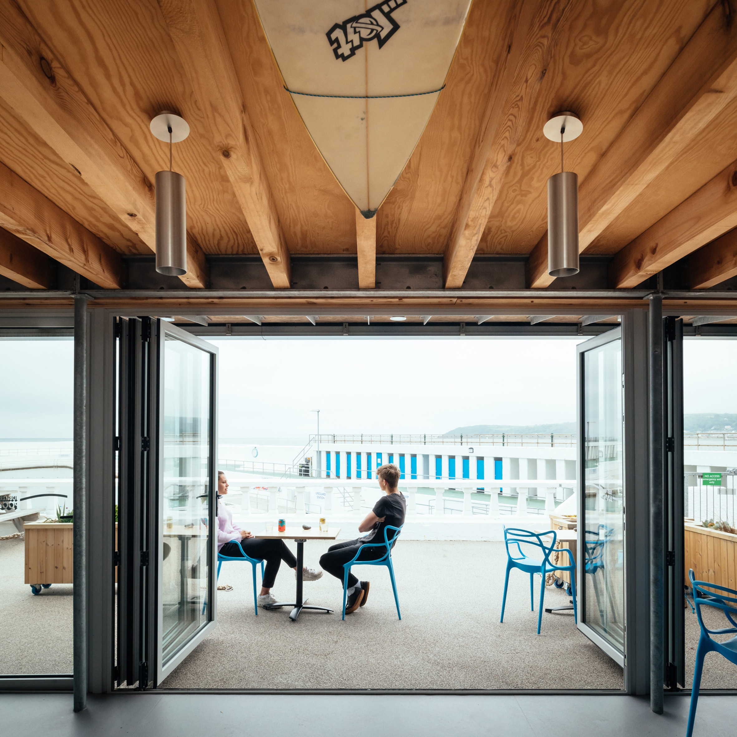
Glazed doors make up the facades of these buildings, allowing them to open up to a new poolside promenade.

"With a building this striking and this loved, our job was to sit back," said architect Alex Scott Whitby.

"We didn't want to get in the way of this incredible art deco celebration of swimming, so we created a series of modest, relatively low-cost additions that let the pool stay in the foreground," he told Dezeen.

New buildings by Scott Whitby Studios at Jubilee Pool PenzanceScott Whitby Studios has upgraded the pool's facilities

The project was initiated in 2014 by Friends of the Jubilee Pool, a charity formed by a group of local people concerned that their much-loved pool was falling into disrepair.

The charity bought the pool and was able to raise £1.8 million towards its refurbishment, thanks to support from Cornwall council, Penzance town council, EU funding, plus a community share of £540,000.

[ Aerial view of Guðlaug Baths by Basalt Architects

Read:

Basalt Architects builds geothermal baths on the Icelandic seafront

](https://www.dezeen.com/2021/03/11/basalt-architects-gudlaug-baths-geothermal-pool-iceland/)

"The people of Penzance invested their own money and savings into the pool, even though this is one of the most deprived boroughs in the UK," said Scott Whitby.

"It shows how important this space is to so many people, far and wide."

Aerial drone photo of Jubilee Pool PenzanceThe pool is now community-owned and run by a charity

The first step in the process, completed in 2019, was the excavation of the 410-metre-deep well, a project overseen by engineering firm Arup and specialist Geothermal Engineering.

The geothermal system extracts warm water from the well and, using a heat exchanger, uses it to warm the pool water up to temperature of between 30 and 35 degrees Celsius.

As a result, the pool can now be open year-round rather than just in the summer months.

Entrance to Jubilee Pool PenzanceThe new buildings have a roof profile that matches the original entrance sign

The task for Scott Whitby Studio was to rejuvenate the architecture, damaged by years of coastal weather, and create facilities that could equally serve the community year-round.

Both the cafe and the community hall were designed to be as flexible as possible, so they can be used in different ways, in all weathers.

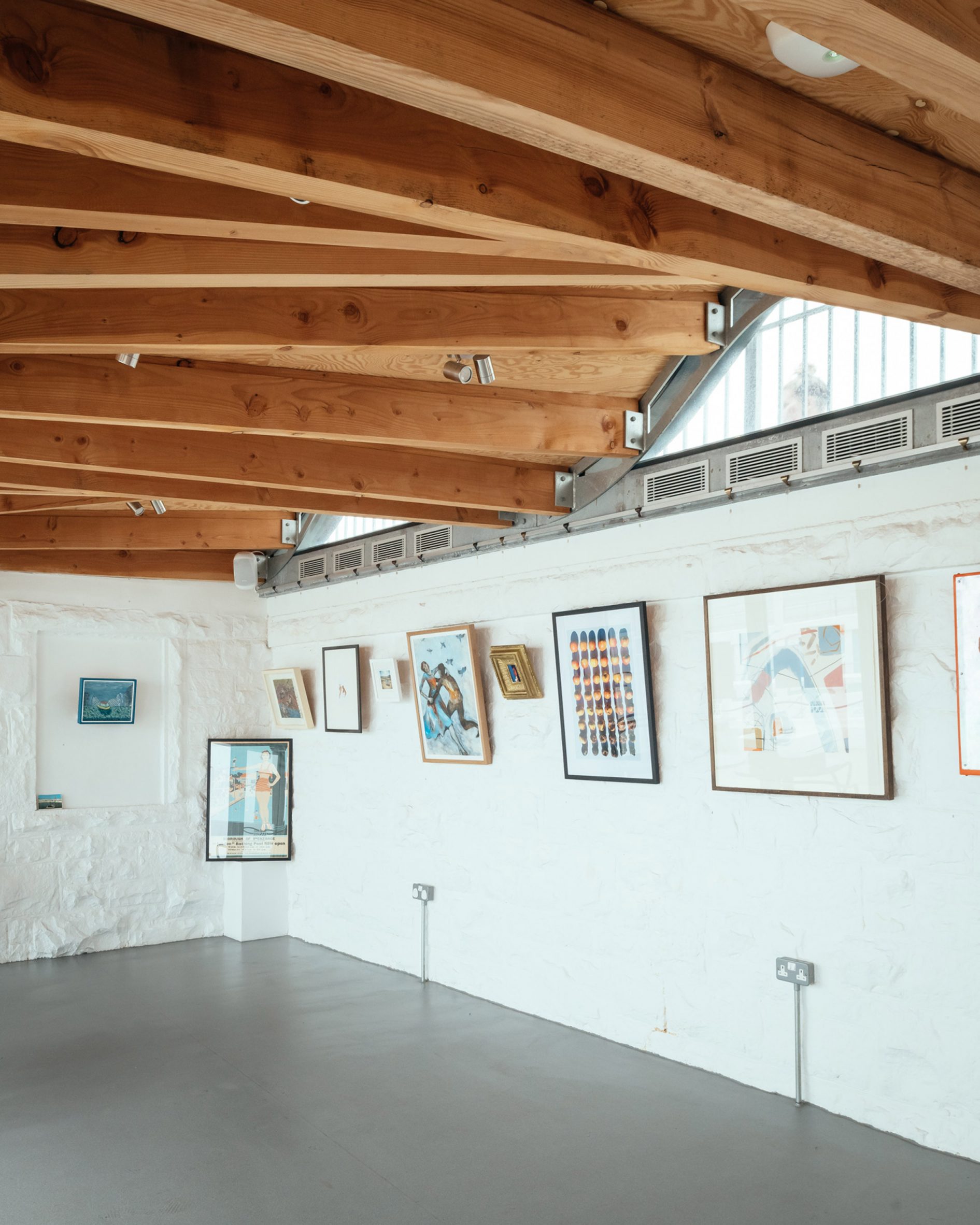
Interior of community space at Jubilee Pool PenzanceThe curves integrate north-facing rooflights
A rippled roof profile mirrors the Jubilee Pool's historic gate signage, and also resonates with the scalloped wall of the churchyard across the street.

This form allows the building to neatly integrate north-facing rooflights, but without making the building too visible from the street. The arches seem to be peeping up over the entrance wall.

Glazed facade of buildings at Jubilee Pool PenzanceThe buildings create more space for a bar and restaurant
Although simple in form, these structures integrate highly durable materials and finishes.

The fibreglass cladding is the same as used in boatbuilding, while the roof is a polyurethane rubber that's typically used for the flooring of oil tankers. The timber structure is salt-resistant, made from Douglas fir.

Community room and gallery space at Jubilee Pool PenzanceA new community space can be used for events, community meetings and exhibitions

"This building sits under the sea wall, which is a pretty unique situation," said Scott Whitby.

"We had to design a building that could cope with wind, waves, sea and a very high salt water environment, which drove a number of design decisions."

Historic photo at Jubilee Pool PenzanceThe pool was built in 1935, to commemorate the silver jubilee of King George V

Scott Whitby is based in London, where he runs his studio and also leads the Architecture and Physical Design department at the University of East London.

His past projects include a pop-up cinema and a bedroom for a throuple, although this project has a more personal significance. His wife's mother grew up in the area and swam in the pool in the 1950s.

"It's been a hugely humbling process to be part of that journey with the people of Penzance," he said.

"The best comment I had was by someone who is very local, who said, it's very Penzance; it feels like it's of its place, not trying to be something else."

Night view of Jubilee Pool PenzanceDurable materials and finishes helps to protect the old and new architecture
The pool was built in 1935 to commemorate the silver jubilee of King George V. British tourism was thriving at the time, before commercial air travel led to people holidaying abroad.

Susan Stuart, who was pivotal to the fundraising campaign, believes the rejuvenated pool can be a catalyst for change in a town whose economic prospects have traditionally centred around the summer season.

"It's wonderful to see this unique place brought back to light, not just as an affordable community amenity but a rare thing, a community driven regeneration asset," she said.

"Year round opening and the resurgence of interest in cold water swimming is supporting 'off-season' growth to reduce seasonality in the local economy and bolster employment prospects for local people."

Photography and film are byJim Stephenson. Aerial photos are by EyeOnHigh.


Project credits:

Architect: Scott Whitby Studio

Project team: Alex Scott-Whitby, Osman Marfo-Gyasi, Mary Tyulkanova, Neil Broadbent, Cherng-Min Teong, Jaahid Ahmad, Ada Keco, Kirk Slankard

QS (RIBA Stage 2): PT Projects

Structural engineer: WebbYates Engineers

Conservation/heritage: Scott Whitby Studio

Services engineer: WebbYates Engineers

Project manager/QS: Fox Cornwall

Main contractor: Catling Construction

Joinery: A1 Construction Penzance

Polyurea roofing: ESW

Fibreglass cladding: Stuart Pease (Fibreglass Ltd)

Geothermal engineering: GEON (GEL Geothermal Engineering Limited/Arup)

The post Jubilee Pool in Penzance reinvented as UK's first heated seawater lido appeared first on Dezeen.

#all #architecture #publicandleisure #videos #restorations #uk #england #swimmingpools #architecturevideos #scottwhitbystudio #artdeco #cornwall

dezeen@xn--y9azesw6bu.xn--y9a3aq

McLaren Excell unveils minimalist London headquarters for Samsung Design Europe

image

Spruce partitions and furnishings in Samsung Design Europe's minimalist office by McLaren Excell

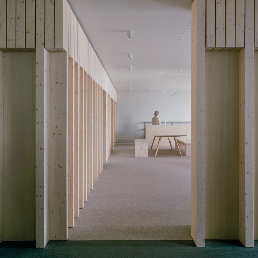
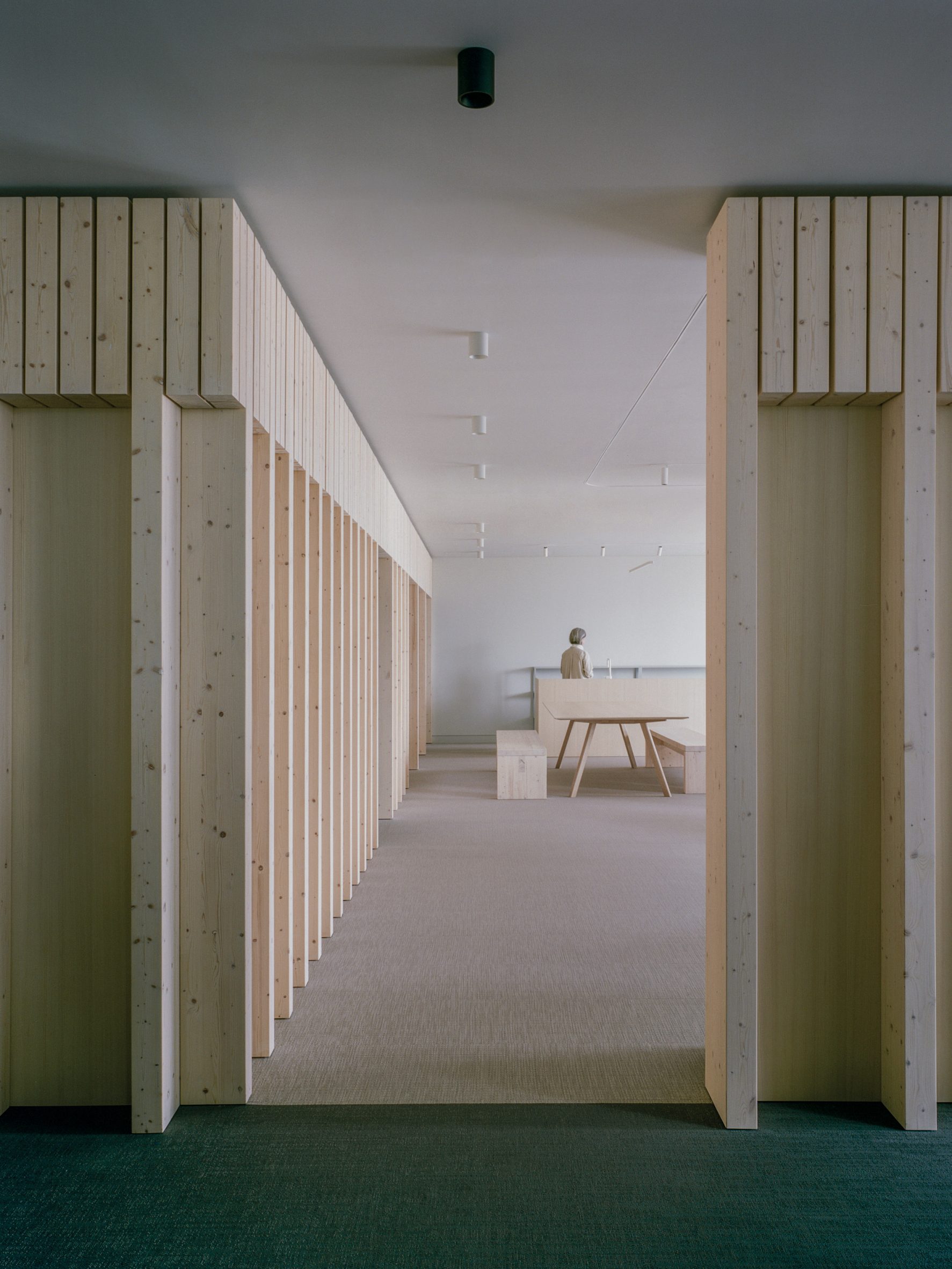
Only a handful of spruce partitions carve up the pared-back interior of this London office, which McLaren Excell has created for Samsung's European design studio.

Set inside a 21-storey tower known as the Can of Ham building, Samsung Design Europe is one of the tech company's seven product design hubs across the globe, with other outposts located in the US, China, Brazil, India, Japan and South Korea.

Local architecture studio McLaren Excell said it devised the minimalist interior for the London headquarters to "consign the formality of the workspace to the past".

Spruce partitions and furnishings in Samsung Design Europe's minimalist office by McLaren ExcellSpruce wood partitions break up the Samsung Design Europe headquarters
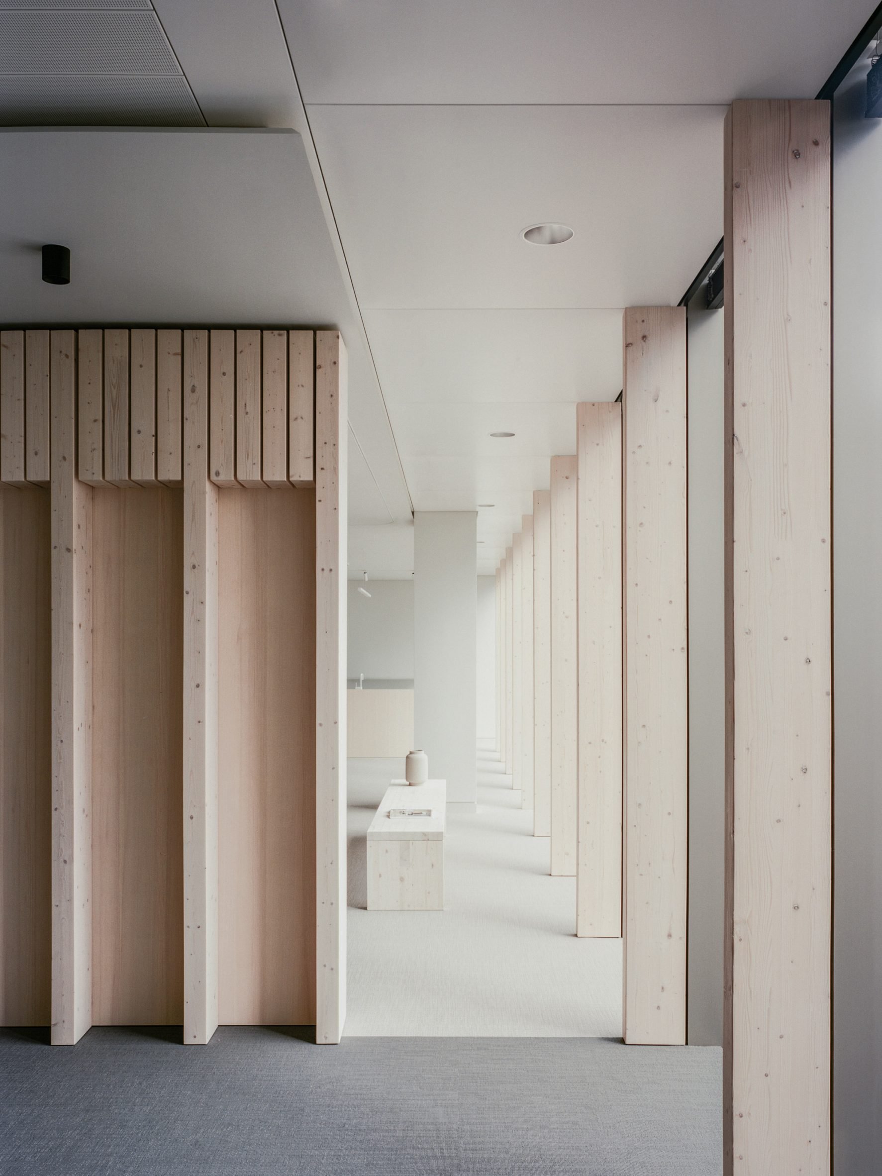
"[The office] instead embraces a more relaxed, informal and experiential place of work," explained the firm's co-founder Luke McLaren.

"We want the Samsung office to have all the qualities that are enjoyable about your home – a softness, a sense of calm, a high degree of tactility, spaces to congregate, spaces to which one can withdraw – but all the while nurturing that sense of welcome, of belonging, of enjoyment."

As a result, the office features just a handful of glue-laminated spruce partitions that loosely split the floor plan into private meeting rooms and communal zones where staff members can engage in more collaborative work.

Spruce wall fins and bench holding a ceramic vase in minimalist office by McLaren ExcellSpruce fins also run along the office's windows
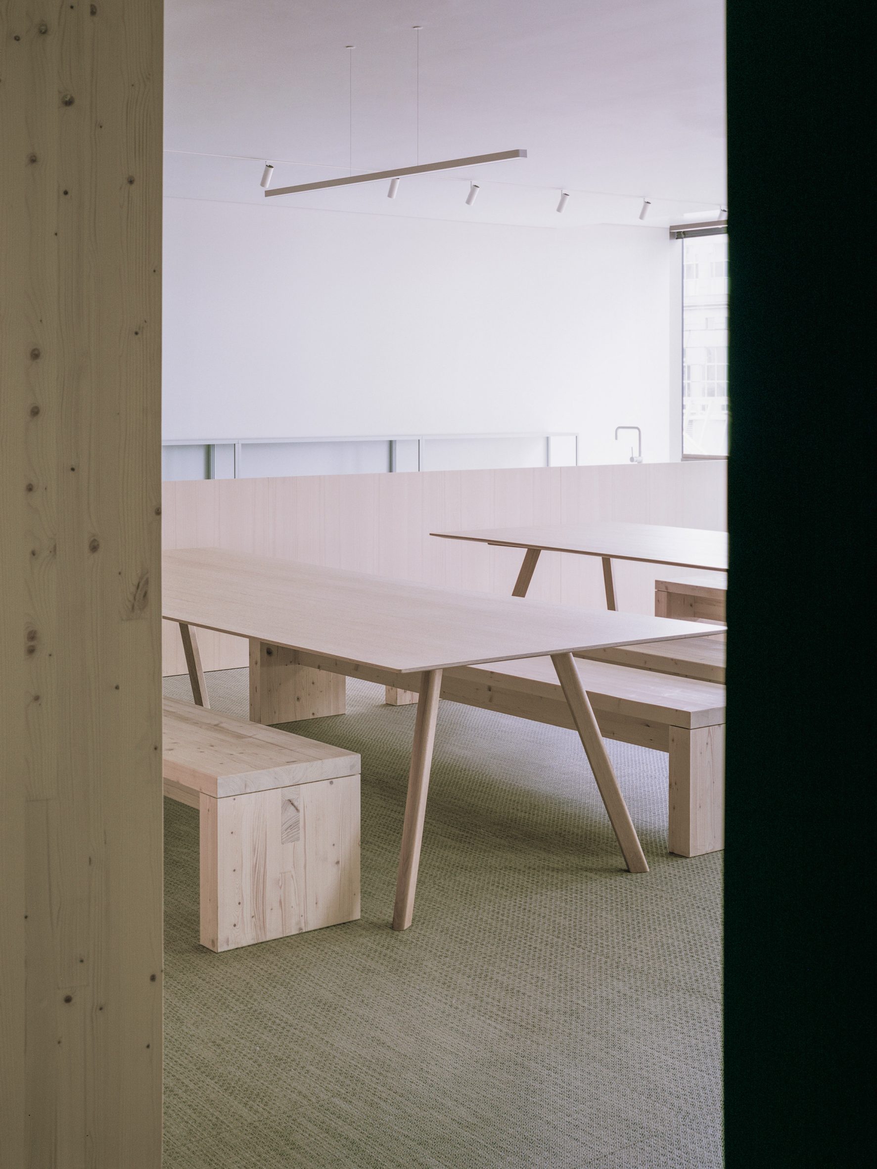
Spruce glulam also forms a series of vertical fins, which appear at intervals along the office's windows.

In the breakout area, the same pale-toned timber was used to craft the dining table, counter and benches.

Light wooden tables and benches in breakout area of Samsung Design Europe officeFurnishings in the breakout area are made from spruce
Grey linen curtains that hang from tracks on the ceiling can be used to further divide up the open-plan office while bringing a sense of tactility to the interior.

In an effort to make the HQ seem more relaxed and inviting, planters overspilling with foliage were embedded into the top of the desk banks.

[ The Splash Lab showroom in LA designed by McLaren Excell

Read:

McLaren Excell channels church interiors for The Splash Lab's LA showroom

](https://www.dezeen.com/2020/06/22/splash-lab-showroom-interiors-los-angeles/)

McLaren Excell also abandoned a traditional lighting grid in favour of fitted lamps, which illuminate pockets of the office in more targeted and intimate ways.

The architecture studio was founded by Luke McLaren and Robert Excell in 2010 and is based in London's Chelsea neighbourhood.

Desk banks with integrated planters in front of spruce partition in Samsung Design Europe office in London Planters are embedded into the office's desk banks

Recent projects by McLaren Excell include a bathroom showroom in Los Angeles with arched doorways and altar-like tables reminiscent of a church.

_The photography is byLorenzo Zandri. _

The post McLaren Excell unveils minimalist London headquarters for Samsung Design Europe appeared first on Dezeen.

#all #interiors #london #uk #england #samsung #mclarenexcell #minimalistinteriordesign #officeinteriors #spruce

dezeen@xn--y9azesw6bu.xn--y9a3aq

RCKa designs Nourish Hub to tackle food poverty in London

image

Kitchen counter in Nourish Hub by RCKa

Architecture studio RCKa has transformed a row of vacant shop units in west London into a community kitchen and learning space that hopes to reduce dependency on food banks.

Located on the Edward Wood Estate in Hammersmith, Nourish Hub provides the first permanent home for UKHarvest, a charity that uses food as a tool for social impact.

Nourish Hub by RCKaNourish Hub is designed to feel open and accessible

With Hammersmith & Fulham the London borough with the highest dependency on food banks, Nourish Hub's ambition is not only to provide food for vulnerable local residents. It offer opportunities for people to practice cooking skills, learn about nutrition and access jobs in the food industry.

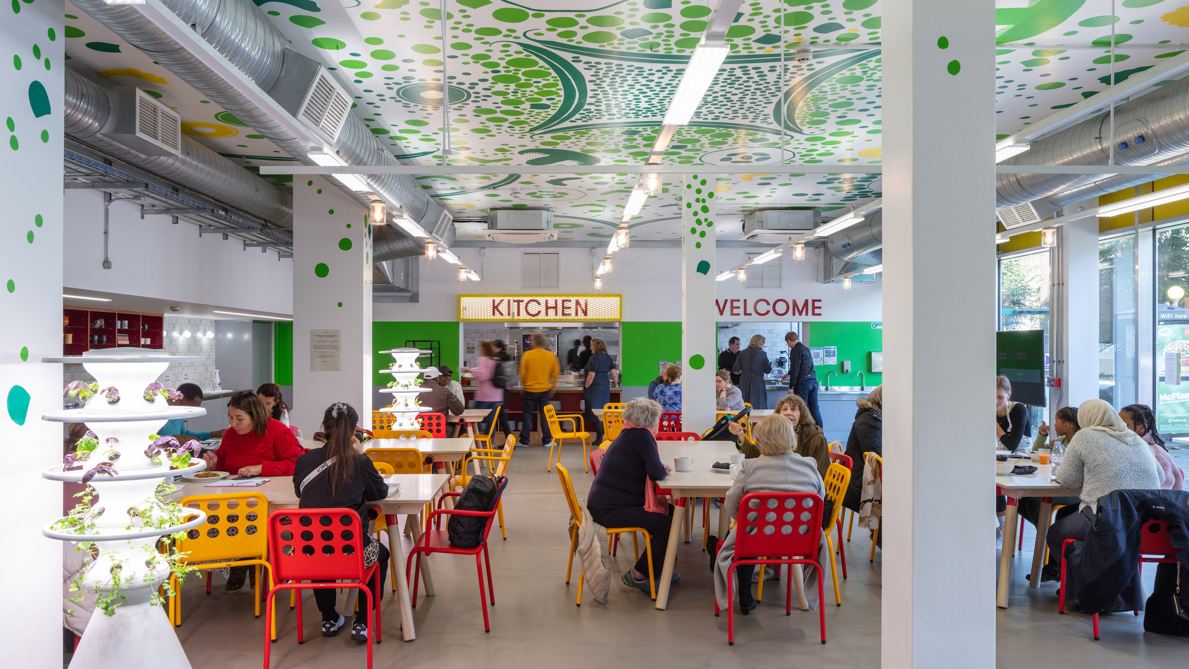
The space includes a commercial kitchen, a teaching kitchen and a flexible space that can be used as a dining room, workspace, classroom or event venue.

Red and yellow chairs in Nourish Hub by RCKaA flexible interior can be used as a dining room, classroom, workspace or event venue

RCKa's role was not only to plan the interior, but to find ways of empowering the local community to get involved in the facility and make it their own.

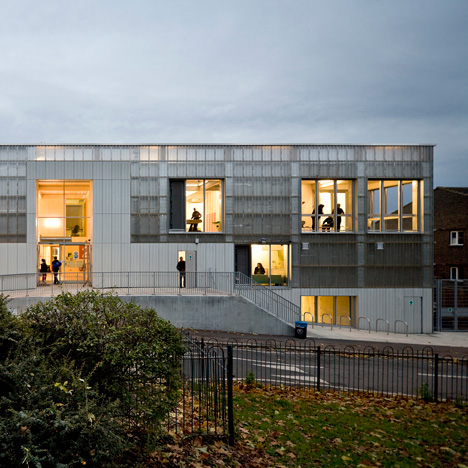
The design strategy focused on making the space – which previously housed a post office and a supermarket – feel as accessible as possible.

Facade of Nourish Hub by RCKaVibrant colours and bold signage make the space more welcoming

The facade can be opened up, thanks to sliding glass doors and a serving hatch, while bright colours and bold signage create a friendly feel throughout.

"Getting people through the door is the first challenge, so the Hub had to seem open and welcoming to the entire community," said RCKa director Dieter Kleiner.

Serving hatch at Nourish Hub by RCKaThe facade integrates a serving hatch and large sliding doors
When developing the design, the architects decided against a traditional community engagement programme. Instead, they hosted a range of pop-up activities to attract the interest of local residents and learn about their experiences.

They started by painting a graphic mural over the old shutters. They also set up an outdoor kitchen, created playful questionnaire cards and hosted workshops with children.

[ The New Generation Youth Venue Lewisham by RCKa

Read:

London youth centre by RCKa features a translucent polycarbonate facade

](https://www.dezeen.com/2014/06/27/rcka-corrugated-polycarbonate-london-youth-centre-translucent-facade/)

"It wasn't about co-designing the space with local people; that wasn't what we needed," explained project architect Anthony Staples during a press tour.

"We had three aims: to raise awareness of the project, to test ideas and to establish a local identity."

Ceiling mural in Nourish Hub by RCKaA ceiling mural design came out of a children's workshop

In one children's workshop, participants created graphic designs out of raw fruit, vegetables and grains.

One of these designs is now painted on the ceiling, while another has been turned into ceramic wall tiles.

Teaching kitchen in Nourish Hub by RCKaThe training kitchen includes wheelchair-accessible surfaces
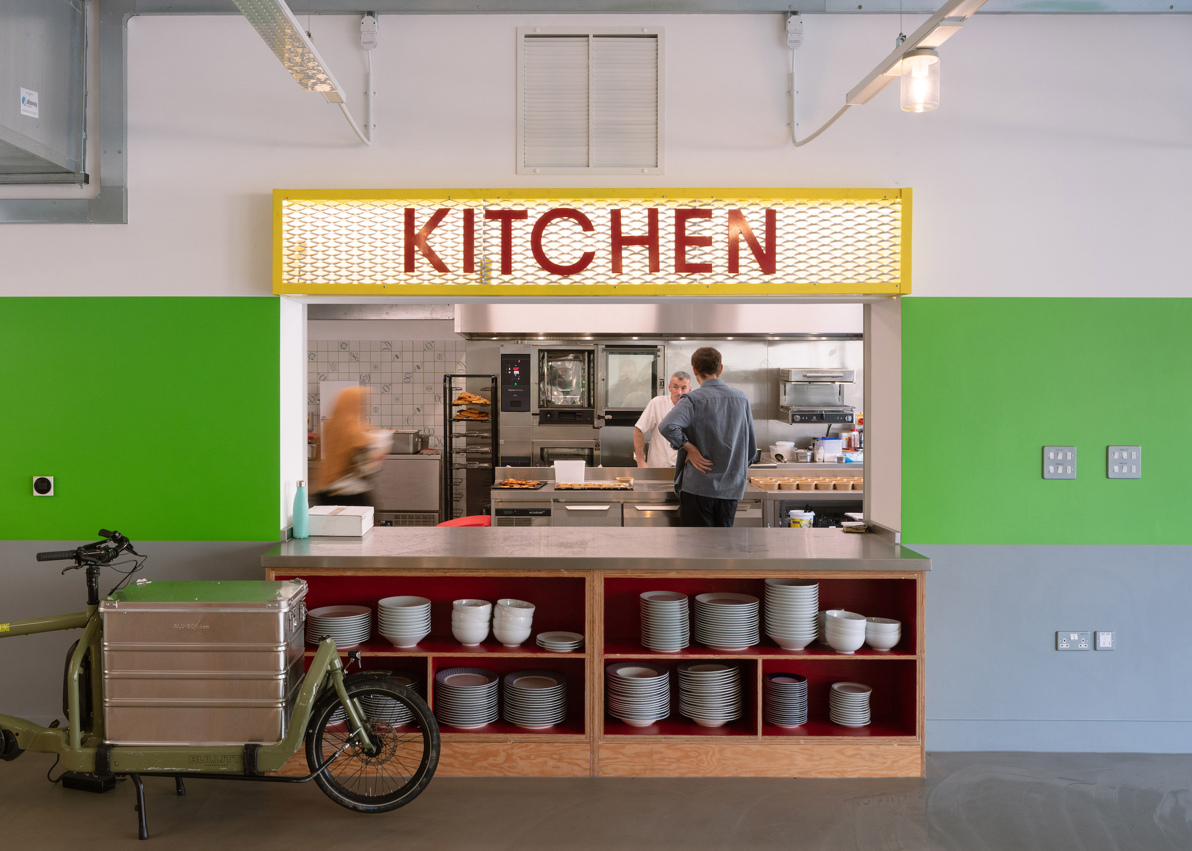
For the interior layout, RCKa took cues from Victorian kitchens. The teaching kitchen takes the form of a large island, while open cabinets display tableware and cookbooks.

"We were really inspired by old-fashioned kitchens, which are very performative," said Staples.

"Everything is on display, so when you go in, you feel like you want to touch and grab things."

Kitchen counter in Nourish Hub by RCKaOpen shelving was favoured over cupboards

The space is furnished with wooden tables, and chairs in bold shades of red and yellow.

There are also various details added in to make the space accessible to a wide range of users. These include lowered surfaces that cater to wheelchair users and a curtain that supports those with specific privacy needs.

RCKa and UKHarvest workshops with childrenThe children's design workshop also provided graphics for ceramic wall tiles

Yvonne Thomson, the CEO of UKHarvest, believes the concept can help to tackle issues of food poverty and insecurity, which impact an estimated 8.4 million people in the UK.

The project was realised with funding support from the Mayor of London's Good Growth Fund, as well as the borough, but the target is for Nourish Hub to become financially self-sufficient within three years.

"Great care has been taken to create a versatile space that enables us to facilitate positive change and meet the needs of different community groups," Thomson said.

RCKa and UKHarvest community engagementThe architects began the community engagement process by painting the old shutters

RCKa compares the project with its previous work on The Granville, a community centre with the purpose of providing accessible workspace for local startups.

Staples believes these types of projects could easily be replicated across the UK, to bring change at a large scale.

"This project is totally replicable," he said. "We could roll them out in a lot of London boroughs and beyond."

Photography is byFrancisco Ibáñez Hantke.

The post RCKa designs Nourish Hub to tackle food poverty in London appeared first on Dezeen.

#all #interiors #london #uk #england #communitycentres #rcka

dezeen@xn--y9azesw6bu.xn--y9a3aq

Roof of Richard Rogers' Millennium Dome blown off in Storm Eunice

image

Richard Rogers' Millennium Dome roof damage

Breaking news: the high-tech Millennium Dome in London, which was designed by British architect Richard Rogers, has been severely damaged in Storm Eunice.

A large section of the fabric roof of the building in Greenwich, which is now known as the O2 Arena, has been pulled off by the storm, exposing the inside of the venue.

Videos and images shared on social media show six panels of the PTFE-coated glass fibre fabric roof ripped away from the building as the damage continues to spread.

Dome update - six panels shredded and counting ! pic.twitter.com/p2AVhf17Ly

-- Ben Hubbard (@BJFHubbard) February 18, 2022

The 50-metre-high dome in east London is one of the city's most recognised landmarks. Opened in 1999, it was built to house an exhibition celebrating the beginning of the new millennium called the Millennium Experience.

Effectively a giant tent, the fabric roof is supposed from 12 bright yellow towers that rise 100 metres above the structure.

It was designed by British architect Rogers, who recently passed away, and is a key example of the high-tech architecture style.

Following the Millennium Experience exhibition closing, the building was converted by architecture studio Populous into the 20,000-capacity O2 Arena.

In 2013 Rogers' studio Rogers Stirk Harbour + Partners returned to the project to create the Up at the O2 attraction. The studio collaborated with Bblur Architecture to add a fabric walkway to the outside of the dome's roof that allows visitors to reach a viewing platform at the top.

The photography is by PA.

The post Roof of Richard Rogers' Millennium Dome blown off in Storm Eunice appeared first on Dezeen.

#all #architecture #news #london #uk #richardrogers #england

dezeen@xn--y9azesw6bu.xn--y9a3aq

Alexander Martin Architects designs Arts and Crafts-influenced home in Surrey

image

Claygate House

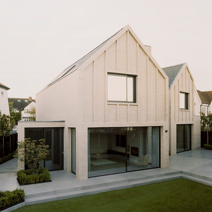
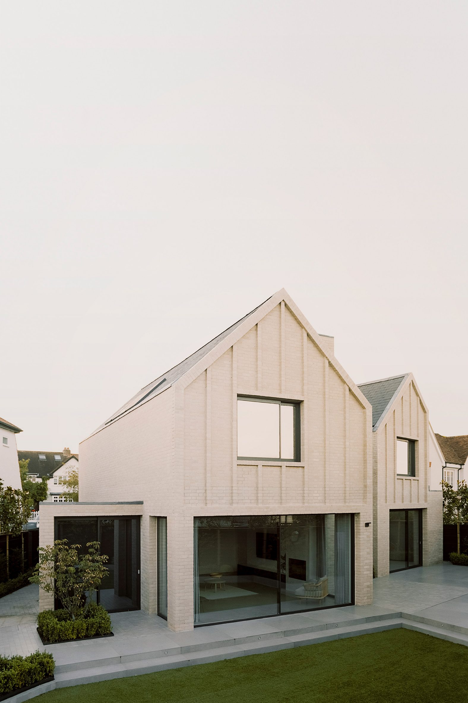
Two gabled brick volumes informed by the architecture of the 19th-century Arts and Crafts movement define this home in Claygate, Surrey, designed by Alexander Martin Architects.

Claygate House sits on a triangular plot that was formerly the site of a 1920s home, which the clients wanted to replace with something unique but sensitive to its suburban site.

Arts and Crafts-informed homeTwo gabled brick volumes define Claygate House
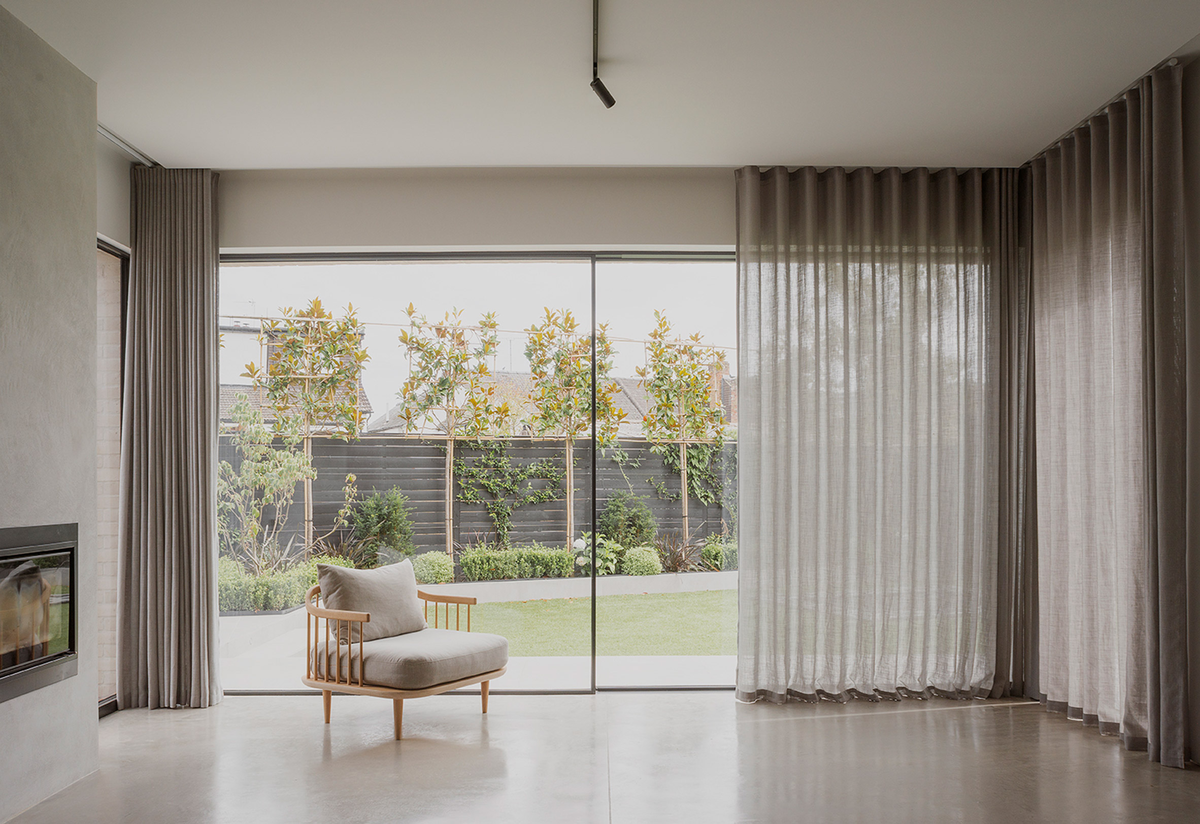
London-based Alexander Martin Architects' response was to base the home's design on a modern, stripped-back interpretation of the area's traditional Arts and Crafts style, "redefining the aspirations for suburban architecture".

"Our client was clear from the outset that they didn't want a run-of-the-mill house and that they were prepared to do something bold in the suburbs," said director Alexander Martin.

Full-height glazingStrips of full-height glazing provide views into the house
"However, the design and materials have all been carefully orchestrated to create a series of spaces that best serve the needs of the family while still maintaining an elegant appearance," he continued.

Taking advantage of the triangular site, the home is organised as two individual gabled forms that sit at a slight angle to one another. They are sized to not exceed the height of the neighbouring building.

Alexander Martin Architects staircaseAn exposed metal staircase sits in the centre of the house
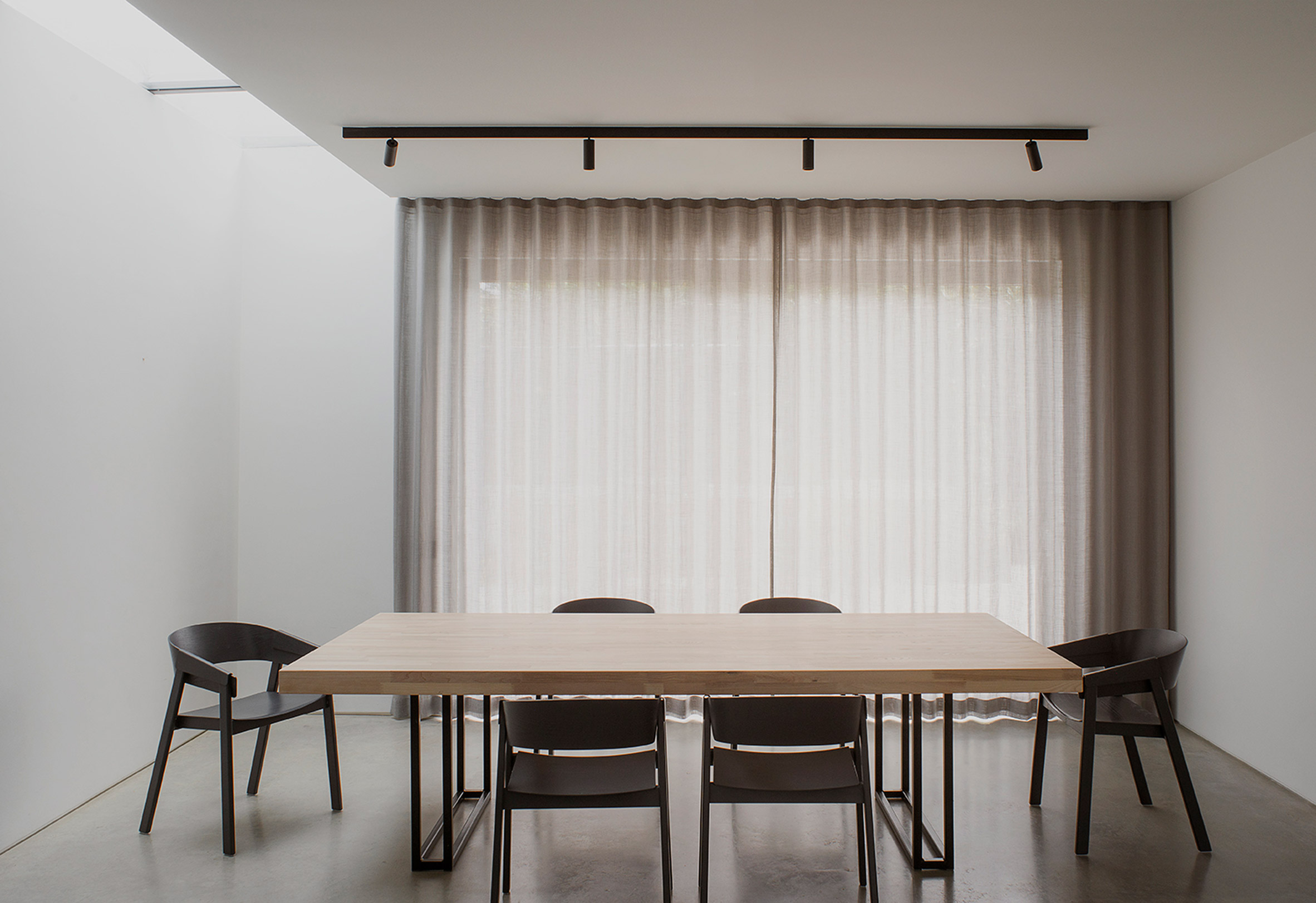
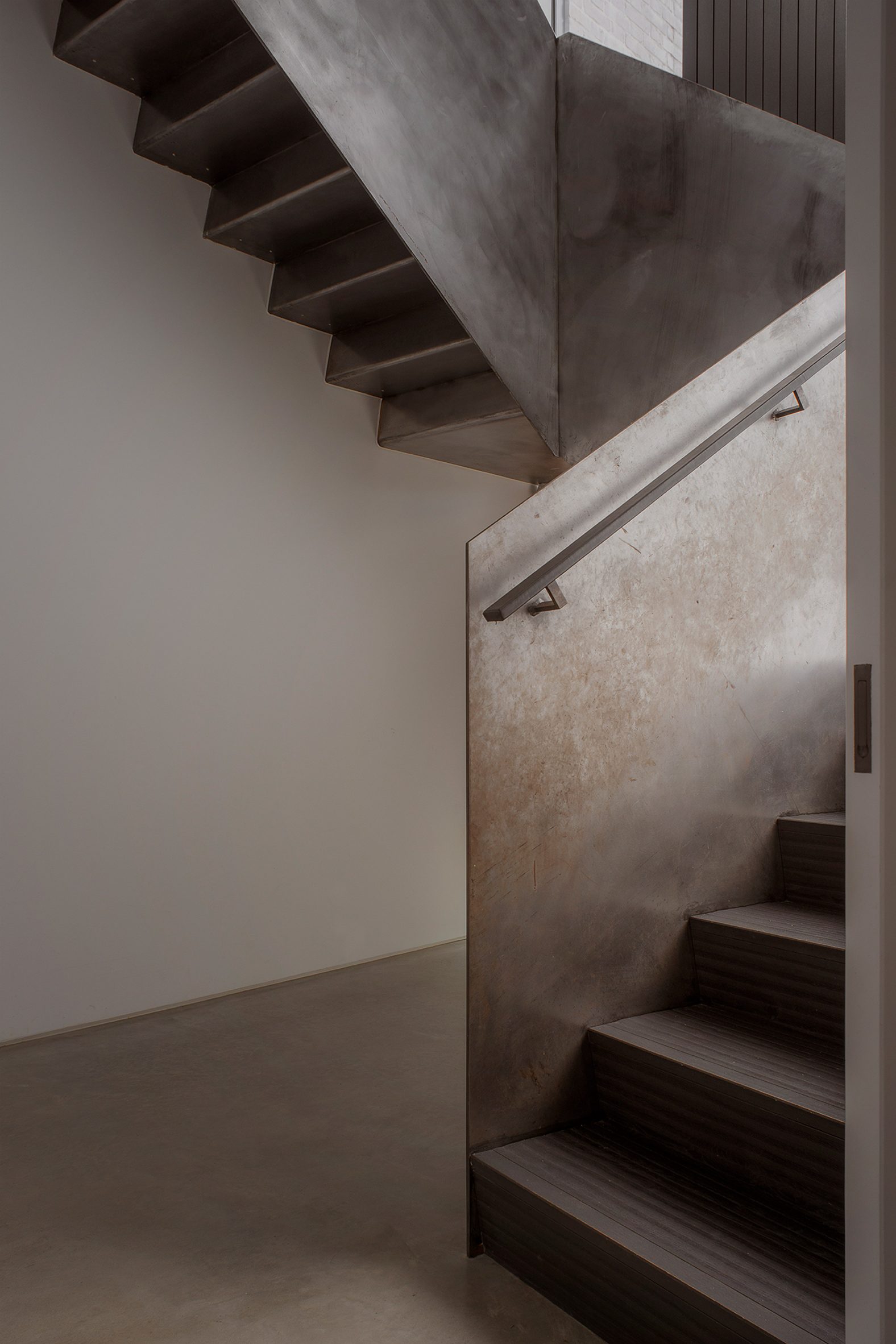
Connecting these two main forms is a double-height volume that contains an exposed metal staircase, with strips of full-height glazing providing views in and flooding this connecting space with light.

The programme is split across the two halves, with a large dining and kitchen area to the east and a living room to the west. Bedroom spaces above are connected by a short bridge.

[ Exterior view of the extension at Woodthorpe Stables

Read:

Delve Architects strips back and extends 19th-century stone barn in Surrey

](https://www.dezeen.com/2021/12/14/delve-architects-woodthorpe-stables-residential-architecture-surrey-uk/)

Large glass sliding doors open both of the ground floor spaces onto a stepped terrace, which leads down to a large garden at the rear of the home.

Claygate House was built using a Structural Insulated Panels system (SIPS), which allowed the core structural frame to be completed within four months.

Dining area of Arts and Crafts houseIn the east portion is a large dining and kitchen area
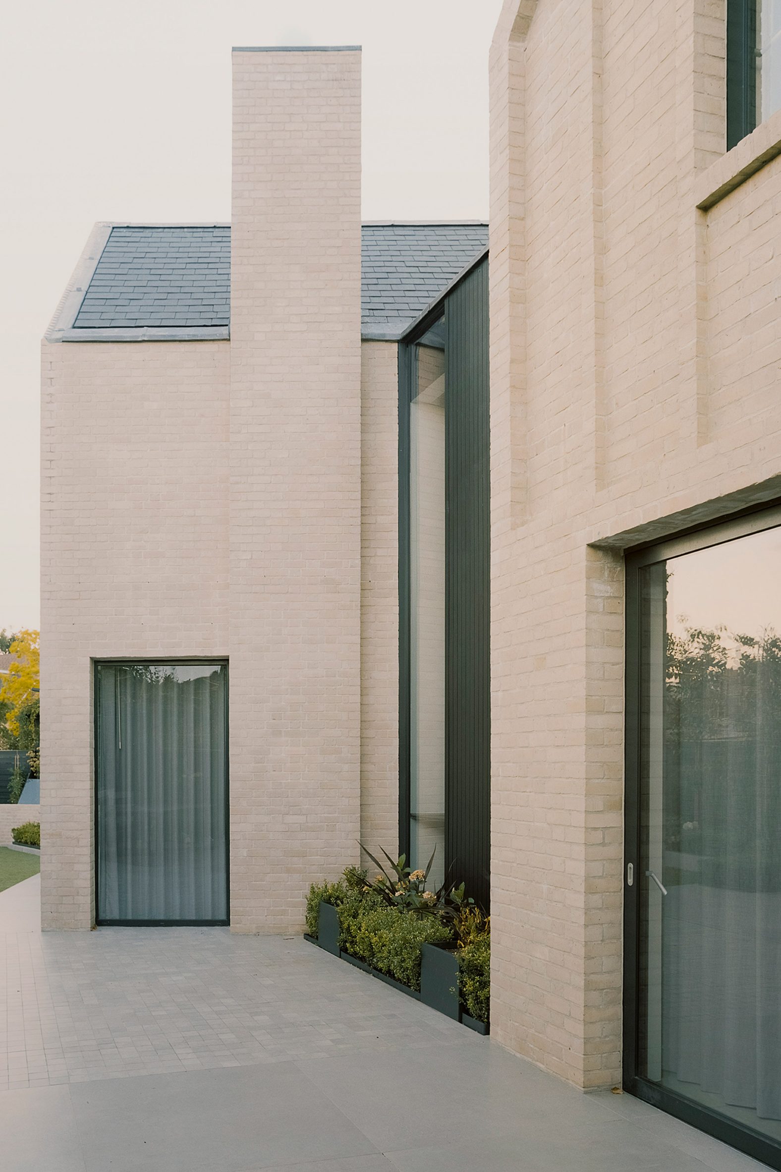
The gabled forms are clad in pale buff brick, with simple facades defined by vertical banding and contrasted by black metal window frames.

The Arts and Crafts references of the exterior are contrasted by sleek contemporary finishes and a monochrome palette in the interiors, including white walls, stone floors and black veneered joinery.

Claygate House by Alexander Martin Architects The exterior references the Arts and Crafts movement

Marble details in the bathrooms and countertops bring a "timeless" quality to the spaces.

Previous projects by Alexander Martin Architects include a three-storey extension to a Victorian house in London, with an area of double-height glazing overlooking a garden.

The post Alexander Martin Architects designs Arts and Crafts-influenced home in Surrey appeared first on Dezeen.

#all #architecture #residential #uk #england #bricks #houses #gables #britishhouses #surrey #alexandermartinarchitects

dezeen@xn--y9azesw6bu.xn--y9a3aq

UK government could block developers that refuse to pay cladding costs from housing market

image

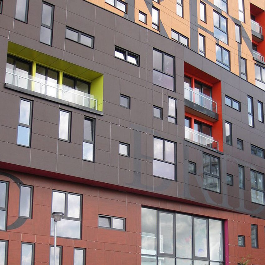
Cladding removal UK government fund

The UK government has threatened to block property developers who refuse to contribute towards the costs of fixing unsafe cladding from obtaining planning permission or building control sign-off.

It is the latest move by ministers to try to solve the so-called cladding scandal, which emerged in England after the Grenfell Tower fire and has left hundreds of thousands of flat owners facing huge bills to replace their building's facades.

The measures, which were introduced to parliament on Monday as amendments to the Building Safety Bill, would effectively prevent uncooperative homebuilders from building and selling homes.

Last month, UK housing secretary Michael Gove told the residential developer industry that it must agree to help meet the £4 billion estimated remaining cost of replacing dangerous cladding on buildings or face penalties, with a similar demand later made to construction product manufacturers.

With talks between the government and industry ongoing, the proposals put forward this week spell out the severe nature of those penalties.

Cap on leaseholder costs

If passed, the amendments would also give leaseholders legal protection from cladding and other fire safety costs above £15,000 in London and £10,000 in the rest of England.

Those capped costs would only fall on leaseholders if the new measures aimed at raising funds from developers and product manufacturers fail to raise the full £4 billion, and would include money already paid out over the last five years for interim safety provisions.

The government said this clause "will enshrine in law" its promise from last month that no leaseholder of a flat in a building taller than 11 metres will have to pay a penny to remove defective cladding, with the capped costs mostly expected to relate to other safety issues.

Some residents have previously been issued cladding remediation invoices for more than £100,000 by building owners.

"It is time to bring this scandal to an end, protect leaseholders and see the industry work together to deliver a solution," said Gove.

[ Inquiry: The UK government has promised to pay out £200 million to replace cladding from private high-rise housing, almost two years after the Grenfell Tower fire.

Read:

Grenfell architect unaware of fire rules and cladding risk

](https://www.dezeen.com/2020/03/06/grenfell-tower-inquiry-architect-fire-rules-news/)

"We cannot allow those who do not take building safety seriously to build homes in the future, and for those not willing to play their part they must face consequences," he added. "We will take action to keep homes safe and to protect existing leaseholders from paying the price for bad development."

As well as the measures to block developers from the housing market, the amendments make it possible for courts to sue builders that have used shell company structures to dodge responsibility for cladding problems.

Cladding manufacturers prosecuted for selling defective products would also become subject to Cost Contribution Orders, forcing them to pay a share of the cost to remediate affected buildings.

Among other proposals in the package of amendments is a widening of the scope of the building safety levy, a tax on developer profits aimed at recouping some of the government's own costs of fixing the cladding crisis, with higher rates for companies refusing to make voluntary contributions.

Lords to debate proposals

The amendments would also require building owners or developers to pay to fix other historic safety issues besides cladding on their own blocks, in a bid to protect leaseholders from bills for problems uncovered while inspecting facades, such as missing fire breaks.

Since the Grenfell Tower fire in 2017, which claimed 72 lives, the UK government has spent £5.1 billion fixing dangerous cladding on buildings taller than 18 metres.

The £4 billion it is hoping to raise from industry will pay for remediation work on buildings between 11 and 18 metres. No funding has been offered for buildings below 11 metres.

Introduced to parliament in July 2021, the Building Safety Bill is a huge piece of legislation that seeks to overhaul the regime for managing safety in high-rises and solve the issues that led to Grenfell.

The amendments introduced this week will be debated in the House of Lords on 21 February.

The top photo is by David Jones.

The post UK government could block developers that refuse to pay cladding costs from housing market appeared first on Dezeen.

#all #architecture #news #residential #uk #england #grenfelltowerfire

dezeen@xn--y9azesw6bu.xn--y9a3aq

Henley Halebrown creates Bauhaus-inspired offices in converted London warehouse

image

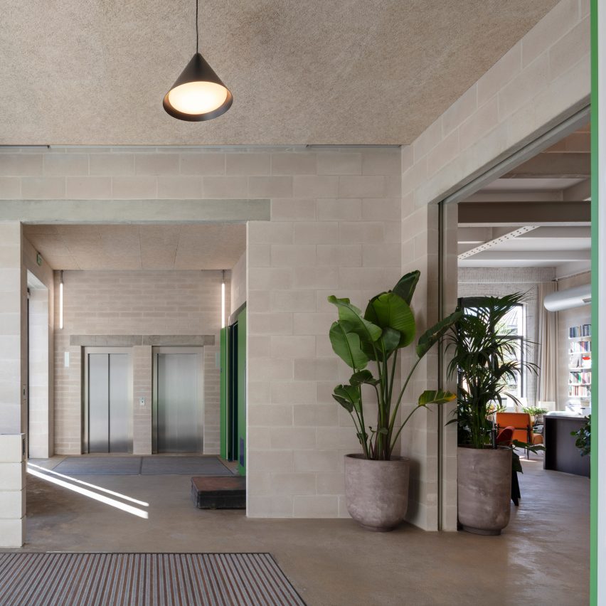
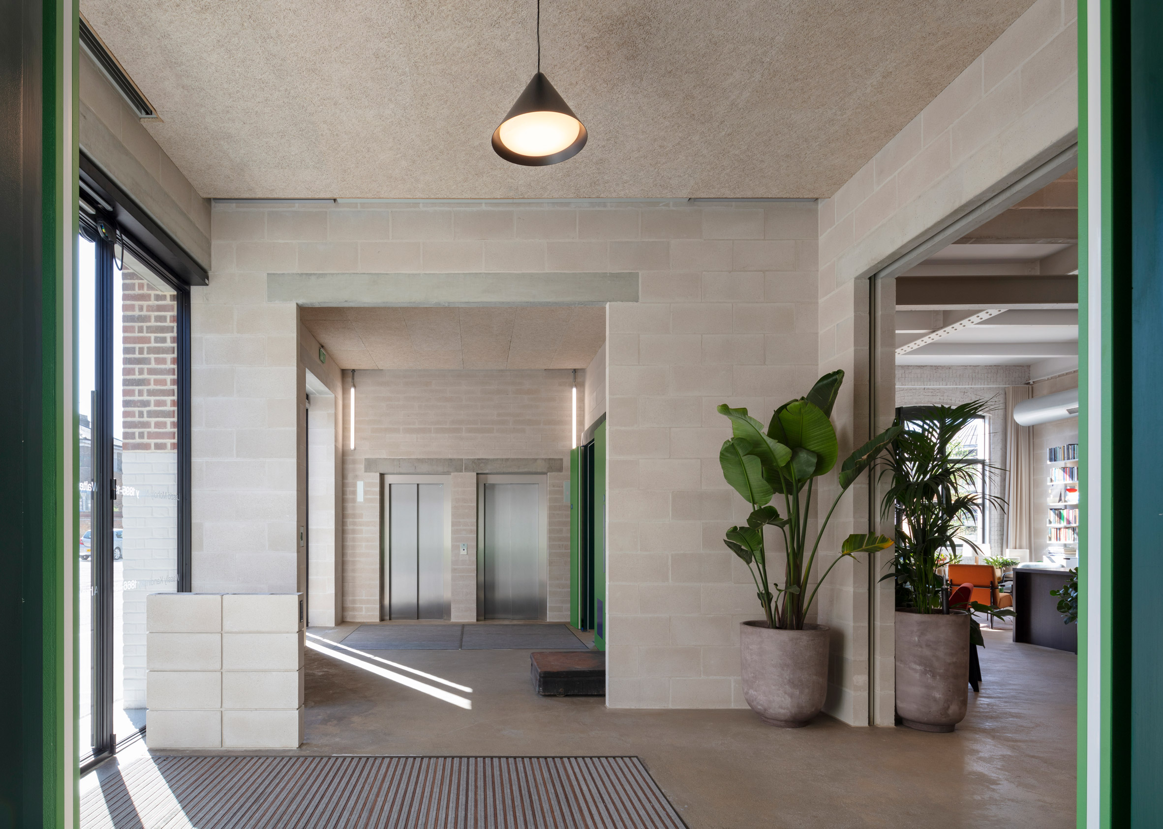
Concrete block walls in the reception of Lazlo offices by Henley Halebrown

The colours and craft techniques of the Bauhaus movement were the inspiration behind Laszlo, a century-old warehouse building transformed into workspaces by London studio Henley Halebrown.

Located in north London, the renovated building now contains five floors of flexible offices, ranging from 482 square metres up to 647 square metres.

Concrete block walls in the reception of Lazlo offices by Henley HalebrownStructural elements are left exposed through Laszlo's interiors
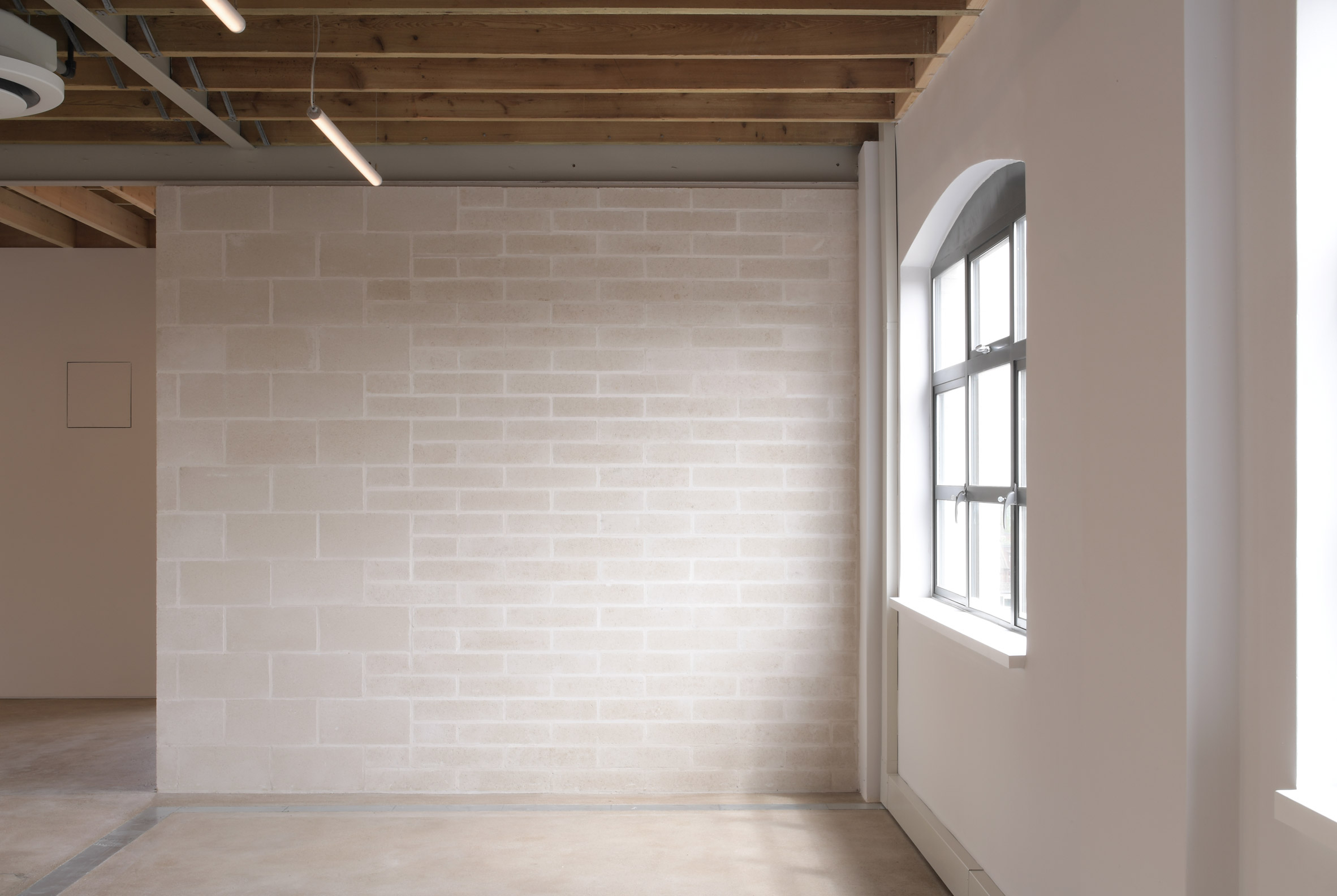
Henley Halebrown approached the project differently to a standard office conversion.

Instead of a "shell and core" approach, where tenants have no choice but to complete a fit-out, the architects have made spaces that can be occupied simply as they are.

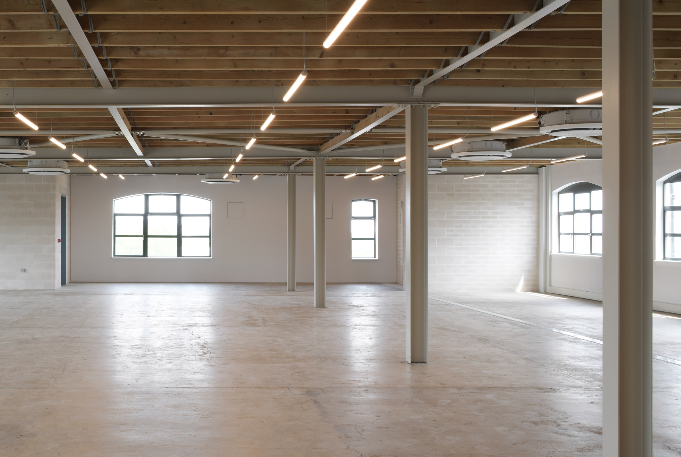
They did this by exposing the building's internal structure – its concrete floor slabs and steel I beams – and bringing order to the elements around. Services are neatly organised, while low-tech materials like concrete and timber are used to make adjustments.

Office floor in Lazlo offices by Henley HalebrownOffices are designed to require minimal additional fit-out
Studio founders Simon Henley and Gavin Hale-Brown describe the approach as seeking "to illustrate how elementary the construction of an office might be".

The idea is that companies would only need to add their own branding, plus furniture, which would significantly reduce the amount of waste generated when tenants move out.

[ 6 Orsman Road by Waugh Thistleton Architects in London

Read:

Waugh Thistleton Architects creates fully demountable office block next door to Dezeen

](https://www.dezeen.com/2020/07/08/waugh-thistleton-architects-demountable-clt-6-orsman-road/)

"Working on adaptive reuse buildings like Laszlo is second nature to us as a practice," said Henley.

"It builds on our interest in how you create new layers of life within a city while celebrating both its past and future, and of course, the great thing is that the huge environmental benefits that come through reuse are now more widely understood."

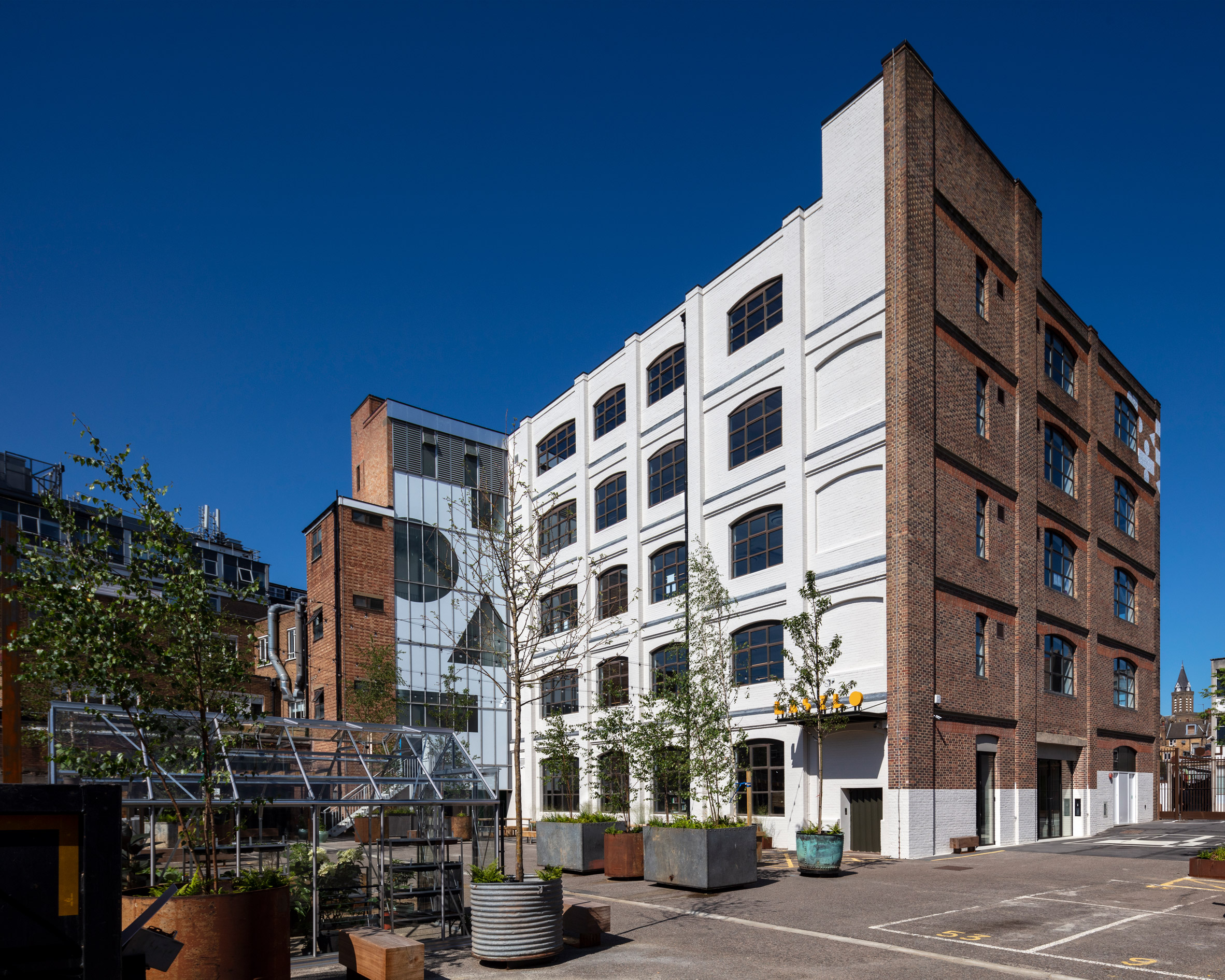
Exterior of Lazlo offices by Henley HalebrownGeometric graphics signal the building's change of use
Originally known as Batavia Mills, Laszlo was built in the early 20th century as a facility for manufacturing and printing, although it also served as storage for gas masks during the second world war.

The Bauhaus become an obvious point of reference for the renovation; not only does it date from the same period, but its core ethos was about being true to materials and finding beauty in craft.

Office with wooden ceiling in Lazlo by Henley HalebrownA steel and timber joisted roof is now exposed on the fourth floor
A painting by Bauhaus artist Laszlo Moholy Nagy – who the building is named after – provided the cues for repairs made to the concrete floors.

There were various gaps created where partition walls had been removed. Instead of infilling these with concrete, Henley Halebrown chose an earth-coloured screed that highlights these marks as traces of history.

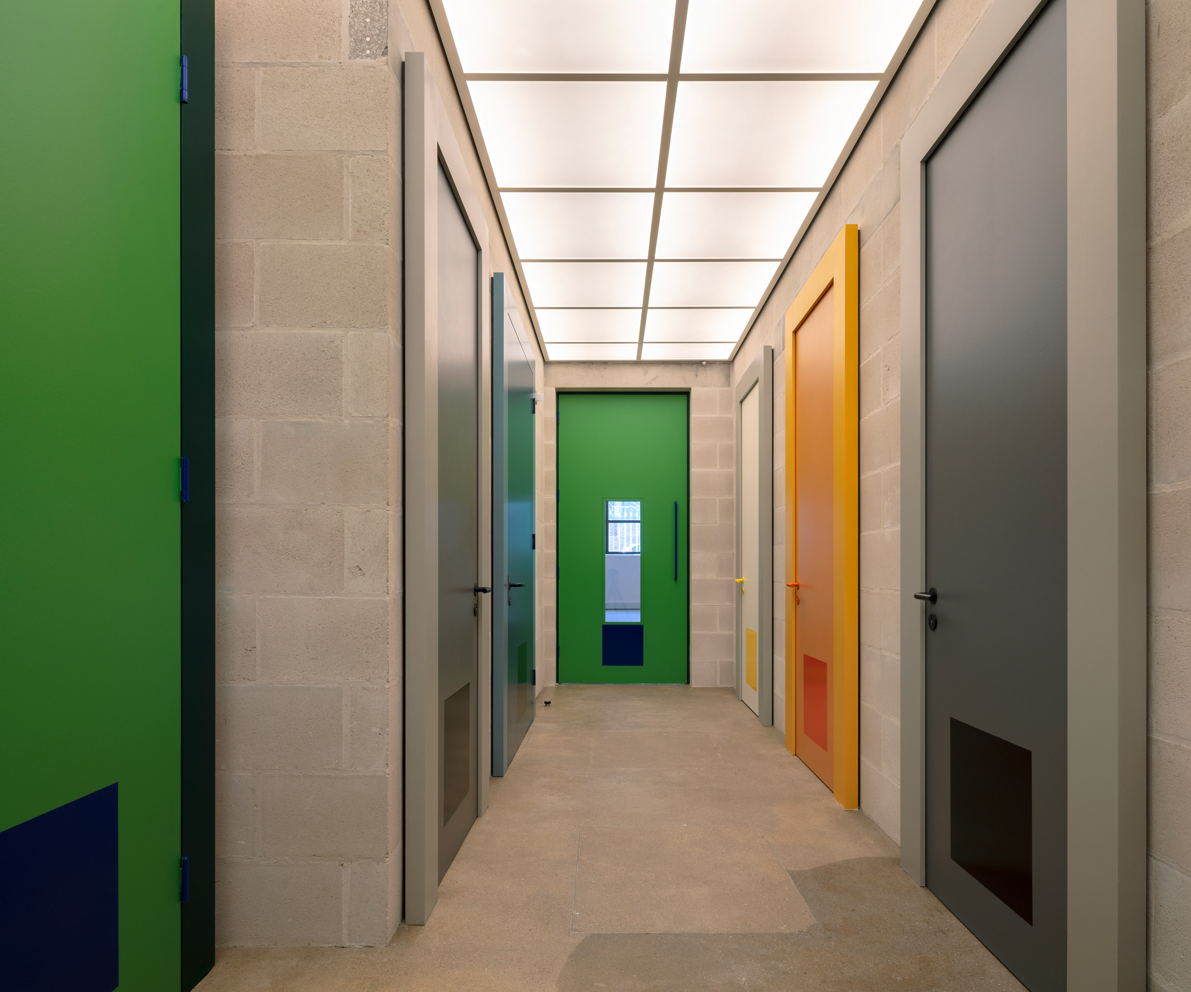
Colourful doors in Lazlo offices by Henley HalebrownDoors throughout the interior borrow tones from Josef Albers' colour studies
The building refers to the colour studies of Bauhaus teacher Josef Albers with a series of doors painted in bold but complementary shades of green, yellow, grey and blue.

Another Bauhaus reference can be found on the exterior, where the brickwork and glazing have been subtly decorated with the same graphic shapes and lettering that give the building its brand identity.

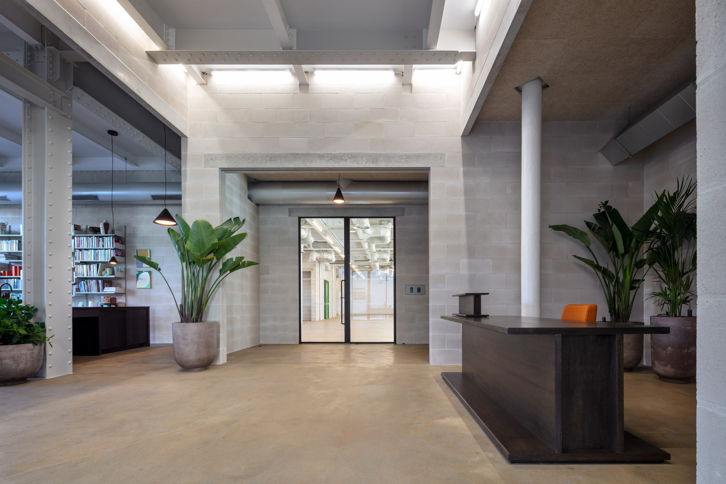
Lazlo offices by Henley HalebrownThe reception features a desk shaped like an I beam
Laszlo offers various amenities to its tenants, including a large outdoor seating area, bicycle parking and showers. There are also shared spaces on the ground floor, including a reception and an area known as the living room.

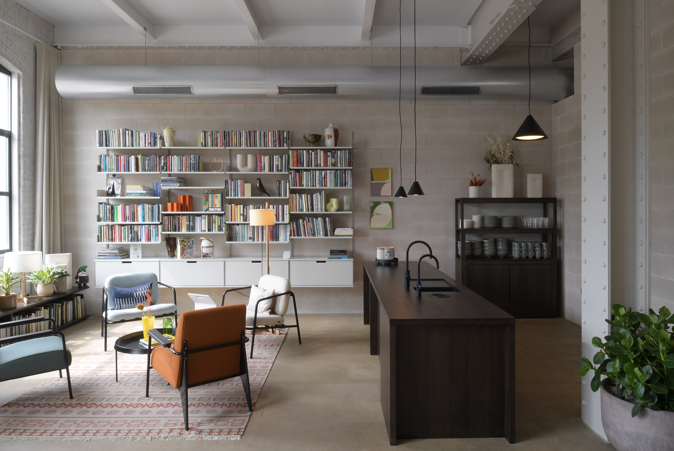
Furniture in these ground floor spaces is designed to feel like part of the structure, with highlights including a reception desk and bookshelf that both look like giant I beams.

Living room in Lazlo offices by Henley HalebrownA living room with kitchen is shared by all tenants
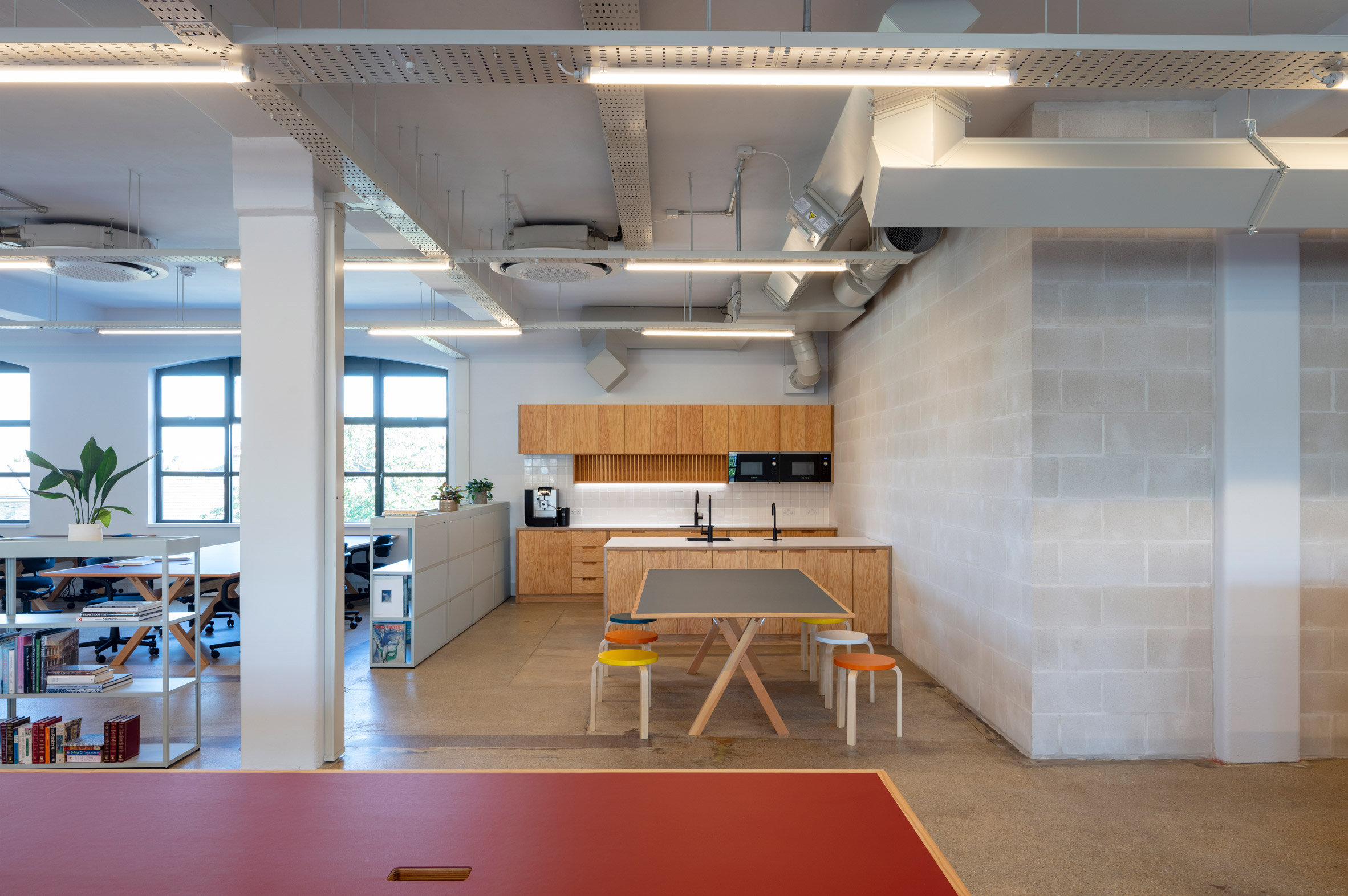
"Within the framework of the original structure, we composed a series of unconventional spaces with conventional building materials, mostly blockwork, lintels and paint," said Jack Hawthorne, an associate at Henley Halebrown.

"These spaces are occupied with pieces of furniture that are imagined and made as oversized elements of structure, 'furniture as structure', placing them in playful dialogue with the building's newly exposed frame."

Lazlo offices by Henley HalebrownOne of the office floors has already been furnished
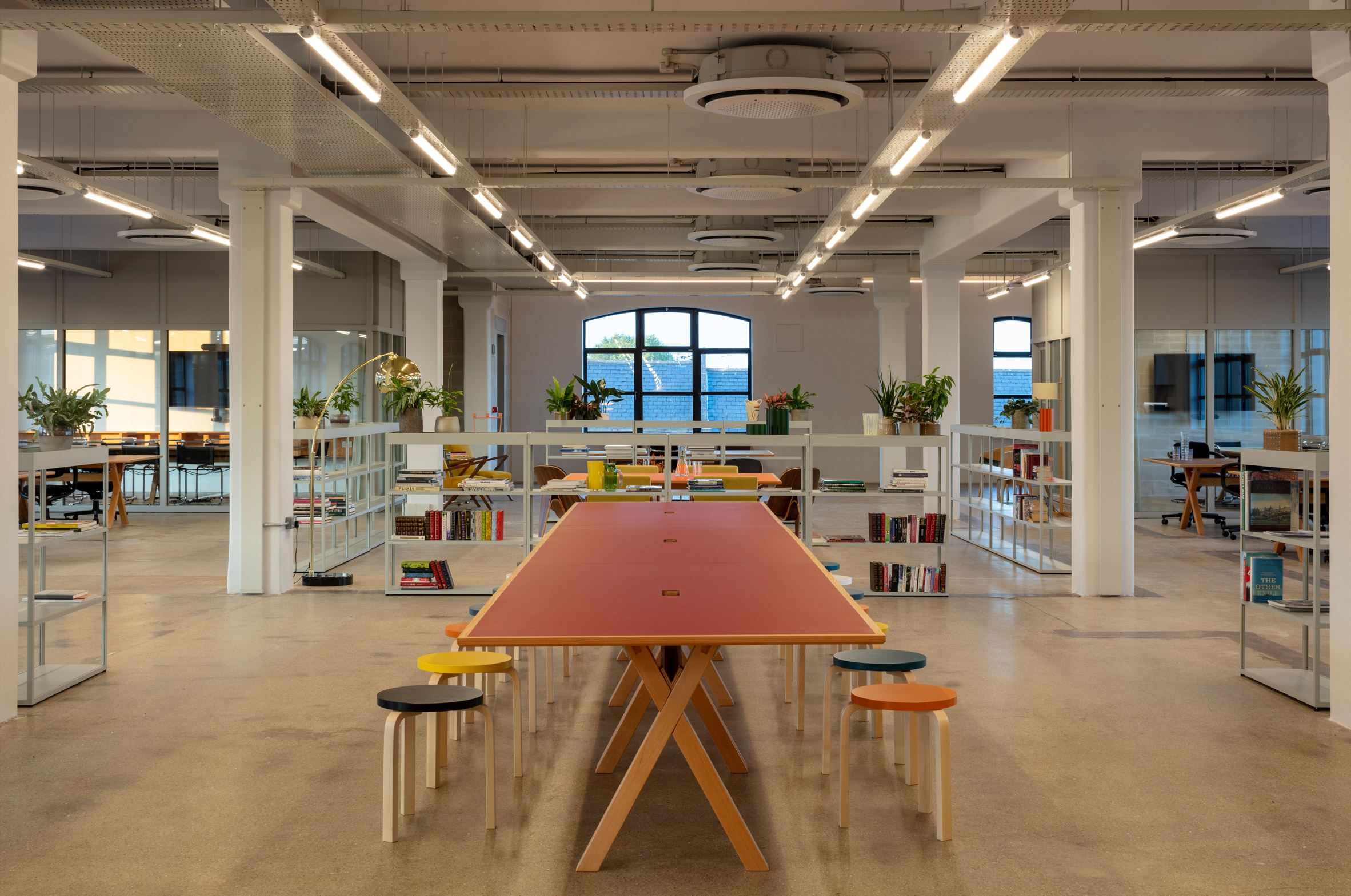
Photos of the project show one of the office floors already fitted out.

The light-touch approach includes glazed meeting rooms, a wooden kitchen and mobile shelves that function as room dividers. Desks and seats integrate bold flashes of colour that feel at home with the rest of the building.

Each floor is similar in layout and finish, although the fourth floor features an exposed steel and timber joisted roof and a balcony terrace.

Lazlo offices by Henley HalebrownThe space features colourful desks, open shelves and glazed meeting rooms

Laszlo is one of several innovative offices designs recently completed in London, as companies adapt to more flexible working policies following the impact of the pandemic.

Other recent examples include a co-working office that doubles as a "town hall" and an office with more meeting areas than desks.

The photography is by David Grandorge.

The post Henley Halebrown creates Bauhaus-inspired offices in converted London warehouse appeared first on Dezeen.

#all #interiors #london #uk #bauhaus #england #officeinteriors #henleyhalebrown #offices

dezeen@xn--y9azesw6bu.xn--y9a3aq

RIBA urges mass retrofit of England's interwar housing

image

Aerial view of Becontree housing

The Royal Institute of British Architects has urged the UK government to retrofit over three million homes in England to help cut carbon emissions and tackle fuel poverty.

In a report named Homes for Heroes, the professional body calls for a national programme involving the insulation of 3.3 million houses built in England's interwar suburbs between 1919 and 1939, which are usually poorly insulated.

According to the Royal Institute of British Architects (RIBA), the fabric-first retrofit of these dwellings could cut England's total carbon emissions by four per cent per year.

This is the "same amount as completely decarbonising [England's] waste and recycling sector" and could play a key role in helping to meet the UK's 2050 net-zero carbon target, RIBA said.

"There can be no further delay"

To carry out the mass retrofit, RIBA has suggested a National Retrofit Strategy programme, which prioritises insulating walls and installing heat pumps at homes in interwar suburbs.

Introducing tax levers, grants and allowances and other policies to incentivise private landlords to improve the homes they own would also play a key part.

"Without reducing our domestic operational energy consumption, the UK will miss its net zero carbon target," explained RIBA president Simon Allford.

"There can be no further delay in embarking on a national programme of home retrofitting, which will transform UK housing, creating warm and cheaper to heat homes while bringing health and wider societal benefits."

Interwar homes "perfect" for mass retrofit

Built between the end of the first world war and the beginning of the second world war, interwar homes make up over 15 per cent of England's housing stock. Examples include Becontree estate in east London and Kingstanding in Birmingham.

The homes are the target for the report as they are among the worst insulated in England – accounting for 12 per cent of the total carbon emissions produced by the country's housing each year.

Aerial view of Becontree housing in the 1970sRIBA is urging the government to retrofit England's interwar homes such as those in Becontree (above and top image). Image is by Tony Ray-Jones, courtesy of RIBA Collections

This is due to a combination of "poor insulation, solid wall construction, and high gas reliance", RIBA said, which means just 10 per cent of interwar homes achieve an Energy Performance Certificate (EPC) above B and C.

An EPC is a measure of the overall efficiency of a home, for which the best rating is A and the worst is E.

However, as many of these homes have repetitive designs and construction, RIBA believes they are "the perfect property type" for mass retrofit and can be easily improved.

Retrofit "can catalyse wider change"

In addition to reducing carbon emissions, a mass retrofit programme could also contribute to UK's national levelling-up agenda.

Improving the energy efficiency of interwar homes could minimise fuel poverty faced by their occupants – 17 per cent of which faced fuel poverty in 2021, exceeding the national rate of 13 per cent, RIBA revealed.

Additionally, if current band D-rated interwar homes were retrofitted to achieve band C performance or better, the drop in energy usage could save households almost £500 per year.

"Retrofit also offers benefits to both residents and communities," Allford explained.

"Implementing decarbonisation measures across homes in an area can catalyse wider change in community engagement and employment programmes," the RIBA president continued.

"In light of recent gas price increases, moving to low-carbon heating such as heat pumps could make a significant difference to residents of interwar homes."

[ Thermal image of heat loss from house

Read:

Poor-quality housing is "the number one thing holding the UK back" says Bulb CEO

](https://www.dezeen.com/2021/06/16/carbon-emissions-poor-quality-housing-uk-bulb-ceo/)

RIBA also argues that a National Retrofit Strategy could create thousands of green jobs, with the external insulation of England's interwar homes creating 5,000 jobs every year for the next 10 years alone.

"With the UK economy having suffered the worst recession since records began, the case for public investment to stimulate economic growth and create jobs has rarely been stronger," Allford concluded.

"The government must act now to support the residents of these homes and follow through on their net-zero target."

Homes for Heroes latest report issued by RIBA

RIBA's report echoes comments made by Hayden Wood, the CEO of renewable energy supplier Bulb, who recently told Dezeen that the UK needs to drastically improve its "poorly insulated, draughty" homes if it is to eradicate its carbon emissions.

'The number one thing holding the UK back is the quality of its housing stock," Wood said. "Our houses are poorly insulated, draughty."

Homes for Heroes follows the RIBA's Built for the Environment report that it issued in collaboration with Architects Declare. The report sets out ways to decarbonise the industry and calls on governments to overhaul building codes to better regulate the energy performance of buildings.

However, leading UK architecture studios including Foster + Partners and Zaha Hadid Architects are yet to join the signatories. Foster + Partners said that this is because it contradicts the Paris Agreement treaty on climate change.

The main image is byZinc Media, courtesy of RIBA

The post RIBA urges mass retrofit of England's interwar housing appeared first on Dezeen.

#all #architecture #news #uk #england #houses #riba

dezeen@xn--y9azesw6bu.xn--y9a3aq

McCloy + Muchemwa adds timber-framed "orangery" to renovated garage

image

Greenhouse and garage by McCloy + Muchemwa

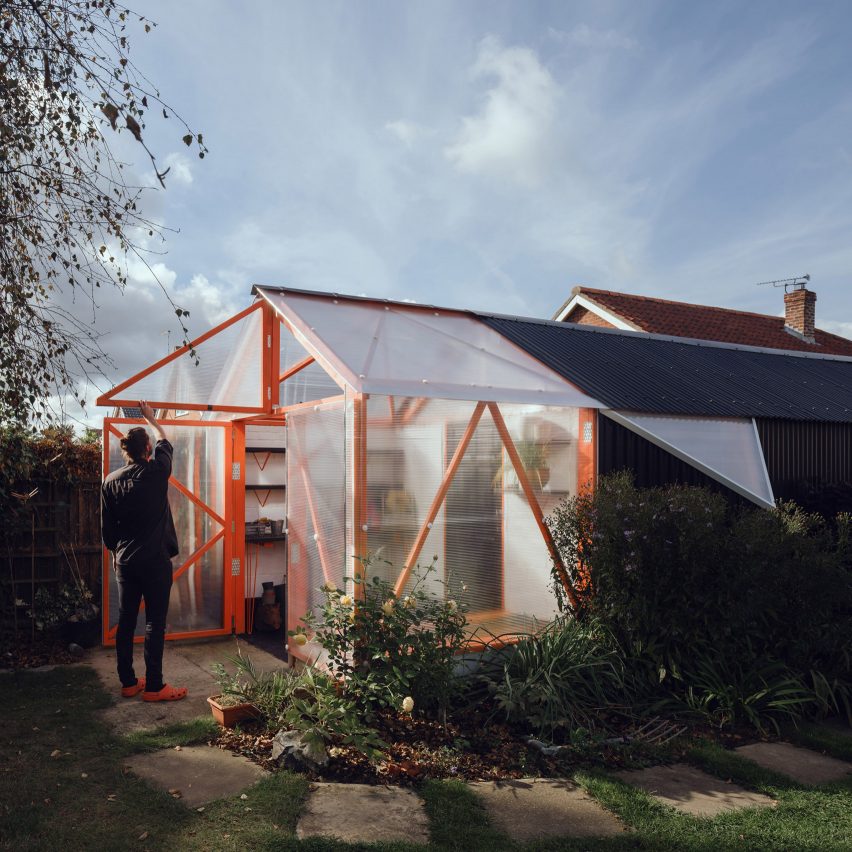
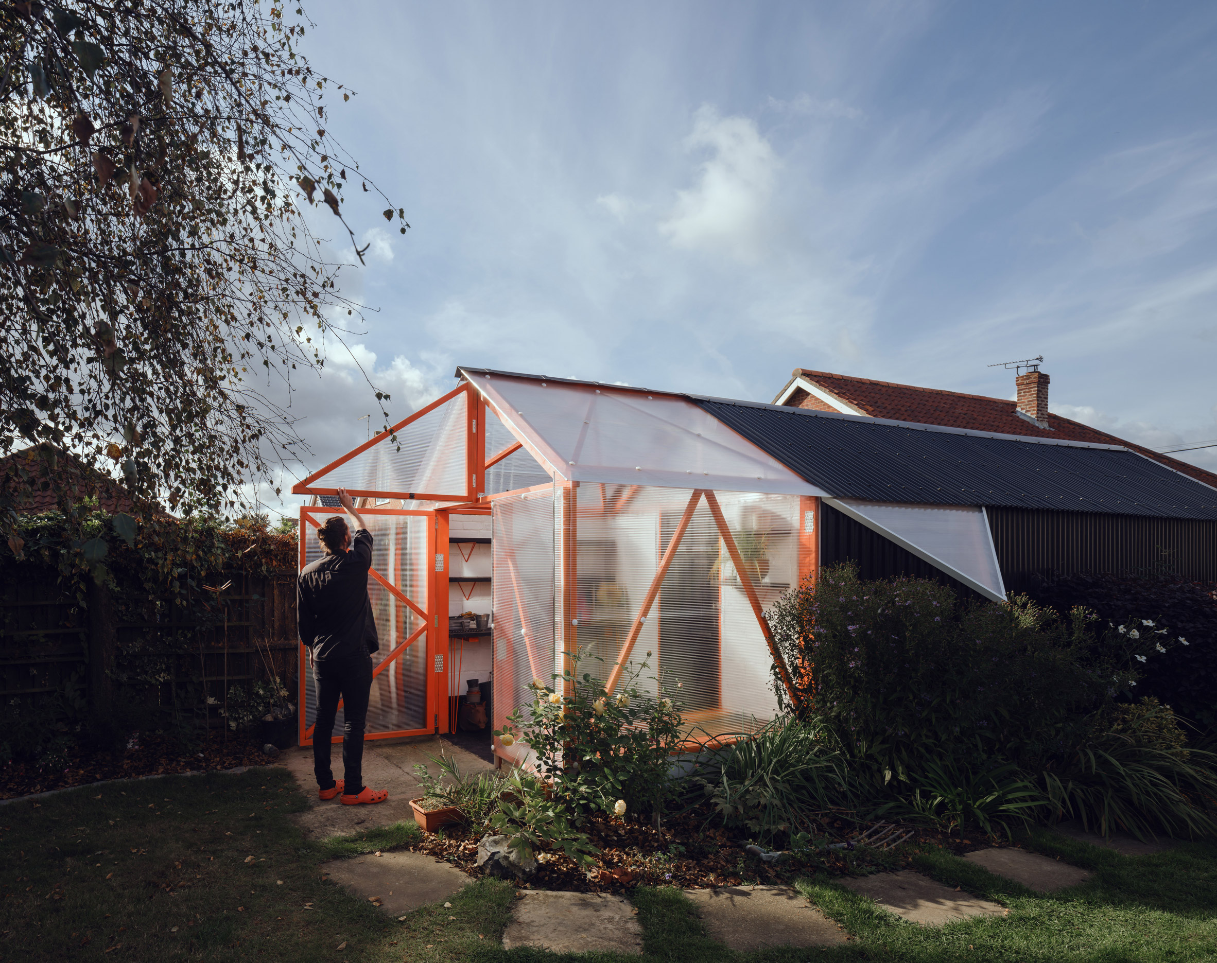
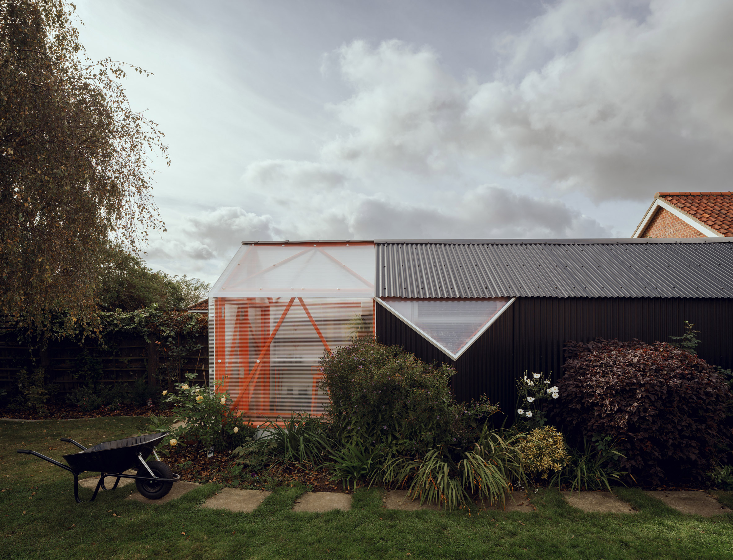
Architecture studio McCloy + Muchemwa has renovated a dilapidated garage in Norwich, England, adding a greenhouse extension with a bright-orange framework wrapped in polycarbonate cladding.

The London-based studio McCloy + Muchemwa was tasked with transforming the dark, dusty and asbestos-riddled garage into a safe and attractive outbuilding in the clients' rear garden.

Renovated garage by McCloy + MuchemwaMcCloy + Muchemwa has renovated an old garage in Norwich
As a consequence of spending more time at home during the Covid-19 lockdowns, the clients wanted to restore the existing outbuilding into a usable space for hobbies and DIY.

The self-build project's small budget informed an approach that focused on simple adaptations, upgrading the existing structure and reusing materials wherever possible.

Garden shed with polycarbonate greenhouseThe studio added a timber-framed "orangery" to one side
"The internal timber structure was largely sound, if a little haphazard, so to minimise the quantity of new materials added, a 'surgical' approach to refurbishment was chosen," explained McCloy + Muchemwa.

"Improvements to the building fabric promise to extend the working life of the structure and have been undertaken to minimise the waste taken off site."

Garden greenhouse by McCloy + MuchemwaThe new structure has a bright orange frame
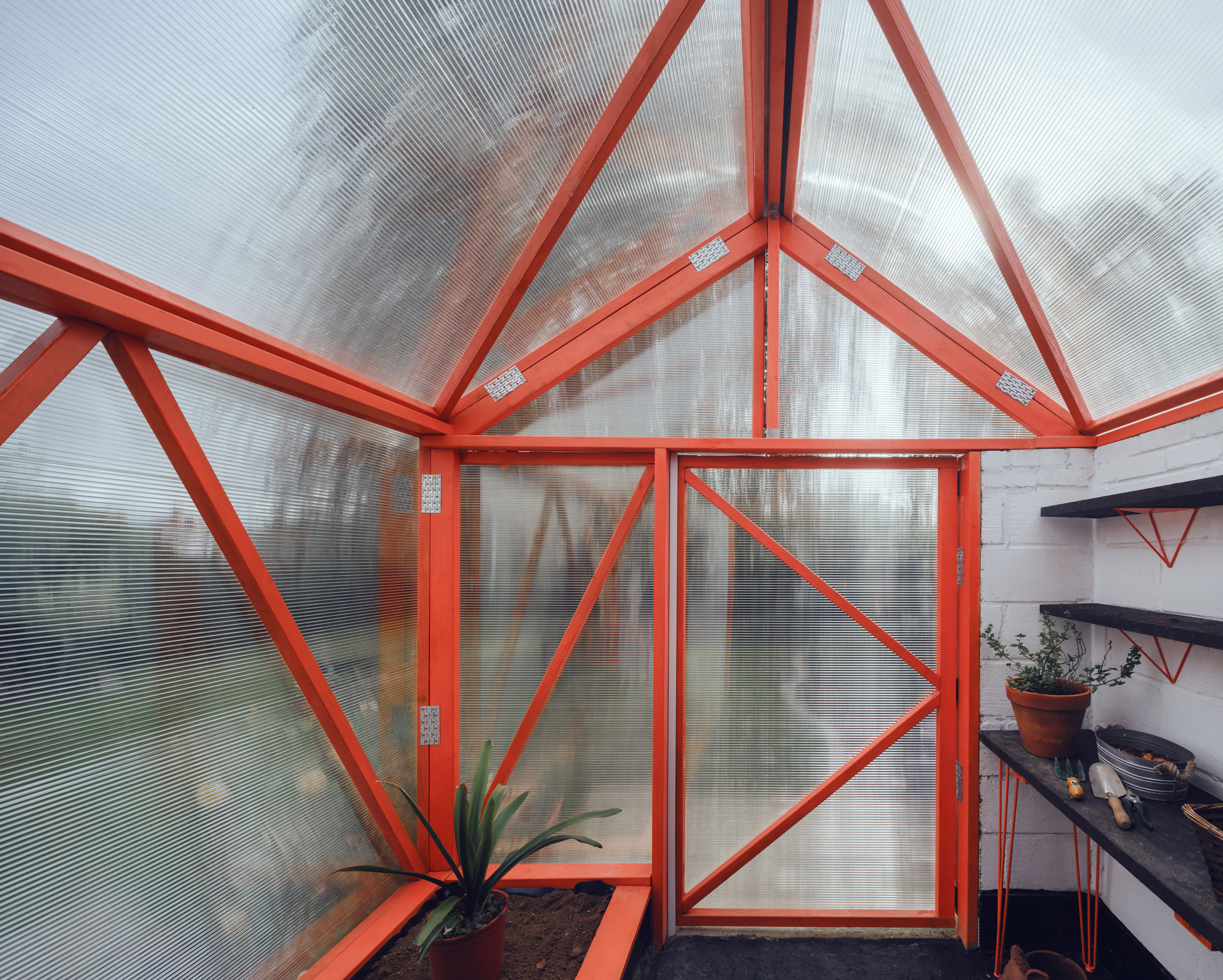
A priority of the renovation was the removal of the damaged roof, which contained asbestos. Sections of timber affected by rot were also replaced.

The original blockwork walls were retained and sealed with exterior-grade paint to improve their longevity.

Polycarbonate-clad greenhouseThe greenhouse is clad in polycarbonate

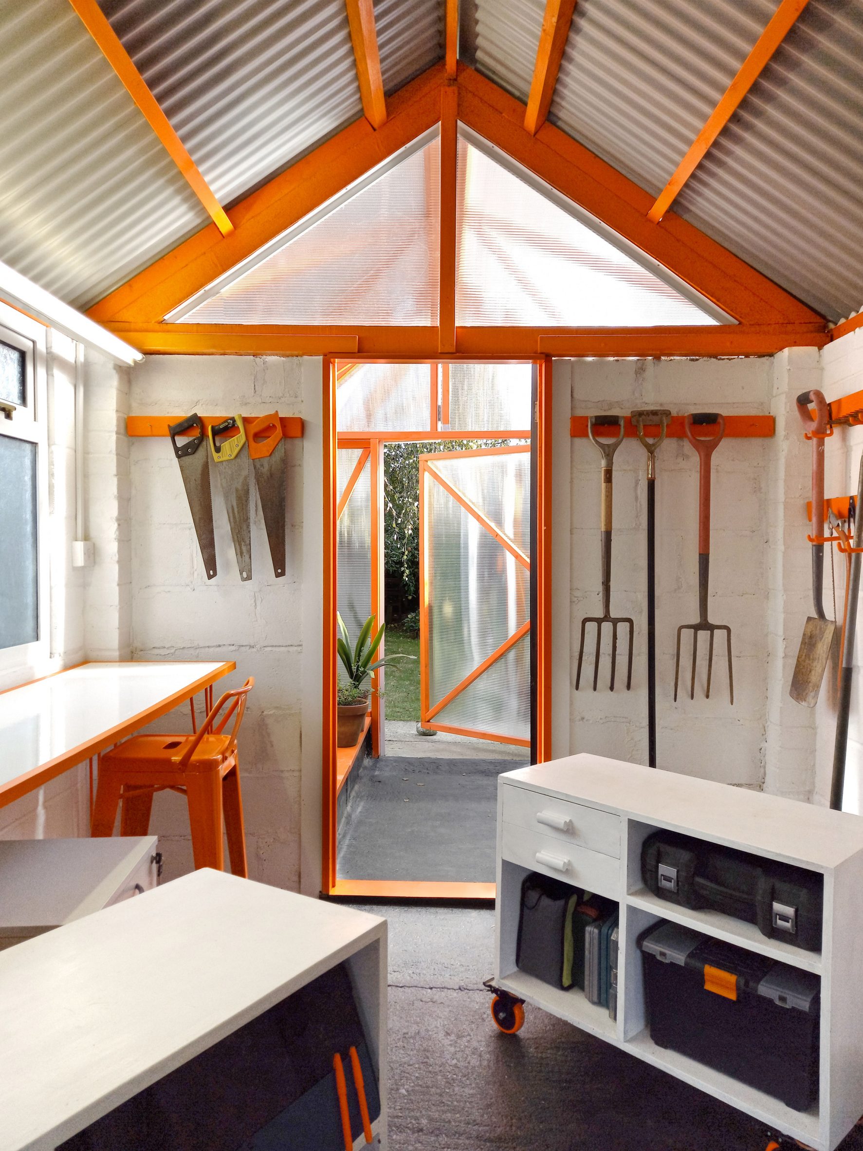
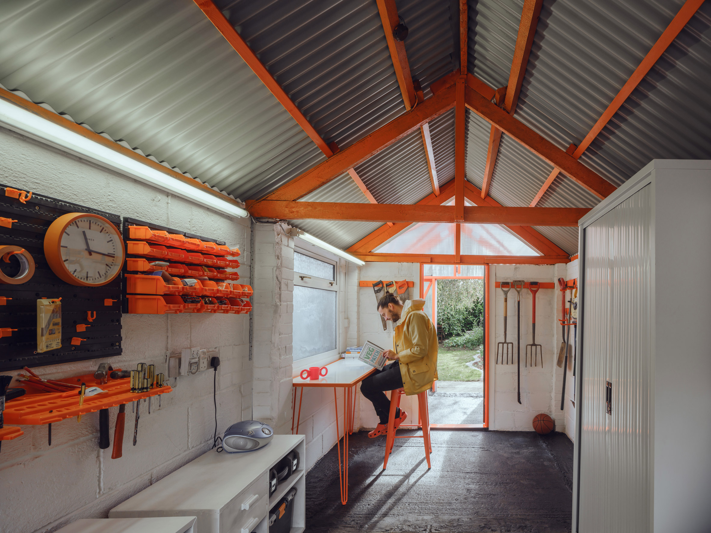
The converted garage, named The Orangery, now houses a storage area for large items such as bikes and lawnmowers, alongside a hobby zone with a workbench and further storage for power tools and gardening equipment.

Much of the furniture used inside is either upcycled or made from recycled building materials. Storage units are raised off the floor on wheels and can be reconfigured if required.

Inside The Orangery by McCloy + MuchemwaThe garage now functions as a hobby zone and storage area. Photo is by McCloy + Muchemwa
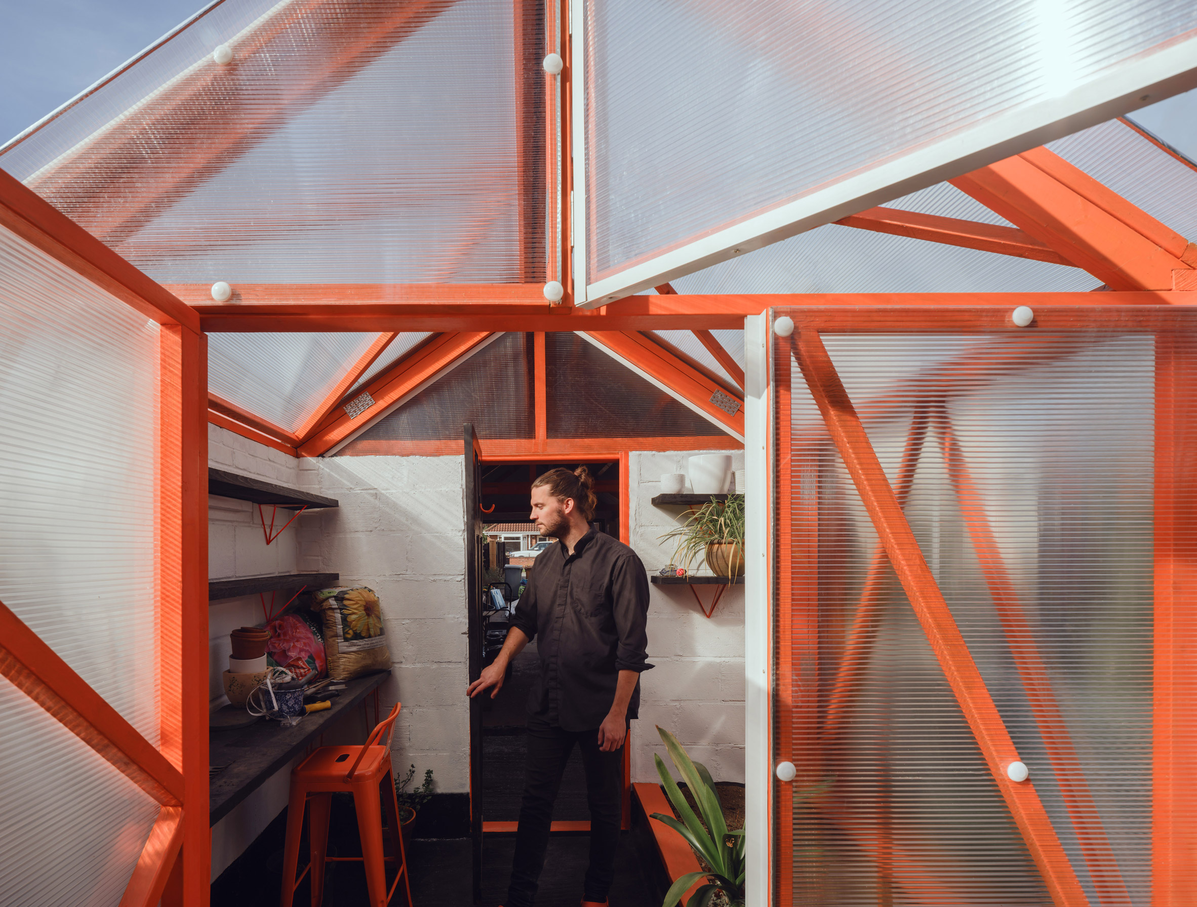
An extension to the existing structure contains an "orangery", or greenhouse, which is used for growing food. This timber-framed addition is clad with polycarbonate panels that allow light to reach the planters, shelves and potting table inside.

The woodwork inside the greenhouse and garage is painted a vibrant shade of orange to evoke the aesthetic of the high-tech architecture movement and, in particular, the work of the late architect Richard Rogers.

[ Ghost Barn by Invisible Studio

Read:

Invisible Studio builds fibreglass prototyping workshop at its growing woodland campus

](https://www.dezeen.com/2017/03/31/ghost-barn-invisible-studio-prototype-architecture-workshop-bath-uk/)

Elements such as the angular shelf brackets, simple hairpin table legs and castors are finished in the same industrial orange hue.

The garage is illuminated naturally by daylight entering through a triangular opening on the gable end connected to the greenhouse and a new pyramid-shaped window on one side.

Renovated garage with exposed timber frameThe orange structure continues inside the renovated garage

Corrugated black metal cladding applied to the building's walls and roof was chosen to emphasise the colours in the garden – an approach that the architects said "references classical still-life paintings".

The simple colour palette of orange and black creates consistency throughout the design, along with a recurring triangular motif.

Exterior of The Orangery by McCloy + MuchemwaA pyramid-shaped window has been added. Photo is by McCloy + Muchemwa
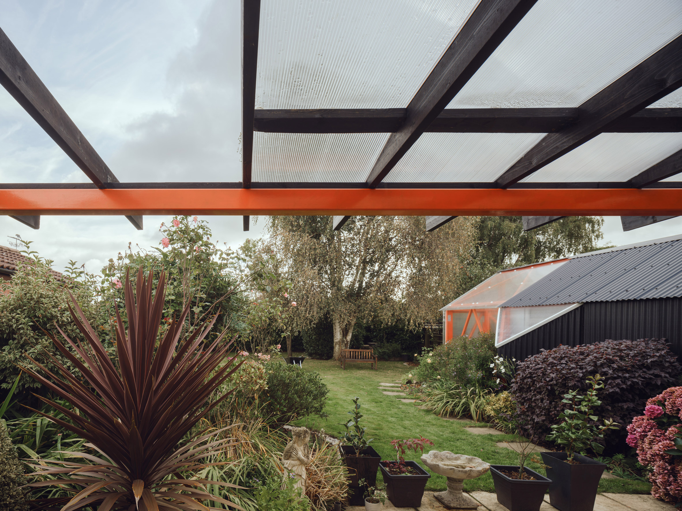
The same colour scheme and design language are applied to a pergola added to the rear wall of the clients' house.

This seven-metre-long structure provides a sheltered outdoor space and incorporates drainage for collecting rainwater used in the garden.

A view of The Orangery garage in NorwichA matching pergola has been added to the clients' house

Elsewhere in England, architect Richard John Andrews also recently completed a multifunctional outbuilding for his garden in east London, and Invisible Studio created a translucent model-making shed for its self-built studio in Bath.

McCloy + Muchemwa was founded by Steve McCloy and Bongani Muchemwa in London in 2017. Its work ranges in scale from architecture to objects, such as the undulating yellow bench that it designed for the London Festival of Architecture in 2018.

The photography is bySimon Kennedy unless stated.

The post McCloy + Muchemwa adds timber-framed "orangery" to renovated garage appeared first on Dezeen.

#all #architecture #residential #uk #england #garages #polycarbonate #sheds #renovations #greenhouses

andre_henze@pod.geraspora.de

The Specials & Saffiyah Khan – 10 Commandments

via Arte
#Ska #music from #England

Lyrics:
The Commandments of I, Saffiyah Khan

Thou shall not listen to Prince Buster
Or any other man offering kindly advice
In matters of my own conduct
You may call me a feminazi or a femoid
And then see if I give a stinking shit
Pseudo-intellectuals on the internet
They tell me I'm unhappy because I'm not feminine
Failing to consider that I may be unhappy
Because it's 3 AM and I'm in the depths of YouTube
Watching them... whining
Thou may catcall me on the street
But thou should take note that I'll catcall you right back
To tell you that you look pretty sexy too in your joggers
Or your suit, or your new-found look of confusion
Girls should not turn on each other
Or use man-made ideals like paths
Don't you realize that you're only making a fool of yourself
When you ask... "Why don't you wear makeup?"
Is that what it takes to impress a bloke
Whose brain is made up of promises of curvy size zeros
And anti-gravity tits?
Thou shall not tell a girl she deserved it
Because her skirt was too short
She walked home, streets lights illuminating her as a target
But she started it, because she looked at him
And he finished it 'cause he wanted to
And they'll bring out her skirt as "exhibit A" before the judge
And she should have the right to say
"Thou shall not tell me what to wear
Nor how to wear it"
I shall not be the icing on your cake
And I shall not be the candy on your arm
But I shall be seen
And I will be heard
The commandments of I, Saffiyah Khan
Pseudo-intellectuals